Cindy Sherman’s work
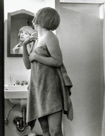
Sherman’s image
My image
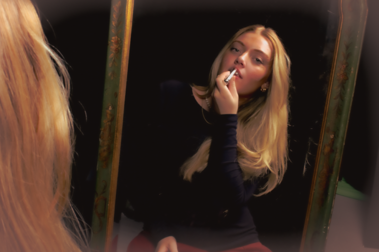
I personally prefer this image in colour as it shows my editing to make it look more vintage using warm tones so it looks more like Cameron’s work as well. However I am going to experiment by putting my image in black and white so it resembles Sherman’s famous image.
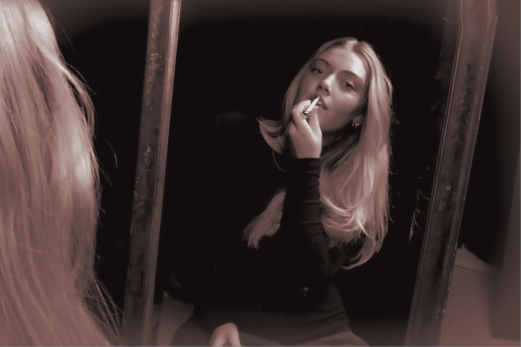
Similarities and differences
In Cindy’s work she is standing in a towel which ultimately looks very feminine and vulnerable which is typically a feminine stereotype. However, as seen the subject has her arm up with her fingers which gives off a elegant and gentle look to the image meaning viewing herself in the mirror with draw catching eyes. This is similar to my work as the subject in the mirror has her arm up however holding a prop which could link to Sherman’s work. Another contrast is how Sherman is in a w towel which is a large factor to the image whereas the subject in my image is wearing black which would make the viewer look more at the face rather than the body as the background is black. A major difference is my subject in my image is not a full body shot whereas Sherman’s work is. Sherman’s work also contains depth in the shadows of her image where as mine does not as it is through a mirror completely. Lastly the subject in Sherman’s image is looking through the reflection same as my image however not looking into the camera through it. Whereas, my image the subject is looking through the camera giving more a seductive and confident look.
Julia Margaret Cameron
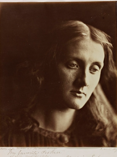
Cameron’s image
My image
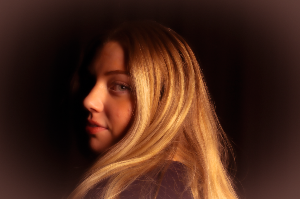
Similarities and differences
A major eye catching similarity is the lighting. Within my image I used Chiaroscuro lighting to emphasize the beauty of femininity. This relates to Marilyn Monroe as a character as my inspiration. Cameron’s image has a soft focus in the centre and high exposure on the right side of the subjects face however that is what she was known for and was good at. We both used a black background to blend in other features which could make it look mysterious as without a background the image cannot say a lot. I edited my image to make it look vintage and sort of a rusty colour which I executed through using warm tones and a warm feathered boarder which Cameron successfully did too.
