Femininity and Masculinity
In this photoshoot I have chosen to experiment with different male and female stereotypes in the studio, including different lighting, poses and props. I have decided to do stereotypes, so I can compare my stereotype images to my chosen artists photographs, which are Cindy Sherman and Claude Cahun. I have used the chosen stereotypes below to really look into:
• Males are aggresive
• Females are too emotional
• Females should be housewives
• Makeup is feminine
• The colours pink and blue to show masculinity and femininity
I have chosen these stereotypes to look at, because Cahun and Sherman have used some of these stereotypes, so it makes it easier for me to compare and analyse my images against theirs.
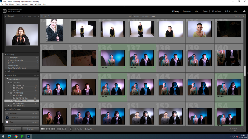
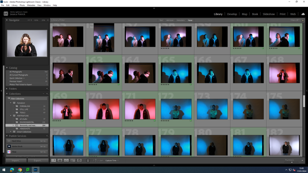
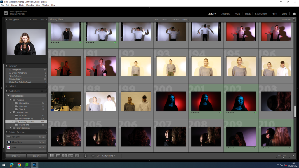
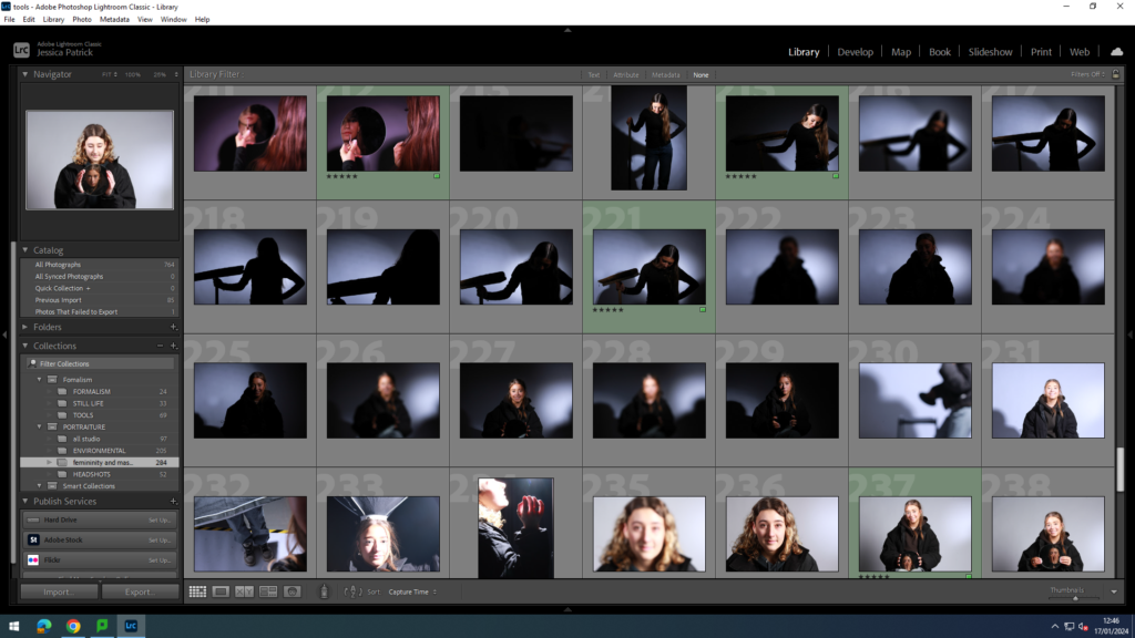
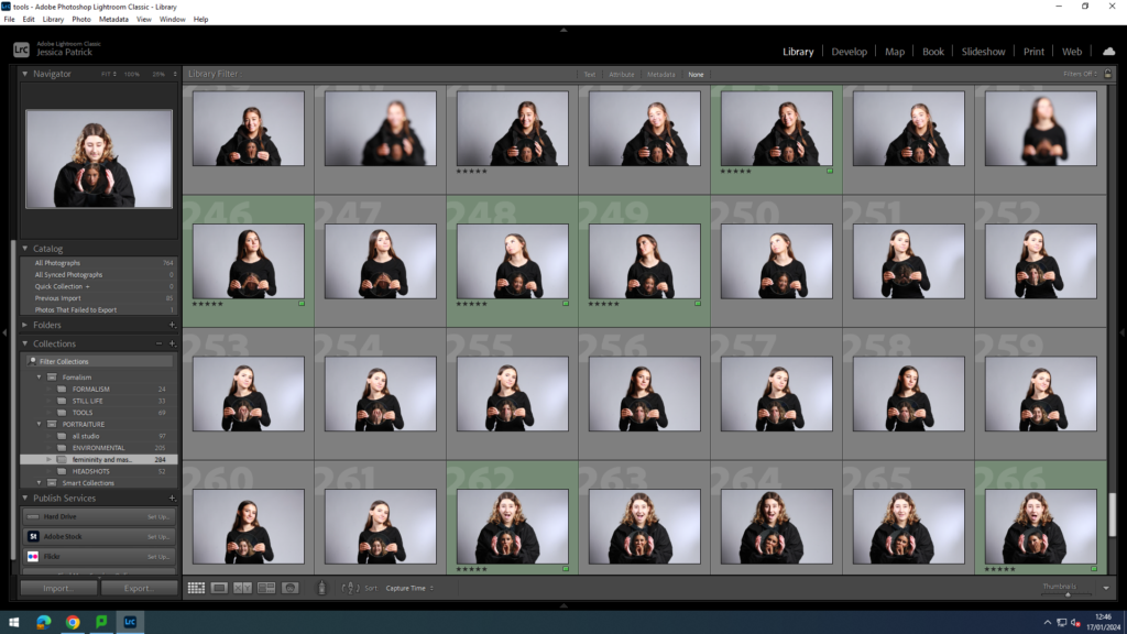
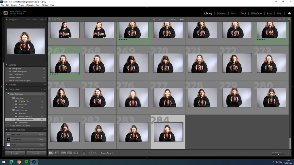
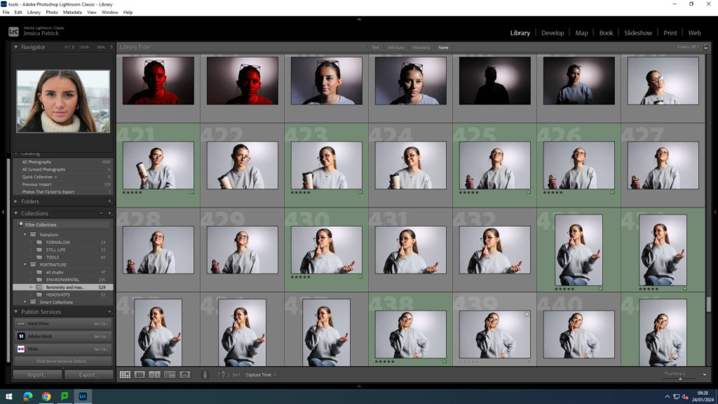
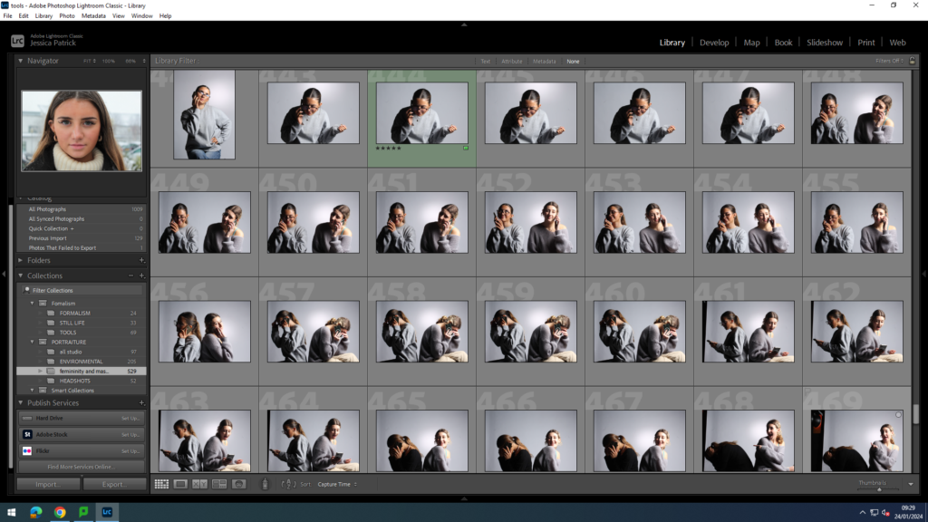
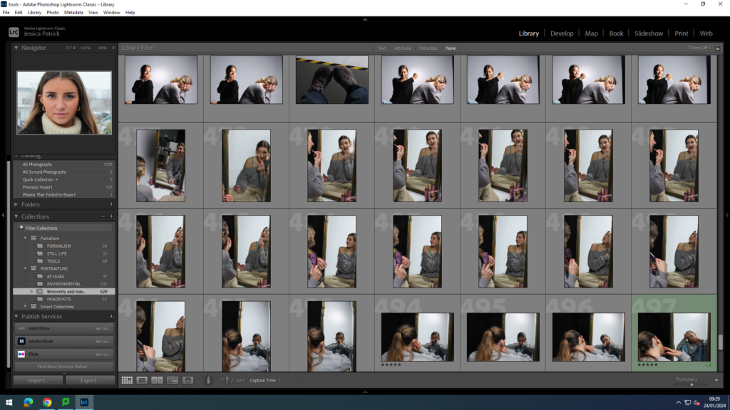
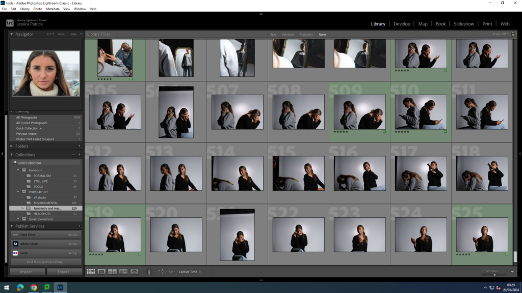
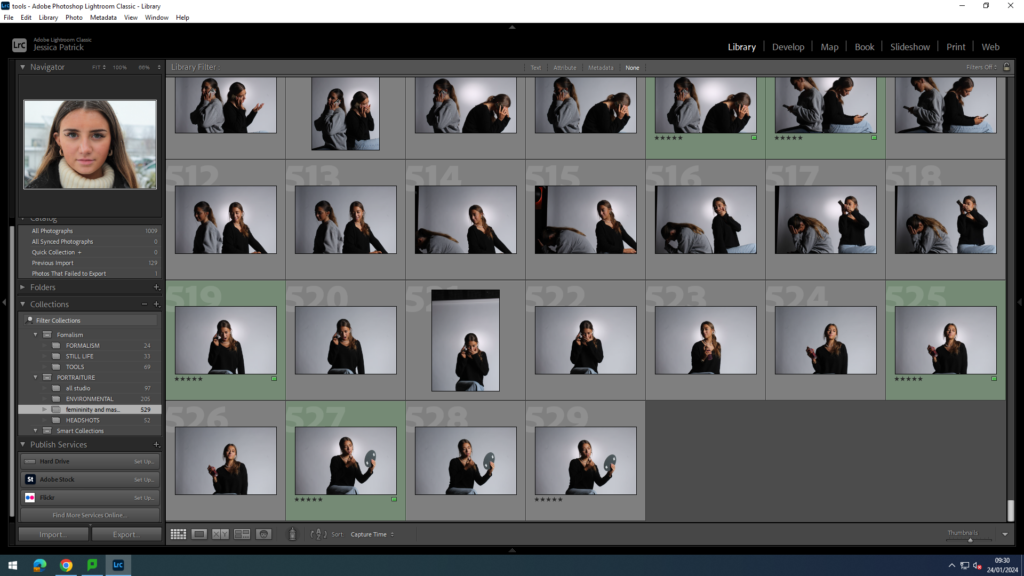
The images which I have highlighted green are the images I have chosen to edit, because they present the stereotypes the best, and have the best composure, focus and lighting techniques. I went down to the studio three times for this photoshoot, because in the first photoshoot there were shadows behind my models, from the lighting used, because they were stood too far back. In the second attempt I made sure to move the models more forward, to help prevent the shadows behind them. In my third photoshoot I experimented with different props, such as lip gloss, hair brush, perfume, mirrors, phones and other make up products.
Firstly in the studio I experimented with different coloured lighting e.g. pink and blue, because they are stereotypically colours that represent femininity and masculinity.
masculine
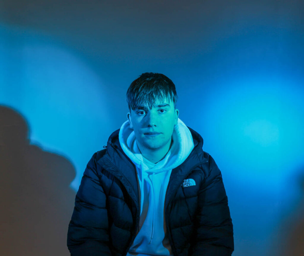
Firstly, I used a male as my model and experimented with blue lighting, because stereotypically blue is associated with males.
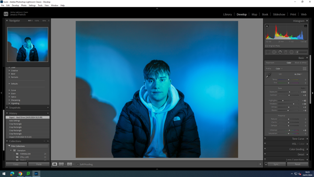
I edited this image by increasing the exposure, contrast, shadows, whites and vibrancy, while decreasing the highlights and blacks. I did this to make the lighting more vibrant.
Then, I decided to take inspiration from Claude Cahun, because she experimented with gender fluidity and went against stereotypes, so I decided to use female models, but also use the blue lighting.
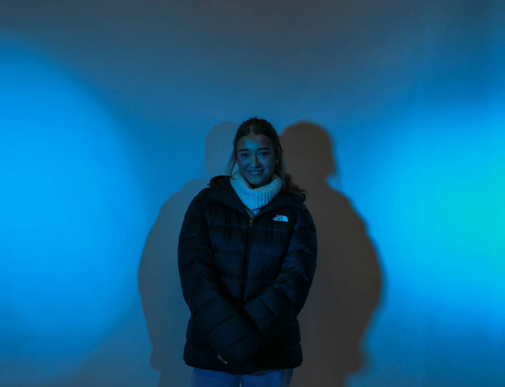
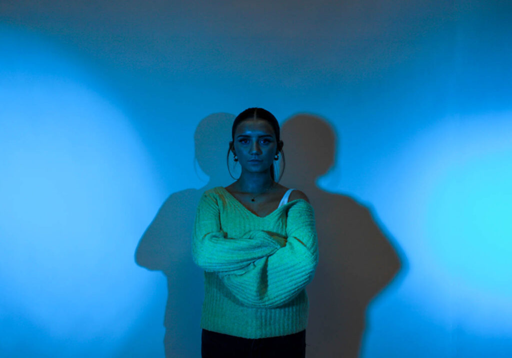
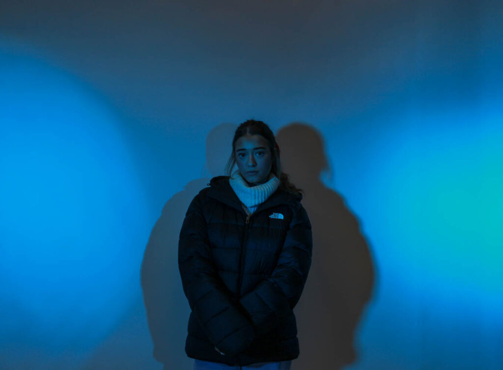
I also has my model try look more masculine while stood in this light, by giving her a male jacket and asking her to put her hood up and look tough.
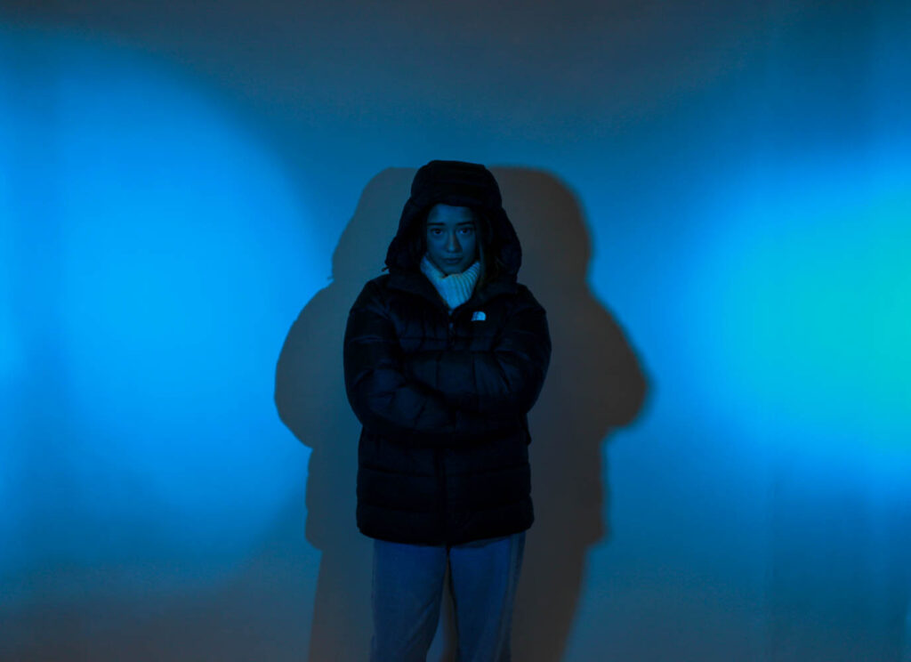
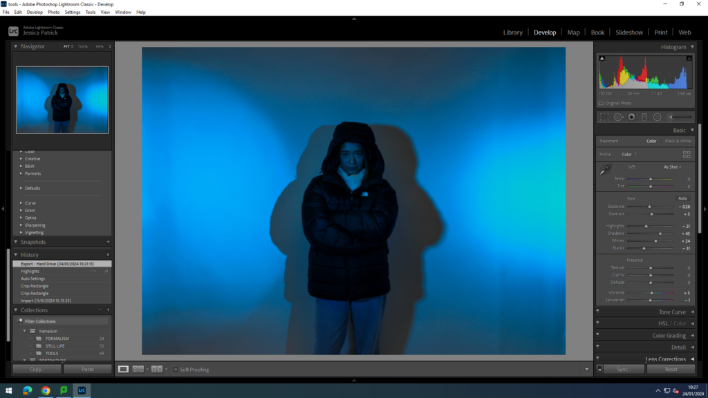
I edited these photos by increasing the contrast, shadows, whites and vibrancy, while decreasing the exposure, highlights, blacks and saturation. I did this to make the blue lighting more vibrant, and to make the model stand out more.
Femininity and masculinity
I had used both pink and blue lights here and positioned the male and female next to each other in the photograph, so the comparison between femininity and masculinity could be seen.
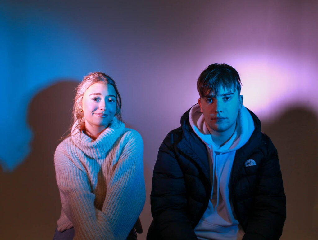
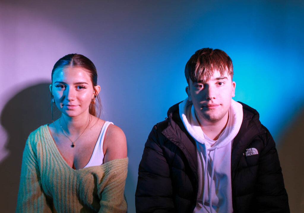

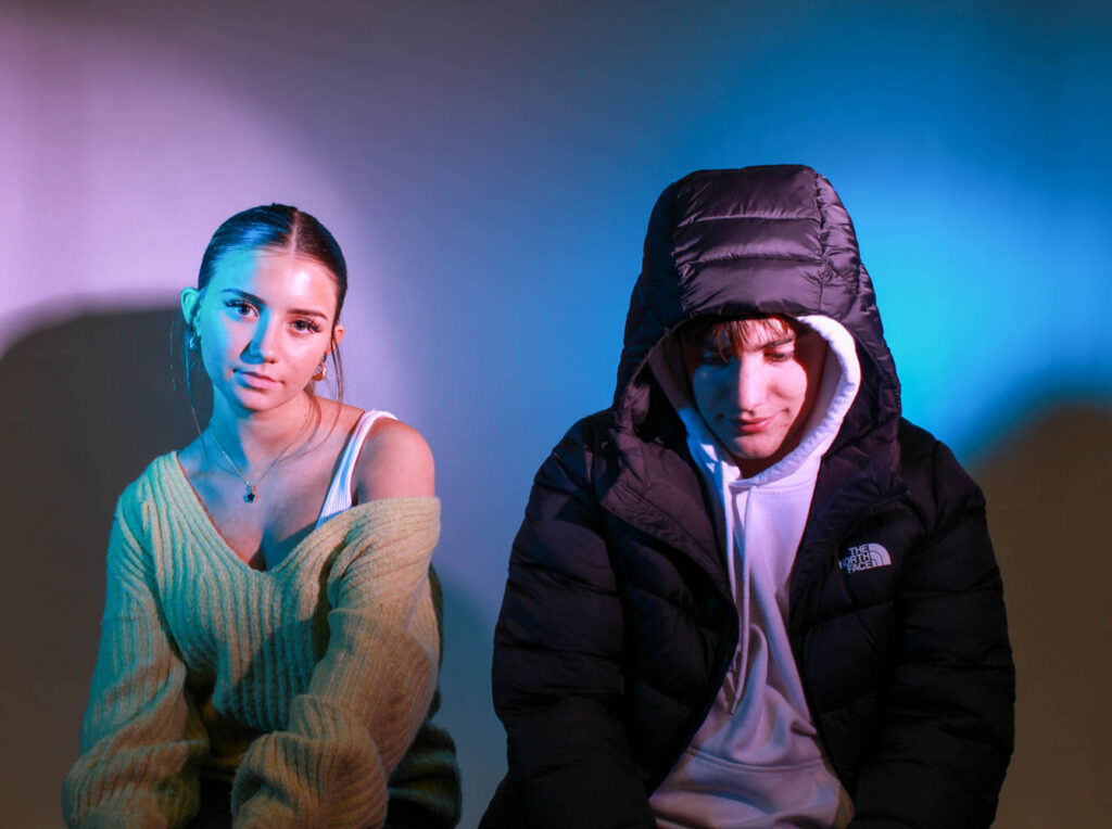
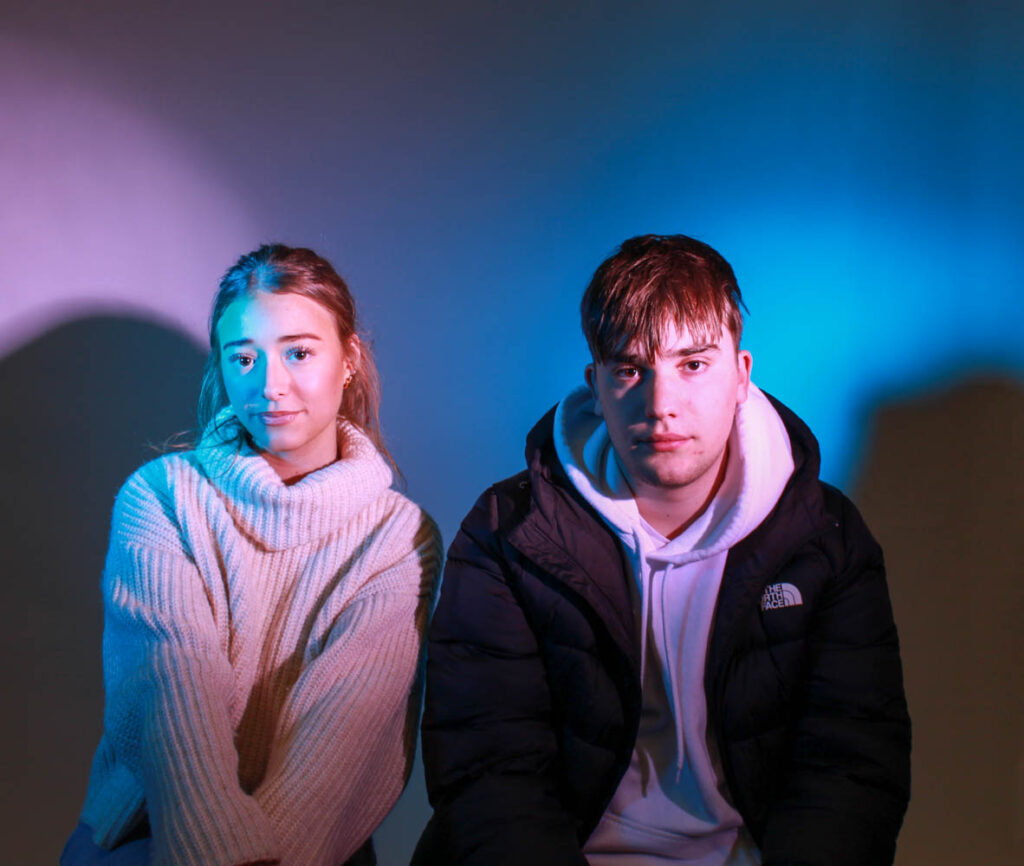
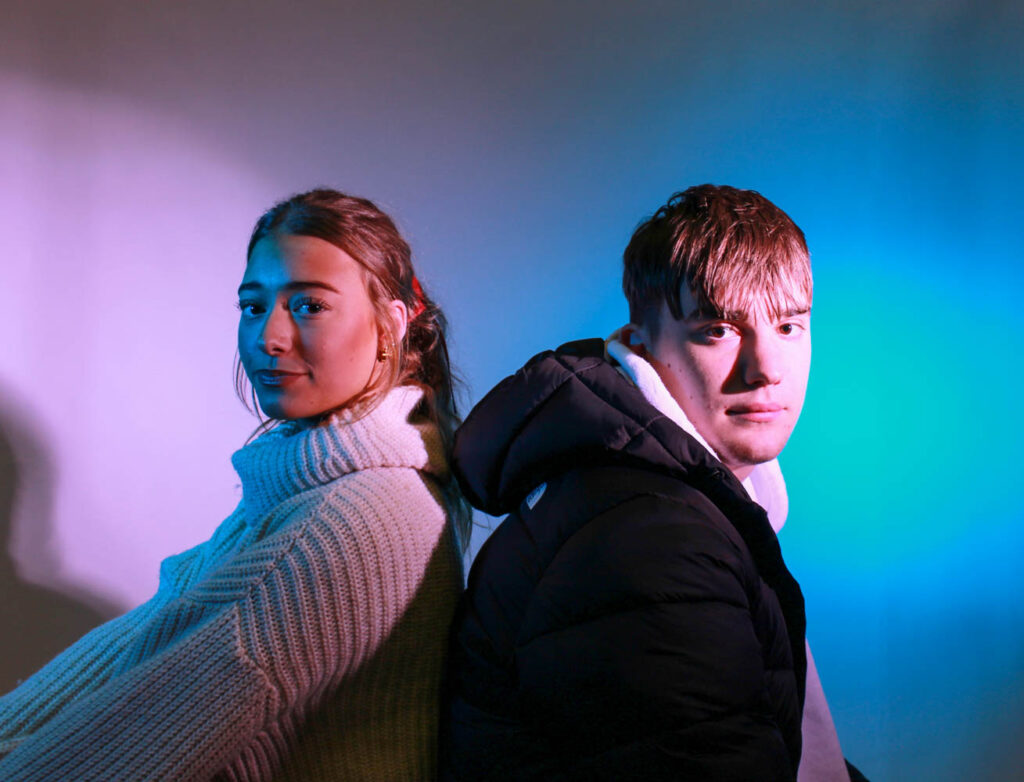
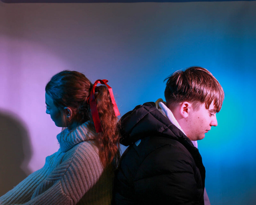
I had the female model sit in the pink light and the male model sit in the blue light, because they are their stereotypical colours. However, I was influenced by Cahun and how she went against stereotypes, so I also switched their positioning around, so they went against their stereotypes.

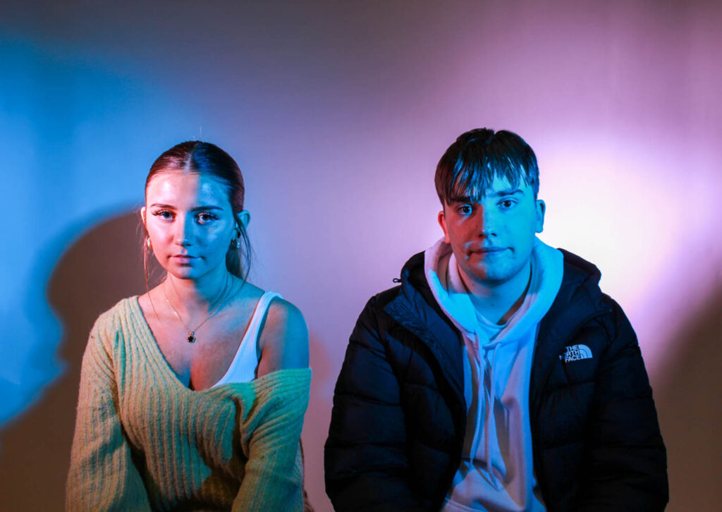
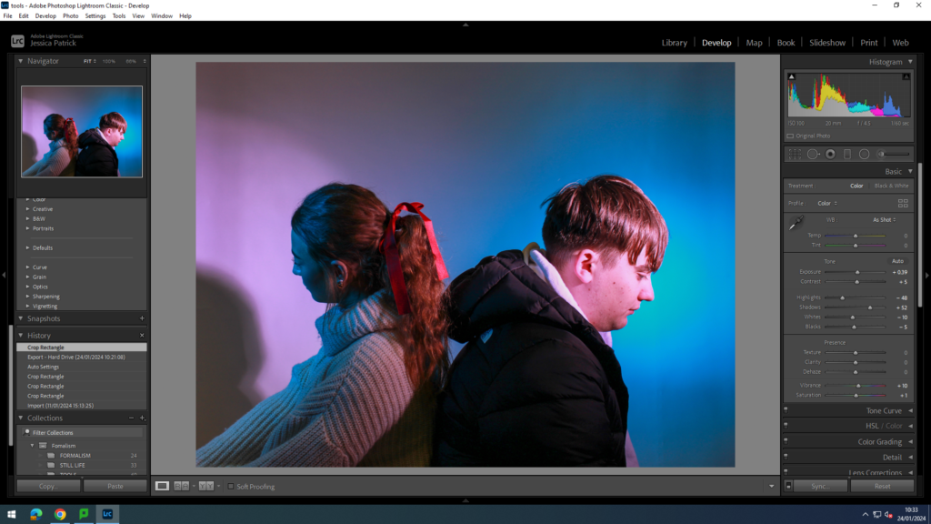
I edited these photos by increasing the exposure, contrast, shadows, vibrancy and saturation, while decreasing the highlights, whites and blacks. I did this so the coloured lighting would be more vibrant. I also used the prop of a bow in the hair to represent femininity, because bows are seen as a very feminine accessory.
Femininity
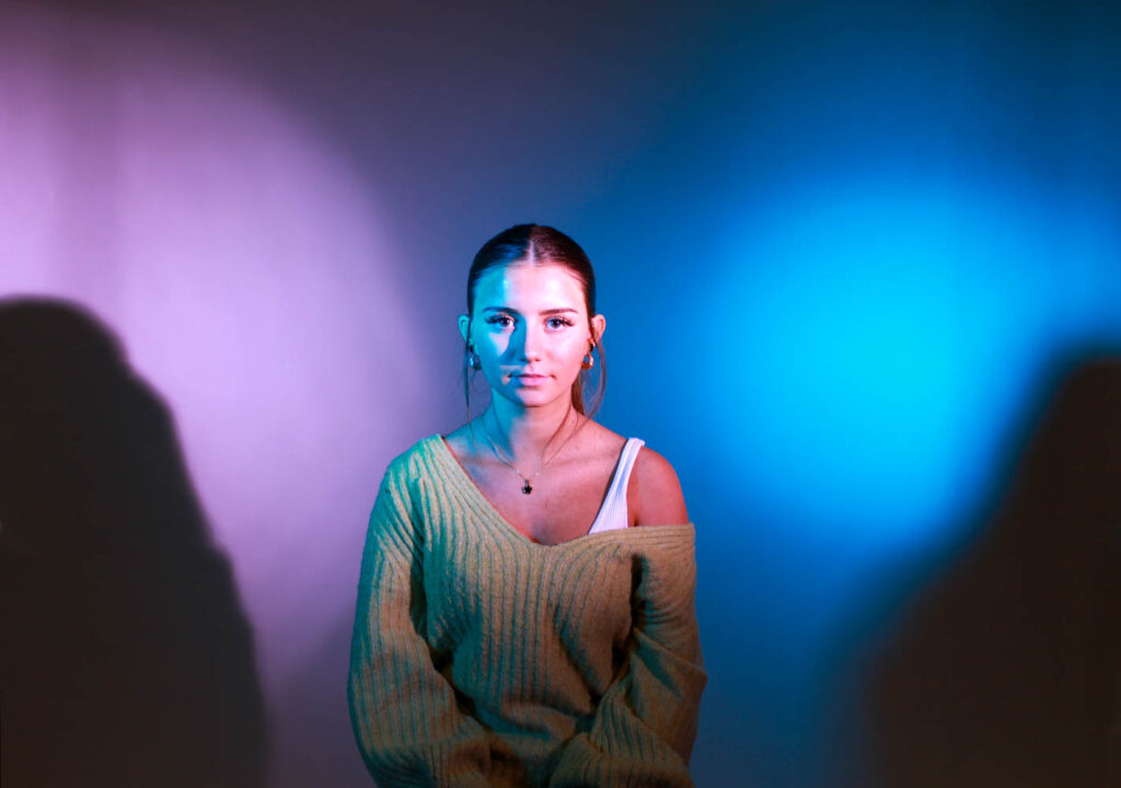
I also used a female model in both pink and blue lighting to represent gender fluidity and to go against stereotypes, just like Cahun did.
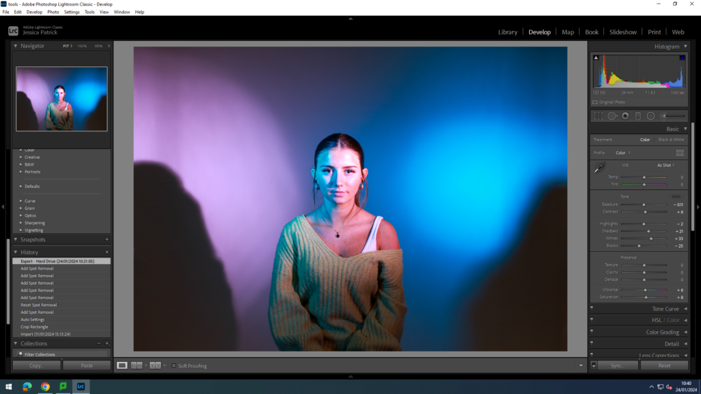
I edited this image by increasing the contrast, shadows, whites, vibrancy, saturation, while decreasing the exposure, highlights and blacks. I did this to make the lighting more vibrant.
Next, I experimented with different masculine and female stereotypes.
Masculine
The first masculine stereotype I experimented with was that men are aggressive. I used different poses to show this. I also used red coloured lighting, because the colour red signifies anger.
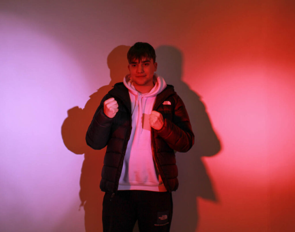
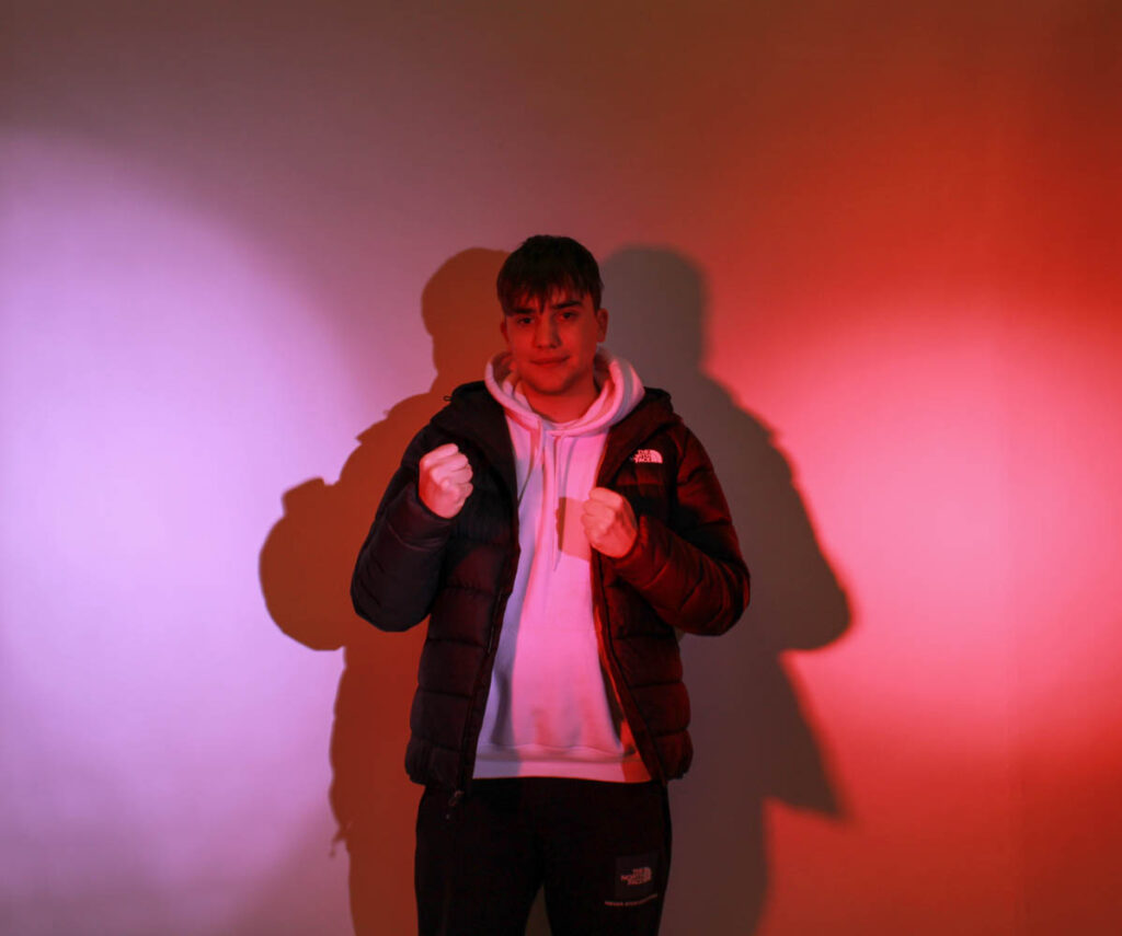
I had my model put his hands up in fists to signify that he was angry and being aggressive. However, I then decided to go against the stereotype, like Cahun, and have him pose smiling, while in the red light. I did this to show that even if angry, like the red light portrays, not all men are aggressive all the time and that it’s just a stereotype.
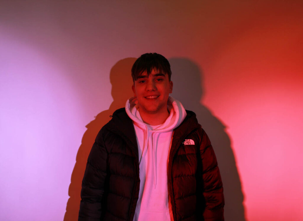
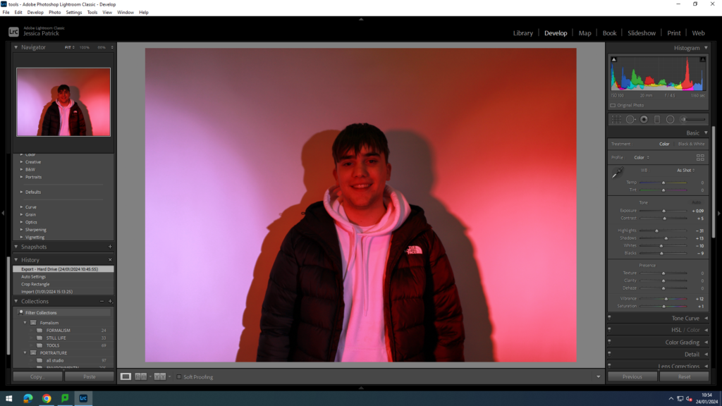
I edited these images by increasing the exposure, contrast, shadows, vibrancy and saturation, while decreasing the highlights, whites and blacks. I did this so the model would stand out more and the lighting would be more vibrant.
I then experimented with the stereotype that males are strong and tough.
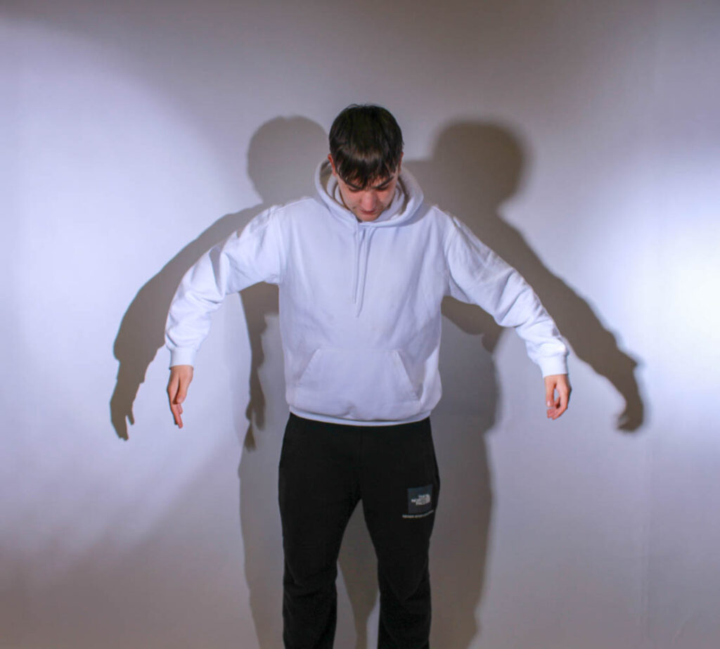
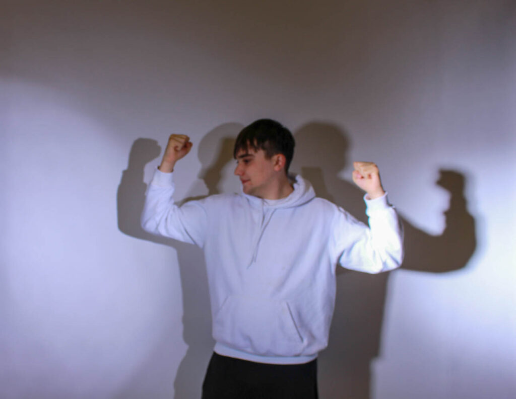
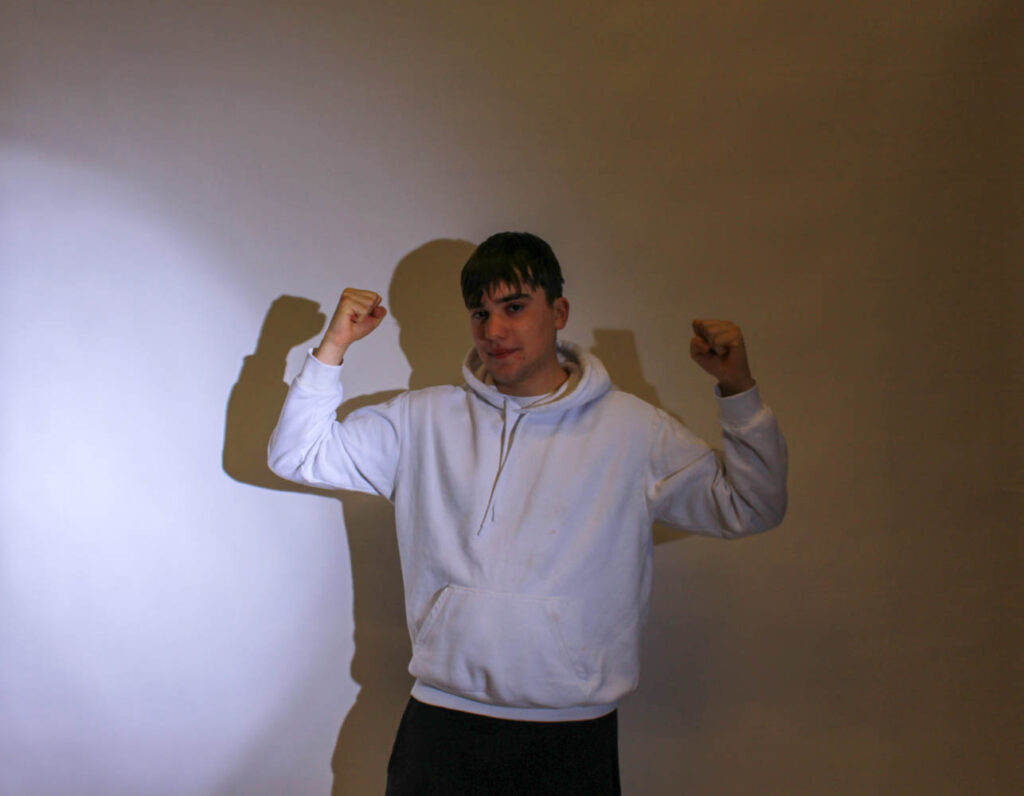
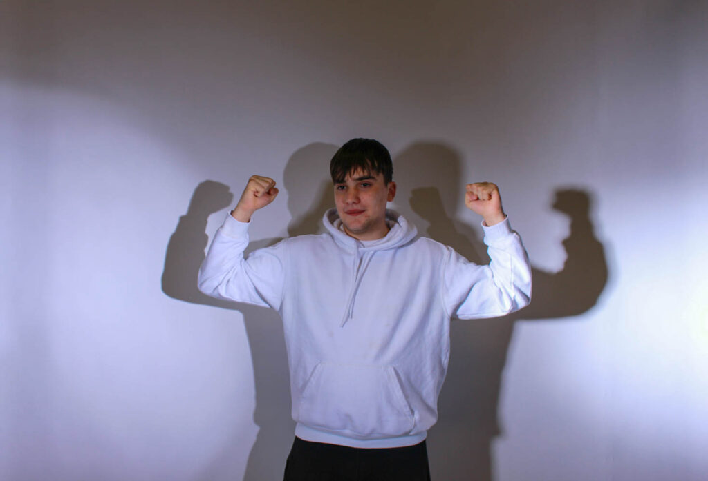
I had my male model pose flexing/ showing his muscles, so that he would look big and strong.
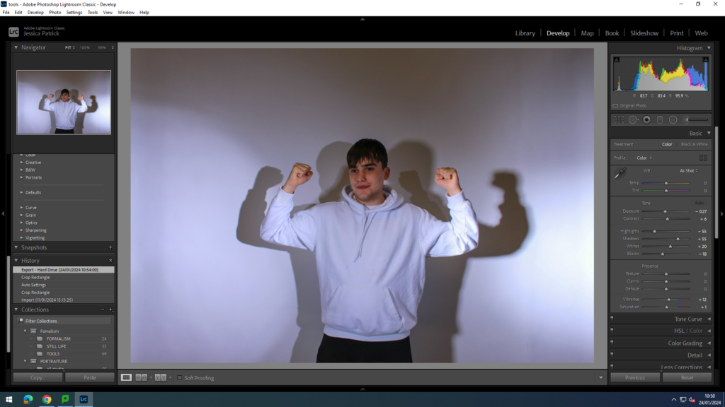
I edited this photo, by increasing the contrast, shadows, whites, vibrancy and saturation, while decreasing the exposure, highlights and blacks. I did this, so the model would stand out more.
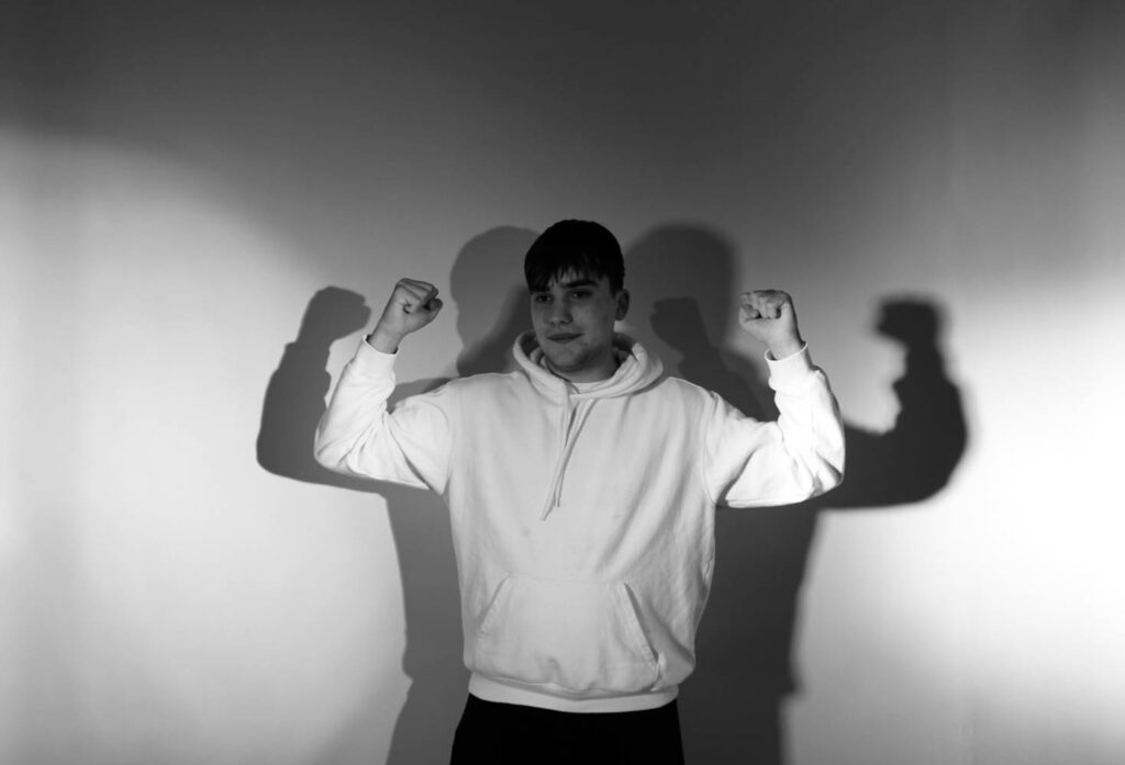
I then made a virtual copy of the edited photo, so I could create a black and white copy.
Conclusion of shoot
The photos represented femininity and masculinity well, as they showed the different female and male stereotypes well. However, there were too many shadows in the images. Therefore, I went down again for another shoot and made sure my models were stood further forward, away from the backdrop, so that those shadows were not created. However, I do like the shadows in the final black and white image, because it make my model look even more touch as he has two large shadows behind him also flexing his muscles.
Femininity
In this shoot I experimented with different female stereotypes and different props. Firstly, I experimented with the stereotype that women are too emotional.

In this photo I was crying, so that I could represent the stereotype that women are too emotional and cry a lot.
In this photo I also experimented with ‘selfies’, the photo was of myself. I did this, because Cahun and Sherman both took photos of themselves.
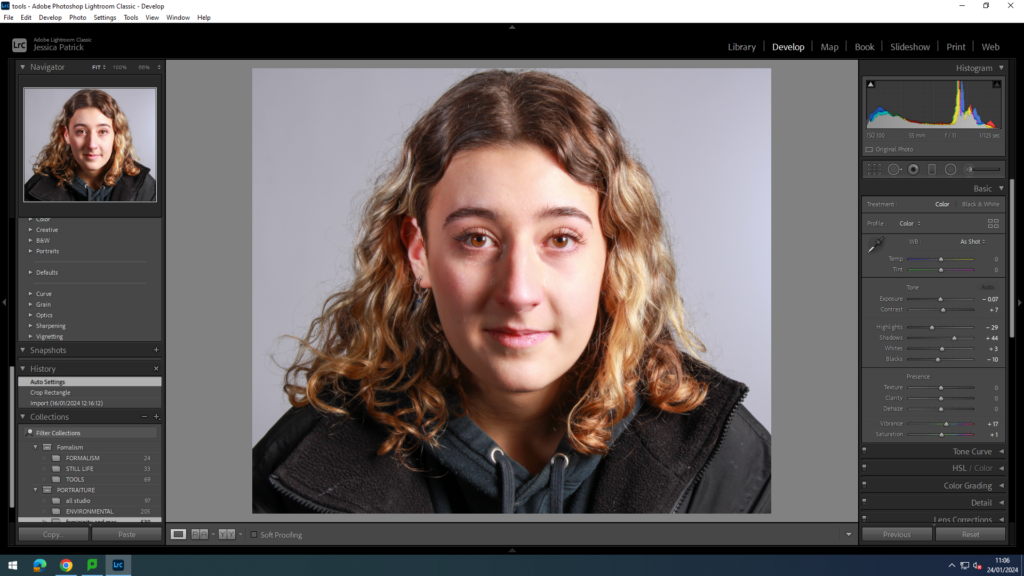
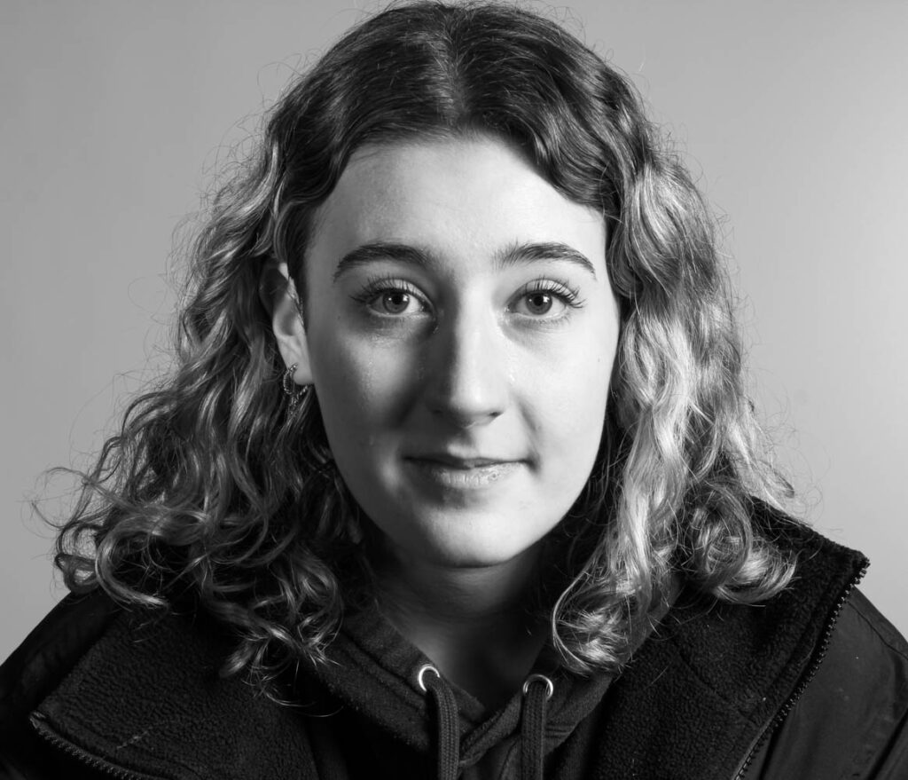
I edited this image by increasing the contrast, shadows, whites, vibrancy and saturation, while decreasing the exposure, highlights and blacks. I did this, so the tears would be more visible.
Before:
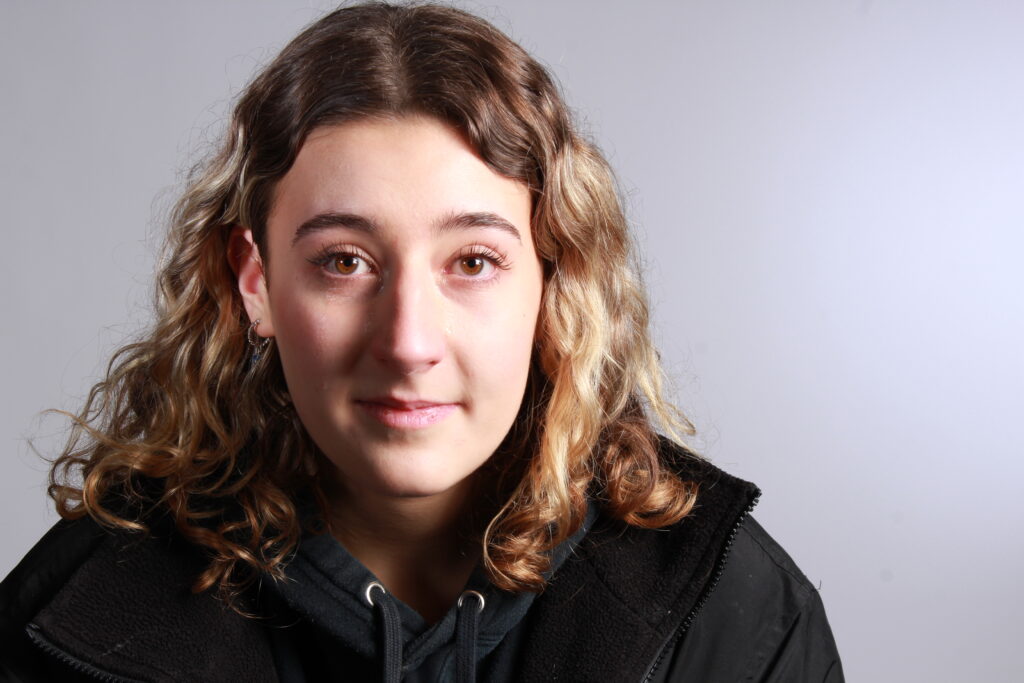
After:
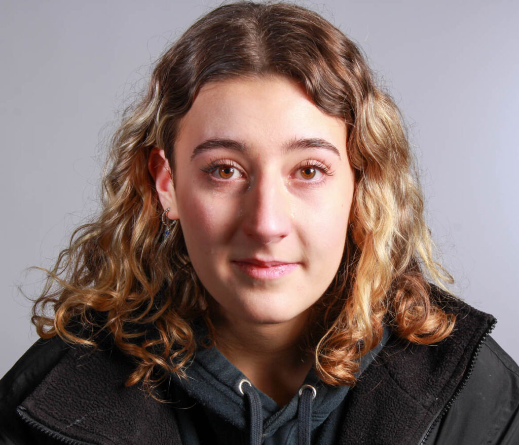
Then, I made a virtual copy of thee edited image, so that I could create a black and white version. I created a black and white version, so that the tears would be even more visible in the photo.
I then took photos of my model sad in the mirror to show that she is too emotional. She also looks insecure in some of these images in the mirror.
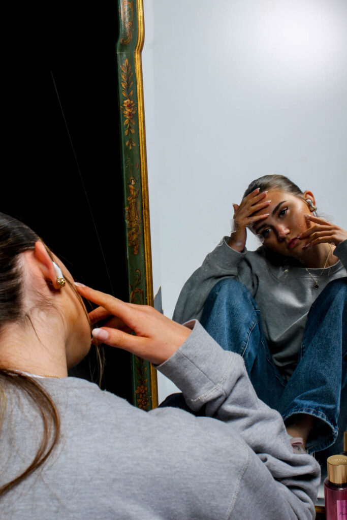
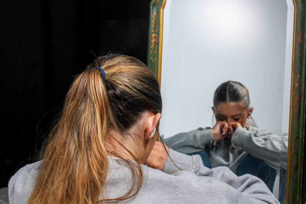
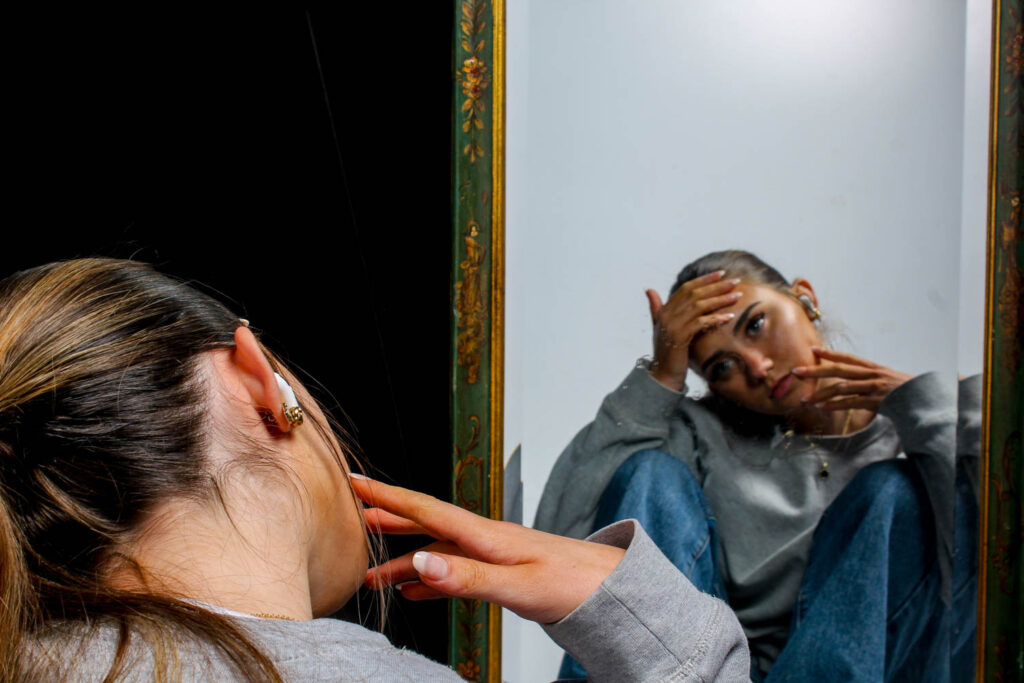
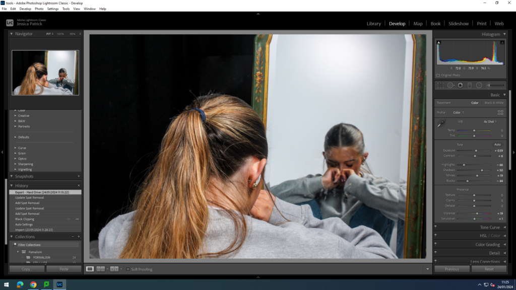
I edited these photos by increasing the exposure, contrast, shadows, whites, vibrancy and saturation, while decreasing the highlights and blacks.
Next, I experimented with different props, that would represent different stereotypes of women.
Lip stick/gloss
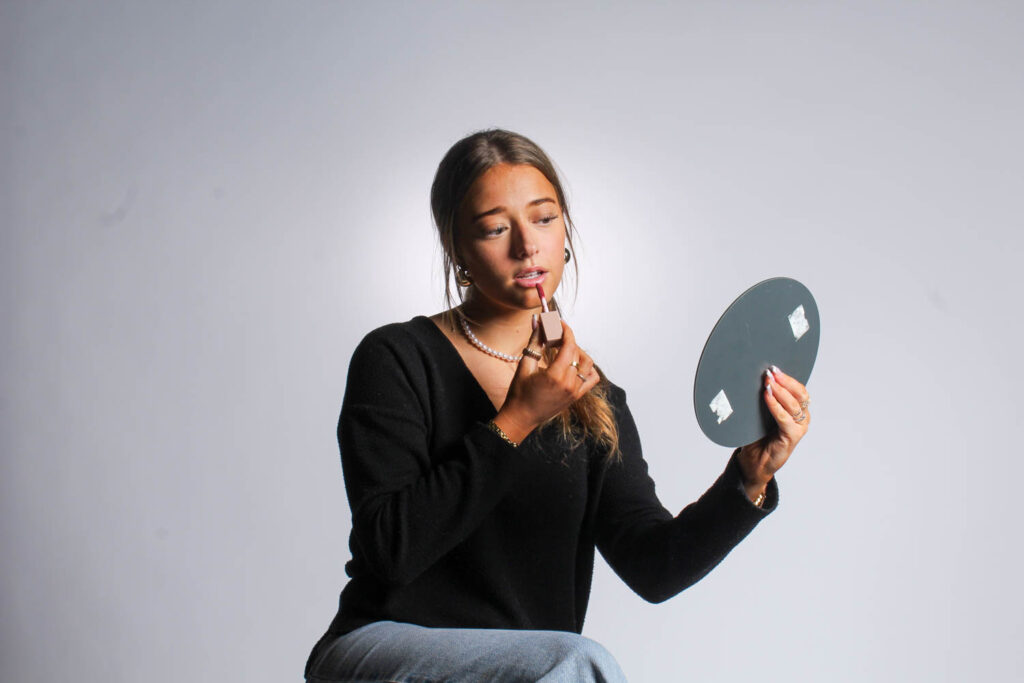
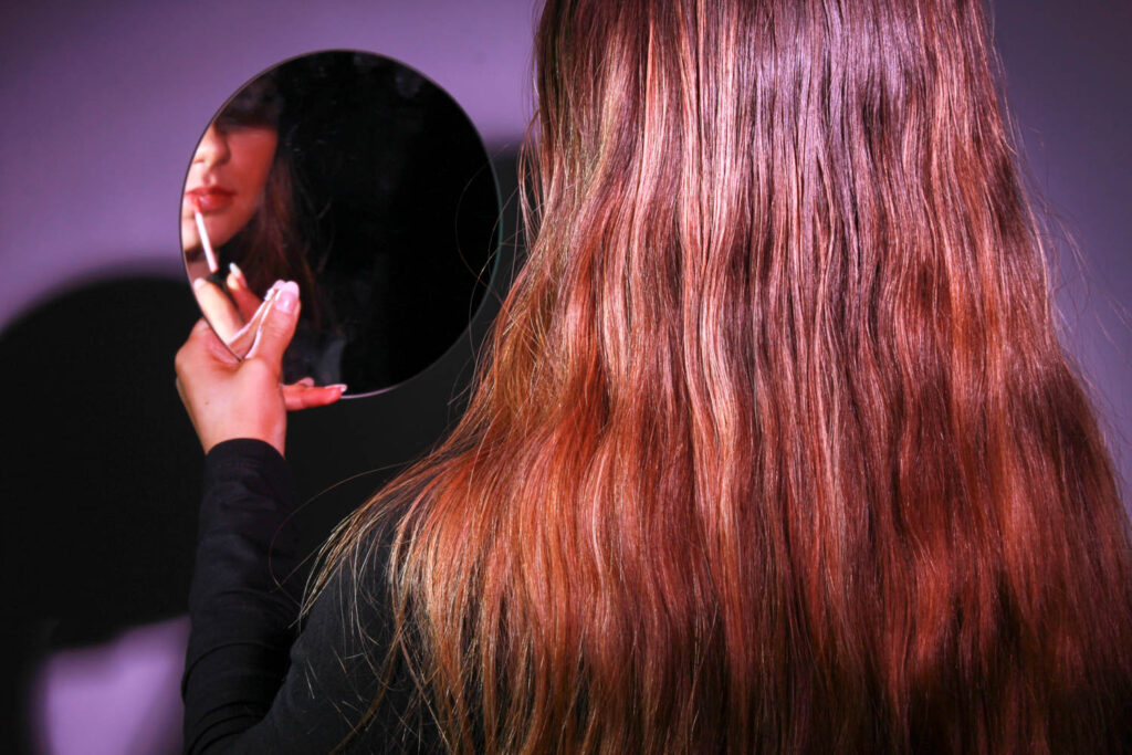
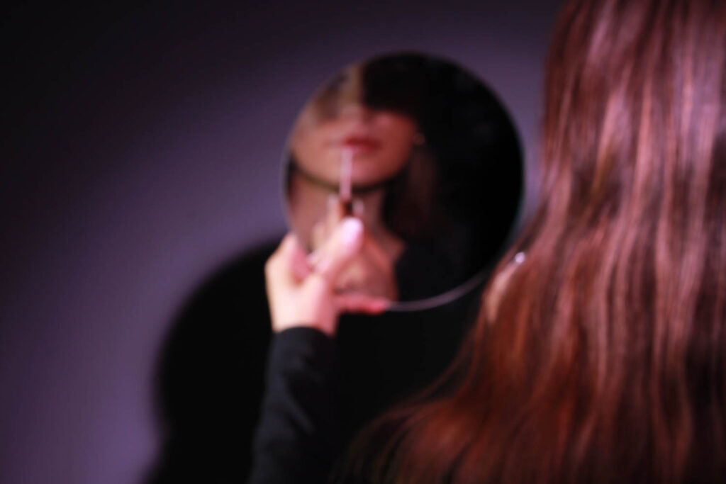
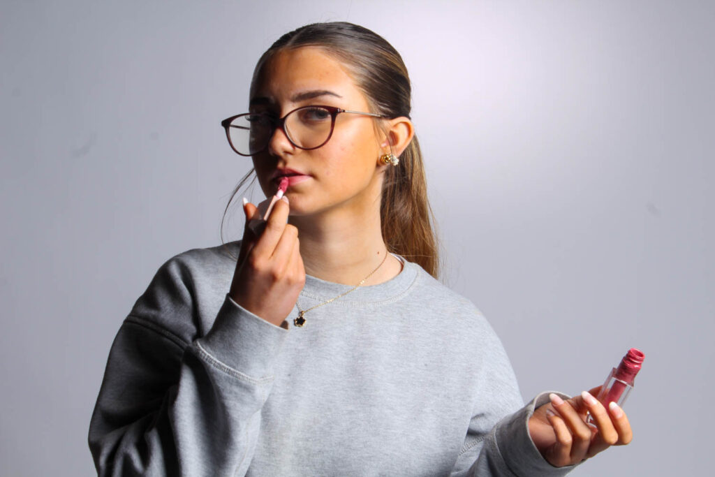
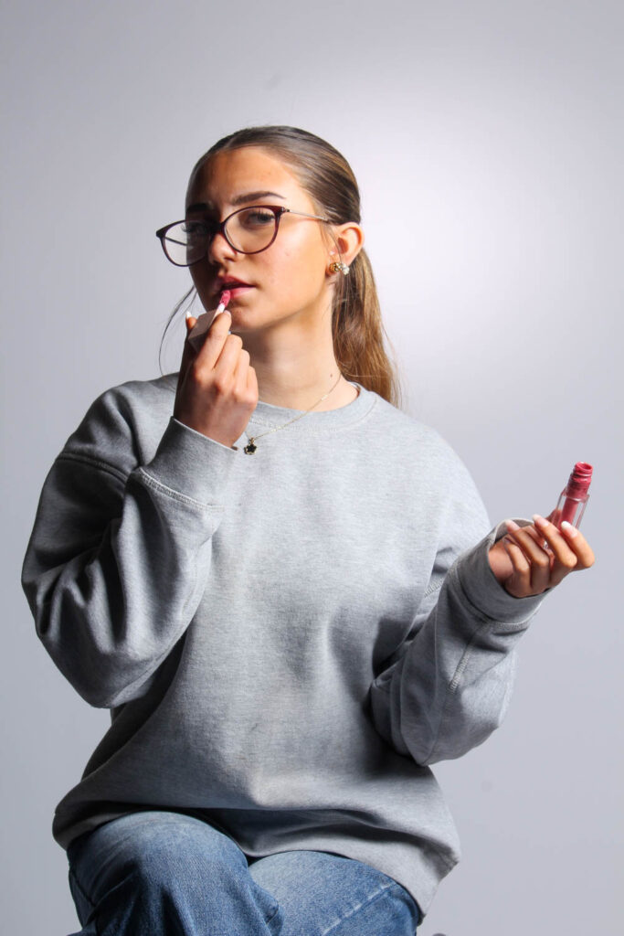
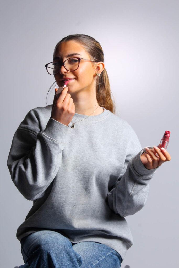
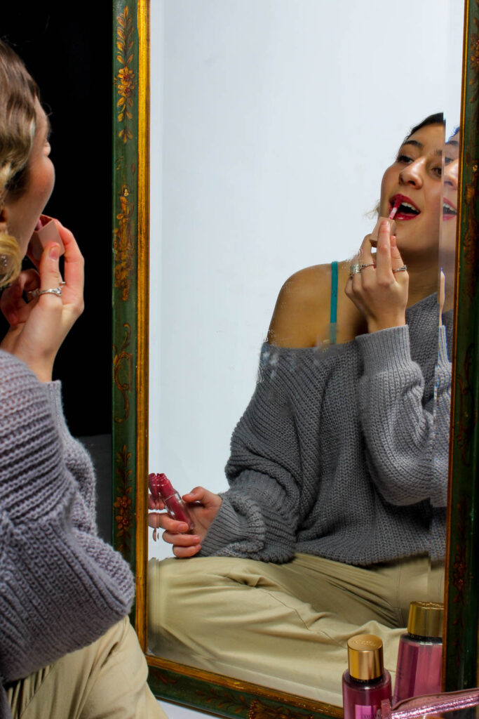
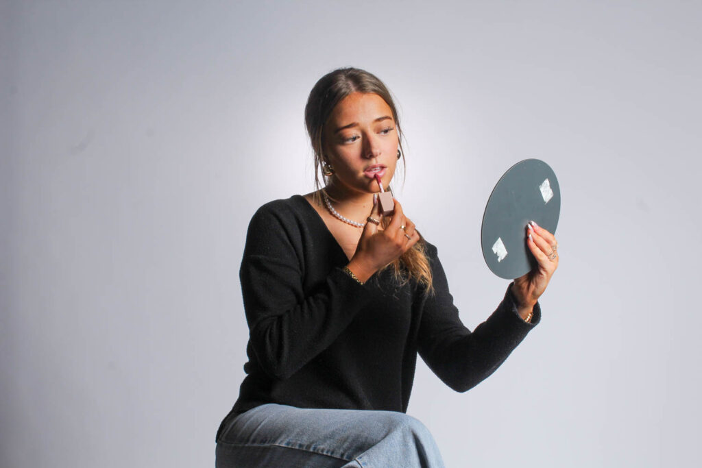
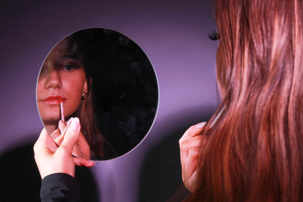
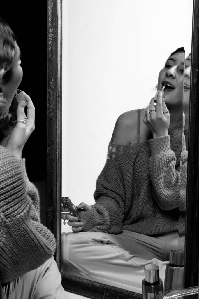
I used make up to represent femininity, because a stereotype of women is that they should be beautiful and wear make up. Make up is more related to females, rather than males.
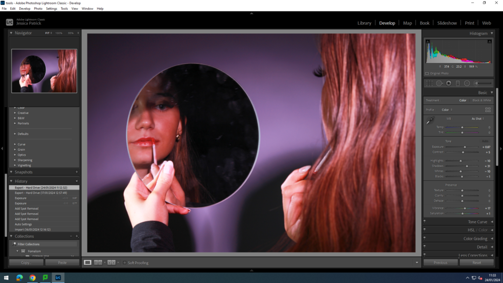
I edited this photo by increasing the exposure, contrast, shadows, vibrancy and saturation, while decreasing the highlights, whites and blacks. I did this to make the lighting more pink and so the background was not see in the mirror reflection.
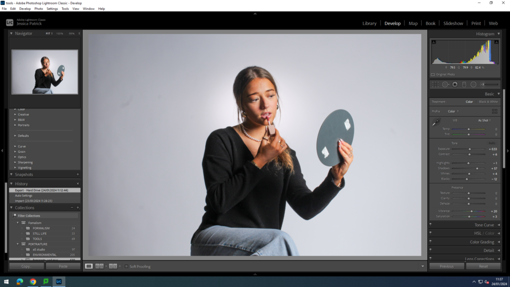
I edited the white lighting and background photos by increasing the exposure, contrast, shadows, whites, vibrancy and saturation, while decreasing the highlights and blacks. I did this, so the props would be more vibrant and so the model would stand out more.
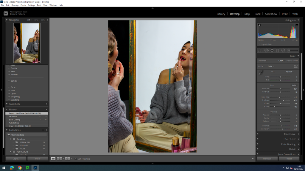
I edited this image by increasing the exposure, contrast, shadows, whites, vibrancy and saturation, while decreasing the highlights and blacks. Then, I made a virtual copy of my edited photo and created a black and white version and then edited it slightly more.
Perfume
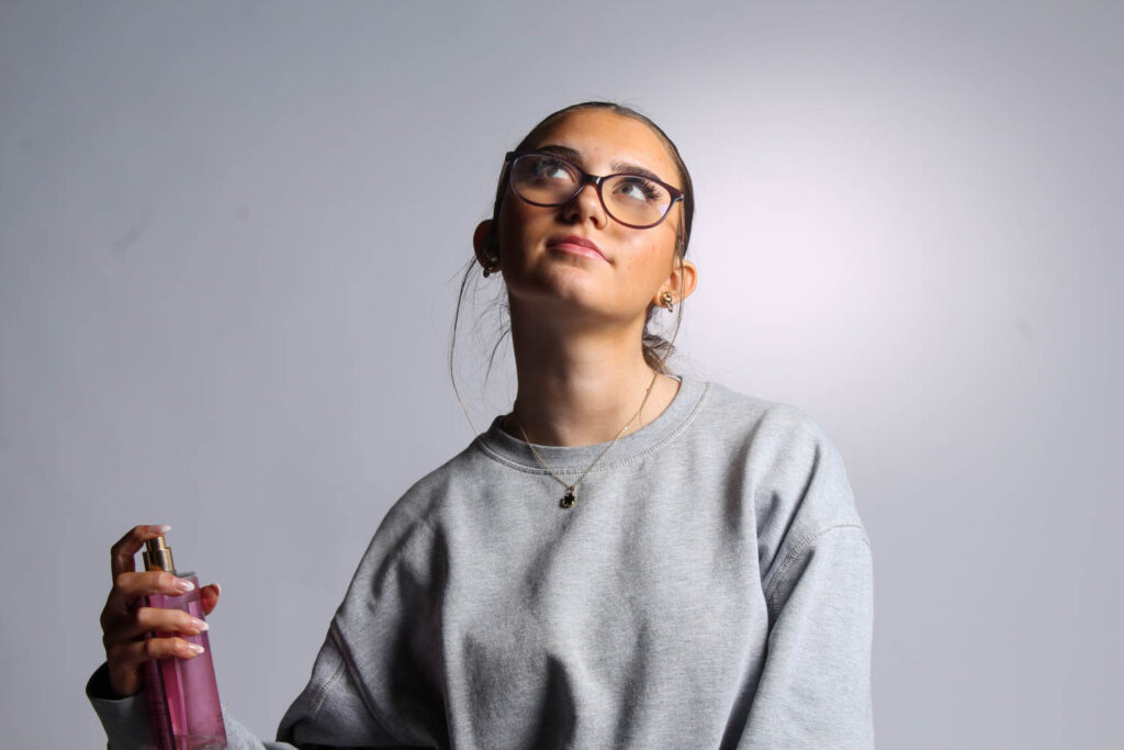
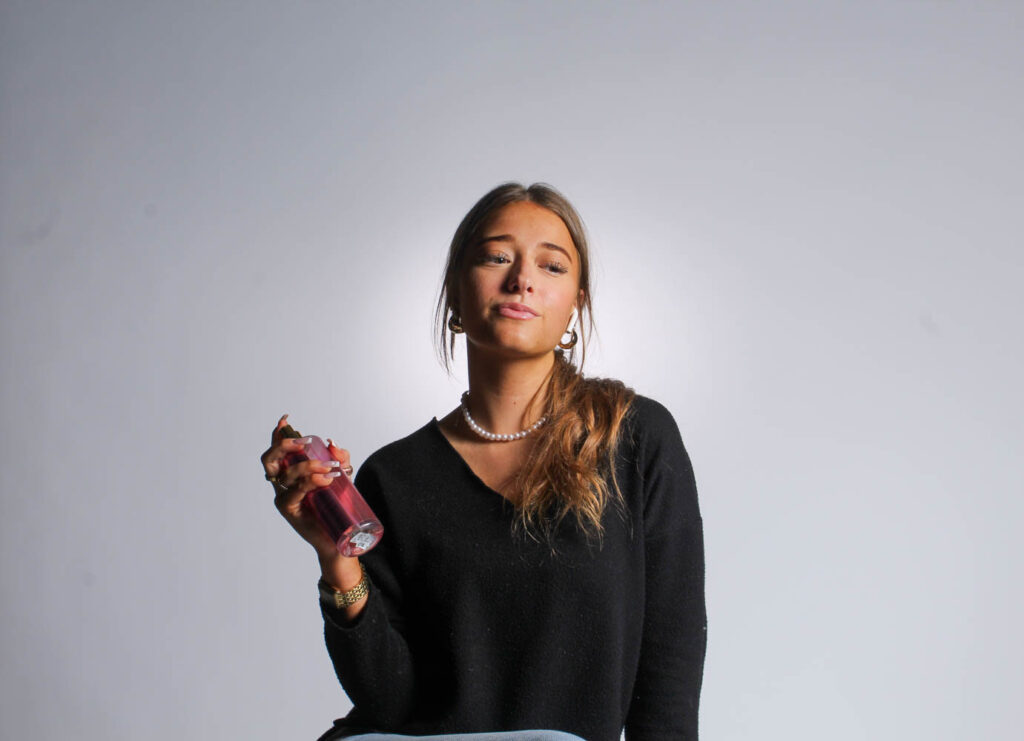
I used perfume as a prop, because there are different sprays for men and women, and perfume represents females more than males, whereas aftershave represents males.
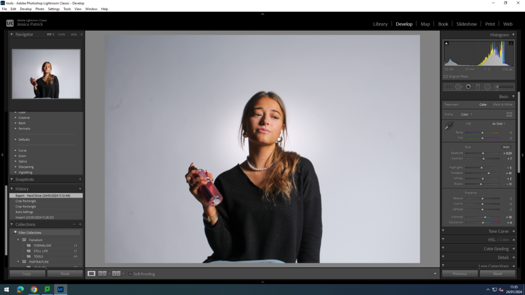
I edited these images by increasing the exposure, contrast, shadows, whites, vibrancy and saturation, while decreasing the highlights and blacks. I did this to make the prop more vibrant and to make the model stand out more.
Phone
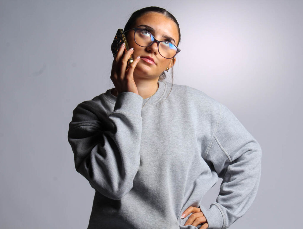
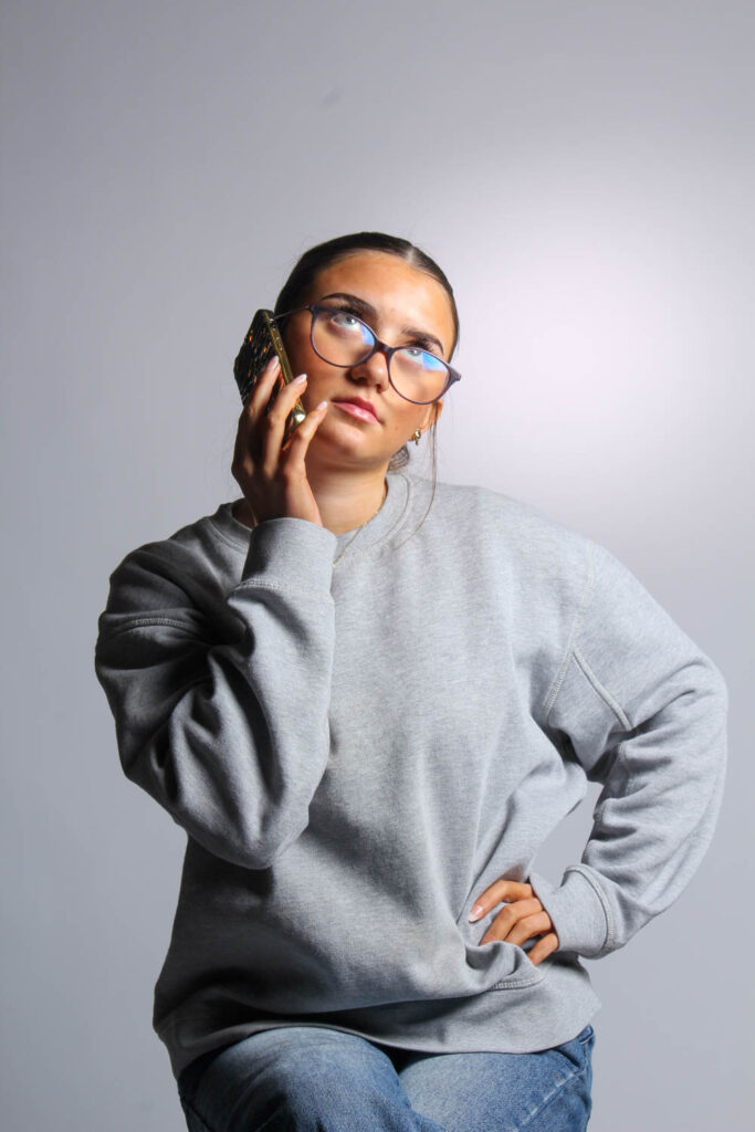
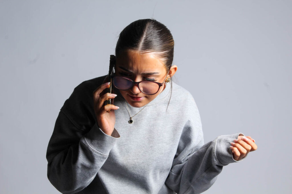
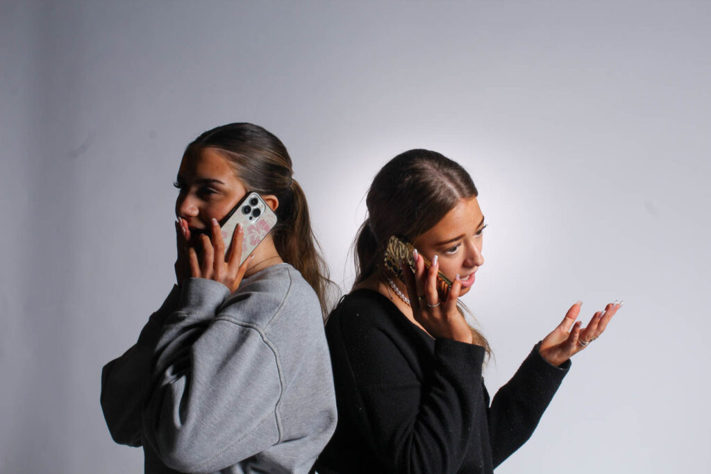
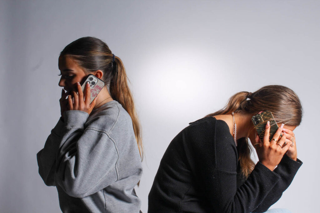
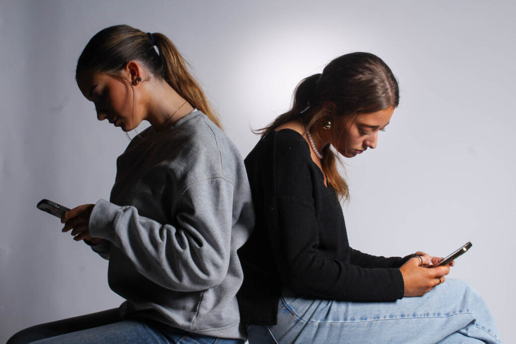
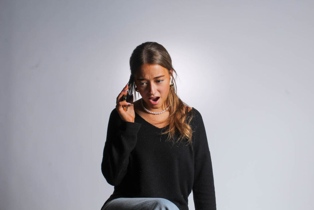
I used a phone, because another stereotype of females is that they gossip a lot, so I asked my models to pull either shocked, sad or happy expressions, so it seems like they are gossiping on the phone.
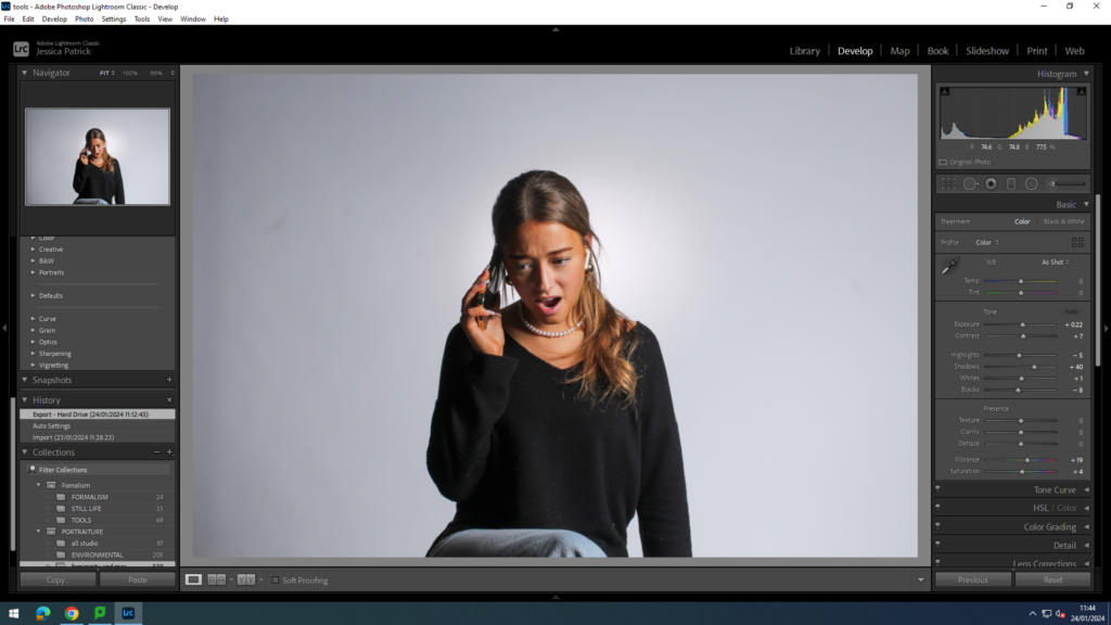
I edited these images by increasing the exposure, contrast, shadows, whites, vibrancy and saturation, while decreasing the highlights and blacks. I did this, so the model and her facial expression would stand out more.
Broom
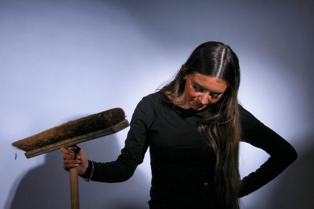
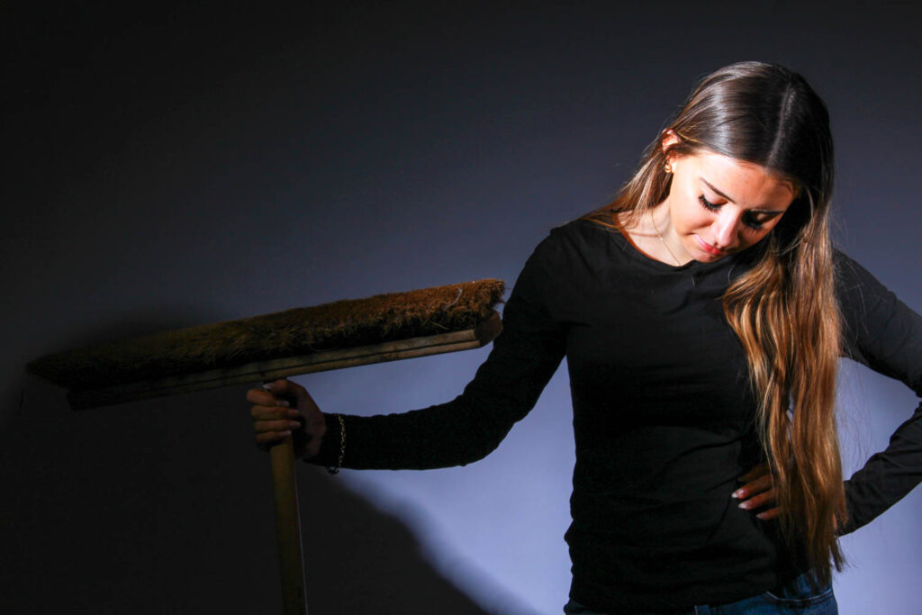
I used a broom as a prop in these photos, because a stereotype of women is that they should be housewives and stay at home so they can cook and clean. I was influenced by Cindy Sherman for this photo, because she created a photo of her as a housewife, but she was in the kitchen cooking.
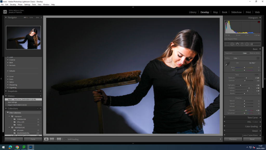
I edited this image by increasing the exposure, contrast, shadows, whites and vibrancy, while decreasing the highlights. I did this, because the image was too dark, so I had to make the model and prop stand out more.
Mirrors
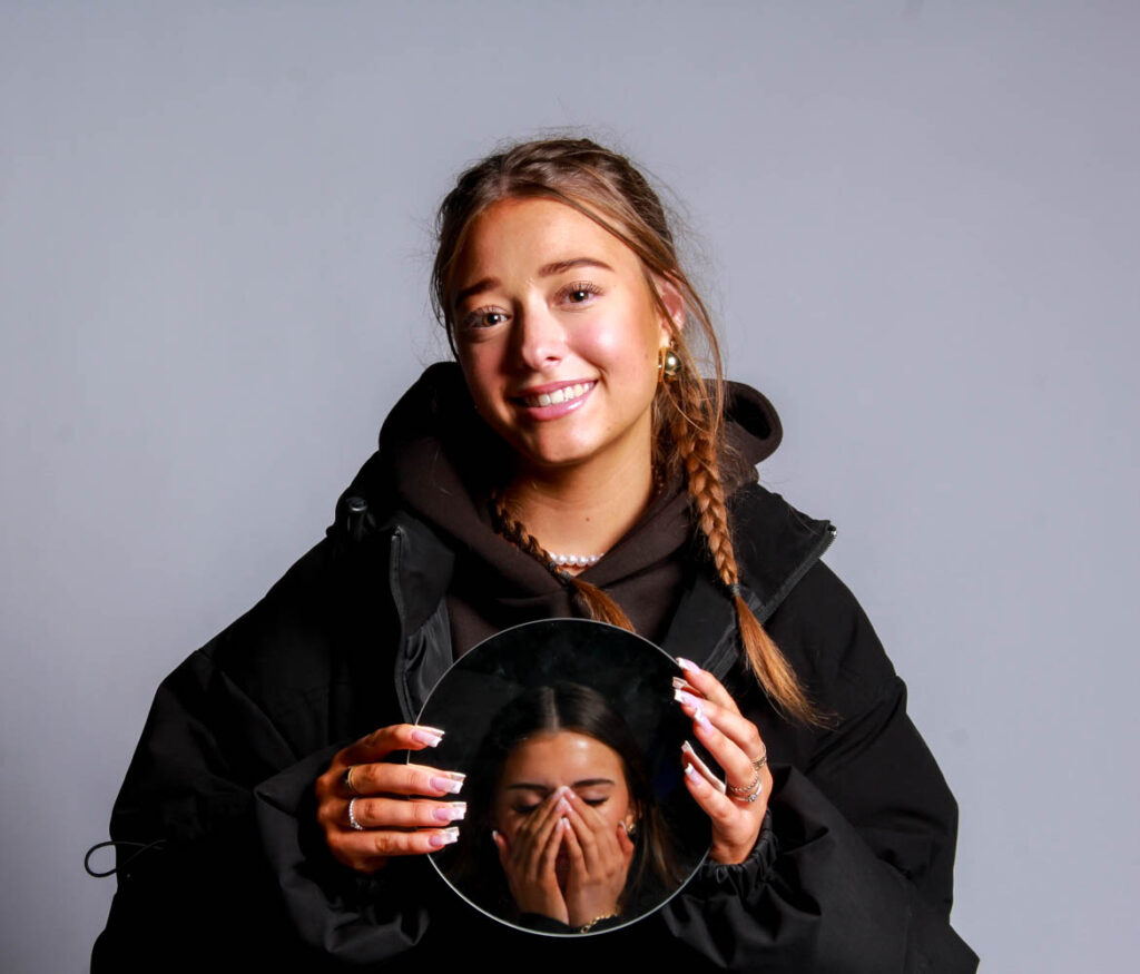
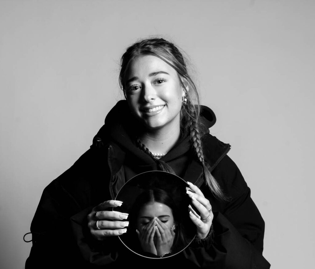
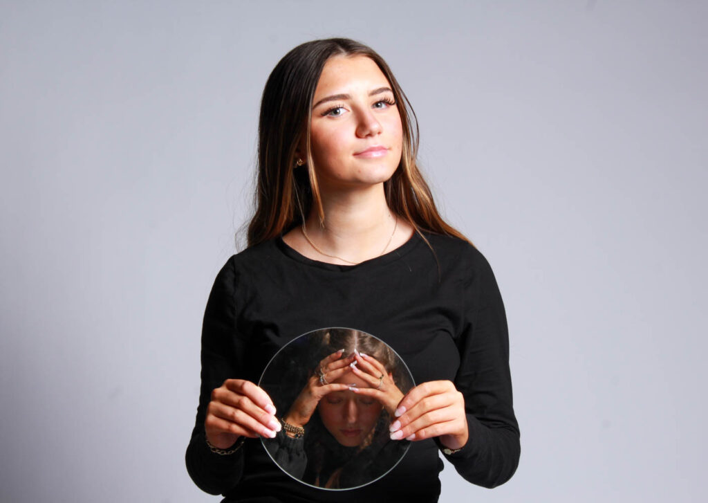
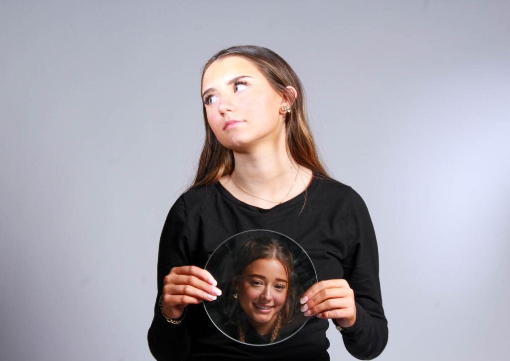
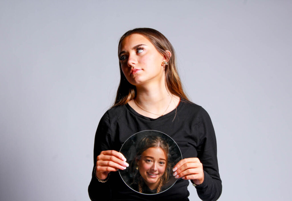
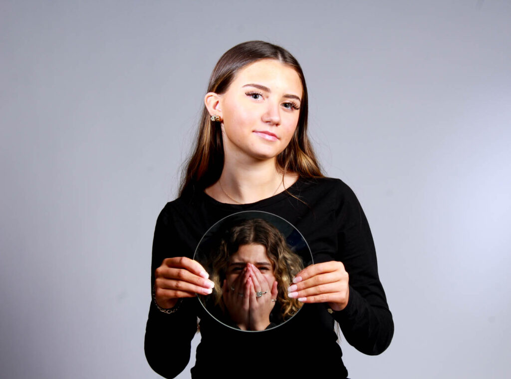
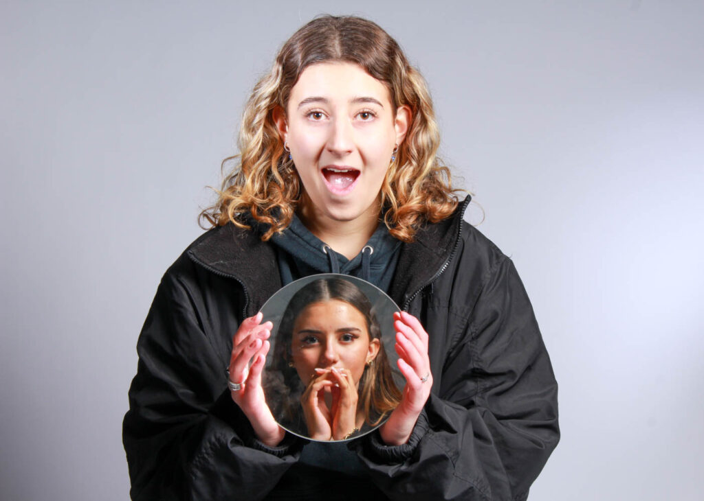
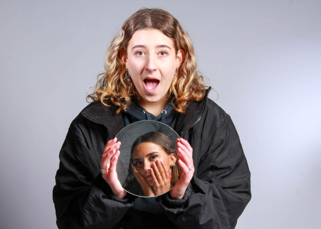
I used mirrors as a prop, because stereotypically make is related to females and females should wear it, so they look beautiful. Therefore, females are always looking in the mirror doing their make up. Females are also seen as insecure so they are often looking in the mirror because of that.
I also had my models pull different faces in the mirrors, so they also correlated to other stereotypes, such as women are too emotional.
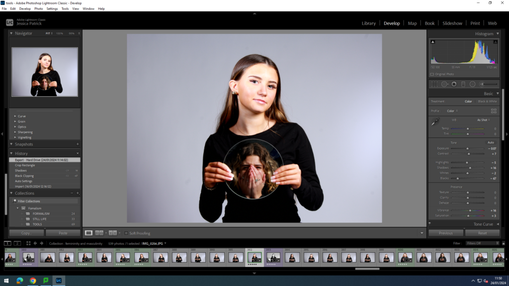
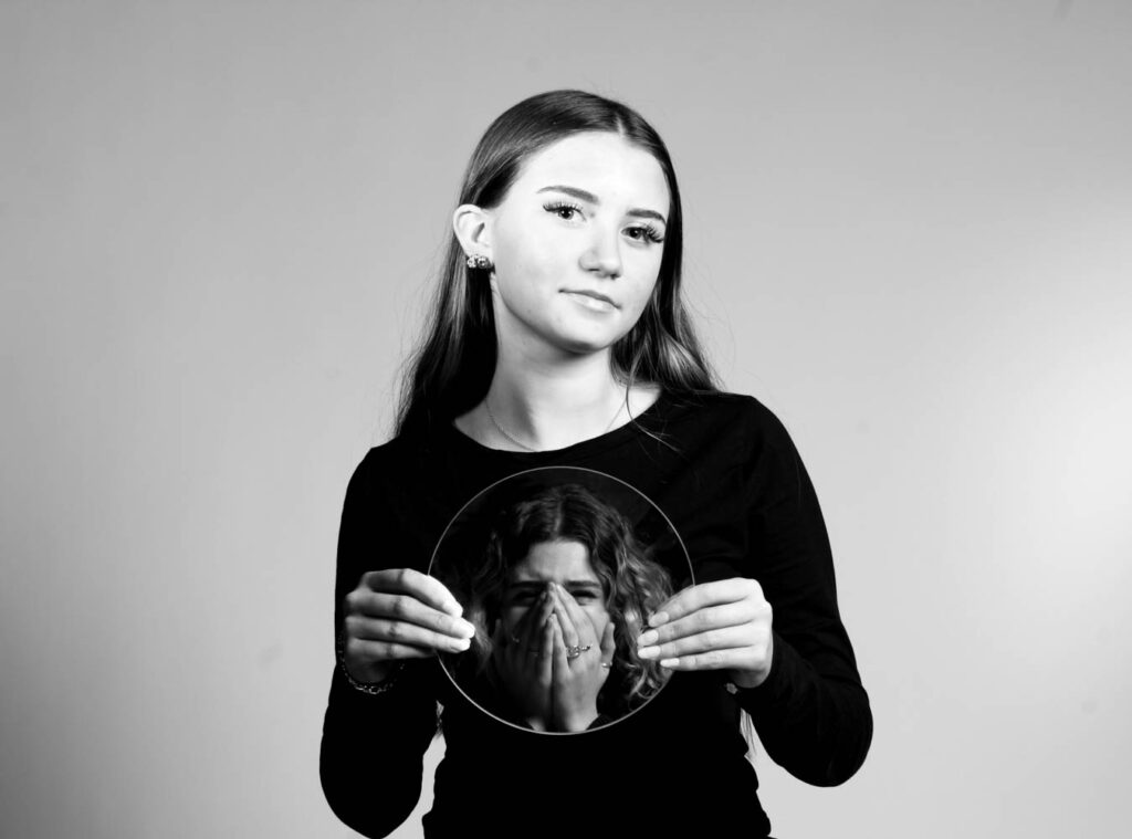
I edited this image by increasing the contrast, shadows, vibrancy and saturation, while decreasing the highlights, whites and blacks. Then, I made a virtual copy, so I could create a black and white version. I made a black and white version, because in the mirror I am upset. Black and white can correlate with feelings of sadness.
Photoshoot Conclusion
In conclusion, I think this photoshoot went really well, because I used lots of different props to represent both feminine and masculine stereotypes. I also think that even though my first few photos had too many shadows behind the models, I think I corrected this very well when I went down the studio again. However, next time I would like to get more photos to support the masculinity theme.
