Contact Sheet:
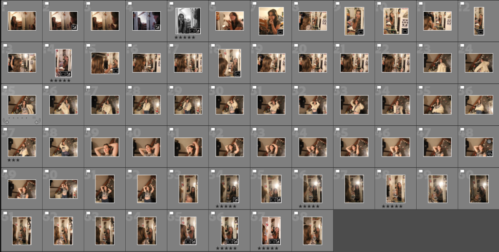

Final Images:
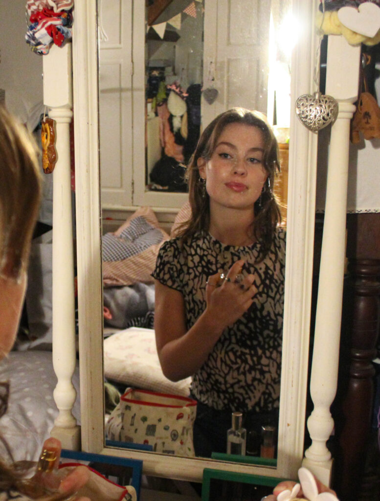
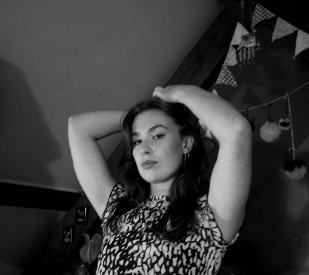
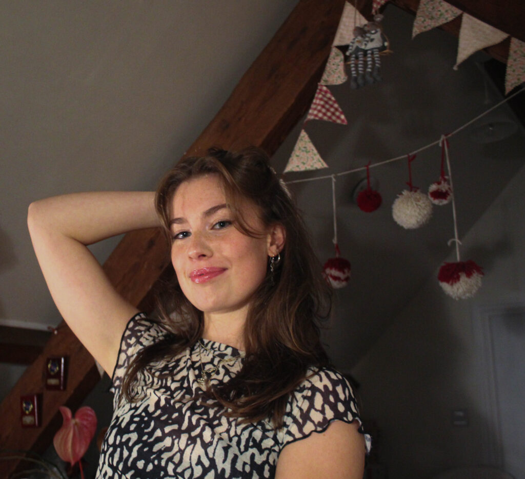
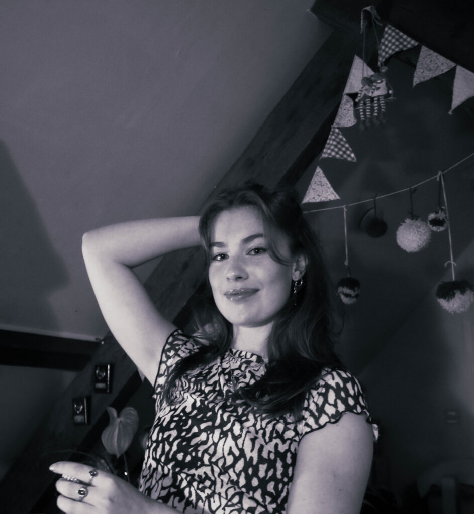
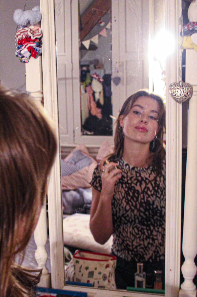
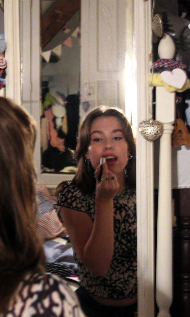
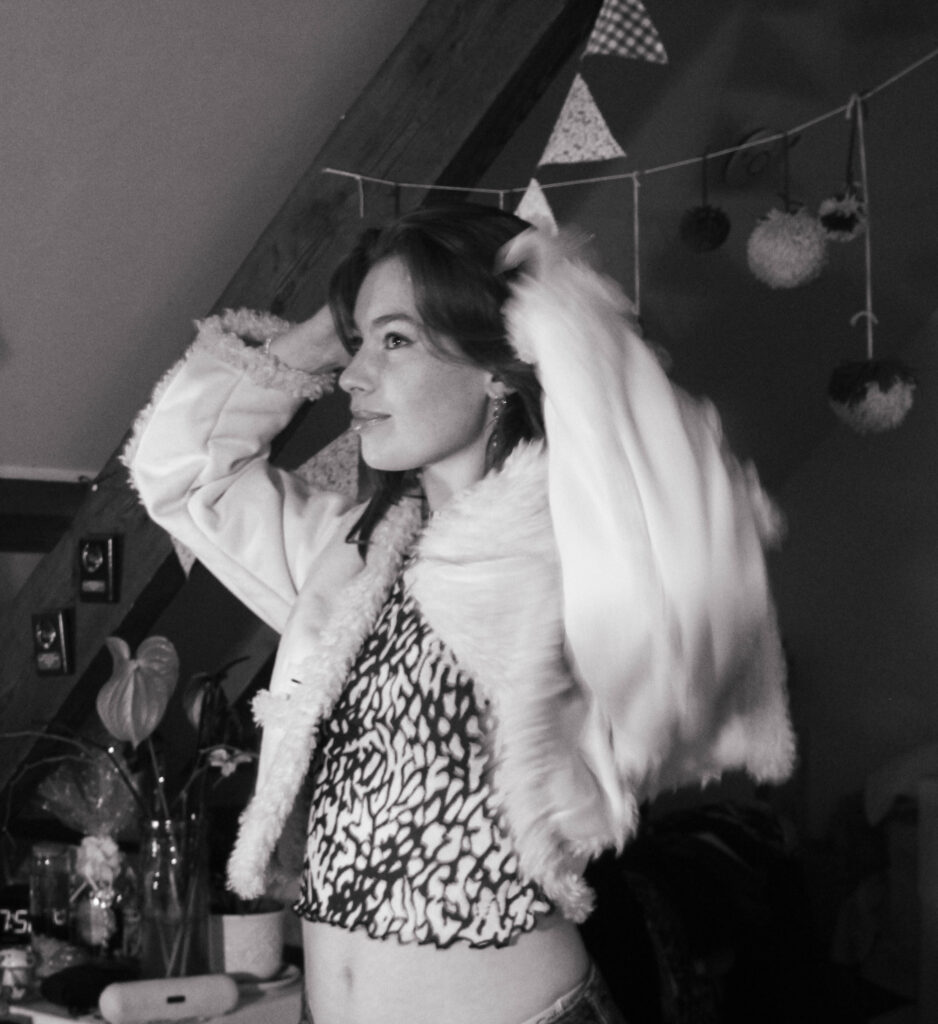
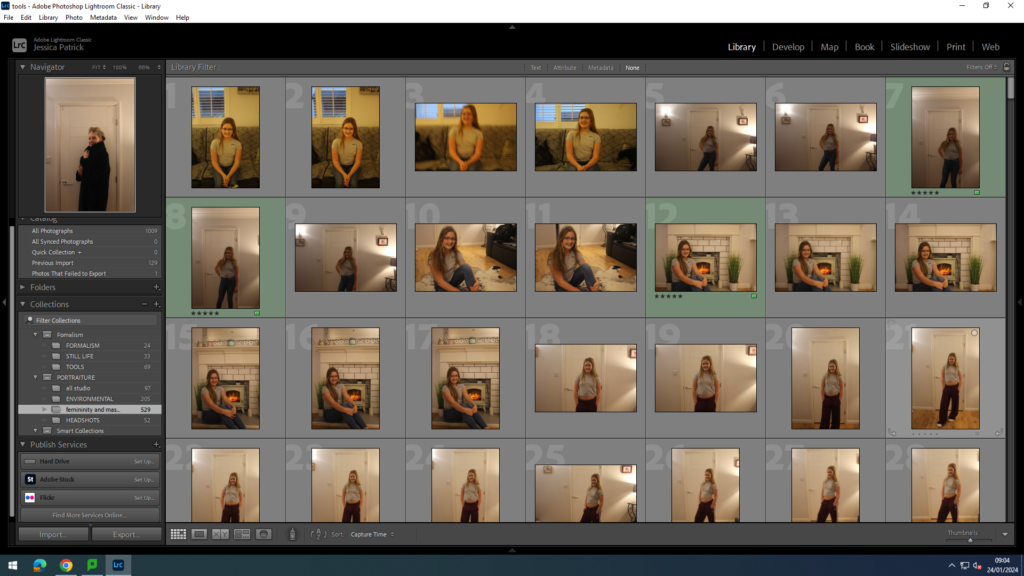
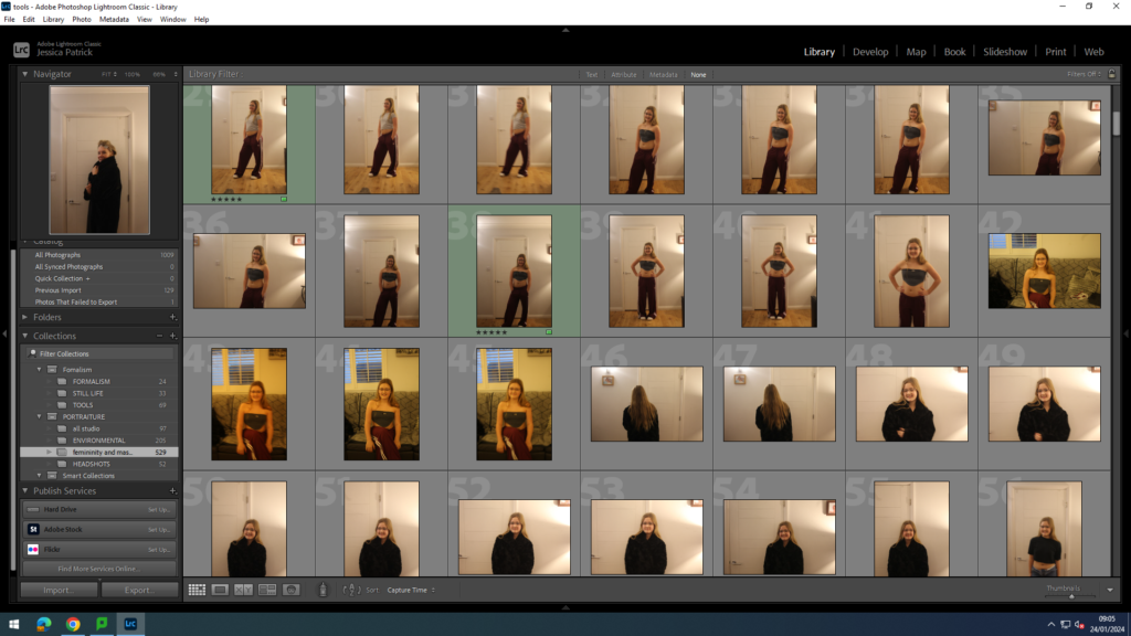
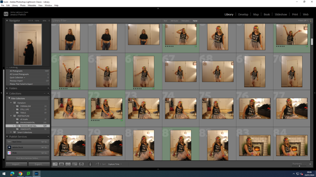
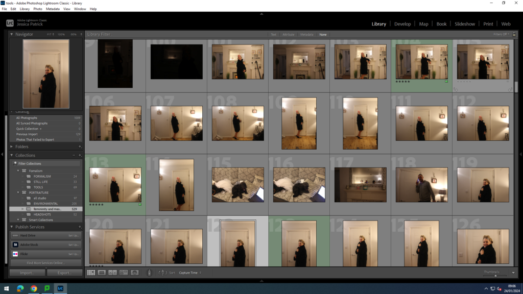
Contact Sheet:


Final Images:


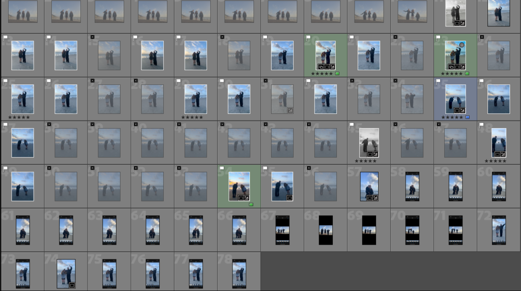

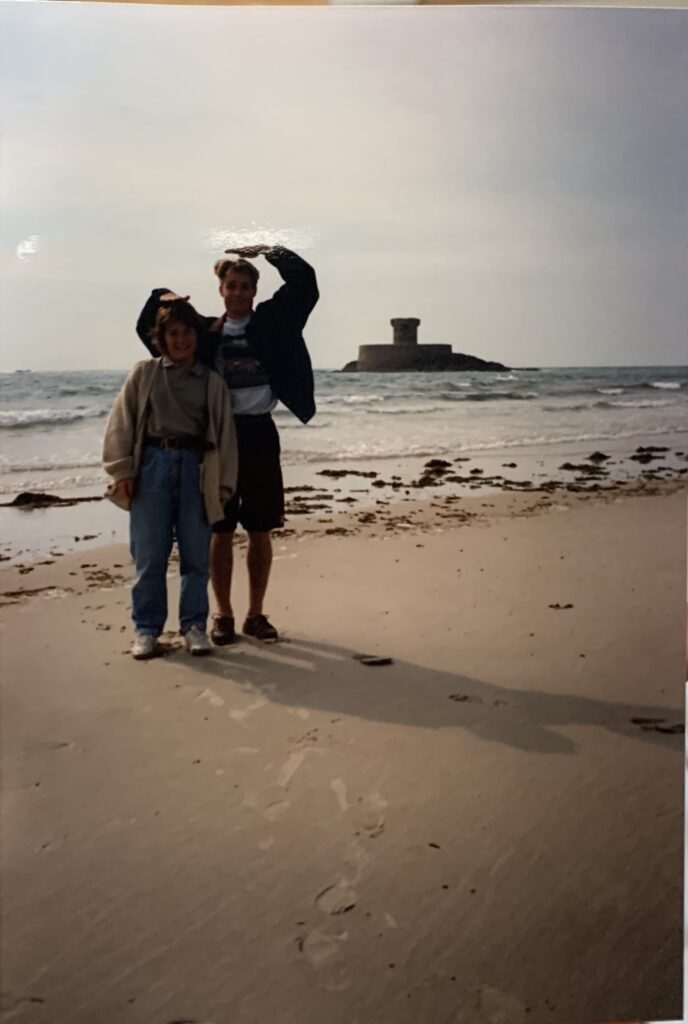
This was one of the inspiration photos I used for this photoshoot. I though it would be an interesting concept to explore the theme femininity through generations, for example using pictures of my mum and recreating.
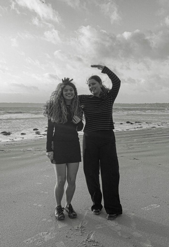
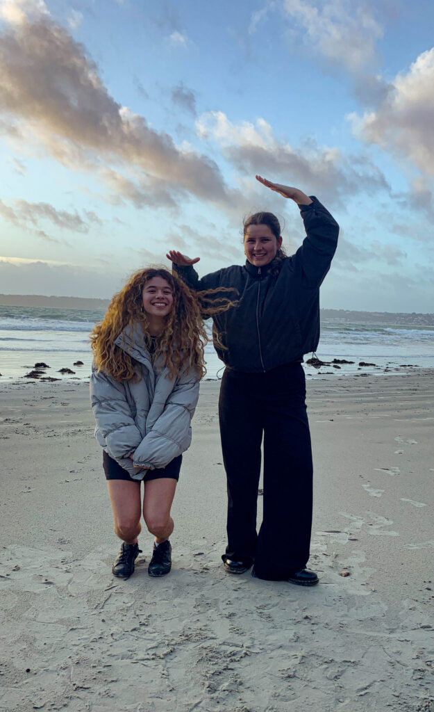
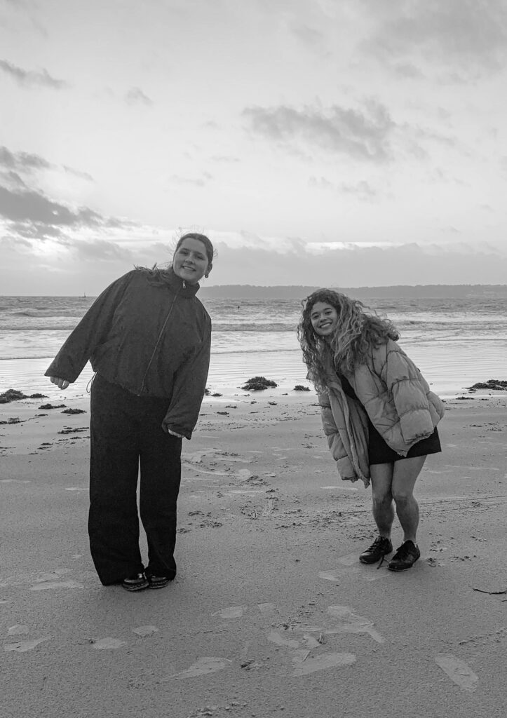

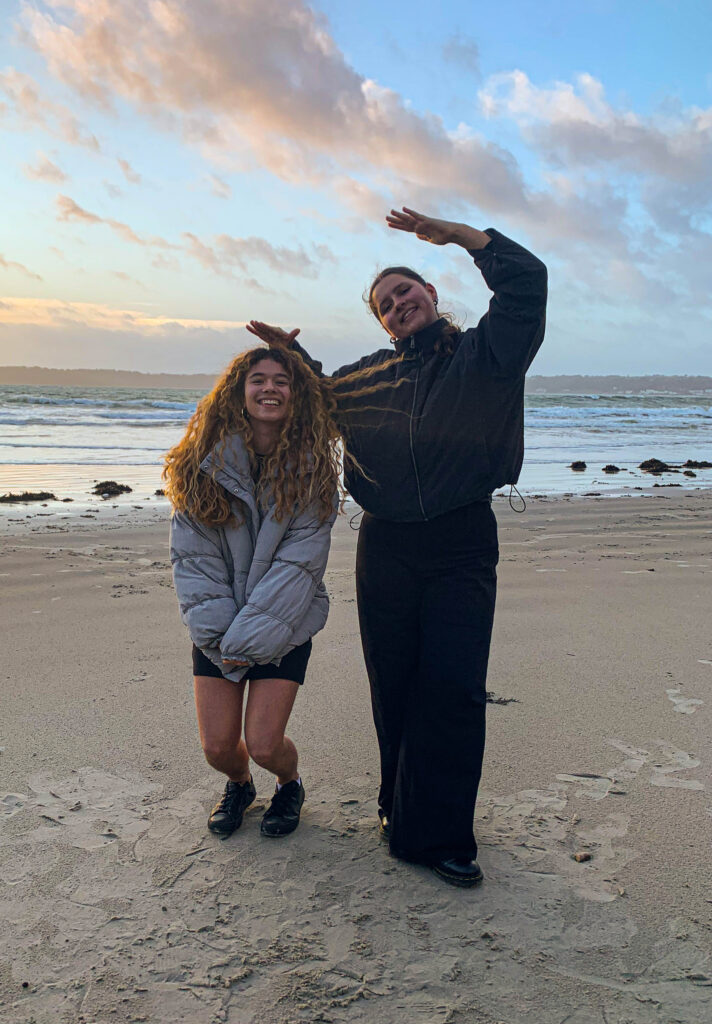
These photos are my final outcomes as they
All edits :
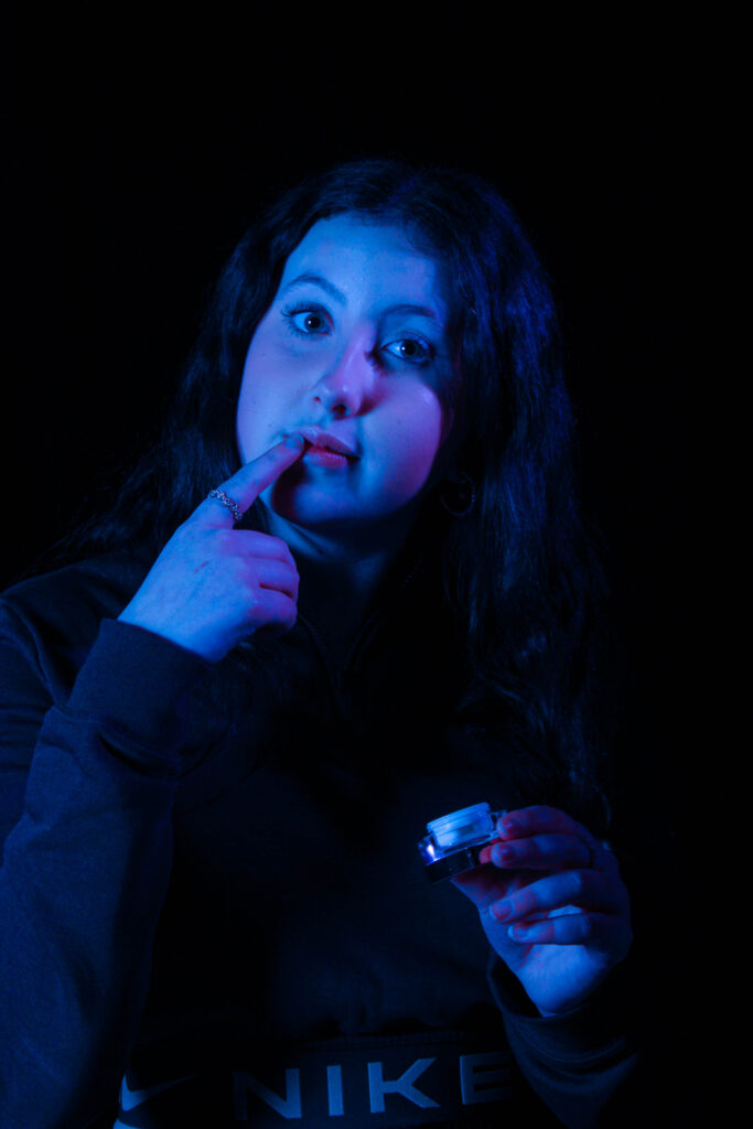
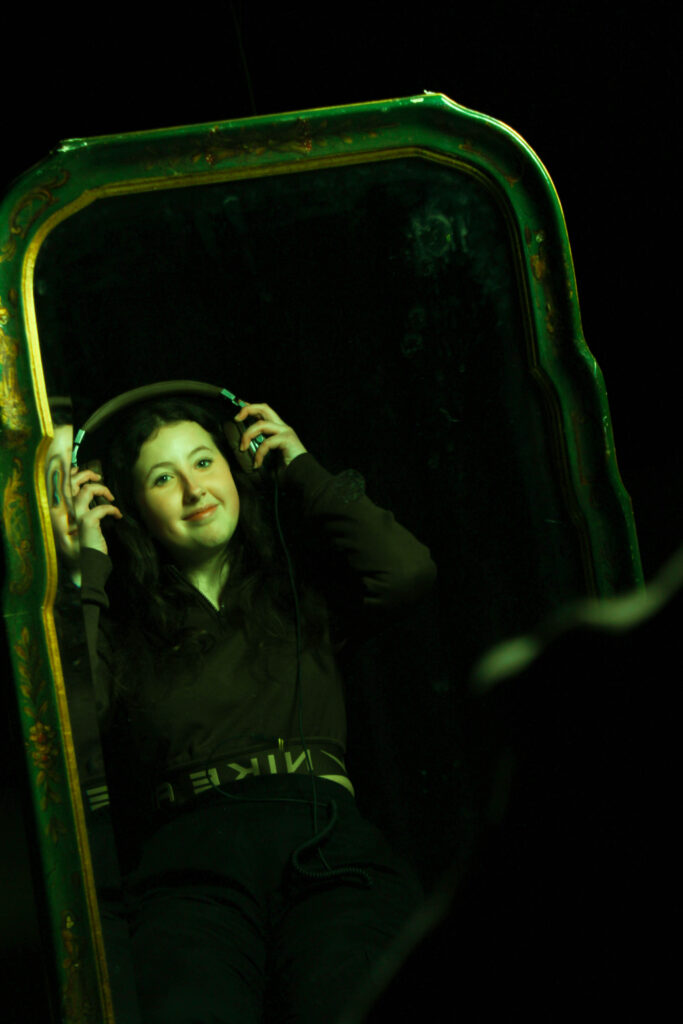
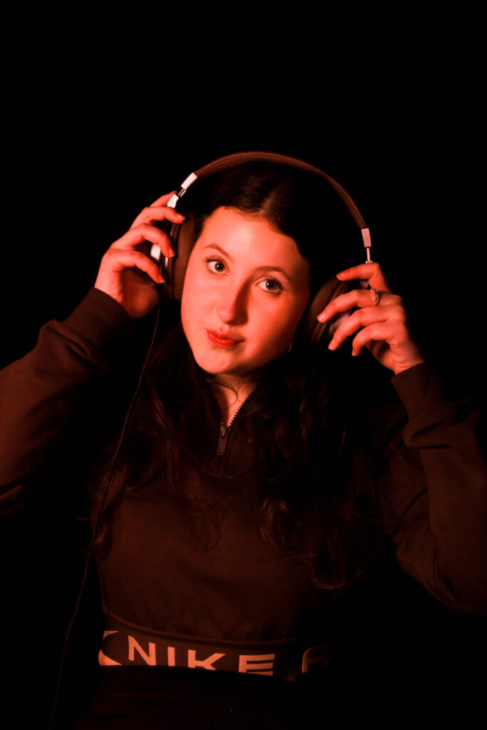
These images were taken from my second femininity photoshoot, for these edits I decided to add some colour to the images and enhanced the saturation and brightness to create more of a focus on the model with a dark background.
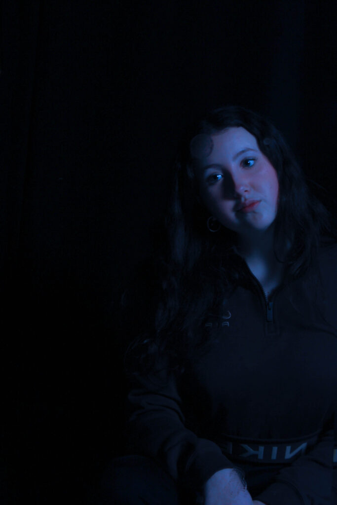
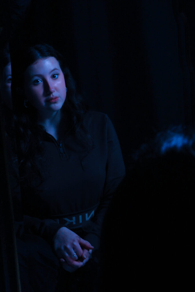
For these two edits I decided to add a slight blue tint to create a bit of a different look to the images rather then just the basic studio lighting and plain black background, the tint seems to bring out the model slightly more as the colour draws your attention to her.
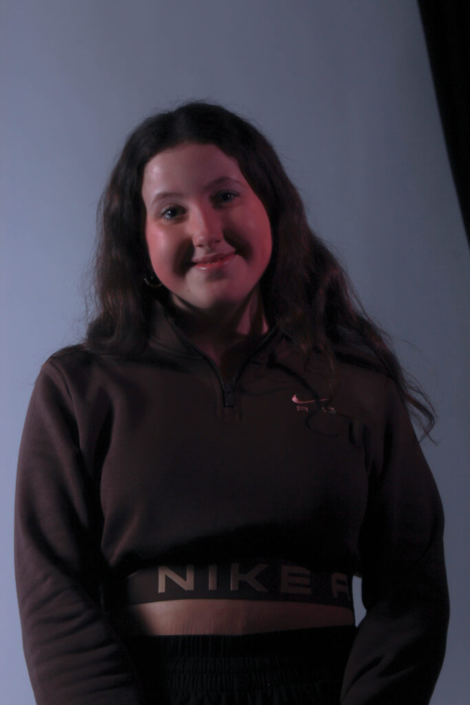
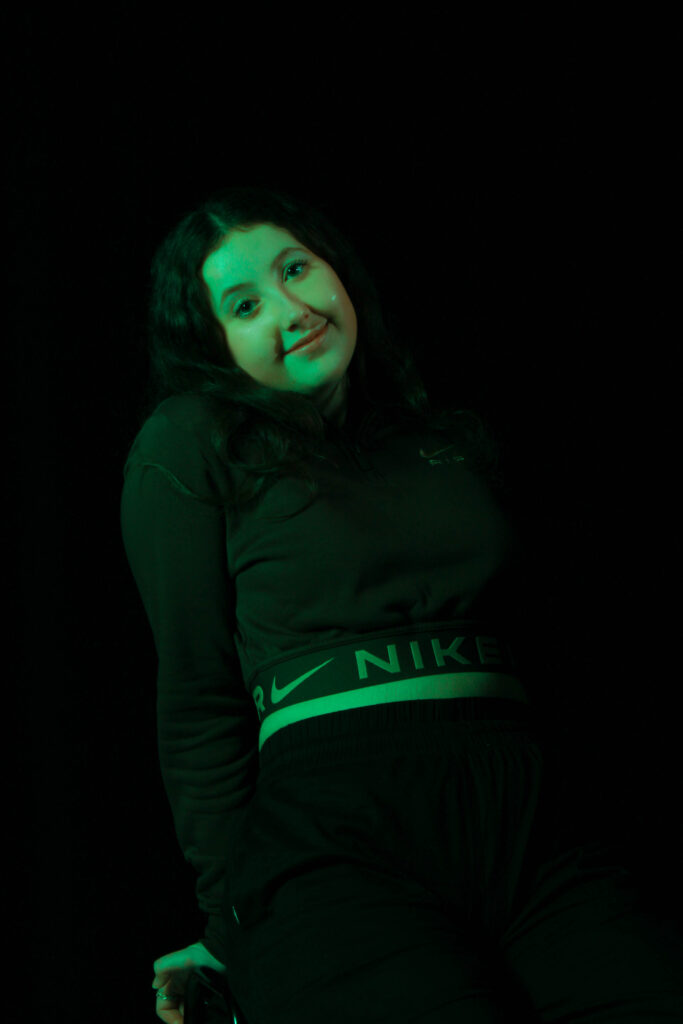
Again for these edits I decided to add slight tints and colours to change up the images slightly and create more of a bright and outgoing look to the images this could represent the energy and outgoingness that women tend to have.
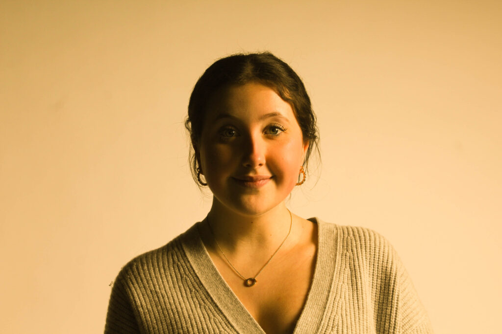
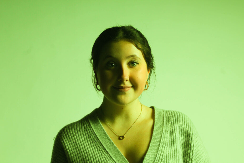
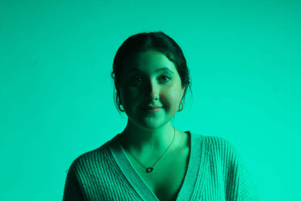
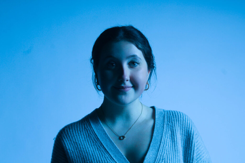
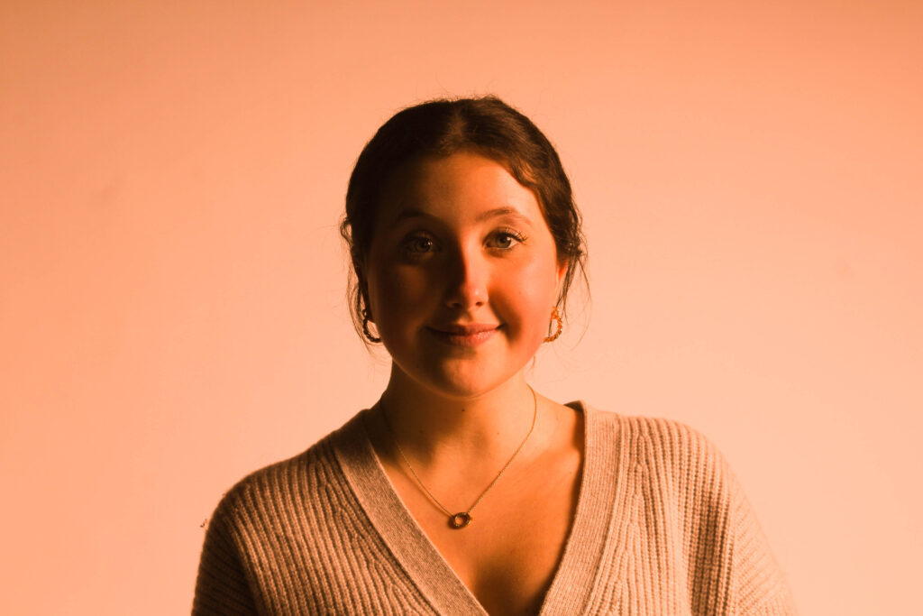
For my other femininity shoot I experimented with the same image using different colours to create a colourful edit.
Femininity and masculinity
In this photoshoot I experimented with different outfits/ costumes, so I could represent women through time. This links to the theme femininity, because it shows how feminine standards evolve and change through time. This photoshoot took place outside the studio, outside school. I experimented with different poses and angles, as well as props in this photoshoot, so I could really present the changes women have gone through.
I have chose to take photographs of my models in different outfits from the years below:
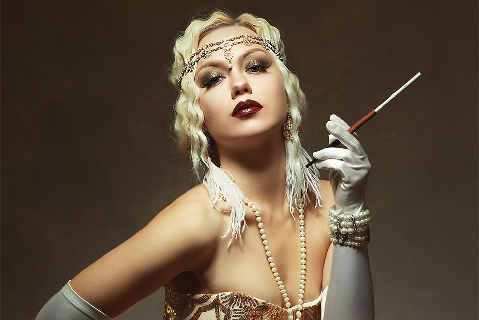
1920’s:
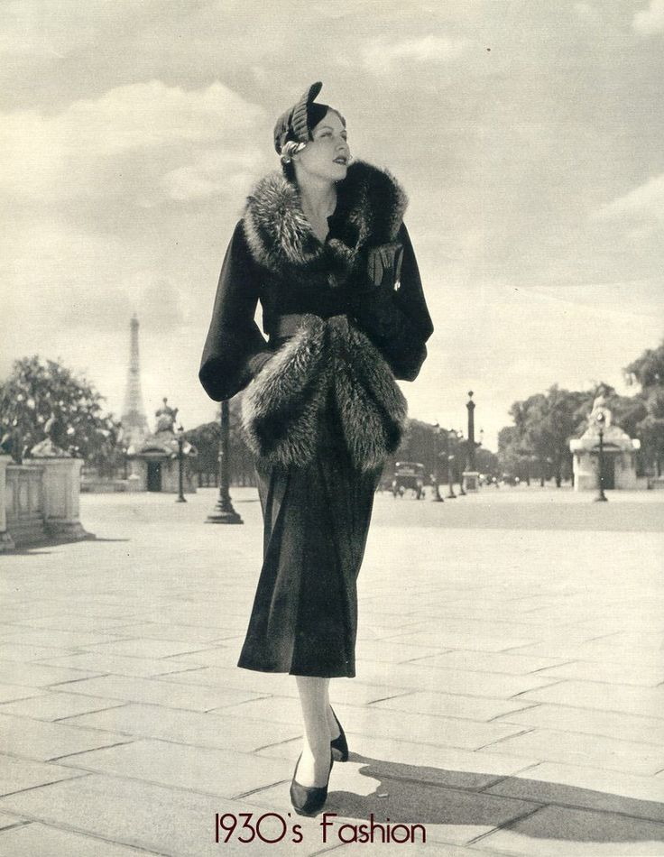
1930’s:
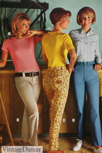
1960’s:
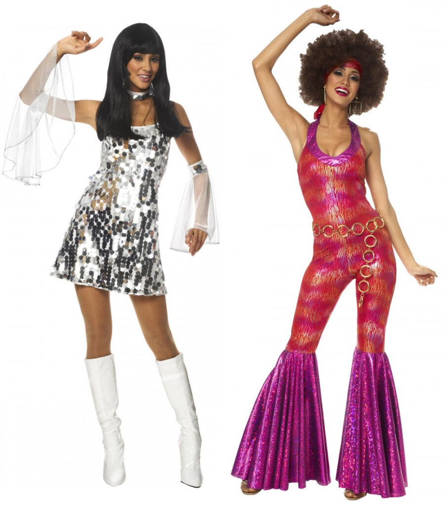
1970’s:
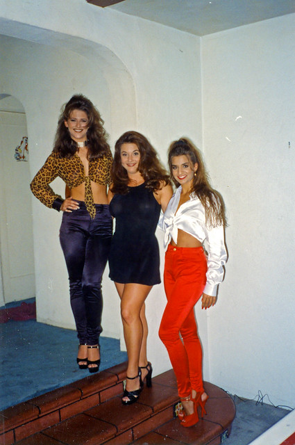
1990’s:
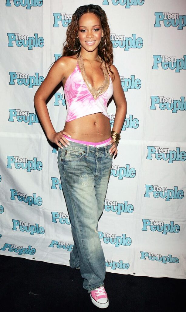
2000’s:
I chose these decades, because the 1930’s is very similar to the 1940’s and the 1950’s. I have chose the decades 1960-2000, because this is where I see the most change in the feminine standards through time.
I have chosen to do this photoshoot, because I have been influenced by Cindy Sherman as she also dressed up in different costumes/ characters to present the theme of femininity.
The images that I have highlighted green are the images I have chosen to edit, because they represent the different decades the best, and have the best focus and composition.
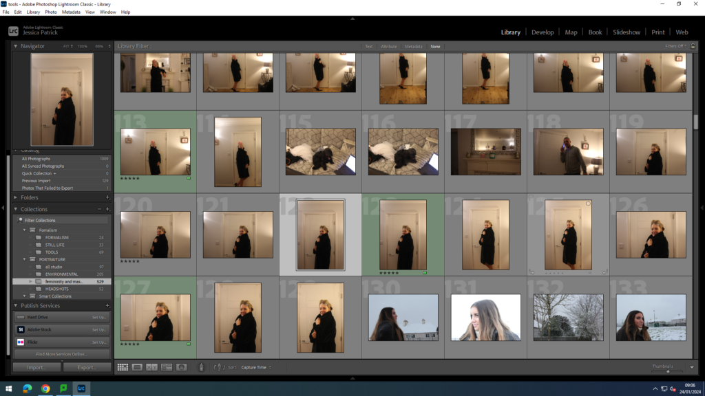
1920
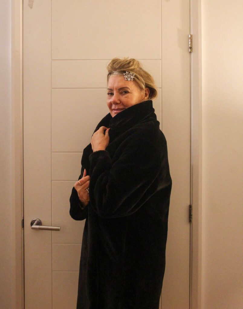
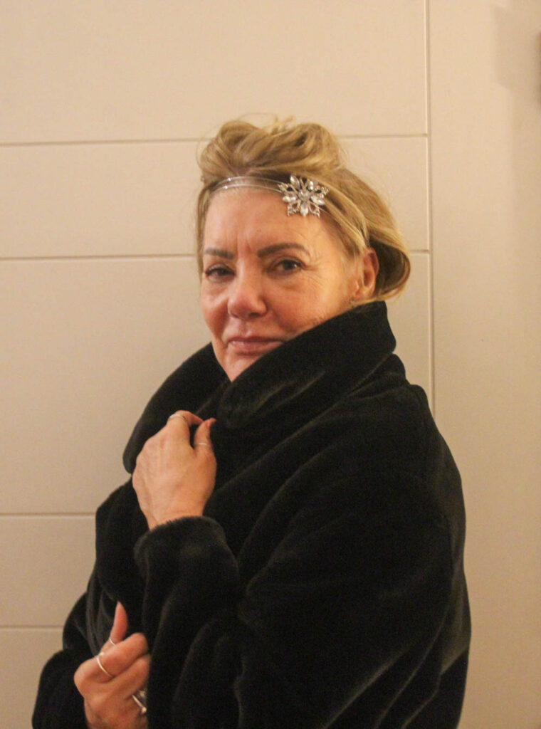
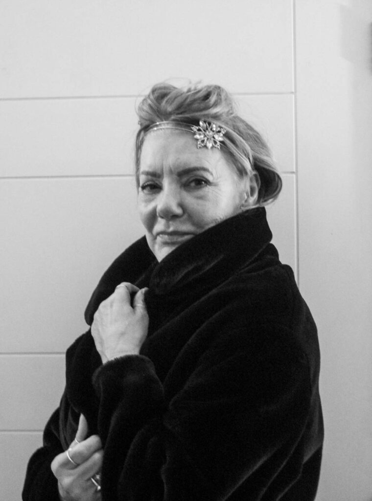
These images represent femininity in the 1920’s, because women back then would wear unique headdresses or hair accessories, which I have tried to replicate, by having my model dress up in similar head accessories.
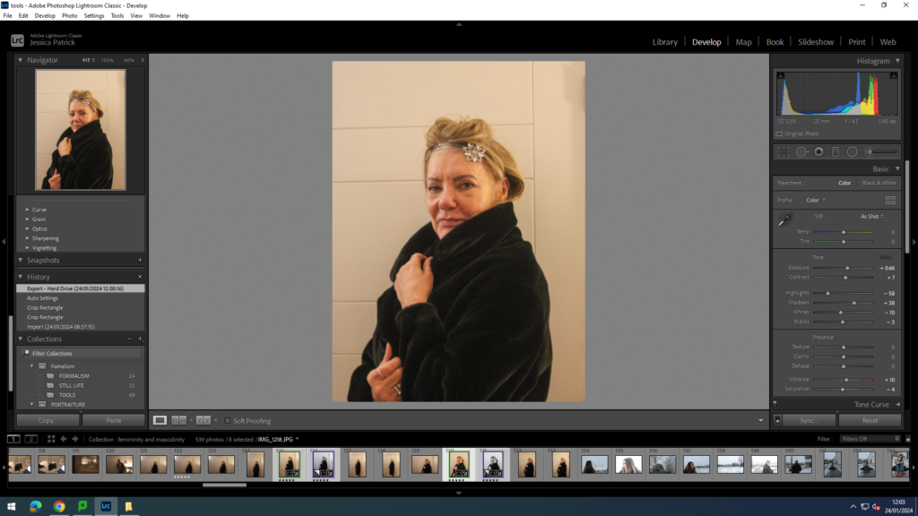
I edited these images by increasing the exposure, contrast, shadows and vibrancy, while decreasing the highlights, whites, blacks and saturation. I did this, so the photo would have better lighting.
Then, I made virtual copies of these images and created black and white versions of each one, because I wanted my photos to be more authentic, as all photos were in black and white in that era.
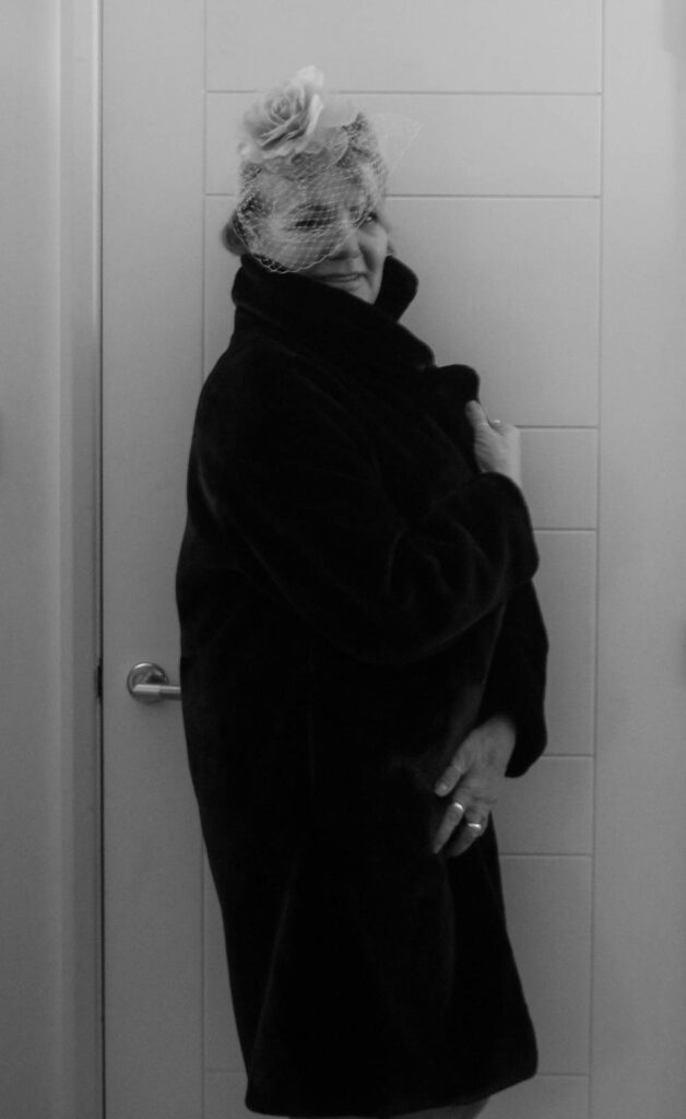
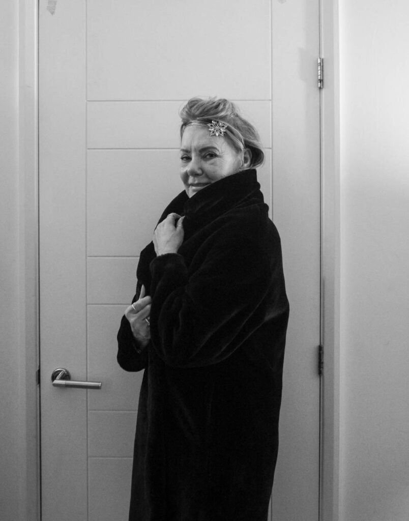
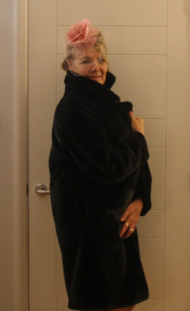
1930’s
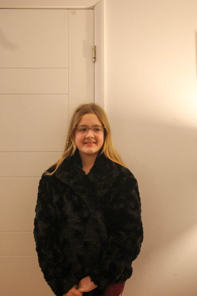
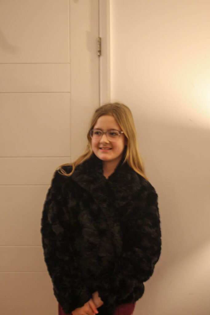
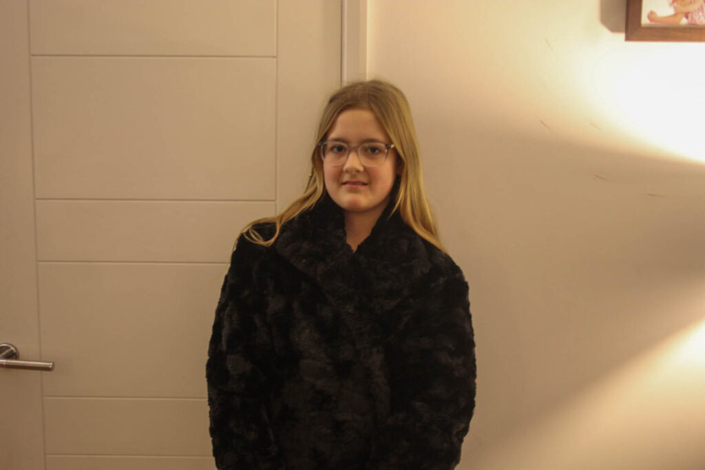
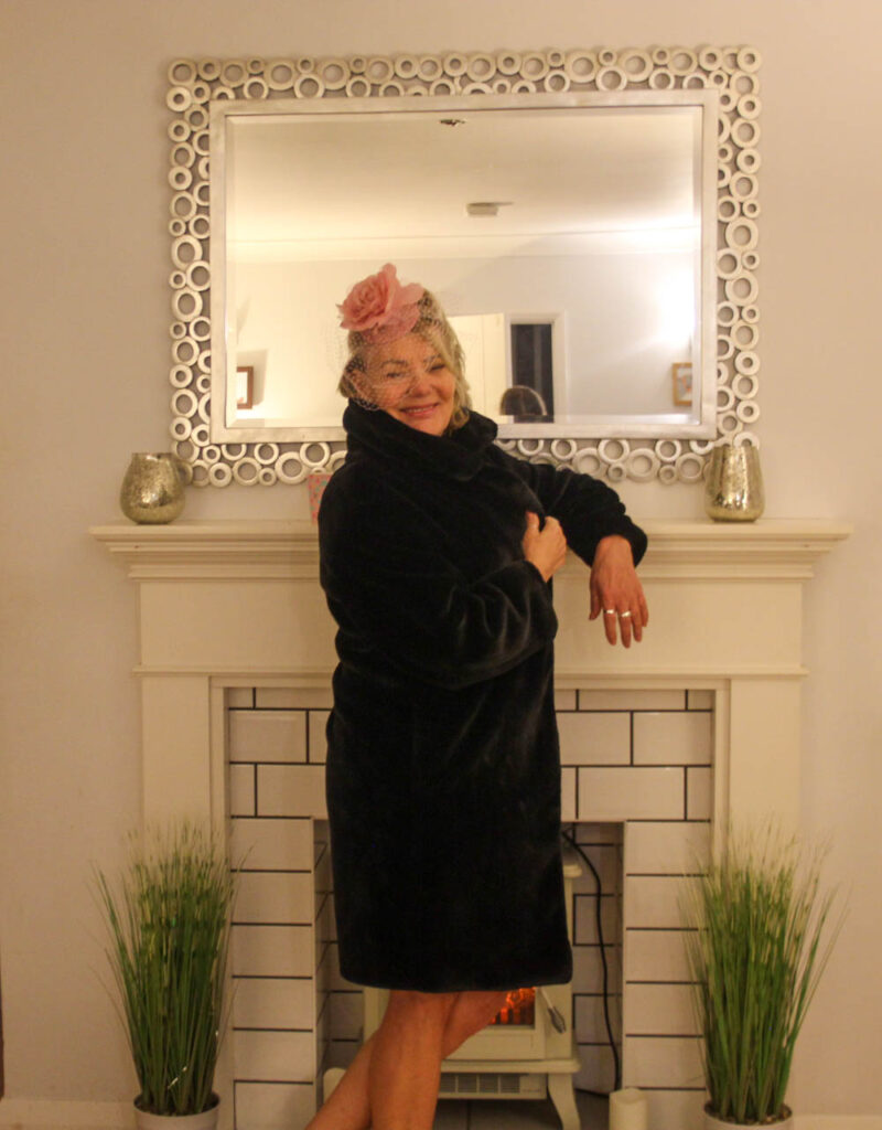
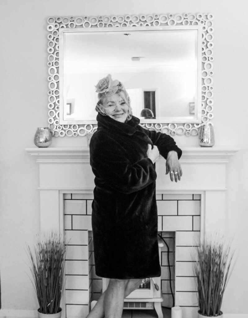
This images represent 1930’s femininity, because the standards then were long clothing that covered the body. This image represents that, because my model has on a long fur coat, which covers her up.
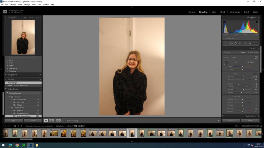
I edited these images by increasing the exposure, contrast, shadows, vibrancy and saturation, while decreasing the highlights and blacks. I did this to improve the lighting.
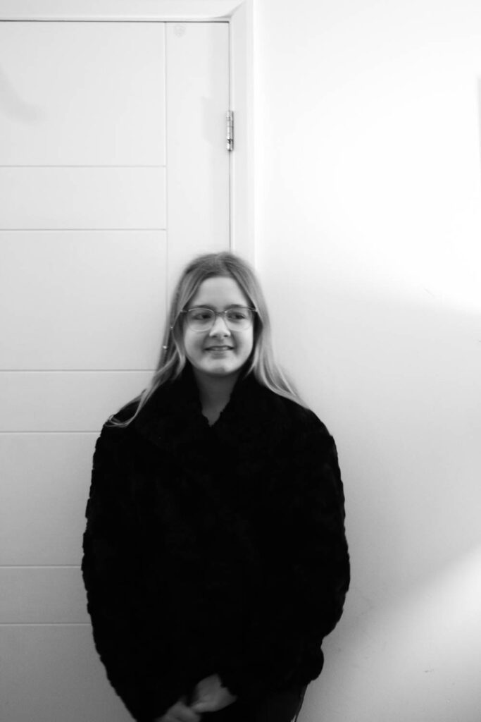
I also made virtual copies of my photos, so I could create a black and white version, so they would be more authentic, because all photos were still in black and white at this time.
1960’s
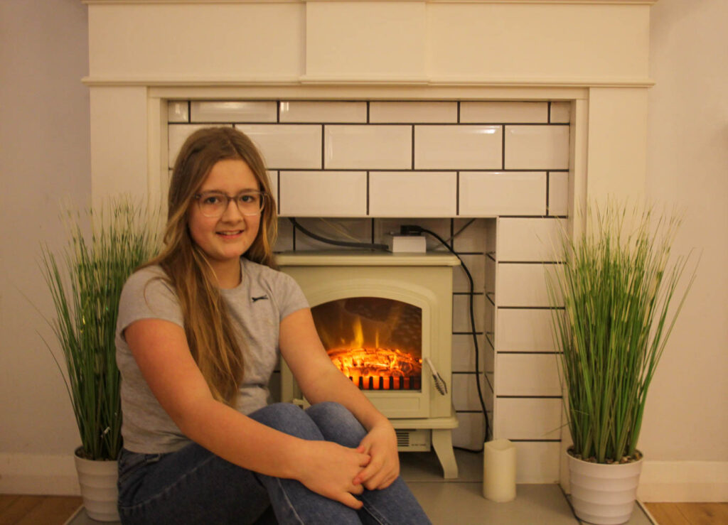
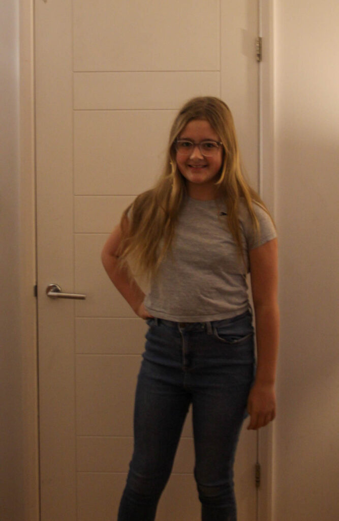
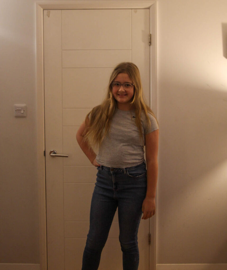
these images represent 1960’s femininity, because they wore jeans and tops that were long enough to cover their stomach. The feminine standard was still very respectful, but much more casual.
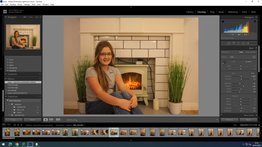
I edited this image by increasing the exposure, contrast, shadows, whites, vibrancy and saturation, while decreasing the highlights and blacks. I did this to improve the lighting.
1970’s
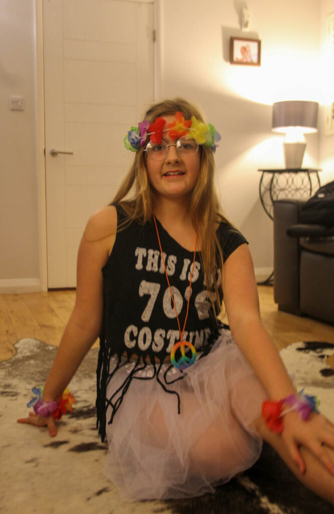
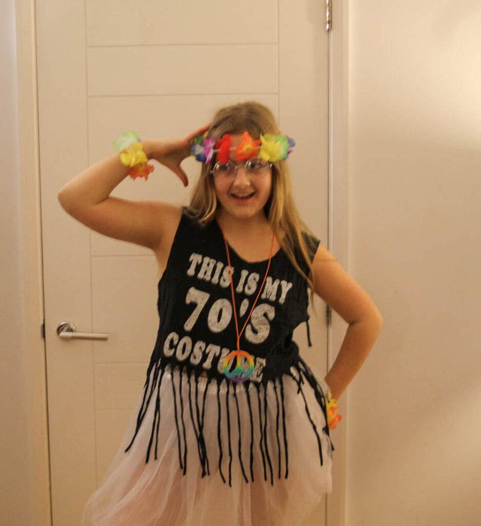
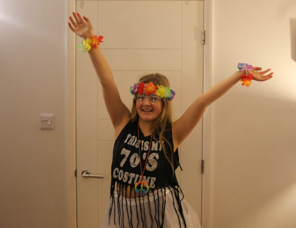
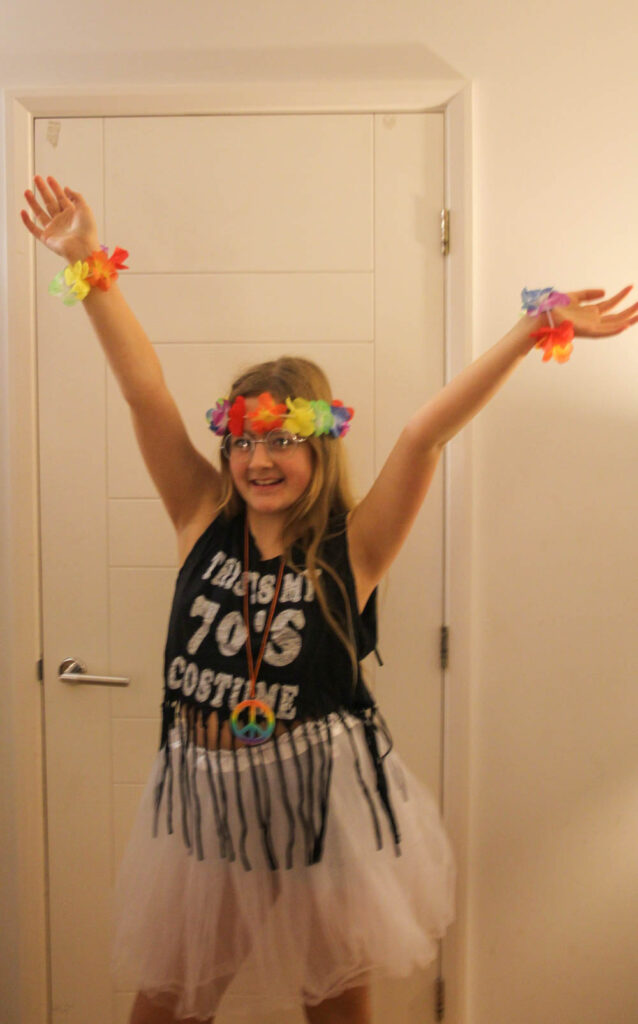
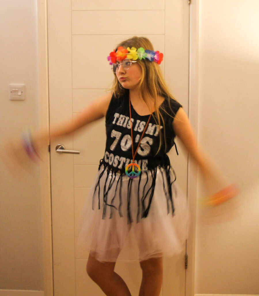
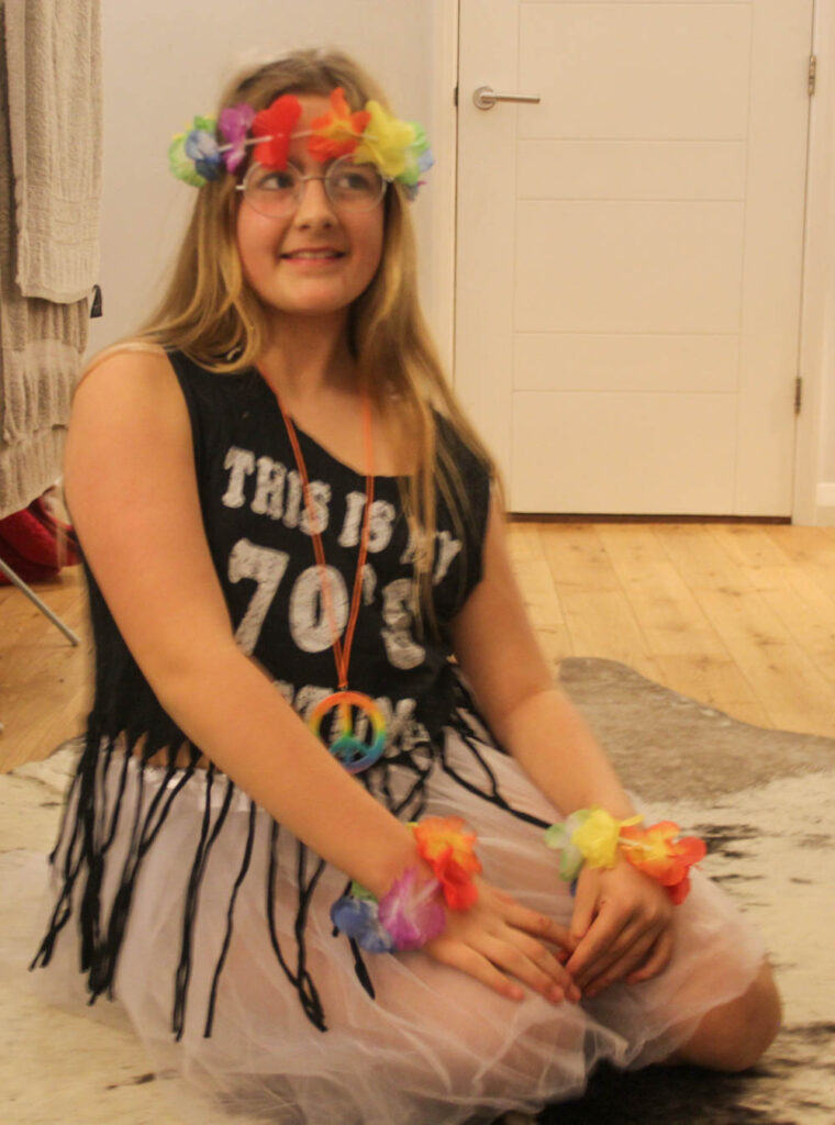
My model is now dressed up in an outfit that represents femininity in the 70’s. The feminine standards had changed and females would now wear more colourful clothing and they did not have to cover up as much.
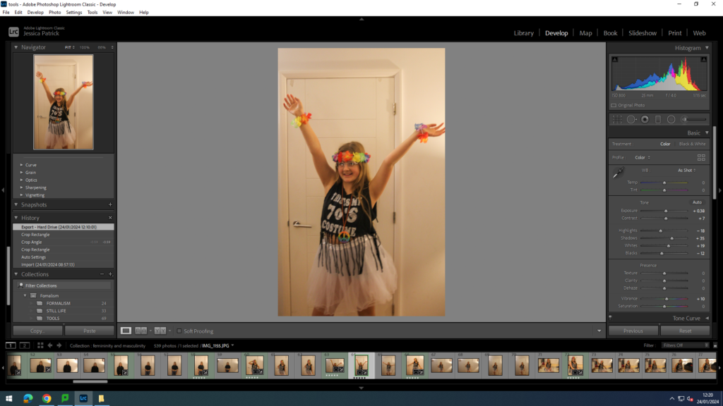
I edited this photo by increasing the exposure, contrast, shadows, whites and vibrancy, while decreasing the highlights and blacks. I did this so the brightly coloured accessories would stand out more and be more vibrant and also to make the lighting better.
1990’s
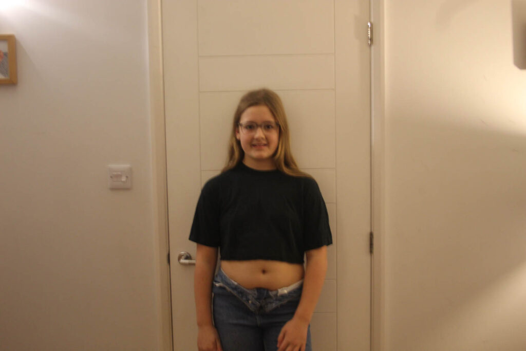
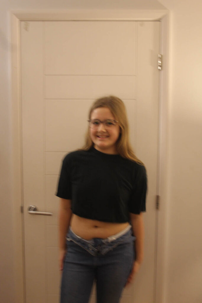
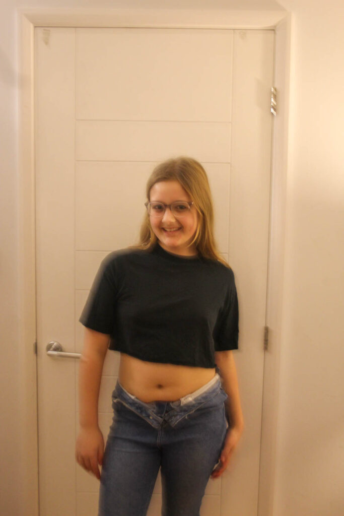
The feminine standards had now changed a lot and females could now wear more revealing clothing, like crop tops.
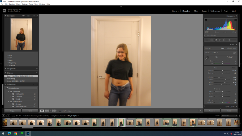
I edited this photo by increasing the exposure, contrast, shadows, whites and vibrancy, while decreasing the highlights, blacks and saturation, so that the lighting would be better.
2000’s
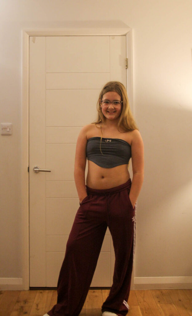
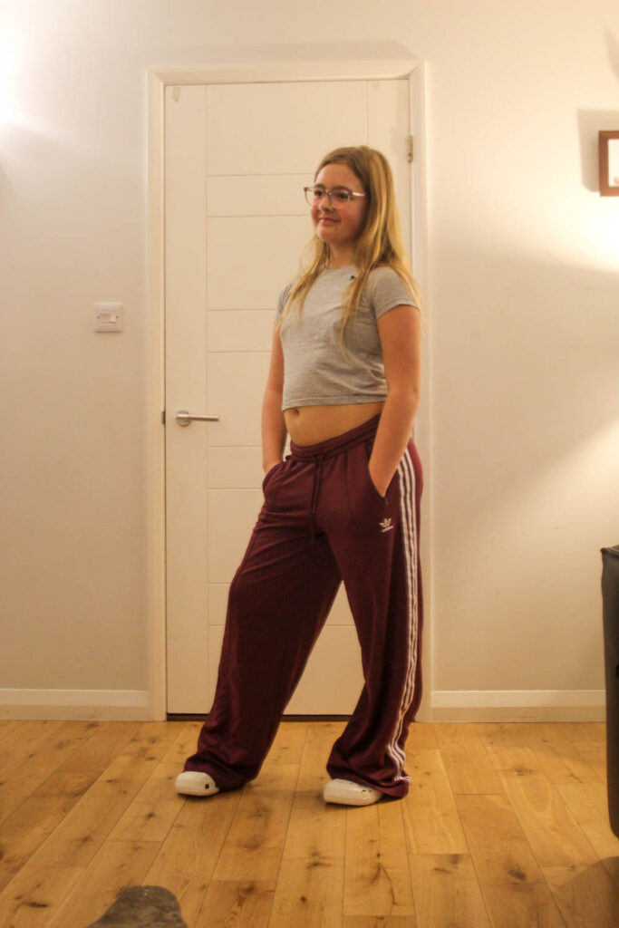
The feminine standards were now much different from the 1920’s. Women could now wear more revealing clothing, like low rise trousers, with smaller crop tops.
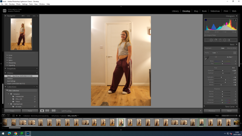
I edited this photo by increasing the exposure, contrast, shadows and whites, while decreasing the highlights, blacks and vibrancy. I did this to improve the lighting.
These images relate to the theme of femininity, because they show a timeline from 1920-2000 of how femininity has altered through time. It also shows that their is not just one definition of femininity, because it is constantly changing, and societies demands are also constantly changing.
Photoshoot Conclusion
In conclusion, I think the outfits in this photoshoot was a good idea, because I can now compare this photoshoot to Cindy Sherman’s photos of her as different characters. I also think I portrayed femininity throughout time well, because the outfits were realistic compared to the actually outfits they wore. However, next time I would find a better place to take the photos, so the lighting was the better and so the background of the images were better. I would also experiment with the camera settings, so all the images were more in focus.
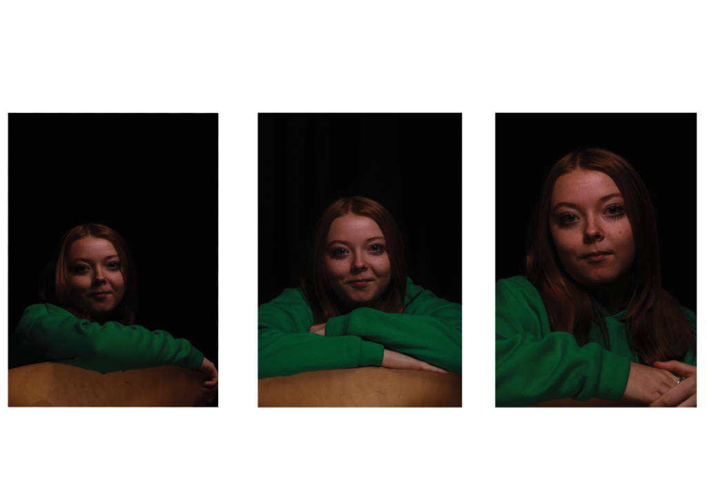
I put these three Headshots together because they all link and have a connection. These Images all have Butterfly lighting under the cheeks which is why I put these images together as a Tryptic. These images also look really good together because the first image is quite small and on the last photo, the size of her head is a lot bigger and the photos go up in size.
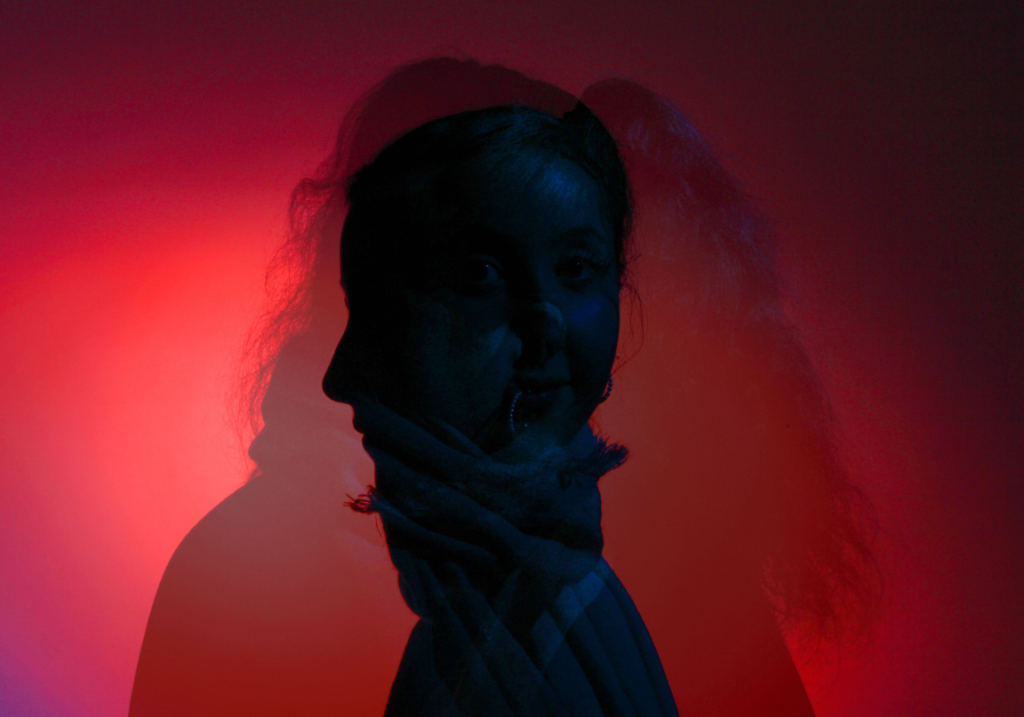
I put these three Headshots together because of the angles of the head. The first image was angled to the left, the second image to the right and the third image was pointing straight to the left. I then changed the Opacity of these three photos so that you can see all three of the Headshots.
Femininity and Masculinity
In this photoshoot I have chosen to experiment with different male and female stereotypes in the studio, including different lighting, poses and props. I have decided to do stereotypes, so I can compare my stereotype images to my chosen artists photographs, which are Cindy Sherman and Claude Cahun. I have used the chosen stereotypes below to really look into:
• Males are aggresive
• Females are too emotional
• Females should be housewives
• Makeup is feminine
• The colours pink and blue to show masculinity and femininity
I have chosen these stereotypes to look at, because Cahun and Sherman have used some of these stereotypes, so it makes it easier for me to compare and analyse my images against theirs.
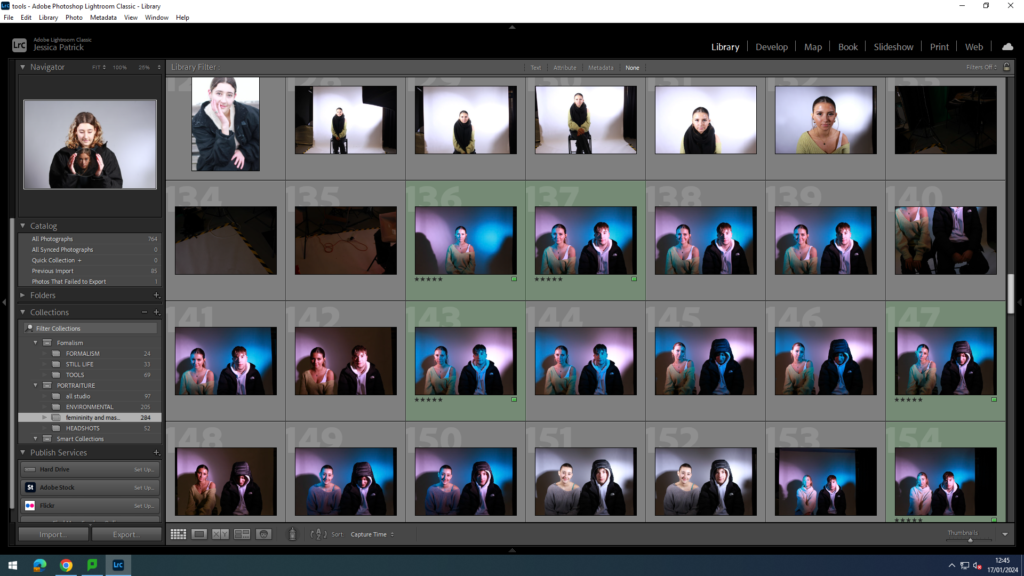
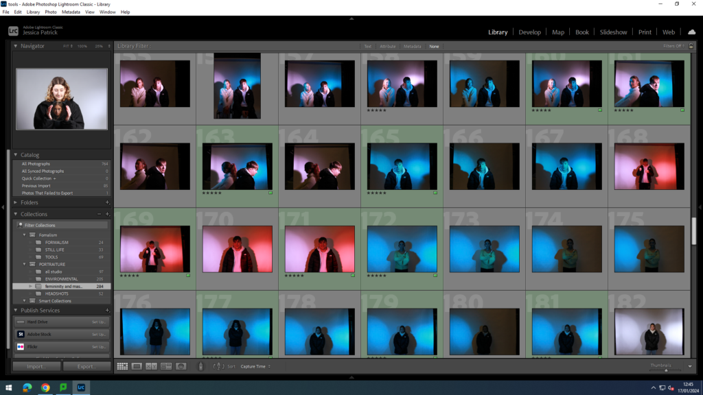
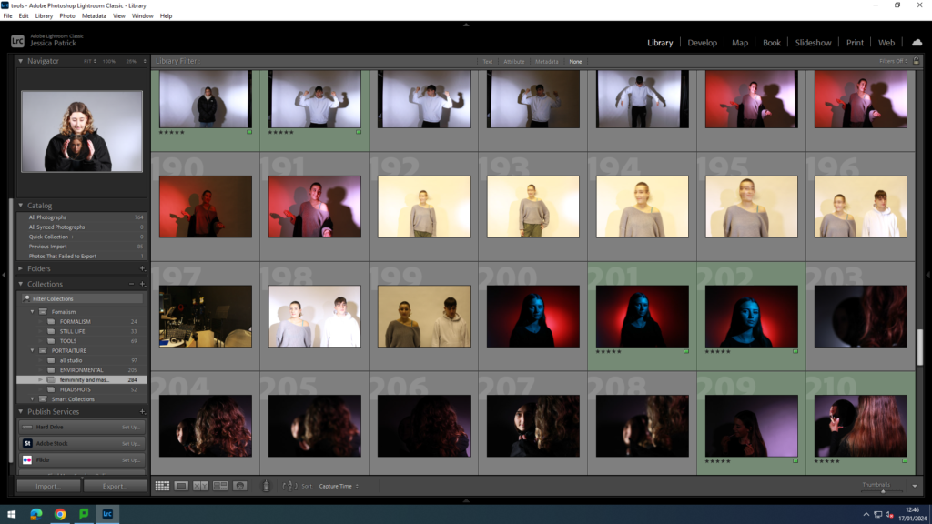
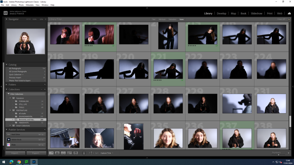
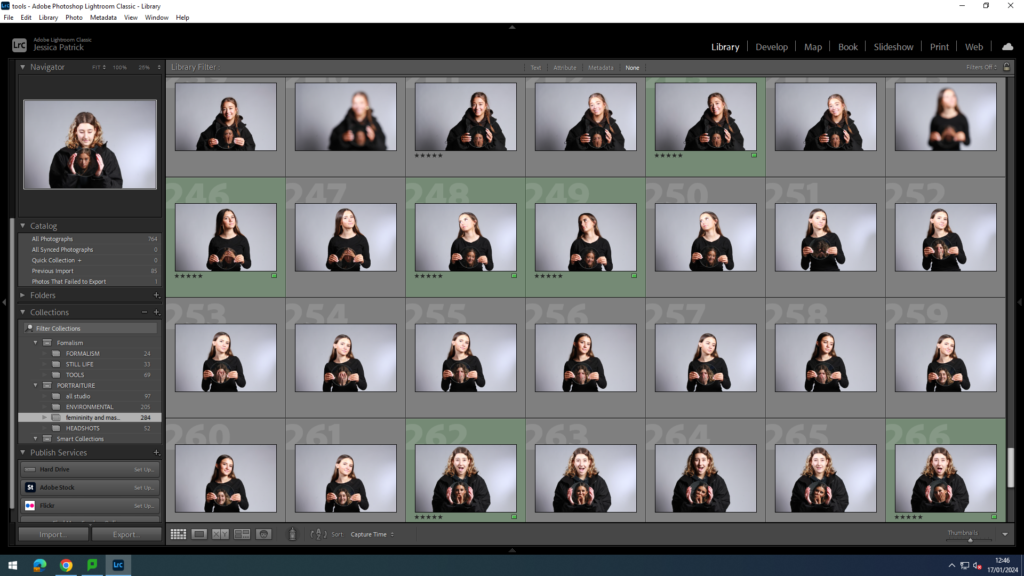
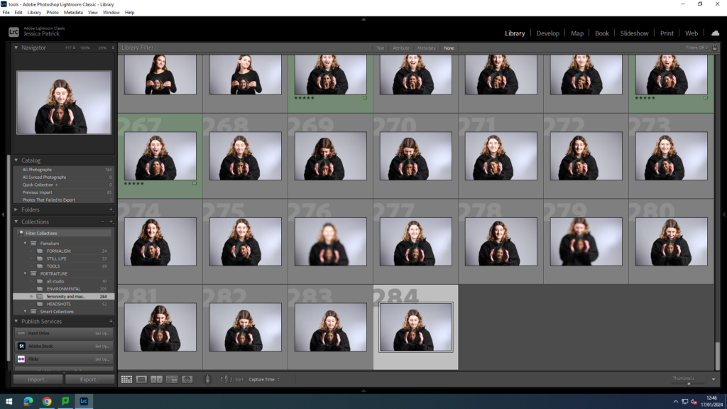
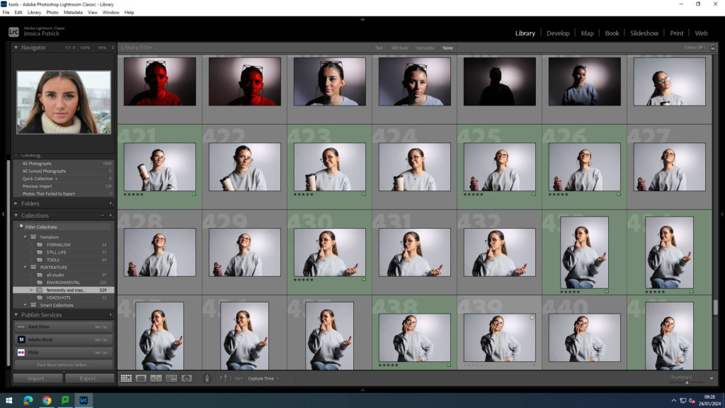
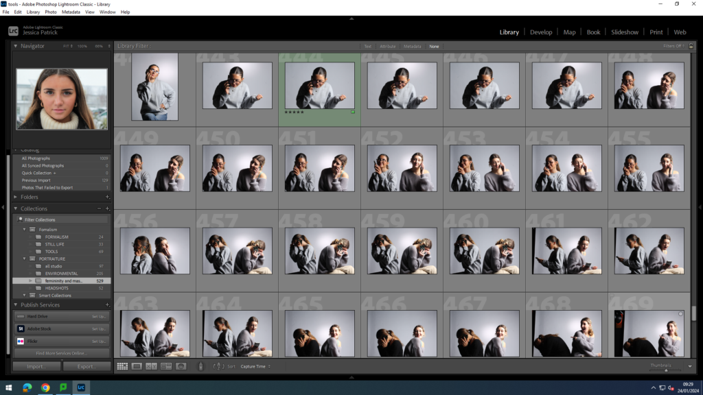
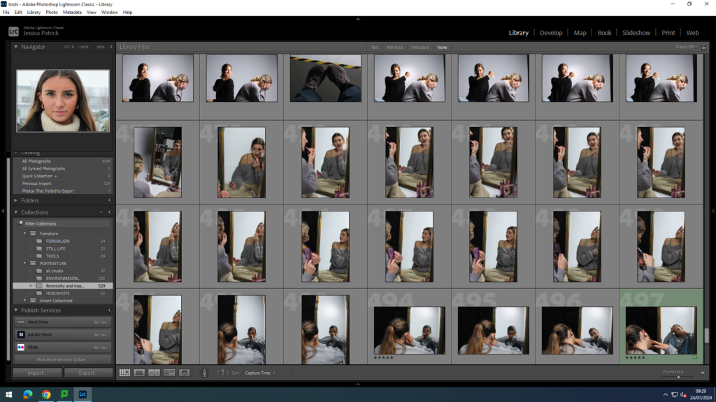
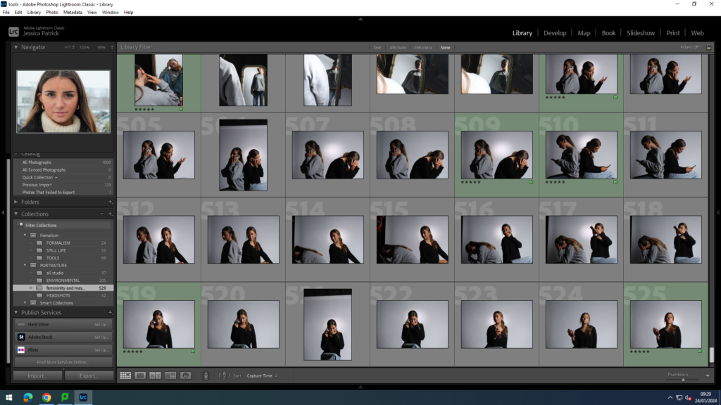
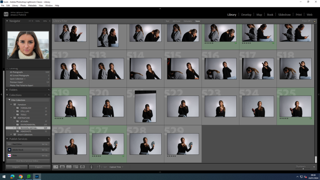
The images which I have highlighted green are the images I have chosen to edit, because they present the stereotypes the best, and have the best composure, focus and lighting techniques. I went down to the studio three times for this photoshoot, because in the first photoshoot there were shadows behind my models, from the lighting used, because they were stood too far back. In the second attempt I made sure to move the models more forward, to help prevent the shadows behind them. In my third photoshoot I experimented with different props, such as lip gloss, hair brush, perfume, mirrors, phones and other make up products.
Firstly in the studio I experimented with different coloured lighting e.g. pink and blue, because they are stereotypically colours that represent femininity and masculinity.
masculine
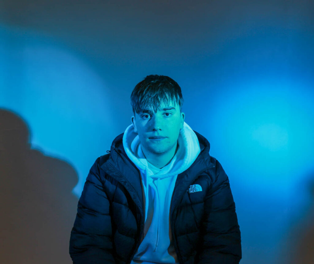
Firstly, I used a male as my model and experimented with blue lighting, because stereotypically blue is associated with males.
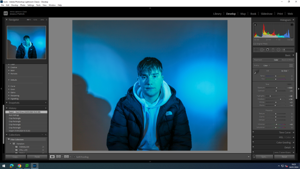
I edited this image by increasing the exposure, contrast, shadows, whites and vibrancy, while decreasing the highlights and blacks. I did this to make the lighting more vibrant.
Then, I decided to take inspiration from Claude Cahun, because she experimented with gender fluidity and went against stereotypes, so I decided to use female models, but also use the blue lighting.
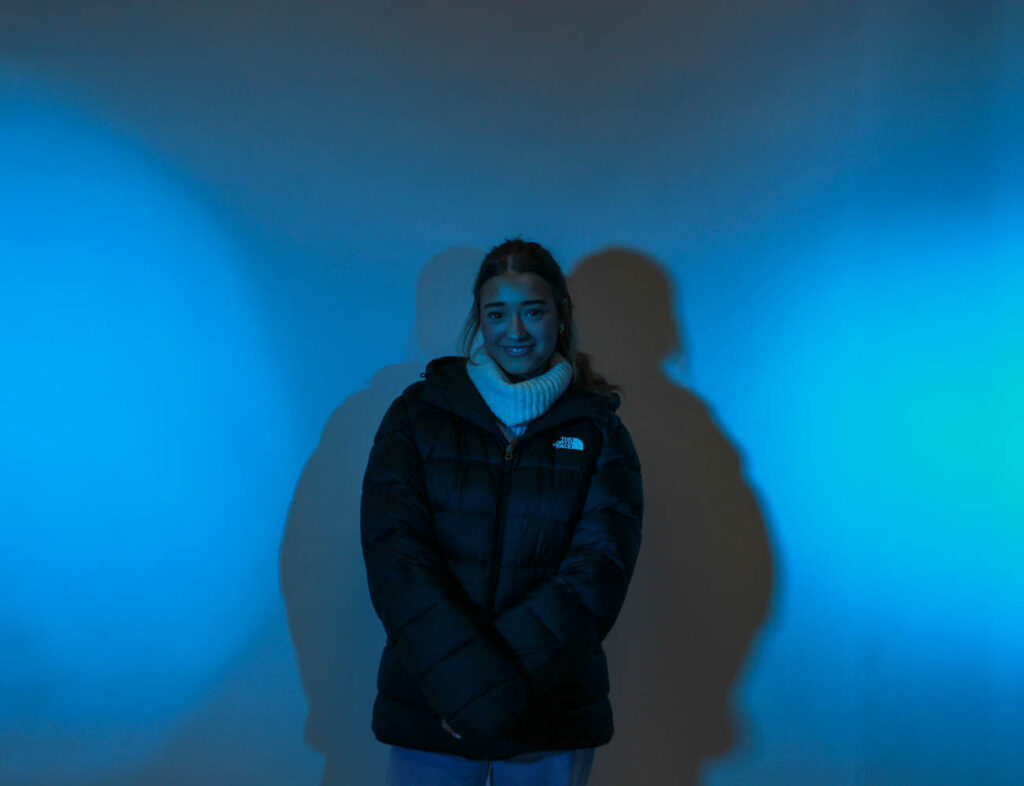
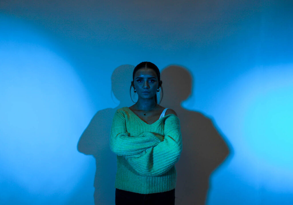
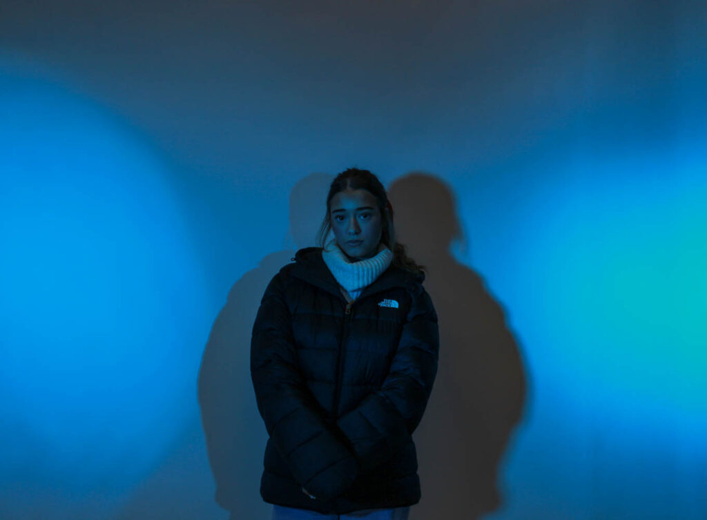
I also has my model try look more masculine while stood in this light, by giving her a male jacket and asking her to put her hood up and look tough.
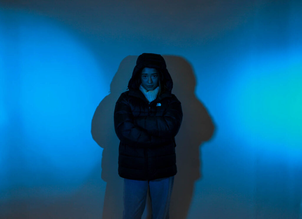
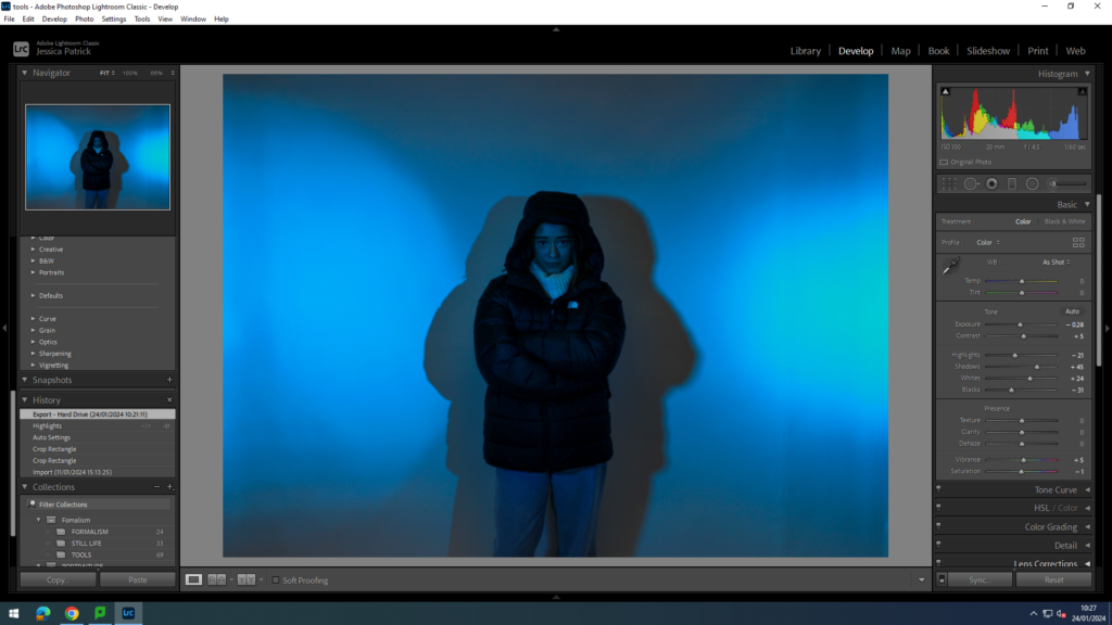
I edited these photos by increasing the contrast, shadows, whites and vibrancy, while decreasing the exposure, highlights, blacks and saturation. I did this to make the blue lighting more vibrant, and to make the model stand out more.
Femininity and masculinity
I had used both pink and blue lights here and positioned the male and female next to each other in the photograph, so the comparison between femininity and masculinity could be seen.
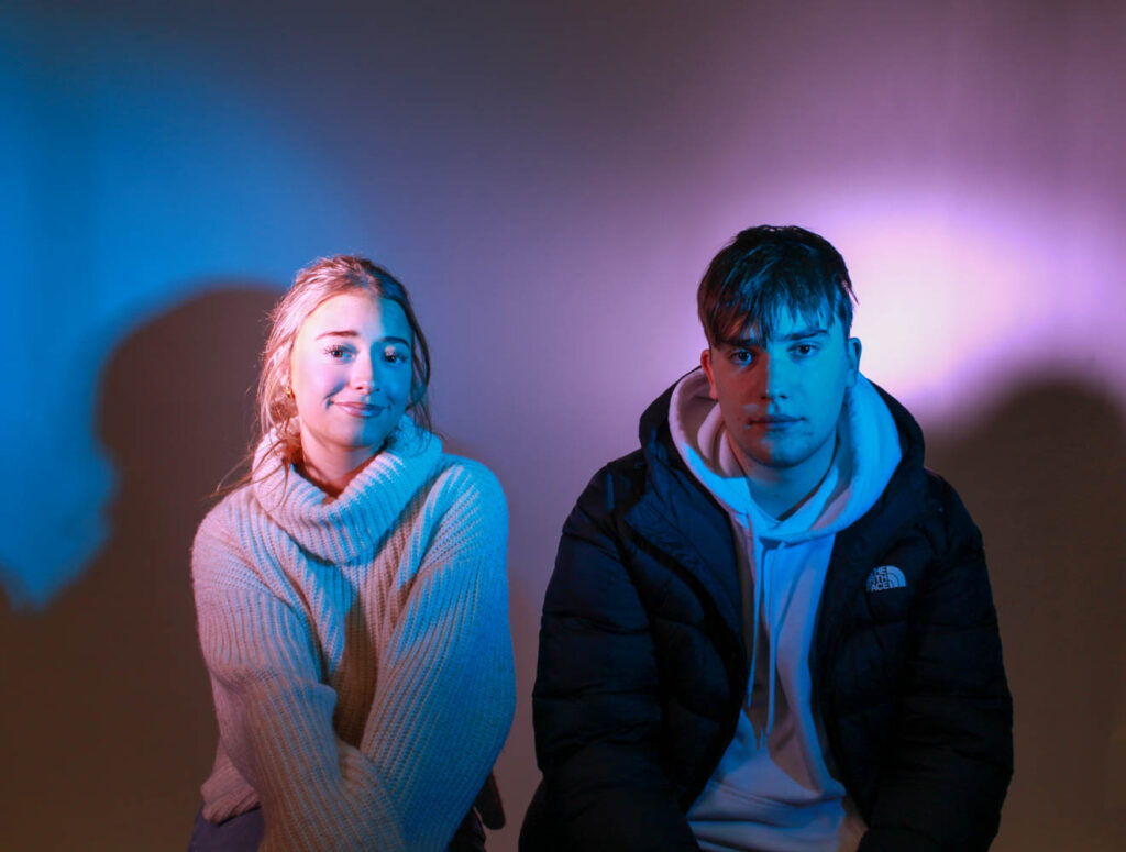
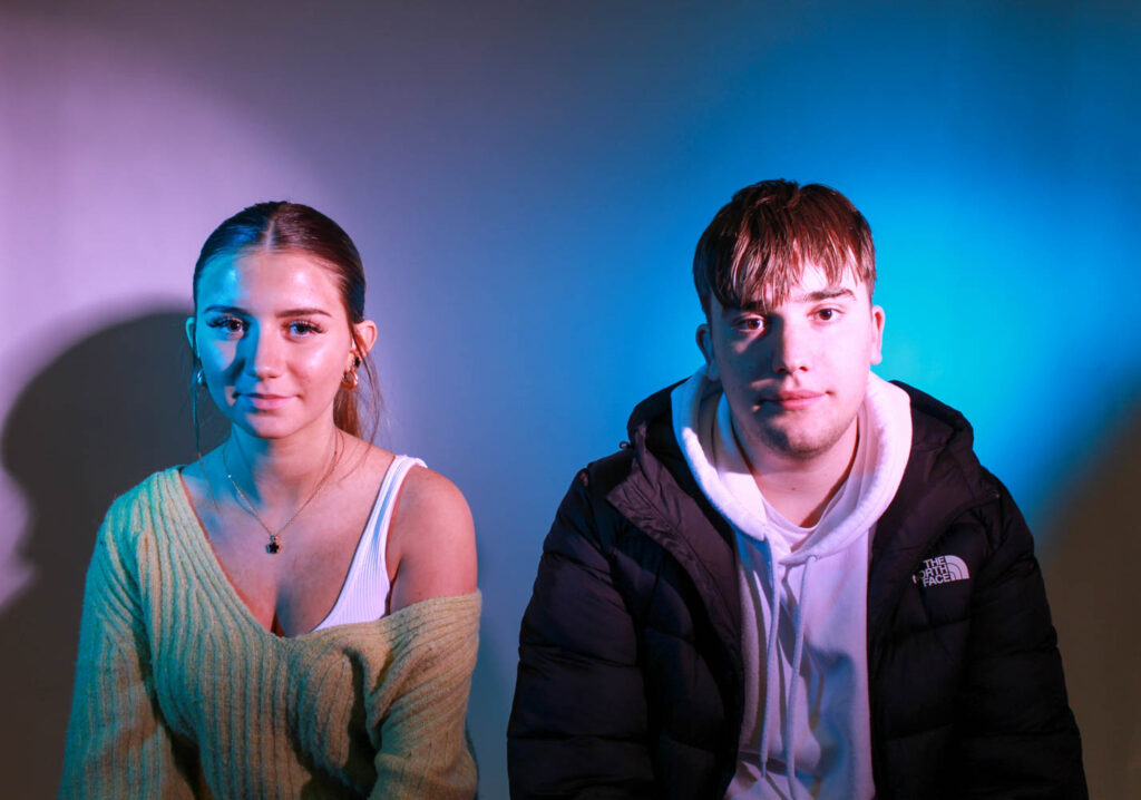

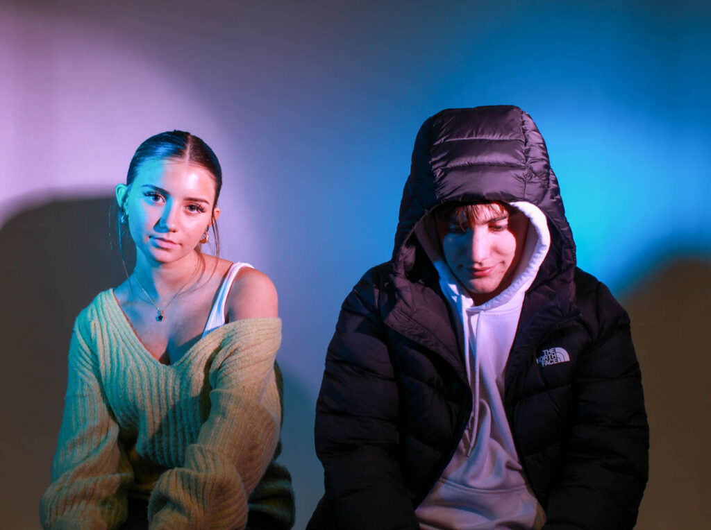
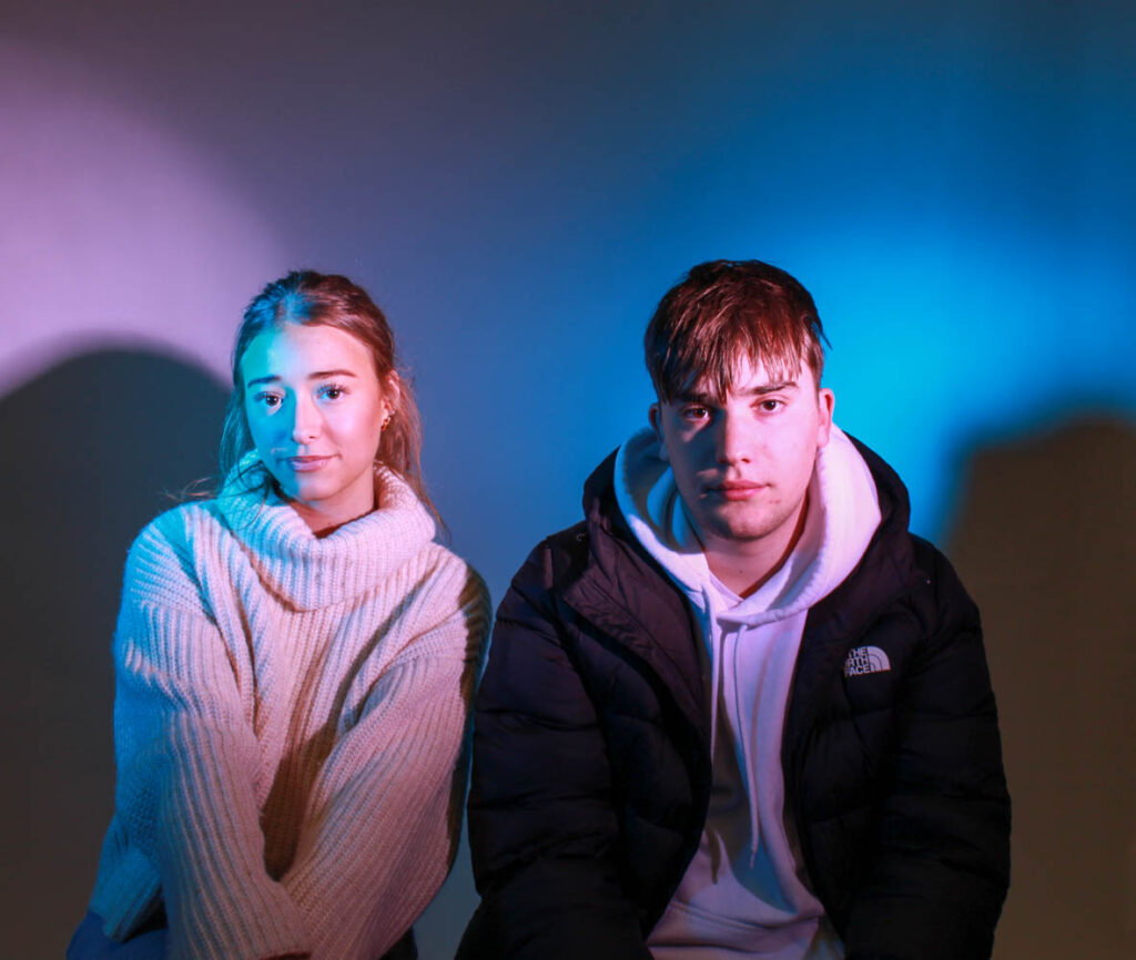
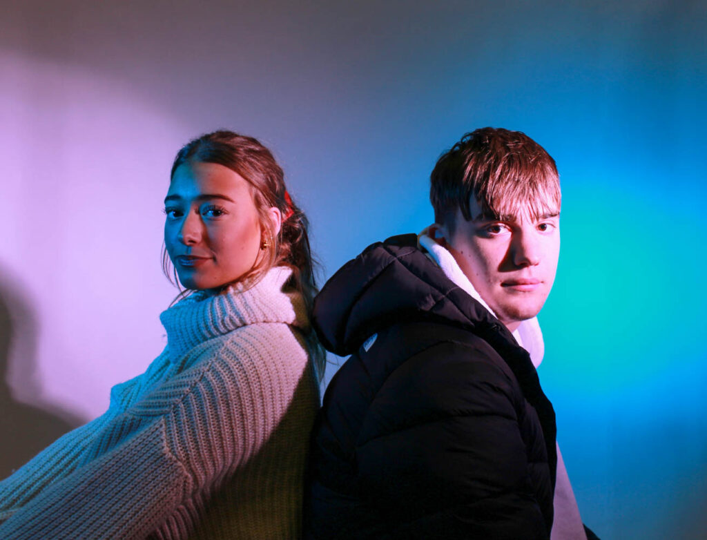
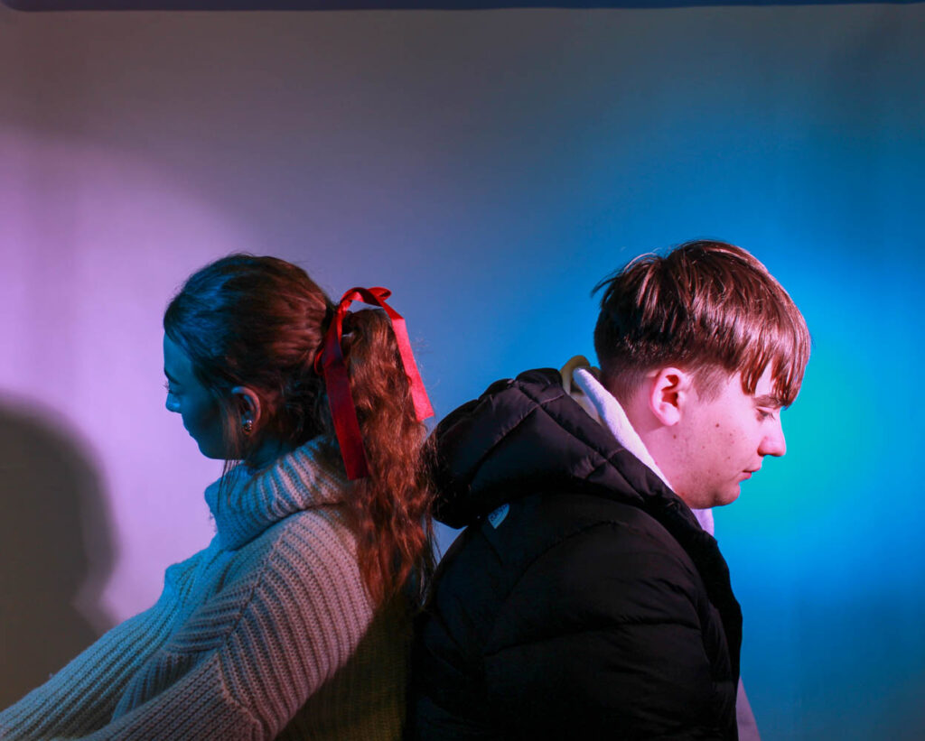
I had the female model sit in the pink light and the male model sit in the blue light, because they are their stereotypical colours. However, I was influenced by Cahun and how she went against stereotypes, so I also switched their positioning around, so they went against their stereotypes.

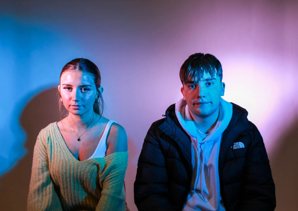
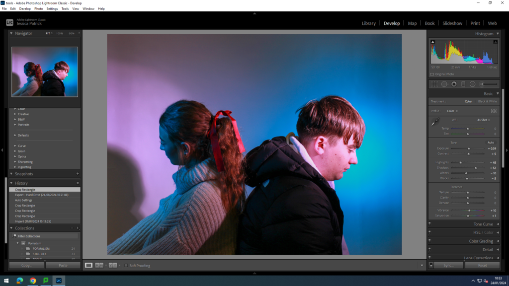
I edited these photos by increasing the exposure, contrast, shadows, vibrancy and saturation, while decreasing the highlights, whites and blacks. I did this so the coloured lighting would be more vibrant. I also used the prop of a bow in the hair to represent femininity, because bows are seen as a very feminine accessory.
Femininity
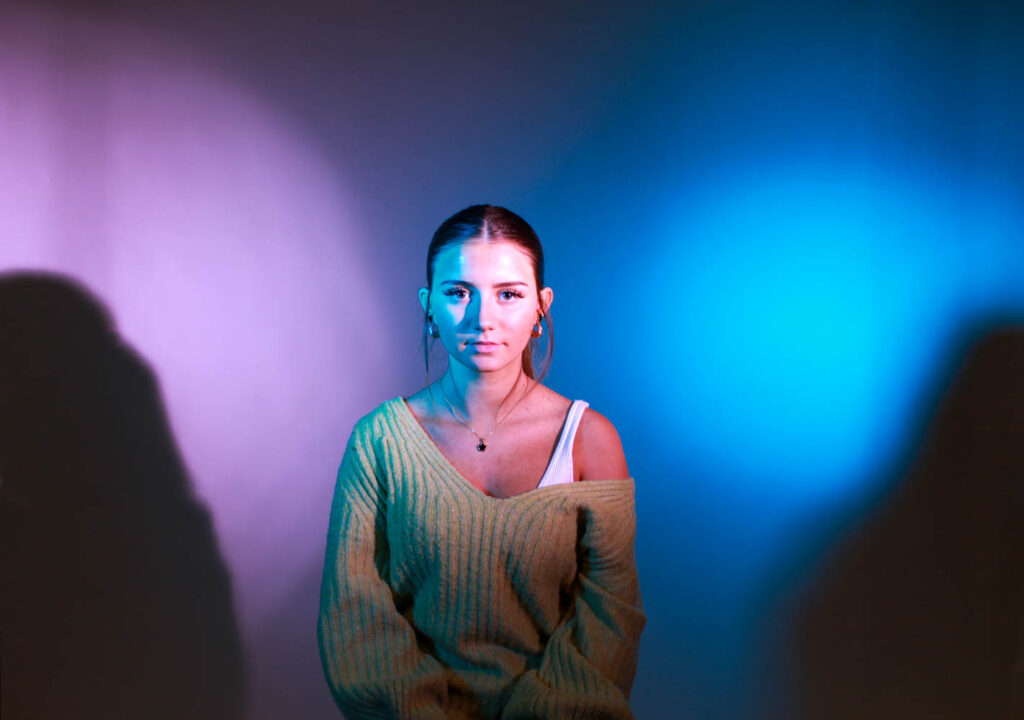
I also used a female model in both pink and blue lighting to represent gender fluidity and to go against stereotypes, just like Cahun did.
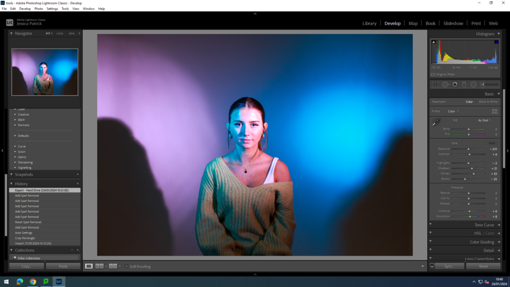
I edited this image by increasing the contrast, shadows, whites, vibrancy, saturation, while decreasing the exposure, highlights and blacks. I did this to make the lighting more vibrant.
Next, I experimented with different masculine and female stereotypes.
Masculine
The first masculine stereotype I experimented with was that men are aggressive. I used different poses to show this. I also used red coloured lighting, because the colour red signifies anger.
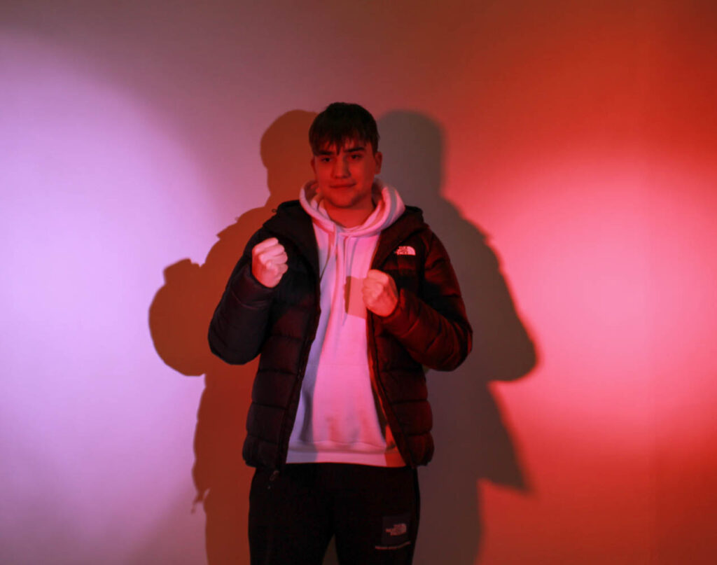
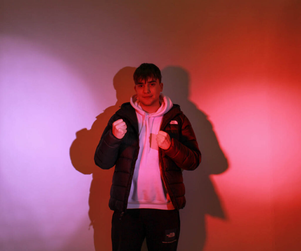
I had my model put his hands up in fists to signify that he was angry and being aggressive. However, I then decided to go against the stereotype, like Cahun, and have him pose smiling, while in the red light. I did this to show that even if angry, like the red light portrays, not all men are aggressive all the time and that it’s just a stereotype.
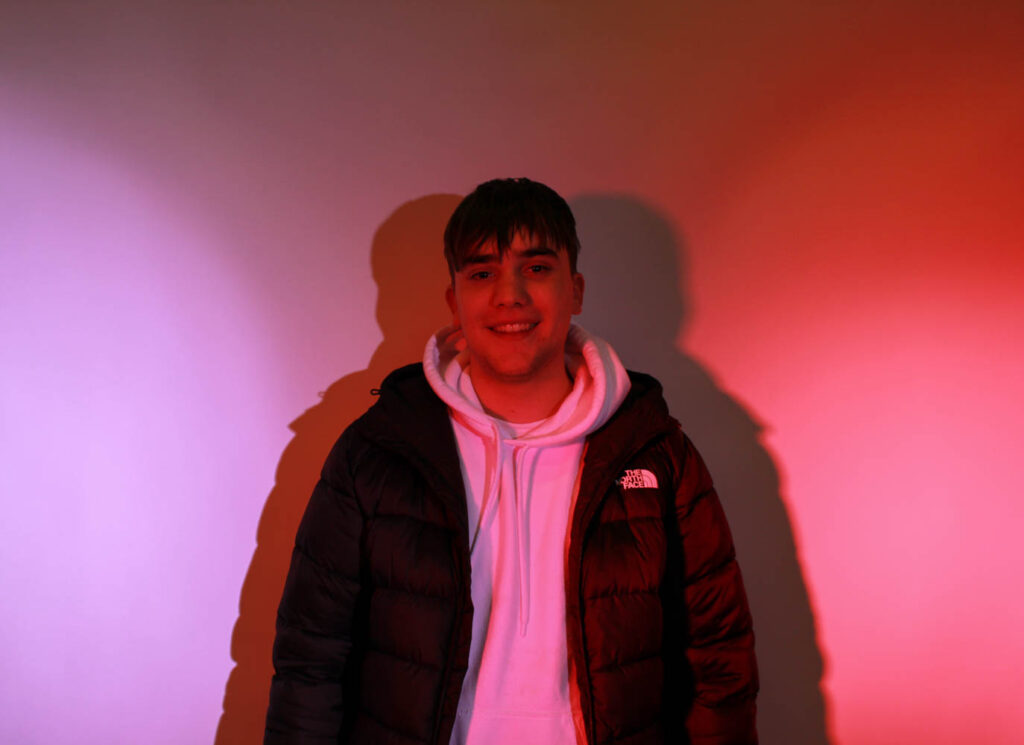
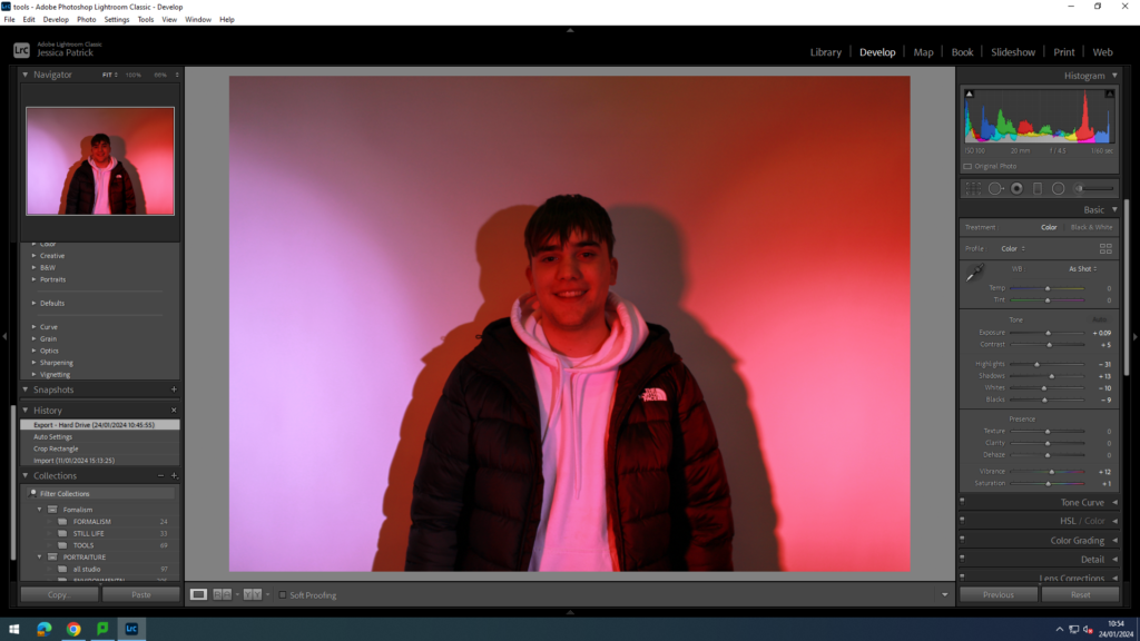
I edited these images by increasing the exposure, contrast, shadows, vibrancy and saturation, while decreasing the highlights, whites and blacks. I did this so the model would stand out more and the lighting would be more vibrant.
I then experimented with the stereotype that males are strong and tough.
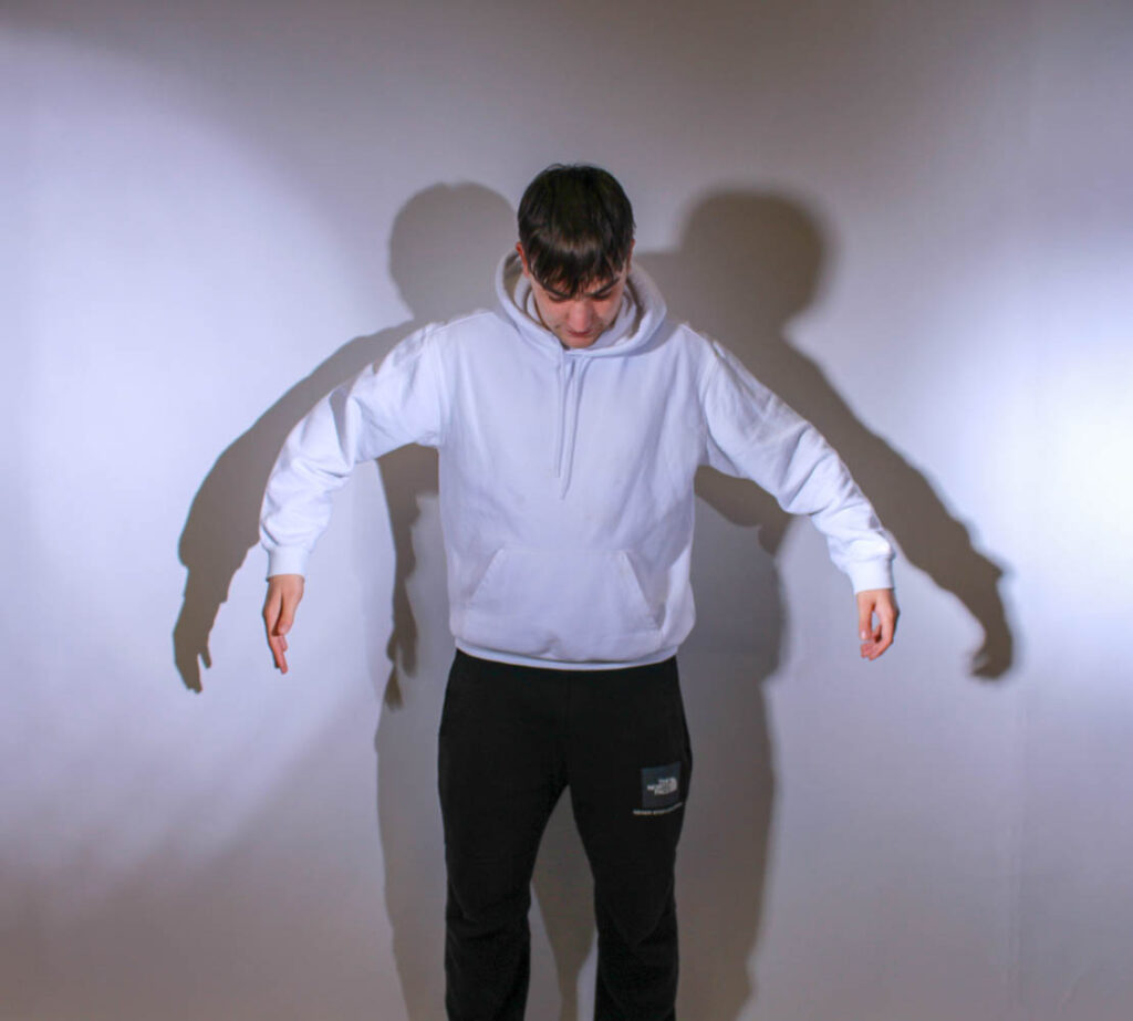
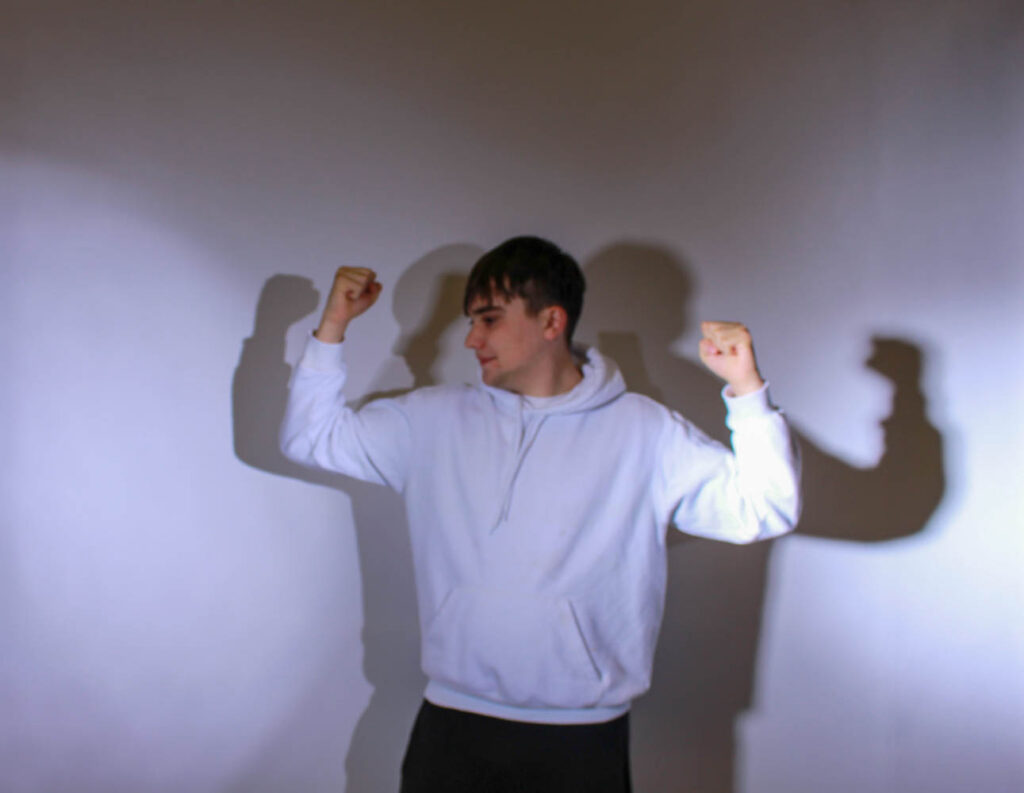
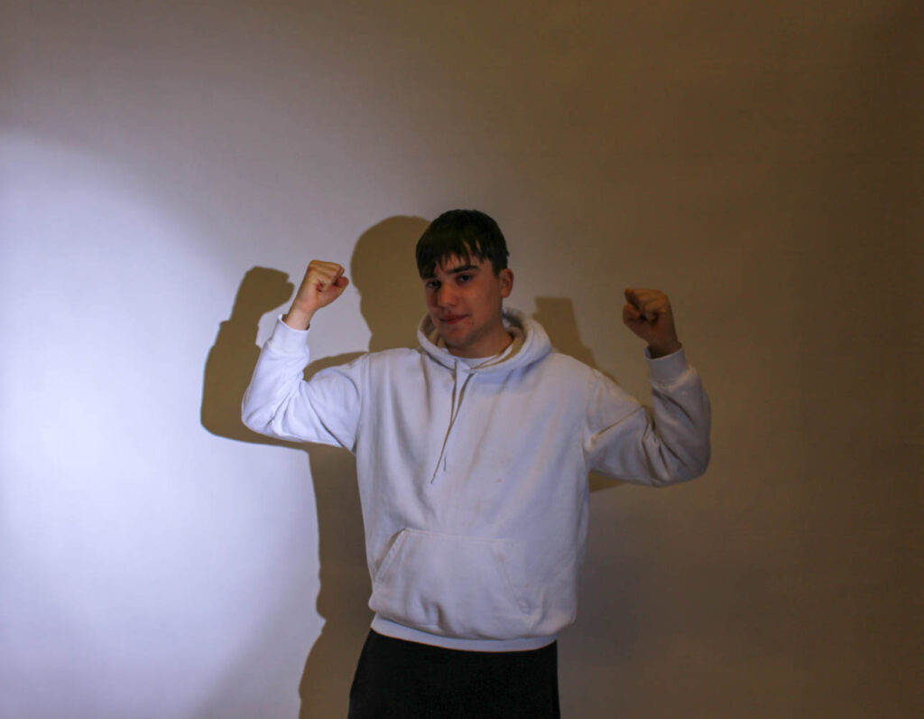
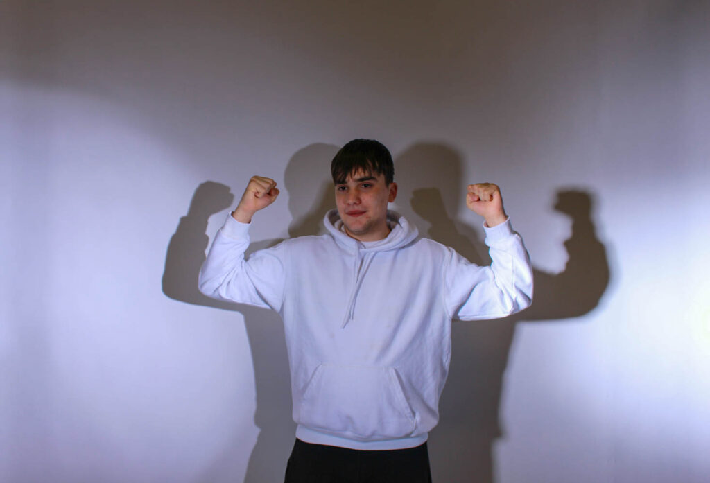
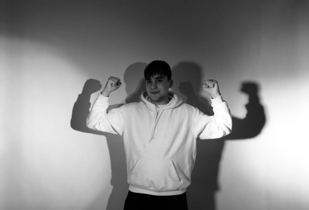
I had my male model pose flexing/ showing his muscles, so that he would look big and strong.
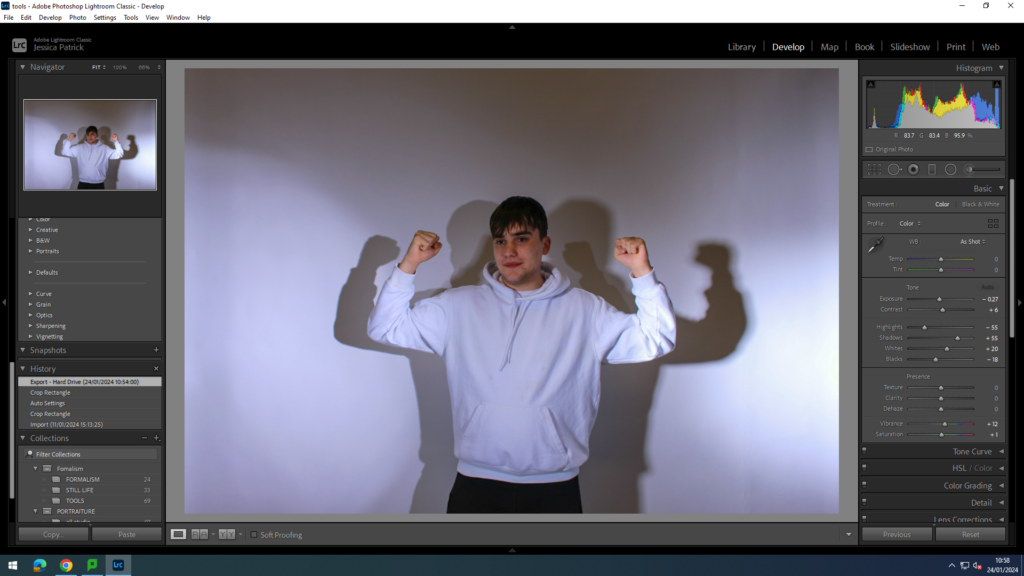
I edited this photo, by increasing the contrast, shadows, whites, vibrancy and saturation, while decreasing the exposure, highlights and blacks. I did this, so the model would stand out more.
I then made a virtual copy of the edited photo, so I could create a black and white copy.
Conclusion of shoot
The photos represented femininity and masculinity well, as they showed the different female and male stereotypes well. However, there were too many shadows in the images. Therefore, I went down again for another shoot and made sure my models were stood further forward, away from the backdrop, so that those shadows were not created. However, I do like the shadows in the final black and white image, because it make my model look even more touch as he has two large shadows behind him also flexing his muscles.
Femininity
In this shoot I experimented with different female stereotypes and different props. Firstly, I experimented with the stereotype that women are too emotional.

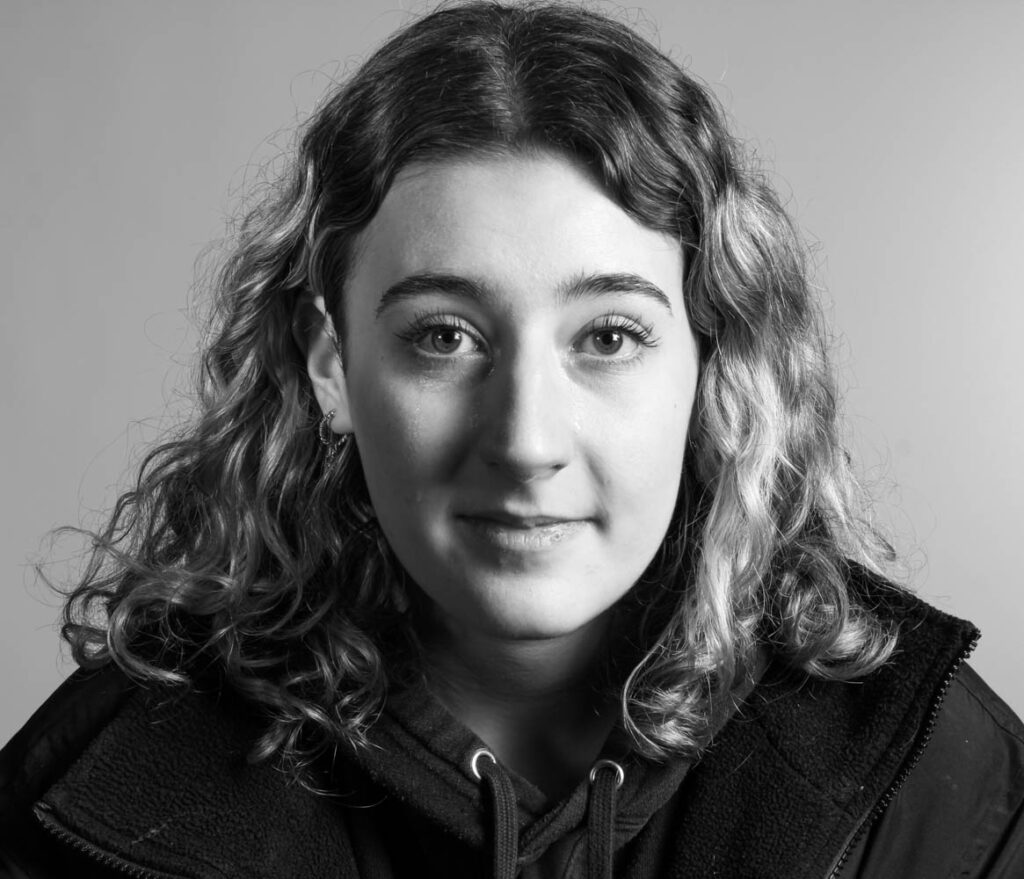
In this photo I was crying, so that I could represent the stereotype that women are too emotional and cry a lot.
In this photo I also experimented with ‘selfies’, the photo was of myself. I did this, because Cahun and Sherman both took photos of themselves.
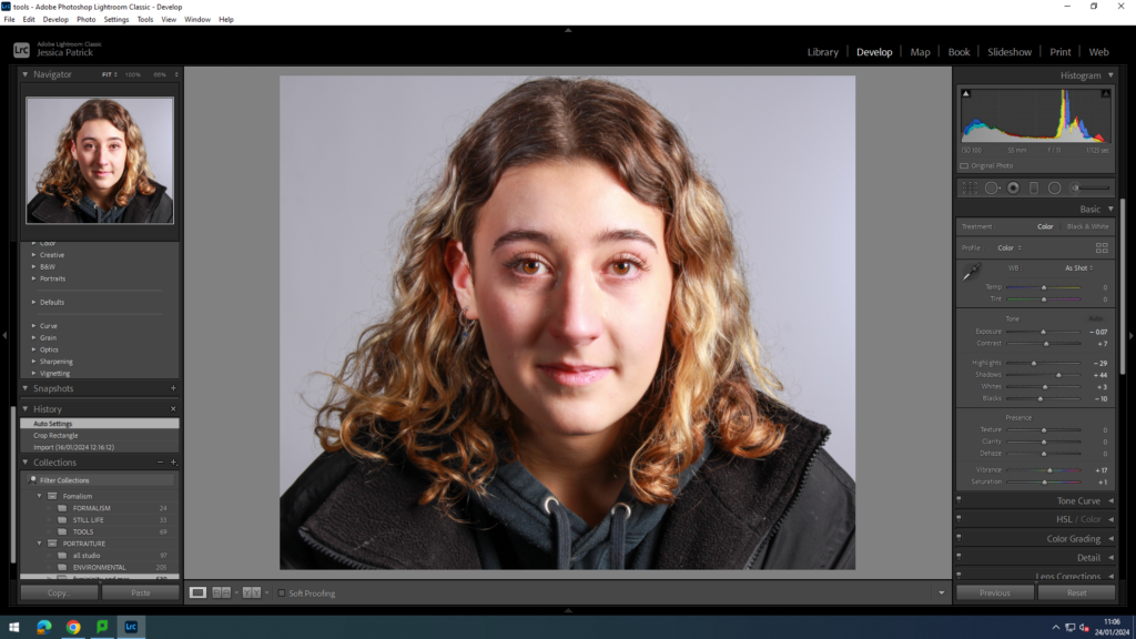
I edited this image by increasing the contrast, shadows, whites, vibrancy and saturation, while decreasing the exposure, highlights and blacks. I did this, so the tears would be more visible.
Before:
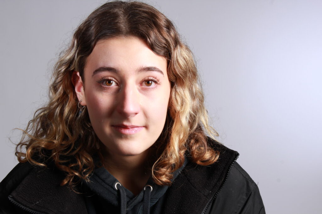
After:

Then, I made a virtual copy of thee edited image, so that I could create a black and white version. I created a black and white version, so that the tears would be even more visible in the photo.
I then took photos of my model sad in the mirror to show that she is too emotional. She also looks insecure in some of these images in the mirror.
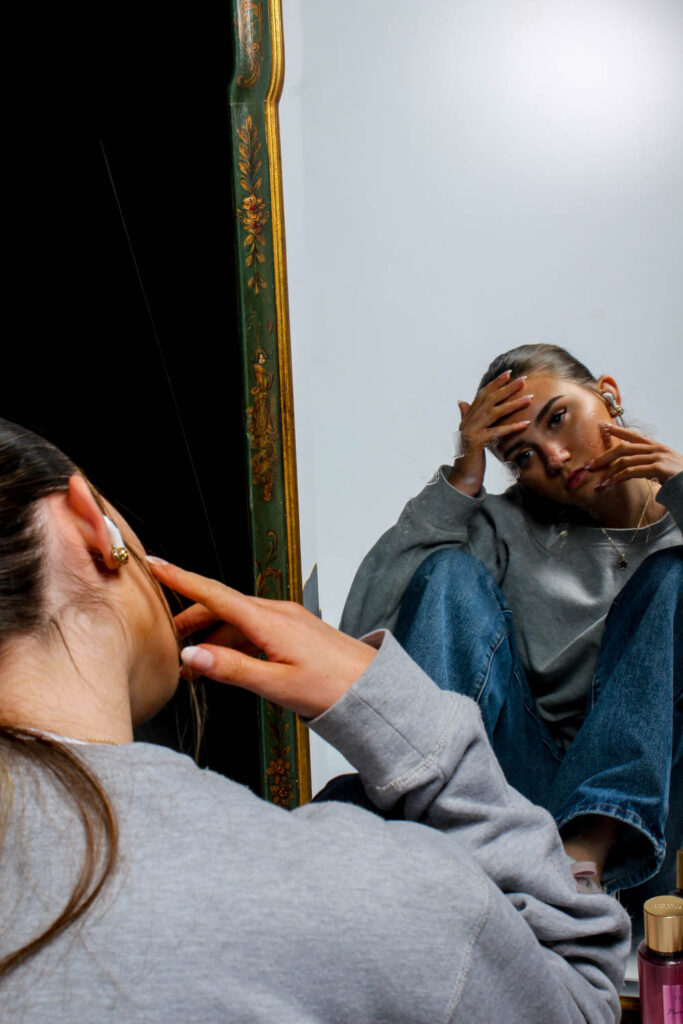
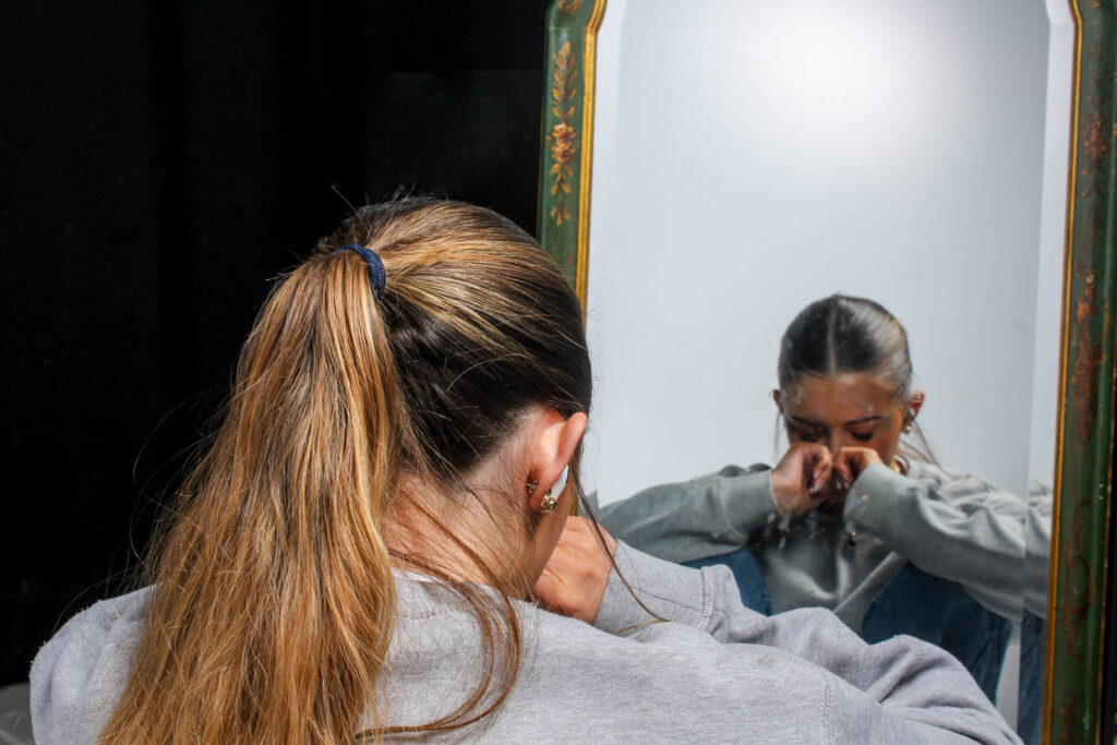
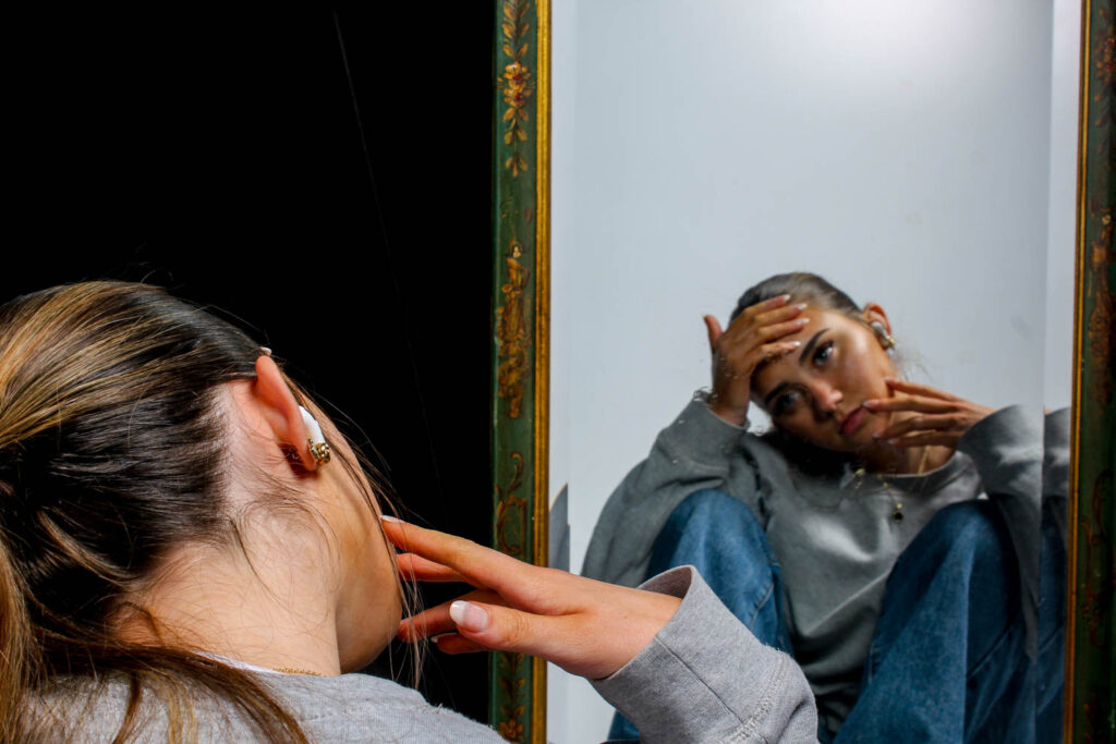
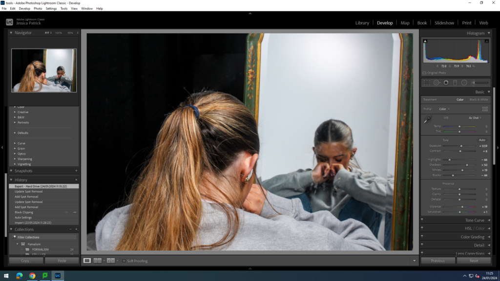
I edited these photos by increasing the exposure, contrast, shadows, whites, vibrancy and saturation, while decreasing the highlights and blacks.
Next, I experimented with different props, that would represent different stereotypes of women.
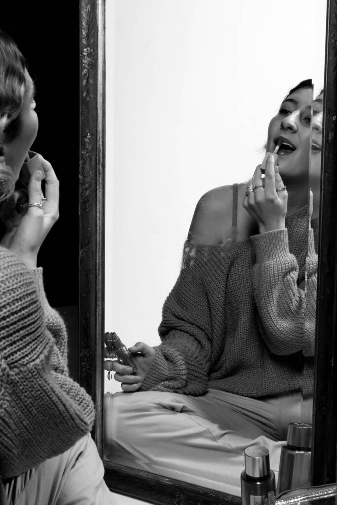
Lip stick/gloss
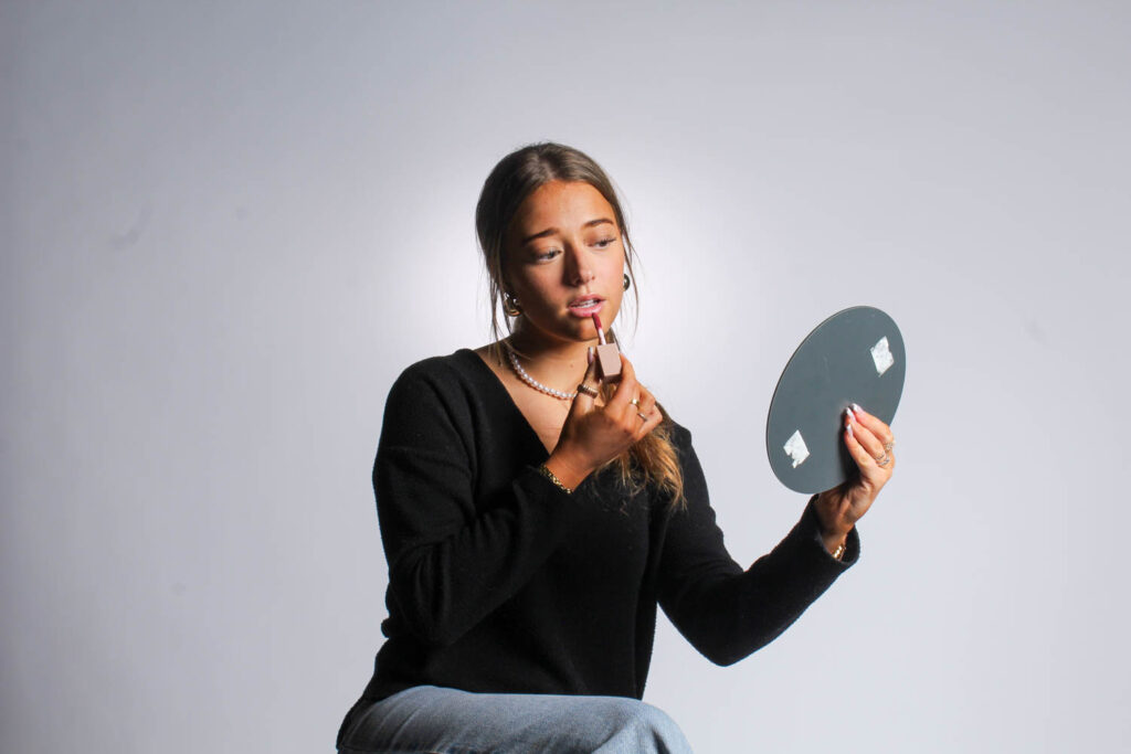
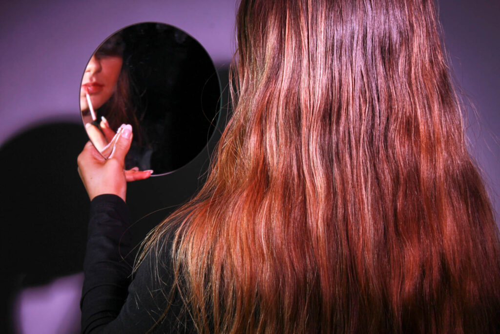
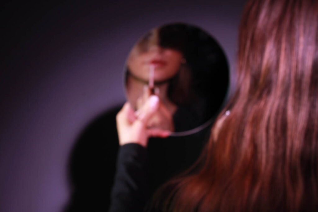
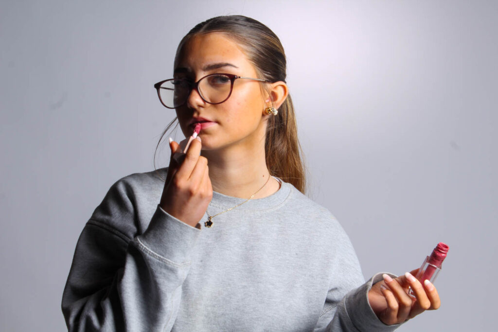
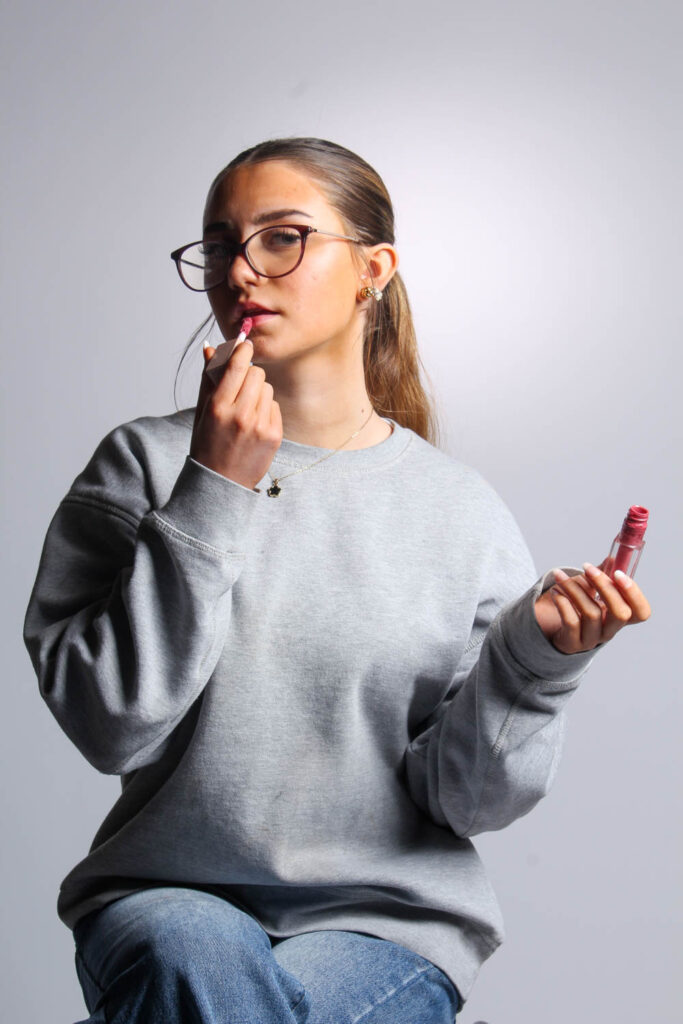
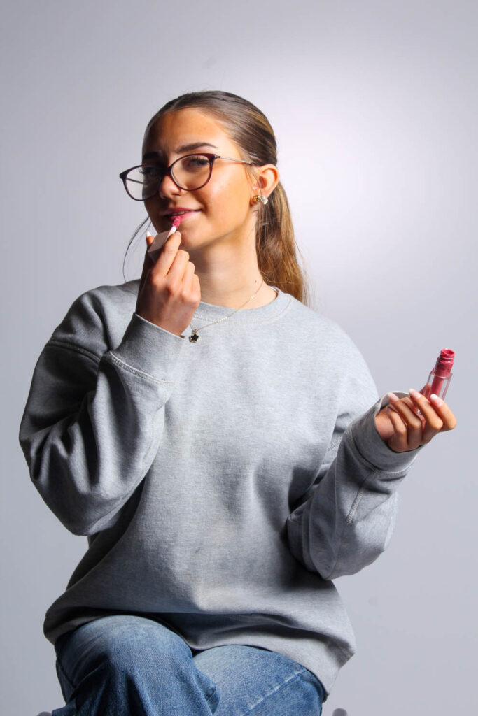
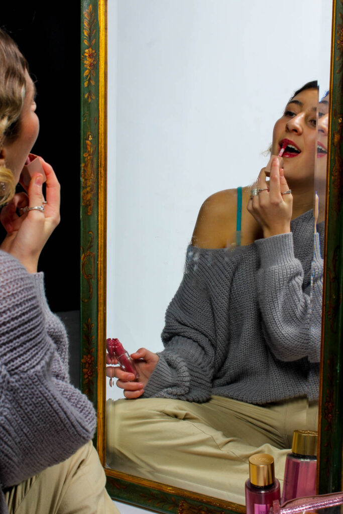
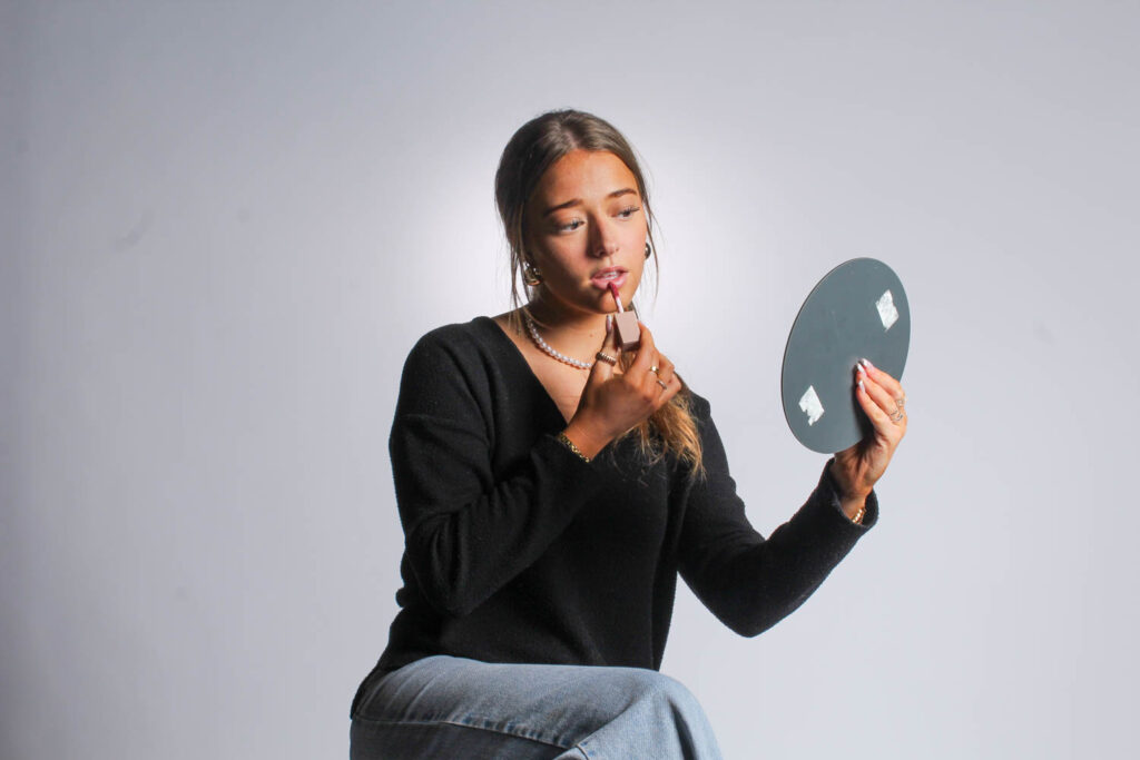
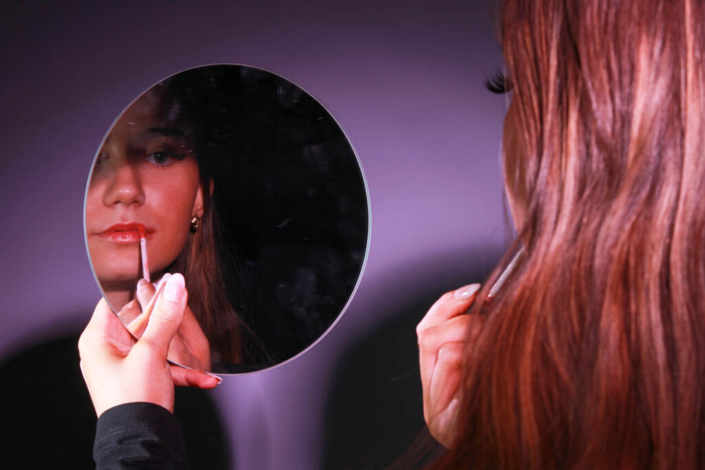
I used make up to represent femininity, because a stereotype of women is that they should be beautiful and wear make up. Make up is more related to females, rather than males.
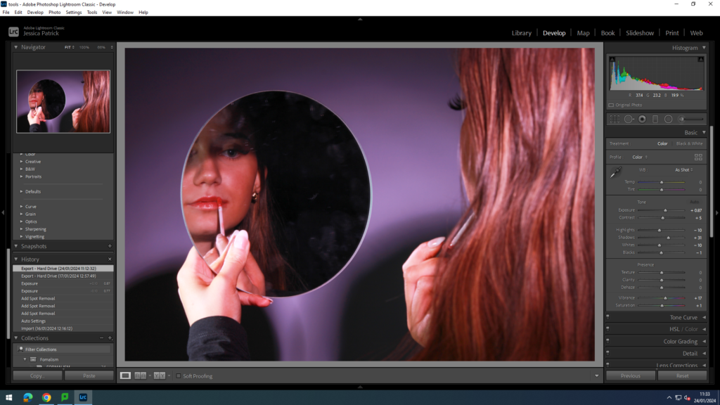
I edited this photo by increasing the exposure, contrast, shadows, vibrancy and saturation, while decreasing the highlights, whites and blacks. I did this to make the lighting more pink and so the background was not see in the mirror reflection.
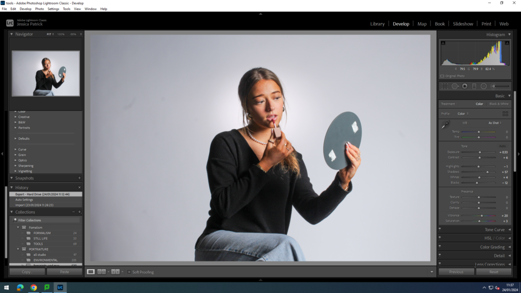
I edited the white lighting and background photos by increasing the exposure, contrast, shadows, whites, vibrancy and saturation, while decreasing the highlights and blacks. I did this, so the props would be more vibrant and so the model would stand out more.
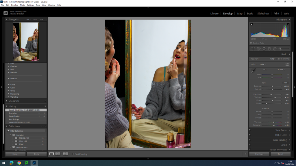
I edited this image by increasing the exposure, contrast, shadows, whites, vibrancy and saturation, while decreasing the highlights and blacks. Then, I made a virtual copy of my edited photo and created a black and white version and then edited it slightly more.
Perfume
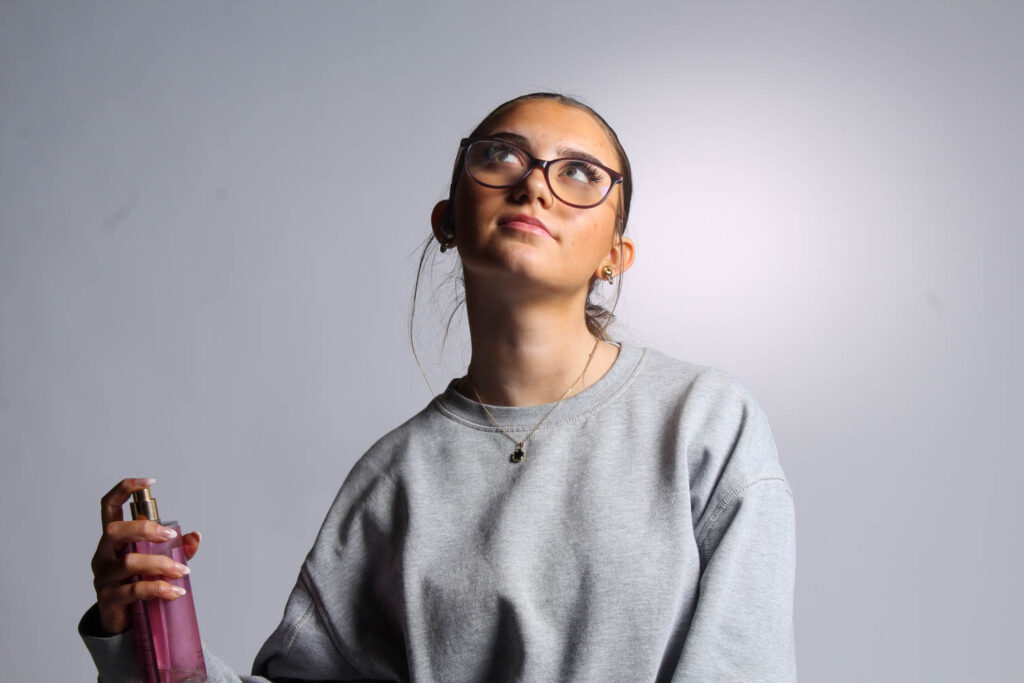
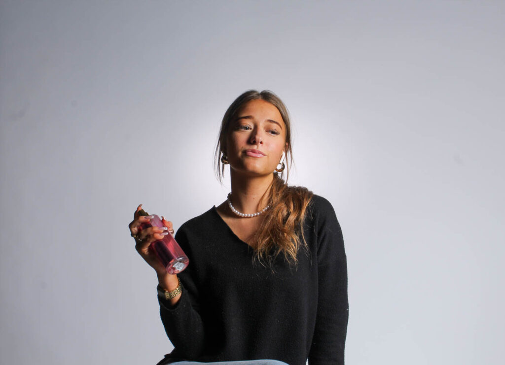
I used perfume as a prop, because there are different sprays for men and women, and perfume represents females more than males, whereas aftershave represents males.
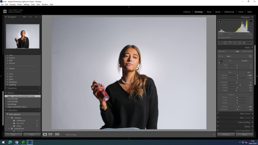
I edited these images by increasing the exposure, contrast, shadows, whites, vibrancy and saturation, while decreasing the highlights and blacks. I did this to make the prop more vibrant and to make the model stand out more.
Phone

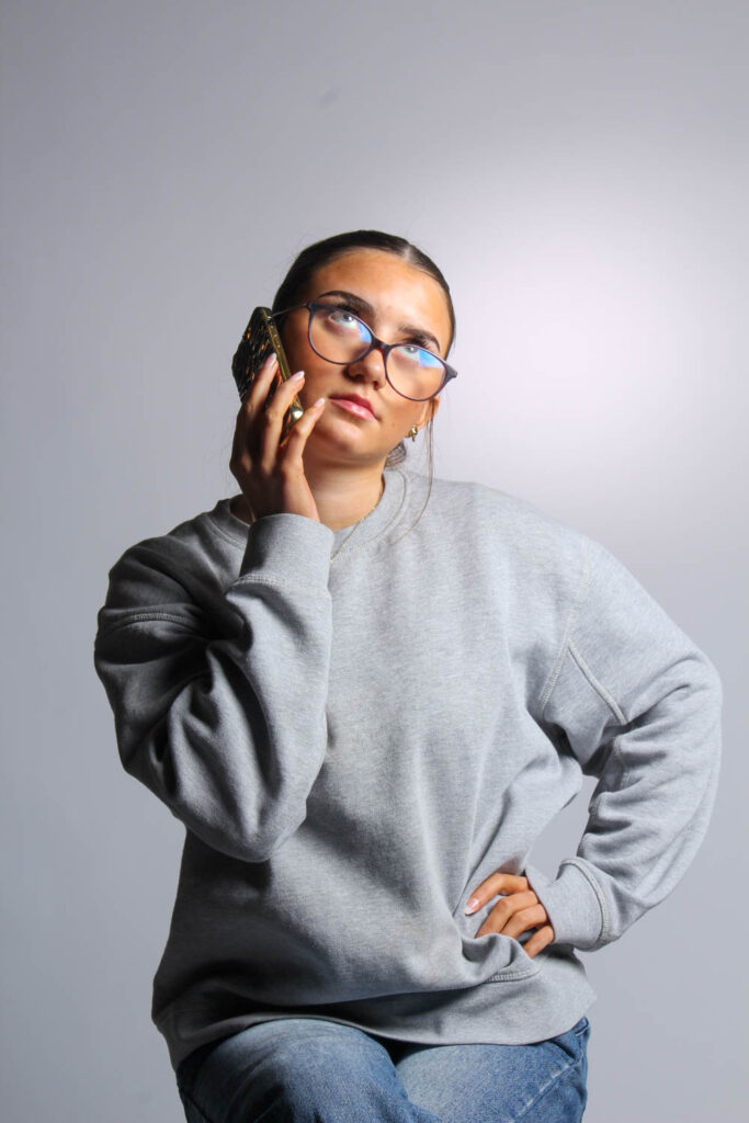

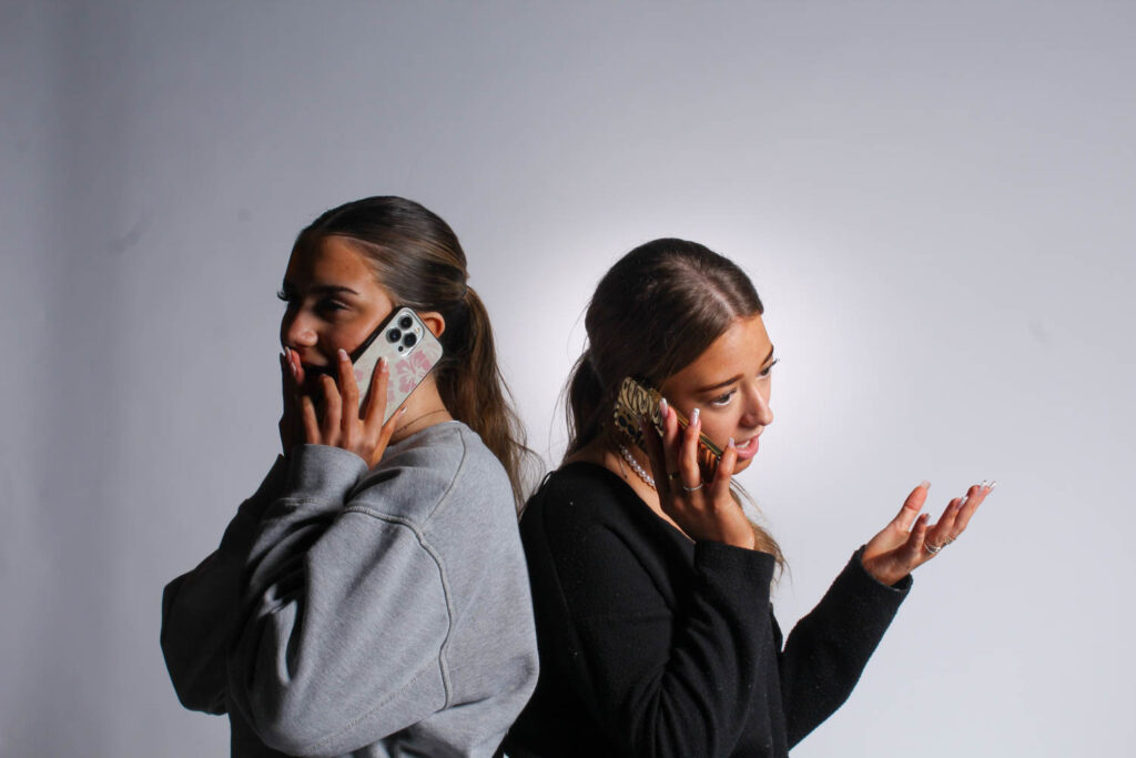
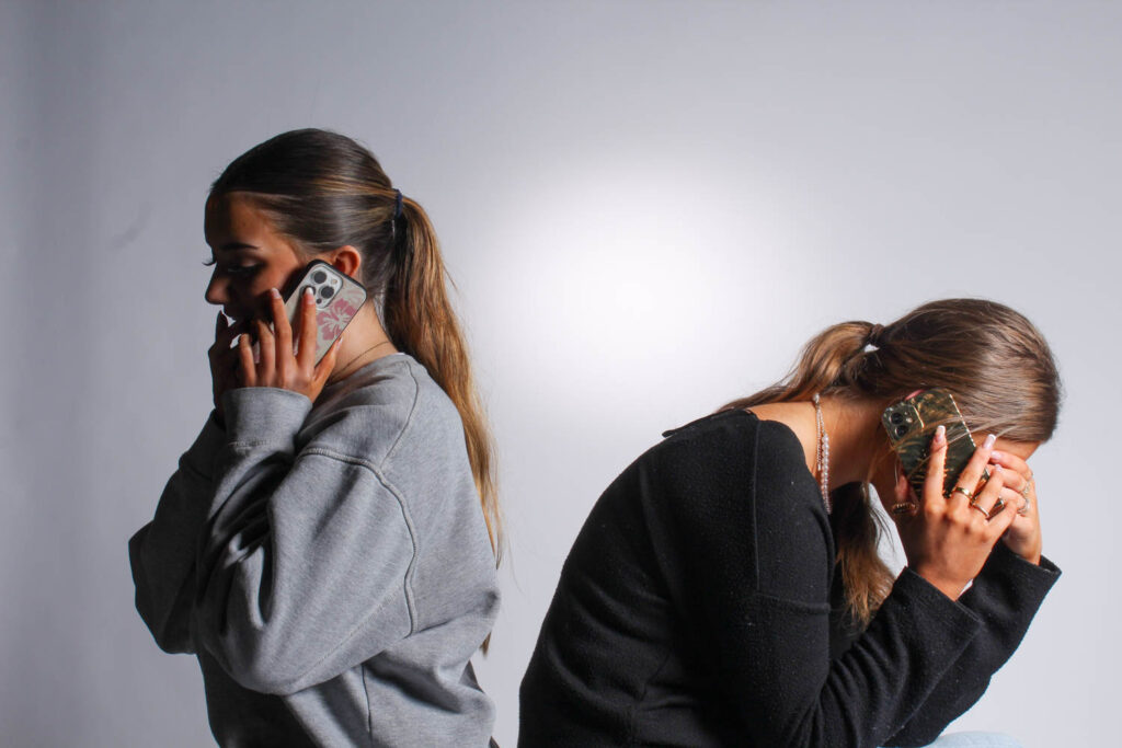


I used a phone, because another stereotype of females is that they gossip a lot, so I asked my models to pull either shocked, sad or happy expressions, so it seems like they are gossiping on the phone.
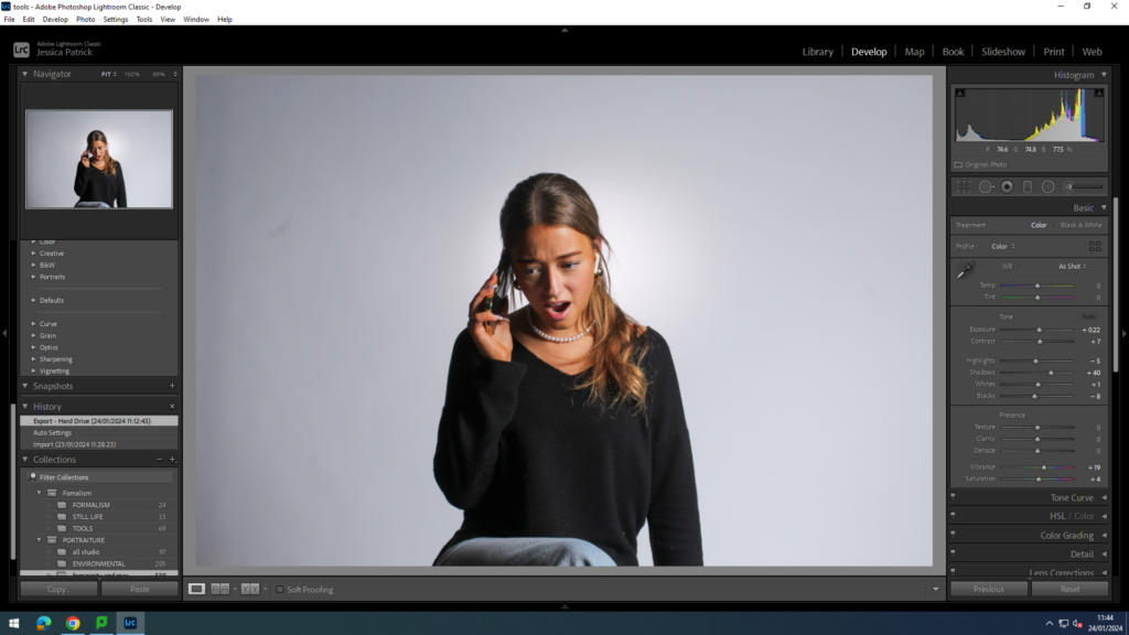
I edited these images by increasing the exposure, contrast, shadows, whites, vibrancy and saturation, while decreasing the highlights and blacks. I did this, so the model and her facial expression would stand out more.
Broom
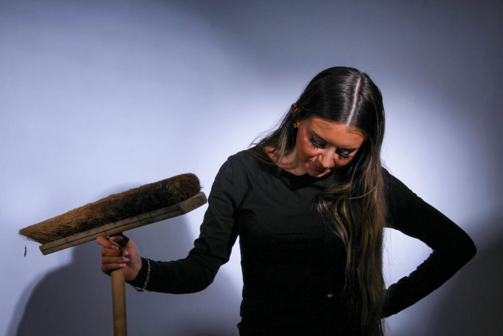
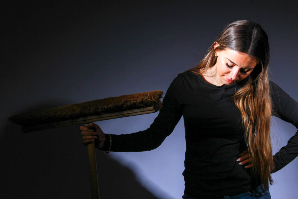
I used a broom as a prop in these photos, because a stereotype of women is that they should be housewives and stay at home so they can cook and clean. I was influenced by Cindy Sherman for this photo, because she created a photo of her as a housewife, but she was in the kitchen cooking.
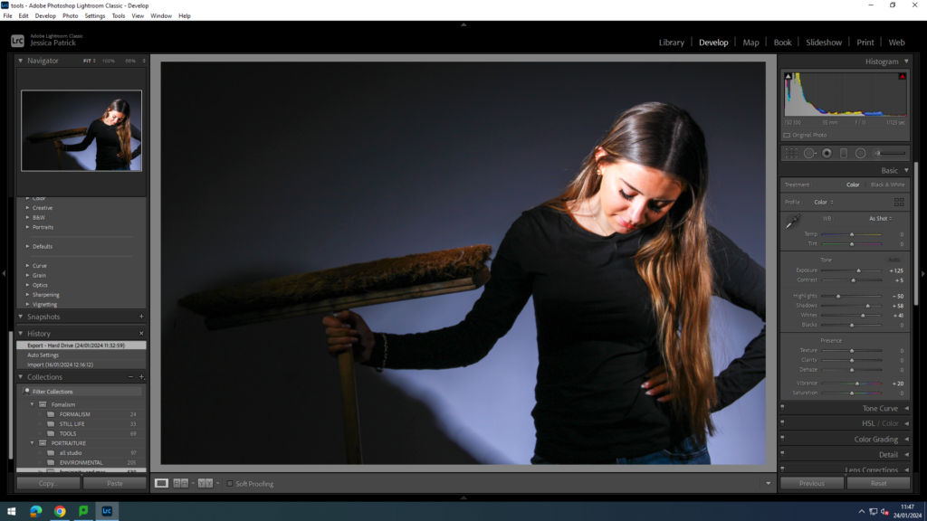
I edited this image by increasing the exposure, contrast, shadows, whites and vibrancy, while decreasing the highlights. I did this, because the image was too dark, so I had to make the model and prop stand out more.
Mirrors
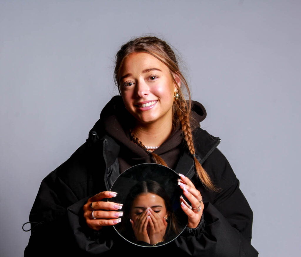
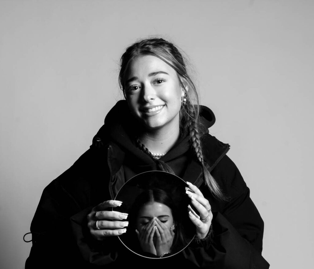
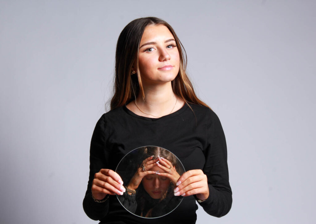
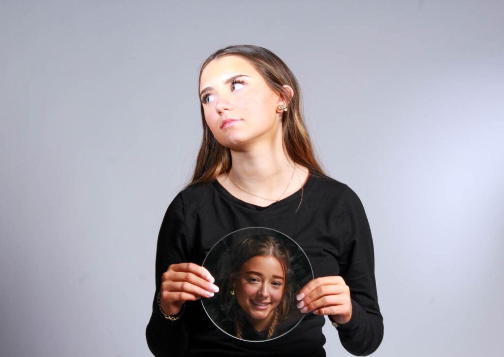
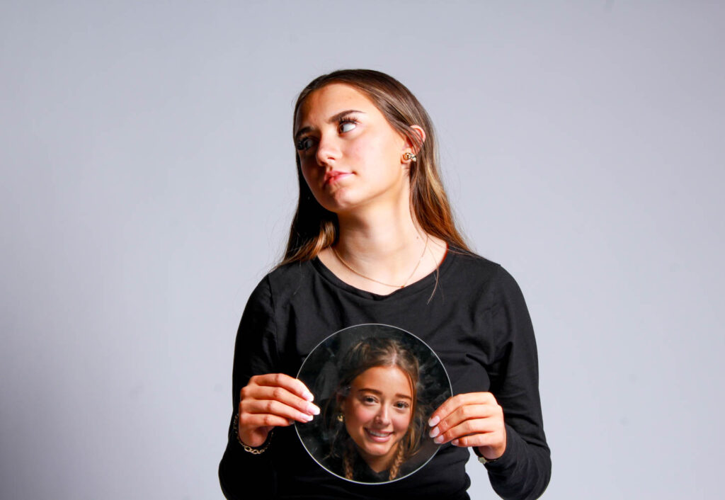
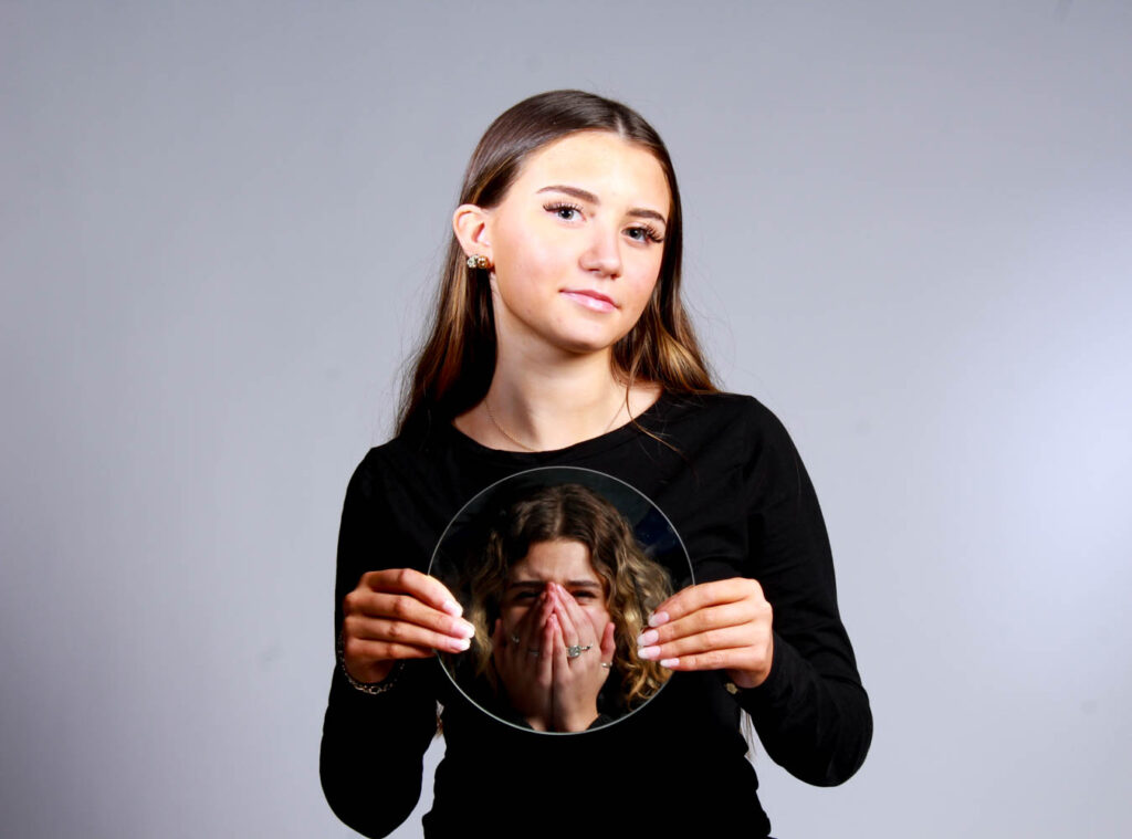
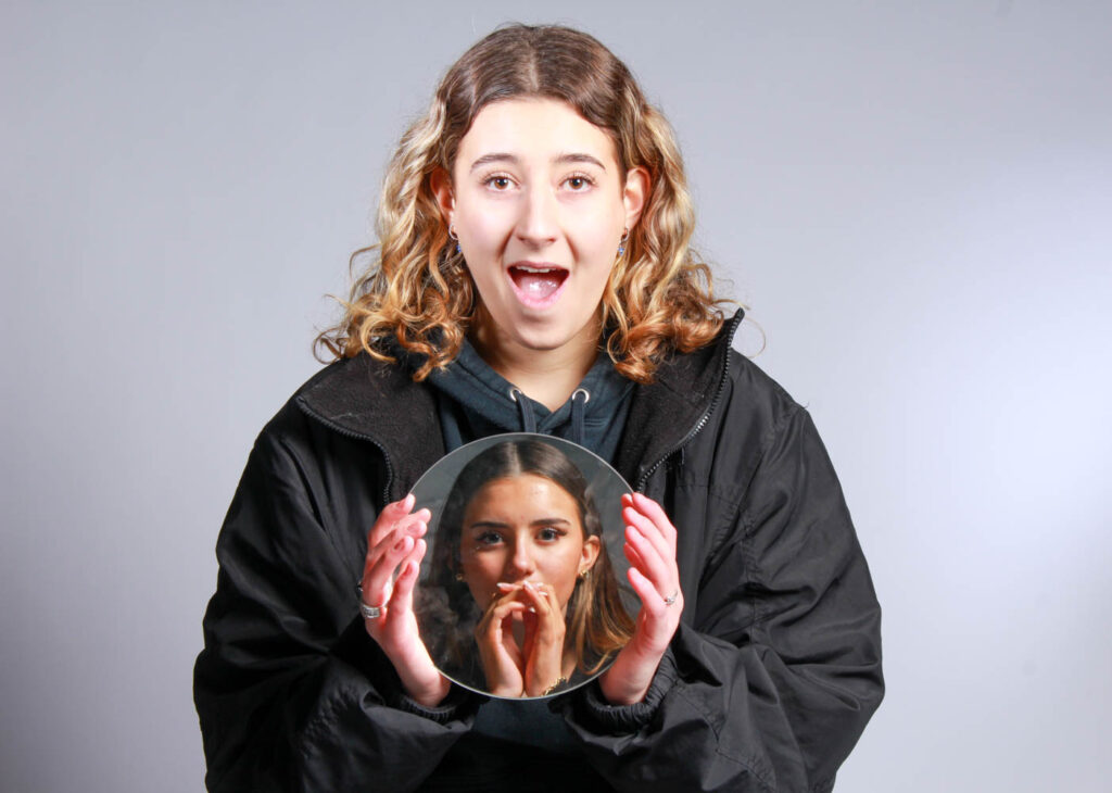
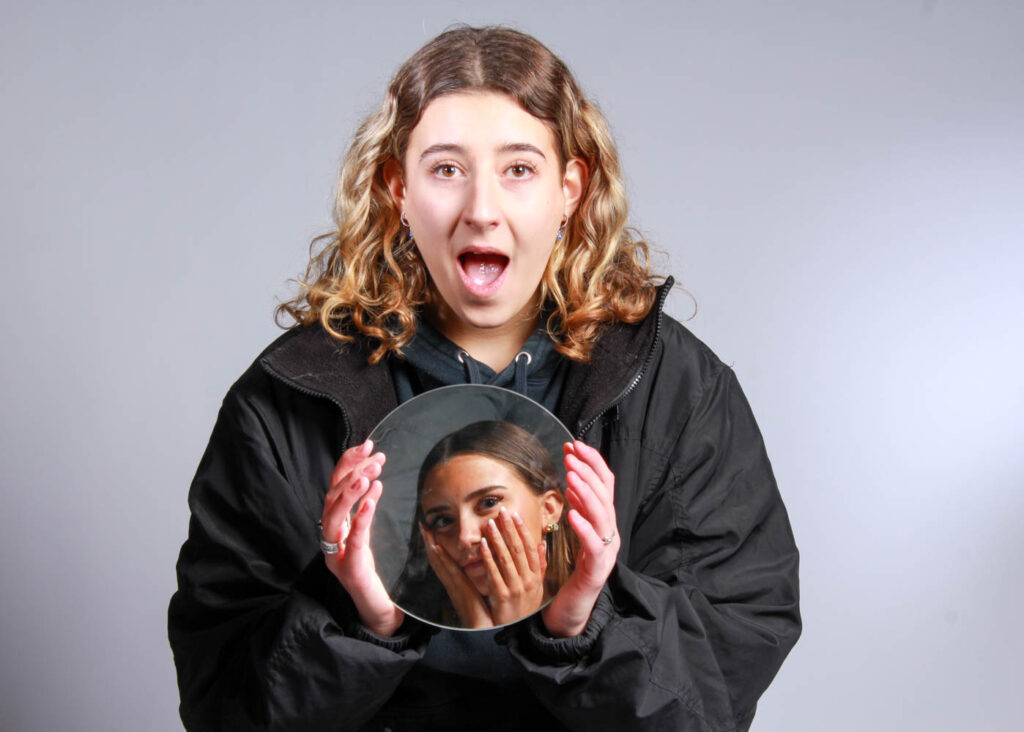
I used mirrors as a prop, because stereotypically make is related to females and females should wear it, so they look beautiful. Therefore, females are always looking in the mirror doing their make up. Females are also seen as insecure so they are often looking in the mirror because of that.
I also had my models pull different faces in the mirrors, so they also correlated to other stereotypes, such as women are too emotional.
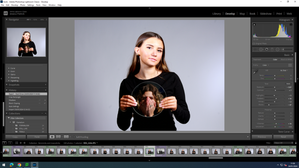
I edited this image by increasing the contrast, shadows, vibrancy and saturation, while decreasing the highlights, whites and blacks. Then, I made a virtual copy, so I could create a black and white version. I made a black and white version, because in the mirror I am upset. Black and white can correlate with feelings of sadness.
Photoshoot Conclusion
In conclusion, I think this photoshoot went really well, because I used lots of different props to represent both feminine and masculine stereotypes. I also think that even though my first few photos had too many shadows behind the models, I think I corrected this very well when I went down the studio again. However, next time I would like to get more photos to support the masculinity theme.
Femininity and Masculinity
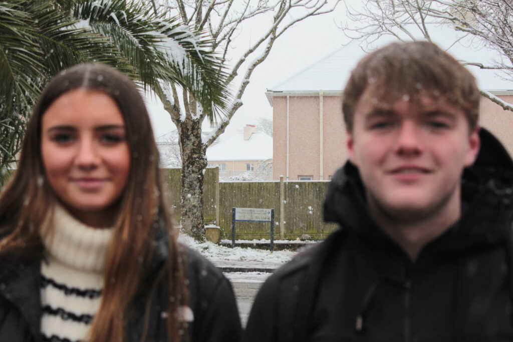
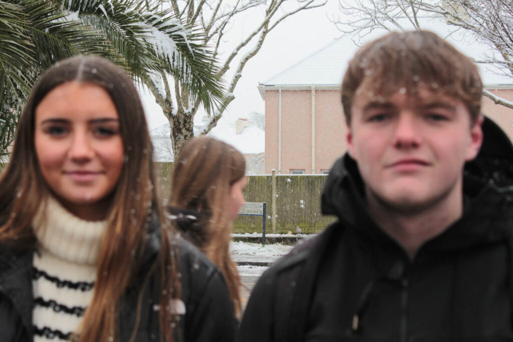
In this photoshoot I have decided to use the element of nature to experiment with the themes of femininity and masculinity. I chose a snowy setting, because I think the beauty of snow represents femininity, while I also used flowers and trees and other nature as props in my photoshoot. I also attempted to make the snow masculine, by using props such as snowballs, which are more aggressive, just like the masculine stereotype. The images which I have highlighted green are the images I have chosen to edit, because they have the best focus, lighting and composition.
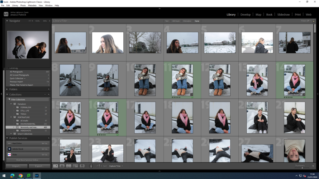
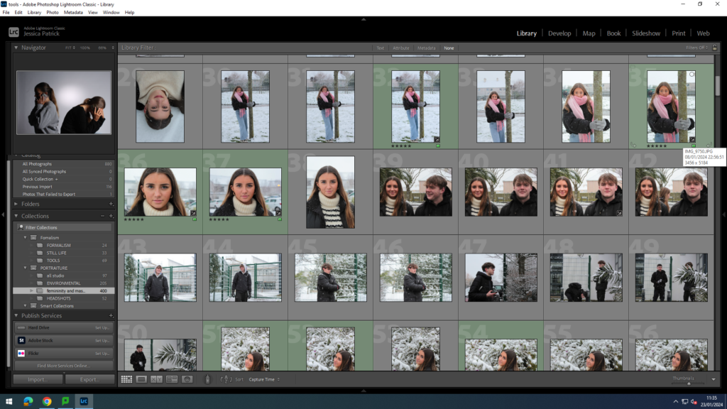
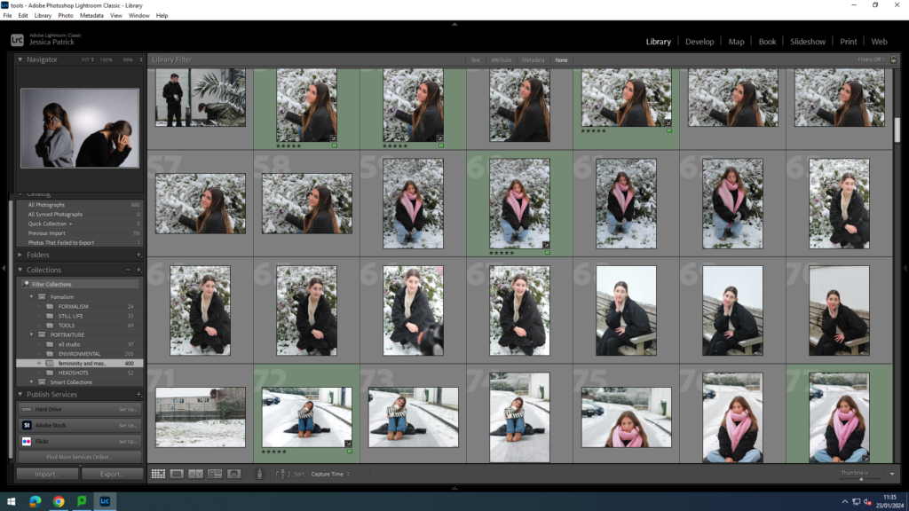
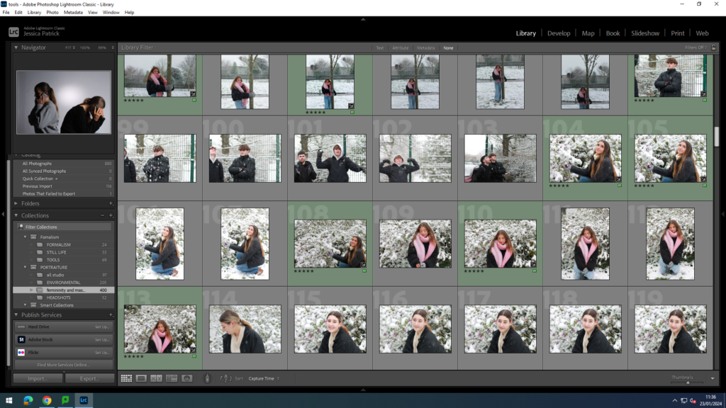
The images which I have highlighted green are the images I have chosen to use and edit, because they are my best photos, because they have the best props and composition. They also represent the themes femininity and masculinity the best.
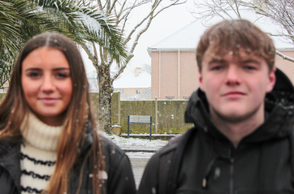
I first attempted to take a photograph capturing both masculinity and femininity, by positioning both a male and female next tot each other. However, the images were not in focus, as the camera was not on the correct settings to start. I did however try and edit the image, but could not get it into focus.
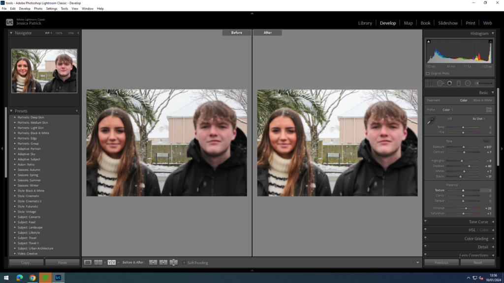
I edited this image, by increasing the exposure, contrast, shadows, vibrancy and saturation, while decreasing the highlights, whites and blacks. I did this, so there would be more colour in both the models faces, and so the image would be brighter.
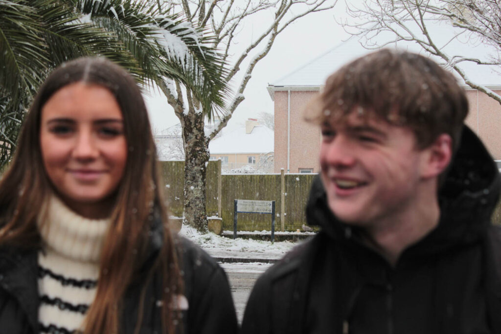

Masculinity Theme
I attempted to use snowballs, so it would correlate with the masculine theme, as snowball fights can be quite aggressive and the stereotype of males is that males are aggressive. However, the photos did not come out how I had wanted, because it was hard to capture the action shot as the camera was not on the correct settings.
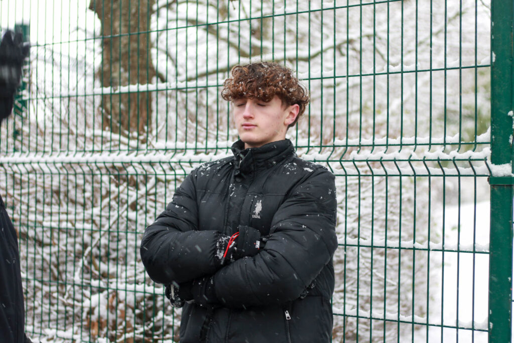


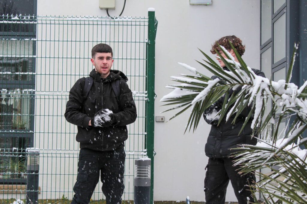


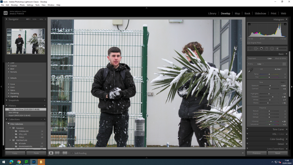
I edited all these images in the same way, by increasing the exposure, contrast, shadows, whites, vibrancy and saturation, while also decreasing the highlights and blacks. I did this, so the images would be brighter and more vibrant, so they attracted the viewers eye more.
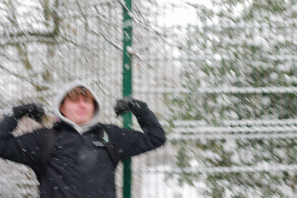
However, this image is extremely blurry, so I tried to edit it to make it less blurry, but couldn’t as the camera was not steady as the photograph was being taken.
However, the idea behind this photo was that the model was flexing or showing his muscles to make him look big and strong, because a stereotype of masculinity is that men are tough and strong. However, this photo was executed poorly.
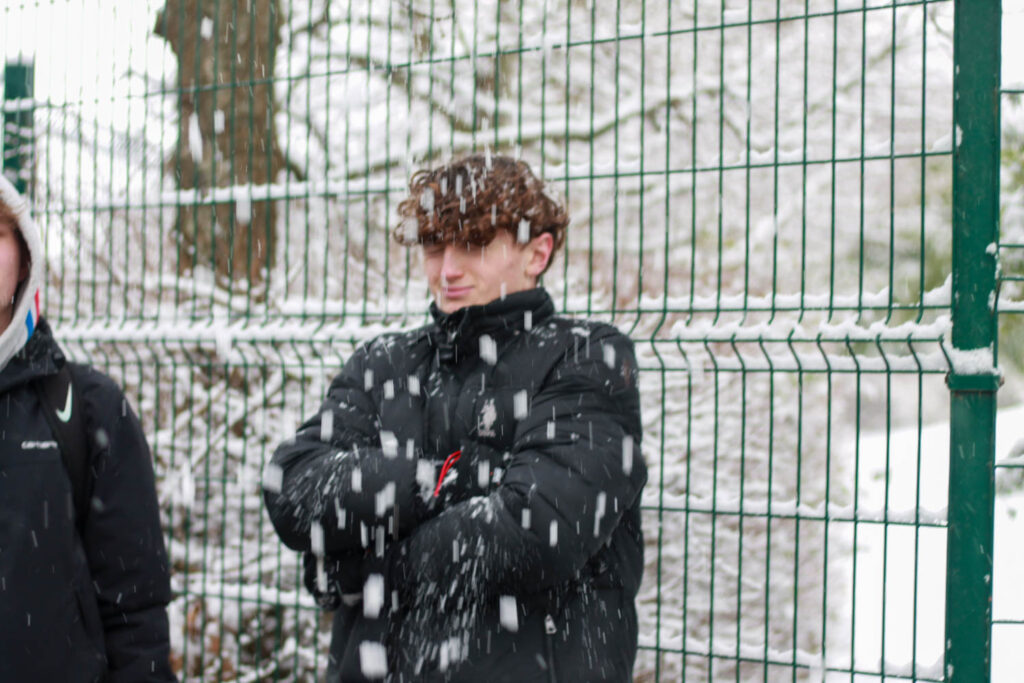


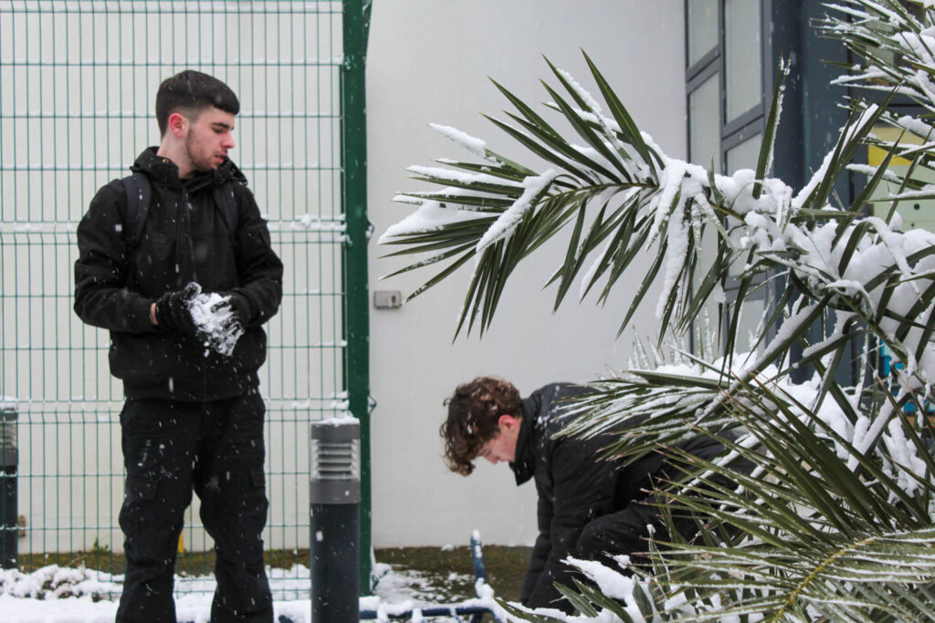
In these images the snowballs were used as props to show masculinity, because snowball fights can be aggressive, which correlates with the stereotype that males were aggressive. In the first image I tried to get an action shot of the snowballs being thrown at the model, but this did not come out how i expected it to, as it caused the model to pull a face. In the second image I got a shot of the model about to throw the snowball, to show that he was in the middle of a snowball fight. In the last two images the models were collecting snowballs, so they could get ready for their fight.
Femininity Theme
In this photo I decided to use nature, such as trees and flowers of props, because I think the beauty of nature represents femininity, because nature is beautiful and gentle, which femininity and women are often seen as. I also used a pink scarf as a prop/ outfit in the snow, because the colour pink also suggests femininity, due to the stereotype that women like/ wear pink.



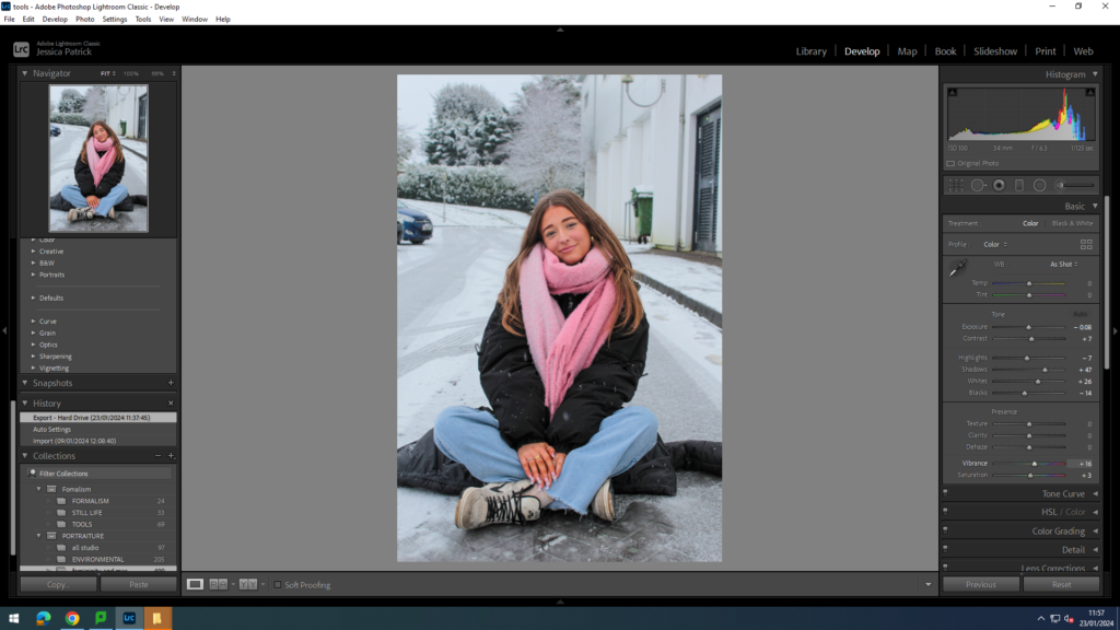
I edited these three images the same way, by increasing contrast, shadows, whites, vibrancy and saturation, while also decreasing the exposure, highlights and blacks. I did this, so the focus of the image would be the model and so the pink would be more vibrant and stand out more, so it would attract the viewers attention.
Before:
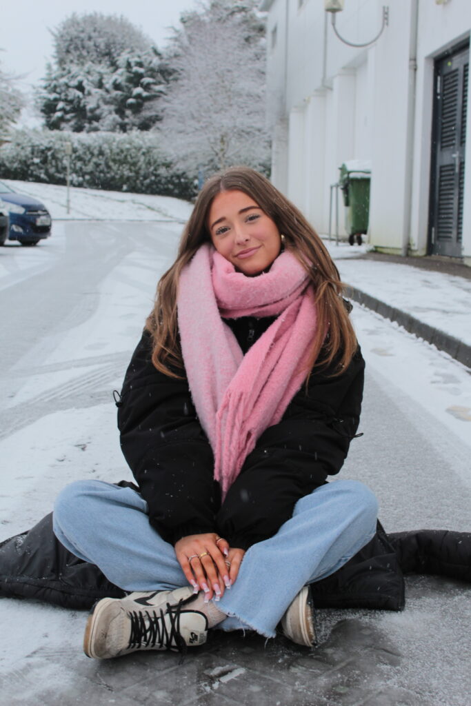
After:

You can see the difference in the two images and that the pink scarf stands out much more in the second image, so that the viewers eye is drawn to the pink more. This exaggerates the theme of femininity in the photograph.
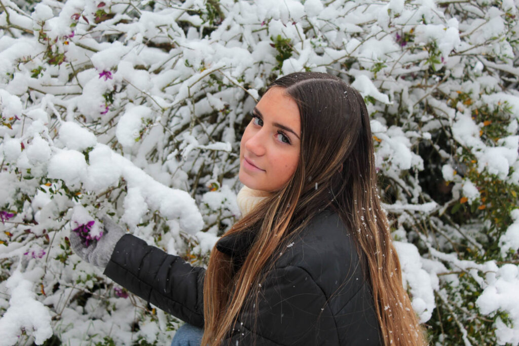



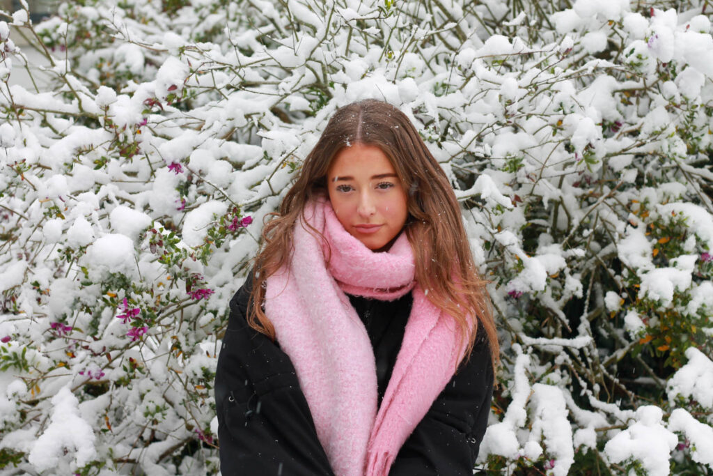

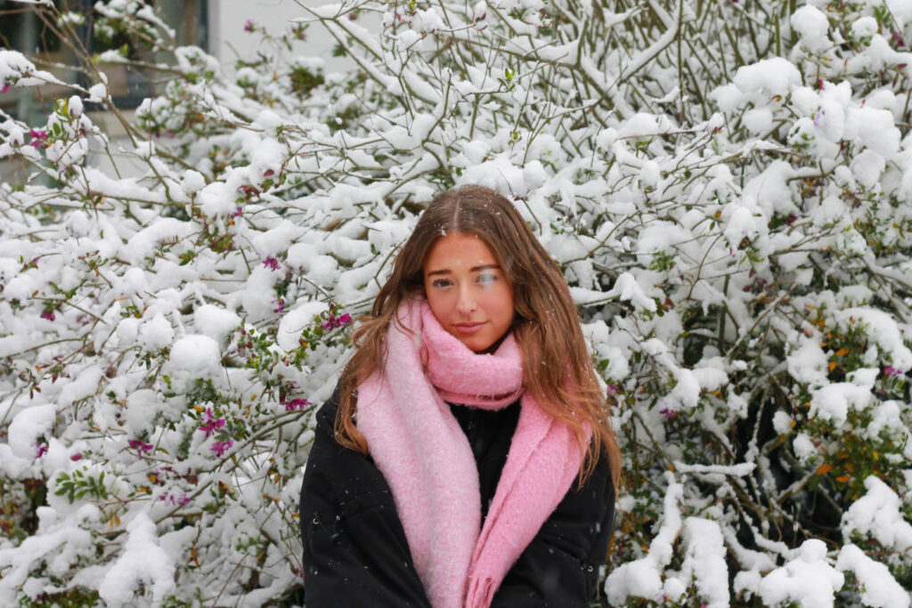

In these images I used the prop of flowers, because they relate to the theme of femininity, because flowers as stereotypically seen as a feminine thing, because it is always the male buying ang gifting the females flowers. Flowers are also very delicate and beautiful, which women are also often seen as. The flowers in this image are also a purple/ pink colour, which is also stereotypically related to women. The pink scarf was also used in some of these images.
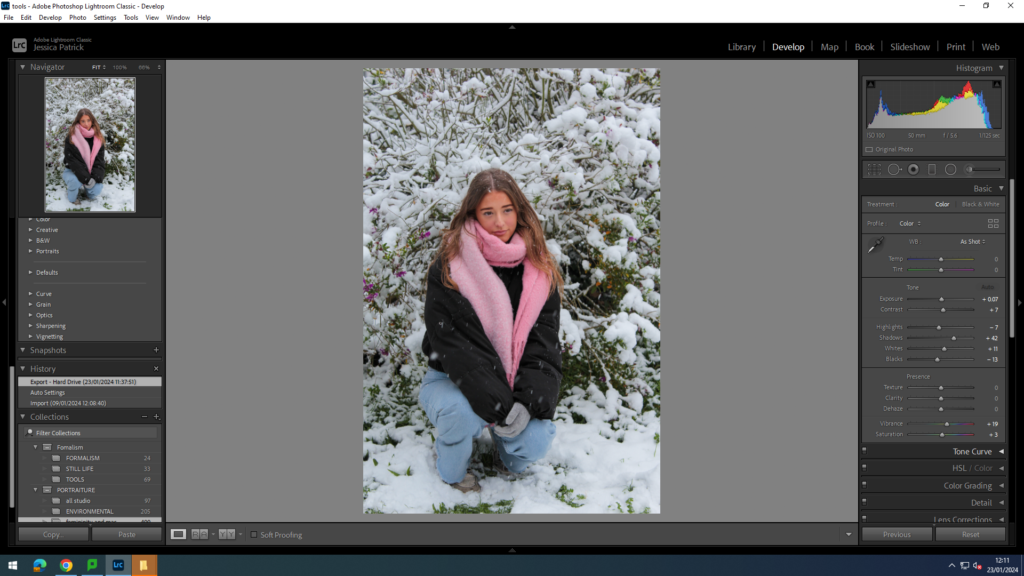
I edited these photos, by increasing the exposure, contrast, shadows, whites, vibrancy and saturation, while decreasing the highlights and blacks. I did this, so the flowers in the background would stand out more, and so the image would also be brighter.
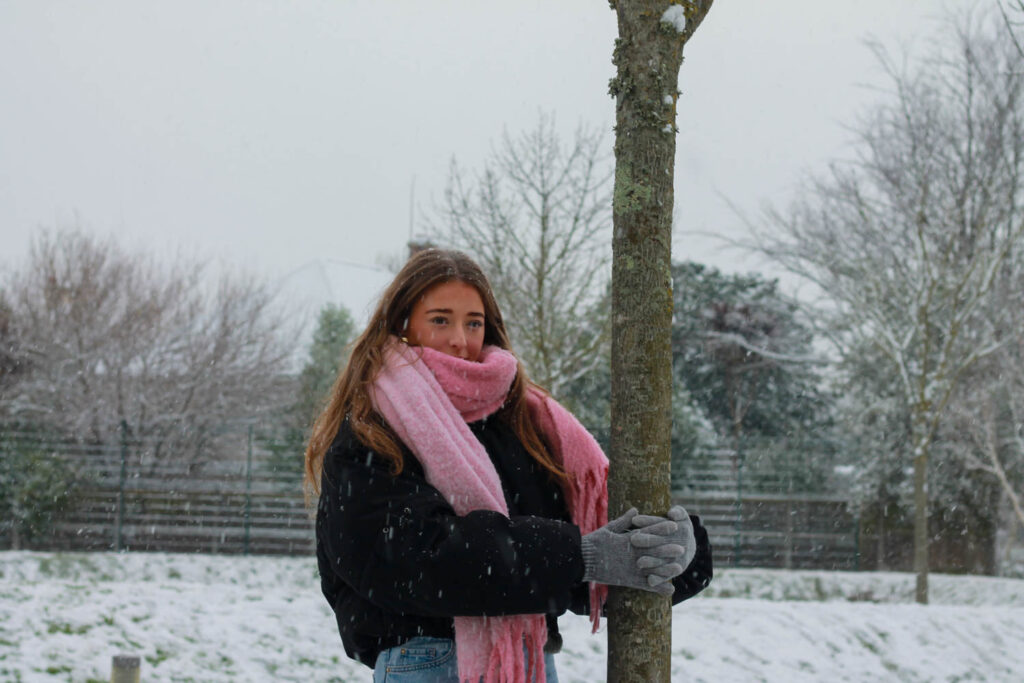

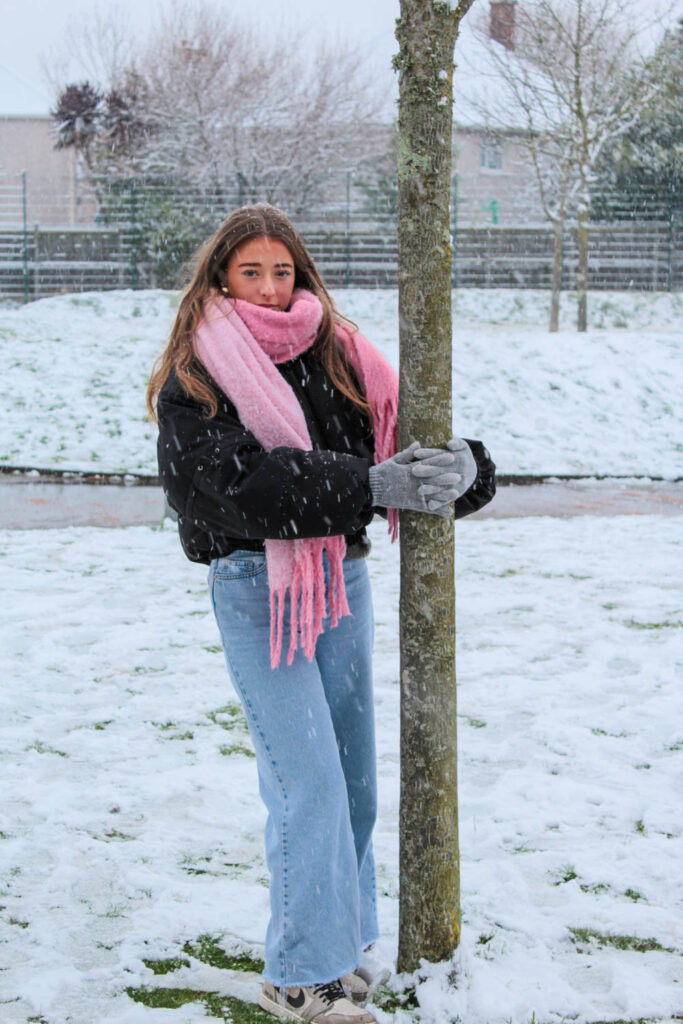
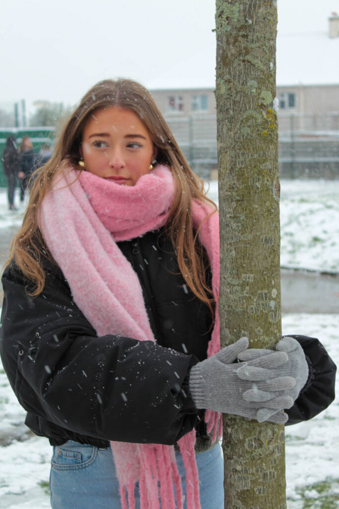
I also attempted to use another element of nature (a snowy tree) as a prop. The snowy tree also represents femininity, because of its beauty. However, trees are big, tough, strong and stand tall, which also relates to the theme of masculinity, because these are some of the stereotypes of males.
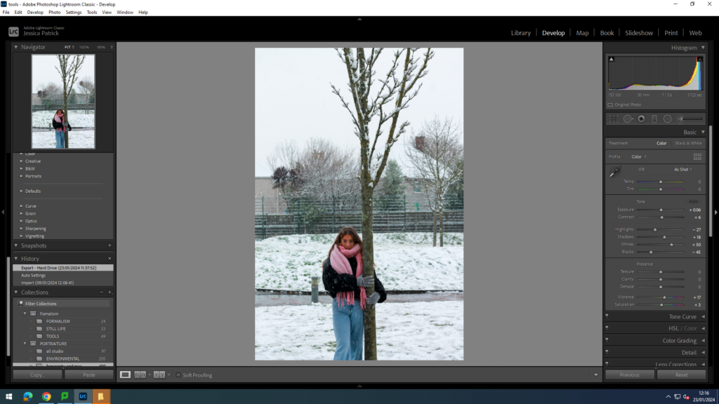
I edited these images by increasing the exposure, contrast, shadows, whites, vibrancy and saturation, while decreasing the blacks and highlights, so that the snow would come out more white and less grey, compared to the original photo. I also did this, so the image would be brighter and more vibrant.
Before:
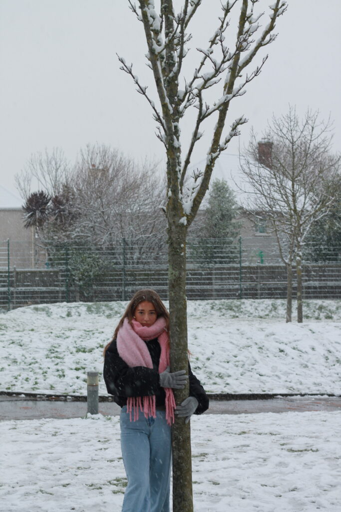
This image is dull and not vibrant enough, which is giving the snow a light grey colour.
After:
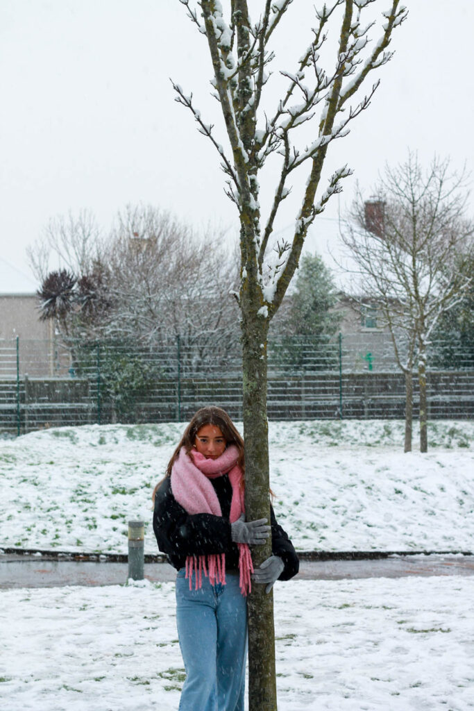
The photo is now more vibrant, therefore making the snow look whiter.
Then, I experimented with different feminine like poses, by asking my model to use her hands, by positioning them on her face.


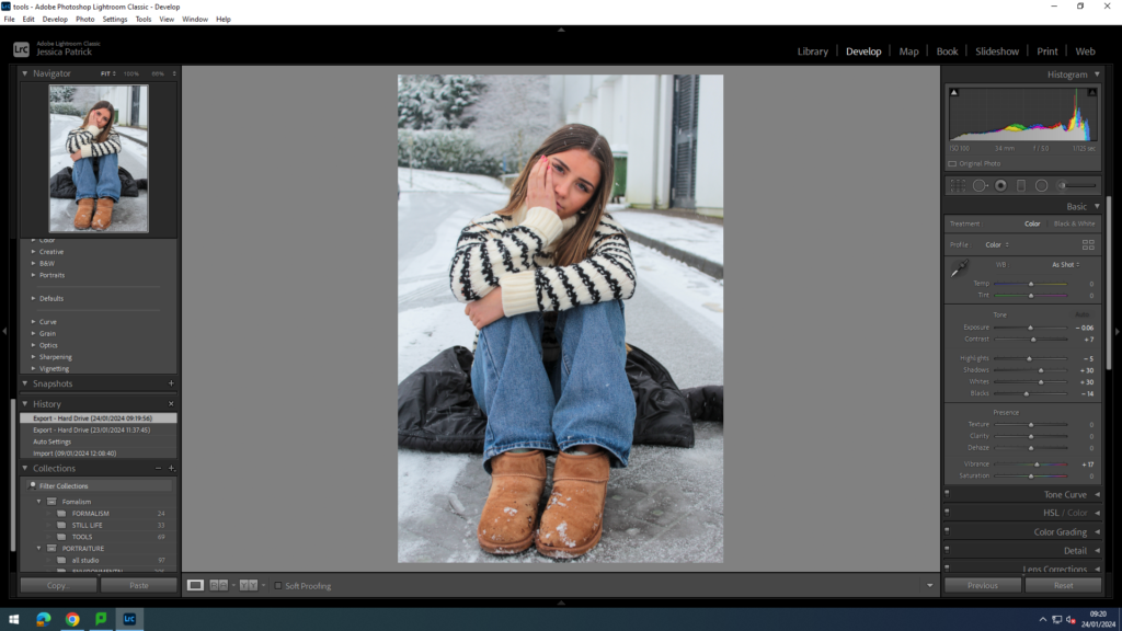
I edited these two photos by increasing the contrast, shadows, whites and vibrancy, while decreasing the exposure, highlights and blacks. I edited the photo this way, so that it would be more vibrant and so the model would stand out more.
Next, I experimented with headshots in the snow.
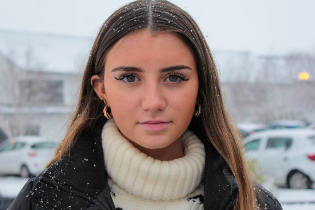
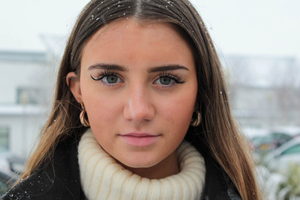
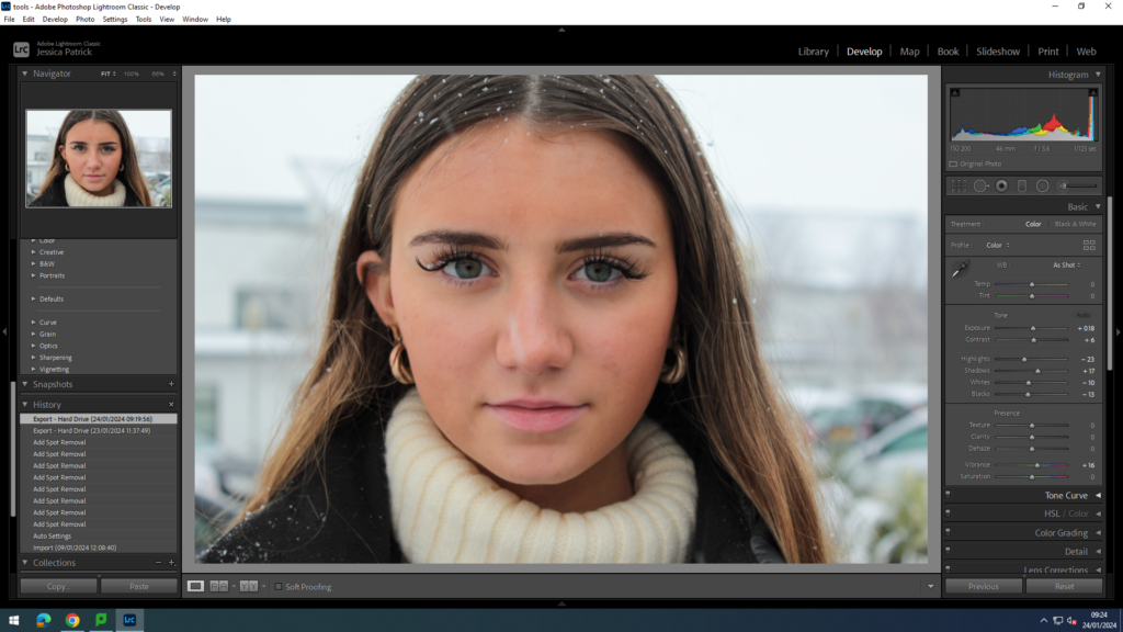
I edited these two images by increasing the contrast and vibrancy, while decreasing the exposure, highlights, shadows, whites and blacks. I also used a correction tool, so I could get rid of any blemishes on the models skin.
Conclusion of shoot
I think this shoot went well, because I captured both the themes of masculinity and femininity by using both female and male models. I also liked how I used different props such as flowers and snowballs to capture different stereotypes of femininity and masculinity. However, next time I would like to get more photos that represent masculinity and make sure all my images are in focus.
I manipulated my images with one another in Photoshop after editing in Lightroom.
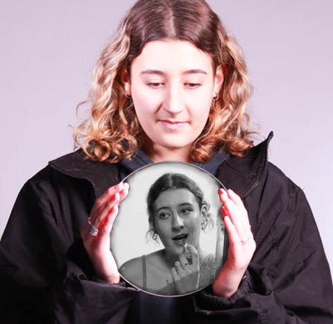
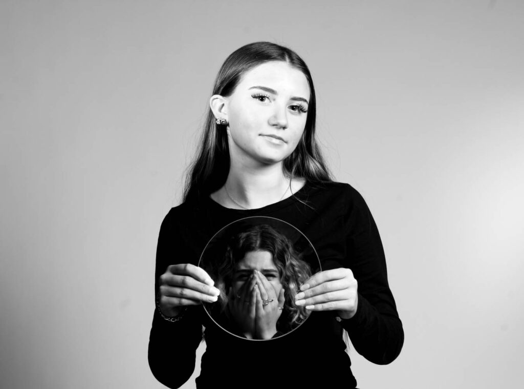
My concept behind this experiment is a shared societal insecurity of how we all never feel that we are beautiful enough and feel that we cannot be happy with ourselves until everything about us is improved. I wanted to represent how, especially girls, are so eager to grow up however once you have it makes you reminisce on being young and not cherishing it enough. My idea was a woman looking back into her young teenage years, which is why it is in black and white, recalling the memories of her as a young person in a society of beauty standards, trying to ‘improve’ every characteristic about herself. This is representative of how much pressure is put on women in society and how it causes young girls to be infatuated with their looks, when realistically they should be living the best years of their lives.
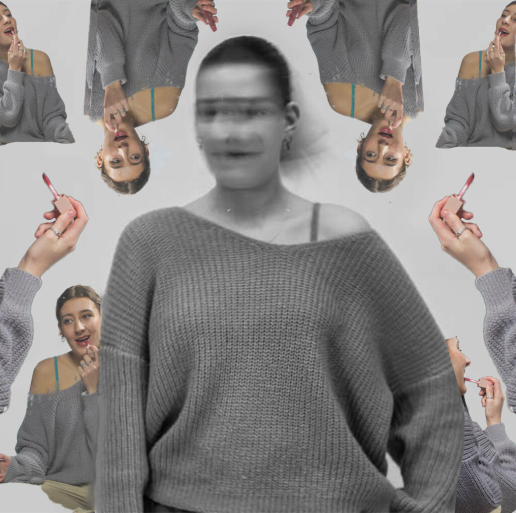
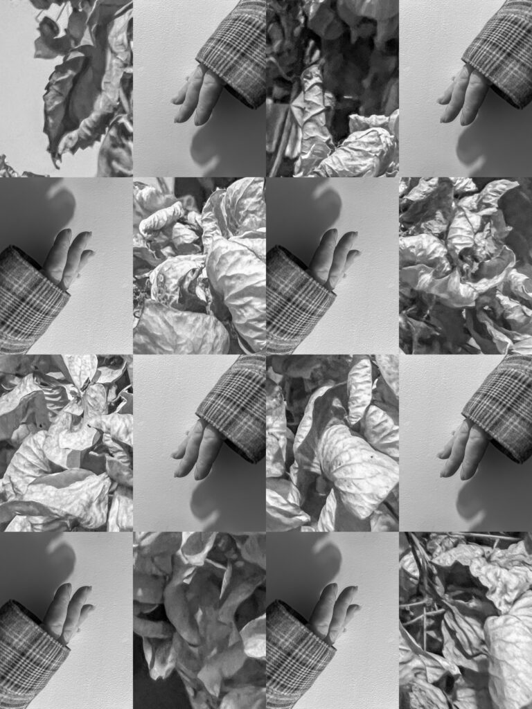
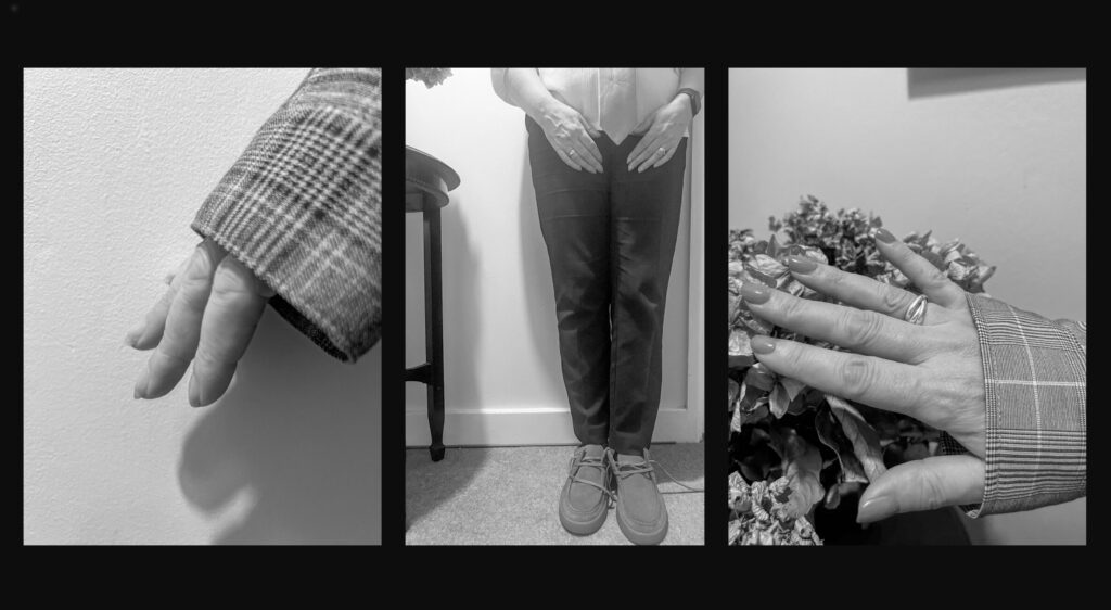
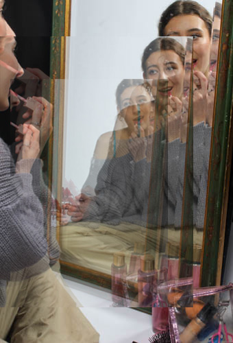
In this image I wanted to represent how through society’s strict perception of beauty, and how our reflections and opinions on our own looks become warped through the constant attempt to find something else to change.
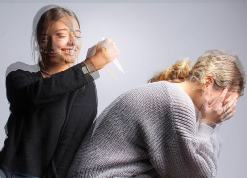
I made these two images look as if they are shaking to represent the stress, betrayal and drama within the culture of teenage girls.
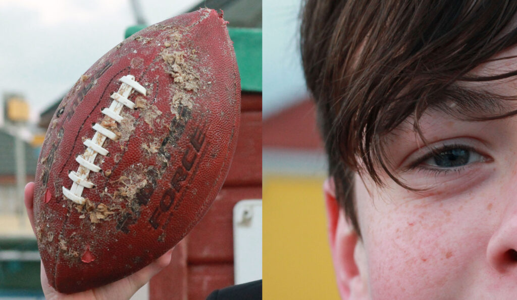
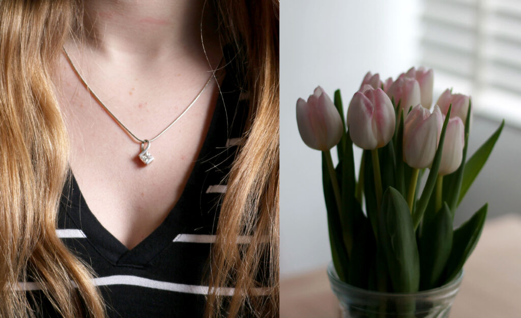
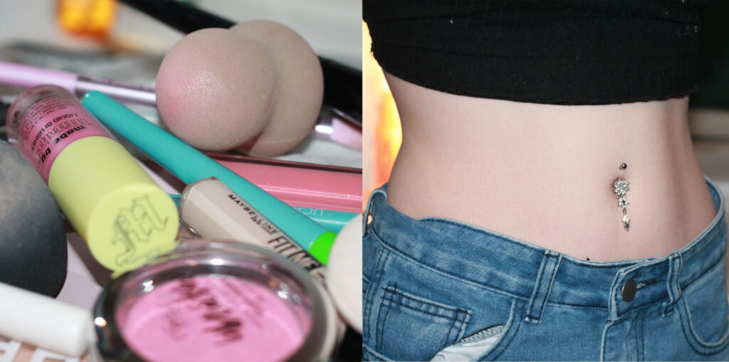
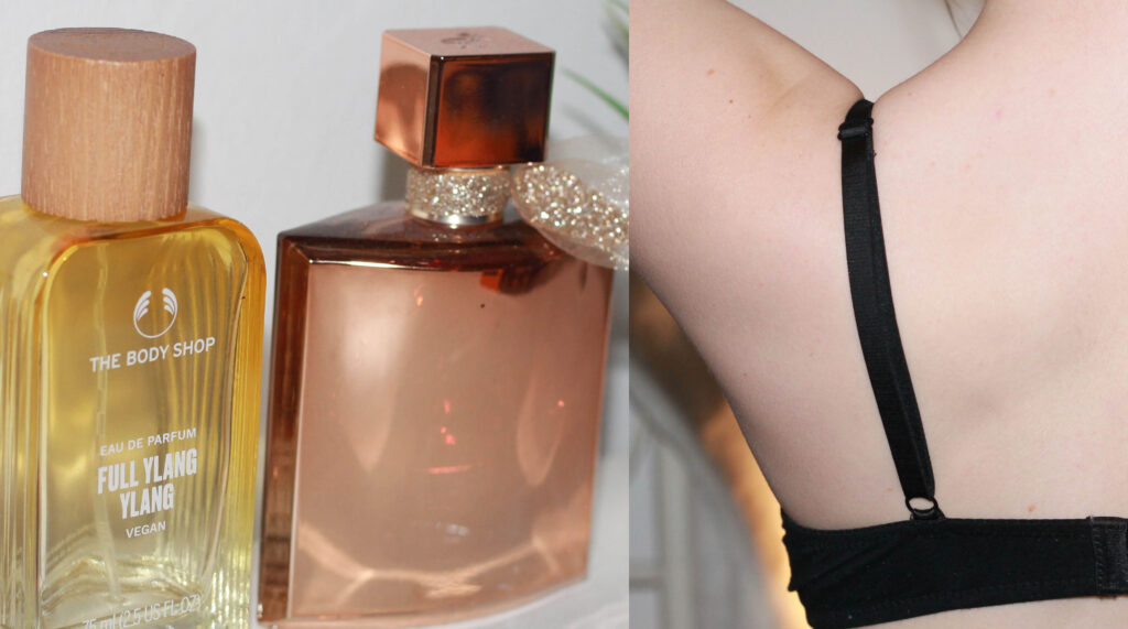
I think this first outcome has turned out really well as I was able to do exactly what I had in mind when planning. I like how the different objects paired with an aspect of a person, shows a slight view of their personality. I think it is really good as the photos I have put with one another, compliment each other really well and the concept works how I hoped it would. My end outcome, successfully resembles the work of the artist Nikita Pirogov who originally inspired me.
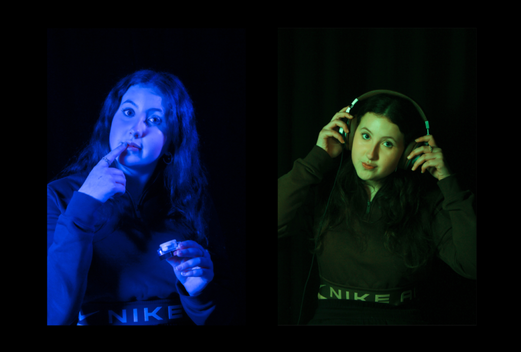
For this edit I took two of my pictures and resized them to fit the black background so that there was a gap in between the images and the outside of the photos. The space in between the images is small so that the connection between the images is still there. After I clicked on layer style and made a white border around the photos to make them stand out more on the black background. The first image is about putting on makeup and being a stereotypical women doing her makeup. The reason behind the second image is about how women hear things about themselves and are told they should act a certain way and look a certain way when actually they should be able to dress and be whoever they desire to be. The reason why I put these photos together was because they capture how women should be and how people see them.
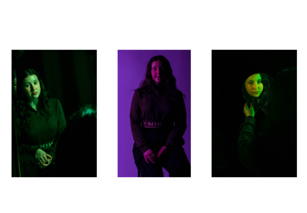
For this edit, I used three of my Femininity photos and made a tryptic, having the two images on the outside that are tinted green makes the image in the middle of them tinted in pink stand out more. My idea for this tryptic was to print them out in A5 and mount them on foam board and then stick the images on a larger piece of foam board to create the tryptic. These images are about what you see when you look in the mirror and that people are perfect in there own ways. I like the image in the middle because there was no specific pose for the photo and it is very true and in the moment.
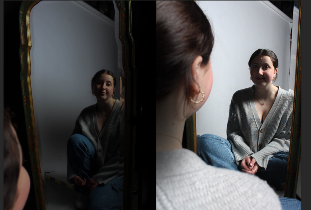
For this edit I put these two images together because it shows how when women and girls look in the mirror it shows that society makes them seem not perfect and that they desire to be someone else and look different. These images were about how you should feel comfortable as who you are and that nobody should have to change themselves because they feel they are not perfect.