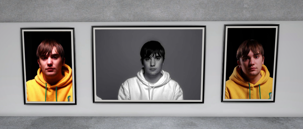
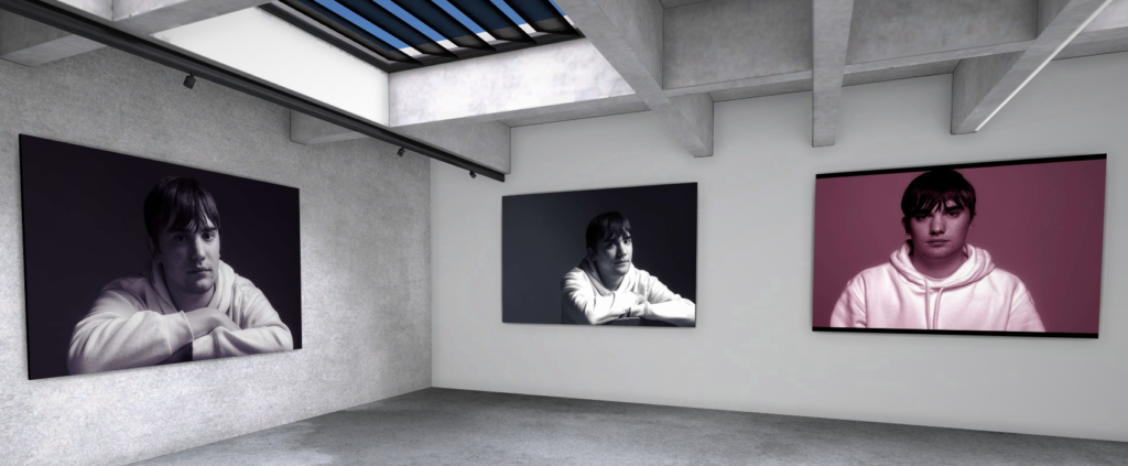
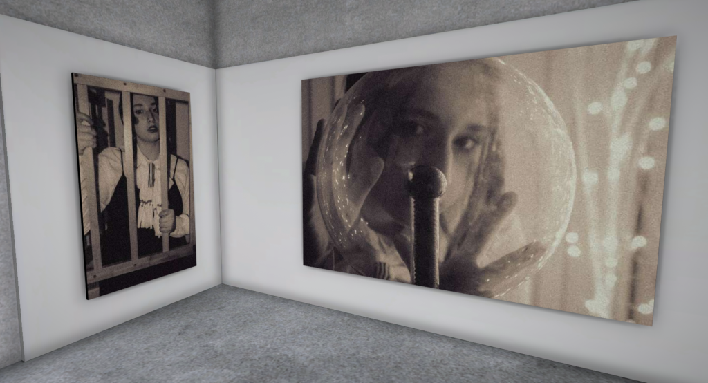
For all my photoshoots I have selected my best images that have been edited in Lightroom or photoshop and placed them inside a virtual (Artsteps) gallery.
Femininity and Masculinity
Evaluation and Critique
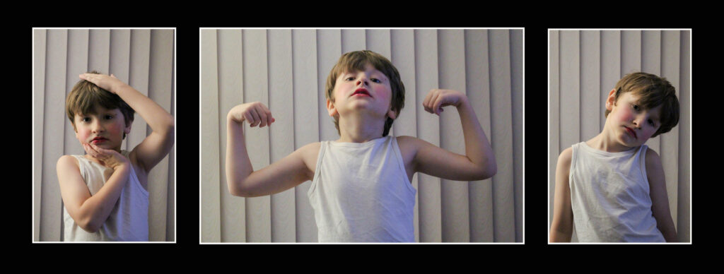
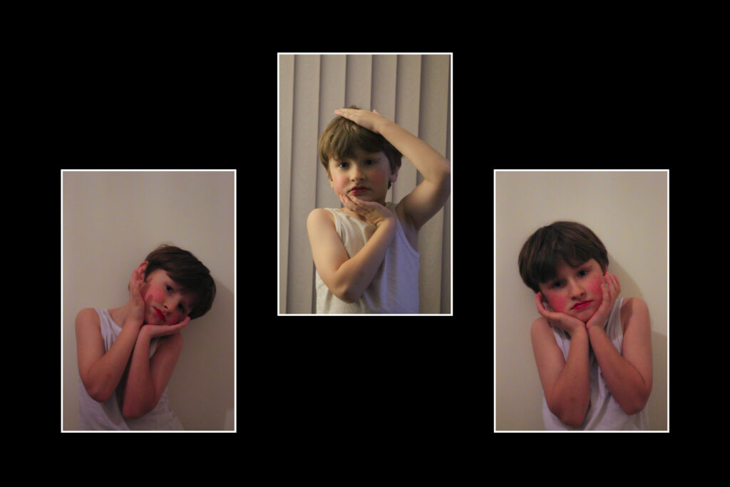
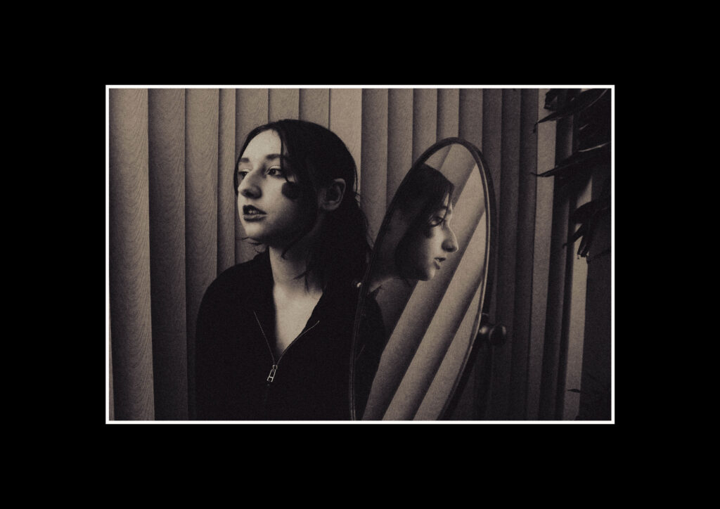
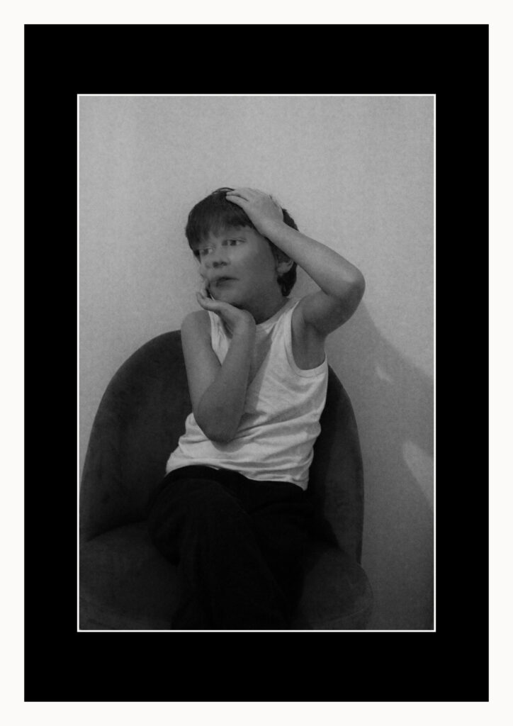
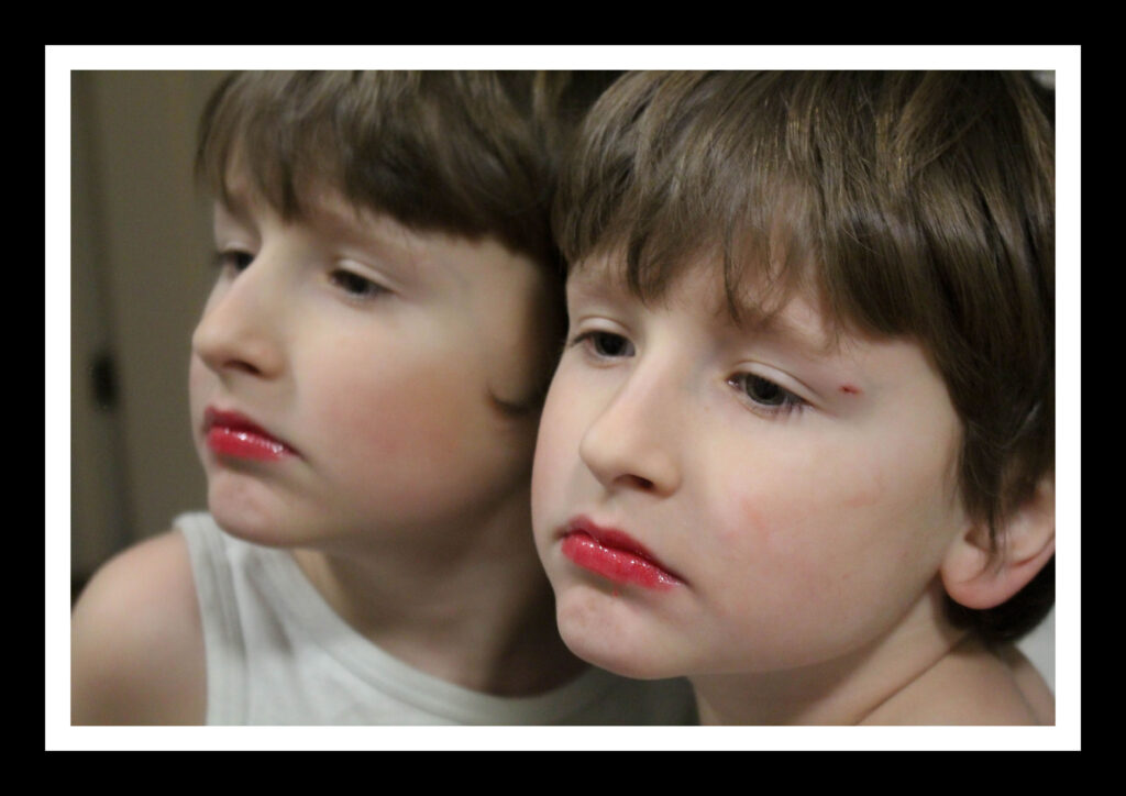
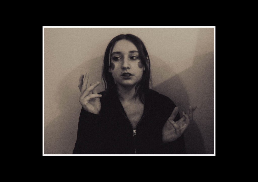
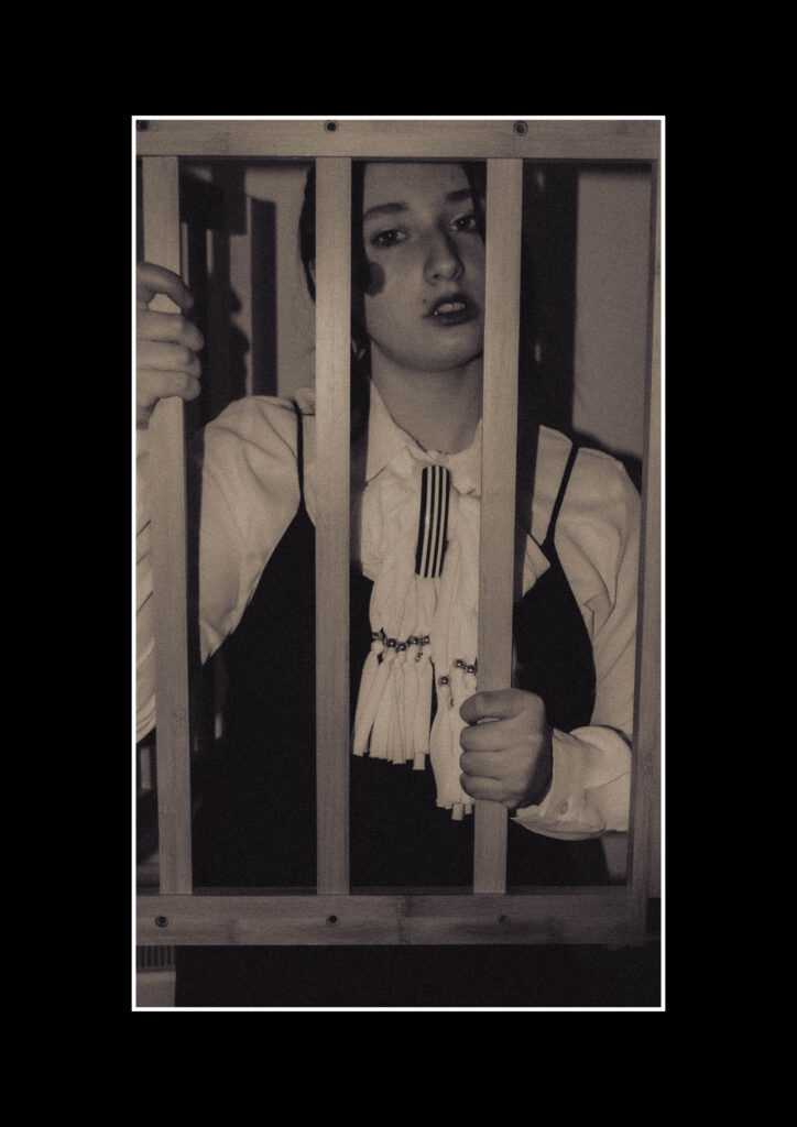
In this photoshoot I had experimented with the theme of masculinity, femininity as well as identity. I was very inspired by Claude Cahun and her style of work so I incorporated ideas from her own photoshoots into my work, for example, using a mirror to create a double portrait as well as bold makeup and outfits. I also wanted to keep some colour in a few of my photos because I like how Tsoku Maela incorporated it into his own work and how he used it to complement his subject’s skin tones as well as the other bright colours he has used .
I had used black and white filters in the majority of my second photoshoot to show more contrast with the colours in the image, especially the red makeup and hair.
The meaning I wanted to capture in my first photoshoot was that in modern society it is more accepted for young people to be more feminine, masculine or other, and identify as what they feel like without as much discrimination as past generations. However, I wanted to include sad expressions to show that despite society being more accepting, there is still hatred against trans people and identity. I also wanted to covey the idea of people still having an unclear identity so I have edited various images to have a blur-like affect mainly on the subject’s face.
In my second photoshoot I wanted to focus more on femininity. I included various elements of Claude Cahun’s style into it to show my interest and inspiration for my photoshoot.
I had used more sad expressions and objects, such as a gate, to convey the struggles of women and the role of femininity. The poses, which were inspired by both Claude Cahun and Tsoku Maela, I had used in my photos were also used to show this idea, including the idea of the male gaze.
I’ve experimented with using a piece of paper with a question mark drawn on it to suggest that femininity is still being questioned, however I felt like it made the meaning too obvious so I did not use it in the majority of my images.
I like how the majority of my images have turned out especially the black and white contrast affect on my second photoshoot and the blur affects I had experimented with on photoshop.
Next time I should aim to take a third photoshoot exploring masculinity and more identity. I should also try to improve on my lighting skills and make sure my images have an equal white balance.
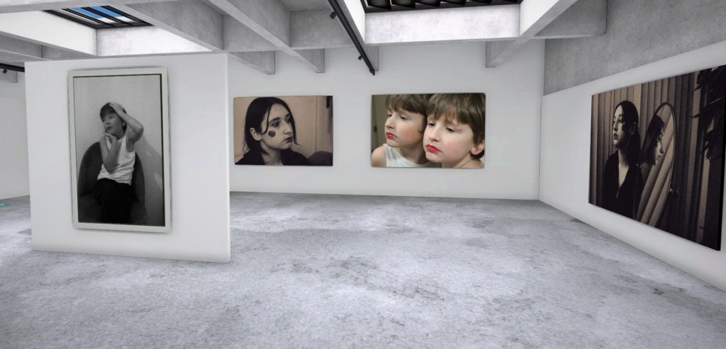
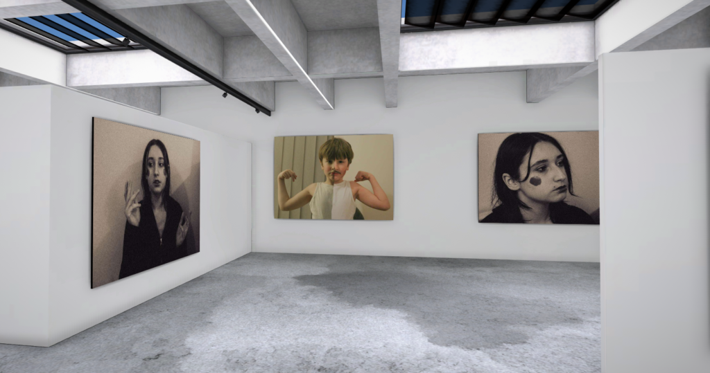
Along with the virtual gallery, I have also created various mock ups of how I’d like to present my final images. I’ve experimented with various layouts and how I might mount them onto foam boards/card.
Below are some ideas that I have for presenting my photos.
Environmental Portraiture
Evaluation and Critique
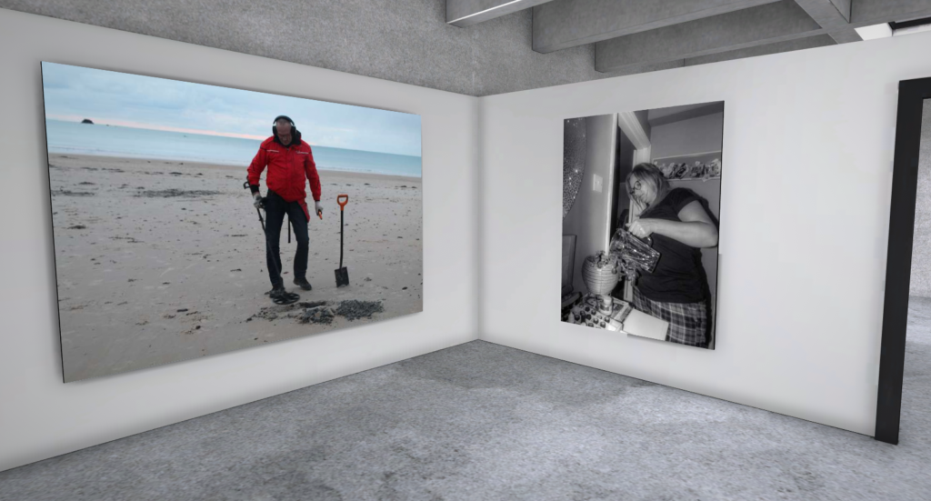
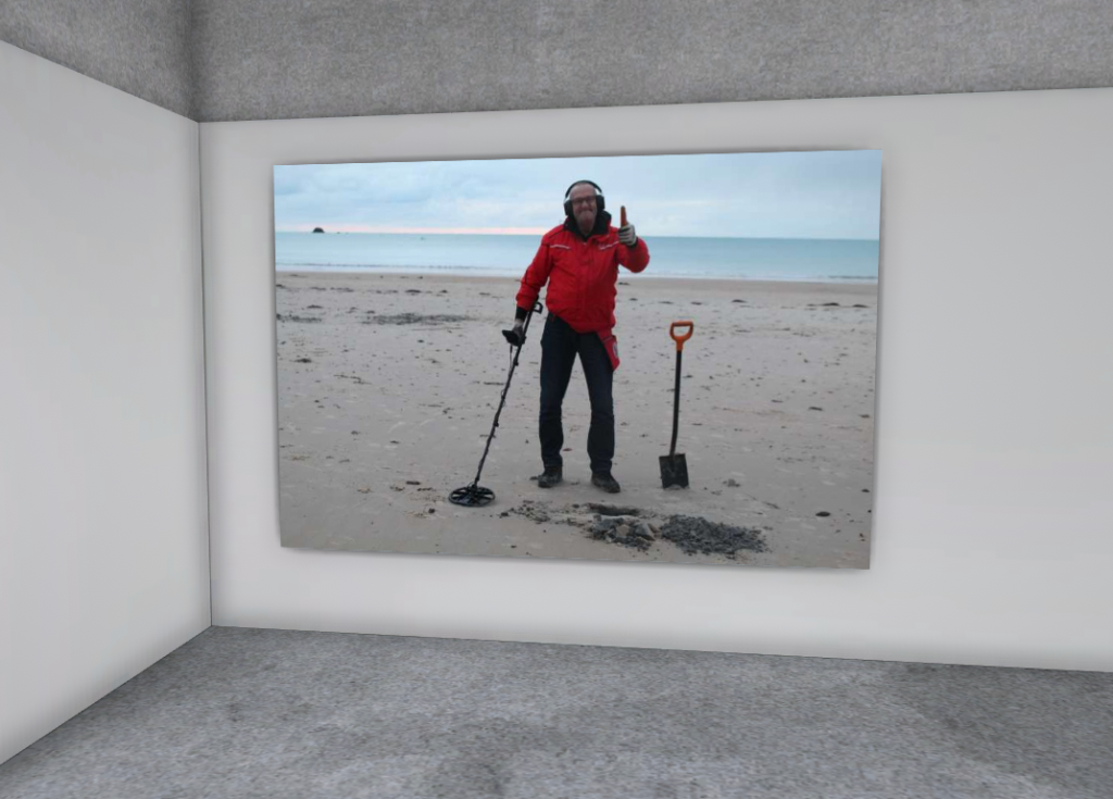
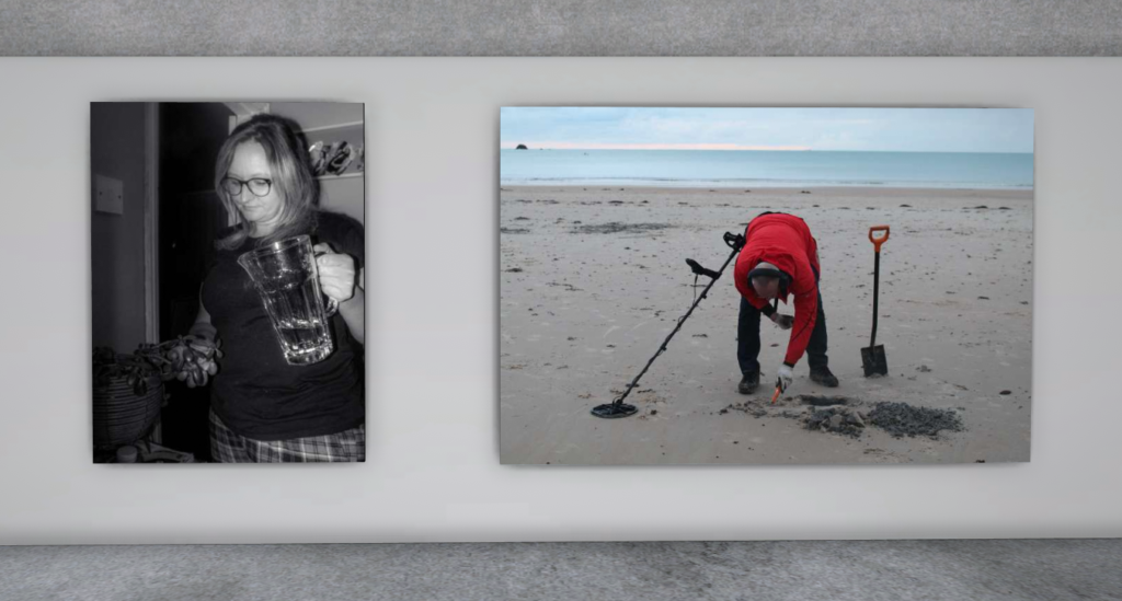
In this photoshoot I had aimed to take a couple photographs of people in their natural everyday environment. I had managed to take pictures of a person metal detecting and my own mum doing tasks/hobbies that they regularly do.
In my first photoshoot I like how the flash of the camera captures the glass jug, that my mum is holding, and makes it look quite shiny. I also like the pattern on her trousers because it makes the image more interesting
In my second photoshoot with the metal detector I really like the contrast of his red jacket against the background, I also like how his tools take up some of the photo making it look not as empty.
Next time I need to take more photos with a bigger variety of poses or angles. I also need to make sure my exposure is balanced especially when using the flash on the camera.
Lighting Techniques
Evaluation and Critique
In this photoshoot I had worked on using different lighting techniques, Rembrandt, Butterfly and Chiaroscuro. I had taken photos at different angles, as well as a lower exposure, to try and capture the shadows that correspond to the lighting techniques.
I like how I’ve edited my photos to be brighter and colourful, but I also like the simplistic black and white images. I might use the format in the first screenshot for my images as I like the contrast of the bold yellow and green colours against the black and white image in the middle.
I should experiment more with different poses and take more photos of Chiaroscuro lighting. I also should use colour gels to add colour into the photos. I need to make sure when doing Chiaroscuro lighting to set the lighting up correctly.
