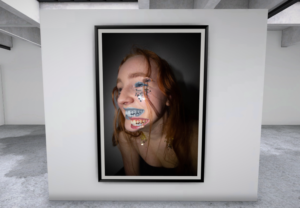
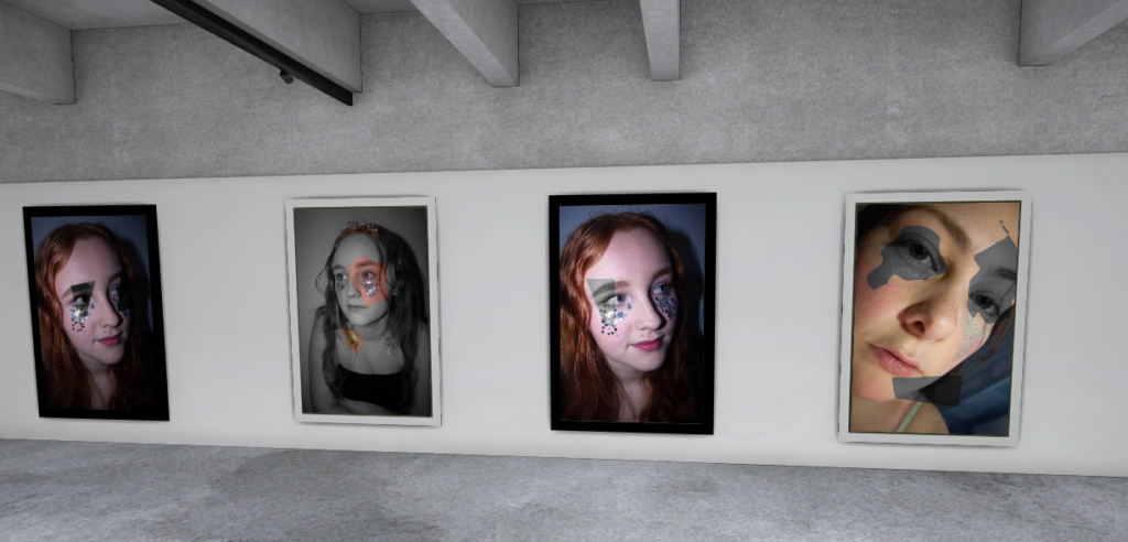
I have chosen to present my final outcomes in a virtual gallery, I chose a particular layout by using my most usual and creative final photo on a wall by it’s self I chose to do this as it is out there to compared the rest of my final outcomes but I don’t dislike it. However it is following the idea of absurdism a lot more than the rest so I didn’t want to take away from the other shots as the meaning could be glossed over if they started to get too unusual. To keep with this idea of keeping the photos uncomplicated enough to understand the meaning quickly I did use frames to keep the photos from feeling flat against the wall but I made sure to them fairly neutral by only using black and white frames which also works with the photos being black and white. A lot of thought went into how to display each shot in the gallery, things like the photos taking up most the wall was important to me as I wanted the photos to feel daunting and real. By also using a pattern for the frames it separates each photo and gets people to separate them in their mind. This also links to why I chose a more complex frame for the more extravagant image as it matches the photo better than a basic frame does.
Final Best Image
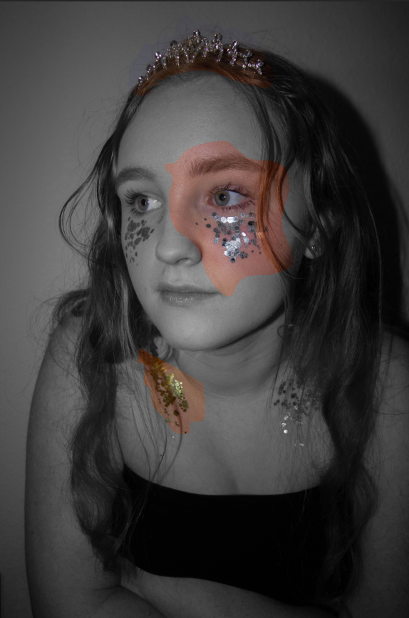
This is my strongest image overall for many reasons, it first caught my eye because the model wasn’t looking at the camera and instead placed herself slightly off centre in the framing of the shot. The model fills the frame as I chose to use a close cropped framing and a plain background to keep the focus on the model and not the background or anything around her. Inspired by Kayla Varley and Hannah Altman the close cropped, glitter and makeup look in scattered through out the shoot and this image I chose to edit in the style of Sherman’s work. I wanted to show the link between femininity and what it takes to be ‘feminine’. By using a mix of silver and gold glitter which is commonly associated with winning something or being precious. To add to this I got the model to wear a tiara to further add to the precious idea as people commonly say beauty is pain but then say as women we should be soft and gentle without being too princess like. This is all rather confusing to anyone especially teenage girls so through this photo I have pulled peoples attention to different parts of the model, one of her eyes, one side of her collar bone and the tiara. By using the lasso tool it allowed me to create free hand designs for the parts I have cut out of the the photo and recoloured, I didn’t want set shapes as I wanted the photo to keep its raw look as much as possible.
Comparing Photographers Work and My Final Outcomes
Cindy Sherman
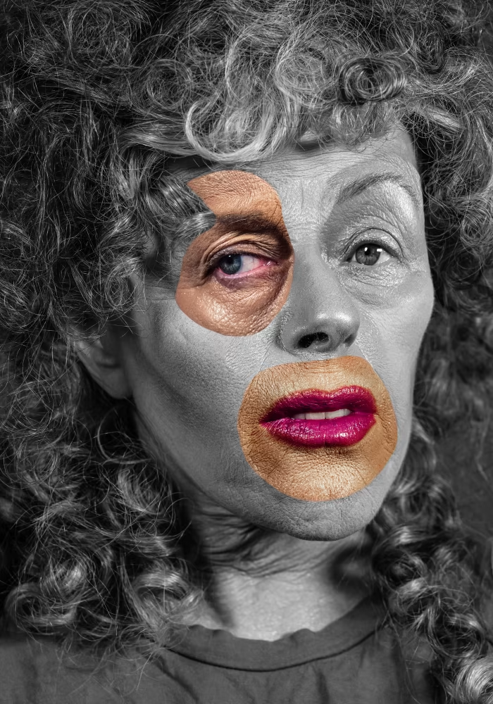

On the left is Cindy Sherman’s and mine is on the right. Having the images side by side really helps me look at what I have done well and what I could look at improving if I was to do it again. There are some clear differences in that Sherman’s work is down more of the absurdism route where as mine is looking at more what is expected. However this also is due to Sherman’s work is aiming to be someone else she dresses up as characters and even though it herself in photos she does not consider them self portraits, where as with my work I was taking a photo of a model posing but the model was my ‘character’ dressing how I suggested, with untamed hair, and of course the glitter inspired by Altman’s work of a similar theme. I did keep to the idea of having a black and white base photo and the cut-outs in colour but I chose to cut out parts of the same photo and not move them so instead it’s just a glance at the person underneath the black and white where as Sherman’s work has manipulated multiple images and pulled them into a large collage of sorts.
Kayla Varley
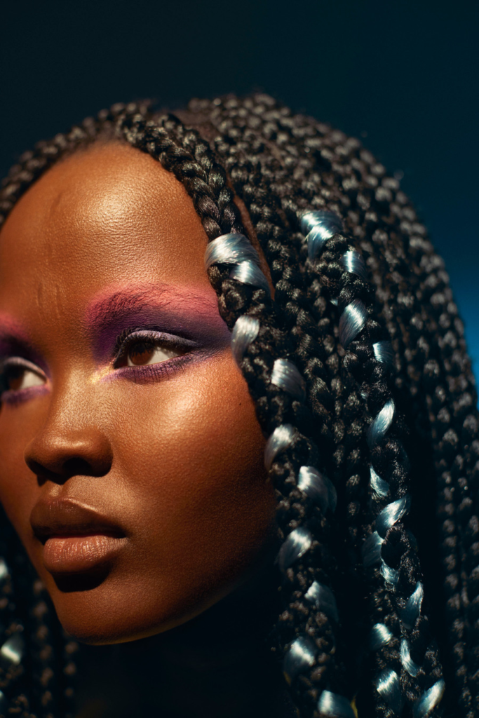

I liked Sherman’s work and took a large amount of editing inspiration from her but for a large portion of the shoot I was focused on getting shots similar to Varley’s work, specifically her beauty work. Her style is unusual looking at different angles and bright, interesting makeup a lot of the time. This inspired me to look into using angles other than straight on and using lighting to my advantage. Lighting is a huge part of Varley’s work and it provoked me to look at how artificial lighting could have been used to make the glitter stand out, so I used a flash and a small torch to get a shine onto the glitter so it felt in cooperated into the photo and not just placed onto the models face. Varley also uses closely cropped angles focusing on the models face or parts of their face over full body shots which I thought was an interesting idea nd implemented in my own photography.
