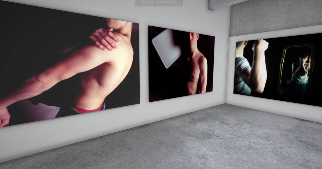
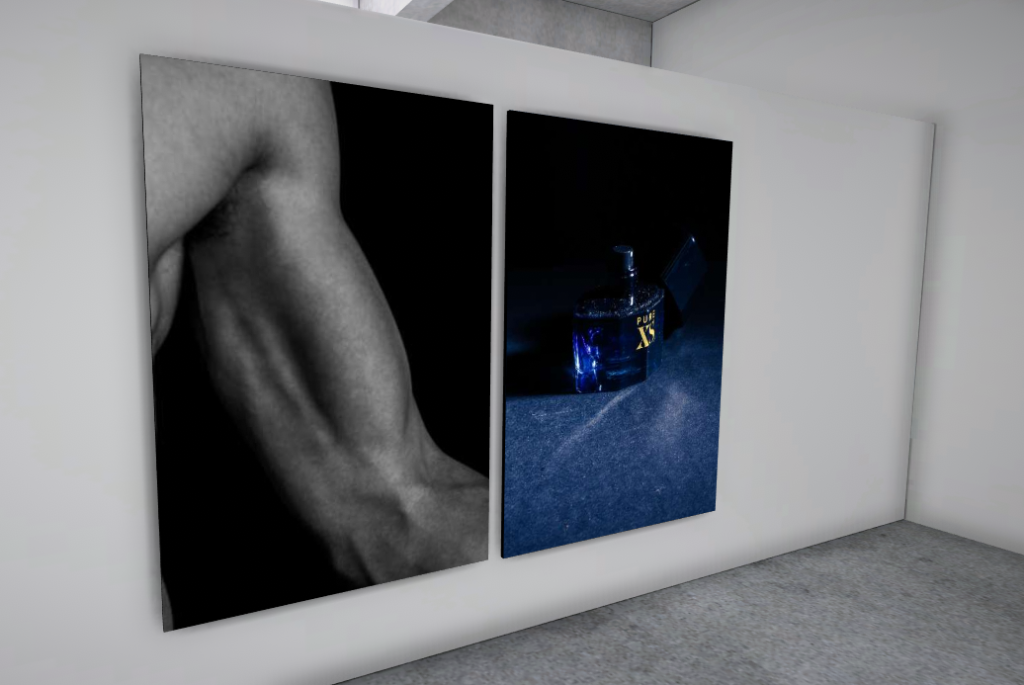
I decided to lay out my favourite final images in a virtual gallery here:
Evaluation:
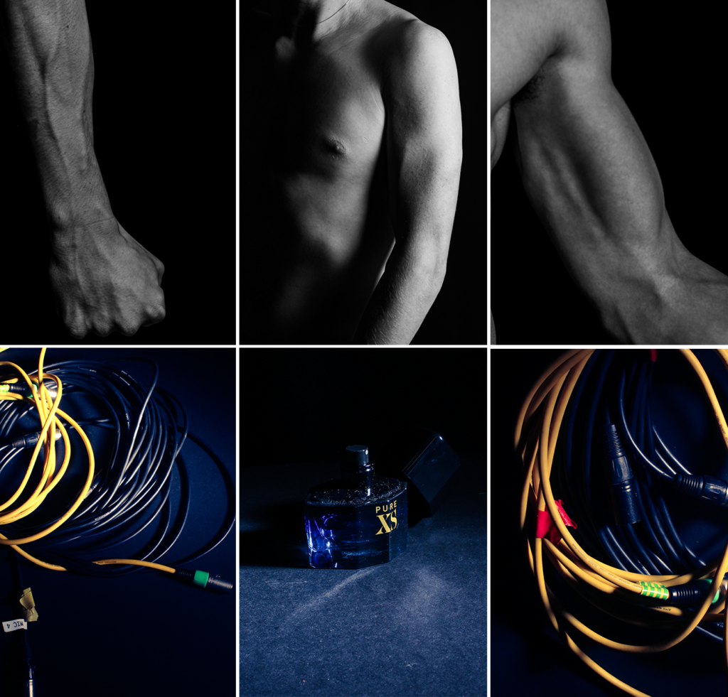
Overall, I think this montage of images does a good job of presenting classic masculine ideas. With the colour grading and high contrast, It makes each image stand out. However to improve on this next time I will need to organise this montage better (e.g. diamond cameo) And I feel like the top middle photo does not match any other photo so I will need to take more specific body part photos. I had a little bit of inspiration from Claude Cahun (with the camera work and editing), but I feel like I should of stepped more into her style of bold, outgoing photos.
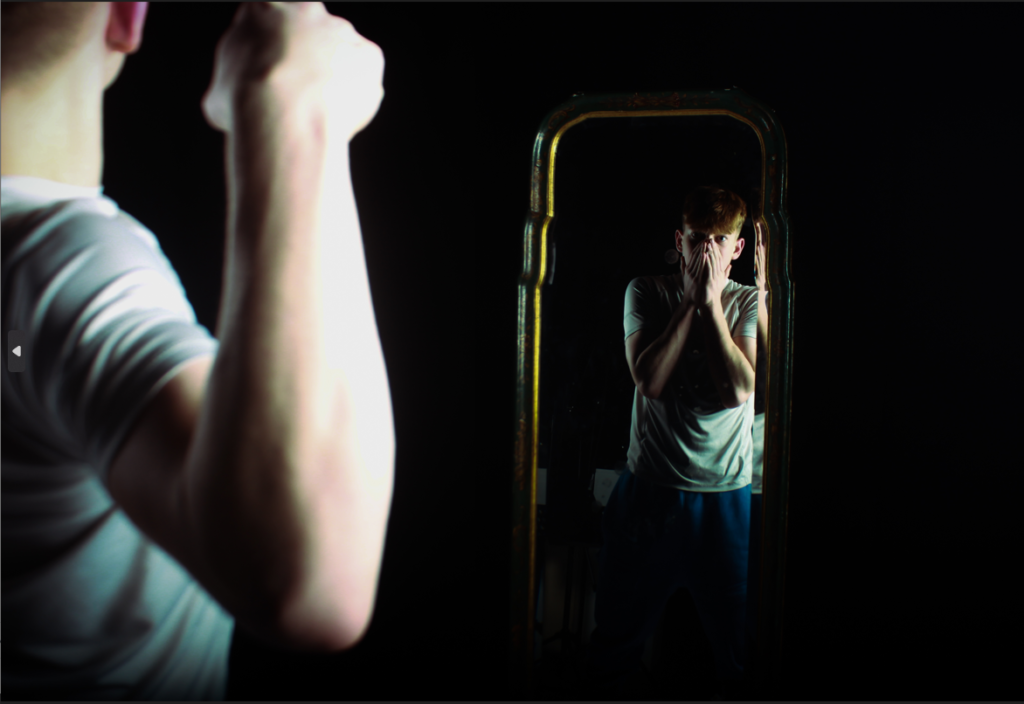
I think this image links very closely to Duane Michal’s work, by showing the insecurities of a person with there identity. It shows how modern masculine expectations can make a person insecure in themselves. I feel like the foreground model isn’t in frame enough to make it obvious to the viewer that there are 2 different photos.
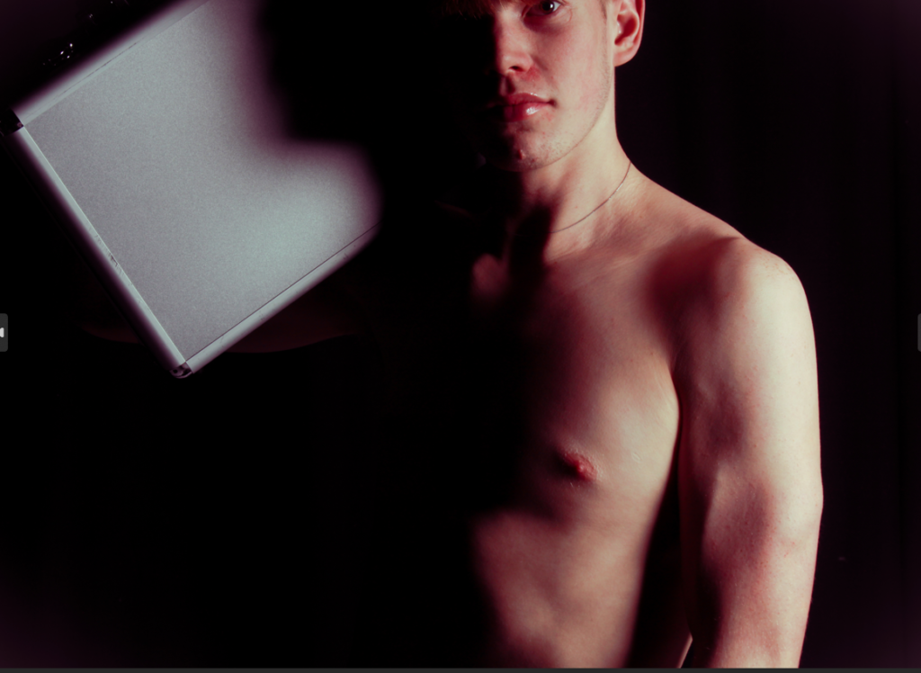
I think this image links fairly closely to Cindy Shermans work linking to the male gaze. However, I edited my photos to have a rosy red colour grading to them, breaking the norms of gender identity with a feminine colour. The bright, glossy lips of the subject take the viewers attention away from the ‘manly’ body in a strong looking pose. By taking the viewers attention towards the lips you are making more ‘feminine’ traits a focus in the photo, conflict the binary opposites of masculinity vs femininity.
