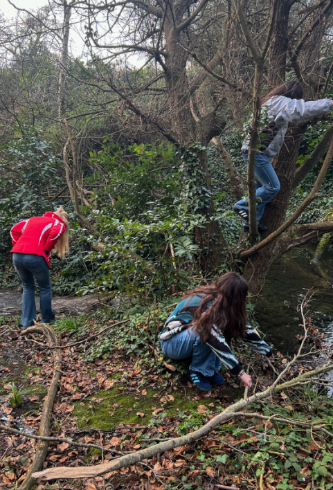
Photoshoot 1 – Inspired by Hannah Altman
Contact Sheet/Image Selection
These are a combination of my photoshoots inspired by Hannah Altman ‘Indoor Voices’. I took these in various places around my house using a tripod and my camera with a 10 second timer.
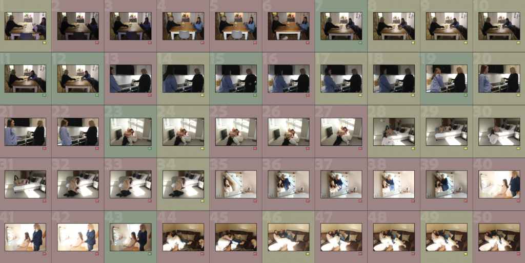
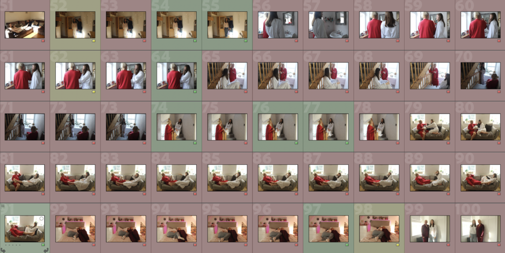

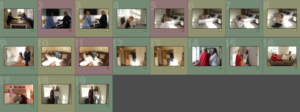
Image Sub Selection
I have decided to go back through my most successful photos and colour rate them to determine which ones to edit. Green is yes, yellow is unsure and red is no.
Edits
Edit 1
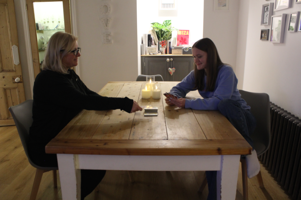
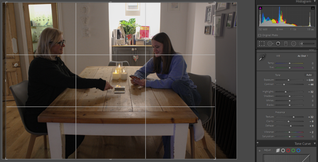
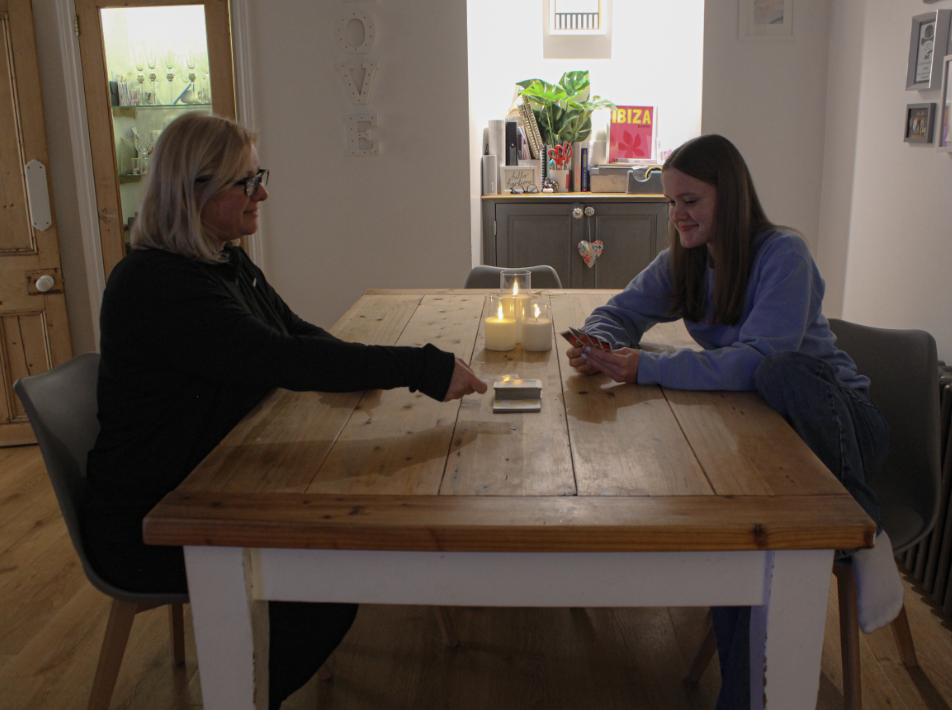
I found that the original image for this edit was very pixelated and not the best quality so I edited it by, firstly, making it darker by lowering the exposure, contrast and highlights. I then increased the texture so things are more defined but lowered the clarity and increased dehaze so everything appears smoother.
Edit 2
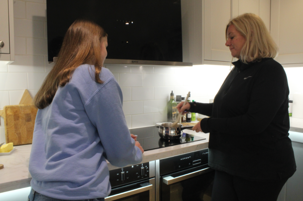
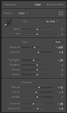
My aim for this edit was to make the colours of my hair and my Mum’s face look less orange, therefore, I lowered the exposure, highlights and vibrancy. Similar to the previous edit, I also increased the texture and lowered the clarity.
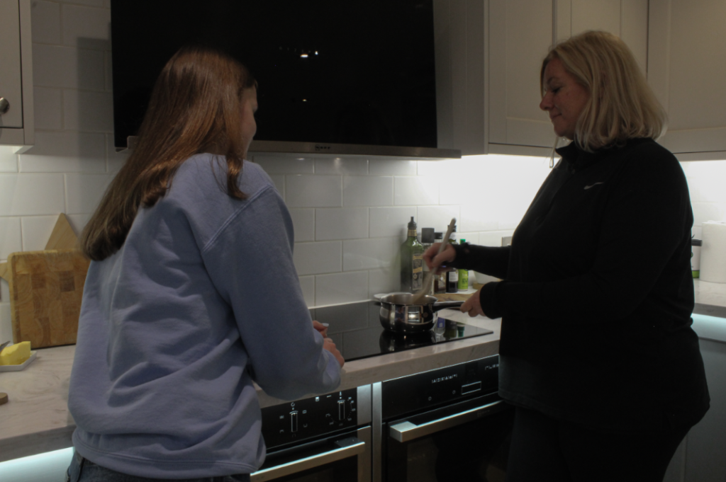
Edit 3
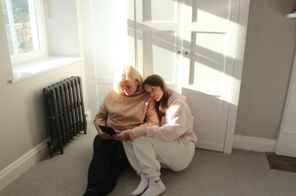
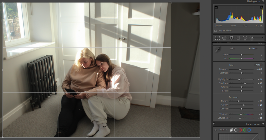
I edited this photo by cropping it then lowering the exposure, highlights and texture. I also increased the shadows and clarity. Finally, I lowered the vibrancy and saturation to make the colours less bright in the photo and make the image more tranquil.
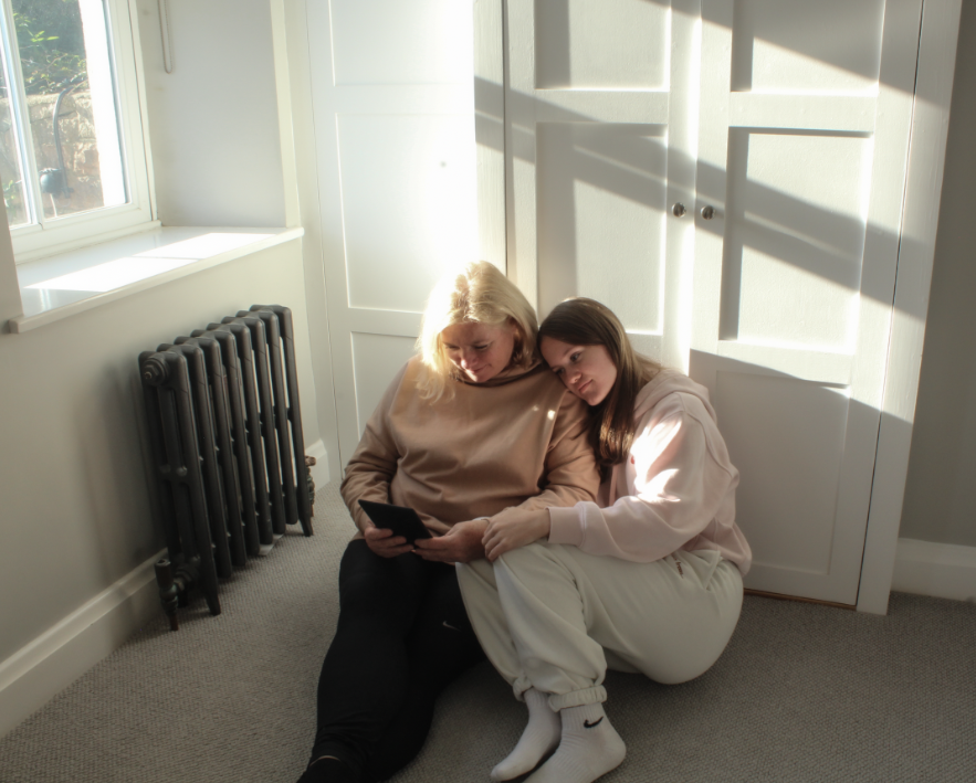
Edit 4
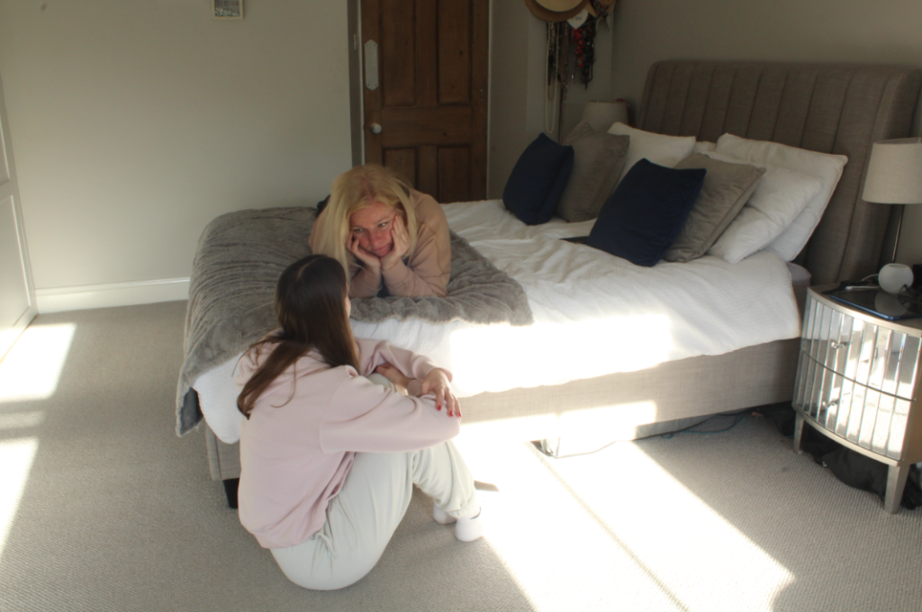
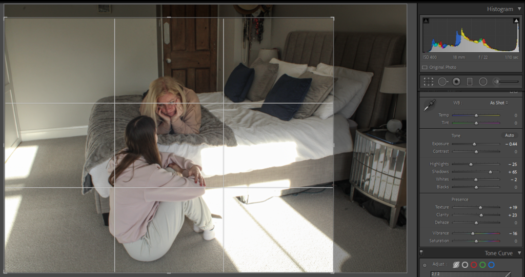
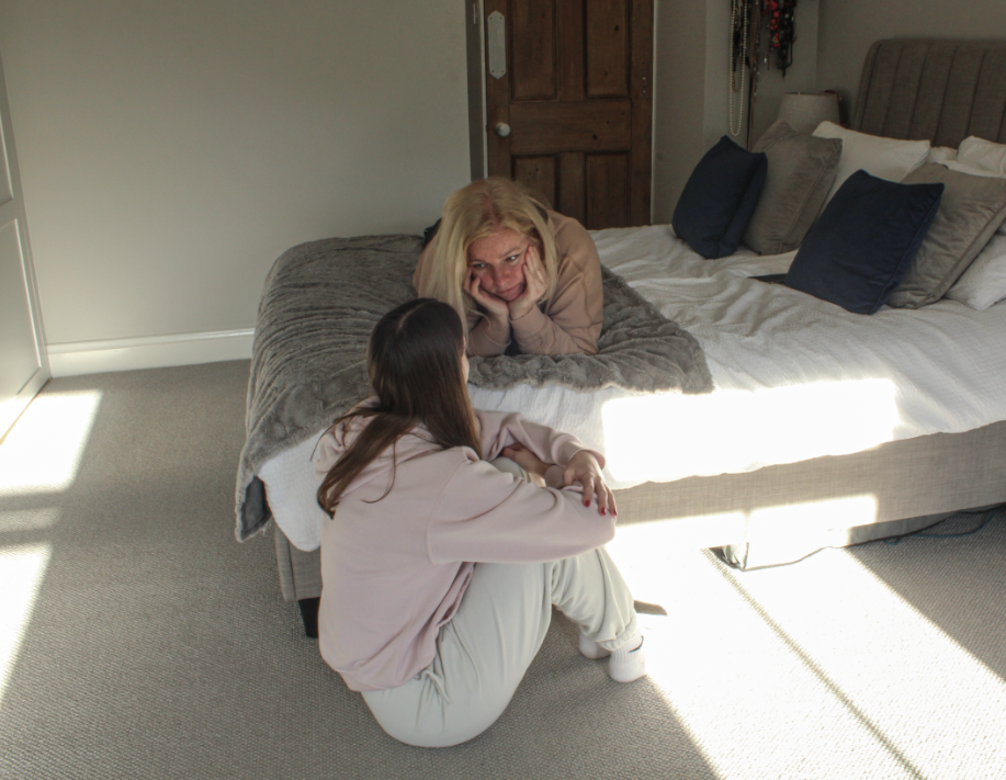
I edited this by, firstly, cropping it then lowering the exposure, highlights and vibrancy. After this, I increased the shadows, texture and clarity to make the lines in the photo more defined.
Edit 5
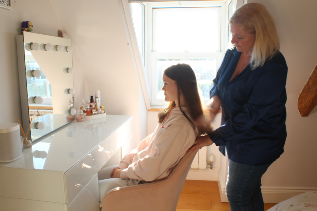
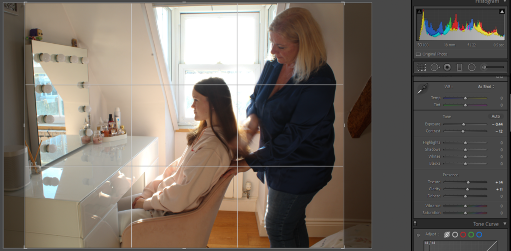
I started off editing this photo by cropping each side then lowering the exposure and contrast slightly and increasing the texture and clarity.
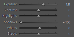
Additionally, I used the brush tool to increase the exposure of the bottom half of the window so that it can’t be seen through.
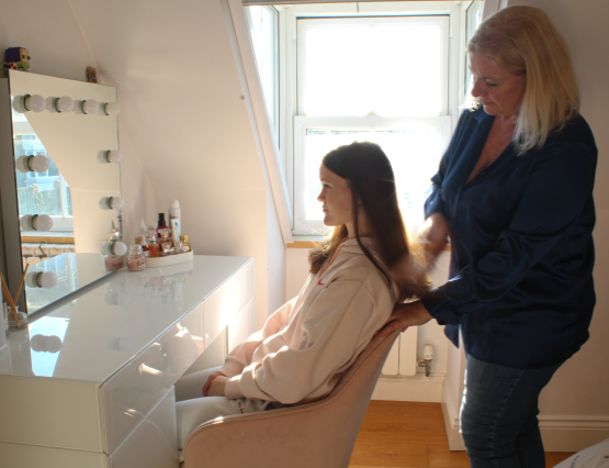
Edit 6
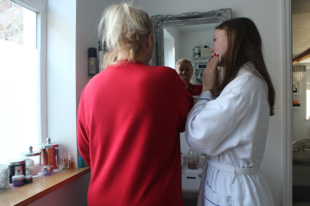
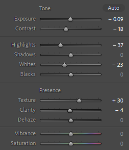
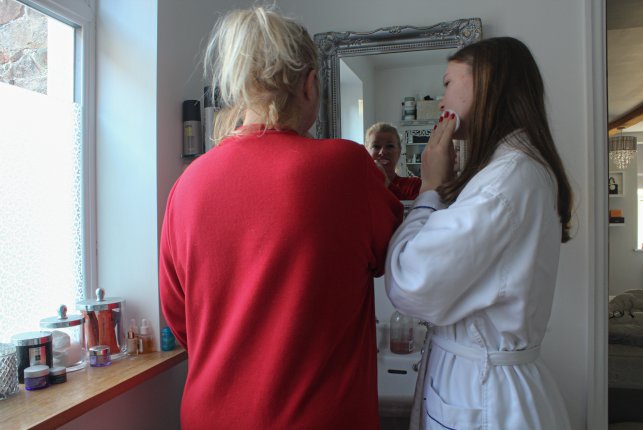
I edited this by lowering the exposure, contrast, highlights, whites and clarity then increasing the texture. I did this to make the image just a little bit less bright and more defined.
Edit 7
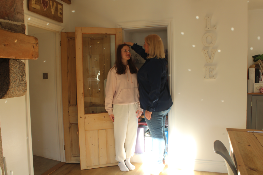
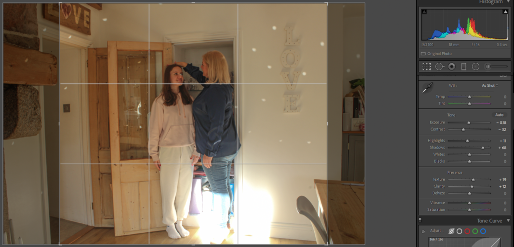
To begin editing this photo, I started off by cropping the sides. After this, I lowered the contrast, highlights and exposure and increased the shadows, texture and clarity. Furthermore, I attempted to use the brush tool to get rid of the glisten in my eye, however, it just made it look worse so I kept it how it was.
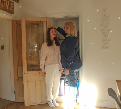
Edit 8
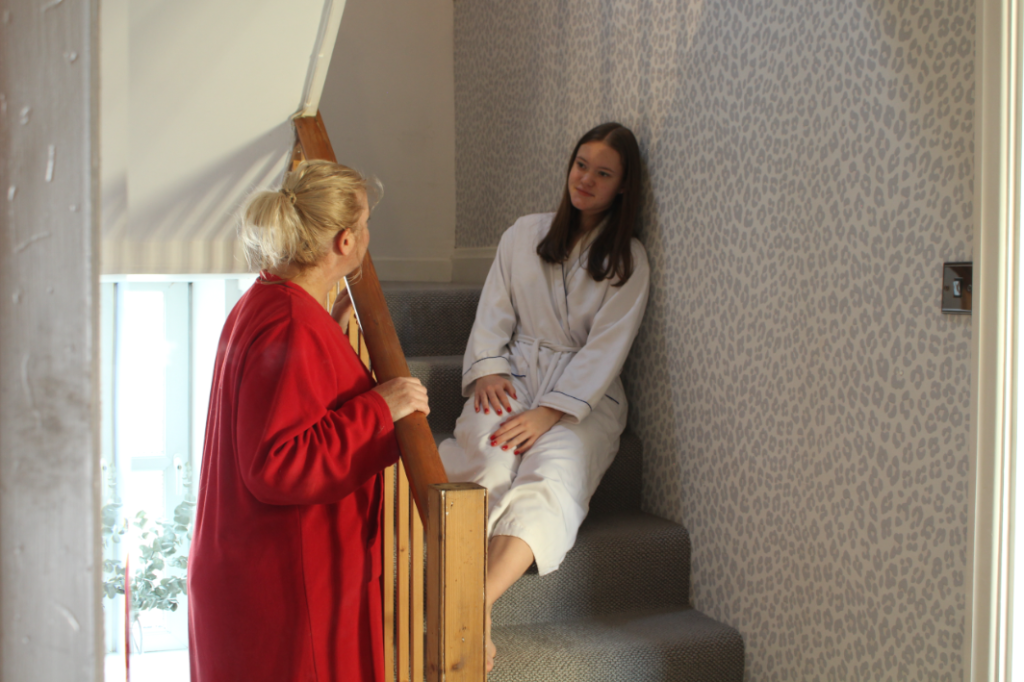
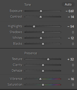
I personally think that the original photo doesn’t need editing, however, I decided to try edit it anyway which I actually prefer the outcome of. To edit this photo, I decreased the exposure, contrast, highlights, whites and vibrancy and just increased the texture.
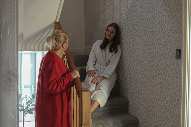
Edit 9
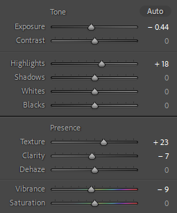
I edited this photo by lowering the exposure and clarity then increasing the highlights and texture. After this, I lowered the vibrancy to give the photo a bit less warmth as it makes it look better quality.
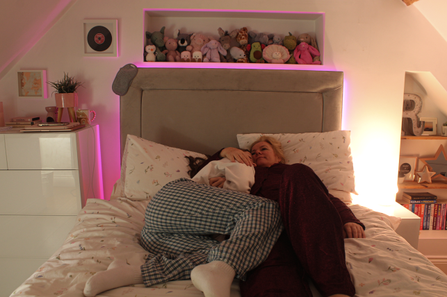
Edit 10
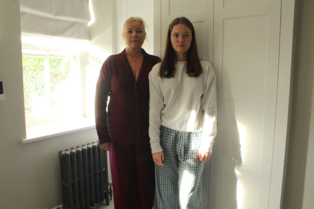
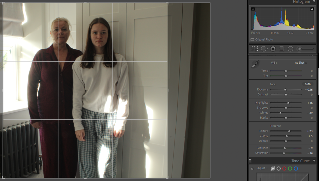
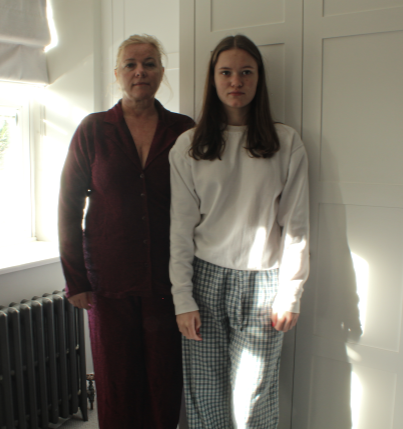
This was my last edit to represent a mother and daughter relationship and I edited it by lowering the exposure and whites then increasing the highlights. After this, I increased the texture and clarity to make everything more smooth yet defined. Finally, I finished off by cropping it then lowering the vibrancy and saturation to make the colours less lively to fit the sense that we are in pyjamas and look tired.
Photoshoot 2 – Inspired by Justine Kurland
Contact Sheet/Image Selection
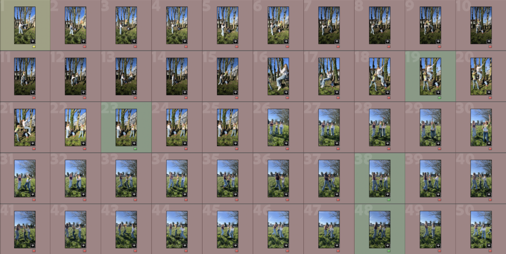
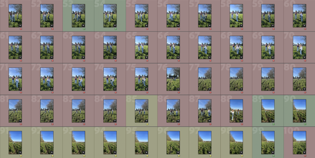
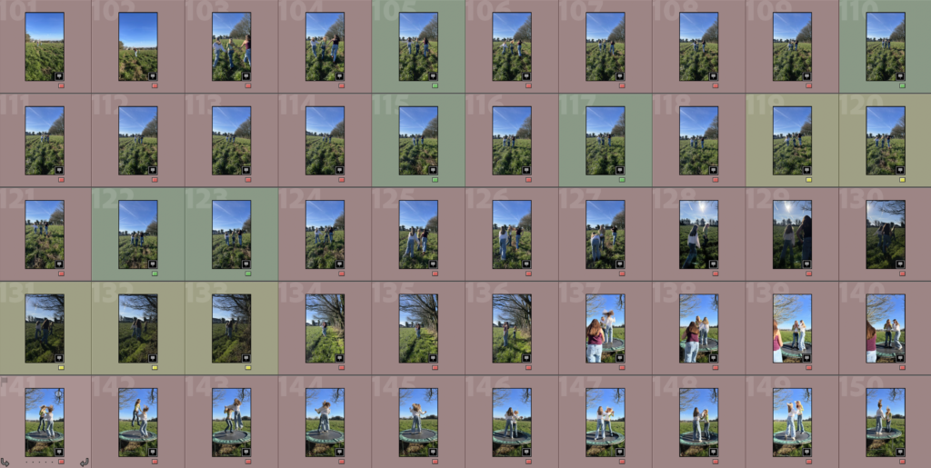
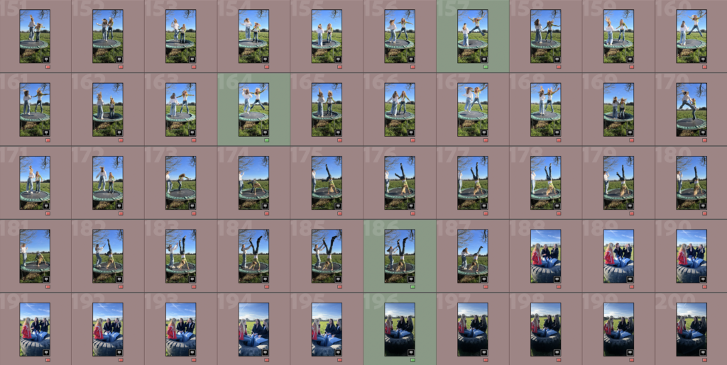
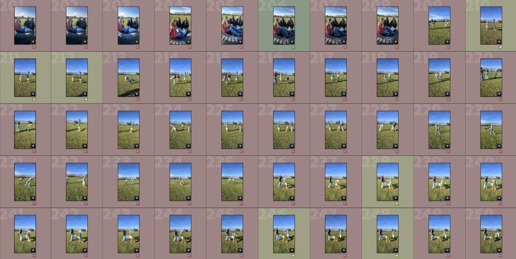
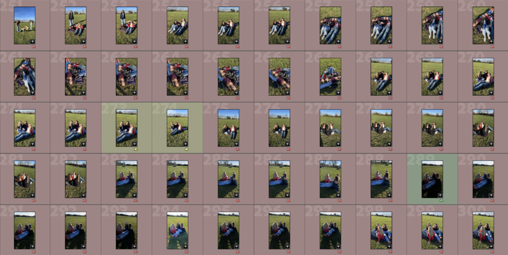
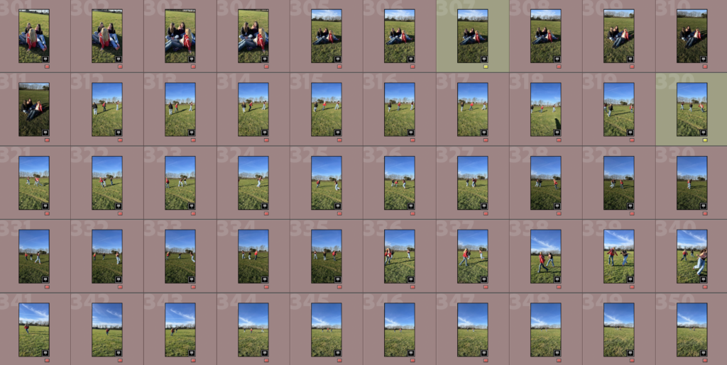
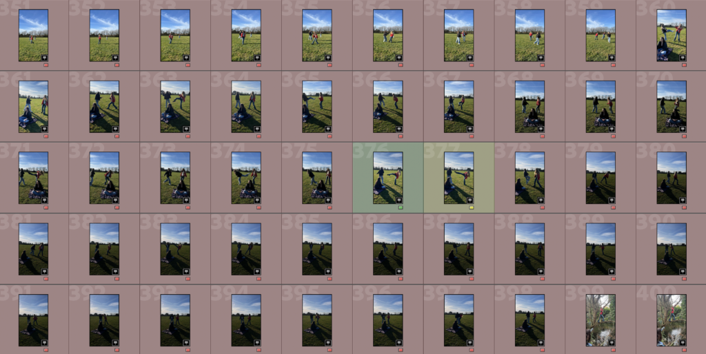
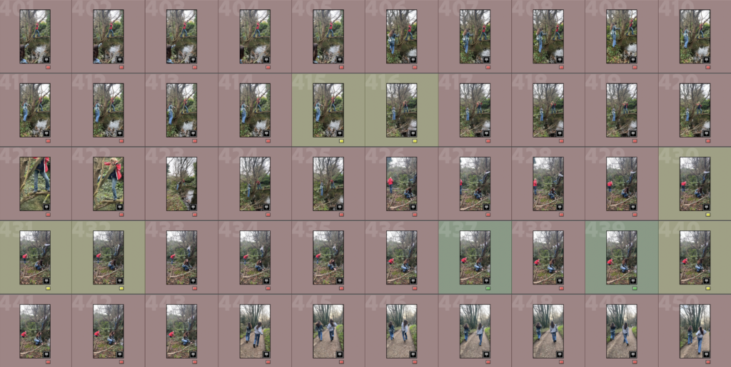

Image Sub Selection
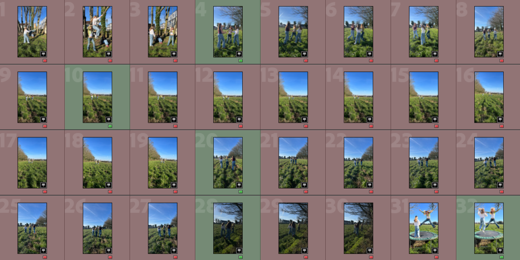
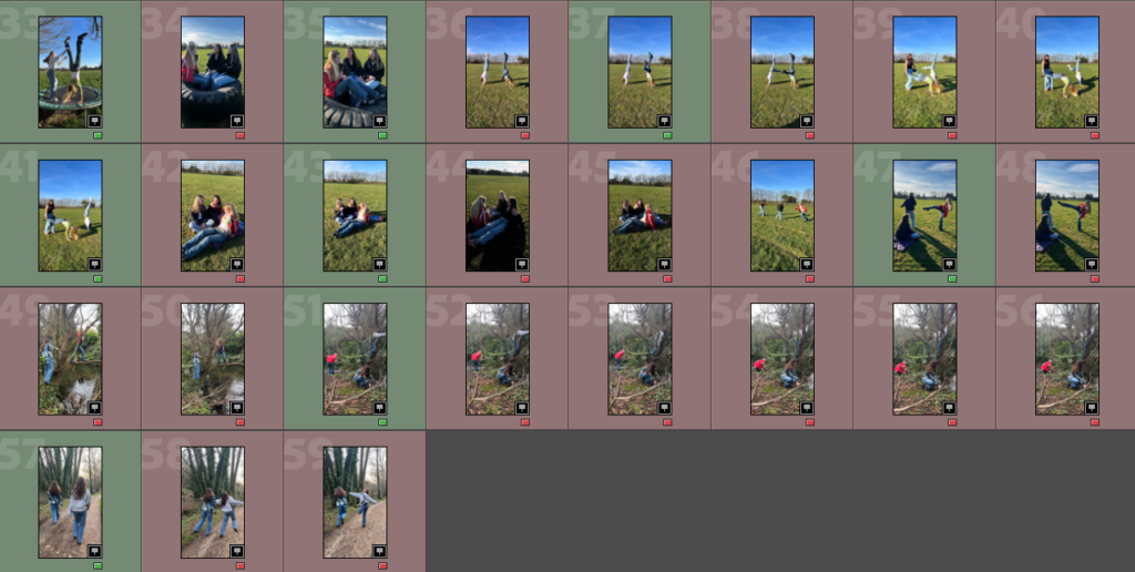
I have decided to go back through my chosen images and create a sub selection of the specific ones that I am going to edit, shown in green.
Edits
Edit 1
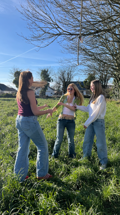
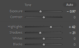
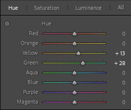
I only subtly edited this photo by lowering the exposure to make it more vibrant, increasing the highlights, decreasing the shadows and then increasing the blue and yellow hue.
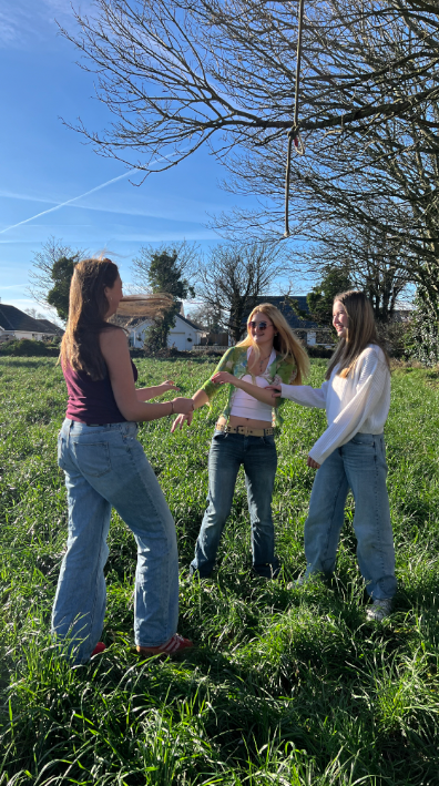
Edit 2
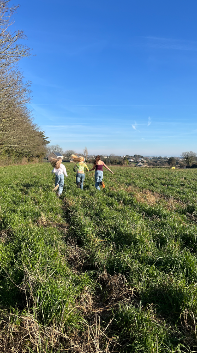
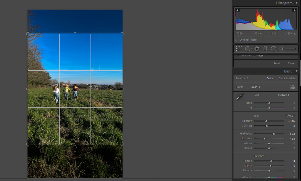
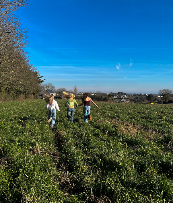
I edited this by, firstly, cropping it then lowering the exposure, increasing the highlights and texture and increasing the yellow and green hue.
Edit 3
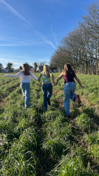
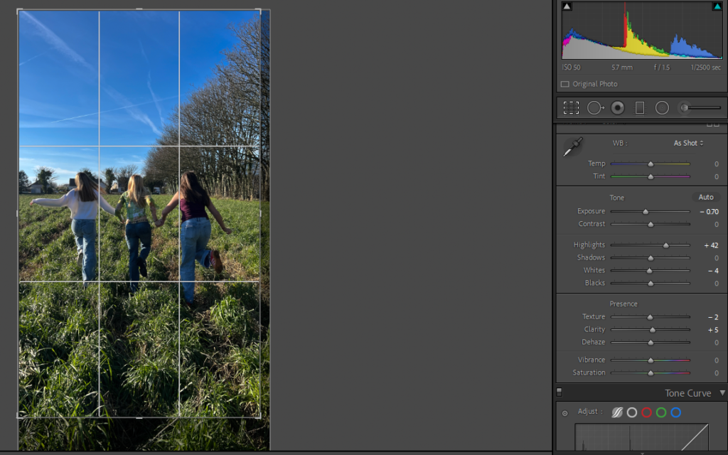
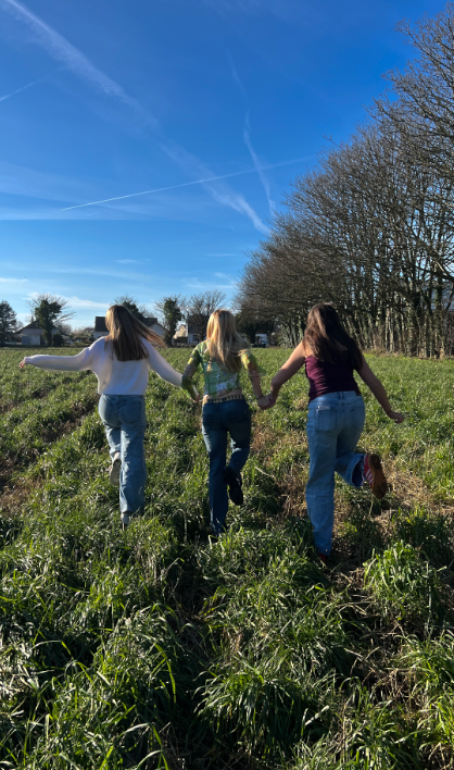
I edited this photo by, firstly, cropping it then lowering the exposure, whites and texture and increasing the clarity and highlights.
Edit 4
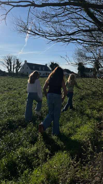
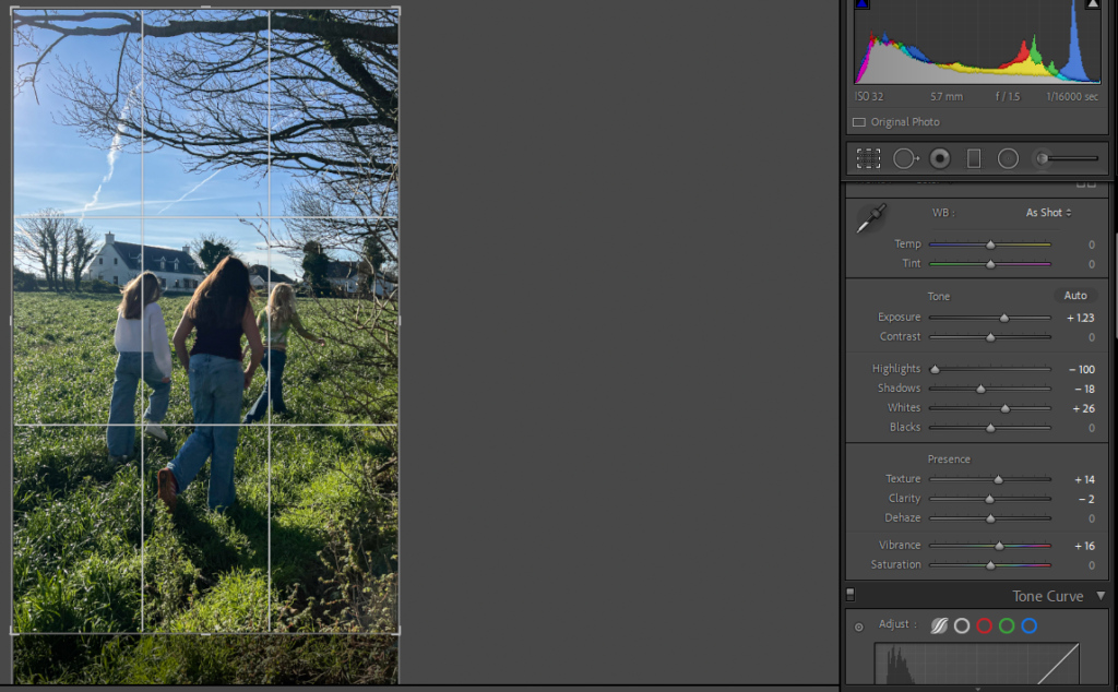
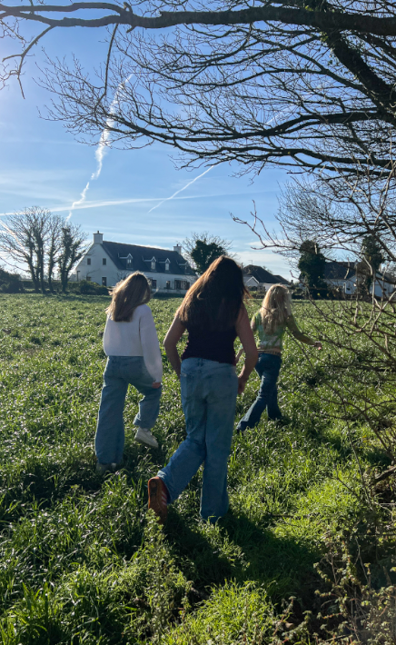
I personally think that the original photo was too dark so I edited it by increasing the exposure, whites and vibrancy and decreasing the shadows and clarity. Finally, I slightly cropped the bottom.
Edit 5
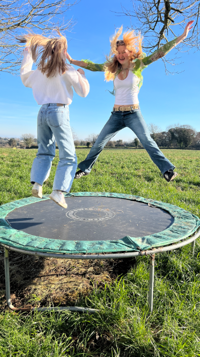
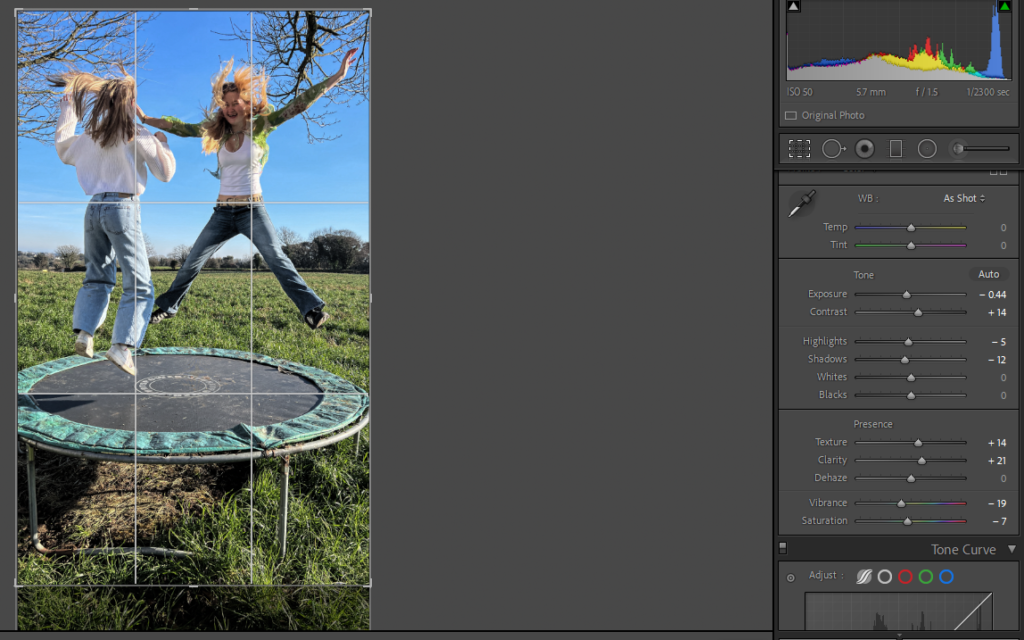
I edited this photo by cropping the bottom then increasing the texture, clarity and contrast to make shapes and lines more defined. I then lowered the exposure, highlights, shadows, vibrancy and saturation because I think that the original photo was too vibrant.
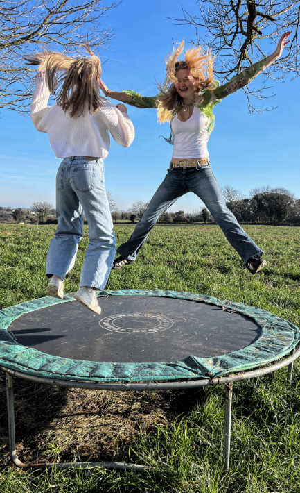
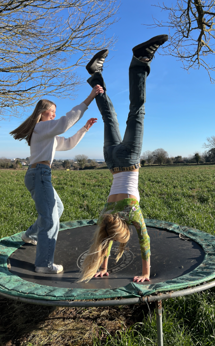
Edit 6
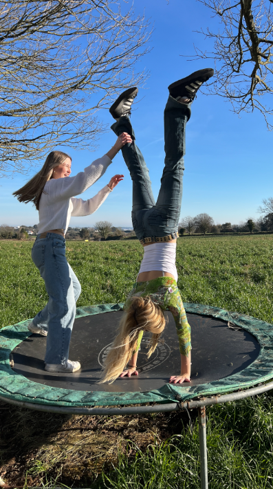
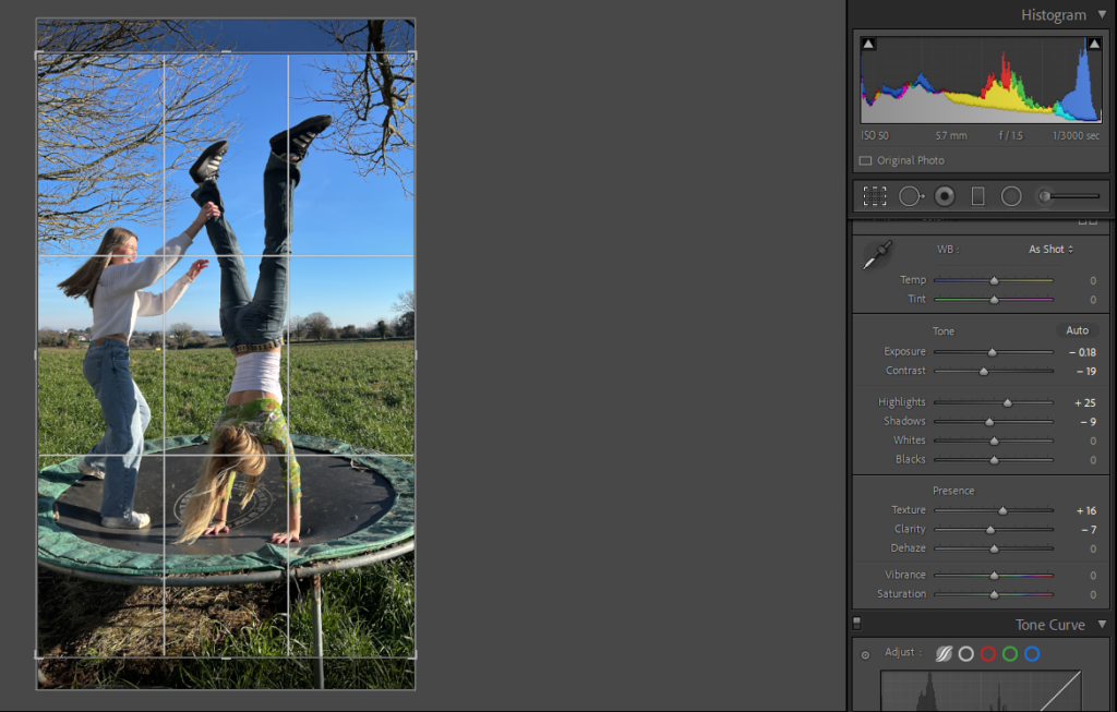
I edited this photo by decreasing contrast, shadows, clarity and exposure and increasing highlights and texture. Finally, I finished off by cropping the bottom of the photo.
Edit 7
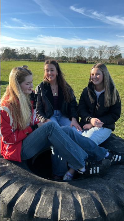
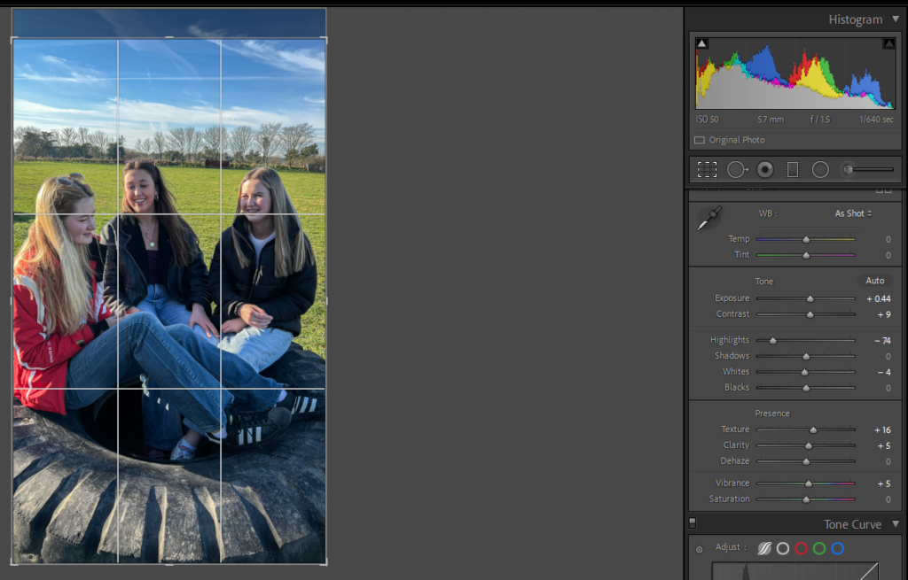
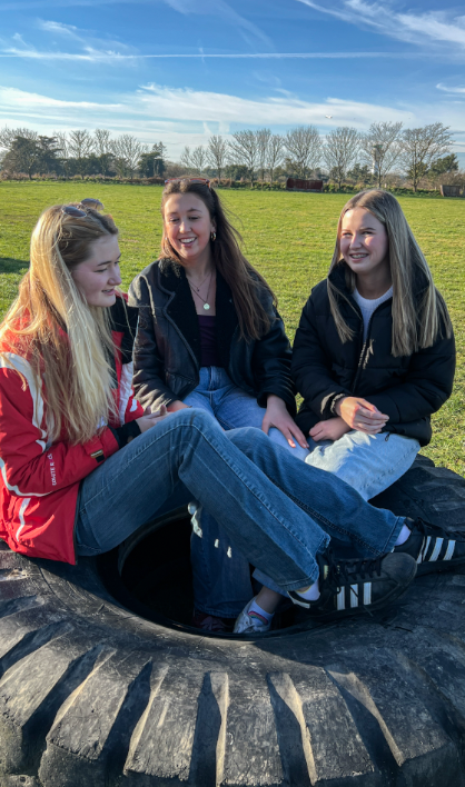
I edited this by slightly cropping the top of the image then increasing the exposure, contrast, texture, clarity and vibrance then decreasing highlights and whites to make the image a little less bright.
Edit 8
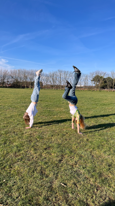
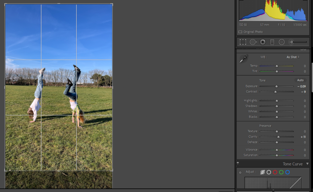
I edited this by cropping the bottom then making small adjustments to the exposure, contrast and clarity.
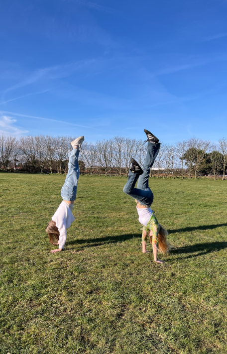
Edit 9
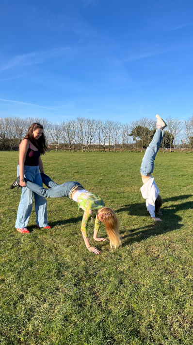
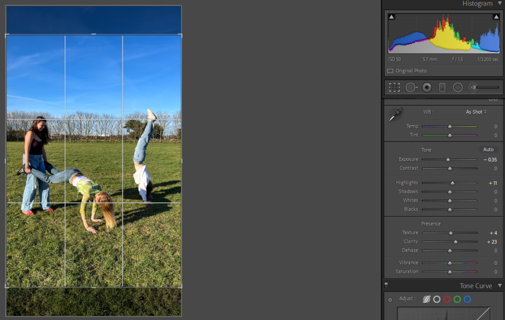
To edit this photo, I cropped it then increased texture clarity and highlights and lowered the exposure.
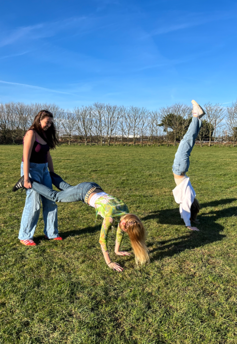
Edit 10
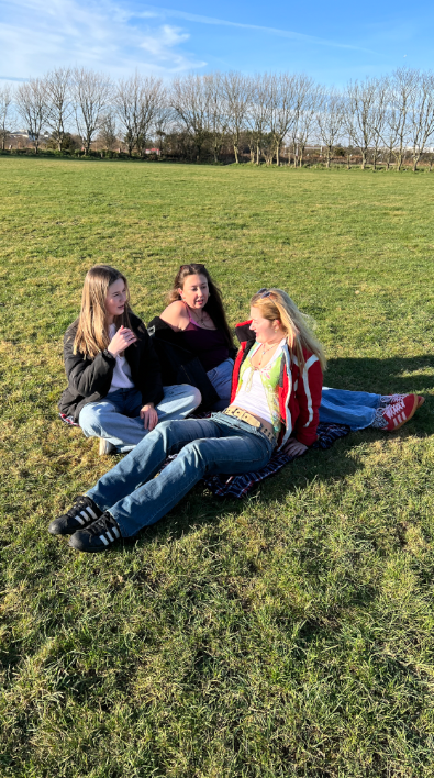
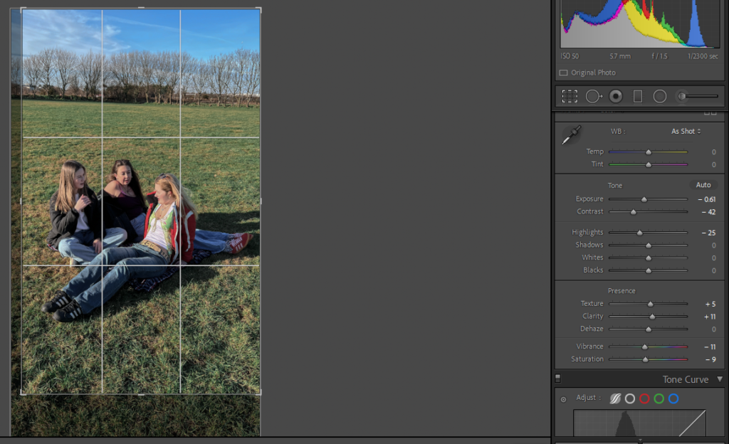
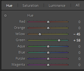
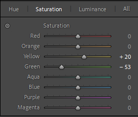
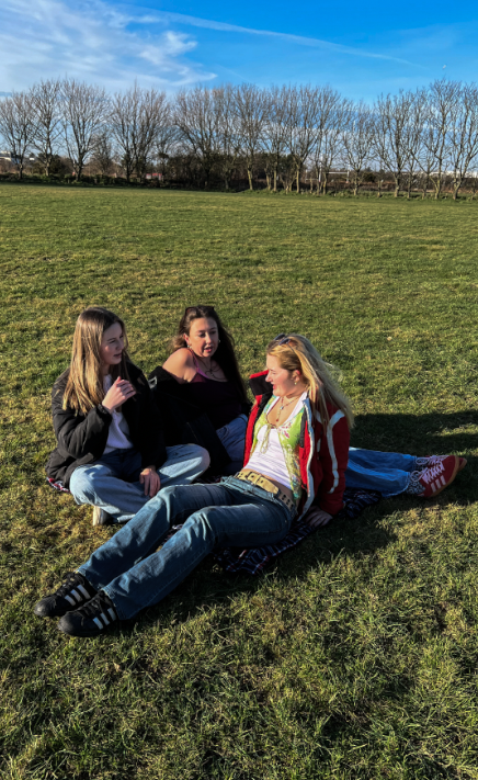
When editing this photo, I attempted to remove the orange tint in my friend’s face and hair. I did this by lowering the exposure, highlights, vibrancy and saturation then increasing the contrast, clarity and texture. After this, I finished off by experimenting with the hue and saturation of green and blue to make the grass a bit more vibrant.
Edit 11
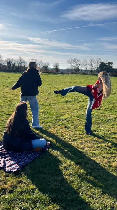
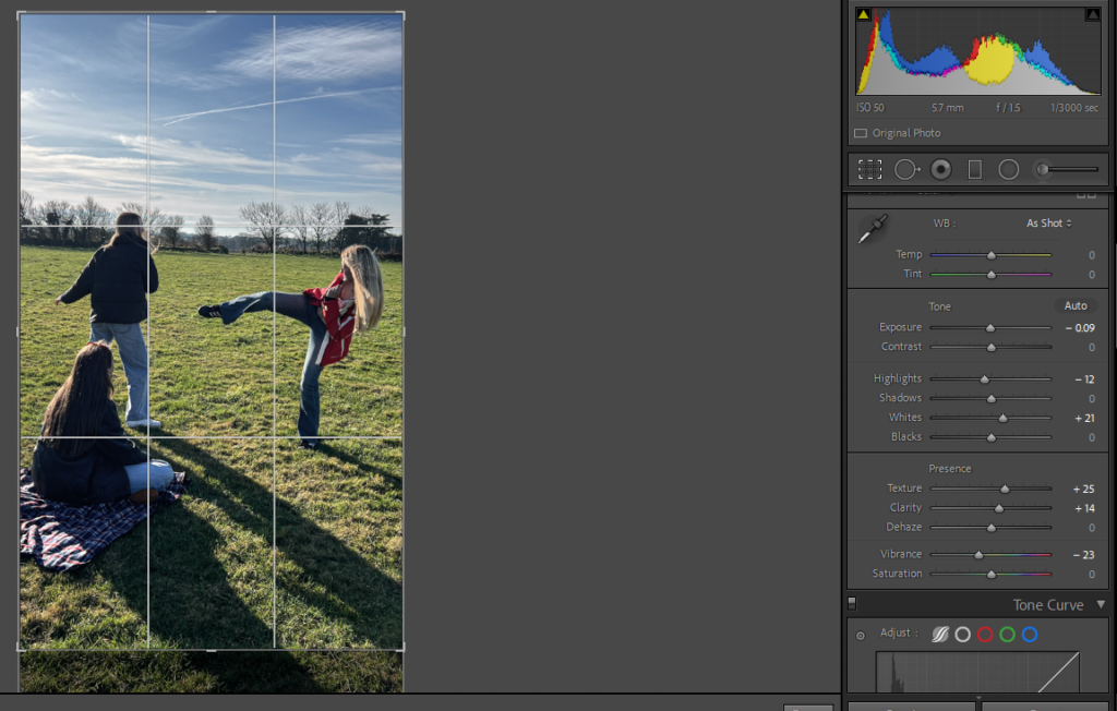
I edited this image by slightly cropping the bottom then decreasing the exposure and highlights to make the photo less bright then increasing whites, texture and clarity.
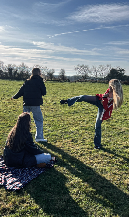
Edit 12
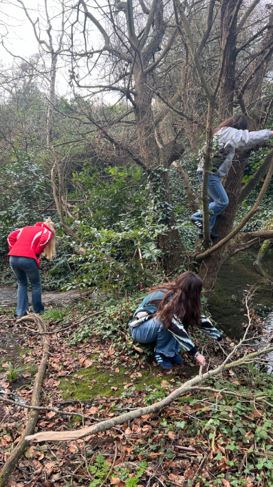
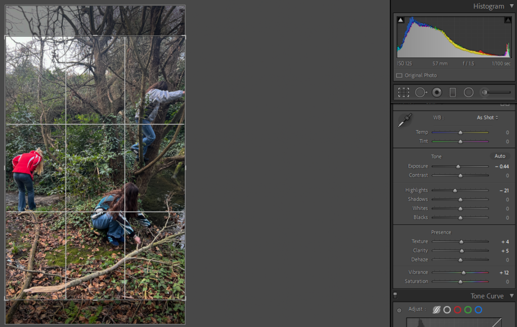
This is my final edit for this photoshoot inspired by Justine Kurland’s ‘Girl Pictures’. I edited this photo by just slightly adjusting the exposure, highlights, texture, clarity and vibrancy. Finally, I finished off by cropping the top and bottom, as well as a little bit off the left.
