Photoshoot 1
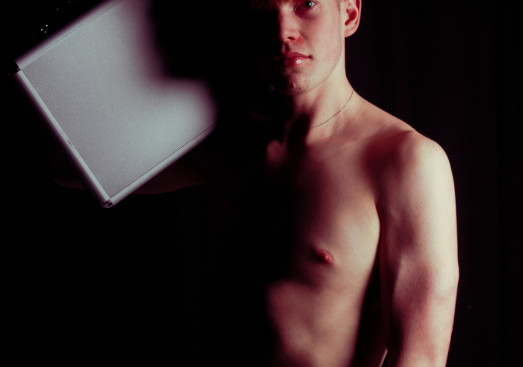
For editing I decided to use other photos from photoshoot one, This Image below I tried to capture Cindy Sherman idea of the “male gaze”, but complete flip it so I’m capturing images of men instead.
The characters in Sherman’s photos are often an exaggeration of widely represented female identities. Since this exaggeration and masquerade is visible through heavy make-up or distinctive clothing, the works appear to reveal the artificial construction of what is supposed to make a person female, such as wearing clothes typical for a housewife or the extensive use of eyeliner:
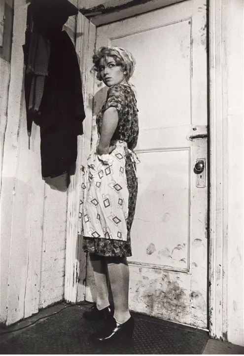
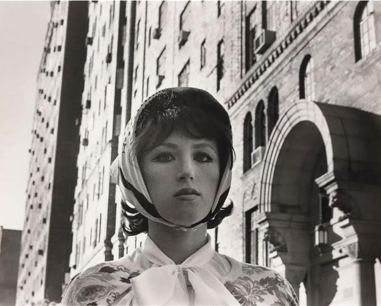
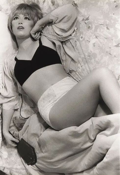
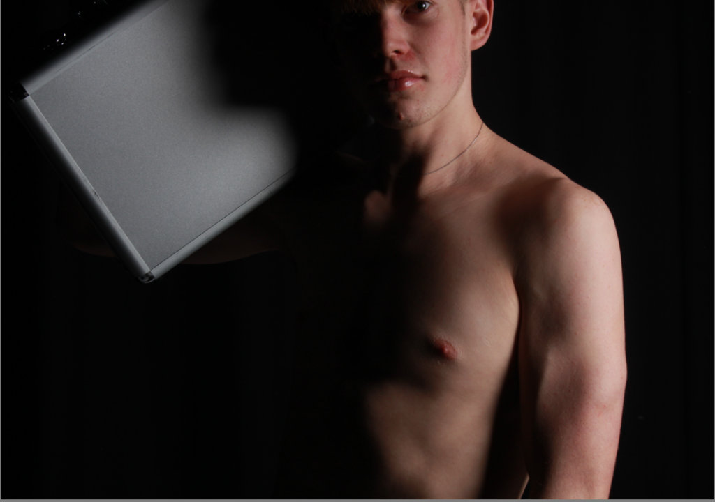
So for this image I made a very traditionally “masculine photo” with my model where he has no t-shirt, and holding a breath case with a strong intimidating pose. I have cropped this image to keep the eye area away from the rule of thirds to make the body the dominating feature of this image. Keeping the eye area and the posing (of the breath case) high, which further increases the intimidation that this model creates for the viewer as he is looking down to the camera so to the viewer. :
To confuse the viewer I have edited this photo with some colour grading often associated with feminine traits like rosy red, to remove the line between masculinity and femininity. This take away a lot of the intimidation that I talked about above:
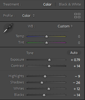
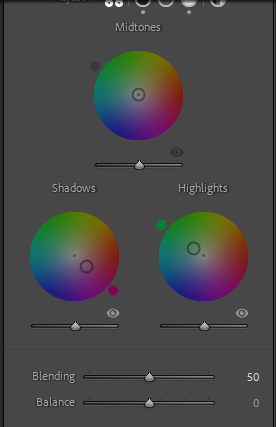
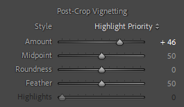
After this, I noticed that the background, not being completely black, could distract the viewers eyes from the subject and a easy way of mitigating that is by using a vignette. A lot of old photos also have naturally occurring vignettes due to incorrect camera equipment (e.g. lenses with large apertures or barrels) But adding it digitally can make your images pop and guide the viewers eyes to the subject:
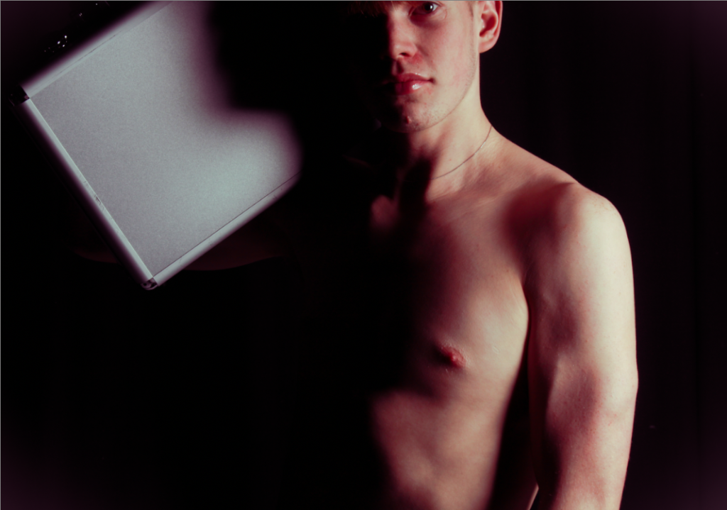
I repeated this process with other photos:
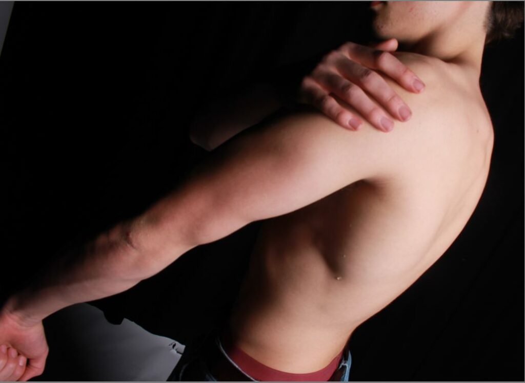
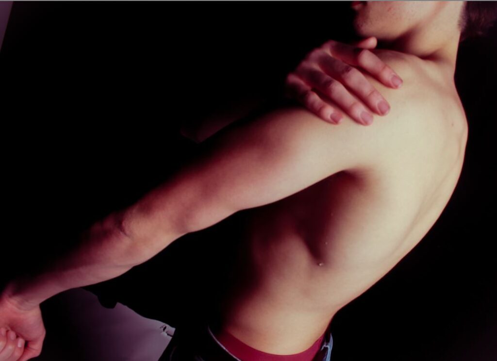
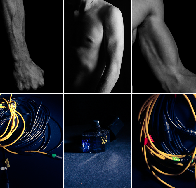
Here I tried re-arranged the first photos I took to make it look more clean:
Photoshoot 2
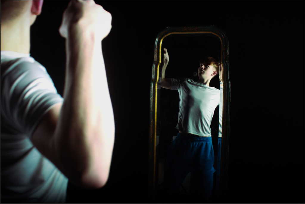
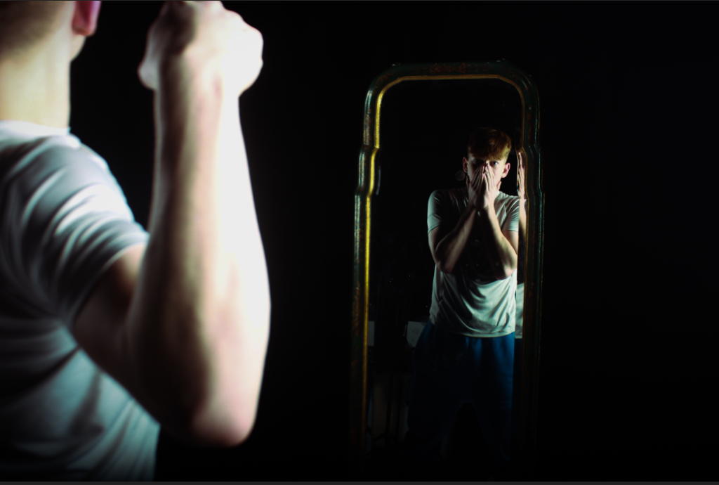
For this image I didn’t want to overdo it in editing so I kept it simple and just merged 2 images together. One being confident and the mirror one being more insecure. It almost looks as if the foreground image is going to punch him inside the mirror, suggesting he’s insecure about himself.
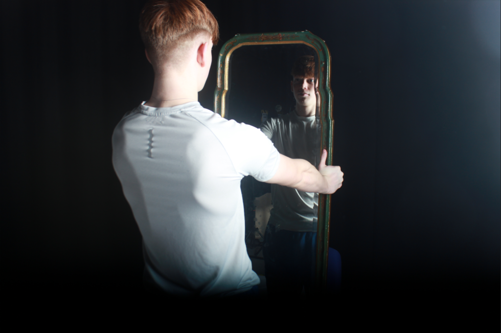
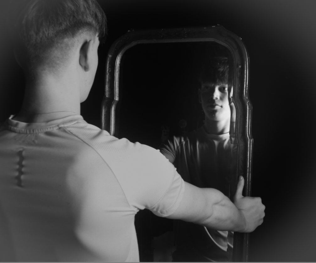
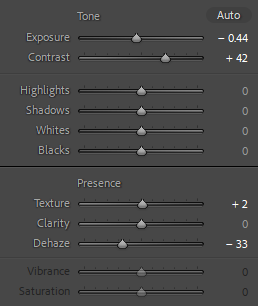
For this Image below I really tried to replicate Duane Michals images with mirrors. I got my subject to hold a mirror looking into it, I also increase the lighting to create a hazy look:
ANOTHER ONE G
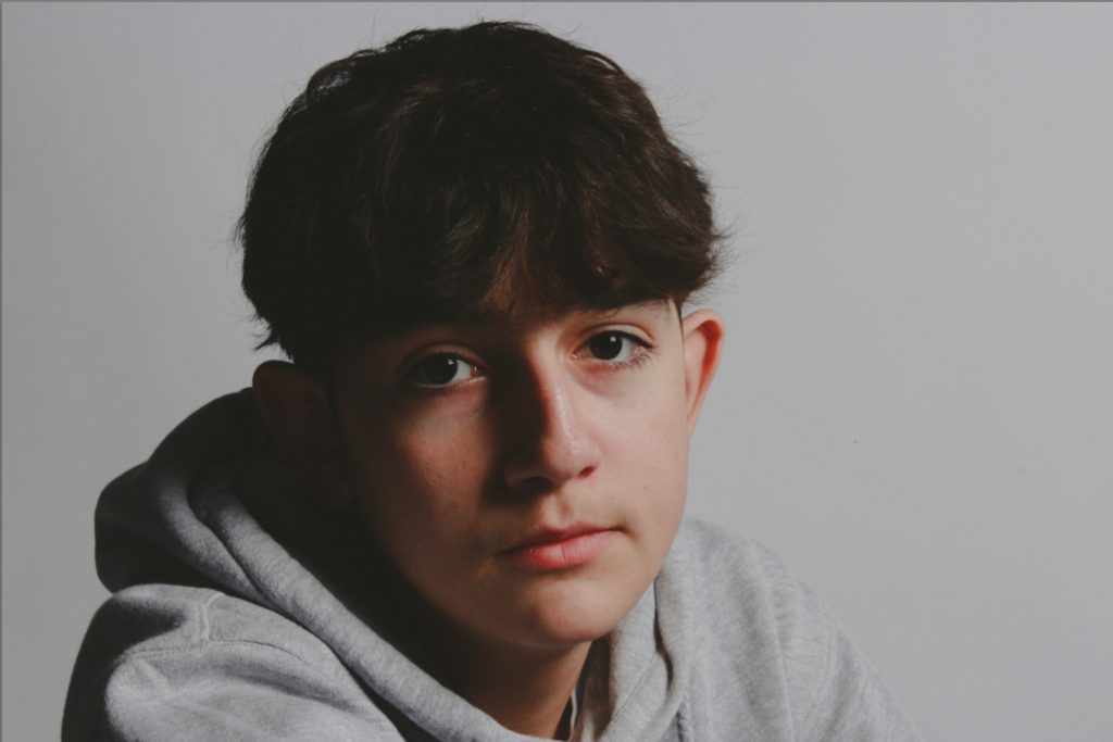
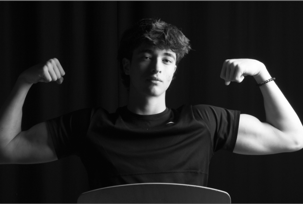
COMBINED:
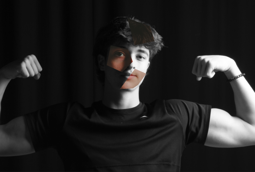
For this one I used Images I took a while ago and was inspired by Cindy Sherman’s latest exhibition, here are some examples:
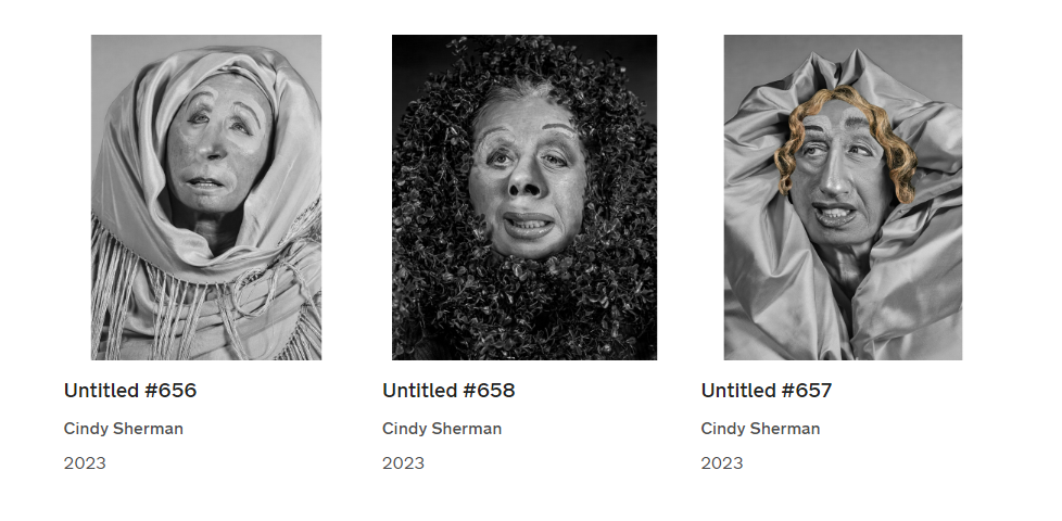
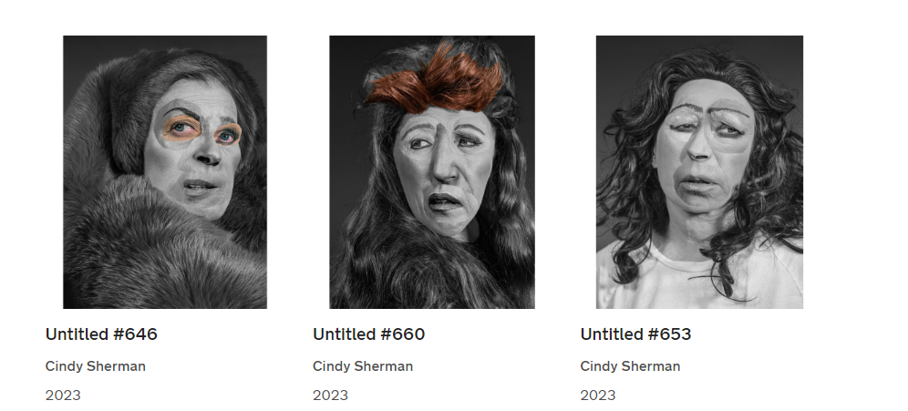
They are all very ‘ugly’ looking, giving a almost humorous effect on the viewer.
The exhibition showcases the artist’s individual series and also presents works grouped thematically around such common threads as cinema and performance; horror and the grotesque; myth, carnival, and fairy tales; and gender and class identity.
