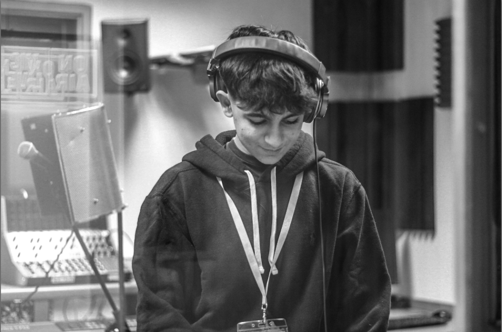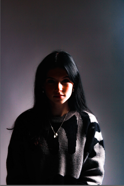
Femininity Vs Masculinity Photoshoot 3. – Colour Stereotypes

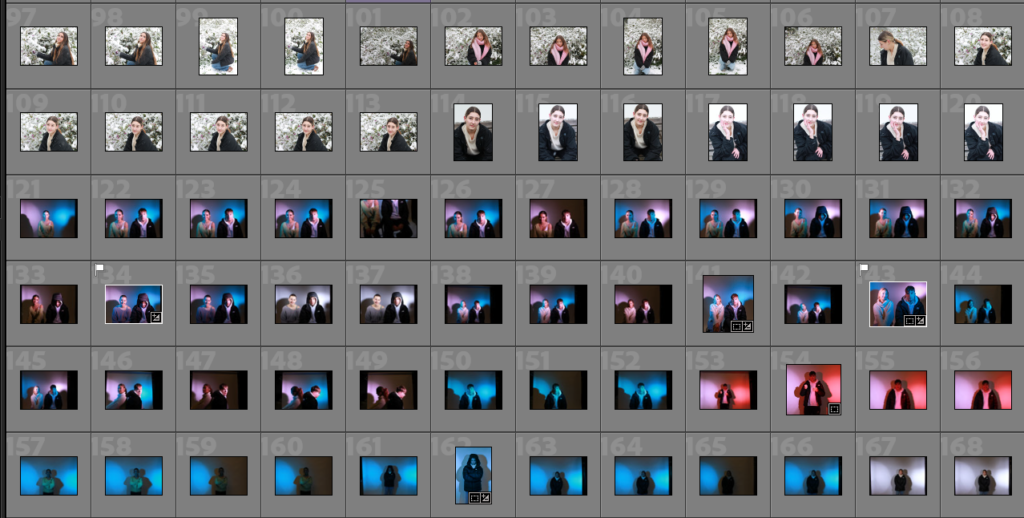
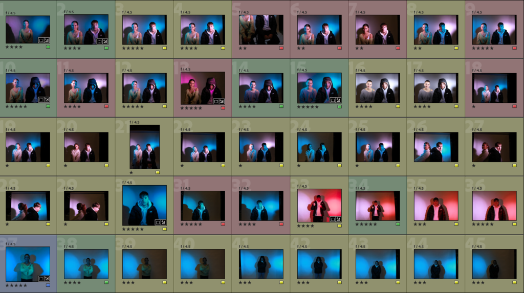
Here is all the photos I took during my photoshoot, whilst focusing on the theme of FEMININITY AND MASCULINITY through gender stereotypes. these stereotypes may consist of colours being assigned to each gender. This is usually seen as the basic analysis of blue being associated with boys and pink being associated with girls. However, some other colours such as black, navy and grey are also associated with boys and pastel colours or bright colours being associated with girls.

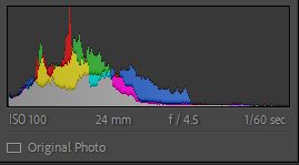
My camera settings were:
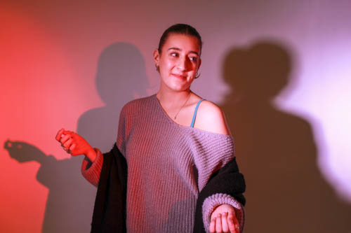
My Favourite Image.
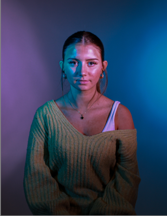
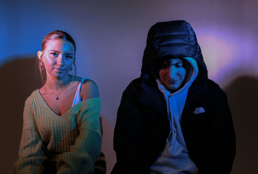
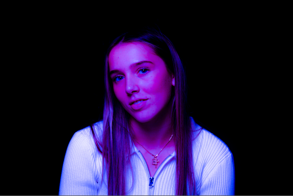
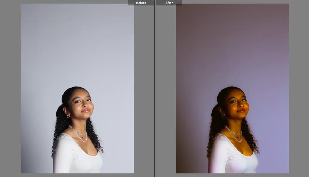
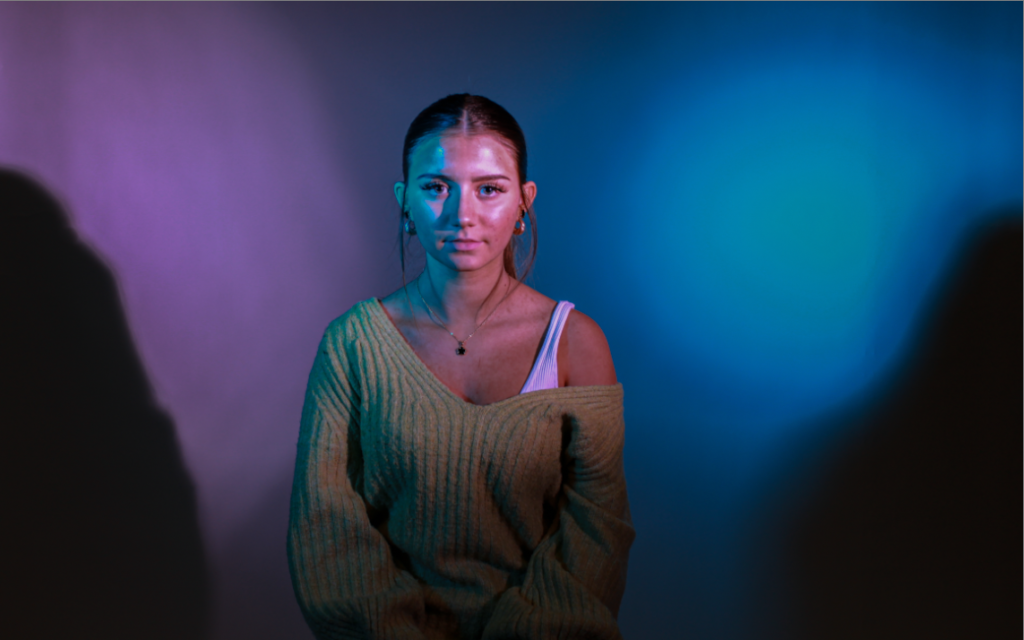
This is my favourite image throughout the whole photoshoot. I really like the plain and blank expression on her face I think this is perfect in order to portray a confused or torn mindset. This photo may either contribute to the idea of either being confused when It comes to gender or being in a sense of conflict when it comes to expression, style and stereotypes in gender. I wanted my model to sit completely in the middle of the picture, which I think really adds to the picture, It helps her to be the focal point of the picture with the hazy colours of pinks and blues around her. I also decided to crop this photo to eliminate the shadows of people and lighting fixtures around her as I think this decreased the overall quality of the image.

Here is the original photo.
My Other Favourites.
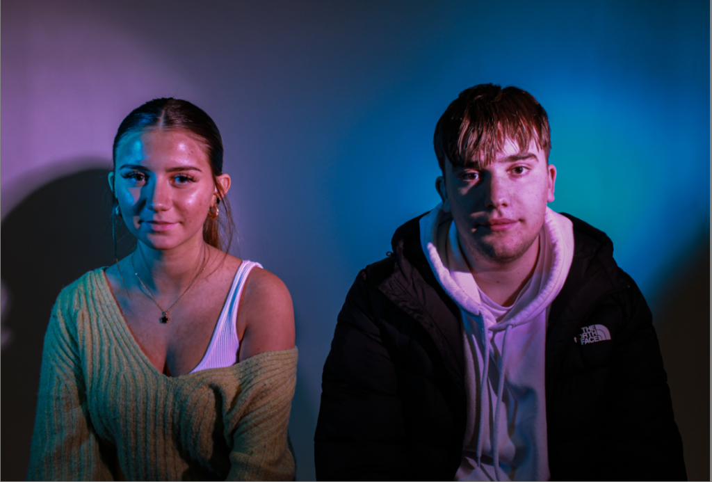
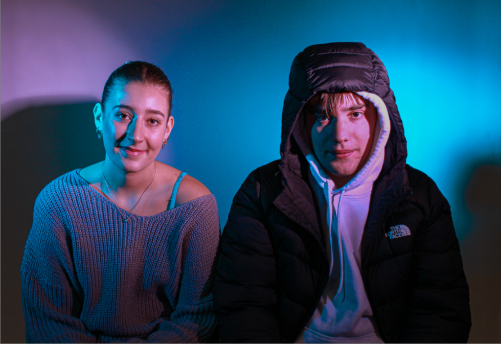
For these two photos I decided to have my female model sit on the left and my male model to sit on the right. I then firstly abided by the colour stereotypes of girls being associated with pink and boys being associated with blue. After that contrasted these gender and colour stereotypes of males and females by swapping the coloured sheets in my lights to have the bright blue light shining on the girl and the bright pink light to be shining on the boy, this is to highlight the idea of ignoring colour stereotypes and, in fact, showing the importance of free gender expression within all sexualities and genders.

In this first photo I had my honeycomb light and my other light with a snout head. For this split lighting the light with the snout was on the right side of my models, this contained a coloured disk of the colour pink and my honeycomb light was on the left of my models with a coloured blue sheet over it. These lights were both either side of my camera at a specific a 45 degree angle, but the snout light was slightly closer to my models than the honeycomb light, this is due to the light less powerful and bright than the other, having this light slightly closer than the other helped me to achieve a balanced amount of coloured light on either side.
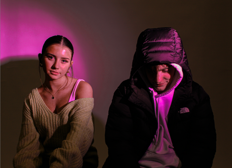
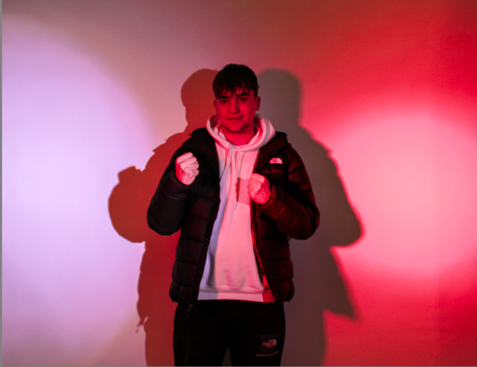
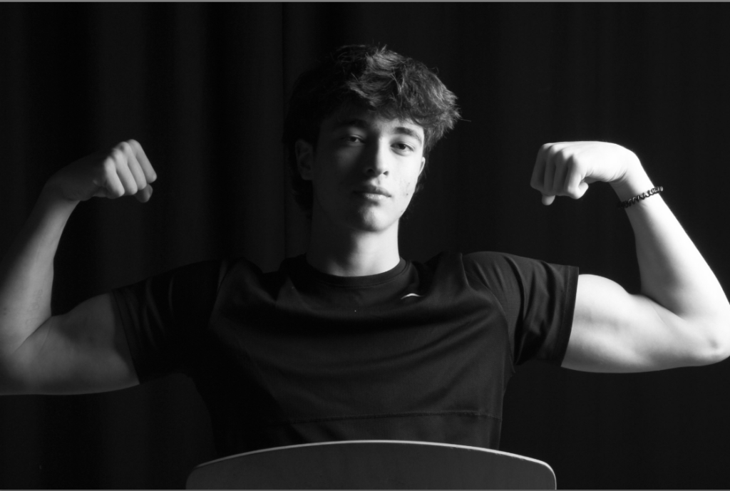
In this part of the photoshoot, I had my male model expressing traditional male stereotypes by holding his fists up to demonstrate anger, toughness and power. However, I chose to shine a pink light on my model whilst he is holding this pose in order to represent femininity shining through a façade of strength and masculinity. Initially I did not like the shadows behind the picture, however after contemplating the true meaning of the photo I like how the shadows help to add to the idea of a façade being put up and having fists up pointing right, left and forwards. If I wanted to in the future, avoid shadows, I would have my model stand closer to the camera and further away from the white background, causing a shadow.
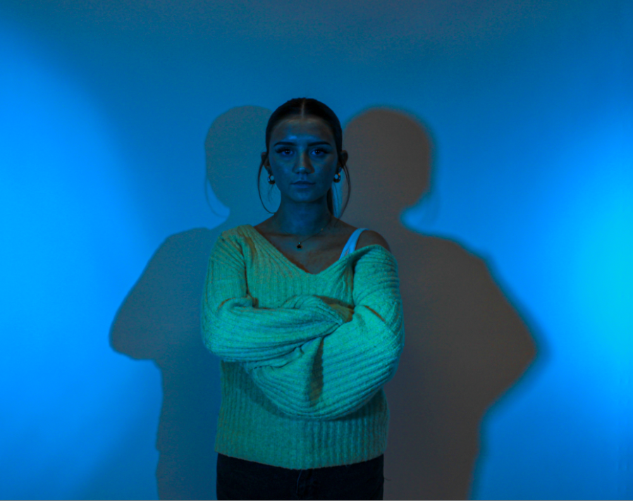
In this part of the photoshoot, I then had my female model expressing traditional male stereotypes by folding her arms and having a fixed blank expression on her face, I also chose to shine a blue light on my model whilst she is holding this pose in order to represent masculinity through a female to show male qualities in a female through a façade of strength and solidity.
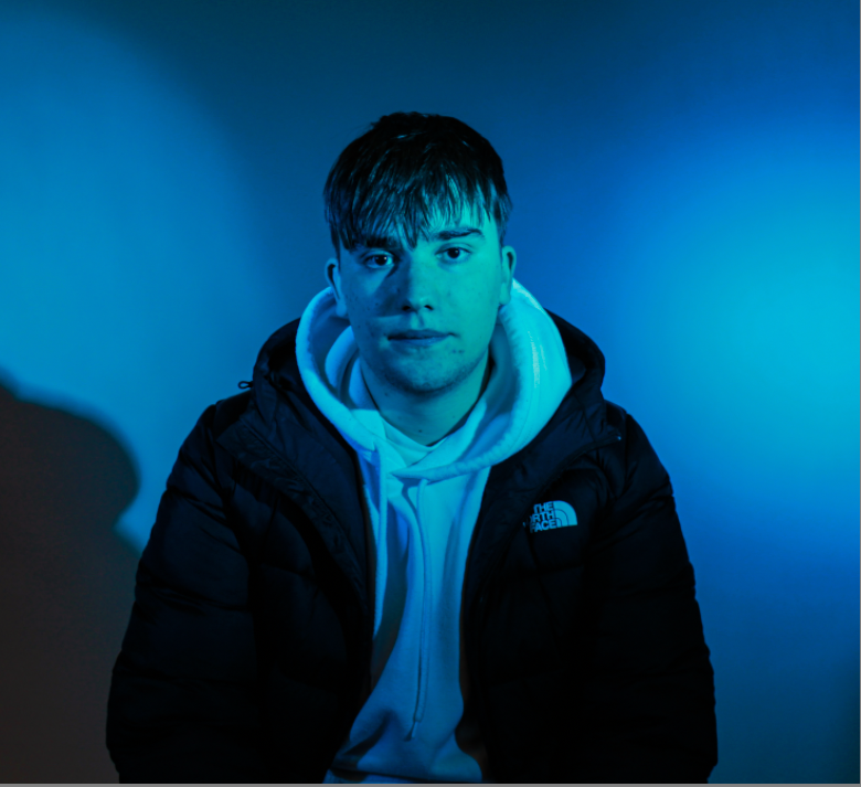
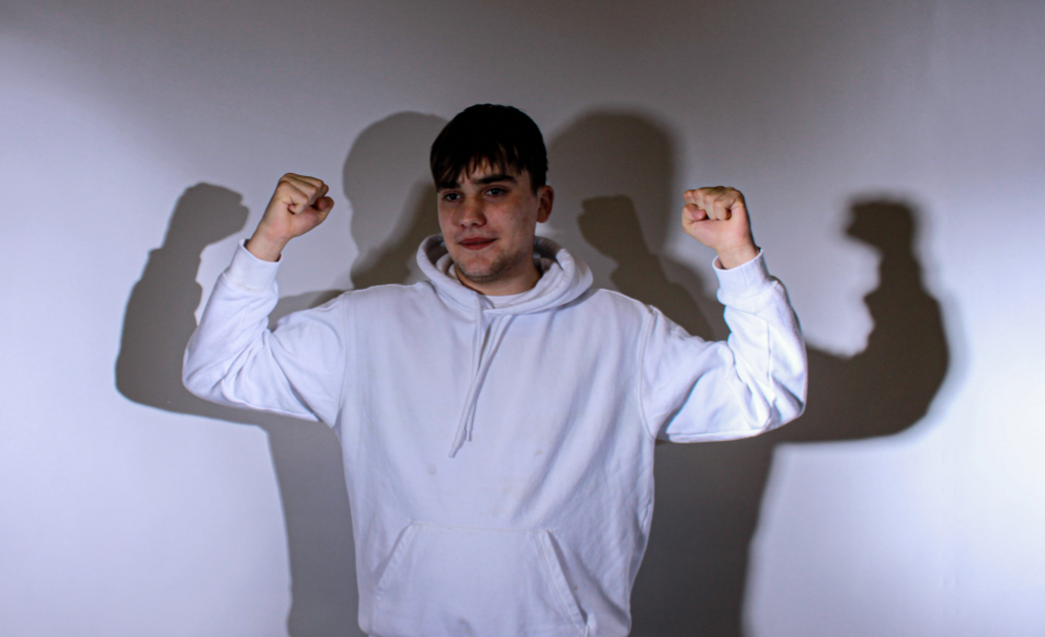
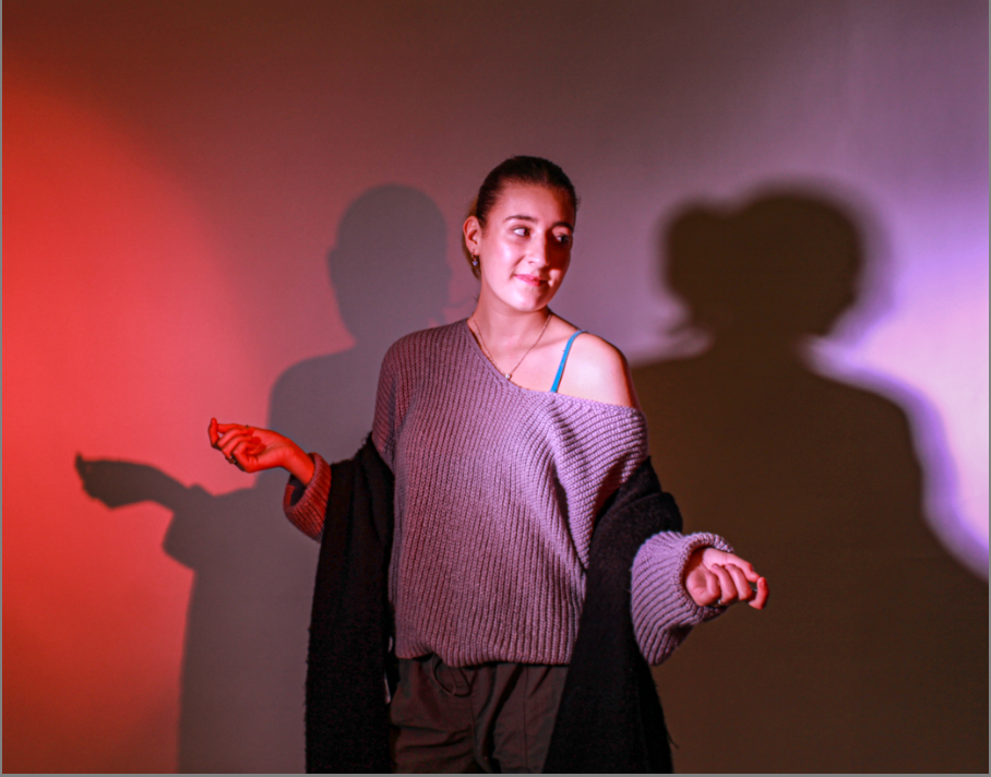
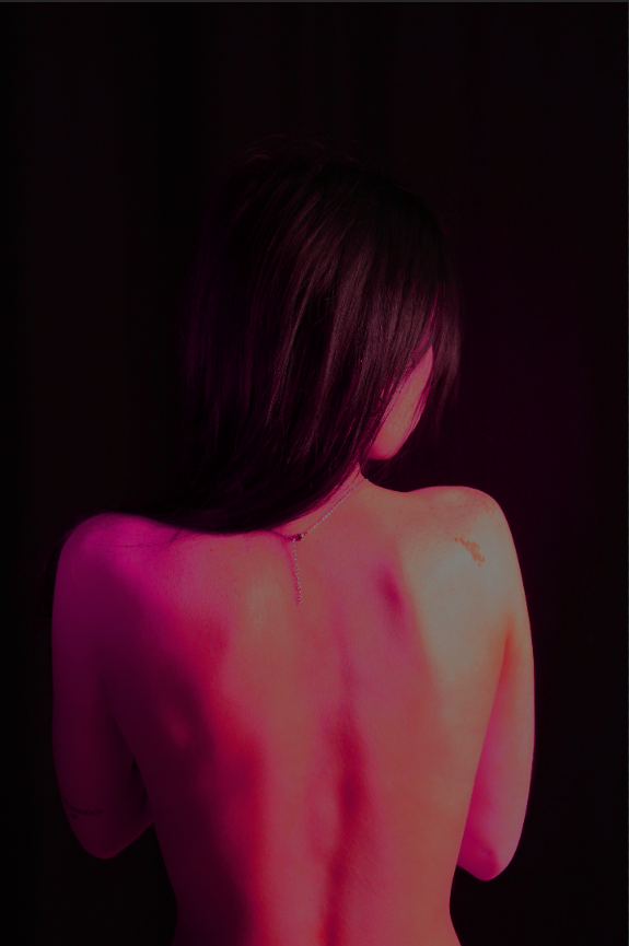
These final photos consist of my models demonstrate the idea of boys embracing femininity and girls embracing masculinity. These photos also demonstrate traditional gender stereotypes like my female model doing a traditional female pose whilst being surrounded by stereotypical female colours like reds, whites and pinks.

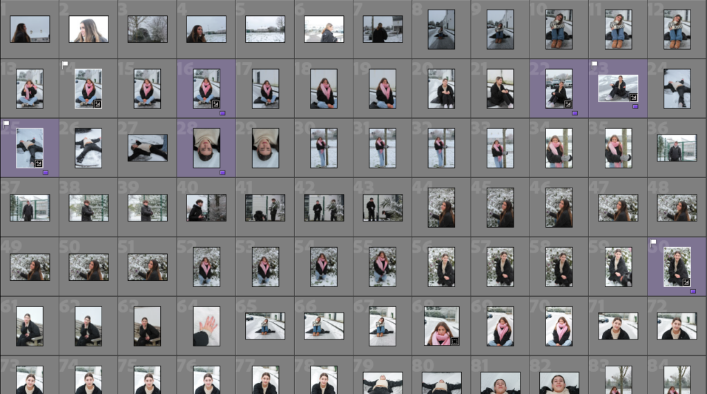
Photoshoot- Femininity vs Masculinity

I took 3 photoshoots for this theme so that I would have a range of ideas to assess.
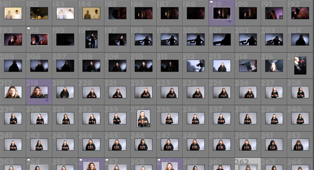
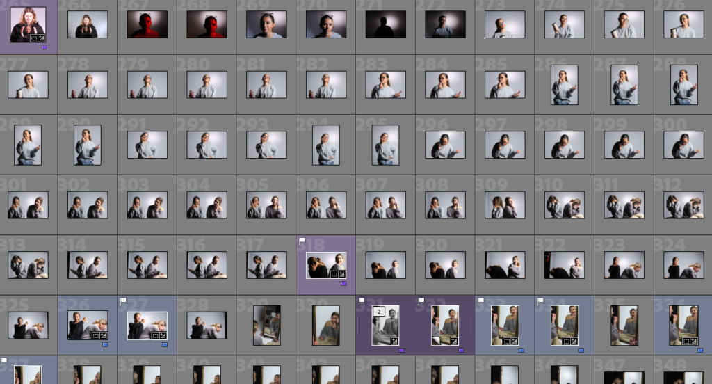
My images:

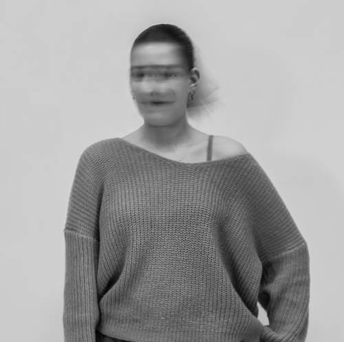
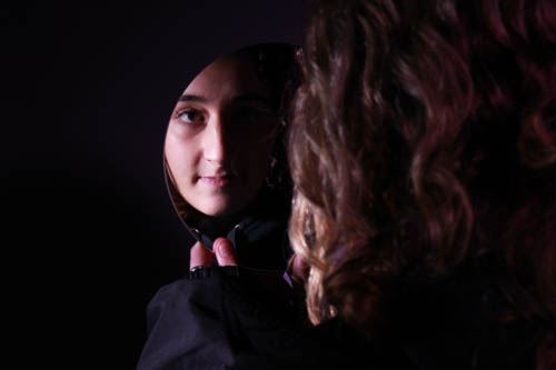
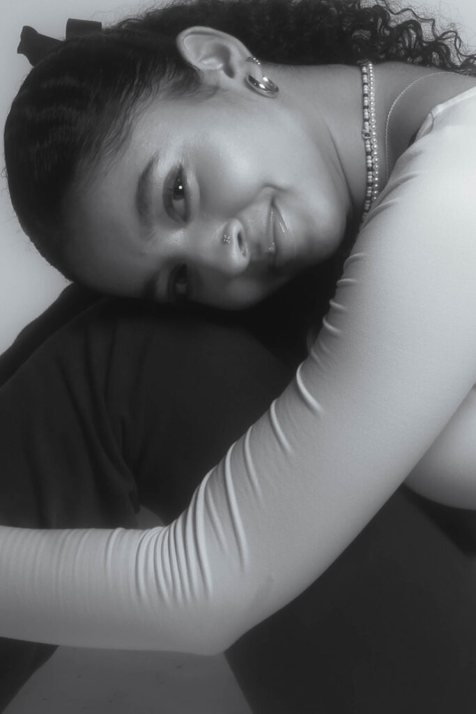
For this image I used a slow shutter speed to recreate that effect on the head that Francesca Woodman used in her work so that it gives the viewer a sense of displacement. This applies well in gender identity as this can represent the struggles of growing up in a strongly gendered society. I feel that this also correlates with Shannon O’Donnell’s work because of the hidden identity on the face however I’ve still managed to capture her eyes looking straight at the camera which I feel looks very mysterious and unnerving because you can ever so slightly see them staring. I put the image into black and white, not only from inspiration from both my artists but because I feel the light background causes the viewer to become drawn to the subject as she is dressed in darker clothes.
These three images are inspired by my artist Shannon O’Donnell as she likes to disclose the subjects identity and mix up the modern perspective on femininity vs masculinity.
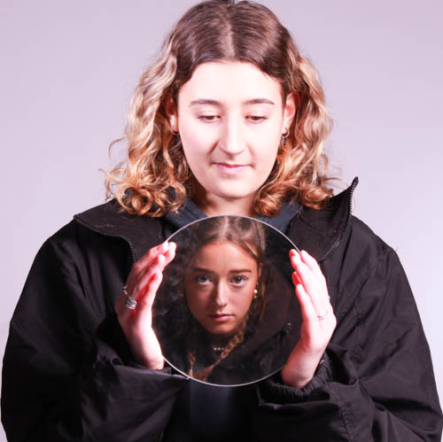
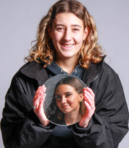
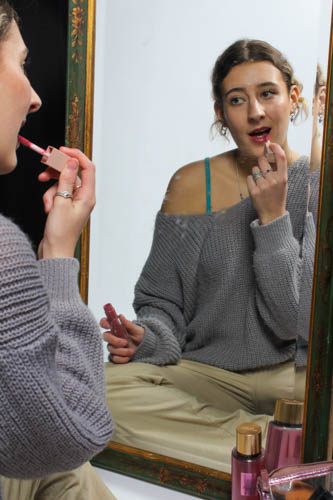
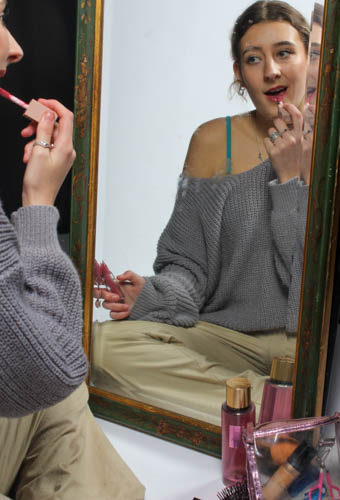
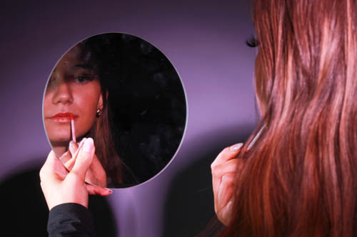
In these two images, one subject sat in front of the other to catch their reflection whilst capturing an image of the second subject too. I played with the tone in both images with the first one, a more dramatic pose, has a contrasting warm pinkish tone to it however the cheerful image has a more cool tone to it.

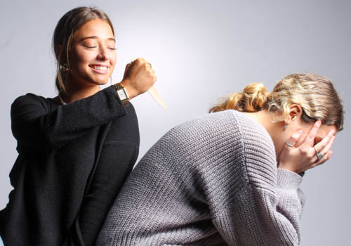
I chose this image as I feel like this represents the culture of teenage girls in school as this stage in their life is filled with drama and arguments with friends. I sat the two subjects alongside one another, the girl on the right looking really devastated while on the left she is holding a knife with a smile, as if she is ‘stabbing her in the back’ through betrayal.

For this image I place feminine objects in front of the mirror such as makeup, perfume and a hairbrush to the right of the subject as if she is getting ready. This heavily represents stereotypes around women because it shows the way that women pamper themselves with products of this sort and how when growing up this is the ideology around teenage girls only caring about growing up too fast. This would generally be the image of a magazine cover for women, in which young girls would see and usually compare themselves due to the unattainable beauty standards for women in fashion.

In this image I put the light behind me to catch my subjects face in the mirror which gave the image Chiaroscuro lighting. I like the way it has made the background dark and lit up one side of her face through her reflection because it means that her face is the only thing you can relatively look at. The way the girl looks into the mirror represents the idea in society that girls/women are overly obsessed with their image.

Again in this image the light was directly behind me to give a visible reflection into the mirror and a dark background behind the subject so the focus is entirely on the face. However, instead of there being a strong Chiaroscuro aspect to this image I used the snout light with a pink-coloured gel alongside the flash-head and I have raised it to a warmer tone so the outcome has turned a vibrant pink. There is a strong theme of femininity throughout this image alongside that due to the nails, lipgloss and lashes. I feel the use of the mirror has helped reinforce the stereotypical idea of young women being overly obsessed with their looks and presentation throughout the image.

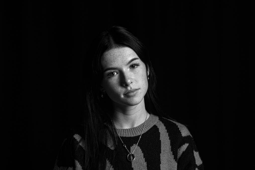
I’ve chosen this image as she is showing real emotion with the tears just under her eyes which is relative to the stereotypical views of women being that they are emotional. My subject sat just off-centre towards the left wearing black as I feel that the monotone jumper and background reflects the mood of the image, making the viewer focus on how this image brings an element of sadness to the viewer and makes them feel it too as she is looking straight into the camera.

Final outcomes and evaluation:

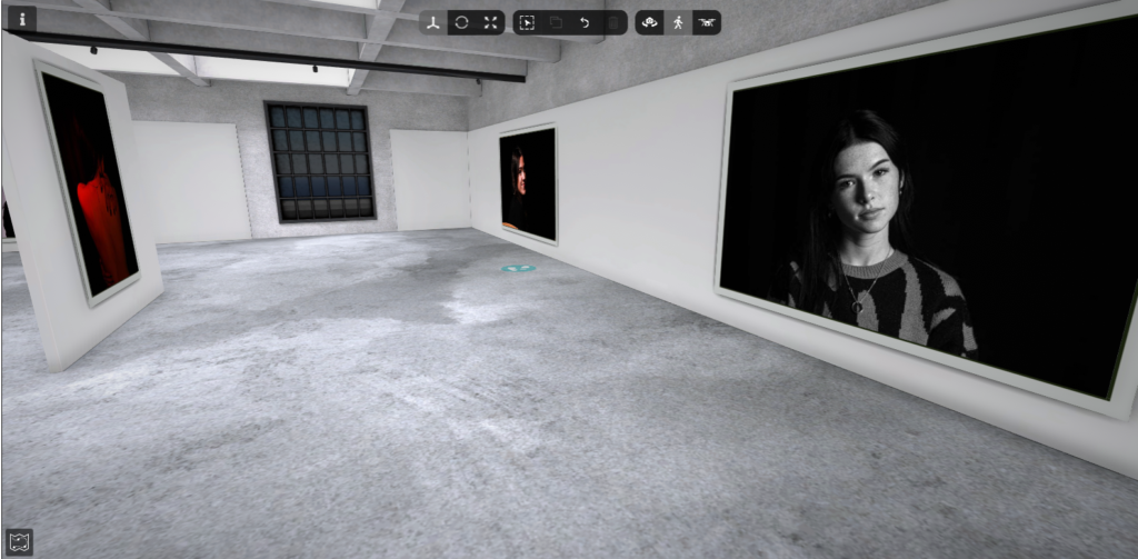
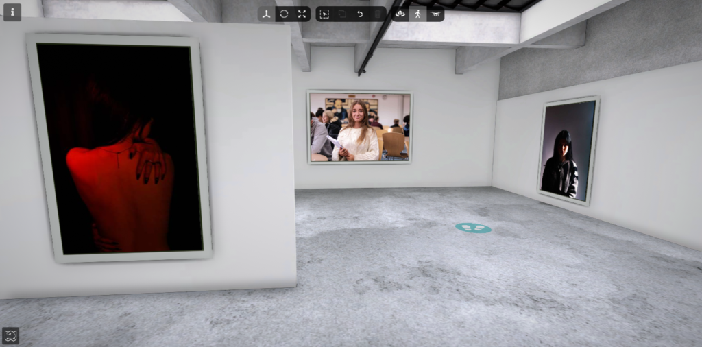
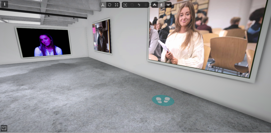
Virtual gallery presentation:

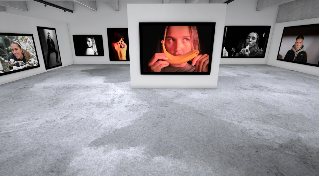
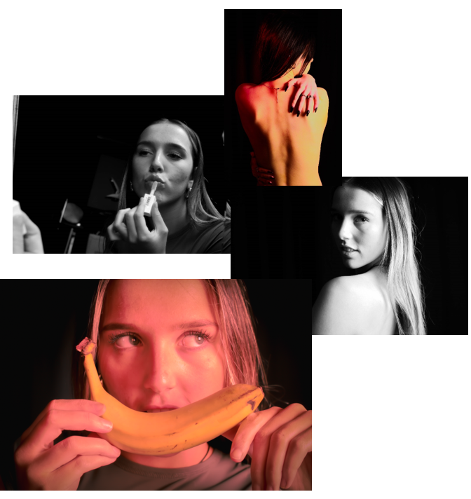
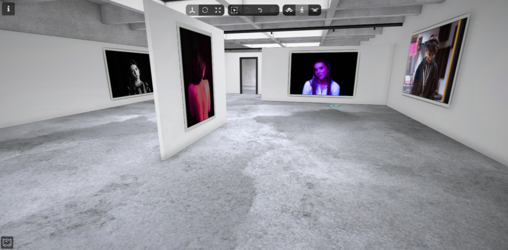
Here, I presented all of my favourite and final images from my project ‘femininity and masculinity’. I lay them out so that my overall favourite image was centre, while the other photographs are surrounding it. This creates a huge contrast between the different photos and the way they are presented.

Evaluation:

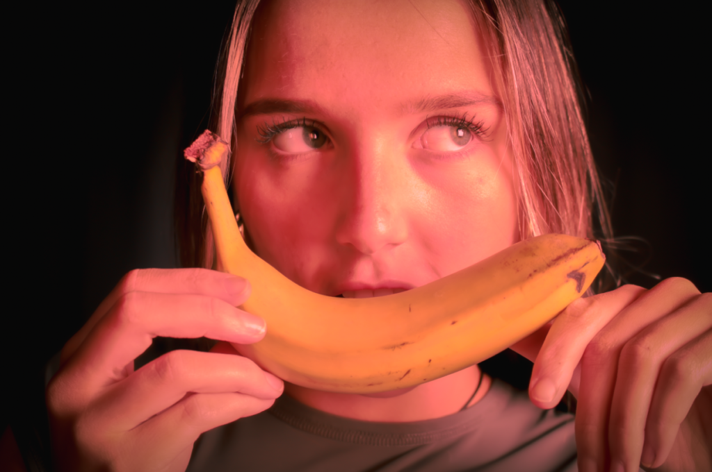
Personally, I think all of my images were successful and I’m very happy with my final outcomes. My favourite overall image is this one because I like how the tone is pink which contrasts to the yellow banana. I included fruit in my photography because it feels like the subject is hiding behind it, as if its a mask. The banana portrays a smile, whereas the subject behind is not smiling and is showing a different emotion.

Image editing and experiments:

For all of my photoshoots, I chose to represent femininity and masculinity through the different stereotypes and expectations both genders are supposed to live up too.

Photoshoot one:

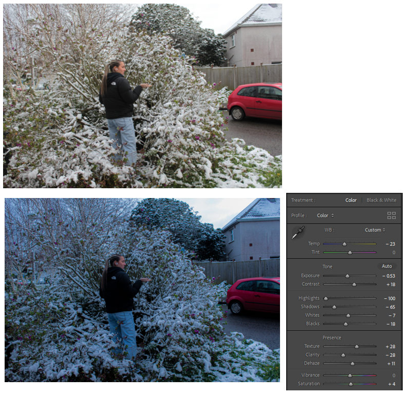
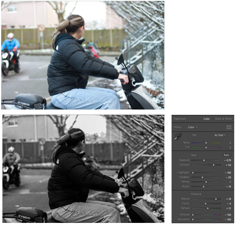
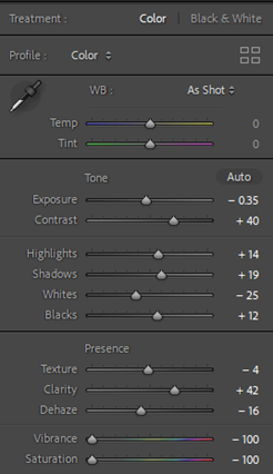
Firstly, for this photoshoot I went outside as it was snowing and I thought I could use the snow as an opportunity to include some feminine elements for my photographs. I edited the first photo by decreasing the highlights and the shadows which made a significant difference. This helped to decrease the light in the image as it was quite bright, and increase the shadows. There is also a blue tint which gives the image as a whole an ‘icy’ feel which links to the subject as they are in the snow.

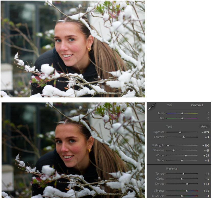
For my second image, my aim was to make the subject a bit more focused so I decreased the exposure and increased the contrast. By increasing the contrast, the face looks brighter as the shadows are increased and the face looks defined.

For my last image, I chose to edit this one because the subject is using a motorbike as a prop to show a more masculine aspect. I decided to decrease the vibrancy and saturation to make it black and white. This photo looks like an ‘action-shot’ and stereotypically, women riding motorbikes is not normalised.

Photoshoot two:

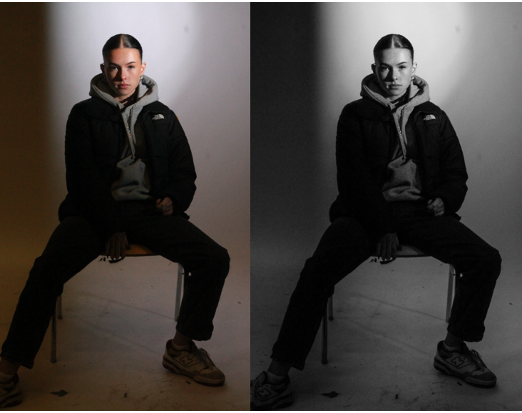
I think both of these photos perfectly represent the stereotype of men, that they are more important and powerful compared to women. I like the way the subject is staring directly into the camera which replicates the ‘male gaze’ and reinforces this idea of the stereotype.

Photoshoot three:

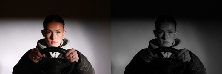
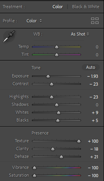
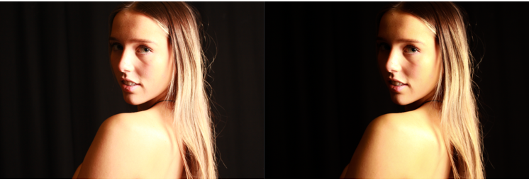
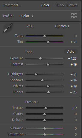
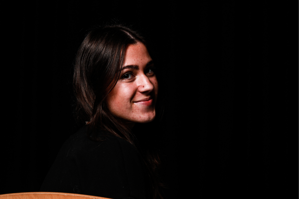
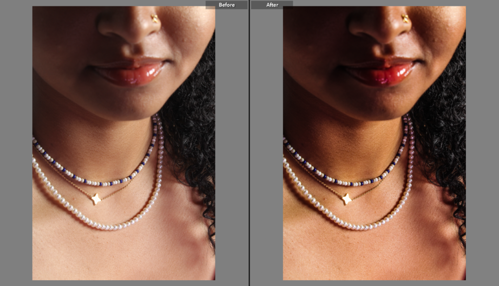
Lastly, I edited this photo to make it softer and give off a more ‘feminine vibe’. I like the way her skin looks very shiny, and she is lightly gazing over her shoulder towards to camera to represent innocence. I made the background darker and her skin brighter, so the viewer feels like they can only focus on the main subject.

This image has an empty alt attribute; its file name is image-1800.png

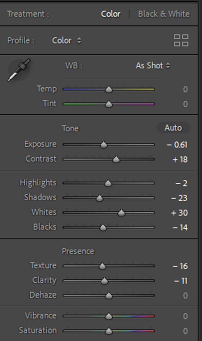
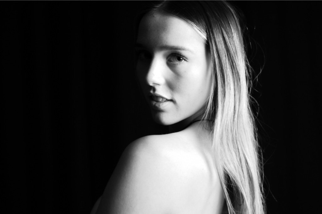
I then experimented by changing the vibrancy and saturation to make this image black and white, whilst keeping the edits of the previous image the same. This enhances the feeling of ‘innocence’ to the viewer. Femininity is represented nicely here as the subject is close up and we can see her face features very clearly. Stereotypically, women are supposed to have long hair, soft facial features and nice skin. As we can see here, this model represents all of those aspects finely.

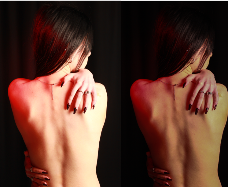
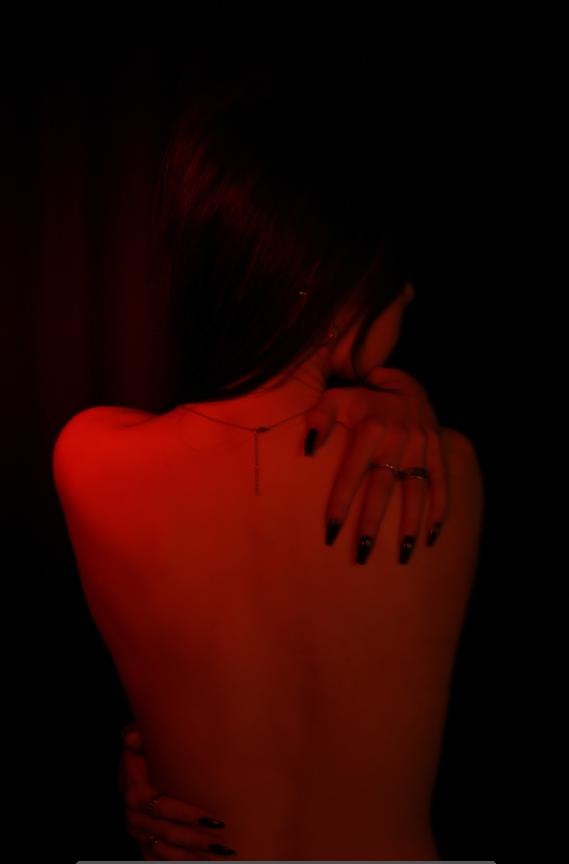
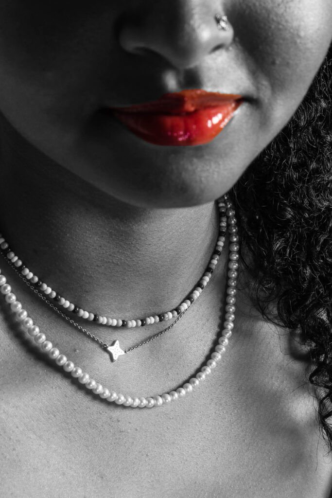
Finally, this is my favourite image I edited because femininity is represented in a different way. Rather than reflecting on the stereotypes, femininity is presented here through the large amount of skin on show, and her long red nails. Many years ago, when women were seen as less important then men, and they were only stay at home wives/mums, they were expected to keep their skin hidden by wearing long, concealing clothing and to keep their nails short and clean. If lots of skin was on show it was seen as provocative. The colour pink, ribbons and lace are also associated with typical feminism, whereas the colour blue is seen to be linked to masculinity. As we see in the image above, the model is revealing her skin to show us how much this has changed over time. The long, red nails represent a sense of power, confidence and individuality as red symbolises femininity.

I edited all of these images using Lightroom, with the hopes of improving them and completing the ideas I had in mind. I tried to experiment with different things, for example, black and white tones. The black and white inspiration came from Claude Cahun as I believe most of Cahun’s work is in black and white which she used to reflect on herself as a person. I think the black and white tone goes really well with the specific photos I chose because it sets the mood of the photograph. Personally, I think all of these edited photographs represent Femininity and Masculinity in many different but clear ways.

Final Presentation + Evaluation – Identity

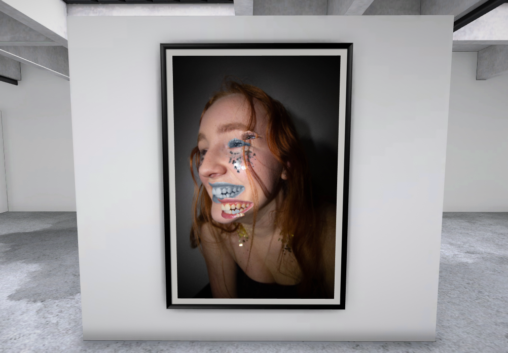
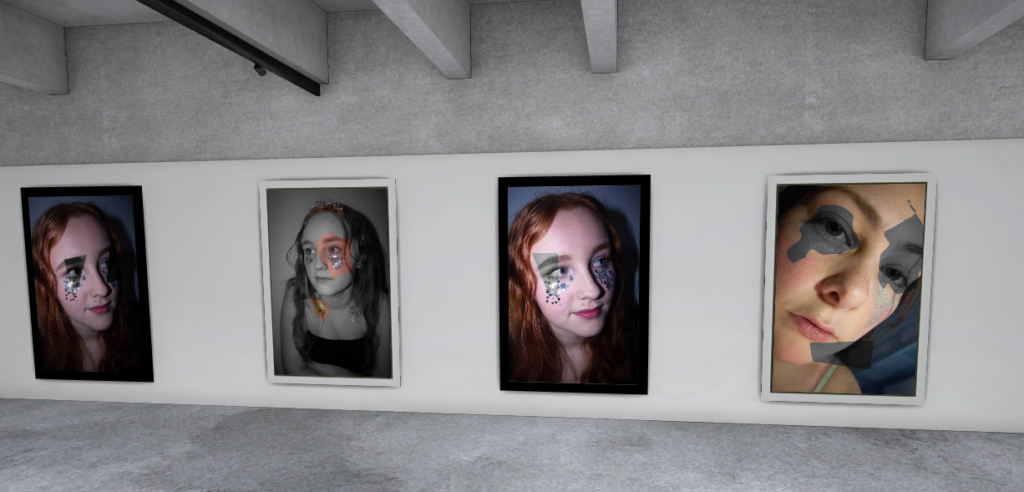
I have chosen to present my final outcomes in a virtual gallery, I chose a particular layout by using my most usual and creative final photo on a wall by it’s self I chose to do this as it is out there to compared the rest of my final outcomes but I don’t dislike it. However it is following the idea of absurdism a lot more than the rest so I didn’t want to take away from the other shots as the meaning could be glossed over if they started to get too unusual. To keep with this idea of keeping the photos uncomplicated enough to understand the meaning quickly I did use frames to keep the photos from feeling flat against the wall but I made sure to them fairly neutral by only using black and white frames which also works with the photos being black and white. A lot of thought went into how to display each shot in the gallery, things like the photos taking up most the wall was important to me as I wanted the photos to feel daunting and real. By also using a pattern for the frames it separates each photo and gets people to separate them in their mind. This also links to why I chose a more complex frame for the more extravagant image as it matches the photo better than a basic frame does.

Final Best Image

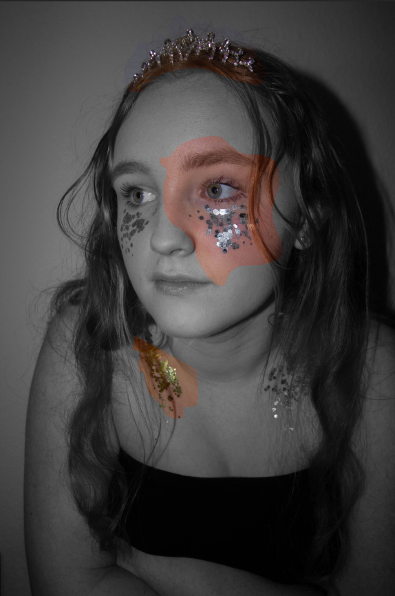
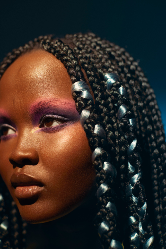
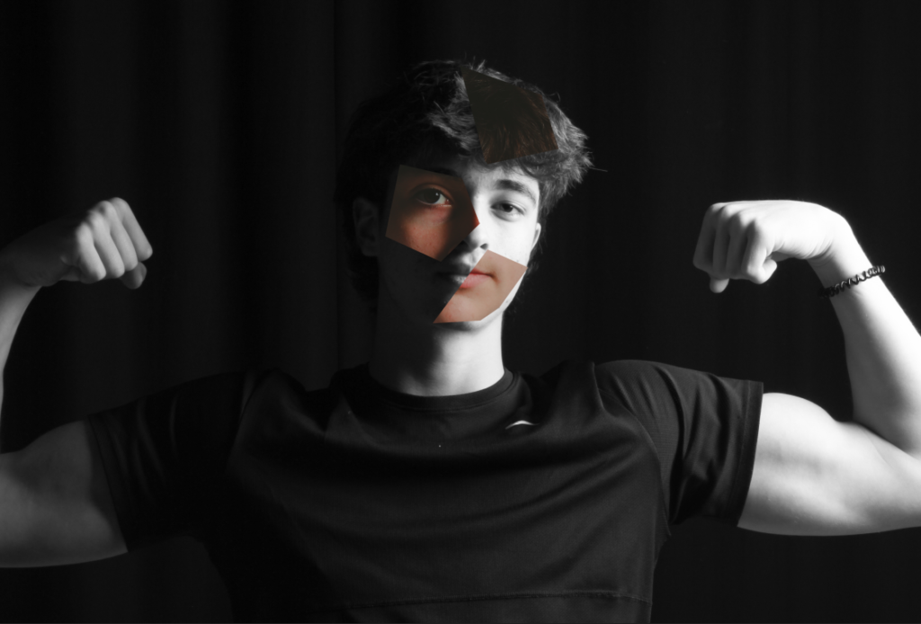
This is my strongest image overall for many reasons, it first caught my eye because the model wasn’t looking at the camera and instead placed herself slightly off centre in the framing of the shot. The model fills the frame as I chose to use a close cropped framing and a plain background to keep the focus on the model and not the background or anything around her. Inspired by Kayla Varley and Hannah Altman the close cropped, glitter and makeup look in scattered through out the shoot and this image I chose to edit in the style of Sherman’s work. I wanted to show the link between femininity and what it takes to be ‘feminine’. By using a mix of silver and gold glitter which is commonly associated with winning something or being precious. To add to this I got the model to wear a tiara to further add to the precious idea as people commonly say beauty is pain but then say as women we should be soft and gentle without being too princess like. This is all rather confusing to anyone especially teenage girls so through this photo I have pulled peoples attention to different parts of the model, one of her eyes, one side of her collar bone and the tiara. By using the lasso tool it allowed me to create free hand designs for the parts I have cut out of the the photo and recoloured, I didn’t want set shapes as I wanted the photo to keep its raw look as much as possible.

Comparing Photographers Work and My Final Outcomes

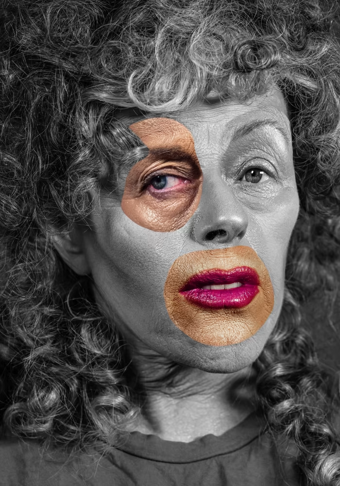
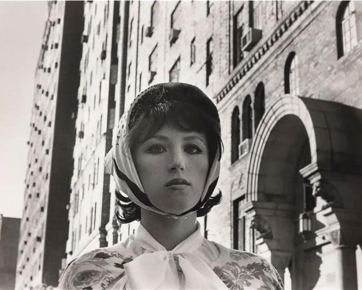
Cindy Sherman

On the left is Cindy Sherman’s and mine is on the right. Having the images side by side really helps me look at what I have done well and what I could look at improving if I was to do it again. There are some clear differences in that Sherman’s work is down more of the absurdism route where as mine is looking at more what is expected. However this also is due to Sherman’s work is aiming to be someone else she dresses up as characters and even though it herself in photos she does not consider them self portraits, where as with my work I was taking a photo of a model posing but the model was my ‘character’ dressing how I suggested, with untamed hair, and of course the glitter inspired by Altman’s work of a similar theme. I did keep to the idea of having a black and white base photo and the cut-outs in colour but I chose to cut out parts of the same photo and not move them so instead it’s just a glance at the person underneath the black and white where as Sherman’s work has manipulated multiple images and pulled them into a large collage of sorts.

Kayla Varley

I liked Sherman’s work and took a large amount of editing inspiration from her but for a large portion of the shoot I was focused on getting shots similar to Varley’s work, specifically her beauty work. Her style is unusual looking at different angles and bright, interesting makeup a lot of the time. This inspired me to look into using angles other than straight on and using lighting to my advantage. Lighting is a huge part of Varley’s work and it provoked me to look at how artificial lighting could have been used to make the glitter stand out, so I used a flash and a small torch to get a shine onto the glitter so it felt in cooperated into the photo and not just placed onto the models face. Varley also uses closely cropped angles focusing on the models face or parts of their face over full body shots which I thought was an interesting idea nd implemented in my own photography.

Final Images and evaluation

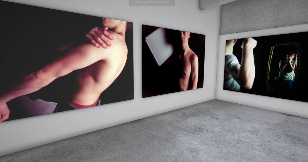
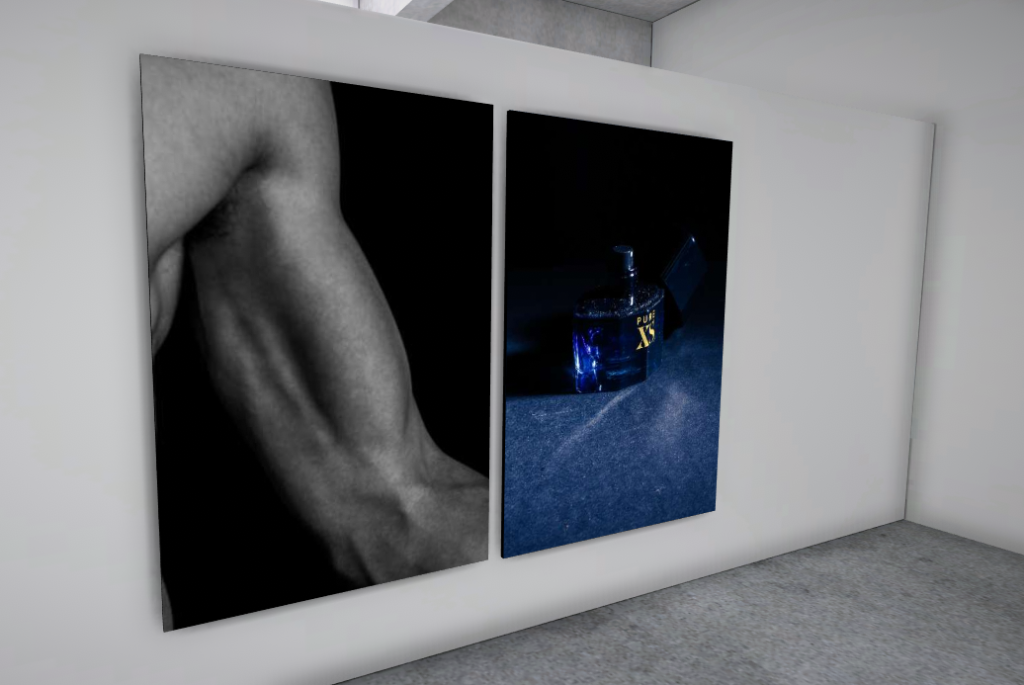
I decided to lay out my favourite final images in a virtual gallery here:

Evaluation:

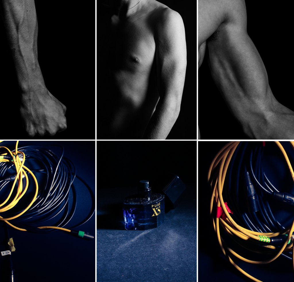
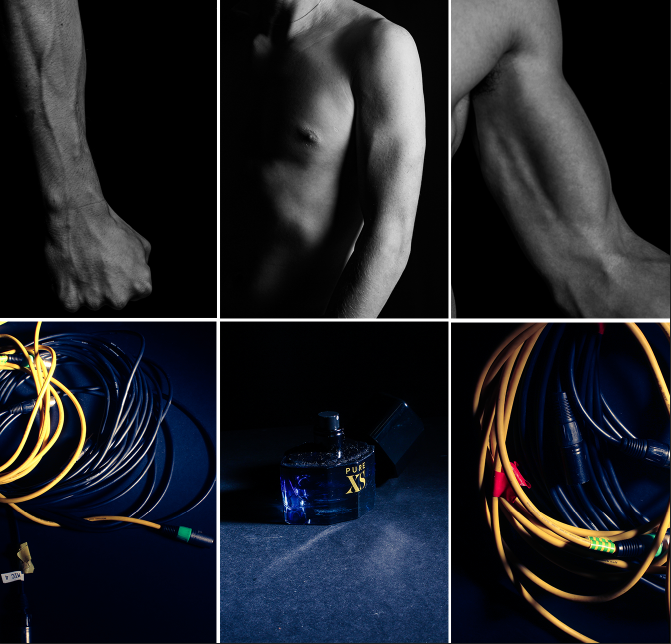
Overall, I think this montage of images does a good job of presenting classic masculine ideas. With the colour grading and high contrast, It makes each image stand out. However to improve on this next time I will need to organise this montage better (e.g. diamond cameo) And I feel like the top middle photo does not match any other photo so I will need to take more specific body part photos. I had a little bit of inspiration from Claude Cahun (with the camera work and editing), but I feel like I should of stepped more into her style of bold, outgoing photos.

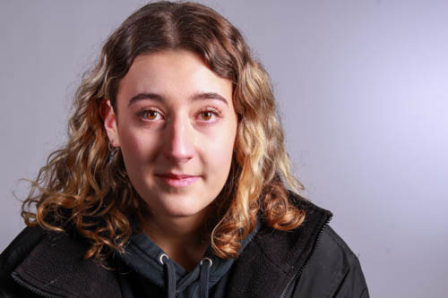
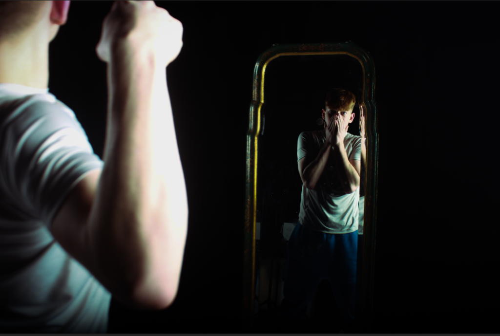
I think this image links very closely to Duane Michal’s work, by showing the insecurities of a person with there identity. It shows how modern masculine expectations can make a person insecure in themselves. I feel like the foreground model isn’t in frame enough to make it obvious to the viewer that there are 2 different photos.

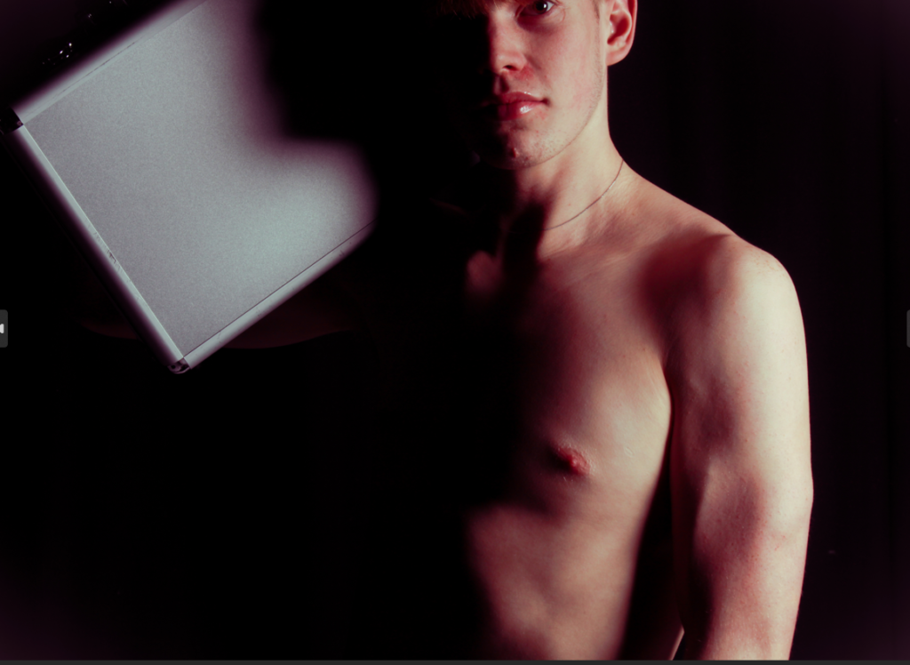
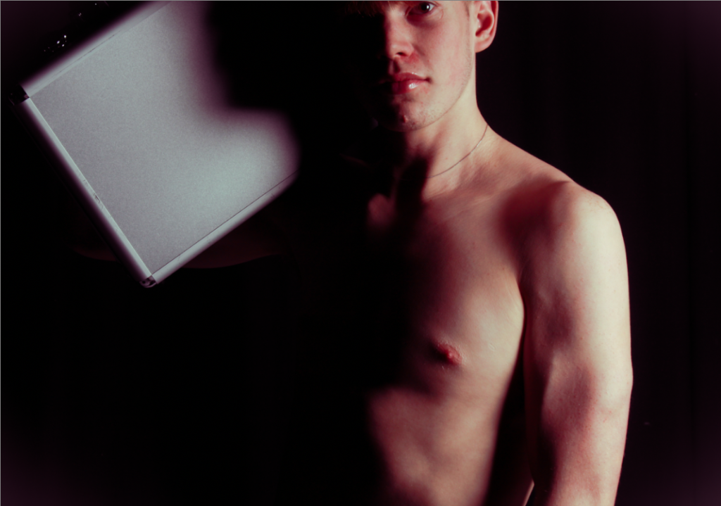
I think this image links fairly closely to Cindy Shermans work linking to the male gaze. However, I edited my photos to have a rosy red colour grading to them, breaking the norms of gender identity with a feminine colour. The bright, glossy lips of the subject take the viewers attention away from the ‘manly’ body in a strong looking pose. By taking the viewers attention towards the lips you are making more ‘feminine’ traits a focus in the photo, conflict the binary opposites of masculinity vs femininity.

Editing and experimenting

Photoshoot 1

For editing I decided to use other photos from photoshoot one, This Image below I tried to capture Cindy Sherman idea of the “male gaze”, but complete flip it so I’m capturing images of men instead.

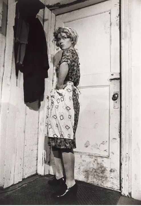
The characters in Sherman’s photos are often an exaggeration of widely represented female identities. Since this exaggeration and masquerade is visible through heavy make-up or distinctive clothing, the works appear to reveal the artificial construction of what is supposed to make a person female, such as wearing clothes typical for a housewife or the extensive use of eyeliner:

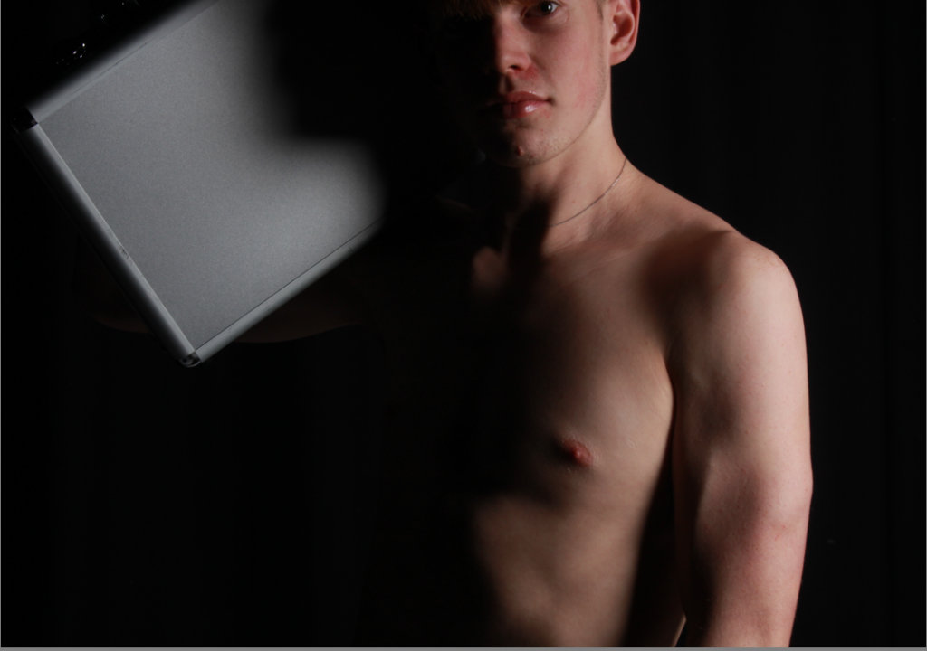
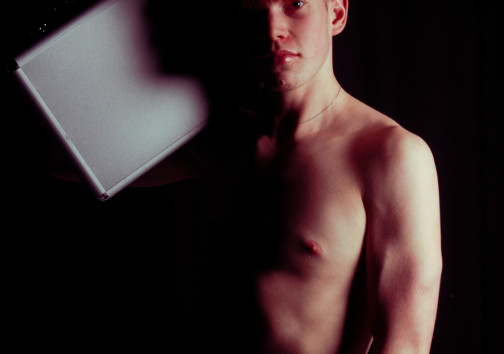
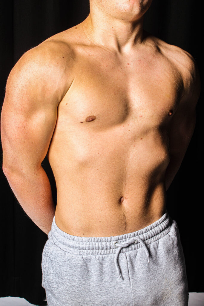
So for this image I made a very traditionally “masculine photo” with my model where he has no t-shirt, and holding a breath case with a strong intimidating pose. I have cropped this image to keep the eye area away from the rule of thirds to make the body the dominating feature of this image. Keeping the eye area and the posing (of the breath case) high, which further increases the intimidation that this model creates for the viewer as he is looking down to the camera so to the viewer. :

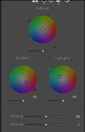
To confuse the viewer I have edited this photo with some colour grading often associated with feminine traits like rosy red, to remove the line between masculinity and femininity. This take away a lot of the intimidation that I talked about above:

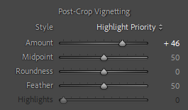
After this, I noticed that the background, not being completely black, could distract the viewers eyes from the subject and a easy way of mitigating that is by using a vignette. A lot of old photos also have naturally occurring vignettes due to incorrect camera equipment (e.g. lenses with large apertures or barrels) But adding it digitally can make your images pop and guide the viewers eyes to the subject:

I repeated this process with other photos:

Here I tried re-arranged the first photos I took to make it look more clean:

Photoshoot 2

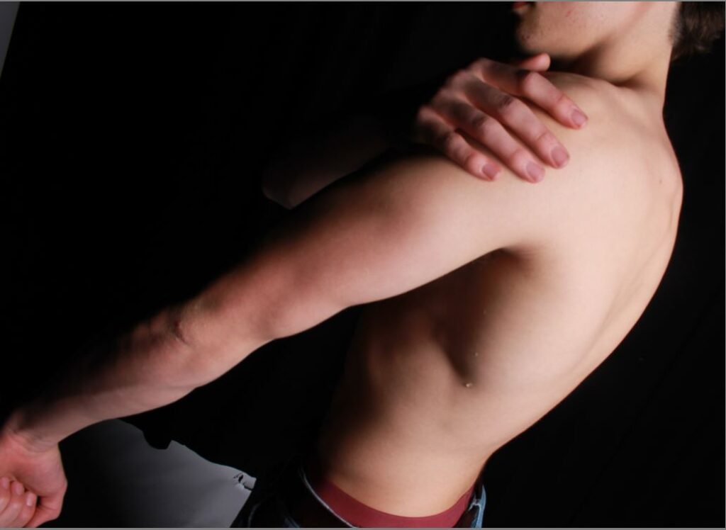
unedited
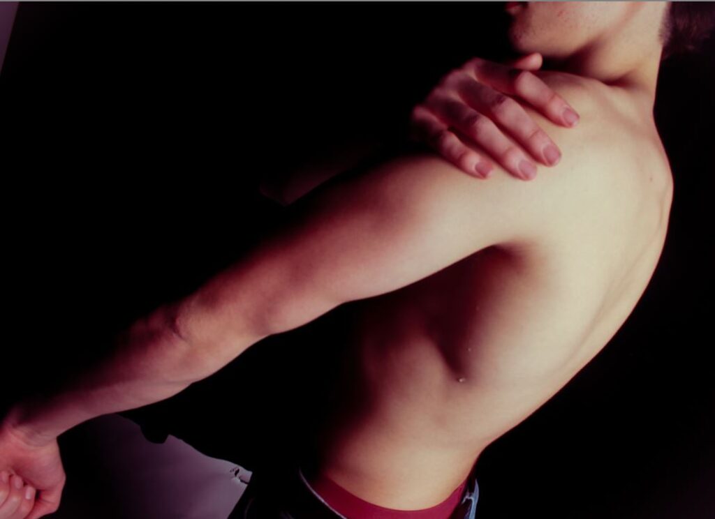
edited

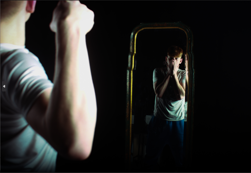
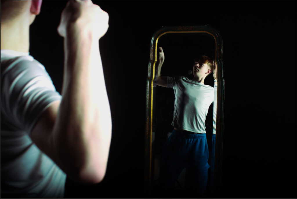
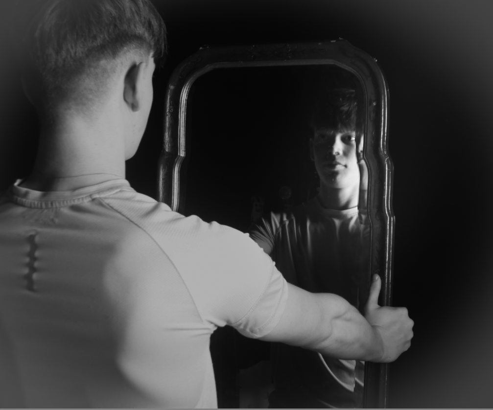
For this image I didn’t want to overdo it in editing so I kept it simple and just merged 2 images together. One being confident and the mirror one being more insecure. It almost looks as if the foreground image is going to punch him inside the mirror, suggesting he’s insecure about himself.

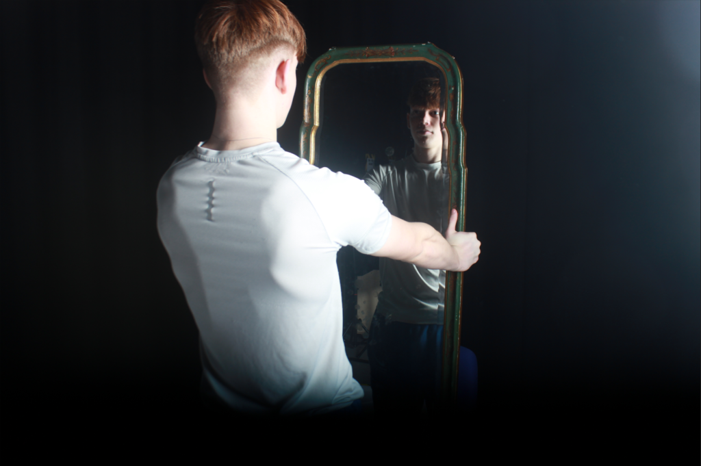
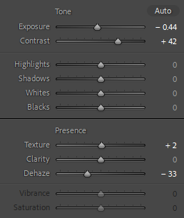
For this Image below I really tried to replicate Duane Michals images with mirrors. I got my subject to hold a mirror looking into it, I also increase the lighting to create a hazy look:

ANOTHER ONE G

COMBINED:

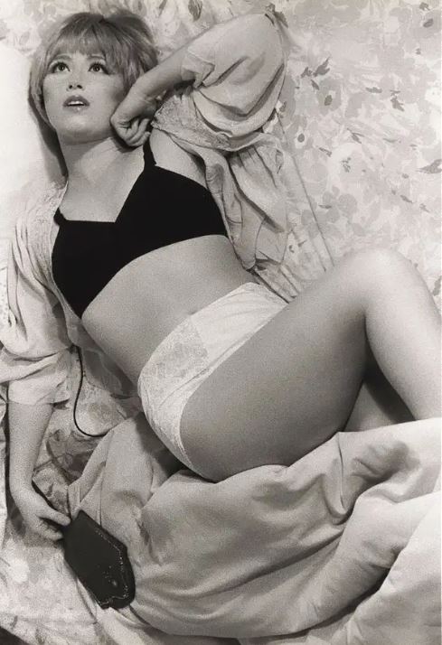
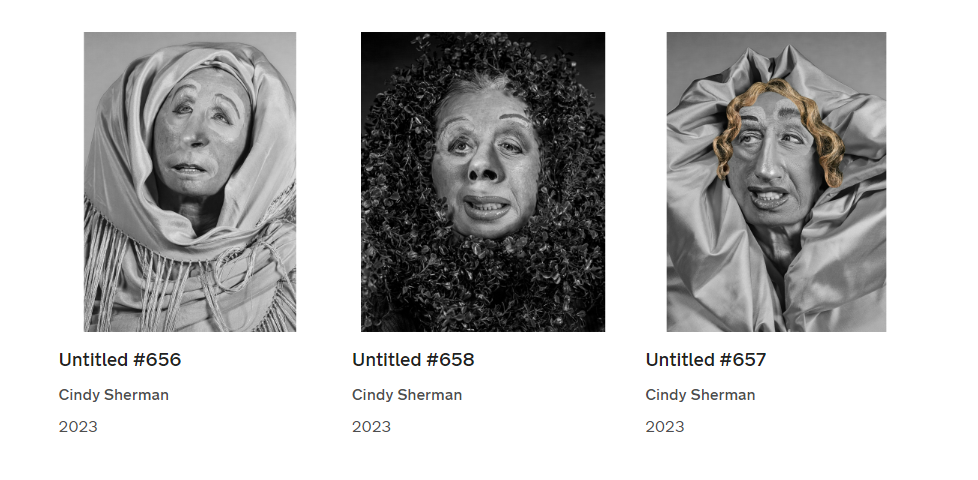
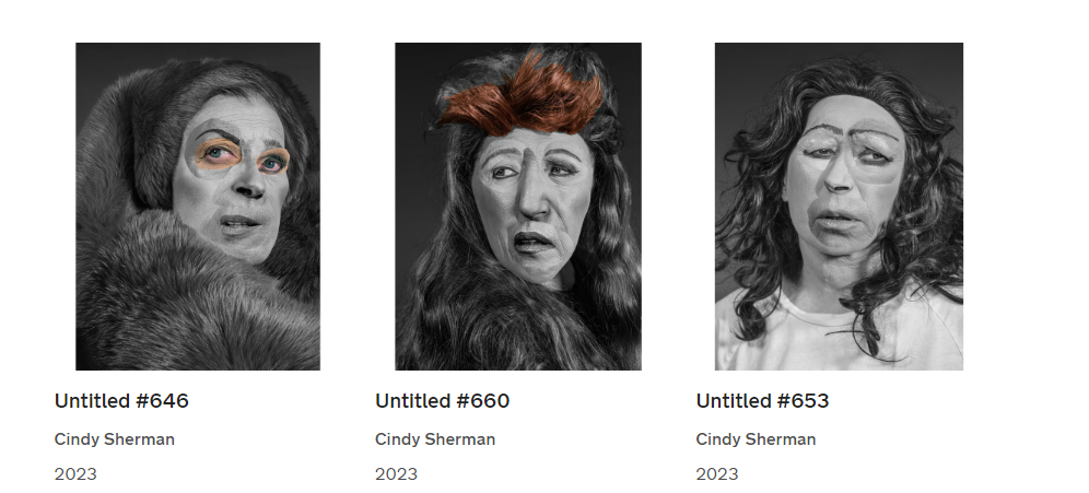
For this one I used Images I took a while ago and was inspired by Cindy Sherman’s latest exhibition, here are some examples:

They are all very ‘ugly’ looking, giving a almost humorous effect on the viewer.

The exhibition showcases the artist’s individual series and also presents works grouped thematically around such common threads as cinema and performance; horror and the grotesque; myth, carnival, and fairy tales; and gender and class identity.

Image Editing/Experimenting

Cindy Sherman Inspired Edit

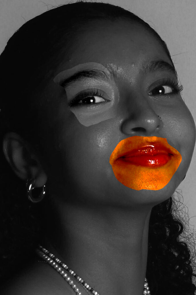
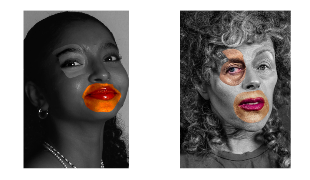
For this image I increased the saturation and added a filter over it in Lightroom. When I was happy how the original image looked I opened the edited version in photoshop, I then duplicated the layer so that I could have one layer in monochrome and one in colour. On the monochrome layer I used the lasso tool to cut out certain sections of the models face. This edit was inspired by Cindy Sherman’s photoshoot where she would distort her face to create a more unique image and question beauty. Overall I think that this photo turned out pretty good and is similar to what I was aiming for, however I think this could have been a better outcome if I had taken more close ups of the model and some with her showing no emotion as Cindy Sherman does. Below is a comparison of my image and Cindy Sherman`s Image.

Edit 2 – masculinity

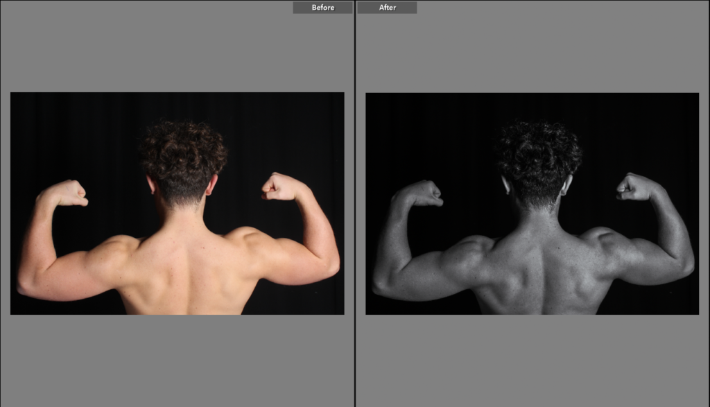
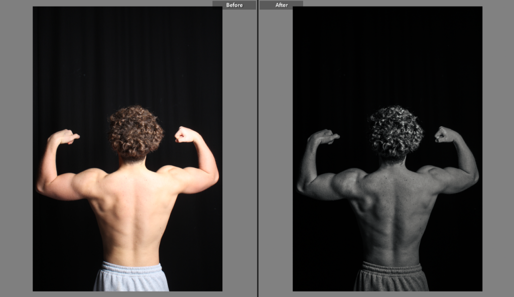
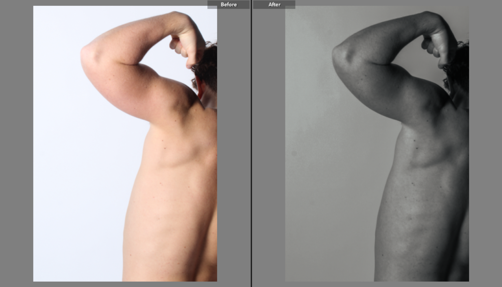
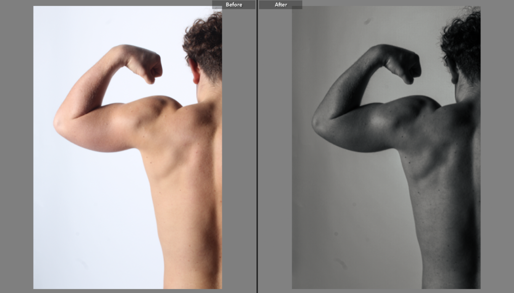
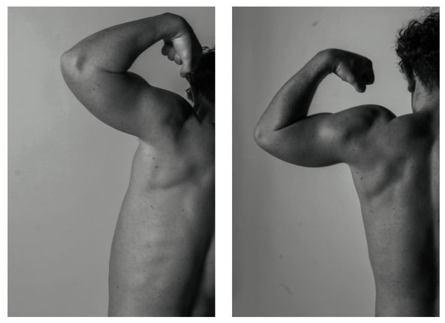
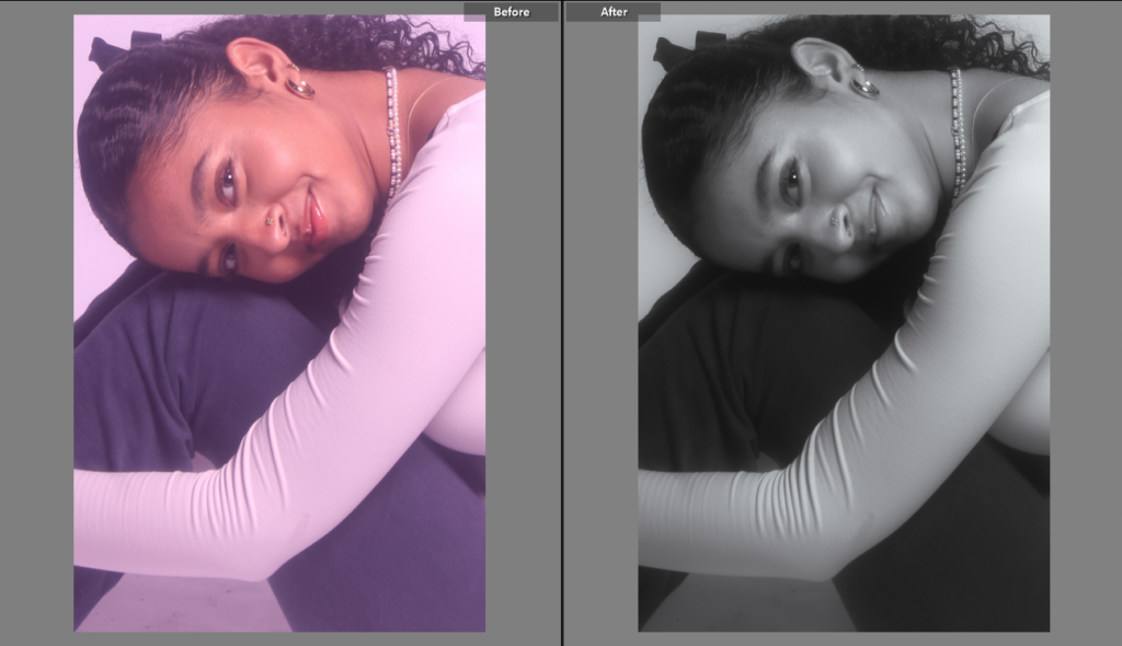
This is a before and after of the four images I used in this second edit.

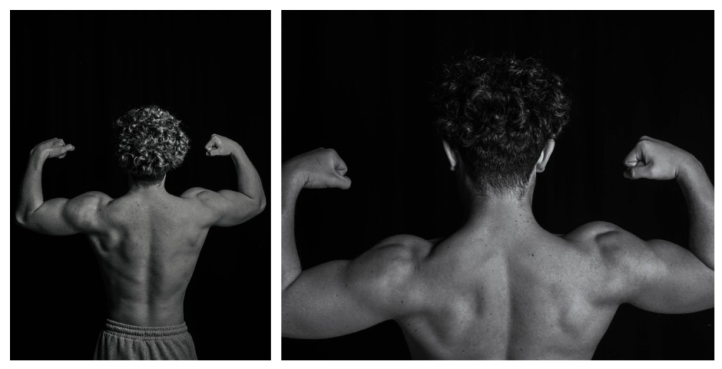
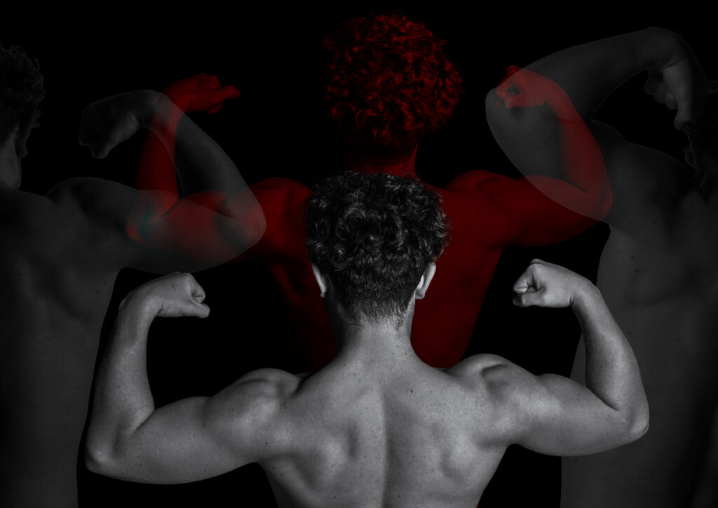
These are the final four images once I had edited them in Lightroom, I put all the images in monochrome to refer back to the artist Sam Contis, Sam Contis also focused on the male body like I did with my photoshoot and his images are in black and white so I took inspiration and did the same. With these final four images I put them into an A3 canvas/document in photoshop in which I created this:

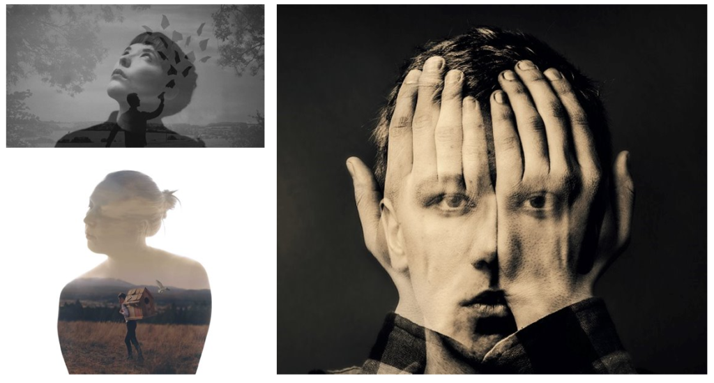
I really like how this edit came out, this edit really portrays the theme of masculinity. I used a technique I have used in the past , multi exposure so for this image I took inspiration of Sam Contis and Muhammed Faread who gave me stylistic inspiration for this image. Here is a few pictures taken by Muhammed Faread which inspired me :

Muhammed Faread is a talented Egyptian photographer who is recognised for his multi exposure/ double exposure work. Muhammed Faread said that he sees double exposure as a form of poetry. I like the concept of Fareed’s images and i really like how they turn out therefore I took style inspiration from him.

Edit 3 femininity

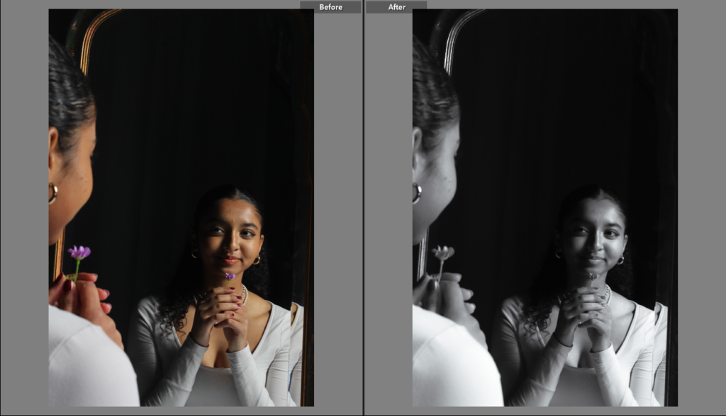
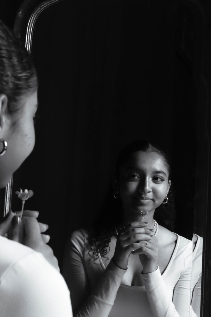
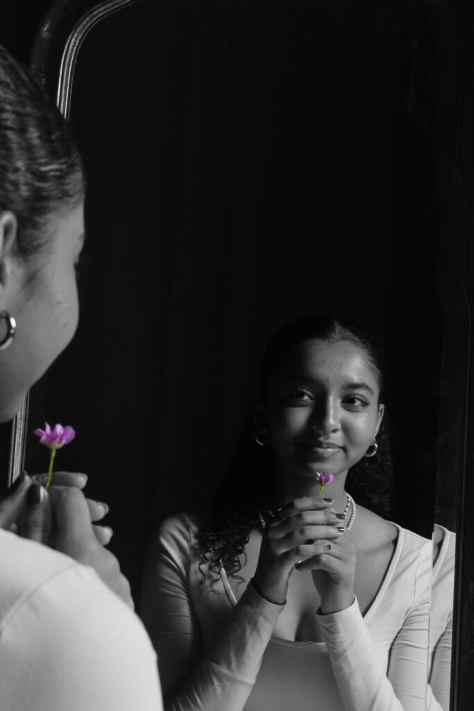
For this edit I used this photo of the model holding a flower in the mirror and I put the image into black and white changing the temp and exposure until I got the right tone I wanted on the image. Then once I had edited it in Lightroom I thought that making the flower in the image the only thing in colour was a great idea as it changes the focal point. So then I put the image into photoshop, duplicated the layer, made it monochrome and then selected the flower to keep the colour.

Edit 4 – femininity

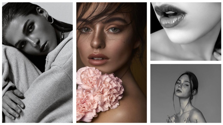
For this image I did a simple edit in Lightroom, I turned the image into black and white and I played around with the exposure, highlights, temp and etc until I was happy with how the photo looked. This photo was inspired by a photo on my femininity mood board which is the image on the left of the mood board.

edit 5 – Femininity

For this edit I put a filter over the natural image and adjusted exposure and shadows on Lightroom, Once that was done and I was happy with the overall photo I then opened the photo in photoshop ,duplicated the layer, made the new layer monochrome and selected her lips as it is associated with femininity and removed it so that the lips would be in their normal colour.

edit 6 – Masculinity

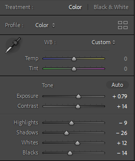
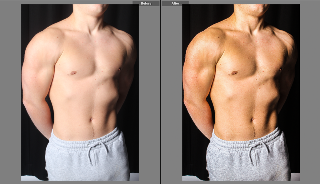
For this edit I thought that this image was too overexposed and that the body was too white so in Lightroom I played around with the exposure and added filters to it until his body was clearer.

Photoshoot 2 bruv

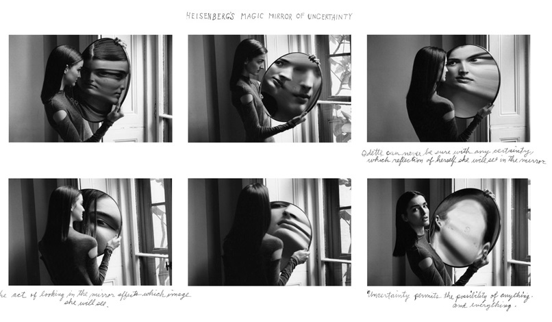
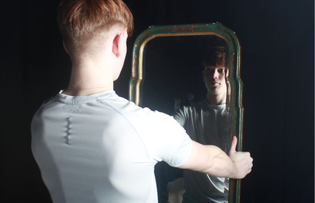
I was inspired for this photoshoot by some of Cindy Sherman’s mirror images, especially Untitled Film Still #2 by Cindy Sherman . She almost seems insecure about herself and the qualities that men have expected upon her. I will replicate this but for men instead with my images. Another artist I got inspiration from was Duane Michals. Her magic mirror of uncertainty shows a woman looking into a skewed mirror. This constant change of position in the mirror represents her uncertainty. It almost represents self consciousness which I will try to replicate in my work, where the uncertainty of masculinity is at its peak right now.

These B&W sequence of images, all with different image skewed, could show a story of self consciousness, and how her appearance is always changing. The last photo she looks directly into the camera almost like she has given up on trying to match the feminine look that people have put upon her.

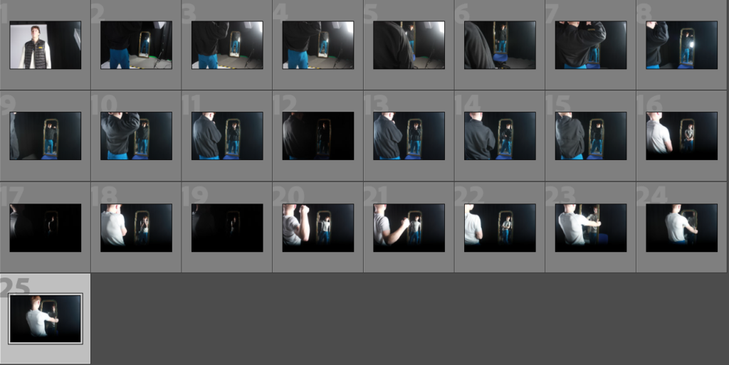
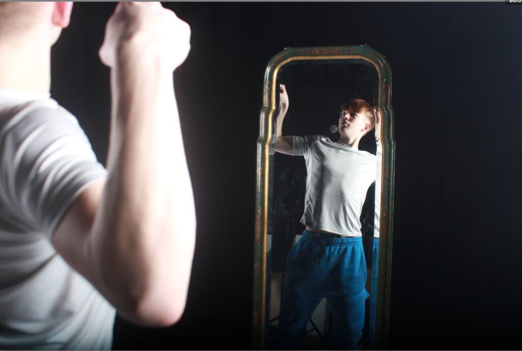
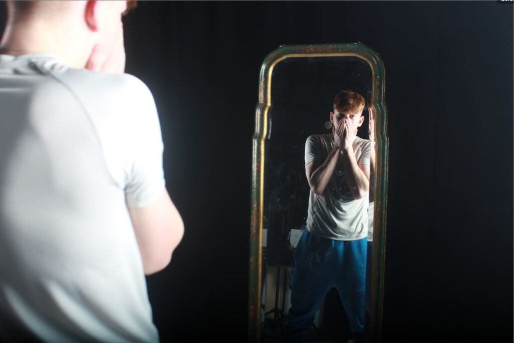
Here I told my model to stand in different poses while I kept the camera at the same location. This is so I can montage them together and create interesting photos when editing. Here are A few that I liked:

The Idea for this photoshoot was to focus the image on the reflected subject from the mirror, showing the true reflection of the subject. I will need to edit them so the real subject is different from the virtual subject, since I kept the tripod the same Hight and length away it should be easy. The camera settings used are; f/4.5 (creates blurred foreground keeping the focus on the virtual subject), exposure time of 1/360 as I used 3 flash lights with a box diffuser on to light up the subject, ISO of 100 to reduce noise, and a focal length of 18mm.