Photoshoot 1
For this photoshoot I was inspired by how Cindy Sherman showcased stereotypes, gender roles and her overall characters.
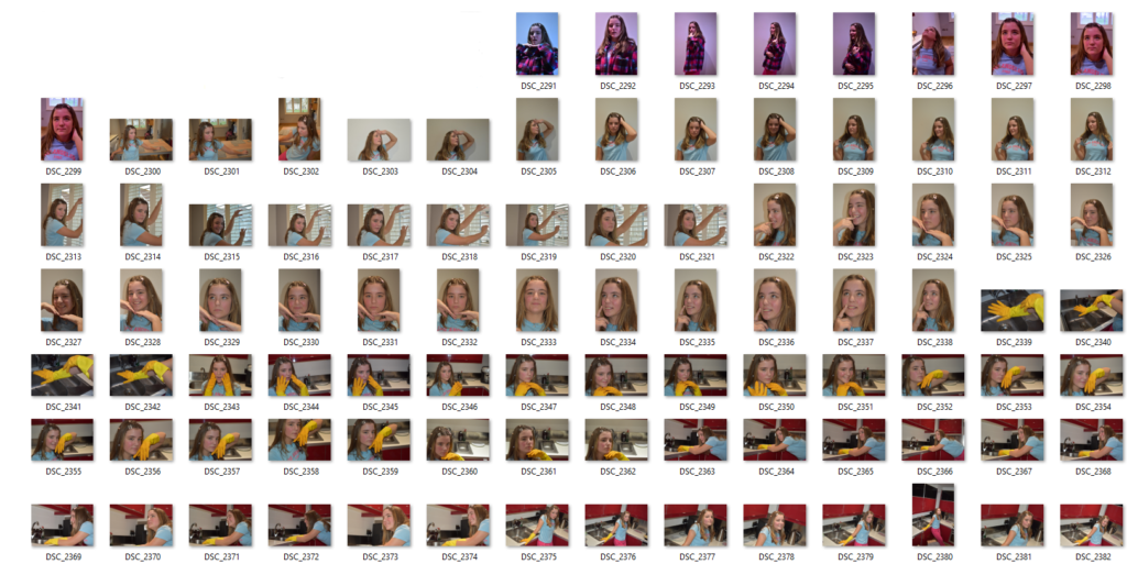
I took these photographs at my friends house because she had a traditional sink with two compartments which was important. A traditional metal sink is quickly recognisable for what it is and heavily associated with the gender roles of women through out the ages.
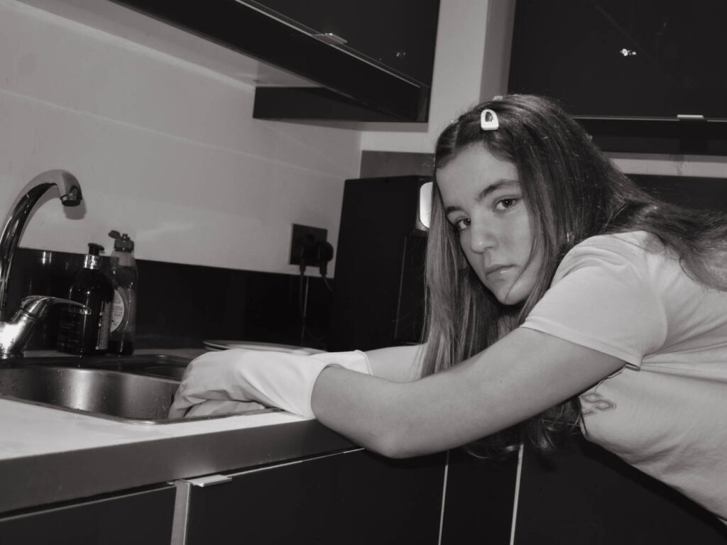
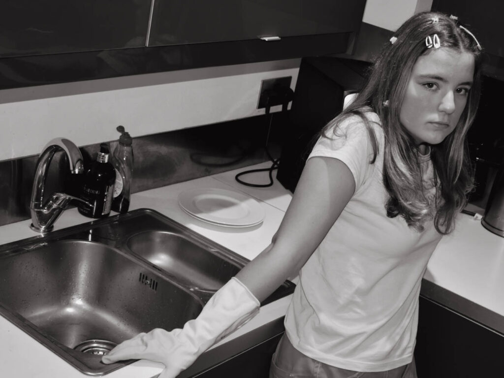
This kitchen only had lights on the ceiling for lightning which were extremely bright and cast heavy shadows over my friends face. I raised myself higher than her to ensure that her face and the sink would be at the same level in the frame which I think turned out rather well as it has the expectations looming behind her constantly. I also stood at her level for some where she would lounge around the counter.
I wanted to create a character who doesn’t want to be in the kitchen. Instead she has dreams of a luxurious life which she would see in films and adverts. I think that the dramatic poses and over the top parts encapsulate this well.
The draping poses show a lack of effort or care while also showing comfortability and knowledge of her environment. Her disinterest in her activities shows that she wants be elsewhere and that she might be above housework alternatively that she’s tired of working or finished and out of things to do.
I edited this same image in two ways to achieve an aged appearance:
- Cropped into a square with a retro effect
- Black and White inspired by Cindy Sherman in 4×3 aspect ratio
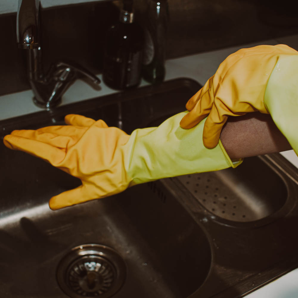
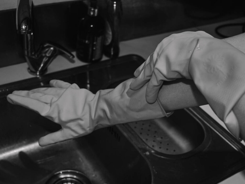
I didn’t like how the brown tinged ‘retro’ image as the colours were extremely muddy. While the muddiness could say the same as colourless I think the lack of colour not only looks older but also carried across each image consistently.
After narrowing down my selection I settled on these nine images:
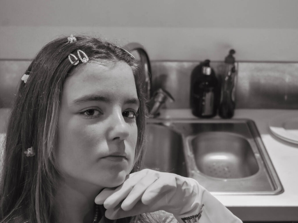
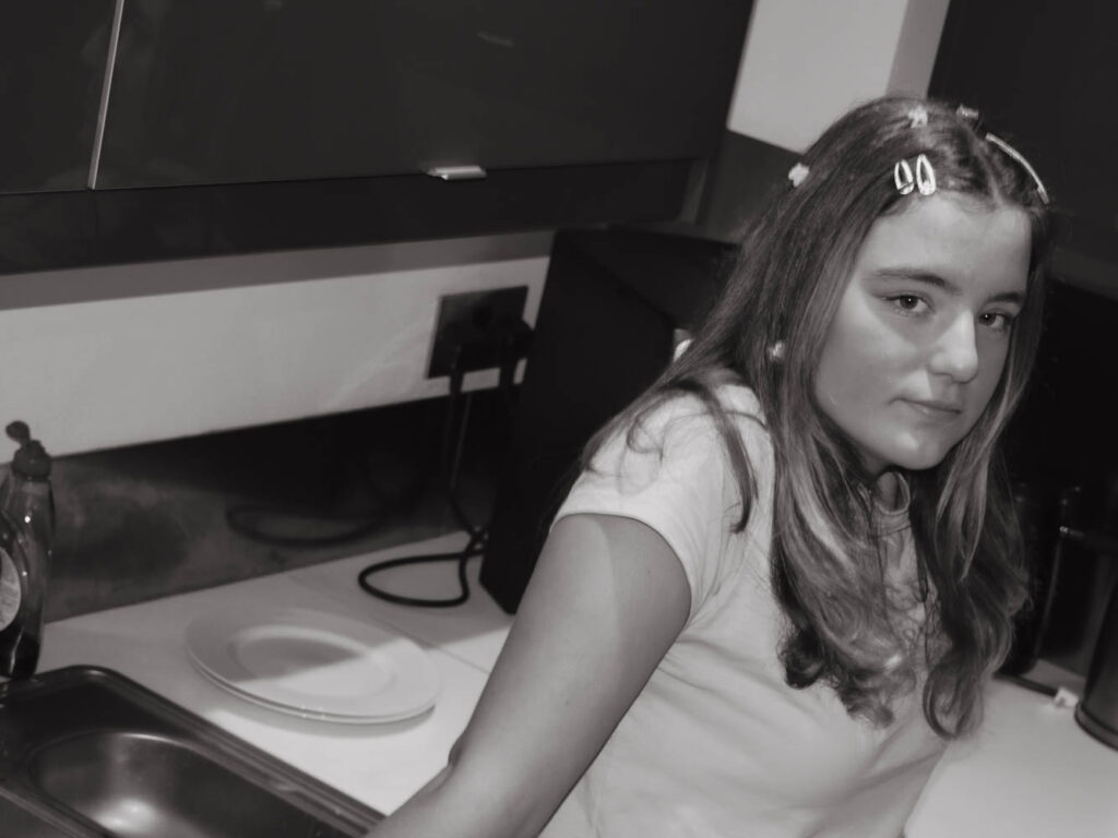
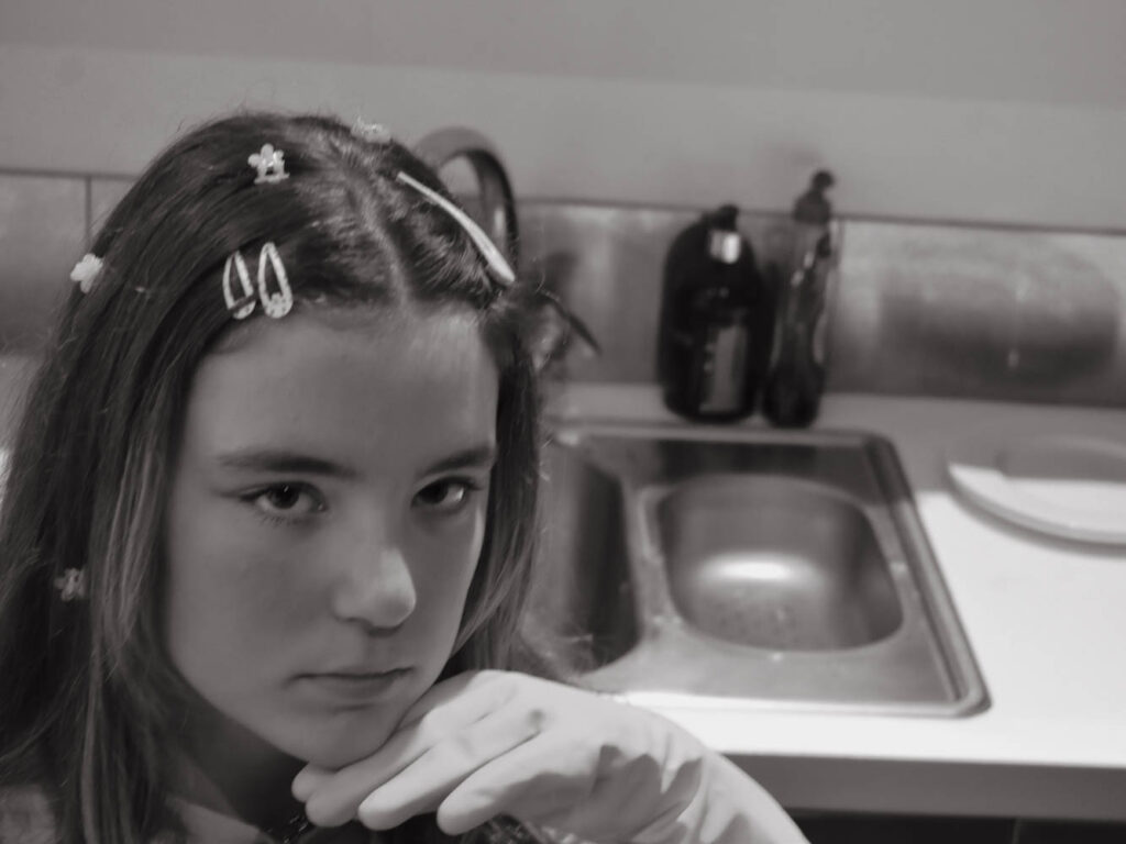
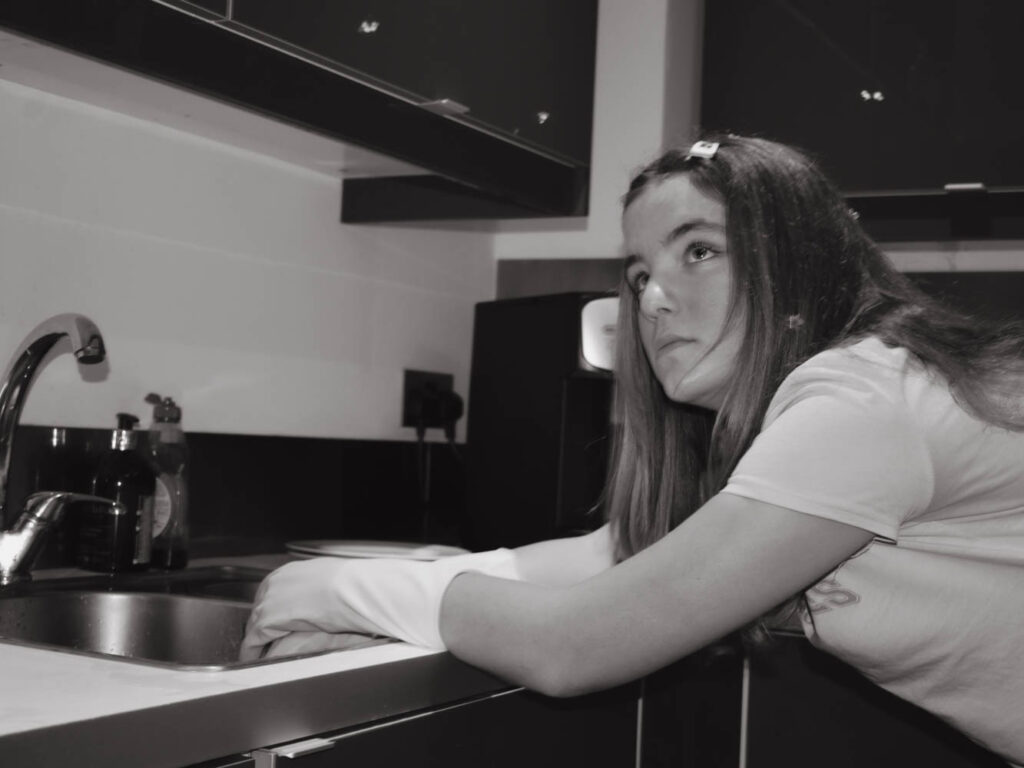
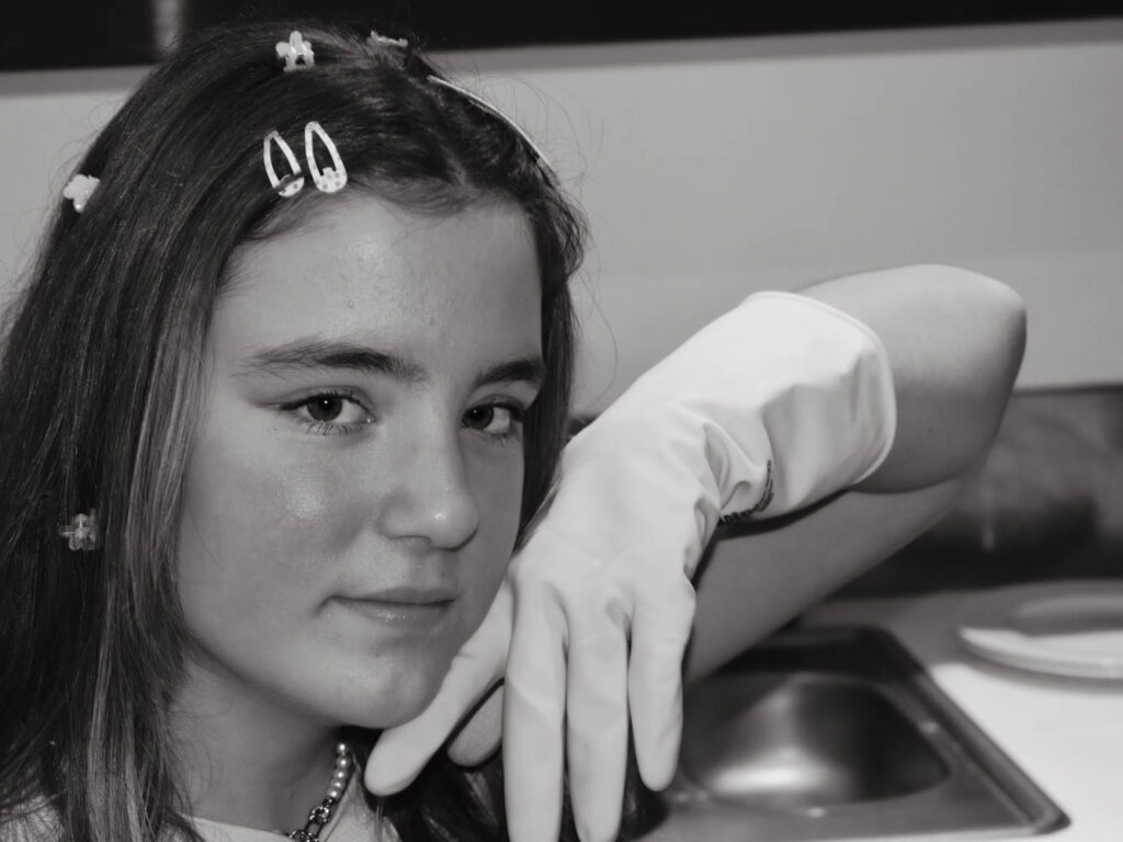
Some of these are rather similar however at this point I was still trying to narrow down the selection and wasn’t sure which expressions were best. After comparing to Cindy Sherman however, I managed to narrow down the selection even further.
Each one had the aspect ratio changed and set into black and white. I had two arrangements in mind: all of the images together or 3-4 arranged together.
Both image arrangements were inspired by Hans-Peter Feldman. I fitted all 10 images in frames and arranged these frames in different sizes and positions.
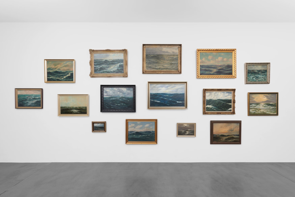
These arrangements all contain photographs of a similar theme or focus for example in this image all the framed photographs are of the ocean. These frames come in different sizes, shapes and colours which I would like to try myself. How the frames are so different but don’t look messy is due to the similar colours of the frames and because the photographs inside are all closely related.
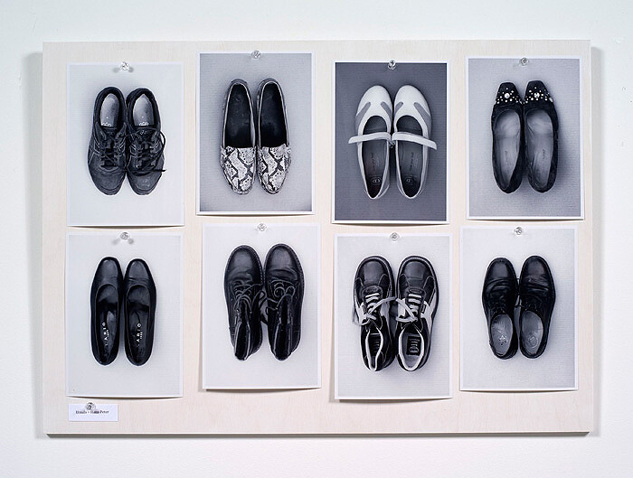
This is another layout created by Hans-Peter Feldman which doesn’t use frames instead pins and a board. All the photographs are of shoes, in black and white and the same size. This is another layout I would like to try. The photographs aren’t all perfectly aligned which is something I will try to incorporate into my own arrangements.
To create these arrangements I first had to arrange the images in photoshop to open later onto a virtual gallery wall. I fitted each image into a golden frame (which looking back should have been silver or grey scaled) and arranged them in a basic shape. I then adjusted the sizes of each photograph and frame which resembled a Hans-Peter gallery wall. In order to insert this image onto a virtual gallery wall later I also added some drop shadows and removed the background.
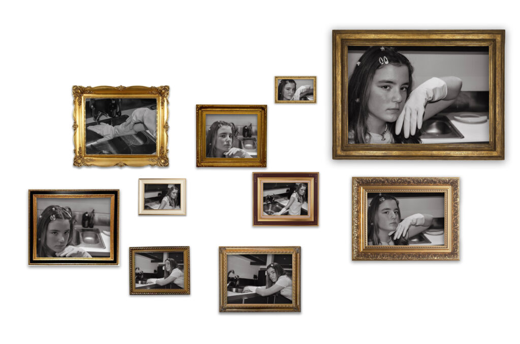
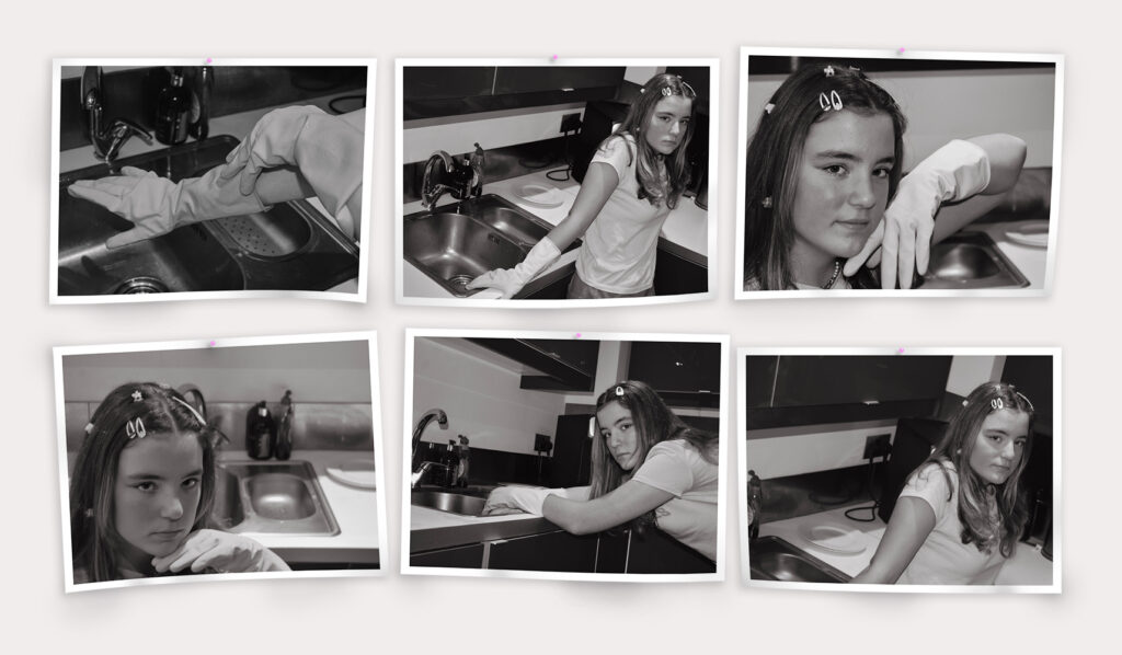
I prefer the pin arrangement with black and white Images because I think the frames are too vibrant in comparison. For my printed images I will be arranging them in a similar way to the pined up idea only with 2 images instead.
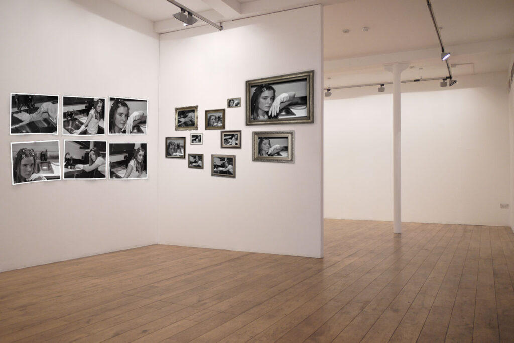
I really like how this arrangement turned out and with shaded details it really brings the set together. I began this arrangement by adding white boarders behind each image to make them look printed. Then I arranged them in a 3×2 grid. To make the images look more like paper being pined up I also distorted the shapes using ‘warp’ which made them look like they were flapping. In addition I added pink dots for pins and rotated 3 images slightly. The pin was either going to be plain white which blended in or pink since its heavily associated with femininity. At this point the images just looked slightly strange so I added a drop shadow to all the images and pins as well as changing the background darker to see the boarders. To finish off I added slight shaded parts to corners and bumps as well as additional shadows under raised sections which in my opinion helped the image turn out best.
I arranged both arrangements onto a blank virtual gallery space and adjusted the vibrancy of the frames.
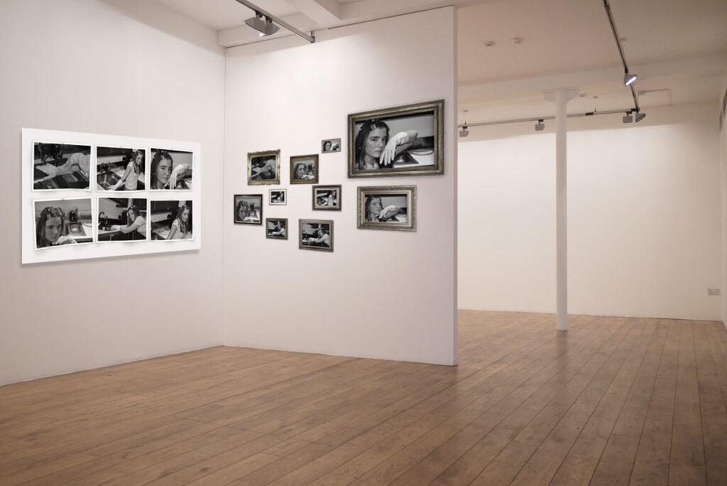
On the gallery wall with greyer frames, I think the frame arrangement shines. The pined arrangement gets lost next to the frames despite on their own being the complete opposite. I think that the board behind the pins is too large so I removed the board instead. I originally didn’t want to remove the board because I liked how Hans-Peter Feldman arrangement turned out. By changing the frames and board both the setups look much better and more cohesive.
I narrowed the selection for final print outs to the following:
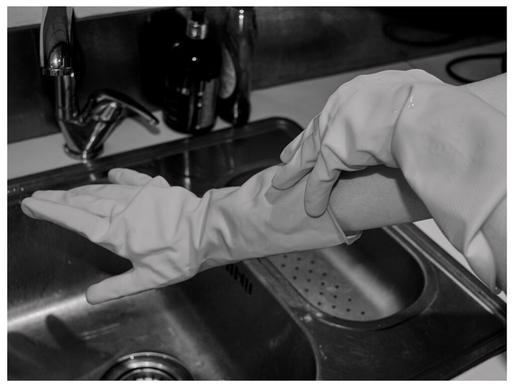
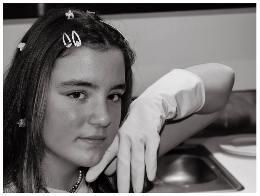
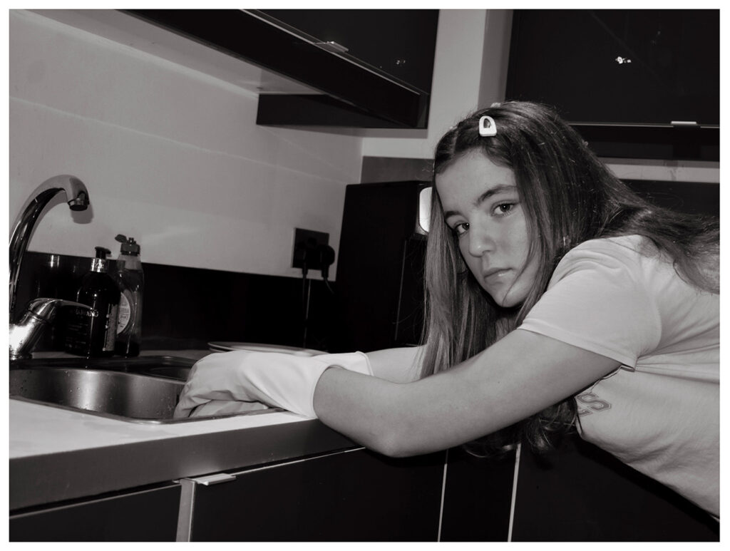
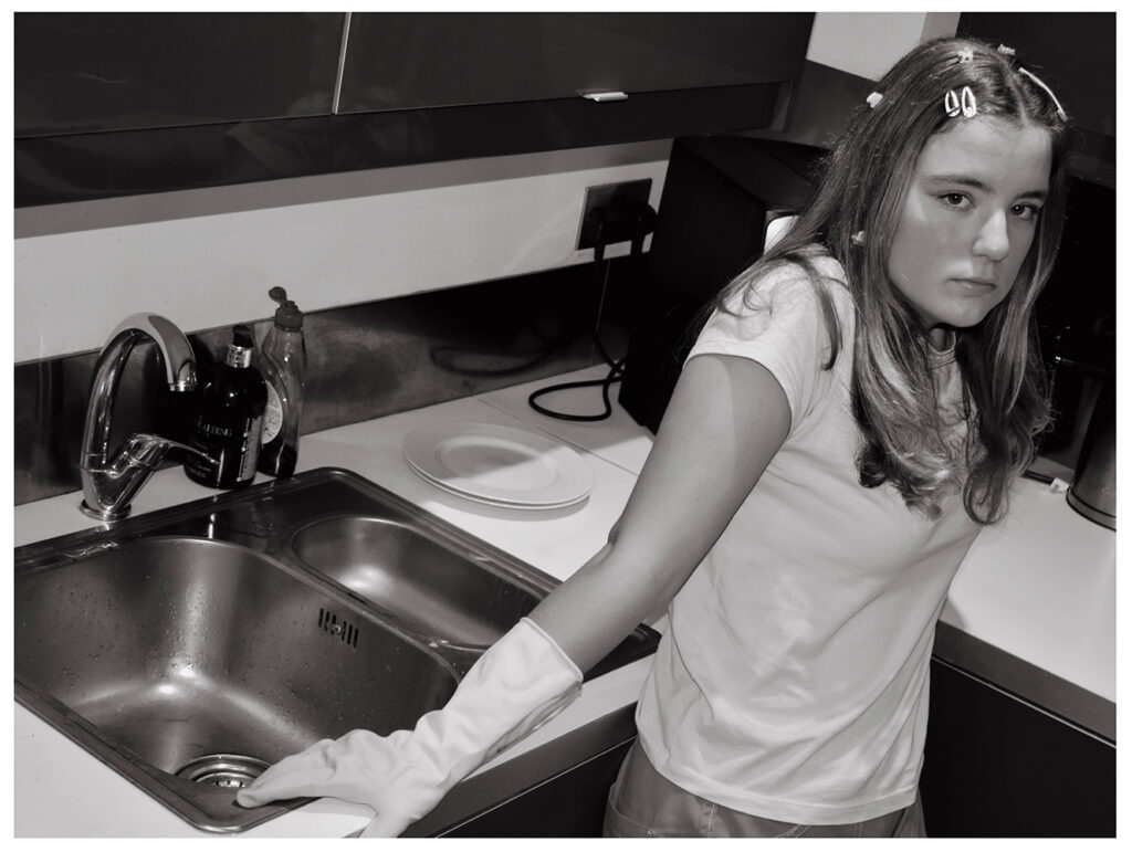
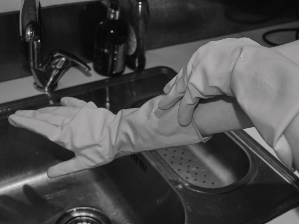
These four are probably my best however since I can only print a maximum of two images I decided to print the rubber gloves and hunching over the sink.
Exploration
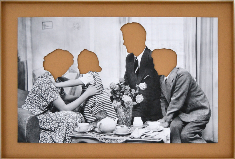
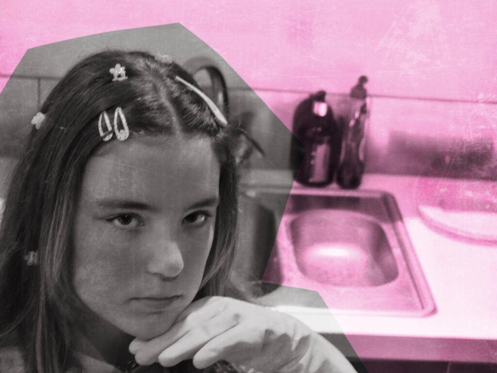
Using Hans-Peter Feldman again for inspiration, I edited these photographs to remove parts of the face. In this image above each head was sliced out of the physical print of a family photograph. This photo was then raised against a coloured background.
My photographs might not look right without the whole head because the subjects hair is not stylised in a recognisable shape like the photographers. To compensate I tried removing accessories, faces, arms etc and settled on these two:
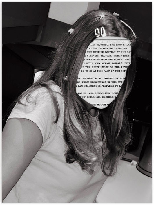
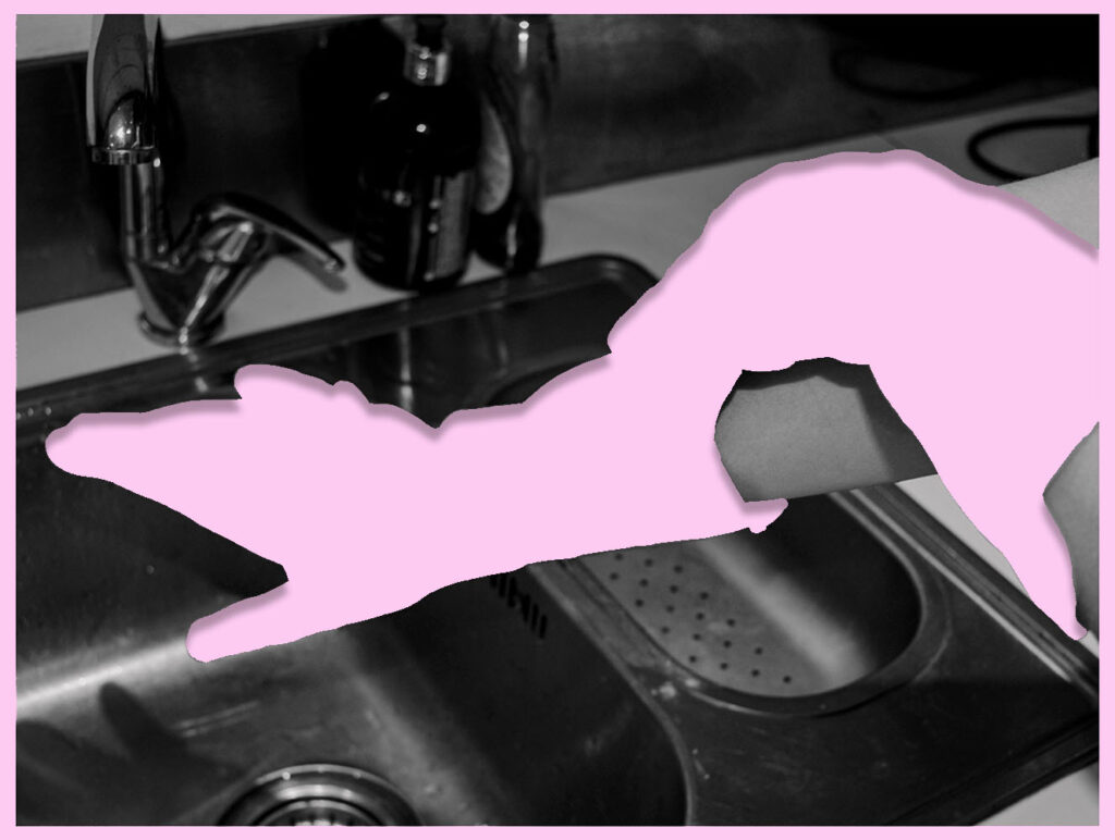
I prefer the gloves image to the newspaper for a number of reasons. If I was going to try this again I would have planned ahead and photographed a hair style with a distinct shape. Additionally I would have removed the hair accessories in photoshop so that the face wasn’t the only missing part. I think that the hair accessories also being newspaper would have created a more cohesive appearance. I made the gloves pink because it is a colour heavily associated with femininity. I made the shadows more intense in this image also which actually made the image look raised against the pink background.
For this next layout I wanted to create a scrapbook appearance by removing the background in choppy lines.
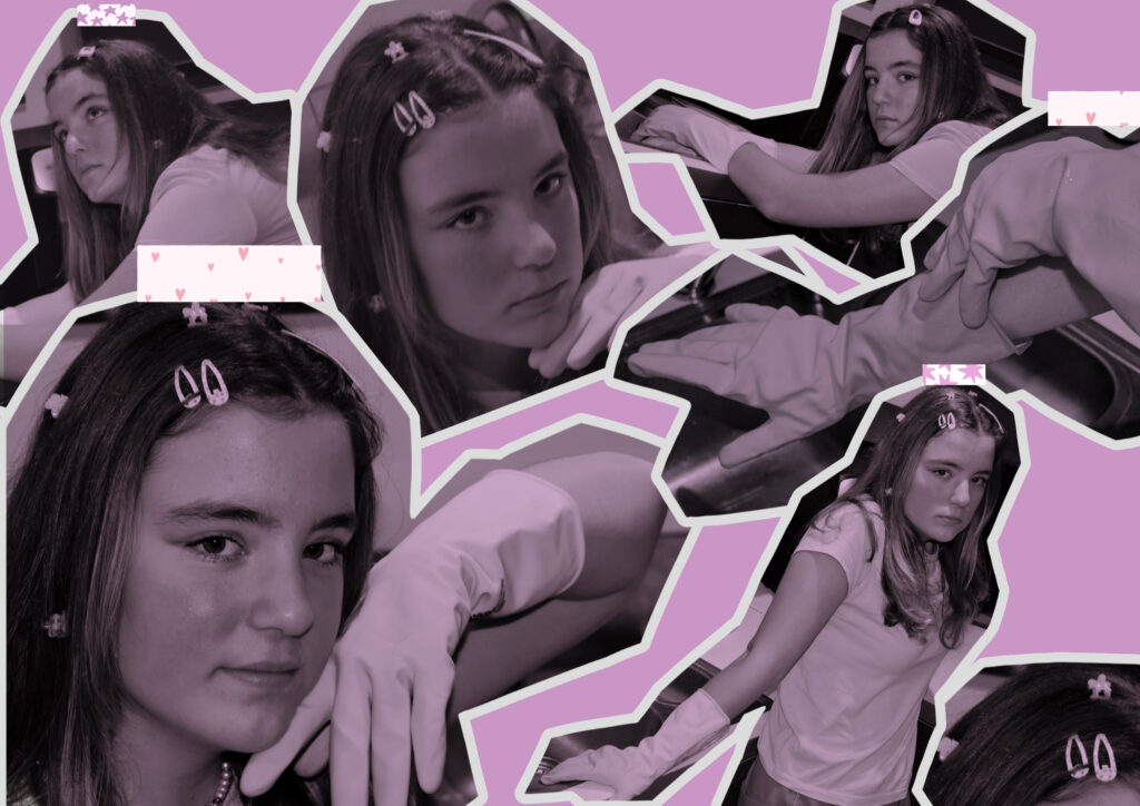
Comparison
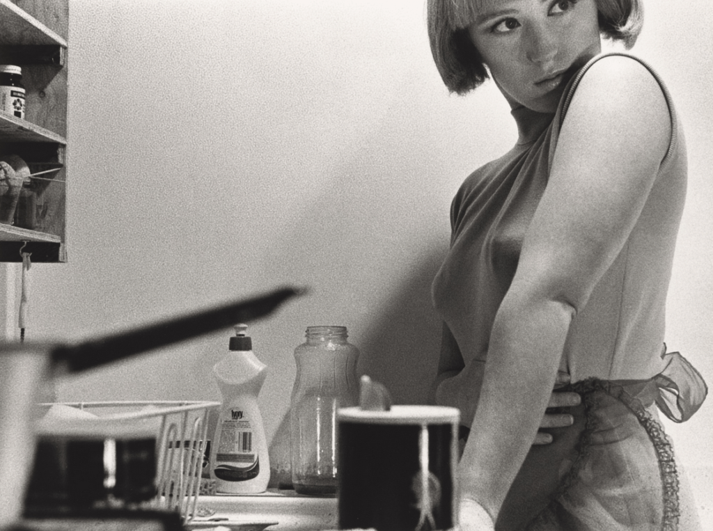
This photoshoot was inspired by Cindy Sherman. The most obvious similarities is the use of the background. Both images show someone in a kitchen which has been closely associated with women.
Unlike Cindy Sherman these were not based on old films and therefore clothing was not intended to look old. I also had my friend looking at the camera instead of away because looking at the camera making her look assertive and confident and utilises the photographic gaze. This combines modern associations such as the clothing and confidence as well as outdated ones such as housework.
My final Images

I like these two images the most even though they aren’t flashy or over the top. I think their simplicity says more about the mundane life of a housewife and boredom that follows.
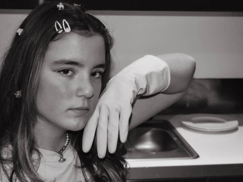
In this Image my friend is dressed casual while leaning over a sink. Leaning shows a lack of energy or interest in the task of simply doing dishes. Her gloves create a barrier between her hands and the chore which is reflective of her mind creating a barrier between her wants/wishes and her reality of scrubbing plates. She has dreams of something more where her life isn’t some repetitive cycle of cleaning a mess that just stacks up the following morning and instead engaging where she can see progress and an outcome.
Her clothing is casual without any additional aprons or rags to prevent stains or spillages showing the pointlessness of her gloves which only accounts for the present mess and nothing else. No matter how much she tries telling herself otherwise, it is inevitable that this little gesture to herself wont change a thing and that she’s stuck somewhere she doesn’t want to be. In addition she has a neutral/unimpressed expression which again shows no interest in her task, instead she is looking away at the camera which shows this longing for something else.
Her hair is inconvenient for her task of the dishes. With long hair down she’s likely going to get it dirty however she’s accessorised her hair regardless. This demonstrates the want for outwards approval over convenience. She wants to is is expected to still look a certain way even when alone and getting dirty which is reflective of contradictory gender roles. Women are expected to do housework and cleaning but are also expected to do their hair and makeup, not necessarily at the same time but these expectations follow that woman throughout her whole life ending up with inconvenient hair styles for the dishes.

This photograph does not showcase a face but rather focuses on the gloves. These gloves are significant in this image for a number of reasons: Gloves not only act as a barrier but also an outlet for her imagination. This pose is reflective of a lady posing with expensive arm length gloves on her way out to dinner. Instead of a harsh tug to pull up the rubber with outstretched fingers this action is graceful and pointed which juxtaposes the kitchen surroundings and rubber dish gloves. A pair of full length dinner gloves show that she doesn’t need to get her hands dirty since they’re expensive and that would be a waste of flashy gloves. While she is dreaming of being the wealthy woman attending the expensive dinner she’s more likely to be the cook for the wealthy woman which is not a colourful reality.
The fact these images are in black and white is not only because they were inspired by Cindy Sherman but also the bleak nature of this lifestyle.
Cindy Sherman
Similarities
Both photographs showcase the subject looking away from the sink which shows a disinterest in dishes and rather a desire to be elsewhere. Despite this desire, neither has left. By having both at a kitchen this also buckles down on the idea of gender roles however nothing other then themselves is stopping them from leaving. This is because they have taken onboard societal expectations and fear acting out for the reaction of others around them.
Both subjects inconvenience themselves in order to appear a certain way. Cindy Sherman has a full-face of makeup despite being alone at home which is reflective of the films she was inspired by. The women were by no means realistic in representation order to appeal to the ‘male gaze’. This image is supposed to reflect these ideas by her clothing which is not fit to be at the sink, showy apron and face of makeup. Similarly the subject in my images has her long hair down would will get in her face and the dirty dishes. She’s also wearing new clothes which would get damaged and has a full face of makeup.
Both images are set in black and white but for different reasons. Cindy Sherman is in black and white because the 50s films would have been mostly in black and white as 1961 was the last year Hollywood was mostly not coloured. I chose to change the images to black and white to reflect the dull nature of these tasks and to reflect how old and outdated gender roles tend to be.
Differences
In this image she wears an apron which is purely for show. This is because the fabric will do nothing to keep her clean as opposed to rubber gloves which are over the top, rather useless in the grand scheme but have at least some purpose to distance the work from the person. An apron made of mesh fabric wont do any good with its bottom half covering and permeable material however is completely for show linking back to gender roles and expectations.
Cindy Sherman is looking away from the task and camera with her eyes looking out of frame. This makes her appear as though she is unaware of the camera and is a part of her film inspiration as actors aren’t supposed to acknowledge the camera but also factors into her objectification and underestimation since she seems slightly ditsy. By not challenging the photographic gaze she showcases how women in films were viewed. The subject in my portraits is looking at the camera instead and is stood mostly out of frame which acknowledges the camera and therefore has her posing for it knowingly.
Evaluation


I think that I achieved what I was aiming to with this set of images which was a Cindy Sherman inspired photoshoot highlighting gender roles and how much they have changed. Modern women have better chances of finding work then the ever have and with an unstable economy, even women who do not wish to enter the work force are being forced to take up part time jobs on top of housework. Women still find pressure to cook and clean but nowadays they are also expected to work alongside men. I’m not entirely sure I approached this the right way to tackle the double job point and if I did this again I would plan out additional photoshoots where I covered this topic better. If I had more time I would have also liked to explore the rising househusband which is a reversal of old gender roles.
If I had more time I also would have photographed someone different and in a different location since all of these images are of the same person in the same kitchen which means that they all look very similar.
In conclusion I believe that this photoshoot was successful and that I touched on gender roles in a basic but successful way however in future I would like to delve deeper into how they have changed.
