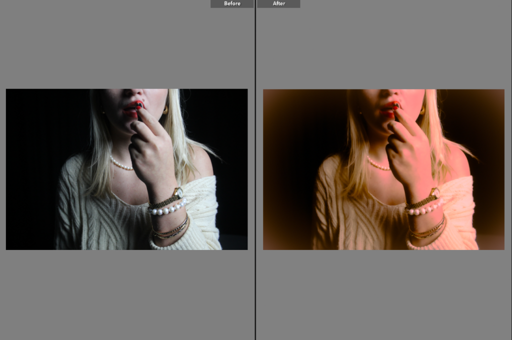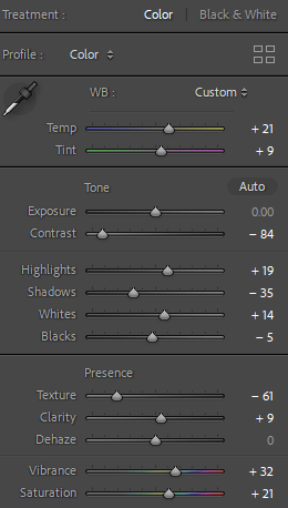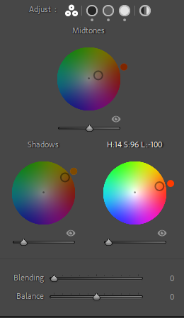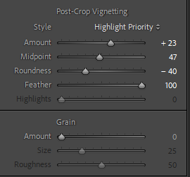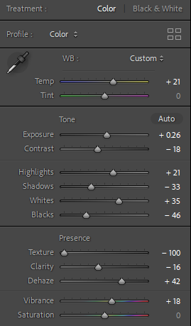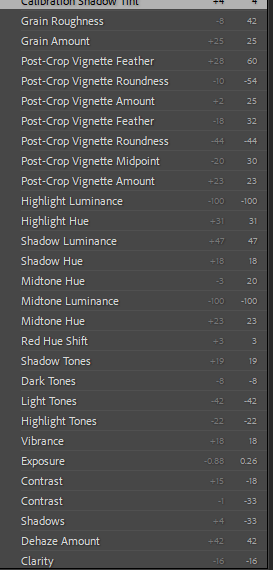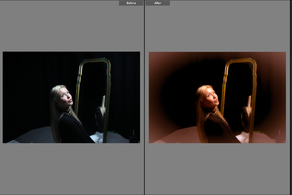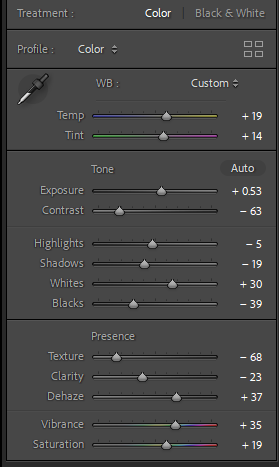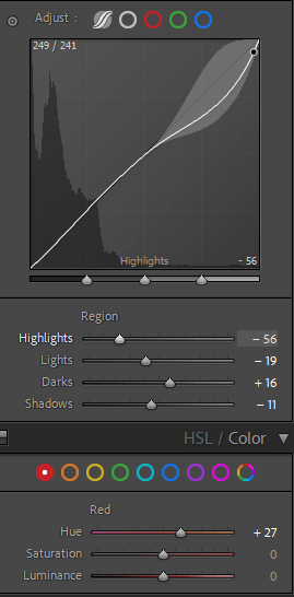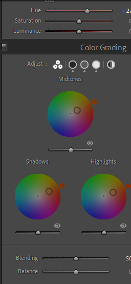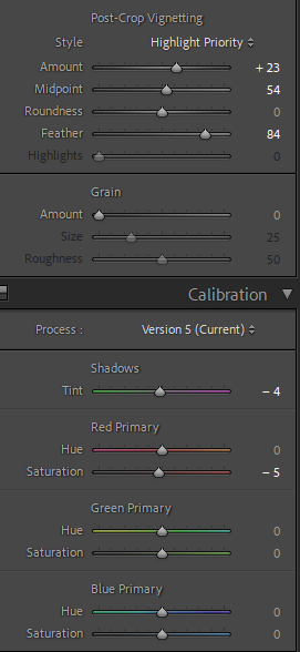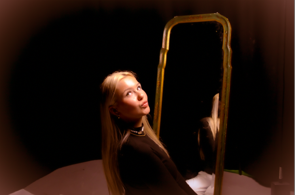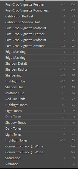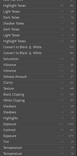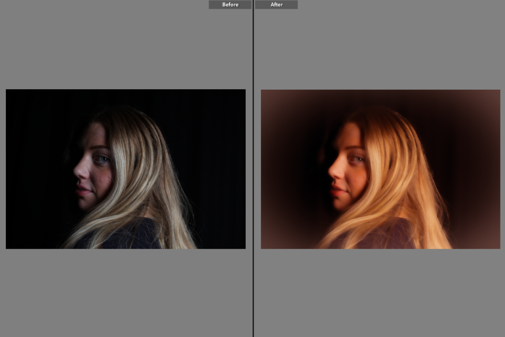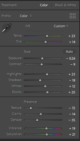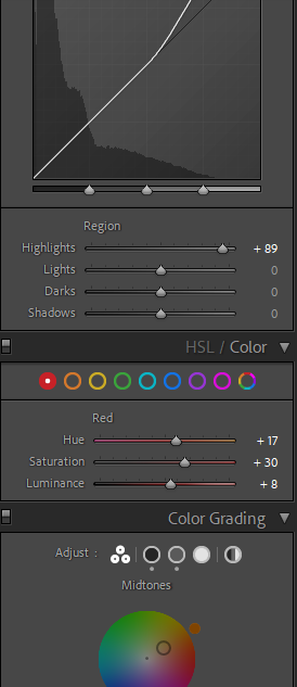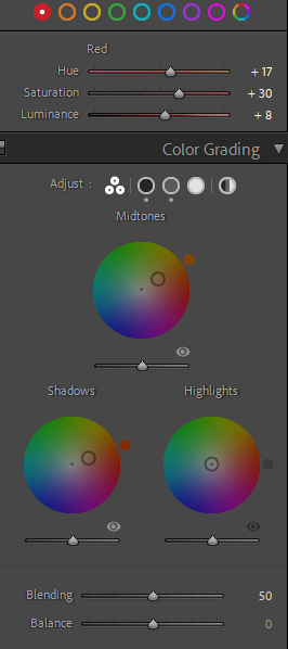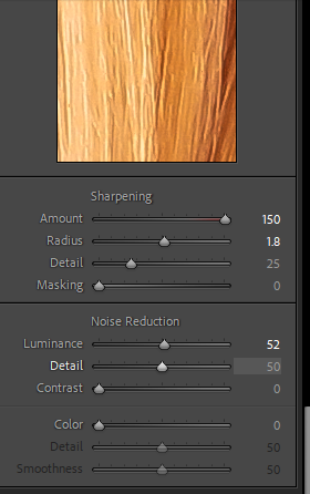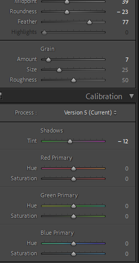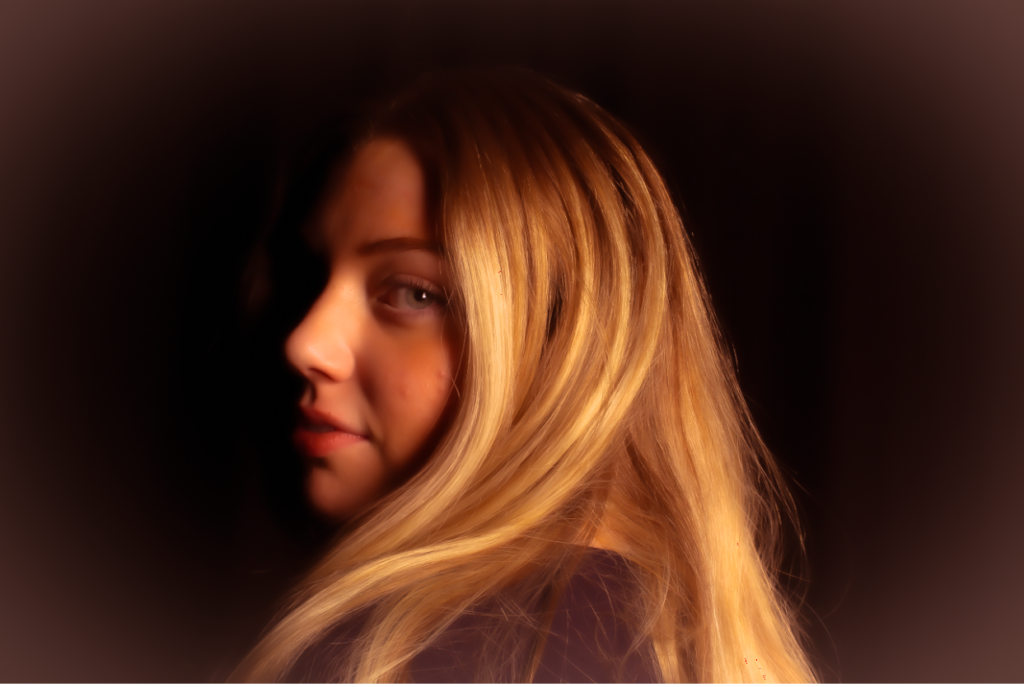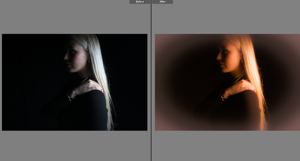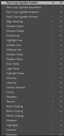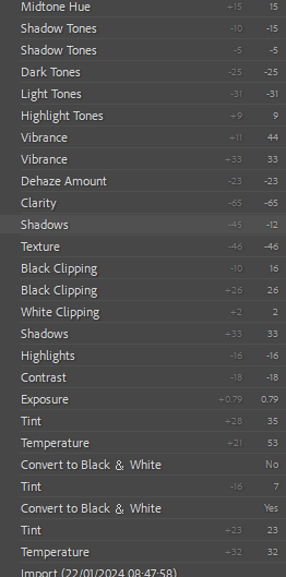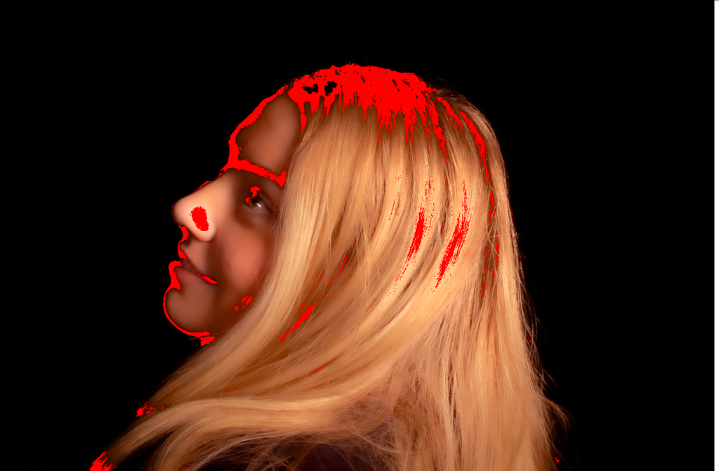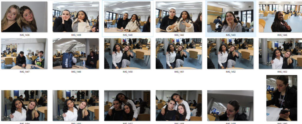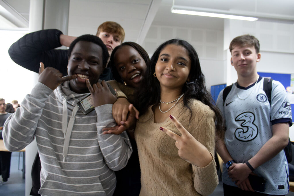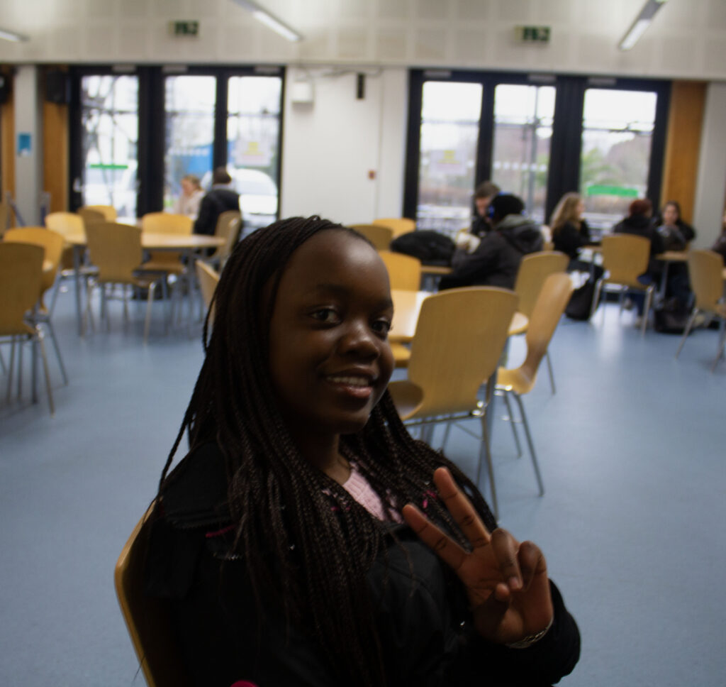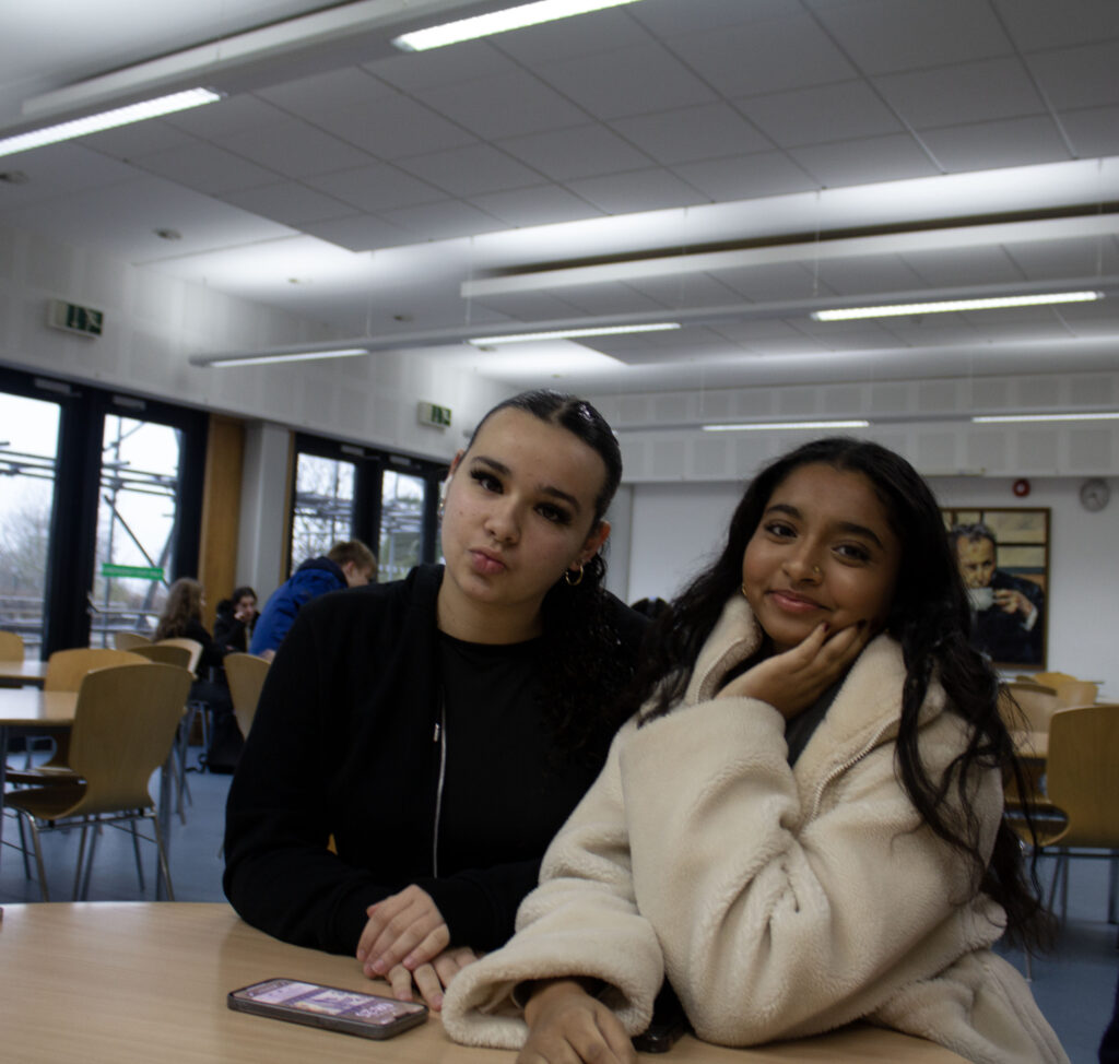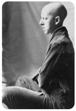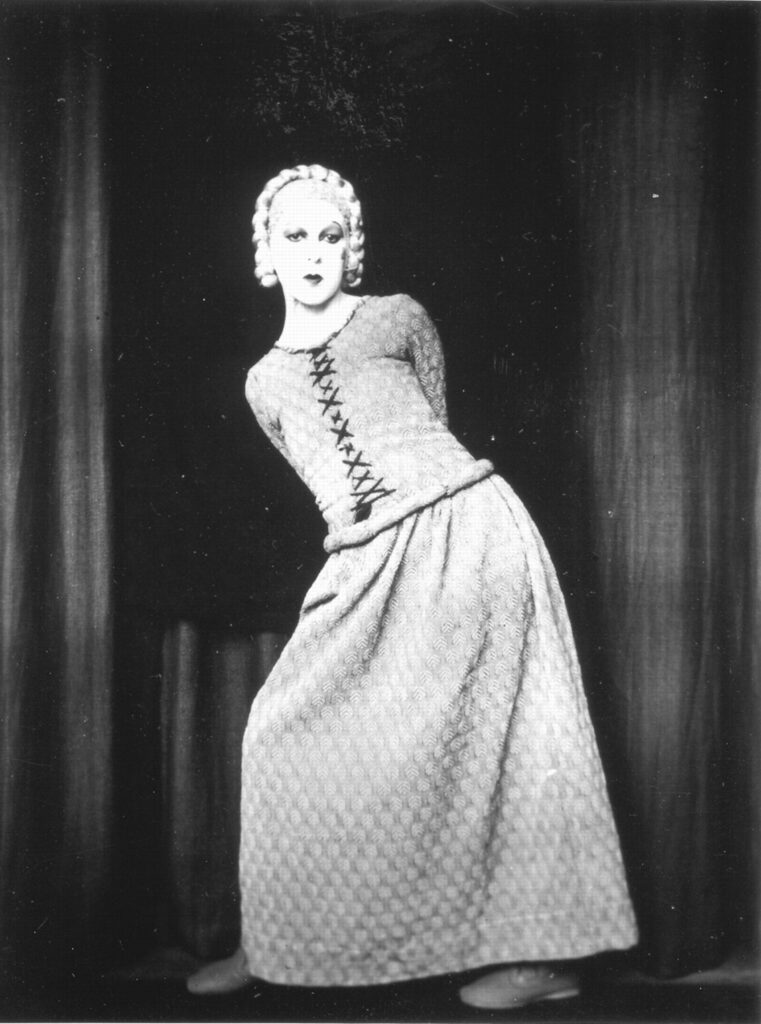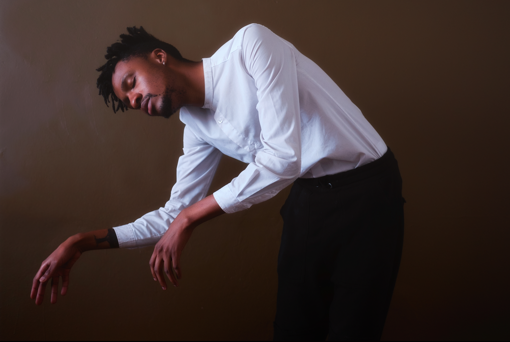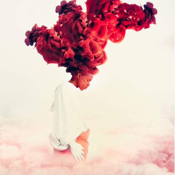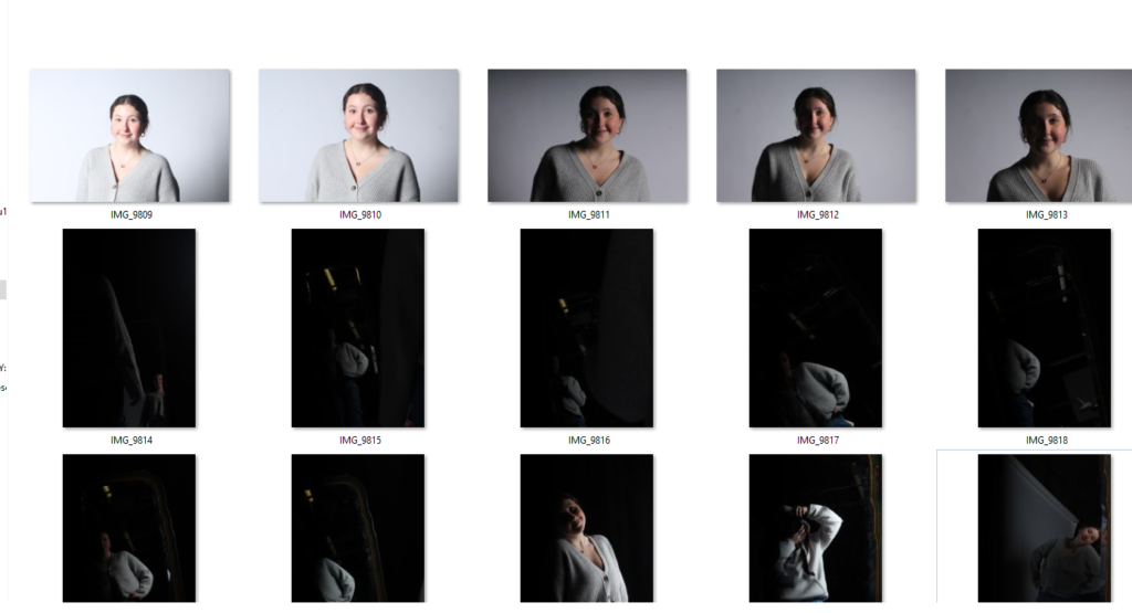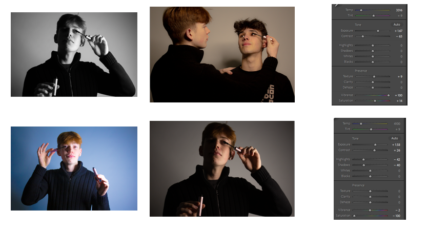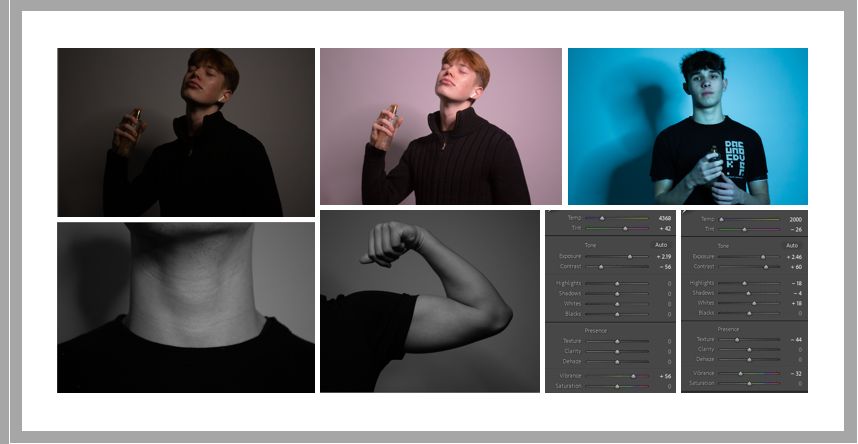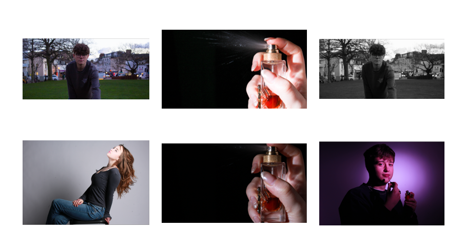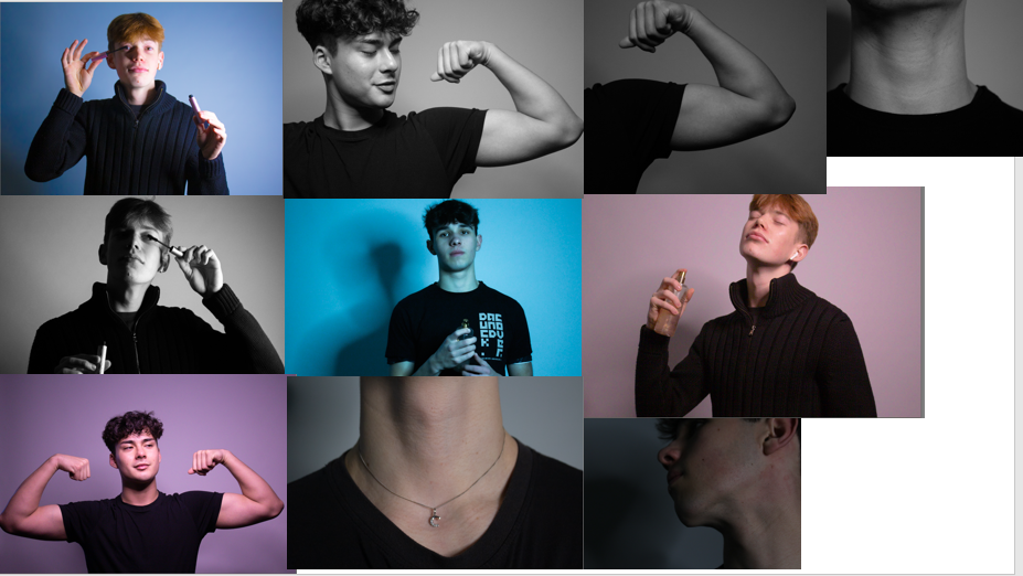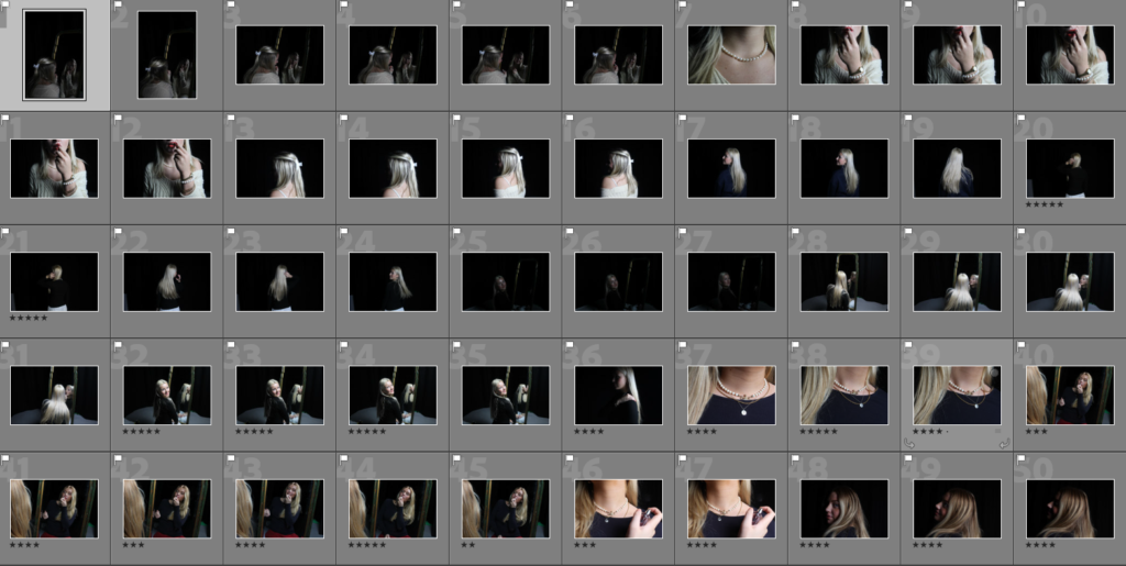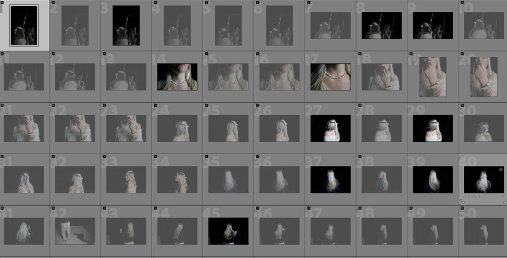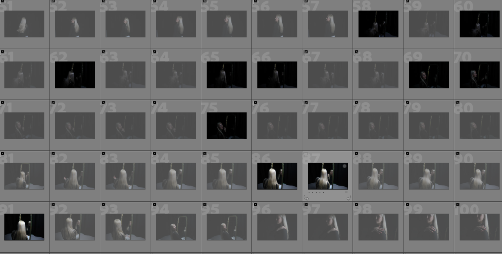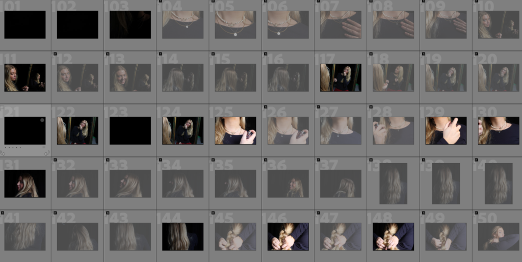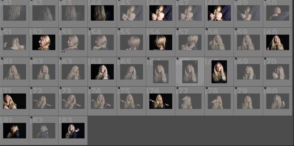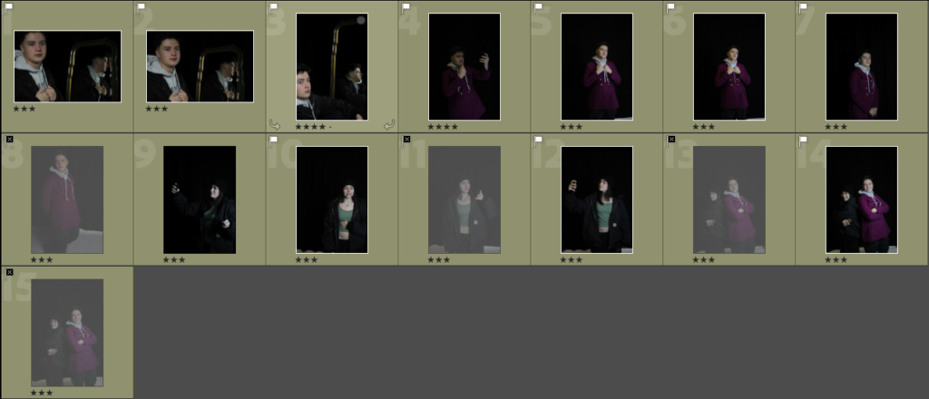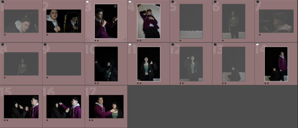
For my first edit, I knew I wanted it in black and white because I think it portrays a similar resemblance to many photos of Marilyn Monroe. I increased the exposure because I think it adds an advantage to the lighting, making the model’s face look brighter against the dark background.
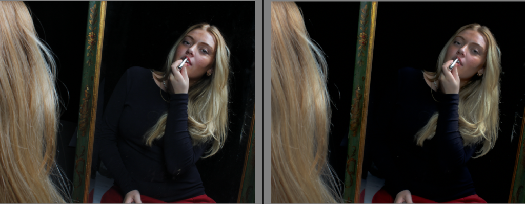
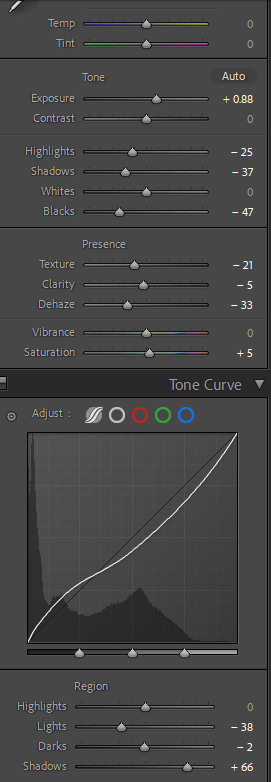
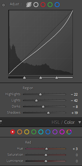
For my second image I went into further depth with the editing, to achieve more unique outcomes; I decreased the lights and darks to create more of a contrast between them, and also adding shadows to give the outcome more definition.
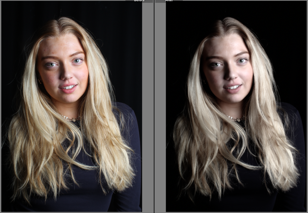
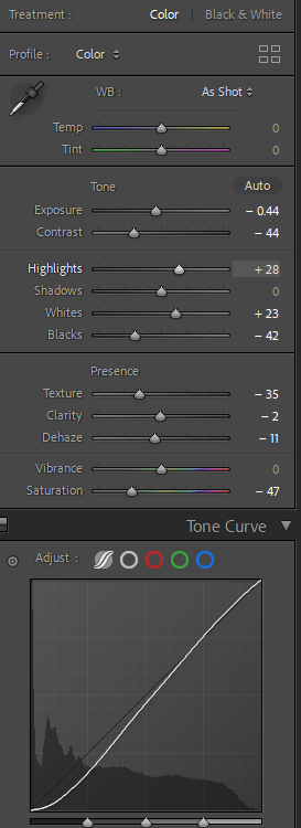
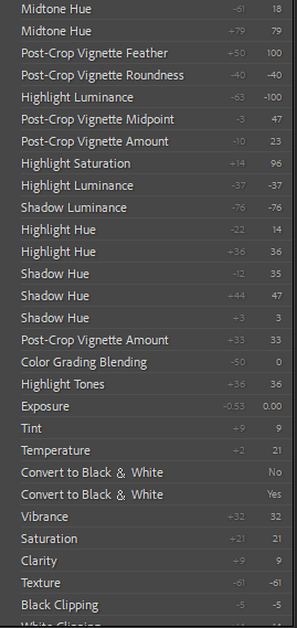
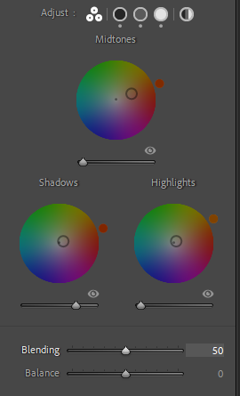
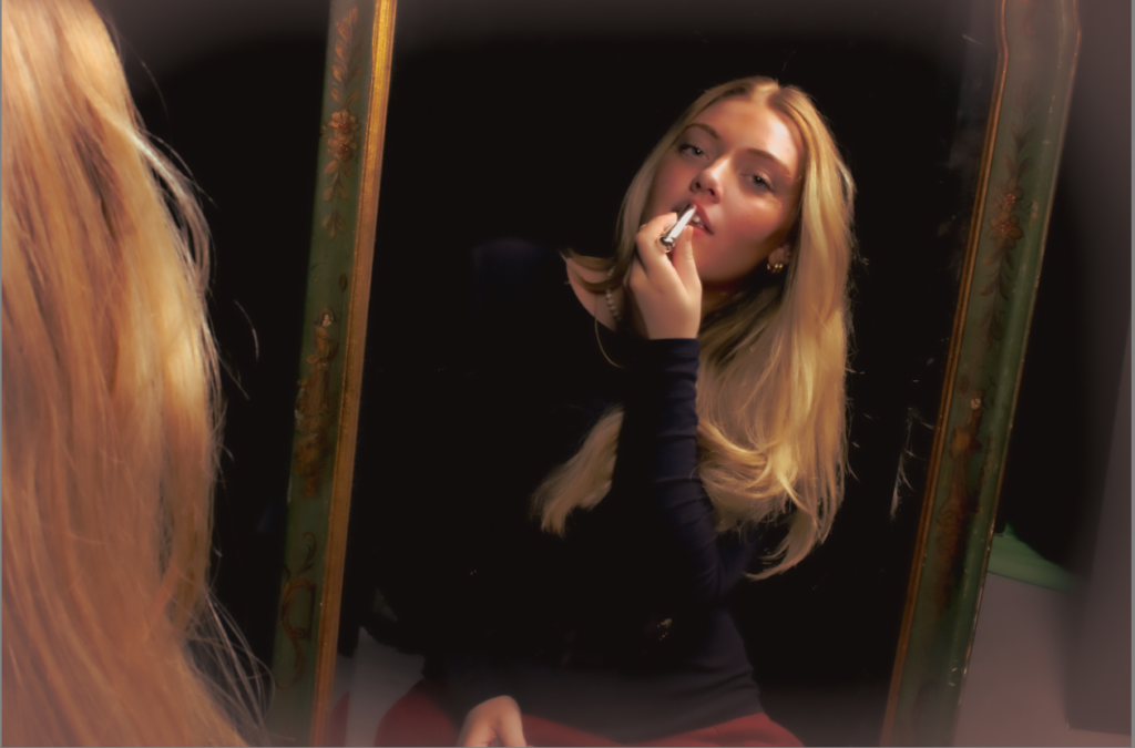
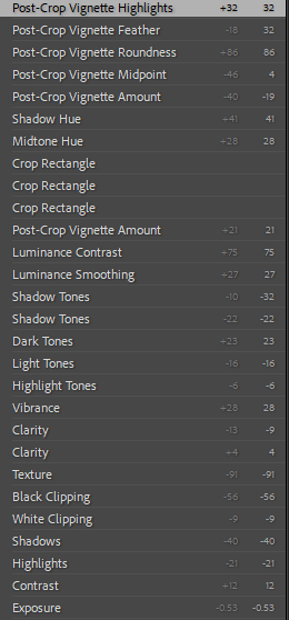
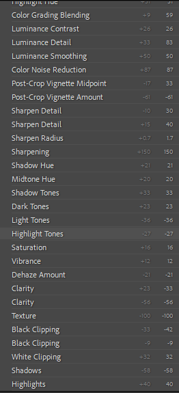
For this image I wanted to create more of an ancient effect, in order to do that I had to decrease the saturation. I also decreased the texture so the model looked flawless like Marilyn. To prevent any distractions from the subject, I decreased the blacks so the background is easier to ignore. I also increased the highlights so the image didn’t look dull.
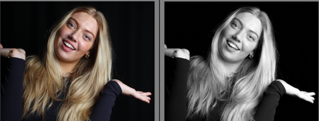
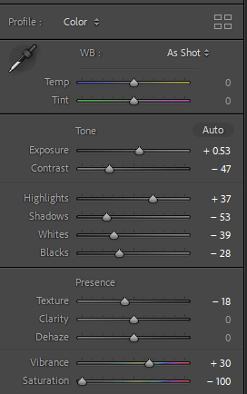
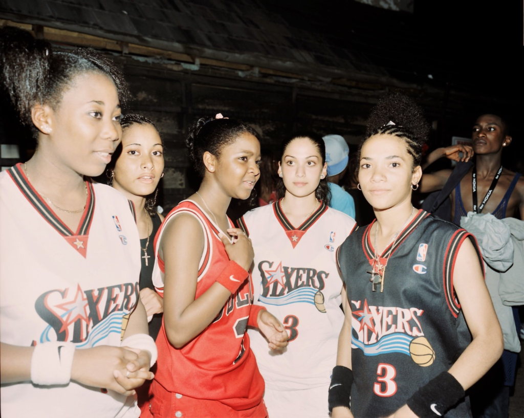
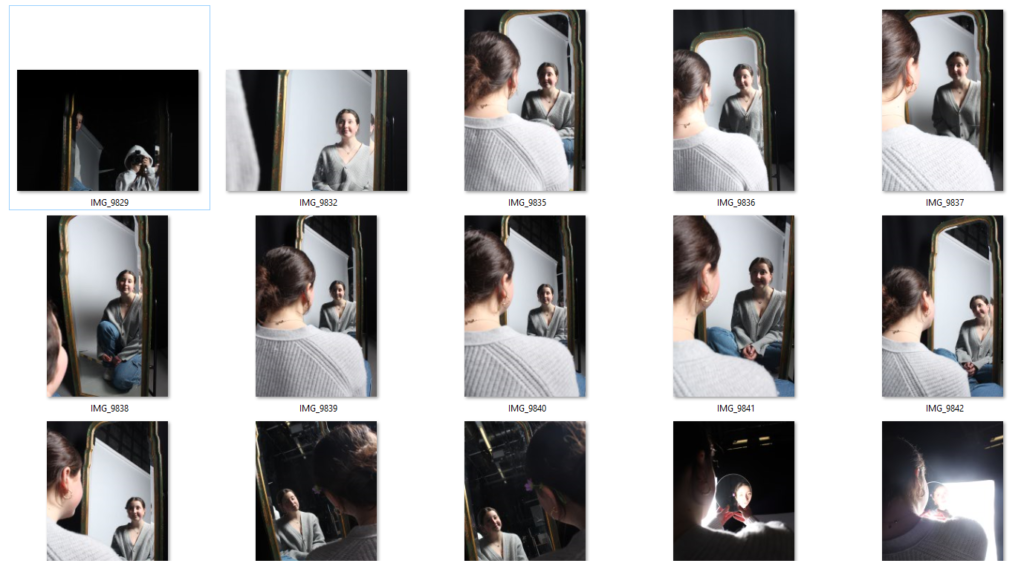
In this photo I made it black and white again, while decreasing the contrast so the image did not look too extreme. Although I increased the vibrancy because I didn’t want the image to look uninteresting, as well as increasing the highlights.
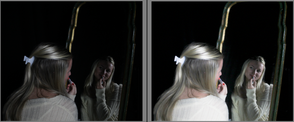
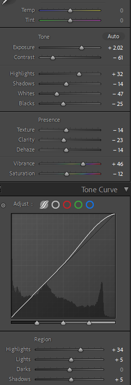
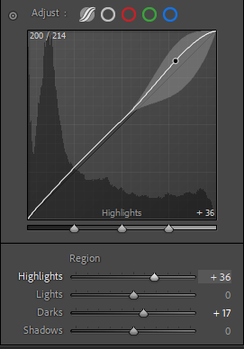
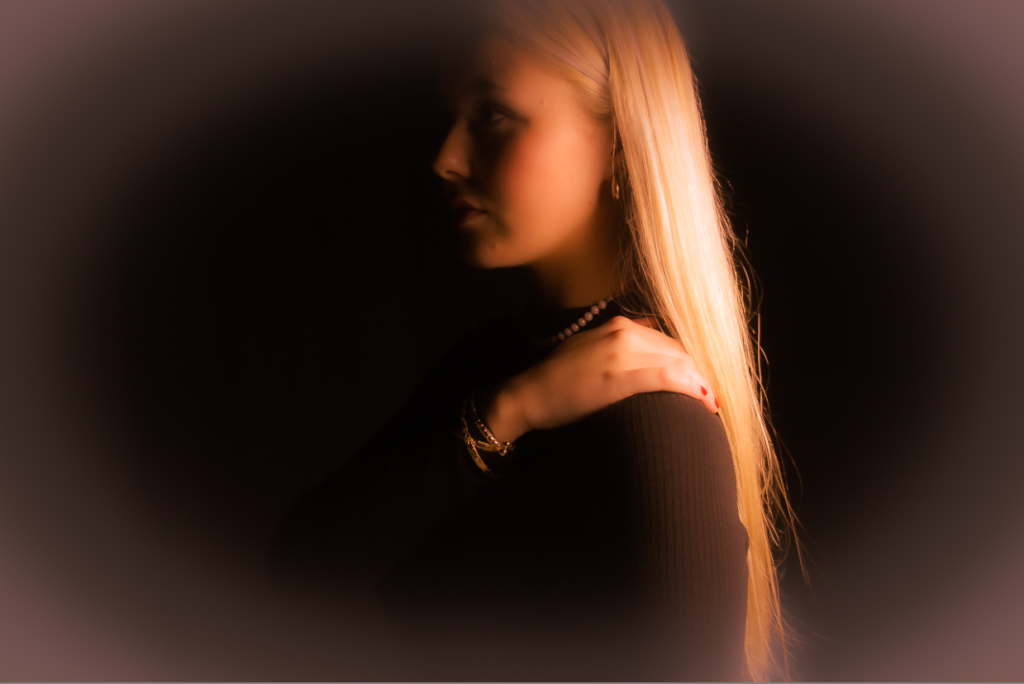
This image I also experimented further with as it started off as one of my most characterless photos, due to the lighting. I increased the highlights and vibrancy to substitute for the poor lighting. I decreased most of the other options such as shadows, whites, blacks, saturation and dehaze in order to emphasise the lights.
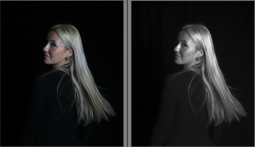
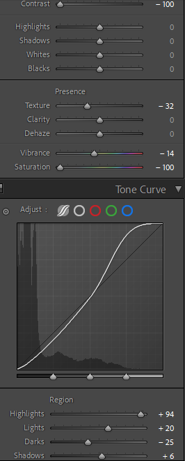
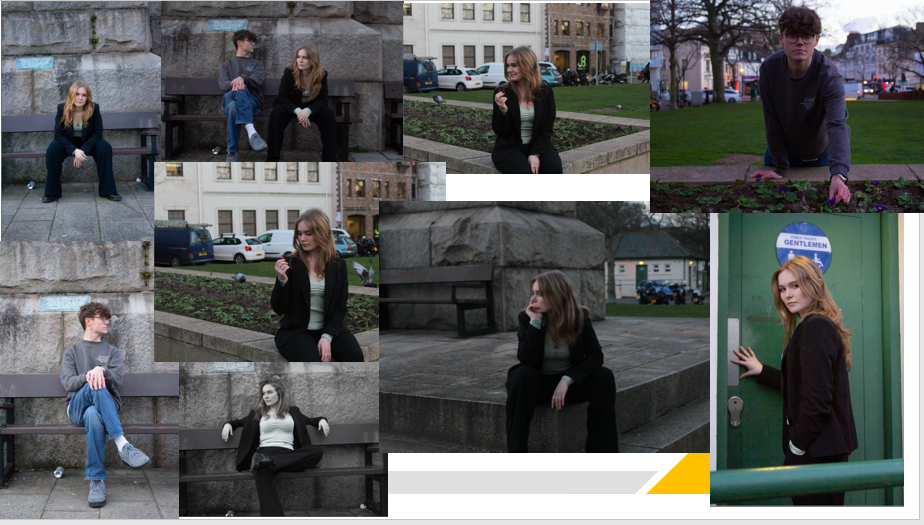
This photo I made it black and white by decreasing the saturation to -100, and also decreasing the vibrancy slightly. However I increased the highlights to emphasise the blonde in my hair, as this closely resembles Monroe.

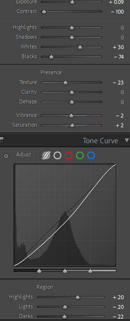
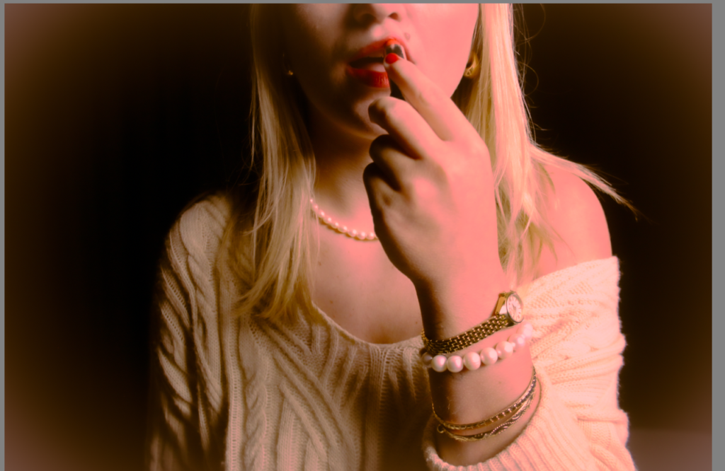
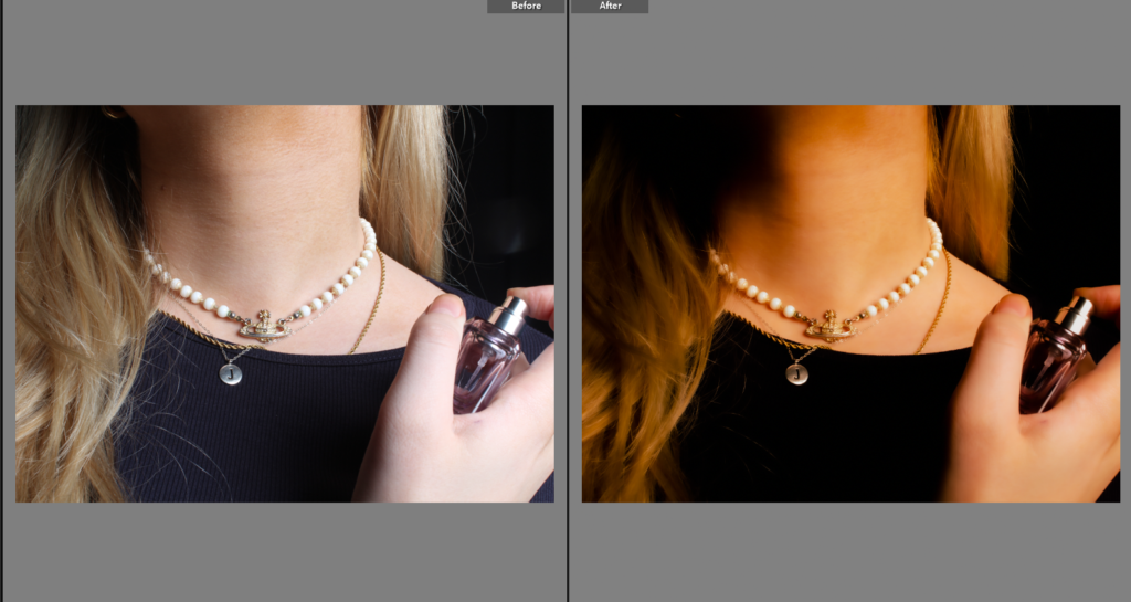
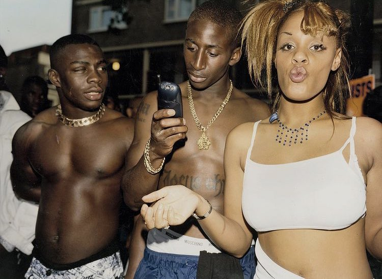
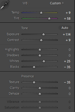
Within this image, I decreased the texture as I knew it would benefit how classy it looked altogether. By increasing the whites and decreasing the blacks I was able to create a visible contrast, which I think brought out the jewellery in the photo, which is the main subject. Also, by increasing the whites it helped to emphasise the blonde tones in the hair.

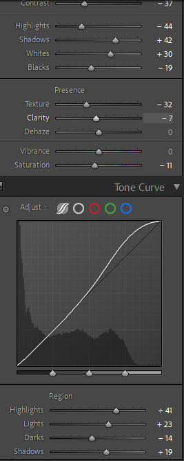
In this image, the main subject has many lighter tones such as the jewellery, hair and skin complexion. I knew that in order to draw attention to these features, I had to decrease the blacks, while also bringing out the shadows to give the image definition.
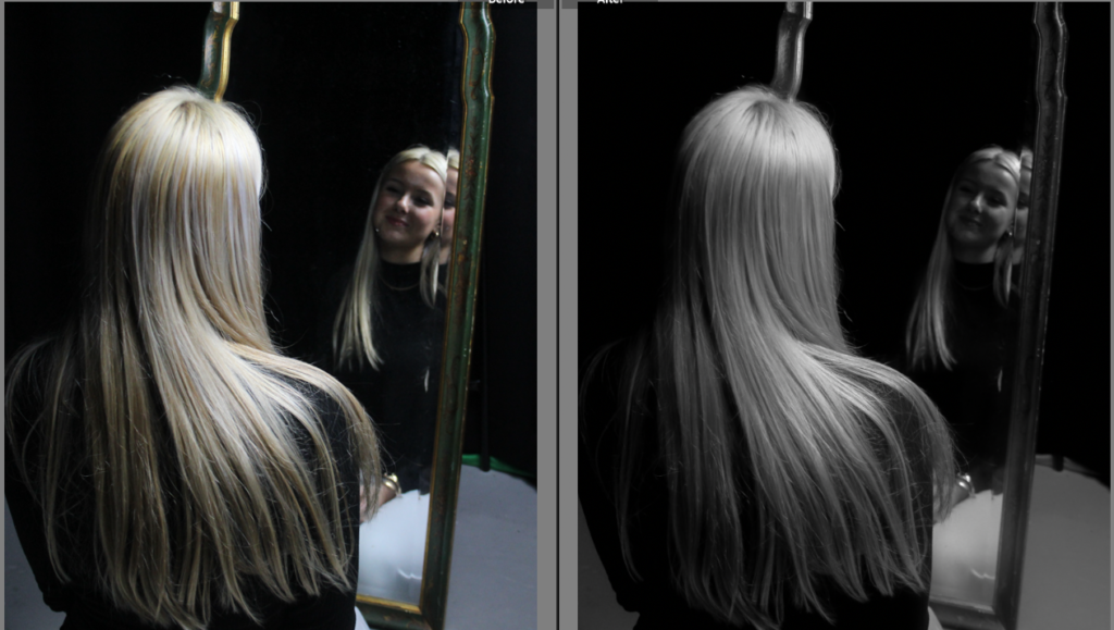
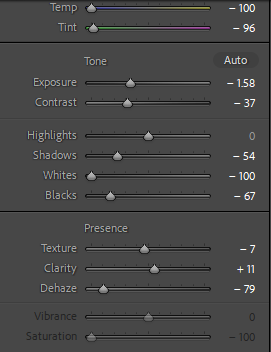
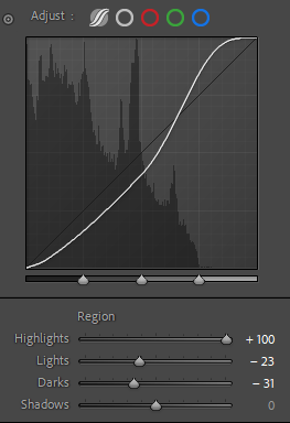
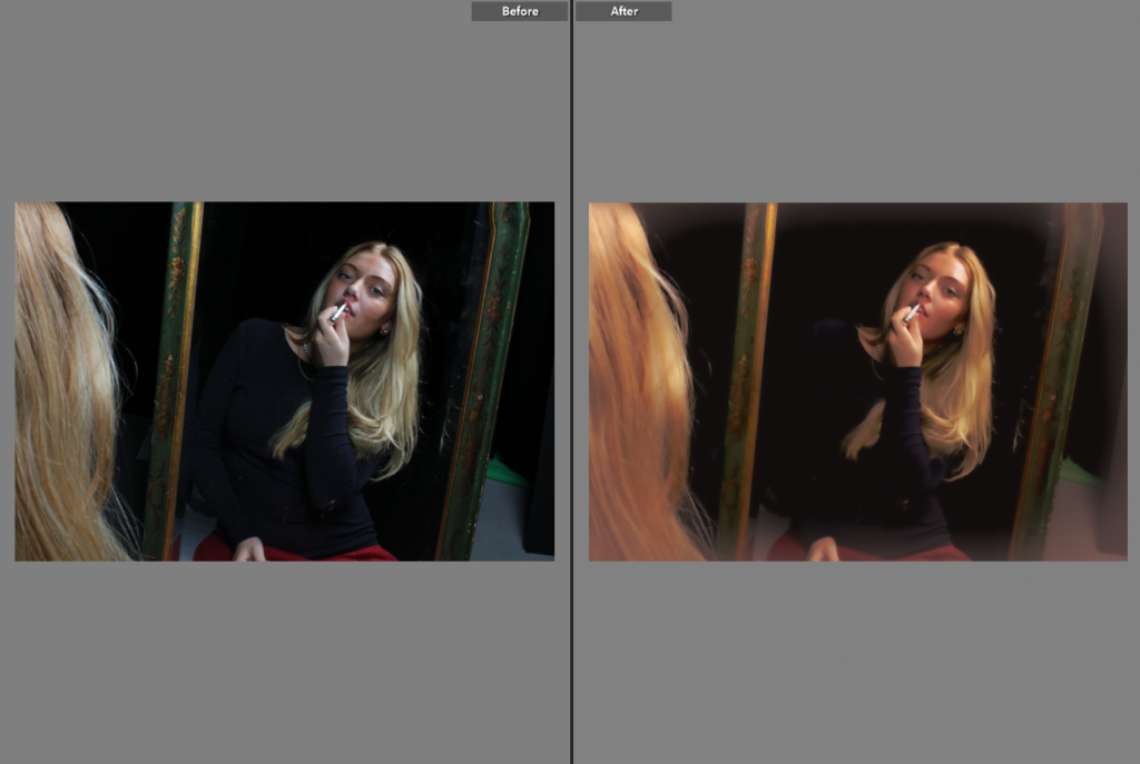
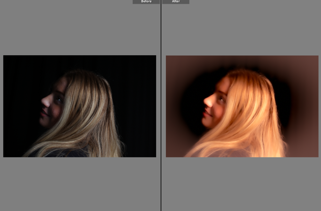
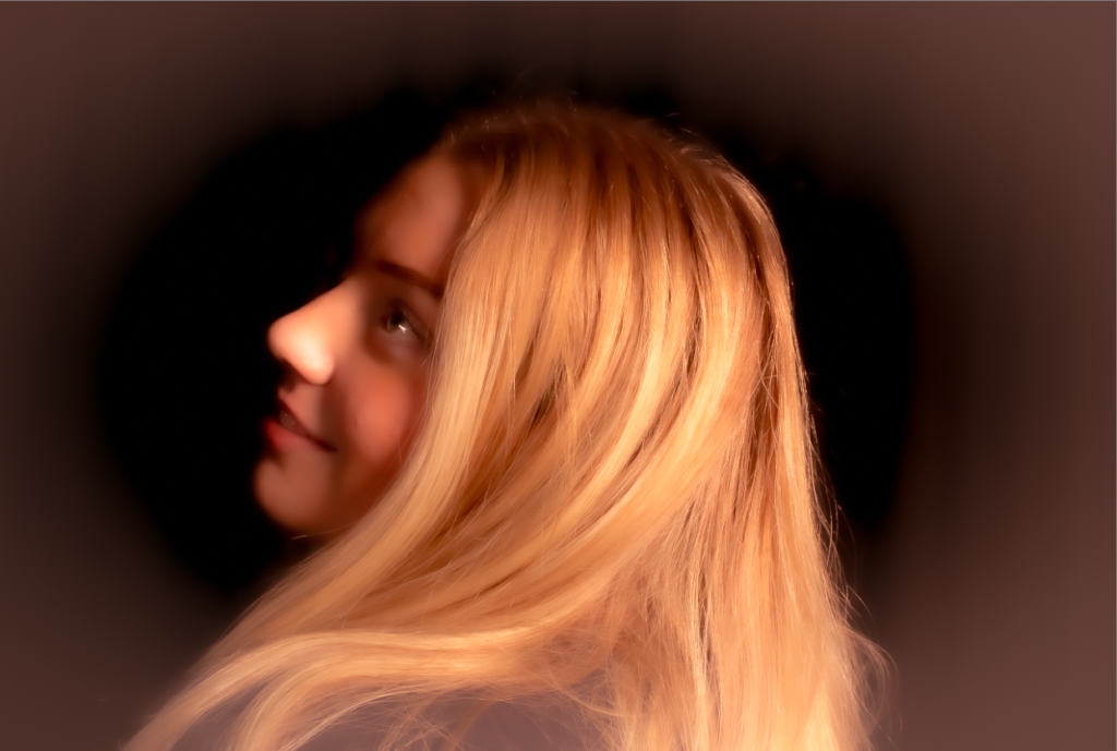
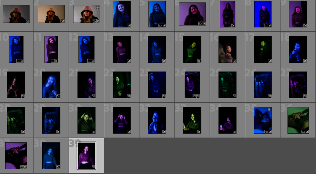
This image was originally extremely dull, with poor lighting. Therefore I decreased both the temperature and tint of the image, while bringing focus to my hair. I wanted to keep the image quite dull, to add a sense of mystery, so I also decreased the lights and darks. However, I adjusted the highlights to 100 so my hair was still eye-catching, whilst being black and white.
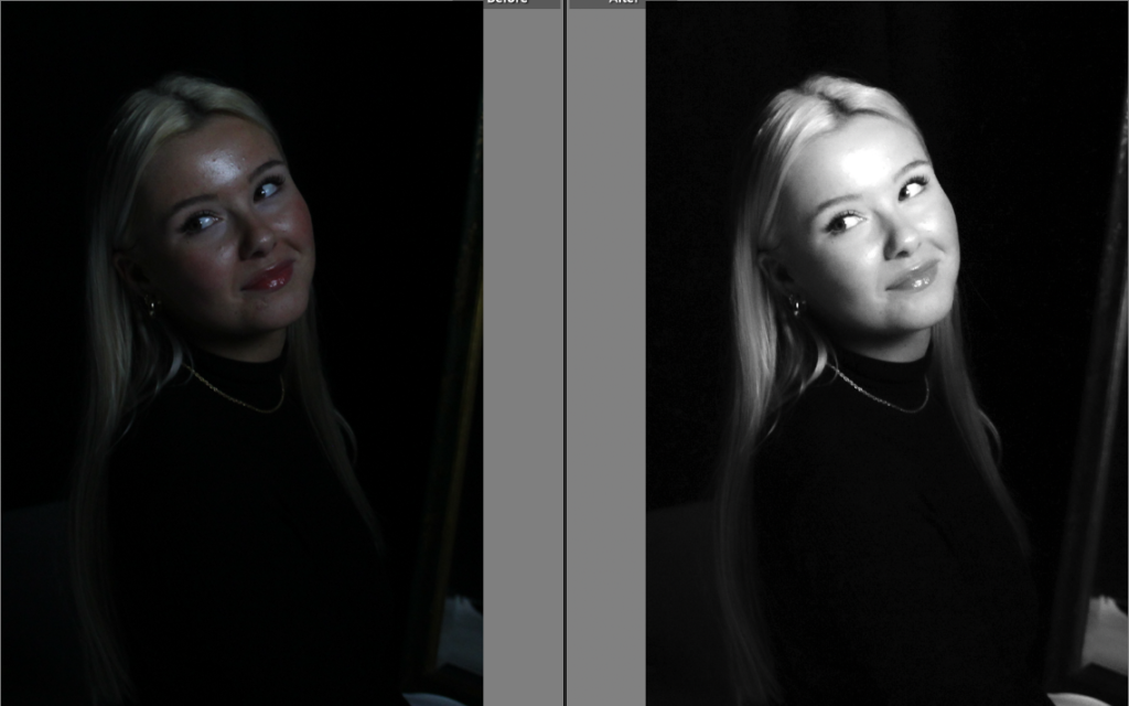
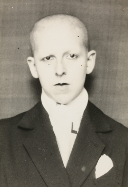
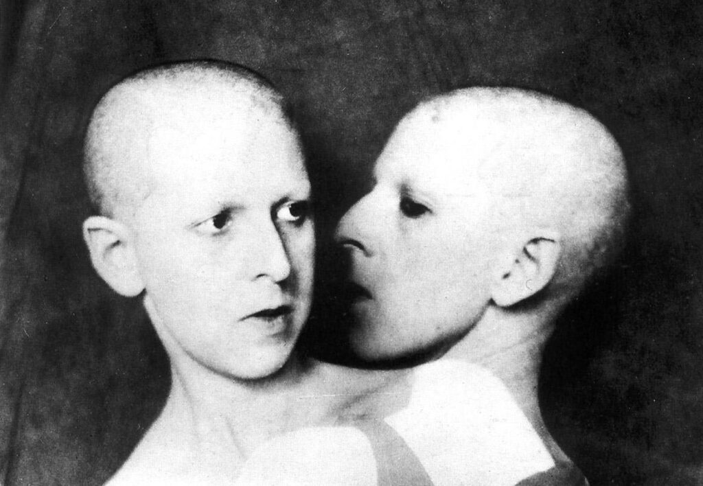
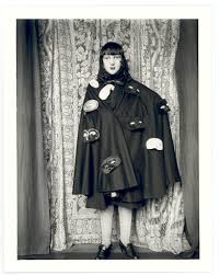
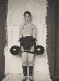
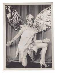
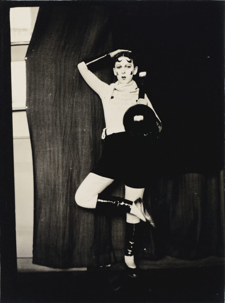
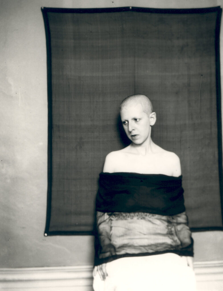
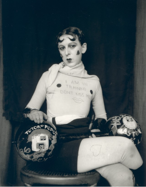
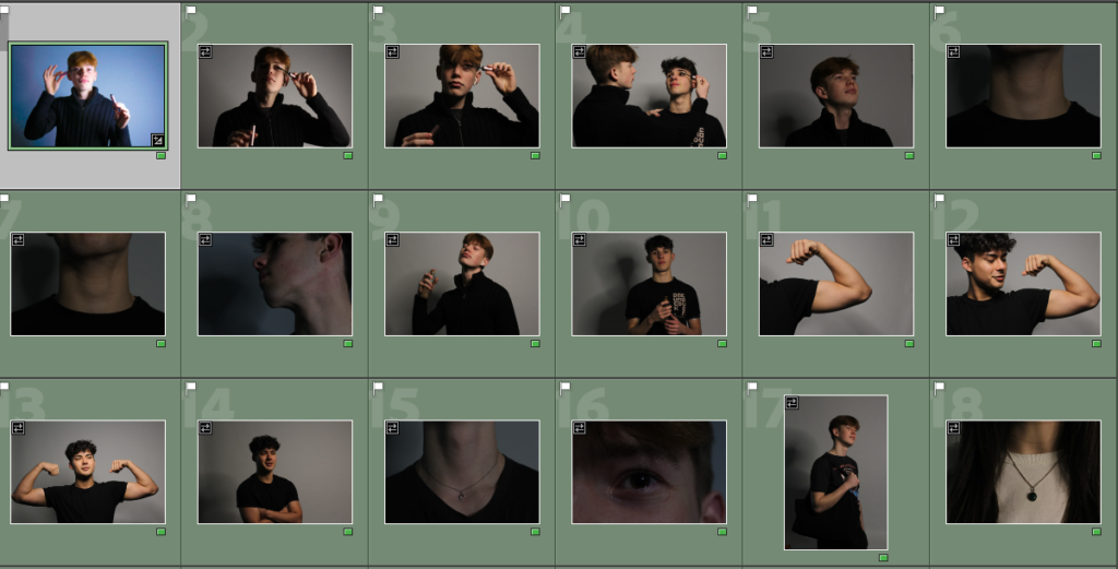
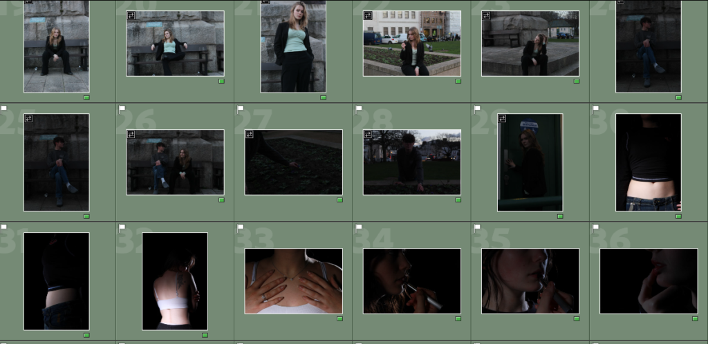
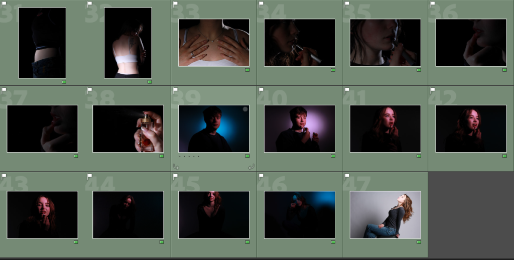
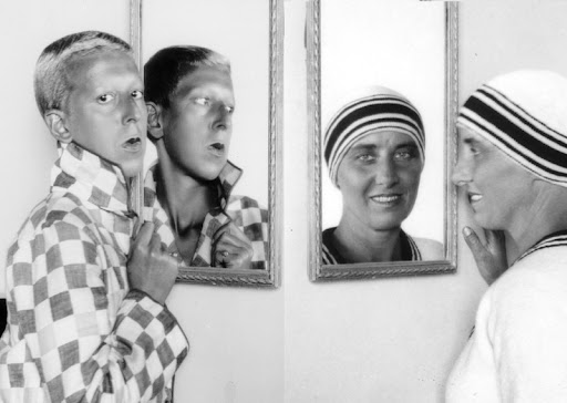
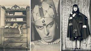
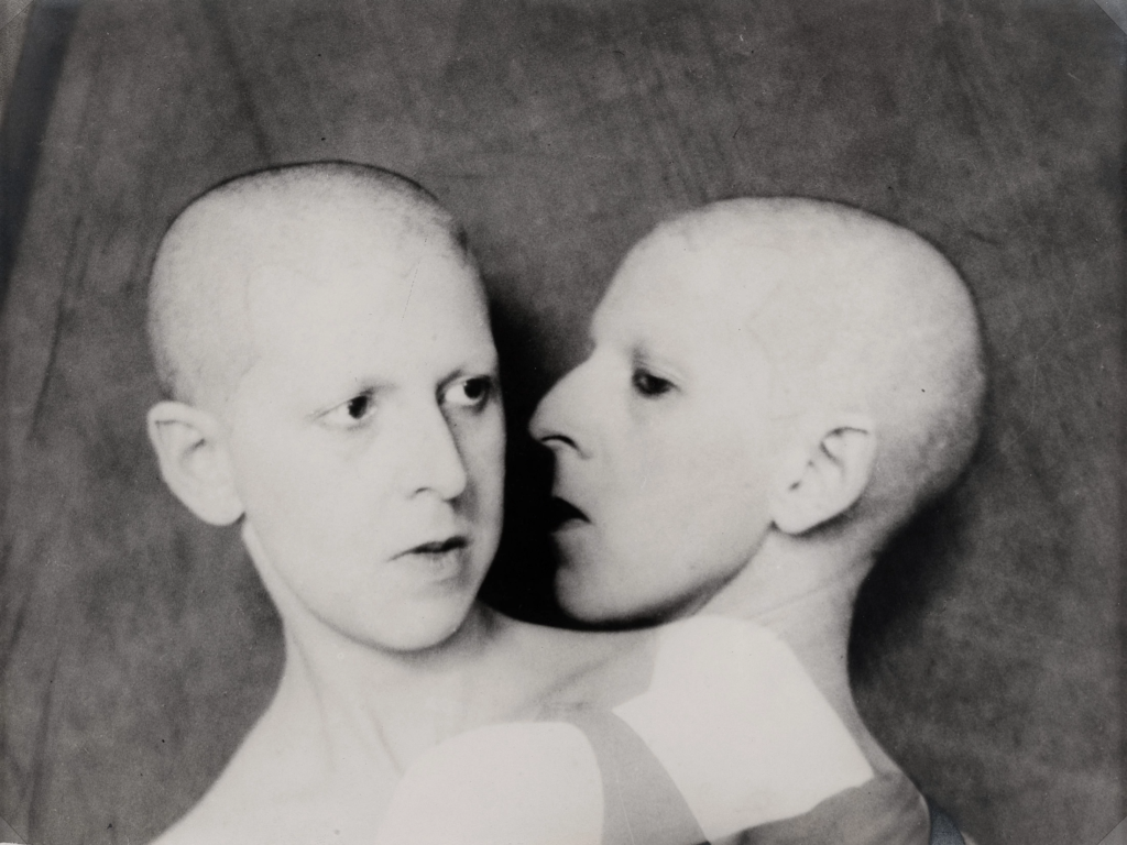
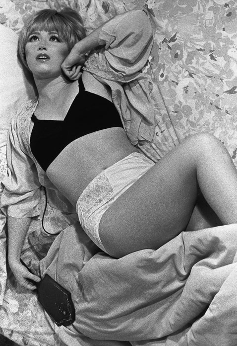
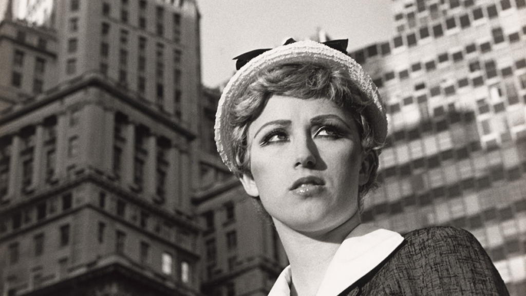
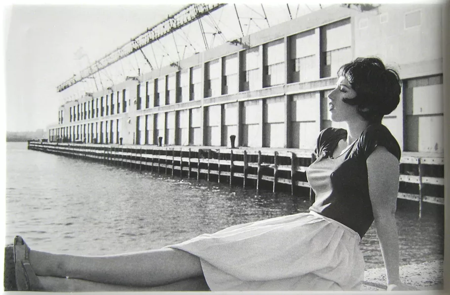
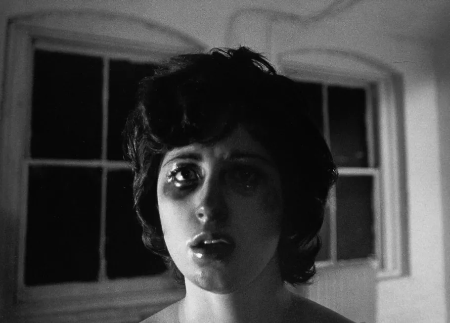
I edited all of these images in Lightroom hoping I could achieve similar outcomes to Marilyn Monroe. Most of my photos are in black and white, which I also believe is useful as Cindy Sherman and Claude Cahun both embody black and white images in their work too. This way I am able to incorporate artists we have looked at, as well as embracing my own creativity and ideas. The use of black and white is successful because it gives the photos an ancient theme to them, which adds a sense of realism throughout my work. I believe this is important because Monroe became popular in the 50’s, in which all photos were black and white. I also cropped all of my photos so there would not be any unnecessary background distracting the viewer from the subject of the image. A common theme throughout my edited photos is increasing the exposure, which I did because I think it perfectly separated the light and dark tones in each of them, helping to highlight the different shades. Furthermore, I increased all the blacks and all the whites in each photo too, which made it easier to identify the main subject. This means that there was hardly any background in any of them, allowing the viewer to stay focused. Additionally, I decreased the texture in all of my images because I wanted to achieve as similar to Marilyn Monroe as possible, in which she always looked flawless in every photo.

