Final Images

Final Lighting Techniques

I have produced three final lighting images for my mock project, I have used a range of different lighting within the studio and a range of different lighting experimentations.

Photo One~
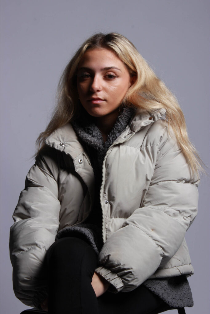
This first photo is an example of using softbox lighting, by having the light placed above the models head it creates a shadow across the models face and allows for a very bright lighting. This photo is also an example of a three-point pose where you can see from above the thigh of the model but not the feet.

Photo Two~
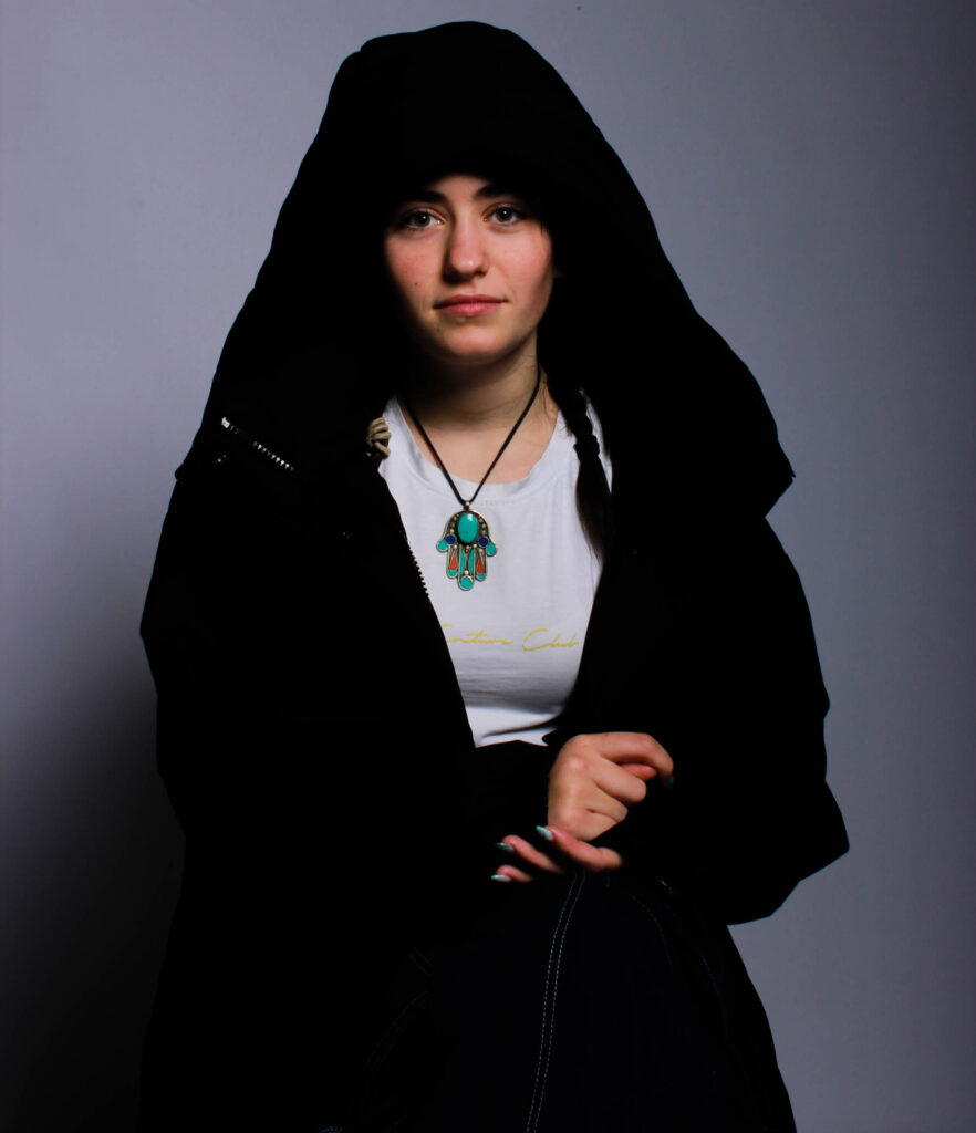
This photo is another example of soft box lighting but with the model looking straight at the camera creating a further personal effect, this creates a personal attention between the person looking at the photos .

Photo Three~
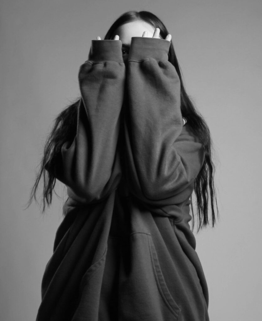
I edited this photo to be in black and white to create a more vague effect, to allow the mind to think, you can see the different lightings within this self portrait on the crevices in my jumper.

Final Masculinity and Femininity

Femininity and masculinity is a very hard thing to pick up just generally on a camera, there is so much baggage that comes with either/or so I have tried my best to represent this in a in depth story telling way.

Photo One ~
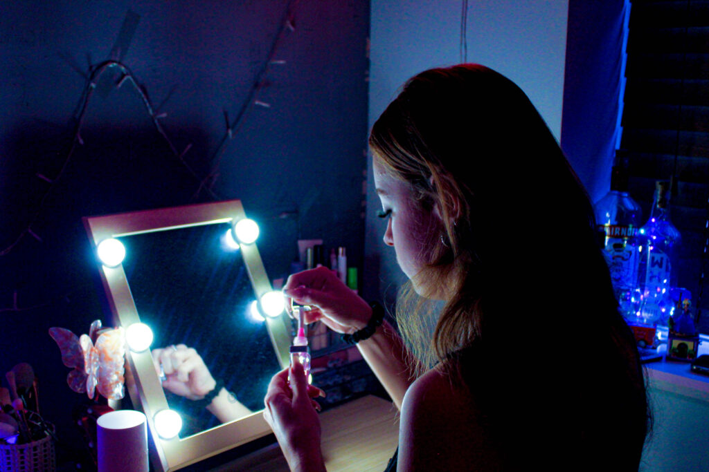
I have chose this photo as one of my final outcomes due to its display of the beauty of being feminine rather than all the baggage that comes with it, a woman’s mind generally goes both ways when a male starts talking about femininity, either wondering if there about to display sexism and sterotypical explanation’s or whether theyre going to talk about the beauty of being a woman. I feel like there is so much negativity around girlhood and womanhood so I’ve decided to try my best to portray the fun within it. The stereotype that only females can wear makeup has been around since makeups birth, and many people either frown upon this or agree, I have captured my model doing her makeup (lip-gloss), to show just how much fun something like makeup can be. Many people (mostly men) shade on makeup claiming that nowadays a woman’s beauty can be removed with ‘one wipe’, and so what? Woman have been denied fun all their lives, being shoved into stereotypes of cooking and cleaning, and when makeup was created this changed the lives of women and girls all across the globe, this is why I have captured my model in a very girly lit environment, not only to juxtapose her and her surroundings’ but also to create ambient lighting to portray the mood of female empowerment and all the happiness that comes along with it.

Photo Two~
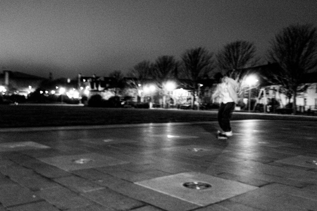
I have taken the opposite approach for my second photo, this photo is aiming to describe what it’s like to be a man. Men are stereotyped to generally not talk about their emotions and that would make you ‘feminine’, so i have tried to capture this by photographing the ‘lone skater’. Men are known for being ‘alpha’ and like they should always have one foot forward and planning ahead, for example they should provide for the whole family, and although this may give them a purpose in life this may not be what they were personally born to do. Men have hobbies too, such as skating,skating is generally seen as masculine as its a sport of throwing yourself around, but i wanted to capture skating as a breath of fresh air, something to free a males locked up mind, by skating you can take all the pressure off your head and do something that they enjoy, I have seen men be shamed for doing what they want to do instead of fitting into their own stereotype, so i wanted to portray this as a sadness, a lone sadness, like males cant have fun with their friends but instead have to roam alone. I have put this image in black and white to use the darker colours to portray the meaning behind the image, the scariness and loneliness like theres no one around to lean on.

Photo Three~
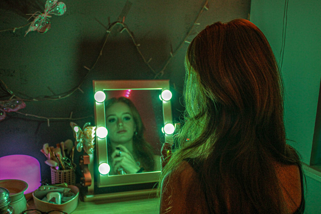
I have tried to make this feminine photo more masculine by adding a colour tint to the image, I chose the colour green which is typically related with masculinity to create a sense of incongruity. I wanted to capture the beauty of being a female and how many fun things you can do that ‘males cannot’, such as makeup and looking pretty spending hours getting ready, to prove that we literally just do it for ourselves and not for men.

Photo Four~
Final Environmental

An environmental portrait is executed in your characters personal environment, it’s the beauty of finding a model and snapping a photo of them doing what they love most to tell a story, this is why I have chose these two photos as my final images.

Image One~
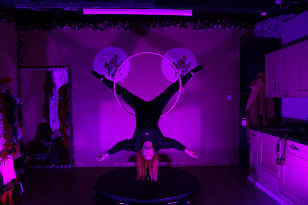
I have chose this full-body shot photo to be one of my final submissions for environmental photography because it tells a whole story. The lighting within this image portrays many different things about this character’s emotions when within their environment the brighter lighting shows emotions of confidence and happiness rather than being hidden in the corner of darkness, the shade of fuschia pink shows the ‘girliness’ of the environment, which coordinates well with subliminal messages being portrayed by items also within the images, such as the flowers around the mirror, the clothing on the clothes rail which is only slightly being captured and much more, this creates an intense ambiance of feminine energy. There are also other concealed things within this photo that tell a story, such as the two business logos he hind my model which display ‘showgirl sass’, a hidden message like this can make you wonder what they are, ‘showgirl sass’ is my character’s business, where she dances and teachers other people her passion. Overall this is a very wholesome photo, which is another reason why I have decided for it to be my final submission. Although the image is quite grainy it almost makes it look more alive, like there is an actual conversation and interaction going on behind and infront of the camera.

Image Two~
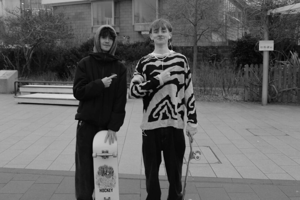
I have chosen this as my second environmental portrait because I love this three-point image, I have edited the photo to be in black and white to keep the main focus on the energy this image is giving off and the pure emotion which is captured within it. This image consists of two friends skating, making valuable memories which they will one day go on to tell their children, which allows this image to portray a story. By having my models smiling it yet again adds onto the sheer raw emotion which has been captured within this image. The lighting I used was the daylight on a cloudy day, and although that may seem gloomy the atmosphere was most certainly the opposite, showing how a good friendship can allow you to be happy even on the darkest of days. This photo creates a sense of stereotype as well, the fact that they are ‘obviously boys skating’ ad not girls and also there ages, skating is generally perceived as a sport for the young which I have portrayed here but this doesn’t mean that it completely vanishes from you when you are older, it’s something that you can teach on, a passion.

Femininity Photoshoot

Photoshoots – Marilyn Monroe inspired

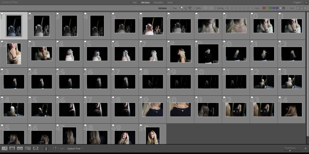
For our photoshoot we took a total of 213 images. Before I began editing them, I firstly flagged my favourite ones. I ended up having 50 flagged images from 2 photoshoots.

After I flagged the images I narrowed them down again by selecting my favourites from them and making them green, I flagged 50 photos and then narrowed them down to 12, these are the images I edited.

I started editing these photos to have the same vibe as Marilyn Monroe’s photographed images in the 50s/60s. This means that they all fit the theme of femininity and also had either a vibrant/vintage colour or black and white which she was photographed a lot in.

In the end I narrowed it down to my favourite 9 images. These were personally my favourite as I love the way it portrays the vibe perfectly of Marilyn Monroe’s images. These images to me represent femininity perfectly.

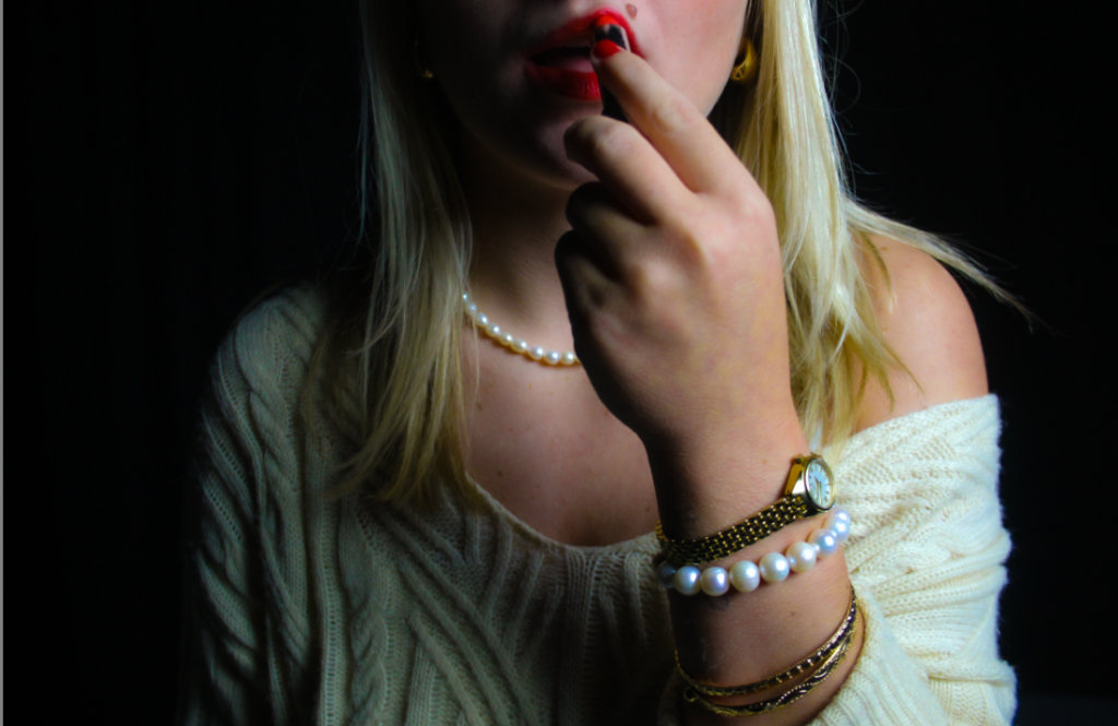
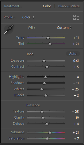
This was a favourite of mine because I love the way the jewellery is presented on her wrist, the gold and the pearls represent femininity, especially Marilyn Monroe as pearls were a signature look for her. I made the image more vibrant as it looked dull before as there was just plain lighting when we took it. The red lipstick is also a major part of this image. It is a signature look of Marilyn Monroe’s, and it also represents femininity as the red lip colour gained popularity internationally as women’s rights movements spread worldwide.

For the image I made sure to add vibrancy and colour. This made the image more colourful and gave it a vintage look, it also made the red lipstick pop and that makes it a main focus of the image and that was a goal when we decided we wanted Marilyn Monroe as inspiration.
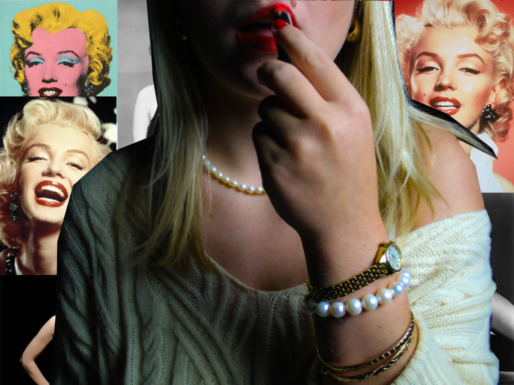
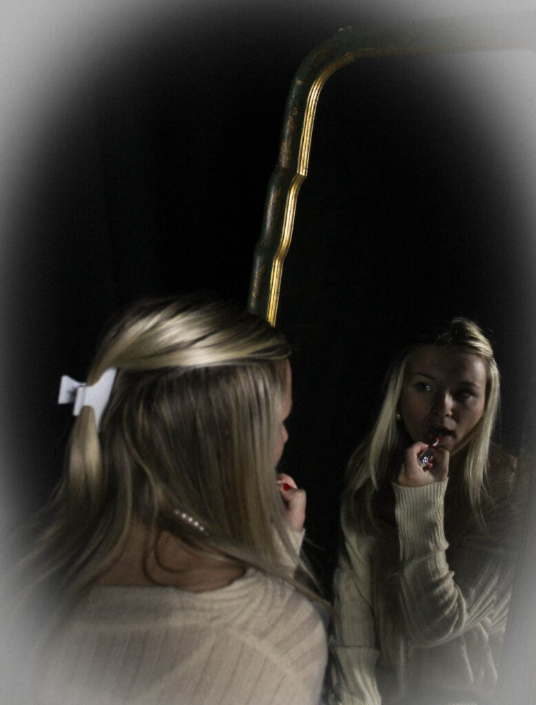
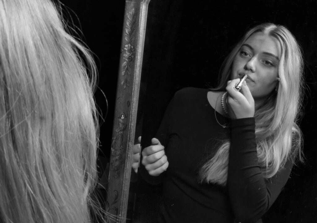
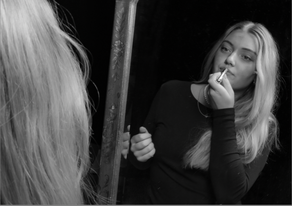
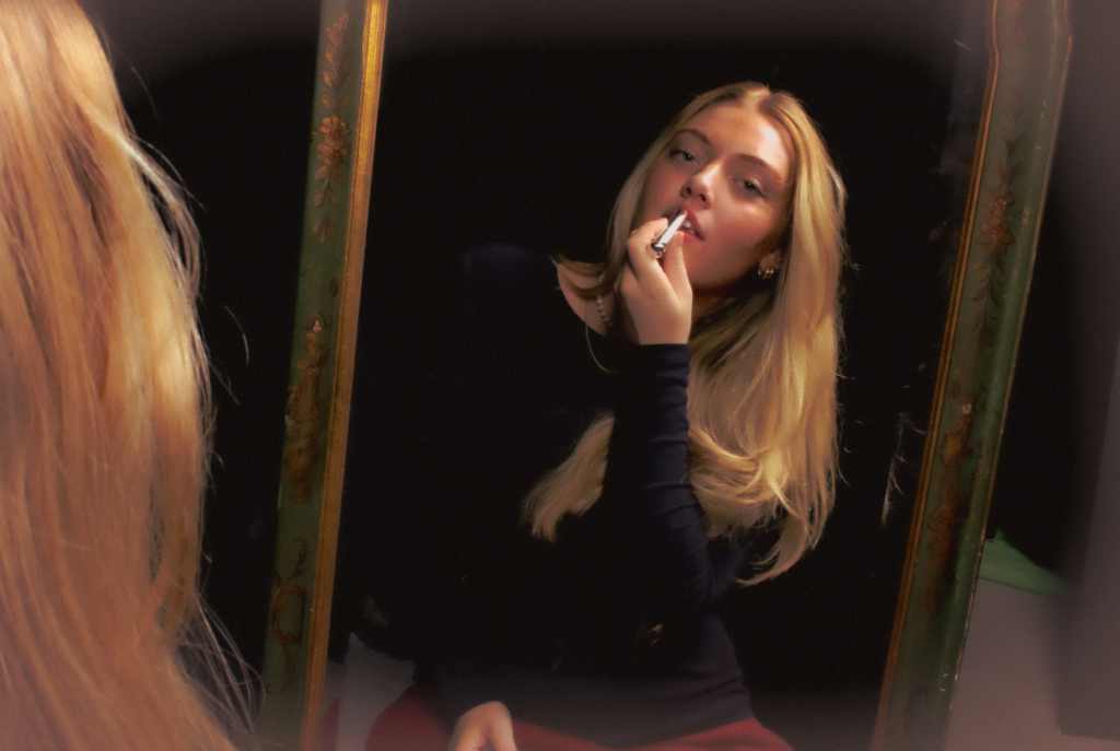
This was another one of my favourite images as I think it represents femininity well. putting lipstick on in the mirror is something that all females do and I think it fits the theme of having Marilyn Monroe as inspiration for these images as she had the signature red lip. The thing that pops out most in this photo is that I am putting on the lipstick which shows similarities with Marilyn Monroe.

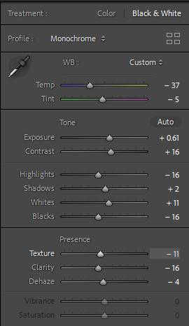
For this image I made it black and white as I took inspiration from an image I found on Marilyn Monroe which was black and white with her applying lipstick. I turned the exposure up as we were in a dark room with one light which made the photo give a spotlight effect on me and the mirror and everything else around was dark and not visible making there no other distractions in the image.

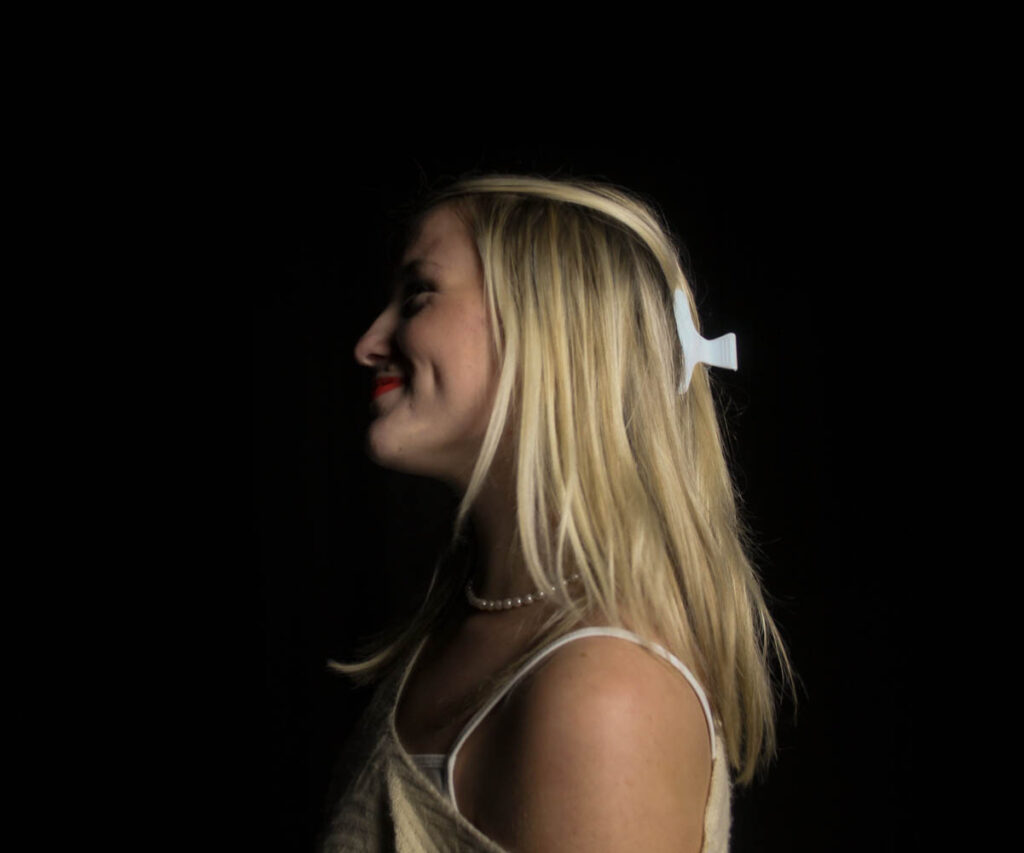
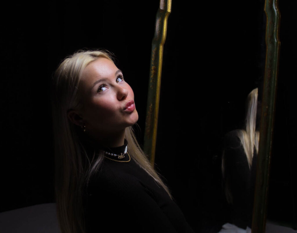
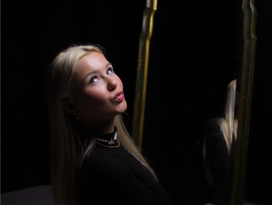
I chose this photo as the signature pout is very feminine. Marilyn Monroe was known for pouting which is why I chose this photo. The eyes not focussed on the camera give a bit of a dumb look which Marilyn Monroe was known for playing the role of “Dumb blondes” which is what we tried to resemble in these photoshoots.

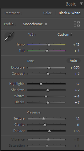
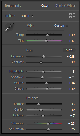
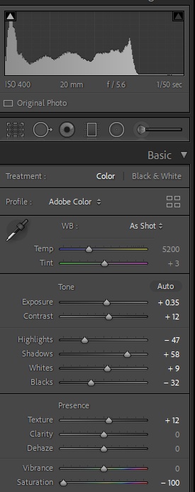
I turned up the temperature and tint as it gave a vintage look in the photo which was also key in doing so in the image. I turned down all highlights, exposure and whites as originally the image was very bright as we had the light right in front of the model. This also gave the effect that we had a spotlight on her which can also show that Marilyn was always in the spotlight when she was photographed. I used the spot remover on this photo as there were lots of specs in the mirror and on the floor.

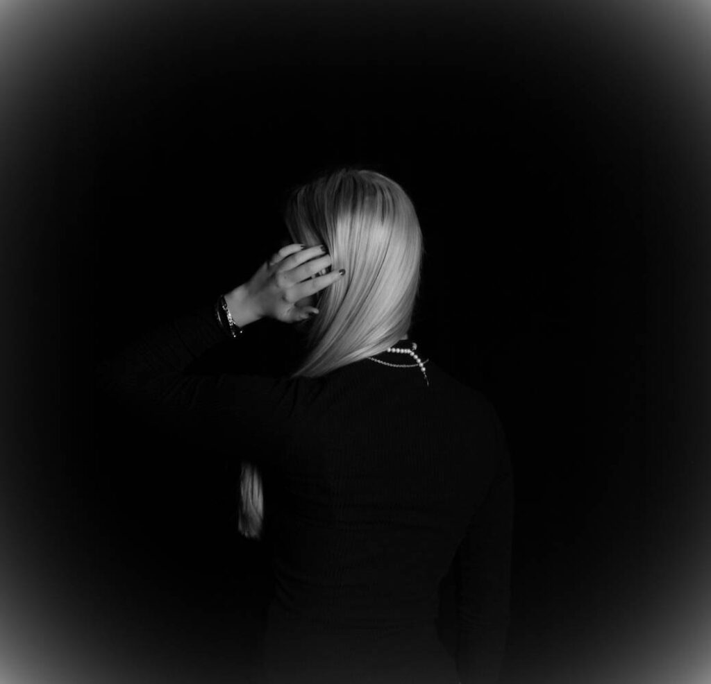
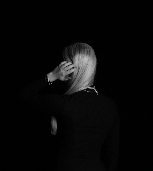
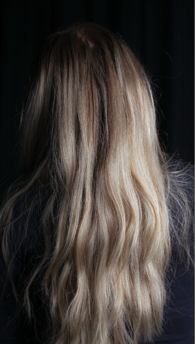
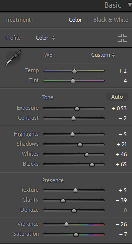
Personally I love this photo as it looks very classy and elegant. the straight hair swept to the side is key for the image as it shows of the pearls that she is wearing. The hand going through the hair is very feminine with the painted nails which are a dark red colour but just look black in the image as I made it black and white.

I didn’t change much for this photo as it was already practically perfect, I did change it to black and white then turned up the exposure a little bit to make it visible where you can see where she is.

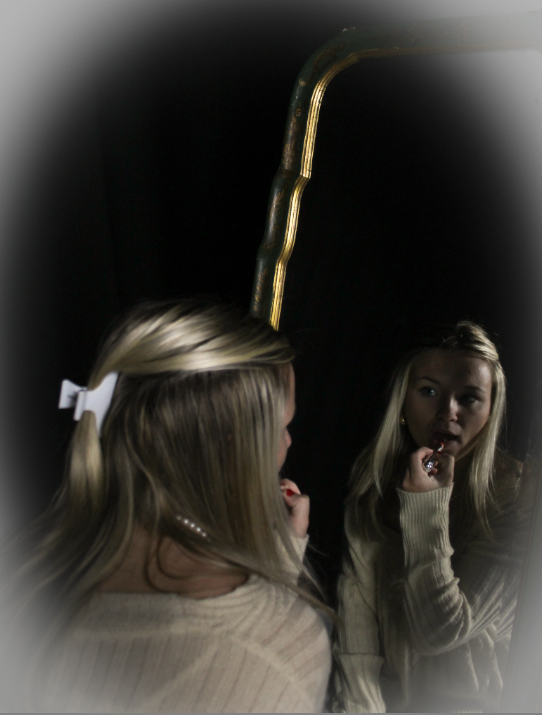
I love this photo because it looks very angelic and feminine. The warm tones in and on the mirror make it look very golden and warm tones while on the boarder of the image it is cool toned. This is also inspired by Marilyn Monroe as she also is applying the red lipstick in the mirror like she did in one of her photos.

I turned up all highlights and made the image colourful with different warm and cool tones in it. I like the way that the colours go from warm to cold from the centre going outwards.

I added an effect to this image and it made it look very angelic and pretty. I chose to add this to this image because I really like the way it adds a different and unique twist to the photo.

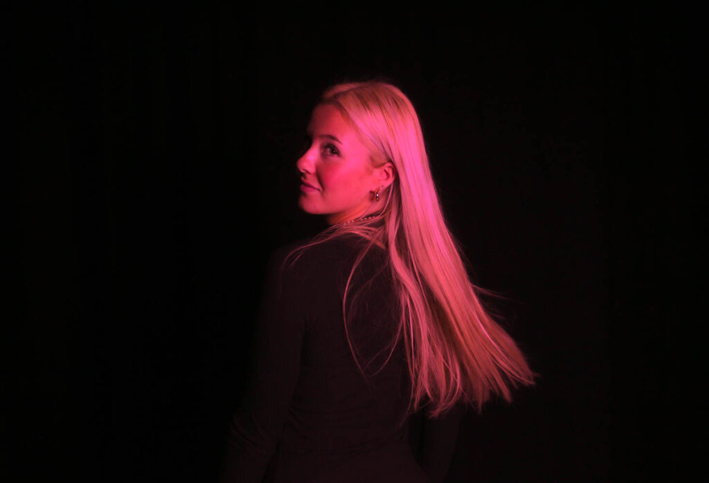
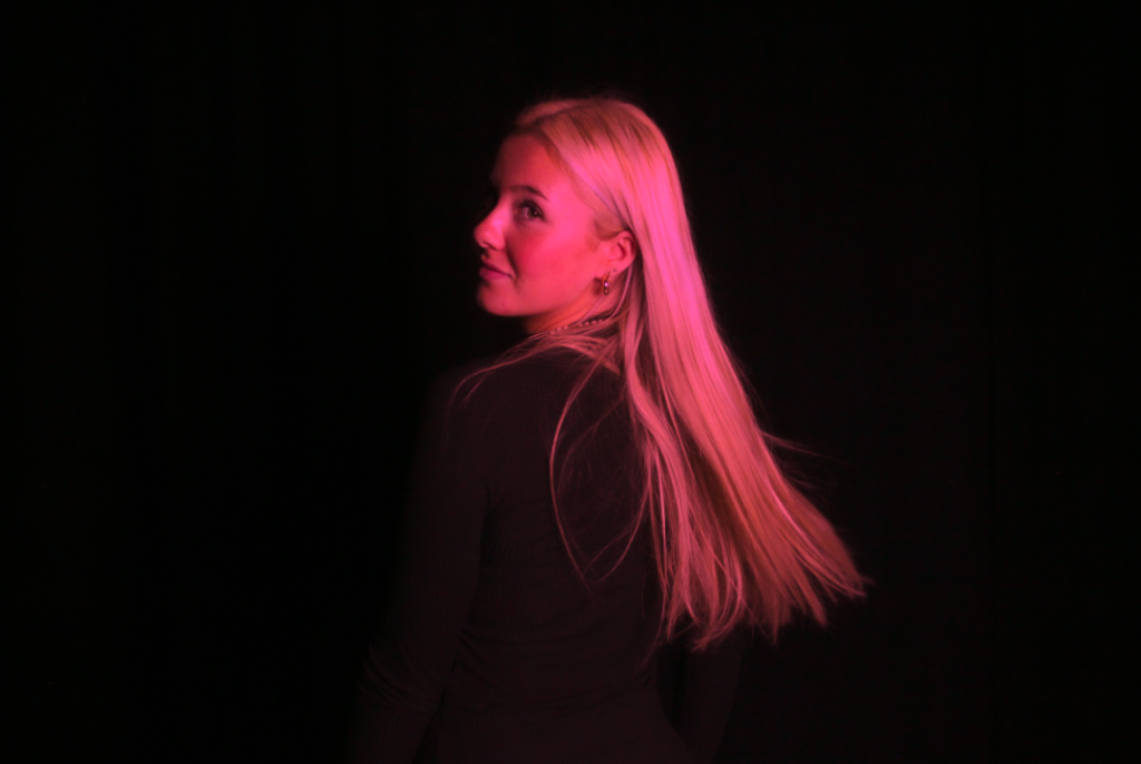
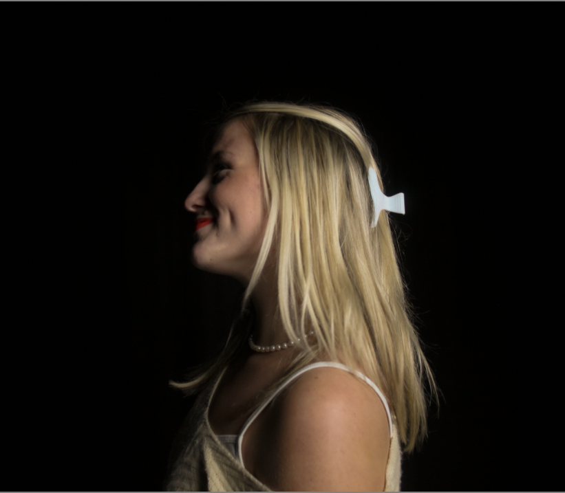
This picture I experimented with because it felt like the type of photo I could do a lot with. I focussed a lot on femininity with all of these photos and stereotypically pink is the most feminine colour so I used it to create this image. I love the way it contrasts with the black background to make it really stand out.

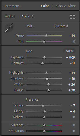
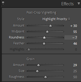
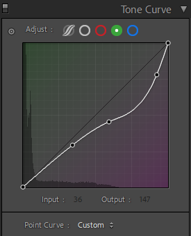
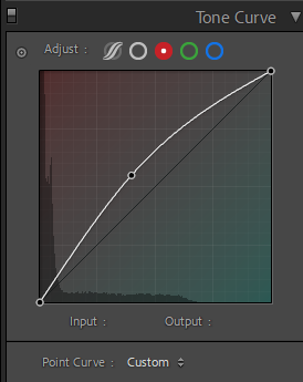
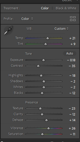
I didn’t do much with the basic tools as it wasn’t necessary to do. I did edit the texture the most as when I changed the tone it was the thing that stood out most on the model and in the background. The green Tone curve I turned to a light purple and the red tone curve I changed to red to make it a bright vibrant pink colour.

This is a really sweet image it is stereotypically very feminine as women were stereotyped to be caring and soft.

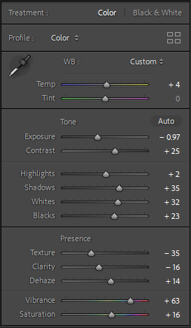
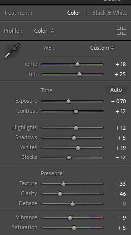
I turned up the temperature and vibrancy in the image to make the colours stand out more I really liked how it ended up looking especially with the red lipstick. I turned down shadows and highlights to make the subject obvious and stand out in the photo as in the original photo she was just blending in with the background.

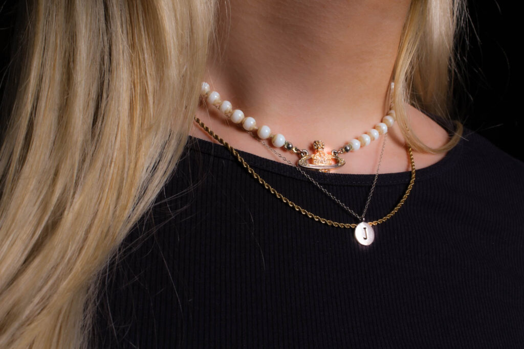
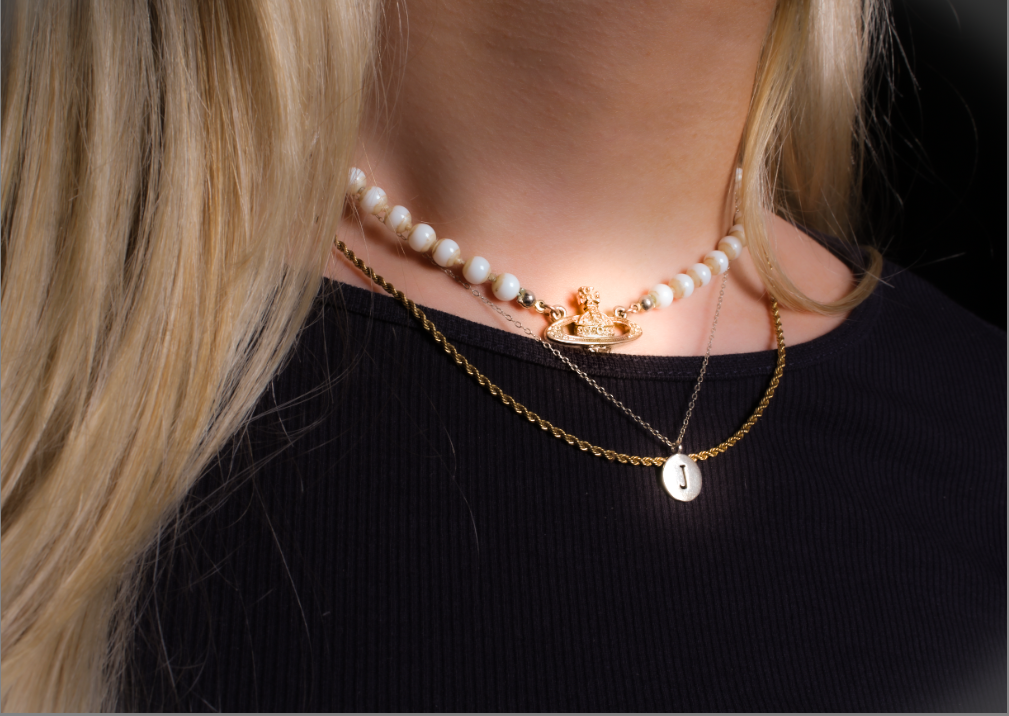
This photo shows femininity to me by the jewellery, the gold and the pearls mixed together make it very feminine. I also used the radial filter which added a luminescent glow in the necklaces to make them look magical.

I used most of the basic tools for this photo to make it vibrant and colourful. I think this photo is really simple and it doesn’t n

This photo is very basic but it goes nicely with the theme of chosen images it is very simple but it matches with all of my other selected photos.

I edited this image minimally but enough where it looks cleaner and simpler.

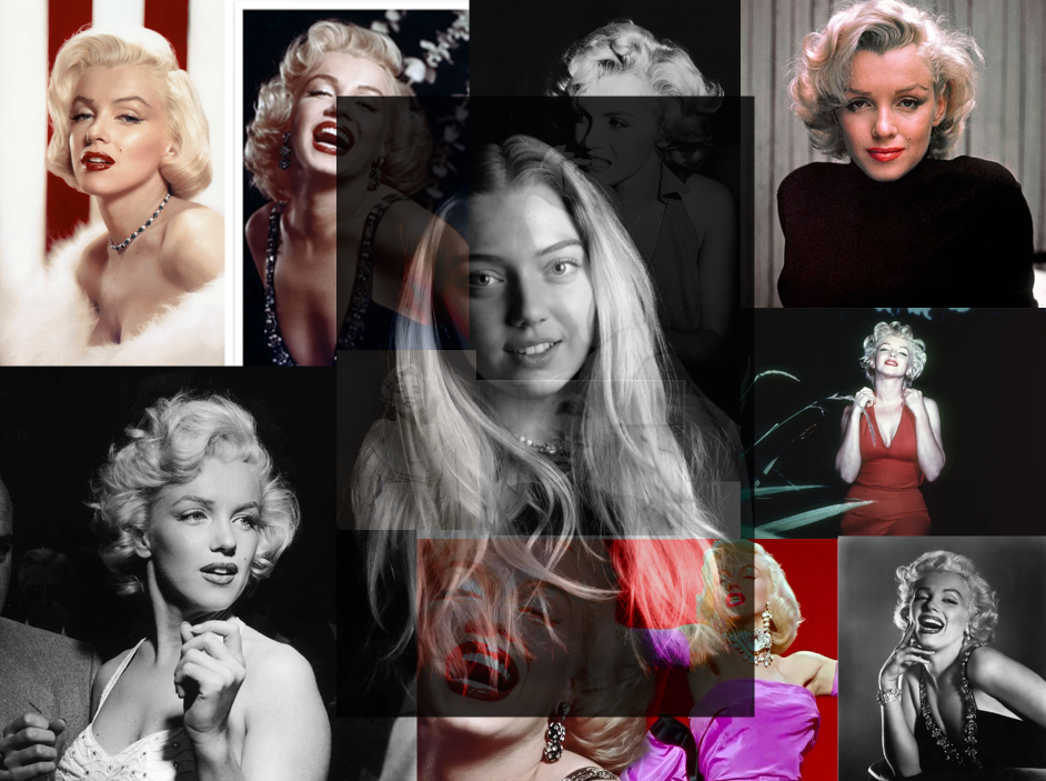
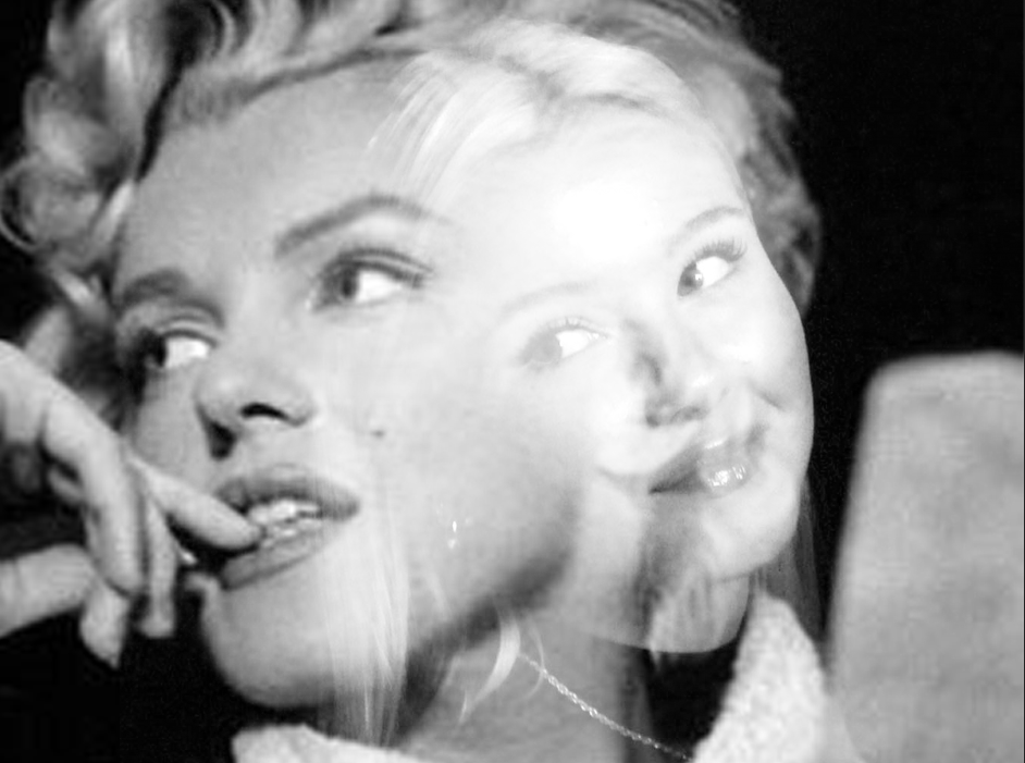
This picture I experimented with on photoshop. I created a collage of Marilyn Monroe pictures which I thought looked really good with my photo. I love the way this turned out because the image layering of my image on top of the selected Marilyn Monroe images I found goes really nicely with the photograph I took.

Final Outcomes

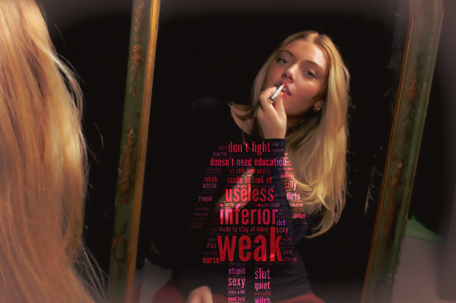
This image is too suppose to contrast the image and the stereotypes itself. As the subject in the image is applying red lipstick which is representing bold and confident as a women whilst viewing themselves in the reflection. This significantly contrasts to the stereotypes around her as a female as this is significantly the opposite to the results of red lipstick. Therefore, this piece is a juxtaposition as it is 2 different things contrasting one another. This relates to Monroe’s work from using the props and Claude and Sherman’s work as they used a mirror within femininity which could represent vulnerability.
PRESENTATION

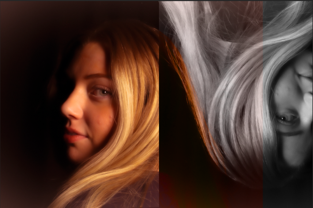
I personally like both of these images however I prefer the second one as it has a more blended look of the two photo combination. Therefore, it generally has more of a cleaner and professional look to the image. However, the first image has 2 lines with different colours and highlights between them which I think looks quite abstract and different but purposely not perfect.
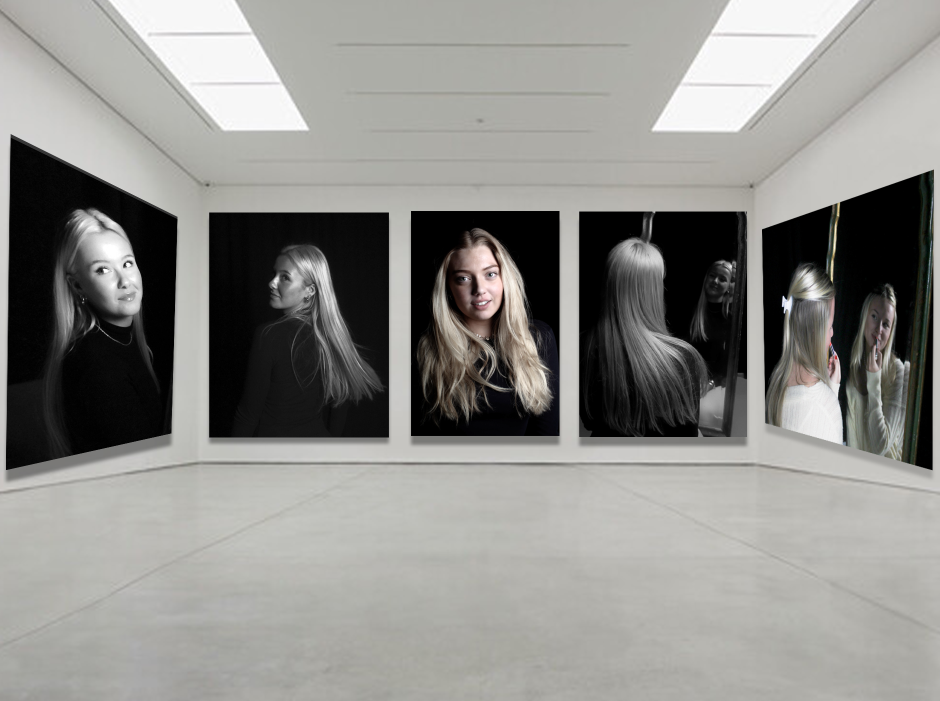
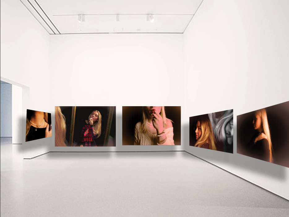
Virtual Gallery/ Presentation

I chose these photos as they were personally edited the best or the most unique. They were suppose to look vintage and old so it is inspired by Julia Margaret Cameron and Marilyn Monroe so they do not look modern. The mirror was inspired by Cindy Sherman and Claude Cahun however the props were an inspiration from Monroe and edited like Cameron.

Comparing my work to Cindy Sherman

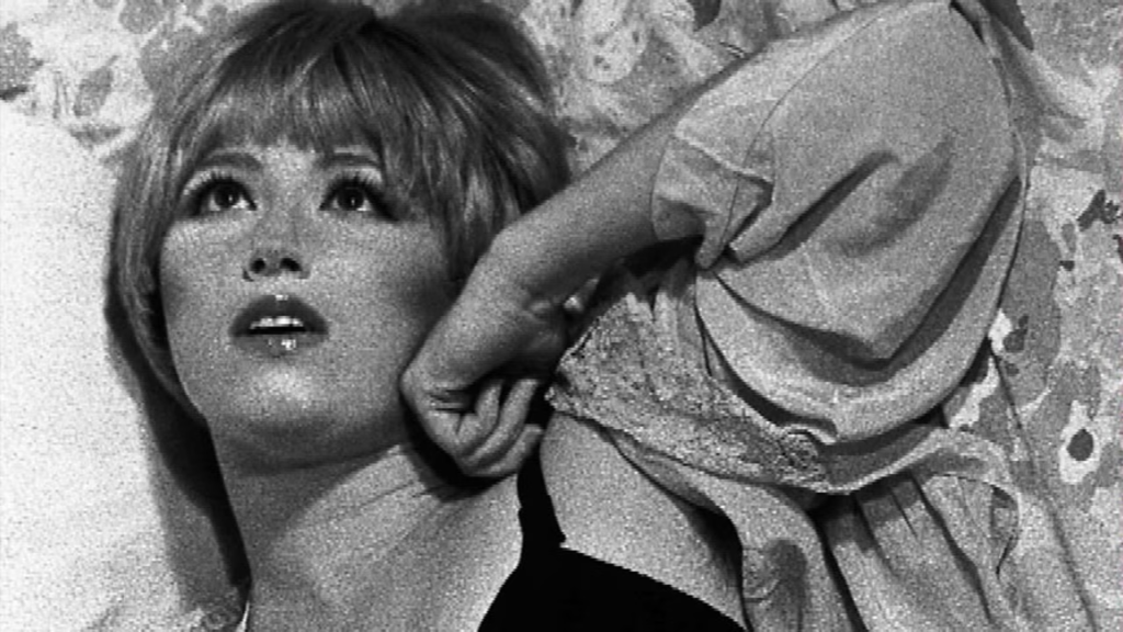
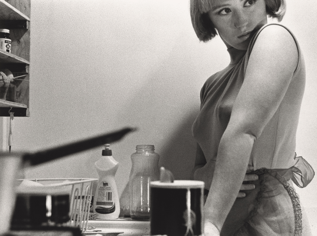
Artist Reference image:

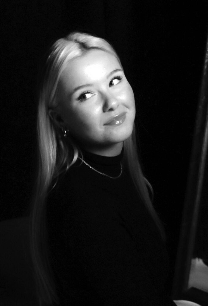
My image:

I see similarities between mine and Sherman’s work as we both explored the idea of traditional photos. This is seen in the black and white filter over both images. I like this because it gives the photo itself an ancient look, even in modern day photography taken with more technical cameras. Another similarity between both images is both models are dressed in dark clothing, which helps keep the viewer focused on the subject and their facial expressions. Finally the last similarity between the images is the use of not looking at the camera whilst the photo is being shot. I think this is a favourable touch as compared to posed photos, candid’s make observers feel more connected to the poster, feel more interested in getting to know them and like them more. This was driven by candid’s making people seem more genuine, which made others react more favourably.

However there are many noticeable differences between mine and Sherman’s final images. One of the main ones being the background; Sherman explored having a slight hint of colour to add some interest into the photo, whereas I wanted to keep my background plain as an object or model against a plain background will naturally stand out better and produce a stronger image. Another big difference between the two images is Sherman has added a grainy filter into hers, which ultimately makes it look slightly more ancient. I like this idea because grain makes the image look sharper as there is added texture. I did not add a grainy look because I wanted my image to appear softer, as I feel it symbolises femininity whilst also portraying a similar look to Marilyn Monroe. The last perceptible difference between the two photos is the hairstyle of the model. In the artist’s image she has shorter and “messier” hair with a fringe. A fringe on women was extremely trendy in the 1920s, which Sherman’s image compliments well. Whereas in my image I wanted a more sleek look, like Marilyn Monroe’s photos.

Editing Testing – Identity

Before the controlled conditions I want to make sure that I have tested editing techniques and worked out what exactly I want to do.

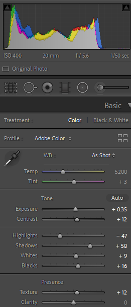
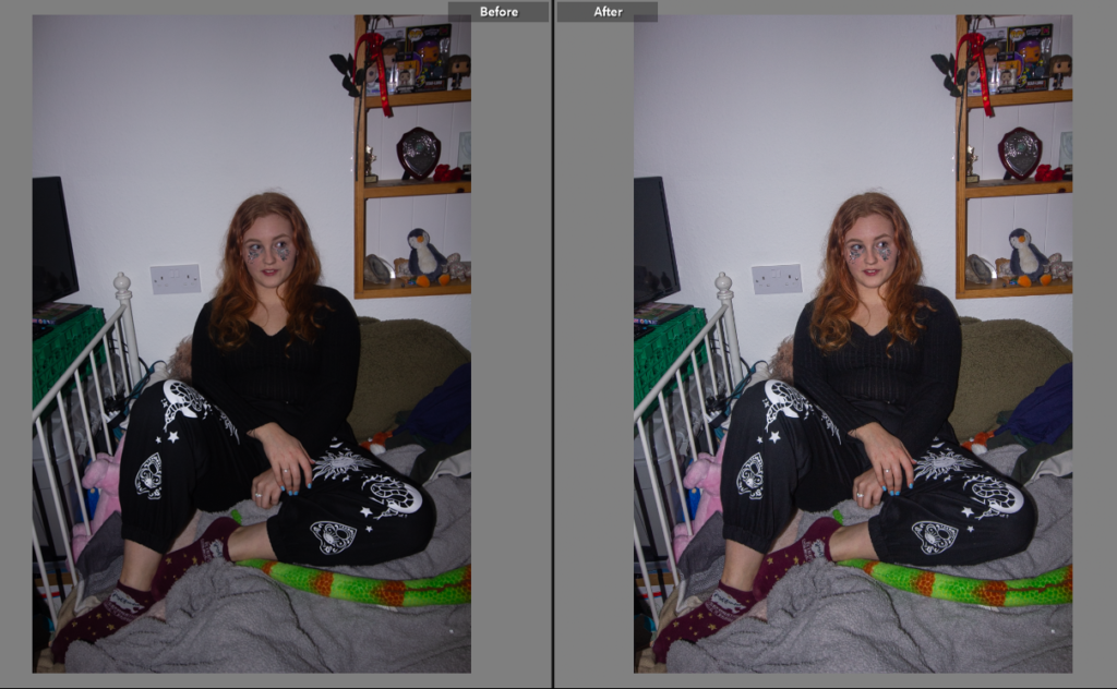
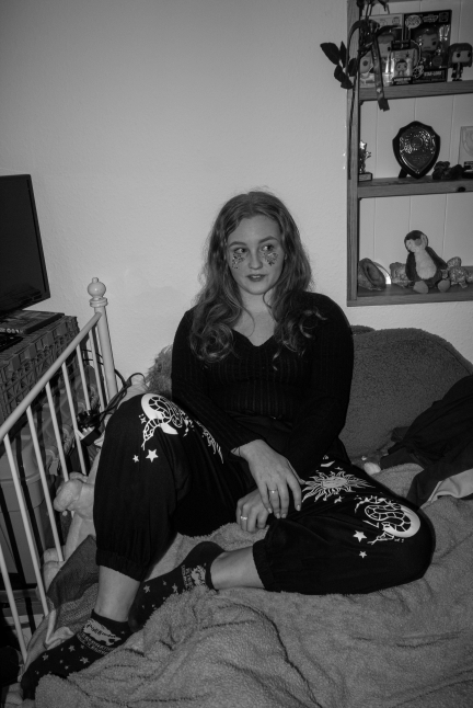
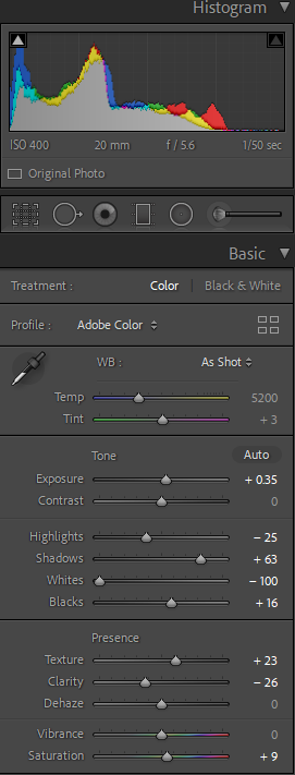
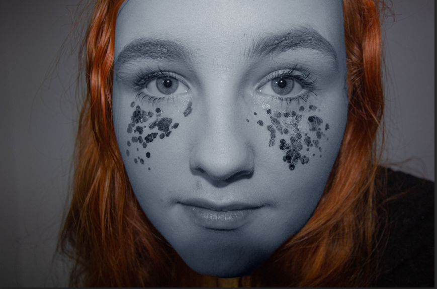
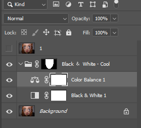
I started by adjusting the settings in Lightroom to create a better balanced well rounded image. This included adding texture and reducing the highlights before reducing the saturation to make the image black and white.

By then taking the image onto photoshop I could manipulate the busyness of the plug socket and the teddies tail that I felt didn’t add to the image and ended up making it seem messy and unfinished.

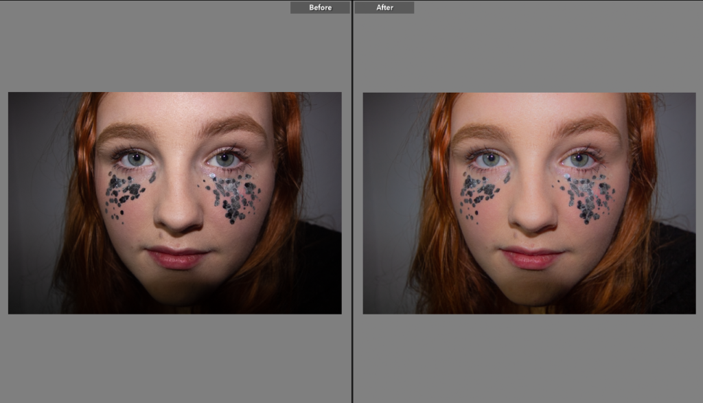
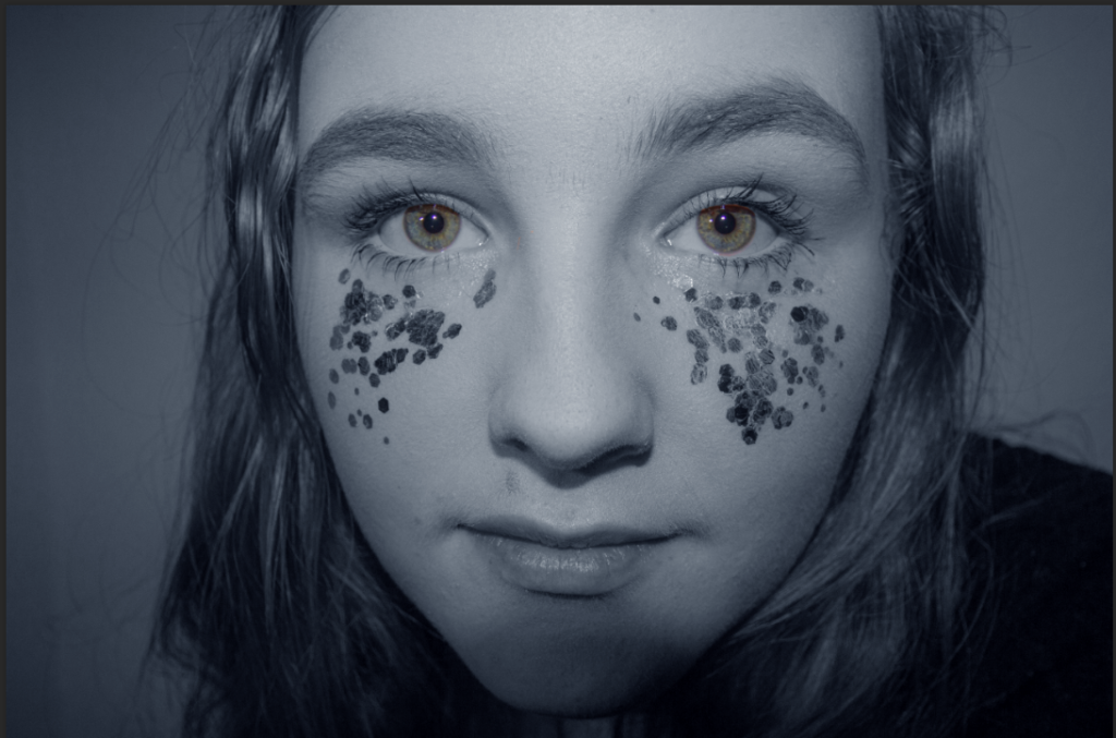
For the next shot I wanted to try and use some of the close up detail photos. These were inspired by Kayla Varley’s work with unusual angles and bold makeup, I have edited them by turning parts black and white and bright colours have been left in colour.

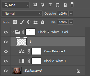
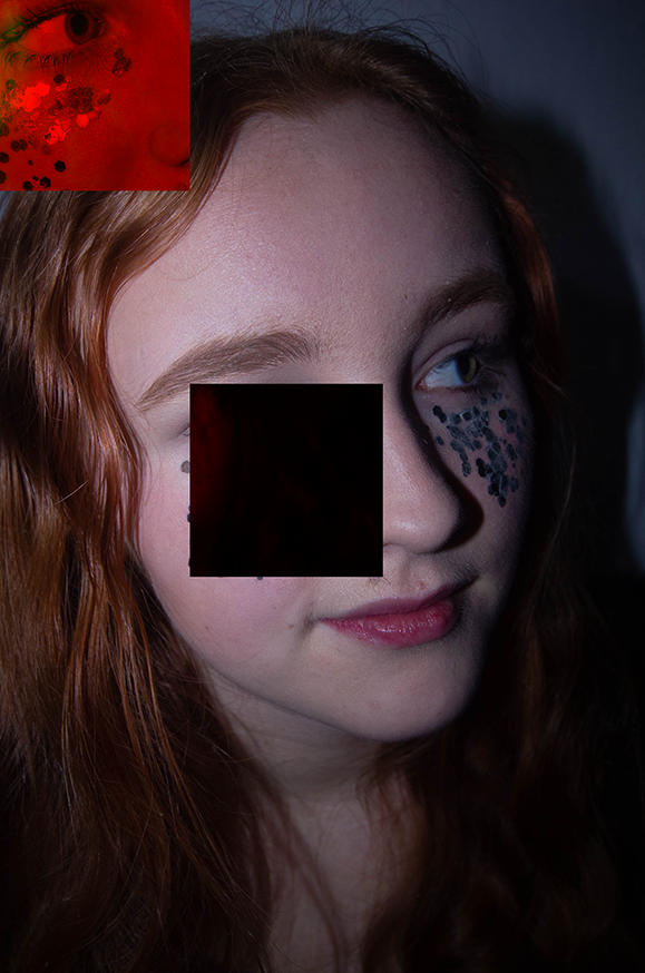
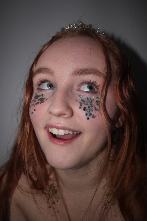
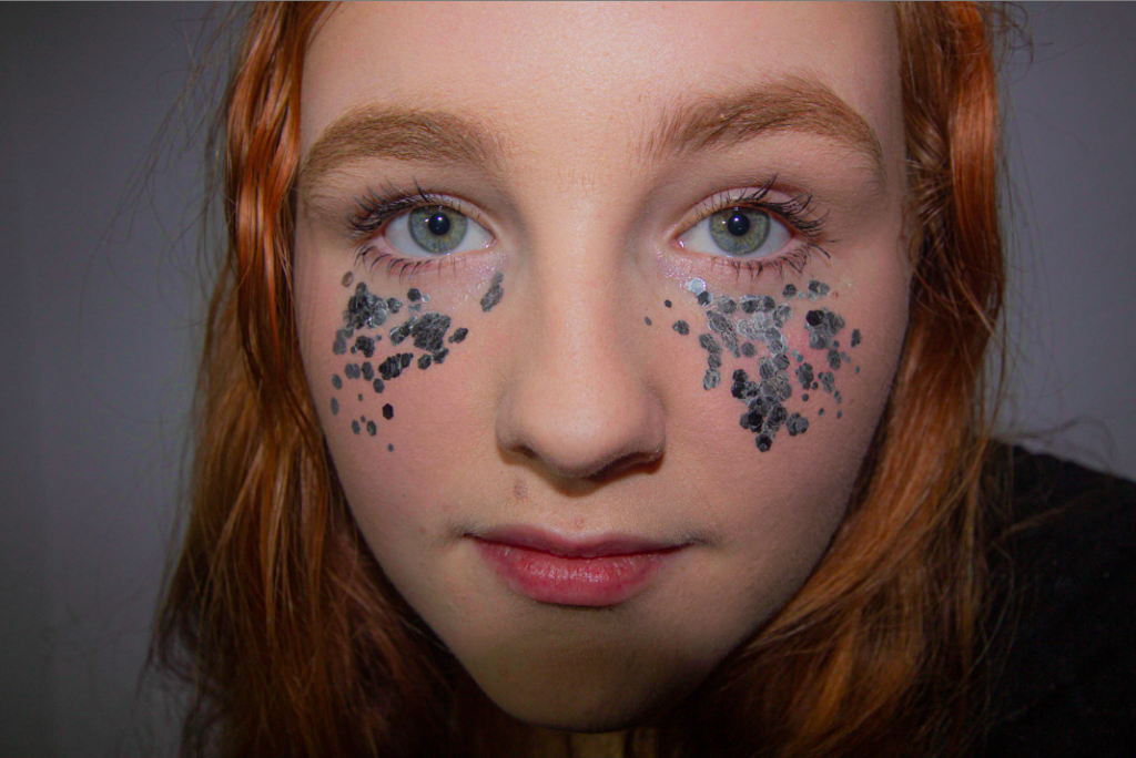
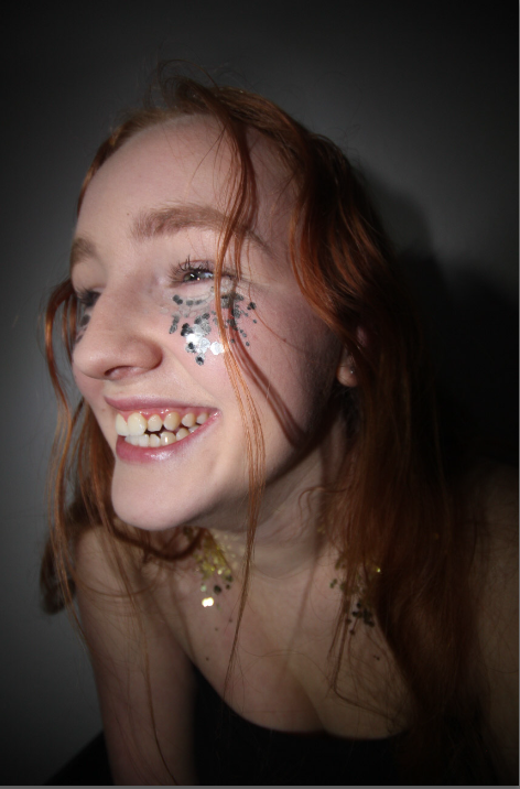
For my final test I tried a style heavily inspired by Cindy Sherman’s editing work and Varley’s photography style. I did this as I didn’t love my previous edits as I don’t think they show the theme well. So to do this I made sure I had a high quality image and then put it on photoshop to allow me to use the lasso tool to cut parts of the image out and move them. By then using -image-adjustments-colouring on the moved layer it allowed me to change the colour of the ,moved square to make it more noticeable. I love the outcome of this photo and it blends my inspiration together very well taking Varley’s photography style, Sherman’s editing style and Altman’s model presentation. I also think this shows the message I was trying to get across with the theme of femininity and masculinity, as I was heavily inspired by the absurdism idea and showing typical female stereotypes of beauty and being uncomfortable in who you are or simply not knowing who you are which is are all common things as a teenage girl.

Response

Photoshoot 1

For this photoshoot I was inspired by how Cindy Sherman showcased stereotypes, gender roles and her overall characters.

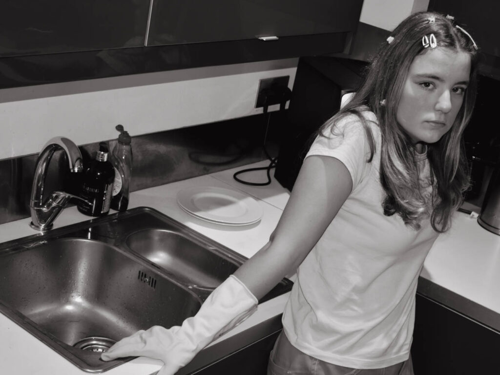
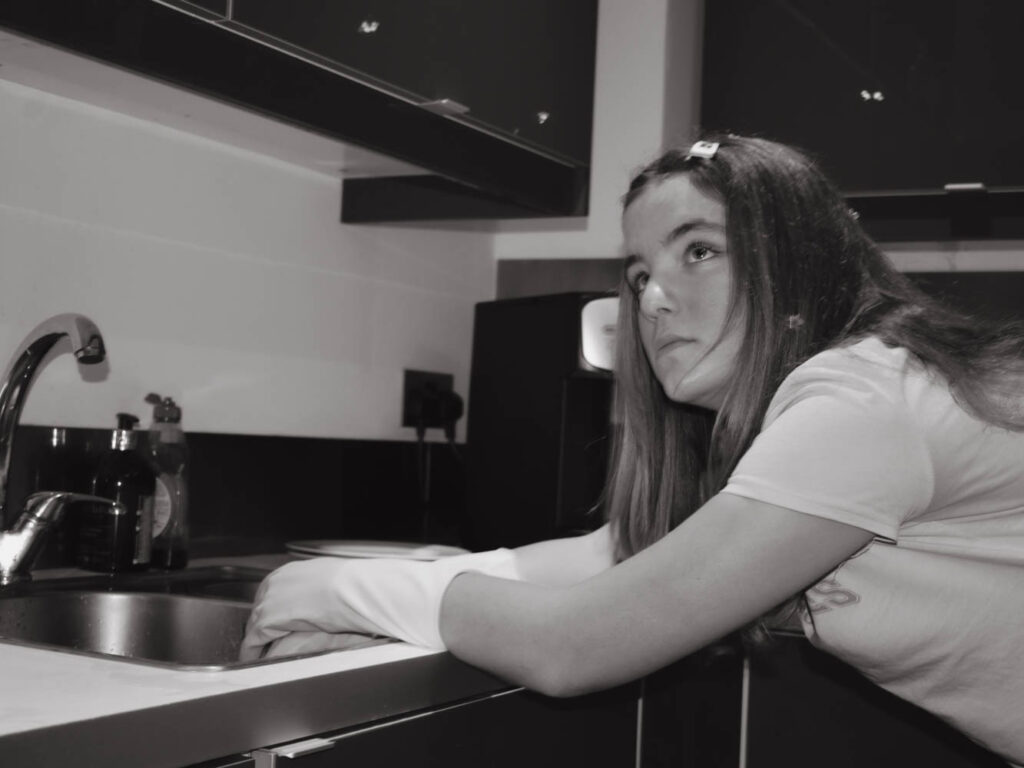
I took these photographs at my friends house because she had a traditional sink with two compartments which was important. A traditional metal sink is quickly recognisable for what it is and heavily associated with the gender roles of women through out the ages.

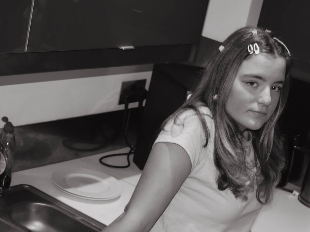
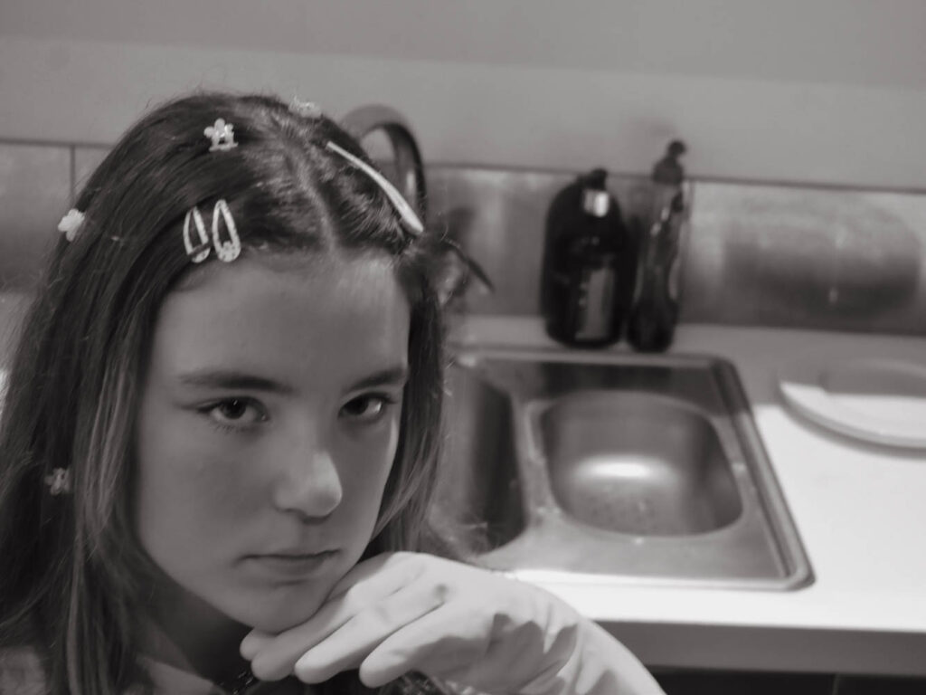
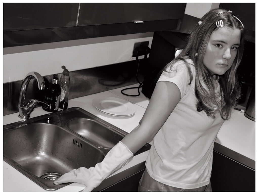
This kitchen only had lights on the ceiling for lightning which were extremely bright and cast heavy shadows over my friends face. I raised myself higher than her to ensure that her face and the sink would be at the same level in the frame which I think turned out rather well as it has the expectations looming behind her constantly. I also stood at her level for some where she would lounge around the counter.

I wanted to create a character who doesn’t want to be in the kitchen. Instead she has dreams of a luxurious life which she would see in films and adverts. I think that the dramatic poses and over the top parts encapsulate this well.

The draping poses show a lack of effort or care while also showing comfortability and knowledge of her environment. Her disinterest in her activities shows that she wants be elsewhere and that she might be above housework alternatively that she’s tired of working or finished and out of things to do.

I edited this same image in two ways to achieve an aged appearance:

  1. Cropped into a square with a retro effect
  2. Black and White inspired by Cindy Sherman in 4×3 aspect ratio

I didn’t like how the brown tinged ‘retro’ image as the colours were extremely muddy. While the muddiness could say the same as colourless I think the lack of colour not only looks older but also carried across each image consistently.

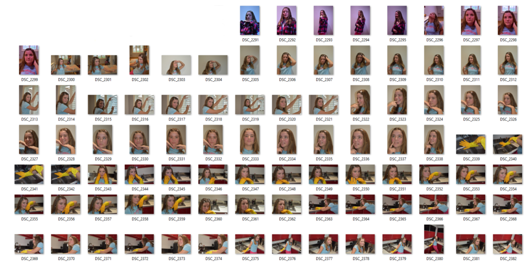
After narrowing down my selection I settled on these nine images:

Some of these are rather similar however at this point I was still trying to narrow down the selection and wasn’t sure which expressions were best. After comparing to Cindy Sherman however, I managed to narrow down the selection even further.

Each one had the aspect ratio changed and set into black and white. I had two arrangements in mind: all of the images together or 3-4 arranged together.

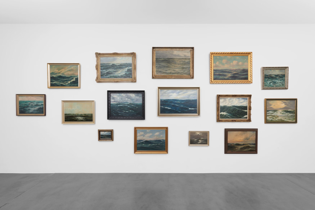
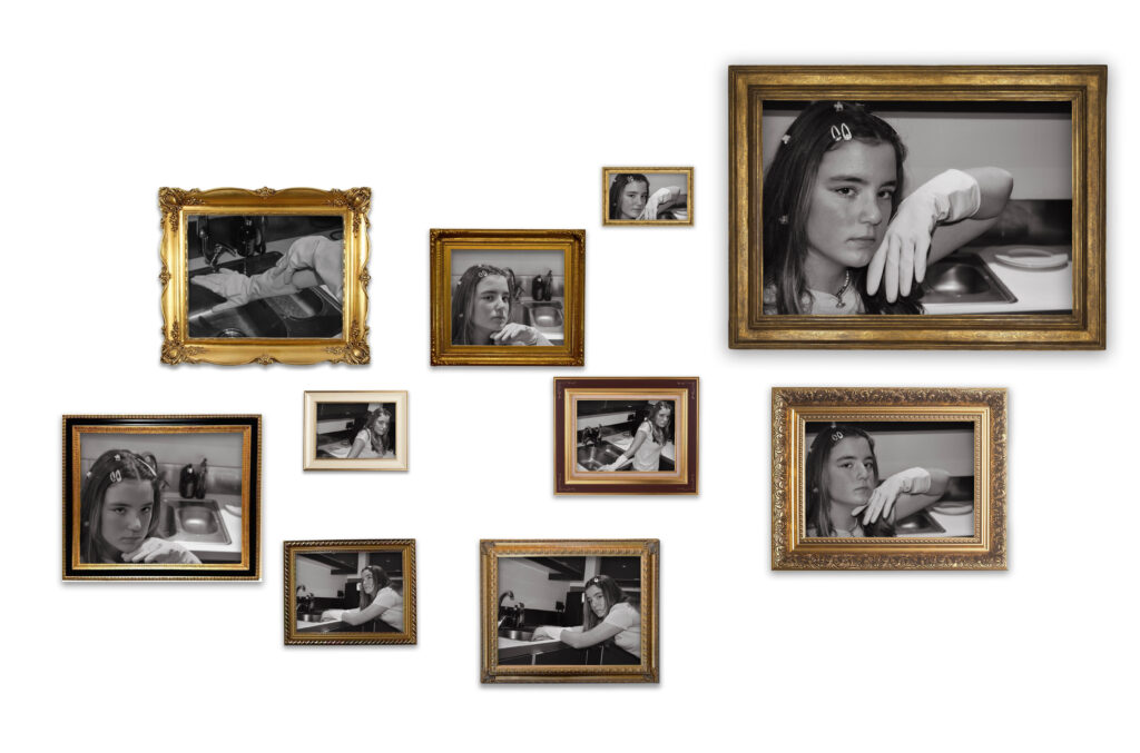
Both image arrangements were inspired by Hans-Peter Feldman. I fitted all 10 images in frames and arranged these frames in different sizes and positions.

These arrangements all contain photographs of a similar theme or focus for example in this image all the framed photographs are of the ocean. These frames come in different sizes, shapes and colours which I would like to try myself. How the frames are so different but don’t look messy is due to the similar colours of the frames and because the photographs inside are all closely related.

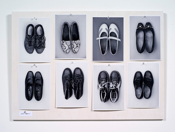
This is another layout created by Hans-Peter Feldman which doesn’t use frames instead pins and a board. All the photographs are of shoes, in black and white and the same size. This is another layout I would like to try. The photographs aren’t all perfectly aligned which is something I will try to incorporate into my own arrangements.

To create these arrangements I first had to arrange the images in photoshop to open later onto a virtual gallery wall. I fitted each image into a golden frame (which looking back should have been silver or grey scaled) and arranged them in a basic shape. I then adjusted the sizes of each photograph and frame which resembled a Hans-Peter gallery wall. In order to insert this image onto a virtual gallery wall later I also added some drop shadows and removed the background.

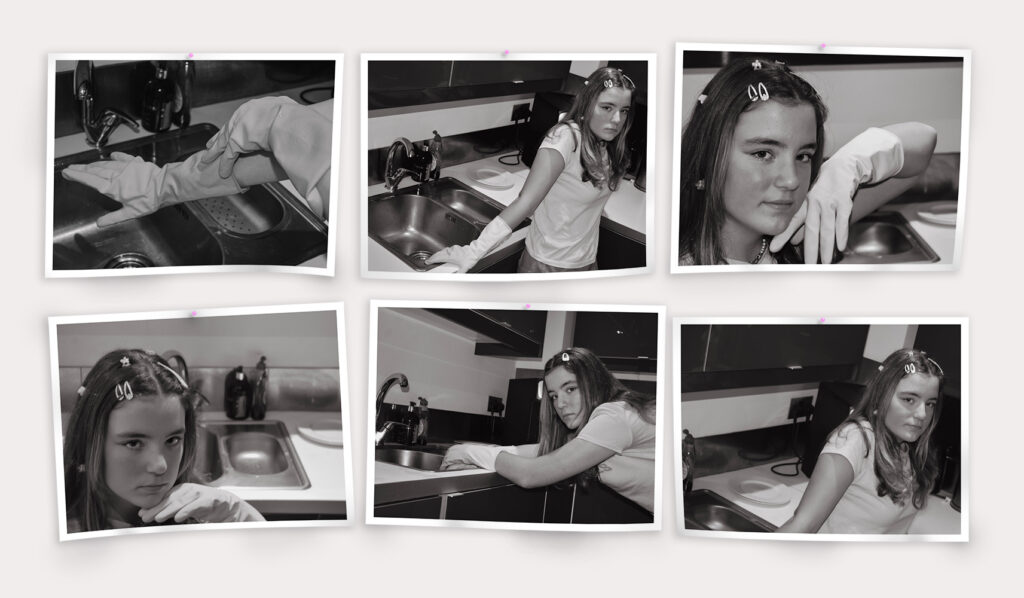
I prefer the pin arrangement with black and white Images because I think the frames are too vibrant in comparison. For my printed images I will be arranging them in a similar way to the pined up idea only with 2 images instead.

I really like how this arrangement turned out and with shaded details it really brings the set together. I began this arrangement by adding white boarders behind each image to make them look printed. Then I arranged them in a 3×2 grid. To make the images look more like paper being pined up I also distorted the shapes using ‘warp’ which made them look like they were flapping. In addition I added pink dots for pins and rotated 3 images slightly. The pin was either going to be plain white which blended in or pink since its heavily associated with femininity. At this point the images just looked slightly strange so I added a drop shadow to all the images and pins as well as changing the background darker to see the boarders. To finish off I added slight shaded parts to corners and bumps as well as additional shadows under raised sections which in my opinion helped the image turn out best.

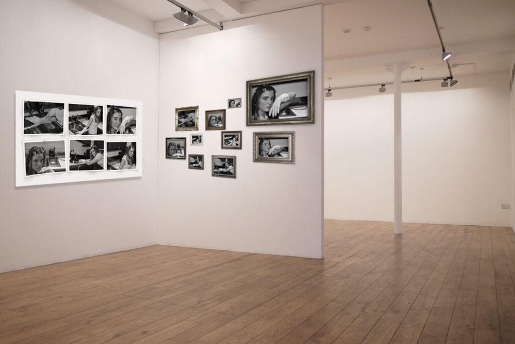
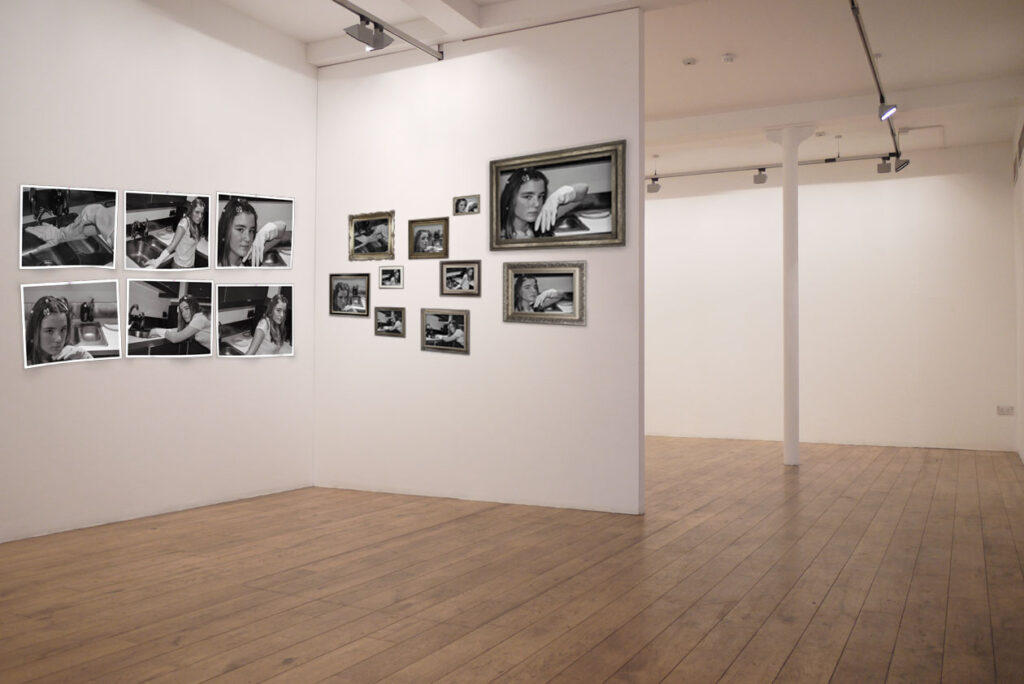
I arranged both arrangements onto a blank virtual gallery space and adjusted the vibrancy of the frames.

On the gallery wall with greyer frames, I think the frame arrangement shines. The pined arrangement gets lost next to the frames despite on their own being the complete opposite. I think that the board behind the pins is too large so I removed the board instead. I originally didn’t want to remove the board because I liked how Hans-Peter Feldman arrangement turned out. By changing the frames and board both the setups look much better and more cohesive.

I narrowed the selection for final print outs to the following:

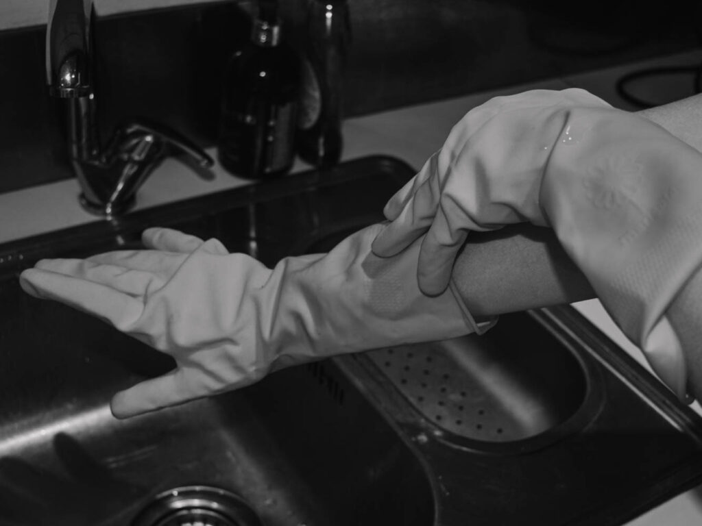
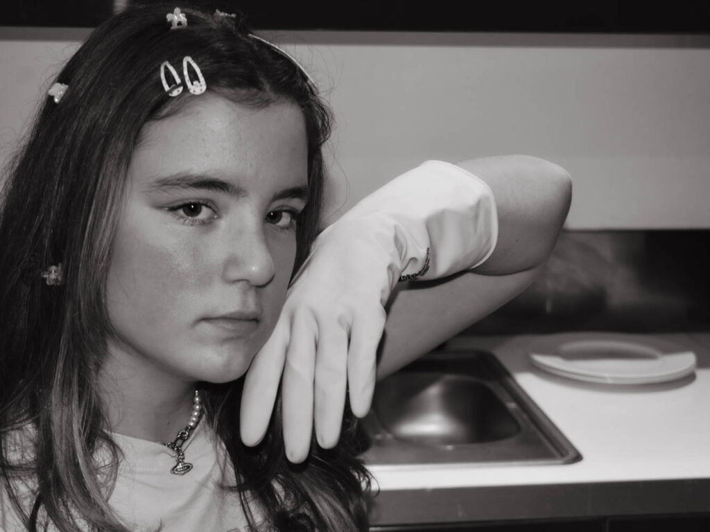
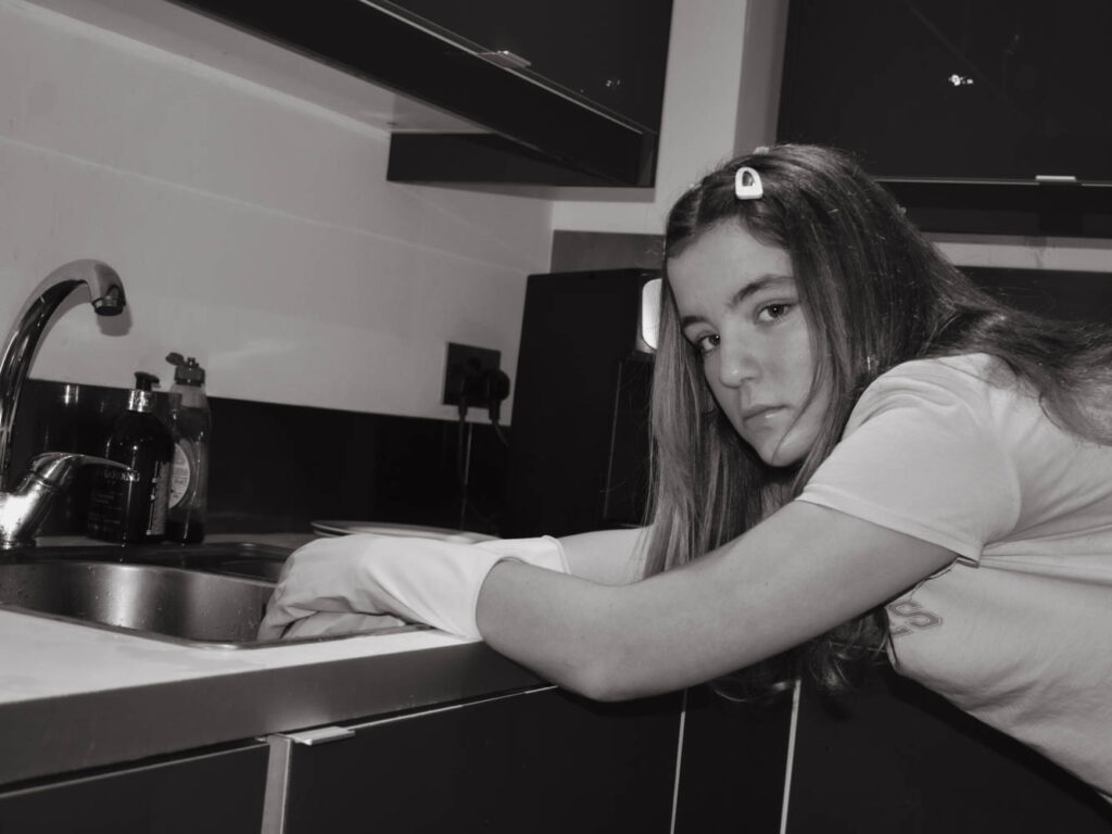
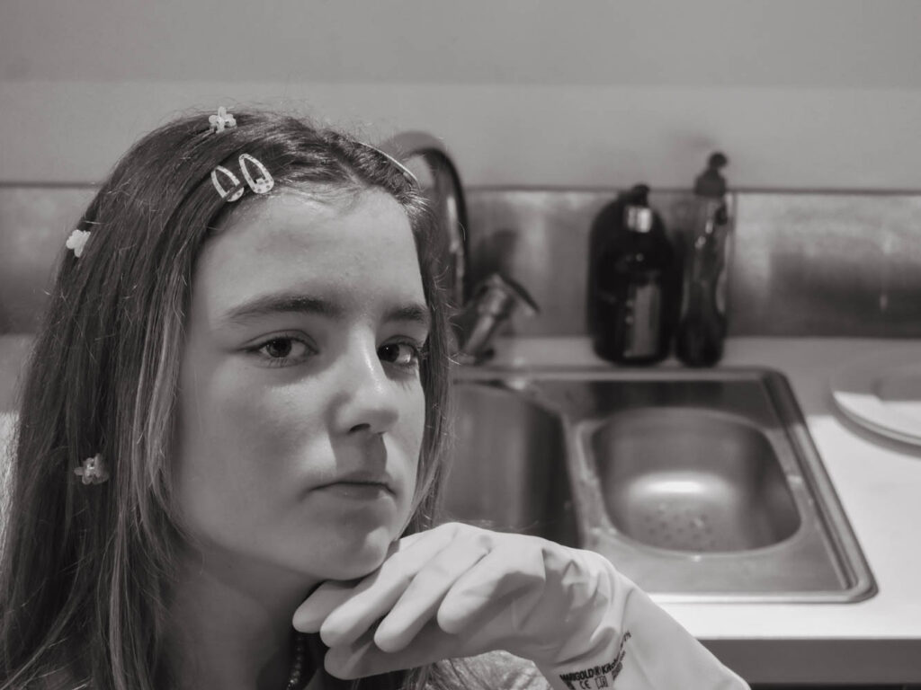
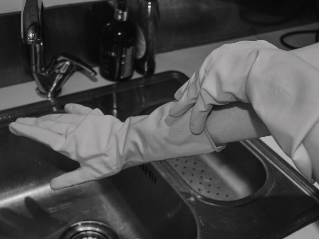
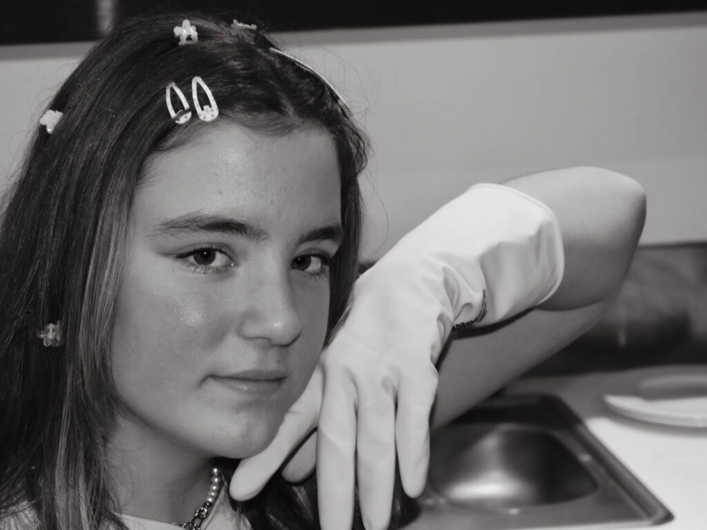
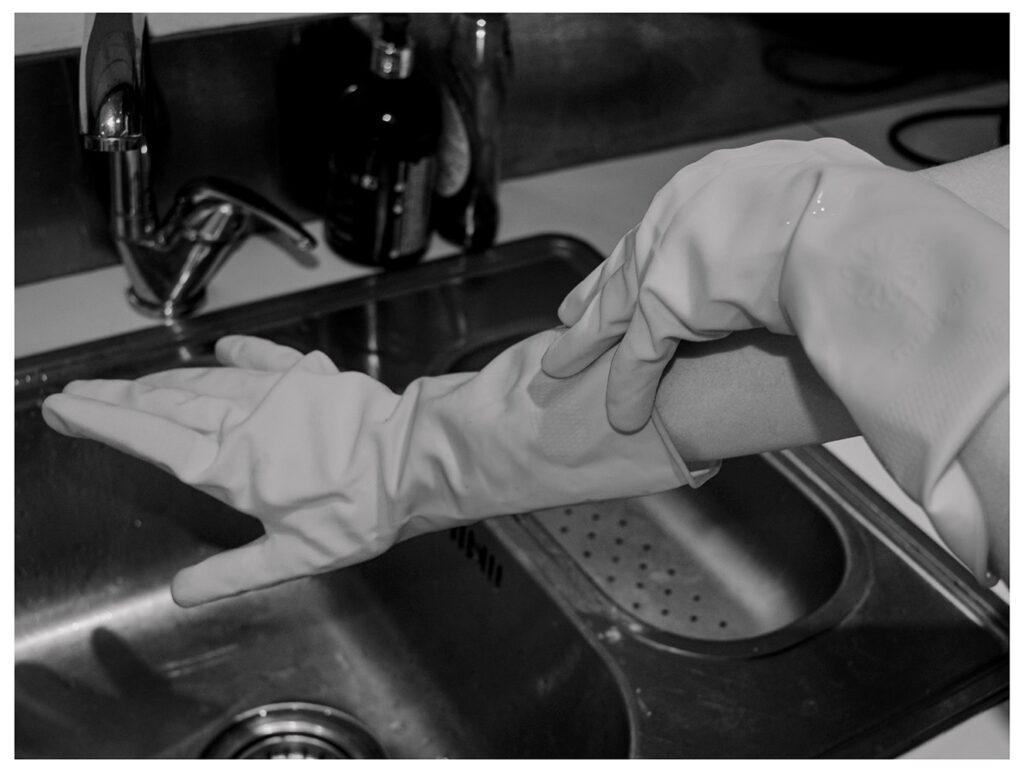
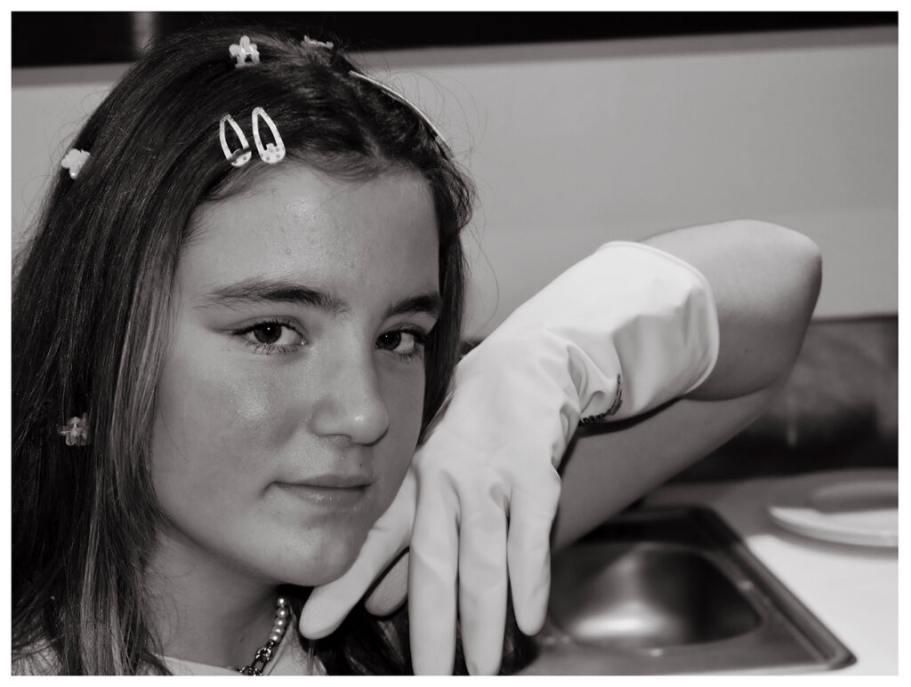
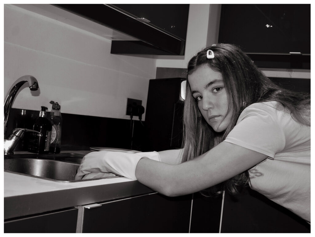
These four are probably my best however since I can only print a maximum of two images I decided to print the rubber gloves and hunching over the sink.

Exploration

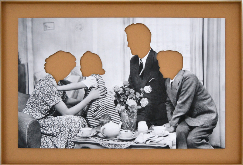
Using Hans-Peter Feldman again for inspiration, I edited these photographs to remove parts of the face. In this image above each head was sliced out of the physical print of a family photograph. This photo was then raised against a coloured background.

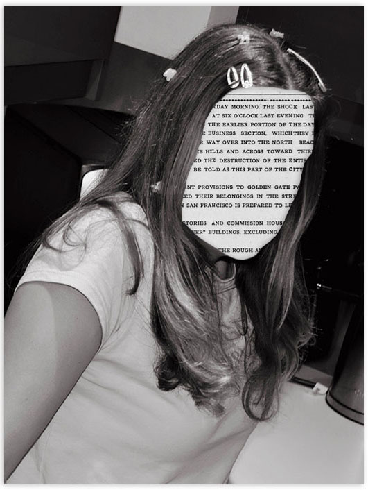
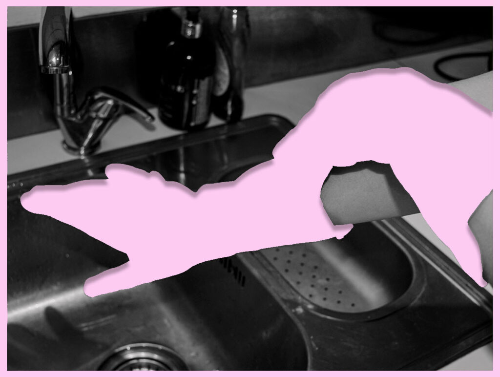
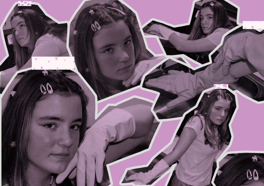
My photographs might not look right without the whole head because the subjects hair is not stylised in a recognisable shape like the photographers. To compensate I tried removing accessories, faces, arms etc and settled on these two:

I prefer the gloves image to the newspaper for a number of reasons. If I was going to try this again I would have planned ahead and photographed a hair style with a distinct shape. Additionally I would have removed the hair accessories in photoshop so that the face wasn’t the only missing part. I think that the hair accessories also being newspaper would have created a more cohesive appearance. I made the gloves pink because it is a colour heavily associated with femininity. I made the shadows more intense in this image also which actually made the image look raised against the pink background.

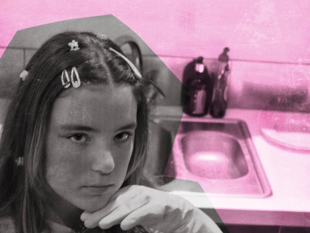
For this next layout I wanted to create a scrapbook appearance by removing the background in choppy lines.

Comparison

This photoshoot was inspired by Cindy Sherman. The most obvious similarities is the use of the background. Both images show someone in a kitchen which has been closely associated with women.

Unlike Cindy Sherman these were not based on old films and therefore clothing was not intended to look old. I also had my friend looking at the camera instead of away because looking at the camera making her look assertive and confident and utilises the photographic gaze. This combines modern associations such as the clothing and confidence as well as outdated ones such as housework.

My final Images

I like these two images the most even though they aren’t flashy or over the top. I think their simplicity says more about the mundane life of a housewife and boredom that follows.

In this Image my friend is dressed casual while leaning over a sink. Leaning shows a lack of energy or interest in the task of simply doing dishes. Her gloves create a barrier between her hands and the chore which is reflective of her mind creating a barrier between her wants/wishes and her reality of scrubbing plates. She has dreams of something more where her life isn’t some repetitive cycle of cleaning a mess that just stacks up the following morning and instead engaging where she can see progress and an outcome.

Her clothing is casual without any additional aprons or rags to prevent stains or spillages showing the pointlessness of her gloves which only accounts for the present mess and nothing else. No matter how much she tries telling herself otherwise, it is inevitable that this little gesture to herself wont change a thing and that she’s stuck somewhere she doesn’t want to be. In addition she has a neutral/unimpressed expression which again shows no interest in her task, instead she is looking away at the camera which shows this longing for something else.

Her hair is inconvenient for her task of the dishes. With long hair down she’s likely going to get it dirty however she’s accessorised her hair regardless. This demonstrates the want for outwards approval over convenience. She wants to is is expected to still look a certain way even when alone and getting dirty which is reflective of contradictory gender roles. Women are expected to do housework and cleaning but are also expected to do their hair and makeup, not necessarily at the same time but these expectations follow that woman throughout her whole life ending up with inconvenient hair styles for the dishes.

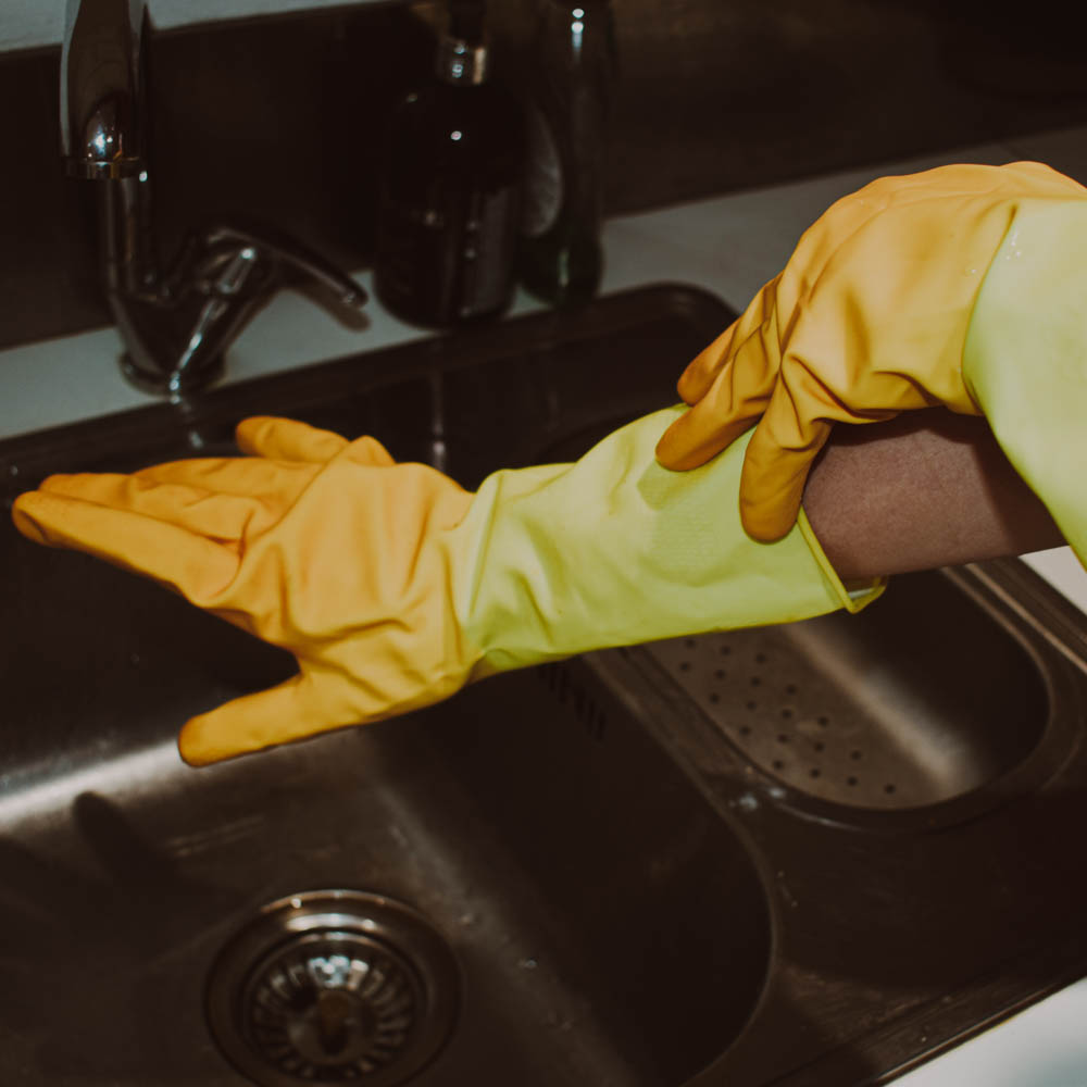
This photograph does not showcase a face but rather focuses on the gloves. These gloves are significant in this image for a number of reasons: Gloves not only act as a barrier but also an outlet for her imagination. This pose is reflective of a lady posing with expensive arm length gloves on her way out to dinner. Instead of a harsh tug to pull up the rubber with outstretched fingers this action is graceful and pointed which juxtaposes the kitchen surroundings and rubber dish gloves. A pair of full length dinner gloves show that she doesn’t need to get her hands dirty since they’re expensive and that would be a waste of flashy gloves. While she is dreaming of being the wealthy woman attending the expensive dinner she’s more likely to be the cook for the wealthy woman which is not a colourful reality.

The fact these images are in black and white is not only because they were inspired by Cindy Sherman but also the bleak nature of this lifestyle.

Cindy Sherman

Similarities

Both photographs showcase the subject looking away from the sink which shows a disinterest in dishes and rather a desire to be elsewhere. Despite this desire, neither has left. By having both at a kitchen this also buckles down on the idea of gender roles however nothing other then themselves is stopping them from leaving. This is because they have taken onboard societal expectations and fear acting out for the reaction of others around them.

Both subjects inconvenience themselves in order to appear a certain way. Cindy Sherman has a full-face of makeup despite being alone at home which is reflective of the films she was inspired by. The women were by no means realistic in representation order to appeal to the ‘male gaze’. This image is supposed to reflect these ideas by her clothing which is not fit to be at the sink, showy apron and face of makeup. Similarly the subject in my images has her long hair down would will get in her face and the dirty dishes. She’s also wearing new clothes which would get damaged and has a full face of makeup.

Both images are set in black and white but for different reasons. Cindy Sherman is in black and white because the 50s films would have been mostly in black and white as 1961 was the last year Hollywood was mostly not coloured. I chose to change the images to black and white to reflect the dull nature of these tasks and to reflect how old and outdated gender roles tend to be.

Differences

In this image she wears an apron which is purely for show. This is because the fabric will do nothing to keep her clean as opposed to rubber gloves which are over the top, rather useless in the grand scheme but have at least some purpose to distance the work from the person. An apron made of mesh fabric wont do any good with its bottom half covering and permeable material however is completely for show linking back to gender roles and expectations.

Cindy Sherman is looking away from the task and camera with her eyes looking out of frame. This makes her appear as though she is unaware of the camera and is a part of her film inspiration as actors aren’t supposed to acknowledge the camera but also factors into her objectification and underestimation since she seems slightly ditsy. By not challenging the photographic gaze she showcases how women in films were viewed. The subject in my portraits is looking at the camera instead and is stood mostly out of frame which acknowledges the camera and therefore has her posing for it knowingly.

Evaluation

I think that I achieved what I was aiming to with this set of images which was a Cindy Sherman inspired photoshoot highlighting gender roles and how much they have changed. Modern women have better chances of finding work then the ever have and with an unstable economy, even women who do not wish to enter the work force are being forced to take up part time jobs on top of housework. Women still find pressure to cook and clean but nowadays they are also expected to work alongside men. I’m not entirely sure I approached this the right way to tackle the double job point and if I did this again I would plan out additional photoshoots where I covered this topic better. If I had more time I would have also liked to explore the rising househusband which is a reversal of old gender roles.

If I had more time I also would have photographed someone different and in a different location since all of these images are of the same person in the same kitchen which means that they all look very similar.

In conclusion I believe that this photoshoot was successful and that I touched on gender roles in a basic but successful way however in future I would like to delve deeper into how they have changed.

Photoshoot Two- Identity

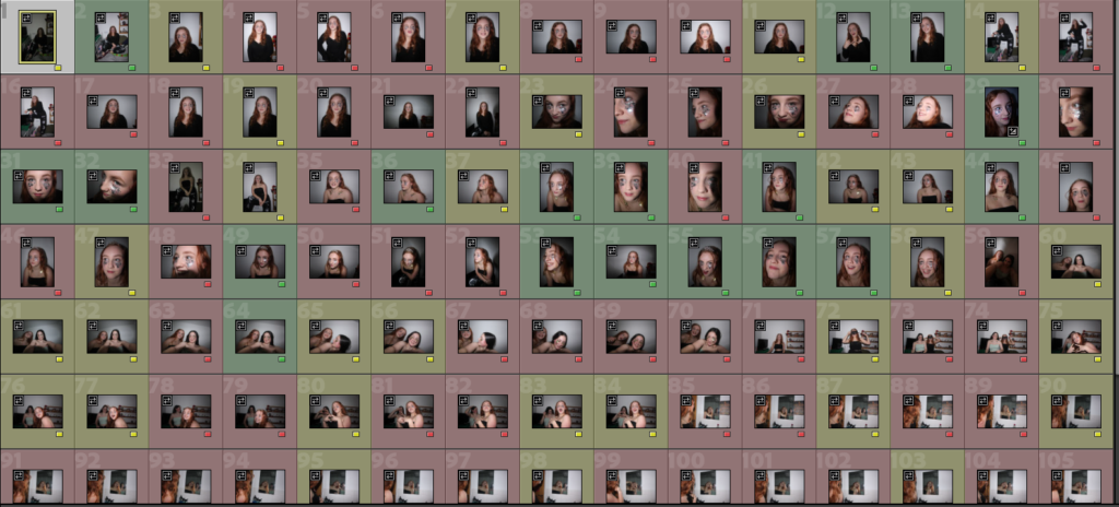
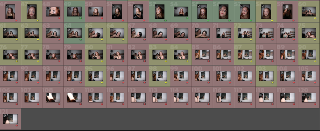
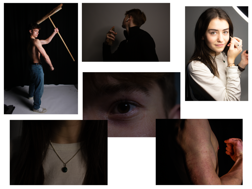
This shoot was by far my strongest one, I have many images I like the RAW outcomes of and I would love to go onto edit in more detail. The ones highlighted in green are my strongest outcomes. I looked for certain elements within my photos when selecting my best shots, from good focus to the models looking relaxed and fitting the theme with her facial expressions.

These are a few examples of photos marked in green, I will go onto to do some test edits to finalise ideas before the controlled conditions. Overall I happy with the results of this shoot and it made me try creative poses and angles which ended up being really fun with some great results.

Plan for Final Photo Editing

My plan for the final photos I will edit will consist of:

1: One idea I had was that I will cover the photo in dark, and then select different parts and shapes on the photo to show the underneath photo.

2: I will have a photo fully blurred but at the main focal point it will be unblurred.

3: Another idea is that I will combine some of the photos with shapes/masculinity/femininity ideas to create a stronger photo.

4: A collage of photos of Joey, my Model, with different exposures all low opacity overlapping each other.

5: A combination of multiple exposures of different models doing different poses and positions to create an overall clear photo.

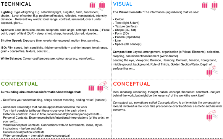
Follow and critique my own photos using this Image Analysis Matrix.