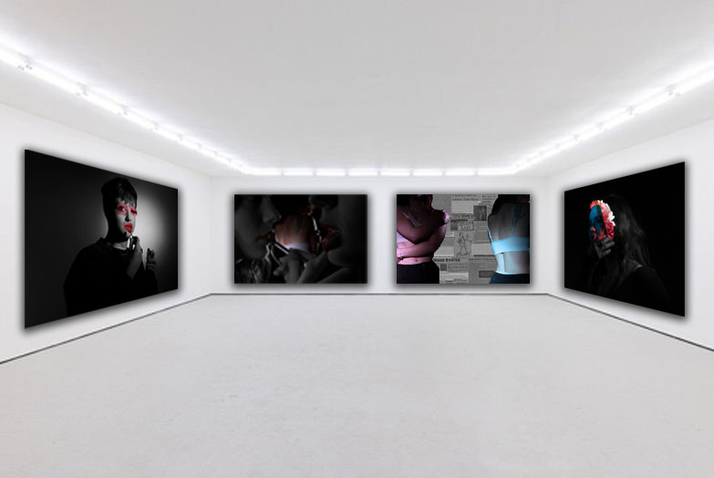
For my first edit, I cut out an two images (using the quick selection tool) of a body I had previously photographed. I then dragged these cut outs onto a plain white piece of paper and searched on google for news articles of different assault cases. Once I found the one I wanted to use, I copy and pasted it onto photoshop and used ctrl t to move it. Finally, to highlight the theme of femininity and masculinity I added a photo filter to the bodies (one pink and the other blue).
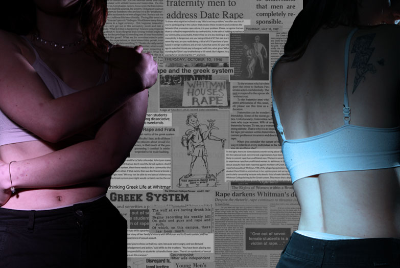
I chose to make this edit in order to spread awareness of sexual assault. By the models in the image covering their body or facing away from the camera, it portrays the idea of women feeling they have to cover up their bodies in fear of being attacked, judged or harmed. Additionally, the use of the blue light (which is seen as a masculine colour) and the pink light (which is seen as a feminine colour) shows that both genders are equally at risk of sexual assault etc. Overall, I like how this edit came out as I feel it represents a serious topic whilst also showing the key theme of masculinity and femininity through the different coloured lighting and showing that both genders can experience these horrible things. However, if I were to improve this edit next time I would try and create a smoother blend between the bodies and the background or create a drop shadow on the bodies so they are purposefully pronounced.
For my next edit, I cut out two lip images and then a body image and then stuck them all onto one page. I then decided I wanted to highlight the theme of femininity even more and so created a colour splash in which the faces are all grey apart from the lips drawing attention to them and highlighting the idea of the male gaze, as lips can be seen as seductive and provocative. I created this colour splash by using the quick selection tool to go around the lips and then pressing layer via copy. I then clicked back onto the faces layer and changed them to black and white.
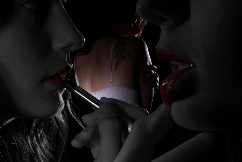
Overall, I think this edit was successful in showing the theme of femininity due to the body with minimal clothing and the red lips which are edited in a way that makes them stand out.
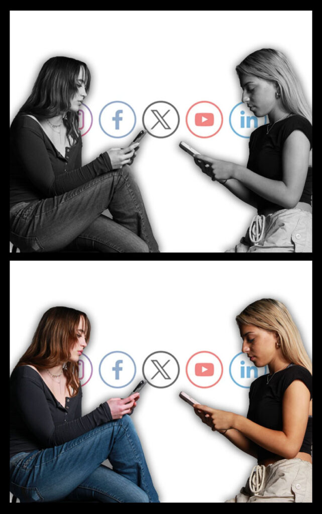
My next images were inspired by the artist Cindy Sherman. This first edit is referring to her photos in which captured a typical woman in the 1950s. However, I decided to photograph a stereotypical woman today. When I first thought of a stereotypical girl in 2024, I immediately thought of girls constantly being on their phones. So, I took photographs of different girls scrolling on their phone. For this edit, I cut out two of images I had taken and then copied them onto a blank piece of A4 paper. I then wanted to further highlight the idea of phones and social media so I got an image of different social media platforms from google and then pasted it onto the background (lowering the opacity so it didn’t look like such a harsh background). Finally, I created one version which had the models as black and white and then another with normal colour. I then added these two images onto an A3 piece of paper and created a black boarder around the two.
My next edit was also inspired by Cindy Sherman and her images called ‘This is how I look. I guess’. I created this by opening up an image of a boy I had taken previously and then opening up different images of girls and using the quick select tool to cut out different parts of the girl’s faces eg their eyes/ lips. To finish off this idea, I decided I wanted to emphasise the idea of different faces being cut out onto one face and so I decided to make the original face black and white whilst keeping the cut outs in colour. I also added a drop shadow to them.
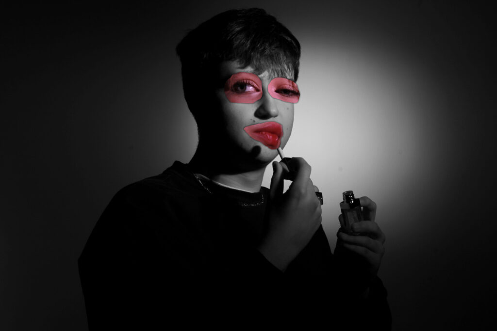
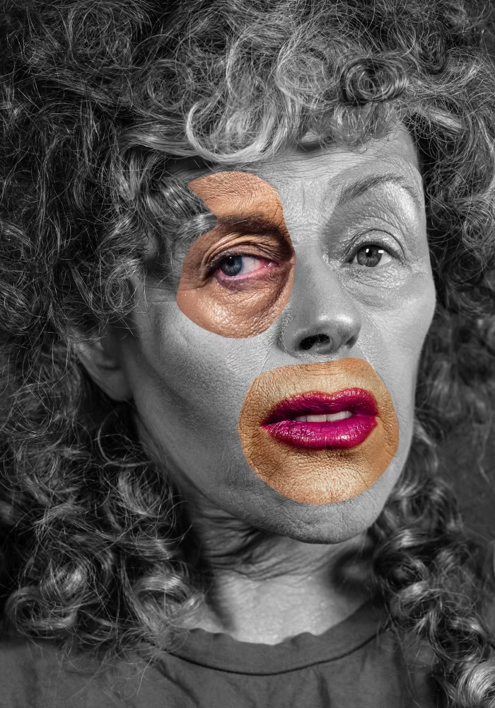
Overall, I like how this edit came out as I think I managed to successfully recreate the work of Cindy Sherman and explore how a typical woman is seen today compared to the 1950s. However, in order to further this edit and make it look more like Cindy Sherman’s work next time, I would make sure the face is more zoomed in so there’s less background showing as it cam be a bit distracting.
For this edit, I was inspired by Marcelo Monreal who is known for placing flowers behind a person’s face which is cut out. In order to achieve this, I first used the quick select tool to cut out part of the model’s face and then pressed layer via copy. Next, I moved the person’s face to side slightly. I then searched on google for flower illustrations and selected pink flowers (in order to portray the theme of femininity) then pasted them onto my image and put them behind the cut out face. I repeated this step until I had a wide range of flowers. Finally, I created an image in which the main photograph was black and white and another where it is in colour.
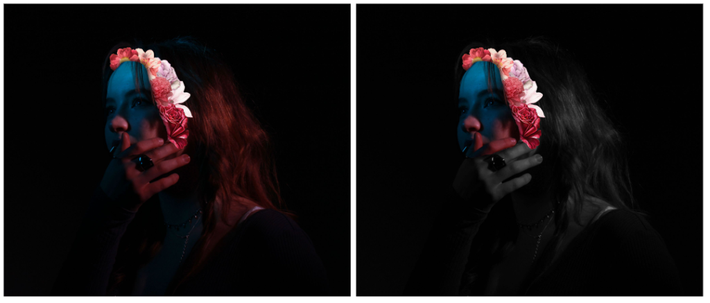
Overall, I like how this final piece came out as I think it successfully combines elements of masculinity and femininity into one image. This can be seen in the flowers which are often associated as being a feminine thing and then the blue light which represents masculinity. If I were to do this edit again, I would use a boy model and then have flowers coming out of his head as this juxtaposes what people traditionally think of males and would portray the idea of it being okay for men to have feminine traits or likings.
For this edit, I wanted to create something more simpler and so decided to use an A3 template and then added 4 of my own images onto it. I decided to use two females and two males with a black background to go with the dark lighting seen in the images.
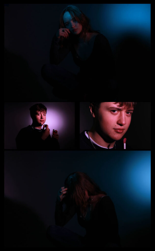
I like how this photograph defies typical stereotypes about men and women as the ‘girl’ coloured lights are reflected onto the male whilst the ‘boy’ coloured lights are reflected onto the female. The bottom image shows an insight into the confusion one can feel regarding their identity as seen in the use of both blue and pink lights surrounding her but no specific colour actually being on her. Her head being in her hand further emphasises this idea and gives off the sense of her being lost and overwhelmed. On the other hand, in the images of the boy he can be seen proudly putting on lipstick in pink light (both of which are traditionally seen as feminine things). Additionally, he is looking straight into the lens with purpose suggesting that he is comfortable with his identity and doesn’t feel he has to act in a certain way in order to be regarded as a man.
Finally, for this edit I opened up two images of lips that I had taken previously and then used the quick select tool to go around only the face and then pressed layer via copy. I dragged both of these cut outs onto a blank page and then made the background black. I then used the rectangular marquee tool in order to make a rectangle on my image. Next, I pressed layer via copy and then dragged the shape either to the left or right slightly. I repeated this step for each rectangle.
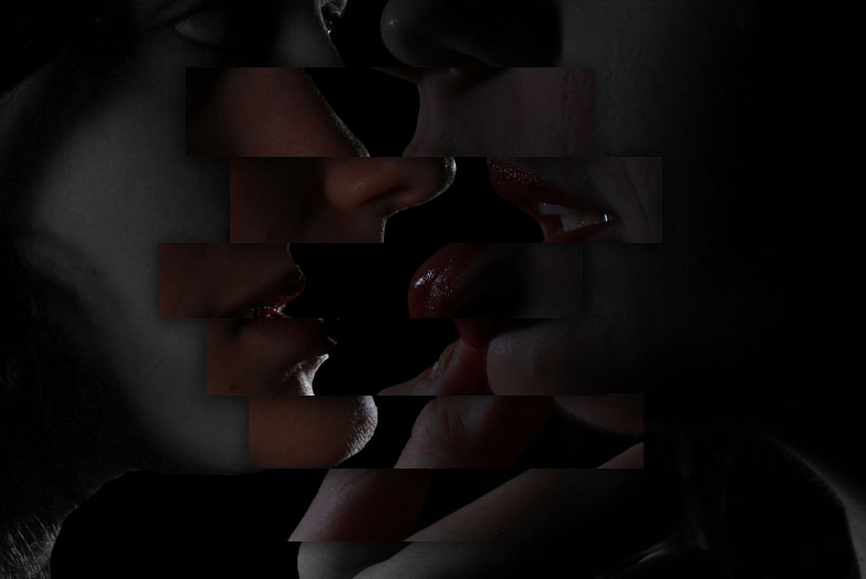
Overall, I think this image turned out alright in terms of trying something new on photoshop. However, if I were to do this idea again I would add a male to one side and a female to the other side then have the rectangles bringing the two closer to one another, showing that although we have many differences we are all the same and can have traits of the other gender without having to lose our own sense of identity.
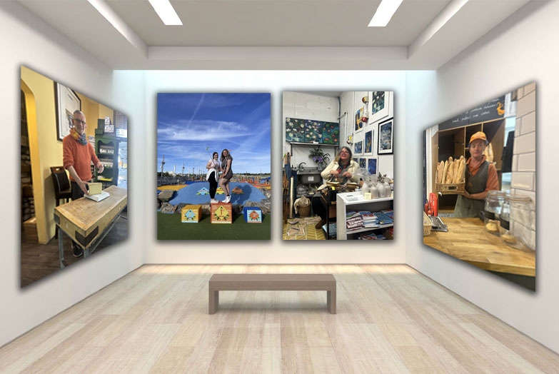
Femininity and Masculinity Virtual Gallery:
Lighting Techniques and Diamond Cameo Virtual Gallery:
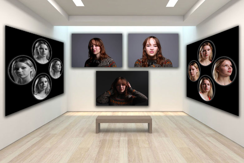
Environmental Portraits Virtual Gallery:
