Photoshoots – Marilyn Monroe inspired
For our photoshoot we took a total of 213 images. Before I began editing them, I firstly flagged my favourite ones. I ended up having 50 flagged images from 2 photoshoots.
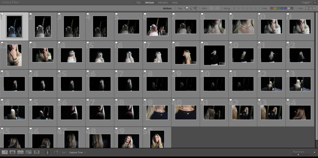
After I flagged the images I narrowed them down again by selecting my favourites from them and making them green, I flagged 50 photos and then narrowed them down to 12, these are the images I edited.

I started editing these photos to have the same vibe as Marilyn Monroe’s photographed images in the 50s/60s. This means that they all fit the theme of femininity and also had either a vibrant/vintage colour or black and white which she was photographed a lot in.
In the end I narrowed it down to my favourite 9 images. These were personally my favourite as I love the way it portrays the vibe perfectly of Marilyn Monroe’s images. These images to me represent femininity perfectly.
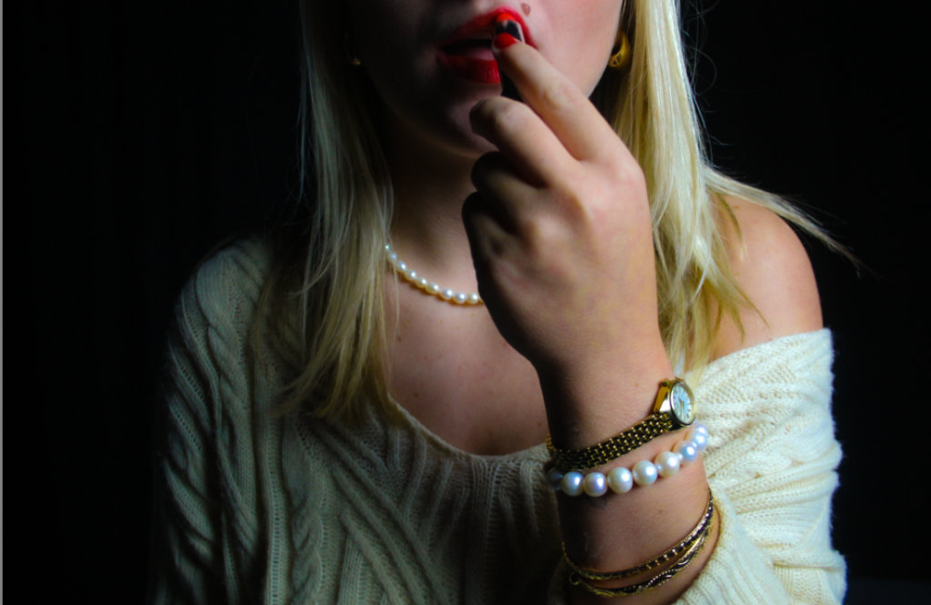
This was a favourite of mine because I love the way the jewellery is presented on her wrist, the gold and the pearls represent femininity, especially Marilyn Monroe as pearls were a signature look for her. I made the image more vibrant as it looked dull before as there was just plain lighting when we took it. The red lipstick is also a major part of this image. It is a signature look of Marilyn Monroe’s, and it also represents femininity as the red lip colour gained popularity internationally as women’s rights movements spread worldwide.
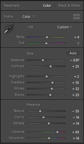
For the image I made sure to add vibrancy and colour. This made the image more colourful and gave it a vintage look, it also made the red lipstick pop and that makes it a main focus of the image and that was a goal when we decided we wanted Marilyn Monroe as inspiration.
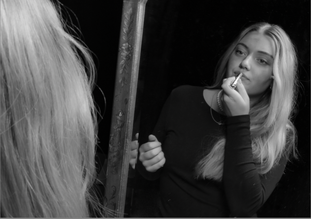
This was another one of my favourite images as I think it represents femininity well. putting lipstick on in the mirror is something that all females do and I think it fits the theme of having Marilyn Monroe as inspiration for these images as she had the signature red lip. The thing that pops out most in this photo is that I am putting on the lipstick which shows similarities with Marilyn Monroe.
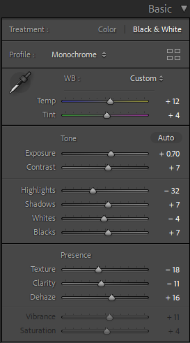
For this image I made it black and white as I took inspiration from an image I found on Marilyn Monroe which was black and white with her applying lipstick. I turned the exposure up as we were in a dark room with one light which made the photo give a spotlight effect on me and the mirror and everything else around was dark and not visible making there no other distractions in the image.
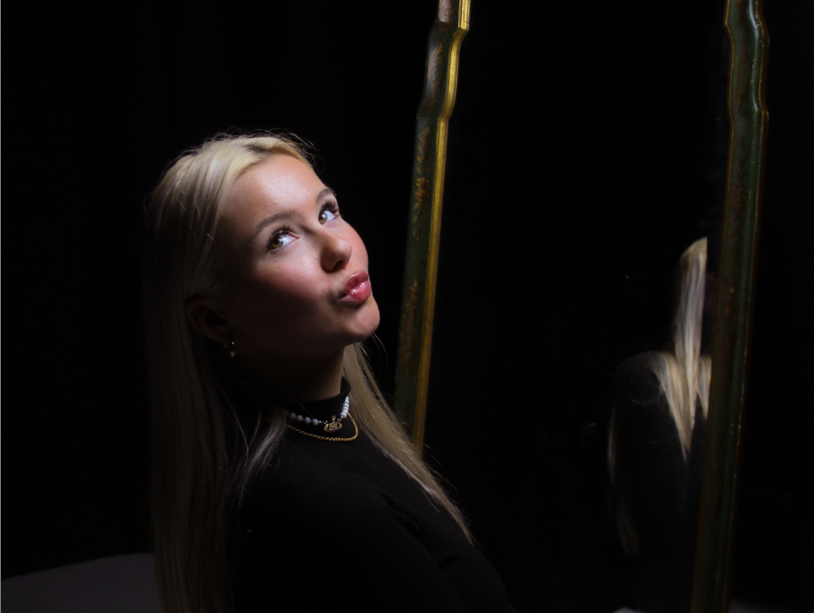
I chose this photo as the signature pout is very feminine. Marilyn Monroe was known for pouting which is why I chose this photo. The eyes not focussed on the camera give a bit of a dumb look which Marilyn Monroe was known for playing the role of “Dumb blondes” which is what we tried to resemble in these photoshoots.
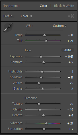
I turned up the temperature and tint as it gave a vintage look in the photo which was also key in doing so in the image. I turned down all highlights, exposure and whites as originally the image was very bright as we had the light right in front of the model. This also gave the effect that we had a spotlight on her which can also show that Marilyn was always in the spotlight when she was photographed. I used the spot remover on this photo as there were lots of specs in the mirror and on the floor.
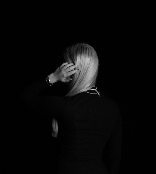
Personally I love this photo as it looks very classy and elegant. the straight hair swept to the side is key for the image as it shows of the pearls that she is wearing. The hand going through the hair is very feminine with the painted nails which are a dark red colour but just look black in the image as I made it black and white.
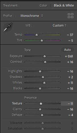
I didn’t change much for this photo as it was already practically perfect, I did change it to black and white then turned up the exposure a little bit to make it visible where you can see where she is.
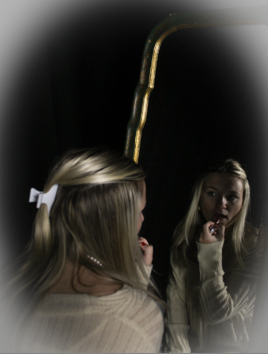
I love this photo because it looks very angelic and feminine. The warm tones in and on the mirror make it look very golden and warm tones while on the boarder of the image it is cool toned. This is also inspired by Marilyn Monroe as she also is applying the red lipstick in the mirror like she did in one of her photos.
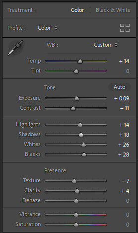
I turned up all highlights and made the image colourful with different warm and cool tones in it. I like the way that the colours go from warm to cold from the centre going outwards.
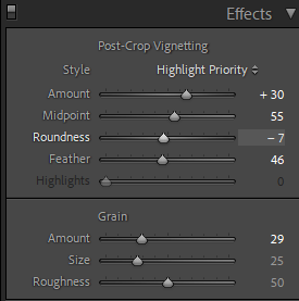
I added an effect to this image and it made it look very angelic and pretty. I chose to add this to this image because I really like the way it adds a different and unique twist to the photo.
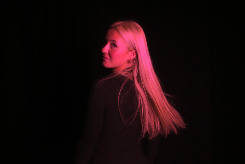
This picture I experimented with because it felt like the type of photo I could do a lot with. I focussed a lot on femininity with all of these photos and stereotypically pink is the most feminine colour so I used it to create this image. I love the way it contrasts with the black background to make it really stand out.
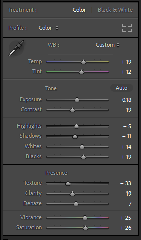
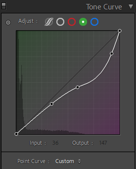
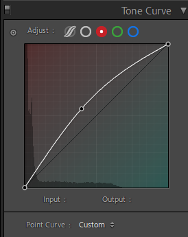
I didn’t do much with the basic tools as it wasn’t necessary to do. I did edit the texture the most as when I changed the tone it was the thing that stood out most on the model and in the background. The green Tone curve I turned to a light purple and the red tone curve I changed to red to make it a bright vibrant pink colour.
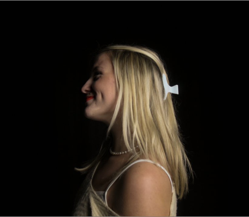
This is a really sweet image it is stereotypically very feminine as women were stereotyped to be caring and soft.
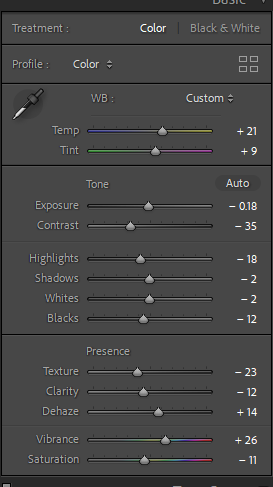
I turned up the temperature and vibrancy in the image to make the colours stand out more I really liked how it ended up looking especially with the red lipstick. I turned down shadows and highlights to make the subject obvious and stand out in the photo as in the original photo she was just blending in with the background.
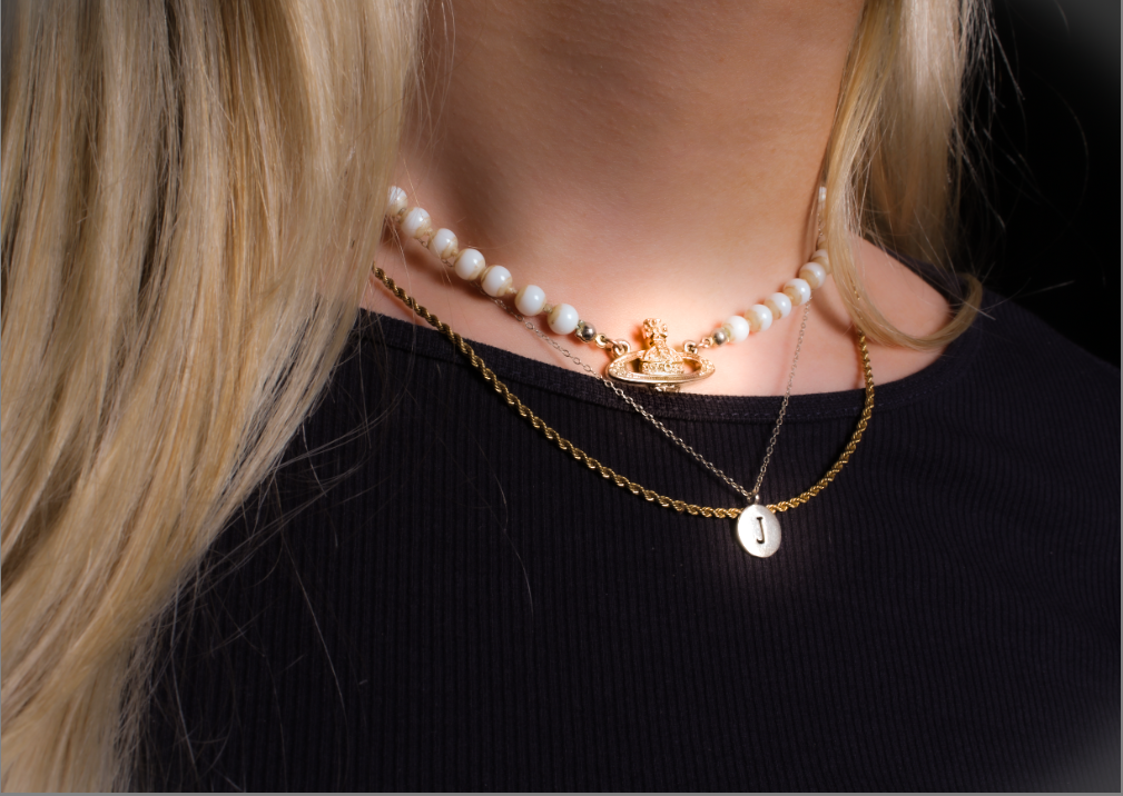
This photo shows femininity to me by the jewellery, the gold and the pearls mixed together make it very feminine. I also used the radial filter which added a luminescent glow in the necklaces to make them look magical.
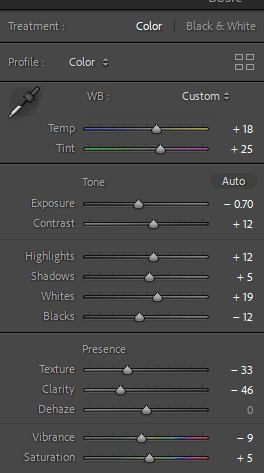
I used most of the basic tools for this photo to make it vibrant and colourful. I think this photo is really simple and it doesn’t n
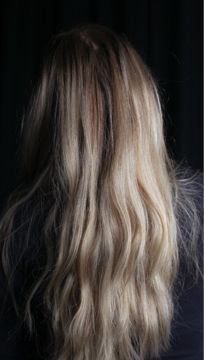
This photo is very basic but it goes nicely with the theme of chosen images it is very simple but it matches with all of my other selected photos.
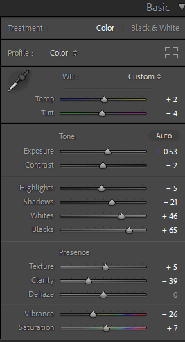
I edited this image minimally but enough where it looks cleaner and simpler.
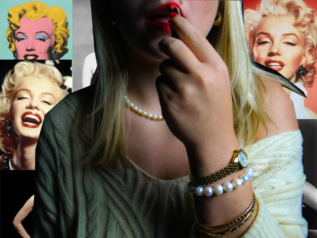
This picture I experimented with on photoshop. I created a collage of Marilyn Monroe pictures which I thought looked really good with my photo. I love the way this turned out because the image layering of my image on top of the selected Marilyn Monroe images I found goes really nicely with the photograph I took.
