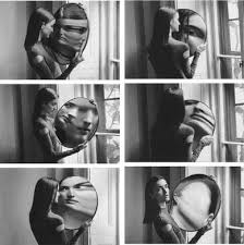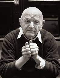
Michals first made significant, creative strides in the field of photography during the 1960s. He was famously known for his cinematic frame-by-frame format within his images. The Morgan Library and Museum in New York exhibited a career retrospective of Michals’ work The Illusions of the Photographer: Duane Michals at the Morgan. Michals received a BA from the University of Denver in 1953 and worked as a graphic designer until his involvement with photography deepened in the late 1950s. His work was created in an era heavily influenced by photojournalism. He wasn’t interested i being the usual photographer with a studio and employees, he took his photos in his own settings. He said “I was the cottage industry, I liked small scale, I do small scale photographs”
“My pictures are more about questions, not about answers.”
Michals was a unique photographer who aimed to be different from the rest with the way he created his artworks. The thought of created films with small snapshots on a camera as appealing to him to create a story behind the photos and leave the interpretations to the viewer.

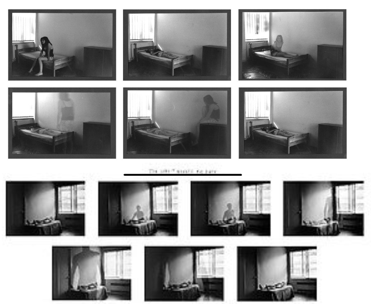
For these 2 photos, I have put them together to reference the contrasts between them. Michals has created many film shoots that surround death but using double exposure to add another person. My conceptual thoughts on these photos together link to the theme of masculinity and femininity a huge amount. In my opinion i perceive these images together as a representation of the stereotypes of the make and female individual. In the first photo, the woman can be seen to rise from her body and stay looking at it for what seems like a while. whereas, in the second photo, the male sits up and walks away fairly confidently. This would link to the theme of stereotypes by showing how stereotypical emotions affect an individual. Woman could be seen to be more accepting to being emotional and seen normal to attach to things an take longer to let go. In contrast, I view the man as showing the stereotype of being strong as he confidently rises and walks away without a look back.
The technical side of the images such as the lighting has a good impact on the images. Michal has used the use of natural light from the window to create a more natural feeling to the image to show death is a natural cause. The position of the lighting is also powerful as it is only focussing on the individual. The blank spaces and dark tone make the image feel colder as well.
The tone of the image is very clearly a dark tone. with the use of black and white and the one source of light, it can make the viewer show emotions such as sadness. The space in the images are very large and there is no cluster of objects in sight. this makes the viewer only focus on the main point which are the two individuals.

