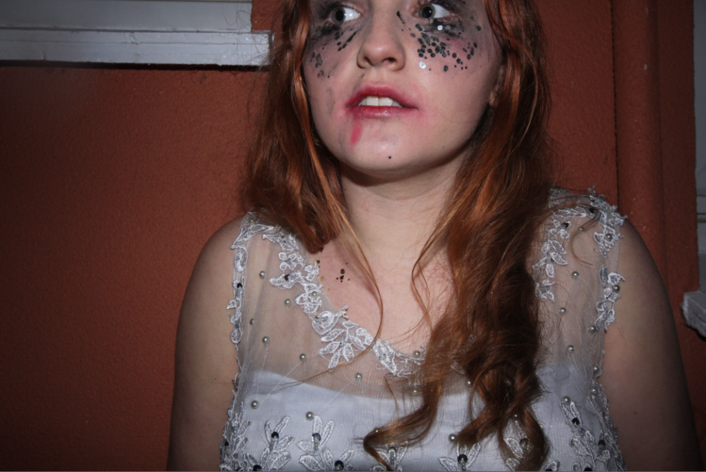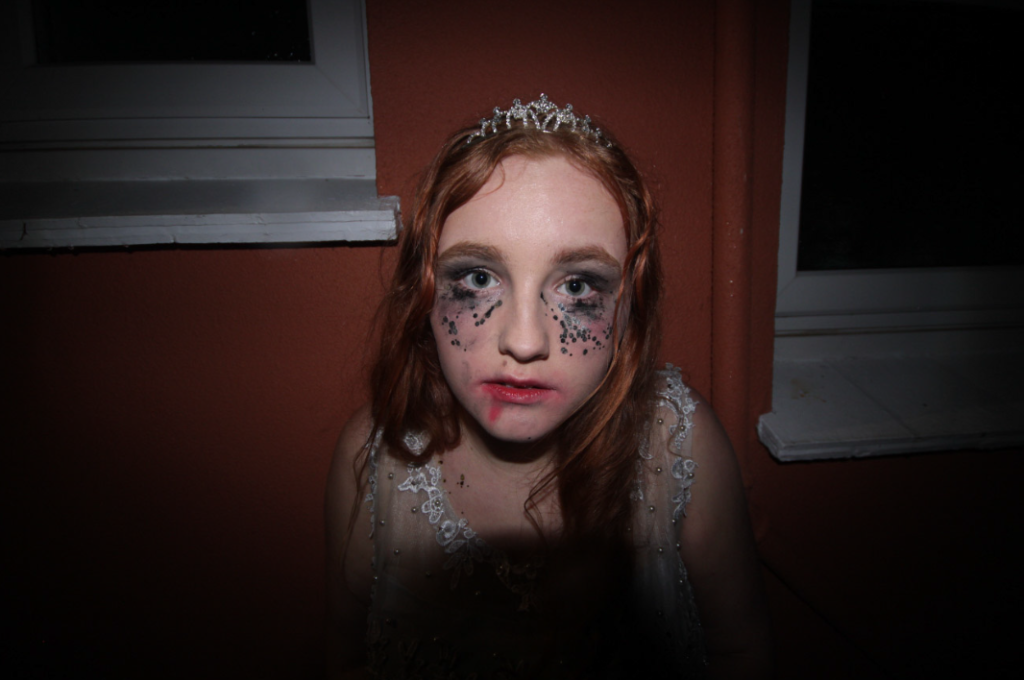
This photoshoot was another creative concept however after 59 photos it wasn’t working the way I wanted and I actually preferred the previous shoots results. However I did get some good photos as featured below.


While these are good results they aren’t what I wanted and I think the message would be stronger if I draw more inspiration from Sherman’s work. I did here in the sense I got the model to dress up and ‘not be herself’ but I think the message is over shadowed but the general shock of first glancing at the photo. I don’t think the over all look of the photo with the orange wall and window frames are quite distracting to compared a blank wall.
