Artist references: Shannon O’Donnell

Shannon O’Donnell is another photographer who I would like to incorporate into my work as an inspiration because her work is very moving and attempts to grasp an understanding of the way gender can be represented in a fast-growing society.

Shannon O’Donnell:
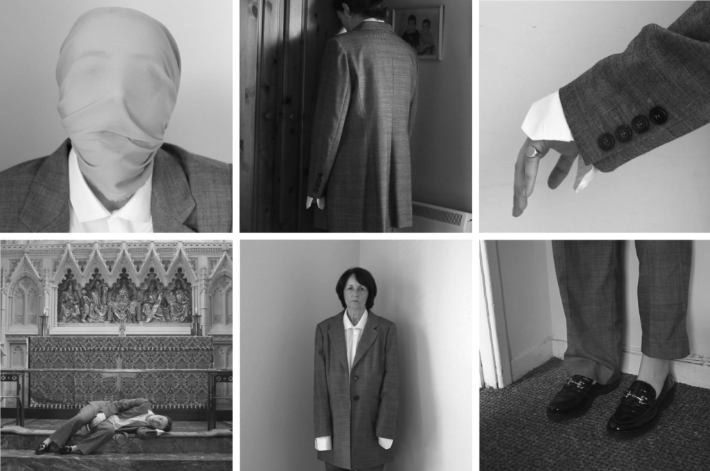
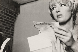
Shannon O’Donnell is a contemporary artist, photographer and short filmmaker currently living in Jersey Channel Islands. Her work is documentary yet performative which explores a gendered experience which focuses on the characteristics and traits of femininity and masculinity. The outcomes she produces challenges the traditional stereotypes placed on women and men in a sociological way, attempting to gage an understanding on how gender is seen in general society. Her work that particularly stands out to me is That’s Not The Way The River Flows (2019).

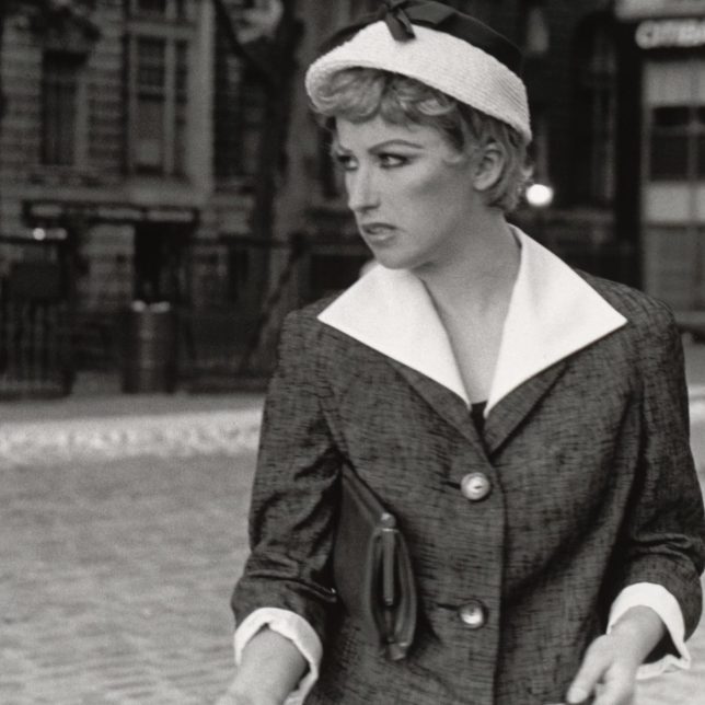
That’s Not The Way The River Flows (2019) is a collection of images that playfully explores the themes of masculinity and femininity through a series of self-portraits. However, this (similar to Cindy Shermans work Untitled Film Stills) comes from selections of stills from moving scenes of her masquerading as different personas however she opens up to a multitude of different sub-categories of gender differentiating from male or female: non-binary, transgender and gender fluidity. By doing so, this unpicks the traditional conforming narrative of gender causing the viewers to re-imagine our society and understand what makes us who we are and how we identify. This project gives another insight into how the photographer may have conflicting thoughts on her own identity and gender experiences. This project is fundamental to a growing and fast-changing society because it helps people (especially those who find it harder to comprehend) see the struggles and hardships that many people during the exploration and acceptance of themselves, revealing the pressures, stereotypes and difficulties that they face whilst growing up in a strongly gendered society.

That’s Not The Way The River Flows (2019) is from a short film, described as a moving visual poem demonstrating the claustrophobia of identity in peoples lives and the demanding pressure to ‘fit in’. This piece also pokes fun at the ideals surrounding masculinity and femininity and pushing the boundaries and characteristics that were dictated to these themes.

Image Analysis:
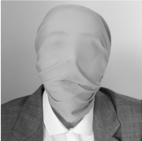
I find this image one of the most powerful of the visual poem series. Initially, the monotone to the image creates drama with a sense of seriousness and professionalism. Due to this, the clothing on the subject has a high contrast from the pale wall behind, with the aspect of blankness throughout the image this means that the detail of the blazer and the material over the face gives the ability to focus on the textures more. The most appealing part of this image for me is the face in this headshot. The greyscale linen looking material draped over the face seems to be pulled back and behind the subjects head, covering the identity and ability to differentiate the gender of this person which highlights one of points of this series; the growing exploration of gender fluidity within society. However, as the material is sheer, the subjects pained expression through the pulling of the material describes the suppression and pressure that people struggling with their gender identity have to face. I also feel the panic in the subjects face shows how terrifying this must be in a society that has strong expectations and set propositions of gender. Alongside that, I feel the headshot represents this theme really well as the closeness of the camera to the subject makes a connection with the viewer which forces them to listen. The way that the subjects face is only partially visible through this material that almost blends into the wall in the background, means that we can infer that this makes people want to hide away their struggles with their gender and attempt to fit in. The focal point of the image is on the subjects face with the shoulders slightly blurred so that the raw emotion of the image really speaks to the viewer too, which means that it educates them on how difficult this matter is in a visual manner. I think the photographers intentions of displaying the claustrophobic pressures of gender identity has been represented really well in this image.

Inspired – Photoshoot Plan

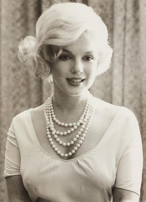
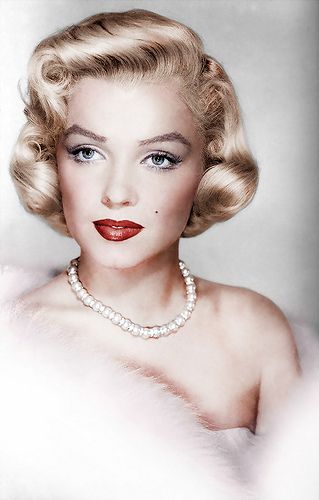
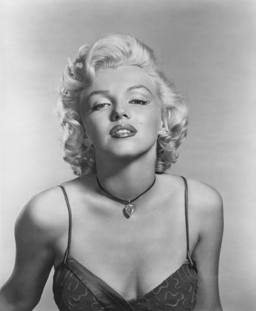
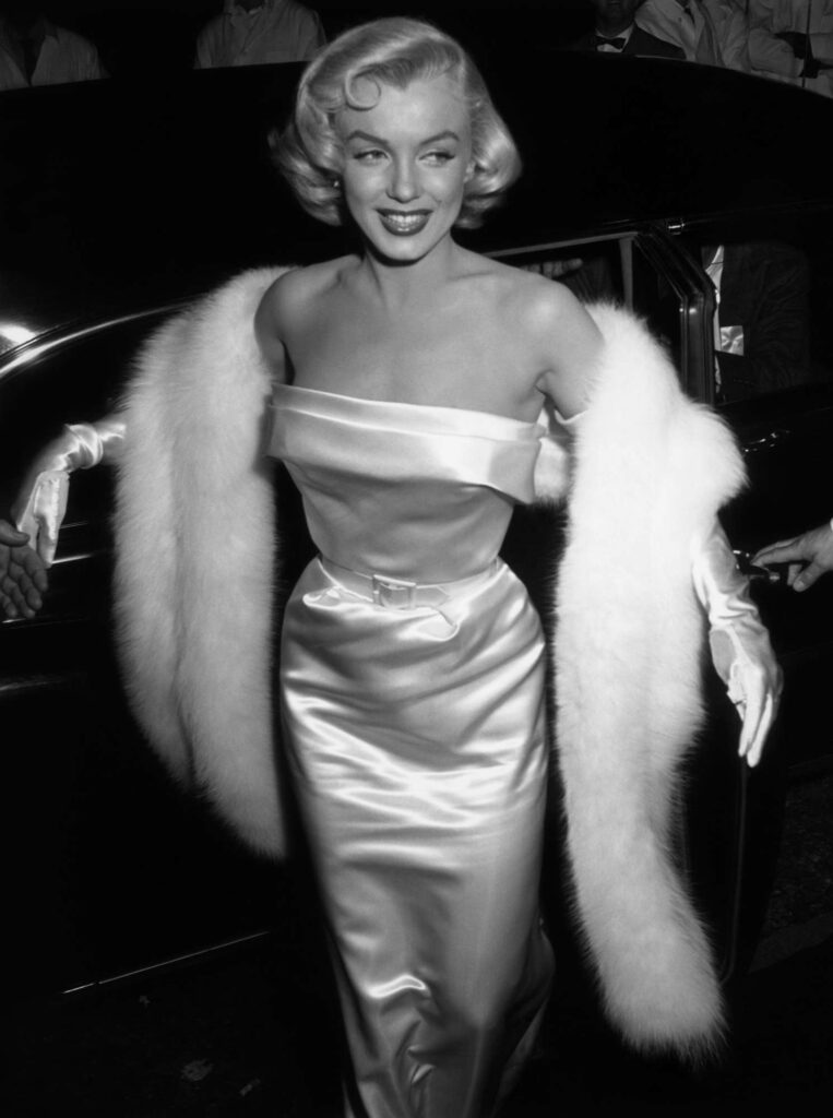
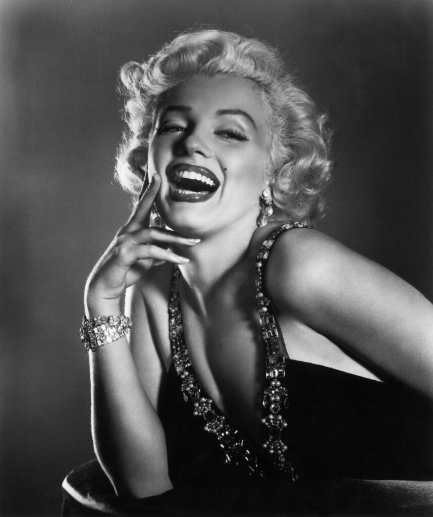
Marilyn Monroe Inspired

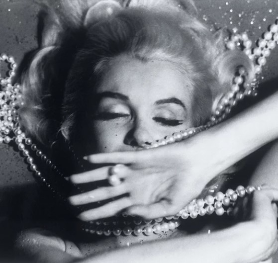
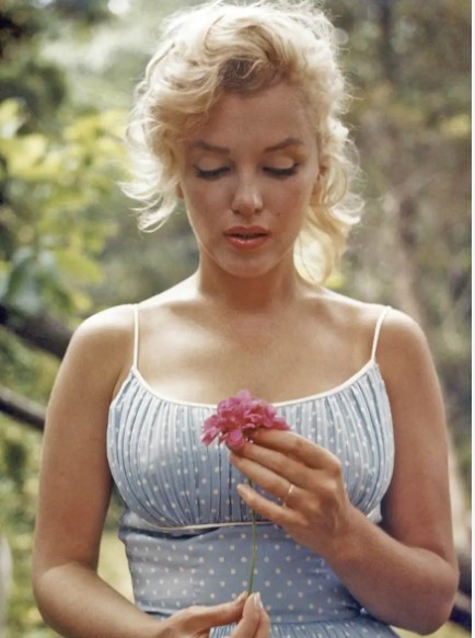
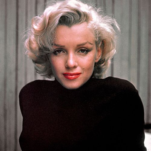
Marilyn Monroe was born June 1st 1926 in Los Angeles, California and died August 5th 1962. She was an American actress who became a major sex symbol, starring in a number of commercially successful films during the 1950s, and who is considered a pop culture icon. Monroe portrayed an early image as a “dumb and seductive blonde“, later implied that she was a sensitive and insecure woman unable to escape the pressures of the Hollywood society: a society where women were objectified and treated poorly compared to men. Her vulnerability combined with her needless death raised her to the status of being an American culture icon.

Monroe gained the most recognition from the movie “Gentlemen prefer blondes” in which she played a dumb blonde character that essentially men were attracted to, sadly she was never seen as anything more than a pretty woman.

Monroe was widely known throughout the 1940s and 1950s. She received several thousand fan letters a week, and was declared “Miss Cheesecake of 1951” by the army newspaper Stars and Stripes. She was mainly recognised for her blonde hair, wearing excessive amounts of pearls and red lipstick, and modelling.

My Plan:

My plan for my photoshoots is to produce a large selection of photos in the studio, enhancing Monroe’s iconic and eminent touches to her look. I plan to embody mine and the other model’s blonde hair in a variety of different ways, whilst also including pearls and making them the subject in some images. This way, we are able to tell a part of Monroe’s emotional story to people, signifying the importance of women’s rights and femininity.

Inspired Photoshoot Plan

Marilyn Monroe

Marilyn Monroe was an American actress, model and singer. Known for playing comic “blonde bombshell” characters, she became one of the most popular sex symbols of the 1950s and early 1960s, as well as an emblem of the era’s sexual revolution.

Monroe portrayed an early image as a dumb and seductive blonde. Her early image as a dumb and seductive blonde gave way in later years to the tragic figure of a sensitive and insecure woman unable to escape the pressures of Hollywood. Her vulnerability and sensuousness combined with her needless death eventually raised her to the status of an American cultural icon.

The most famous movie where Marilyn portrayed a dumb blonde was ‘ Gentlemen Prefer Blondes’ made in 1953 this was the film that Marilyn Monroe debuted the gold digging dumb blonde character that she would ascend to icon status with and, eventually, come to hate.

Unfortunately, the Hollywood professional and tragic personal struggles caused a ‘probable suicide’ at the age of 36 in 1962.

MOODBOARD

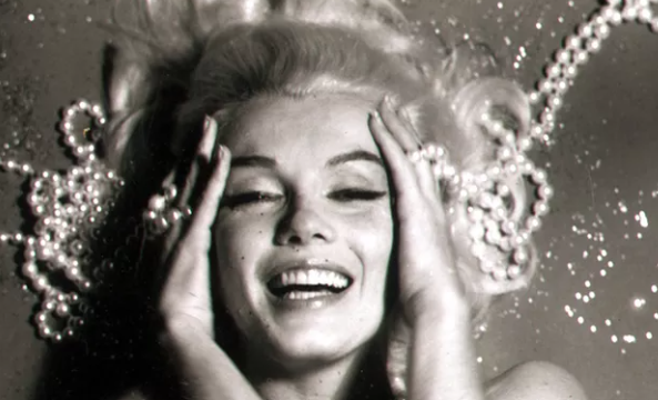
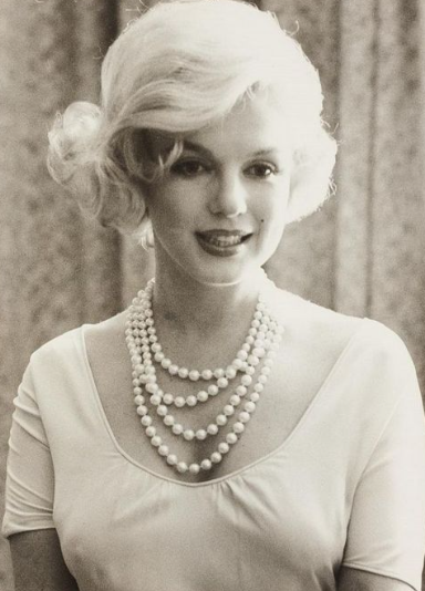
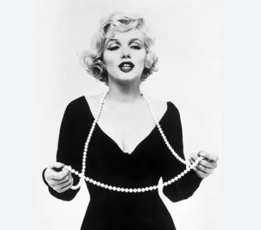
Monroe often wore pearls which ultimately became a part of her and would think of her with them. Marilyn and pearls associated together. Pearls are a very feminine piece of jewellery especially in the 50’s. This simple pearl necklace became her most famous piece of jewelleryMonroe wore them throughout her life as a reminder of ‘happier times’.

Marilyn also often wore red lipstick. This was probably too look like her role as a seductive blonde as the colour red symbolizes bold and confident and is an eye catching colour.

“It falls under the umbrella of power posing. The act of putting it on penetrates your sense of confidence and competence. It changes how you feel, which can change how people react to you and thus reaffirms your choice.” Throughout history, women have chosen red lipstick as a way to signal their power. Red lip colour gained popularity internationally as women’s rights movements spread worldwide. Red lipstick has been a symbol of feminism since the 19th century when it was popularized by the Suffragettes as a way to make a statement and express their desire for equal rights. The use of red lipstick was also seen during the Civil Rights Movement as a way of expressing solidarity with other feminists.

The impact was in her achievement to keep together things that are often thought to be incompatible: her ambition, her idealism, her femininity, and her striving for independence. She inspired, from both men and women, a lot of strong personal feelings, a lot of love.

My Plan

Our plan to successfully achieve Marilyn’s Monroe aesthetic is to associate little details to try create a similar vibe for the 50’s. This may be a bit difficult as we are living in the modern day however we could attempt to edit them to make them look more nostalgic and vintage. We will be including Marilyn’s large factors such as red lipstick and a pearl necklace too symbolize that sense of ‘dumb blonde’ and the femininity characteristics as Marilyn was in fact a role model and was a feminist but sadly passed before the women’s right movement. Lastly, we will be attempting to pose how Marilyn did but still using day to day outfits as the most eye catching subjects was the seductive look of red lip stick and pearls rather than her outfits. We also will be using a mirror to contrast to Cahun’s and Sherman’s work to focus on emotions and vulnerability.

Femininity photoshoot plan + inspiration

Marilyn Monroe Inspiration

My photoshoot will be based on Marilyn Monroe. Marilyn Monroe was an American actress, model and singer. Known for playing comic “blonde bombshell” characters. I have worked with two other students to make this photoshoot work well. All of us are blonde so we were inspired by Marilyn Monroe and how she was associated with femininity in the 50s for this photoshoot.

What was so special about Marilyn Monroe?

Her early image as a dumb and seductive blonde gave way in later years to the tragic figure of a sensitive and insecure woman unable to escape the pressures of Hollywood. Her vulnerability and sensuousness combined with her needless death eventually raised her to the status of an American cultural icon.

Inspiration Mood Board

The Plan

For the photoshoot we will try and use a similar approach to her pictures. Lots of her outfits are very glam, but lots are also quite casual and we will try and resemble these in a modern way. We plan to wear pearls and lipstick as it was a signature look for Marilyn. We will go for casual clothes with glamourous jewellery and make-up as that is a main part of why she is so iconic.

Cindy Sherman – Artist Reference

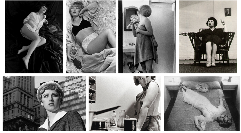
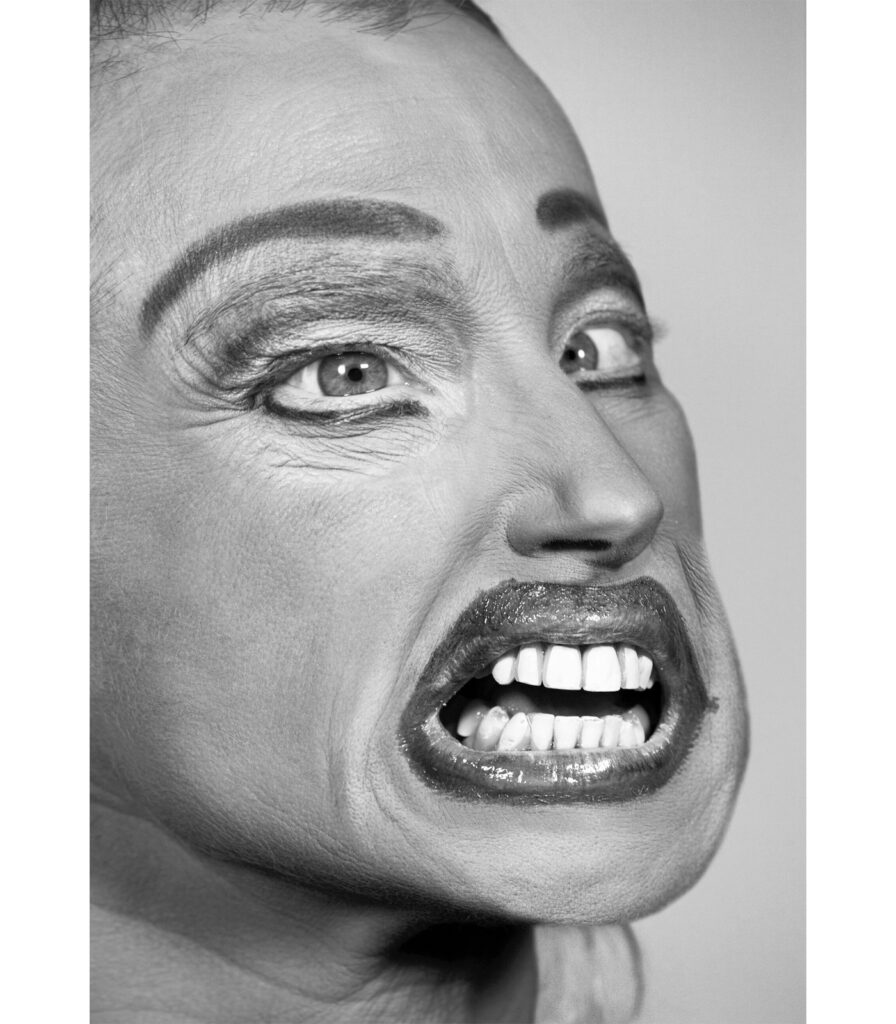
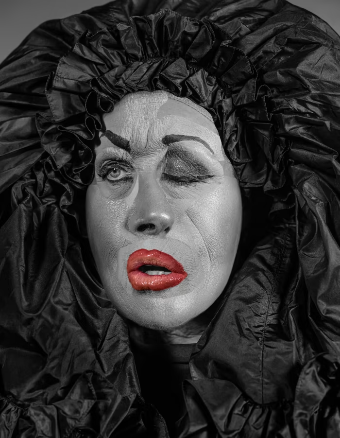
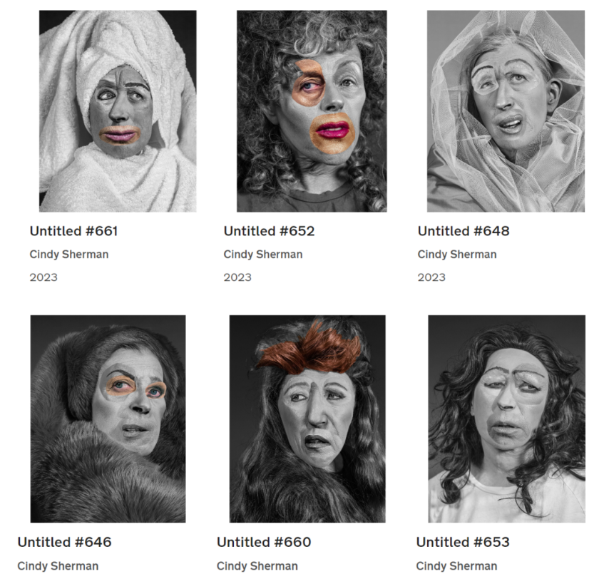
Cynthia Morris Sherman (better known as Cindy Sherman) is an American artist born on January 19th 1954, whose work consists primarily of photographic self-portraits, depicting herself in many different contexts and as various imagined characters. For 40 years, Sherman has probed the construction of identity, playing with the visual and cultural aspects of art, celebrity, gender and photography. She is among the most significant artists of the Pictures Generation. Sherman has continued to transform herself, displaying the diversity of human types and stereotypes in her images. She often works in series, improvising on themes such as centrefolds (1981) and society portraits (2008). Her history portraits (1981), portray her use of theatrical effects to embody different roles and her lack of attempt to disguise her efforts: often her wigs are slipping off, her prosthetics are peeling away, and her makeup is poorly blended. She highlights the artificiality of these fabrications, a metaphor for the artificiality of all identity construction.

For four decades, Cindy Sherman has probed the construction of identity, playing with the visual and cultural codes of art, celebrity, gender, and photography. Sherman was always interested in experimenting with different identities. As she has explained, “I wish I could treat every day as Halloween, and get dressed up and go out into the world as some eccentric character.” Sherman has continued to transform herself, displaying the diversity of human types and stereotypes in her images.

Image analysis:

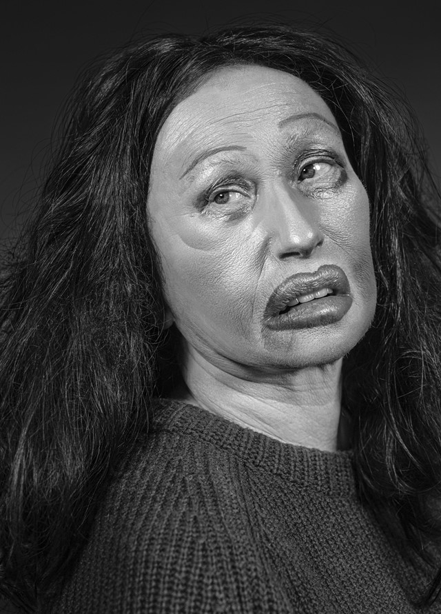
All of Sherman’s images incorporate a lack of femininity throughout them, as shown. One of the main aspects I noticed first was the deep contrast between the dull and dark colours surrounding the subject in the image. The background is black, allowing the face to stand out, along with the clothing she is wearing. These are effective because they do not allow the viewers eye to wonder throughout the image, rather we stay focused on the subject. Sherman regularly alters her appearance to the extreme, which makes her almost unrecognisable. For example, in this photo she has exaggerated her lips to the maximum, which I find interesting because I believe it symbolises femininity. She has also altered her eyes and eyebrows, making them very thin to the point they look fake. The use of this portrays a confused expression on her face. This is important because it gives the idea that perhaps Sherman is confused within her own identity, which leaves the viewer also questioning.

More of Sherman’s work:

Some of Sherman’s most famous artwork:

Artist Reference- Francesca Woodman

Francesca Woodman

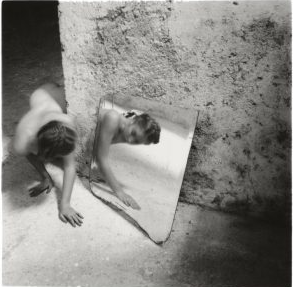
Francesca Stern Woodman was an American photographer best known for her black and white pictures featuring either herself or female models. Many of her photographs show women, naked or clothed, blurred, merging with their surroundings, or whose faces are obscured.

At the age of thirteen Francesca Woodman took her first self-portrait. From then, up until her untimely death in 1981, aged just 22, she produced an extraordinary body of work. Comprising some 800 photographs, Woodman’s oeuvre is acclaimed for its singularity of style and range of innovative techniques. From the beginning, her body was both the subject and object in her work.

Although she died very young, there is no denying that Woodman was one of the most innovative and promising artists of her generation. She pushed the boundaries of experimental photography and played with the potential of shutter speed and exposure.

The very first photograph taken by Woodman, Self-portrait at Thirteen, 1972, shows the artist sitting at the end of a sofa in an un-indentified space, wearing an oversized jumper and jeans, arm loosely hanging on the armrest, her face obscured by a curtain of hair and the foreground blurred by sudden movement, one hand holding a cable linked to the camera. In this first image the main characteristics at the core of Woodman’s short career are clearly visible, her focus on the relationship with her body as both the object of the gaze and the acting subject behind the camera.

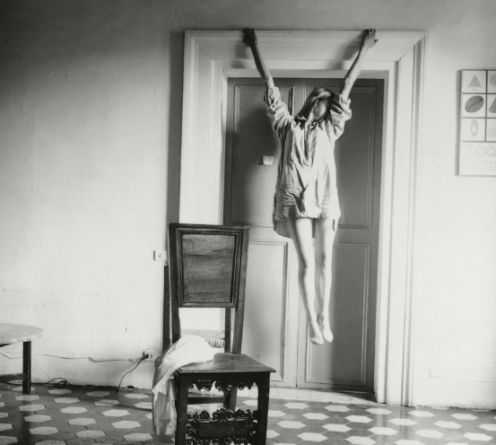
Woodman tested the boundaries of bodily experience in her work and her work often suggests a sense of self-displacement. Often nude except for individual body parts covered with props, sometimes wearing vintage clothing, the artist is typically sited in empty or sparsely furnished, dilapidated rooms, characterised by rough surfaces, shattered mirrors and old furniture. In some images Woodman quite literally becomes one with her surroundings, with the contours of her form blurred by movement, or blending into the background, wallpaper or floor, revealing the lack of distinction of both – between figure and ground, self and world. In others she uses her physical body literally as a framework in which to create and alter her material identity. For instance, holding a sheet of glass against her flesh, squeezing her body parts against the glass and smashing her face, breasts, hips, buttocks and stomach onto the surface from various angles, Woodman distorts her physical features making them appear grotesque.

PHOTO ANAYLSIS

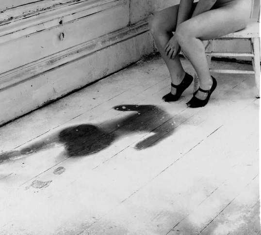
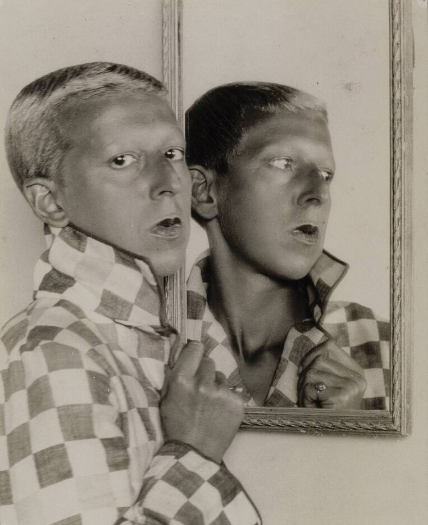
This image has very similarities to Claude Cahun’s work as they both signify characteristics of feminine and in the mirror looking at there reflections would could symbolize a lot especially about emotions which is a typical female stereotype.

The major difference is that the subject in the image is not looking at their reflection compared to Woodman’s work. This could signify that Sherman’s work is implying that females are emotional and sensitive whereas Cahun’s work could imply that beauty does not control femininity. Another major difference is that Sherman’s work is that the subject has no clothes, in a sense this could imply vulnerability but also a strong sense of femininity.

MOODBOARD

The plan

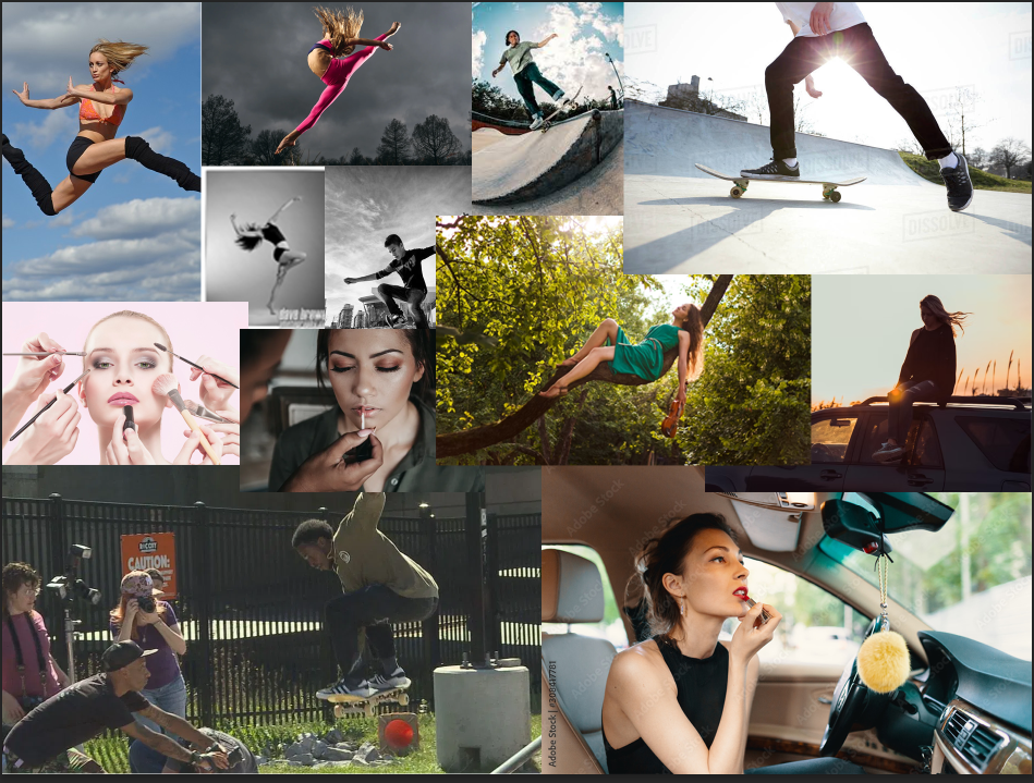
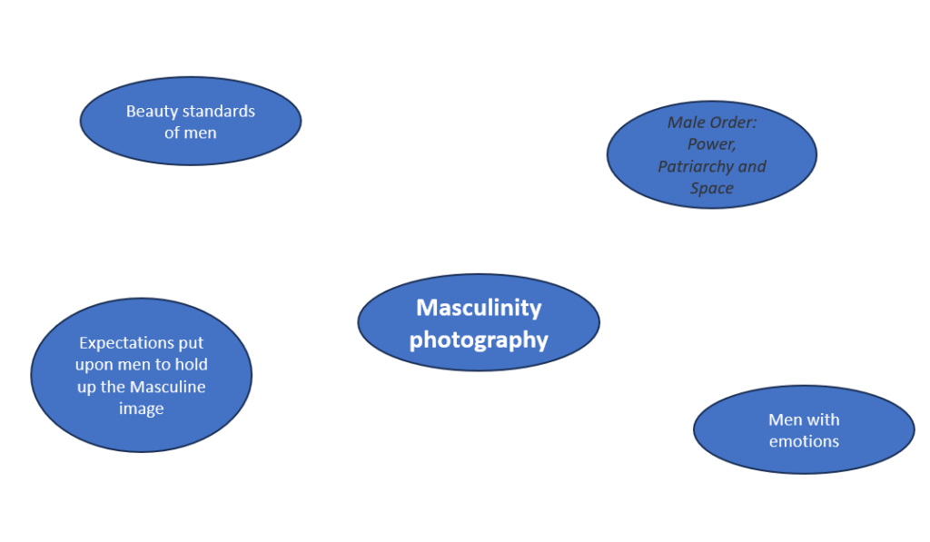
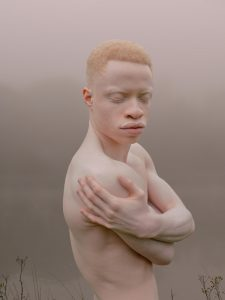
some photo inspiration I found online, I looked for photos that where unique and presented my views on masculinity and how the line between masculinity and femininity doesn’t really exist.

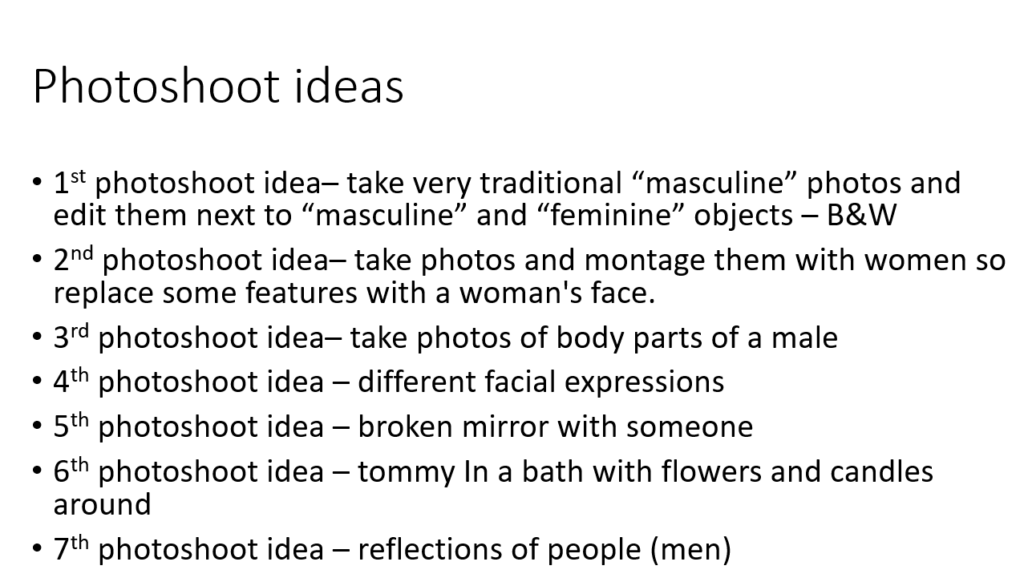
The photoshoots I’ve decided:

different body parts mixed with traditional “male” items, I will montage them next to each other and have some in B&W – DONE

use reflections (i.e. a broken mirror), the reflection is self-conscious but the real life person is happy. – use the photo below as reference for the sad photo that will be in the mirror.

DAVID ỤZỌCHUKWU

Femininity VS Masculinity Photoshoots

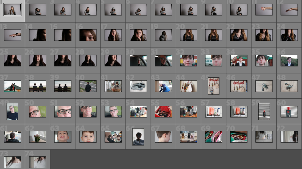
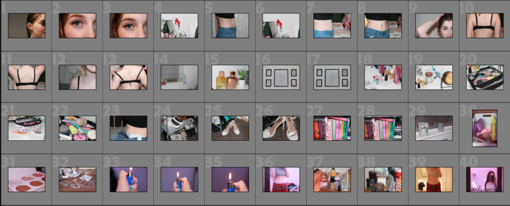
In these photoshoots, I took portraits of people, close ups of their face or body and I also took photos of objects belonging to them. The photographs I captured, will work well with the idea that I have in mind to present them.

Overall, I am quite happy with the outcome of the photos I produced. However, I would’ve liked to take more so that I had a variety to experiment with. I think the lighting used in some of them is much better than others, for example the photographs which used natural sunlight are slightly better than ones without. However, the photos taken in the studio are just as good because I was able to use proper studio lights and adjust the strength of the light and where it was.