I’ve narrowed down to 3 final photos to edit and finalise for the Femininity vs Masculinity topic.
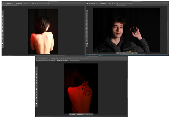
These 3 photos, for me, portray the topic of Femininity vs Masculinity very well, and with some editing I believe they could be staple pieces of my work.
Editing ( photo 1 ) –
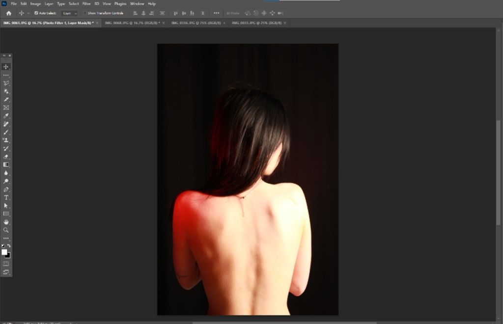
I began with playing around with saturation and colour in photoshop with the first photo, increasing the contrast and hue and played around with black and white a little, just to see what might look the best for this specific photograph.
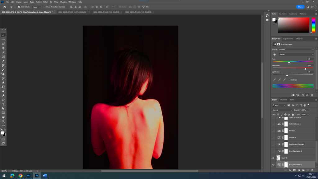
The highlights and shadows with this edit, I feel, worked really well and complimented the dimensions on the photo especially on the skin. It gave the photo a warm feeling with the use of warm colours and lights that were used in the studio as well as successfully contrasting with the shadows and lowlights within the photo.
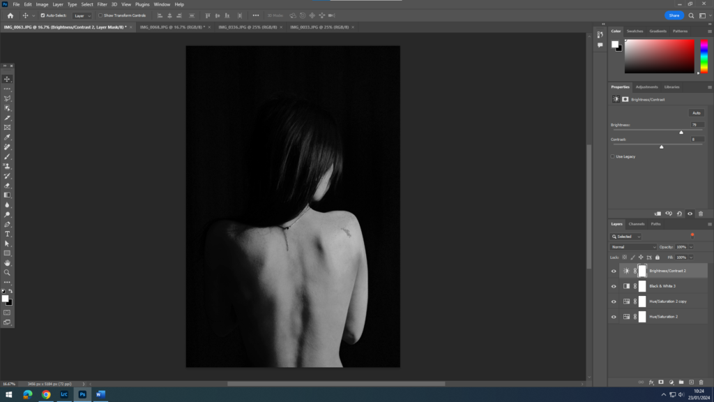
With this edit, I wanted to have a basic feel to it, so I wanted to try out a black and white idea. Initially all I did was add a black and white cover over the top of the original photo but after investigating with the saturation and shadows I was able to give the photo more of a raw and gritty feel which I think fits perfectly with this photo.
Editing ( photo 2 ) –
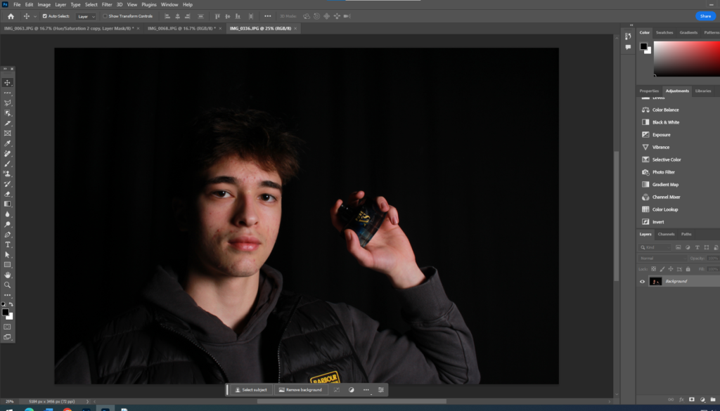
For this photo I have a definitive idea of what I want to do. I want to make this photo almost over saturated to enhance the inspirational aspect of male perfume adds and how they are portrayed through the internet
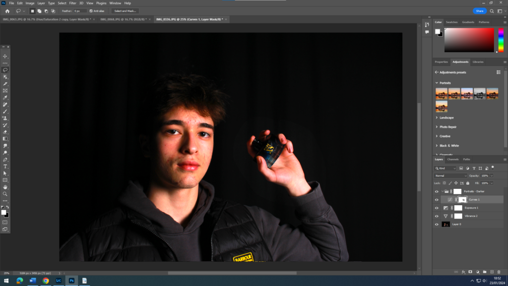
This edit was not very successful as it was difficult editing this on photoshop purely using saturation and hues.
For the next edit I am going to try and use dimensions to improve this photo.
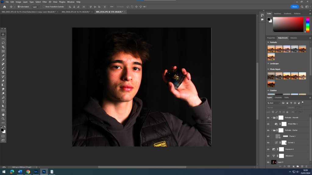
I did end up cropping the photo and changing the hue, but only slightly so that the natural elements of the photo weren’t taken away as it happened. I smoothed the texture a little around the face but made sure to keep it within the rest of the photo to keep the realism.
Editing ( photo 3 ) –
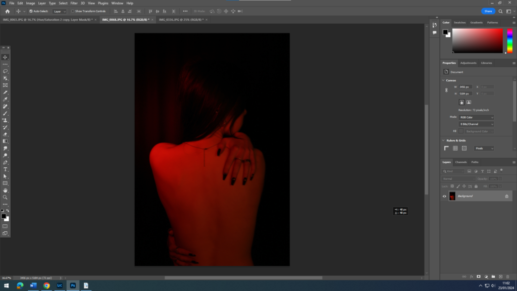
For this photo, I want to definitely use a more grunge feeling to the photo to show almost power as that will compliment the red hue already in the photo.
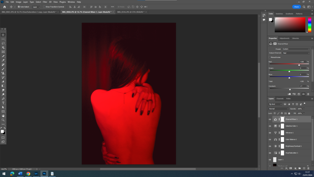
I worked a lot with the saturation in this photo and the colours that make up the photo, like the purples, blues and reds. I am not sure if I like the brightness of the photo, it does not really fit with the grunge idea I was going for, so with the next edit I am going to focus more on the shadows and how that will effect the edit style and photo itself.
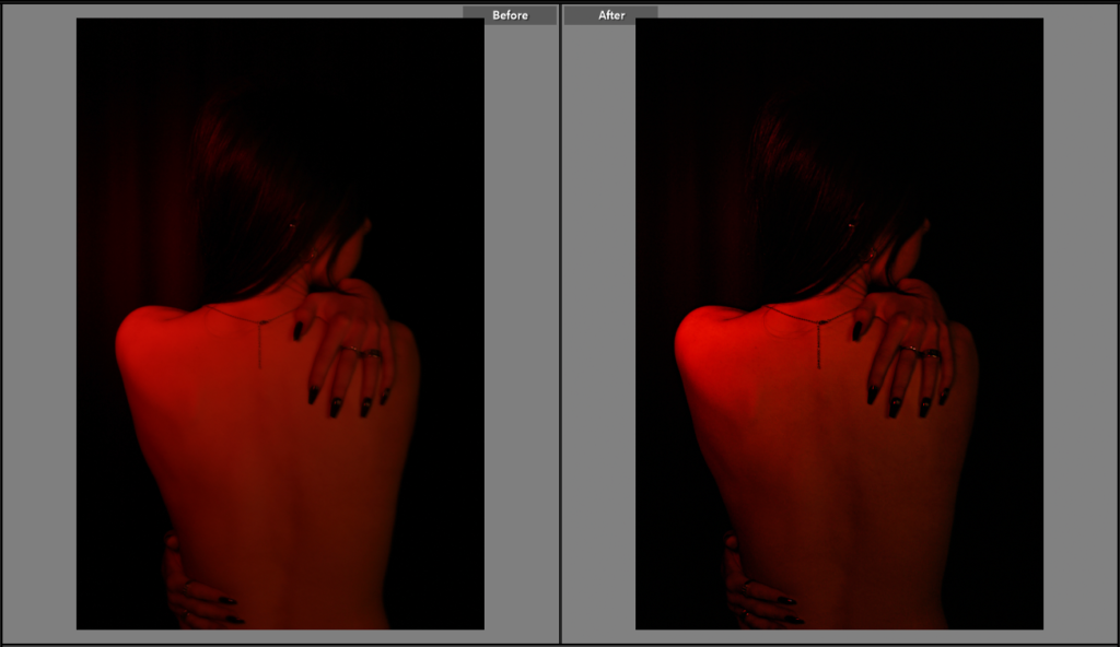
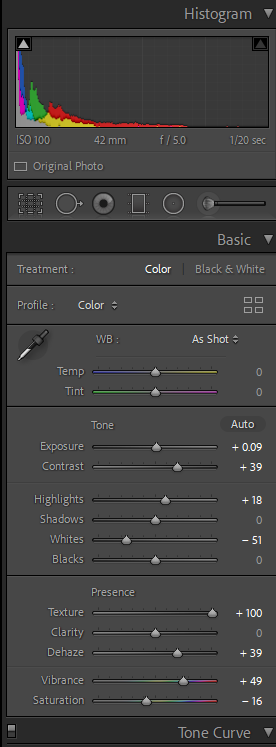
This edit went a lot better for me, as I used Lightroom to edit instead of photoshop. The grunge effect I was going for definitely was shown in this edit as I focused on the contrast between colours and shadows in the photo, also thinking about the texture and clarity of the photo as well. The use of the red hue focuses on the femininity of the photo as well as thinking about the connotations the colour red has, as its often linked to danger which contradicts the stereotypical idea of femininity.
Artist Inspiration –
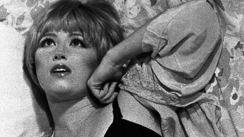
The artist that inspired these photos and edits was Cindy Sherman.
In her photos, she only ever photographed herself and I wanted to use that idea of independence in my work as well because, woman ( stereotypically ) are not independent and rely on other people for most things. I wanted to counteract that idea by using photos of myself.
