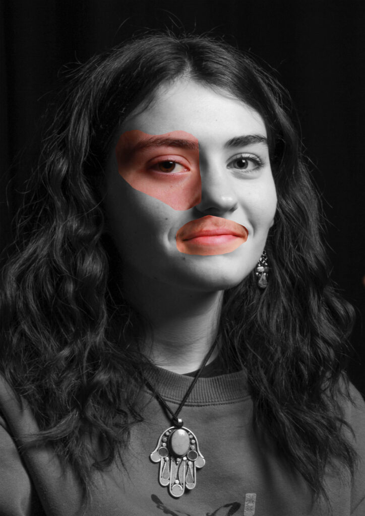
for my masculinity and femininity project I based my project based off of Claude Cahun and Cindy Sherman my creating or recreating some of the photos they have made by using techniques they have used in the past through out my work.
comparison
in my opinion, I believe that I have captured the basis of what I wanted to achieve by when I created the images. however I wanted to put a little twist on one of the photos for the first Cindy Sherman image bellow I had it as a coloured image with a light pink lighting to still give it a girly feel even though I had a male model. And then for the rest of the images I wanted to recreate the artist images to the best of my capability. I was mostly inspired by the vintage photos of Cindy Sherman and Claude Cahun and therefore wanted to make my photos look vintage by using photoshop and adobe light.
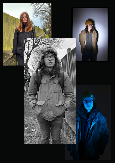
studio portraits
for the studio portraits we had to come up with outcomes that used the different lighting techniques such as Rembrandt, butterfly and chiaroscuro. and also have images inspired by artists such as Henry Mullins.
inconclusion I think I came up with photos that fit the criteria that was given as I was able to have a chiaroscuro, Rembrandt and butterfly lighting effects while also trying to fit the style of the artists Henry Mullins.
however, if I had to go back and do it again I think I would try have more photos than I took to experiment with than what I had to help create additional images and diamond cameos as I didn’t get to create as much as I would have liked. and to also experiment with different multi-exposures.
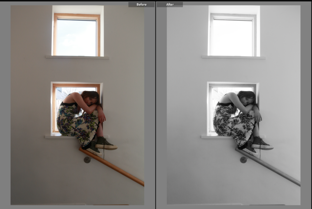
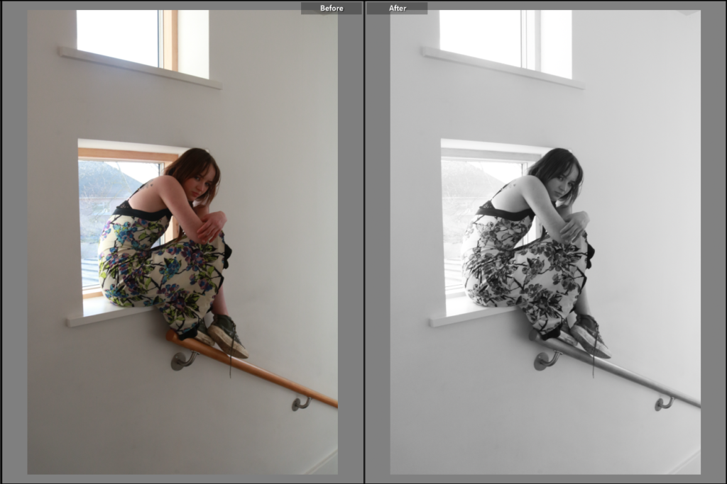
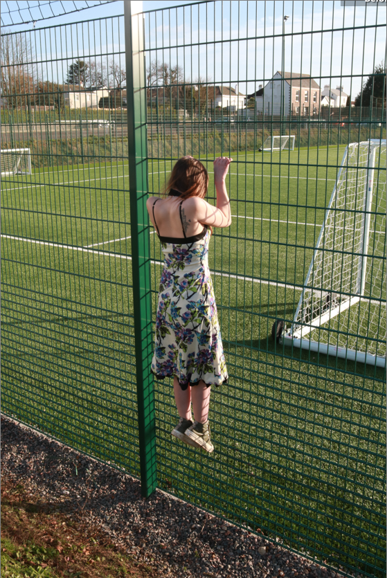
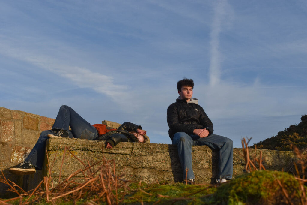
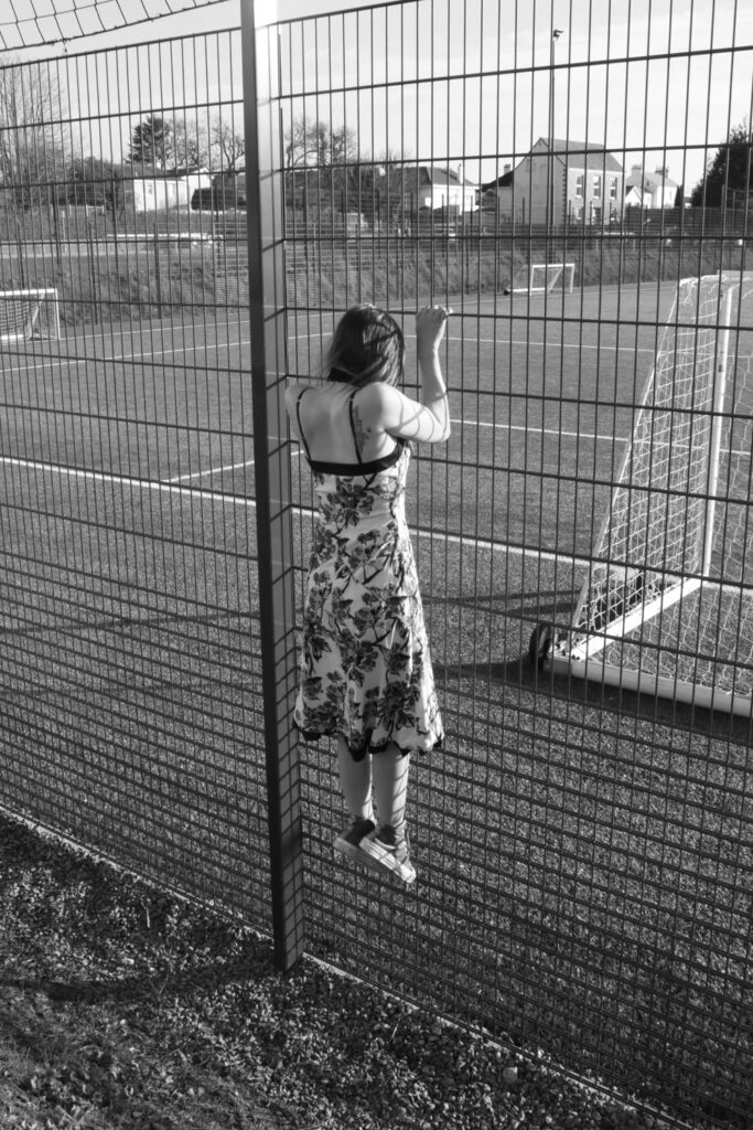
First of all, I think I really achieved that awkwardness Clare portrays in her photos. I did this by making the people who I am photographing in awkward and uncomfortable positions. By doing this, I was able to portray the ideas of performance and the gesture to interrogate and subvert domination modes of representation.
She uses her body to communicate word she is not able to say or doesn’t want to say directly. Her use of her body is a powerful message that implies that one can communicate without words. I think I successfully show this in my pictures. However in my pictures I wanted to show the awkwardness of being objectified. I was still using my subjects body to communicate my message but it was a different type of message.
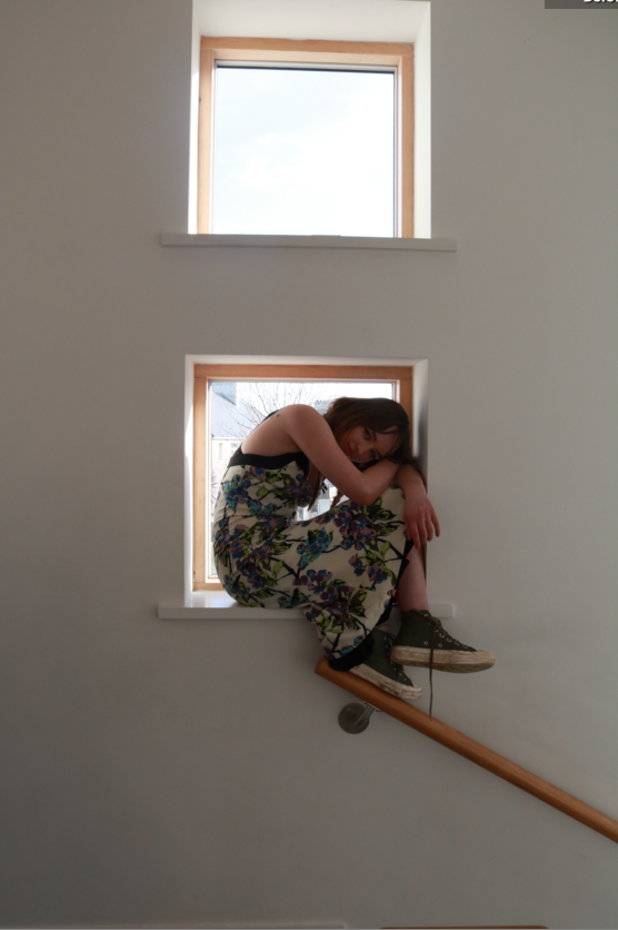
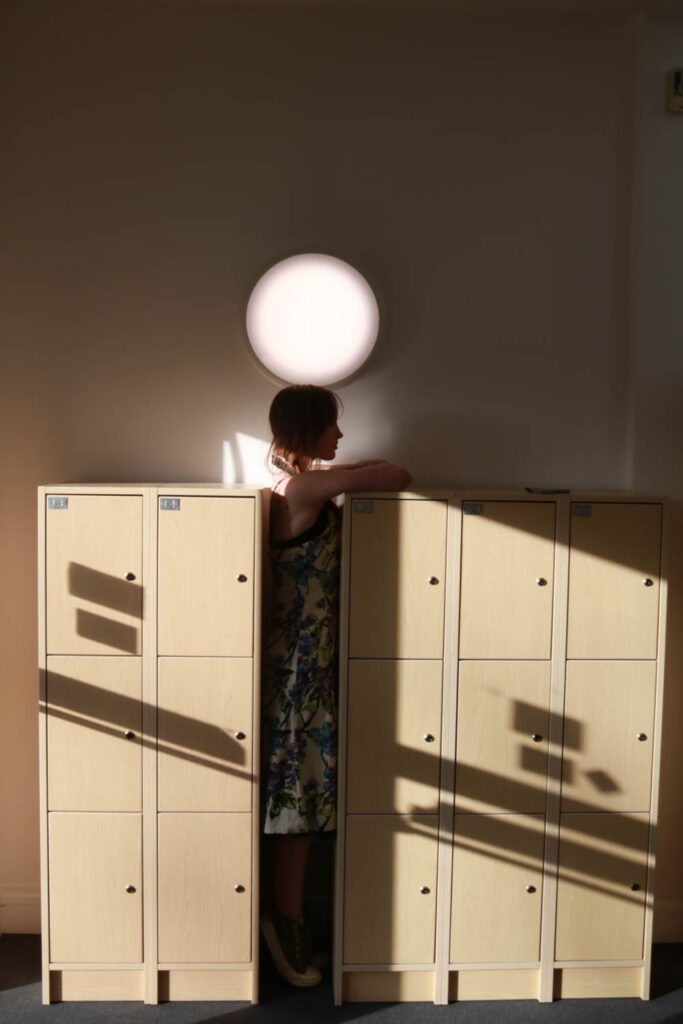
The portrayal of a certain discomfort within my pictures due to objectification, can be taken personally or indirectly, just like Clare Rae. The use of her body to explore her own personal experiences is something that she makes apparent. I, however did not use myself in these pictures, which I should have, so that I could show how I was heavily influenced by Clare, herself.
Furthermore, a way that I showed how heavily inspired I was by Clare Rae was producing a picture with similar settings and colours. As seen above, there is two pictures that shows a girl in a confined space just like what Clare did when she visited jersey and famously took a picture of her in a similar situation. That picture was in black and white so I also edited mine to black and white.
It also is evident that I have some coloured pictures and some black and white pictures, just like Clare Rae.
Overall, I think that my final products relates to Clare Rae’s work. I believe that, next time I should focus more on important details like, producing more pictures with a similar settings as hers and taking pictures of myself, like she does.
As Collier Schorr is my artist reference I wanted to present my final images as a collage, so I started off by selecting images I want in my collage and putting them in a folder I probably won’t use all of the images in the folder but this is a good starting point.
Creating the collage
I started Selecting a few images and moving them around until I came up with this layout. I like the way the images positioned however I want to experiment even more and see if there are any other layouts I like.
After moving the photos around I also came up with this layout I prefer this layout more than my previous one as I like the composition and the way the photos use the space more.
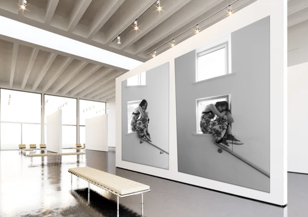
Virtual gallery
Above is my virtual gallery which includes my final images. On the left of the gallery is photos I took in the lighting studio which have been edited and used as my final images as they are the best outcomes from the photoshoots I did in the studio with the lighting.
In the middle is my response to Collier Schorr’s Americans collage which includes some of my final images which have been edited and placed in a collage form. This is also why I put it at the centre of my gallery.
On the right is some more of my final images but they are more natural ones and are more simplistic than my other final images but are still equally important.
Evaluation & Comparison
Overall I am pleased with my final outcome and all the time and work I put into this project.
My work
I felt that my final outcome is quite successful as it is like Collier Schorr’s work but with a more modern feel to it, this is because my work resembles more of modern masculinity with the use of lighting and the studio in some of the photos. It is like a comparison to Collier Schorr’s photos which looks quite old and use more older men in the photos, some of the men are cowboys which gives her photos a more wild western feel.
However, there are some similarities such as the pose and facial expression in the main middle photo on both pieces of work which may hint that even though the idea of masculinity is changing, some things are still the same I also tried to use similar visual and technical references in the middle photo on my response, but for the other photos in the collage I tried to be more creative. If I could do the project again I would try and produce multiple outcomes and use a wider range of people in my photoshoots to make my photos more diverse.
These are the photos I have decided to place into the print folder.
I decided to first choose I Rembrandt lighting technique photo, this is due to a strong background and a strong pose whilst perfectly demonstrating Rembrandt lighting.
I decided to also choose these 4 photos to use in a sequences they all compliment each other. I tested how these would look in a row on photoshop with multiple backgrounds.
I picked these two photos to place next to each other with a black background, I think these two photos also compliment each other very well.
These two photos are my other Cindy Sherman inspired photos, these will be displayed on their own as A4 images.
Virtual Galleries.
I have also created virtual galleries for all 3 portraiture photoshoots of:
Martin Parr is a British photographer, born in 1952, who is mostly known for his work that focuses on consumerism and tourism. Through this work, he has developed a very unique style that often displays the strange mannerisms of human behaviour.
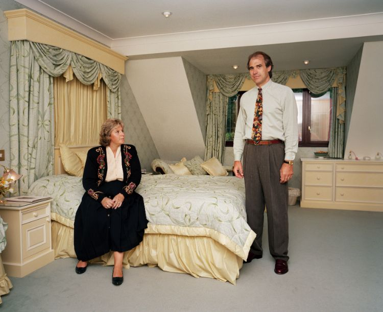
“Each to their own but I think this is going to be one of the best – if not the best – houses on the estate“, Signs of the Times1991, Martin Parr
Take this photo for example. What is immediately apparent to the viewer is the arrangement of the two subjects, a male and a female, who seem to be a married couple. The male in the photo is standing awkwardly in the background of the photo and the female is sitting dominantly in the foreground. This is atypical of the masculine and feminine dynamic, as normally the roles would be reversed. This creates a big contrast between the male and the female in the photo, and it forces the viewer to assume that the traits of this couple are uncanny to regular masculine and feminine traits. Additionally, the name of the image implies the type of people that the subjects are being depicted as. These two characters that Martin Parr creates in this photo are a perfect example of how he uses comedy in his work. The styling of the image is also repeated in the other images found in this series. It is very representative of the typical British household at the time. The colour scheme is both very wide, but also quite bland and uninteresting, for example, it has some pink and green, but it is mostly brown, beige and off-white. The tone is very neutral, as the photo was taken on a cloudy English day, which makes the tone appear grey, in the middle of light and dark. This could have been intentional, because it looks as if they are both dressed for work, and so this image is meant to be a representation of what their daily life is like.
The lighting used for this photo is a combination of natural sunlight coming from the glass doors, and most likely a key light positioned behind and to the right of the camera to bring light to the underexposed areas that the sunlight doesn’t reach. Parr made this key light low intensity so that it blends with the sunlight, and so that the key lighting doesn’t overexpose part of the photo. By doing this, it makes the editing process a lot easier as the photo doesn’t need to be altered in terms of brightness or exposure. Everything inside the house is in focus, but the outside becomes blurry. This tells me a lot about the aperture. The depth of field is deep, therefore the aperture is in the mid-range, my guess is between ƒ5.6 and ƒ11. With this information, I can also justify that the time that the shutter was released was fairly long. Being that the photo was taken indoors, the image doesn’t appear very grainy, and the contrast is low, the ISO was most likely set between 200 and 400.
Along with the rest of the photos in this series, this photo has a strange aesthetic. The image looks like something you would find framed in your grandparent’s house. Additionally, the photo is like a time capsule. It could be that Martin Parr created the photo like this intentionally, because the name of the series is “Signs of the Times 1991”, which implies that this photo is demonstrating the behaviour of groups of people, specifically the working class, in 1991. In this photo, Parr uses these mannerisms in a comedic way, to make fun of how these people care so much about mundane things. This is also clear because of the name of the photo, which is meant to be a line of speech made by one of the subjects in the photo. As well as this, the warped masculine and feminine dynamic going on in the photo also could suggests that the men who behaved like this were typically not the more dominant people in a relationship, and they preferred to stay quiet and be in the background of things.
The context of the photo is fairly simple. The subjects are dressed for work, talking about their mundane commodities and appear to be waiting around. From this information, it is clear that this photo is meant to represent the morning life of the average working class couple, living in an estate in 1991. This perspective is interesting because it answers a lot of questions for the viewer, such as what these people are like, what they talk about and what they do in their daily life.
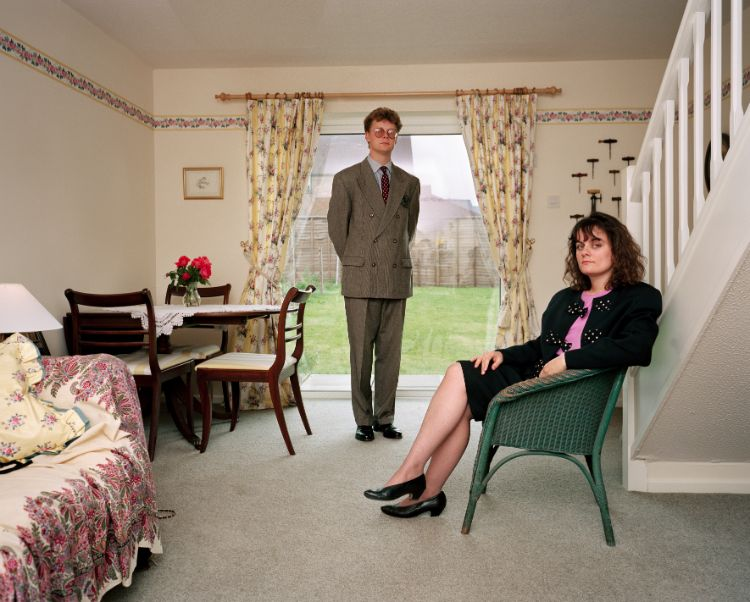
“It still feels as though we are living in a hotel suite. I want to pick up the phone and ask for room service”, Signs of the Times 1991, Martin Parr
This is another example from Parr’s “Signs of the Times” series. Again, the first thing that the viewer recognises is the odd positioning of the subjects. In this case, the man stands oddly by the side of the bed and appears to be looking at the cameraman, whilst the woman sits on the bed facing the man. This arrangement says a lot. Firstly, this photo reflects what the true dynamic of a masculine and feminine relationship looks like. The man and the woman are both placed in the foreground, demonstrating that they are equal from a relationship standpoint. Secondly, having the man stand and the woman sit demonstrates the power dynamic in this relationship, as standing makes the man appear more powerful. Thirdly, where both subjects are looking tells us a lot as well. The woman is facing the man, which could be another example of the power dynamic in the relationship. Additionally, the man is facing the cameraman, which could mean that he is the one who is looking for the direction in the relationship. I think that this was completely intentional by Martin Parr because this positioning is very good for showing the viewer these people’s mannerisms, which plays perfectly with Parr’s style. As mentioned previously, the photos in this series all share the same aesthetic. In this case, the colour scheme is drab, it consists of a mix of off-whites that appear in the majority of English houses. Also, the subjects again appear to be heading off for work, as they are dressed in professional attire.
The lighting used for this photo is a mix of room/artificial lighting and most likely a key light situated behind the camera again. Given that both of these photos appear to have been taken at the same angle, I can also assume that the photo was taken on a tripod. This also makes sense because artificial lighting isn’t ideal for a camera, as it slows the shutter speed, which without a tripod, would make the photos come out blurry and unfocused. Once again, the key light is used to fill in those underexposed areas, but it could also be used to bring up the lighting in the room. This also aids the camera, as bringing up the light intensity will allow more light into the lens, therefore the camera can reduce its shutter speed. The aperture for this photo was most likely the same as the one previously, between ƒ5.6 and ƒ11, as we can see that everything indoors is in focus, however, the objects outside the window come out blurry. As mentioned previously, the shutter speed will be long, due to the photo being taken indoors, however the key light most likely brings the shutter speed down. Indoor photos usually need a higher ISO so that the camera is more sensitive to the light, but the image doesn’t appear extremely grainy, so it is probably in the range of 400 and 1600.
The concept and the context of this photo are mostly akin to the previous photo, however in this photo the subjects are slightly older. This could have been done intentionally by Martin Parr to show the different demographics that existed in 1991 throughout this series. This can also be inferred by the room that they are in. It is even commented on in the title/ line of speech, saying that it is like a hotel room.
Ideas
I used these photos by Martin Parr because I think that they portray a lot about masculinity and femininity. They demonstrate very clearly the dynamics of the relationships in the photos, but they also give a lot of insight into the people around the photo, such as what they do for a living. There is a lot of context in these photos, but it is not political or historical, rather it is a personal context or cultural context.
I want to replicate the portrayal that Martin Parr gives of masculinity and femininity in these photos. I could do this in many ways, but I must stick to a clear framework:
man and woman
positioned on either side of the photo
demonstrating some kind of dynamic
I have a few locations in mind, however I don’t want to recreate the images like Martin Parr. Instead, I want to take the photos outdoors, rather than indoors like how Parr had done. This is because I think it will force the focus to be about the dynamic between masculinity and femininity, rather than personal context, such as what the subject does for a living.
I could demonstrate the dynamic in many different ways. I could experiment with the position of either subject, where they are looking, their stance, and their clothing. I can also use my surroundings to create a deeper meaning.
For example, I have one idea in mind where the background plays in with the positioning of the subjects. I could have the woman sit next to a wall while the man stands with the sky behind him. I believe that this demonstrates a masculine/feminine dynamic very well.
Contact Sheet
These photos were taken at Plemont, a small beach in St. Ouen. I experimented widely with the area, using as many different angles and poses as possible.
Image Selection
From this wide range of photos, I selected a few that I think properly replicate the style that I was going for
In this selection, I took photos that represent the masculine/feminine dynamic I was going for. Within this group are a few photos I am very happy with.
This photo I believe is the best from the selection. I put a few of my ideas to use. One was that the background plays a part in the message that the photo presents. In this photo, the cliffs of Jersey’s north coast are visible in the background behind the female subject, whereas behind the male subject, there is only the vastness of the sea and the infiniteness of the horizon. Another idea I had was to position either subject so that the female was below the male. In this photo, I used the slope of the hill to create this effect. All of this plays a part in the portrayal of masculinity and femininity that I am heading for.
This is another photo from the selection. In this photo, I focused less on the values that masculinity and femininity portray, rather I decided to look more at the mannerisms of either gender. In the photo, the male subject is sitting casually on a wall, whereas the female is wedged in the doorway uncannily. This is a demonstration of the difference in expression between masculinity and femininity. In masculinity, expression is limited, and it tends to be that the masculine man doesn’t express himself by experimenting with things such as clothing. In femininity, expression is a key factor in defining the femininity of a woman. It is more feminine to express your femininity in areas such as clothing, hairstyles, and many other things in the modern day such as makeup.
In this photo, I focused more on the dynamic of masculinity and femininity in terms of a relationship. The male subject in the photo sits coldly, similarly to how he was in the previous photo to demonstrate the lack of expression that comes with masculinity, and watches the sunset. The female subject is lying on the wall, to demonstrate the expressive side of femininity, and is also watching the sunset. I believe that this positioning in the photo displays masculinity as the protective and strong half of a relationship, and femininity as the elegant half of a relationship.
Editing
Going into the editing process, I have a few ideas in mind.
Firstly, I want the colouring to not be like the colouring that Martin Parr uses in his photos. Instead, I want to bring colour to the image. This is because the images are a representation of the dynamic between masculinity and femininity in a relationship, therefore having more visually appealing colours introduces the aspect of beauty to the relationship.
Secondly, I want to emphasise the split between masculinity and femininity more. I could do this by splitting the image in half and changing the colouring of either half. I could also do this by just cutting out the subjects and making adjustments to the colour of those. I will have to experiment with this a bit.
Here is the development process of the first photo. Here, you can see I started just by going through exposure, temperature, highlights and shadows and simply trying to make the image look better. Once I was done with this, I decided that the image was underexposed, and that the ground was not as clear as I wanted it to be.
In the second image, I fixed this by bringing up the exposure and the white balance so that the ground was more visible. This did make my photo more exposed, but I did think it was too bright, meaning it was overexposed.
To fix this in the third image, I brought down the exposure and brought up the contrast so that the colour in the photo was more defined. I also brought up the vibrancy and saturation a small amount just so that the golden hue in the sky is more clear too.
Here is the development process of the second image. To start with, I went through and brought up the exposure, shadows and vibrancy, and brought down the highlights to emphasise the colour.
I found that this photo was too colourful. So in the second image I decided bring down the contrast and bring the highlights back up. As well as this, I took down the saturation to take away some of the colour.
In the third image, I decided that I had taken out the colour too much, so I took down the whites and the contrast and brought the highlights up. This worked very well. It brought up the colouring in the sky, and the colouring of the building is not too yellow like it was previously.
For this image, I started by bringing up the exposure as the photo was previously underexposed. I then brought down the highlights and the whites and brought up the vibrancy just to alter the colouring.
I wanted to bring up the colouring a little bit, so in the second photo I brought the contrast up and also took up the saturation, which resulted in a yellow hue covering the photo.
I was unhappy with this, and so in the third version, I decided to take out some saturation and instead bring down the highlights. This worked well, as it lowered the yellow hue to the point where it isn’t ruining the photo, and I am happy with the final result.
I also went through and cropped the images just so that the subjects share equal space in the photos.
Final images
I think that these images are the best representation of the style I was going for. In reference to Martin Parr, this is exactly what I had in mind when analysing his images and creating my own ideas. I made sure that I followed the criteria I made for myself when mapping my ideas.
Comparison and critique
Here is one of my images and one of Martin Parr’s images. This image is the closest I got to recreating the style of Martin Parr. You can see that the male and female subject both stand on either side of the frame. I did try to find some kind of pose for masculinity and femininity, however in the location I was not able to do anything that fit. Personally, I think I could have done much better. To me, this photo doesn’t really say anything, there is no statement. You could infer some things, such as the male/female hierarchy implied in the slope of the hill, however that’s really all I see in this photo.
In this photo, I think the positioning of both subjects works well. Additionally, the mannerisms of femininity and masculinity are also visible in this photo. In inspiration of Martin Parr, I once again split masculinity and femininity to either side of the frame. However, I also think I could improve on this photo as well. Once again, there is not much to say about the photo, and it isn’t obvious that the photo is about the dynamic between masculinity and femininity. In my opinion, I don’t think there is much to infer about the image. You could say that the masculinity and femininity are both on the same level, however that is not immediately obvious.
Once again in this photo, I have split the frame so that masculinity is on one side and femininity is on the other. This time, I am demonstrating the difference in expression between masculinity and femininity. I think, in this image, the message is more obvious. However, there is not much meaning in the photo. Additionally, the photo doesn’t look interesting or intriguing.
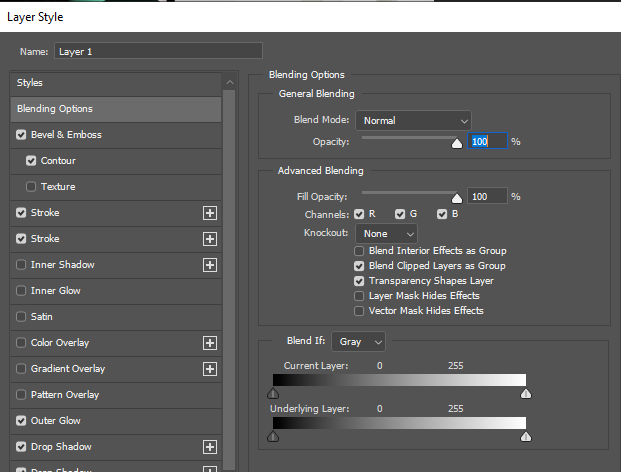
Here I went on Photoshop to create a virtual gallery, I went online to get a phot of an empty gallery and pasted it onto photoshop, then I added some of my best photos I want to present. When resizing each photo, I had to right click and press ‘skew’ this abled me to make the photo look as if it was stuck to the wall like in the normal galleries. I also had to add some blending options such as strokes to add an outline on the photo almost as if it was in a frame. Also, to make the photos stand out I added a faint outline on the outside of the photo.
Here I edited my photos quite similar to the other ones however I added an effect on the side of the frame of the photo. I added an inner glow this makes it loo like the light are reflecting onto my photos. I tried to make all the photos the same length to make it look realistic. On the sides there aren’t any photos as if I had added them it would have looked crowded and too full. I like how this onw turned out as it looks quite modern as the photos are in black and white and so is the gallery.
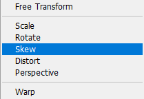
Here is a picture of the blending option and what I had added to the photos, although most of them were edited the same, some had stronger strokes, inner shadows or drop shadows. Each option can change the whole photo completely as the stroke controls if the photo is in a frame or not and how big each frame is. When pressing ‘Ctrl T’ you then press skew to control how the photo is adjusted on the gallery wall.
My Inspiration for this photo was from Cindy Sherman’s Film Still of her looking at herself in the mirror, my image is not identical to hers but it shows the stereotypical things that women do, like putting on makeup or making sure they look good in the mirror.
I got the inspiration to take this photo from Cindy Sherman’s film still in the mirror. The image in the mirror suggests that women look in the mirror most days and see what they are and not who they want to be or what they want to look like. It shows that women and girls should be ashamed of what they look like and how they feel about themselves but society and social media has made them feel like not enough or that they are not pretty enough.
I think I did well to recreate Cindy Sherman’s work using the effect of face distortion. However, there are a few differences between her work and my own. Cindy Sherman creates these pieces with the camera zoomed/ close up to the individuals face which captures the details really well. However, mine is more further away which means a lot of empty space is included. I think my photo could have been improved by copying her close up technique. Another difference is that a lot of Cindy’s work shows her main focus was creating these photos using the older generation whereas mine is an individual from the younger generation. A last difference is that Cindy has used a different person for the cut outs but kept them at a natural size. I decided to use a different person but change the size of the facial features so that they were unproportionable to the face underneath.
A similarity between the two is the different shades. though in this photo she used black and white and I did not, the cut outs are still very clear as there is a difference in skin tone.
Cindy Sherman Female Stereotypes
For this inspiration, I did two sperate photoshoots so I’ve added both. The first one on the left is a copy of Cindy’s photo in my own setting with my own props whereas the second shoot is more of a general inspiration for female stereotypes and not a direct copy of any of her work.
I think the first photo turned out fairly well as it can be quite clear that I have taken inspiration from this particular photo. A similarity of this photo compared to Cindy’s is the use of props. I have taken her idea of adding a pan in the frame to further show the fact that the setting is located in a kitchen. as well as this, she has props that surround her which also bring across this idea and this is also evident in my photo with the use of the apron in the background and the kitchen towel. A difference is the chosen poses. I decided to busy myself with doing something to show the setting more whereas Cindy is looking over her shoulder.
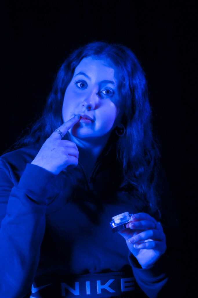
I think the other photoshoot turned out well and is by far my strongest. It matches Cindy’s ideas of showing the general things a woman would stereotypically do. As dance is generally thought as a female sport I decided to also show a stereotype within my photos as well. The particular phot I have chosen shows the individual looking into the mirror fixing her lashes which is also seen as a female thing to do. In both photos, Both woman are not looking to the camera which creates a more natural looking photograph There are a few differences as it is not a direct inspiration. I have not used black and white anywhere in this photo as I think the use of the red lights reflecting off the navy costume is very effective so using black and white would cancel that out.
Duane Michals Reflections
I think this inspiration turned out quite well as its fairly similar to Michals’ idea but also has its differences. We have both used the black and white effect on our images which I think turned out well. As well as this, both takes have a source of light included but one is artificial and one is natural. I think the natural light looks a lot better so I would change that if I were to do it again. We have both used circular mirrors to show the reflections but mine is a lot smaller which lead me to focus on individual separate facial features whereas Michals shows a large part of the face in the mirror. I have not added a person into my photo as the mirror was small and it was tricky to add myself into the photo as well as getting the right angle on the mirror. This differs from Michals as you can see the individual is included in the photo.


 I started Selecting a few images and moving them around until I came up with this layout. I like the way the images positioned however I want to experiment even more and see if there are any other layouts I like.