Themes (femininity & masculinity)

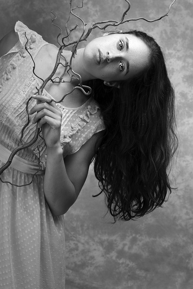
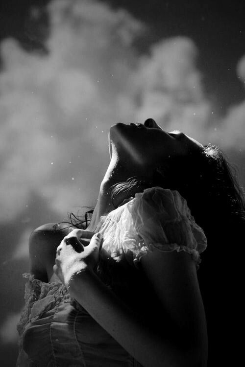
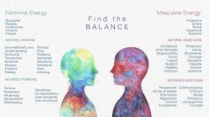
Femininity :

what is femininity ?

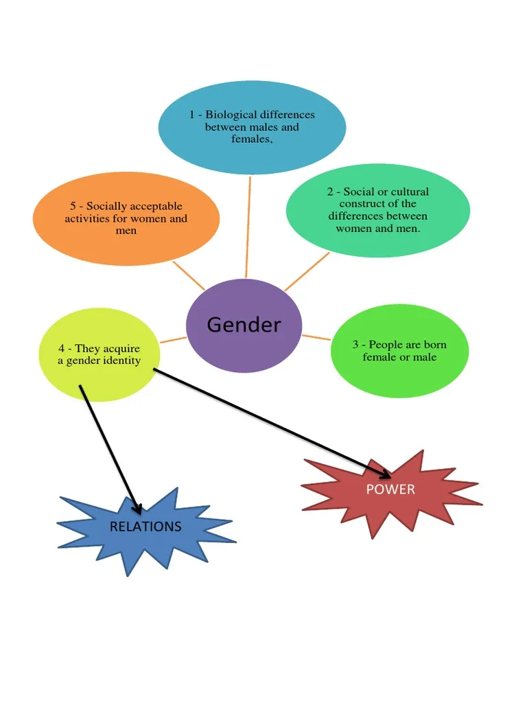
qualities or attributes regarded as characteristic of women or girls. Femininity can be understood as socially constructed, and there is also some evidence that some behaviours considered feminine are influenced by both cultural factors and biological factors.
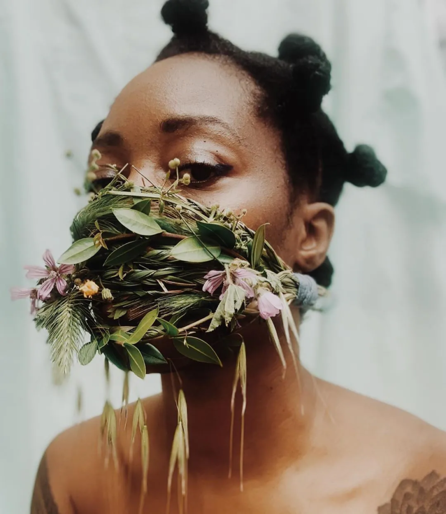
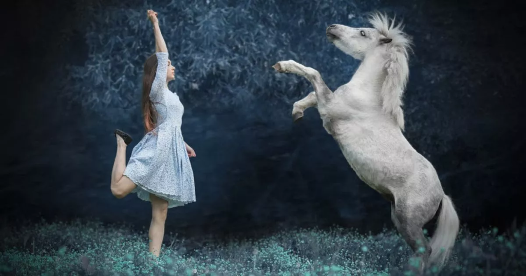
femininity can be altered and changed within a person depending on their area and surroundings, for example if someone was brought up with the old rules and laws based around woman and brought up to think they should be dominated and controlled by all the men in their life they would act different to someone who was brought up to be an independent woman and told to never rely on a man but to provide and live for themselves only without being controlled by an manly figure.
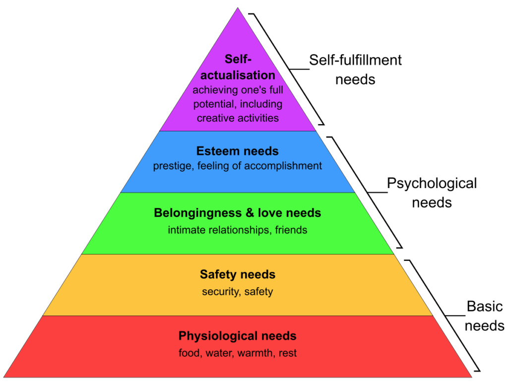
woman are seen to be the weaker gender of society who are seen as needy, weak and mentally unstable compared to men being viewed as strong, mentally stable and always the dominant one of the two, for many years it was a patriarchal society which means it was controlled by men this took years before woman were allowed to have a wider say in day to day things and to have the right to jobs and normal things that men had the priority to be able to do/have whereas woman were treated differently and never had as many rights or freedoms as men.

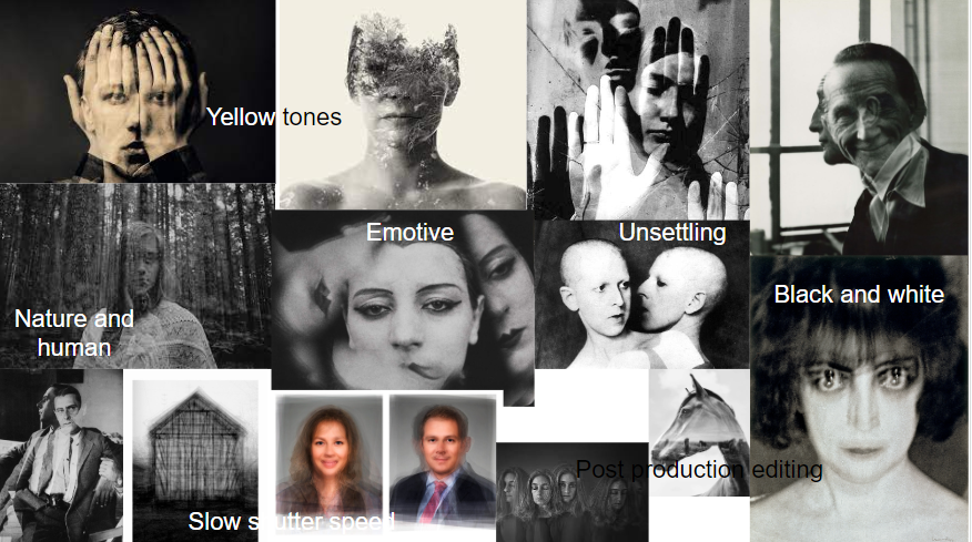
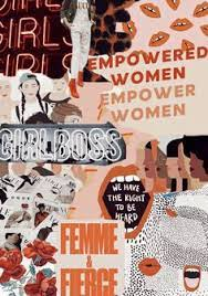
femininity mood board :
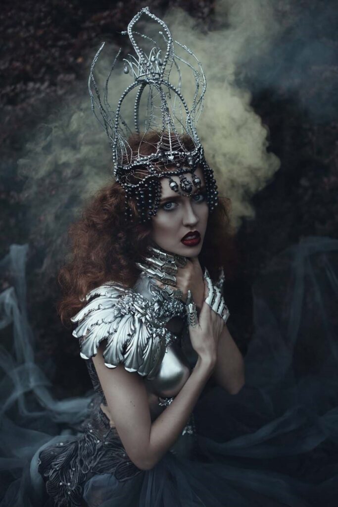
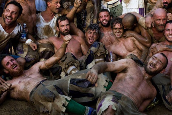
What is masculinity?

Masculinity is a set of attributes, behaviours, and roles associated with men and boys. Masculinity can be theoretically understood as socially constructed, and there is also evidence that some behaviours considered masculine are influenced by both cultural factors and biological factors.
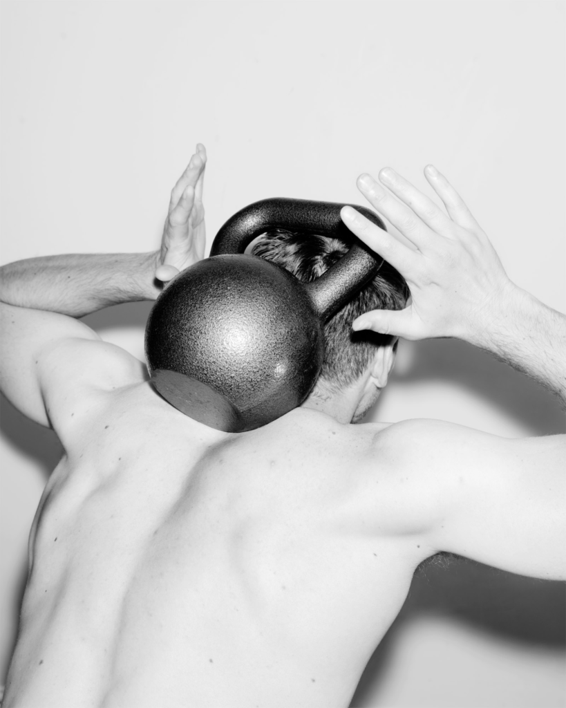
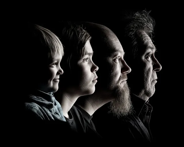
masculinity can be changed depending on the location and who men and boys are brought up surrounded by, for example some boys are brought up around a father who has more control then his mother and the mother may be the one who stays home and does all the housework, living in this household the boy would be brought up to be a man who dominates and makes sure he is in control this also means he would be tough minded and wouldn’t let his emotions get to him, however someone who lived in a household where both the mother and father have hard working paid jobs and both do the cleaning around the house that child would grow up knowing that both men and woman are equal and could possibly be less closed off emotionally rather then someone who was brought up knowing to hide their emotions.

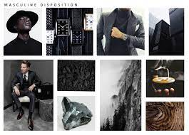
masculinity mood board :
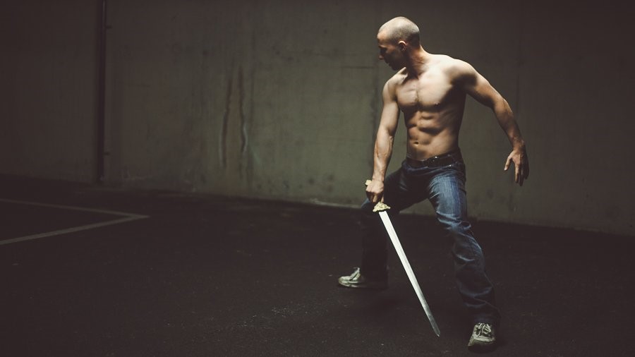
men have always been represented as the dominant, strong and hard working people of society which is a stereotype that has stuck around for years all the way until the end of the second world war where woman were finally given more rights.
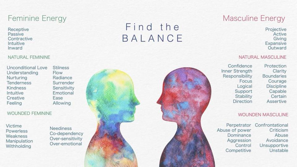
Binary Opposition and Culture Wars

Examples of binary opposition

According to Ferdinand de Saussure, binary opposition is the system by which, in language and thought, two theoretical opposites are strictly defined and set off against one another. Using binary opposites can often be very helpful in generating ideas for a photographic project as it provides a framework 

Good vs Evil Black vs white

peace vs war Man vs women

Masculinity and Femininity

Femininity

Qualities or attributes regarded as characteristics of women or girls. Women after world war 2 were expected to stay in and cook and look after the children. They were often seen as weak and not powerful and less than the man

Masculinity

Qualities or attributes regarded as characteristic of men or boys. The man was suppose to go out to work all day and earn the money for the family and he was seen as the powerful one in the family and who supports the family.

Culture Wars

Culture wars are cultural conflicts between different social groups and struggle for dominance and there values, beliefs and practices.

The term is commonly used to describe contemporary politics in western democracies  with issues such as abortionhomosexualitytransgender rightspornographymulticulturalismracial viewpoints and other cultural conflicts based on values, morality, and lifestyle being described as the major political cleavage

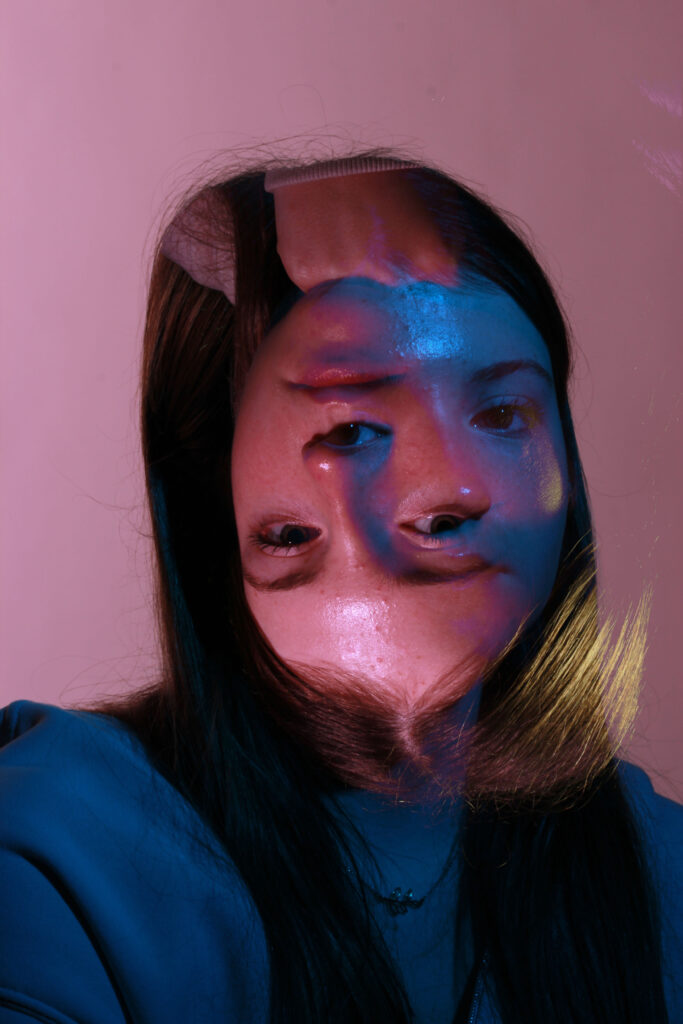
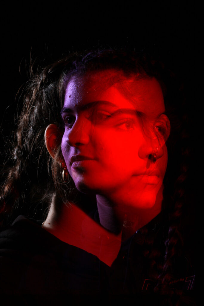
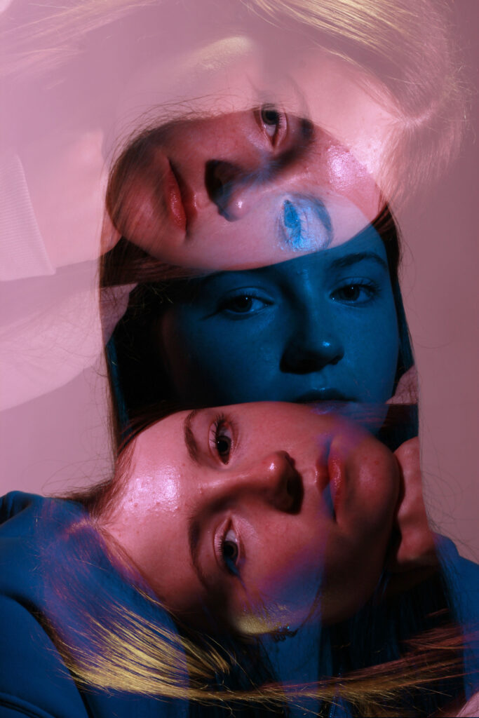
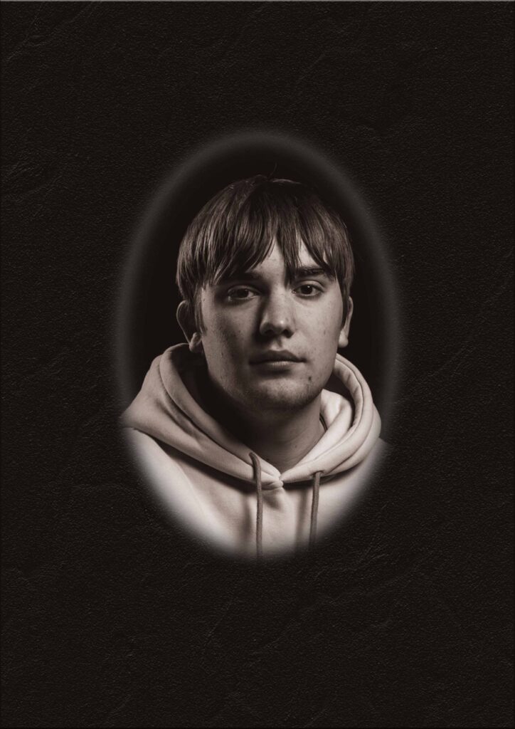
Double Exposure – Headshots

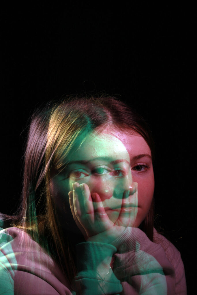
Double exposure is a photography technique used by many photographers around the world as a creative outlet or to create emotive pieces of art like photography. It can be done in many different ways, from using a slow shutter speed and movement to create raw images with double exposure elements, to post production editing on photoshop layering multiple different shots to create a desired results. If there is a particular aim for a shoot then it is more likely the photographer will take multiple photos and merge them together in photoshop, however for things like light painting it tends to all be done in one very slow shot. The results are often emotive, surreal feeling photos commonly having a creepy appearance.
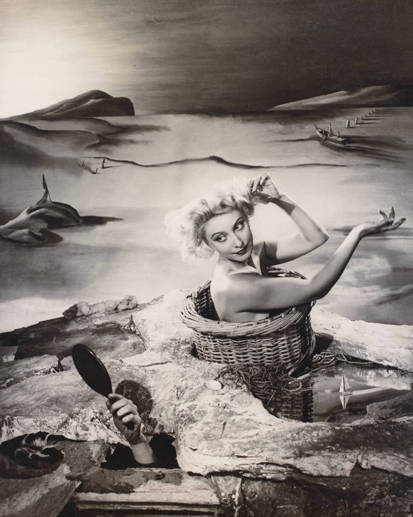
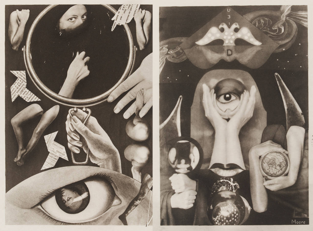
Surrealist photography

The style of surrealist photography had a big impact on the idea of double exposure photography. As it was the first variation of the double exposure technique often used to show multiple, odd objects or subjects, to put across ideas, in one shot. First appear as a style just after the first world war, as the horrors had shifted the perception of reality for many people. It was actually a French writer who first released a book, that rejected the rational way of seeing the world and instead asked people to explore creativity and imagination to view as perceptions of life and the world instead, this is what first solidified the surrealist movement. Surrealist styles created an exciting challenge for photographers as while a painter can take ideas from their imagination with brush and paint, a photograph is derived from the real, material world.

Duane Michal’s

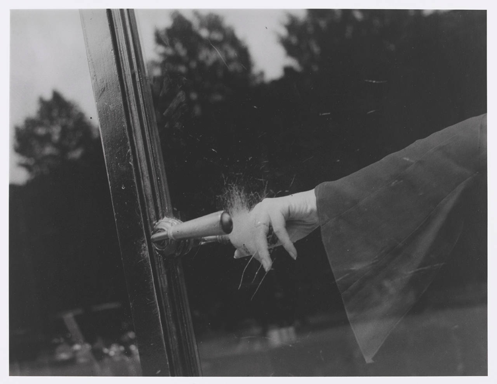
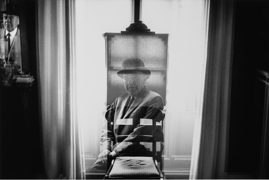
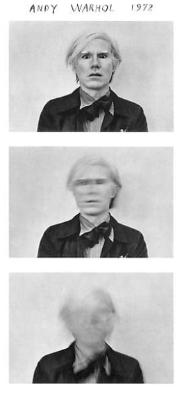
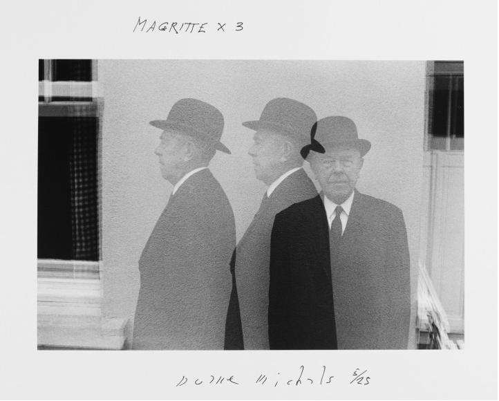
Duane Michal’s is known world wide for his photography work using multiple exposures, series and text over the past years. He first made strides in the photography world in the 1960’s when the world was thoroughly influenced by photojournalism in which Michal’s himself manipulated and changed to allow for his work to tell narratives. I feel the political aspirations are impotent. They can never be seen. If they are, it will only be by a limited audience. If one is to act politically, one simply puts down the camera and goes out and does something. I think of someone like Heartfield who ridiculed the Nazis. Who very creatively took great stands. He could have been killed at any moment, he was Jewish, and my God what the guy did. It was extraordinary. You don’t see that now. Interestingly and unlike most photographers/artists Duane feels that aspirations are pointless to put it simply and aims for the viewer to see the photo and not much more, unless you choose to.
Duane Michal’s Research

Duane Michal’s first began to explore art and photography at 14 years old when he started a watercolour class, he went onto continue his education by completing a B.A. at Denver university before then completing two years in the army before retuning to school to become a graphic designer however he never completed his studies. He actually began his photography career while on holiday in 1958, the work he produced during this holiday actually was displayed in the underground gallery in New York in 1963. Continuing his career he was a commercial photographer also covering filming. He did not have his own studio and instead took portraits of people in their own environment which was a complete contrast to some of the famous photographers of the time like Irving Penn. As his career continued he was asked by the Mexican government to photograph the 1968 summer Olympics, which built a following for him to then continue on personal projects before releasing a book and showcasing more of his work.

Photoshoot Plan

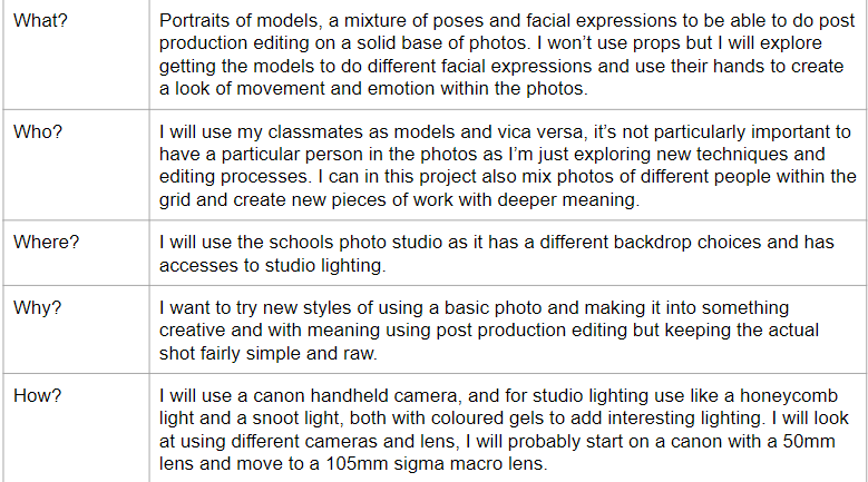
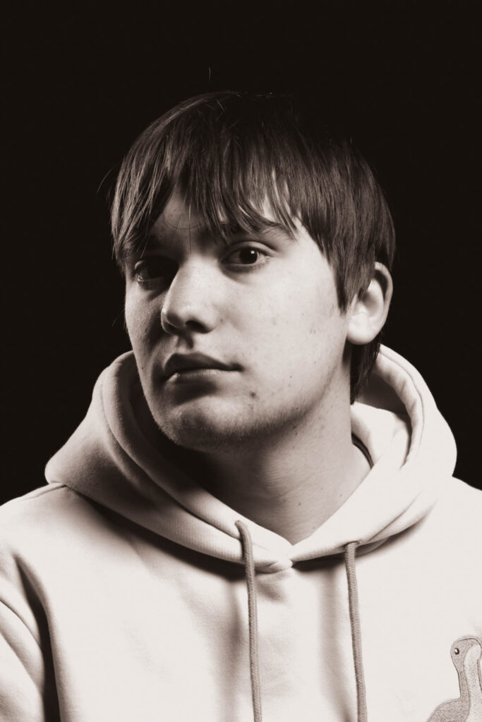
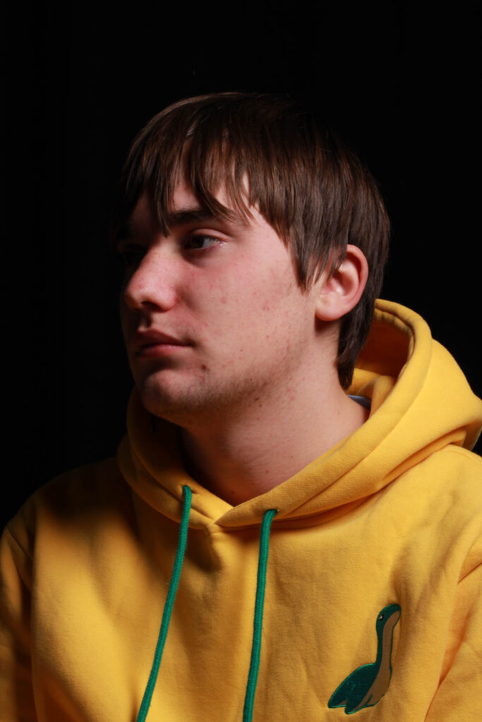
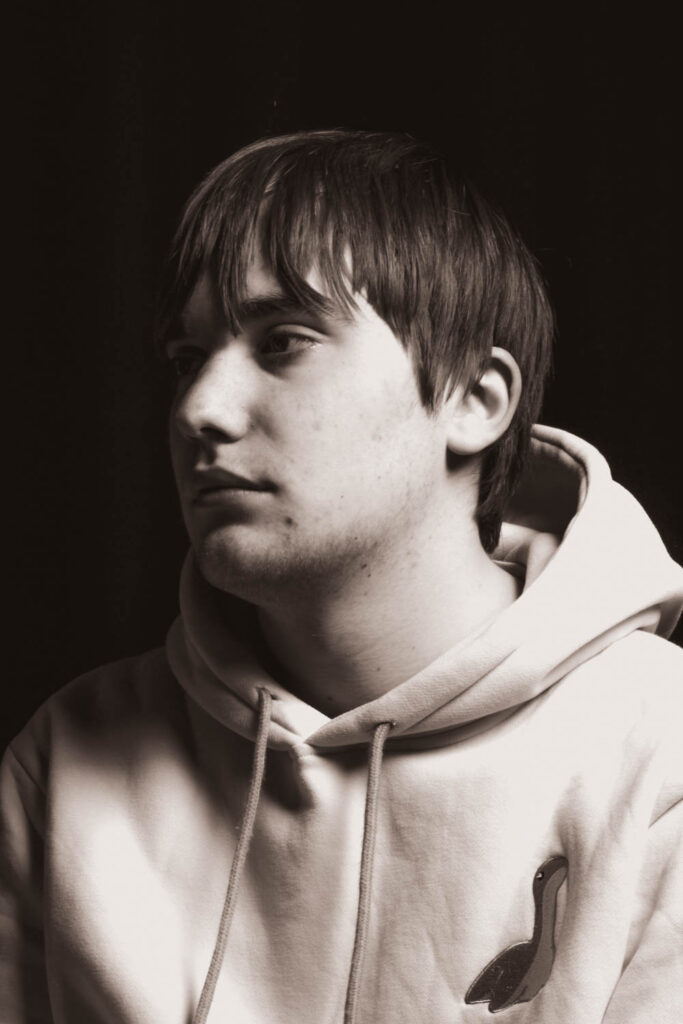
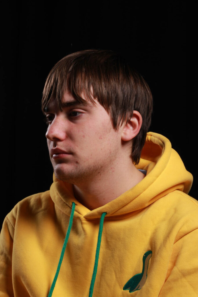
Headshot Photoshoot and Format Experimentation

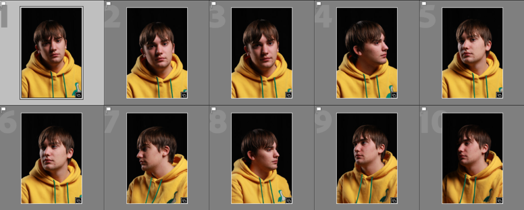
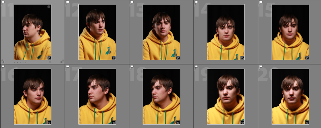
Photoshoot:

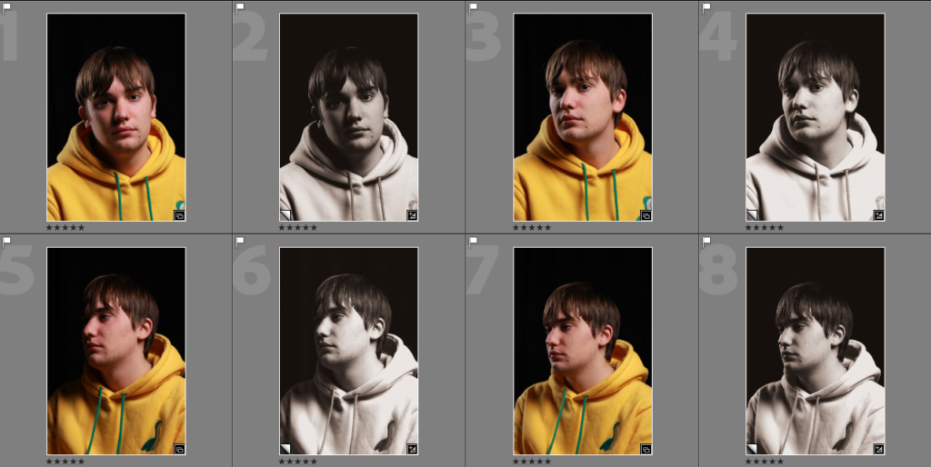
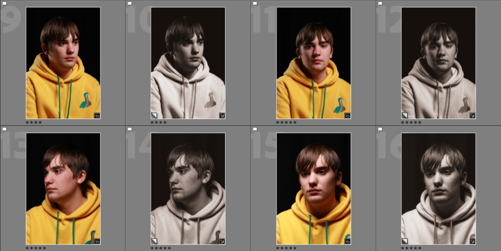
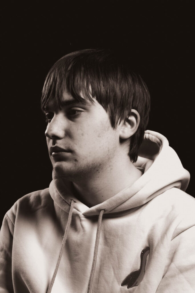
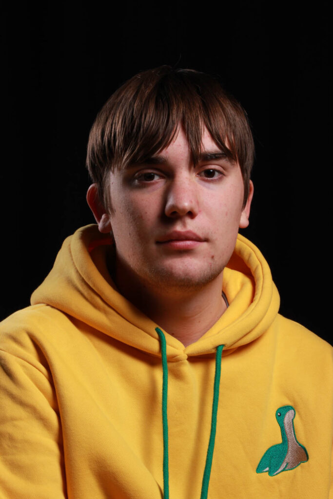
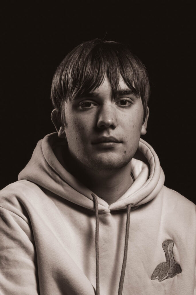
Best photos

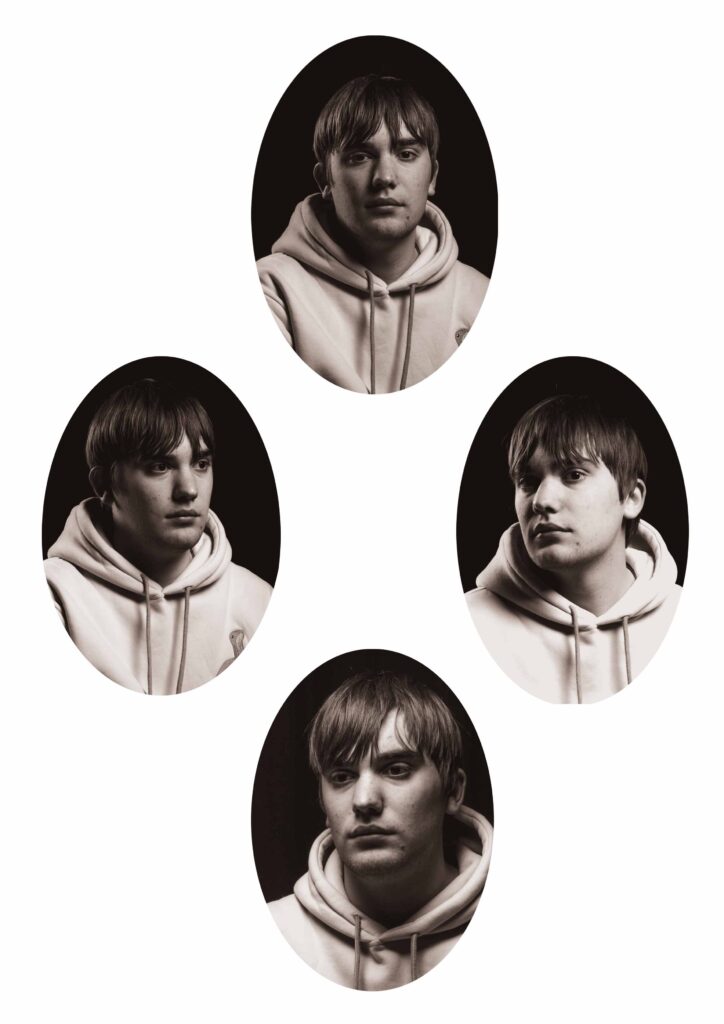
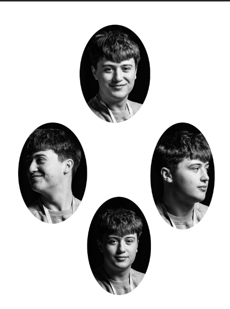
Experimentation 1 – Diamond cameo

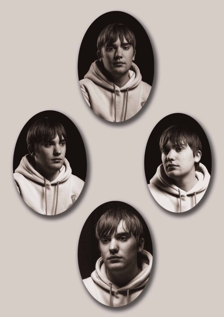
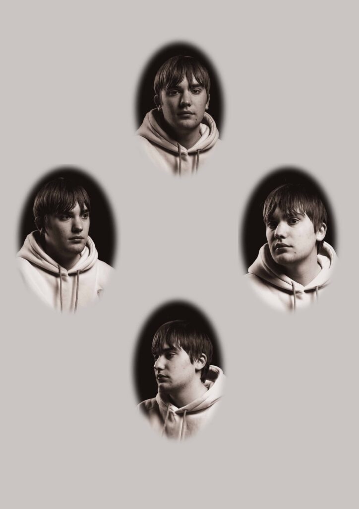
I have experimented with different colour backgrounds as well as a drop shadow and border around the images.

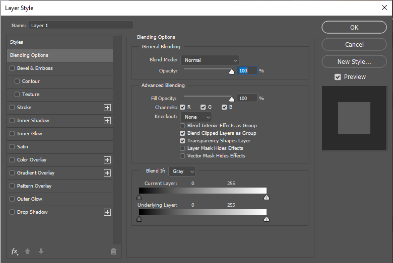
I have made these images by using the drop box that appears after you double click on one of my selected images;

I used this to adjust the border thickness and colour, as well as adjusting the drop shadows. I then right clicked on my edited photo and pasted the adjustments onto my other images;

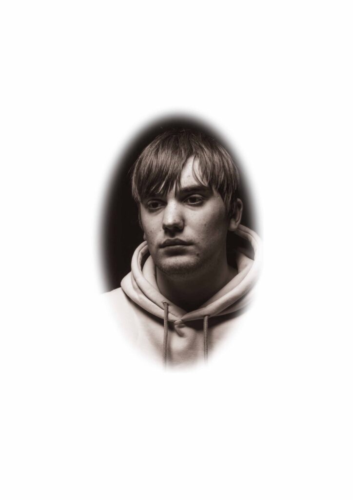
Experimentation 2 – Vignette portraits

Other experiments

Evaluation

I have taken various pictures of different angles of my subject like how Henry Mullens did with his portraits.

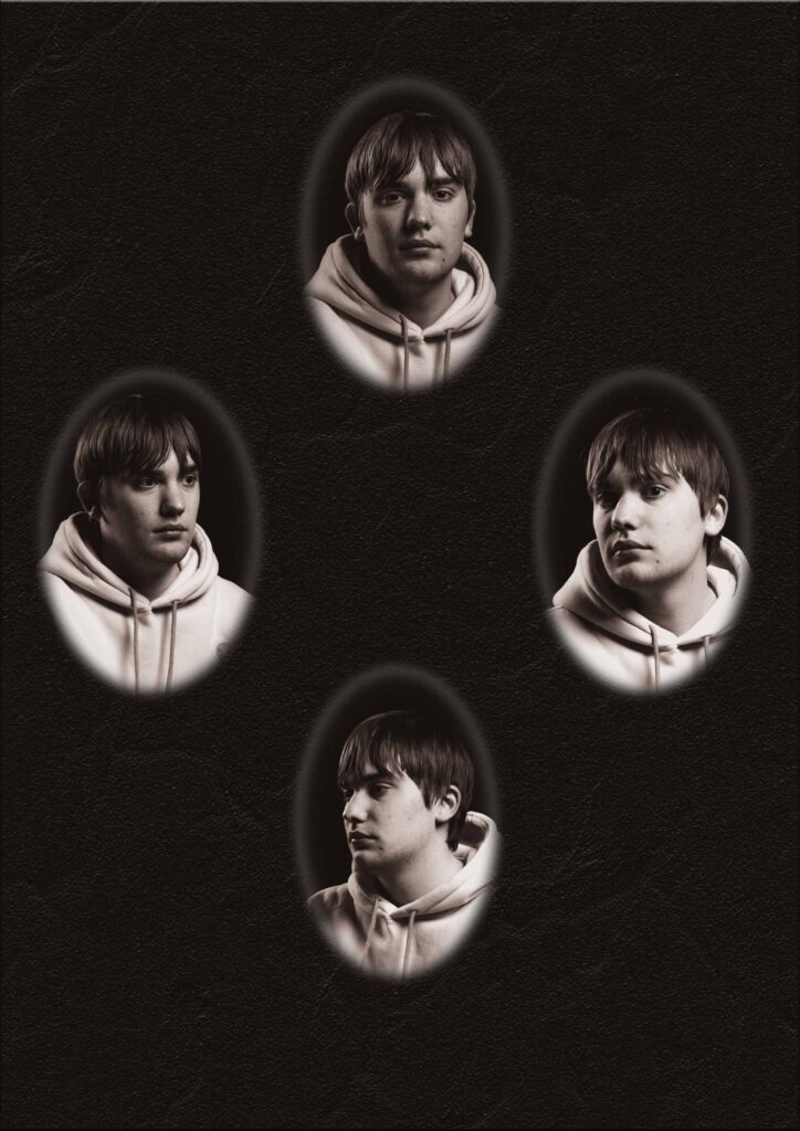
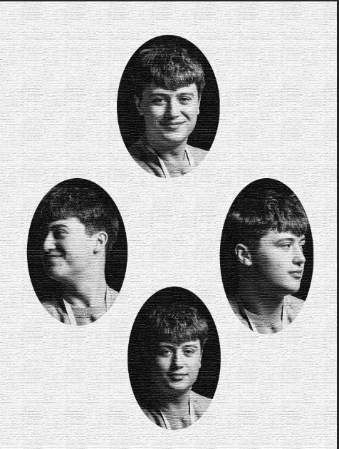
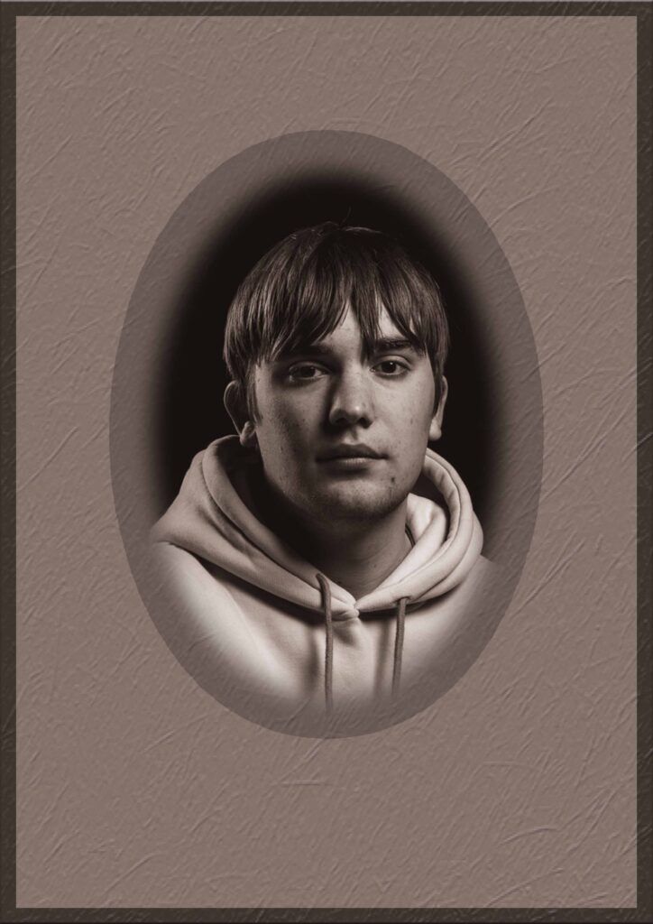
I’ve experimented with various textured backgrounds for my images to try and add to an old or worn down look, I have also tested different borders around the background and image itself.

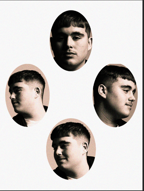
I have used warm browns and beige to add more colour and make my images more interesting and not as flat. I have also attempted to combine Vignette portraits with a Diamond cameo format as well as some other formats.

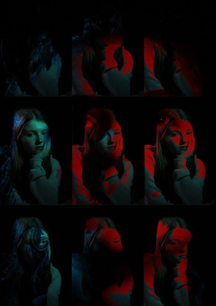
experimenting different edits on photoshop

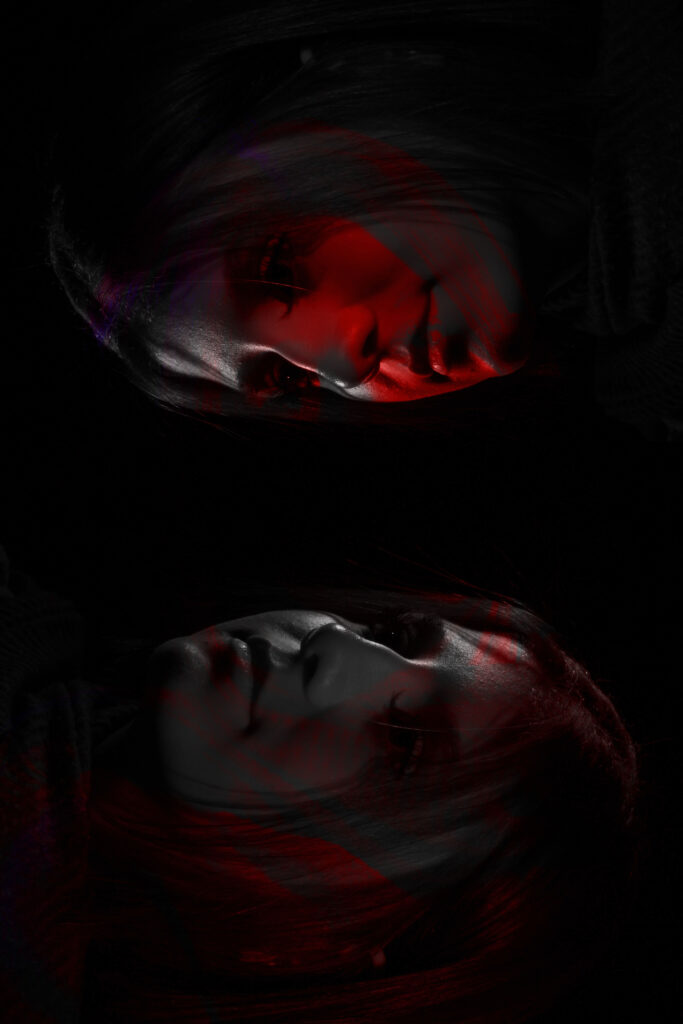
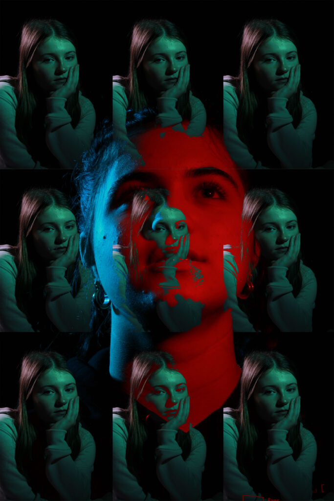
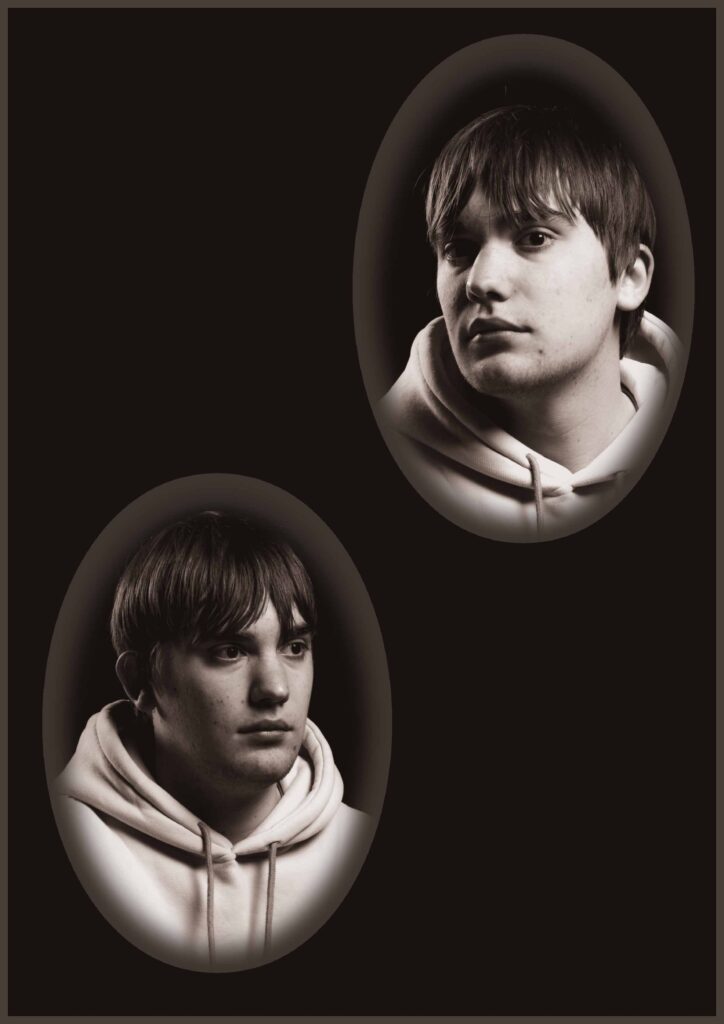
Here I used Photoshop to edit some of my photos together. I had to press a specific mode to choose what type of overlay I wanted to have on each photo. One of the photos I made, I started by putting a background onto photoshop and then applied different photos that I thought would work best. I then used the Elliptical marquee tool to cut out circles of the models face, this then aloud me to get the diamond cameo effect. I turned the photo black and white to make it blend in to the background a little bit better.

For the bottom ones I had experimented on photoshop to see if I could mix up the photos a little bit, I started by importing more than one photo on top of another and then selecting a blending mode or even placing on each end of the page so I could see both faces, whether it was the same face or a different one.

I personally really like how the top left one and the bottom right one turned out as you can see the facial details quite well. It also helps me to identify what hard and soft lighting is. These two photos are quite different as one is light an the other one is rather dark and another is light.

overall I’m really happy how things turned out and how well my ideas came together, although a lot of my final outcomes looks quite similar I made sure to use different photos so that each outcome could have something unique and different. I personally really like how the bottom two ideas worked out as they are very different to my first attempt to edit, although I didn’t use the same photos, I used different affects. However for these bottom two photos I had to copy each layer of the green photo and place it next to each other to create a whole collage of photos, this really impacted the final result.

For these photos I only used on specific tool to edit them, This impacted how much each overlay of the photo could be seen whether I put it on vivid light or soft light. I chose a range of them depending on the lights and shadows of each photograph.

Henry Mullins- Diamond Cameo Editing

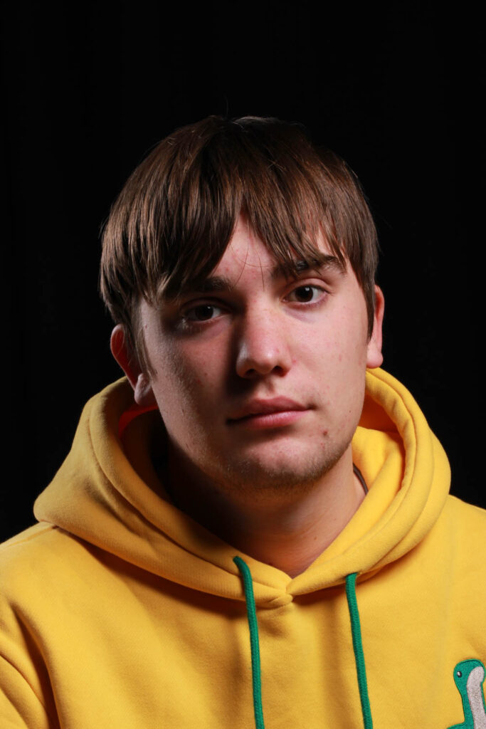
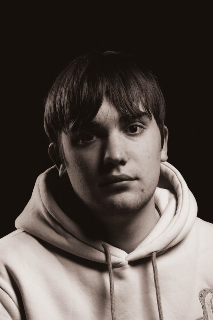
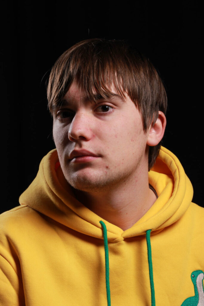
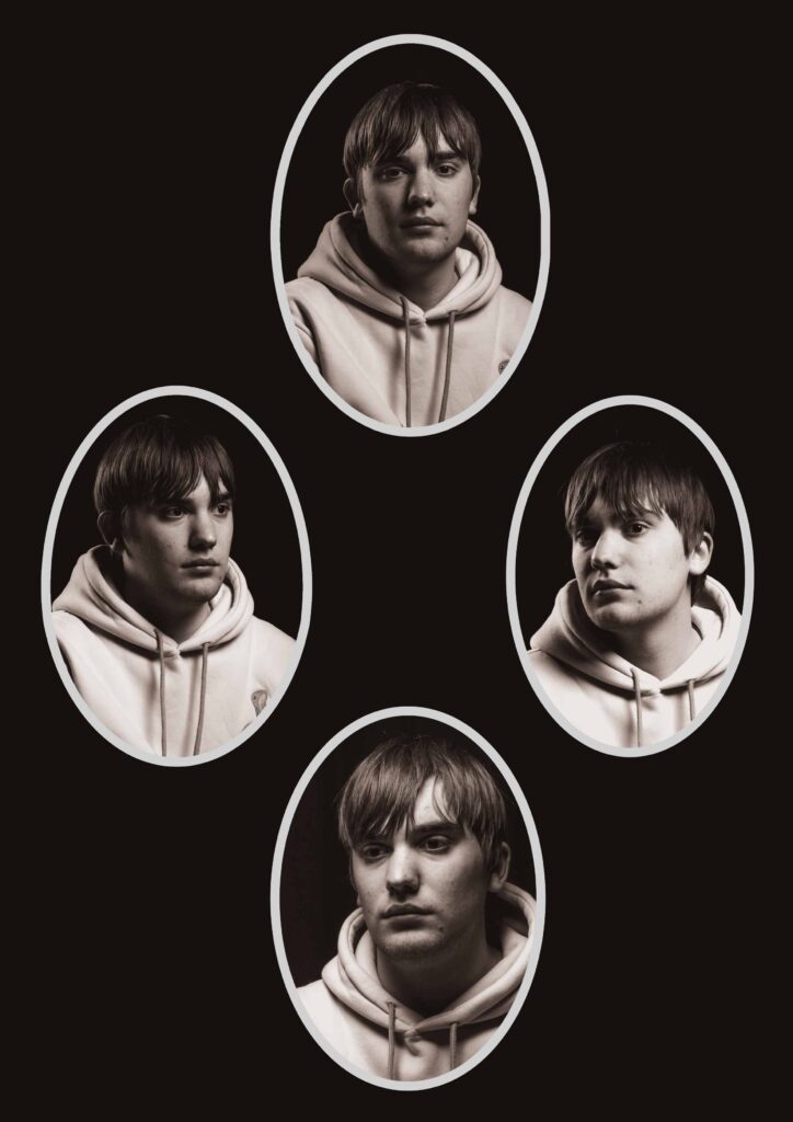
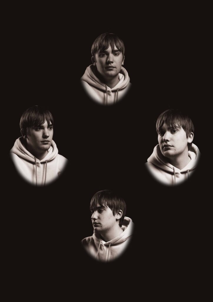
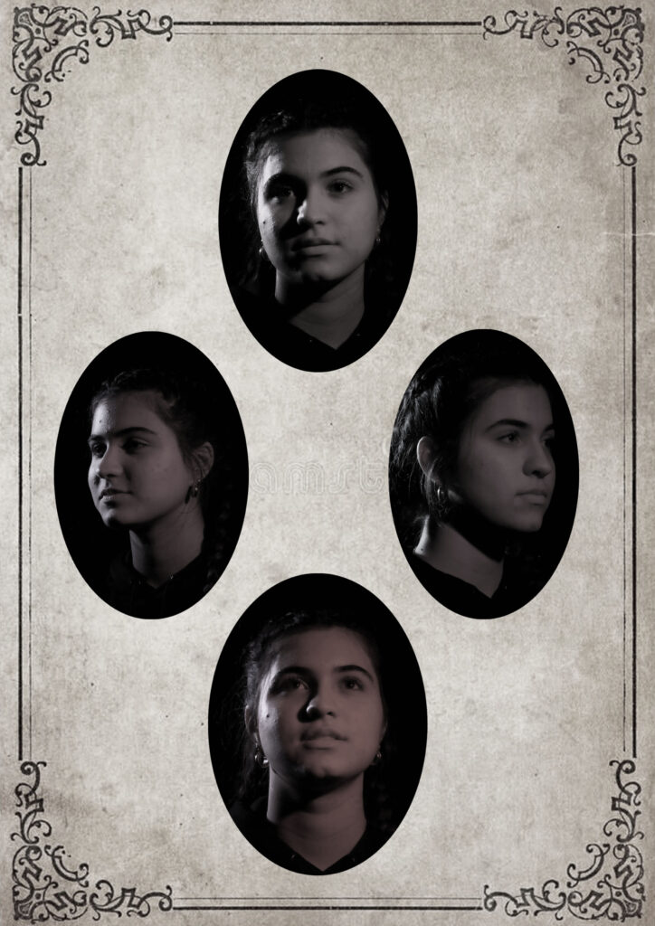
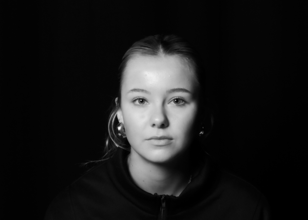
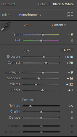
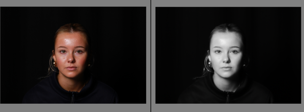
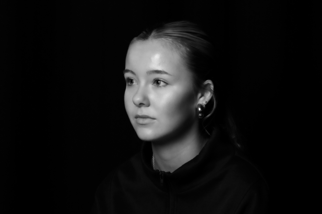
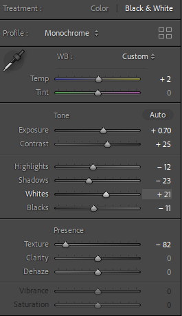
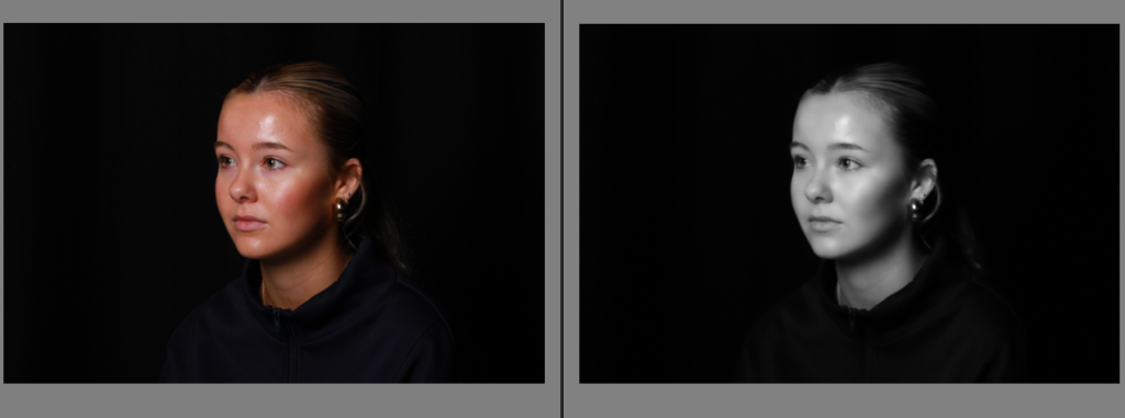
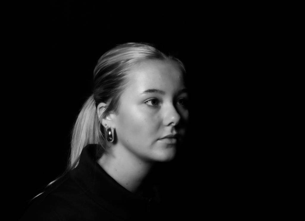
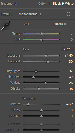
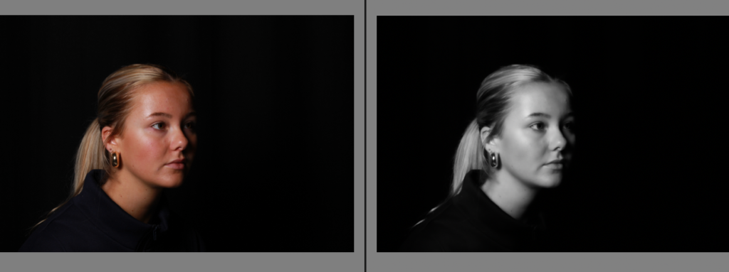
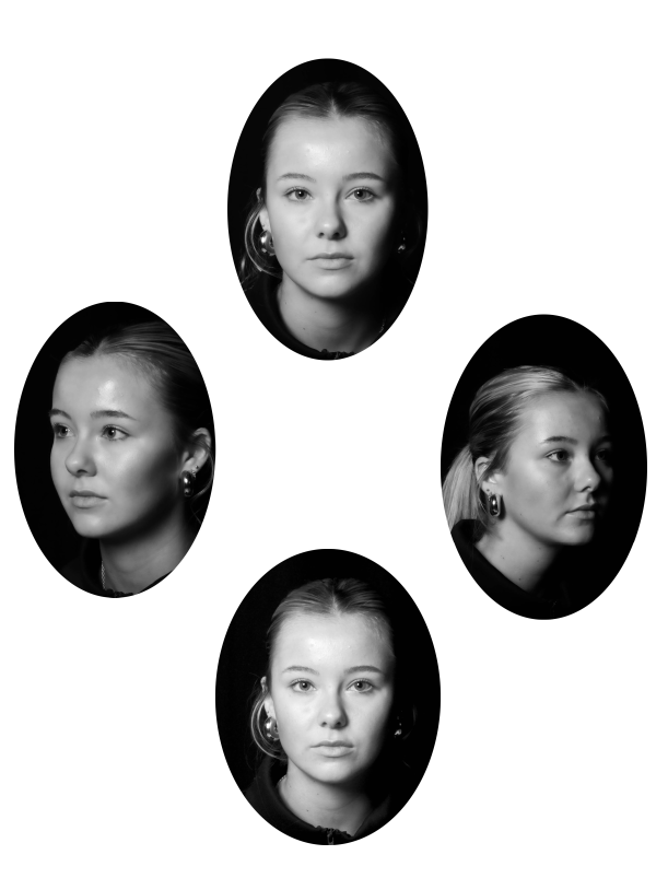
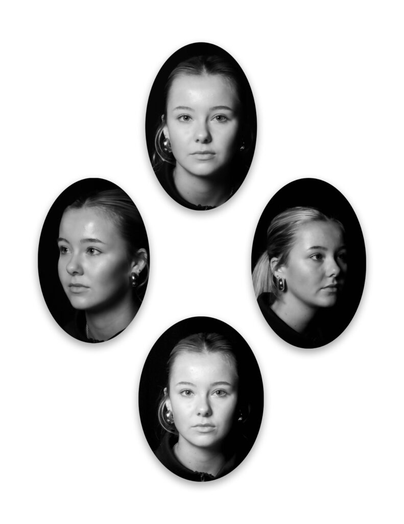
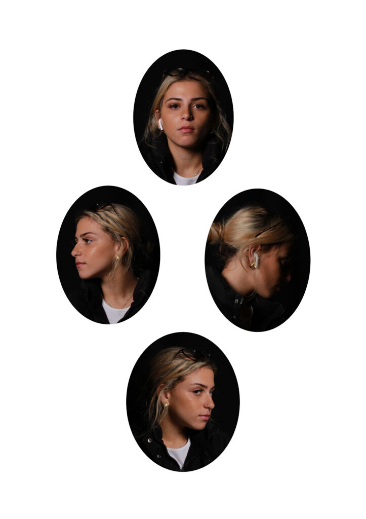
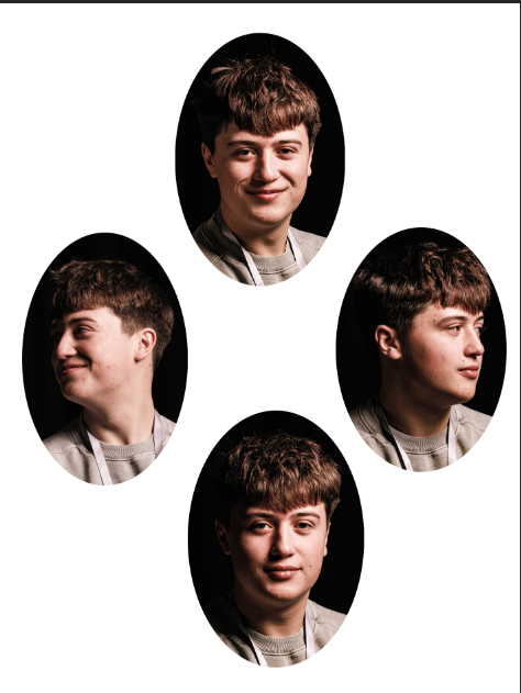
Within these images, we went down to the studio and experimented taking photos in all different angles to make it inspired from Henry Mullin’s diamond cameo technique which shows all angles in a photoshoot which creates the image to be unique and more appealing to the eye. In each image I increased the exposure and contrast to make the image brighter but keeping it contrasted with shadows to deepen the image. I decreased the highlights as the exposure already made it bright enough to the correct amount and emphasized it with increasing the shadows to deepen and add more value to the image itself. I decreased the texture to make the image look more professional and smoother to finalize the image. To make it more similar to Mullin’s work my next step was to actually put these images in an oval shape using Adobe Lightroom and place them on a blank space in a diamond layout to create and finalize this technique.

Next step: Put them in an oval shape in a diamond layout.

Different layout ideas-

My Favourite-

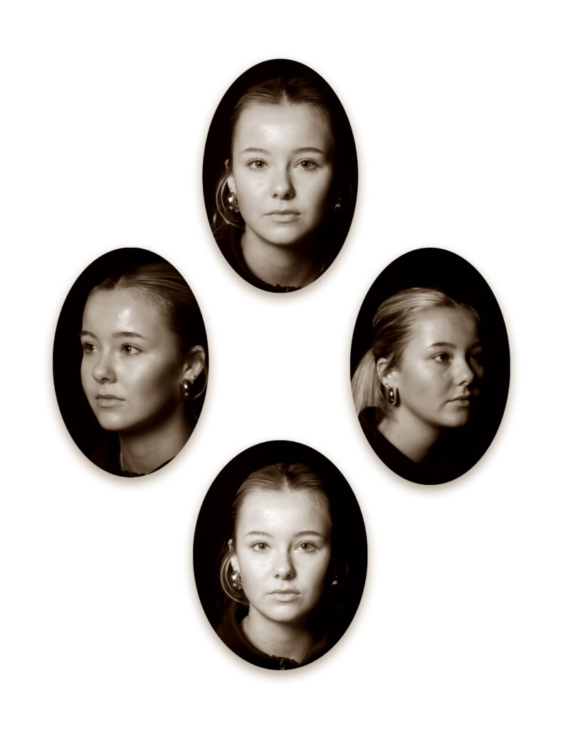
Diamond Cameo

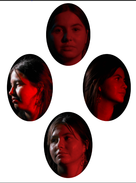
The Patent Diamond Cameo photograph was registered by F.R. Window of London in 1864. Four small oval portraits (1″ x 3/4“) were placed on a carte de visite in the shape of a diamond, each portrait being of the same person photographed in a different position. A special camera made by Dallmeyer was used in which the one glass negative was moved to a new position in the back of camera after each portrait had been taken, and when the paper print had been pasted on the card a special press was used to punch the four portraits up into a convex cameo shape.

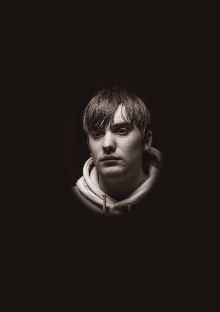
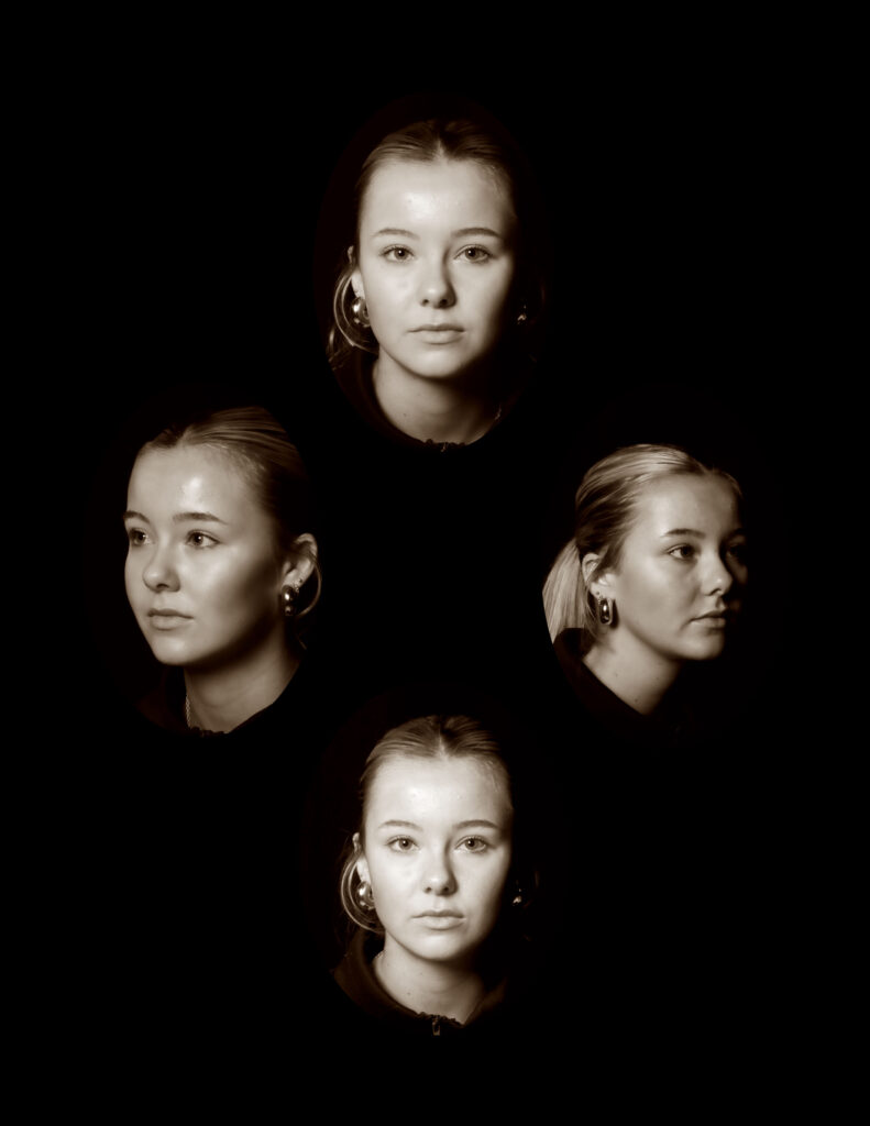
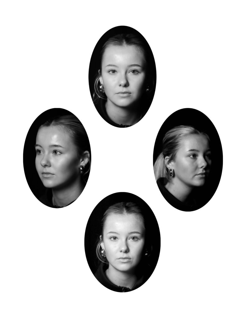
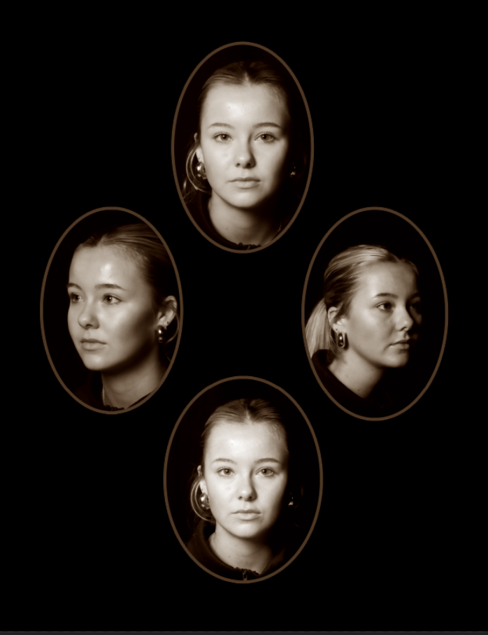
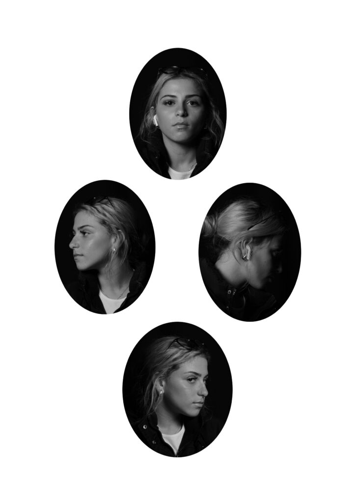
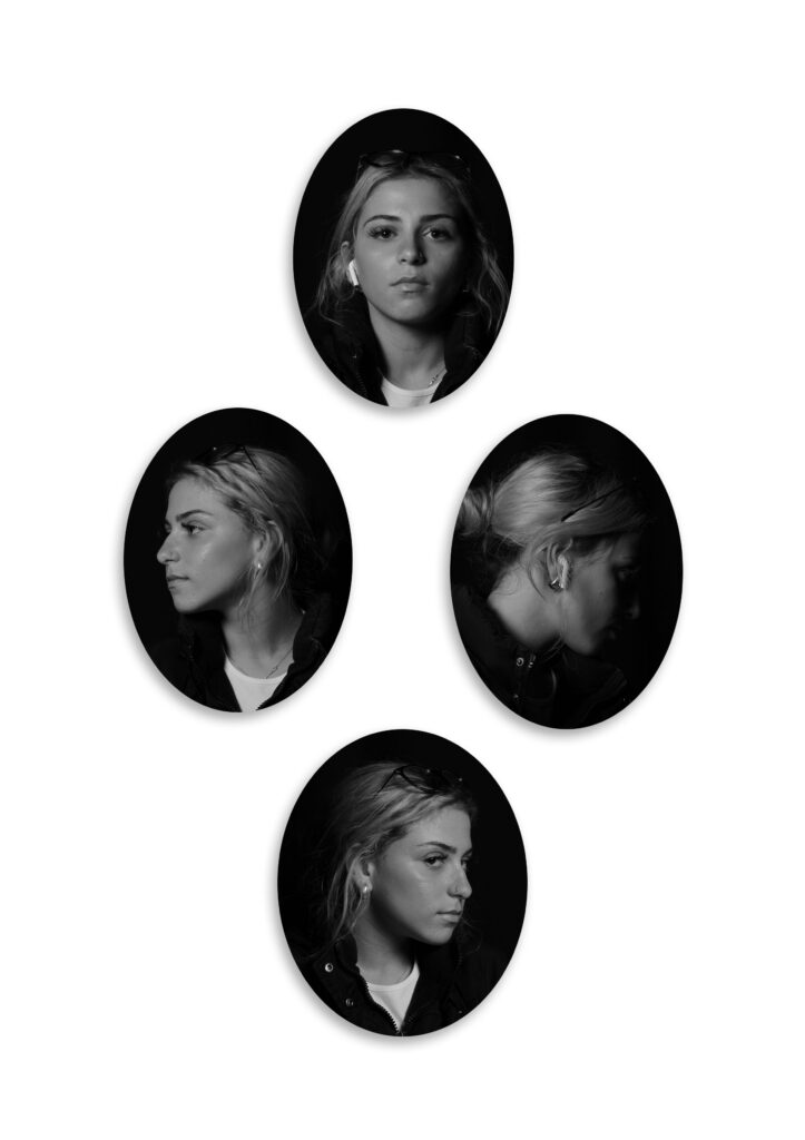
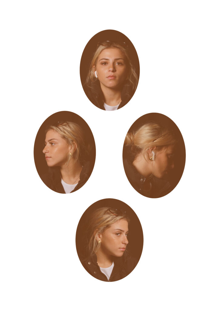
For my attempts of creating a diamond cameo, i used 4 different styles.

I started off just creating a simple diamond cameo, no edits, just the pictures. Then, I made them black and white to create another effect. After that, i added shadows to the picture. Finally, I changed the colour/filter of each picture to make it look older.

Diamond Cameos

This is my first diamond cameo, I edited the actual photos of Lightroom then exported them over to photoshop and turned them into this diamond cameo.

These were two more diamond cameos with the same image but edited differently and placed in diamond cameo form, in the second one I gave it a different texture to look more old and mysterious.

How I make my diamond cameos

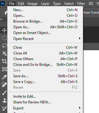
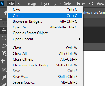
Firstly I go on to photoshop, and export my image I want to use off of Lightroom onto photoshop, by opening file.

This image has an empty alt attribute; its file name is image-813.png

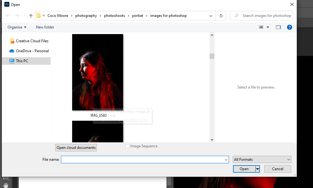
Then once on file I select open.

Once I press open it gives me the images I have exported and I select one

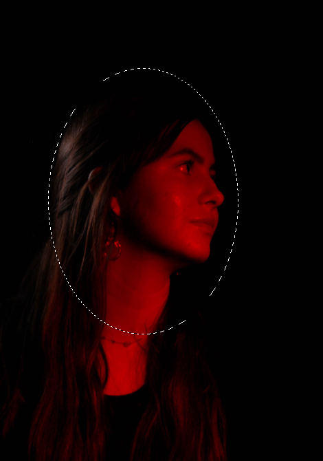
After that I press this button on photoshop, which allows me to make an oval shape.

Then I shape the oval around the face.

After that I select this button which cuts the oval shape and allows me to move it around and place it onto the blank page to create my diamond cameo. Then I do the same for all the images and place them correctly.

Headshot experiments

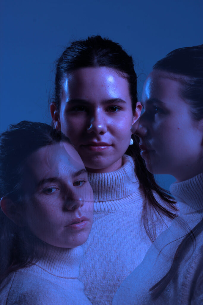
Experiment 1:

Editing process:

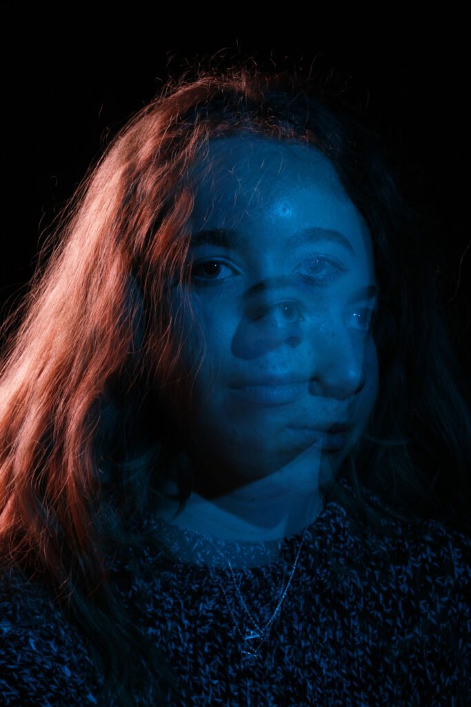
  • I opened Adobe Photoshop.
  • On the top left, I pressed file and open and then selected one of the pictures that I wanted to use. I left the picture as it was and then pressed file and open and chose my second picture.
  • With the second picture, on the left side I selected the object selection tool and pressed on the photo, precisely the subjects face. It selected the subjects face and then I pressed on it again so that it showed a pink outline.
  • After, I right clicked on my mouse and pressed layer via copy. it created a copy of the subjects face whilst still keeping the picture the same.
  • I pressed the move tool on the left side of the screen on photoshop.
  • I grabbed the copy of the subjects cut out face and dragged it to the top of the screen where it showed the first tab I opened which was the one where it had my first picture. The cut out was transferred to my first picture and I placed the cut out on the desired place.
  • I repeated the cut out process with one more of my pictures and dragged it to my first picture and placed it where I thought looked best.
  • As I placed my cut outs on the first picture, it created two layers, one layer for each cut out so overall I had three layers.
  • In each layer minus the first later, I put the opacity to 43% which is on the right bottom side of the screen to create a ghost like texture to the two cut outs.
  • I then I pressed on the background which is on the right bottom of the screen and pressed flatten image so that I could add some adjustments to the image.
  • On the right bottom side of the screen I pressed adjustments and pressed once on the blue mood adjustment.
  • Then I saved the image to a folder and that’s how I created this image.

Evaluation and Critique: I really liked the result of this image because I like how the editing gave the bland picture and ethereal and euphoria sense to it. I think that it is a creative example of a headshot example. Out of the three experiments, this image is my favourite one. However, I could’ve given the picture some texture to create more diversity within the picture. I could’ve experienced with more of the editing tools in photoshop. Overall I’m really satisfied with the picture.

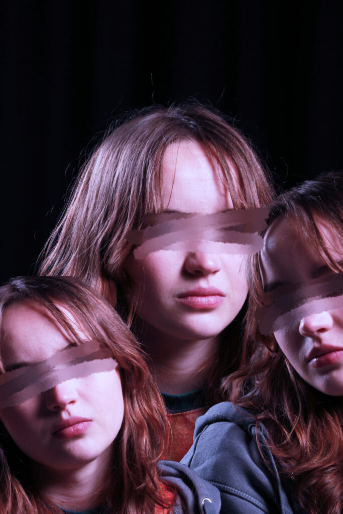
Experiment 2:

Editing process:

  • I opened Adobe Photoshop.
  • On the top left, I pressed file and open and then selected one of the pictures that I wanted to use. I left the picture as it was and then pressed file and open and chose my second picture.
  • With the second picture, on the left side I selected the object selection tool and pressed on the photo, precisely the subjects face. It selected the subjects face and then I pressed on it again so that it showed a pink outline.
  • After, I right clicked on my mouse and pressed layer via copy. it created a copy of the subjects face whilst still keeping the picture the same.
  • I pressed the move tool on the left side of the screen on photoshop.
  • I grabbed the copy of the subjects cut out face and dragged it to the top of the screen where it showed the first tab I opened which was the one where it had my first picture. The cut out was transferred to my first picture and I placed the cut out on the desired place.
  • I repeated the cut out process with one more of my pictures and dragged it to my first picture and placed it where I thought looked best.
  • As I placed my cut outs on the first picture, it created two layers, one layer for each cut out so overall I had three layers.
  • In each layer minus the first later, I put the opacity to 43% which is on the right bottom side of the screen to create a ghost like texture to the two cut outs.
  • I then I pressed on the background which is on the right bottom of the screen and pressed flatten image so that I could add some adjustments to the image.
  • On the right bottom side of the screen I pressed adjustments and pressed once on the moody blue.
  • Then I pressed the smudge tool on the left side of the screen and pressed the smudge tool again because it show two options, blur tool or smudge tool.
  • On the top left corner of the screen, I pressed on the icon that showed the side of the smudge tool and what type of smudge tool you are using and I selected ‘wet media brushes’ and kept the size to 50px and then from the wet media brushes file, I selected ‘kyle’s paintbox’
  • I smudged each pair of eyes that the image had.
  • I saved the picture onto a file and that was how I edited this picture.

Evaluation and Critique: I quite liked the finish product of this image. I like the colour and the overall effect it has. This picture shows a sense of loss of identity or not wanting be aware of what’s surrounding them. However I think the editing in this picture I simple. I wish that it was a more divergent image that had more unique editing. I could’ve experienced with the different tools in photoshop.

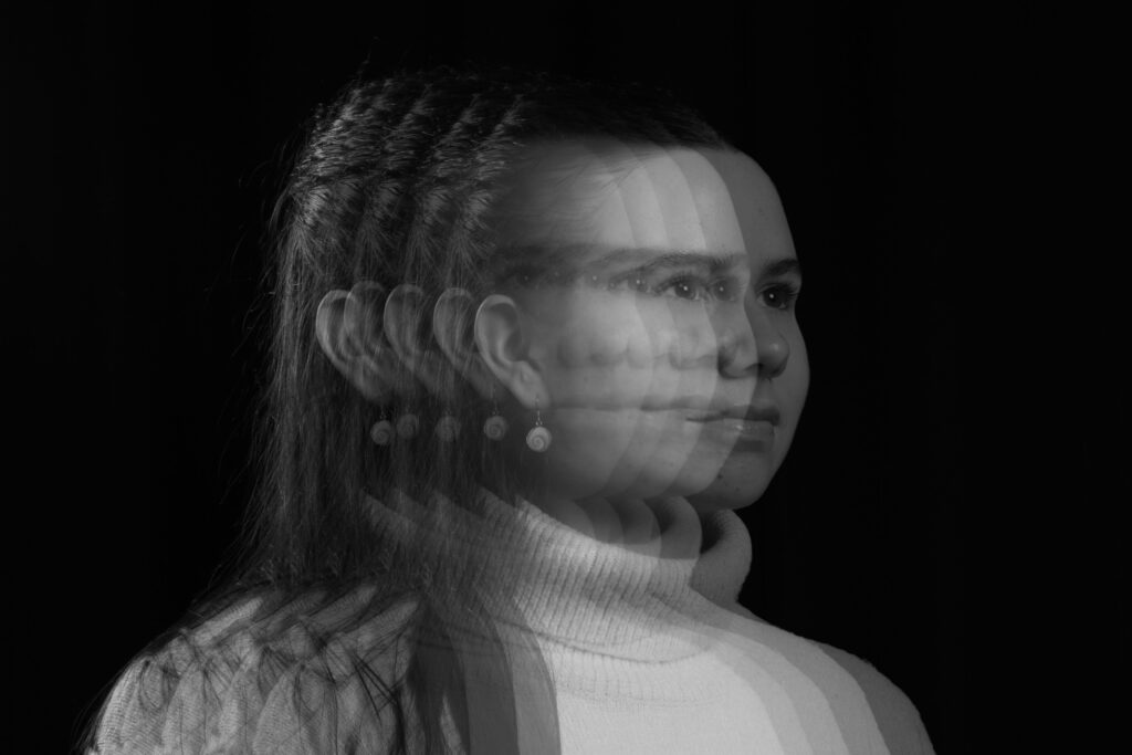
Experiment 3:

Editing process:

  • I opened Adobe Photoshop.
  • On the top left, I pressed file and open and then selected one of the pictures that I wanted to use. I left the picture as it was and then pressed file and open and chose the same picture.
  • With the same picture, on a different tab, on the left side I selected the object selection tool and pressed on the photo, precisely the subjects face. It selected the subjects face and then I pressed on it again so that it showed a pink outline.
  • After, I right clicked on my mouse and pressed layer via copy. it created a copy of the subjects face whilst still keeping the picture the same.
  • I pressed the move tool on the left side of the screen on photoshop.
  • I grabbed the copy of the subjects cut out face and dragged it to the top of the screen where it showed the first tab I opened which was the one where it the first picture. The cut out was transferred to my first picture and I placed the cut out on the desired place.
  • After dragging the first set of the cut out face, I did the same thing three more times, using the same picture as my first picture, just the face cut out, dragging the three set of cut outs to my first picture and placed it where I thought looked best.
  • As I placed my cut outs on the first picture, it created 4 layers, one layer for each cut out so overall I had 5 layers, including the first picture.
  • In each layer minus the first later, I put the opacity to 43% which is on the right bottom side of the screen to create a ghost like texture to the 4 cut outs.
  • I then I pressed on the background which is on the right bottom of the screen and pressed flatten image so that I could add some adjustments to the image.
  • On the right bottom side of the screen I pressed adjustments and pressed once on the neutral adjustment.
  • Then I saved the image to a folder and that’s how I created this image.

Evaluation and critique: I really like this picture, I like how I was able to create this motion like sense to the picture, making it look like I was able to capture the subjects movement in layers. I think that this picture is quite unique and detailed. However I could’ve experienced with texture or different colours instead of the usual black and white.