Grid Photo Editing – Headshots

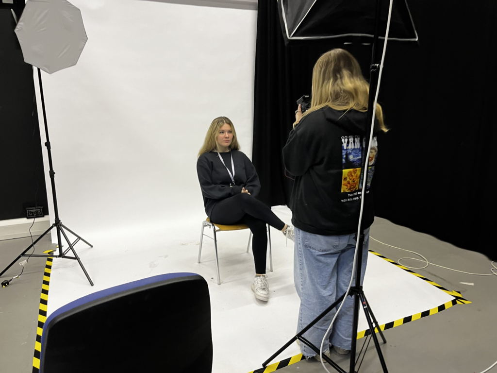
Lighting Set up

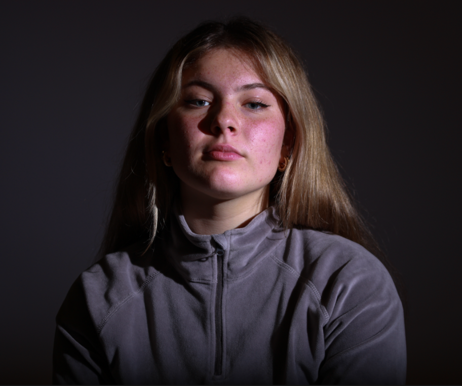
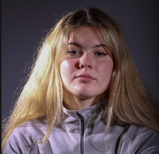
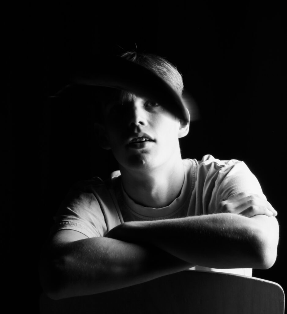
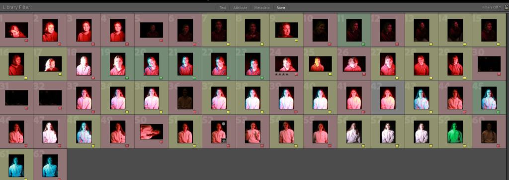
This is the lighting set up I used, by having the flash head behind me as the photographer it allowed for the light to cover the entirety of the models face, I also used another flash head with a transmitter on the camera for both, to light one side of the models face to create interesting and dynamic Chiaroscuro lighting. By having two different flash heads it allowed for good lighting without over exposing the model.
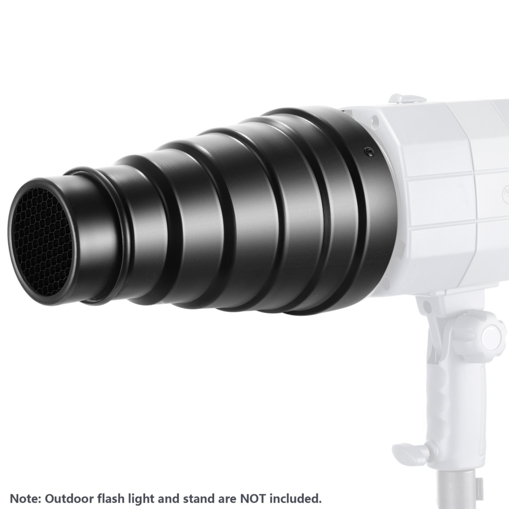
In some of the later photos I used a honey comb filter and coloured gels over a snoot light to keep similar lighting but a coloured filter over the image. This was great as it allowed for me to experiment with different lighting and multiple colours by holding a acetate sheet over one of the flash heads at the same time.
Edit One

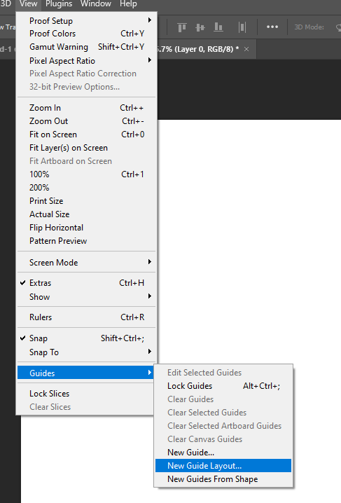
To start making my grid layout I started by opening a document with a width of 1080 and then a res of 72 pixels/inch. I then went onto the view drop down tab and selected guide – new guide layout.
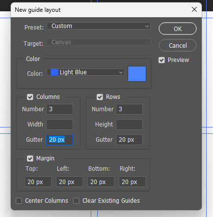
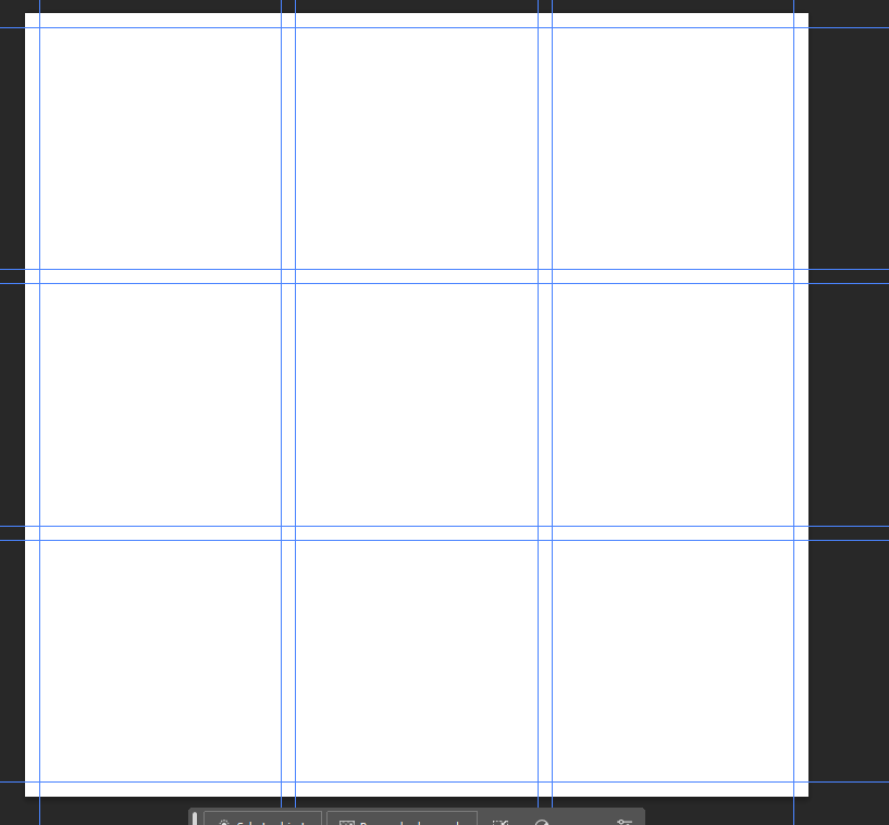
I then put in the details I wanted, I chose to have a gutter and margin to try to keep space between each shot.

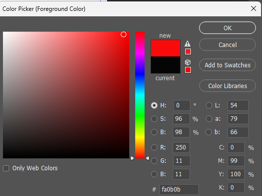
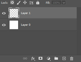
After that I created a new layer and then on the rectangular marquee tool picked a new colour from the side bar.
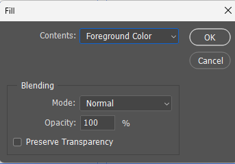
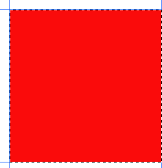
Next I selected a box using the rectangle marquee tool and the right clicked and pressed fill, foreground colour.
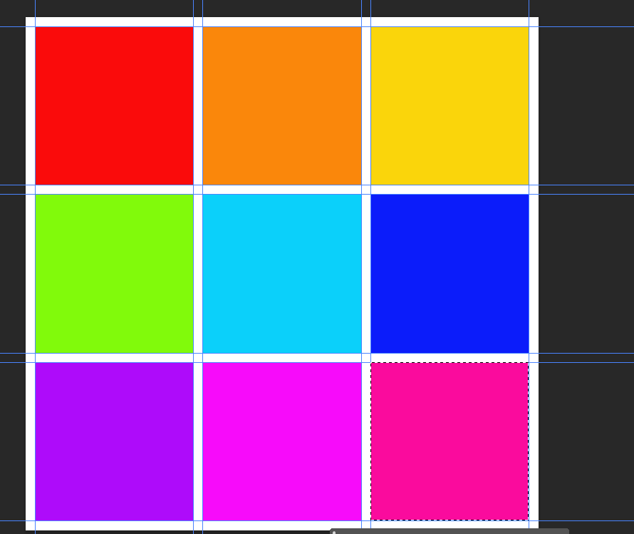
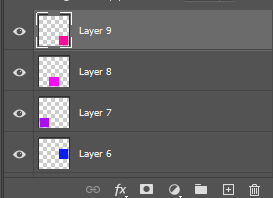
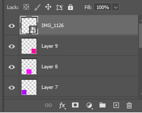
By repeating this process it left me with a colour coded grid on separate layers.
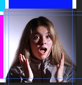
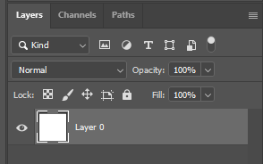
The next step was to click on a layer, selecting it, and then dragging a photo onto the box and clicking the tick.

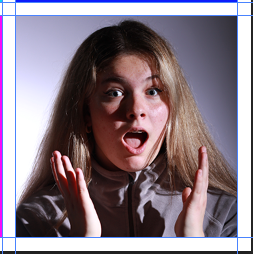
I then right clicked on the layer to produce the option of create clipping which then fits the photo to the box.
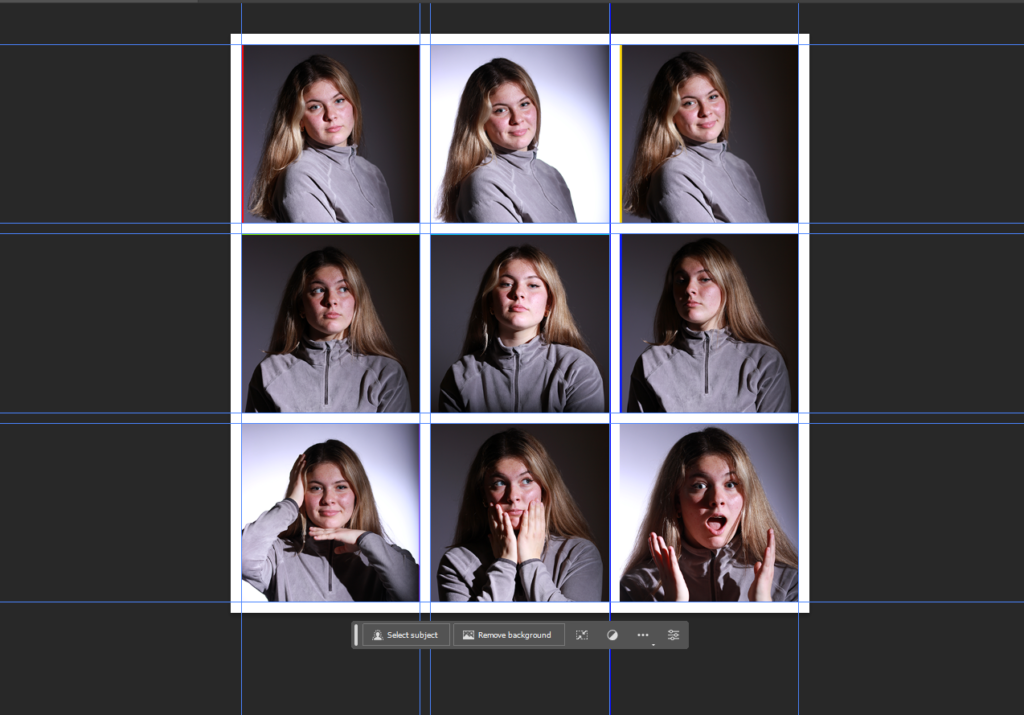
Once I had done the above steps for all 9 boxes I had 19 layers.

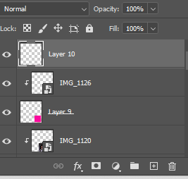
Clicking a new layer open then using the rectangle marquee tool to select the entire document.
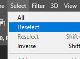
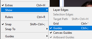
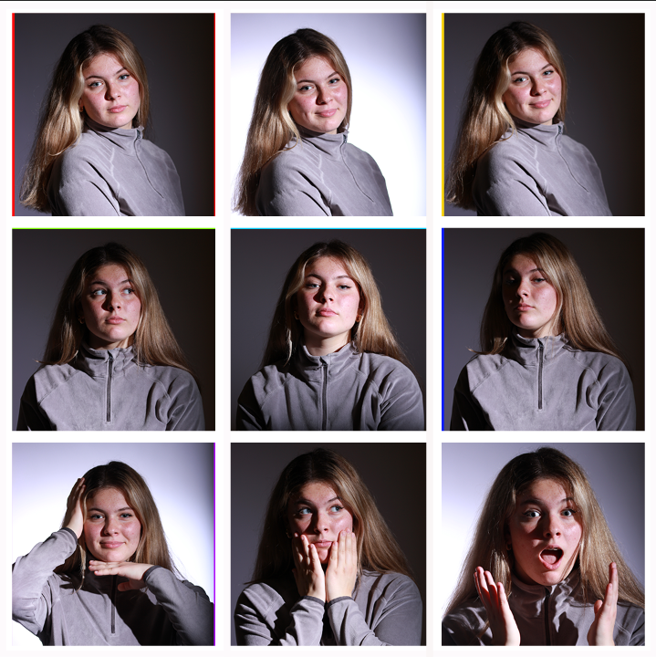
After that I used select- deselect, then view-show- guides.
Edit Two
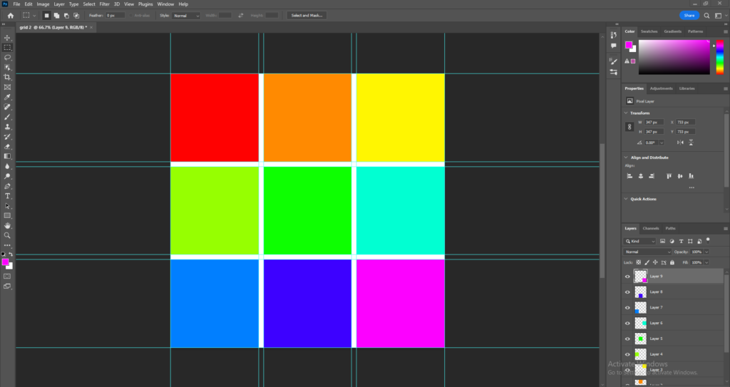
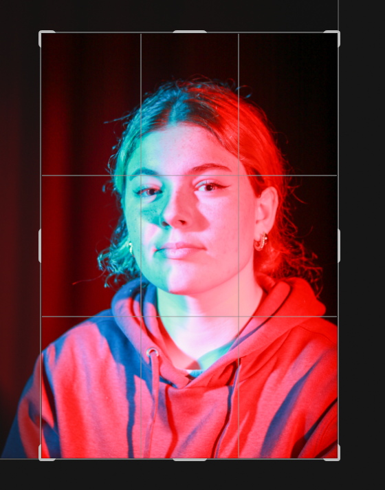
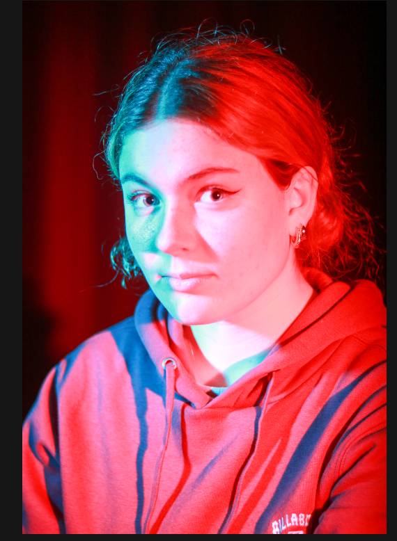
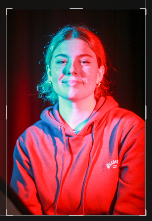
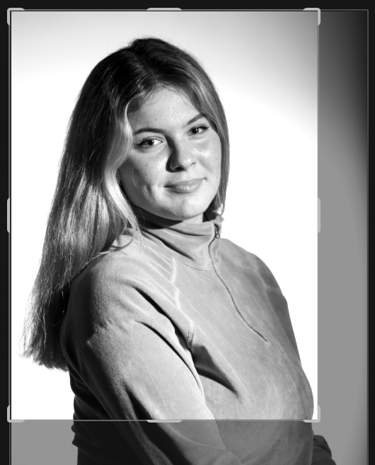
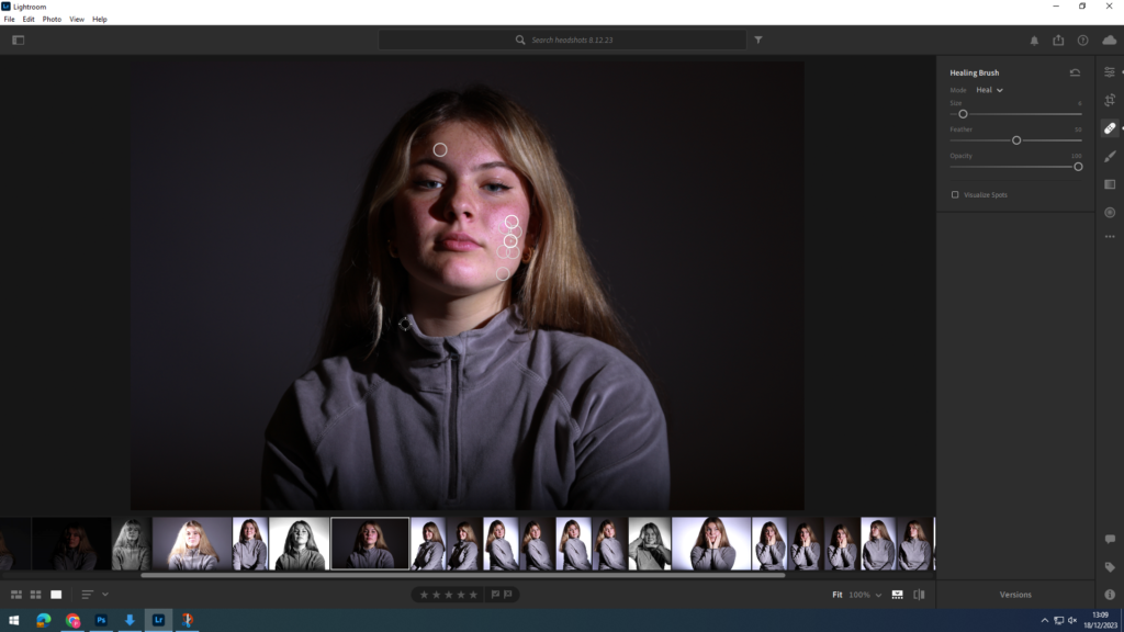
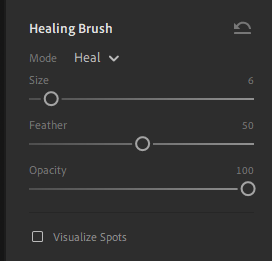
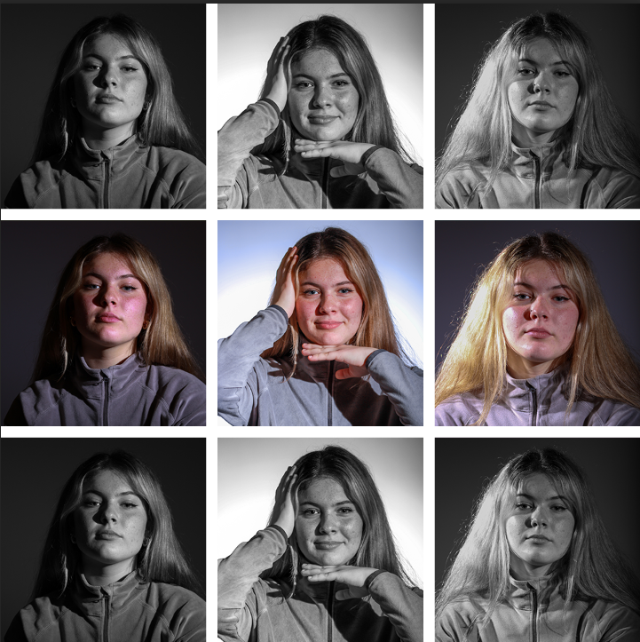
I then repeated the process making sure to have 9 separate layers with different colours on each selection. I started by making the grid and then editing each photo on Lightroom.
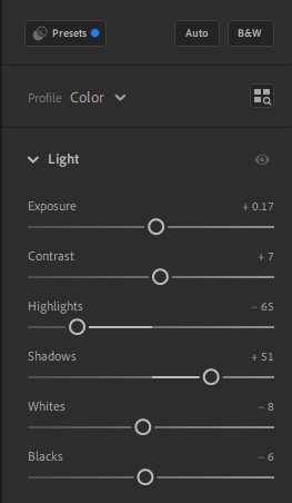
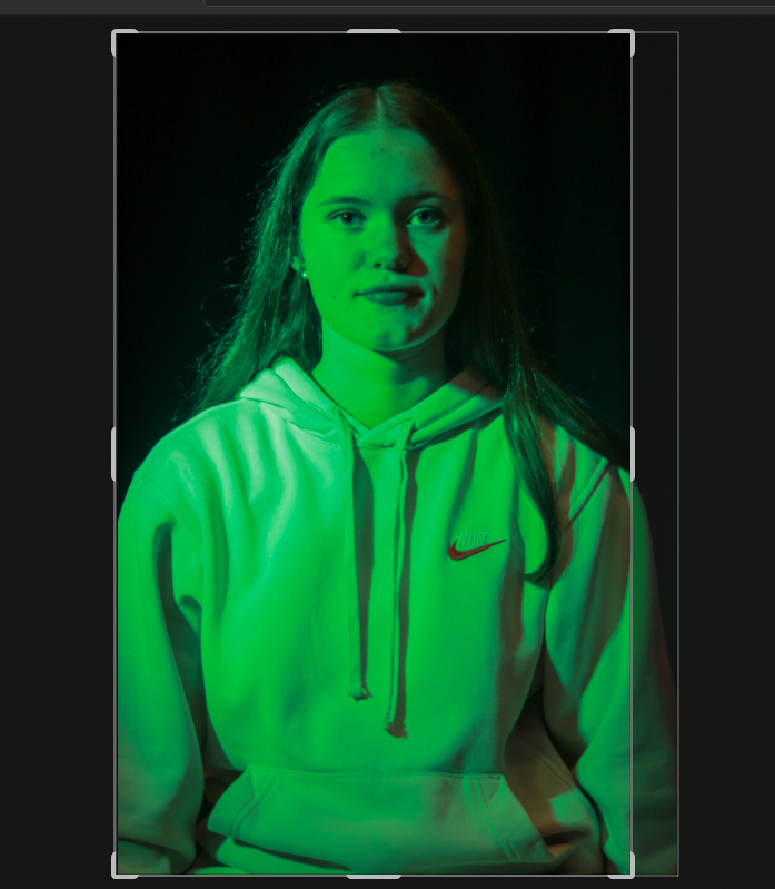
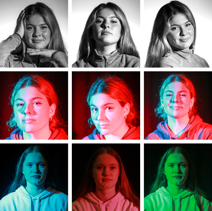
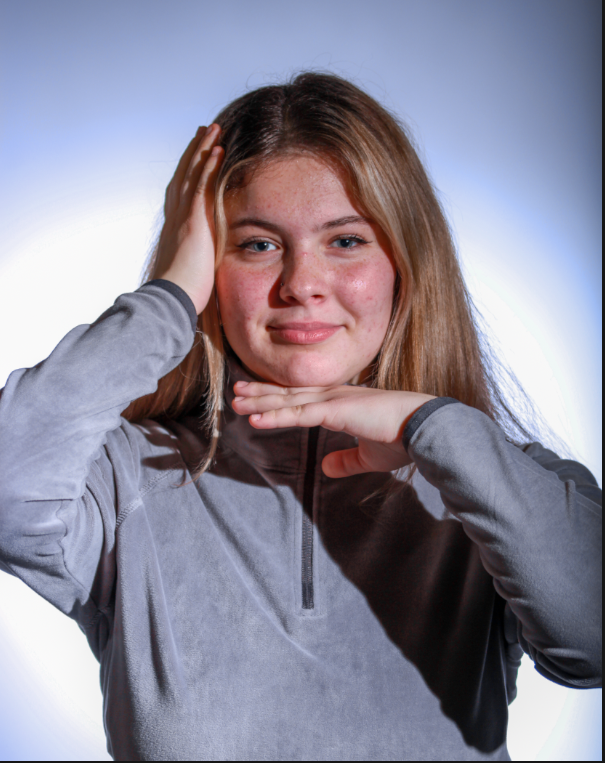
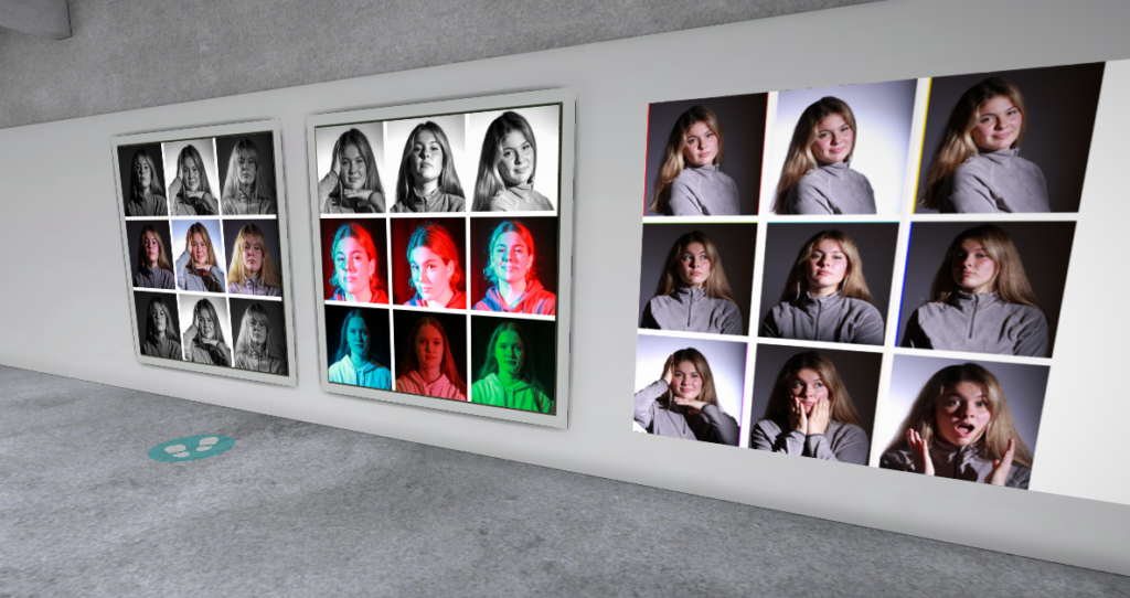
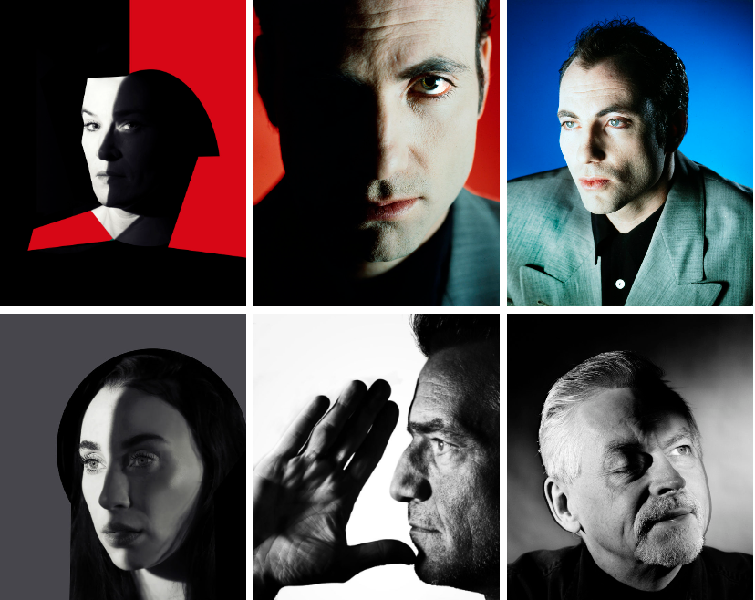
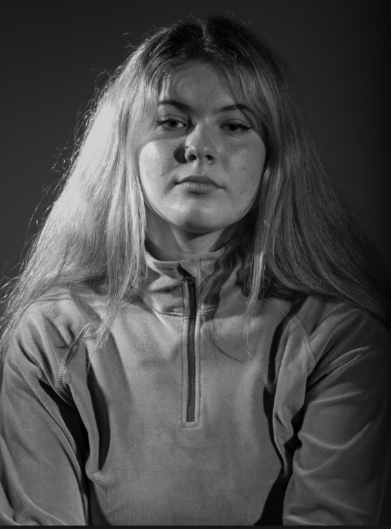
I chose to make an usual grid for this one as many would think it would look better if I put the black and white row in the middle of the grid, however I actually did this to show progression from fashion style, high contrast dramatic photos to fun coloured more natural captures to then a combination of both with interesting lighting but the same pose to not take away from the models natural appearance.

Edit Three
Final Evaluation

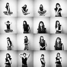
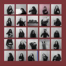
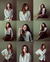
I think this is a great way of displaying photos and I really like the outcome, it allows for many photos to be displayed and its an uncomplicated way to draw peoples attention to different photos and really encourage them to think about the meaning. I used three different approaches on the first one I used the three different rows to display the model posing three different ways, on the second grid I tried to make the grid make no sense using three different colour ways and two different models, and the third grid I repeated the same three photos in the same order on each row although by having the middle row in colour it made appear to be different photos unless the viewer looked at each individual shot and then the grid as a whole. It has also allowed me to expand my photoshop knowledge and I will definitely look at using a grid in the future as it’s a simple way of displaying multiple images to convey meaning and make a point by having very few images or tens of images.

Studio Lighting Techniques Evaluation

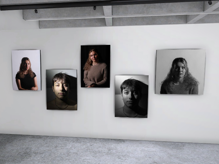
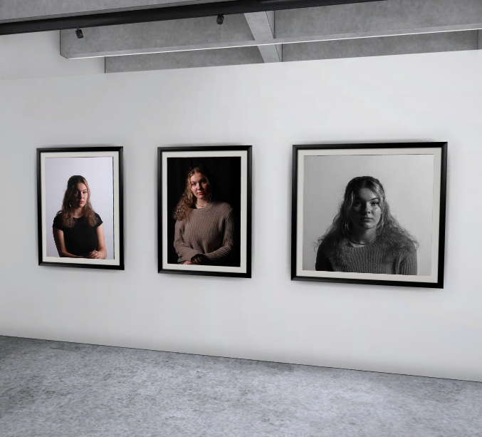
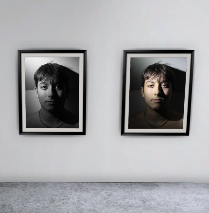
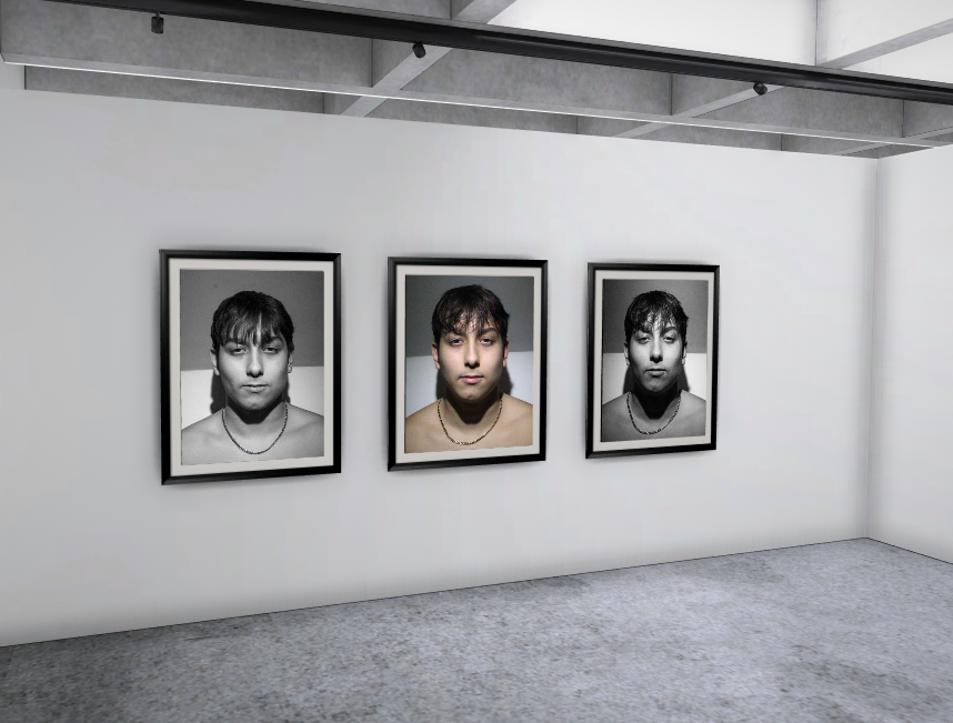
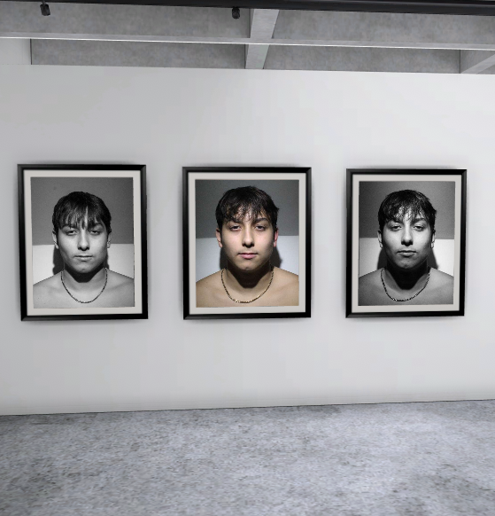
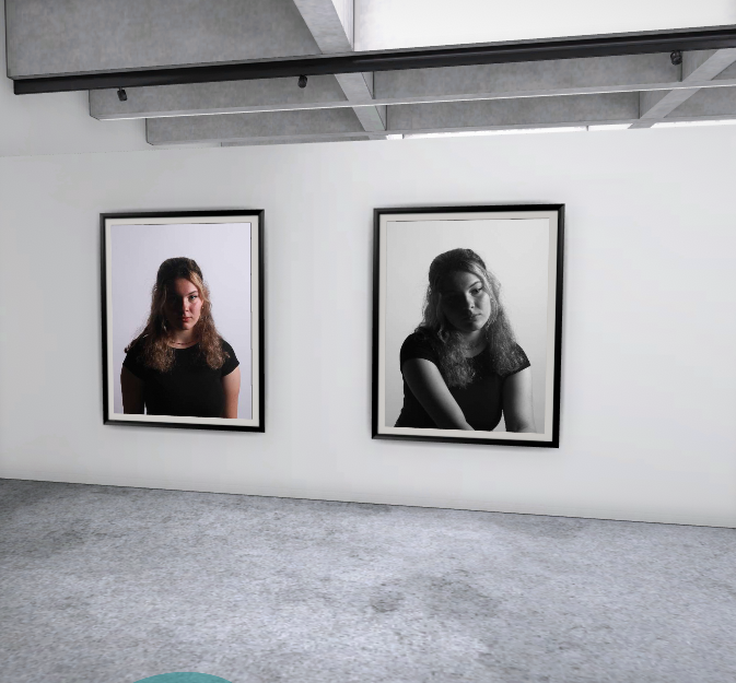
Virtual Gallery

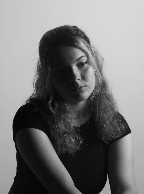
Chiaroscuro

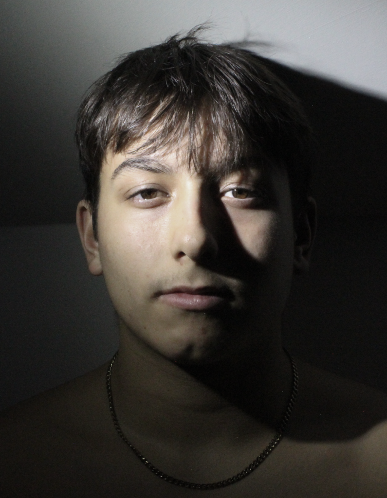
Rembrandt

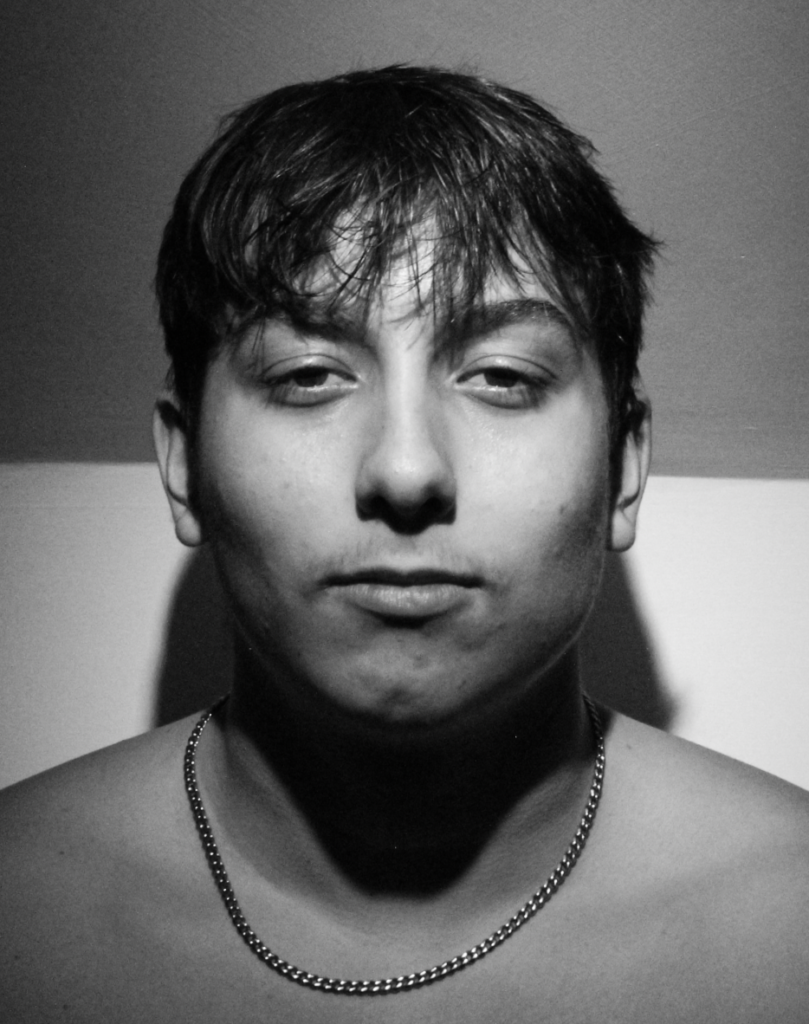
Butterfly

Evaluation

Chiaroscuro

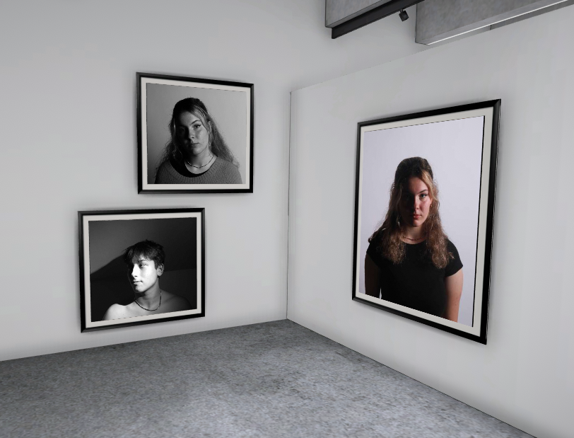
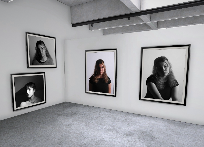
I think that this is my best chiaroscuro photo as, although her head is slanted, there is a straight line down the centre of her face where there is a contrast with the lighting.

Rembrandt

I think that this is my best Rembrandt photo because there is a clear triangle underneath his eye and the photo didn’t need a lot of editing.

Butterfly

I personally think that this is my best butterfly lighting photo as you can clearly see the shadow under his nose and the cheek bones.

Environmental portraits across school

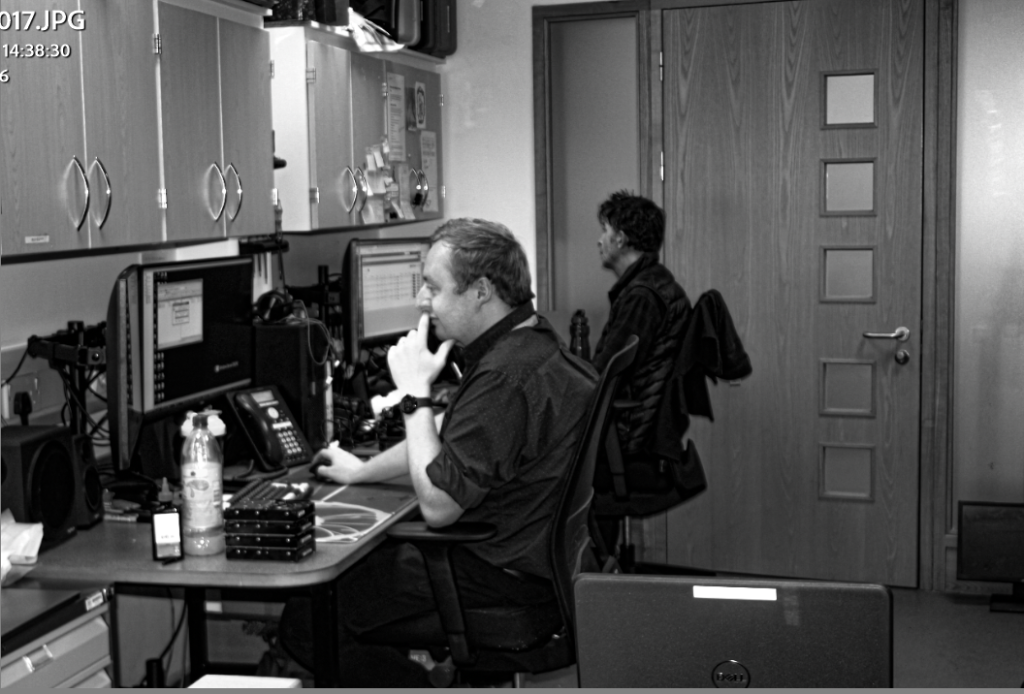
in addition to the environmental photography study i did on my grandmother, i and a few other students took a camera across school to take photos of teachers and school staff in there everyday enviroment

This photo school not only helped my confidence in photographing people i am not close with or comfortable with but also taught me a lot about the camera and helped me learn how to take high quality and in focus photos quickly and under pressure, with the teachers anxious to get on with there work we did ou best not to occupy to much of there time and therefor had to learn very quickly about how to focus and use the camera as quickly as possible, unfortunately a good amount of the photos we took did end up being a little blurry but the ones above are what i believe to be my best work from the hour we spend around school.

i edited these photos to be black and white/greyscale in imitation of Daniel Mordzinski’s photography style when photographing the ‘human atlas’ one of his most famous photography series.

photo-montage

Photomontage is the process and the result of making a composite photograph by cutting, gluing, rearranging and overlapping two or more photographs into a new image. 

The plan:

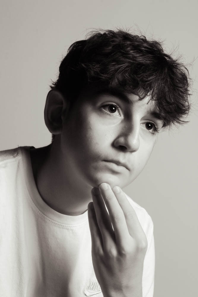
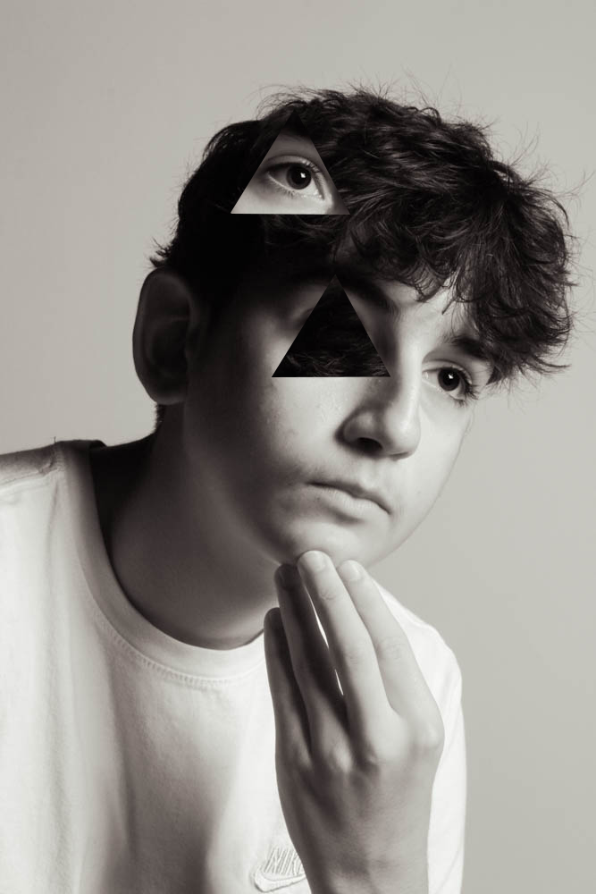
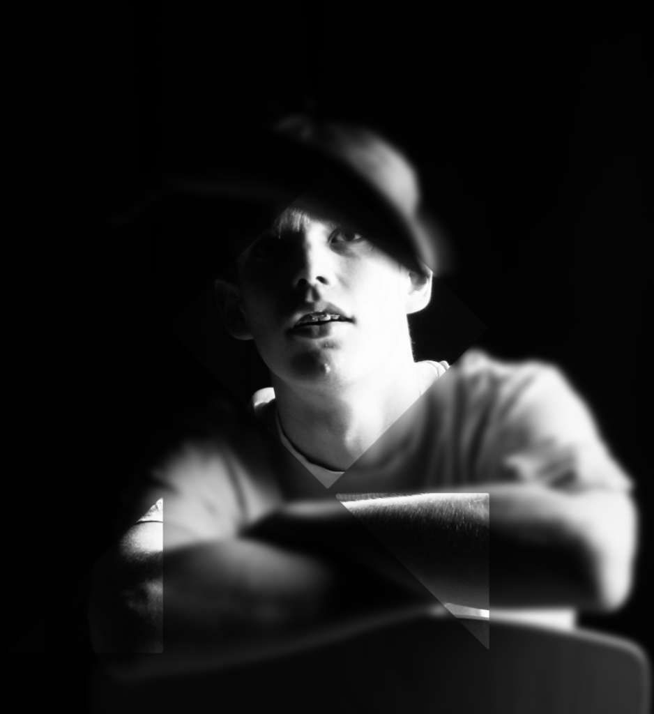
I will take photos of my subject with deadpan expressions and other expression and merge them together, or replace different body parts to different parts of face. Another thing I could do is keep the subject the same but edit certain parts of the face to bring attention to it (make it stand out more).

With these photo-montage edits, I did not want to make it over edit them as they are both already fairly interesting photos. I used photo shop to edit both. With the bottom one I also used geometric template to add the triangles.

diamond cameo

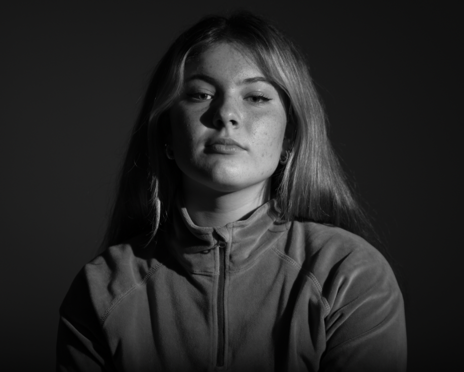
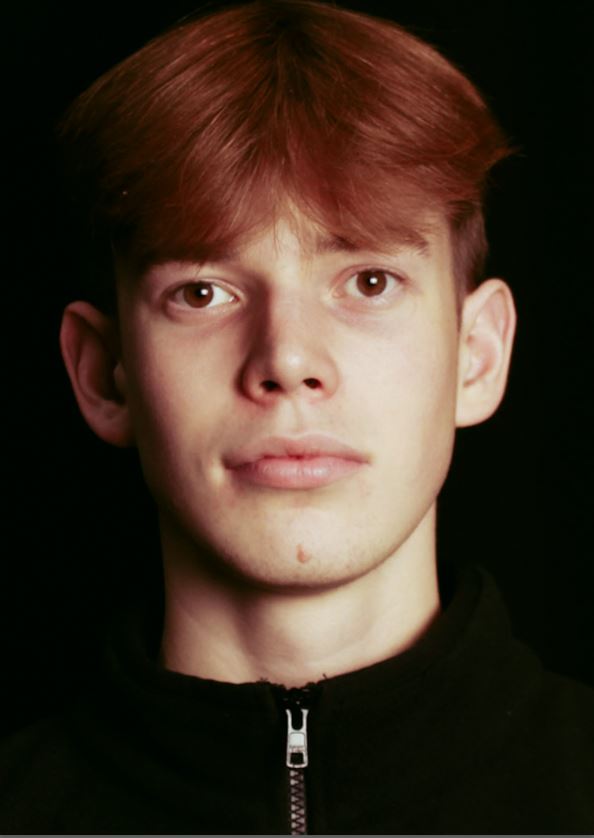
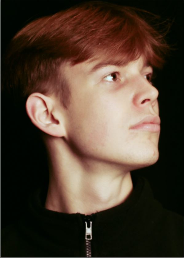
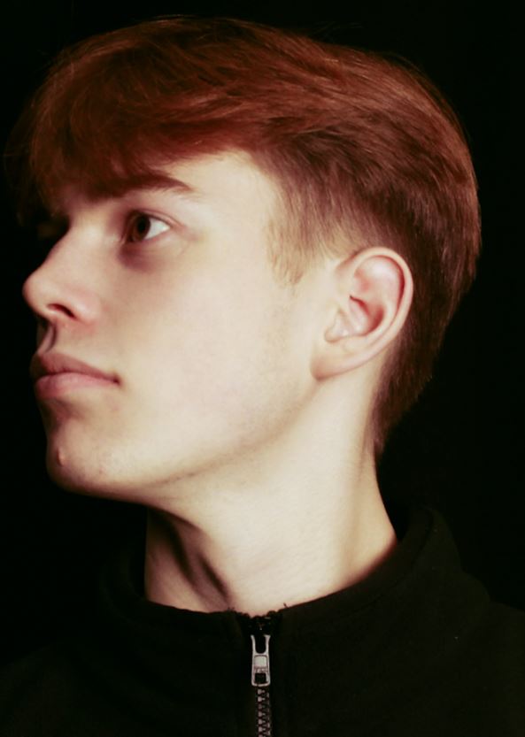
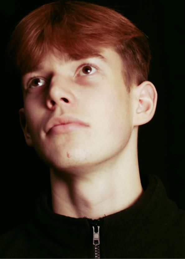
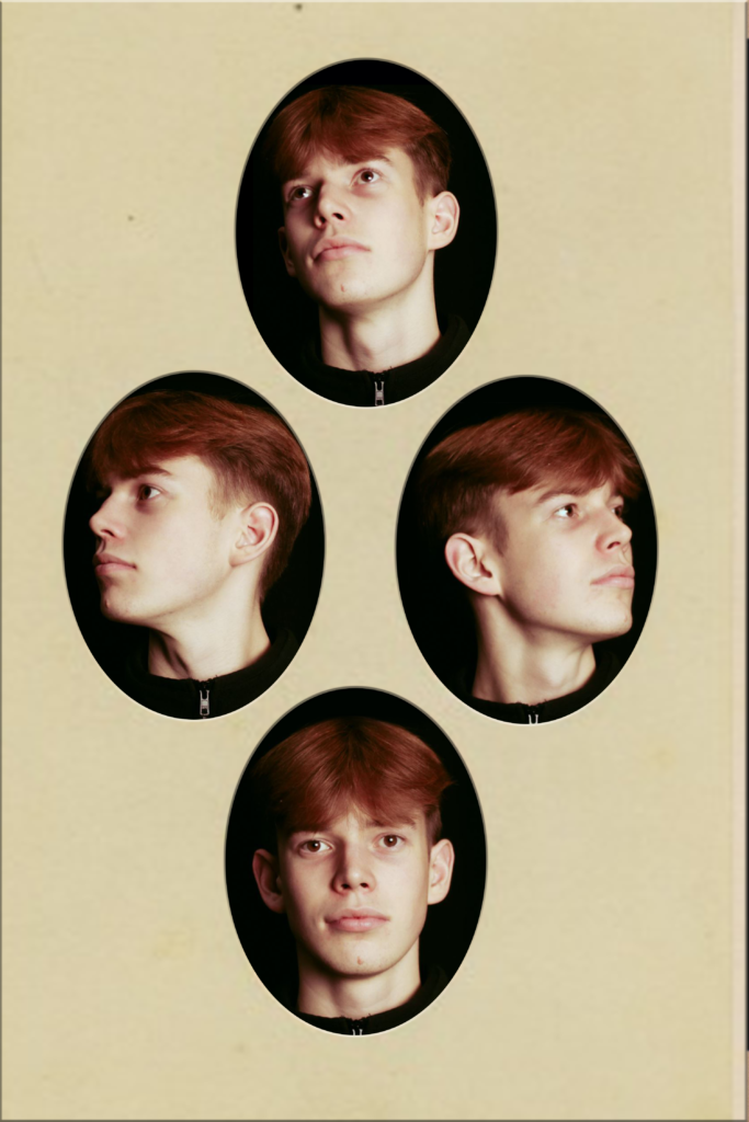
diamond cameo is where photos are arranged into a diamond shape, as it means all photos get equal coverage. I took 4 photos of a class mate with different angles of his face, using the studio lights and a continuous light with a soft box to add some contrast. We positioned it slightly above the subjects face, and slightly on the right. This is done to mimic a butterfly effect.

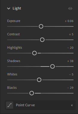
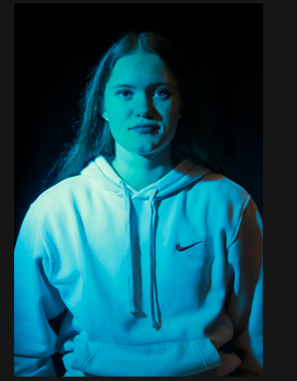
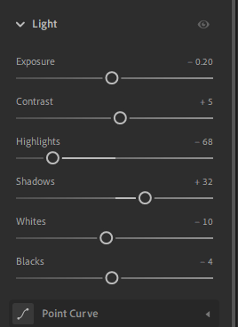
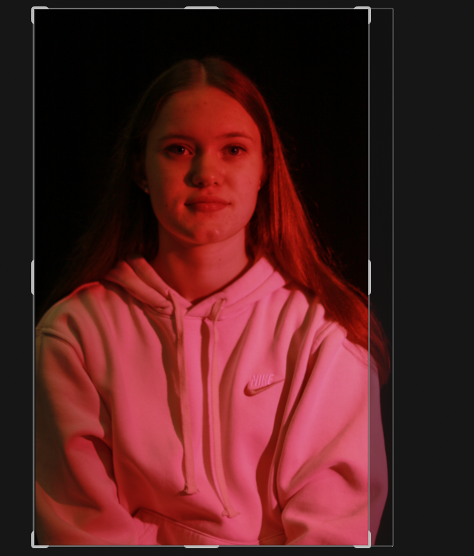
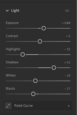
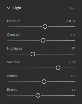
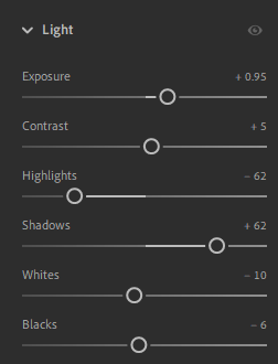
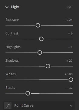
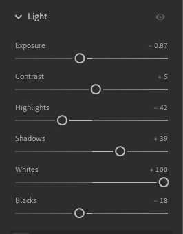
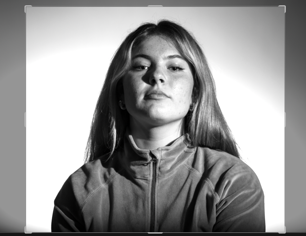
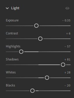
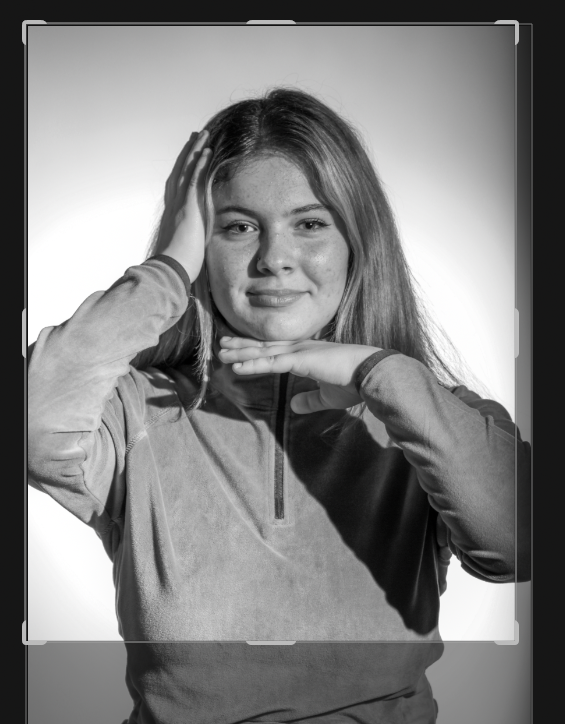
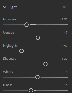
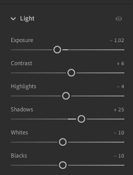
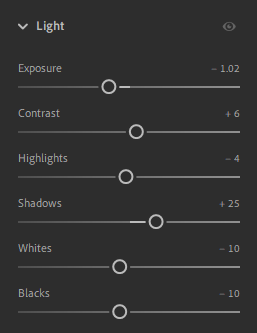
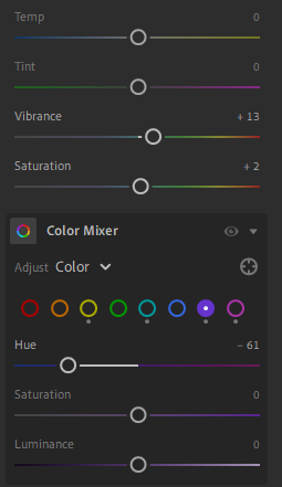
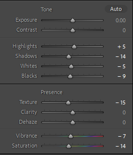
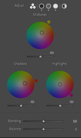
Here are the photos I took and decided to use. I colour graded and adjusted mainly just the shadows and highlights to make it look very retro like. Here are the editing setting.

Headshots artist analysis

BRUCE GLIDEN – FACE

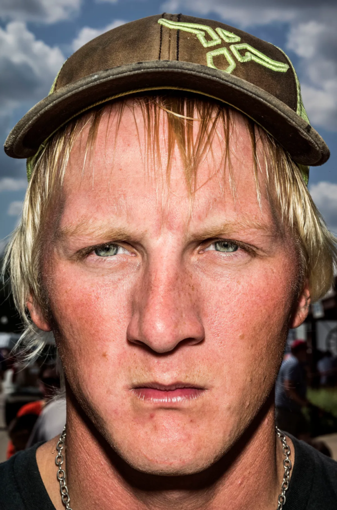
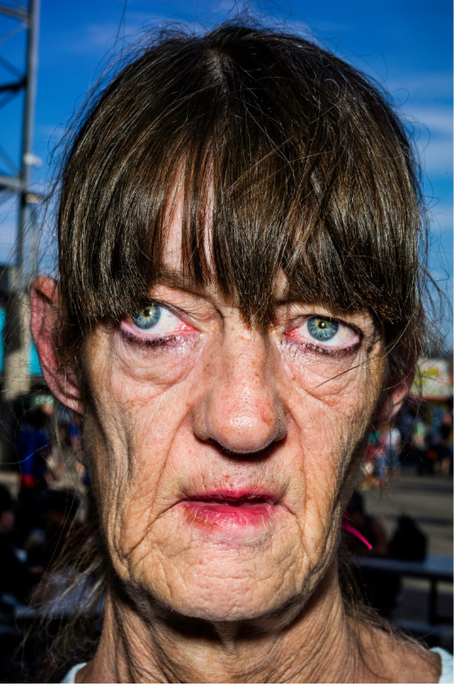
Bruce Gilden’s project, Faces 2012–14, is an extended series of confronting and compelling photographic portraits. He went very up and close to the subjects faces, capturing and amplifying all the imperfections lack of symmetry of people, making each person very different to each other as we are all individuals.

“My style evolved because I liked being among the common man,” he once said. “I like characters. I always have. When I was five, I liked the ugliest wrestler, so it was easy for me to pick what I wanted to photograph.”

Gilden is not without critics who view the photographs as potentially exploiting his subjects. He would often take photos of unsuspecting people along the street. The artist describes the series as a reflection on his childhood in Brooklyn and the result of a lifelong fascination with ‘characters’ he encounters in pursuit of his subjects.

Gilden, like many photographers, often shies away from explaining the meaning in his photographs. “When people look at my pictures I don’t want to tell them what’s in the pictures. I want them to look at the picture and make up their own story.” So now I’m going to analyse some of his photos in my own way.

Both these photos have a few things in common. They leave very little space in the frame for the background, and making sure the whole face is including in the photo. This allows the viewers to see every imperfection in the face, making the individuals look ugly. There’s almost a since of humour to these photos as well as the subjects didn’t get a change to pose properly and it looks like mug shots.

Here, the blemishes, bad teeth, the stubble and the scrapes – as well as the pimples, wounds, wrinkles, and bulbous veined noses – are rendered even more extreme by the closeness of the camera and the unremitting light of the flash.

Headshots – info

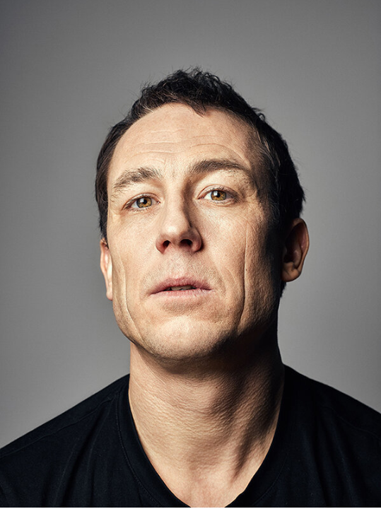
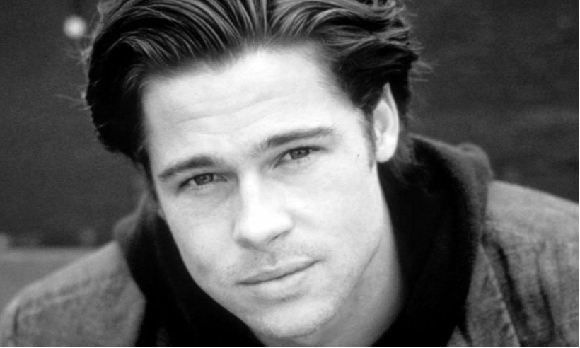
type of portrait photography typically used for websites, press releases, publications, and social-media profiles. The term “headshot” or “head shot” just means that the portrait photo is cropped somewhere in the middle torso – so that the focus is on your face. The subject would usually look directly into the camera so the viewer feels more engaged.

Famous headshot photographers:

There are many famous headshot photographers like Peter Hurley, Jordan Matters, Joel Grimes and many more. They are all famous for capturing interesting models, famous actors and singers, ext.

Examples of Headshots (famous people):

The are many different techniques to create interesting headshots, like DIAMOND CAMEO, DOUBLE/ MULTIPLE EXPOSURE, JUXTAPOSITION, SEQUENCE/ GRID AND MONTAGE. You can make them into a typology of many photos of a similar look.

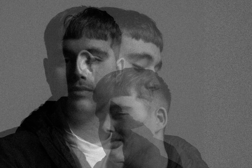
Henry Mullins Multi-Exposures – George Blake

Using my Mullins photos, I experimented more with the types of Headshots I could create.

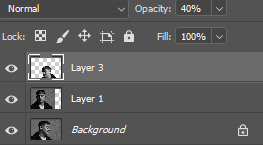
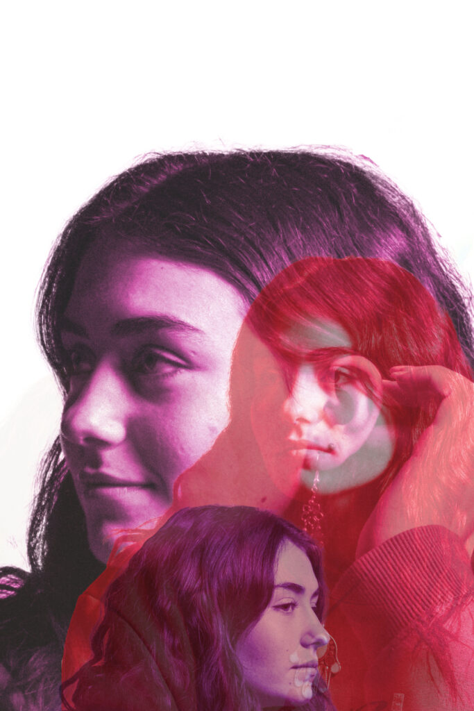
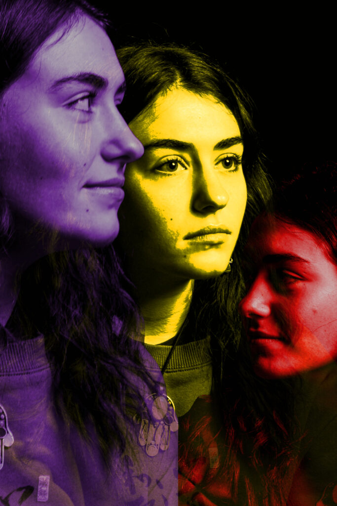
By overlaying images, cutting them out from their individual layers and lowering their opacity I was able to create some edits I liked the outcome of:

(Example of what the cuts look like)

(Layer 3 – 40% opacity, layer 1 – 50% opacity = helps create overlapped effect)

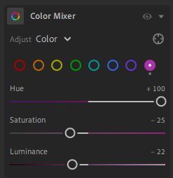
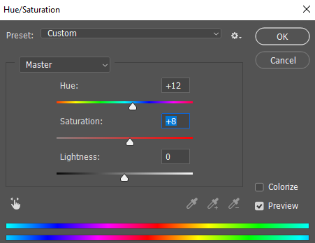
By adjusting the Hue and saturation, this is how I got the multi-coloured image with each layer having a sperate colour.

(For example, this is how I adjusted my images to get the colour I wanted)

Edits:

I like how these images came out, In future, more photos would be better as I would be able to further experiment with my images.
Grid Photos – Headshots

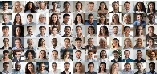
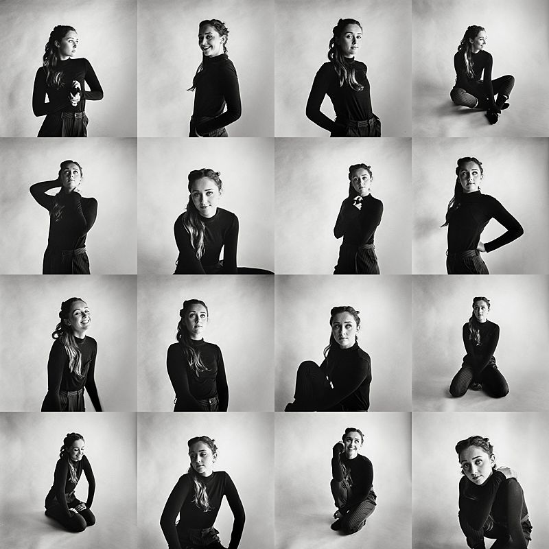
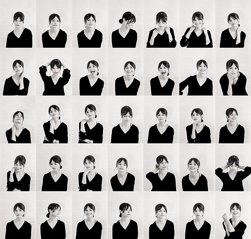
Grid sequence of photos can be used for many different things, from documentation of progression to creative outlets. Most commonly used to make comparisons and group individuals together, for example they are often used to show a team within a company as they create a team feeling and not a narrow focus as everyone’s photos is as important and similar to the next. They have also been used for things like typologies, however I’m, going to be doing headshot portraiture and a typology tends to be a grouping of similar objects or constructions etc.
Ole Christiansen

Brian D Smith

Brian D Smith

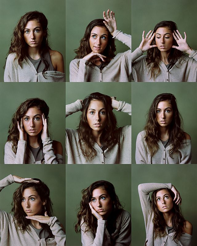
Brain D Smith is a portrait photographer based in Charleston SC and Traverse City MI, he began his career after feeling unfulfilled in his successful engineering career. He was always a hobby photographer until one day he photographed a wedding and the results were beyond what he was expecting and instantly he knew this is what he wanted to do as a career. He had a passion for photography and quickly grew with his unique style of portraiture, he started by doing only wedding portraits before quickly moving onto studio portraiture as well to allow a creative outlet. When he is not photographing a wedding he does mainly editorial shoots as he puts it ‘Portraits and editorial work present an opportunity to slow down, and craft something artistic and uniquely mine. It’s an opportunity to share a bond with a subject and for a brief moment reflect something beautiful within one another.‘ He started his own studio, in which he provides many different types of shoots from professional portraiture to bridal detail shoots.

He combines the idea of 1960’s vouge style shoots with fine art editing, particularly in the bridal portraiture shoots, this allows him total creativity creating stunning, unique results. For this project I’m looking at his studio portraiture that he has made into a sequences of photos displayed in a grid pattern. He uses a simple matching colour palette to create softness in his work that isn’t always clear in many other headshots. I think this makes his work feel friendlier and more appealing. This image has an empty alt attribute; its file name is image-565.png

I love this grid set he has created as there is a real sense of integrity within the photos. There is small details that seem unusual for this style, for example in the middle shot on the bottom row he has posed the model to not be following the rule of thirds and instead having the arm of the model touching the edge of the portrait. He has done this on the top photo of the same column as well, I think this stops the grid feeling too formal and constricted. However the rest the shots are ordered and uniform with following the rule of thirds even if they do not firs appear to be with how he has posed the model when you look closer they do fit the rule. He has posed with model creatively with a different pose in every shot. the first row has the model looking in three different directions including directly into the camera. Where as in the next row the model only looks directly into the camera lens and only her hands move which contrast the last row where the model is looking anywhere but the camera and her arms move in each shot as well. It appears almost like a progression of creativity captured in a series of photos, from how people go about their everyday life fitting their actions to certain situations to then at the end the model doing what suits her and possibly acting outside of societal norms.

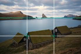
The Rule of Thirds

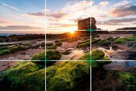
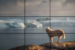
The rule of thirds is a simple useful tool, used in most styles of photography to create a well balanced, equal photo, that draws the eye in. ‘a composition guideline that places your subject in the left or right third of an image, leaving the other two thirds more open‘ there are many other techniques similar to the rule of thirds with similar intentions but rule of thirds is the most common and most widely used.

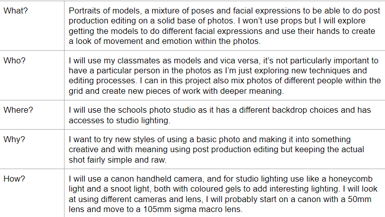
Plan For Photoshoot