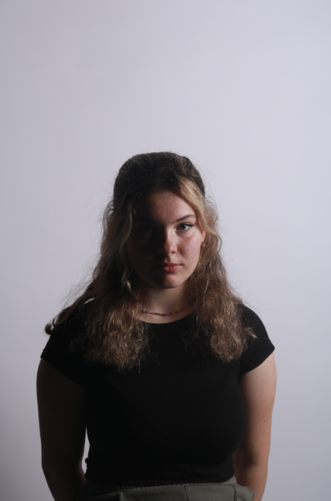
Rembrandt lighting:

WHAT IS REMBRANDT LIGHTING?

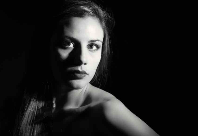
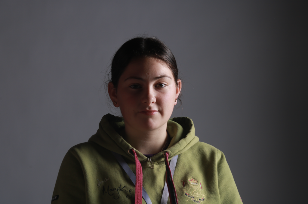
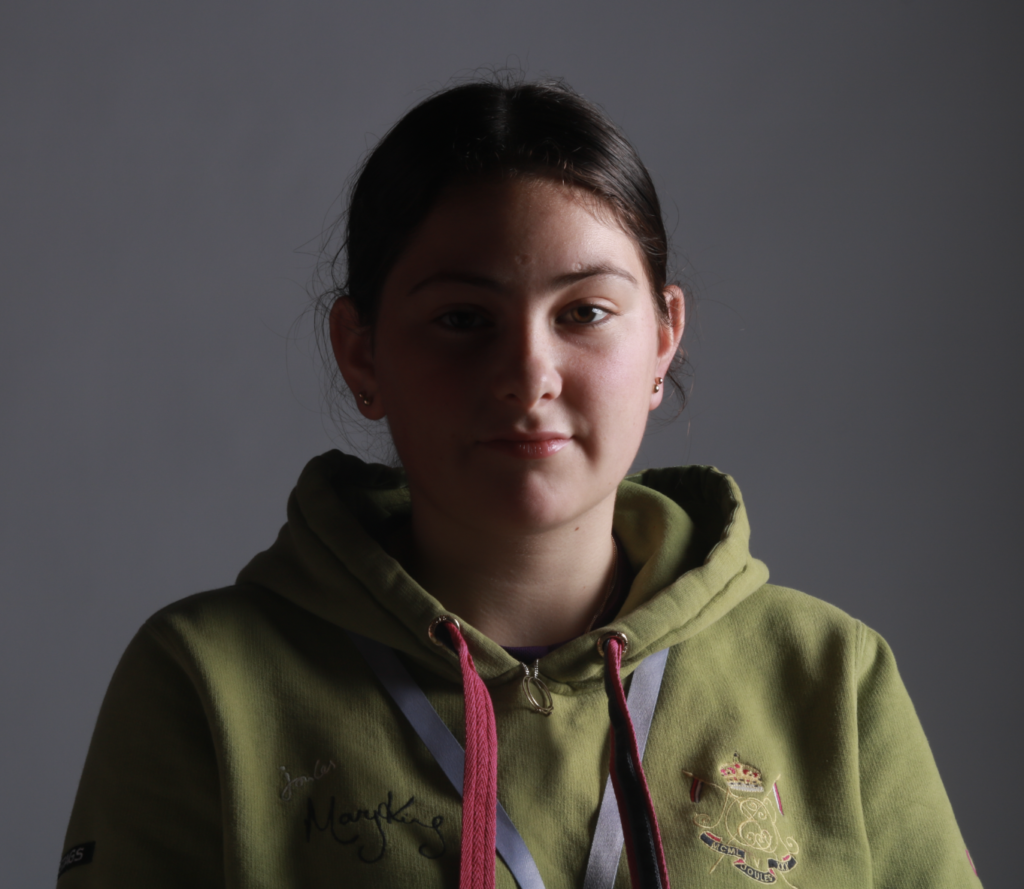
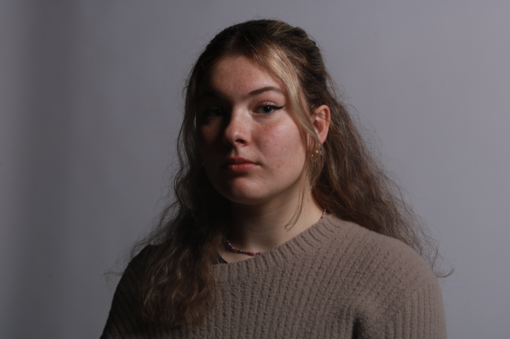
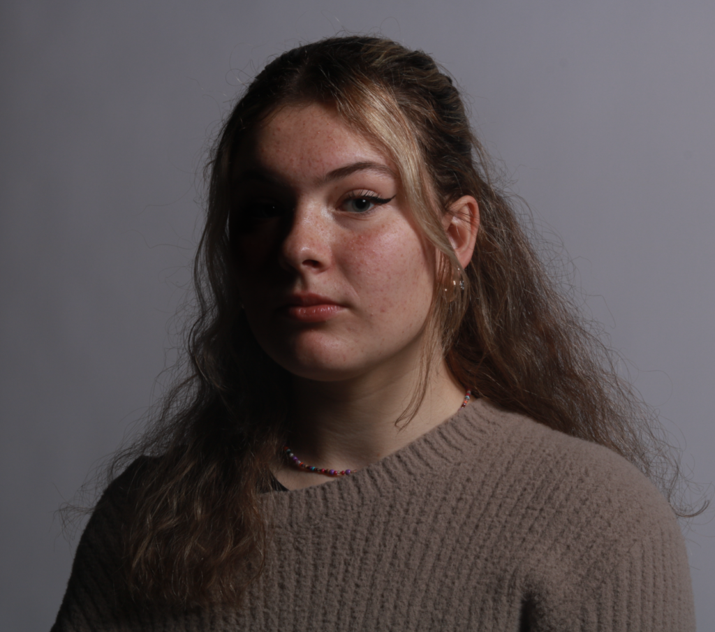
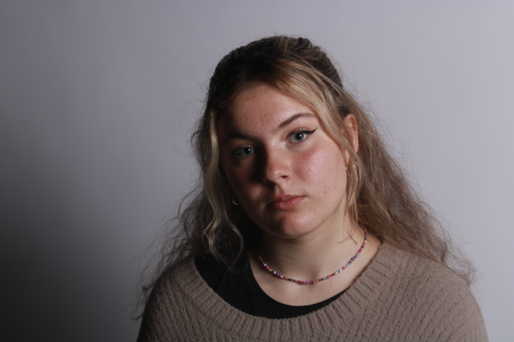
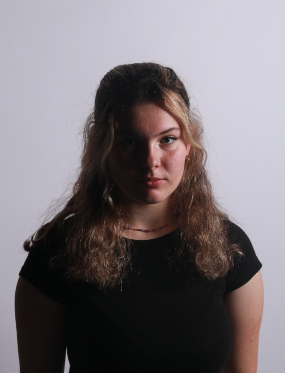
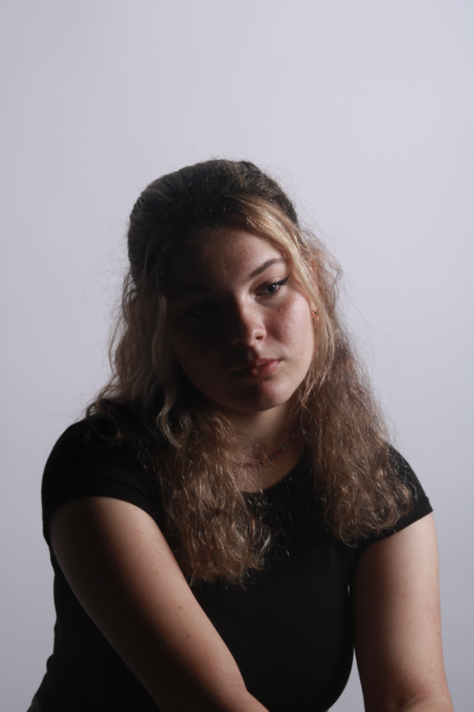
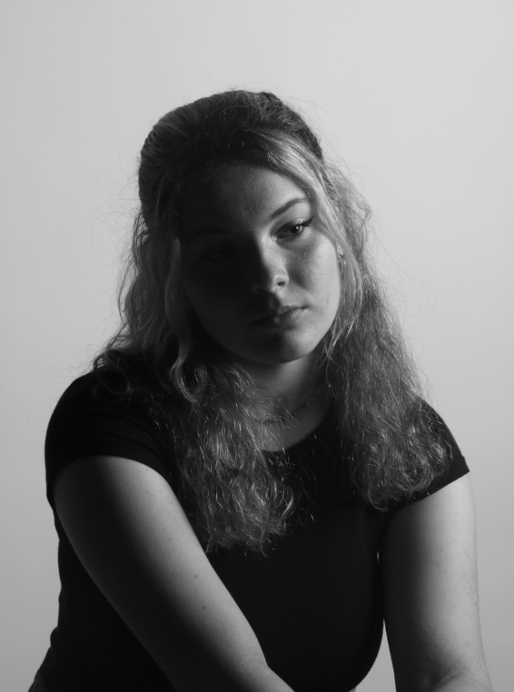
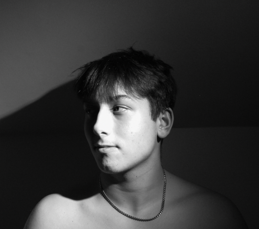
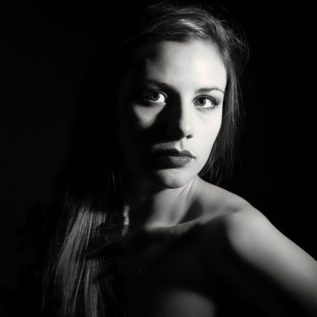
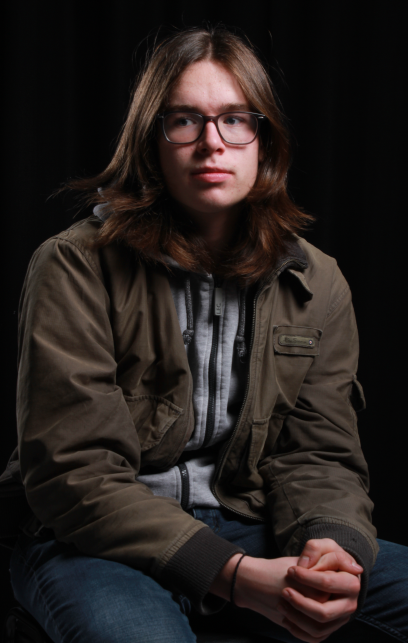
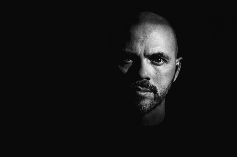
Rembrandt Lighting is a technique that was taken from a famous painter in the 1600s, Rembrandt Harmenszoon Van Reign, named after the way he used light in his portrait paintings. Rembrandt lighting is a technique utilising one light and one reflector, or two separate lights. It is a type of side lighting where the side of the subject is in shadow creating a lit-up triangle underneath the subject’s eye on the less illuminated area of the face. The background of the image is also usually shadowed and dark, putting the subject front and centre. The black background emphasises the contrast between light and dark. This can be highly effective in making a two-dimensional image appear three dimensional. The Rembrandt lighting technique results in a moody and dramatic effect.

WHY DO PHOTOGRAPHERS USE THIS LIGHTING?

It’s a popular technique for photographers to use because it creates images that look both dramatic yet natural. The Rembrandt method is considered low-effort while producing high-impact photographs. Secondly, one of the reasons professional photographers go with Rembrandt lighting is to achieve a dramatic visual effect called the chiaroscuro effect.

EXAMPLES OF REMBRANDT LIGHTING:
LIGHTING SET UP:
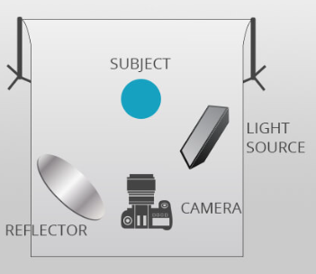
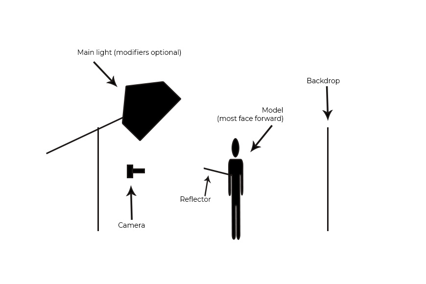
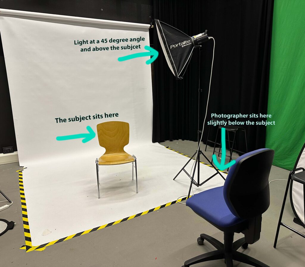
This diagram describes the set up of Rembrandt lighting. to achieve our photos, we used one reflector placed at eye level and one main light source placed on a 45 degree offset from the subject. The reflector projected the lighting back onto the subjects face to create the small triangle of light under the eye, illuminating the model’s face.

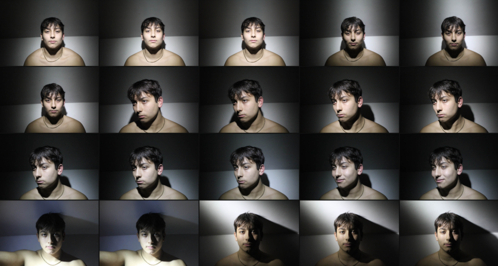
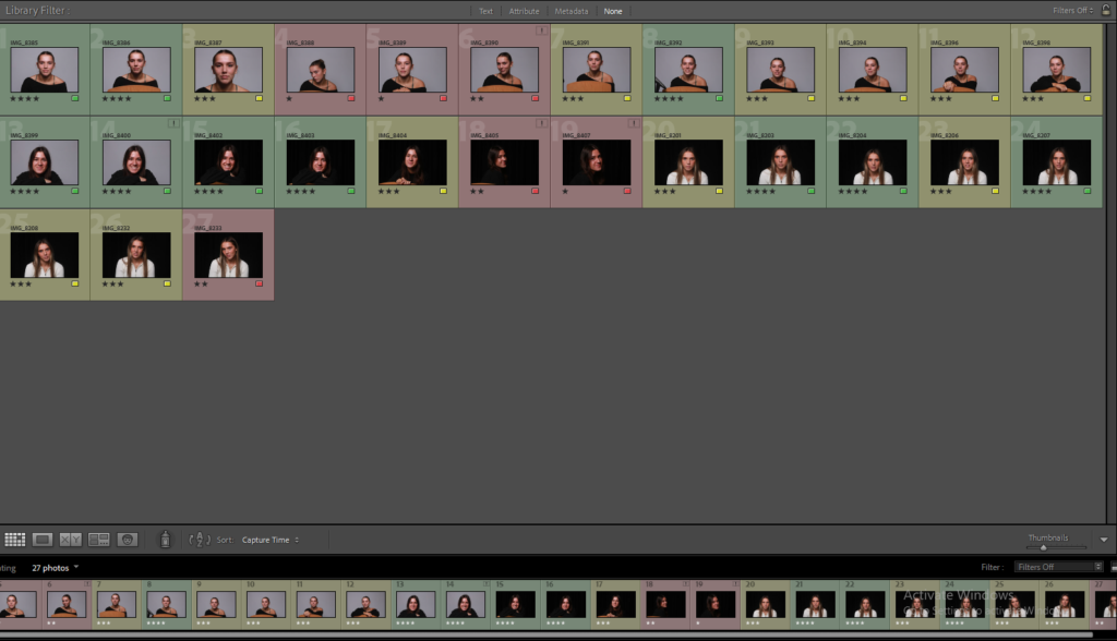
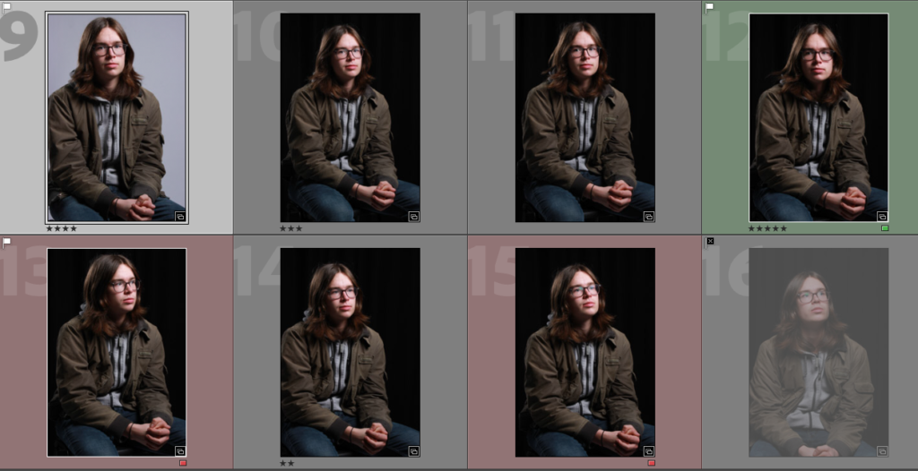
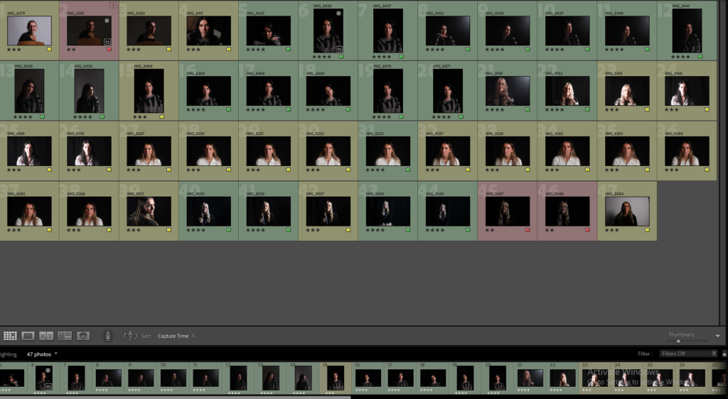
CONTACT SHEET:
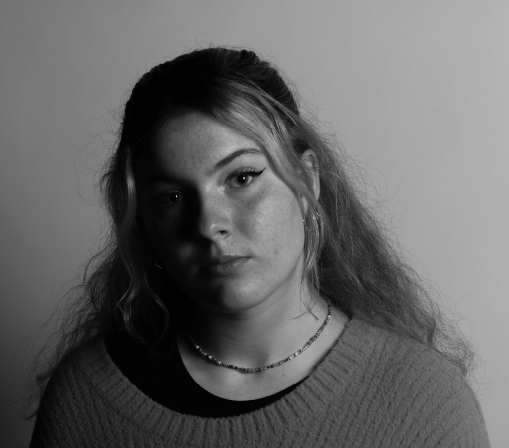
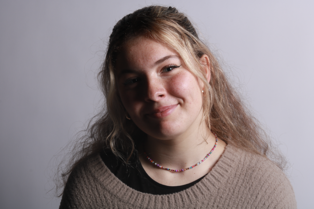
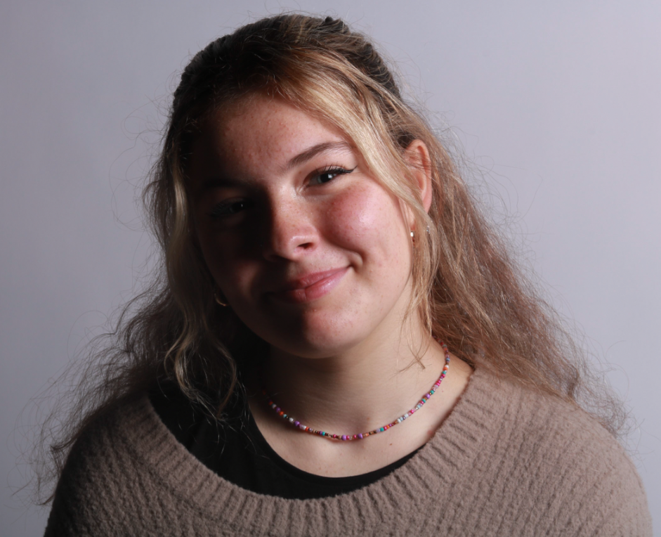
MY FINAL EDITED IMAGES:
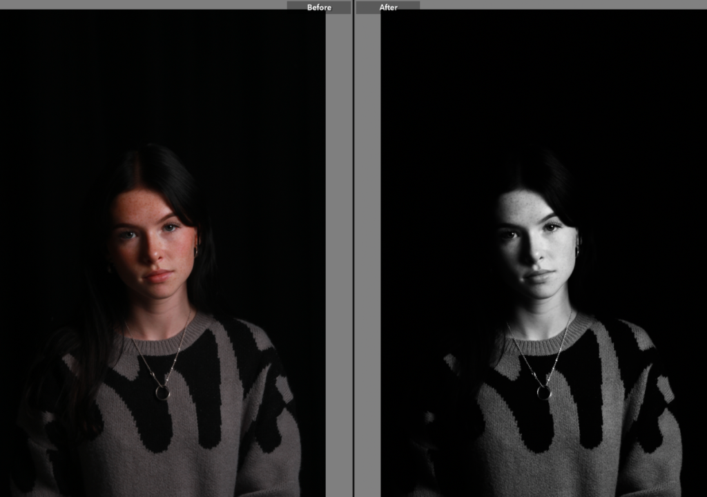
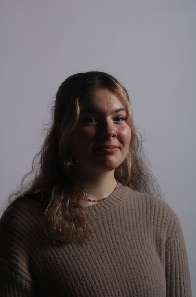
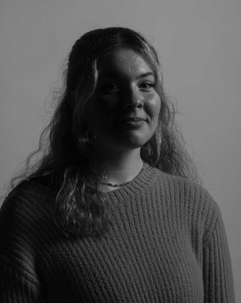
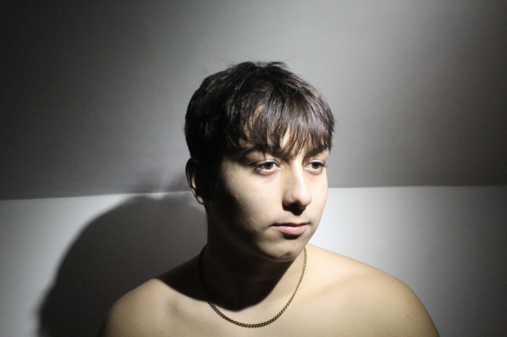
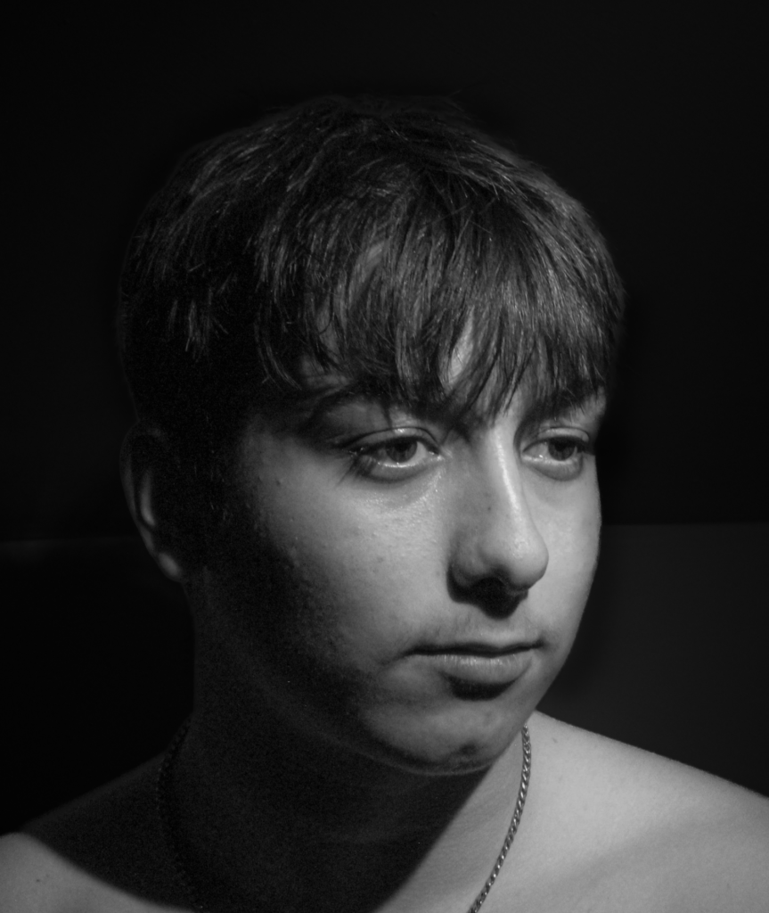
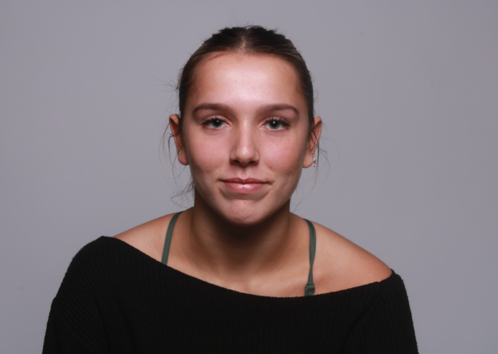
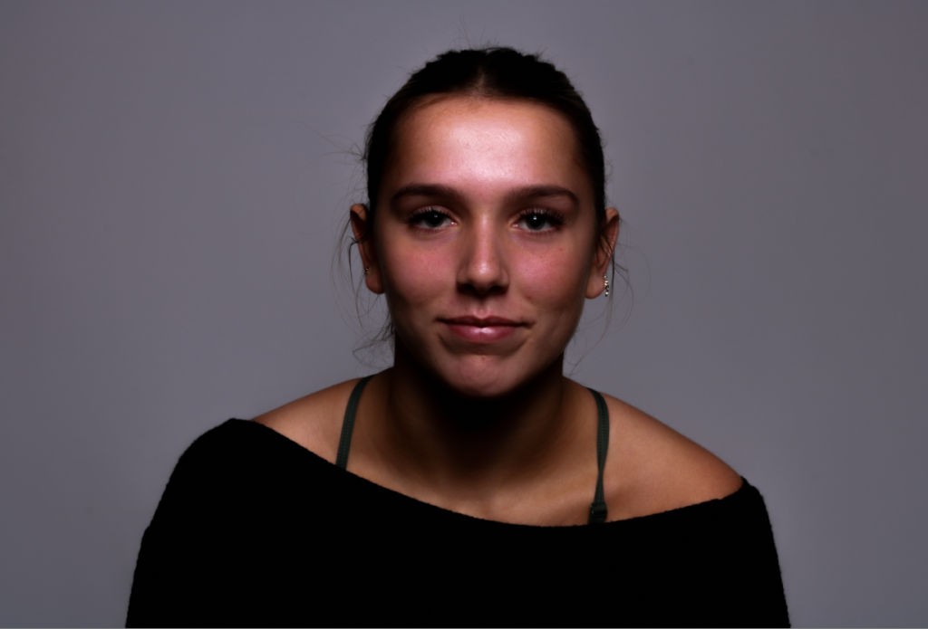
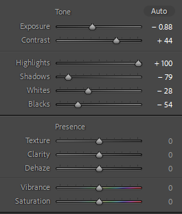
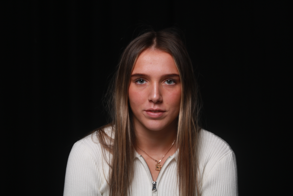
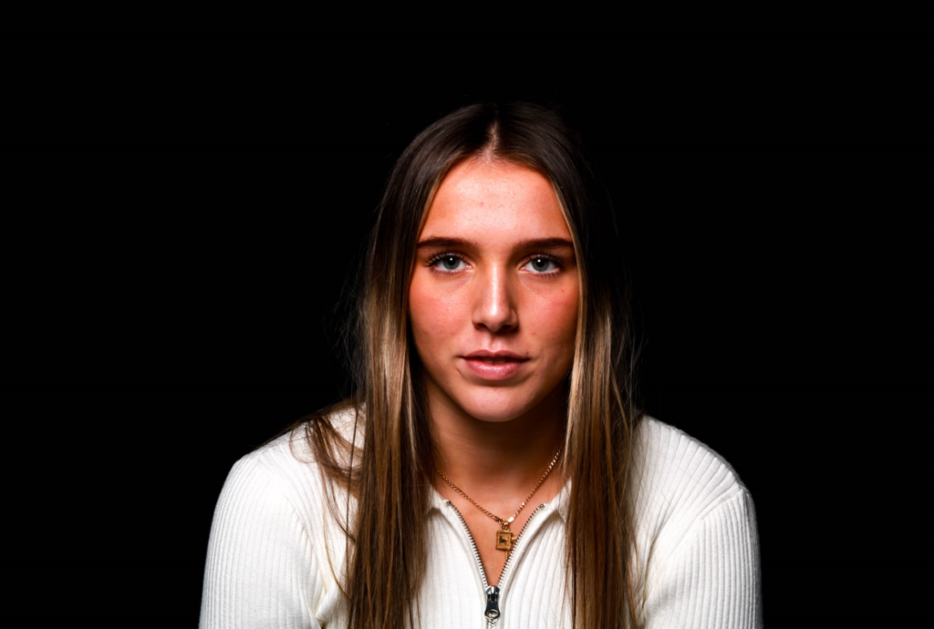
Here are some before and after comparisons of some of my favourite photos to show Rembrandt lighting. I edited all of these images using Adobe Lightroom Classic. To show the lighting technique more accurately, I increased the shadows and intensified the highlighted areas on the face to emphasise the contrast between the light and dark, creating a lit-up triangle underneath the subject’s eye on the less illuminated area of the face. I like the outcome of these edited images because it helps show the enhancement of the triangle of light that is created by using the reflector to bring highlight to half of the subject’s face, whilst the other half of the face is shadowed. The black and white edited photo helps to creates a more effective image as the shadows are made to appear darker and softer, whilst the highlights on the face are sharp and harsh.

Henry Mullins

Henry Mullins started working at 230 Regent Street in London in the 1840s and moved to Jersey in July 1848, setting up a studio known as the Royal Saloon, at 7 Royal Square. Initially he was in partnership with a Mr Millward, about whom very little is known.

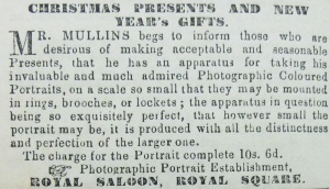
An advertisement in the Jersey Times of 5 June 1849 states that “Portraits are taken in groups of two or three, or the single figure, or bust, and of various sizes, even small enough for a ring, the charge for which is reduced to one half of that in London, viz: 10s 6d for the portrait complete. Instruction given in the Calotype, Energiatype, or photographic processes, and proficiency guaranteed for a fee of five guineas”.

After his death his collection of over 20,000 negatives was acquired in 1883 by  Clarence philip Ouless and formed part of his collection which was given to La Société in 2006.

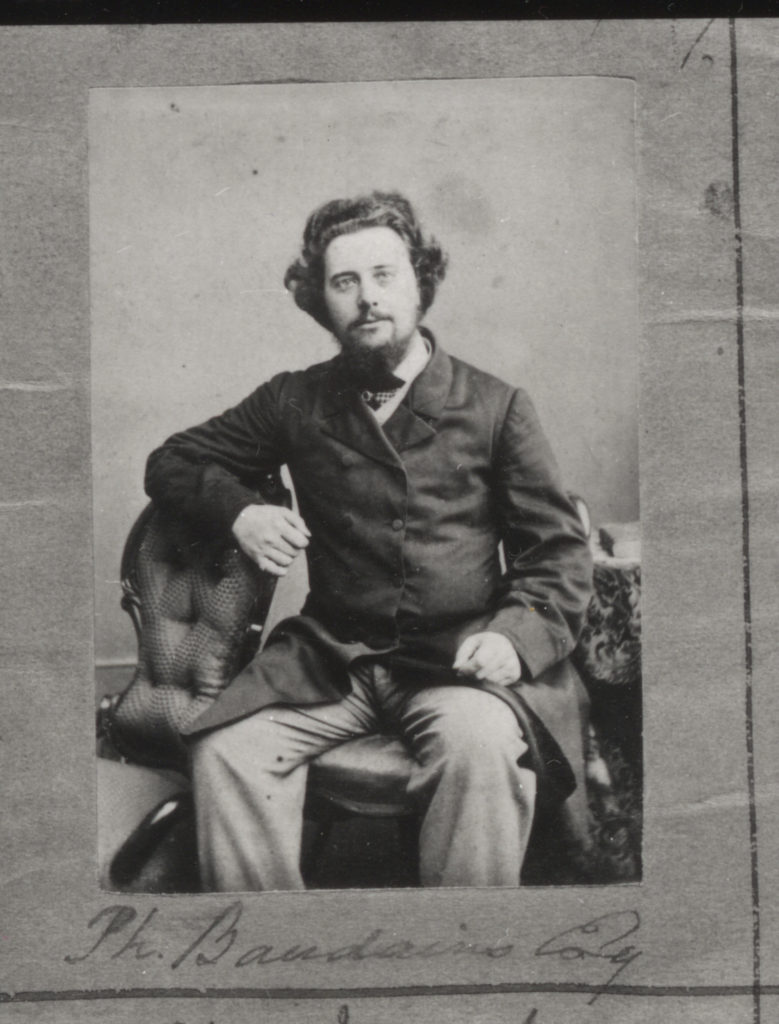
henry Mullins was a photographer who took portraits of people he would then print these photos on  a carte de visite as a small albumen print, (the first commercial photographic print produced using egg whites to bind the photographic chemicals to the paper) which was a thin paper photograph mounted on a thicker paper card. Henry Mullins was the first professional photographer to come to Jersey and establish a portraiture business in the very early days of photography.His speciality was cartes de visite and the photographic archive of La Société contains a massive collection of these. His online archive contains 9600 images, but the majority of these are sets of up to 16 photographs taken at a single sitting. In those times even 10s 6d was a substantial sum to pay to have one’s photograph taken, and included among his subjects are many of the island’s affluent and influential people.

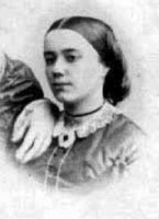
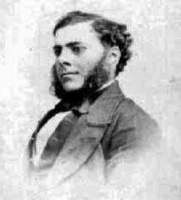
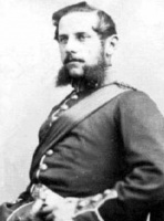
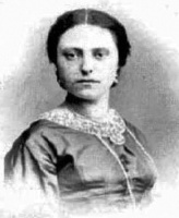
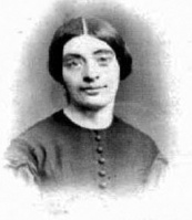
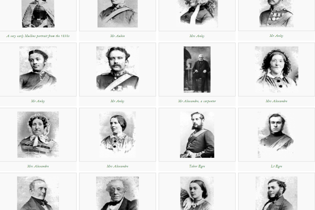
Some headshots by Mullins of both Jersey men and women produced as vignette portrait which was a common technique used in mid to late 19th century.

His photographs are taken very differently as some people were sitting from an angle and others are sat looking straight at the camera, these different photos change the tone of each photo as you could get one to look more professional and others look more like memorable portraits to keep, it also depends on their facial expression and whether they are looking at the camera or to the side. The top right image almost looks like it a family portrait and there is more than one people in the photo as we can very clearly see someone’s hands on the girls shoulder which shows u that Henry Mullins took all types of photos whether they were single portraits or group portraits. Personally I really like the one in the middle on the bottom row as you can see a dark shadow behind the girl an the it begins t be light again which really adds effect to the photo. You can also see some of the peoples clothes so its not just a face that is visible, this makes the photo look more interesting to look at. I also like how Henry has written the persons name under each of their photos so that they could be remembered.

Here we have an article explaining how Henry has opened his new studio in 1848, this gives us so much information, this helps us understand when he started to open his studio and take photos. The small bit of article helps me see that he was a good photographer and that people wanted him to take portraits of them, they views him quite well.

Chiaroscuro

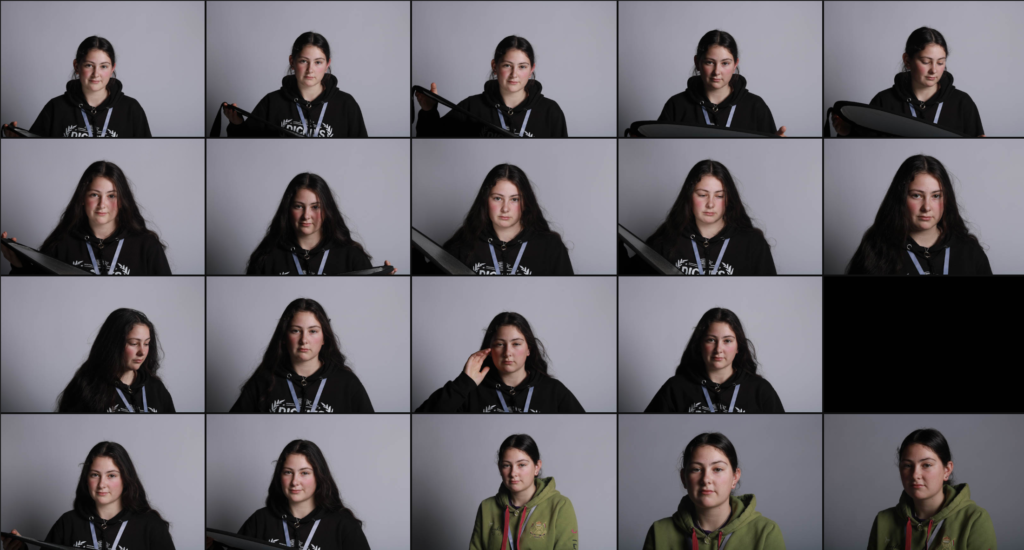
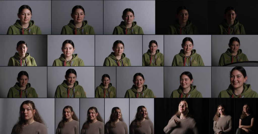
Contact Sheets

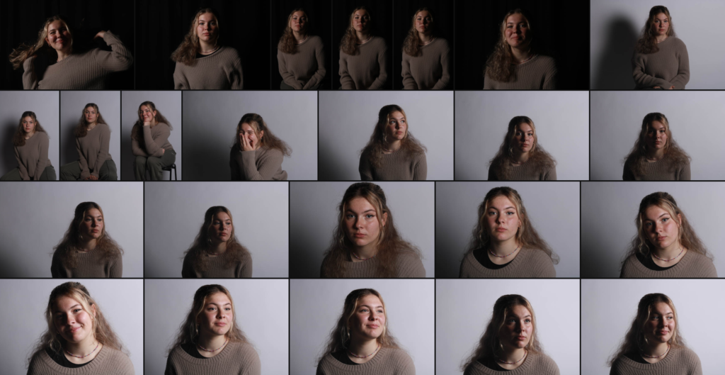
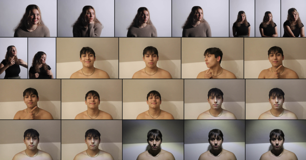
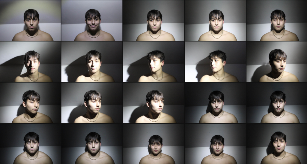
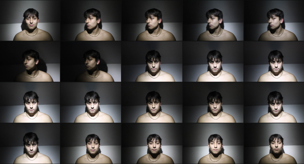
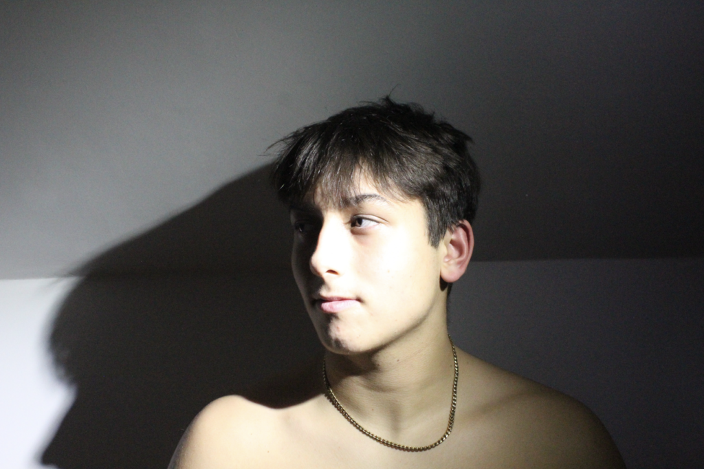
For the studio portraiture photoshoots, I did multiple photoshoots focusing on trying to get each of the various lighting effects rather than doing a photoshoot for each.

Contact Sheet for Chiaroscuro

Chiaroscuro Edits

Edit 1

I edited this photo by using the brush tool the decrease the exposure slightly on the left side of the face to give more off a light-dark effect. I also cropped the edges and top to make the face larger in the frame.

Edit 2

I edited this photo by cropping each side and using the brush tool to make the left of the face dark by decreasing the exposure. After this, I decreased the overall exposure and increased the texture.

Edit 3

I edited this photo by, firstly, cropping the top then making it black and white. Then, I slightly lowered the exposure and increased the texture and clarity. Finally, I used the brush tool to make the shaded side of the face a bit darker.

Edit 4

To edit this photo I started off by making it black and white then slightly decreased the exposure and setting the shadows as -100, rather than using the brush tool. After this I increased the whites and blacks to around 20 each.

Edit 5

I edited this photo by cropping each side then decreasing the exposure, highlights and shadows.

Edit 6

All I did to edit this photo was crop each side, including the top and bottom, and select the background to increase its exposure rather than the whole image.

Edit 7

I didn’t think that this image needed editing so all I did was make it monochrome then cropped the top.

Edit 8

I edited this photo by, firstly, making it black and white then lowering the overall exposure. Finally, I cropped the side so that the side of his face and the edge of his ear met each line that makes the vertical centre of the rule of thirds.

Edit 9

To edit this photo I started off by making it black and white then cropping each side. I then decreased the overall exposure and increased the highlights and shadows. I also increased texture and decreased clarity. Finally, I selected the background and lowered the exposure to make it black then continued to use the brush tool to clean up areas of the background and around the edges of his face which were not black.

Butterfly Lighting:

WHAT IS BUTTERFLY LIGHTING?

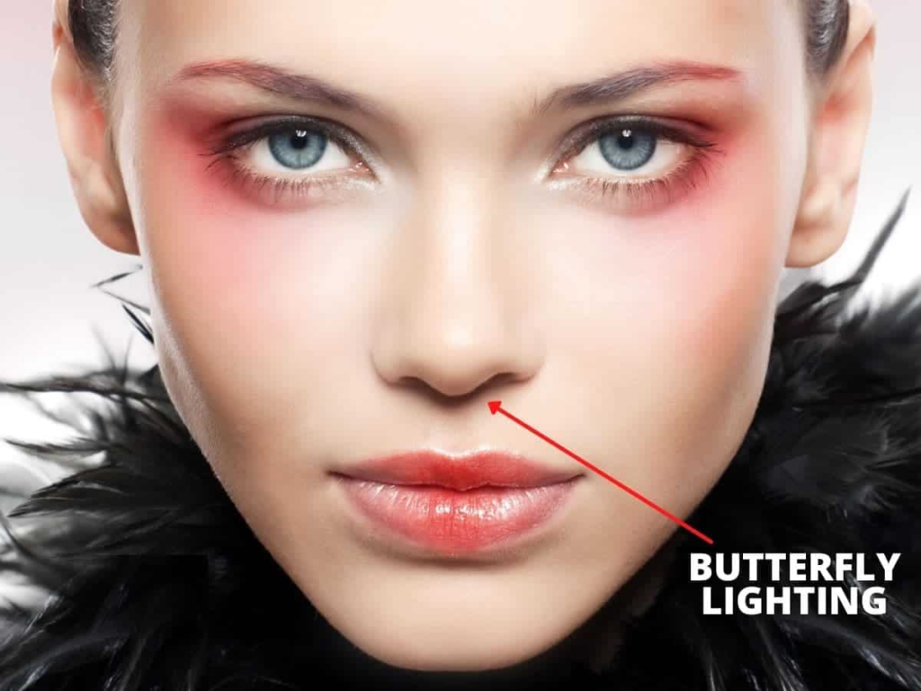
Butterfly lighting is a portrait lighting pattern where the key light is placed above and directly centred with a subject’s face to create a shadow under the nose that resembles a butterfly. The lighting is soft on the face. This lighting is often seen in glamour shots and particularly with headshots. 

WHY DO PHOTOGRAPHERS USE BUTTERFLY LIGHTING?

Photographers use this method to take flattering, glamorous portrait photos. It is a popular setup because it has the effect of slimming the face due to shadows that are created on both sides of the face. This provides a flattering look that emphasizes a subject’s facial features, highlighting the eyebrows, cheekbones, and nose in a photogenic way.  Another reason why photographers use this lighting pattern is that it is easy to set up, doesn’t require a lot of fancy equipment, and it creates a natural but strong look.

EXAMPLES OF BUTTERFLY LIGHTING:

LIGHTING SET UP:

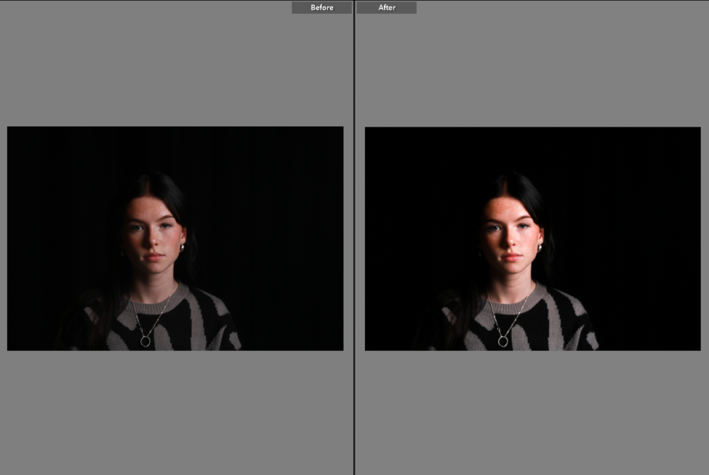
To achieve this lighting, first, we placed the main light source above the subject at a higher angle, pointing down towards the subjects face. We then placed the camera directly under the light source on a tripod. Lastly, we used a reflector to bounce the light back up and soften the shadow under the chin and under the nose. To do this, we positioned the reflector under the subject’s face. The only other thing we used was a black backdrop.

CONTACT SHEET:

MY FINAL EDITED IMAGES:
Before:

After:

Before:

After:

Virtual Gallery

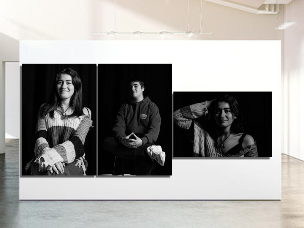
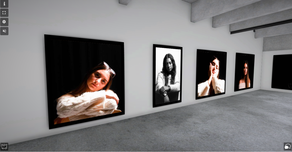
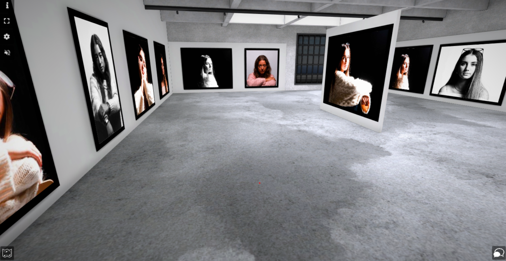
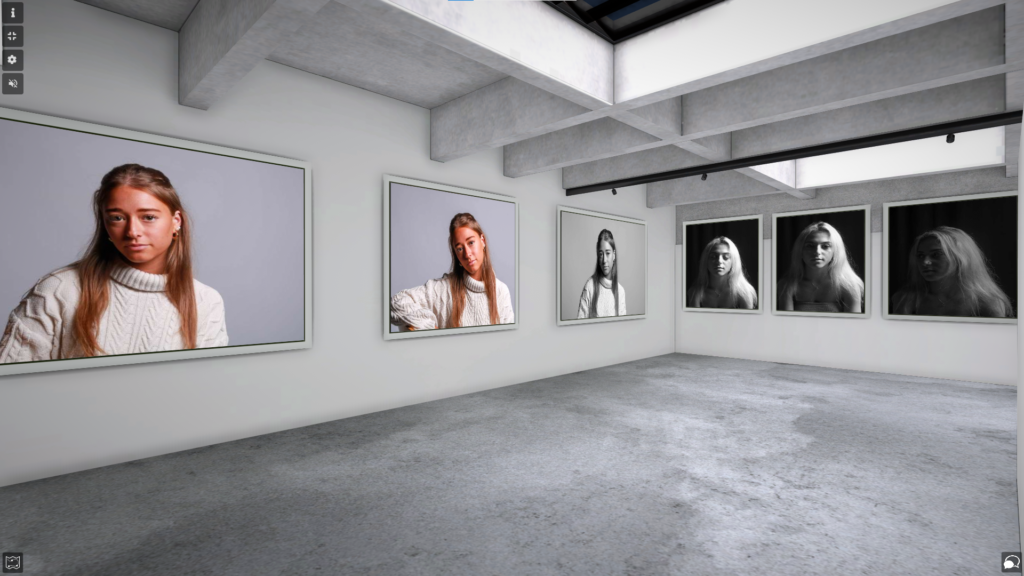
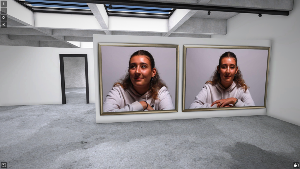
I used ArtSteps to create a virtual gallery of some of my best Rembrandt, Butterfly, Chiaroscuro lighting photographs.
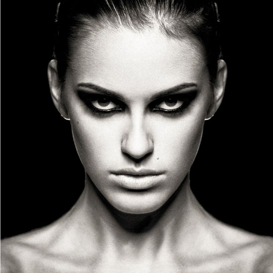
I used a mixture of black and white images, colourful images and of all the different lighting techniques.

Firstly, I picked a virtual gallery on ArtSteps that I liked and wanted to put my photographs in. Then, I dragged the photos I wanted to use for my gallery from my documents into ArtSteps and gave them all unique names. Then, I inserted the photos into the gallery, positioned them where I thought looked good and added a black frame to each one.

This image has an empty alt attribute; its file name is 35d6016a-ef70-4a82-a2a5-21de403b258b-1024x532.png

I took a close up picture of one of the walls of the gallery, so the photographs details and features could be seen clearly. Next, I took a photo of the whole gallery from a distance, so all the photographs could be seen, and so the layout of my gallery could be seen clearly.

This image has an empty alt attribute; its file name is 0092d88a-4c1b-4b97-9eaf-4468cf5ae4ba-1024x528.png

Portraits- virtual gallery

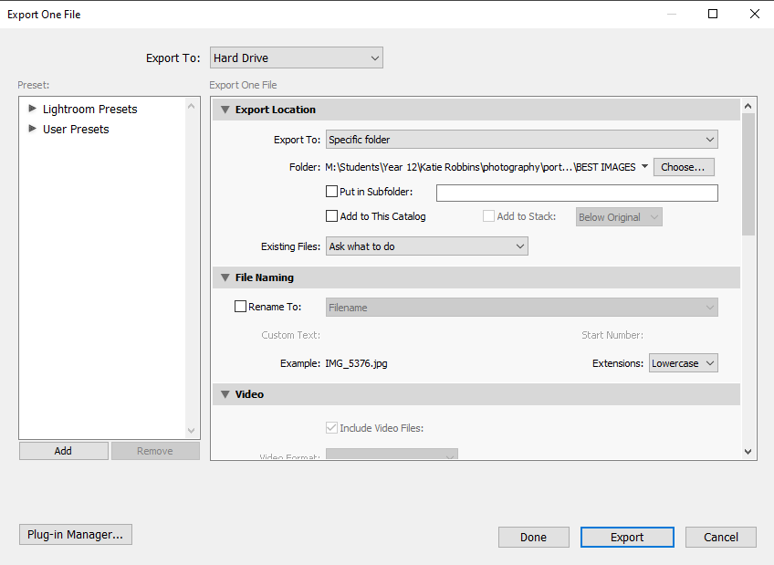
I made a virtual gallery to showcase my final and best images. I placed them on the basis of which lighting was used so it made more sense and were with images similar to it. I did this by exporting my edited images from Lightroom into my documents, then importing them in Artsteps where I was able to add frames and place them on the wall.

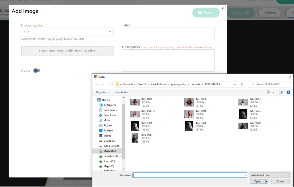
I exported them from Lightroom by placing them into a best images folder within my portraits folder for easy access.

I dragged and dropped my images into the exhibition in this way to import them.

Rembrandt Lighting

Rembrandt Lighting is a form of lighting commonly used in photography and film. It is where their is an upside down triangle of light under the eye on the opposite side of where the key light is. It is also useful for creating shadows and contrast.

An example of Rembrandt lighting

How to set up Rembrandt lighting

We decided to go into the lighting studio and try and take some photos with Rembrandt lighting. The photo below is how we set it up.

Below is a selection of photos I took which best fit the Rembrandt lighting style…

My Final Photo

I selected this as my final photo for Rembrandt lighting as I feel like the triangle is most accurate in this photo also it just stands out from the other photos I took. The only editing I did was slightly crop the photo and remove any small marks with the spot remover tool as I feel like the photo didn’t need to be overly edited.