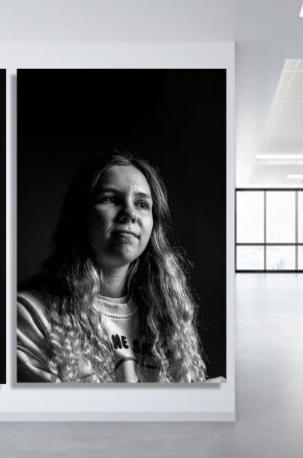
REMBRANDT VIRTUAL GALLERY


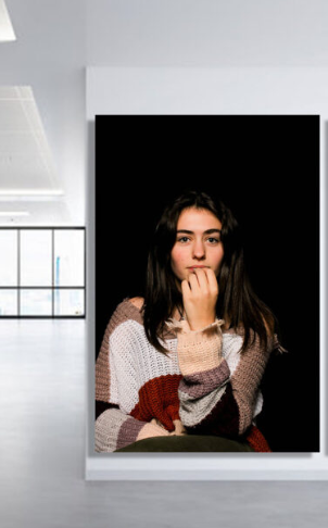
What are lighting loops?
Loop lighting is an essential lighting technique for portrait photographers. It is easy to create with just a single light source and is flattering on most subjects. This lighting pattern will create a shadow that loops down and around the side of the nose, and on the neck and under the chin.
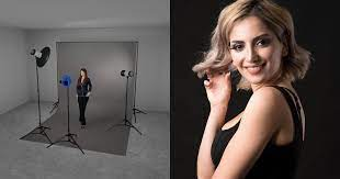
How does a loop light work?
Loop lighting is a lighting pattern that creates a circular shadow on the subject’s face just under the nose. You can achieve this by placing the key light 45 degrees to the side of the subject and raising it just above their eye line.
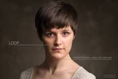
Here’s my example of loop lighting, which is edited.
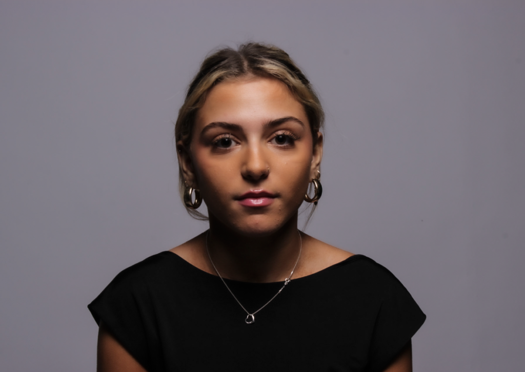
This one is not..
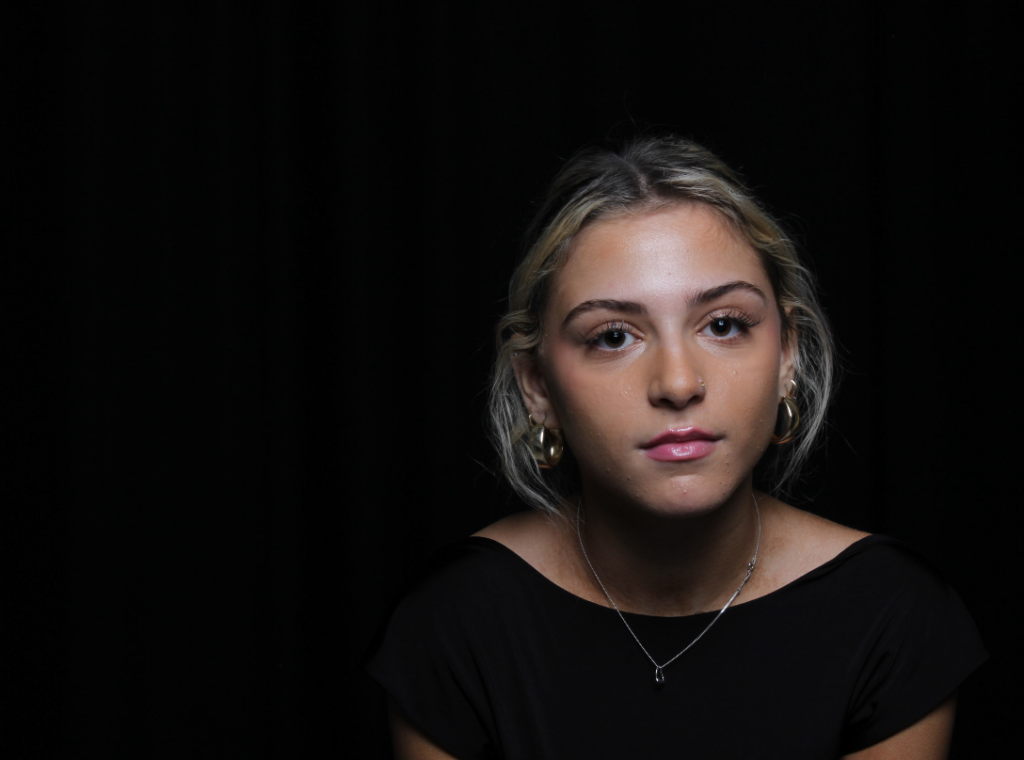
To achieve loop lighting, chose a useful portrait lens, usually between 50mm and 100mm focal length. Position the camera in front of your subject to frame the head and shoulders. Place the light to the side of your camera (at 30-45 degrees) and slightly above the subject’s head.
Who is Henry Mullins?
Henry Mullins, the renowned headshot photographer, was born on June 12, 1975, in Los Angeles, California. From an early age, he exhibited a passion for creativity and art, particularly in the field of photography. As a teenager, he would spend countless hours exploring his neighborhood with his trusty camera, capturing the essence of the people and places he encountered.
After high school, Mullins pursued his passion for photography by enrolling in the prestigious School of Visual Arts in New York City. Here, he honed his skills under the guidance of some of the industry’s most renowned photographers. Inspired by his professors and surrounded by the vibrant art scene, Mullins began to carve his own path in the world of photography. Upon graduating, Mullins moved back to his hometown of Los Angeles, where he established his studio and started his career as a headshot photographer.
He quickly gained a reputation for his unique artistic vision, attention to detail, and ability to capture the true essence of his subjects. Mullins had a natural talent for making his clients feel comfortable in front of the camera, resulting in stunning headshots that truly represented their personalities and capabilities.
Mullins’ work soon caught the attention of casting directors, agents, and actors alike. His photographs graced the portfolios and websites of numerous Hollywood celebrities, catapulting him to the top of his field. His ability to capture an actor’s true essence in a single frame earned him accolades and made him one of the most sought-after headshot photographers in the industry.
Throughout his career, Mullins collaborated with numerous acclaimed actors, directors, and production teams. Not only did he provide stunning headshots, but he also worked on set, capturing behind-the-scenes moments and promotional images for various films and television productions.
In addition to his commercial success, Mullins dedicated his time to giving back to the community. He conducted workshops and mentoring programs for aspiring photographers, serving as an inspiration for the next generation of talent. Mullins believed in nurturing young minds and encouraging them to unlock their artistic potential
Henry Mullins’ passion, dedication, and artistic eye revolutionized the world of headshot photography. His ability to showcase the true essence of his subjects made him a trusted collaborator for actors, models, and performers worldwide. Today, his legacy lives on through the countless aspiring photographers inspired by his work and the impact he made on the industry as a whole.
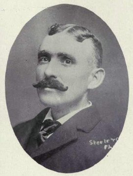
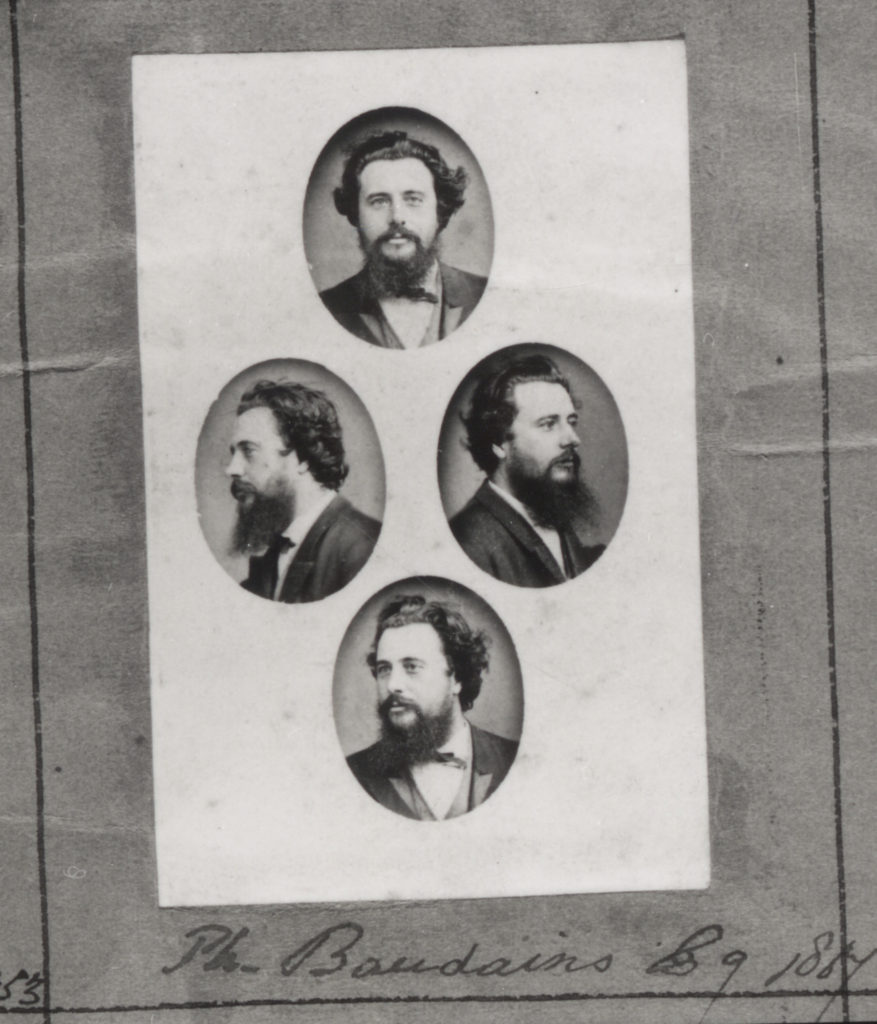
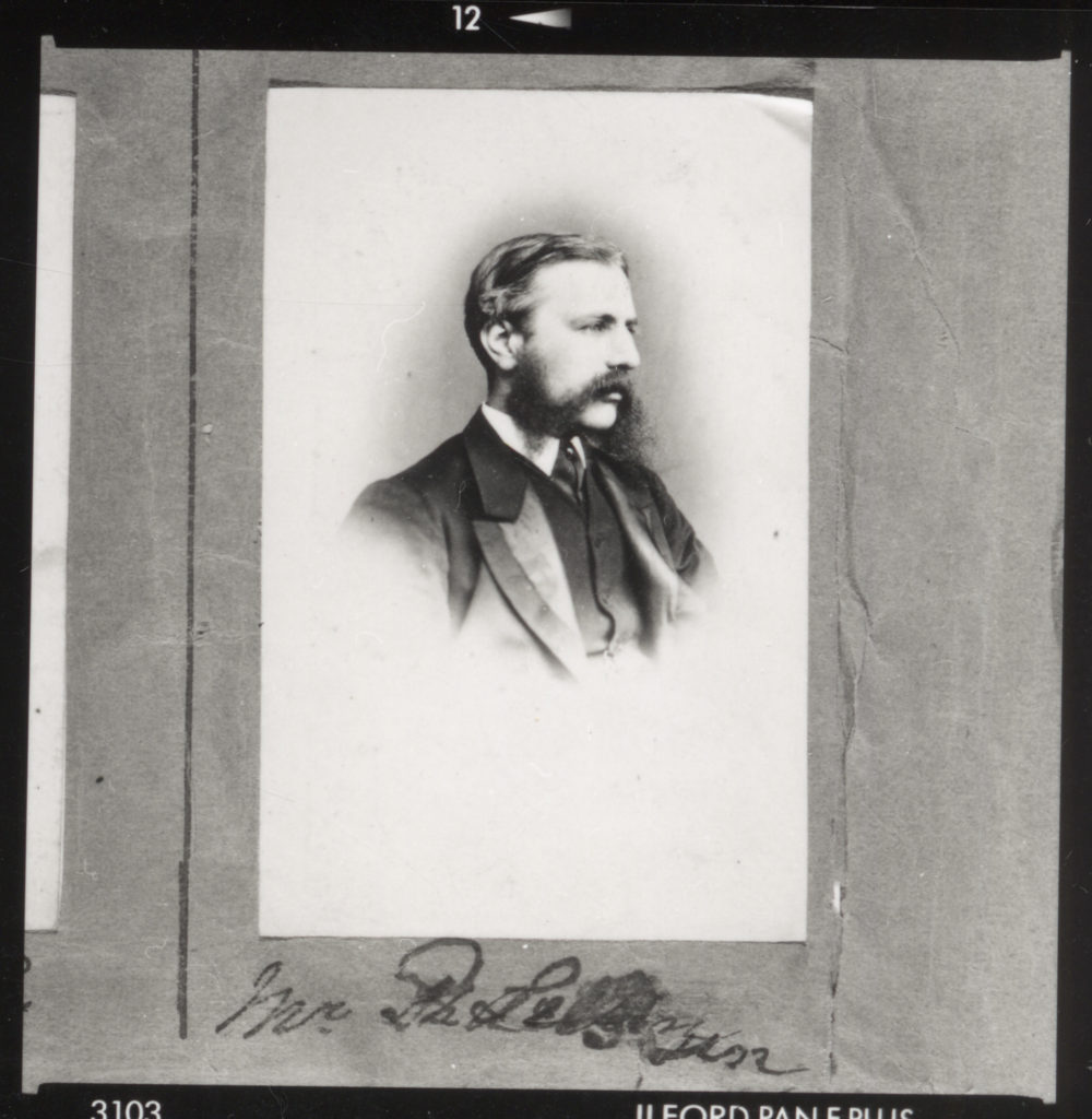
Henry Mullins, a highly prolific photographer, made an indelible mark on the Societe Jersiase Photo-Archive, amassing a collection of over 9,000 portraits of Jersey Island residents. The period in which he operated, from 1852 to 1873, coincided with a population of approximately 55,000. The surviving record of his work, found in his meticulously curated albums, reveals Mullins’ deliberate organization of his subjects according to their social standing, thus imbuing his portraits with a subtly political narrative.
Henry Mullin’s famous Images;
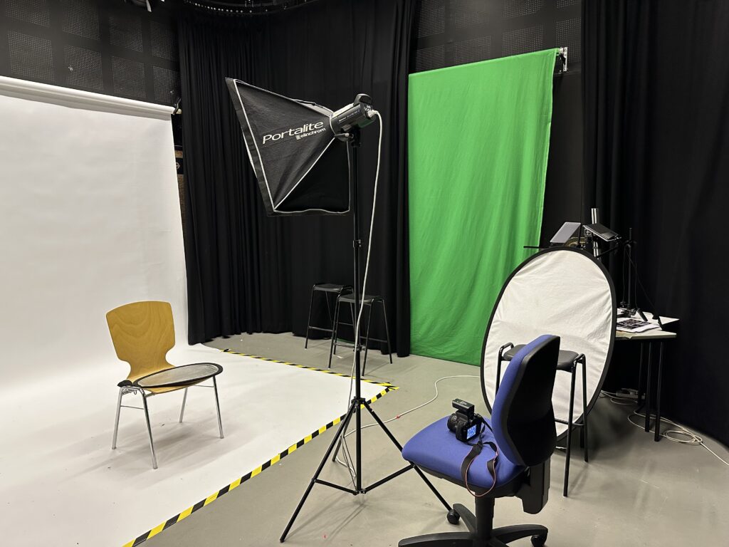
We took a total of 172 photos trying out different lighting methods, and setups. Here is the setup of the studio and our best photos
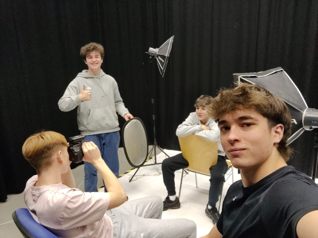
This was the basic setup we used for all the different lighting methods (chiaruscuro, rembrant, butterfly), we just changed the direction of light(s), camera angle and how the subject poses.

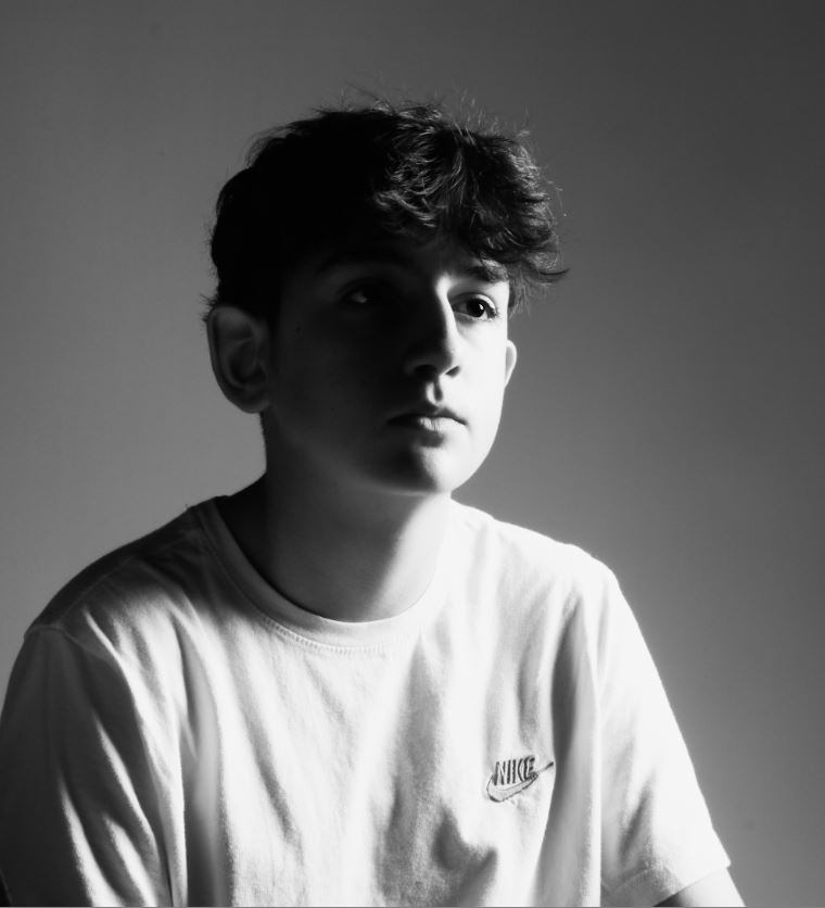
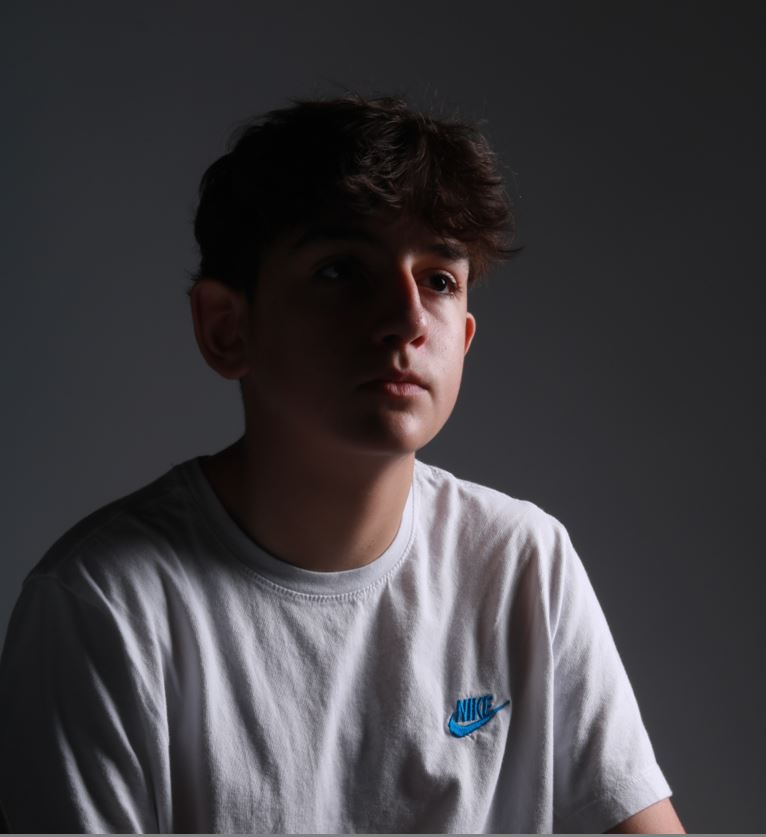
This is a photo i took of Jonny. Its got a white backdrop, with a flash light and diffuser 45 degrees from the subjects face, while still being close to create a dramatic effect between light and dark (chiaruscuro). I make the highlights very dramatic and almost glow like with editing to replicate how old cameras took photos. Many famous movies implemented Chiaruscuro to create a more dramatic scene, so I used the same effect here. I made my subject look into the distance, not at the camera to increase emotional effect.
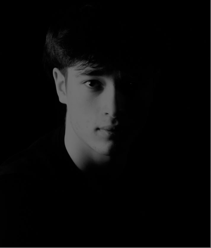
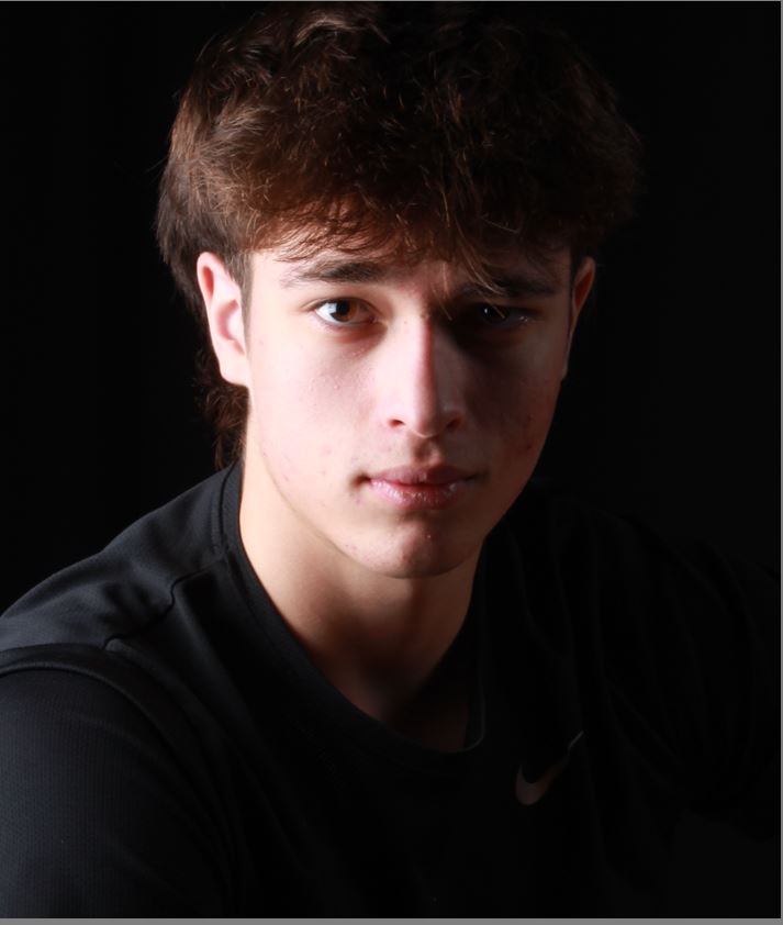
Here, I heavily relied on editing to create more emotion. With the editing you cannot see the subjects right eye, changing his smirk look, into a more sympathetic one. I used the black and white filter to make the contrast more dramatic as colour will not distract the image.
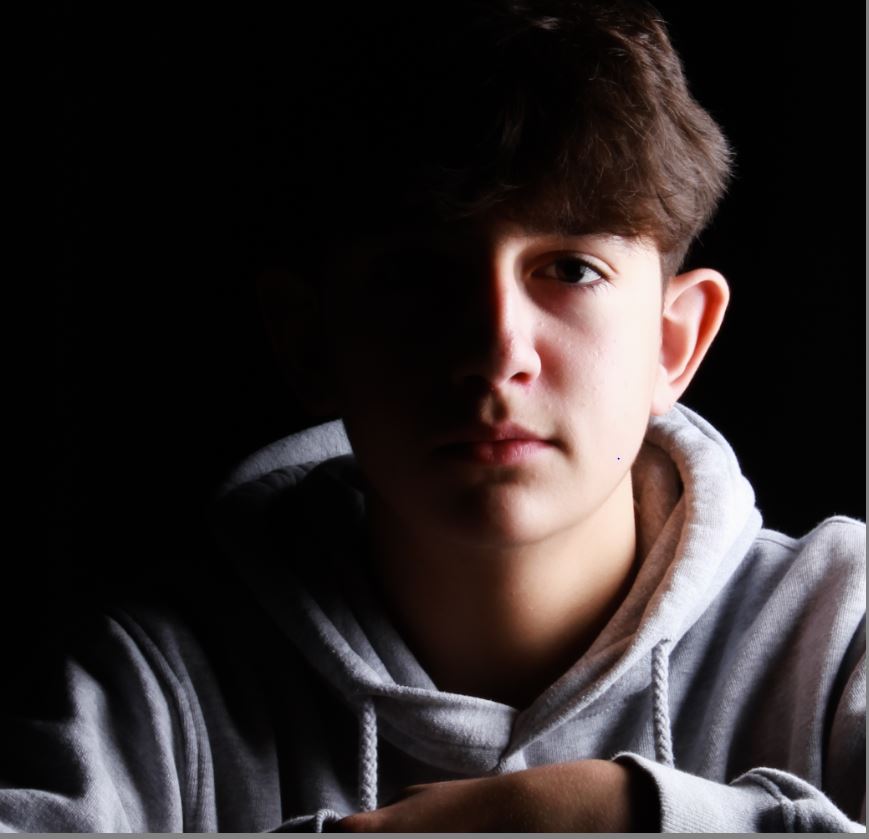
For this picture, I used the black curtains, a lightbox and flash light, and a secondary light that hits the back of his head. There is a clear line between dark and light here, going across the nose, lips, ext. The eyes have little life as we put the reflector further away from his face, giving him a sense of lifelessness.

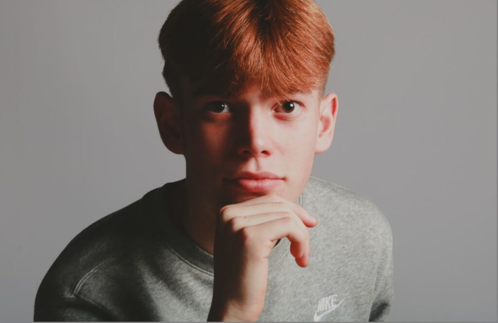
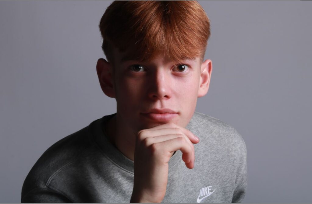
(left one is edited). The triangle is bellow the right side of their face. I edited it with bright and colourful settings and slightly more contrast (keeping the rule of thirds by placing his eyes along one of them.) I did this to oppose the dramatic effect created by a Rembrandt lighting method .
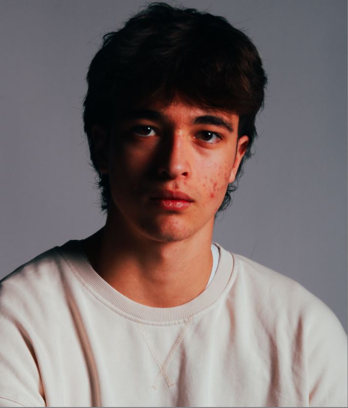
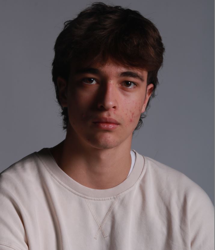
I did a similar thing as the above image for this one, just with a new subject.
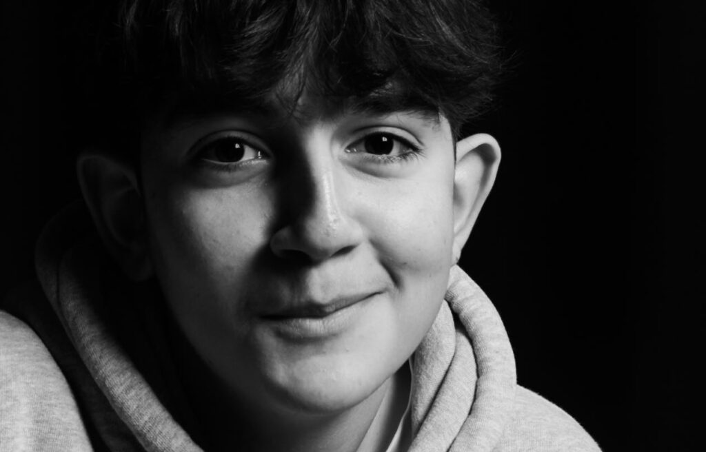
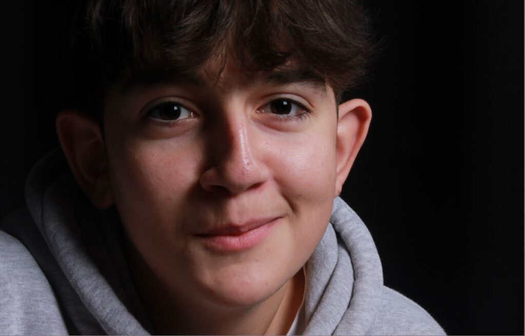
happy dude.

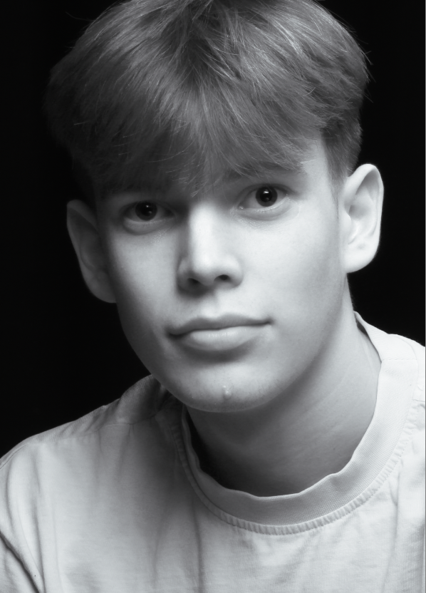
young handsome man
Photoshoot Plan:
Contact Sheet:

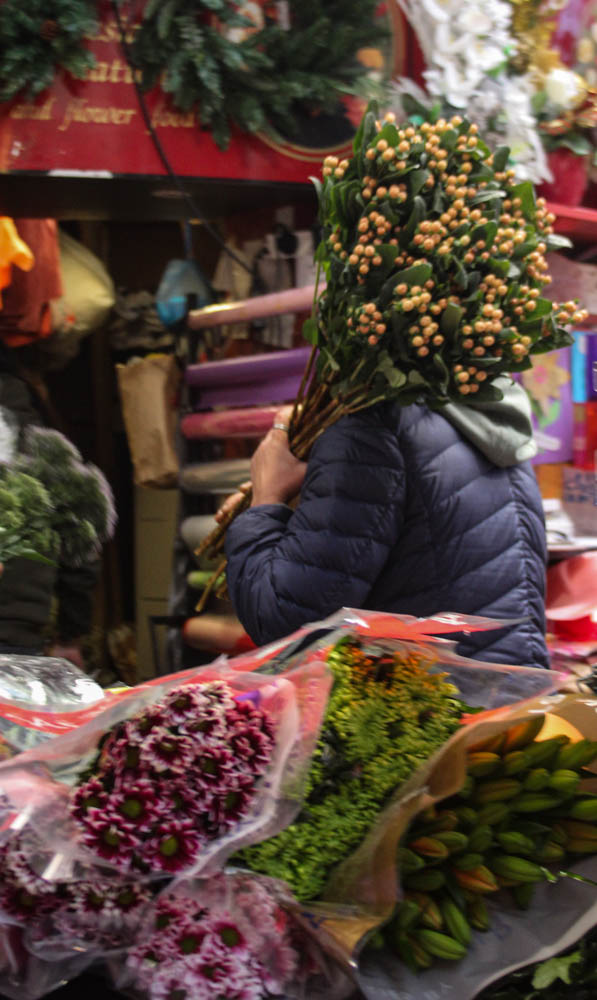
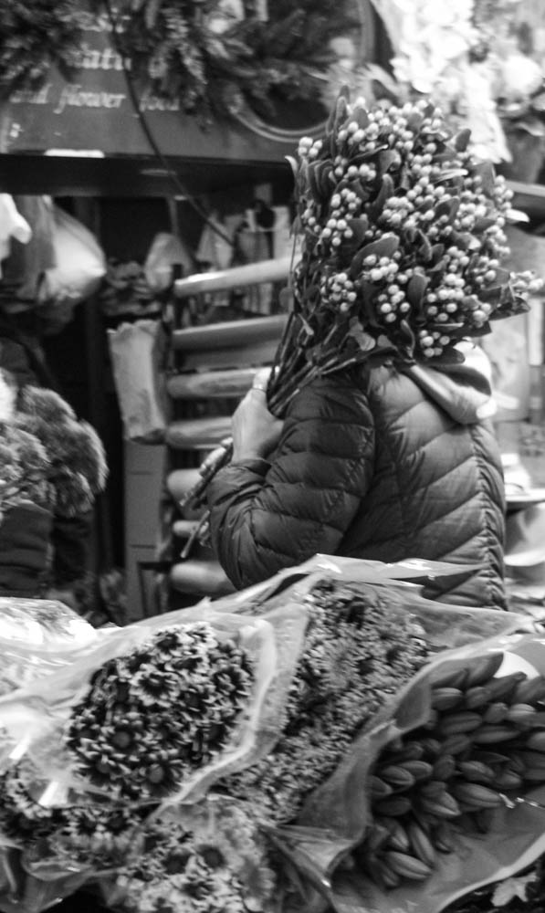
The flowers themself create really eye catching shapes and tones, but I also thought capturing the florist organising bouquets of flowers whilst preparing them would overall create a really interesting and aesthetic photo that would draw your focus towards. I have put an ‘x’ next to the photos, which were my least favourite and my favourites are show below:
My Photos:
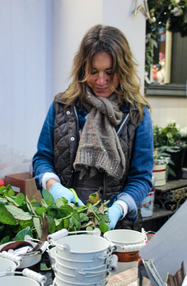
Favourite images:
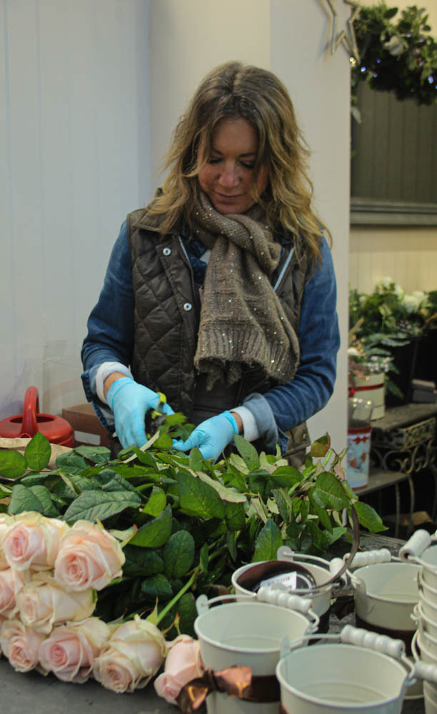
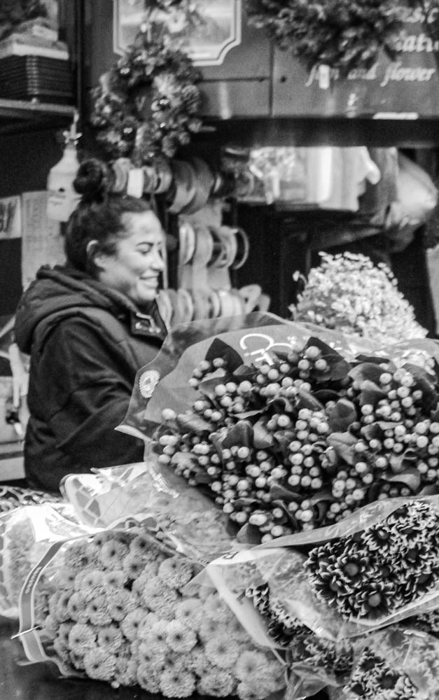
This photo has a shallow depth of field, as I wanted the florist to be the main focus and stand out. I like how the florist is the central focus as you notice it straight away, then leading lines are created directing your eyes down towards the flowers, creating this visual story of what she is doing. I captured this photo in the natural light, then using Lightroom to experiment with different exposure levels and tones.
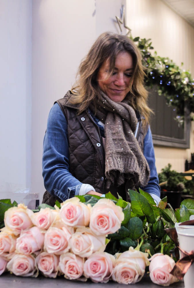
For this photo, I captured the florist at an angle, and looking up towards her. This allowed me to include more of the flowers which I thought would be a really interesting and engaging part of the photo. I wanted to capture the florist with the flowers laid out in front of her because this makes it very eye catching and engaging for the viewer. This angle, creates leading lines upwards towards the centre giving the main focal point. You firstly notice the subject then your eyes are moved down towards the flowers, creating another focal point.
Studio lighting is used for consistency as you can take lots of photos with the same colour and lighting.
It is also used as you can easily recreate lighting techniques in an environment which won’t change based on the outside environment.
Furthermore you can also experiment and create lighting setups in a studio by changing the position, intensity and temperature of the lights.
A point is a light source and could be a key light, backlight, fill light and could even be a reflector.
1 point lighting only uses 1 light source (usually a key light), this could be a light facing someone in a studio, or if someone is outside, the light source would be the sun.
2 point lighting commonly uses 2 light sources or a light and a reflector
3 point lighting is common for portraits as it uses three light sources to control the shadows and make the subject well lit.
Fill lighting is a popular style of lighting used in theatre, film and photography. Fill lighting is commonly used with a 3 point lighting setup to light up darker shadows in order to reduce the contrast to make the subject look more natural. Furthermore it can increase detail by giving more light to darker areas revealing areas of detail.
Henry Mullins is one of the most prolific photographers represented in the Societe Jersiase Photo-Archive, producing in the 19th century. He captured 9,000 portraits of islanders from 1852 to 1873 at a time when the population was around 55,000, proceeding to place them in an order of levels of social class in albums. He began his career by working at 230 Regent Street in London in the 1840s, then moving to Jersey in July 1848, setting up a studio known as the Royal Saloon, at 7 Royal Square. Initially he engaged in a partnership with a Mr Millward yet very little is known about him. By the following year he was working alone and he continued to work out of the same studio for another 26 years.
Henry Mullins’ work of 19th century Jersey is highly politicised, taking images of Jersey political elite (E.g. The Bailiff, Lt Governor, Jurats, Deputies etc), mercantile families– involved in trade (Robin, Janvrin, Hemery, Nicolle etc.), military officers and professional classes such as doctors, bankers and advocates. He organised these images from the most powerful roles, to the lesser powerful.
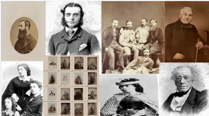
Mood board of his work:


These images are only a small portion of the large amount of images he took, these images would then be placed into an album, presented as Cartes de visite:
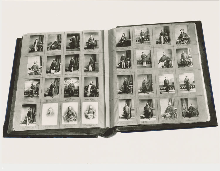
Cartes de visite:
Defined as : ‘visiting card’ or a close-trimmed portrait photograph approximately 2¹/₄×3³/₄ in. intended as a substitute for a visiting card.
Mullins specialised in Cartes de visite, in which the photographic archive of La Société contains a large amount of these (online archive being 9600 images). The Cartes de visite small albumen print. This is described as the first commercial photographic print produced using egg whites to bind the photographic chemicals to the paper which is quite interesting as this is would be very rare to see now. Because the image emerges as a direct result of exposure to light, without the aid of a developing solution, an albumen print may be said to be a printed rather than a developed photograph. Usually, this consisted of a small thin photograph mounted onto a thicker piece of card, however Mullins placed is work into an album.
Many of these images contained the island’s most affluent and influential people, alongside officers of the Royal Militia Island of Jersey, for whom it was very popular to have portraits taken, as well as of their wives and children. The images of the officers document the change in generations as they do not look like the general person today, showing the fashion for long hair, whiskers and beards in the mid-1800s. Their appearance makes it difficult for the viewer to differentiate who is who as they were styled almost identically during this time.
Diamond Cameo:
This layout of final images is called a Diamond cameo due to the diamond-like shape produced by the placement of oval images. I do like this form of layout as it makes it more interesting rather than a regular image alone, or a regular layout of images side by side. It lets the viewer investigate the images more which is more engaging, also making it more aesthetically pleasing to the eye.

Mood board
What is butterfly lighting?
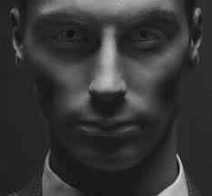
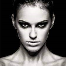
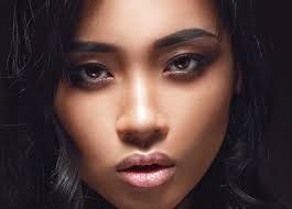
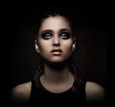
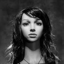
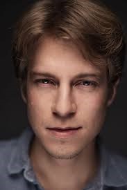
Butterfly lighting is a technique where the studio light is placed directly in front of the model so it creates a butterfly shape underneath the nose and gives defined cheekbones. Its also known as paramount lighting named for Hollywood glamour photography.
The importance of Butterfly lighting?
The butterfly lighting technique was used to take portraits of some of the most famous Hollywood actors. The photography technique creates a dark shadow underneath the neck and on the cheeks to make the model look thinner and leaner.
Image Analysis
The colour in this image is black and white and the contrast between the bright light in front of the model and the black background gives contrast which gives the photo a much more dramatic look. The texture of these photos is quite blurred, by having the light directly in front of the model it covers up the blemishes on the models face and covers up the imperfections.
My response
My best photo
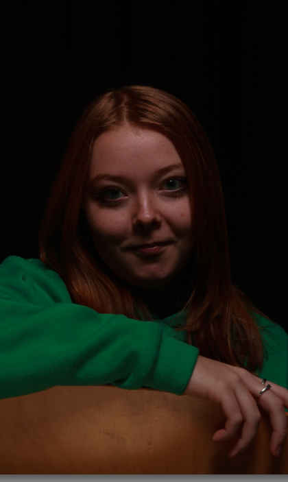
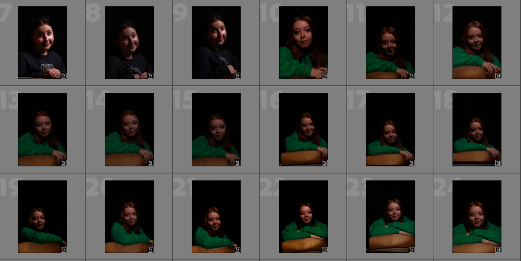
This photo is my favourite because the shadow under the nose and on the cheekbones best showcases the butterfly lighting technique and the contrast between the green jumper and the dark shadow on the face gives a really nice contrast.
For this lighting set up I used the set up below. I found this one the trickiest to get right, but it has produced some great shots. Below I have put my best shots and shown the editing process.
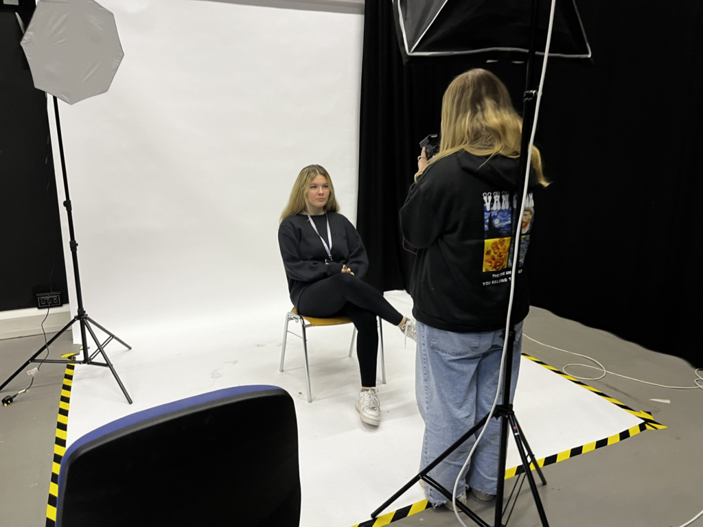
By being under the light to create the butterfly lighting gave me the best results when taking the photos. I mostly had the model facing front on to emphasis the butterfly lighting under the nose.
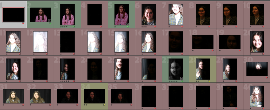
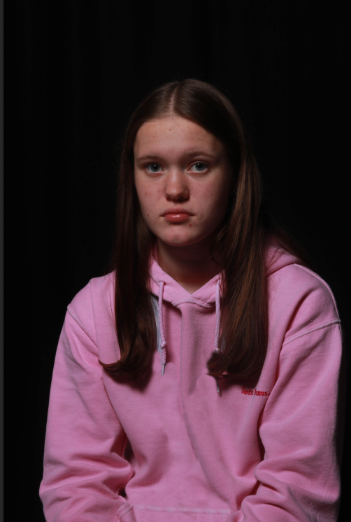
For this contact sheet there is a mix of Chiaroscuro and butterfly lighting shots as while I was trying to get the butterfly lighting to work I took some great Chiaroscuro shots.
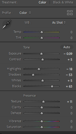
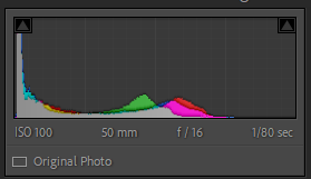
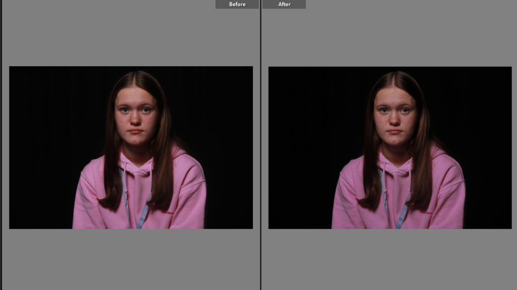
This was some basic lighting adjustments to level the shot out with the pink jumper reflecting making the models face have a pink tint. I would like to remove the lanyard in the future as I think it looks messy but it is accurate to the model being a student.
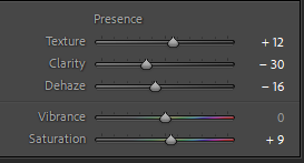
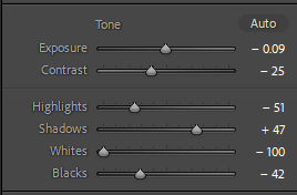
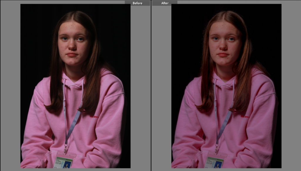
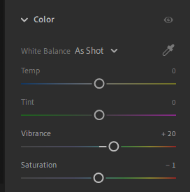
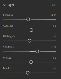
For this shot I used the lighting settings to manipulate the image. While this isn’t the best shot I took for butterfly lighting the shadow was improved when enhanced by editing. By also adjusting the presence settings the texture was increased while taking the clarity down and dehazing the image added to the smooth effect the lighting created. It also brought out the golden colour in the models hair.
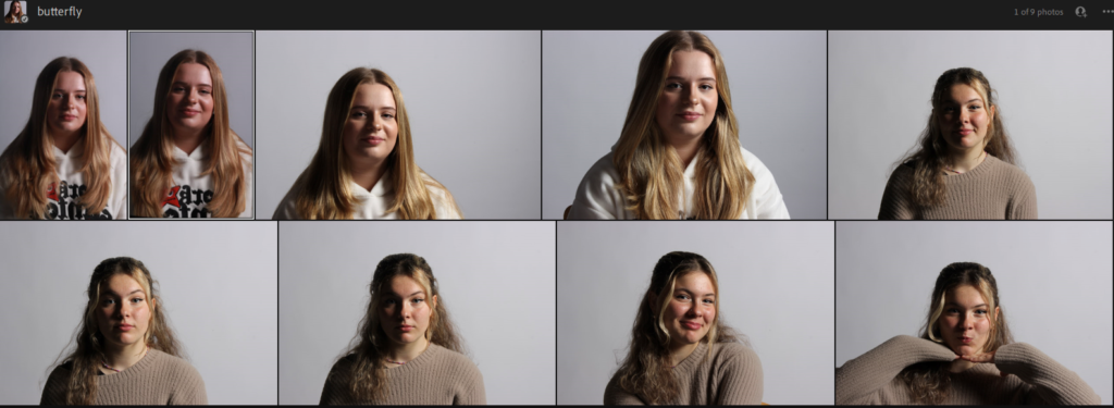
These are some shots I have picked from other shoots that actually have butterfly lighting features. By changing the lighting to get different shots often means that sometimes when while you are trying to take photos for a particular style you end up with different techniques.
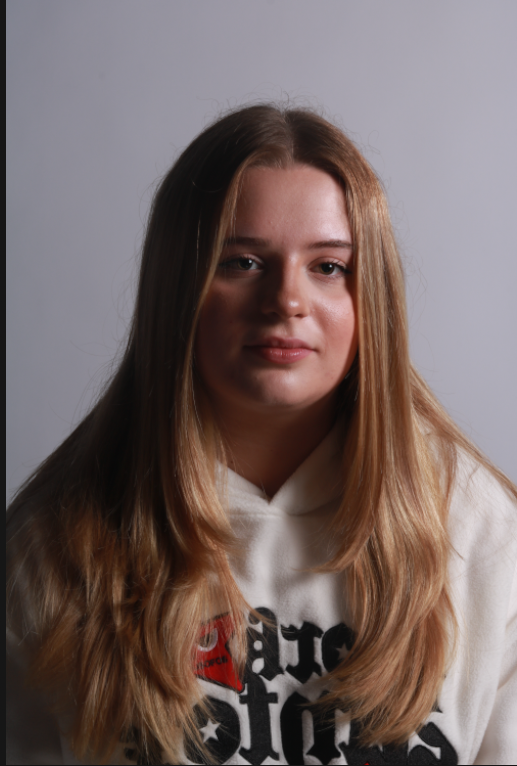
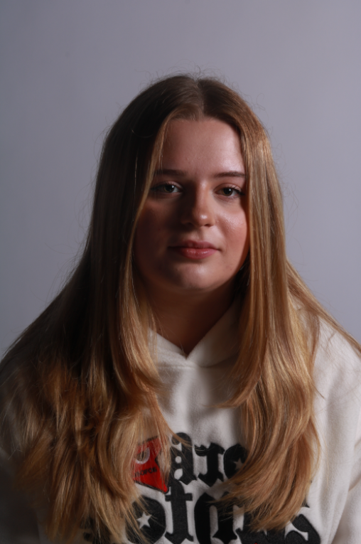
This is one of the shots that is bordering butterfly lighting while this isn’t textbook butterfly lighting it certainly has elements and in general is a nice shot. I like how the model is looking at camera, her hair frames her face nicely creating a frame around her face, pulling the viewer to models face.
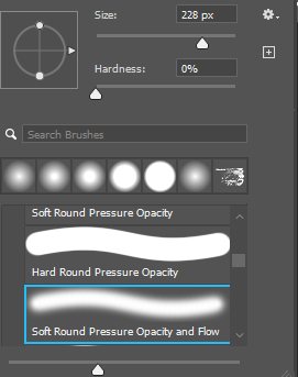

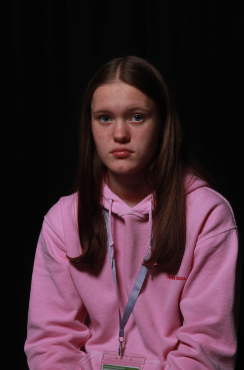

I had a quick go at removing the lanyard off the model on this shot I have already edited. By using the clone stamp tool on varying brush hardness’s and it allowed me to play around with removing the lanyard, while it’s not perfect it is a good insight into potentially future editing.
Final Favourite Shot
