What is double/multi exposure?
Double or multi exposure photographs are when an illusion is created by layering images (or parts of images) over the top of each other. This can be done on Adobe Photoshop by creating image layers and then using blending options and opacity control.
Mood board
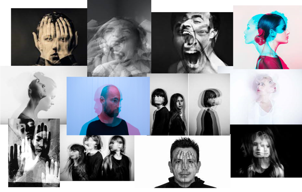
Artist Reference
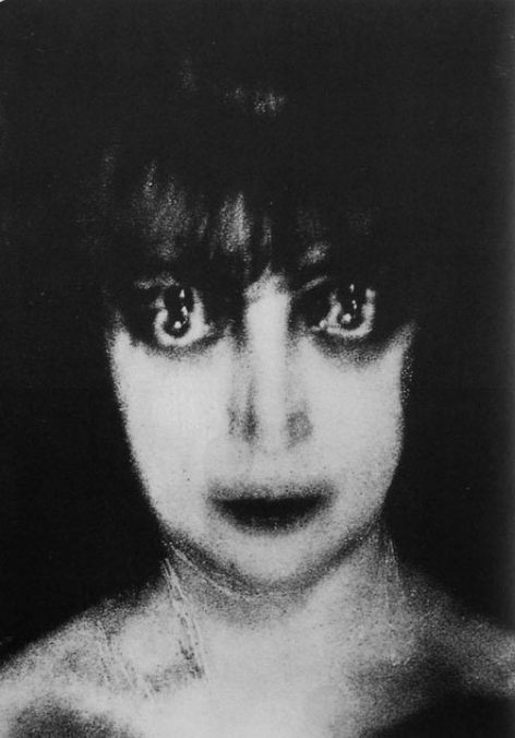
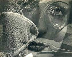
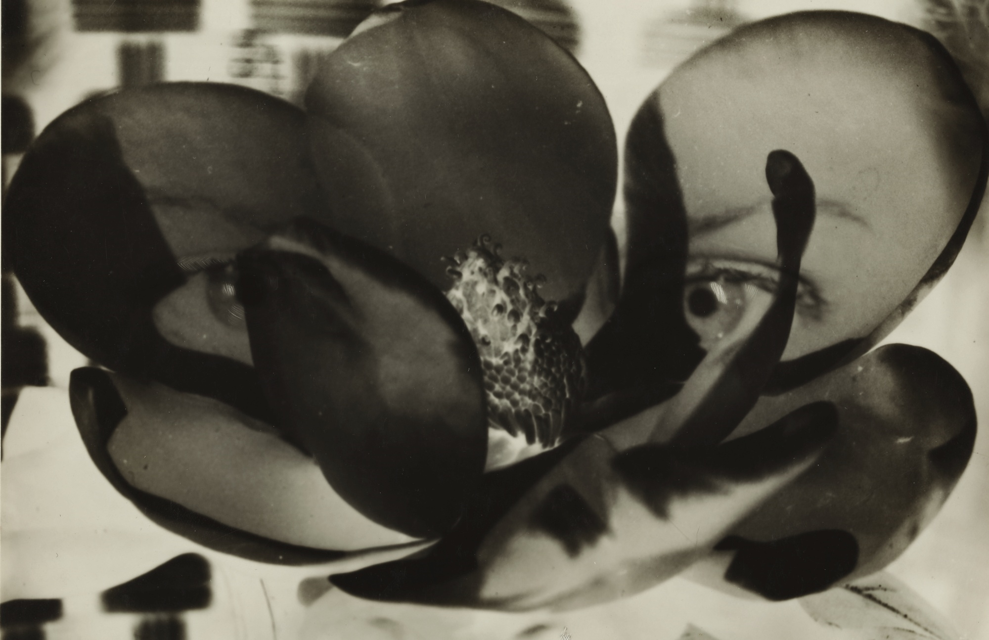
Man Ray was an American photographer, painter and filmmaker, born in 1890 under the name Emmanuel Radnitzky in Pennsylvania. He was most famous for his work in portraiture and spent the majority of his career in Paris, where he later passed away in 1976, aged 86. Man Ray was Jewish and a significant contributor to the Dada and Surrealist Movements, challenging social norms through art and writing. He invented many photography techniques, a remarkable example of this is Rayographs. Rayographs were made without a camera and, alternatively with the use of photosensitive paper which he would place objects on then expose to the sun.
Here are some examples of Rayographs:
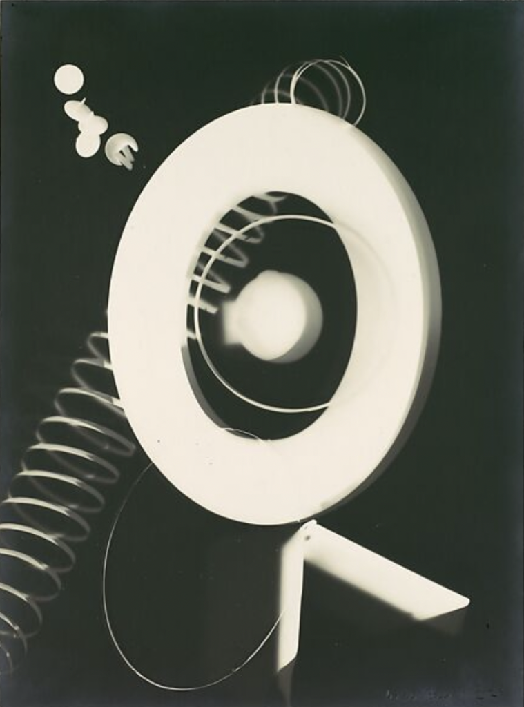
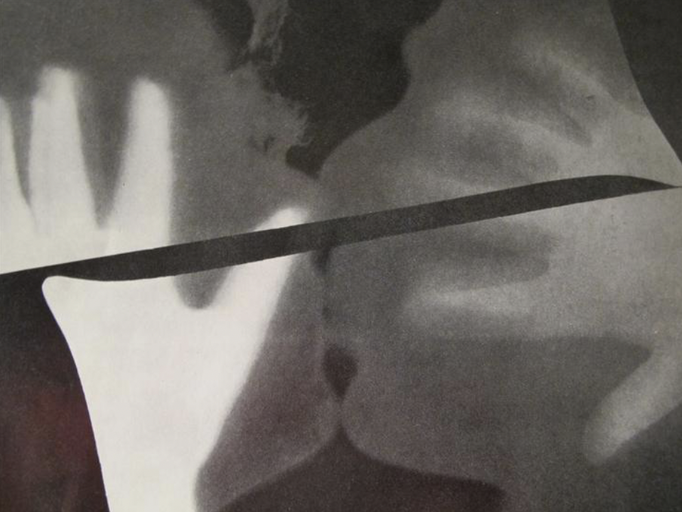
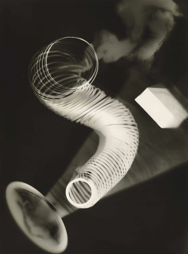
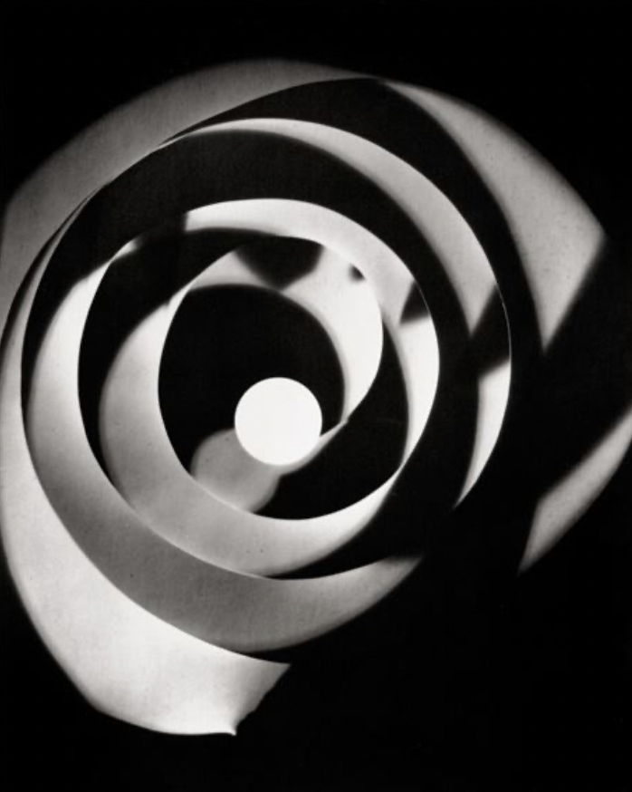
I find these photos fascinating that they were not taken using a camera and they appear like an Xray. These images also look like they have been edited to create a Muti exposure image, which is why Man Ray is an interesting artist for this.
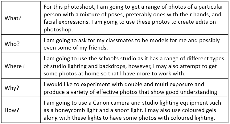
Photoshoot Plan
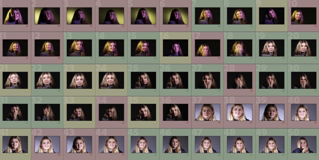
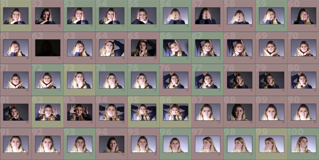
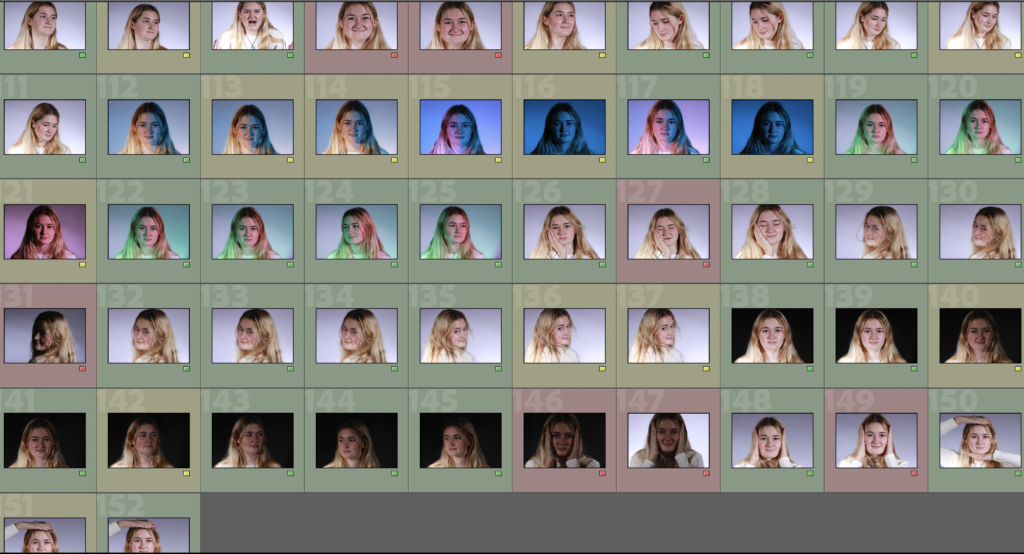
Photoshoot/Contact Sheet
I am going to be using this same set of photos for all Headshots editing.
Edits
Edit 1
The photos I used for this edit are:
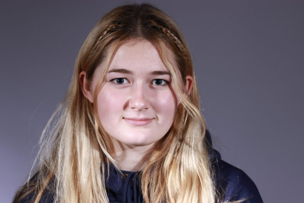
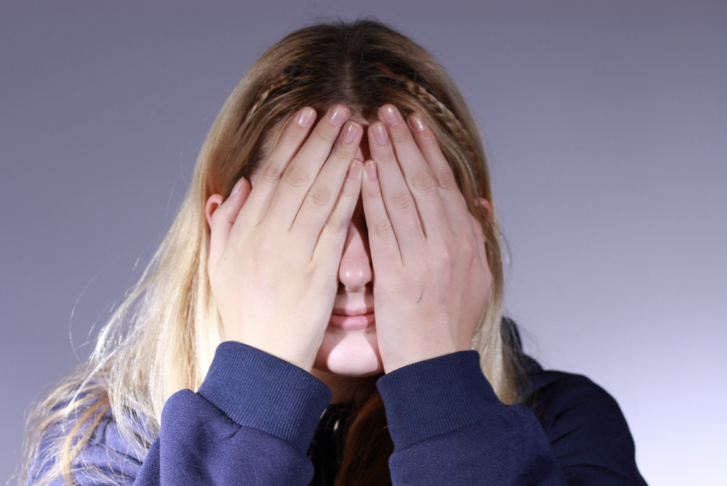
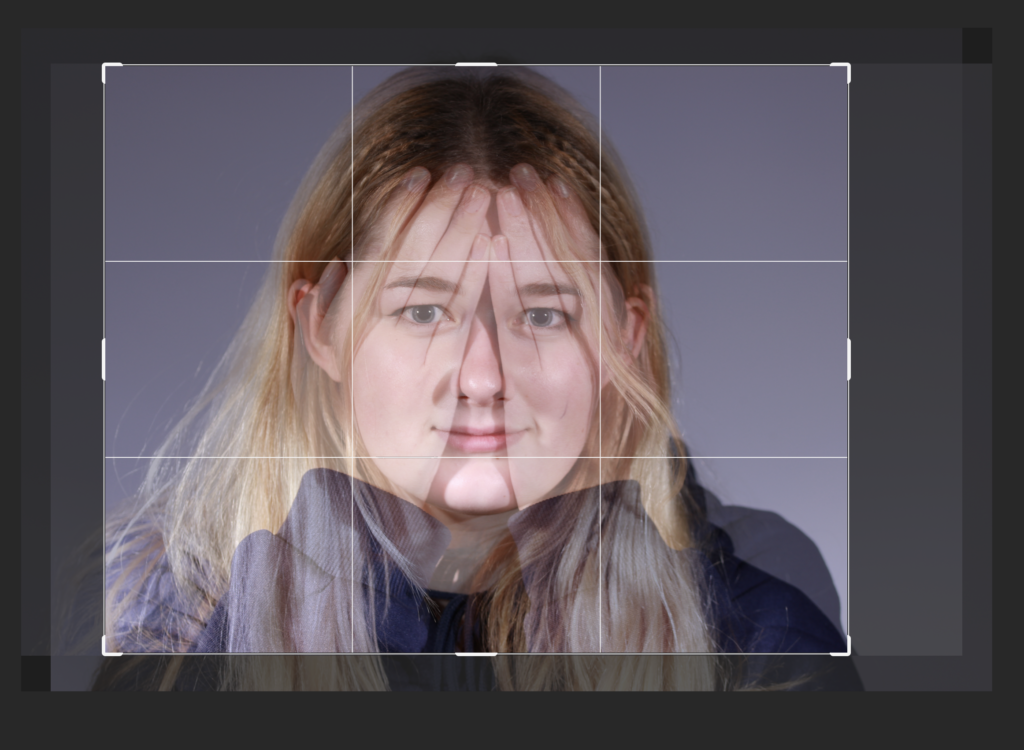
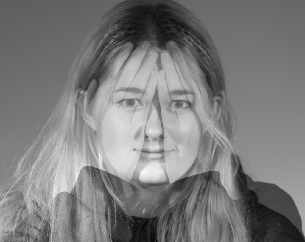
I started editing this photo by adding both images as a layer onto a blank document then lowering the opacity of the layer on top.
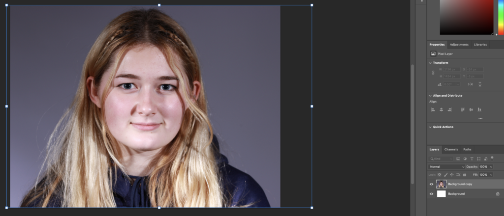
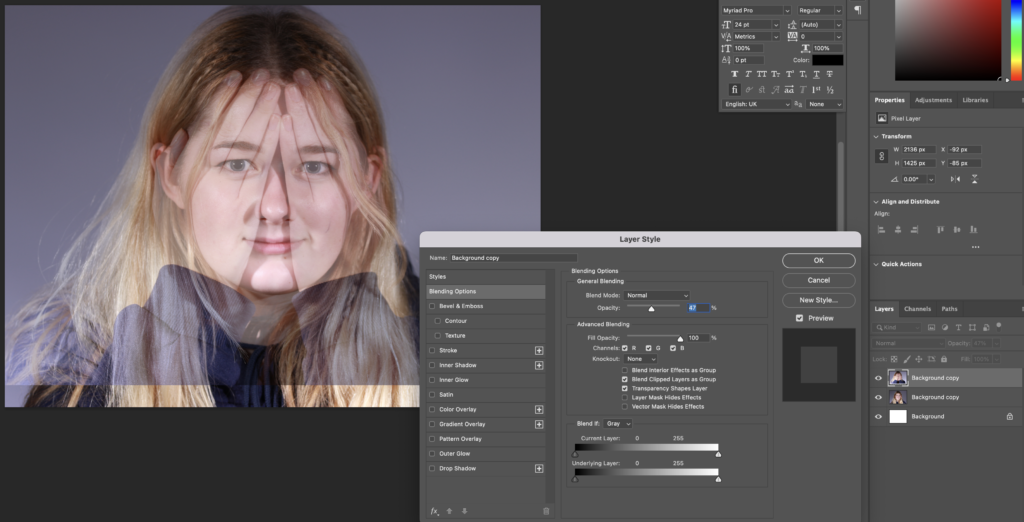
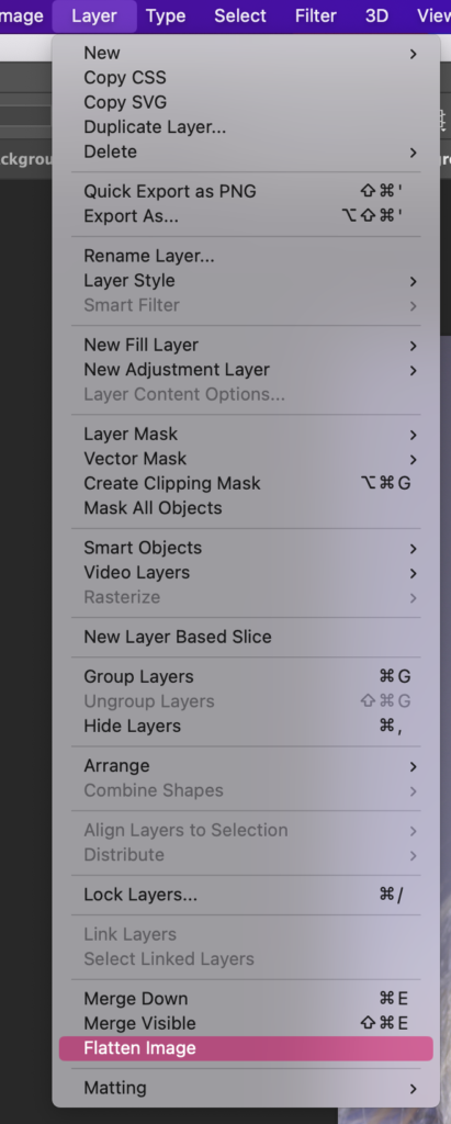
I then cropped the edit so that you couldn’t see the edges of the image layers then I went to Layer > Flatten Image so that the whole thing was just one singular layer.
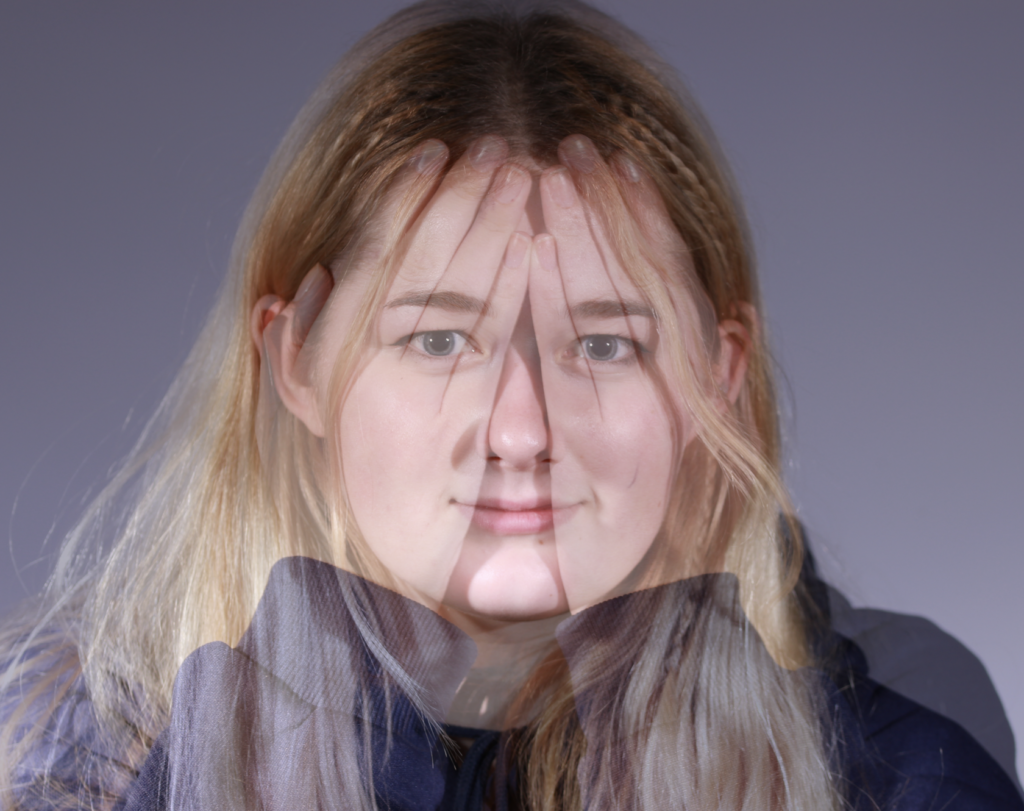
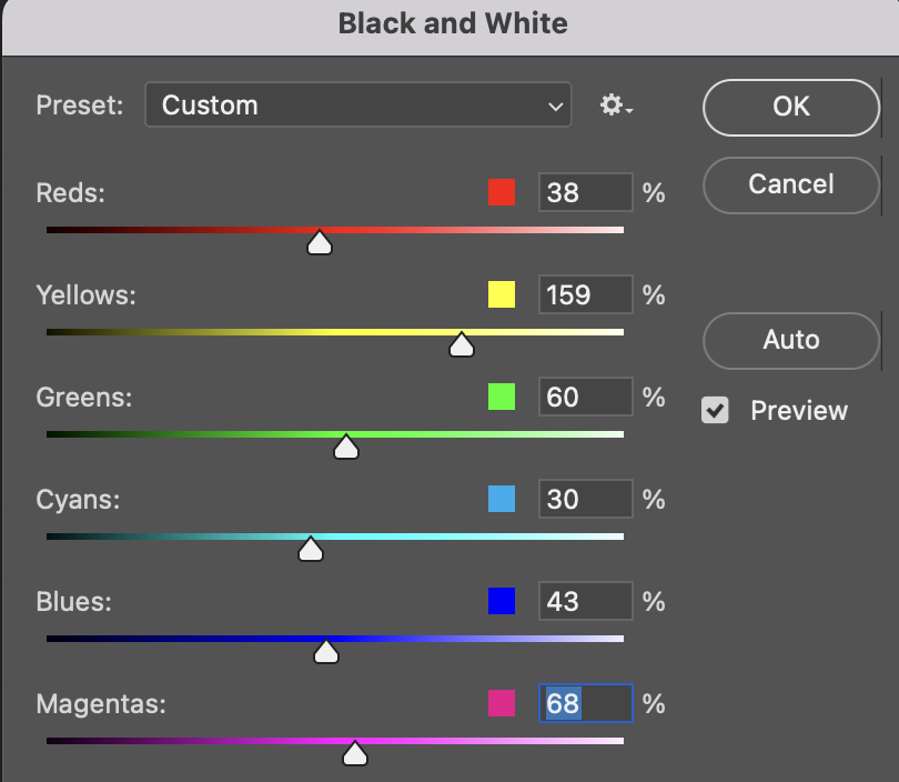
Finally, I made the image B&W by going to Image > Adjustments > Black and White and making the colours how I wanted them.
This is my final result:
Edit 2
These are the photos I used for this edit:
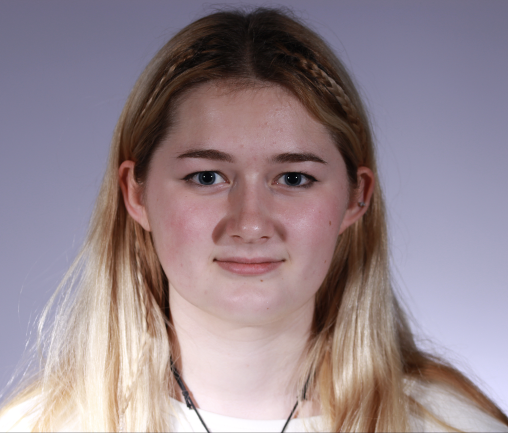
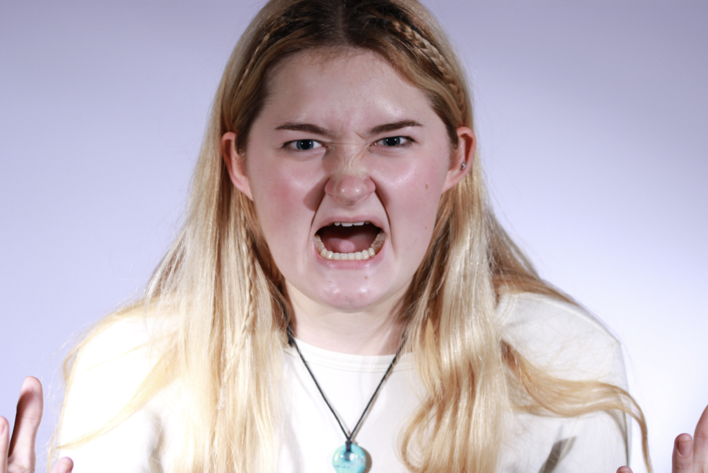
Firstly, I opened up my first photo in photoshop and made the image red for rage by going to Image > Adjustments and changing the Colour Balance.
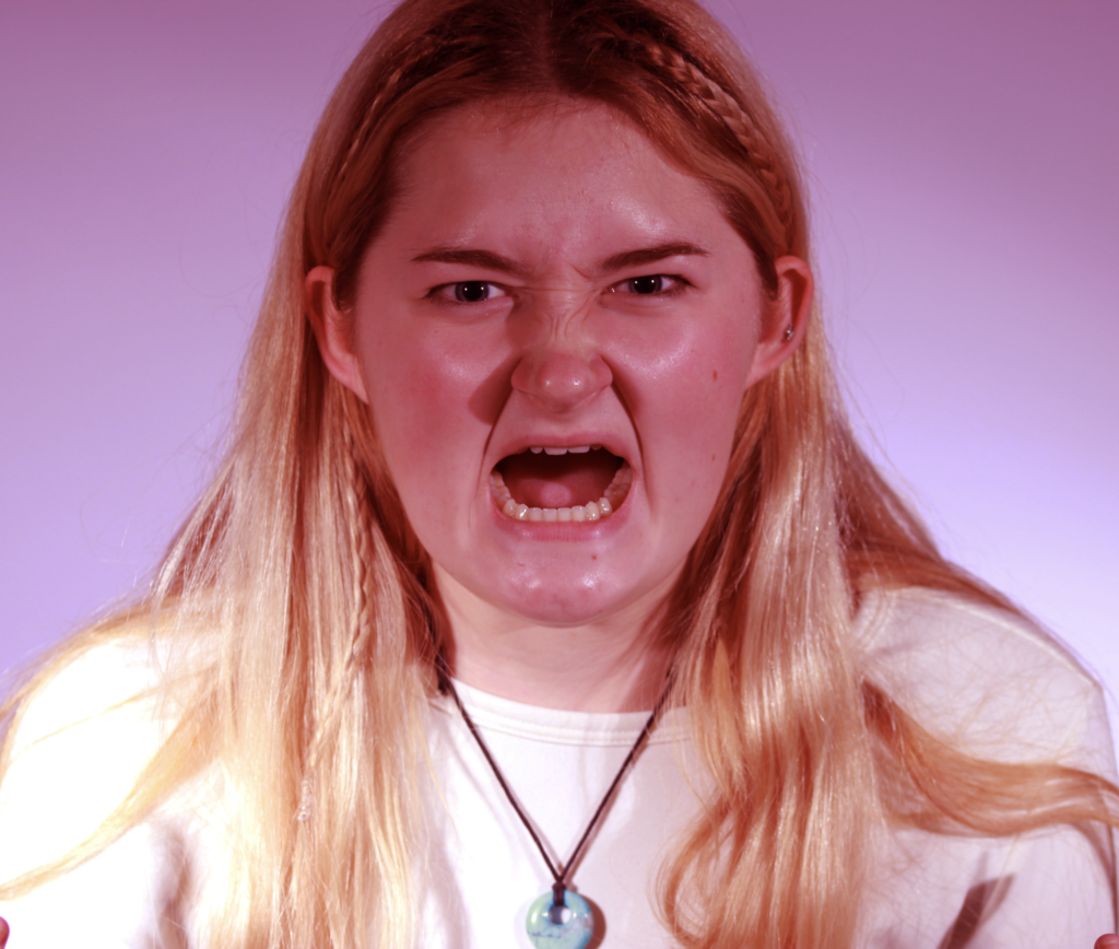
After this, I added that photo as a layer on top of the other and lowered its opacity so that you could see the other beneath.
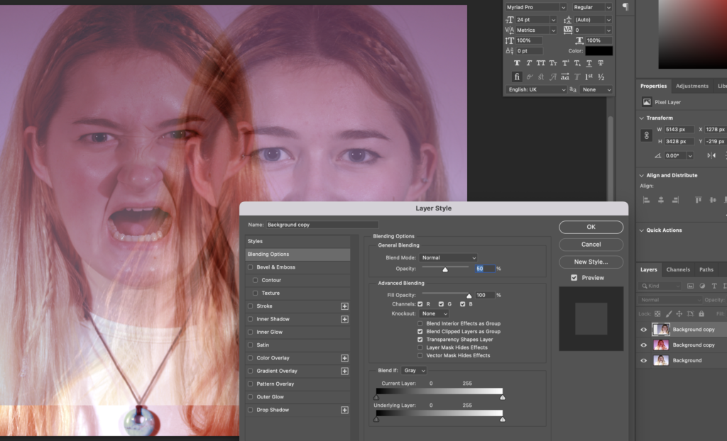
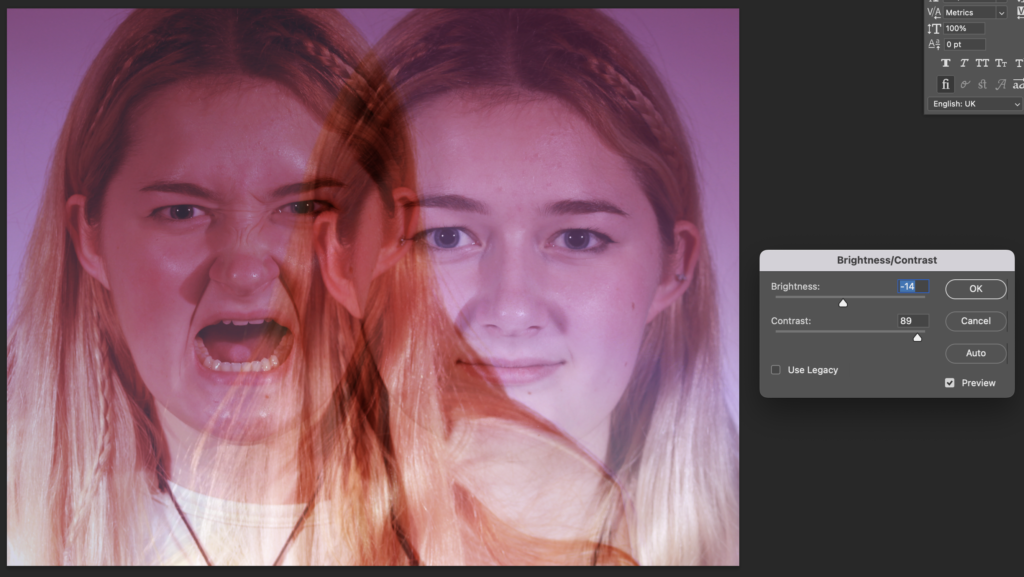
Finally, I lowered the brightness and increased the contrast so that the red of the image, to signify anger, is clear.
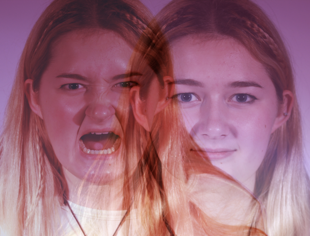
Edit 3
The photos I used for this edit are:
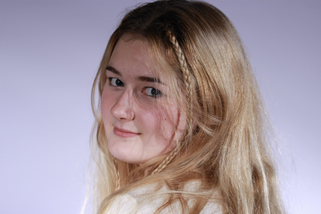
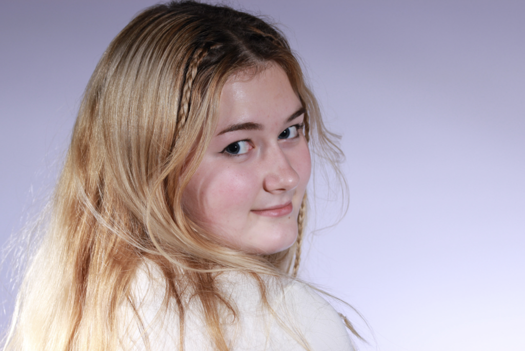
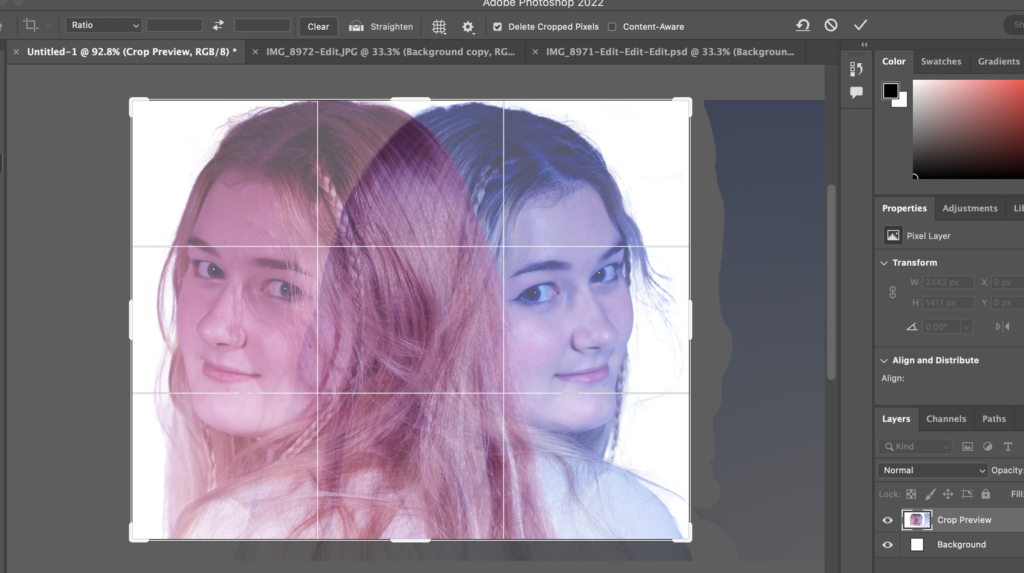
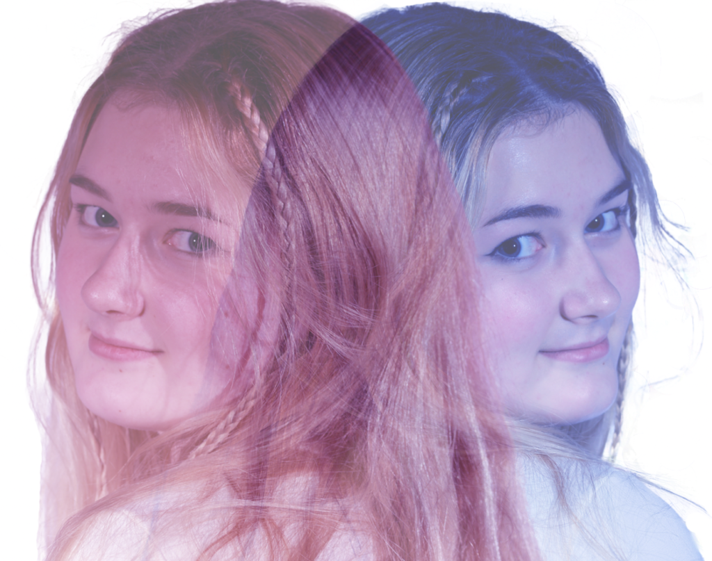
I created the final image by, firstly, layering each image where I would like them and lowering their opacity.
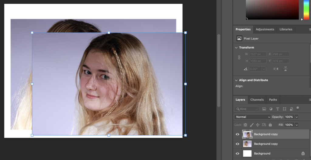
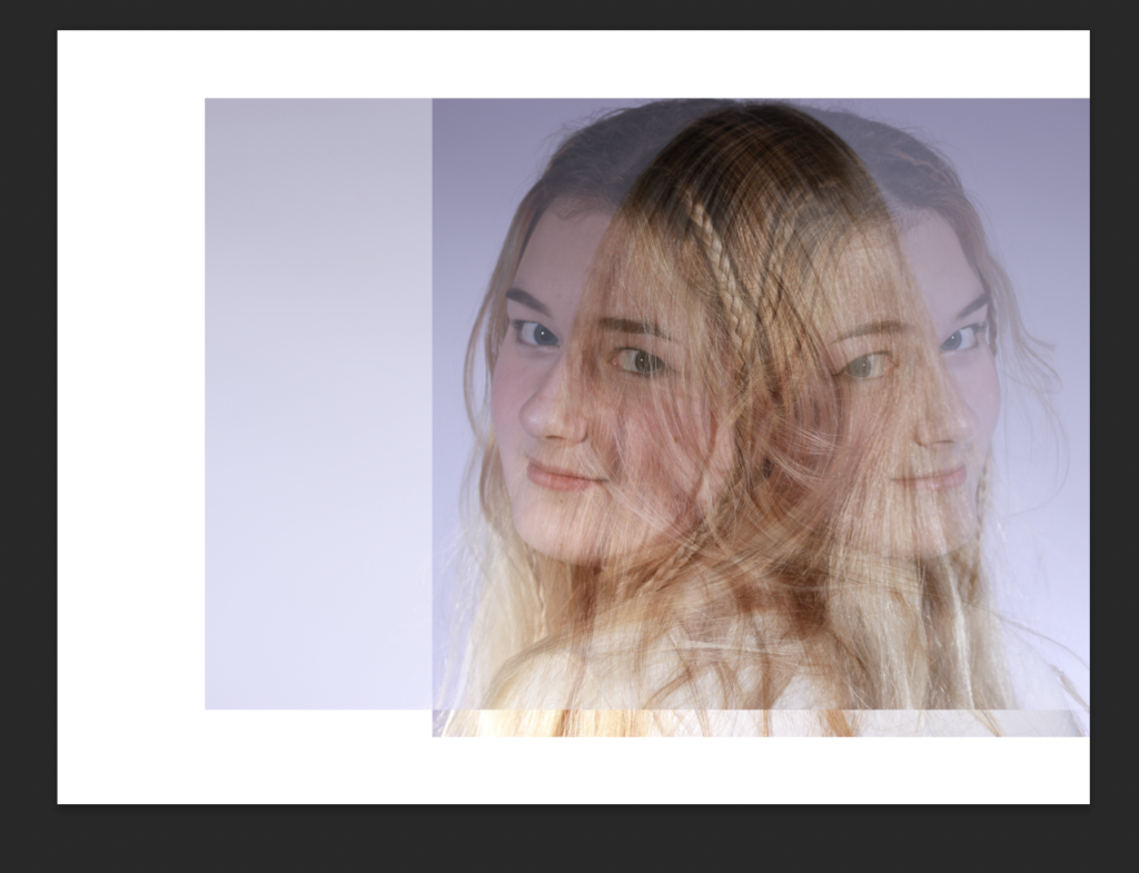
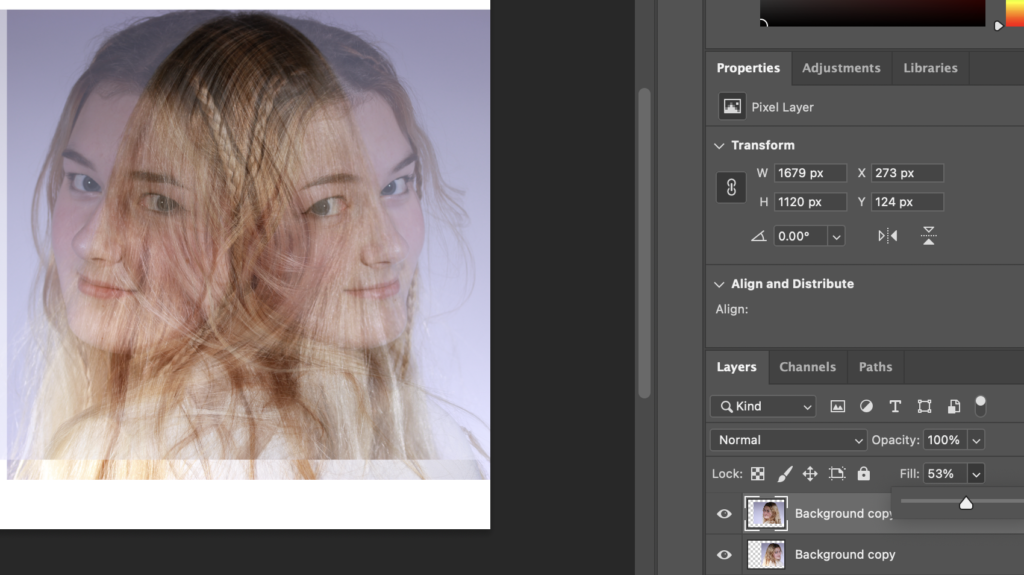
I then decided to go a different way about these images. Whilst hiding the first layer, I used the background eraser tool to remove the background then used the regular eraser tool to clean up. This was so that the backgrounds of each image don’t overlay so, when in colour, you can see the clear contrast between the 2 appearances.
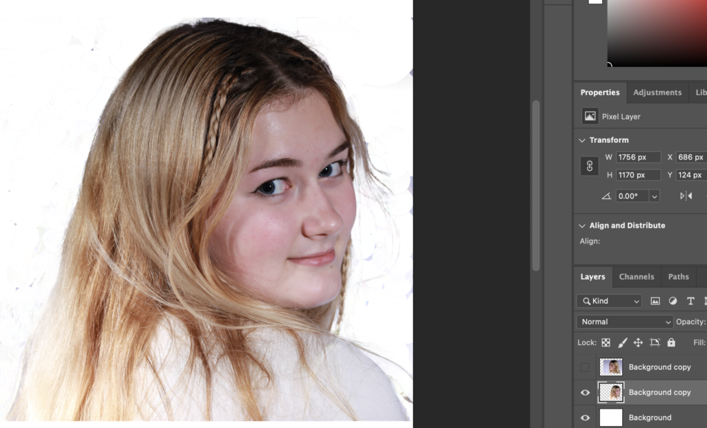
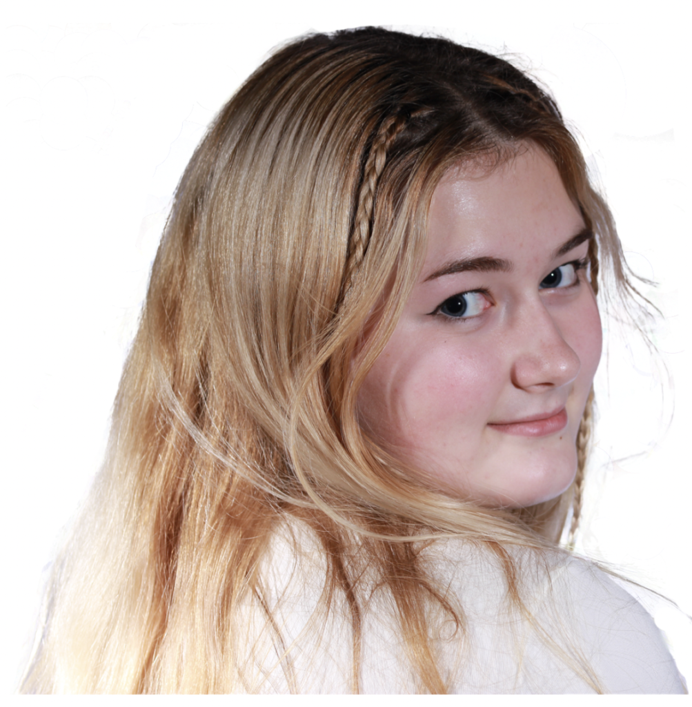
I then repeated this process for the other layer.
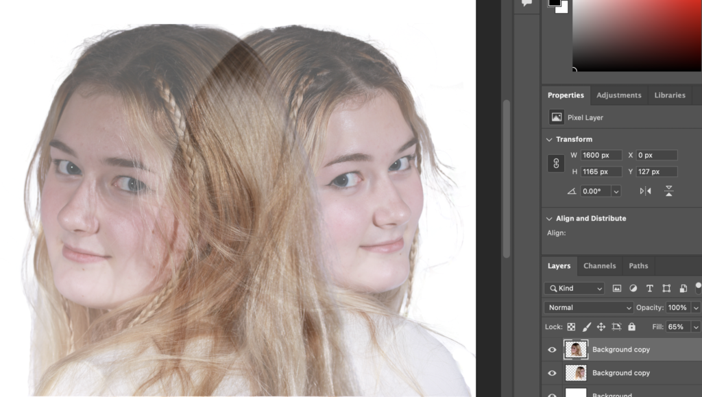
I then repositioned these layers and made each of them fill 65% so that they were transparent then added some colour. I added colour to each image by going to Image > Adjustments > Colour Balance and adjusting the colour until I was happy with it.
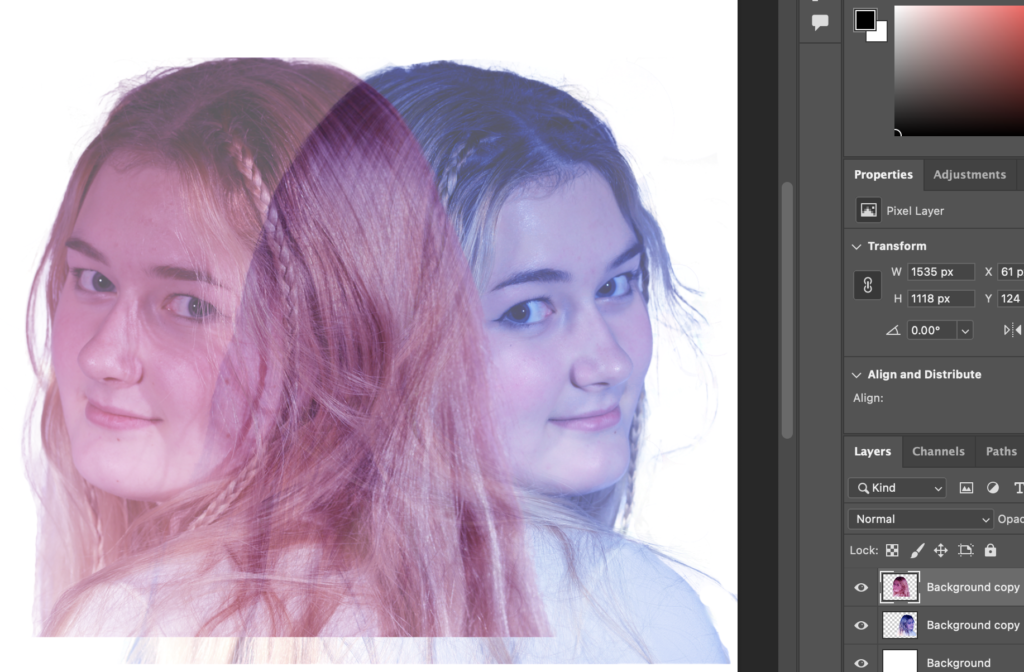
I then cropped this edit to create my final result.
Edit 4
The photos I used for this edit are:
I chose these photos because they are where her facial expressions are most similar so that they will match up well.
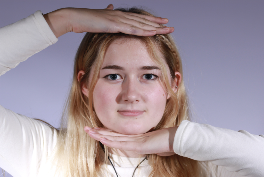
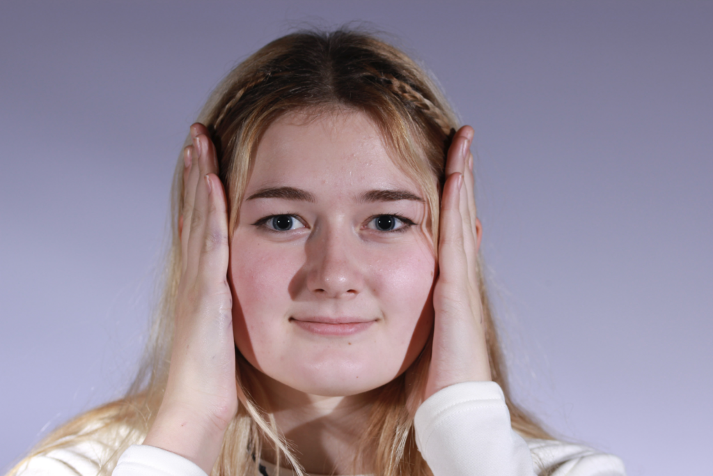
This was a very quick edit. I edited this by placing the image where her hand are on the side of her head on top of the other and lowering the opacity then aligning them so that her face remains normal.
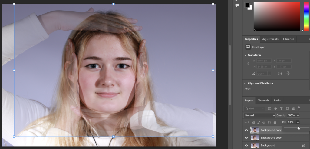
I then decided to make this more interesting by making it black and white.
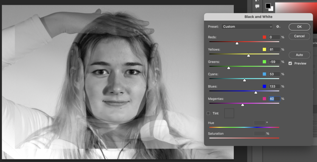
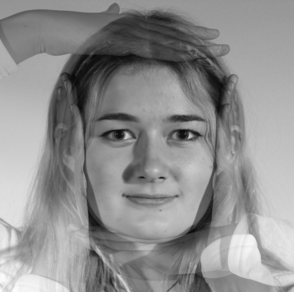
This is the final result after cropping it:
Edit 5
These are the images I used for this edit:
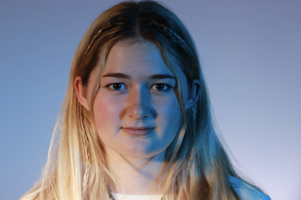
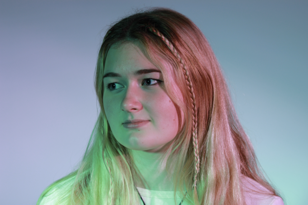
I edited this by, firstly opening up each image in photoshop and duplicating the layer. At this time, the photos were separate from each other. I then, like one of my previous edits, used the background eraser tool to remove the background of each image.

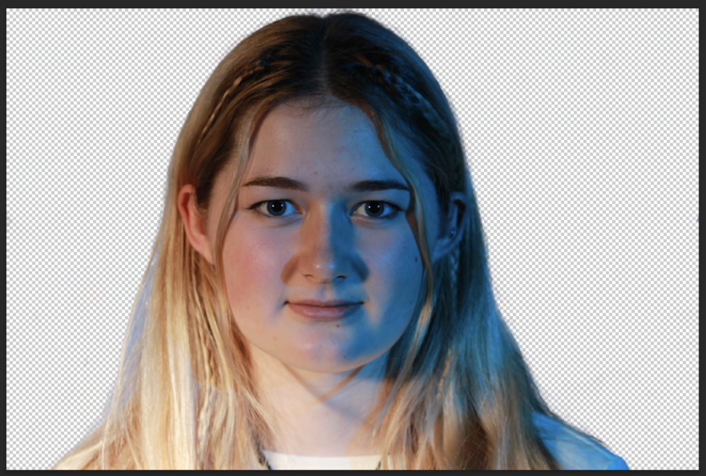
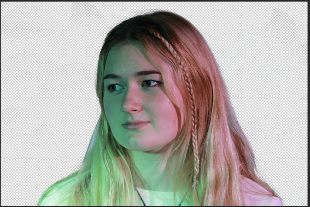
After this, I copy and pasted each layer onto a blank canvas, arranging them how I would like them then changed the colours of the images by going to Image > Adjustments > Colour Balance.
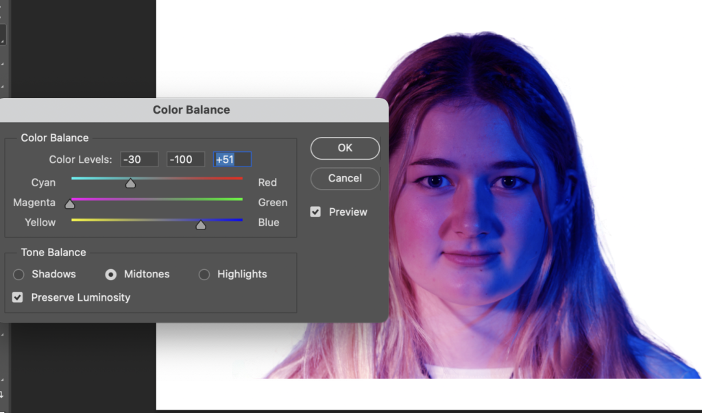
I did the same for this image, however, I also adjusted the Hue/Saturation.
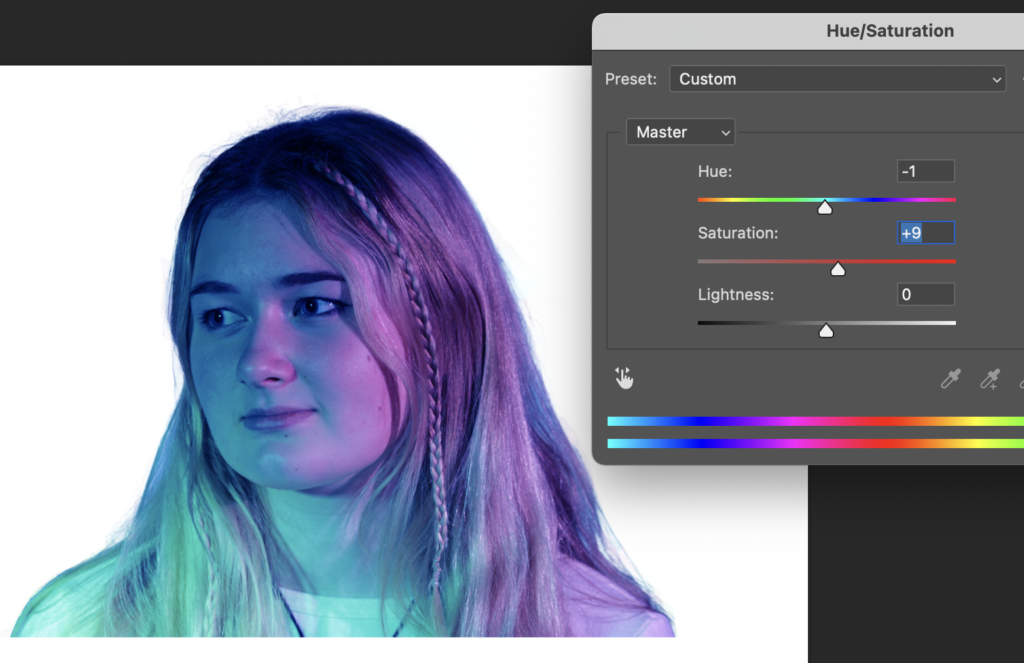
Finally, I altered the opacity of each photo to give a double exposure effect.
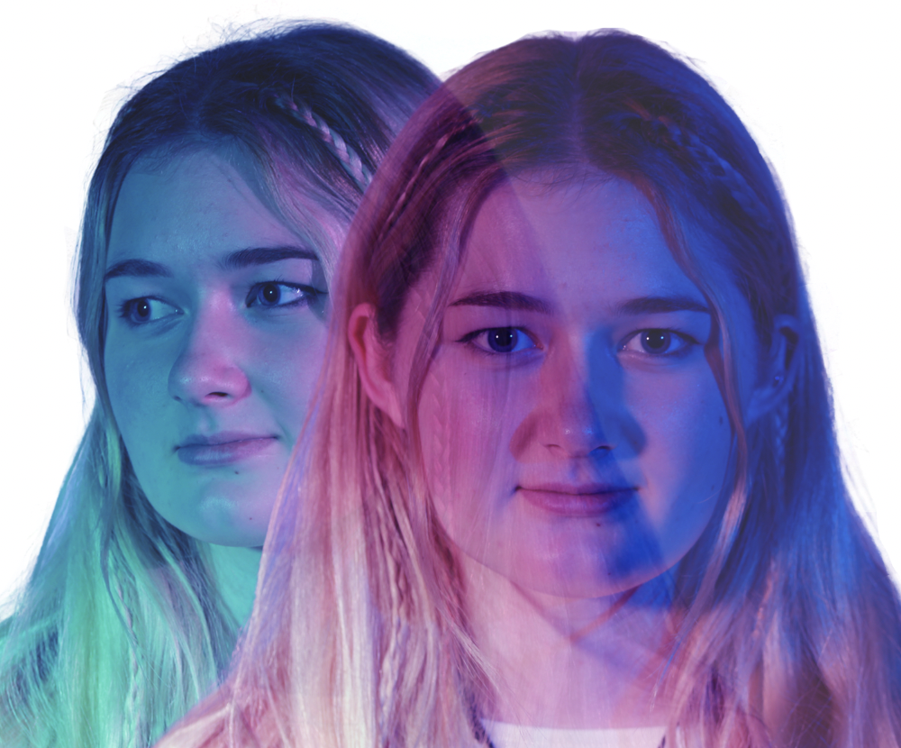
Evaluation/Virtual Gallery
These are my final images:


Virtual Gallery
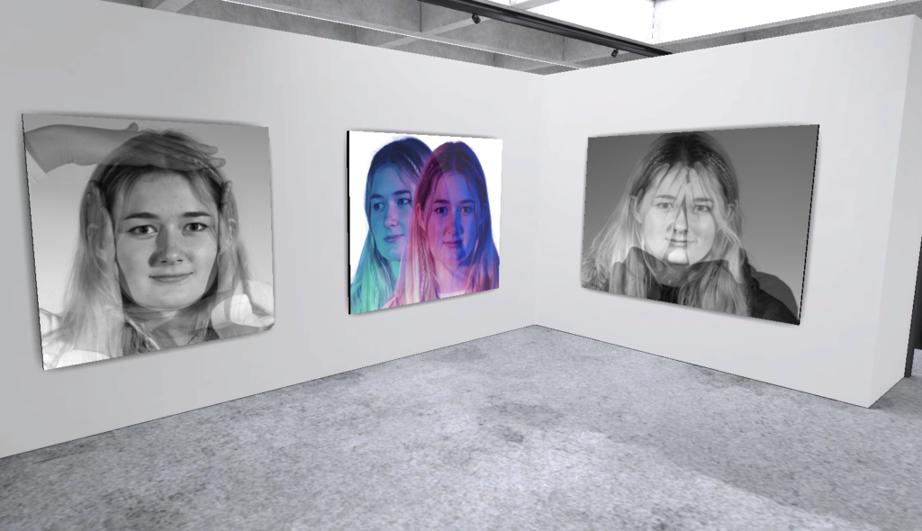
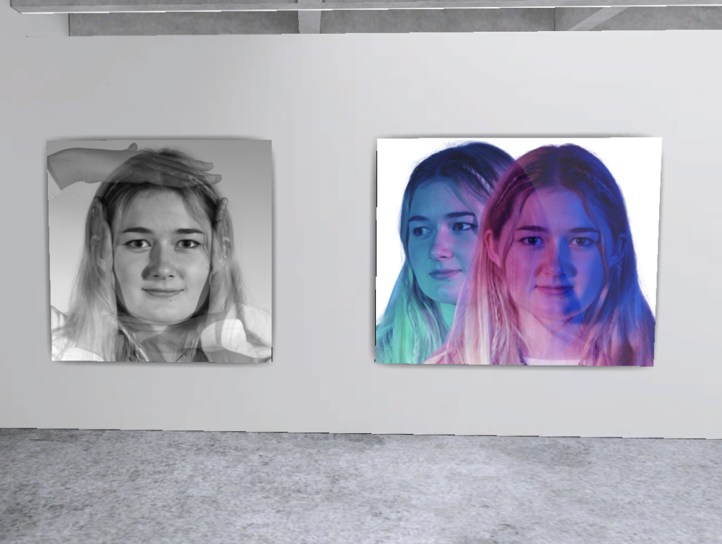
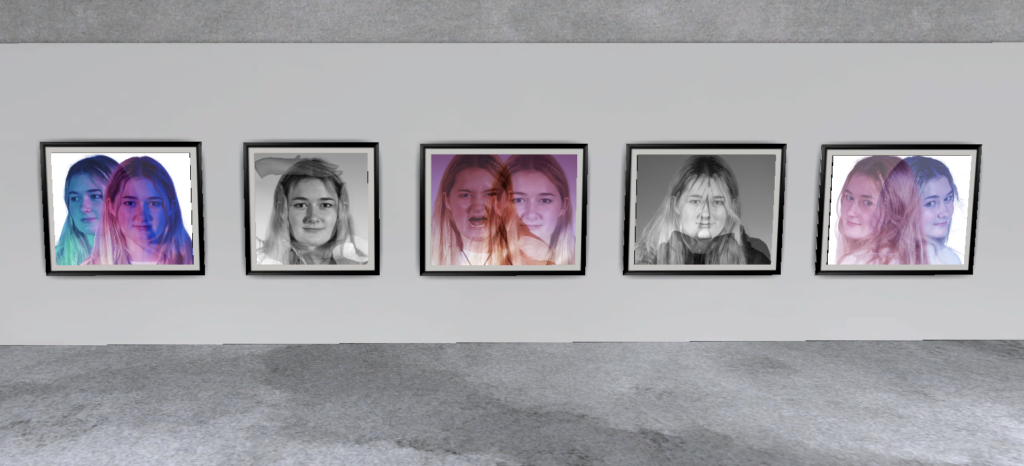
Evaluation
I personally don’t think that any of my edits share any similarities with the work of Man Ray, except from possibly this one:

I think this image is similar to Ray’s in terms of the B&W and Xray effect. I also believe that Man Ray has a rayograph that includes hands on the face, much like mine. This is also possibly my favourite edit for double exposure because I think that it clearly displays understanding of double exposure in Photography.

This is probably my least successful image and I think that I could have improved it by making there a clear contrast between the calm and anger by making just her face red in anger, rather than the whole image.
