Headshots – Photo Montage

What is Photo-Montage Photography?

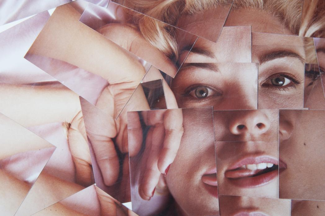
Photo-montage photography is multiple images are cut up and combined to create a new image. It can also be snipping an aspect from one image and adding it onto the same image in a different place. This can be done in two ways: The first way is by hand and the second is by using Adobe Photoshop. To do it by hand you just have to cut out one part of a photo and glue it, overlapping the other photo and arranging it so that it’s visually pleasing. There are many ways you could do this on Photoshop, depending on your wanted result. For example, you could simply create image layers then use the quick selection tool to cut out the image to or the lasso tool to cut out part of an image and then position the photos in their desired positions.

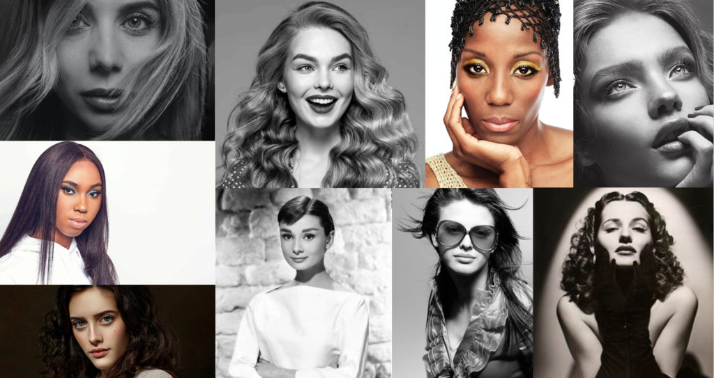
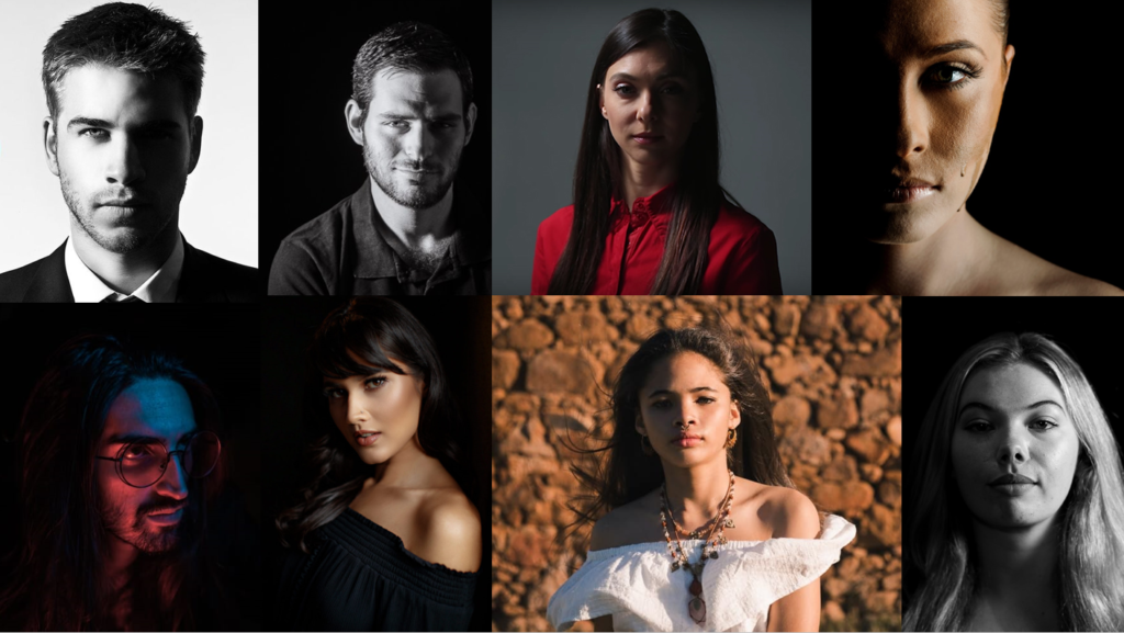
Mood board
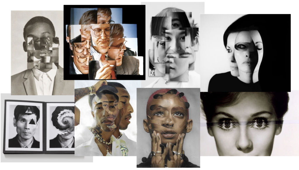
Artist Reference
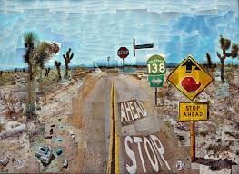
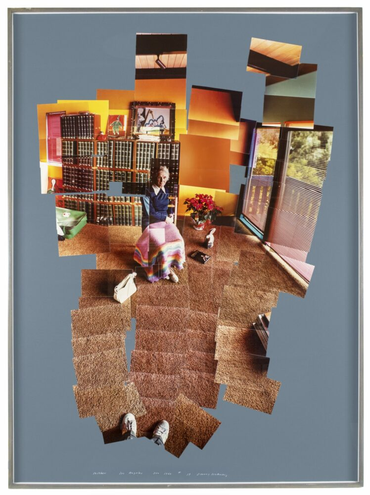
David Hockney, born in 1937, is an English painter, draftsman, printmaker, stage designer and photographer. Hockney is considered as one of the most influential British artists of the 20th century and was also a huge contributor to the pop art movement in the 1960s. He studied at the Bradford School of Art and later attended the Royal College of Art in London. Hockney was elected as a member of the Royal Academy of Arts in London in 1991 and, additionally, has his work displayed in the Tate Gallery in London and the Metropolitan Museum of Art in New York City. In 2018, David Hockney sold an art piece for $90.3 million at an auction. It wasn’t until the 1980s that David Hockney began his photography career, where he experimented with Polaroid photographs and joined them to create visually striking collages.
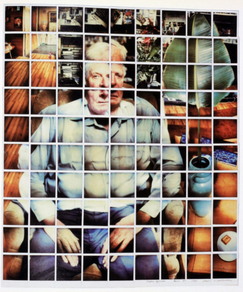
This is one of David Hockney’s photo joiners created with the use of Polaroid photos.
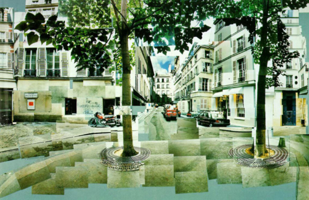
This is one of David Hockney’s photo joiners which was created using photo lab processed 35mm photographs.

Photoshoot Plan
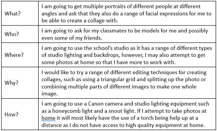
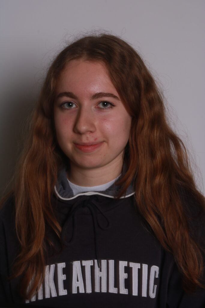
Photoshoot

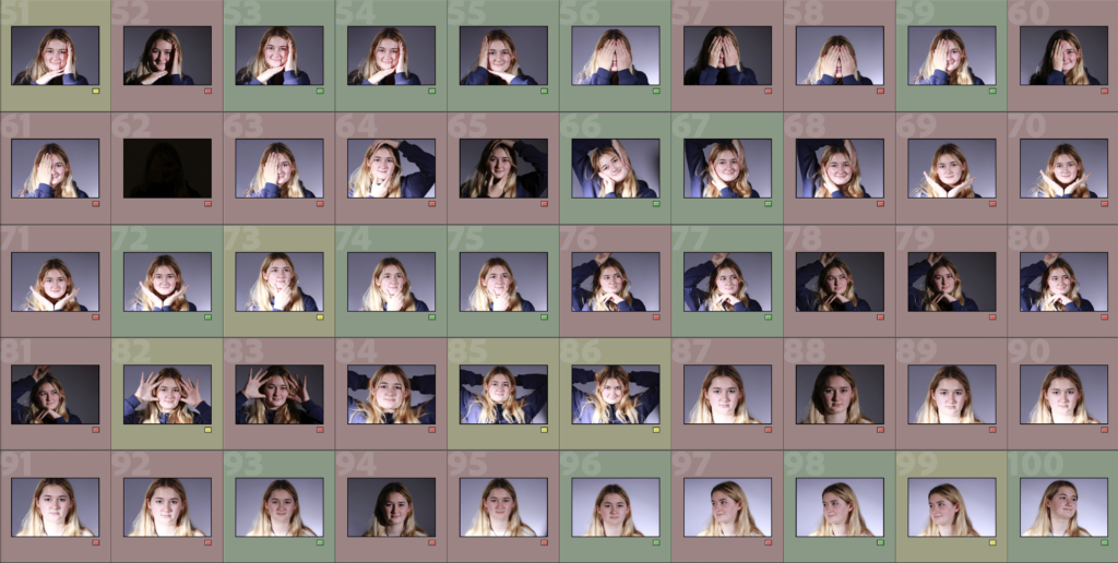
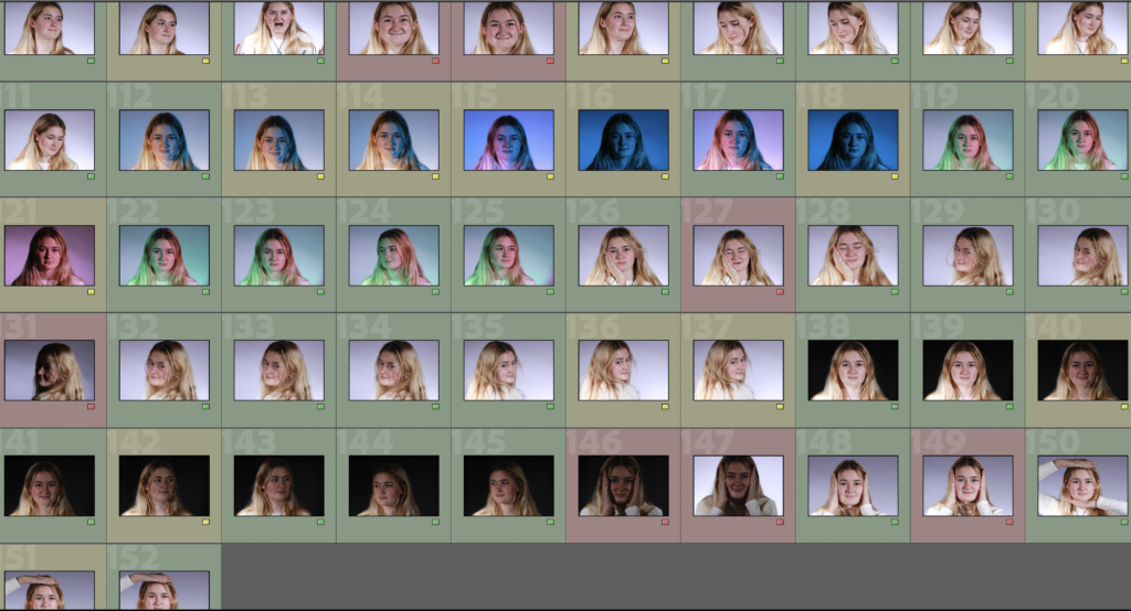
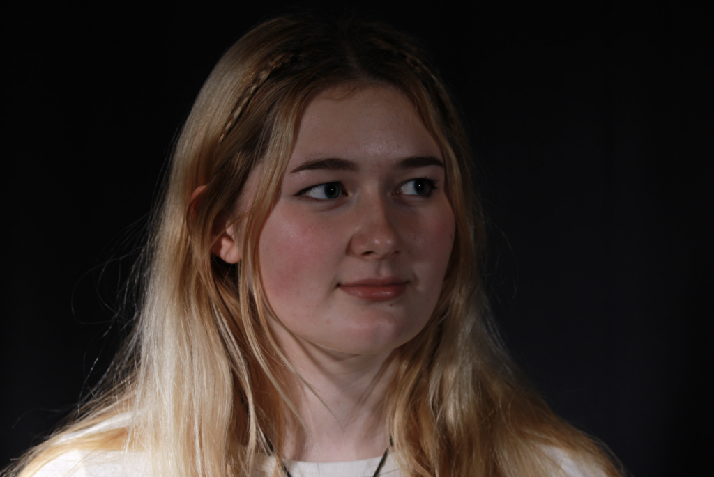
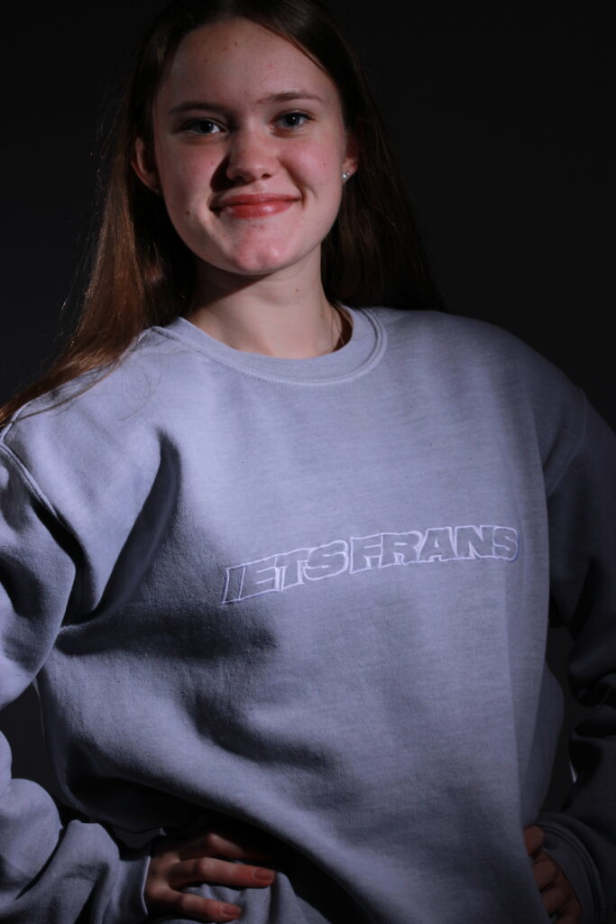
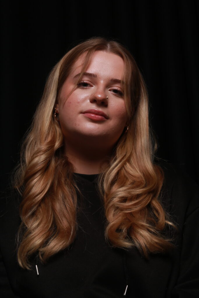
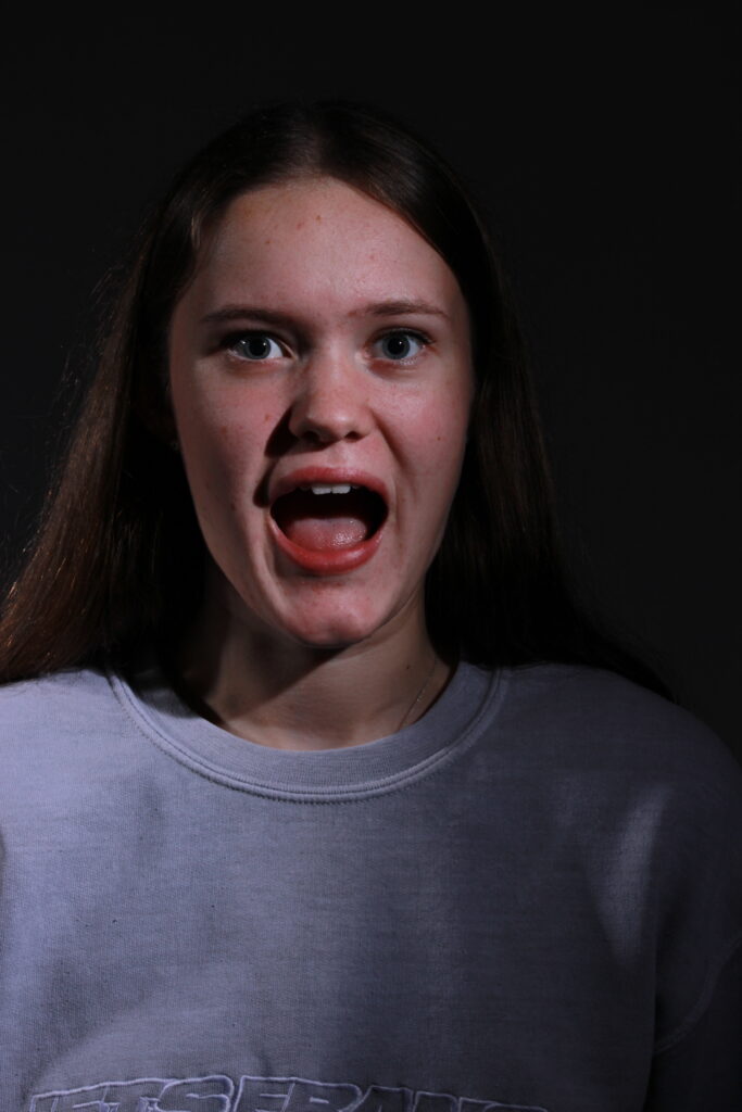
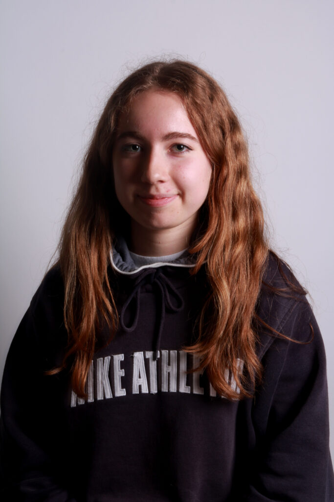
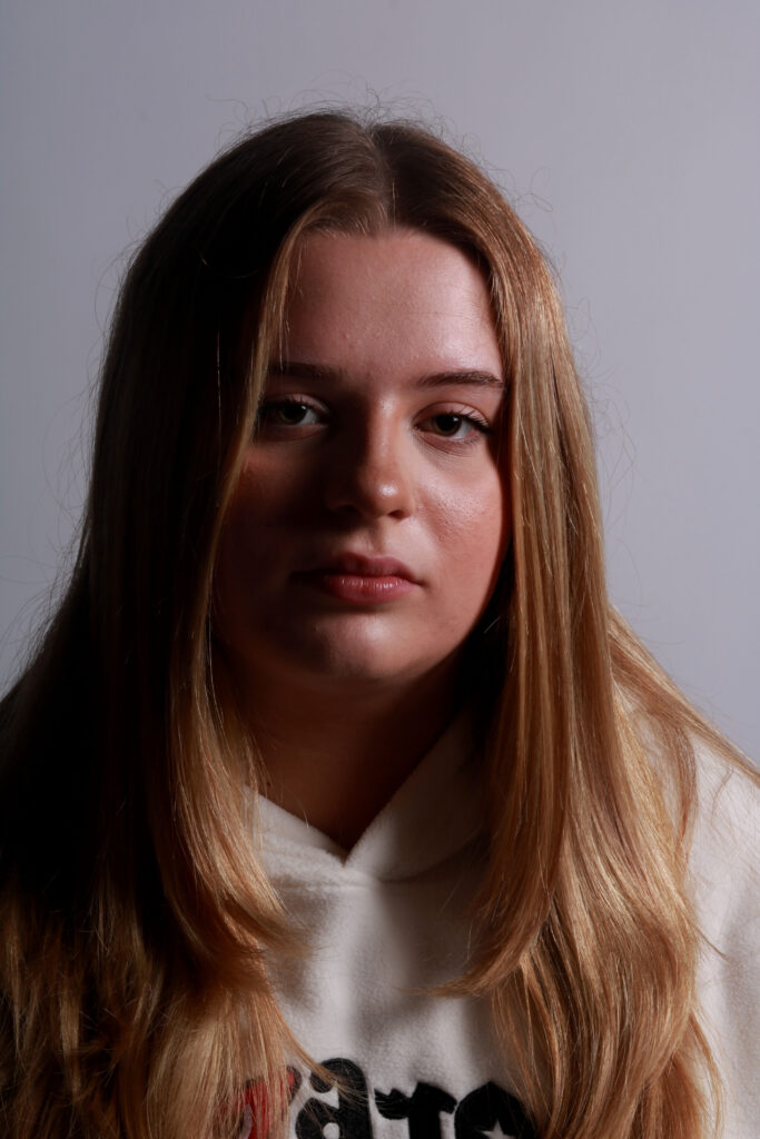
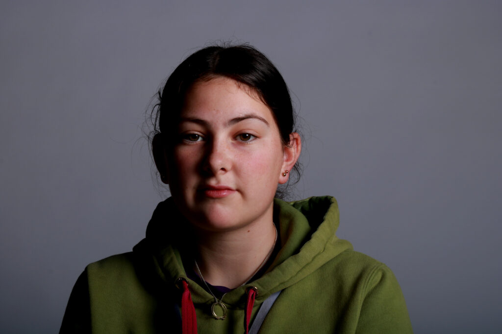
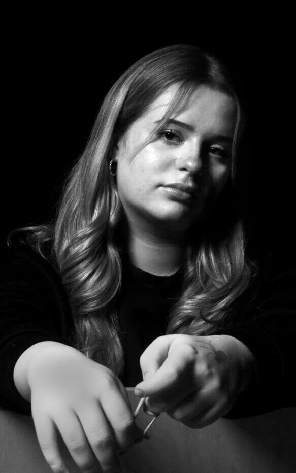
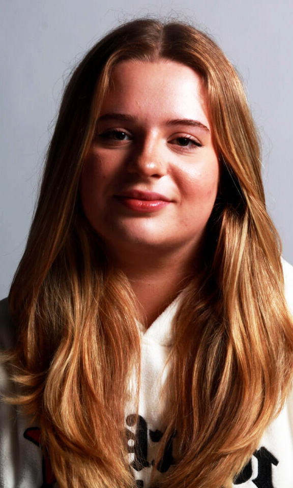
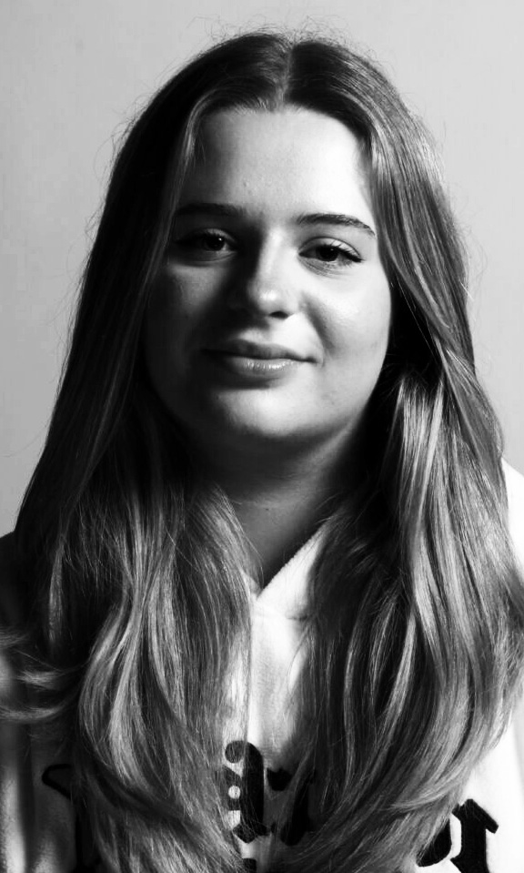
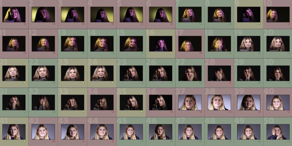
I am going to be using this same set of photos for all Headshots editing.
Edits

Edit 1

I made this photo collage using the following images:

I opened each image in photoshop and used the 3rd image along as the background. I then used the Rectangular Marquee Tool to cut out segments from each image and made them into a collage.

For some segments, I changed the colour slightly by going to Image > Adjustments > Colour Balance.
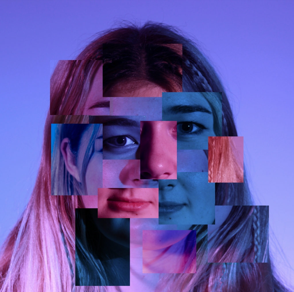
Edit 2

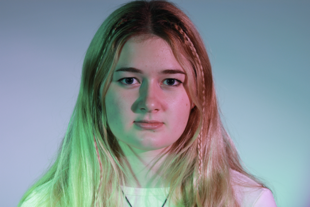
This is the image I used for this edit as I think it would be interesting to have the 2 different colours:
I used this grid template for the squares so that they are the same size:
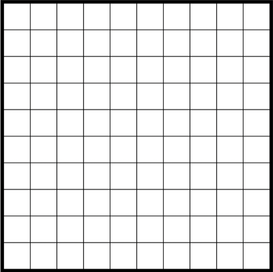
I placed the image as a layer on top of the template and lowered the opacity.
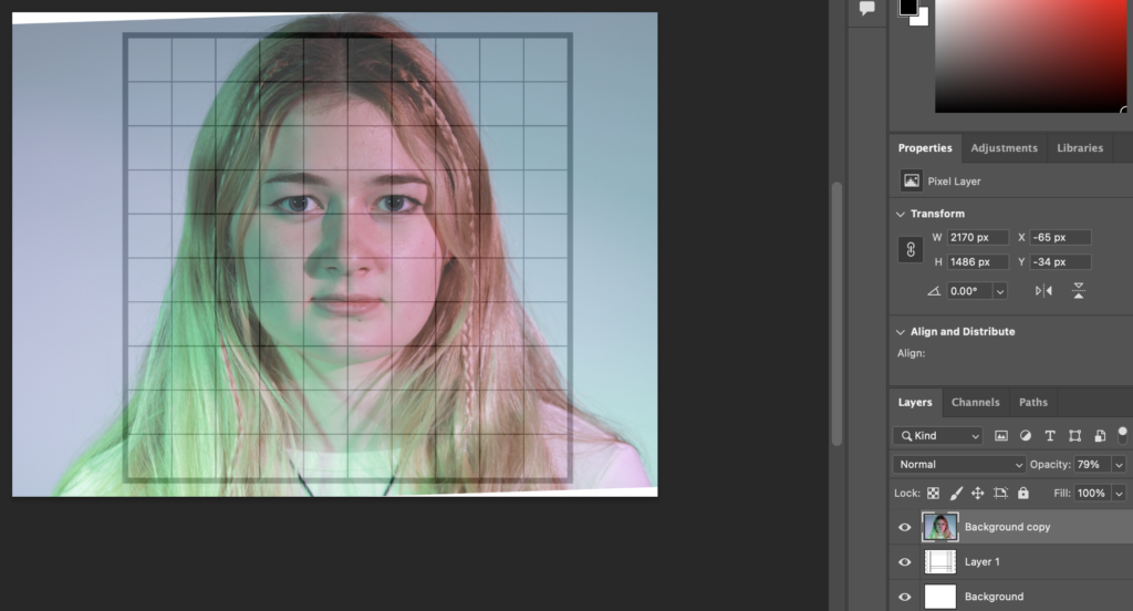
I used the rectangular marquee tool to select part of the image and copy and paste them to create the little squares. I moved around the photo to get the specific sections I wanted, whilst keeping both the photo and grid a constant size.
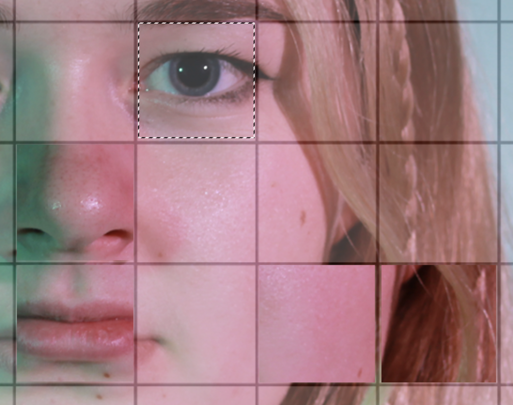
These are my completed squares:
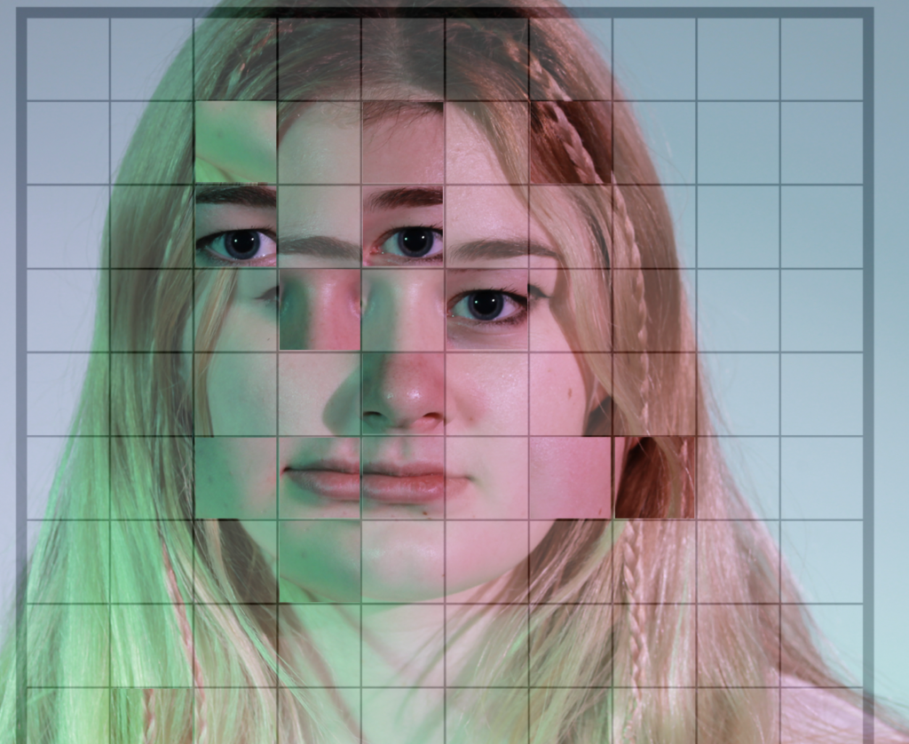
I then reopen the image on its own in photoshop then copy and pasted the squares onto it and arranged them how I would like.
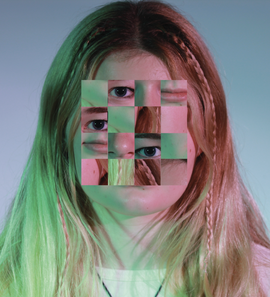
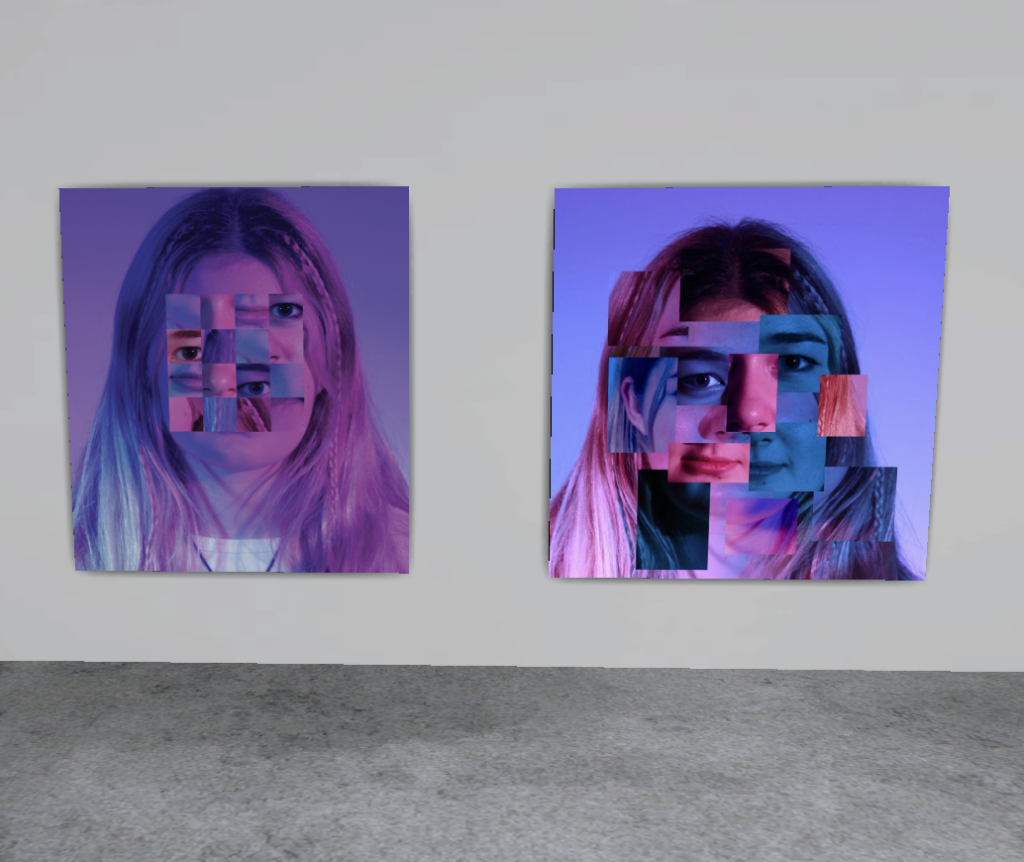
Finally, I edited the photos and squares to make them my preferred colour. I also added a Gaussian Blur to some of these squares. Additionally, I also rearranged some of my squares. This is my final result:
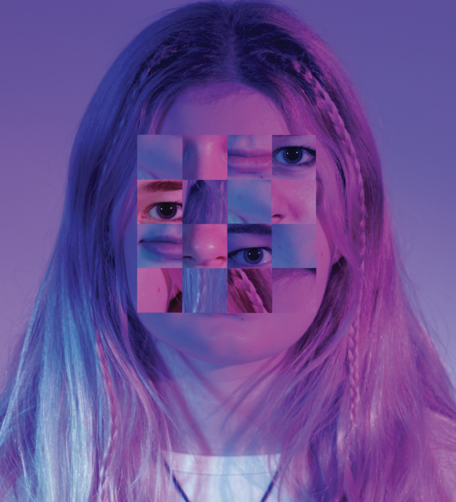
Edit 3

I started off editing this photo by getting a triangle template off of safari and making it a layer on Photoshop with the image I will be using as a layer above and lowering the opacity of the layer so that the template can be seen below. I am going to use this template
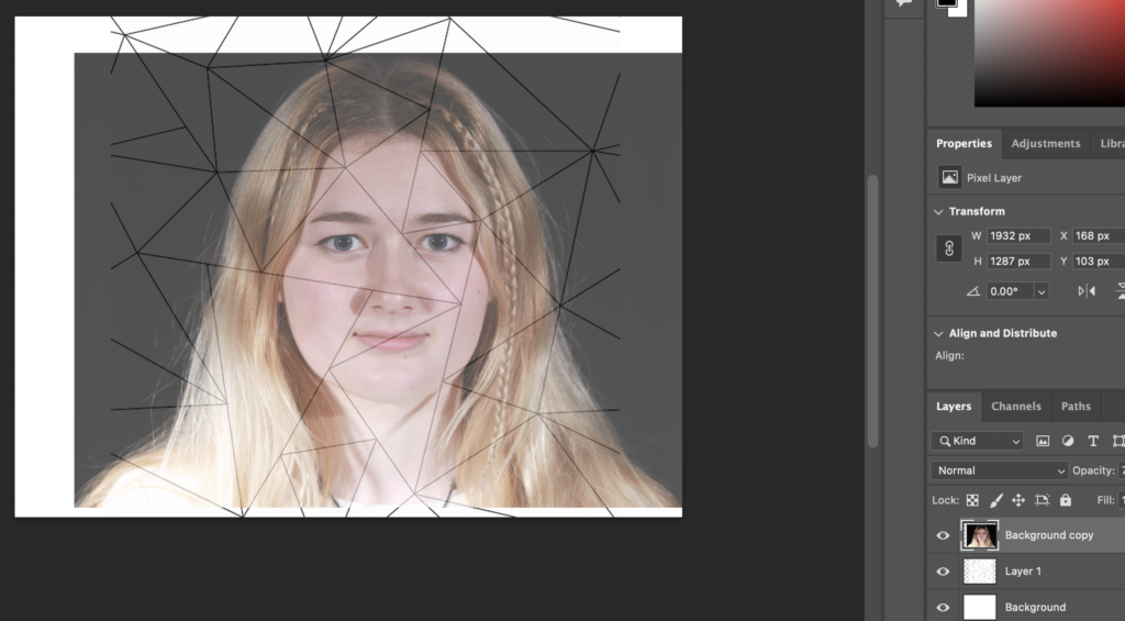
I used the polygonal lasso tool to create triangles, guided by the template, which I then copy and pasted to create a new layer that I could edit separately to the entire image.
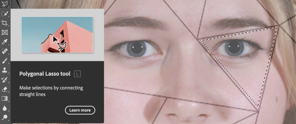
These are my triangles:

As you can see, I went a bit off the template, however, it was a good guide in the beginning.
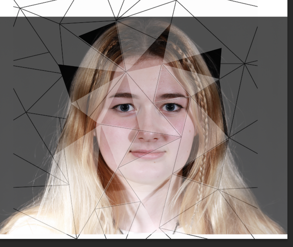
I then added a Gaussian Blur to some triangles and colour to others or both.
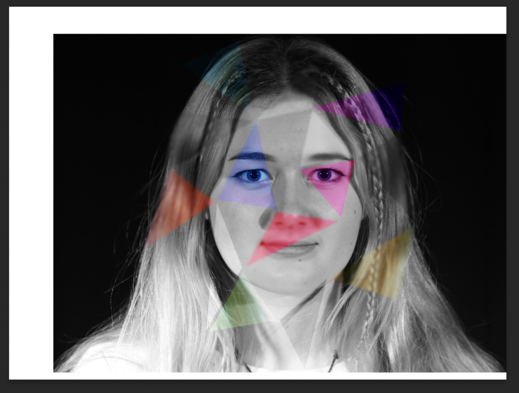
Finally, I flattened the image and cropped it.
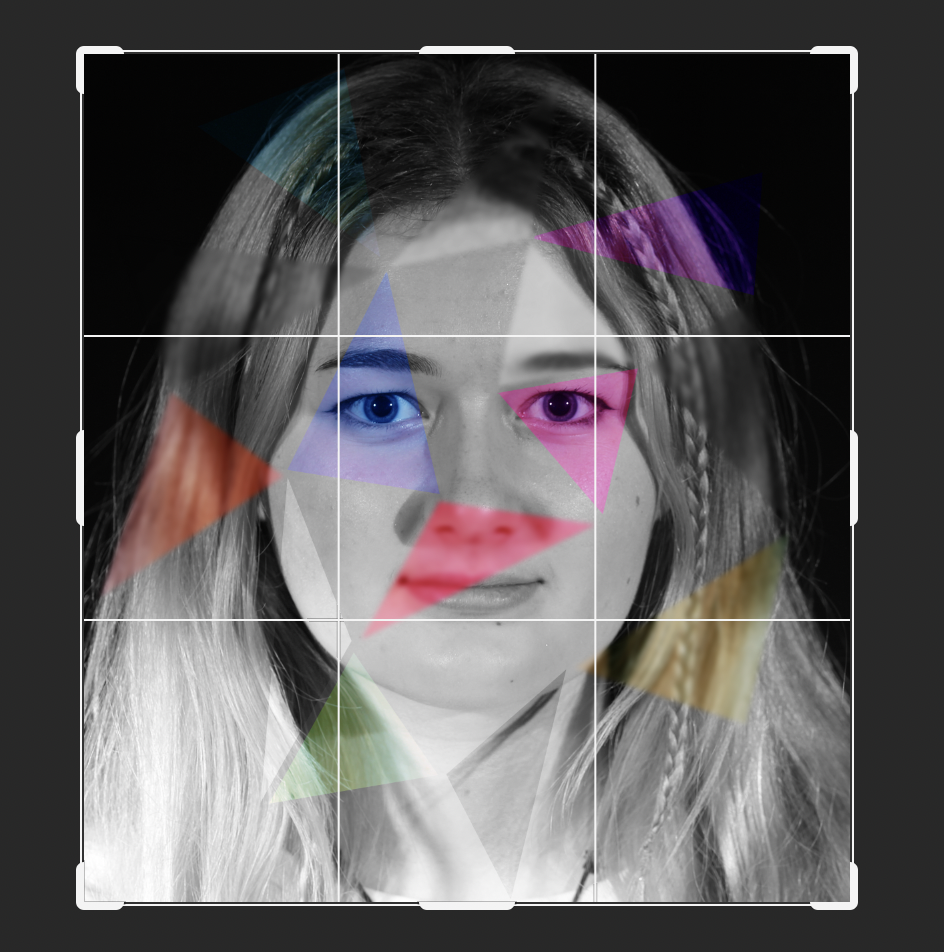
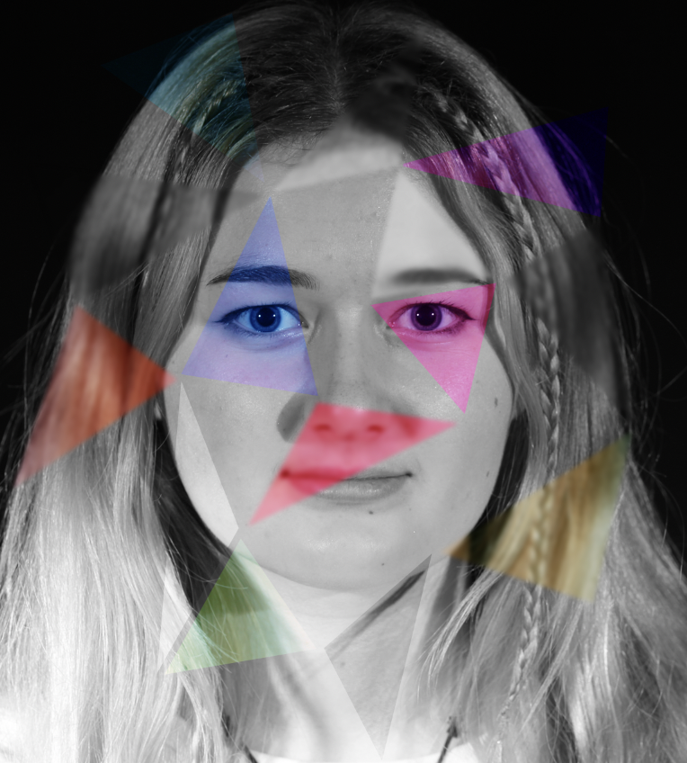
This is my final result:
Edit 4

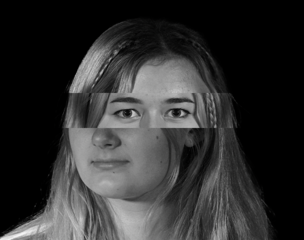
My plan for this edit it to use the following 3 photos as different sections of the face, with the middle one being just a small section containing her eyes.
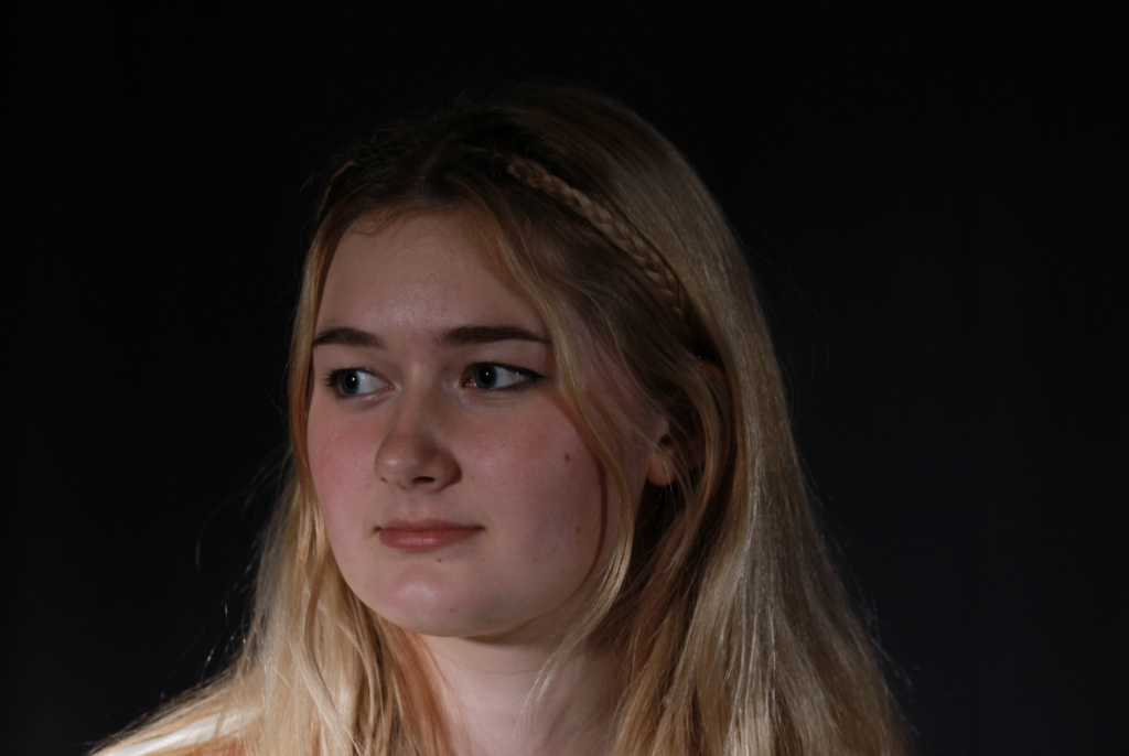
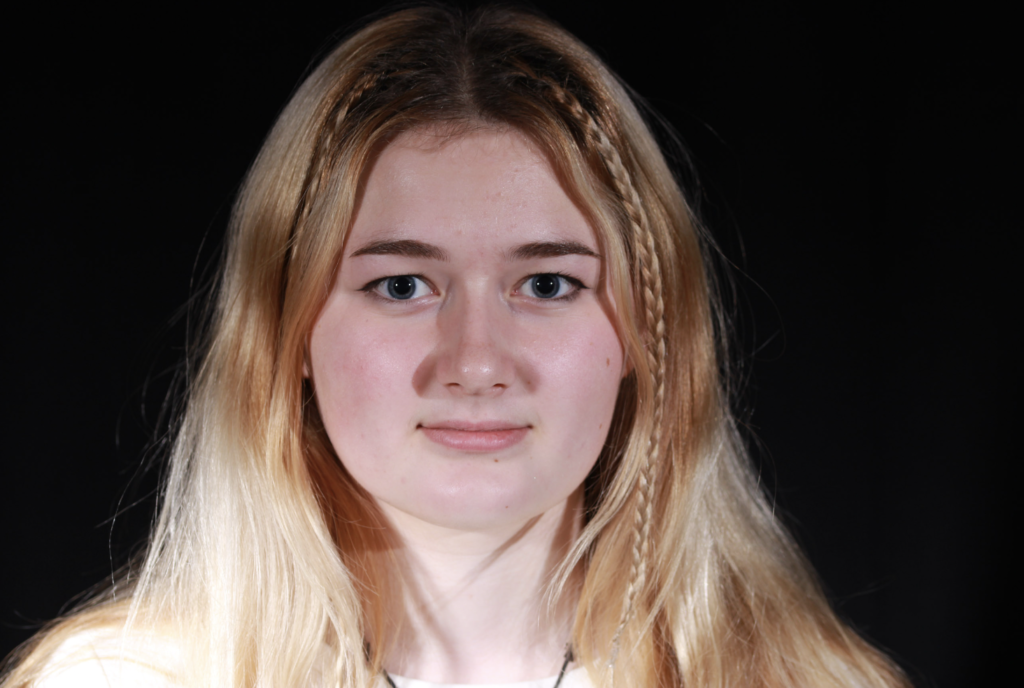
I started this off by opening each image in Adobe Photoshop and creating background copies so that I could copy and paste them onto a blank document, however, before that I cropped them as to how I would like them. I used this image as the background:

Then, I cropped the following images and aligned them so that the sides of her head match up for each layer
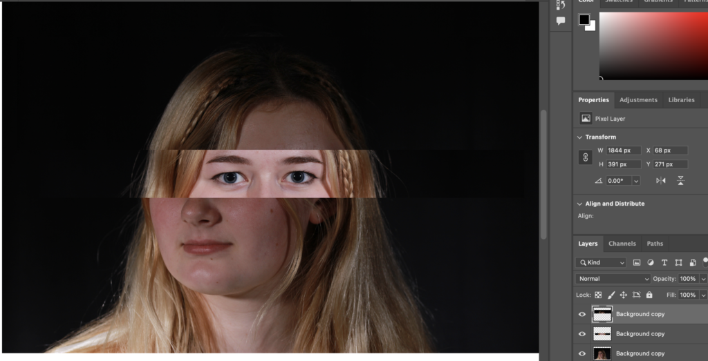
Finally, I edited each layer so that they are B&W and match up well together.
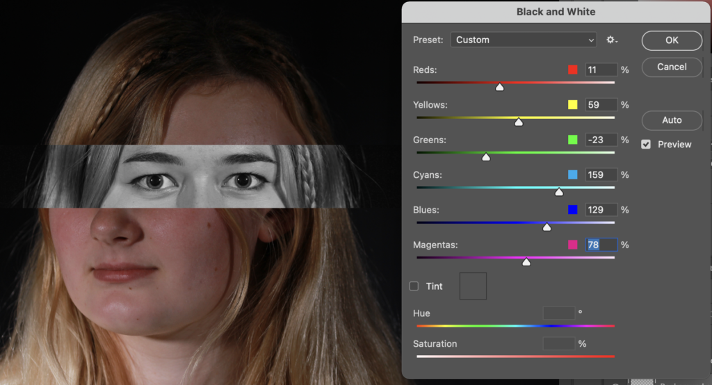
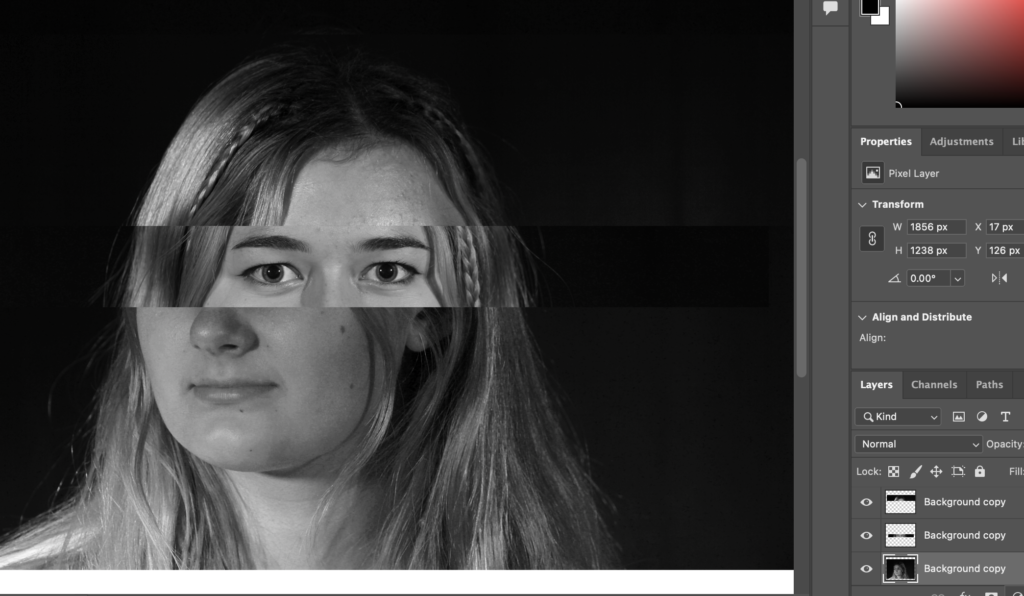
This is my final result after cropping it and regulating the background by selecting it and using the brush tool:
Edit 5

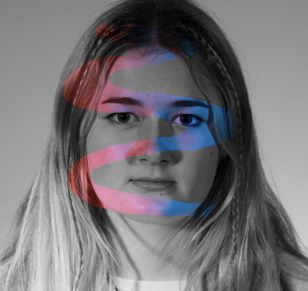
I used this image for the background of this montage:
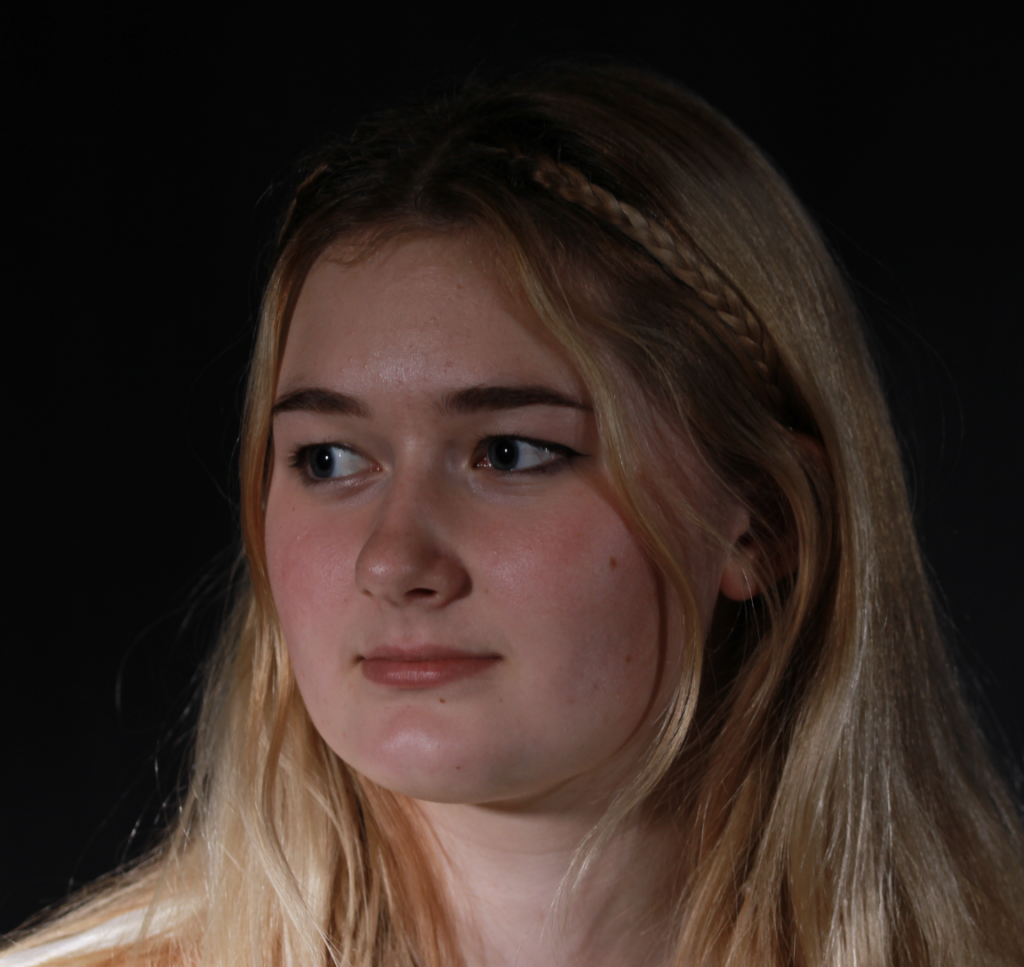
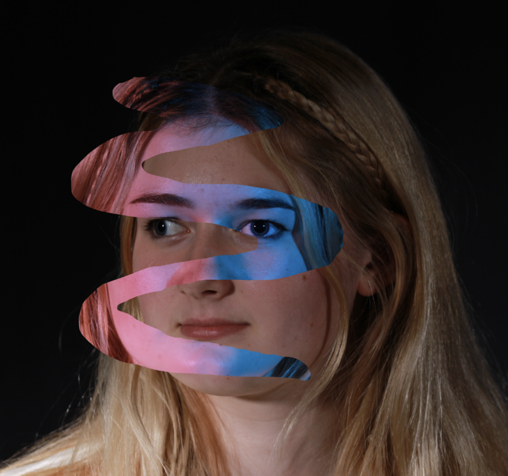
I then opened another image and used the lasso tool to make swirl cut out and copy and paste it onto the other image.

This is the image I used:
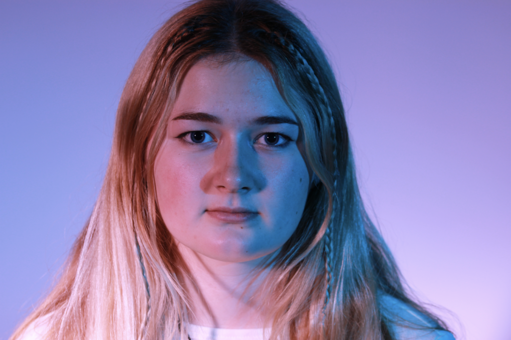
I then added some colour to each layer to make the edit more interesting and this is my final outcome:
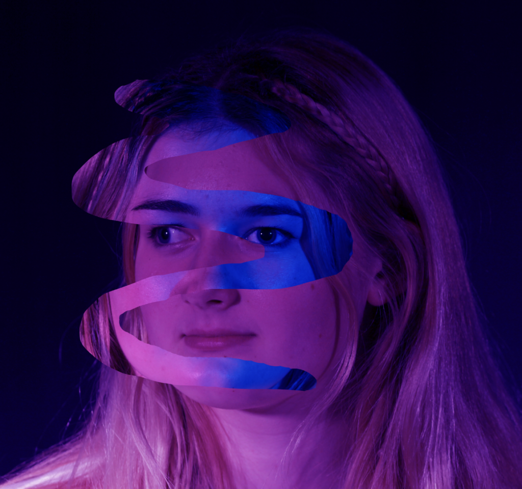
I also made this using the image that I cut the part out of and just changed the colour of it to B&W.
Evaluation

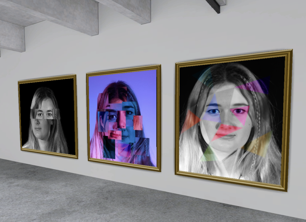
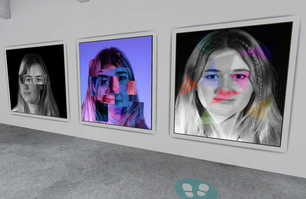
My Final Outcomes

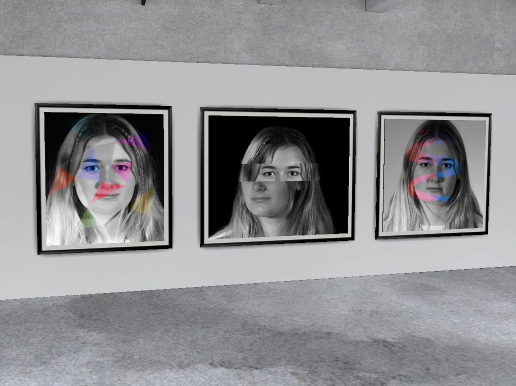
Virtual Gallery
Evaluation

Overall, I think I have created some interesting photo montages, however, none of them are noticeably similar to Hockney’s. I think that my image which is most similar to the work of Hockney’s is this image:
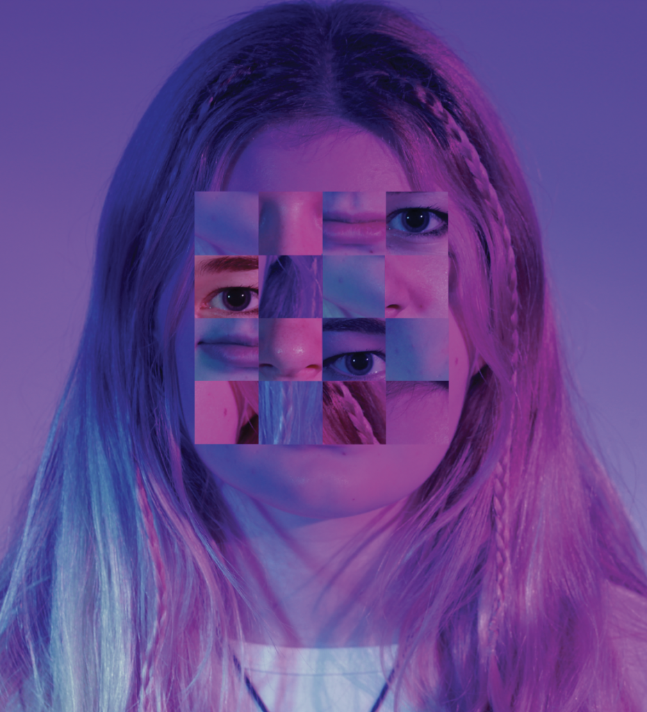
This is due to the small squares which create a photo, however, the squares in mine are jumbled up.

This image is also quite similar to Hockney’s as it does consist of smaller images joined together to create a larger one, although a distorted larger image.

This is my personal favourite outcome because I like the use of different colours and the blur and I just think it all works out together very nicely.

I think this is my least successful photo as it looks a bit silly, however, it was good for experimentation and learning.

Chiaroscuro Lighting Technique

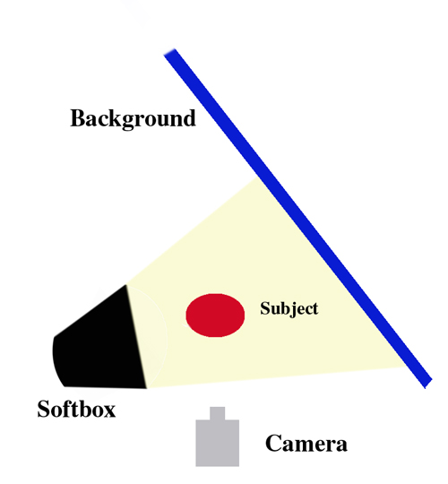
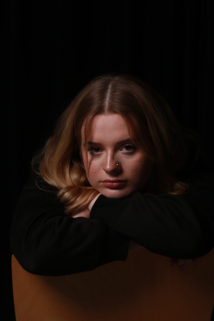
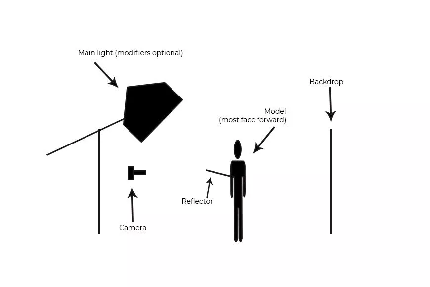
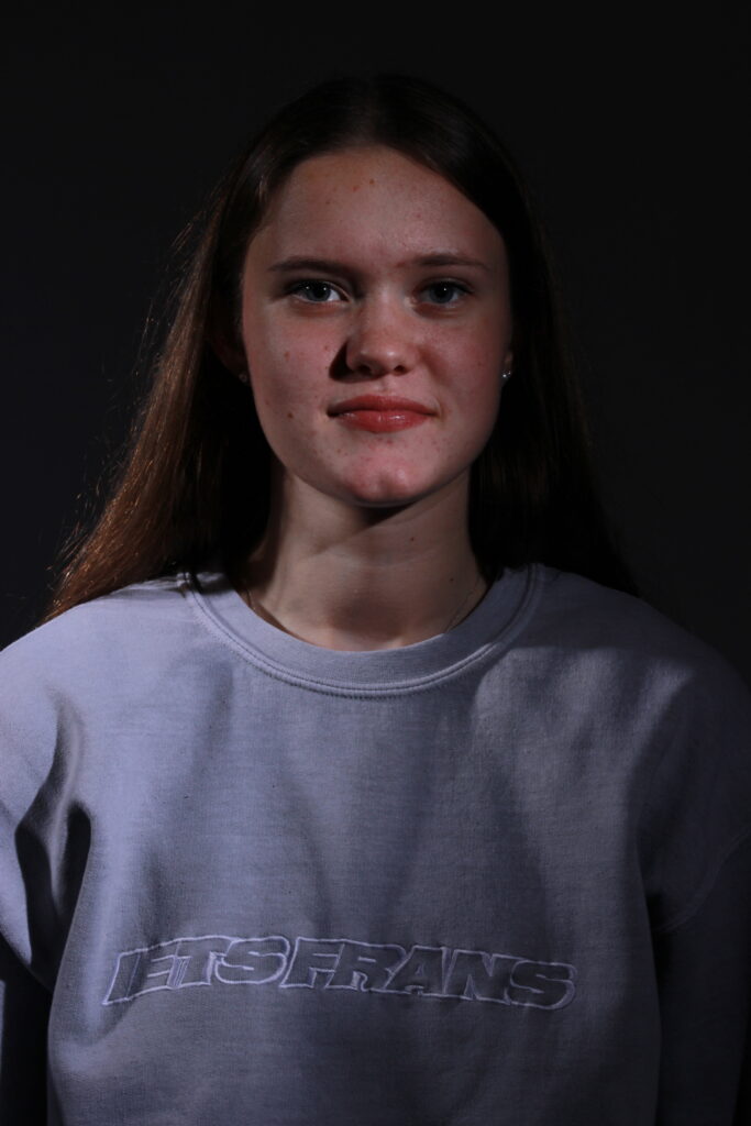
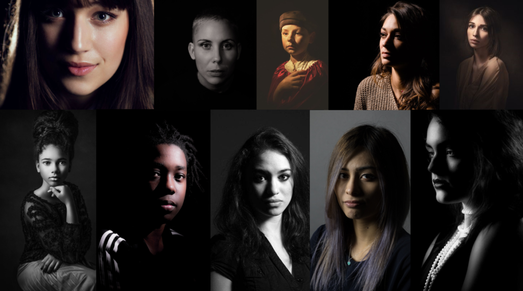
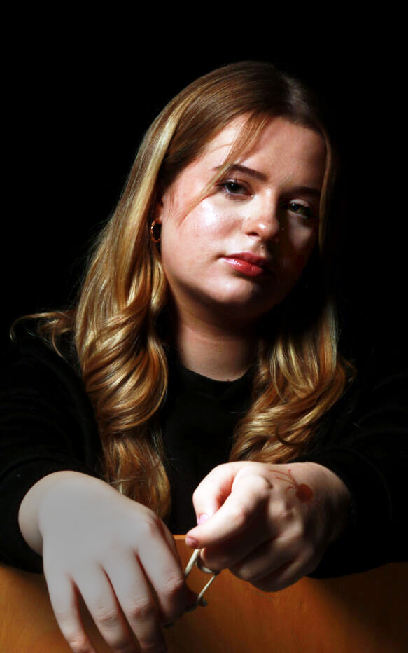
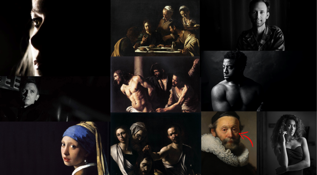
This technique appears when there is a high contrast that can utilize a low-key lighting setup to achieve contrast between a subject and a dark background.

The lighting adds depth and impact, there is an atmosphere created between the contrast of the shadows and highlights. “Dark colours add richness and drama to a scene.”

It’s “employed” visually to represent light and shadow as they define three-dimensional objects.

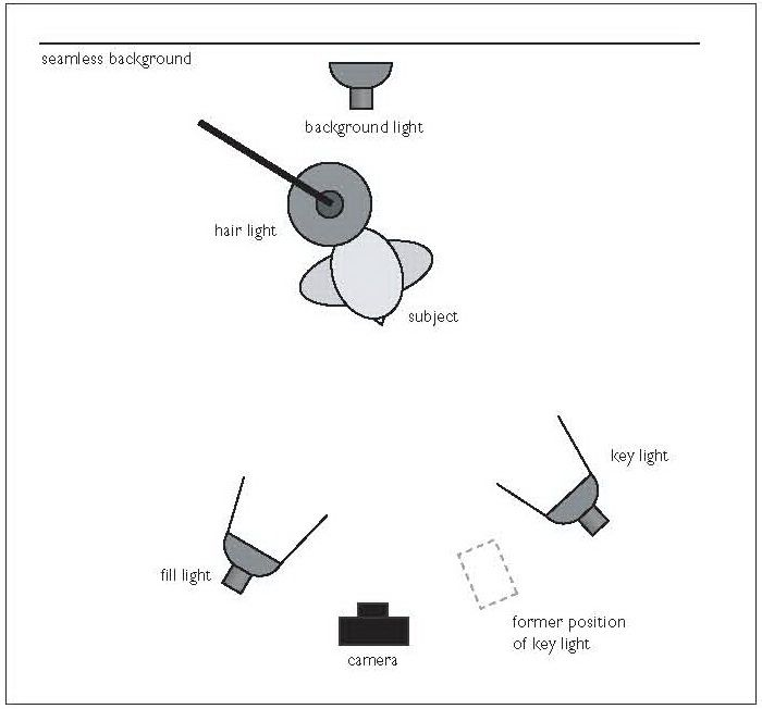
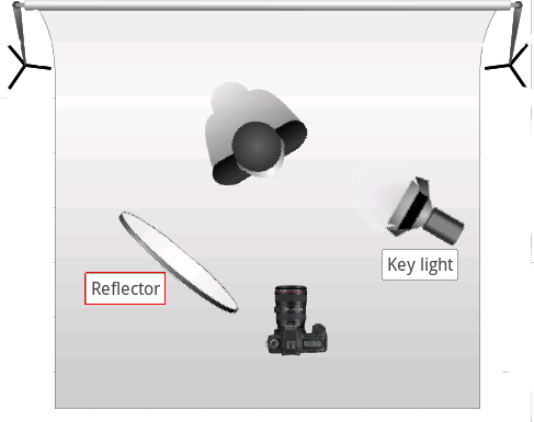
The set up:

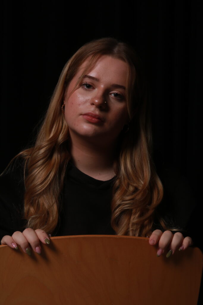
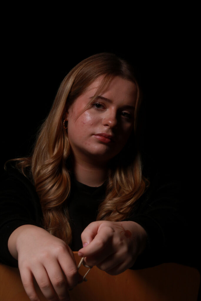
My Own Response:

Butterfly/Loop Lighting Technique

Butterfly lighting is when the lighting creates an even amount of light across the face. It’s a great lighting pattern when photographing a subject with strong cheekbones.

The key light is placed above the subject and points down at them. This creates a dramatic shadow under the nose and chin that appears to look like a butterfly but this can also appear as quite soft and as a flattering effect on the subject’s face. Whereas in Loop lighting: If the shadow from the nose doesn’t extend into the shadows, it is loop lighting (and if the shadow of the nose is directly below the nose, it is called butterfly lighting).

The technique is achieved by placing a light source at a 45-degree angle to the subject, above the eye level. This creates dark shadows and dimensions to the subject’s facial structures.

A butterfly lighting effect refers to the setup not the quality of the light. It can be soft or hard light depending on the effect you want.

Setting up the butterfly technique:

Setting up the loop lighting technique:

Once the key light is set up then you can experiment to fill the shadows. You can use a reflector to bounce the light back up and make the shadow softer under the chin & the one from under the nose.

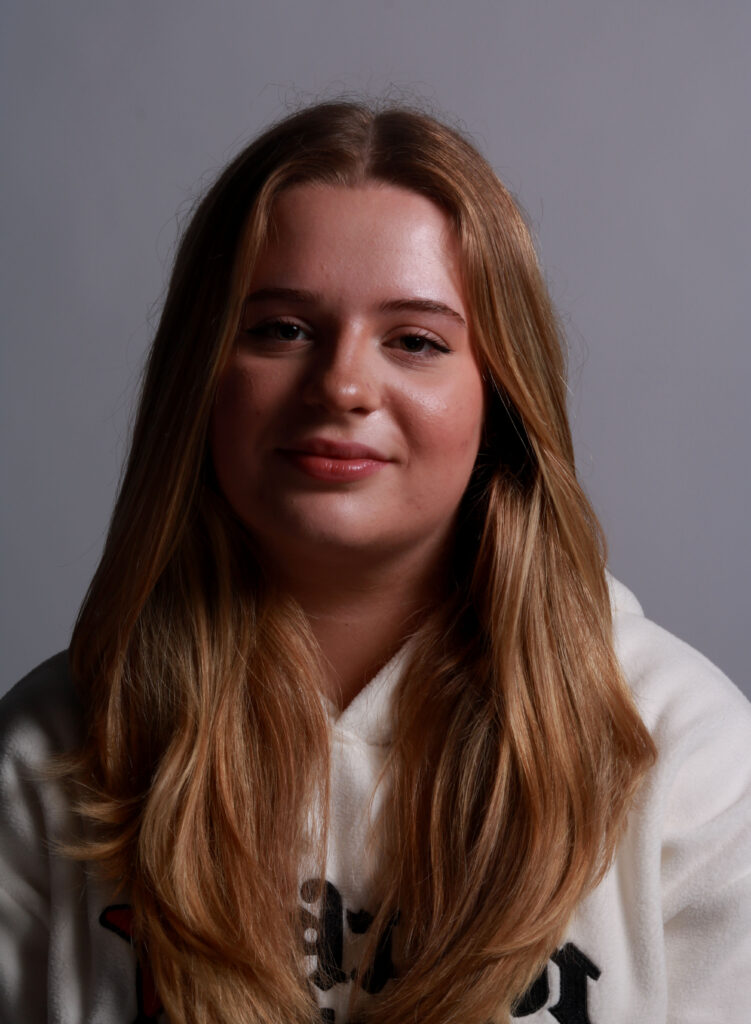
My Own Response:

Split Lighting Technique

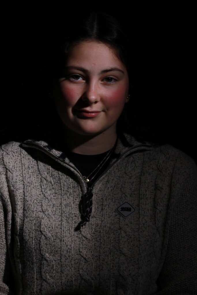
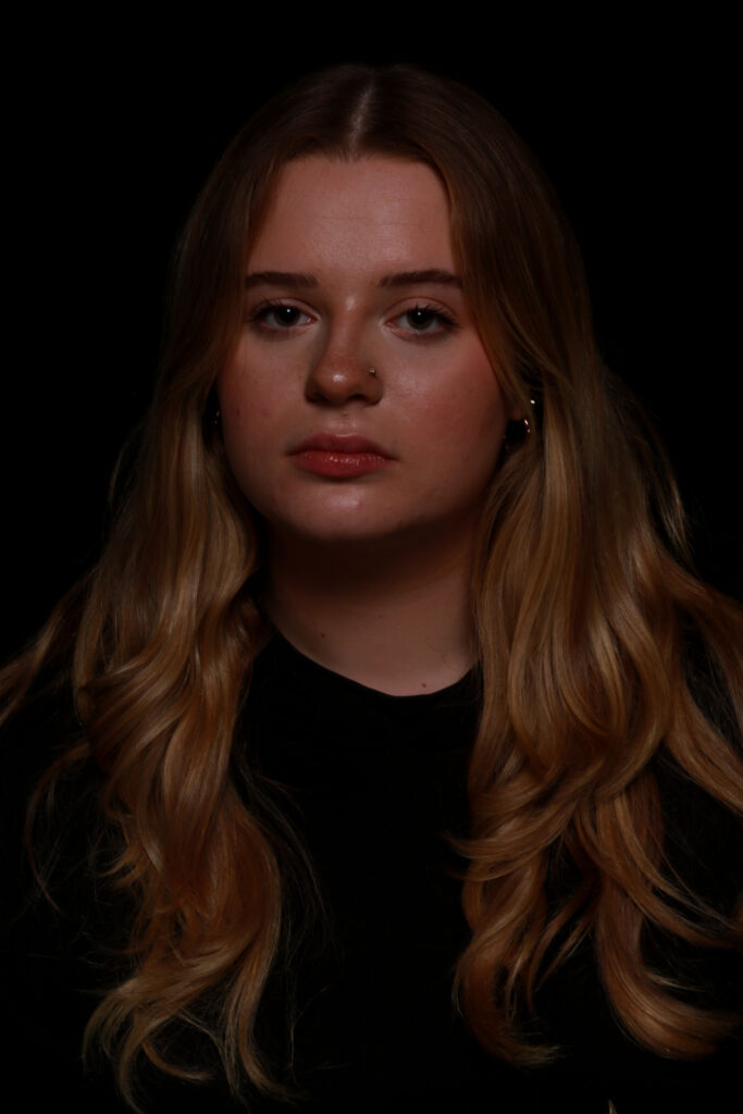
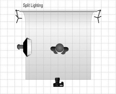
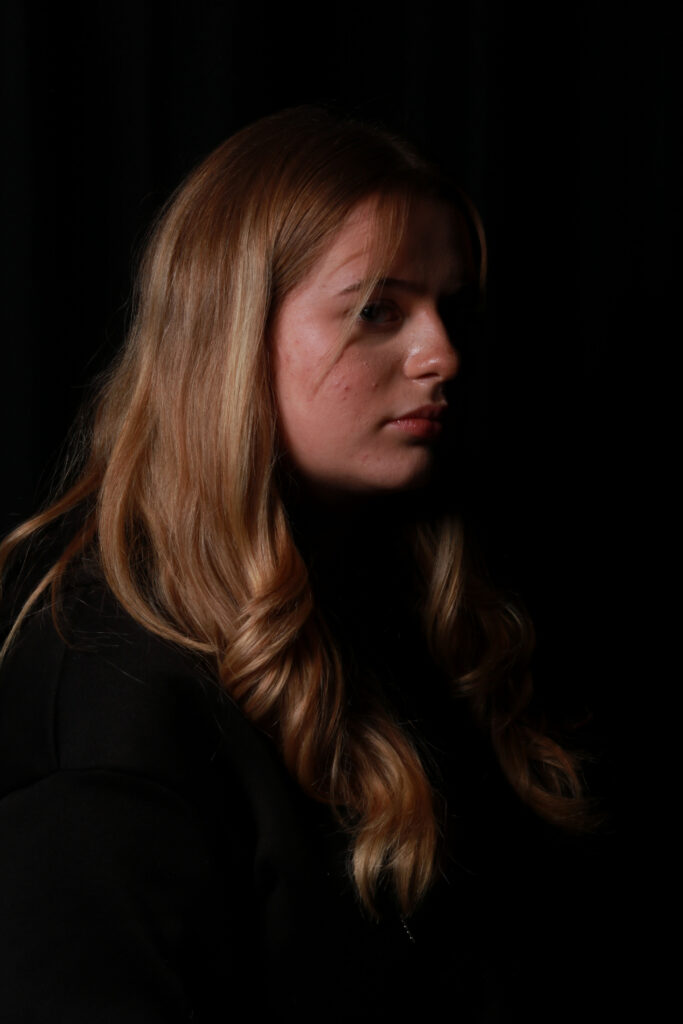
Split Lighting is when the light in the setup “illuminates the subject perpendicular to the model”. The set-up lights up only half of the face presented while keeping the other hidden and “shadowed”. Therefore, it can split the lighting on the subject’s face. This technique creates a sharp yet subtle/moody contrast that can make the image look more dramatic, assertive, and intimidating. It can emphasize power, glamour, and drama in a photograph. At its most basic level, it’s constructed with a single light source placed 90 degrees from the subject and a bit higher than eye level.

The setup:

My Own Response:

Rembrandt Lighting Technique

It is one of the oldest portrait lighting techniques. The technique relates to the 17th Century painter & his technique of adding light to the side of the face in his paintings.

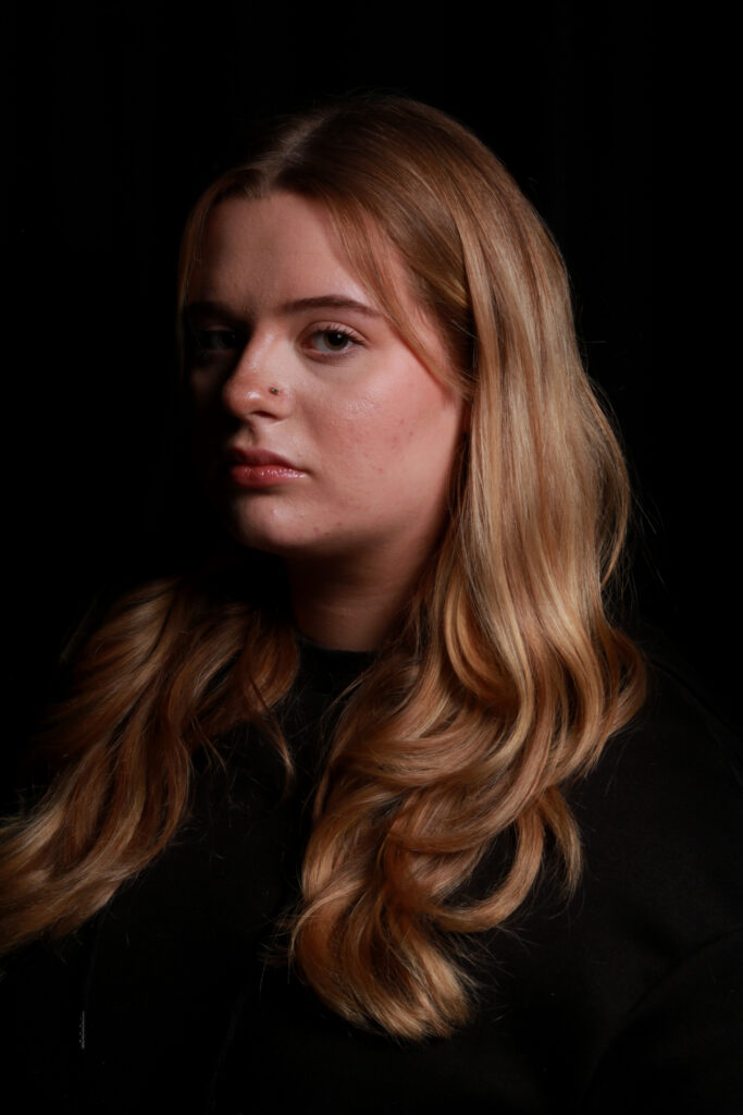
It is considered a dramatic lighting effect with half the face in shadow and the other half-it .

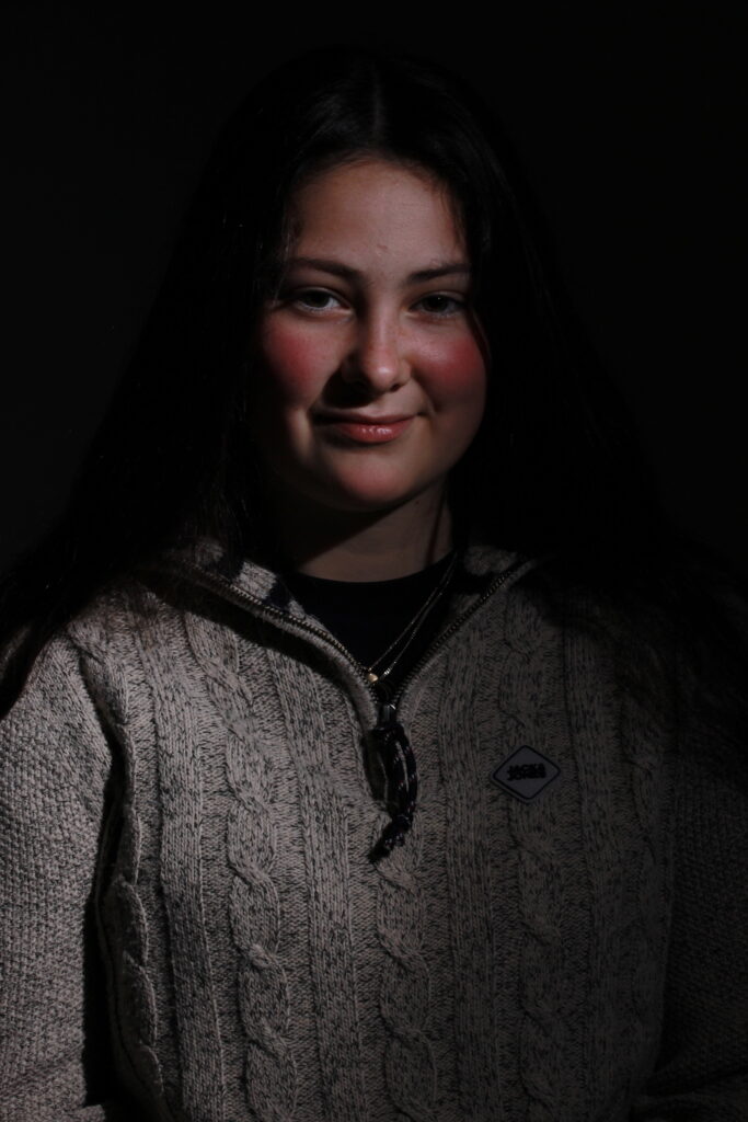
Photographers use Rembrandt lighting as it creates images to look dramatic and moody yet natural with the featuring dark and/or background behind the subject, putting the subject front and centre. It “predominately characterized” by a lit-up triangle underneath the subject’s eye on the less illuminated area of the face (fill side).

https://www.studiobinder.com/blog/rembrandt-lighting-photography/

To achieve this: turn the subjects face away from the light source, making one side of the face lit and the other half in a shadow.

Setting up the Rembrandt Technique:

The single light source would be at a 40-45 degree angle & higher than the subject.

My Own Response:

Edits

Identity Politics

What is Binary Opposition

Binary Opposition has roots in Saussurean structuralist theory in linguistics where two ‘opposites’ are defied by one another and get compared. Examples of binary opposites:

  • Good vs Evil
    • Black vs white
      • Masculinity vs Femininity

‘Masculinity and femininity’ is a common example of binary opposites and a common comparison for backgrounds, discrimination and privilege. It is an easy comparison to make and is one of many that is commonly mentioned in conversations about identity politics and culture wars.

Identity Politics and Culture Wars

Identity Politics are politics based on identity. Many factors influence and makeup someone’s identity such as:

  • Race,
  • Nationality,
  • Religion,
  • Gender, and
  • Social background

Identity by definition is a factual makeup of a person, however it is also a personal interpretation of what makes you you. Personal identity can bring people with similar struggles, opinions and backgrounds together, but can similarly split two people apart for little reason creating tension which builds into ‘culture wars’.

A culture war is a cultural conflict between different social groups who struggle to impose their own ideology. They can be small and harmless grown out of innocent competition or aggressive and hate filled.

Identity can bring people together by harnessing their joined identity to create a community. This group could be a positive thing aimed to help and boost one another but could also become a negative environment if each person holds grudges and fuel one another’s hatred. These communities can build within a geographical location or online in recent times.

Recently left wing LGBT communities have taken over the media. Some label this movement ‘woke propaganda’ as though communities haven’t been fighting for genuine respect for decades. This community strays from the traditional Binaries of gender and therefore defy stereotypical gender norms which upsets conservatives.

The LGBT community has culminated a bad reputation online from loud individuals who attack ‘wrong’ or uneducated individuals for disagreeing with their opinions. They are known to ‘doxx’ these individuals which puts them in harms way. Despite the loud commotion on sites like twitter, other sites are relatively quiet since the large group is not as easily connected.

Groups with shared identities are often sectioned into subcultures online. These can help young people connect and socialise with people with similar interests and feel understood. They could also push young people to become closed off and distant from ‘outsiders’. These communities are also infamous for weaponizing joined identity or radicalisation.

Masculinity vs Femininity

This is one of the most prevalent examples of binary opposition which is acknowledged even by children in the playground due to the ‘social norms’ pushed by society from a very young age. This is achieved in many ways including: marketing, characters in tv and personal experiences. This both separates the two and pits them against each other creating competition and unease.

The differences between the two could be as simple as long hair being associated with girls and short hair with boys. Not particularly harmful stereotypes but prevalent ones regardless.

Masculine stereotypes:

Strength, aggression, well educated, breadwinner, provider, emotionally unavailable, anger, blues, reds, gyms, positions of power, power in general, cars, dinosaurs, trains, army, work, trousers

Feminine stereotypes:

Elegance, emotional, mothers, uneducated, compassion, children, care, house, ribbons, pink, purple, ballet, cooking, cleaning, dresses

Women are often seen as inferior for being emotional, weaker and dumber due to a past of different education and standards being measuring with men’s strengths in mind.