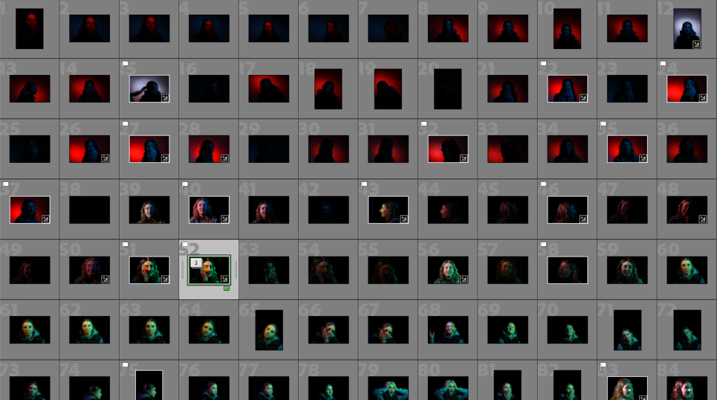
I conducted a photoshoot in the studio using a honeycomb head and snout head on the lights, putting coloured gels in front of them to give me a more dynamic lighting style instead of an ordinary white and yellow-toned light. I played around with different colours, placements and angles of my subject whilst also using a white or gold reflector so that the light would bounce into my subjects eyes as they are the most compelling section of a persons face.
My best images:
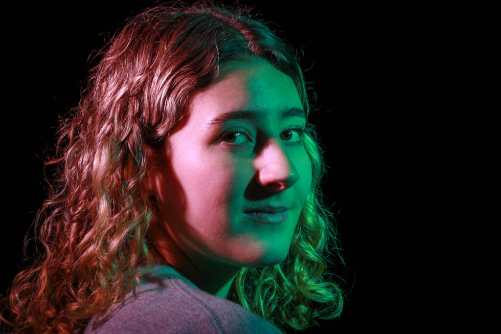
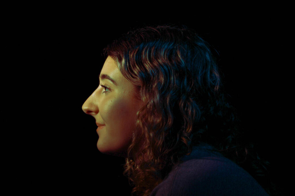
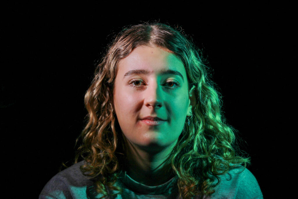
My favourite image:
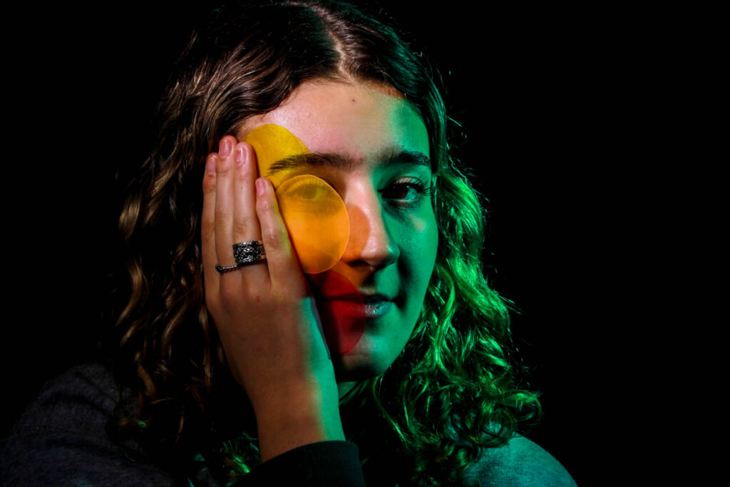
This is my absolute favourite image as I have added in a creative aspect to it. I took the circular coloured gels out of the snout light and chose 3 colours that complimented each other well: red, orange and yellow. I placed them into my subjects hand as she rested it on her face as I felt it would look more natural and genuine. I really like the way this turned out as the shapes aren’t entirely opaque so that her features have still been brought through but in a completely different colour. I put a green gel into the snout light and used a very pale yellow on the honeycomb light as if I used a bolder coloured this would’ve ruined the illusion I was aiming to create. I used a black curtain behind my subject as this meant she was the focal point of the image and made it look more dramatic. I didn’t have to edit this image very much as I shot it quite well.
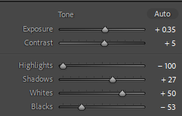
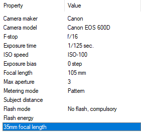
After this, I opened all of these into Photoshop where I created a Diamond Cameo using inspiration from Henry Mullins. Unlike him, I created mine in a more modern way as the colour in my photos would not work aesthetically with an old-fashioned style background.
Diamond Cameo:
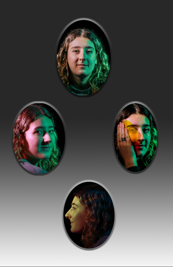
I added shadows around the bottom and highlights at the top as this creates an illusion of it being framed which is what a Diamond Cameo looks like. Instead of filling the background with a block colour, I decided to fill it with a gradient from white to black, reversing the style of the ‘frame’ around the images, I really like the contrast in this. I chose the use monotone colours because I didn’t want to wash out the saturation of my images, using these more bland colours means that my images pop out to the viewer and catch attention a lot more because they look entirely different to the background as they have bright and bold colours. As the background of the images are black too, I feel like it gives a mirror effect as the background is dark too, making the image not only more mysterious but it points out the colourful lighting used and my subject a lot more.
