Photoshoot- Edits
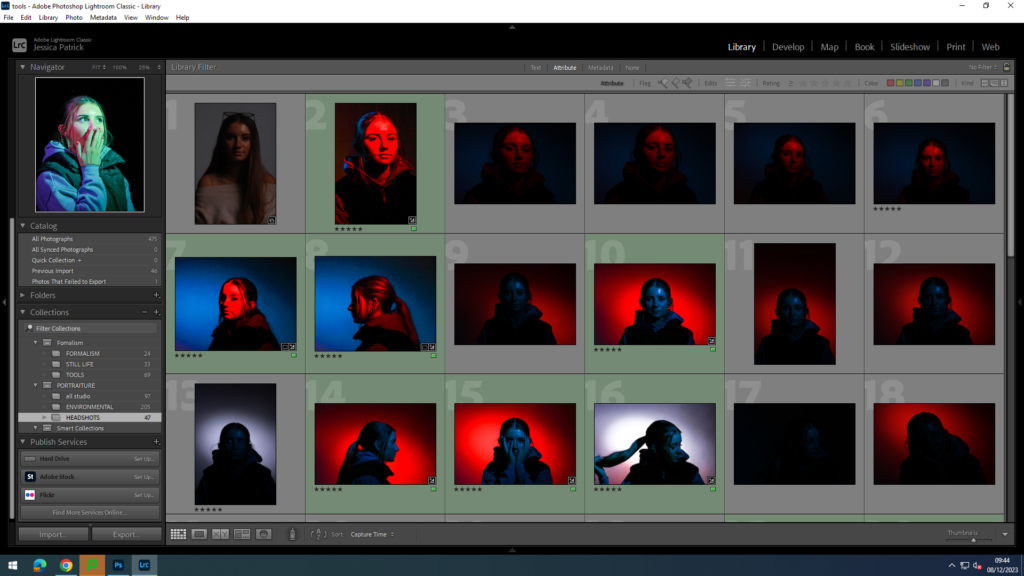
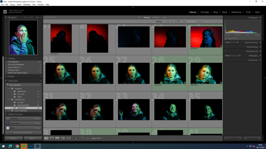
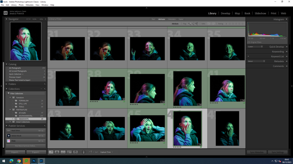
The photographs that are highlighted green are the photos I have chosen to edit, because they use a variety of lighting, positioning and poses.
Set Up
There were multiple different set ups for the different types of lighting used. However, the same two studio lights were used. One light was a honey comb light, while the other had a snout. The snout directs the light to a specific place, whereas the honey comb light creates a strong spot light effect. I also used coloured disks and sheets to create different coloured lighting.
Split lighting-
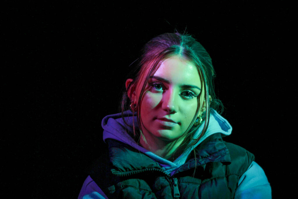
For the split coloured lighting the light with the snout was on the right side of the model with a coloured disk inside it and the honeycomb light was on the left of the model with a coloured sheet help over it. Both lights were to the side of the camera at a 45 degree angle, but the snout light was slightly closer the the model, as it is a less powerful and bright light.
Spotlight behind-
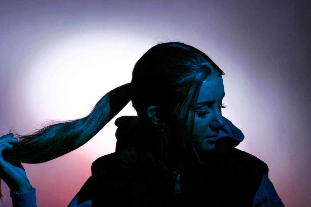
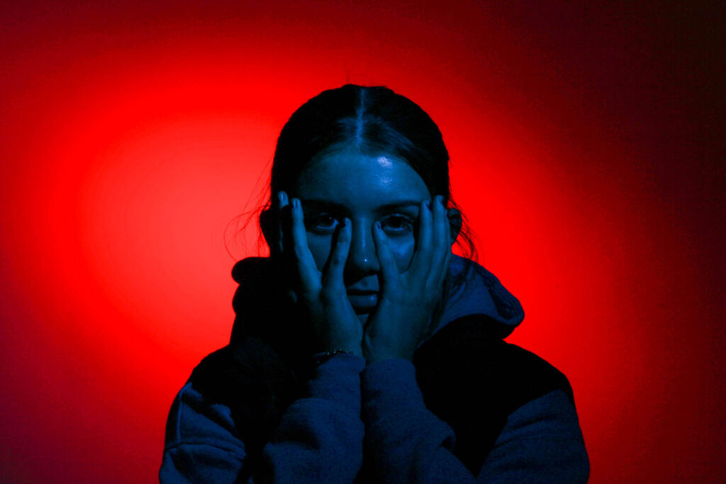
To create the coloured spot light behind the model. while the model is a different colour, the snout light needs to be behind the model on her left pointing at a 45 degree angle onto the background wall. Whereas, the honeycomb light needs to be on the right of the model in line with the camera on a 45 degree angle directly onto the model. The snout light has a coloured disk inside and the honey comb light has a coloured sheet held in front of it.
Editing- Diamond Cameo
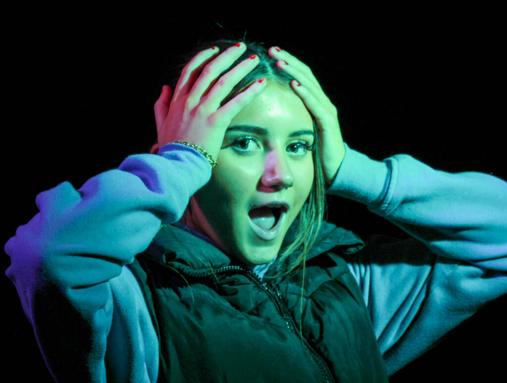
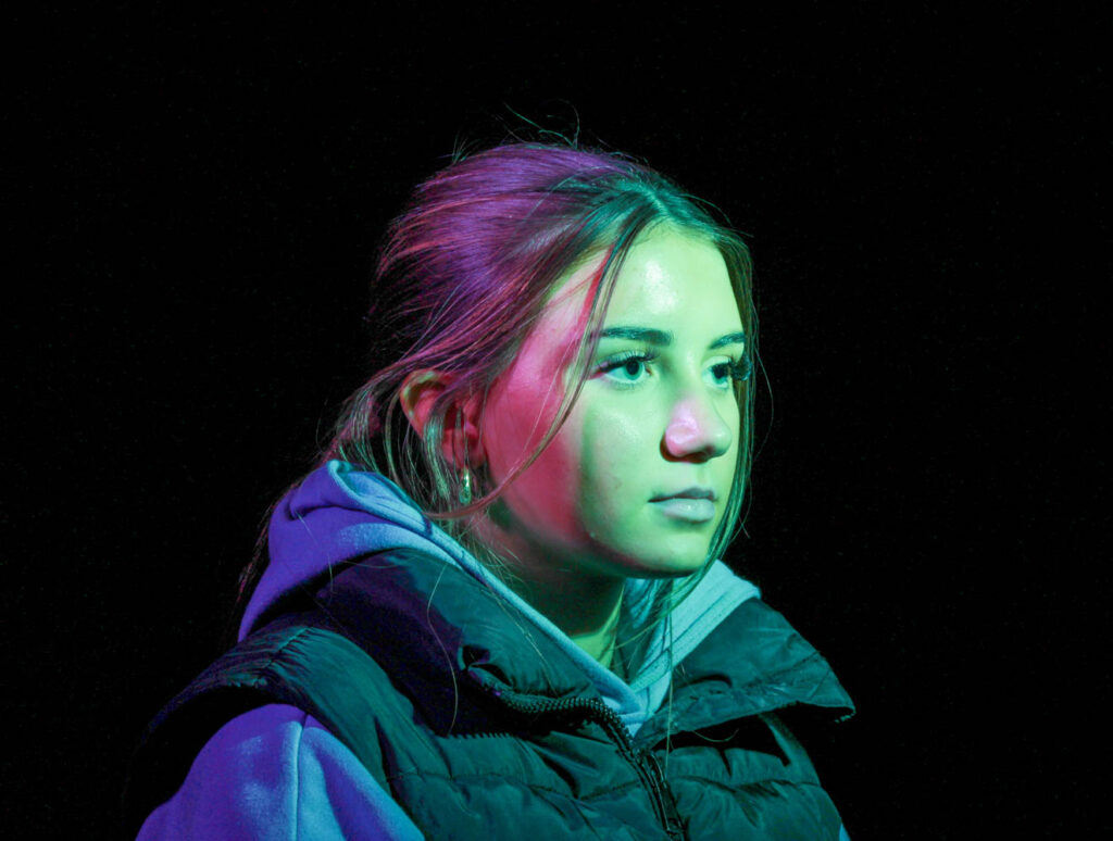
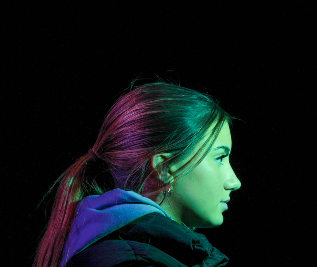
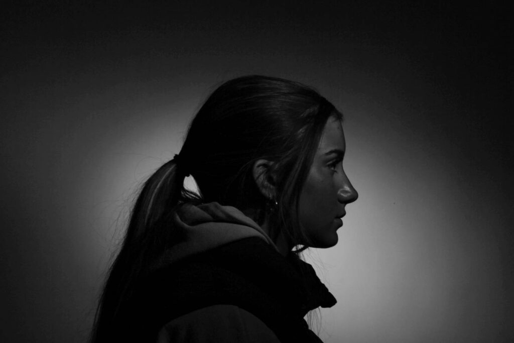
I chose to edit these 4 photos, so I would be able to create a Diamond Cameo with them, as they include all the positions/ angles needed for it.
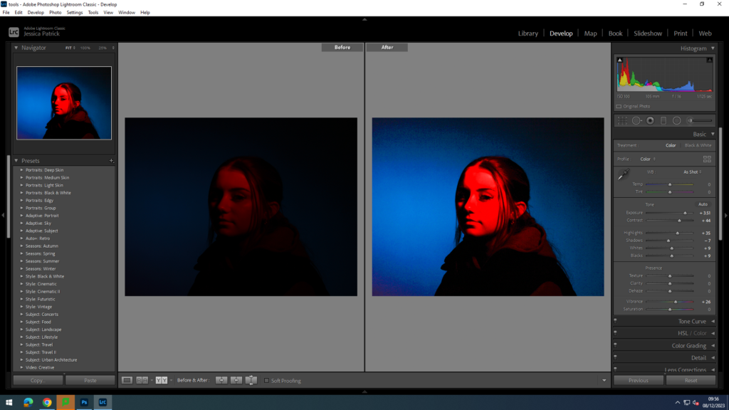
I edited this first photograph to increase the exposure, so the image would be less dark. I did this by increasing the exposure, contrast, highlights, whites, blacks and vibrancy, while decreasing the shadows.
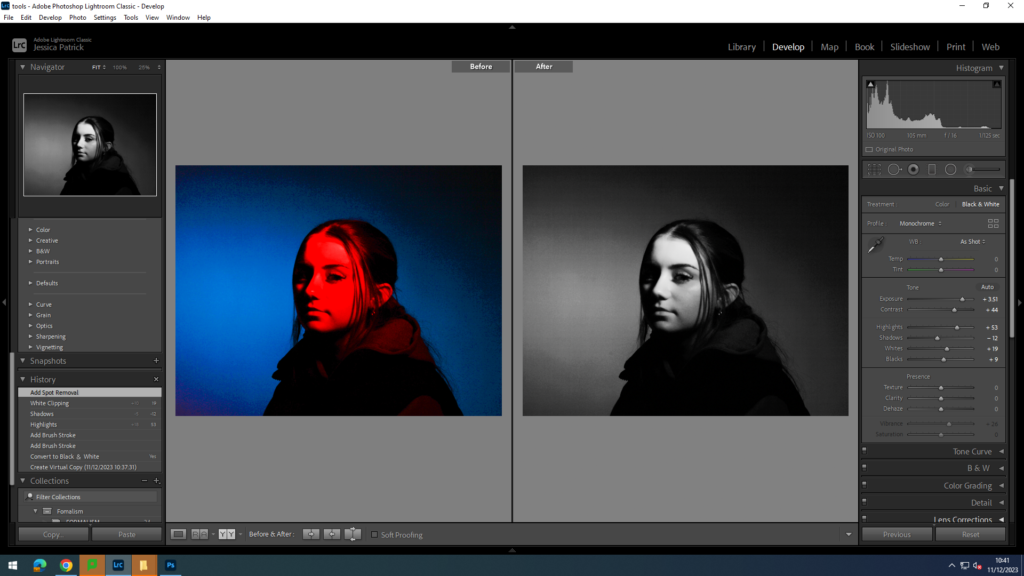
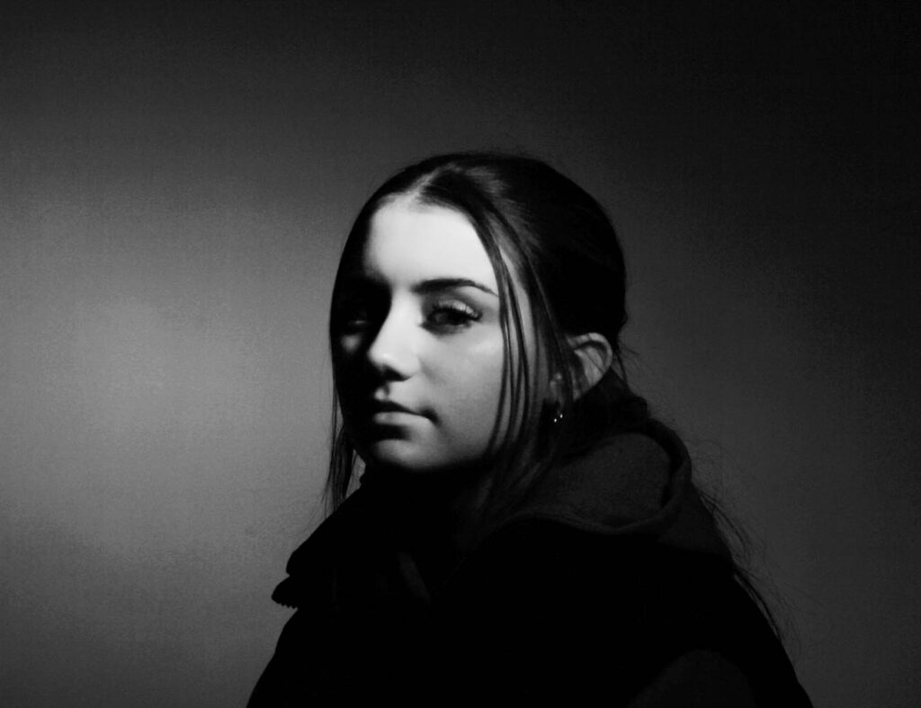
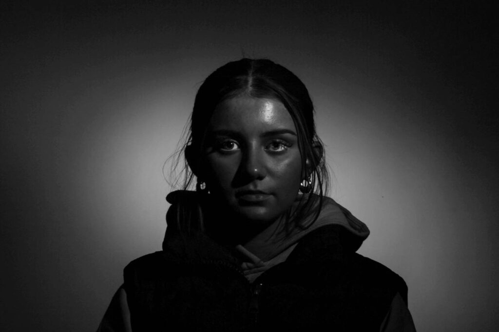
I also created a black and white version of the edited photograph, by creating a virtual copy of the edited photo. I also used a spot removal tool to get rid of any blemishes.
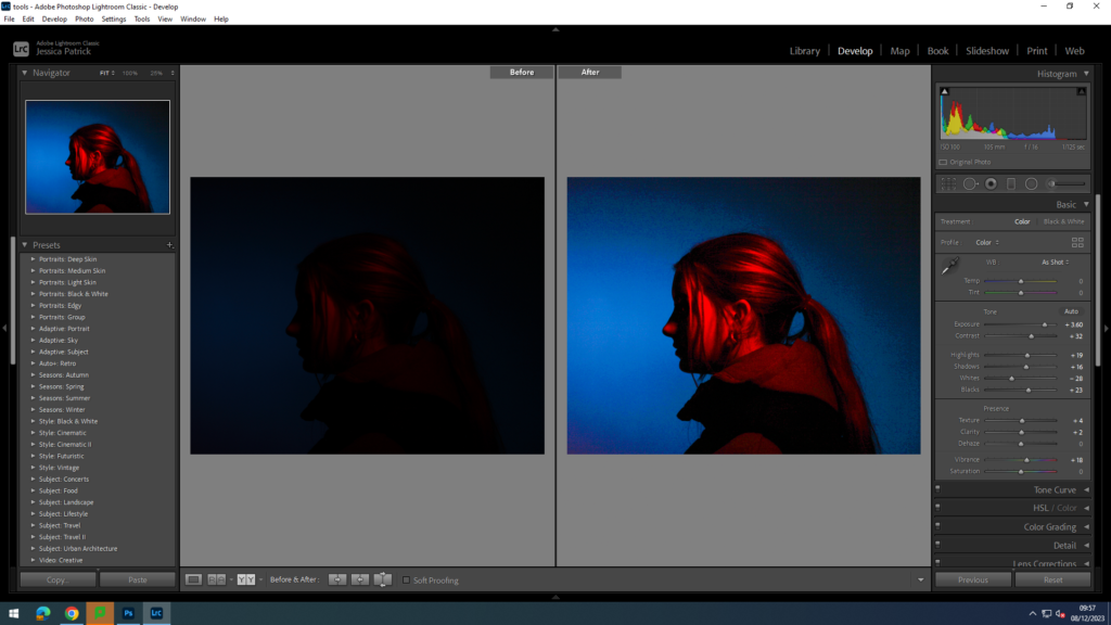
I edited this photo to also increase the exposure, so the image would be lighter. I did this by increasing the exposure, contrast, highlights, shadows, texture, clarity and vibrancy, while decreasing the blacks and whites.
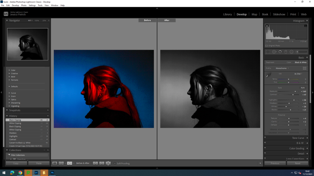
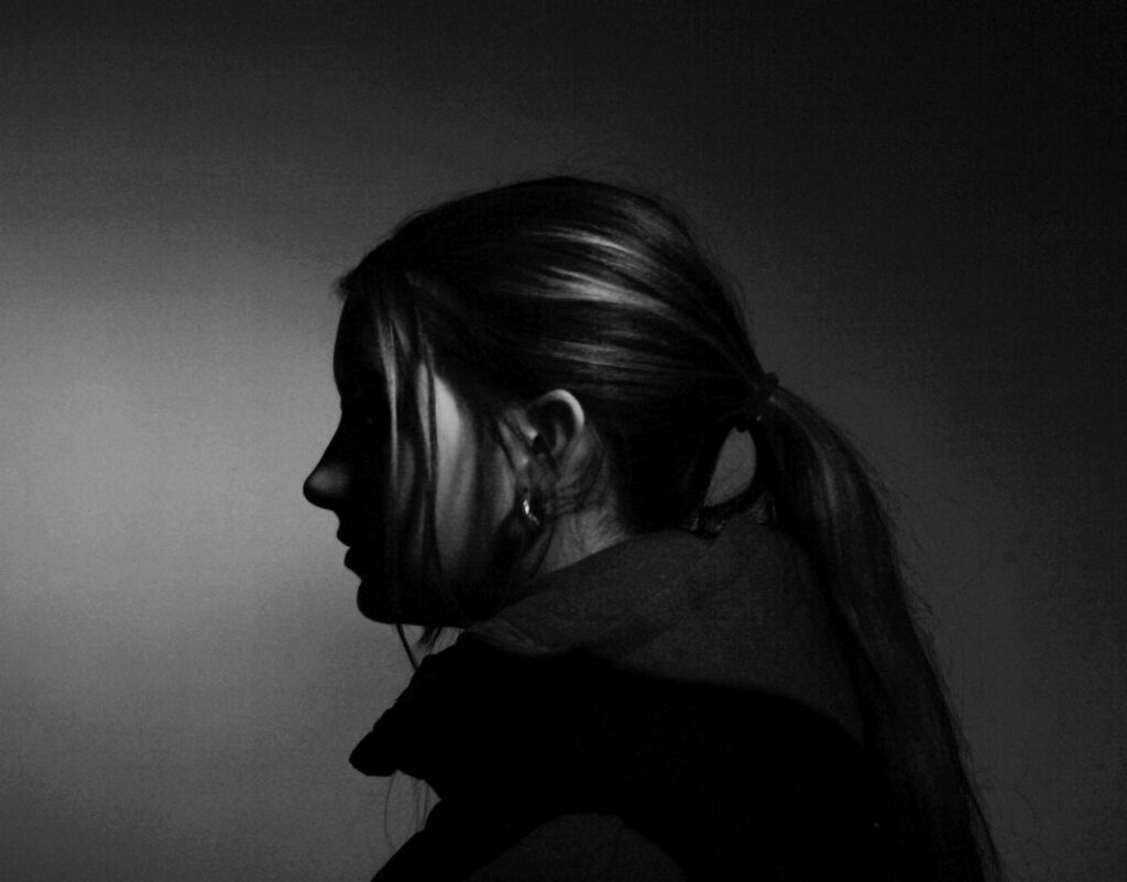
I also made a virtual copy of the edited photograph and made a black and white version.
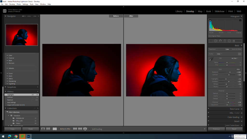
I edited this photo to make it brighter, so the model is more visible. I did this by increasing the exposure, contrast, shadows, vibrancy and saturation, while decreasing the whites and highlights.
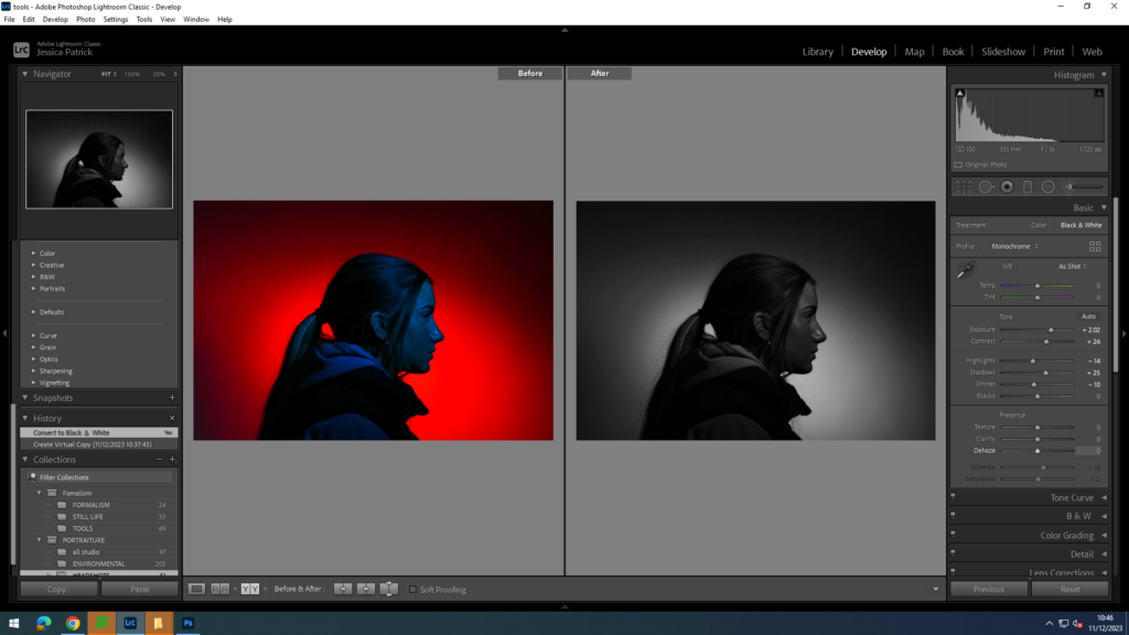
I also made a virtual copy of the edited photograph, so I could create a black and white version.
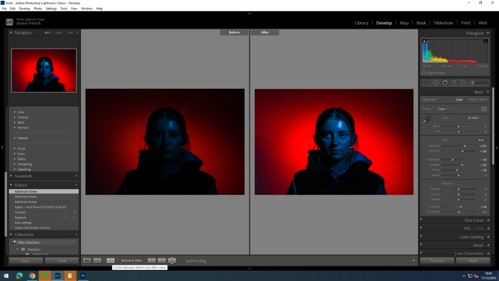
I edited this photo to increase the exposure and to make it brighter. I did this by increasing the exposure, contrast, shadows, vibrancy and saturation, while decreasing the highlights and whites. I also used an eye brightening tool, so the eyes stand out more.
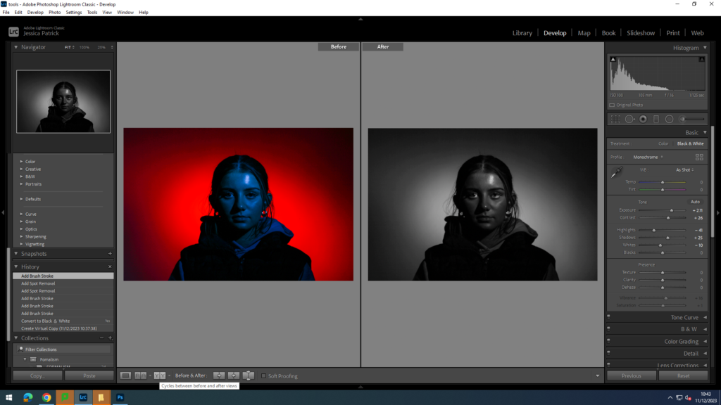
I also made a black and white version of the edited photograph by making a virtual copy. I also used a spot correction tool to get rid of any blemishes.
Final 4 Coloured Images for Diamond Cameo
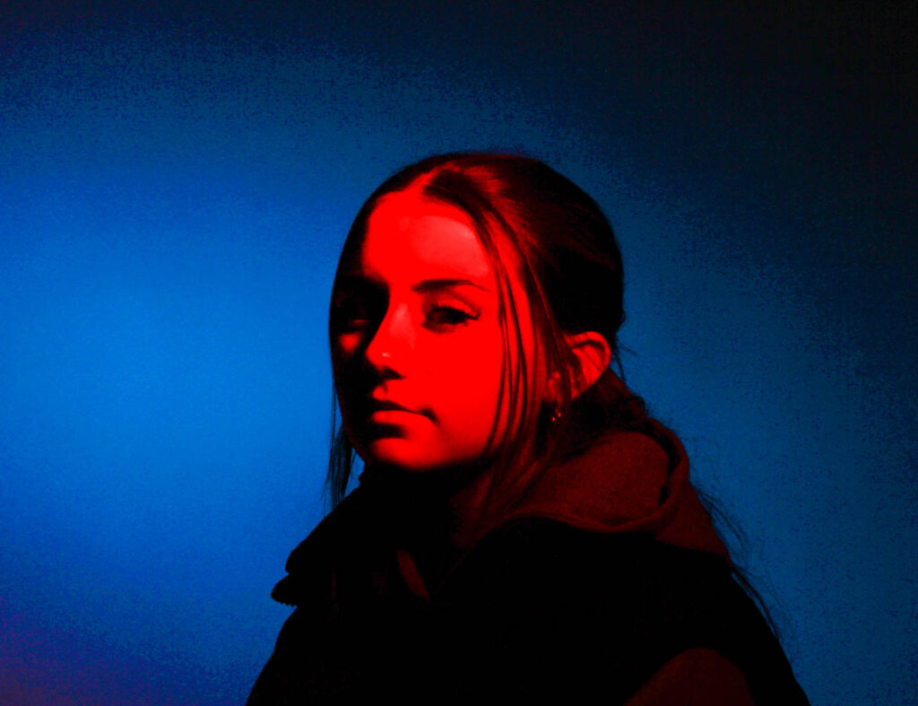
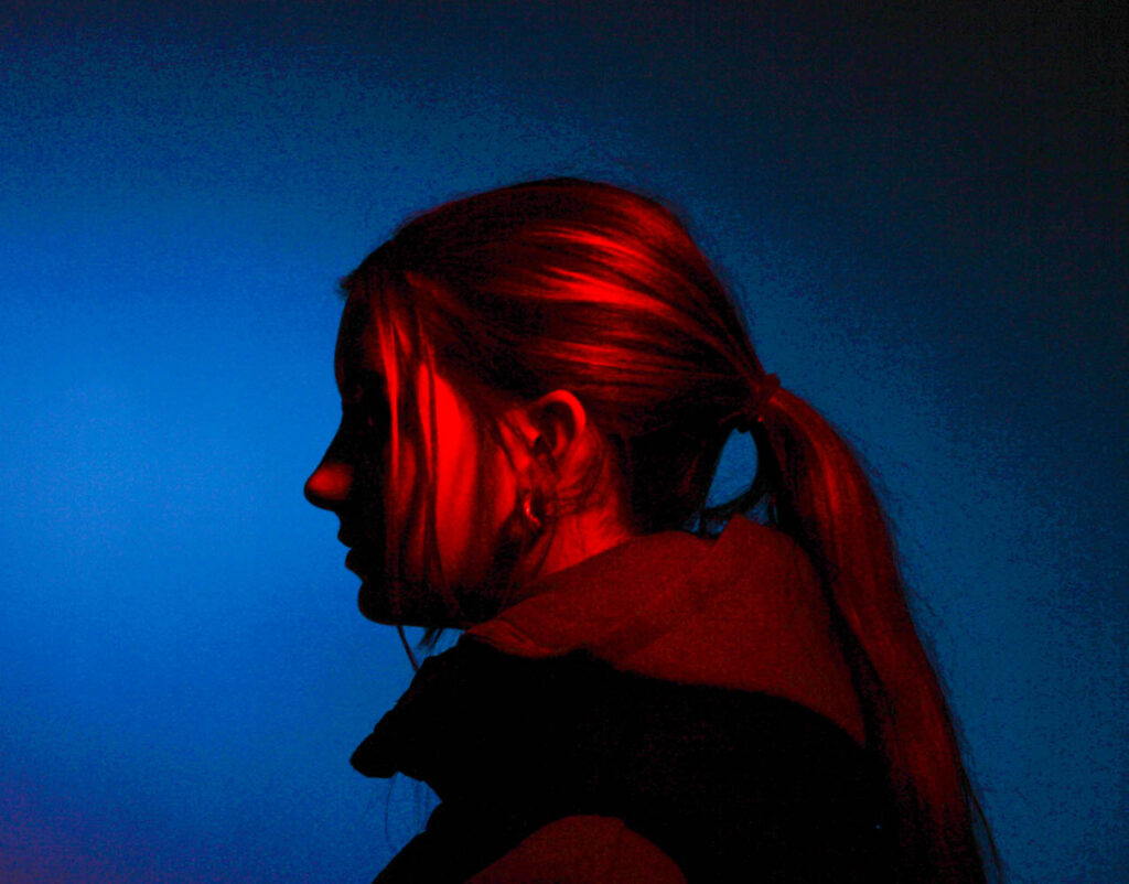
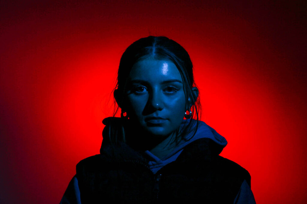
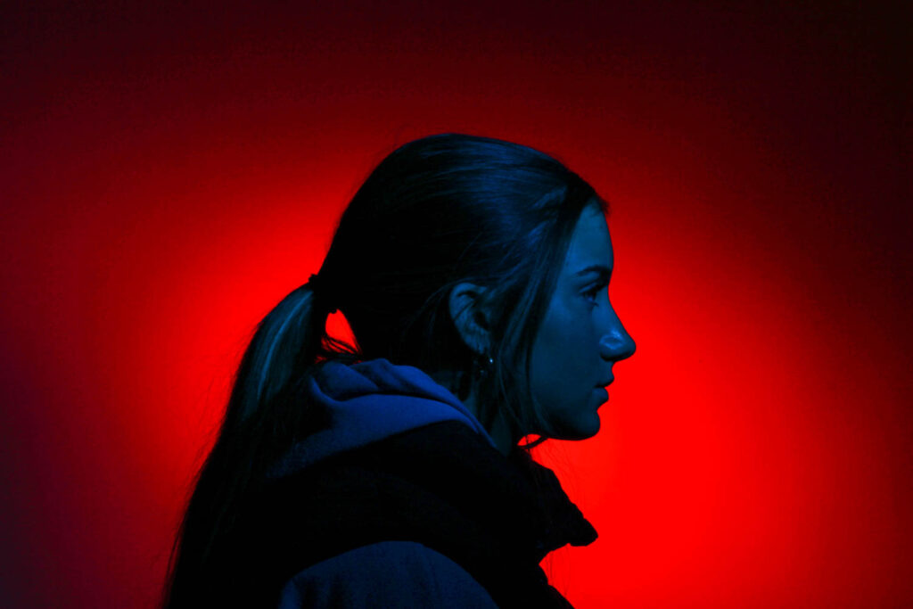
Final 4 B&W Images for Diamond Cameo

Photoshop- Diamond Cameo
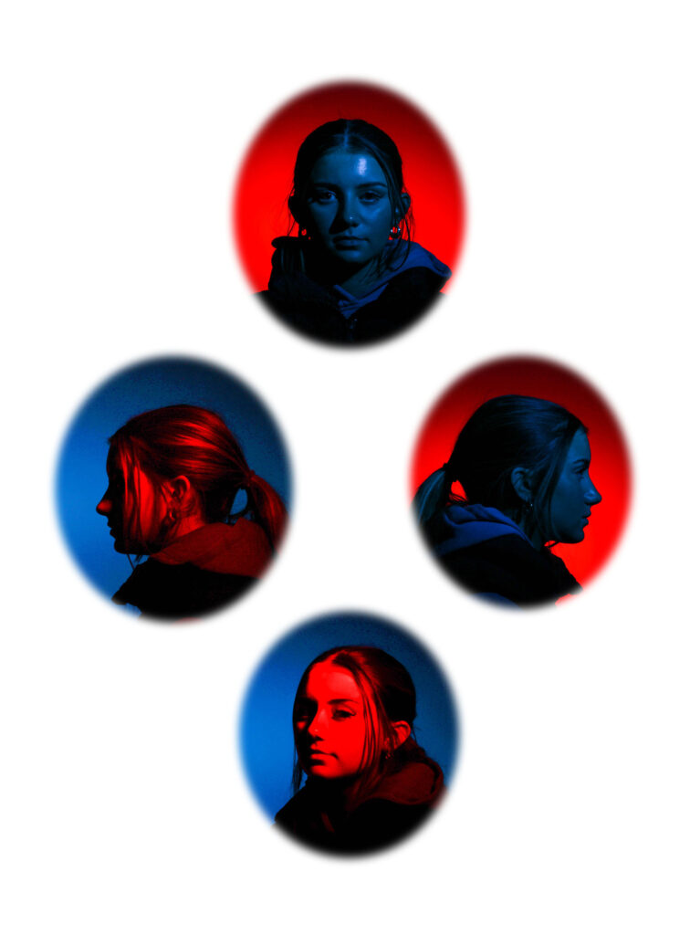
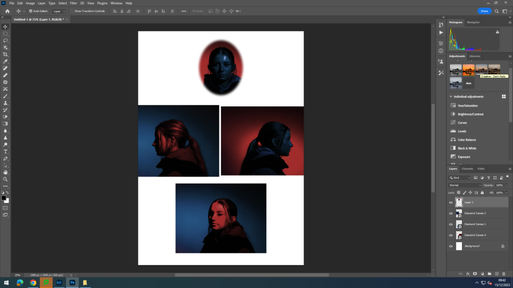
This is my first attempt of creating a diamond cameo on photoshop. Firstly, I imported my four photos which I wanted to use for my diamond cameo onto a background on photoshop. I then selected them all together to resize them to fit the background perfectly. Then, I positioned my four layers where I want them.
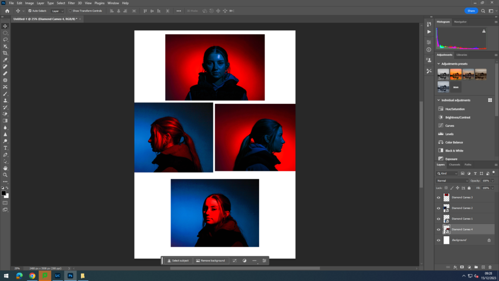
Then I select a layer and select the elliptical marque tool and select the feather at 15, so the edges of my ovals fade in and aren’t sharp ovals. Then, I cut out my desired size and shape oval on the selected layer and right click in the oval click layer via copy to create a copy of the oval cut out.
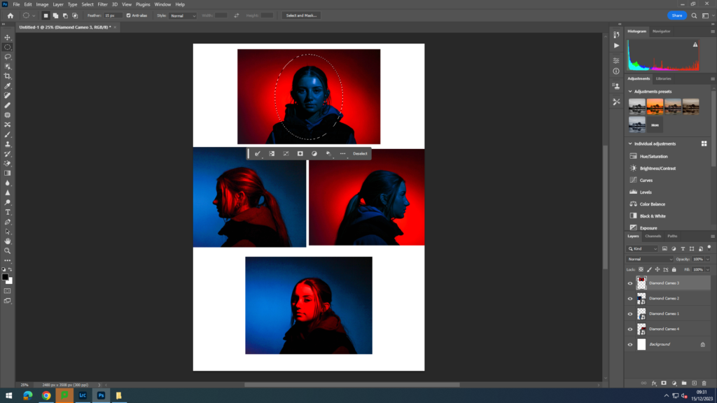
Next, I delete the selected layer without the cut out oval and then repeat this for all the four layers.
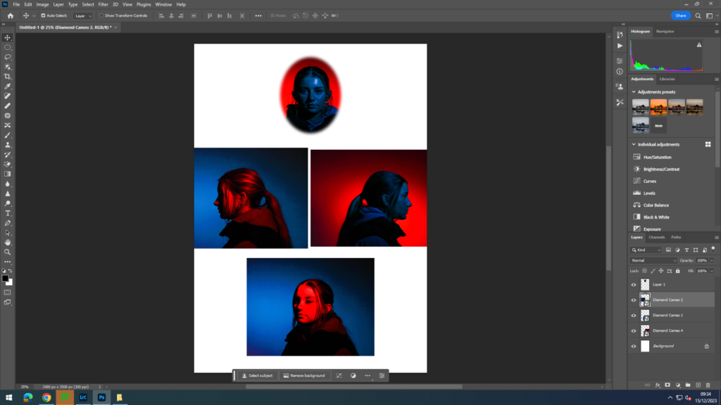
Next, I experimented with my diamond cameo, by changing the background to black by using the gradient tool to fill in the background with black paint. I also experimented with giving my diamond cameo an older look, so I could try and replicate a Henry Mullins diamond cameo.
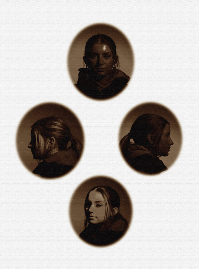
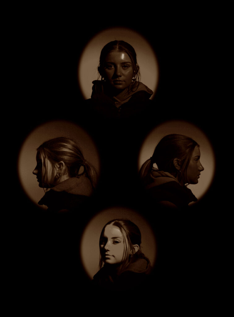
I made an older looking diamond cameo like Henry Mullins by using the filters on the top right of my screen and changing how harsh or light I want them.
Double Multi-Exposure
These are the two images I am going to be using for my Multi-exposure photographs, because they are similar, but also have a very obvious difference, which is how the model is using her hands to pose.

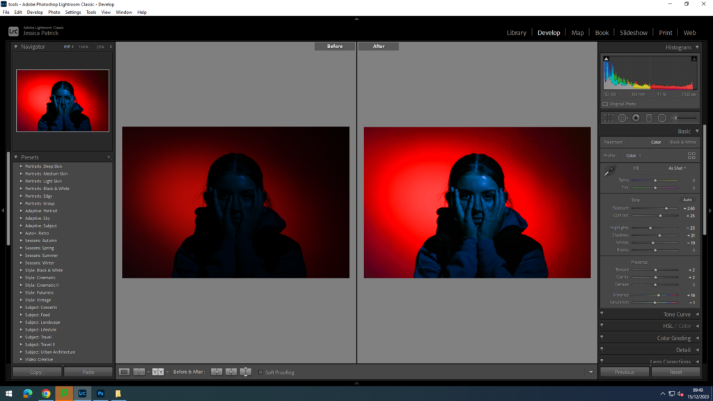
I edited this photos to make them brighter and have a greater exposure. I did this by increasing the exposure, contrast, shadows, vibrancy, texture, clarity and saturation, while decreasing the whites and highlights.

This is my first attempt of a double multi- exposure photograph. I created this on photoshop, by firstly layering my two chosen images on a plain background. I select one of my layers then adjust the opacity of the one layer, so it is more transparent. Then I position the more transparent layer on top of my opaque layer where I want it.
Juxtaposition
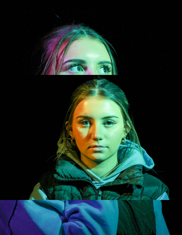
This is the photo I have chosen to edit for my juxtaposition photos, because it has a good composition and is a close up head shot.
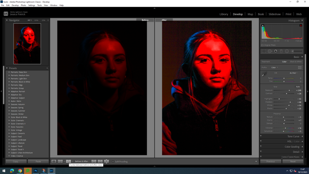
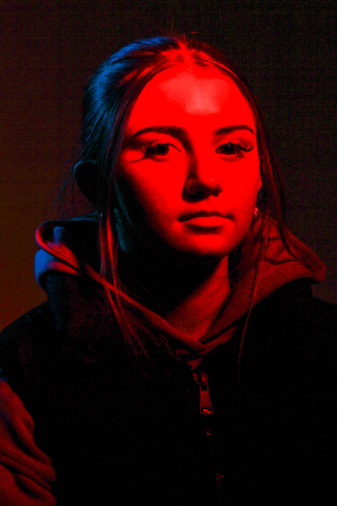
I edited this photo to make it brighter and have a higher exposure, so the model would be more visible and so the image would be less dark. I did this by increasing the exposure, contrast, shadows, whites, blacks, texture, clarity and vibrancy, while decreasing the highlights and saturation.
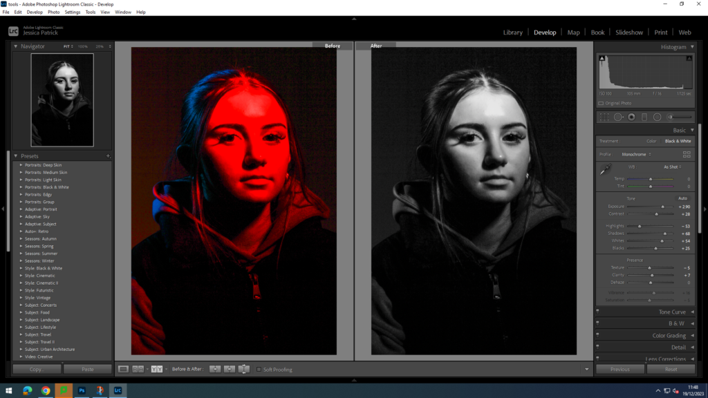
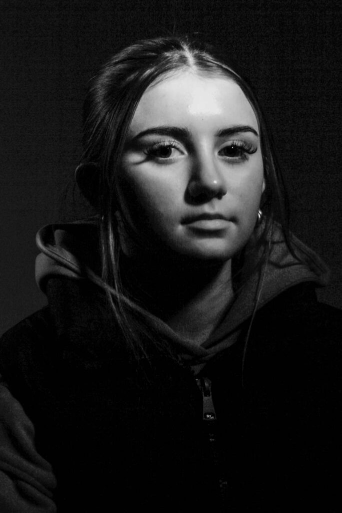
I then made a virtual copy of the edited photograph and created a black and white version for my juxtaposition.
Sequence/ Grid
These are the images I have chosen to edit, because they are my top 9 photographs. This is because they have the best compositions, poses, lighting and editing skills.
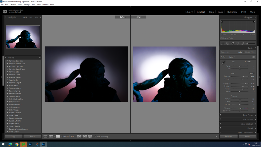
I edited this image to make the models face brighter and for the image to have more exposure, so the model was more visible. I did this by increasing the exposure, contrast, highlights, shadows, texture, clarity, vibrancy and saturation, while decreasing the blacks.
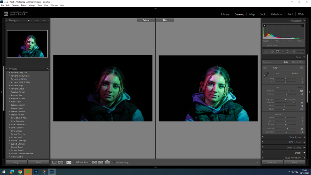
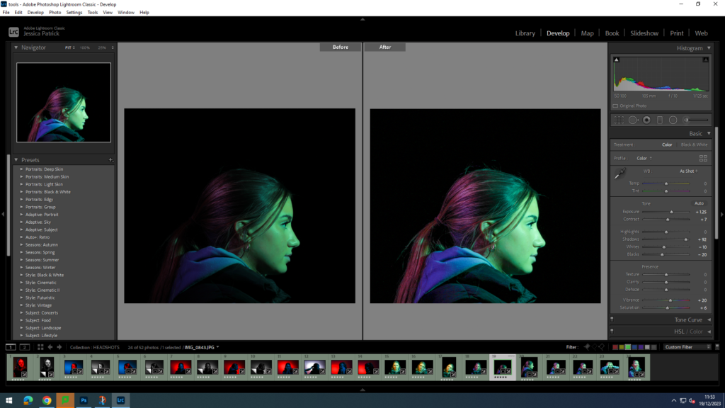
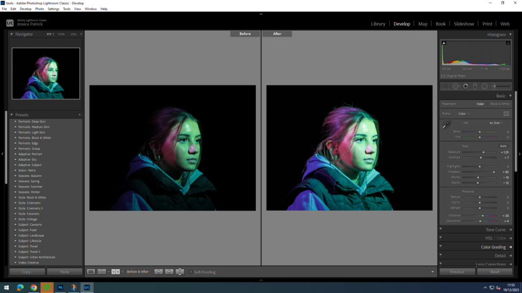
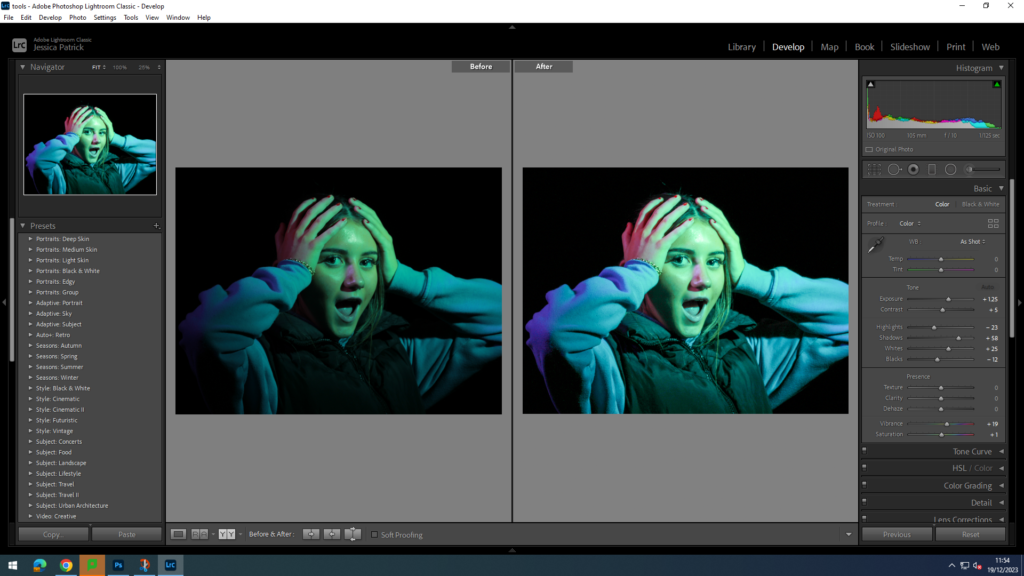
I edited all these images to make them brighter, so the colours used to photograph with pop more and are more vibrant and colourful. I did this by increasing the exposure, contrast, shadows, whites, vibrancy and saturation on them all, while also decreasing the highlights and blacks. I also used the brightening tool on the models eyes in all of these images, so the eyes would pop and stand out more.


Montage
These are the two images I have chosen to edit and use to create my montage, because they have the best composition, poses and lighting.
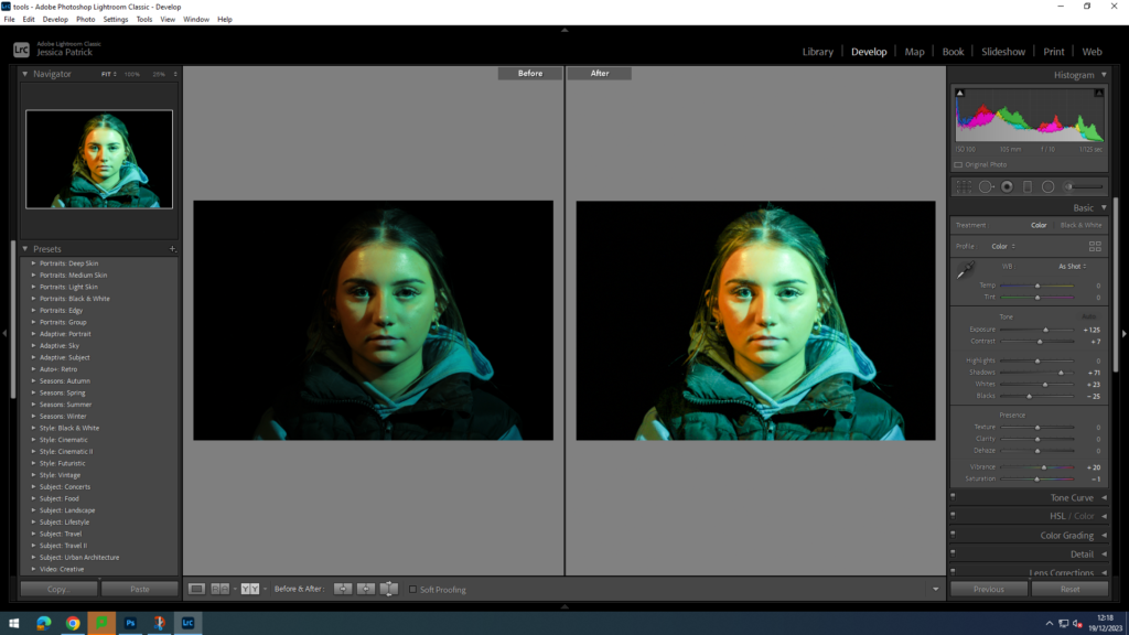
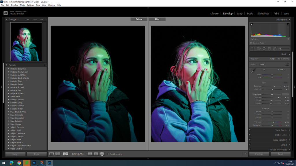
I edited these photographs to make them more vibrant, so the colours pop more. I did this by increasing the exposure, contrast, shadows, vibrancy and saturation on both, while decreasing the whites and blacks. I also used the brightening tool to brighten the eyes of the model, so they stand out more.
