double exposure- artist research

I think one of my favorite photographers who has done work on double exposure would be Christoffer Relander. He was best known for his series called “We Are Nature”. He layers the original portrait photo and layers a blurred nature image on top which is known as double exposure.

Emotional aspects-

I really like these photos they feel very tranquil and calming because all the colours are quite dull and muted but the way it’s blended makes it work

Visual aspects-

I think this image really works I like the fact it is in colour and you have the rich greens showing through unlike some of his other images.

I also really like how you can still see the model’s face very clearly underneath the nature/trees and the trees are almost being used as her hair i think that looks really successful.

technical aspects-

if you use the rule of thirds you can tell they have all the darker parts of the image where the hair would be in the collum on the right and the middle collum seems to be the most bright and colourful. The side on the left is probably the dullest it doesn’t have much it other than the model’s face.

conceptual aspects-

I get the impression from his work that Relander is trying to show us the beauty the calming effect of nature​
I would love to recreate his work I think it’s so interesting and beautiful and would be a great one to recreate.

contextual aspects-

This style of work is from his “We Are Nature” collection. Christoffer Relander is a Finnish photographer who liked the idea of pairing up each subject/model with different geographical/natural elements.

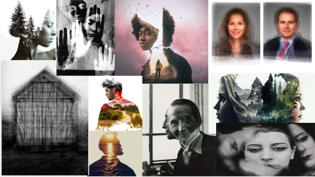
headshots double exposure -introduction

Double exposure is when you have two images layered on top of each other and you’ll change the blending options of the opacity of the images. Double exposure tends to create this dream like effect sometimes making the image look scary and give off a strange vibe but sometimes the photos can look very happy and sometimes nostalgic.

This style I believe comes from when Bernd and Hilla Becher who took photos of buildings then layered them together to create this creepy almost fantasy looking image.

I think the idea behind doing those kinds of photos is to create that kind of surreal effect for the image. Often photographers use double exposure to be able to add lots of deep and almost hidden meaning within their photos.

Butterfly lighting

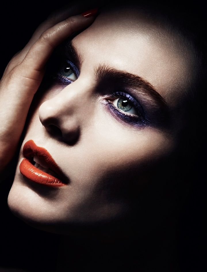
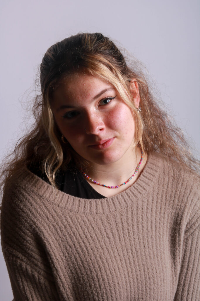
Butterfly lighting is where there is a small shadow usually under the model’s nose. It was first used by Marlene Dietrich who at the time was a German silent film actress in the 1920s and 30s and her director von Sternberg started to use the technique as it seemed to extenuate her strong features. The main reason butterfly lighting is used is because it makes for a very flattering portrait your features tend to stand out more and the lighting tends to be softer.

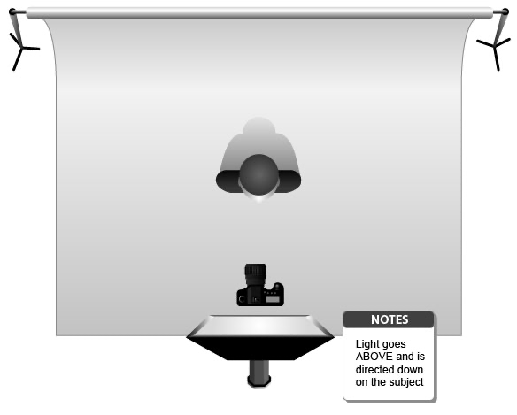
Here is an example of how to actually set up your lighting to create a butterfly effect

  • You want your light source to be quite light up and centered above the model’s face
  • you will need to be below the light source and slightly higher than central to the model face so maybe forehead level level
  • and then having a reflector underneath the model will help

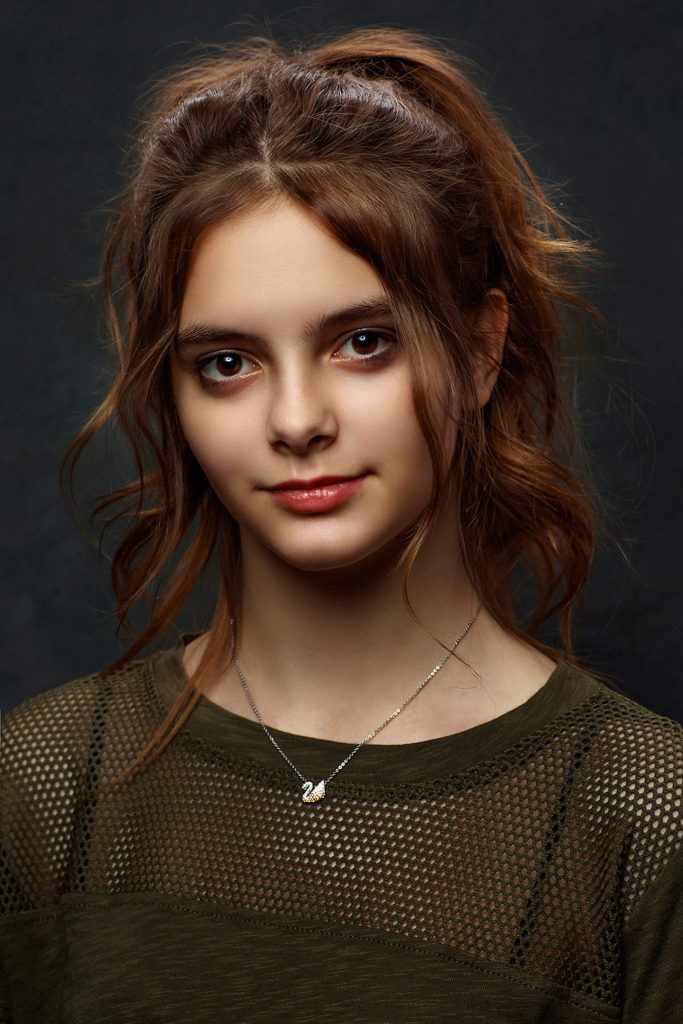
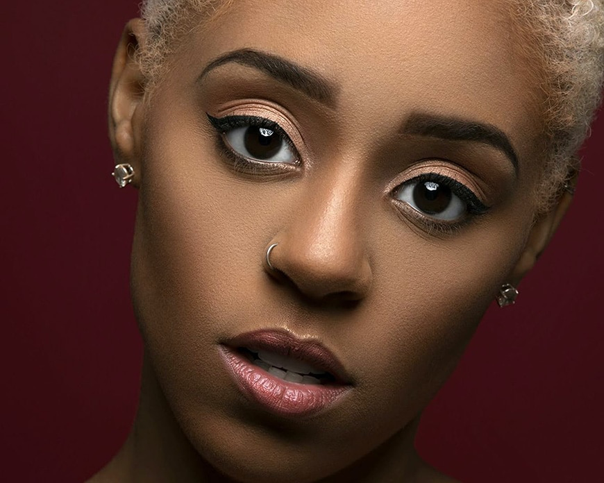
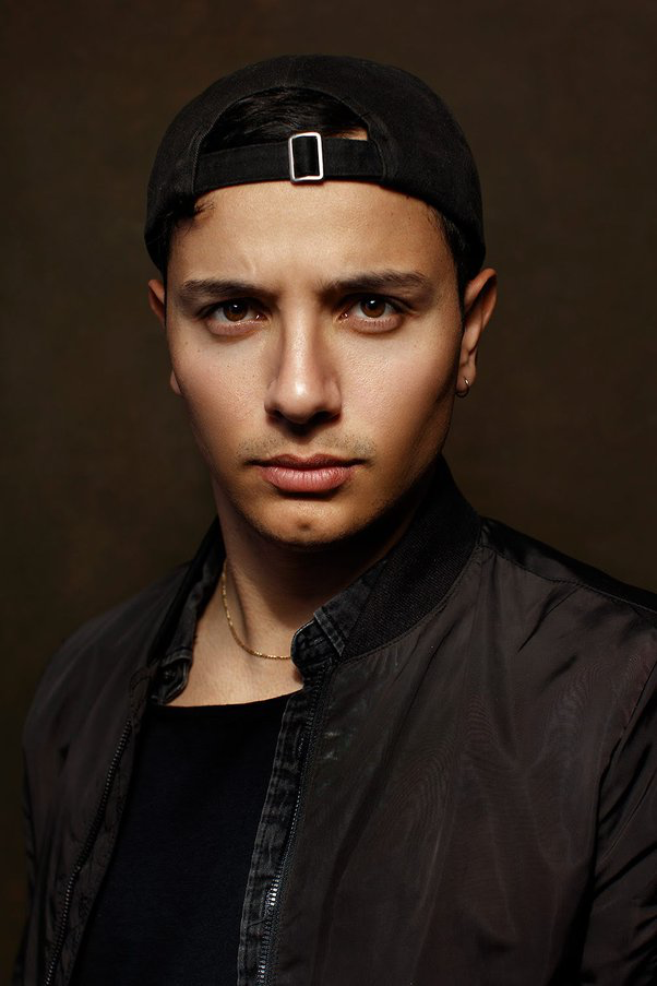
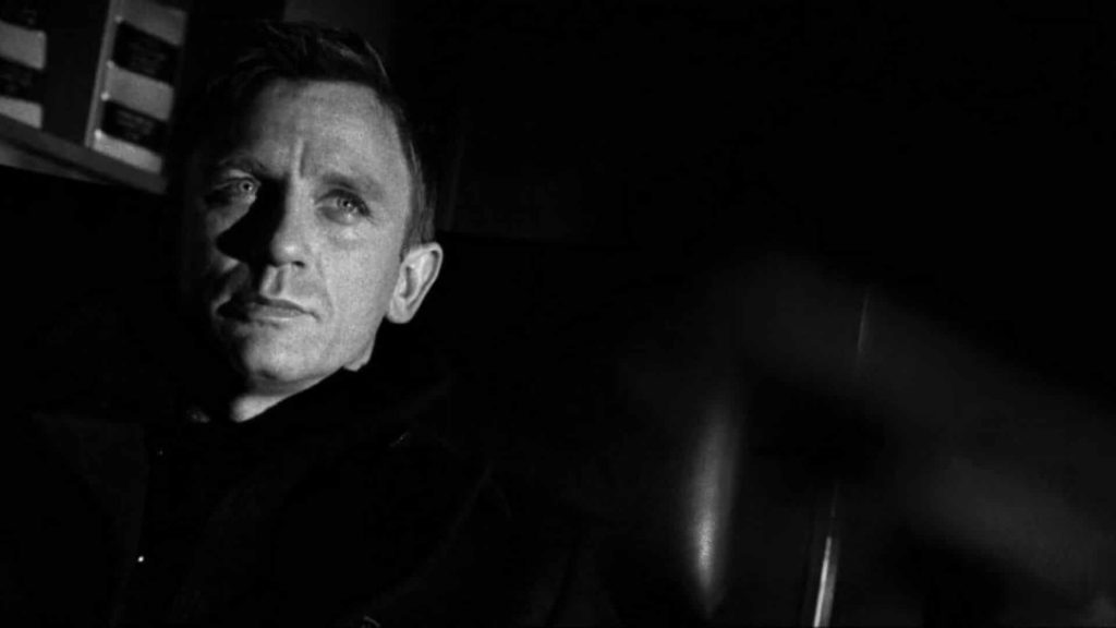
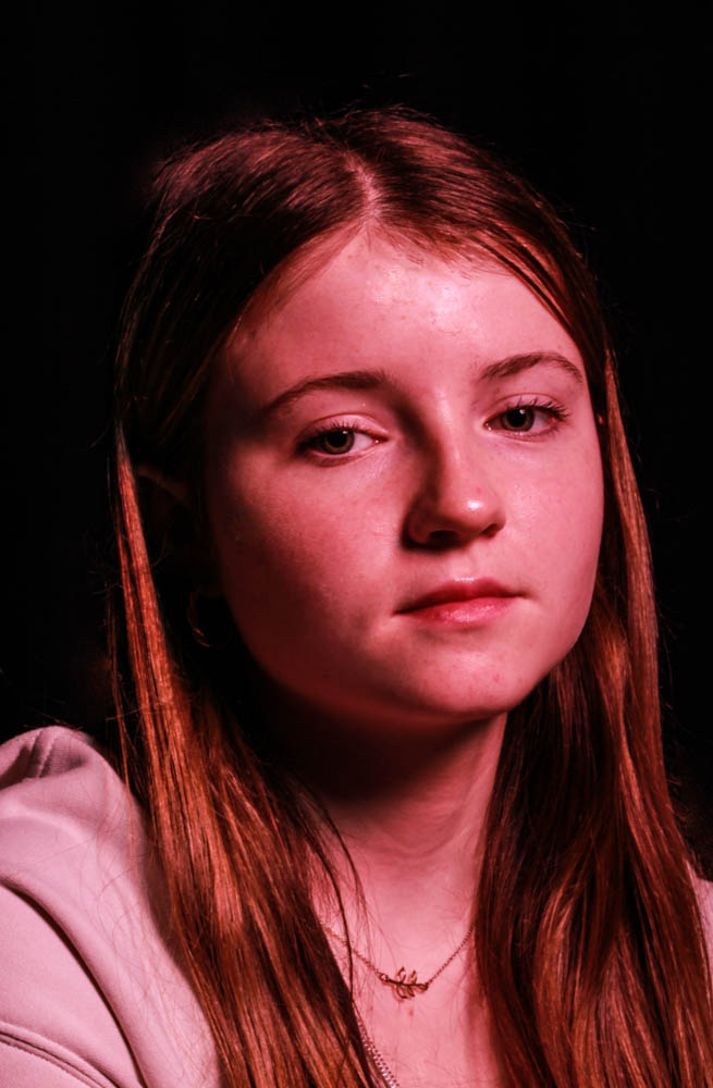
This is what butterfly lighting can look like

Chiaruscuro lighting

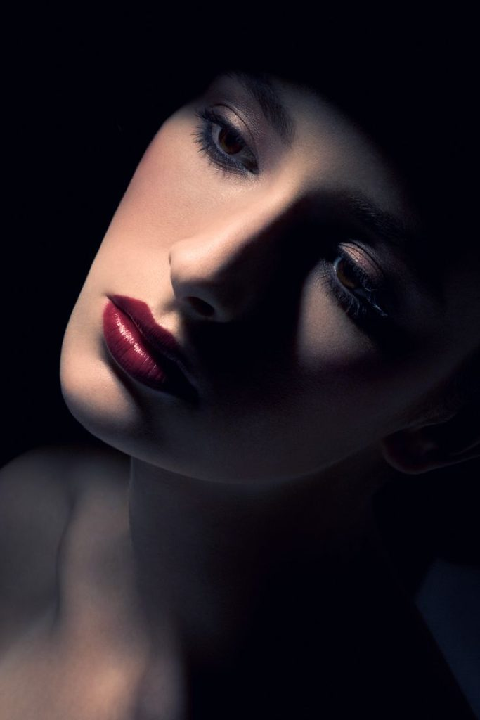
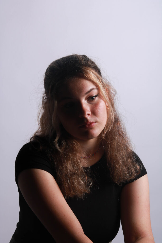
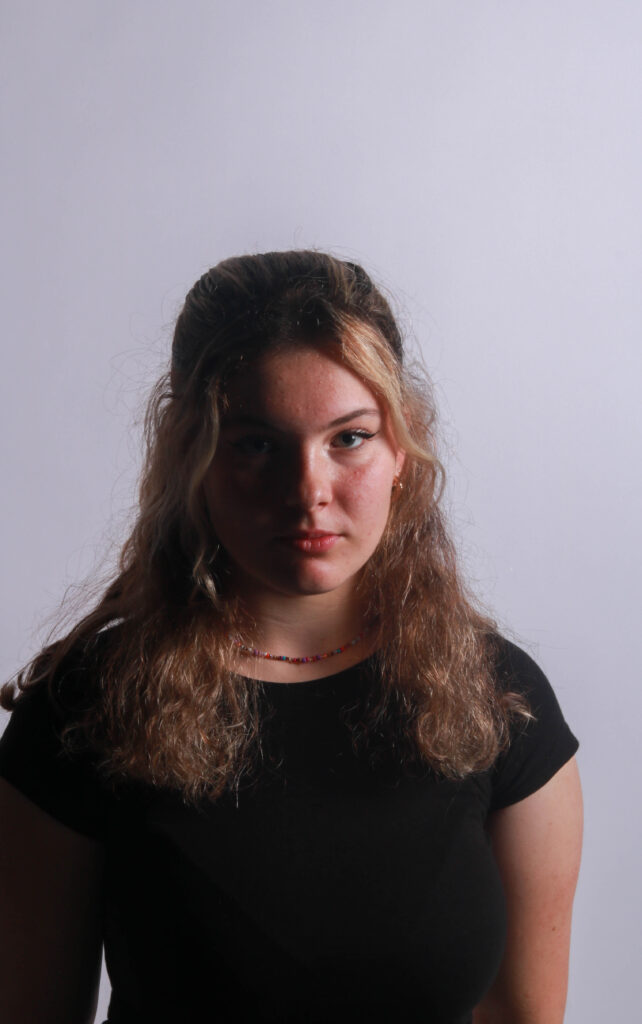
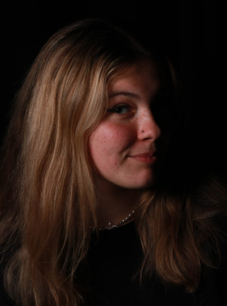
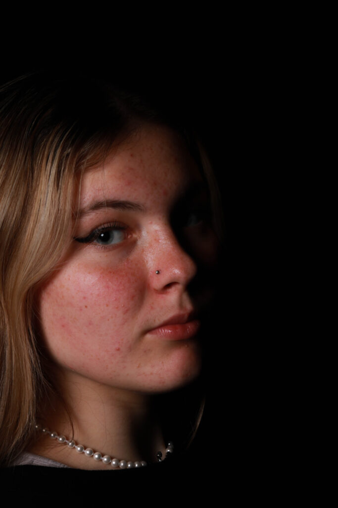
Chiaroscuro lighting is said to be the contrast between light and dark so any type of lighting skill could be classed as chiaroscuro. It’s inspired by films usually Hollywood crime with German expressionists. However, I will be focusing on split lighting where you light up half of the model’s face and have a shadow on the other half. This tends to add an intense feeling to the photo.

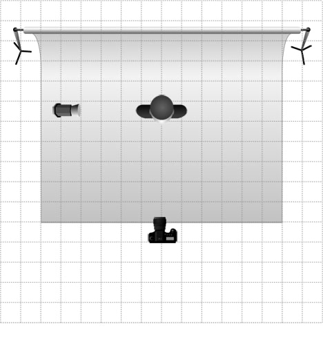
Here is an example of the setup that would been needed to achieve split lighting

  • have the camera directly infront of your model
  • have the light source at a 90° angle to your model
  • then depeding on how harsh you want yout lighting/split effect to be more the light closer or further away

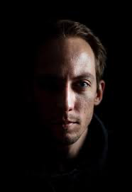
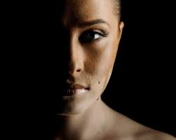
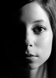
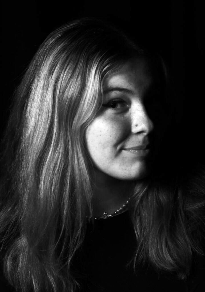
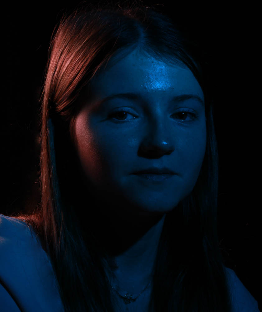
This is what spilt lighting can be

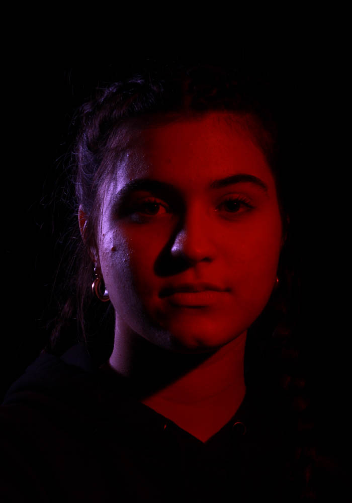
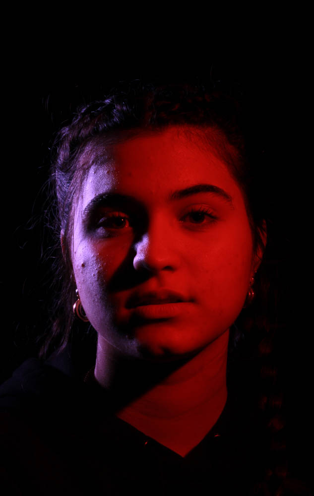
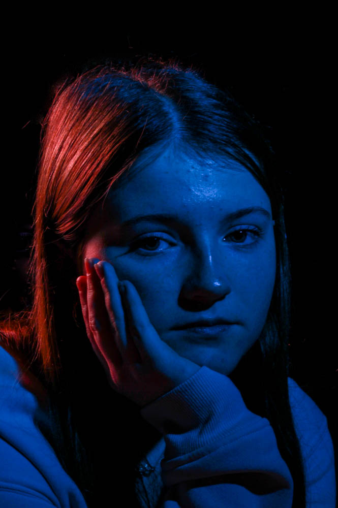
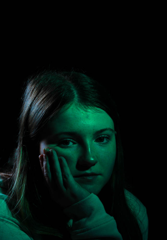
This is more Chiaroscuro lighting which the Hollywood films feel to them

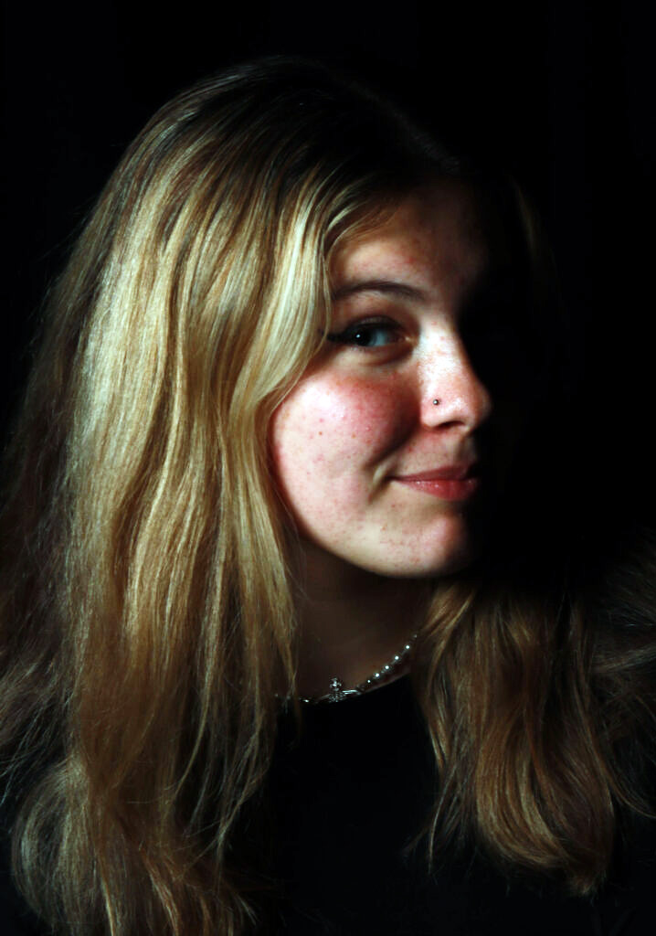
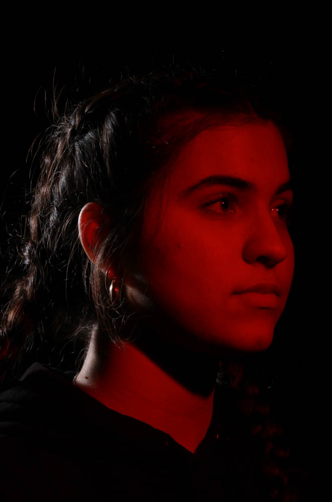
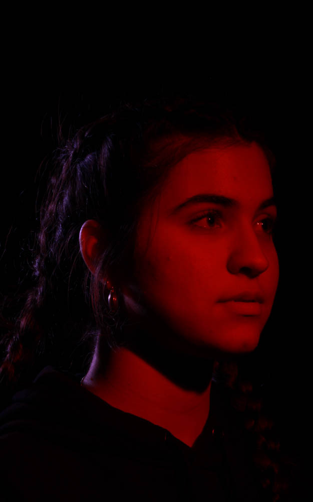
The image on the left is the unedited version and the right is the edited picture there isn’t any apparent change between the two however I did darken the shadows slightly to add a bit more contrast to the image. I think overall this picture turned out really good the split in the model’s face is very defined and sharp which is what I wanted.

This technique worked really well for me I think I managed to have a pretty successful image with sharp lines through the shadow down the model’s face the darker image at the bottom I really liked because I also feel they had more of the Hollywood film feel to them like Chiaroscuro lighting was originally inspired by.

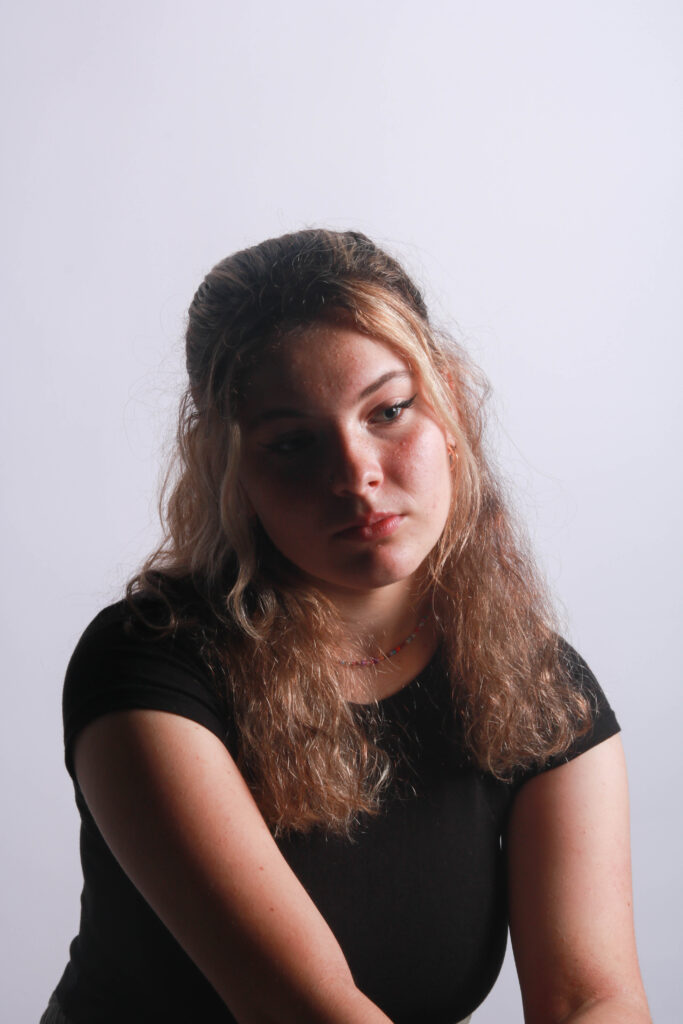
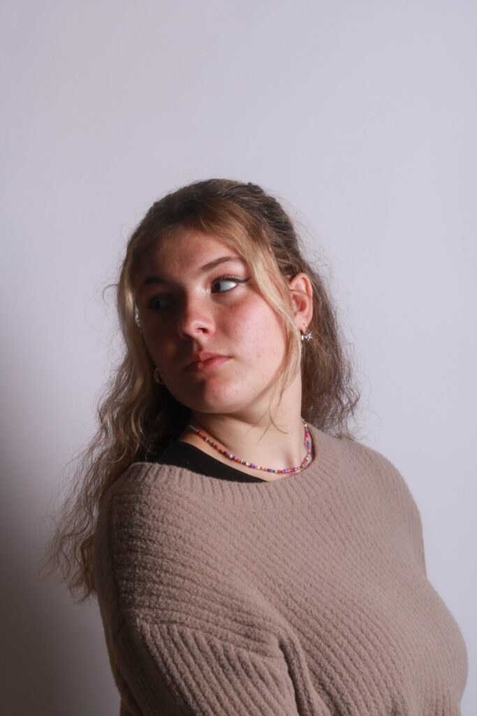
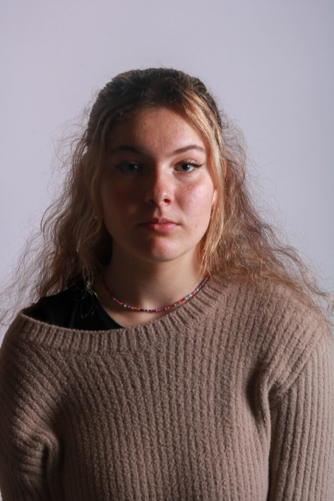
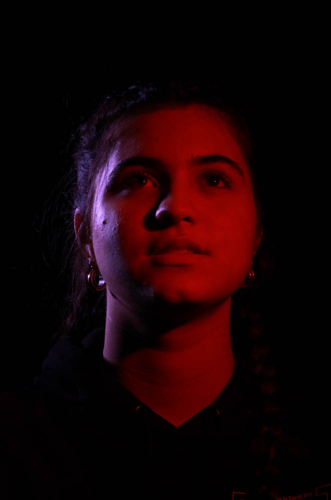
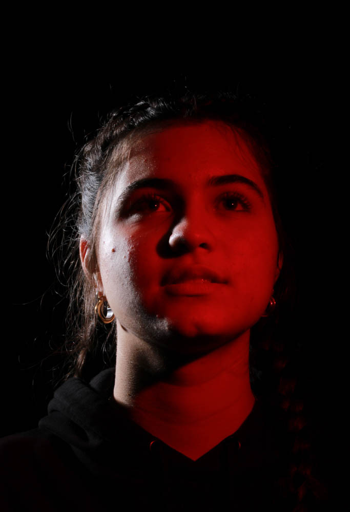
I think the images below could have been better if the show was more dramatic and darker although they are still visible they don’t seem to have the same intense feel to them as some of the others do which I think is to do with the shadows being so light.

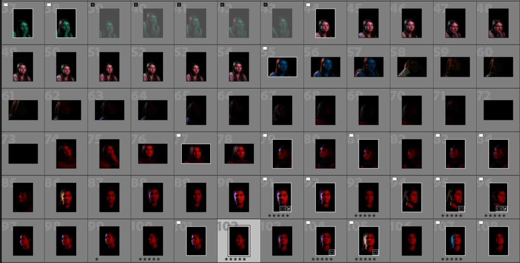
The editing for these photos really didn’t take much is was mainly changing the contrast slightly just so the difference between the light and dark was that little bit more dramatic and then some of the images I cropped so they were a lot closer to the models face as they seemed to look more effective that way.

EDITS