Experiment 1:
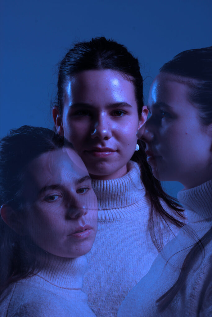
Editing process:
- I opened Adobe Photoshop.
- On the top left, I pressed file and open and then selected one of the pictures that I wanted to use. I left the picture as it was and then pressed file and open and chose my second picture.
- With the second picture, on the left side I selected the object selection tool and pressed on the photo, precisely the subjects face. It selected the subjects face and then I pressed on it again so that it showed a pink outline.
- After, I right clicked on my mouse and pressed layer via copy. it created a copy of the subjects face whilst still keeping the picture the same.
- I pressed the move tool on the left side of the screen on photoshop.
- I grabbed the copy of the subjects cut out face and dragged it to the top of the screen where it showed the first tab I opened which was the one where it had my first picture. The cut out was transferred to my first picture and I placed the cut out on the desired place.
- I repeated the cut out process with one more of my pictures and dragged it to my first picture and placed it where I thought looked best.
- As I placed my cut outs on the first picture, it created two layers, one layer for each cut out so overall I had three layers.
- In each layer minus the first later, I put the opacity to 43% which is on the right bottom side of the screen to create a ghost like texture to the two cut outs.
- I then I pressed on the background which is on the right bottom of the screen and pressed flatten image so that I could add some adjustments to the image.
- On the right bottom side of the screen I pressed adjustments and pressed once on the blue mood adjustment.
- Then I saved the image to a folder and that’s how I created this image.
Evaluation and Critique: I really liked the result of this image because I like how the editing gave the bland picture and ethereal and euphoria sense to it. I think that it is a creative example of a headshot example. Out of the three experiments, this image is my favourite one. However, I could’ve given the picture some texture to create more diversity within the picture. I could’ve experienced with more of the editing tools in photoshop. Overall I’m really satisfied with the picture.
Experiment 2:
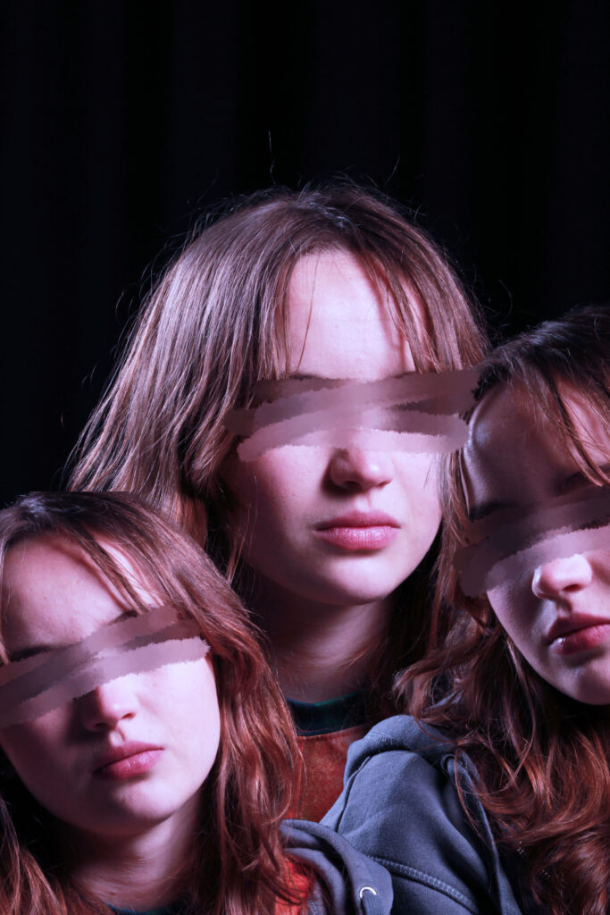
Editing process:
- I opened Adobe Photoshop.
- On the top left, I pressed file and open and then selected one of the pictures that I wanted to use. I left the picture as it was and then pressed file and open and chose my second picture.
- With the second picture, on the left side I selected the object selection tool and pressed on the photo, precisely the subjects face. It selected the subjects face and then I pressed on it again so that it showed a pink outline.
- After, I right clicked on my mouse and pressed layer via copy. it created a copy of the subjects face whilst still keeping the picture the same.
- I pressed the move tool on the left side of the screen on photoshop.
- I grabbed the copy of the subjects cut out face and dragged it to the top of the screen where it showed the first tab I opened which was the one where it had my first picture. The cut out was transferred to my first picture and I placed the cut out on the desired place.
- I repeated the cut out process with one more of my pictures and dragged it to my first picture and placed it where I thought looked best.
- As I placed my cut outs on the first picture, it created two layers, one layer for each cut out so overall I had three layers.
- In each layer minus the first later, I put the opacity to 43% which is on the right bottom side of the screen to create a ghost like texture to the two cut outs.
- I then I pressed on the background which is on the right bottom of the screen and pressed flatten image so that I could add some adjustments to the image.
- On the right bottom side of the screen I pressed adjustments and pressed once on the moody blue.
- Then I pressed the smudge tool on the left side of the screen and pressed the smudge tool again because it show two options, blur tool or smudge tool.
- On the top left corner of the screen, I pressed on the icon that showed the side of the smudge tool and what type of smudge tool you are using and I selected ‘wet media brushes’ and kept the size to 50px and then from the wet media brushes file, I selected ‘kyle’s paintbox’
- I smudged each pair of eyes that the image had.
- I saved the picture onto a file and that was how I edited this picture.
Evaluation and Critique: I quite liked the finish product of this image. I like the colour and the overall effect it has. This picture shows a sense of loss of identity or not wanting be aware of what’s surrounding them. However I think the editing in this picture I simple. I wish that it was a more divergent image that had more unique editing. I could’ve experienced with the different tools in photoshop.
Experiment 3:
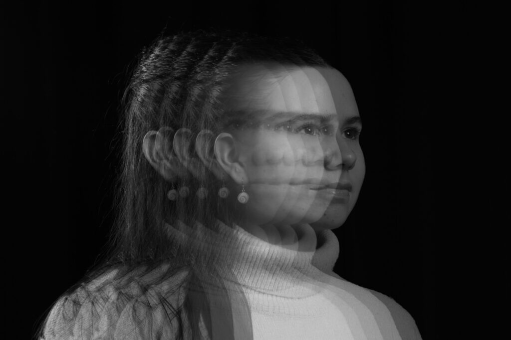
Editing process:
- I opened Adobe Photoshop.
- On the top left, I pressed file and open and then selected one of the pictures that I wanted to use. I left the picture as it was and then pressed file and open and chose the same picture.
- With the same picture, on a different tab, on the left side I selected the object selection tool and pressed on the photo, precisely the subjects face. It selected the subjects face and then I pressed on it again so that it showed a pink outline.
- After, I right clicked on my mouse and pressed layer via copy. it created a copy of the subjects face whilst still keeping the picture the same.
- I pressed the move tool on the left side of the screen on photoshop.
- I grabbed the copy of the subjects cut out face and dragged it to the top of the screen where it showed the first tab I opened which was the one where it the first picture. The cut out was transferred to my first picture and I placed the cut out on the desired place.
- After dragging the first set of the cut out face, I did the same thing three more times, using the same picture as my first picture, just the face cut out, dragging the three set of cut outs to my first picture and placed it where I thought looked best.
- As I placed my cut outs on the first picture, it created 4 layers, one layer for each cut out so overall I had 5 layers, including the first picture.
- In each layer minus the first later, I put the opacity to 43% which is on the right bottom side of the screen to create a ghost like texture to the 4 cut outs.
- I then I pressed on the background which is on the right bottom of the screen and pressed flatten image so that I could add some adjustments to the image.
- On the right bottom side of the screen I pressed adjustments and pressed once on the neutral adjustment.
- Then I saved the image to a folder and that’s how I created this image.
Evaluation and critique: I really like this picture, I like how I was able to create this motion like sense to the picture, making it look like I was able to capture the subjects movement in layers. I think that this picture is quite unique and detailed. However I could’ve experienced with texture or different colours instead of the usual black and white.