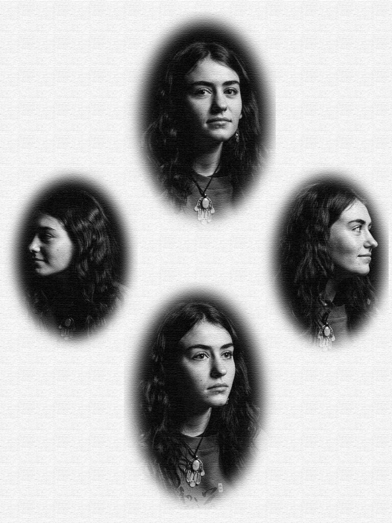
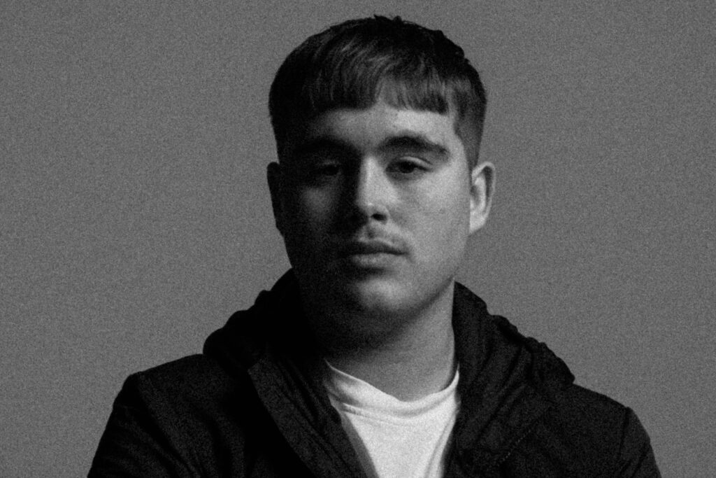
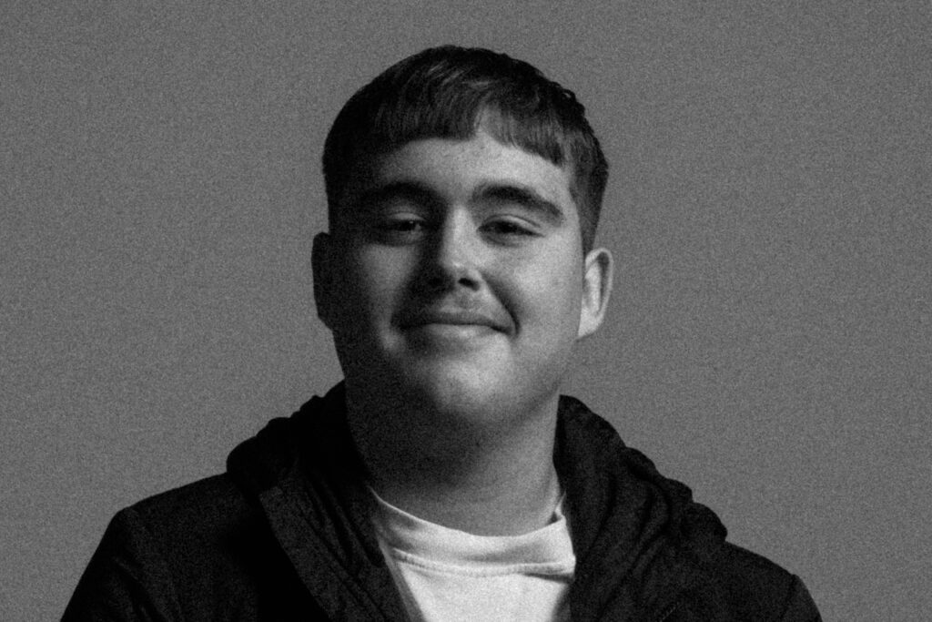
For my edits I wanted to recreate the diamond Cameos Mullins did during his later work. Playing around with the saturation and tone of the image I was going for the Old-timey looks his images had on his Carte-de-visite’s.
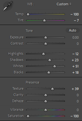
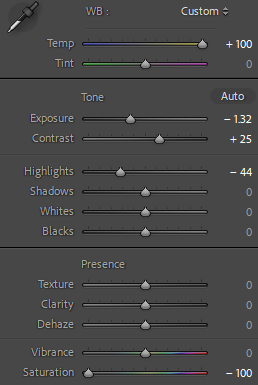
Edit settings:
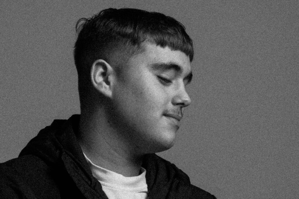
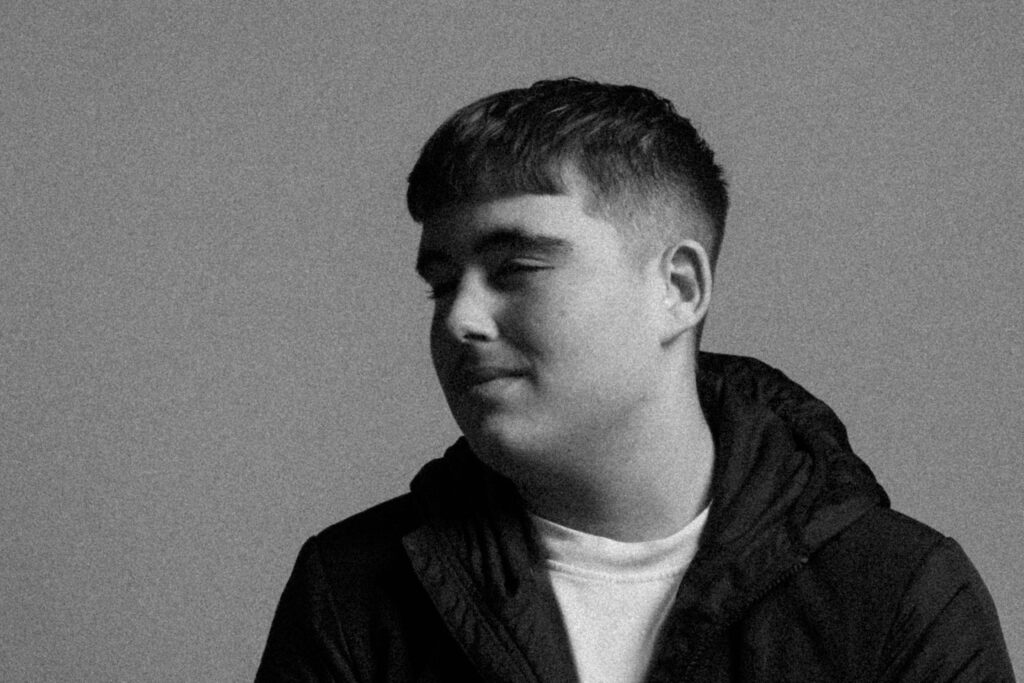
Going for a grainy effect, I tried to replicate the vintage aesthetic of Mullins photographs with the following settings:
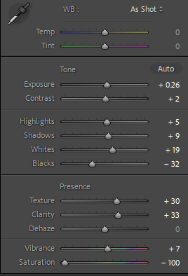
Using from what I have learnt from my studies into studio lighting, I enhanced the shadow on my Chiaroscuro lighting with these edited images.
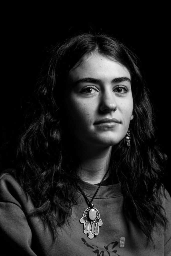
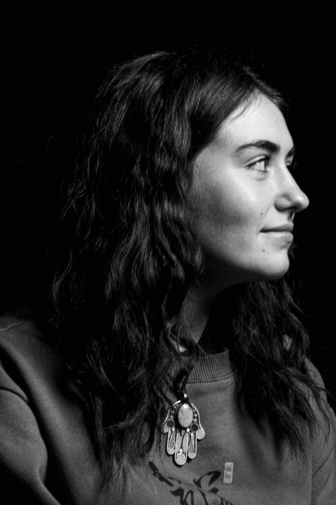
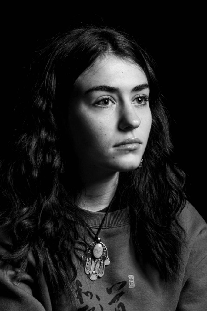
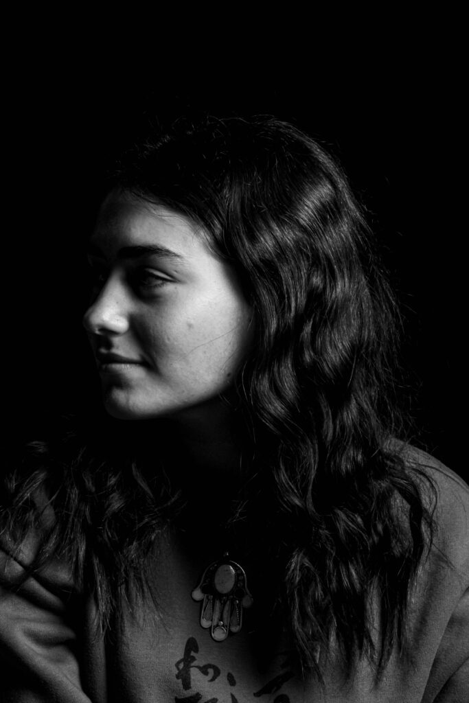
Since Mullins photographs were taken pre-colour film, I decided with my edits to have a low saturation to have that same visual composition of his images.

(Further use of studio lighting, here I used Rembrandt and made it more prominent with white settings)
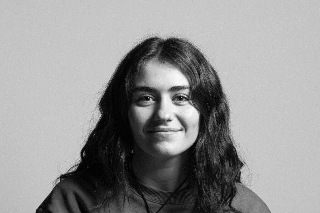
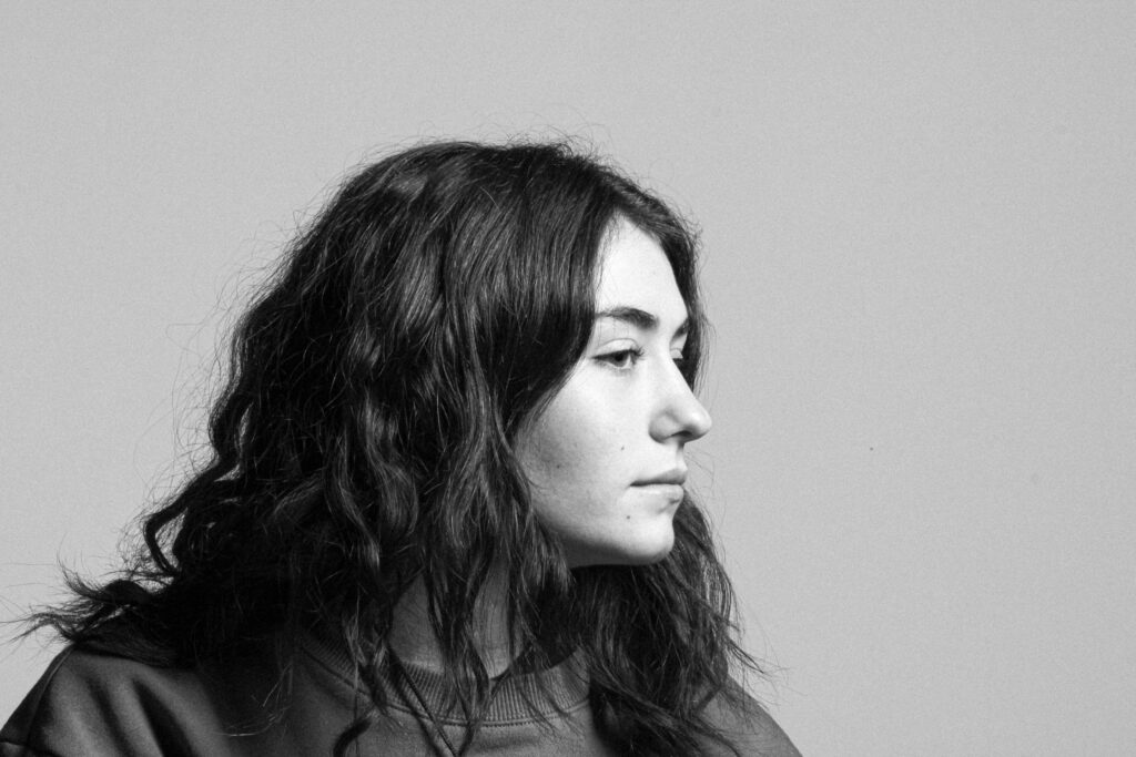
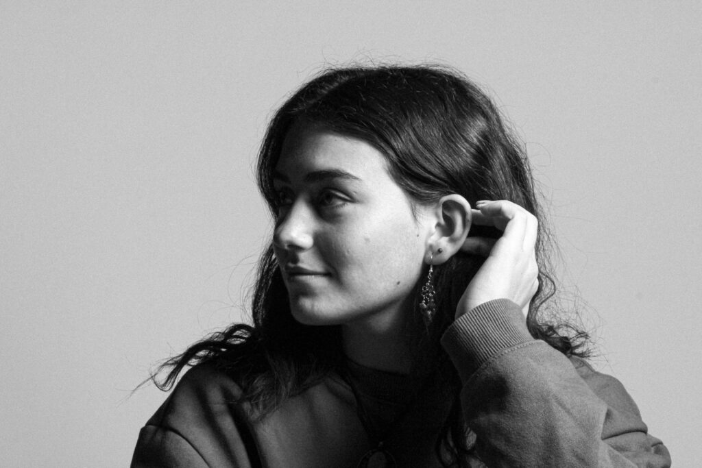
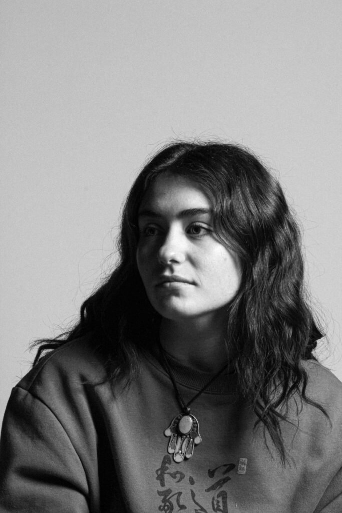
Going for a very old looking photo, I attempted this by Increasing the size and roughness of the grain. Additionally by adjusting the exposure and contrast, it made a more brighter image and tonal difference amongst the light and dark parts of the Image.

(Using Rembrandt lighting again, I used grain to give it a more prominent appearance).
Diamond Cameo edits:
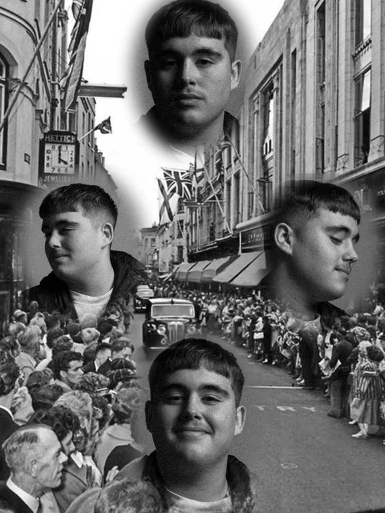
Using the eclipse tool, feathering and a use of alternative backgrounds, I edited my images further with photoshop.
Sticking to the idea of Diamond Cameo, I experimented further by alternatively adding a background of an old photo of Jerseys king street.
With This Diamond Cameo, I matched the background image of my photos to an old image of a newspaper I found. To me this creates an interesting composition as the headshots almost merge into to the newspaper.
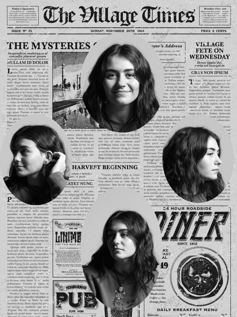
Going for that old card effect, I used photoshop textures to make this image more interesting with its visual composition.
