Henry Mullins Edits – George Blake

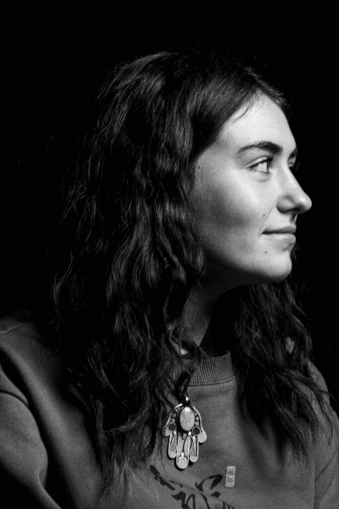
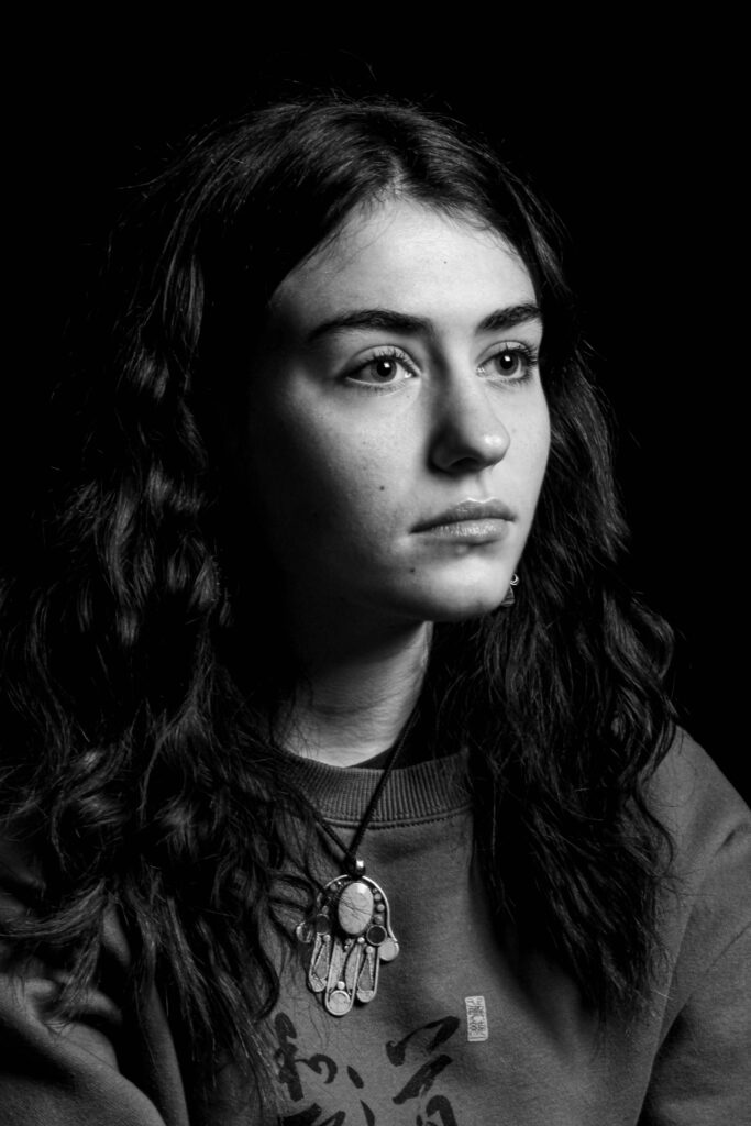
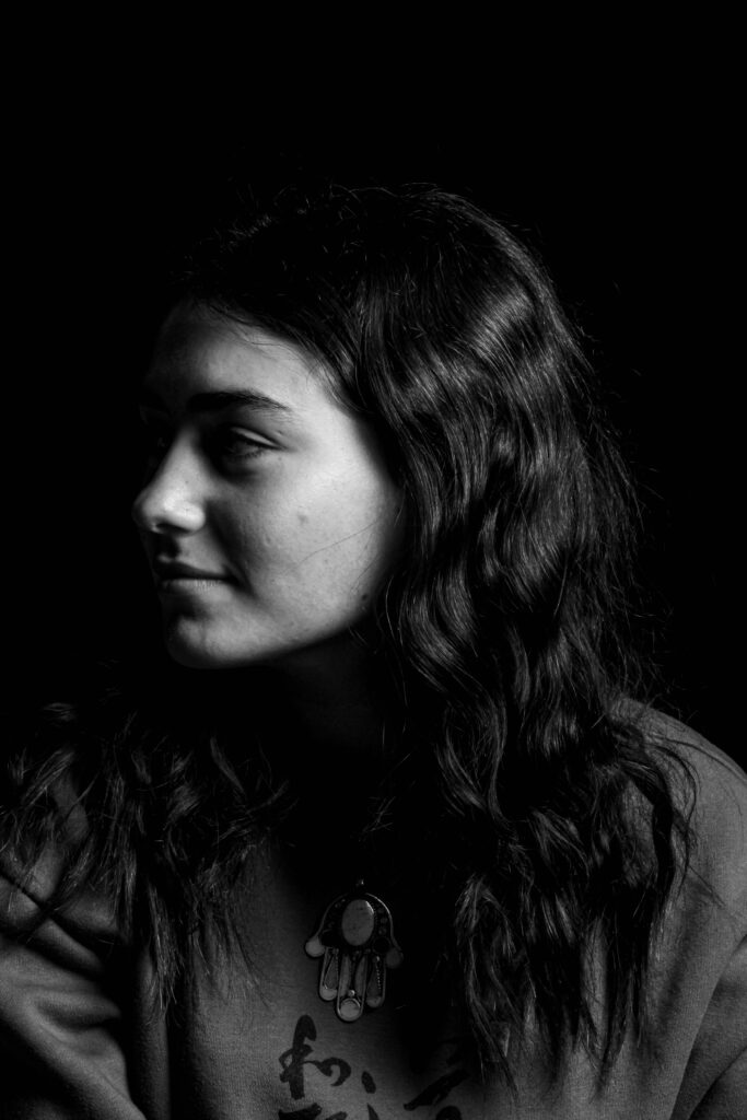
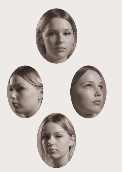
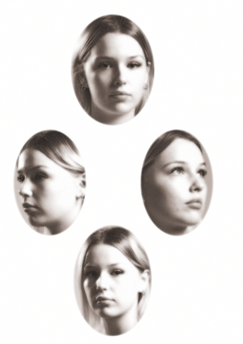
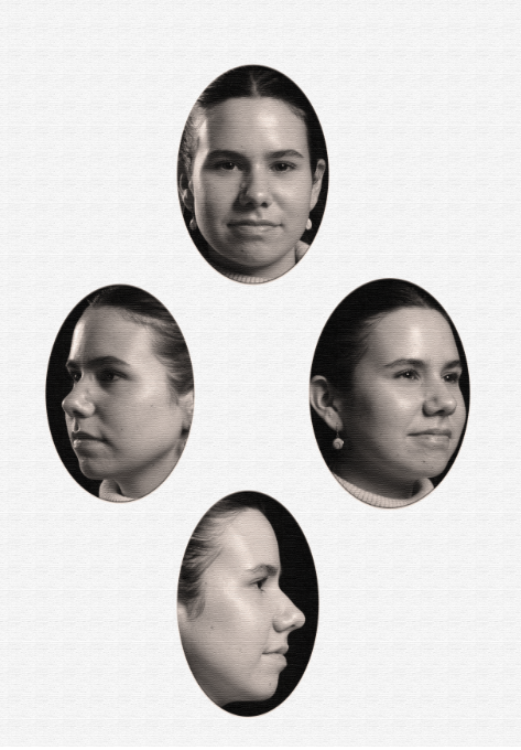
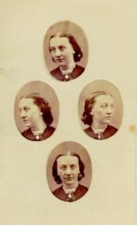
For my edits I wanted to recreate the diamond Cameos Mullins did during his later work. Playing around with the saturation and tone of the image I was going for the Old-timey looks his images had on his Carte-de-visite’s.

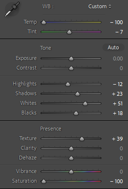
Edit settings:

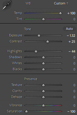
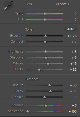
Going for a grainy effect, I tried to replicate the vintage aesthetic of Mullins photographs with the following settings:

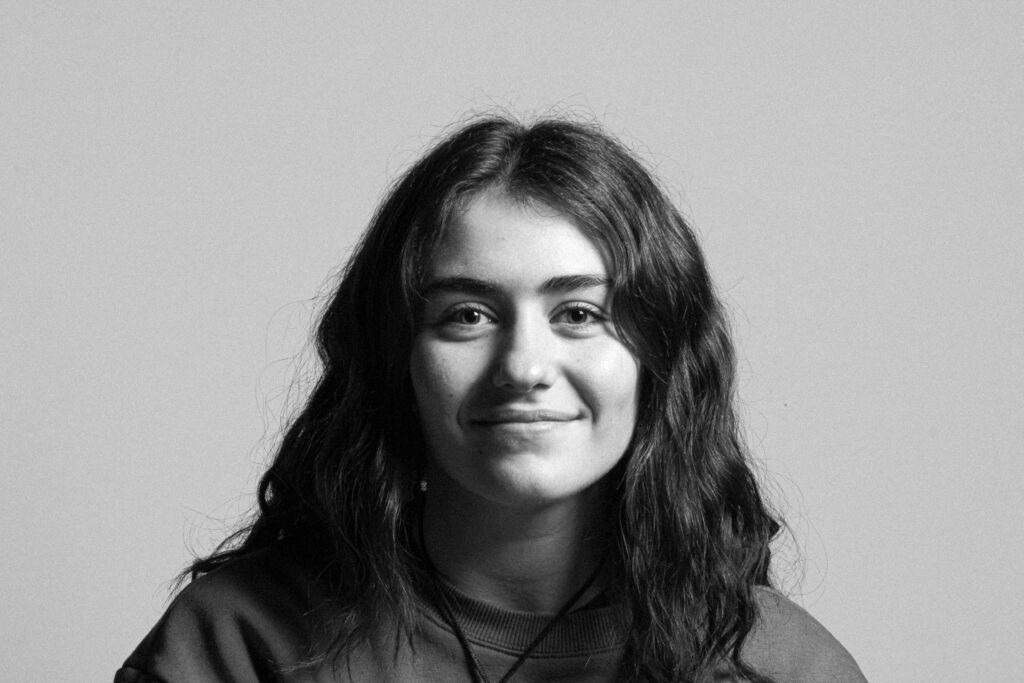
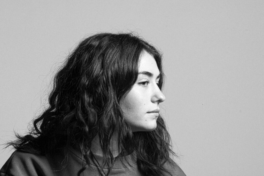
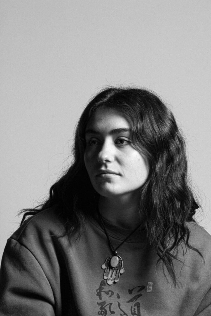
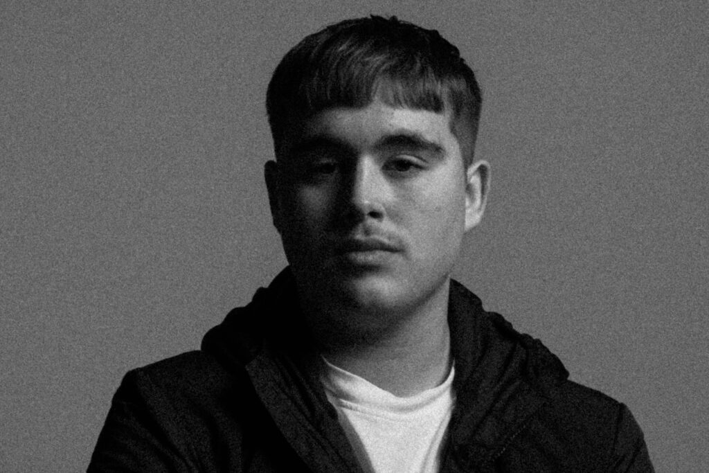
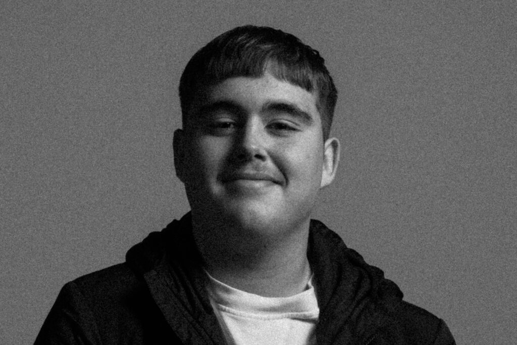
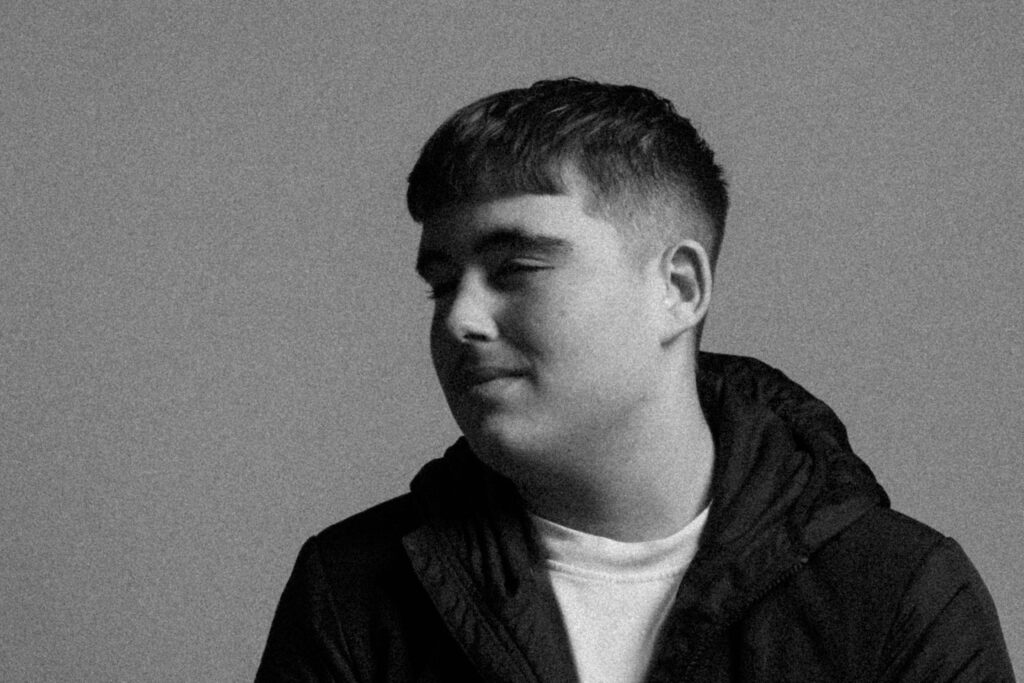
Using from what I have learnt from my studies into studio lighting, I enhanced the shadow on my Chiaroscuro lighting with these edited images.

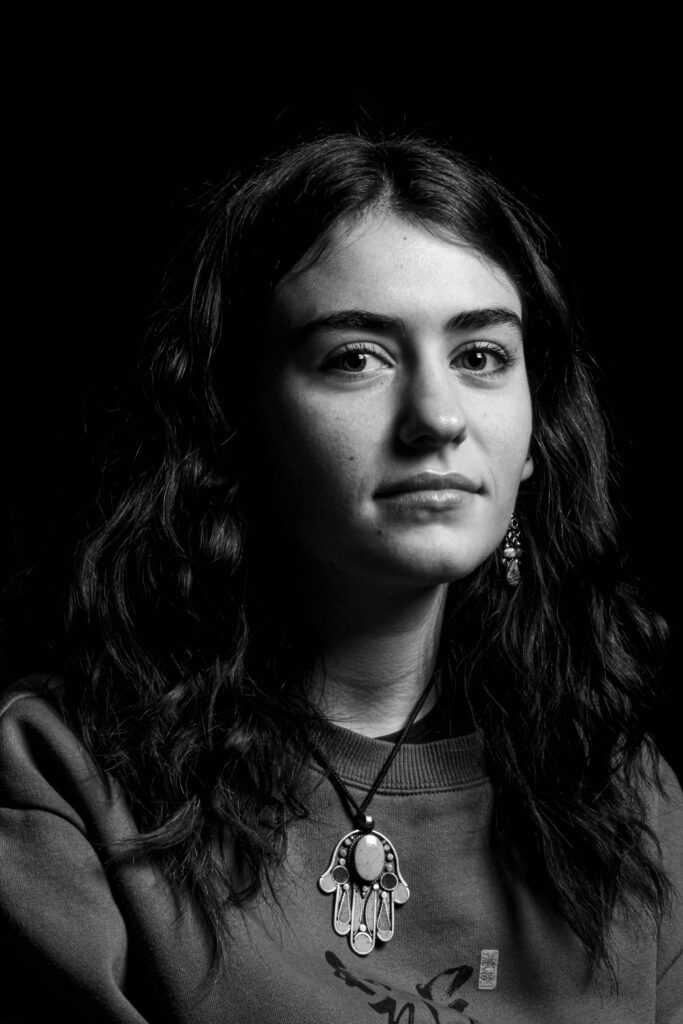
Since Mullins photographs were taken pre-colour film, I decided with my edits to have a low saturation to have that same visual composition of his images.

(Further use of studio lighting, here I used Rembrandt and made it more prominent with white settings)

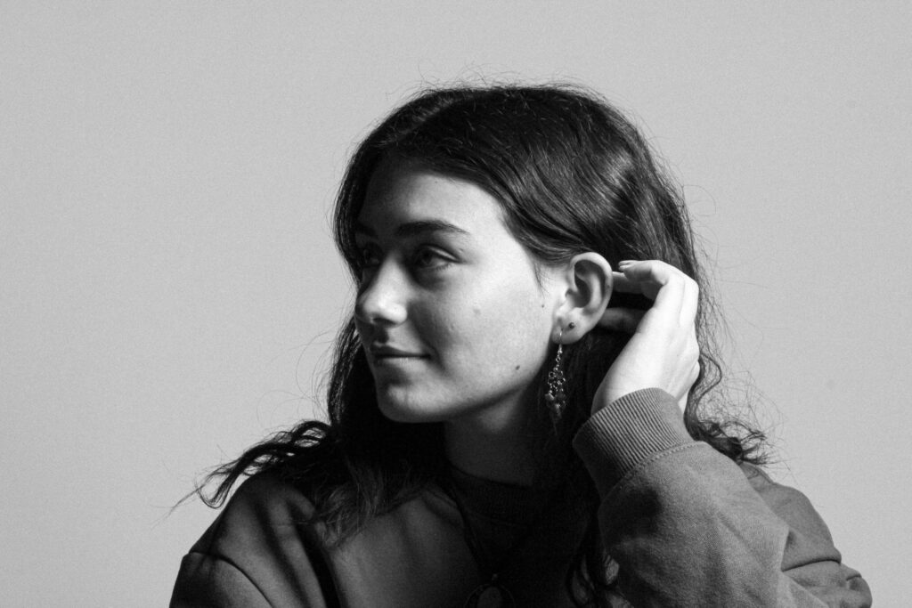
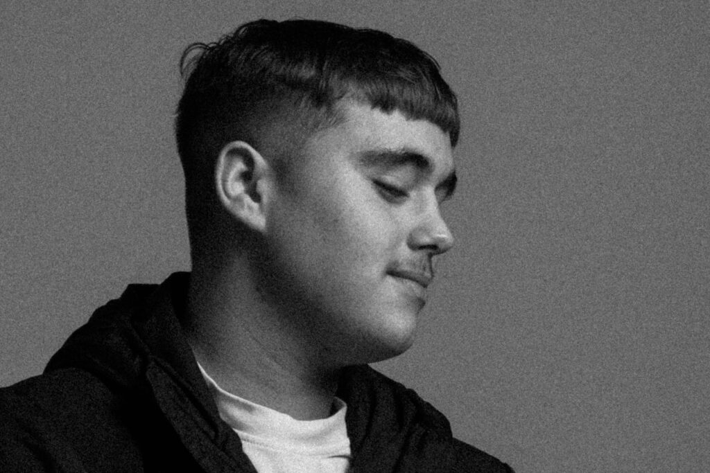
Going for a very old looking photo, I attempted this by Increasing the size and roughness of the grain. Additionally by adjusting the exposure and contrast, it made a more brighter image and tonal difference amongst the light and dark parts of the Image.

(Using Rembrandt lighting again, I used grain to give it a more prominent appearance).

Diamond Cameo edits:

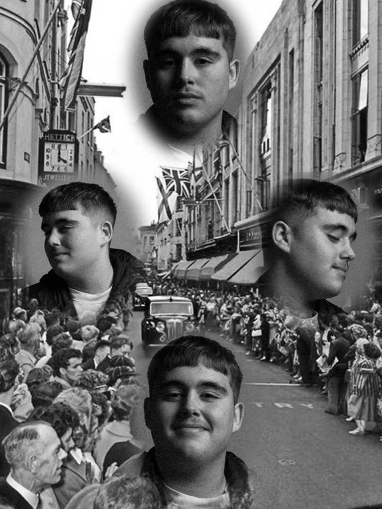
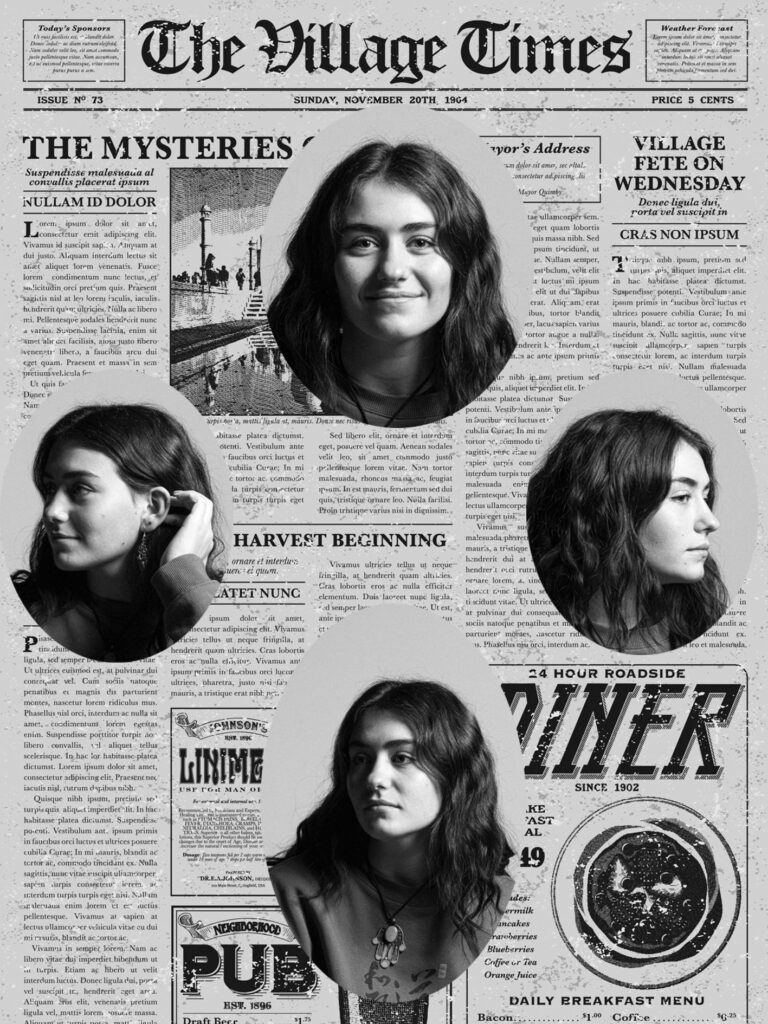
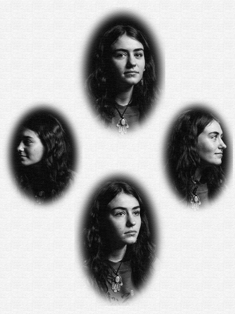
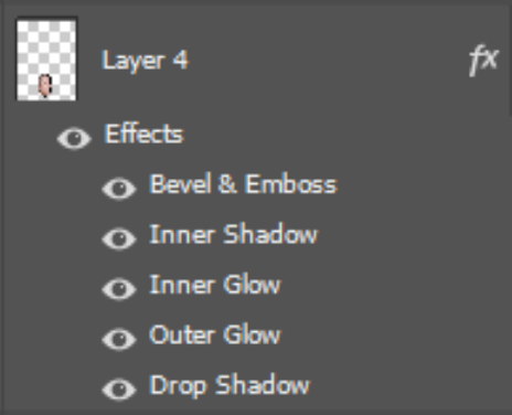
Using the eclipse tool, feathering and a use of alternative backgrounds, I edited my images further with photoshop.

Sticking to the idea of Diamond Cameo, I experimented further by alternatively adding a background of an old photo of Jerseys king street.

With This Diamond Cameo, I matched the background image of my photos to an old image of a newspaper I found. To me this creates an interesting composition as the headshots almost merge into to the newspaper.

Going for that old card effect, I used photoshop textures to make this image more interesting with its visual composition.

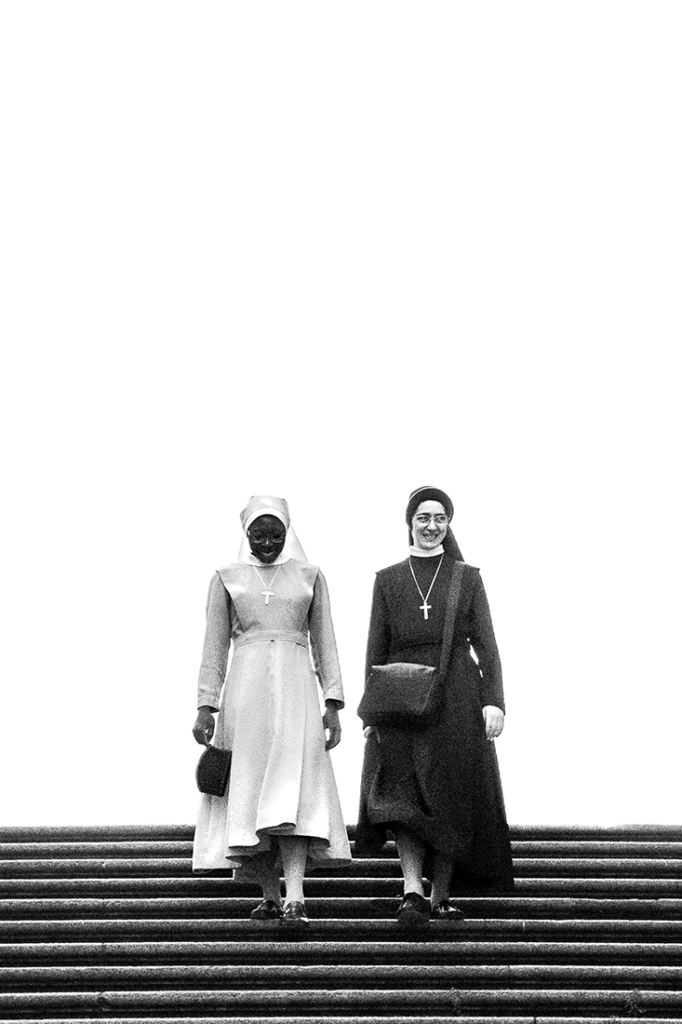
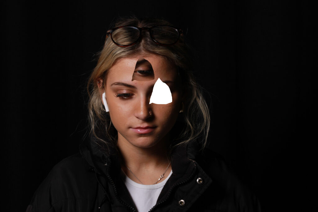
Juxtaposition

Juxtaposition is placing two images together to show contrast or similarities. Juxtaposition is a powerful technique in photography, which essence is to place contrasting elements in the same frame and tell the viewer their story. The juxtaposition in your photography can combine such contrasting things as new and old, man-made and industrial, light and dark, or two different emotions.Juxtapose images according to shapes, colours, repetition, object vs portrait.

My response:

Headshots

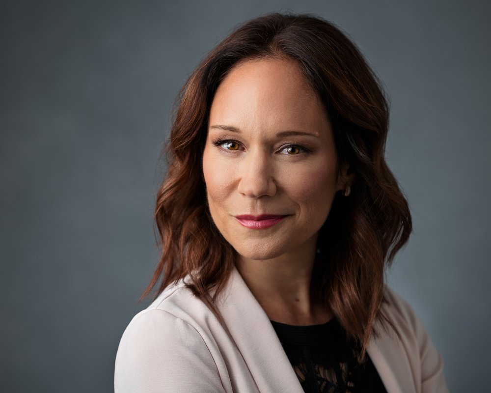
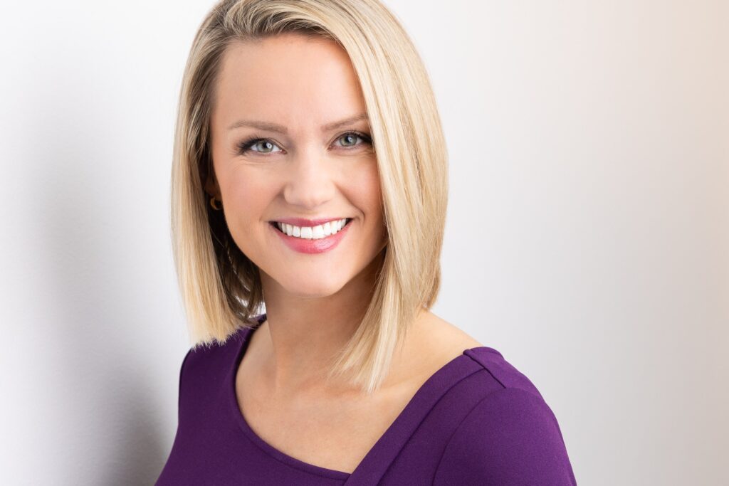
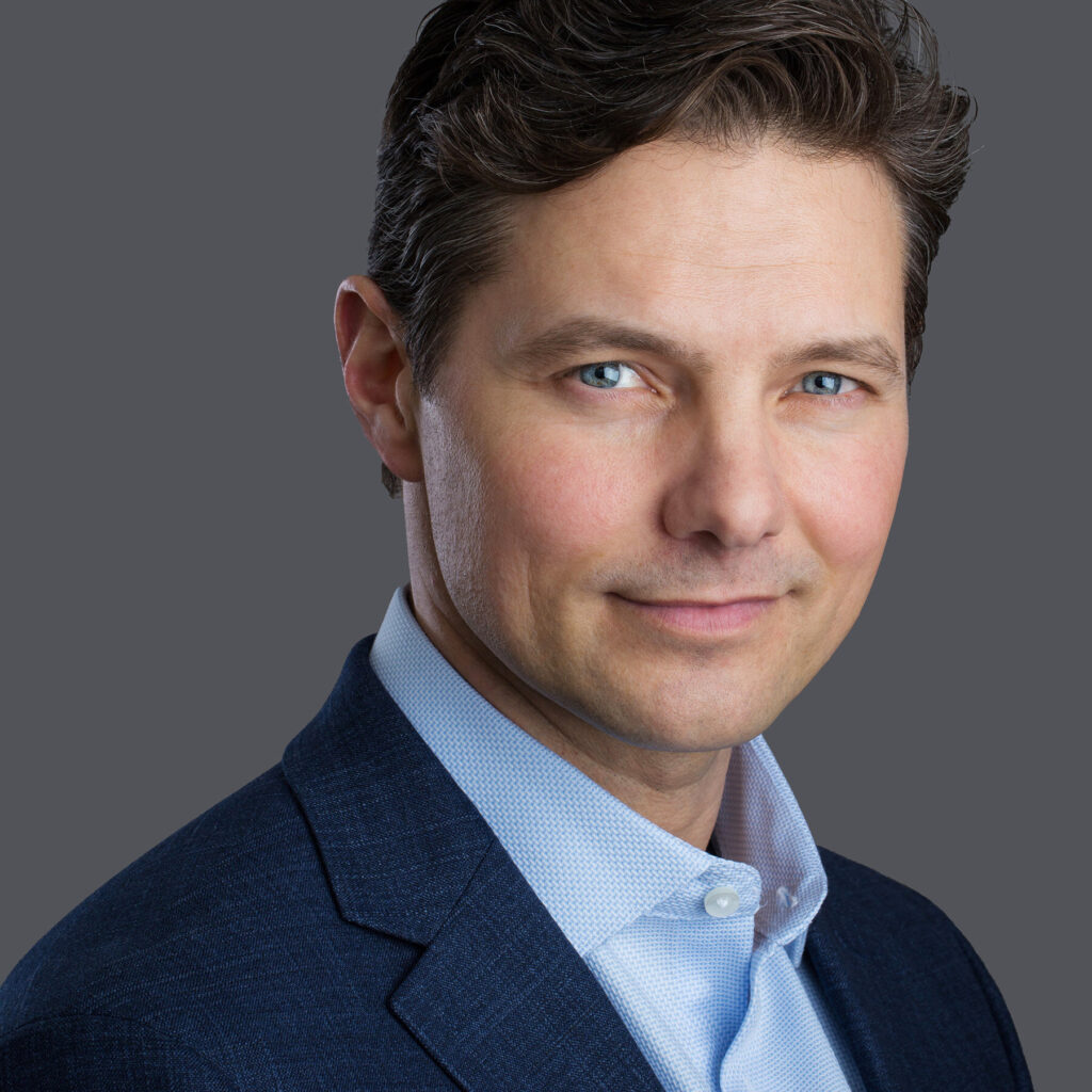
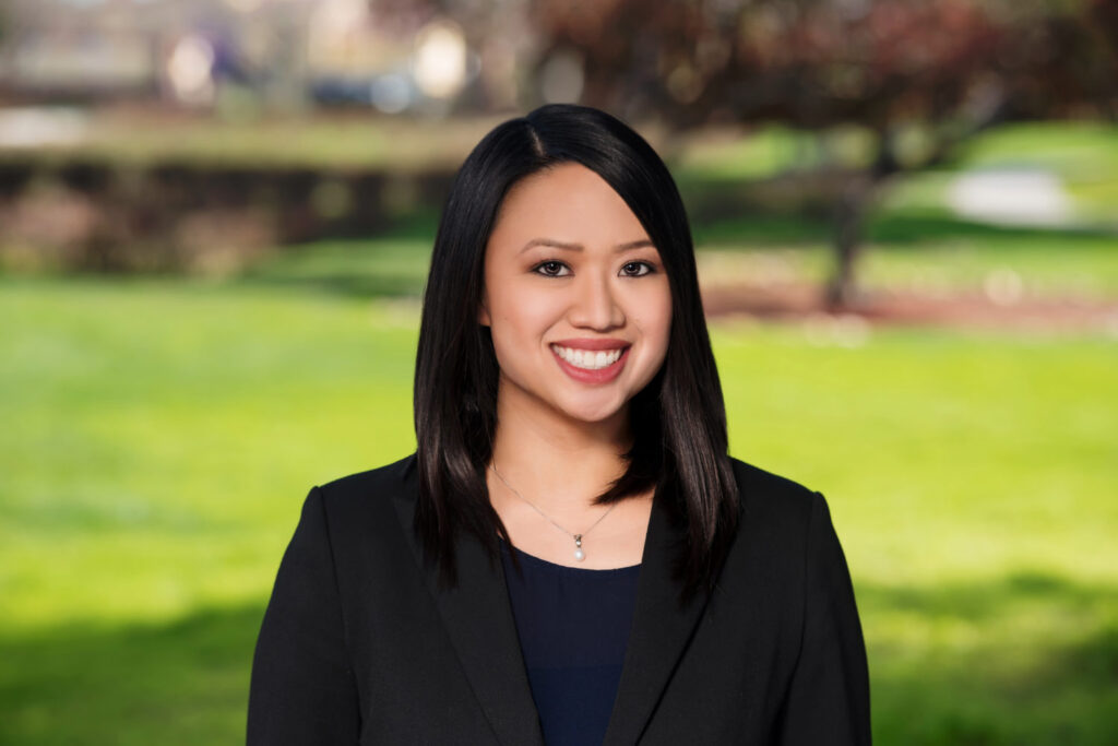
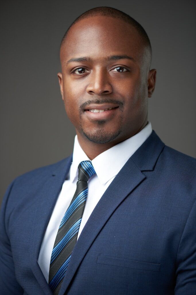
Professional headshots are a type of portrait photography typically used for websites, press releases, publications, and social-media profiles. The term “headshot” just means that the portrait photo is cropped somewhere in the middle torso – so that the focus is on your face.

Some common rules in order to produce successful headshots are:

  • Don’t bend your head too far forward or back – you want to be relaxed and natural-looking.
  • Don’t sit in an awkward position – you want to look comfortable and confident.
  • Don’t look down at the ground – keep your chin up and make eye contact with the photographer.
  • Don’t use outdated corporate headshots.
  • Eyes must be open and clearly visible, with no flash reflections and no ‘red eye’
  • Facial expression must be neutral (neither frowning nor smiling), with the mouth closed
  • Photos must show both edges of the face clearly
  • Photos must show a full front view of face and shoulders, squared to the camera 
  • The face and shoulder image must be centred in the photo; the subject must not be looking over one shoulder (portrait style), or tilting their head to one side or backwards or forwards
  • There must be no hair across the eyes
  • Hats or head coverings are not permitted except when worn for religious reasons and only if the full facial features are clearly visible
  • Photos with shadows on the face are unacceptable
  • Photos must reflect/represent natural skin tone

Headshots Mood Board:

Thomas Ruff- Artist Research:

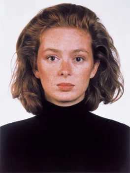
Thomas Ruff was a German photographer born on February 10th 1958,  who lives and works in Düsseldorf, Germany. He has been described as “a master of edited and reimagined images”. Ruff shares a studio on Düsseldorf’s Hansaallee, with fellow German photographers Laurenz Berges, Andreas Gursky and Axel Hütte. Thomas Ruff’s photography suggests the possibilities of his chosen medium, as he might use digital manipulation for one subject and antiquated darkroom techniques for another. Ruff works in series, creating defined bodies of work whose subjects include empty domestic interiors, appropriated interplanetary images captured by NASA, abstractions of modernist architecture and three–dimensional computer–generated Pop imagery.

Ruff is a unique photographer because he explores the boundaries of photography and challenges traditional ideas of representation. He experiments with different techniques such as digitally manipulating them or using large-scale formats in order to create visually striking photographs. His work often prompts viewers to question the nature of photography and our perception of reality.

Bruce Gilden:

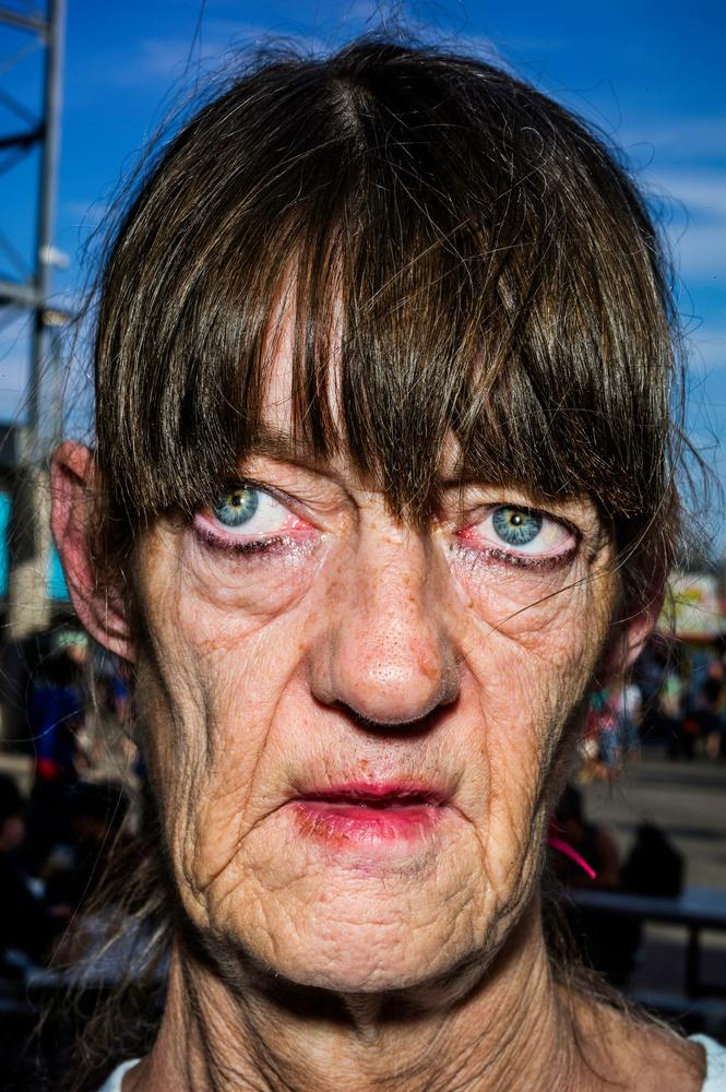
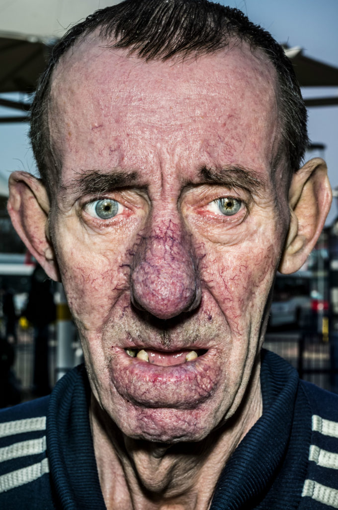
Bruce Gilden is an American street photographer. He is best known for his candid close-up photographs of people on the streets of New York City, using a flashgun. He has had various books of his work published, has received the European Publishers Award for Photography and is a Guggenheim Fellow.

Bruce Gilden is one of the most iconic street photographers known for his confrontational and graphic images of a close-up subject. His work is around this due to being fascinated by the life on the streets and the complicated and captivating motion it involves in his childhood. His work has a high degree of intimacy and directness which have become signature in his work called FACE. Typically, people used are not the average person and have blemishes or look uncomfortable/awkward. Many people may say he is the most aggressive street photographer due to the rawness and realness of his images.

I like Gilden’s work because it has a sense of realism throughout. It is effective because he has a unique style that captures raw and candid moments. He often gets close up to his subjects, which I think creates powerful and intense images. His photos also have a a gritty and unfiltered quality which easily grabs attention and evokes strong emotions.

How I edited my Diamond Cameos and experiments.

After creating a Diamond Cameo with different sides of my subject face, I decided that I wanted to edit them so they looked more rustic.

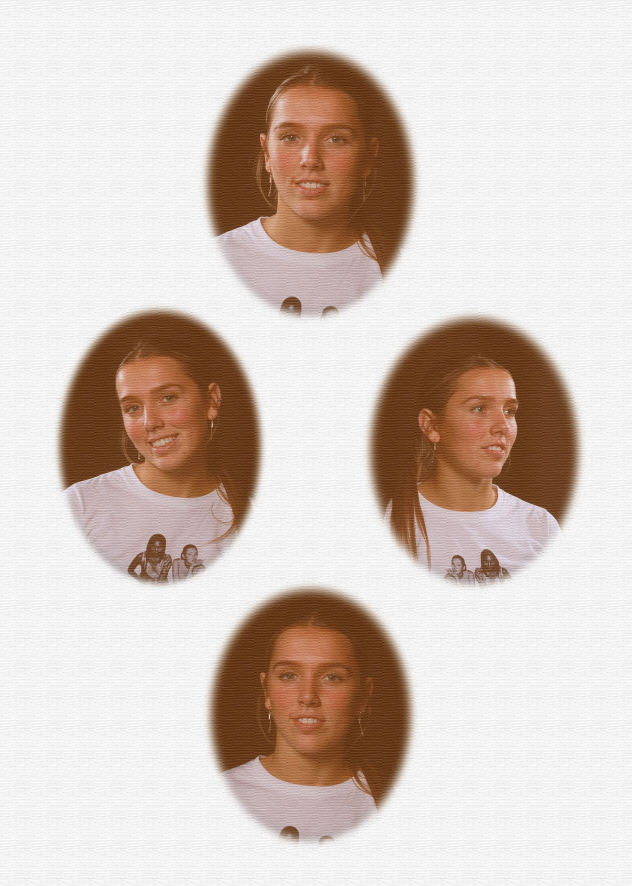
This is my Diamond Cameo without any type of editing (only blending was done as seen in my previous blog. I applied all these blending effect to all my experiment of Diamond Cameo) :

Evaluation and critique:

Although I quite liked the way the diamond cameo looked without editing except for blending, I didn’t like that fact that it looked really bland therefore I decided I wanted to experiment and see which one I liked most and showed that rustic tone to it.

Experiment 1:

Editing process: After using all those blending tools stated above, I flattened image so that I could edit the image I pressed on adjustments and selected the filter called warm. That was all I did to this experiment of Diamond Cameo.

Evaluation and critique: I quite like this picture. I like the way the adjustment adds this rustic tone to the picture and how it gives the picture shadow however I don’t like how dark the picture is. In some parts of the picture, it is so dark that it strips away the subjects face and removes those beautiful details the subject has. I also don’t like how orange the picture is, it makes the subjects face look a little saturated.

Experiment 2:

Editing process: For this Diamond cameo, I added an adjustment called soft sepia after blending my cut outs and flattening my image. That is all I did for this diamond cameo

Evaluation and critique: I really like this picture. I think that this picture is the picture that shows the most rustic tone. I really like the colour of it and how it doesn’t strip the details from the subjects face because it adds heavy shadows to parts of the picture like the experiment above. I really like how the adjustment brought the picture to life and really shows ‘oldies’ look to it. However this picture could have a more orange background like the original diamond cameos so that the diamond cameo would look more realistic.

Experiment 3:

Editing process: For this diamond cameo I decided to add a different type of filter called diffuse glow after blending the cut outs and flattening the image. I added the diffuse glow by pressing filter on the top bar and then I pressed filter gallery and pressed the distort folder and selected diffuse glow and then I added a adjustment called warm. This was all I did for this diamond cameo.

Evaluation and critique: I think this diamond cameo looks alright. The filter adds a really nice, rustic look to the diamond cameo, however, I think that the diamond cameo is overly exposed and gives the subjects too much highlight in parts where the subjects face was more exposed to light. Because of this, it strips that rustic look the picture should have.

Experiment 4:

Editing process: For this picture I decided that I wanted to add texture and an adjustment so I pressed filter on the top bar and then I pressed filter gallery and pressed the texturiser, after flattening and blending my image. After applying texture I felt like the diamond cameo needed something more so I added an adjustment called sepia. This was all I did for this diamond Cameo.

Evaluation and critique: I really like the end product of this diamond cameo. I like the colour of the diamond cameo even though its not entirely that original diamond cameo colour. I also like how the texture added a more rustic tone to the picture. However it doesn’t really look as rustic as I wanted it to look because it doesn’t have that orange undertone that old pictures used to have. The picture is quite bland.

Overall Evaluation:

Overall, I really liked how my diamond cameos turned out. My favourite cameo was experiment 2 as I think that it is the most accurate out of all the experiments. I think that the format of my diamond cameos are pretty precise and I strongly believe that you can see that they are diamond cameos.

A strength that I had with my diamond cameos is how I was able to show creativity. I experimented with lots of textures and colours so that I could be sure to which cameo looked the most ‘correct’. I think that experiment 2 was the one that looked the most accurate and had that old look that Henry Mullins photos had. However that cameo could have some improvements like having a scrunched up effect to it or maybe some burned parts to it so that it looked more old. I could also show more of a yellow tone to it just like Henry’s photos looked like. I could’ve experimented with the colours and layered different colours to create a more aged look to it.

Finally I think that I’m quite satisfied with my diamond cameos. I think that they look exactly what they are meant to look like but I do think that I could’ve focused more in the editing and making sure that my experiments looked more like Henry Mullins photos. Instead of focusing on making them black and white I could’ve focused on trying to correct that yellow tone that Henry Mullins photos had.
Headshots 2: Diamond Cameo

DIAMOND CAMEO:

What is it?

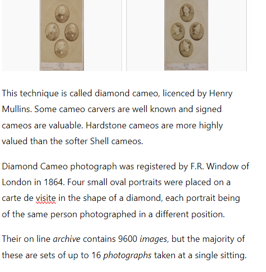
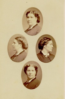
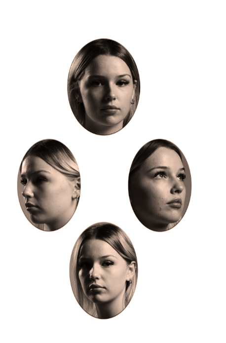
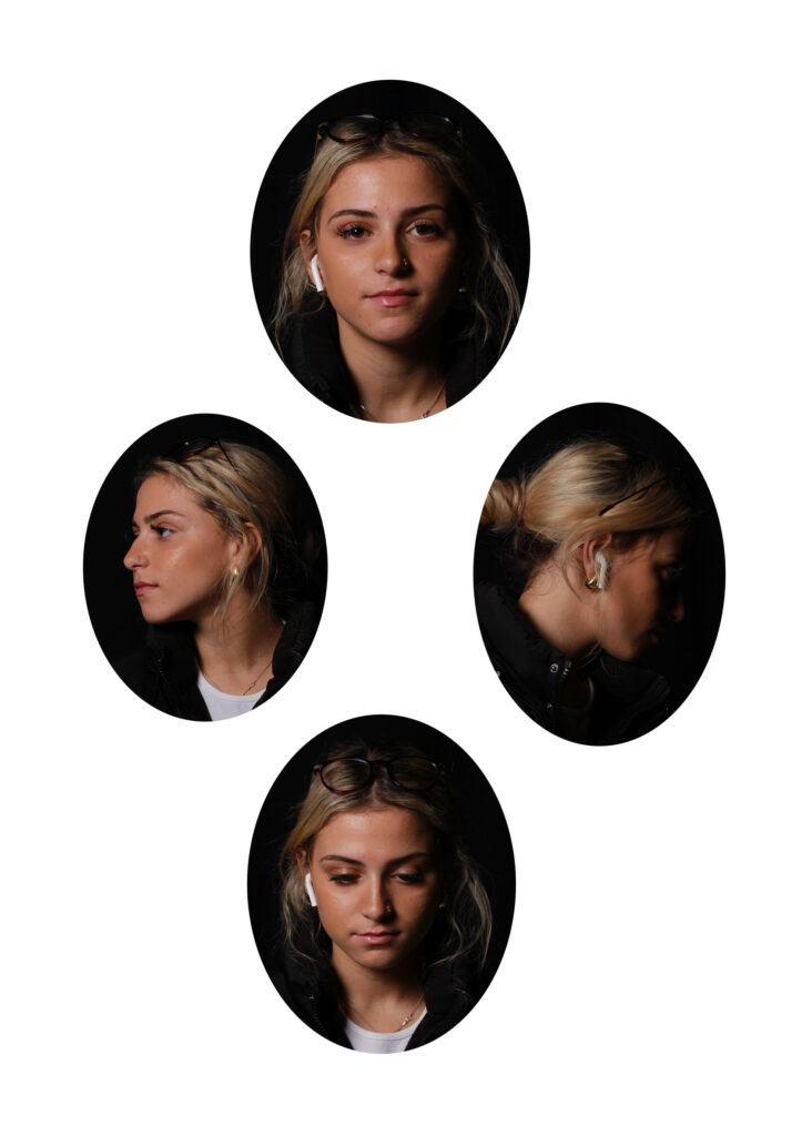
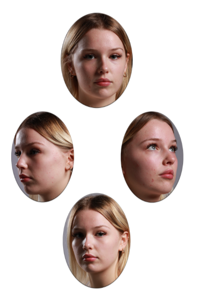
‘Diamond Cameo’ styles of photography is where four oval portraits are presented of usually the same individual person but they are positioned at different angles. The four oval portraits create a diamond shape when they are placed in a certain layout. Sometimes, artists decide to use different people which makes this technique really unique.
Examples of Diamond Cameo methods:

Artist Inspiration– Henry Mullins

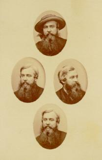
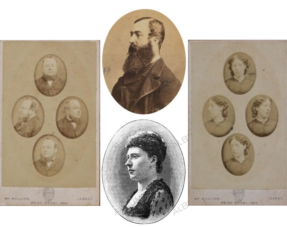
Henry Mullins was a British photographer who moved from London to Jersey in 1848, which he then set up a studio known as the ‘Royal Saloon’ in the prime location of the Royal Square, St Helier. Initially, he was in partnership with a Mr Millward, but by the following year he was working alone and continued to work out of the same studio for another 26 years. He produced thousands of portraits of islanders between 1848 and 1873 at this highly successful studio. While numerous photographic studios opened across the town of St Helier in the 1850s and 1860s, Mullins continued to be the photographer of choice for leading members of Jersey society and successful local and immigrant families.

Examples of his work:

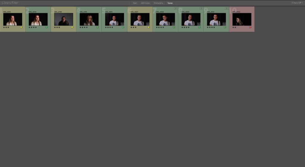
My Contact Sheet:

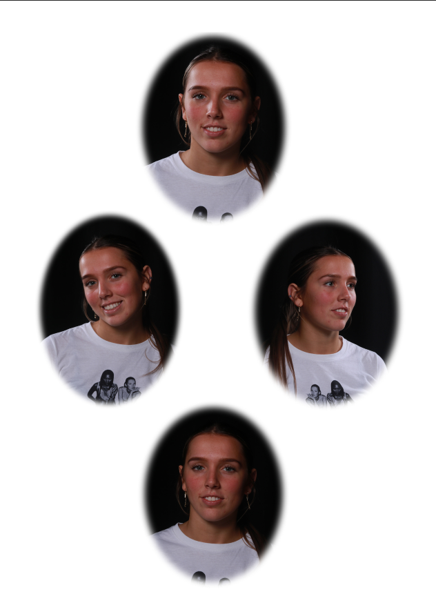
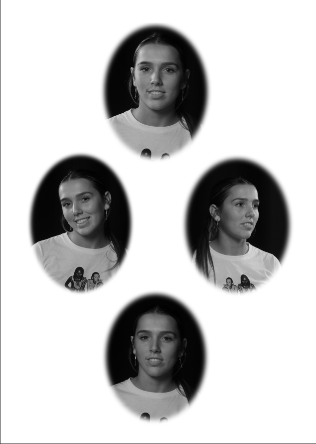
My edited photos:

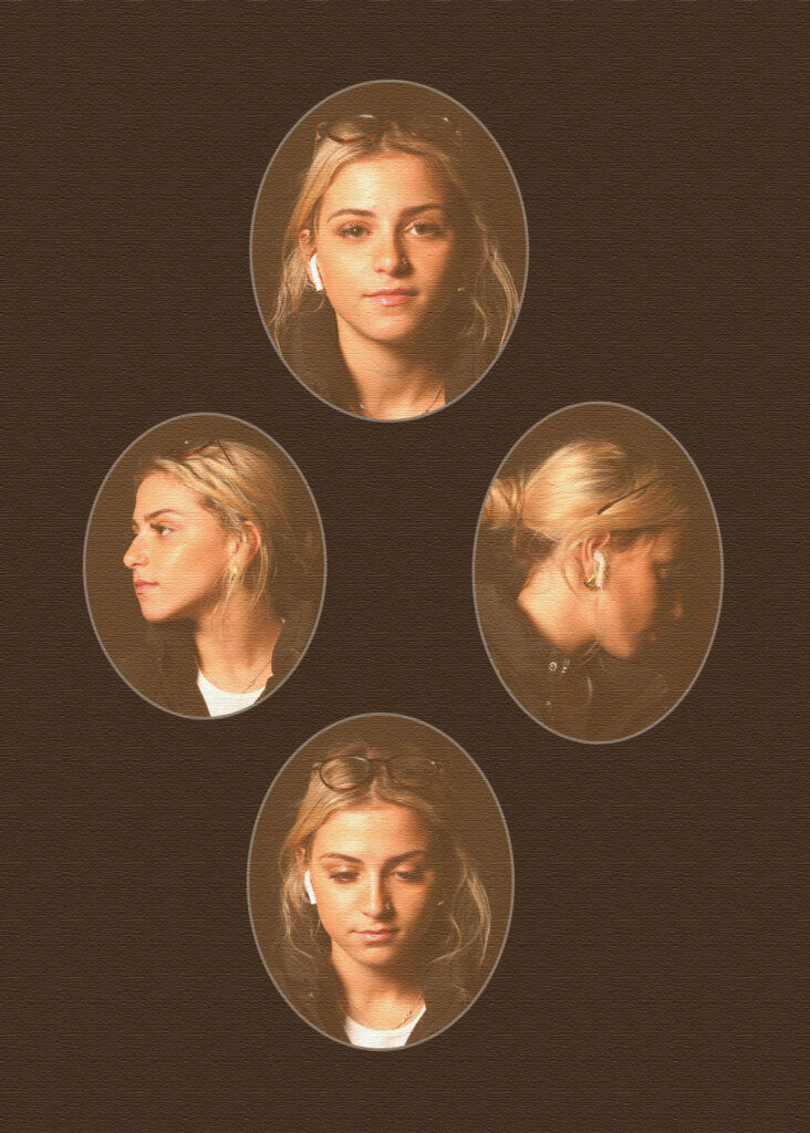
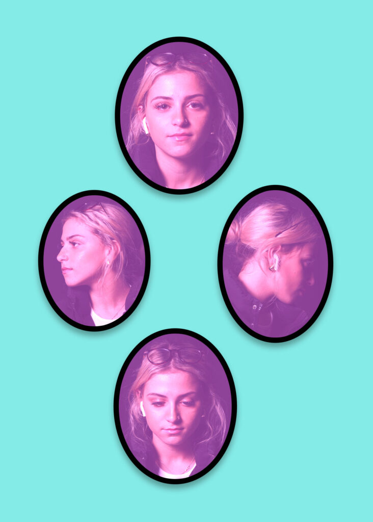
Here is a few examples of my attempt at using the technique of Diamond Cameos. I used four portraits of the same person in different positions and facial expressions so it could look as effective as possible.

I think these Diamond Cameos are really successful, and I like the way in the last one that the added filter creates an old-fashioned affect. I experimented with three different ways of presenting these images. Personally, my favourite is the vintage-like one, as it holds the most emotion behind the presentation of images. The photos have a yellowish, warmer tone to it as this brings an affect of nostalgia. I was inspired by Henry Mullins’ artwork as I love how his photos look really old and vintage, so I tried to similarly do the same with mine.

Diamond Cameo


The Patent Diamond Cameo photograph was registered by F.R. Window of London in 1864. Four small oval portraits (1″ x 3/4“) were placed on a carte de visite in the shape of a diamond, each portrait being of the same person photographed in a different position. A special camera made by Dallmeyer was used in which the one glass negative was moved to a new position in the back of camera after each portrait had been taken, and when the paper print had been pasted on the card a special press was used to punch the four portraits up into a convex cameo shape.

My responses:

How I made a Diamond Cameo.

Step to step guide on how I made a Diamond Cameo.

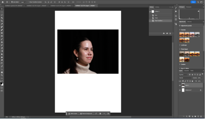
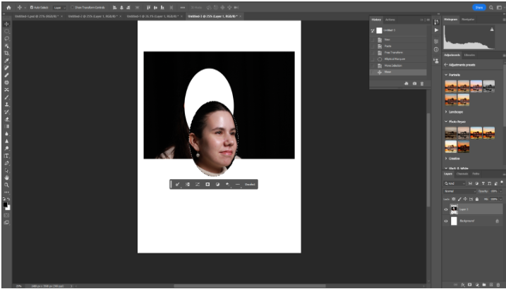
Step 1: First I uploaded my preferred picture from my headshots photography folder into an A4 paper in photoshop.

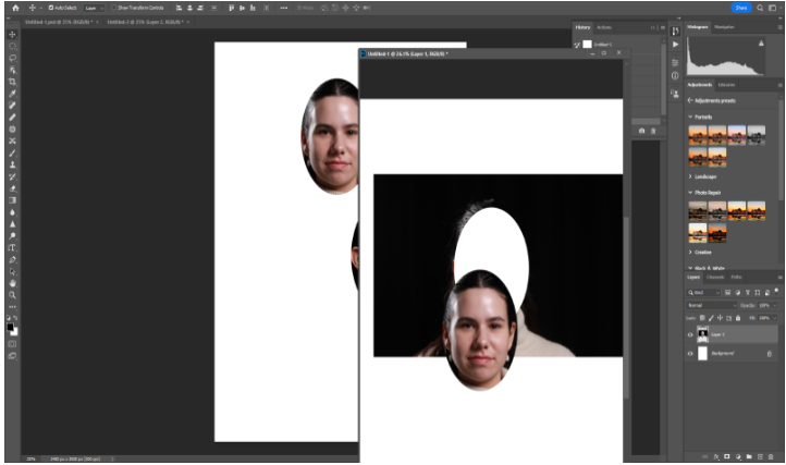
Step 2: Next I selected the elliptical marque tool and created an oval shape on the subject face, making sure I include most of the face. Then I selected the move tool and moved the oval shape which created a cut out of the face of the subject.

Step 3: Shortly after cropping the oval shape of the subjects face, I moved the tab at the top where the picture is and then created a new plain A4 tab. I grabbed the cut out and placed it on the plain A4 paper.

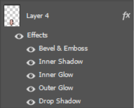
Step 4: I repeated this three more times to create a that Diamond cameo. Then pressing on each cut out I wanted to blend in the pictures, so I right clicked on my mouse and selected blending options and selected all the blending options below. However adding blending is completely an option.

Double exposure

Multiple exposure

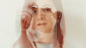
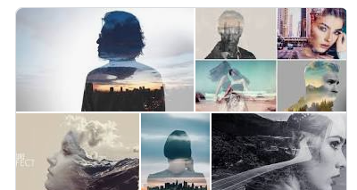
In photography a multiple exposure is the superimposition of two or more exposures to create a single image, and double exposure has a corresponding meaning in respect of two images. The exposure values may or may not be identical to each other. Its the the repeated exposure of a photographic plate or film to light, often producing ghost like images.

This is a style of photography is a technique that layers two different exposures on a single image, combining two photographs into one. Double exposure creates a surreal feeling for your photos and the two photographs can work together to convey deep meaning or symbolism.

Double or multiple exposures are an illusion created by layering images over the top of each other. Artists have used these techniques to explore  surrealist Ideas and evoke dream-like imagery, or imagery that explores time / time lapse – as if they were a ghost.

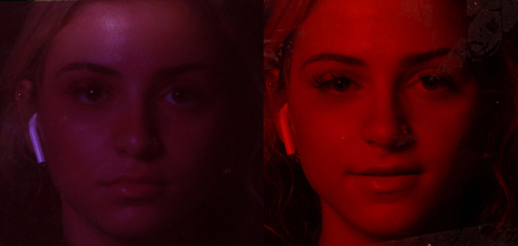
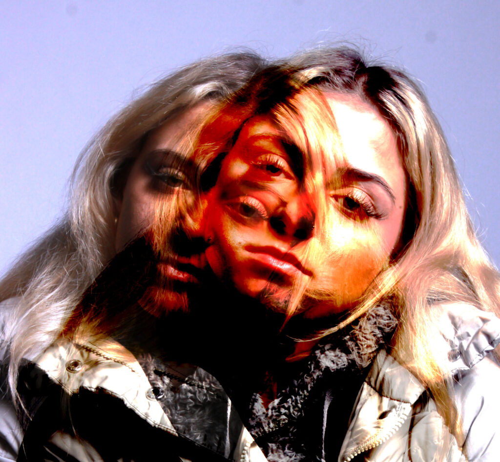
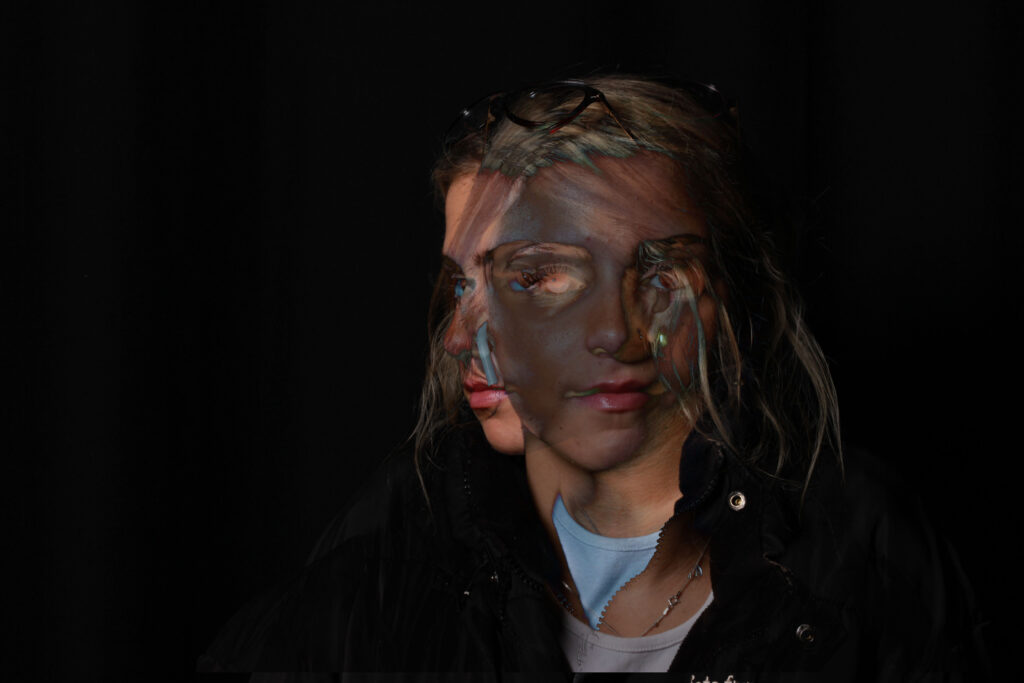
This is my response to double/multi exposure.

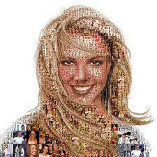
Photomontage

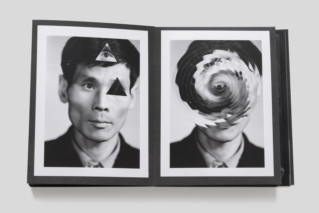
Photomontage is an artistic practice that has endured almost since the birth of photography itself. At its most basic level, the photomontage is a single image combined of two or more images.
Photomontage is the process and the result of making a composite photograph by cutting, gluing, rearranging and overlapping two or more photographs into a new image. Sometimes the resulting composite image is photographed so that the final image may appear as a seamless physical print. Its a montage constructed from photographic images and uses the technique of constructing a photomontage.

My response:

This image has an empty alt attribute; its file name is image-814.png

Why is photomontage important?

It was first used as a technique by the Dadaists in 1915 in their protests against the First World War. It was later adopted by the surrealists who exploited the possibilities photomontage offered by using free association to bring together widely disparate images, to reflect the workings of the unconscious mind.