What is Sequence/Grid Photography?
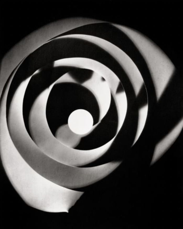
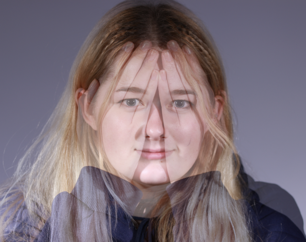
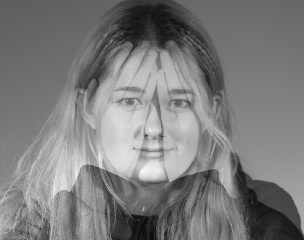
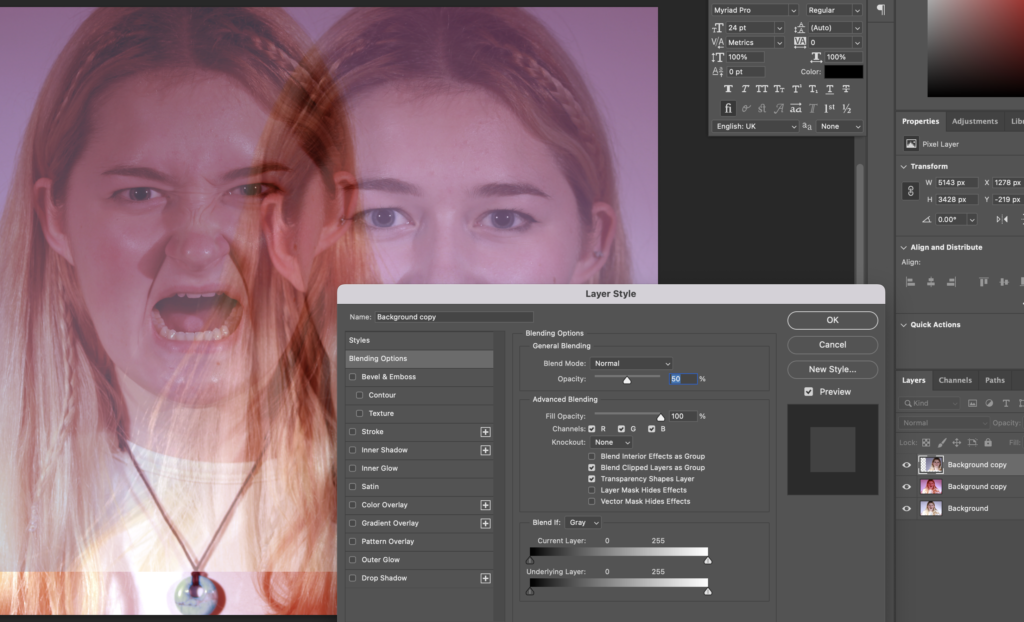
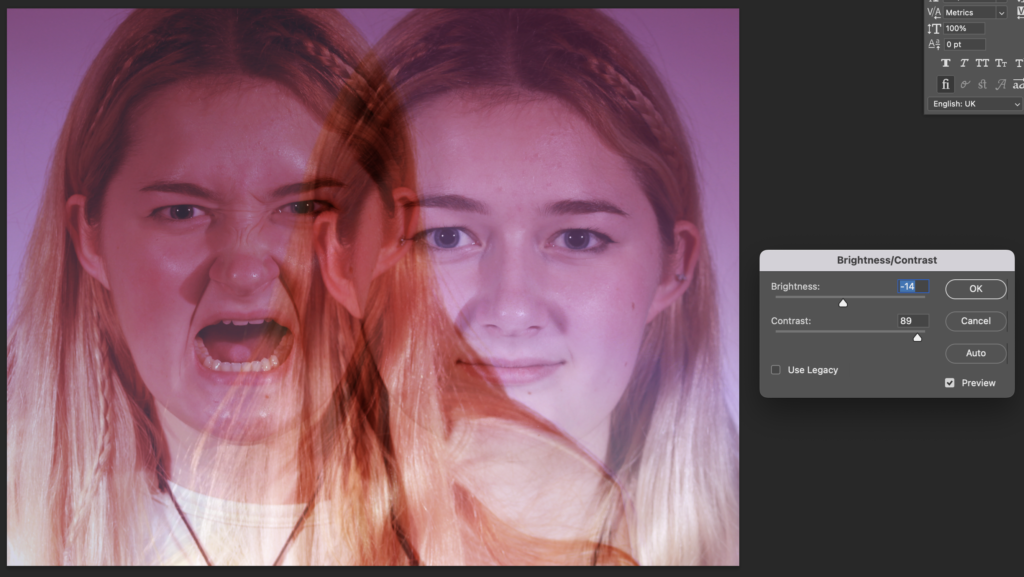
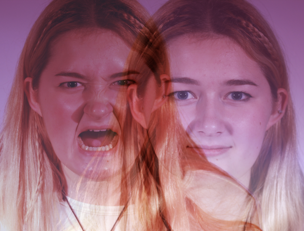
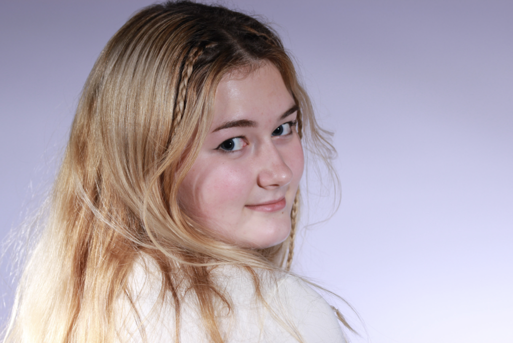
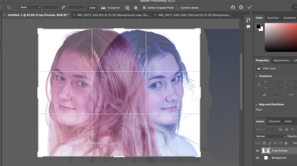
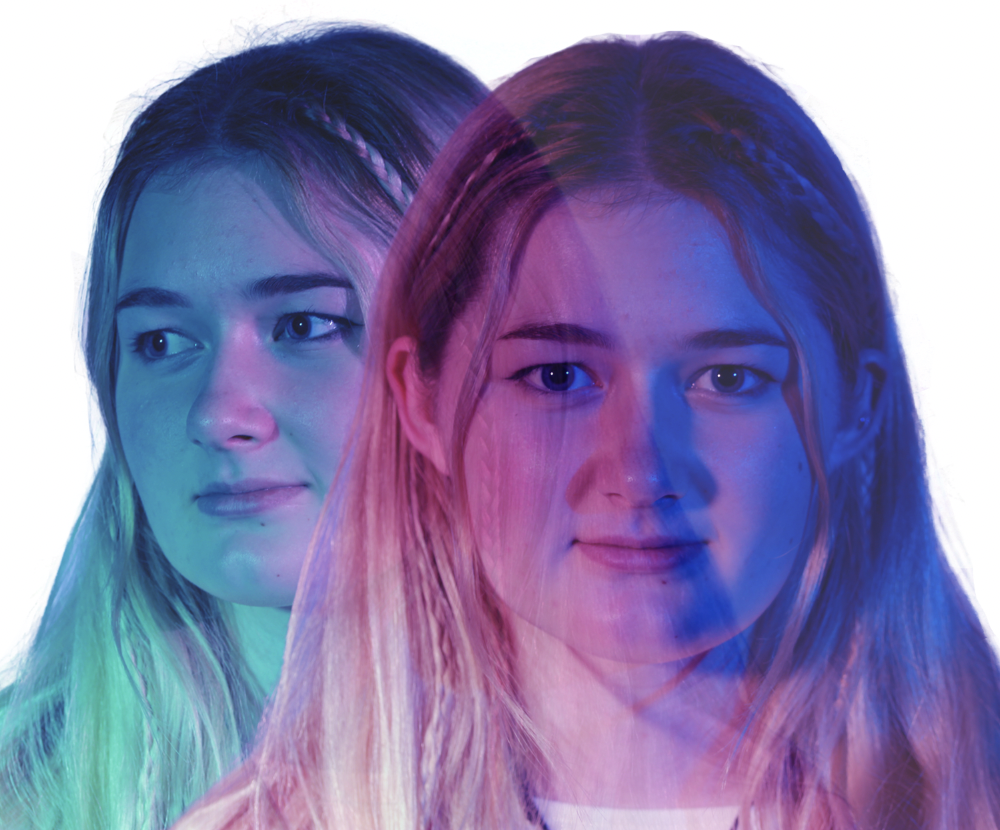
Sequence photography is when you capture the movement of an object or of a sequence of events over time. The photographs are often taken at rapid-fire or they can even be taken separately. This can be displayed as a series of photographs or you could do some editing to make the movement all within one image. This is an example of the subject moving within the same image:

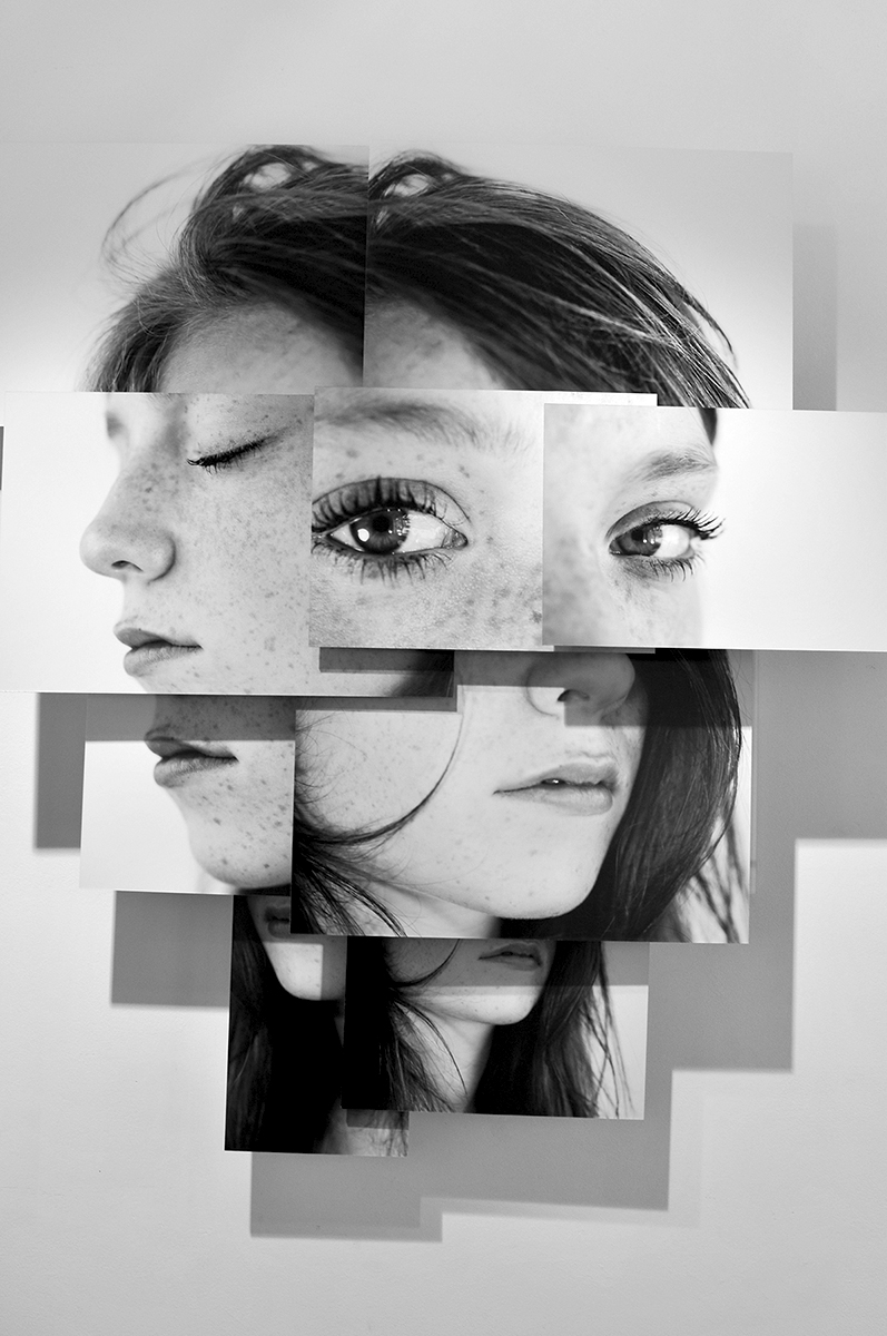
Grid photography can be either a collage of multiple photos together or splitting one photo into a grid known as the rule of thirds. Typologies are also a type of grid photograph and it is when photos are grouped with ones that have similar characteristics and laid out as a grid.
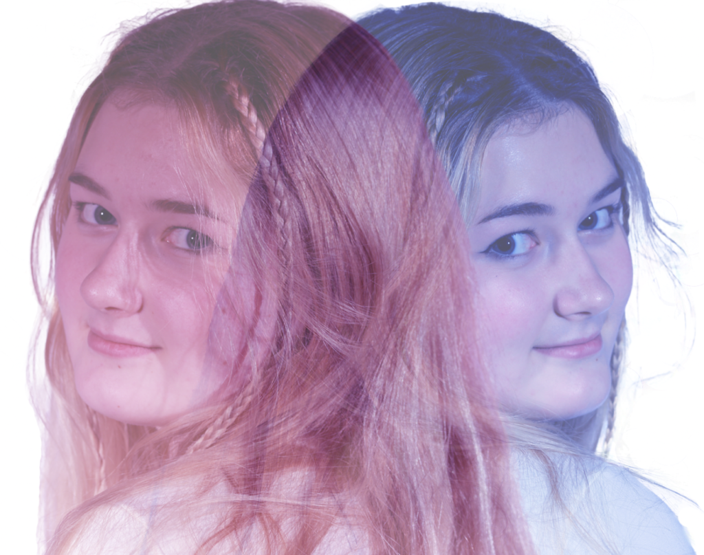
Mood board

Rule of Thirds
What is the rule of thirds?
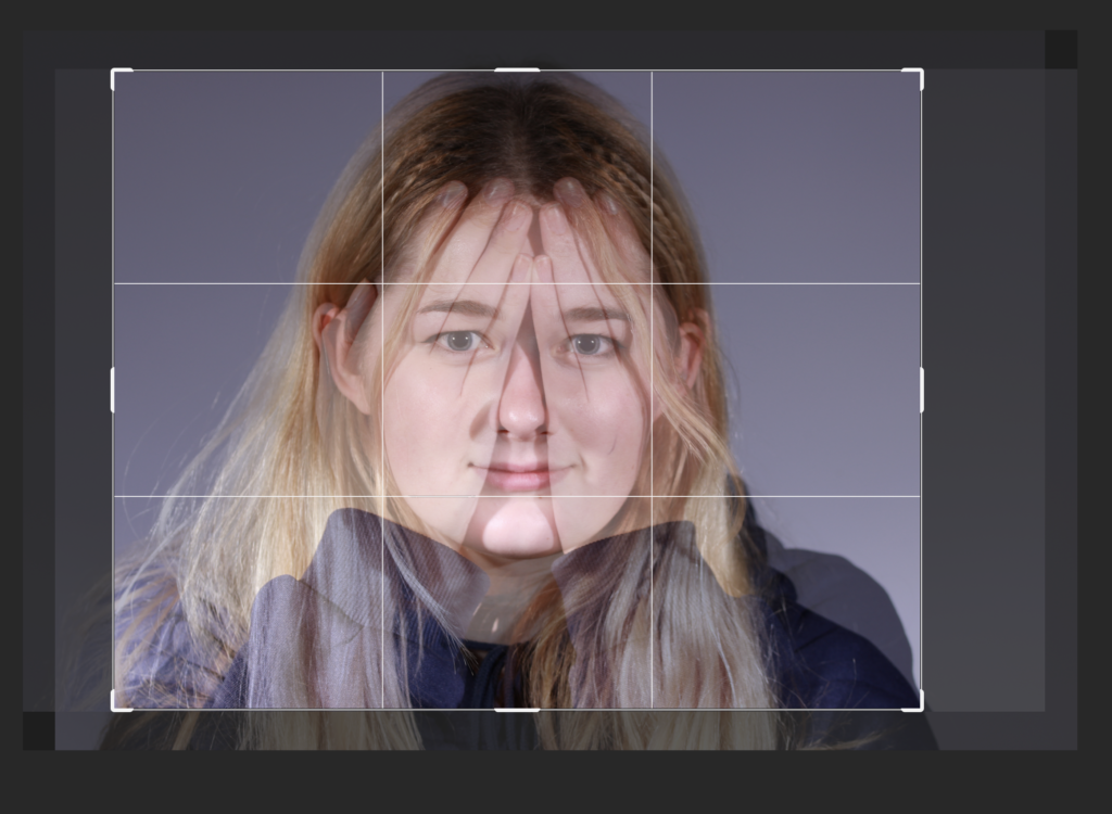
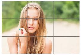
The rule of thirds is a guideline in photography which places the subject in the left, right or middle third, leaving the other two thirds more open. The image is divided into 9 equal parts by two horizontal and two vertical lines of equal distance. The rule of thirds is generally used to create a well balanced, more visually pleasing photograph and draw the audience’s eyes towards the subject you want them to focus on.
Photo examples


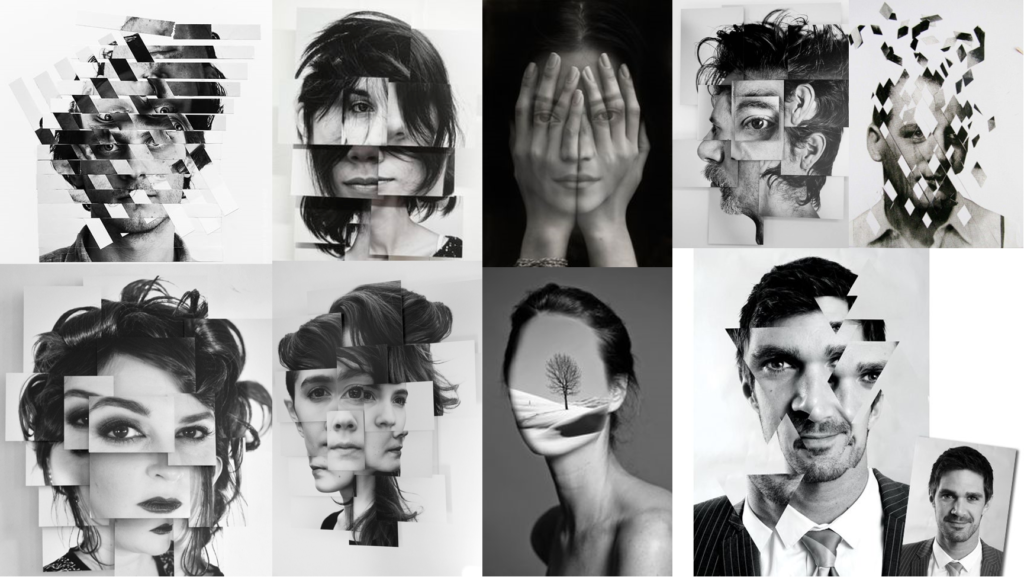
Artist Reference


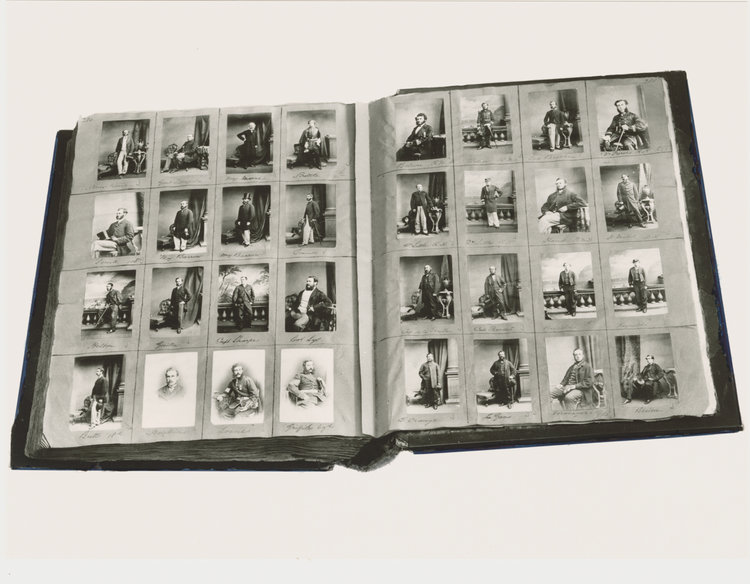
Brian D Smith is an American Wedding and Studio Photographer. He began his career in photography after photographing a wedding and making the decision to pursue his passion and drop his career in engineering. He is passionate about photographing weddings because he believes that committing to one person for life is a beautiful experience to witness. He also enjoys portraits and editorial work because he believes that it provides an opportunity to share a bond with a subject and reflect their beauty.
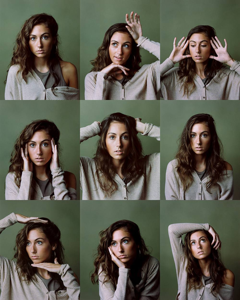
This is a series of photographs taken by Brian D Smith which have been arranged as a grid. In the top row, you can see that the woman’s eyes are becoming less visible to the camera each time, however, in the middle row she is making direct eye contact with the camera in each photo. On the bottom row, the subject is looking away from the camera in each photo and posing with her hands. In the top row, as her eyes become less visible to the camera, her hands are more visible. For example, in the first photo she is not using her hands, however in the second she is using both but only one palm is visible and in the last one both her palms are visible. Each image that makes up this grid looks like it follows the rule of thirds, apart from the bottom, centre image as the subject’s arm is aligned with the side of the photograph. Finally, this grid does not follow a specific trend as each photograph is different, however, they do all have similar characteristics.
Photoshoot Plan

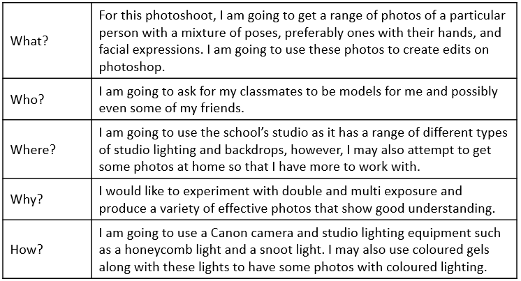
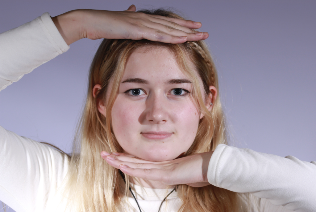
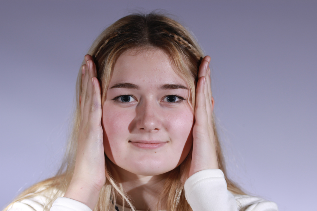
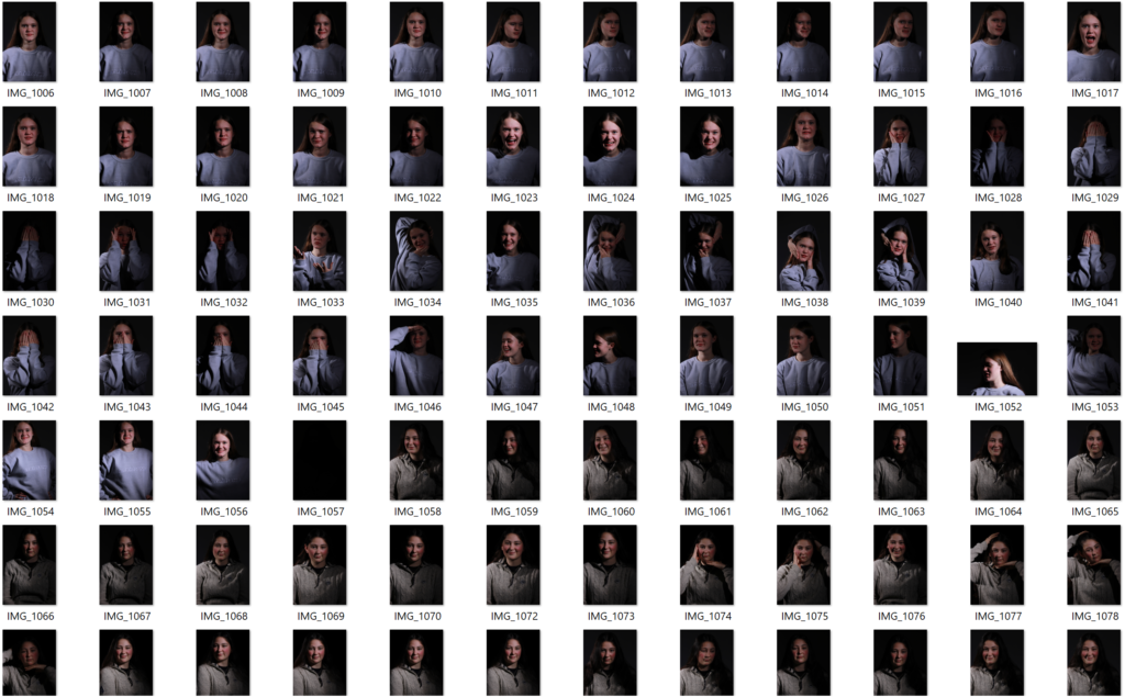
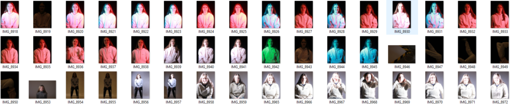
Photoshoot/Photo Selection
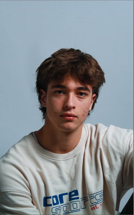
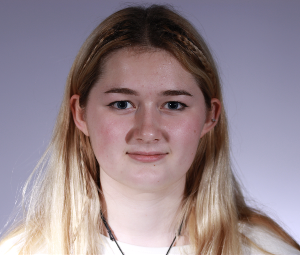
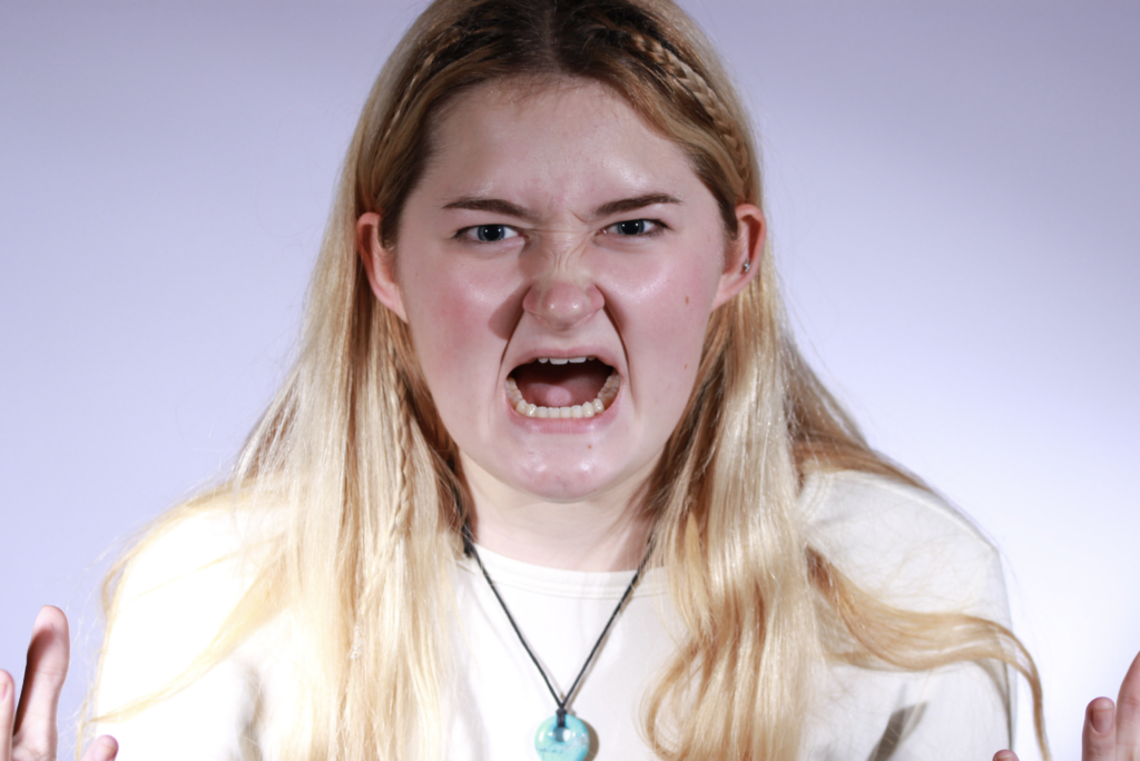
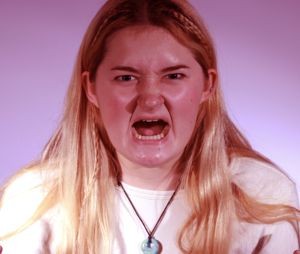
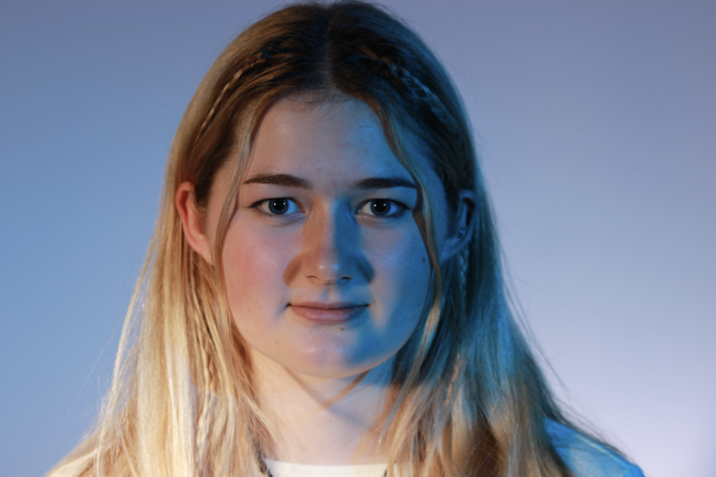
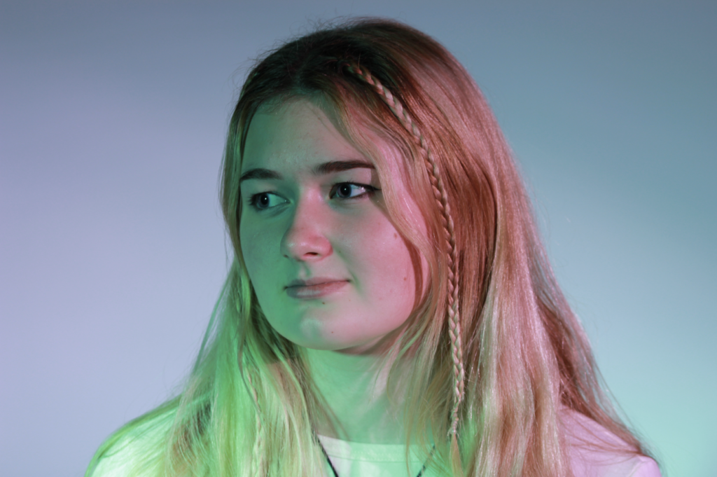
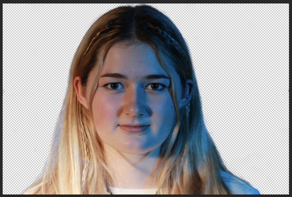
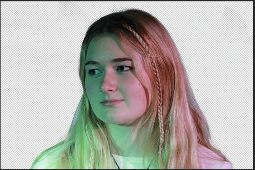
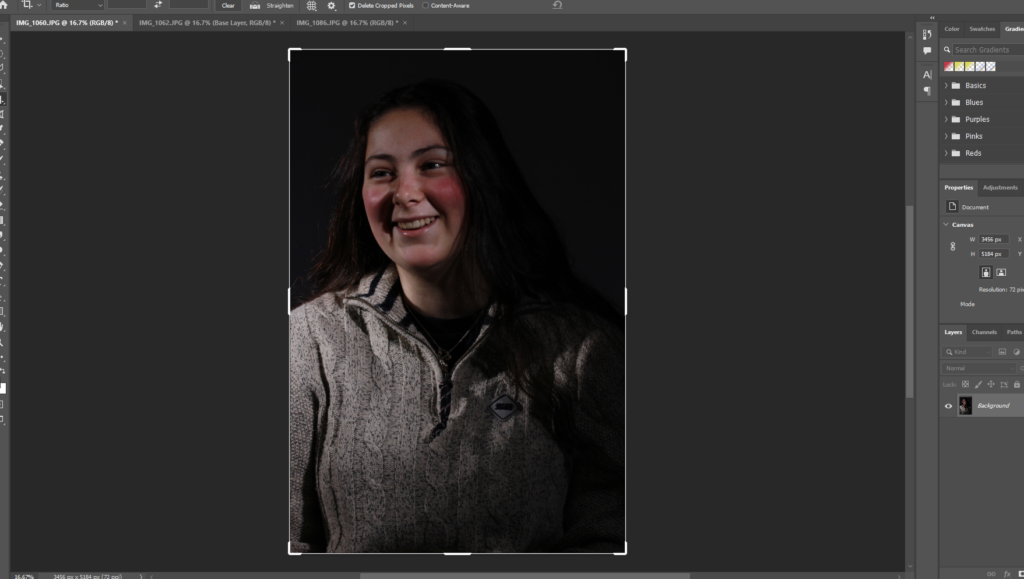
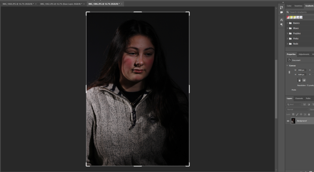
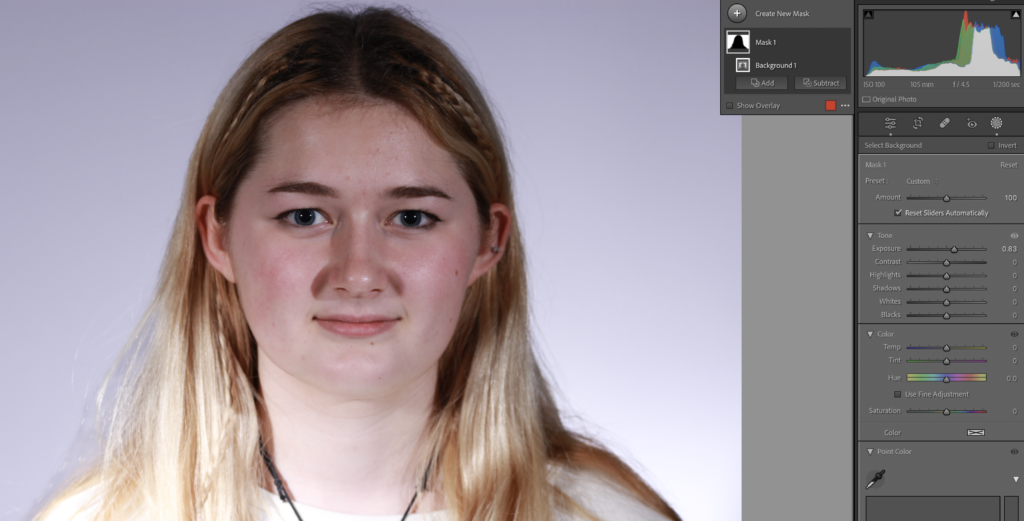
I am going to be using this same set of photos for all Headshots editing.
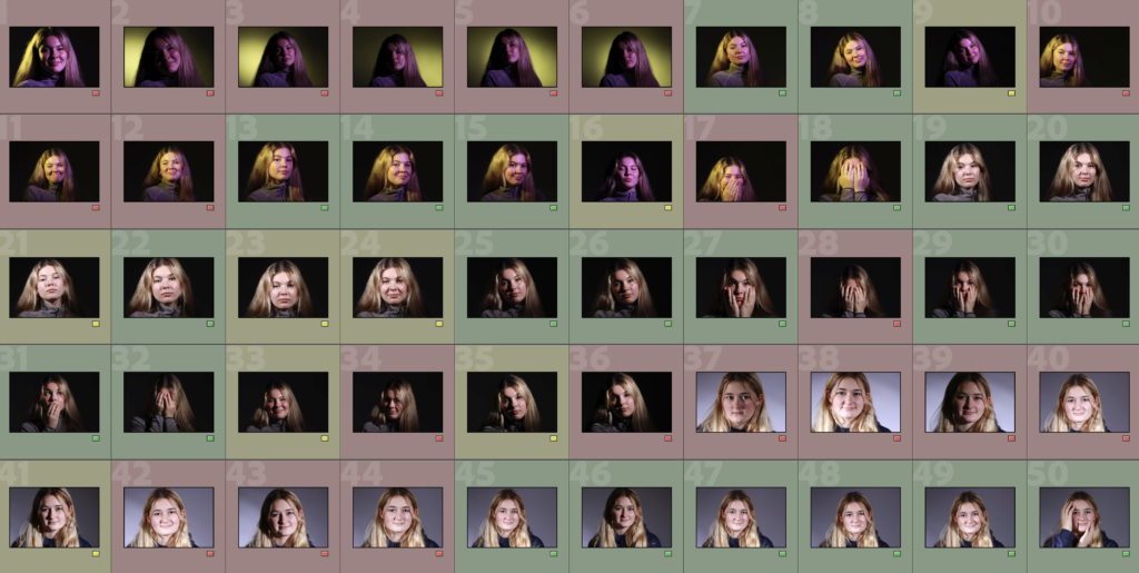
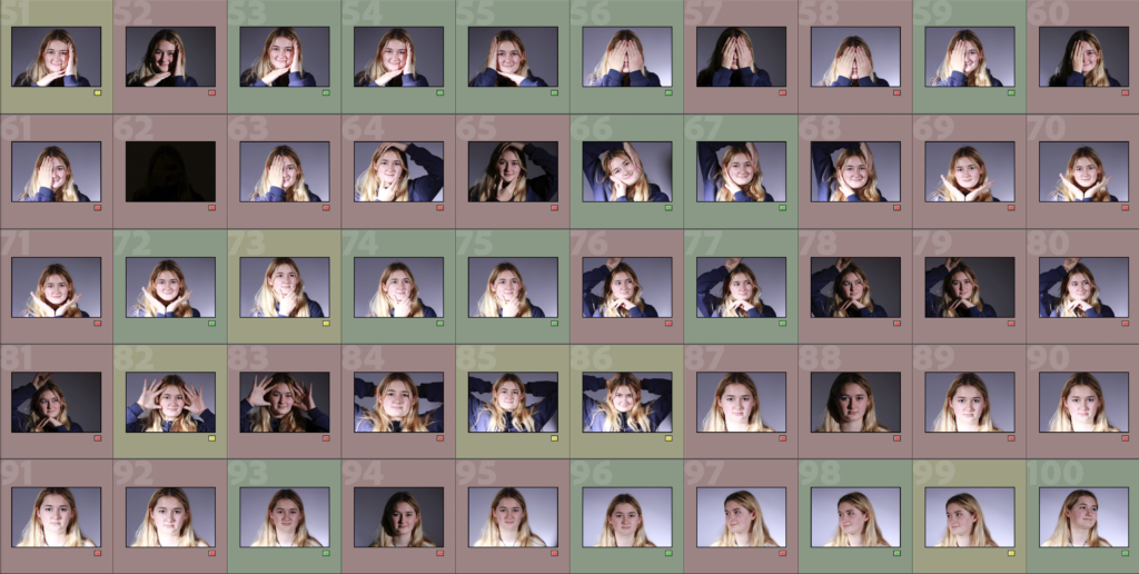
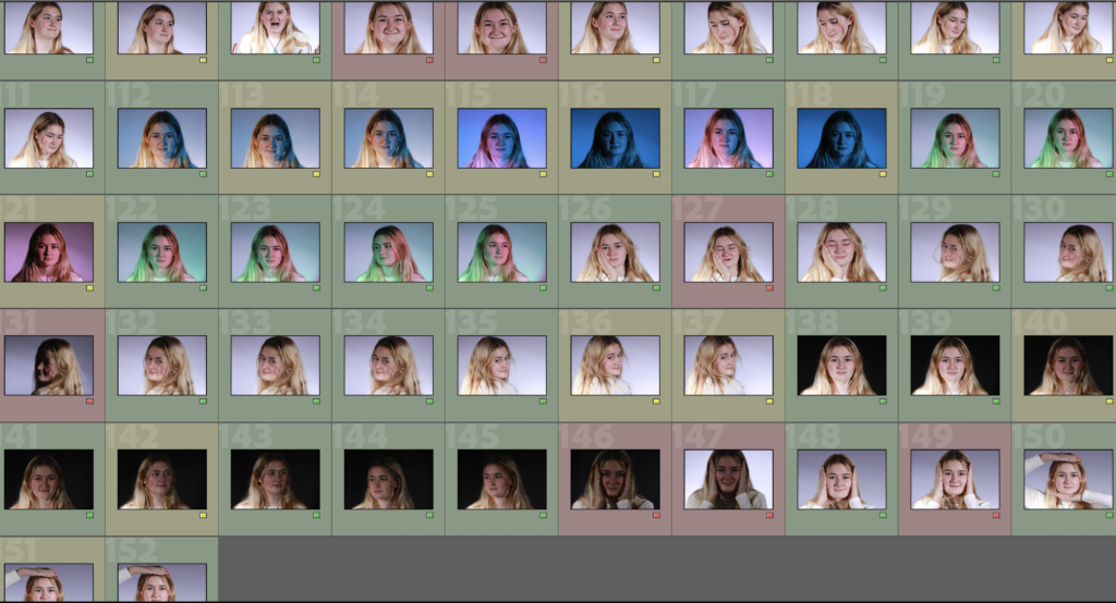
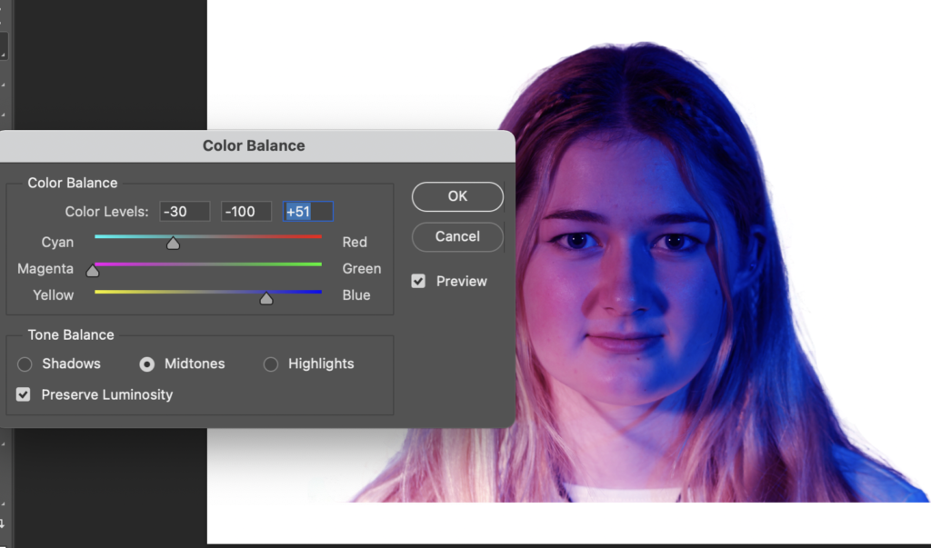
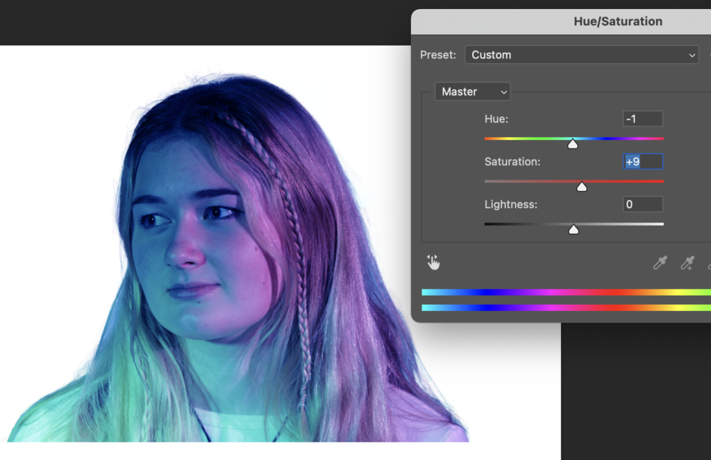
Edits
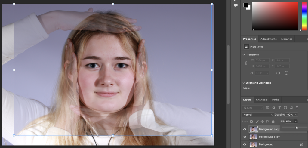
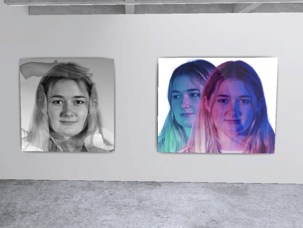
Grid 1
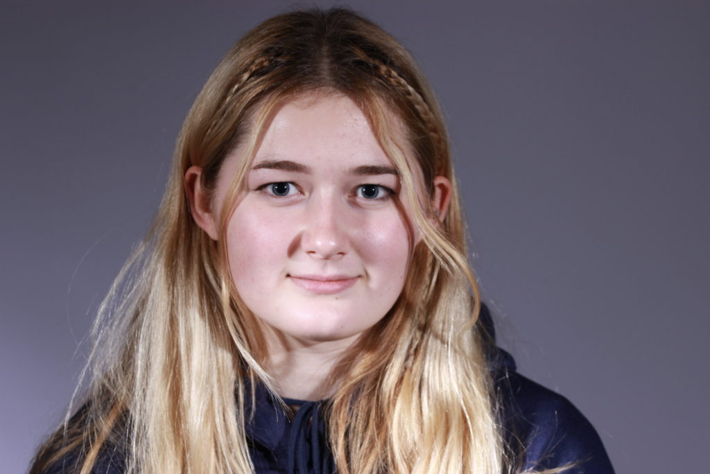
I planned my first grid by selecting the photos I will use and positioning them where I want them in Freeform so I can visualise what it will look like.

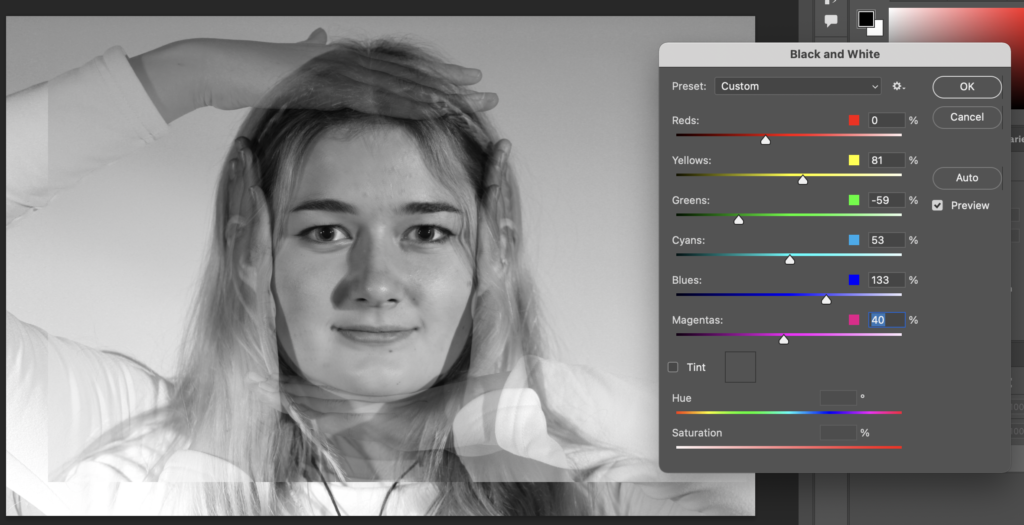
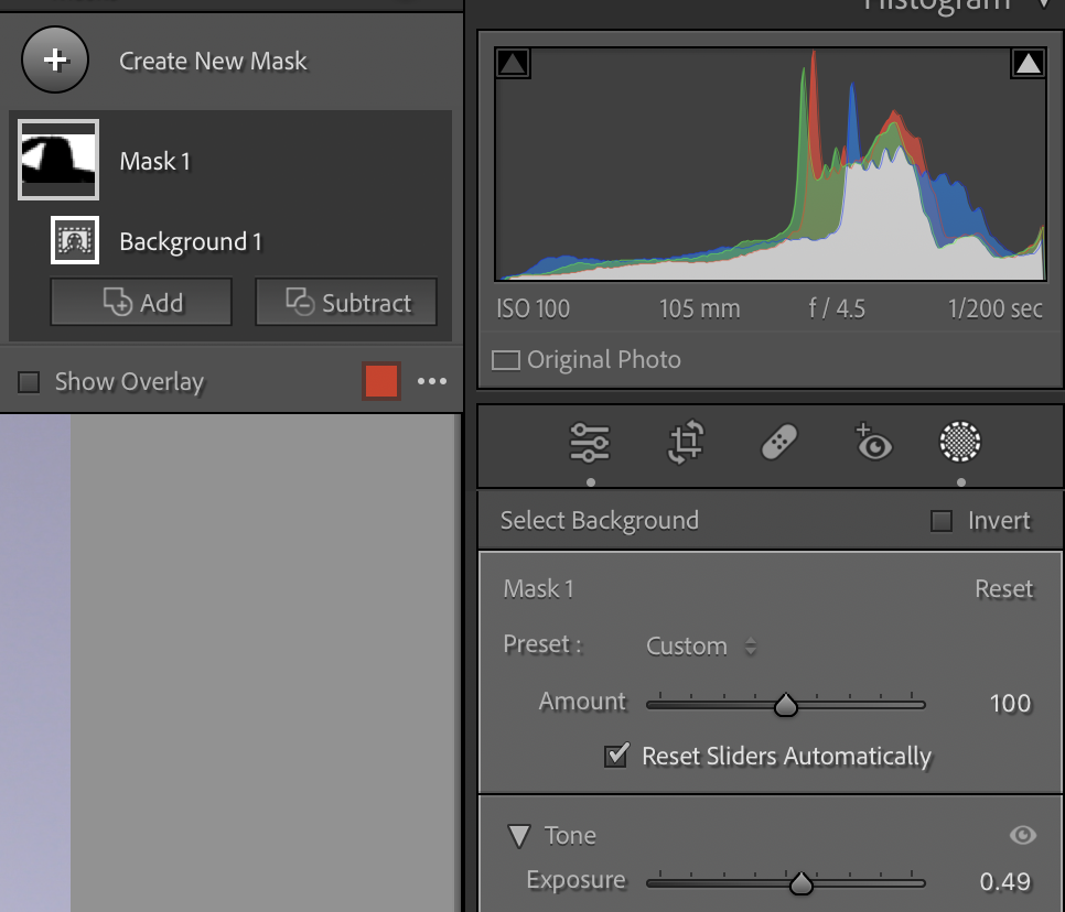
The photos on the bottom row all appear a bit darker than the others, therefore, I am going to edit them a little bit on Adobe Lightroom Classic.


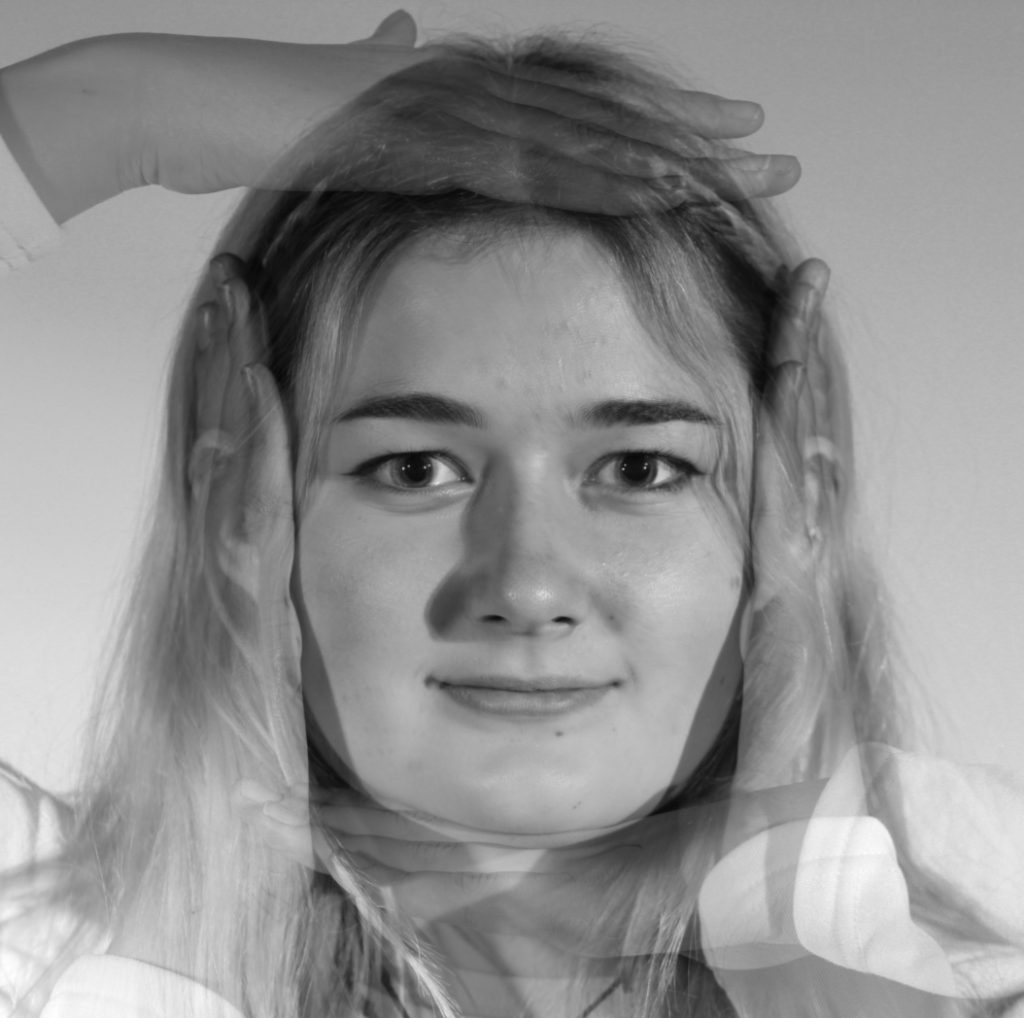
This is my improved grid after editing the photos:

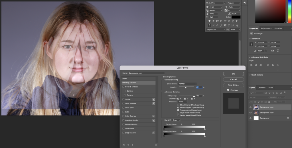
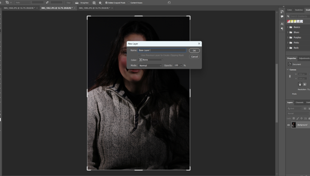
To make my grid on Adobe Photoshop, I followed the following YouTube Tutorial:
The method I undergone for this was:
1) File > New: 1080 x 1080 pixels | 72 Resolution | Background: White

2) View > New Guide Layout: Columns: 3 | Rows: 3


3) Add a New layer and select Rectangular Marquee Tool then select any colour. Select first box, using Rectangular Marquee Tool, then right click and select Fill… > Foreground Colour.


4) Repeat this process with different colours for each of the boxes.

5) Select a layer and drag and drop a photo to place it on top. Right click the photo layer then select Create Clipping Mask.

6) After this, go to Edit > Free Transform and align the image how you would like it.

7) Repeat this process for the rest of the boxes to get your final result and clear Guides.

Grid 2

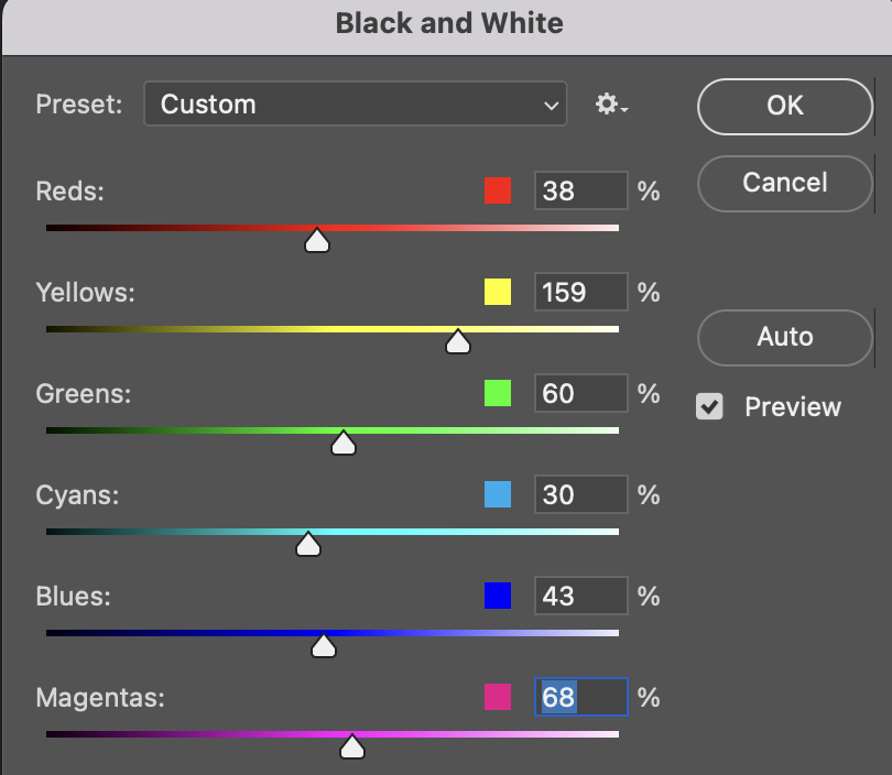
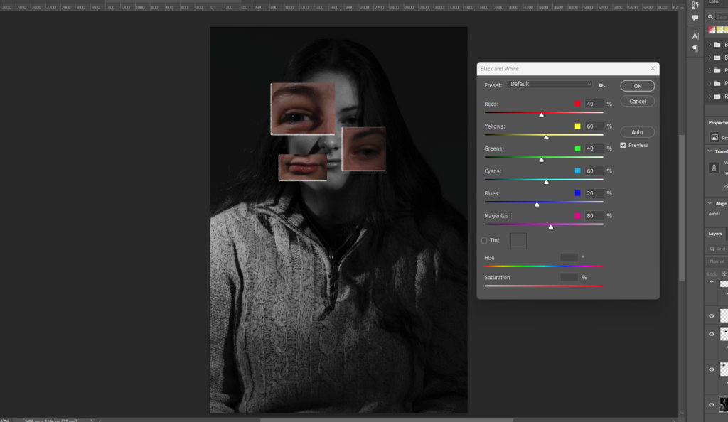
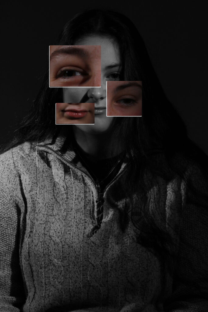
I used the same method from my previous edit, just with different photos. I decided that this grid would look better if I made it B&W, so that is what I did.

Grid 3
This will be the photos used in my 3rd grid. I am planning on possibly making the images in the middle row monochrome.

This is what the grid will look like with that row being in B&W. I then decided that I think it would look better with the B&W row being the bottom row so I changed it.

This is the final arrangement of my grid that I will make in Photoshop.

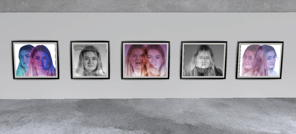
This is my grid that I created using these images in Adobe Photoshop:

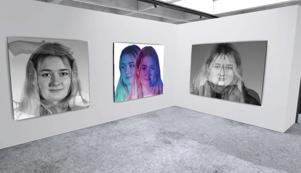
Evaluation
Overall, I think my grids are similar to Brian D Smith’s due to the range of hand gestures and poses, although, my grids are different in terms of shape as they are squares whereas his are rectangular.
^ This is my personal favourite grid as I think that it looks quite professional and I like the B&W. I also like how the background of each image appear similar colour, except from the top left being a little darker.
Additionally, the rule of thirds is another form of grid photography and I would say that the majority of the images within my grids follow this rule.