Arnold Newman- Image Analysis

Emotional:

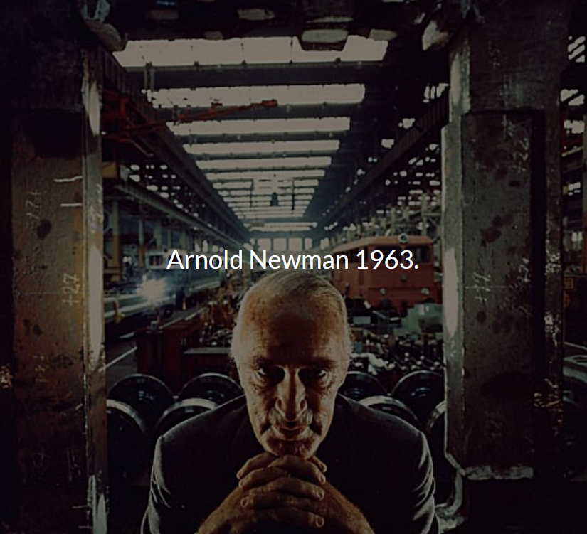
  • Intimidating
  • Uneasy
  • Creepy
  • I like the photo because it makes me think about the backstory and meaning behind it.

Visual:

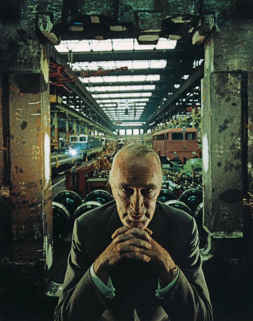
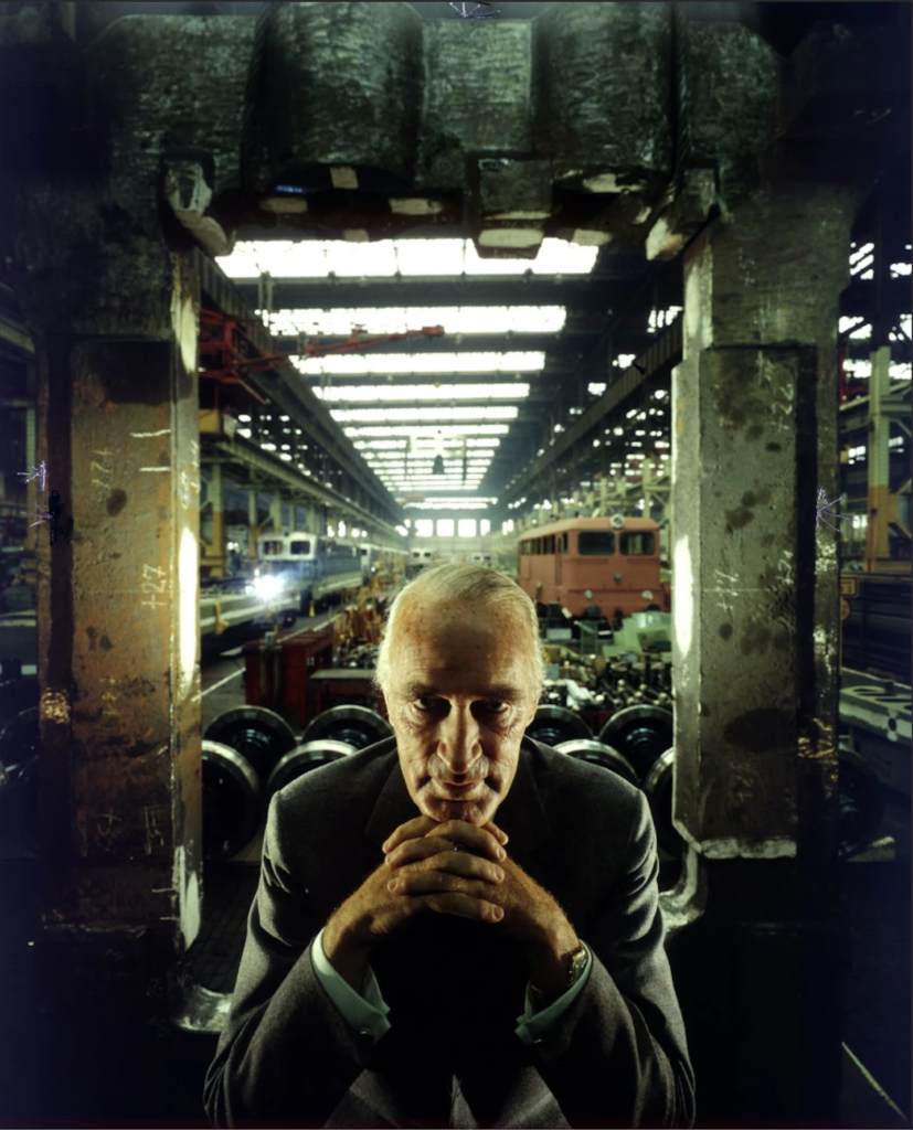
  • Looks like a train factory
  • Dull
  • Dark lighting, lots of shadows
  • Looks a bit abandoned and dirty/rusty
  • Artificial lighting
  • Shallow depth of field
  • Old white man-main focus point, subject of the image-staring into the camera, makes viewer feel uncomfortable
  • Dark surroundings
  • Symmetry

Technical:

  • Balanced composition from the 2 pillars either side making the main subject centered
  • Line of symmetry
  • Losing focus and detail the further back you go behind the subject so the main subject is focused and the rest is blurry
  • Lighting is from either side of his face so the middle of his face is dark shadowy.

Conceptual

Taken from Los Angeles Times:

“In 1963 Jewish photographer Arnold Newman was commissioned by Newsweek to take a portrait of Alfred Krupp, a convicted Nazi war criminal. At first, Newman declined the offer. The Jewish American photographer saw the convicted war criminal as the devil and wanted to put a knife in his back. But Newman did proceed with the job. A sinister-looking man, Krupp was seated on a platform with his factory in the background. Newman asked him to lean forward. Krupp clasped his hands together under his chin. “My hair stood on end,” Newman would later say. It was considered one of the most important photos by the man who became known as the father of the environmental portrait.”https://www.latimes.com/entertainment/arts/la-et-cm-arnold-newman-photographer-20190613-story.html

Contextual

  • 1963

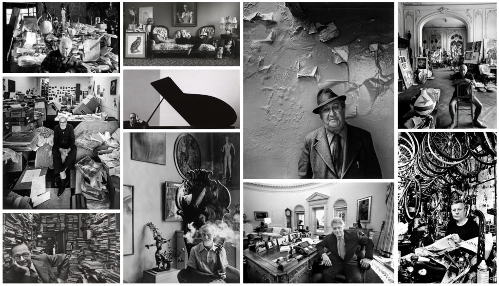
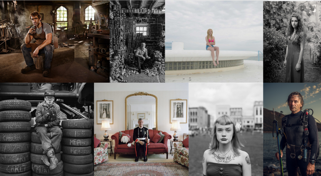
Examples of Arnold Newman’s photography:

Arnold Newman – Image Analysis

Who is Arnold Newman?

Arnold Newman was an American photographer, born in 1918 and died in 2006. From 1936 to 1938, Newman attended the University of Miami then later became an assistant in a Photography studio. In 1941, Newman had his first major exhibition in New York, where he eventually opened his own Portrait studio in 1946 after visiting the City frequently. Arnold Newman was best known for his Environmental Portraits, featuring various artists, writers, political leaders, scientists and more, typically in their own space or somewhere constructed to fit their character. Some of these people include Pablo Picasso, Marilyn Monroe, Jean Cocteau and Igor Stravinsky, many of these images published within magazines such as Time, Look, Life and Harper’s Bazaar.

Image Analysis

Emotional

This photograph makes me feel quite intimidated as the man in the image appears unfriendly and stern and the surroundings look cold and harsh. The positioning of his hands also give the impression that he is plotting an evil scheme, this adds to the oppression.

Visual

This image consists of dull colours with a lack of natural light and was taken in an industrial place. The subject’s aged, stern appearance fits in with the background, which looks like a train factory because it appears like it would be a manly and hard workplace. The fact that the subject is wearing a suit implies that he has authority, therefore, he may be the boss of the factory. The serious look on his face, texture of his skin and the background together all create the impression that the subject is firm and solemn. In this image, there are also many dark tones which may represent the subject’s personality and morals.

Technical

This image has a wide depth of field as you can see far into it and, in terms of perspective, it looks like it is getting further away. The focus/focal point of this photo is the factory owner and it can be seen that there are various leading lines towards him. These include the lights on the ceiling and the trains each side of him. the two pillars and the fact that he is centred within the photo creates symmetry and a sense of balance. Additionally, the pillars also provide a frame for the subject which makes your focus go towards him. The lighting coming from the rear side in this image is quite unique and peculiar as well as the lights on each side of his face. This lighting gives the subject a slender appearance and creates a darker atmosphere, linking with his sinful nature.

Conceptual

This image was taken by a Jewish Photographer, Arnold Newman, of a German Factory Owner. The Factory owner, Alfred Krupp was a convicted War Criminal, therefore, Arnold Newman’s intention was to portray Krupp as evil in the photograph. He did this by making Krupp look like he was plotting an evil scheme through his facial expressions and positioning and using lighting to highlight Krupp’s features such as his wrinkles and nose, almost as if to make him look unpleasant. After seeing this photo, Alfred Krupp was furious as he was just asking for a regular self portrait.

Contextual

In 1963, Newsweek magazine wanted to commission Arnold Newman to take a photograph of Alfred Krupp, a German industrialist who was a convicted war criminal for helping the Nazis, however, he was later pardoned. Arnold Newman originally declined this offer as he was Jewish, therefore didn’t want to be involved with him, but then changed his mind and wanted to backstab Alfred Krupp so he went and proceeded with the job.
ENVIRONMENTAL PORTRAITS

“An environmental portrait is a portrait executed in the subject’s usual environment, such as in their home or workplace, and typically illuminates the subject’s life and surroundings. The term is most frequently used of a genre of photography”
Portraits often show us what a person looks like, but they can also capture an idea of a person or what they stand for. Portraits can also tell us how a person wants to be seen, and capture a particular mood that the sitter is experiencing.

Arnold Newman

Arnold Newman was an American, Jewish photographer who its best known for his environmental portraits. He is also famous for taking portraits of well-known cultural figures, for example, Pablo Picasso, Marilyn Monroe and more. Newman has many different photographs of his that are famous.

Image Analysis 1

This photograph is by Arnold Newman of Alfried Krupp who was an industrialist who ran war factories for the Nazis. Krupp insisted on using slave labour where the prisoners were working to death and even the Nazi’s proposed to use free German workers instead. Krupp always held hatred towards Jewish people. However, he was always intrigued by Newmans art.

Newman did’t want to take this photograph originally but after consideration he chose to do it. When positioning Krupp he asked him to lean forward, and Krupp gripped his hands together and rested his chin onto. Newman said ‘he felt the hair stand up on the back of his neck’ and this is when he took the shot. Krupp did not like the photograph at all and was said to be furious, Newman saw this as revenge.

This photograph brings out emotions of being uneasy and intimidated. This is because the subject is an old man who has a sinister look paired with the darkness of the photograph. His earie look is more intense because he is glaring down the camera making it feel like he is looking right at us. The photograph doesn’t much light, the main source being sunlight through the roof windows which reflects off of all of the metallic materials in the backgrounds. Everything behind the man is old, rusty and worn down adding to the uncanny feel.

Image Analysis 2

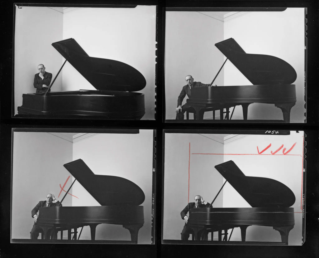
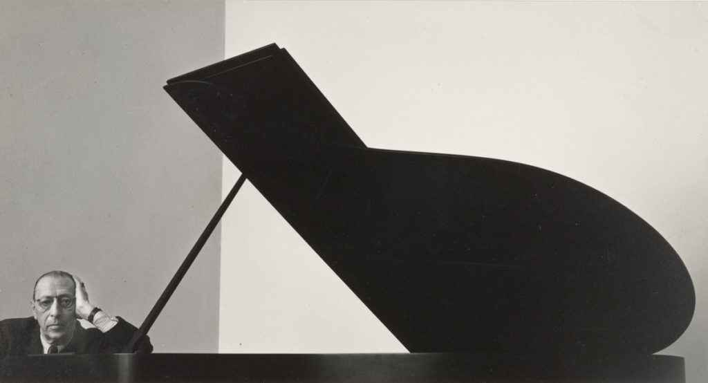
This is Newman’s famous photograph of Igor Stravinsky who was a Russian pianist, composer and musician. In this photo, he is dominated by a grand piano silhouetted against a white wall, with the composer confined to the corner. This suggests that music was a big part and had a big impact on his life. In this photo, the piano also looks like a music symbol which also represents his love for music.

Arnold Newman – Image Analysis

1963, environmental portrait of Alfred Krupp

Emotional

The effect of this image makes me feel quite intimidated and devious 😈 . Its very rough and serious as there’s no natural objects in the scene, except for the subject. Also seen as gloomy, dark, uncomfortable, cold and more. He’s almost blocking the viewer away from the picture.

Visual

Cold blue colours, lots of industrial objects in background (a train factory). The subject sits in the bottom centre of the image sitting almost like he has authority over the factory. He’s giving an intimidating look, especially with the harsh shadows on his wrinkly face.

Technical

symmetry and balance. The 2 pillars add to this symmetry, and leads the eyes towards the subject. harsh lighting – not very conventional giving similar lighting to churches or cathedrals (very intimidating). perspective goes to end of factory, with the focus on the subject.

Conceptual

The idea behind the image was to show his views on people who helped the Nazis win the war. He presented this image in a dark and sinister way, perfectly portraying the man in the image.

Contextual

Alfred Krupp was a German industrialist who ran the Krupp empire, a major arms manufacturer during World War II. Convicted as a war criminal for his company’s use of slave labor, he was later pardoned. Despite his pardon, Krupp remained a controversial figure, and his reputation as a ruthless businessman and war profiteer followed him.

Newman, a renowned portrait photographer, initially refused to photograph Krupp due to his own Jewish heritage and Krupp’s dark past. However, he later changed his mind, deciding to use the portrait as a way to express his personal feelings toward Krupp. he later said after taking the photo that ‘shivers when down my spine’

Environmental Portaits

An environmental portrait is a portrait taken in the subject’s usual environment, for example, in their home or place of work. These types of photographs can reveal things about the person photographed, such as where they feel the happiest or most content. Environmental portraits capture people in their natural environment rather than in a studio where photographed can be forced. This way the photos can almost tell a story of the subject since they’re being captured in their own, personal element.

Typology is a single photograph or more commonly a quantity of photographs that share a high level of consistency. The term was first used to describe a style of photography when Bern and Hilla began documenting dilapidated German industrial architecture in 1959. They described their subjects as ‘buildings where anonymity is accepted to be the style’. Every photograph was taken from the same angle, at approximately the same distance from the buildings.

Typographs links to environmental portraits as the photographs are all taken in a similar way, using the same techniques.

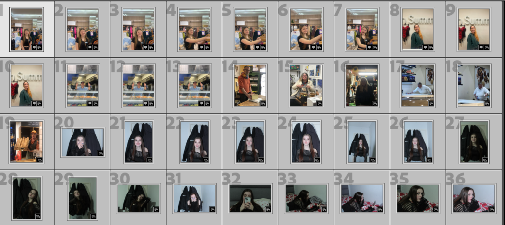
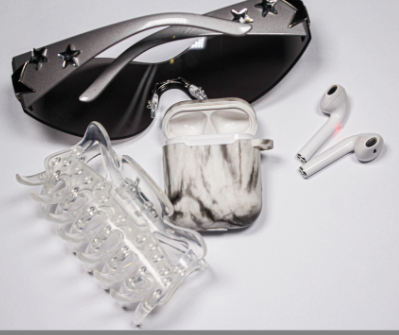
STILL LIFE FINAL IMAGE

My final photo was going to be this one:

But then i edned up taking more photoshoots in the studio and these are what i came up wtih:

first one is the normal image and the second one it the edited one. I also decided to edit them a bit more after and this was how it came out:

more photoshoots and edits:

normal image:

edited images:

For my final image i picked this edit:

I chose the above edit as my final picture because i love how its set and they all just fit in so well together in the photo. Also like the brightness and the texture of it.

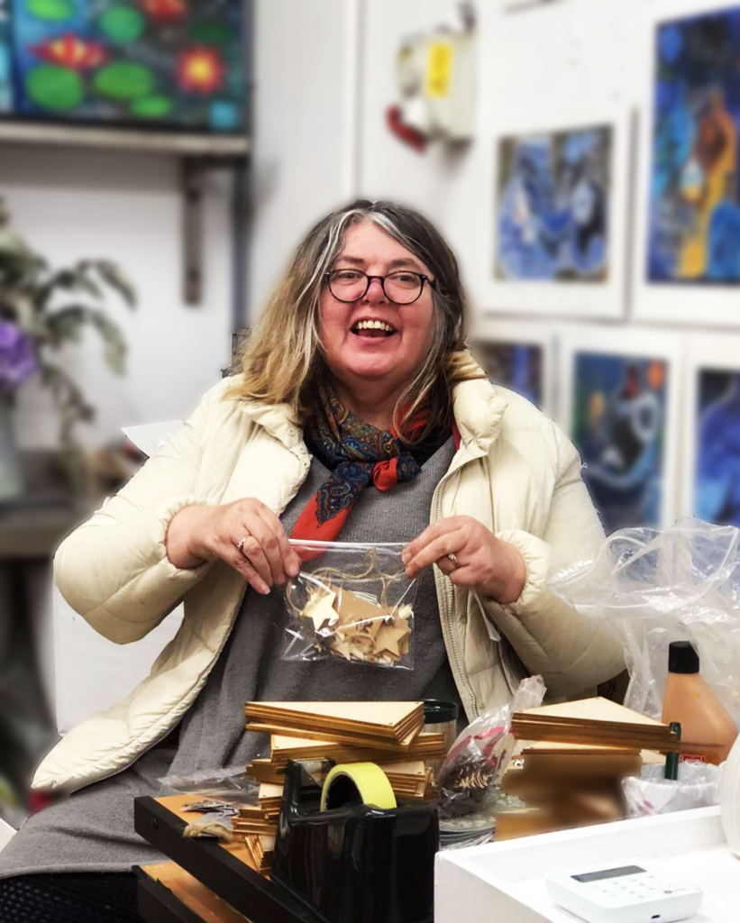
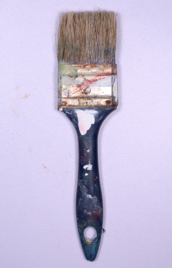
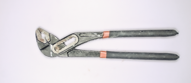
SINGLE OBJECT PHOTOSHOOT & EDIT

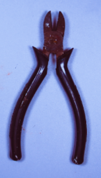
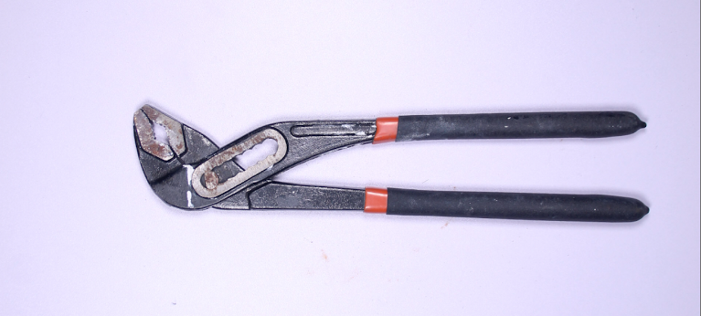
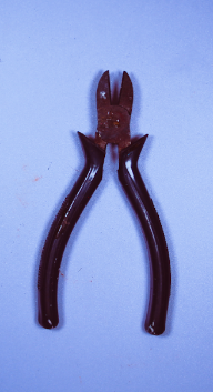
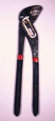
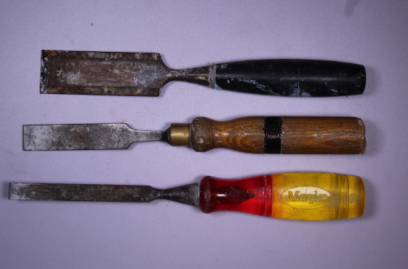
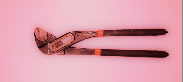
for my photoshoot i used loads of different toots and edited them all in different ways. These are the best photoshoots and edits out of all of them, in my opinion.

Normal image:

Edited images:

For all of these photoshoots the texture has decreased and i tried to make as different to each other as possible. I was playing around with the colours and the brightness and the highlights and i ended up liking them like it’s show above.

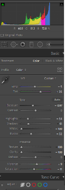
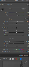
This is a image of how i edited the first image of them all above.

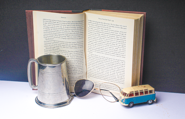
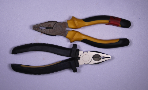
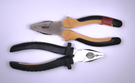
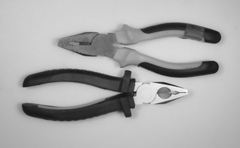
I then decided to take photos of more than one obejcts and edit them and this is how it turned out.

Normal image:

Edited images:

For the second photoshoot in the above i decided to make it a bit more different to the others and change the background of it, i’m not quite sure i like it, i like how its set and the shadows of the objects but all together i dont think its that good. Out of those three the one i liked the most of the first one because i like how the texture is nice and smooth and i like how its nice and bright in the middle then goed dark on the outside.