





Edits:


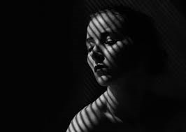
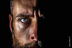
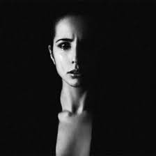
What is Chiaroscuro lighting ?
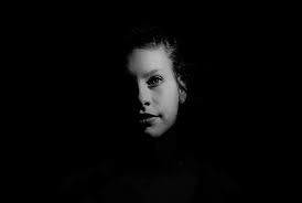
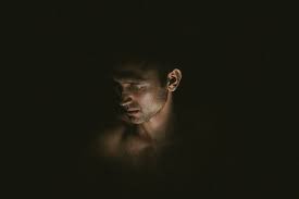
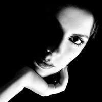
Chiaroscuro lighting is a high contrast lighting technique that utilises a low key lighting set up to achieve contrast between the model and a black background.
The importance of chiaroscuro ?
Chiaroscuro is important as it looks at the contrast between light and dark and emphasis and illuminates important figures in a painting or drawing.
Image analysis
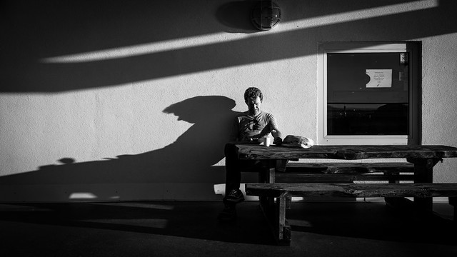
Chiaroscuro uses colour in this image by contrasting black and white light. The form of this image is 3D and there is a pattern of striped light on one of the example images. The space of the images is the depth perception. 3D objects are defined by the three spatial dimensions of height width and depth.
My response
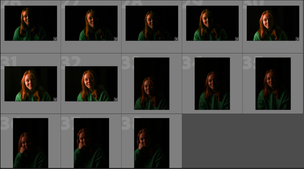
My best photo
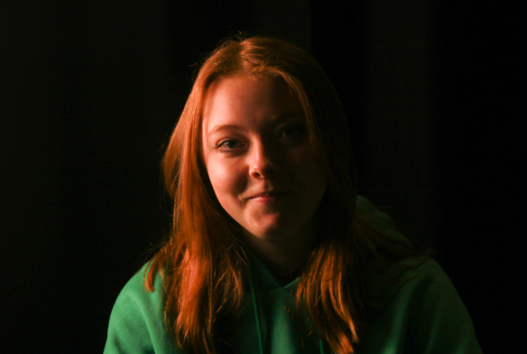
This is my favourite photo because of the contrast between the dark background and the highlights from the light. The colour from the green jumper also gives a nice contrast between the dark background which highlights the eye.
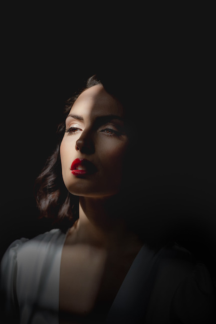
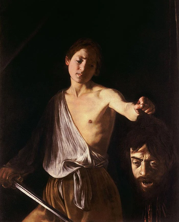
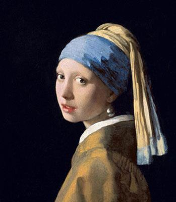
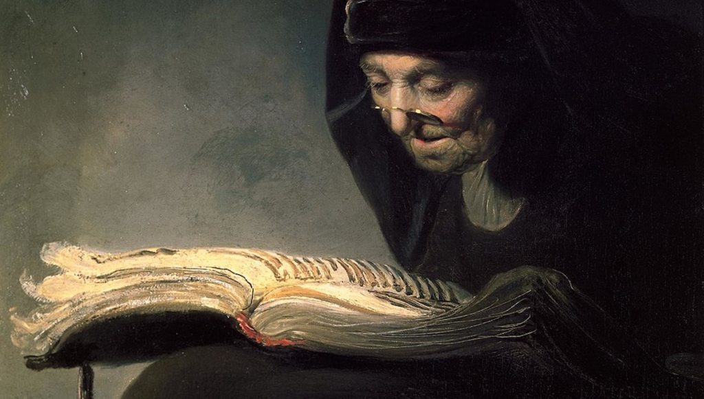
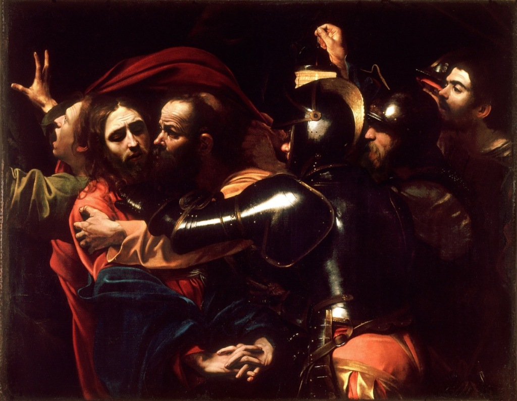
Chiaroscuro was a compositional device developed by Ugo da Carpi, however high renaissance artists Leonardo da Vinci was found out to have also helped to ‘pioneer’ the creation of Chiaroscuro lighting. Chiaroscuro is a renaissance painting technique which means “light-dark” in Italian. The theory of Chiaroscuro is that it is always best achieved by the effect of light falling on the model/ subject however it must also allow the shade to give two-dimensional figures a sense of volume.
How To Do It
Through my research I have found out that the most important elements of chiaroscuro lighting are:
(Definitions obtained from google)
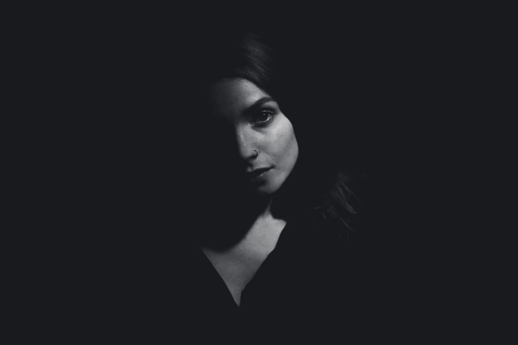
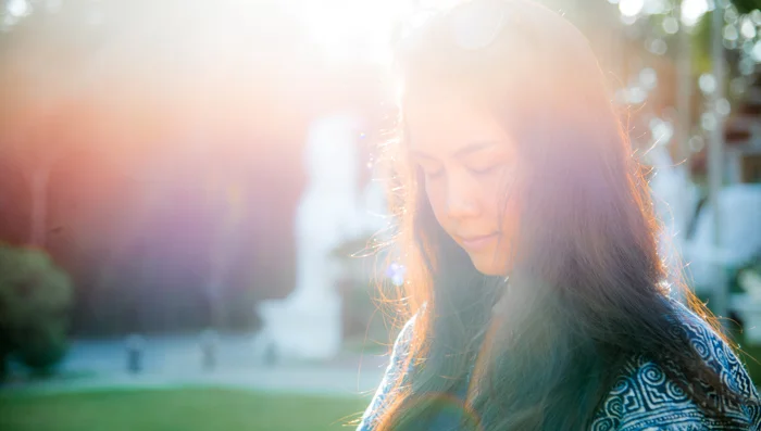
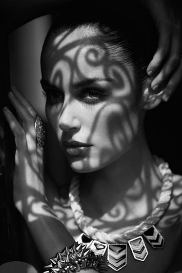
Creation and Development of Chiaroscuro
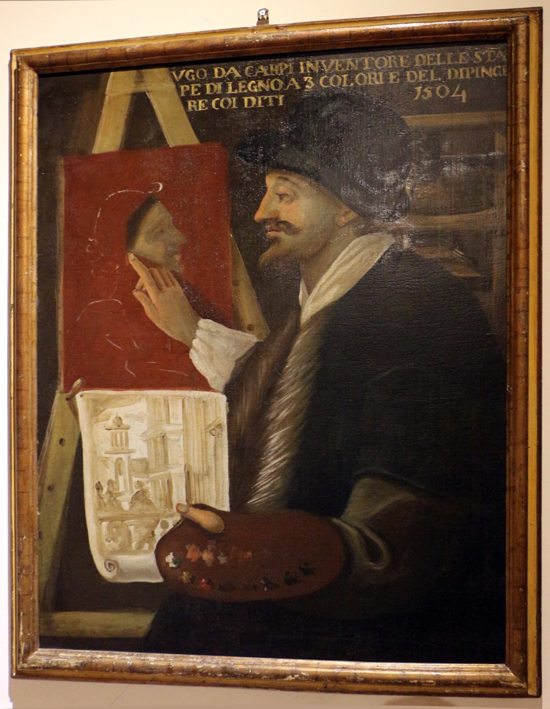
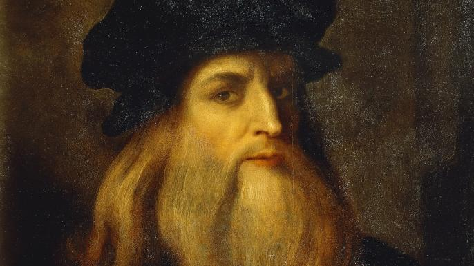
Chiaroscuro lighting is known as a ‘high-contrast’ lighting technique that uses a low-key lighting setup which achieves a contrast between the model and a dark background. Chiaroscuro lighting helps to balance its high-contrast light and its shade which gives the appearance of depth, creating an enhanced or more dramatic monochromatic effect.
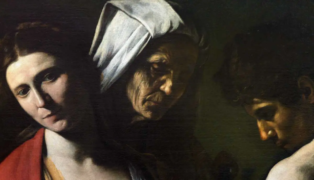
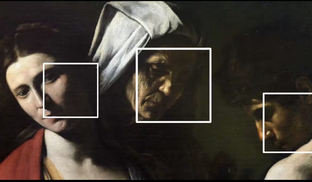
Da Vinci quickly discovered that he could create depth through slow gradations of light and shadow. He then decided to use this in his paintings, this is demonstrated in the painting below. The parts of the painting in the squares are the particular areas that highlight the chiaroscuro lighting technique and how Leonardo Da Vinci used it in his paintings.
Examples of Chiaroscuro Cinematography
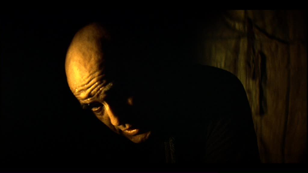
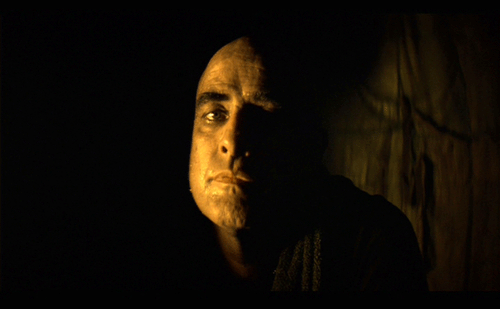
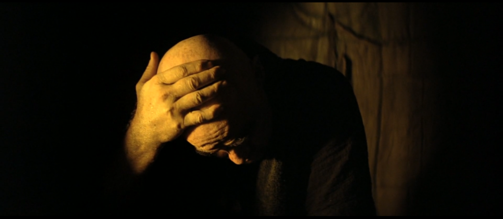
These images I have collected from a movie I have researched called ‘Apocalypse Now’ I chose this movie because I have seen the amazing cinematography throughout. Here are some images that represent the elements of chiaroscuro lighting in this film.
These photos are a perfect example of low-key lighting in cinema. During the ‘Willard’s scenes’ it shows the characters face is darkness apart from a small yellow back light, which lights up the image from behind with only the left half being illuminated. This element of chiaroscuro is shown by some parts of the face being shaded, some slightly exposed to light and some completely exposed to light. The creator made a challenging lighting scenario, however it has positively impacted the images as they create a sense of mystery melancholy and sinister impression . This has inspired me with my photography using the chiaroscuro technique.
My Chiaroscuro Photography
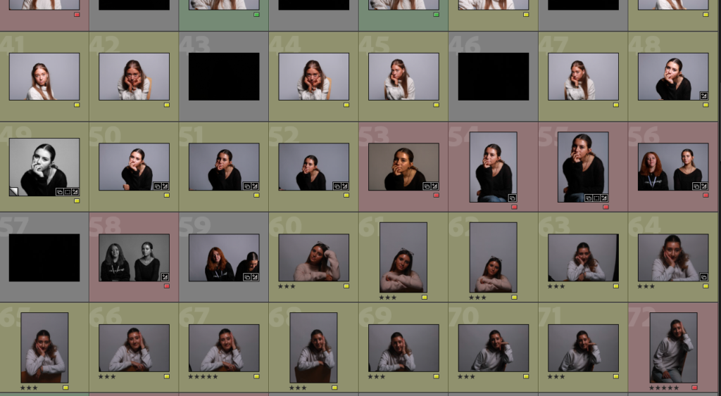
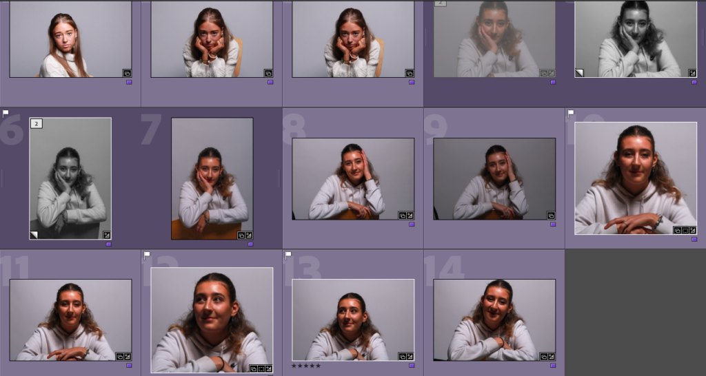
This is a virtual gallery of all the photos I have taken during my photoshoots. I labelled these photos with multiple different colours. I labelled my Rembrandt lighting photos red, my chiaroscuro lighting images green and my butterfly lighting photos in blue. I also then labelled some photos in yellow, this was for photos that include none or multiple of these lighting techniques. This is an easy and simple way to identify images and separate them into different categories. I then categorized them further with stars. This helps me to further categorise my photos and easily pick my highest quality photos. I categorised these by having my best images at 5 stars ‘*****’ and my least favourite, low quality images at 1 star ‘*’.
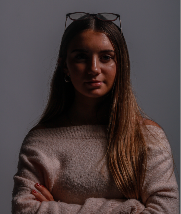
I think this photo is a perfect powerful stance for my model. It is a beautiful 1/4 body shot which demonstrates power through her pose and the chiaroscuro lighting.

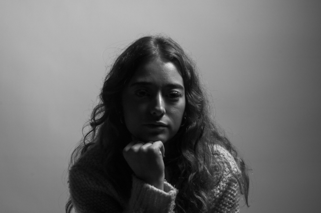
I then took these chiaroscuro inspired images and edited them into black and white, this black and white effect has added an extra element of wonder and dramatic impressions. I think the lack of colour has brought out more contrast and has given them more cohesion to the overall look of my images.
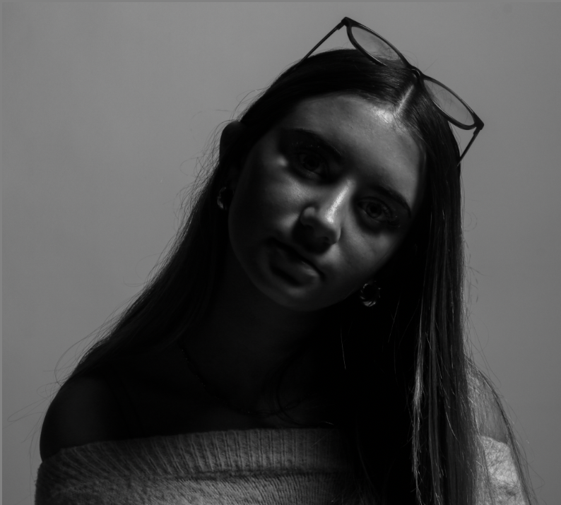
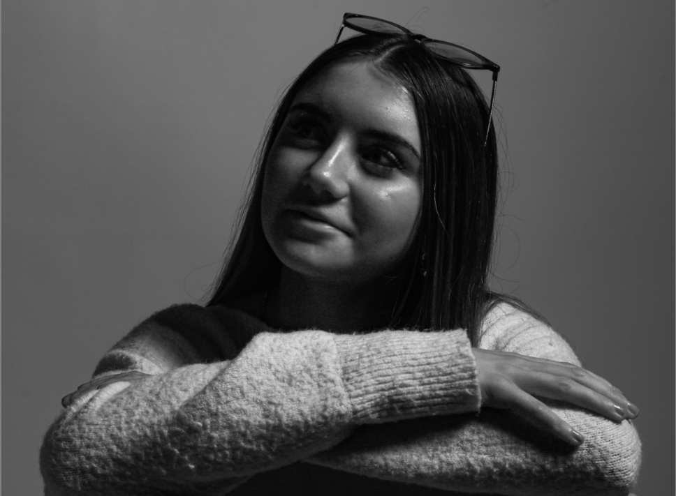
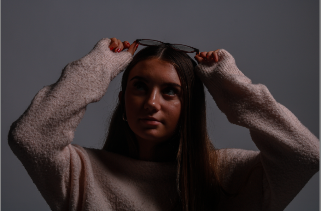
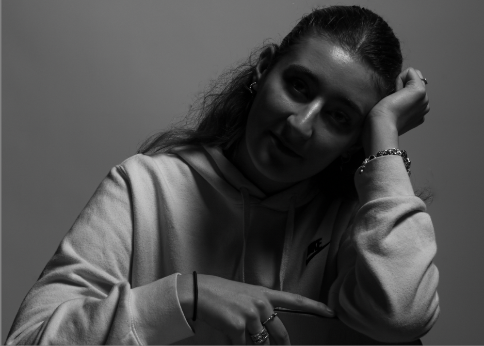
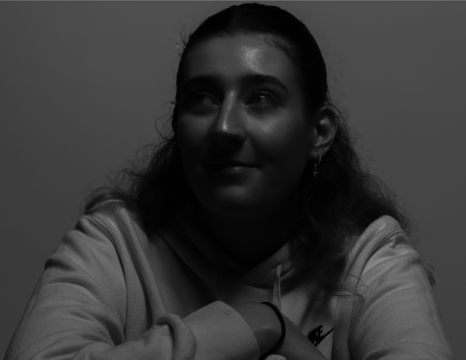
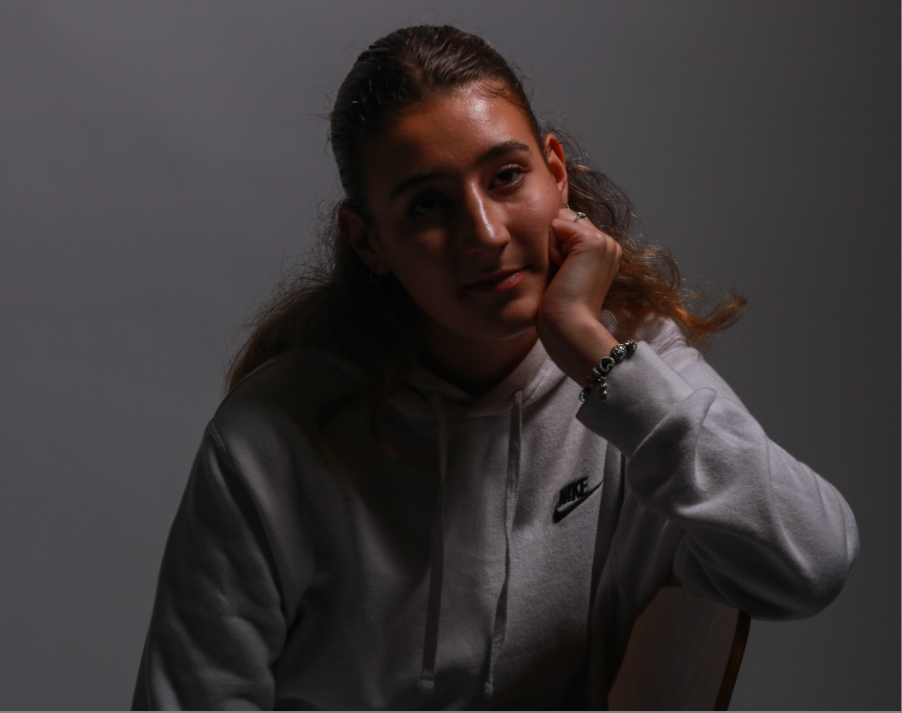

These photos I think perfectly demonstrate chiaroscuro lighting, the way some parts of her face are shaded and some are exposed shows this interesting and mysterious impression about my photos. I think that the lighting technique of chiaroscuro is definitely a great method in accentuating form throughout my photography and editing. Chiaroscuro lighting also will help draw viewers’ eyes to things they might not focus on otherwise in my photos.

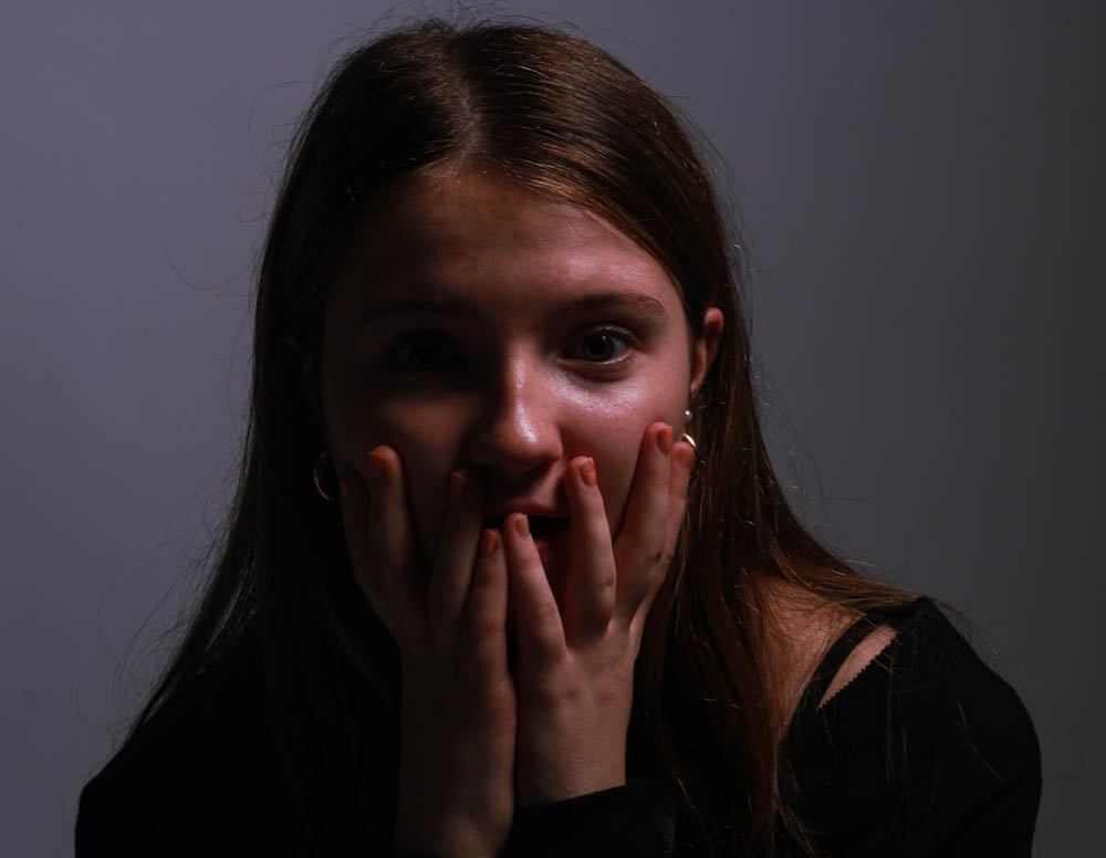
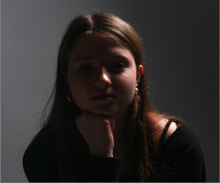
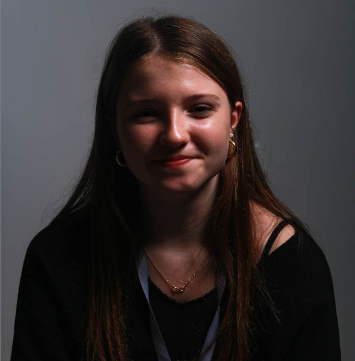
I think in order to take my work to the next level when it comes to Chiaroscuro, Rembrandt and Butterfly, I should use a reflector, this includes another person helping and holding a reflector that looks like this..
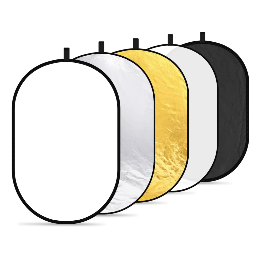
These photography tools called ‘reflectors’ help to redirect light onto my model, I must remember that it does not It doesn’t create any light but it will move and redirect light that is created by a flash head create fill light and lessen shadows.
I organised all of my Chiaroscuro images into one colour so I could easily see them all and figure out which ones had the best lighting.
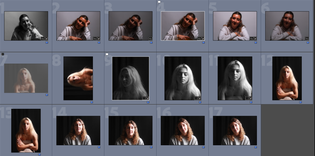
MY FAVOURITE IMAGES:
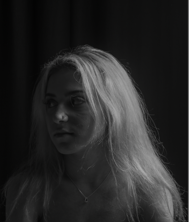
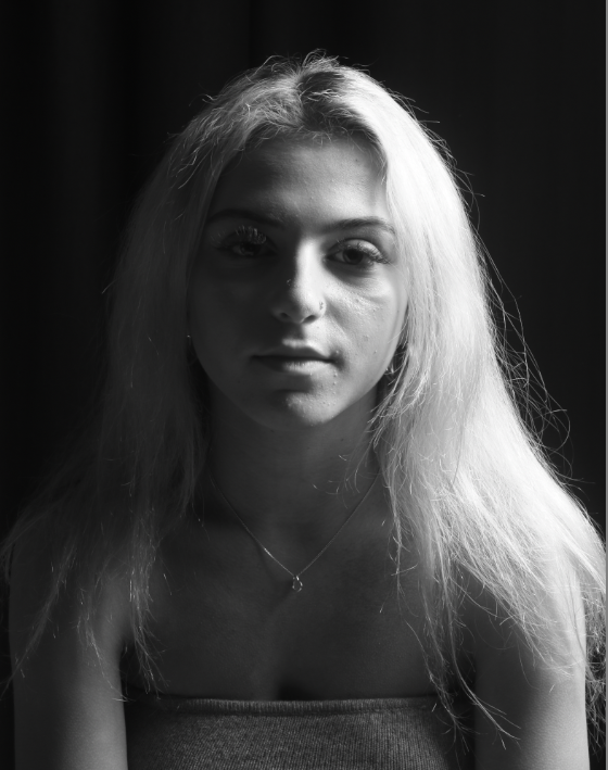
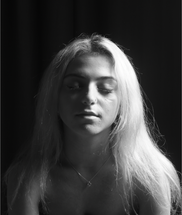
I thought these 3 images were the best out of all the others. Although they are similar in the way that they are the same position and person, however I liked the way they went together. In the first image, as she is blonde this has reflected well off of the light and only lights up part of her face as she is turned away. In the second, the lighting has been completely split down either side of the subject’s face which I really liked. In the last image, I got her to close her eyes as this made the darker part of her face almost disappear which I thought was effective. They didn’t need much editing as the placement of the lighting along with the black curtain behind worked well together.
The original images:
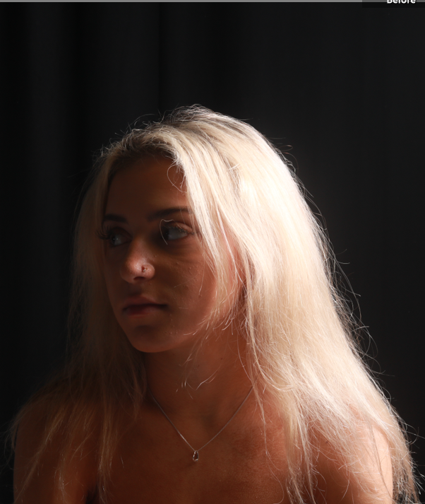
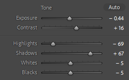
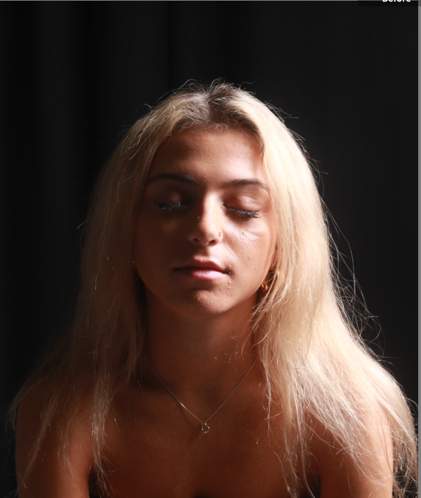
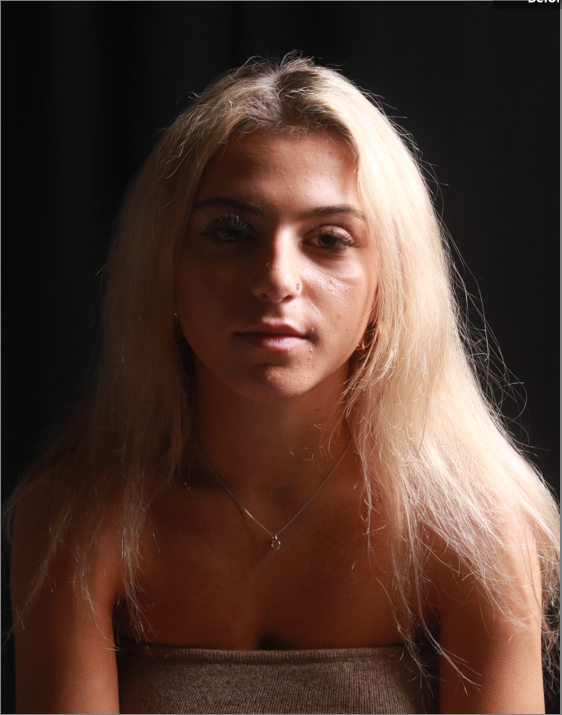
These two images didn’t require any editing.
I colour-coded all my images so I could see which ones I preferred over the ones that were the worst and could easily see them.
MY FAVORITE IMAGES:
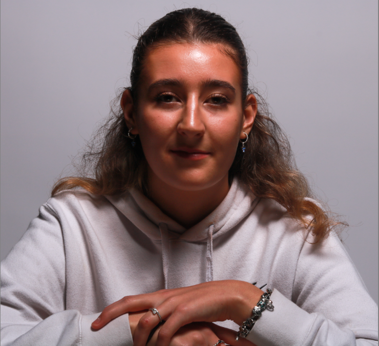
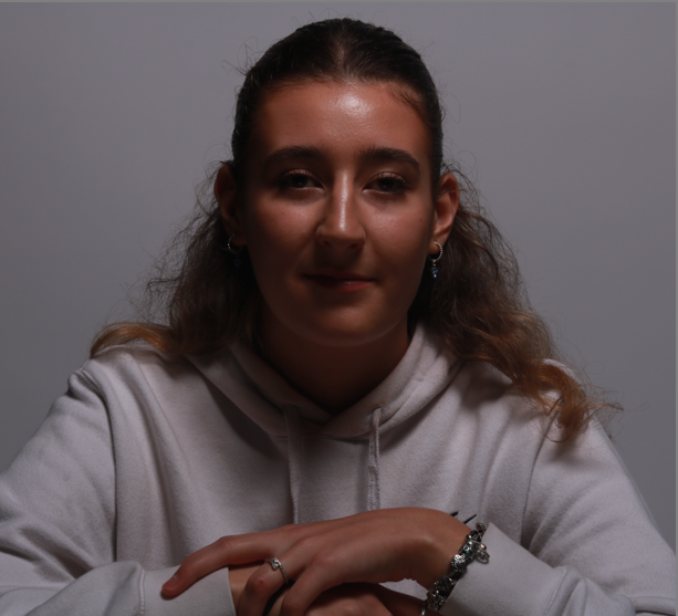
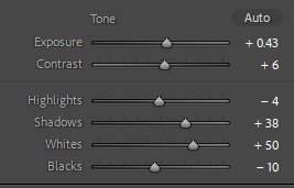
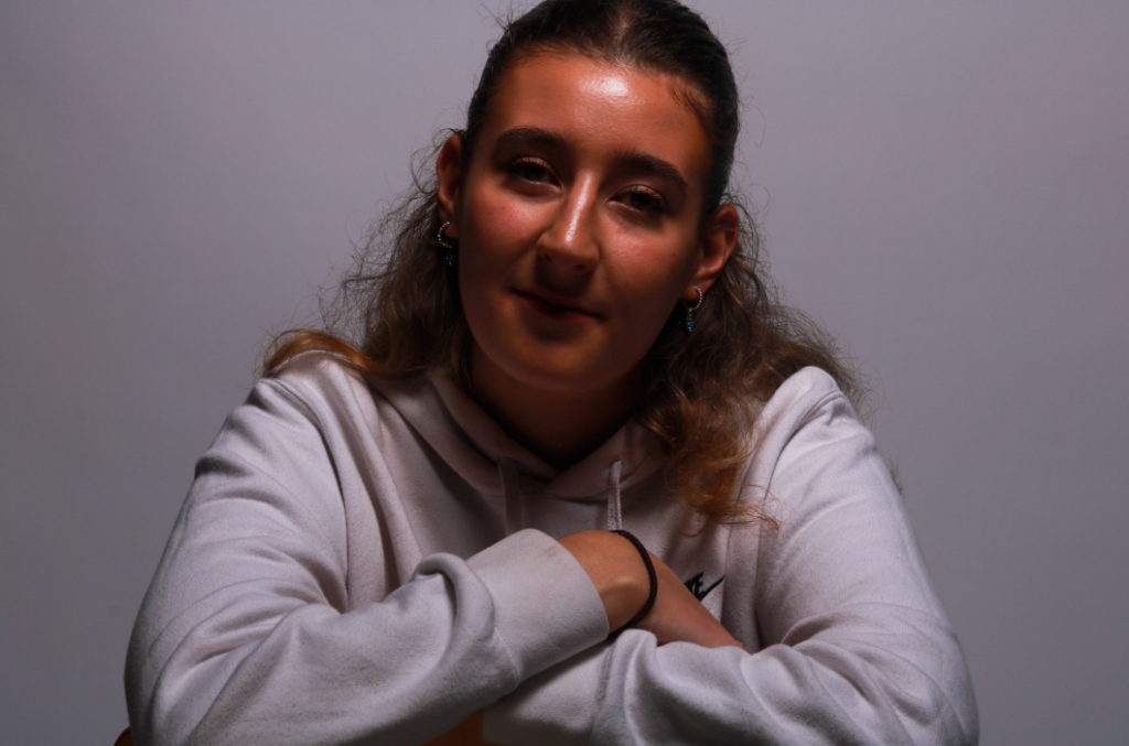
I like the way her hands are included in the image in a relaxed way as I feel it adds more to the image and fills up what would’ve been empty space. I like the way they are curved on top of each other and you can see her jewellery as I feel like this brings more life to her character. She has a very relaxed and neutral expression and is central. I cropped the background so that she was the main focal point of the image. The position she is sat in is quite powerful as she is straight on from the camera looking right into it which I really liked.
Original image:
MY SECOND IMAGE:
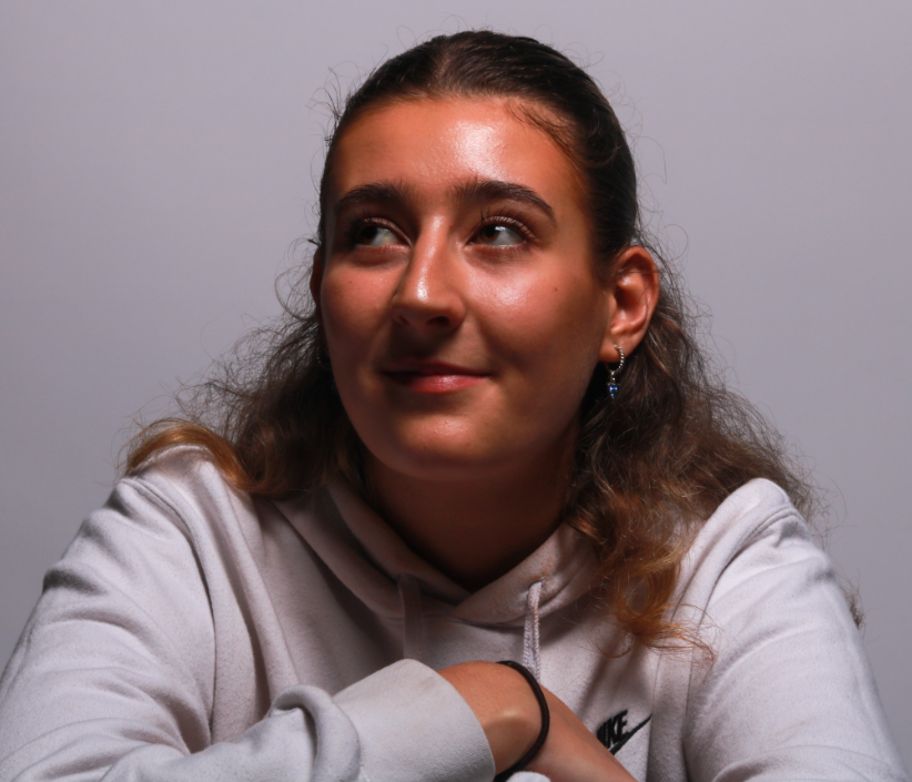
I really like the way she is looking to the left of the camera because a lot of my other images are looking directly forward and the light is bouncing off her face more. Her cheekbones have been darkened alongside the butterfly shape under the nose so I know this technique has been successful. I cropped the background so she would be more central to the image. Instead of a neutral expression she has a slight smile which I also really like as it is more natural instead of being neutral and lifeless.
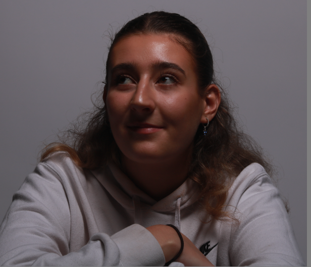
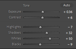
The final images:


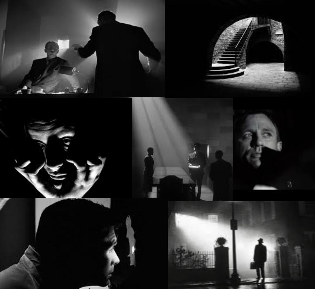
Chiaruscuro Is an Italian word used to describe the use of light in dark in artwork. It combines the Italian words: “chiaro” meaning “clear” or “bright,” and “oscuro” meaning “obscure” or “dark.”
There were a few famous artists at the time Chiaruscuro was introduced but none were as good as using it than Caravaggio.
Chiaroscuro lighting technique was used in films very commonly. As shown in the photos above, it’s common that the lighting used is natural light coming fro, certain places such as through a window or a gap where the sky is visible.
How to set up a Chiaroscuro Lighting studio:
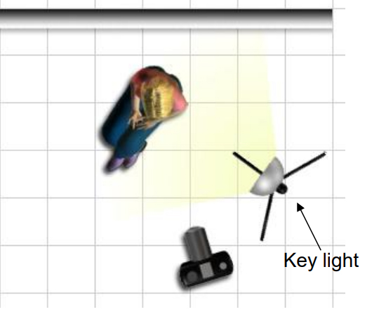
By using artificial light with aid of a flash, Chiaroscuro lighting is very simple to create. The shutter speed should be set very high to remove any ambient lighting. this means any light picked up will only be from the flash. Light cross your subject from only one direction. this is usually taken from the side or on an angle.

My Chiaroscuro Lighting photoshoot editing:
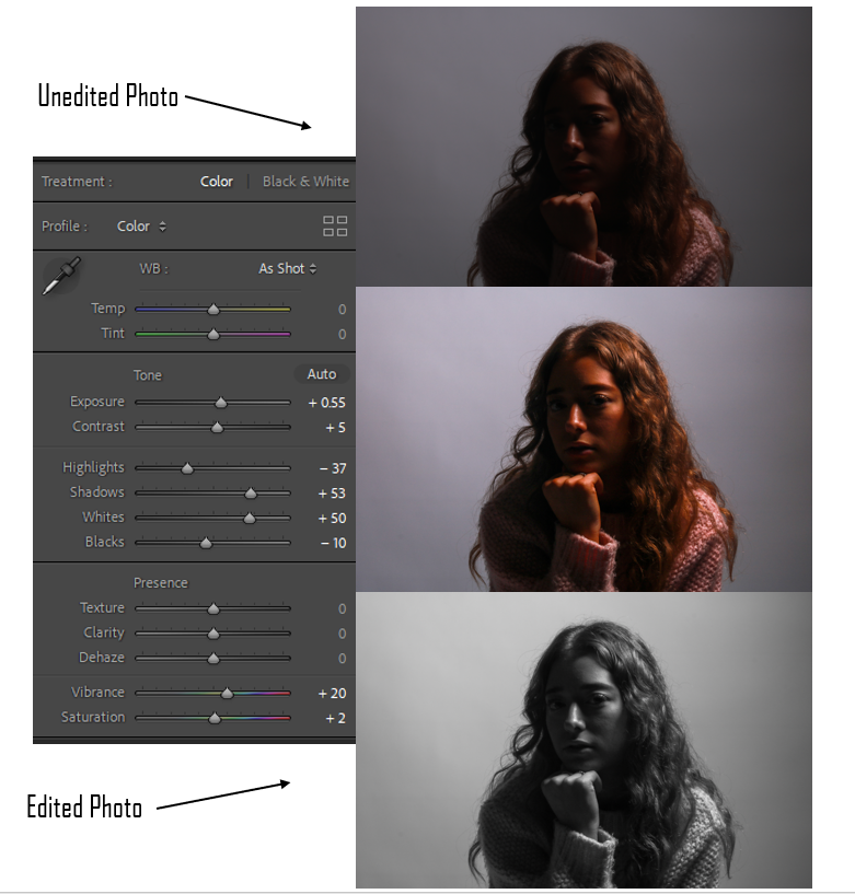
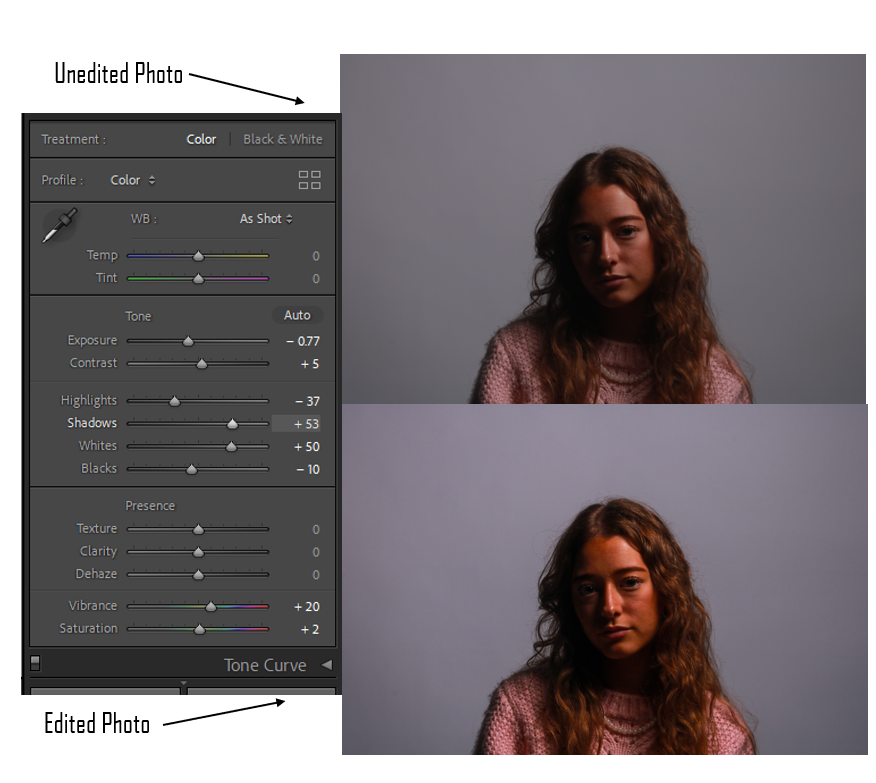
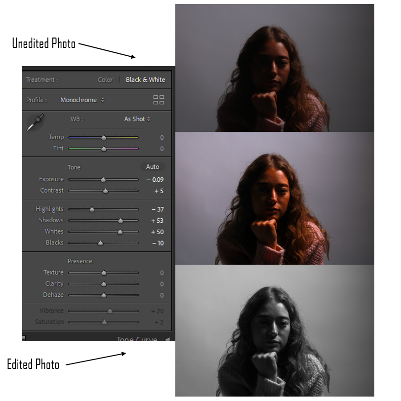
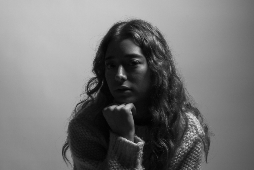
This is an example of Chiaroscuro lighting as the side of her face closest to the light. I placed the flash light at an angle to capture this type of lighting. I think the position of the subjects head also adds to the lighting as all the light is absorbed by only one side.
I decided to make this photo black and white to further show the contrast in the light and dark.
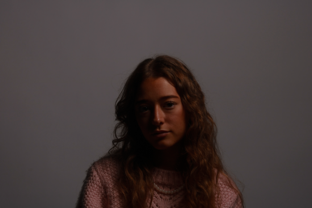
Though many Chiaroscuro lighting photos are edited to black and white, there are still some that remain in colour. For this photo I decided to keep it at the original colours so that I have a photo that differs from the rest.
I like this photo because the subjects face is directly facing onto the camera but the positioning of the light is still managing to capture the contrast of light and dark.
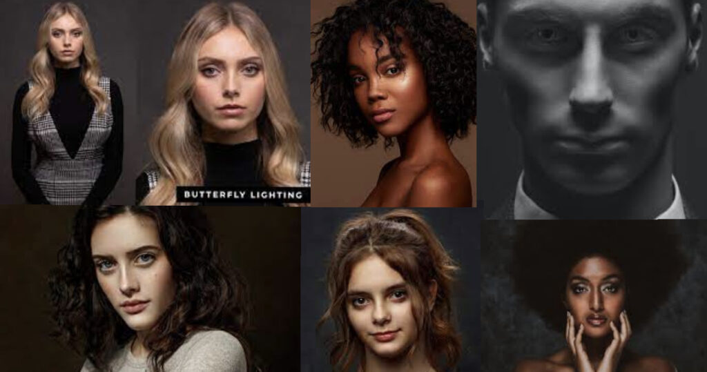
butterfly lighting is a pattern in photography where the lighting sits above and pointing down on the subjects face. This creates a dramatic form of a shadow under the nose and chin which gives it a pattern on a butterfly. It is also given the name “paramount lighting” named for the Hollywood studio for how they lit up the actresses.
Marlene Dietrich, a German silent film actress, was one of the first people to be taken a photo of using this photography lighting technique. director Josef von Sternberg Was the one who would light her up in this way.
How do you set up a Butterfly Lighting photoshoot:
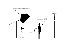
By using artificial light with aid of a flash, Butterfly lighting is very simple to create. The position of the Lighting should be directly in front of the subject and angled above them to create the shadow of a butterfly under the nose. If you find that the shadows created are a little too deep, then another subject could be there to aid the photographer with a reflector to hold below the subjects face.

Butterfly Lighting Photoshoot Edits:
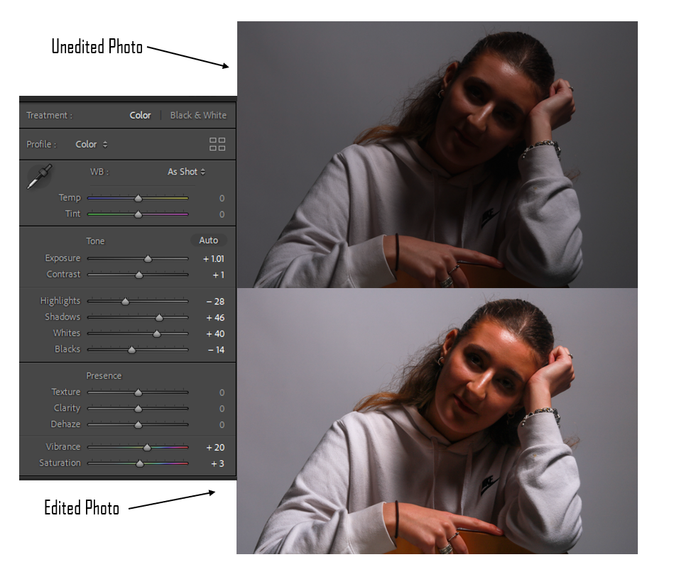
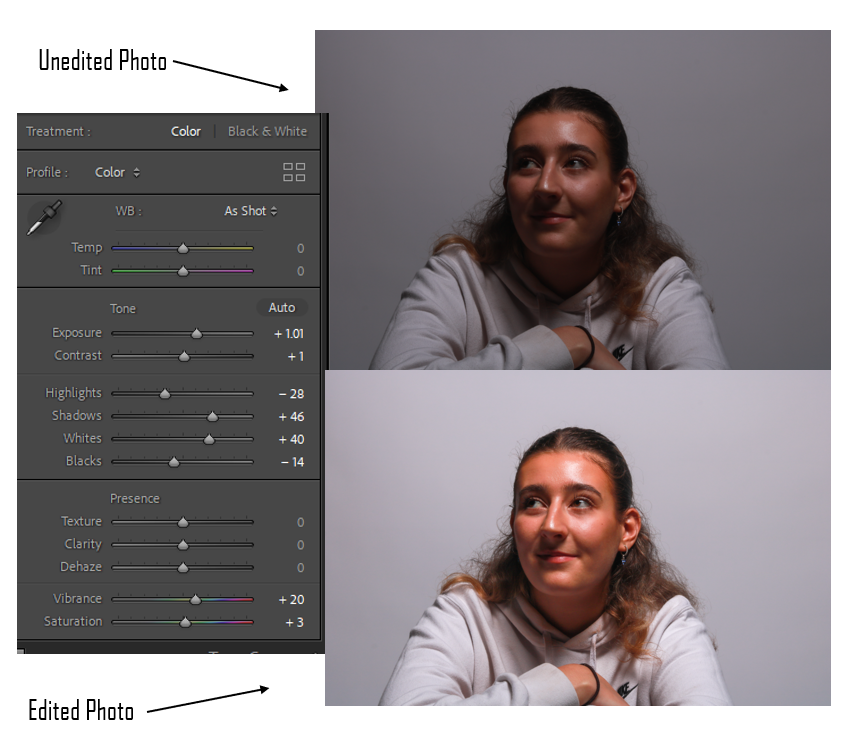
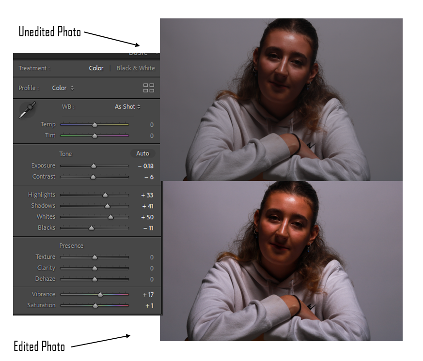
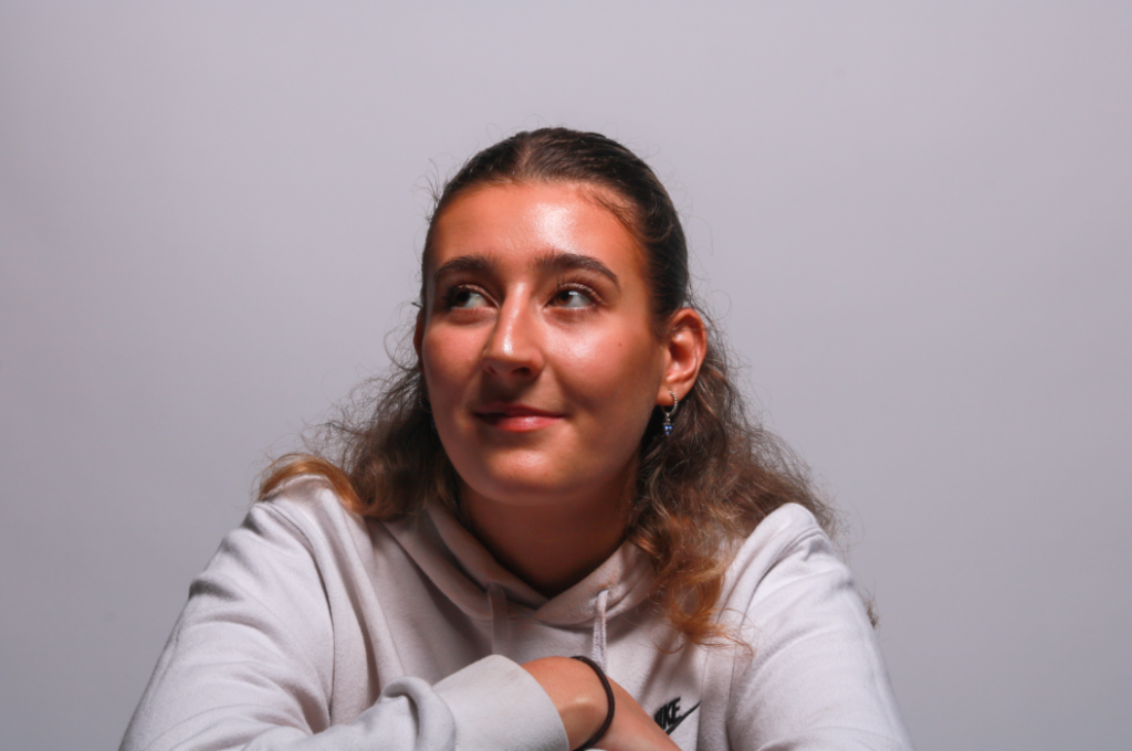
For this example of Butterfly lighting, I placed the lighting directly I front of my subject and angled down onto her face. as you can see in the image, the shadow has been created under her nose. I slightly experimented with the poses of this shoot and got my subject to look upwards diagonally. thought this still worked, I think the shadow would have been dominant if she was facing straight on.
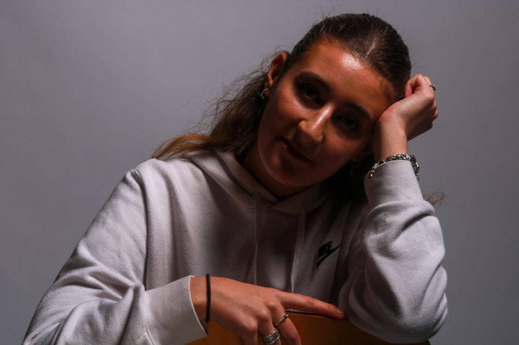
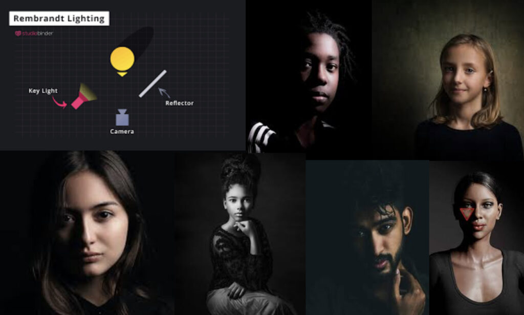
Rembrandt lighting is a technique utilizing one light and one reflector or two separate lights. It can make images look dramatic but at the same time still natural. It’s usually characterized by a lit-up triangle underneath the subject’s eye which is shown in one of the photos above.
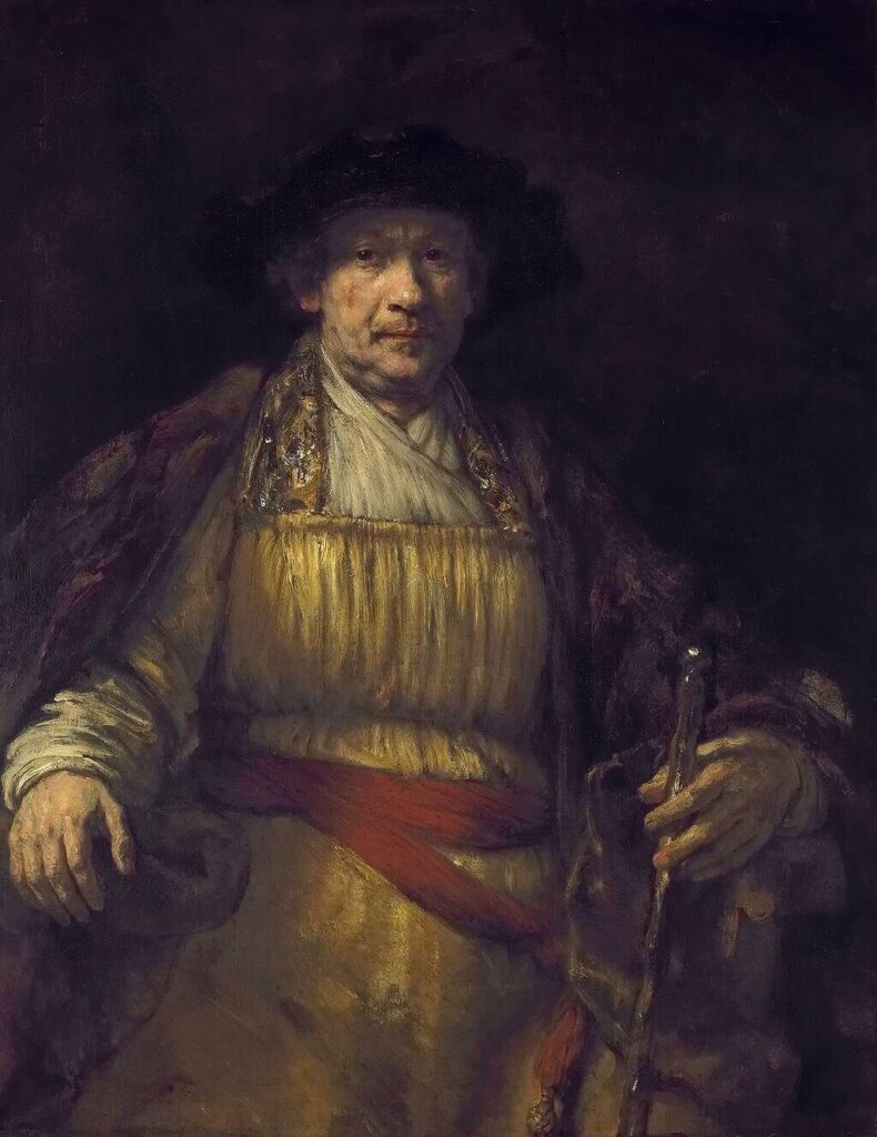
Cecile B. DeMille introduced Rembrandt lighting into photography. Rembrandt photography originated with the famous Dutch painter, Rembrandt. You can locate the triangle of light under his left eye in the self-portrait below.
How to do Rembrandt Lighting:
How to set up a Rembrandt lighting photoshoot
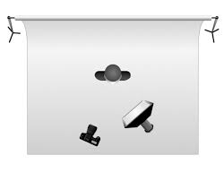
To create a studio portrait using the Rembrandt technique, you should place a single light source on a 45 degree offset from the subject, about 5 feet away. Its said to be more effective if the light is around 2 feet higher than the subjects eye level. the light should be angled slightly and you should aim for it to hit the side of the face that’s furthest away from the light source

Rembrandt Lighting photoshoot edits:
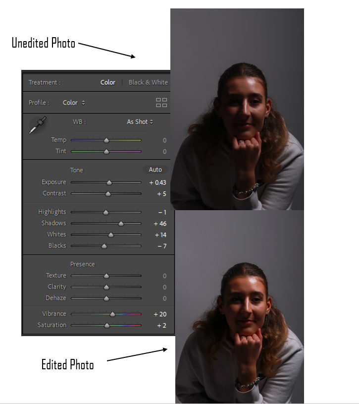
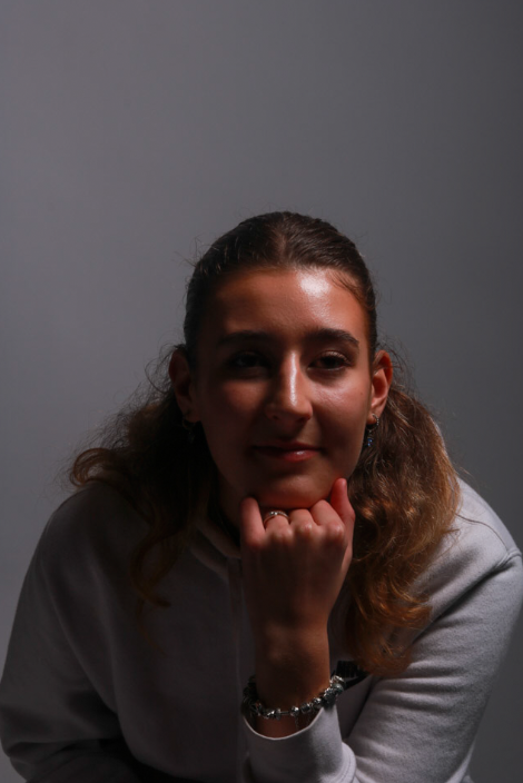
As you can see on the left side of the photo. The subjects face has been well lit up to create the Rembrandt effect. The upside down triangle under her right eye is very visible to the viewer and will make it fairly obvious of the lighting technique that has been created.
I also like this photo because its a different pose compared to the usual basic look at the camera.
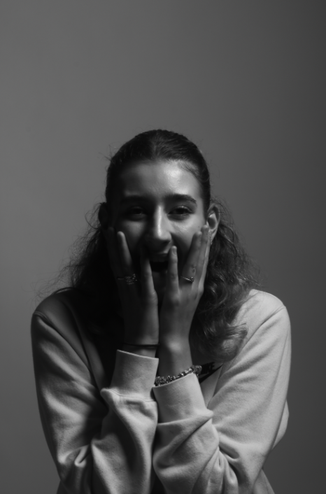
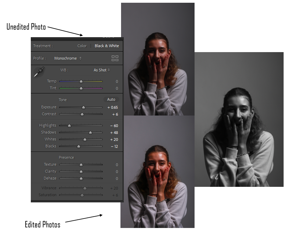
I decided to make this photo black a white so that it could experiment with the different effects on my photos. The upside down triangle has also successfully been created on the subjects right eye and it very clear. I think the poses and position of the subjects hands have also added to the effect of the triangle as her fingers outline it and make it more obvious to the viewer which I think worked really well.
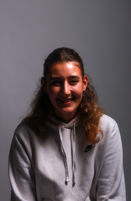
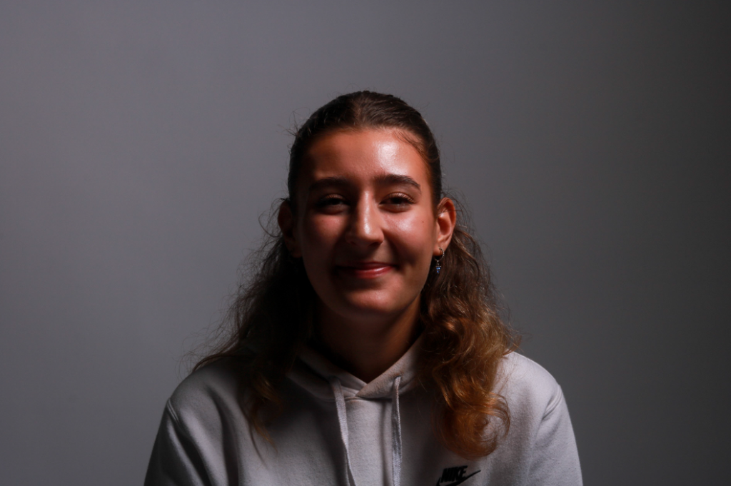
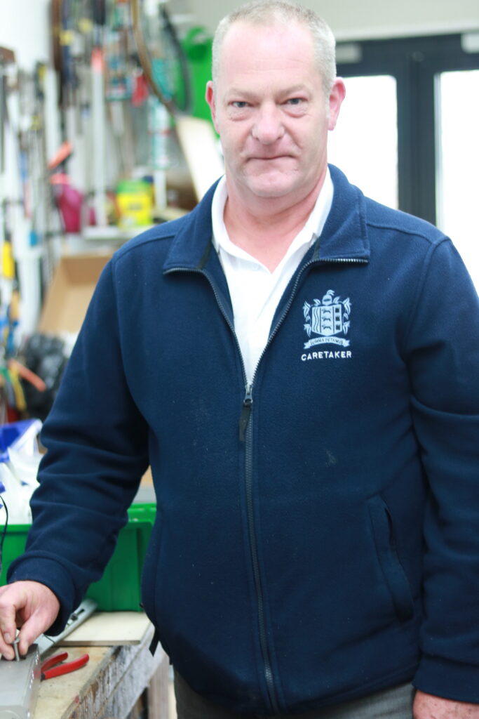
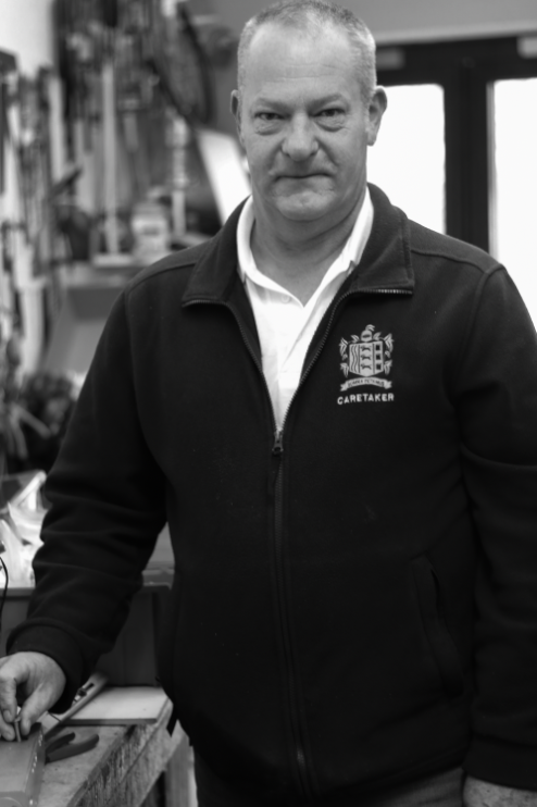
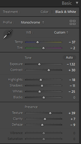
For this photo I changed the colour to black and white to make the photo look moody as he isn’t smiling in the photo. I added texture to display the image better.


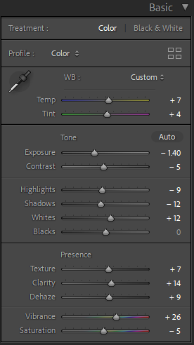
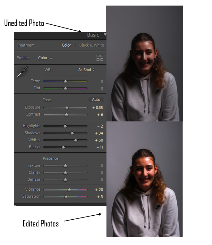
For this photo I added vibrancy into the photo to make all the colours pop more because she was smiling and is a happy lady so it matched the vibe.
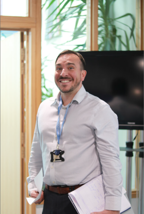
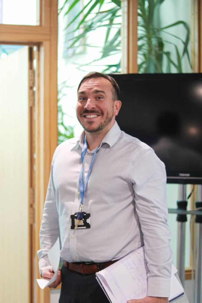
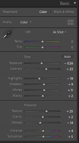
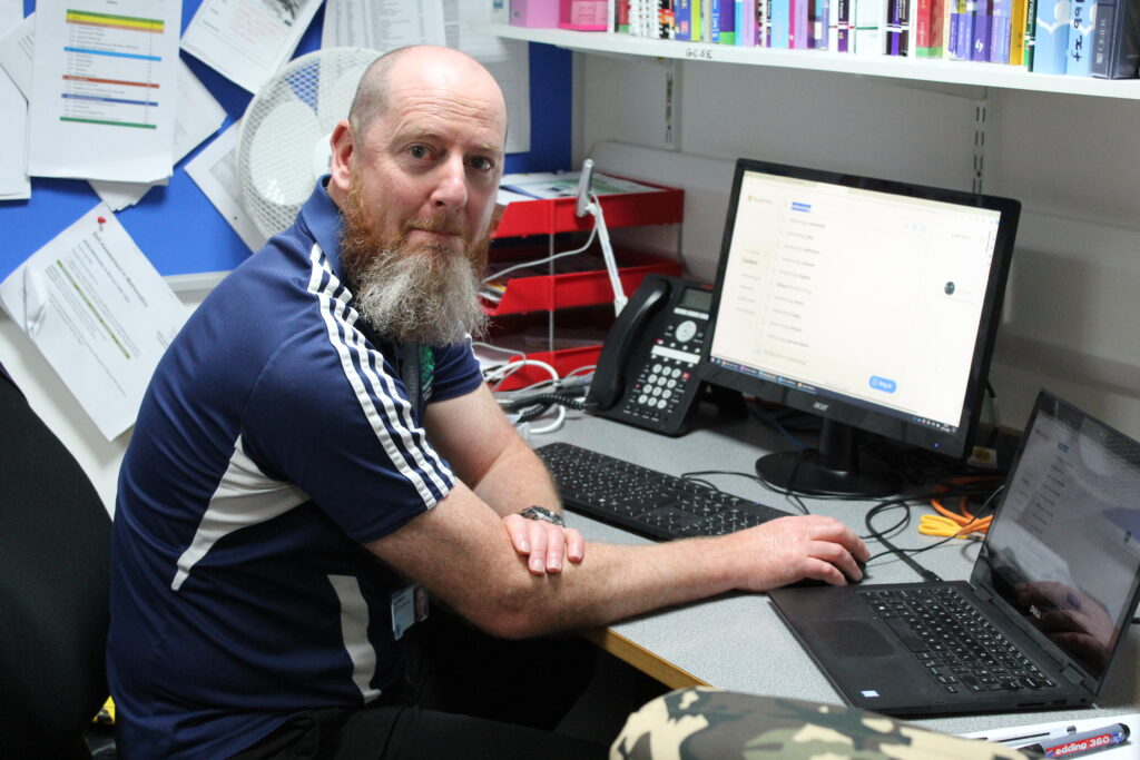
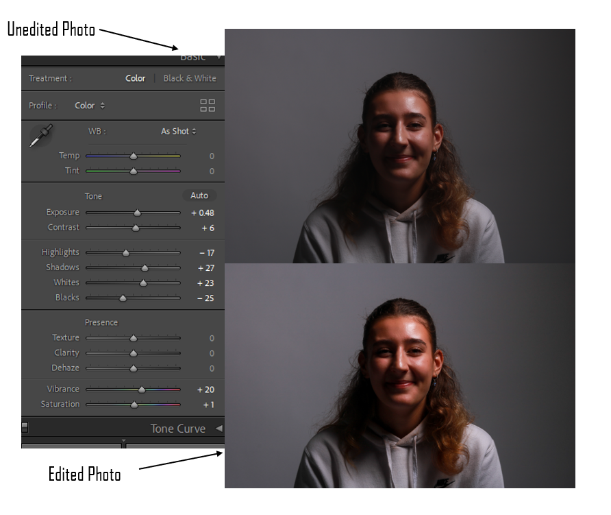
For this photo I didn’t feel the need to edit much as he is in a normal environment and he is smiling so all I did was make the photo clearer and a bit brighter.
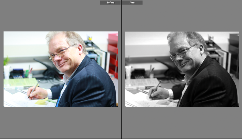
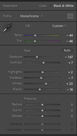
For this photo I made it black and white because I think it looks really good like that. The black and white photo makes the photo have an older vibe which makes the photo look very good as it fit well with the teacher.
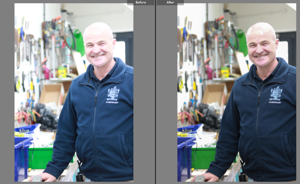
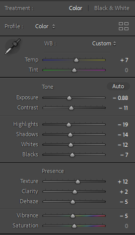
For this photo I turned down the exposure and highlights because the original photo was very bright and it didn’t look good. I turned up the temperature for a warmer vibe to the photo as he is happy and smiling so it makes the photo look really warm.

These pictures are my flagged pictures because they were my favourite photos and they definitely looked the best out of all my pictures they were also the clearest and the best ones taken.
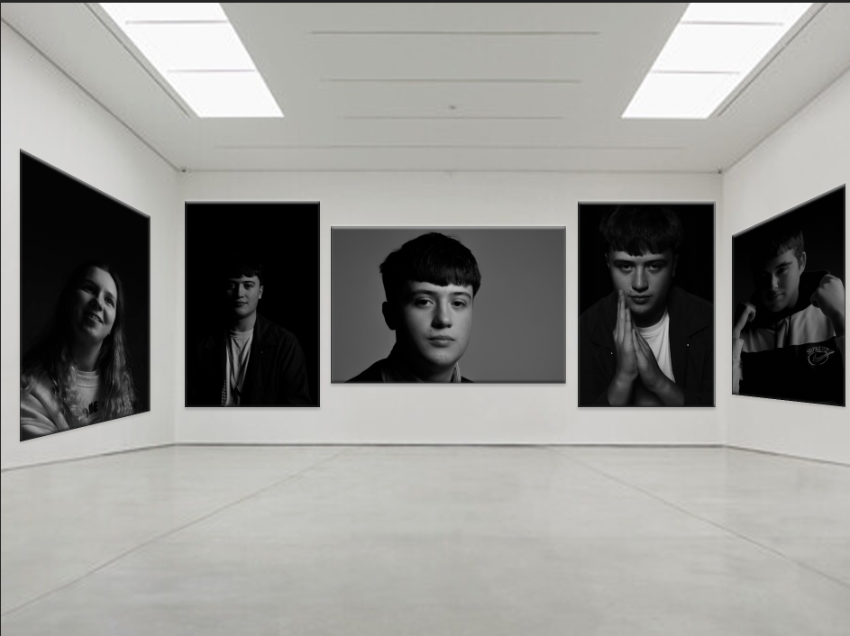
These are a few of my best and favourite edited portraits, I have presented them in a gallery form, and most are in black and white, all the ones that are presented are, because I saw it as inspiration. I also edited in colour as well and these were just the best ones in my opinion.
From this topic I have learnt a greater understanding about different lighting such as, butterfly, Rembrandt, and chiaroscuro. And even learnt more about my camera handling skills, and become more comfortable with it.
Critique
I like them all but there is room for improvement always. I think that the one in the middle of George isn’t clear enough that it is Rembrandt lighting, there is a large triangle on his cheek but it isn’t defined so if I was to retake the image I would bring the light closer to his face making the triangle smaller and clearer.