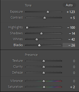
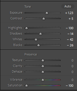
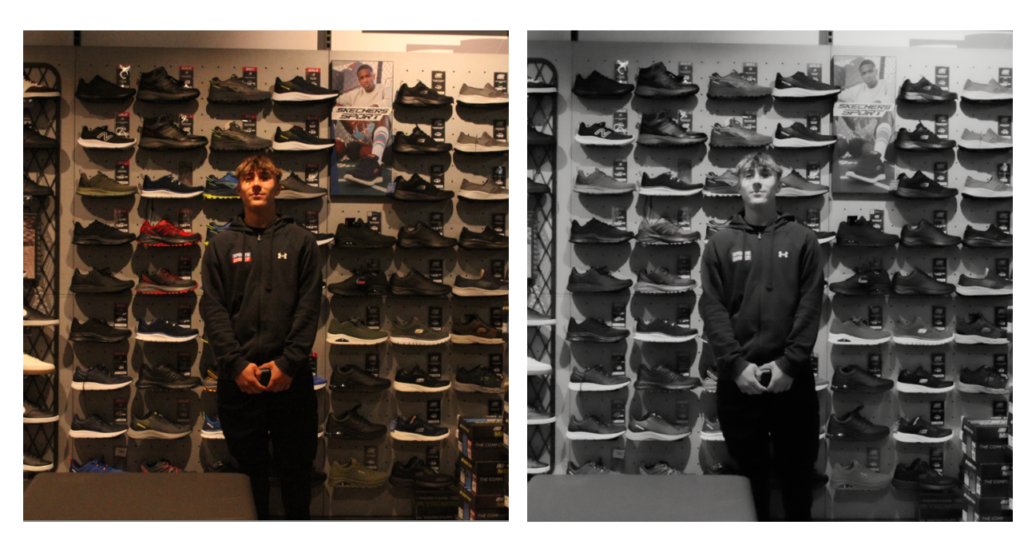
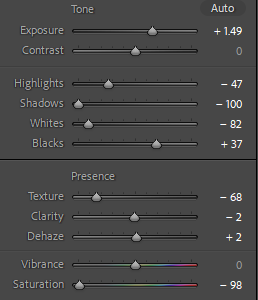
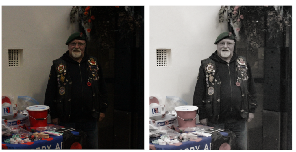
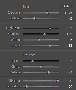
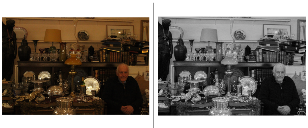
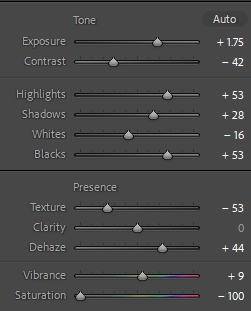
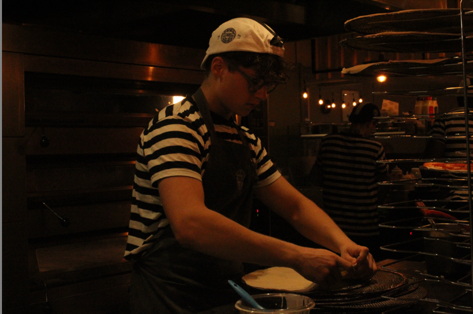
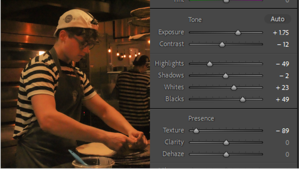
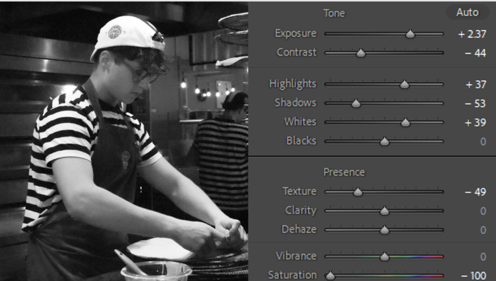
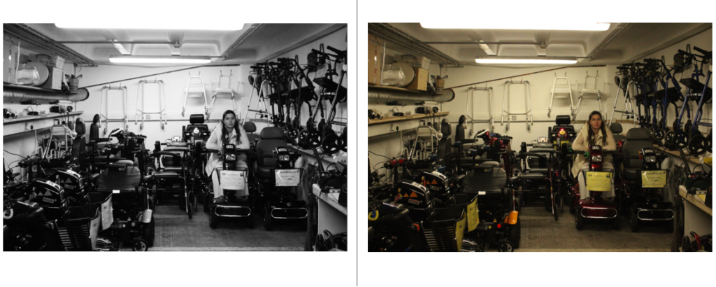
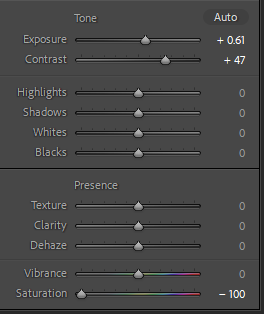
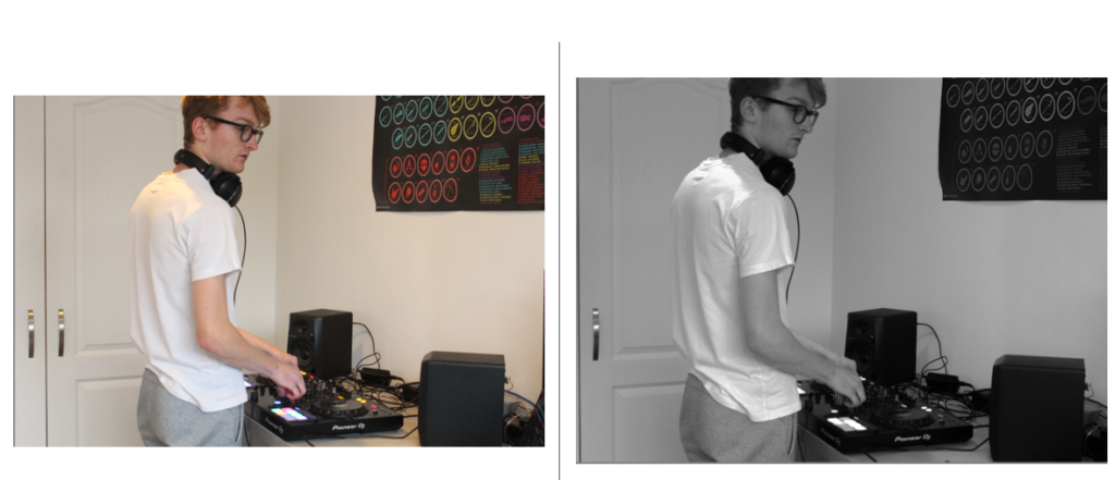
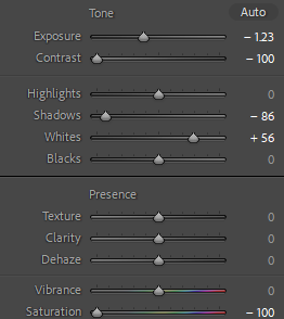
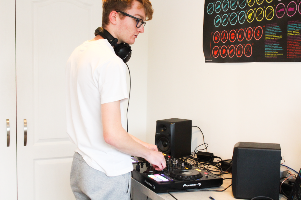
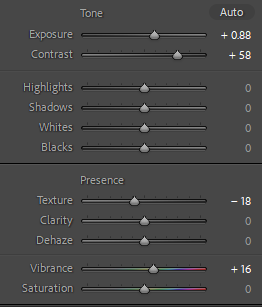
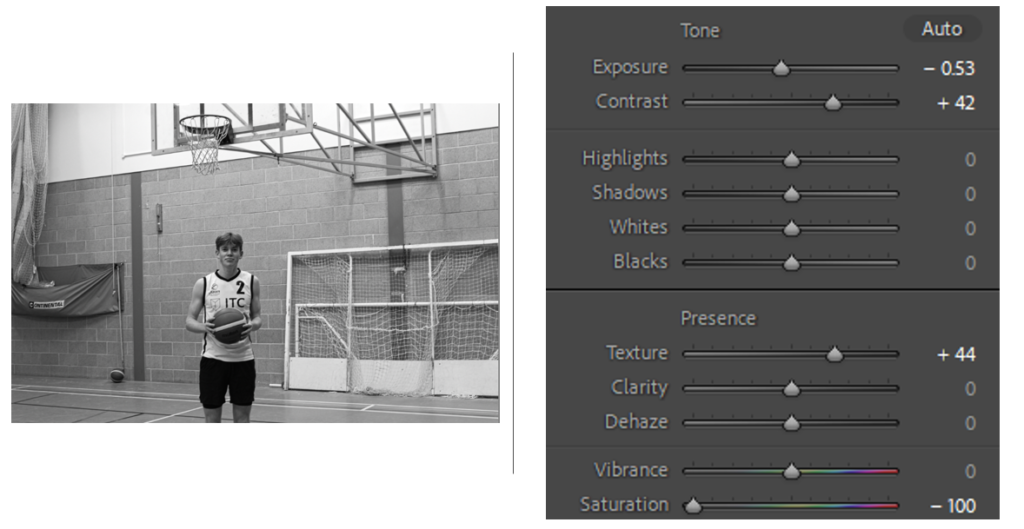
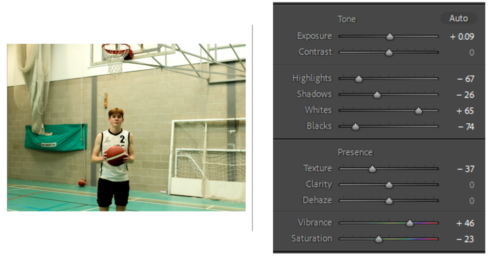
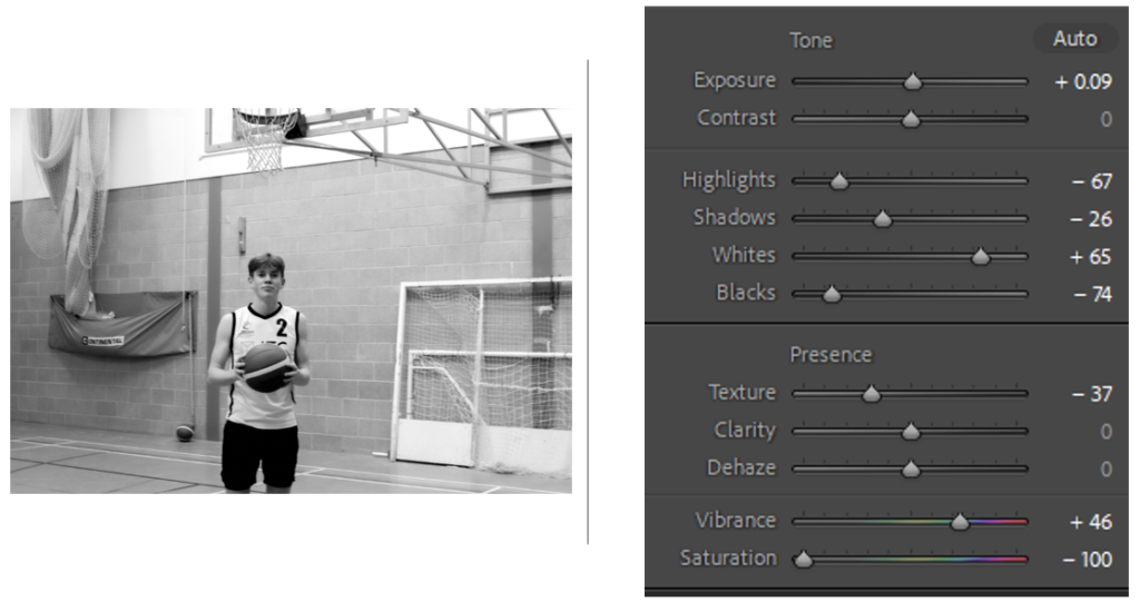
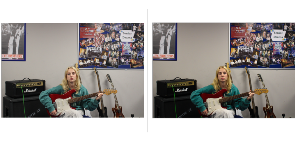
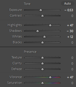
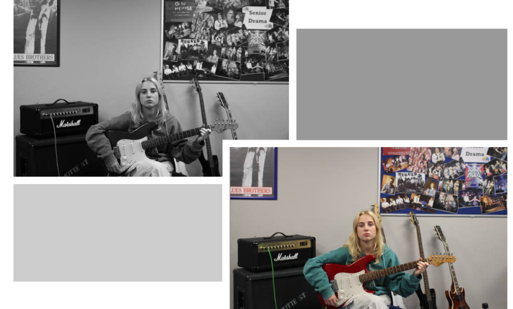
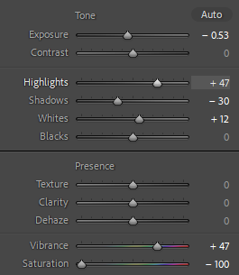
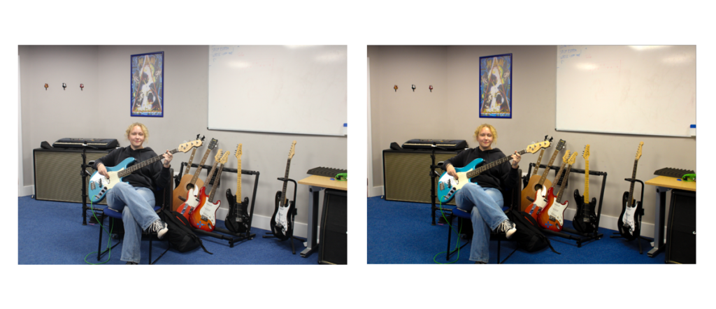
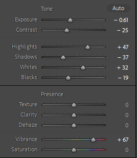
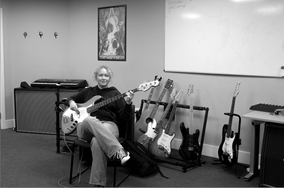
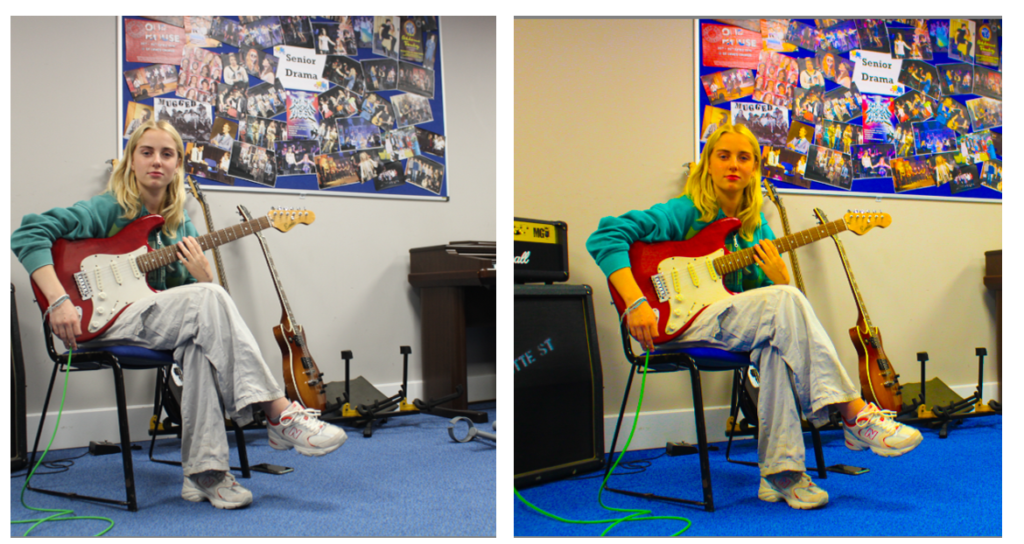
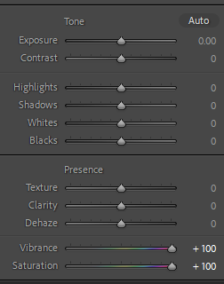
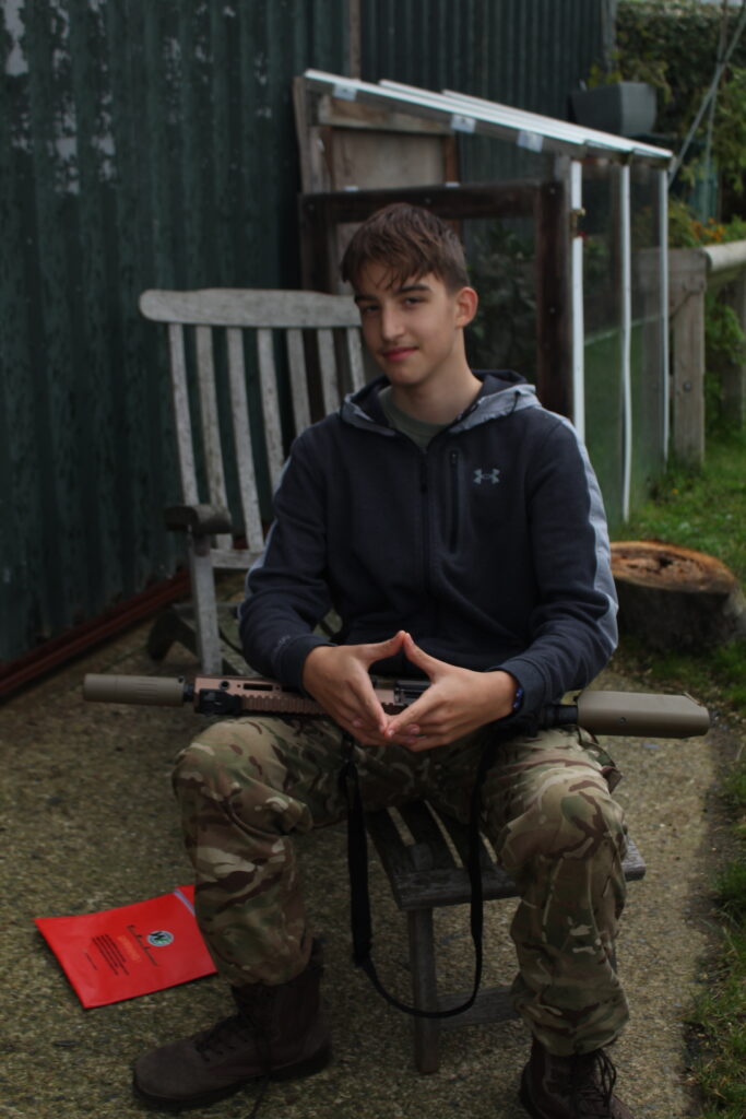
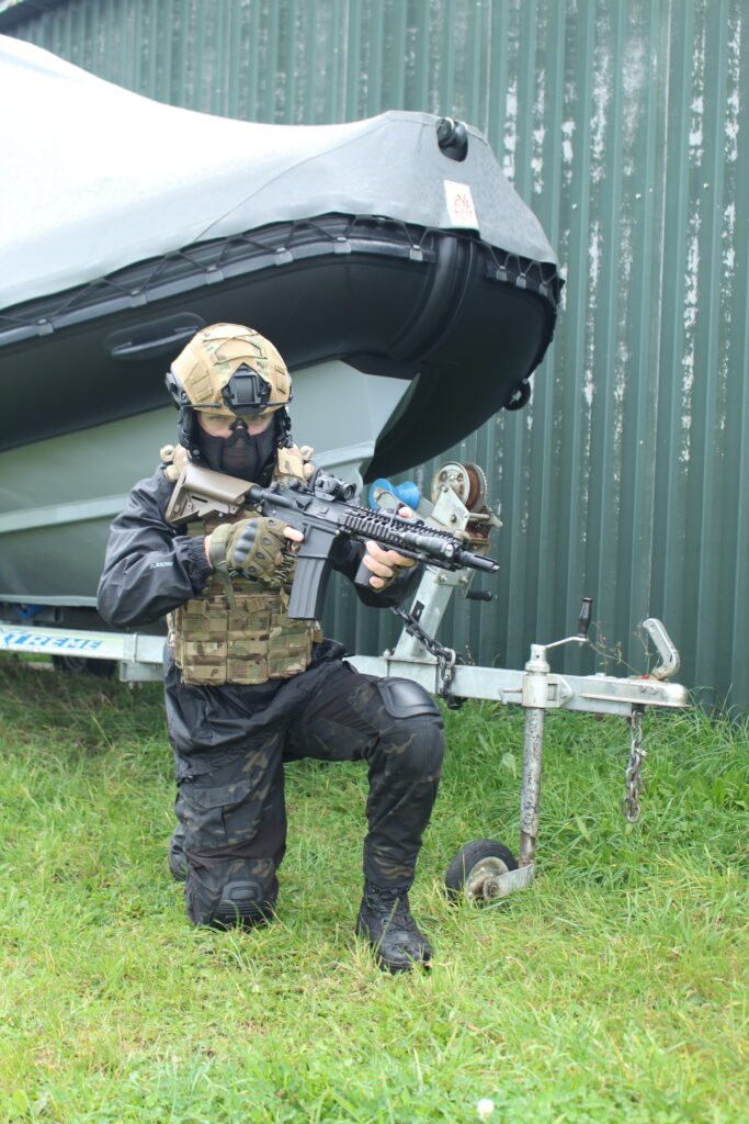
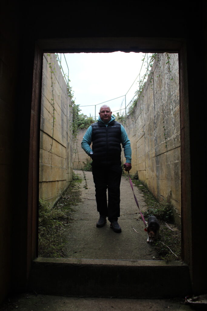
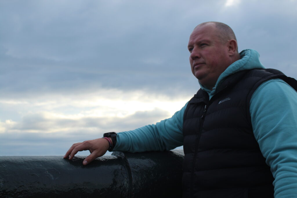
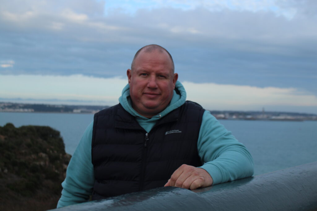
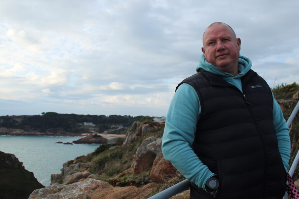
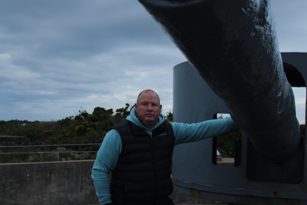
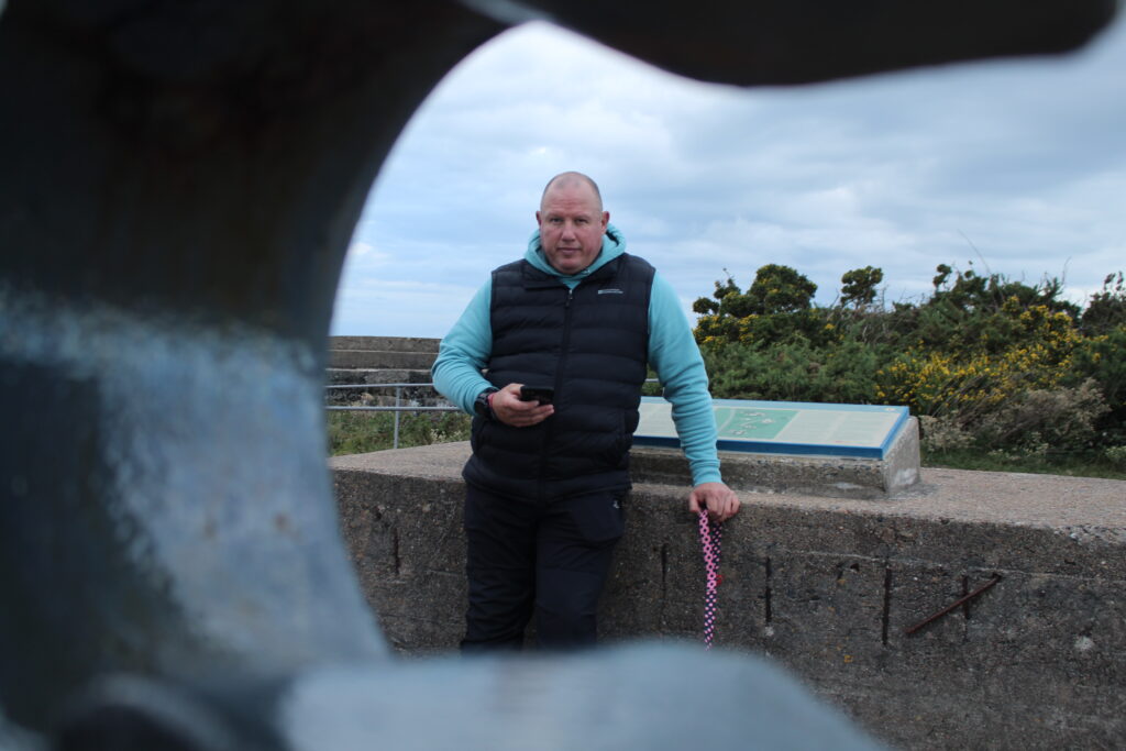
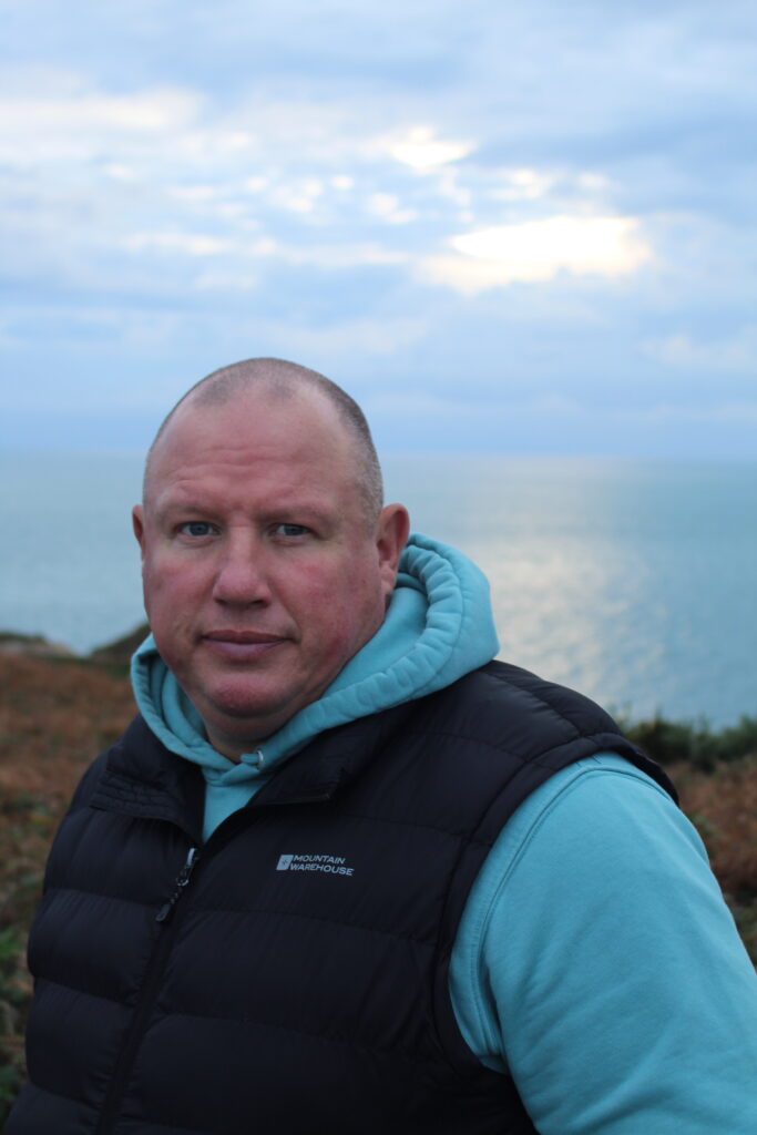
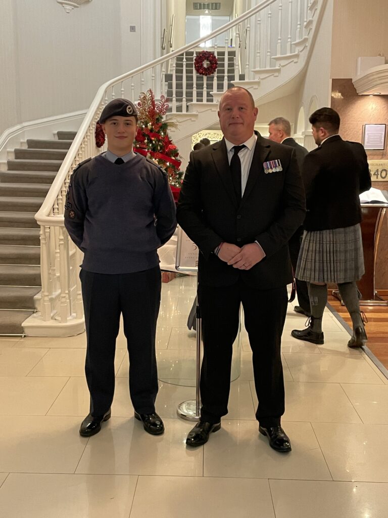
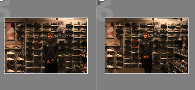
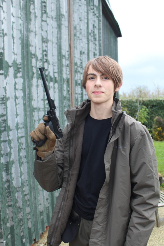
For this photo I really liked it and thought it would really work being black and white but I hated how there was a gloomy dark background not making him or the environment stand out enough. I also thought that it would look cool in black and white but to have the subtle vibrancy of red from poppies and his badges so they stand out a bit more.
Monthly Archives: November 2023
Filters
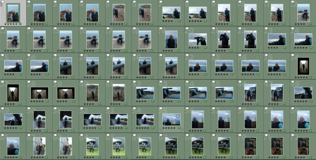
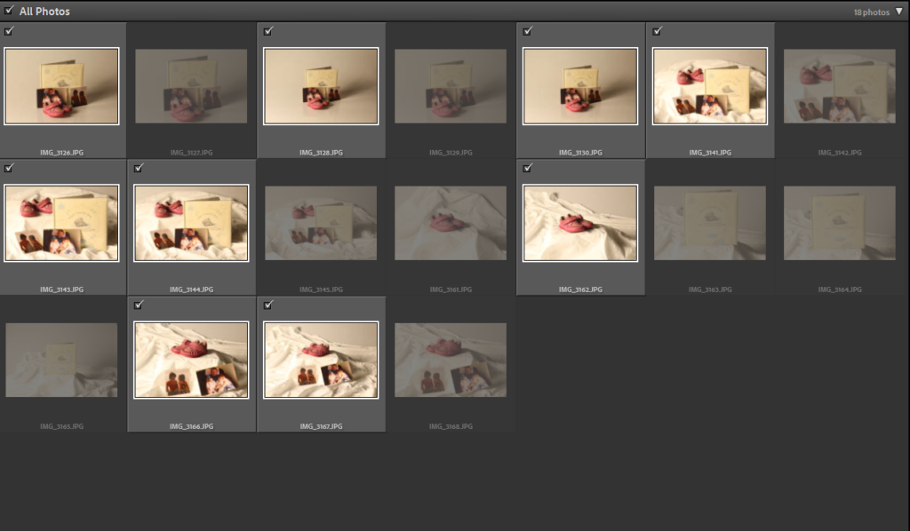
Environmental Portraits/ Contact Sheet – George Blake
These images are from my Environmental Portraits, for my Nostalgia Project.
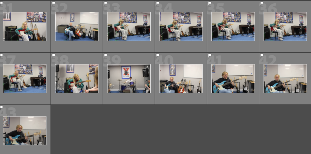
5 – 4 star rated photos:
(These are also white flagged – meaning they consist of clearly taken photos and matched my desired outcome).
These Photos, too me, capture a similar, composition and fixed focal point of a person in an environment like how Environmental Portrait photographers: August Sander and Alec Soth took their photos.
3 – 2 star rated photos:
(These are also white flagged – meaning they consist of mostly clearly taken photos or just didn’t fit the look I was going for).
I would improve upon these images by timing up the shot better and perhaps taking them with a tripod to stabilise the long shutter-speed. These images do display some good qualities however, such as lighting and and use of aperture to create a more focused effect on the person.
2 – 1 star rated photos:
(These are black flagged meaning they do not appeal to what I was aiming for during this photoshoot).
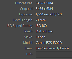
Camera Settings:
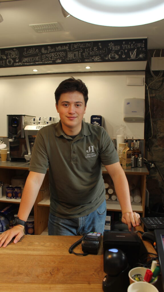
Best Images:
I will edit these Images as my first Edits in the style of my studied Environmental Portraits.
Arnold Newman – Artist Research
Arnold Newman
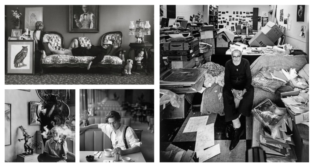
Arnold Newman was generally known as the pioneer of environmental portrait, while also being known for his still life and abstract photography. He is considered as one of the most influential photographers in the 20th century. Newman’s environmental approach to portraiture was greatly influenced by impressionism and symbolism, which attracts the viewer no matter how well we know what the focus is.
Arnold Newman became well know for his distinctive approach to portraiture, where he would capture the person/ subject in their job or their natural surroundings. He didn’t ask the person to pose in a studio or in a particular way, instead he took a more realistic approach which told an insightful story of their life. Newman wanted to create depth and composition in his portraits, so he had equipment set up in a particular way, possible poses, and a floor plan ideas as he really wanted to show the relation between the person and their natural surroundings. This engages the viewer, showing a story and connection.
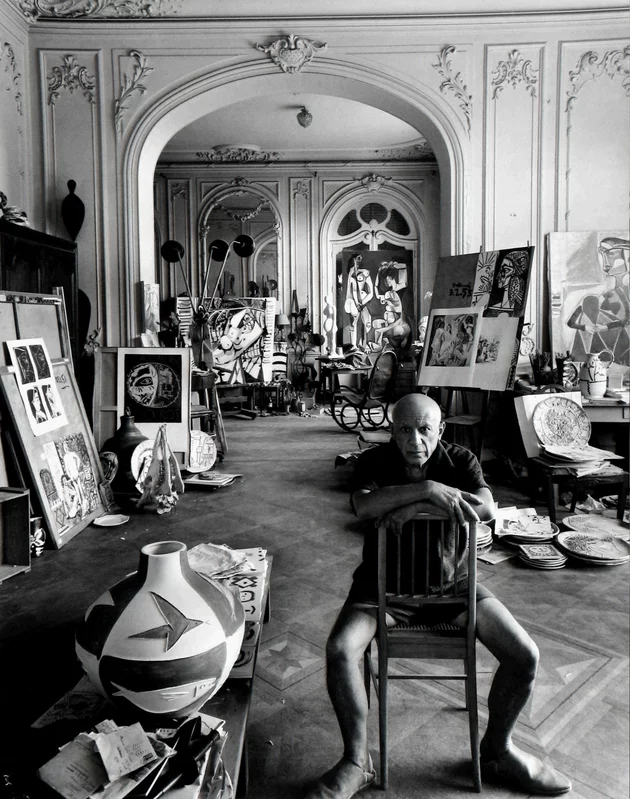
The photo makes me really interested because I can see into his studio where he does his work. I think having the photo in black and white makes you look closer into the background filled with his paintings, as from a distance all you can see if unique shapes filled with tones and shades that blend together creating this chaotic, but engaging scene to look at. I think having him sat in an informal position at the bottom right, with not much facial expression, makes him blend in almost with his studio behind, creating this feeling that Newman didn’t just want to make the portrait purely of Picasso. Instead he wanted to engage the viewer from a different perspective, which I think is what makes the environmental portrait of him more engaging, because it makes us wonder what he is doing, creating lots of focal points for the viewer.
The photo looks like it is captured in the natural light, that brightens up various parts of the portrait which I think makes it more effective because it shows it, in that moment. This emphasizes parts creating soft and intricate textures in his studio, leading your eye closer into the photo.
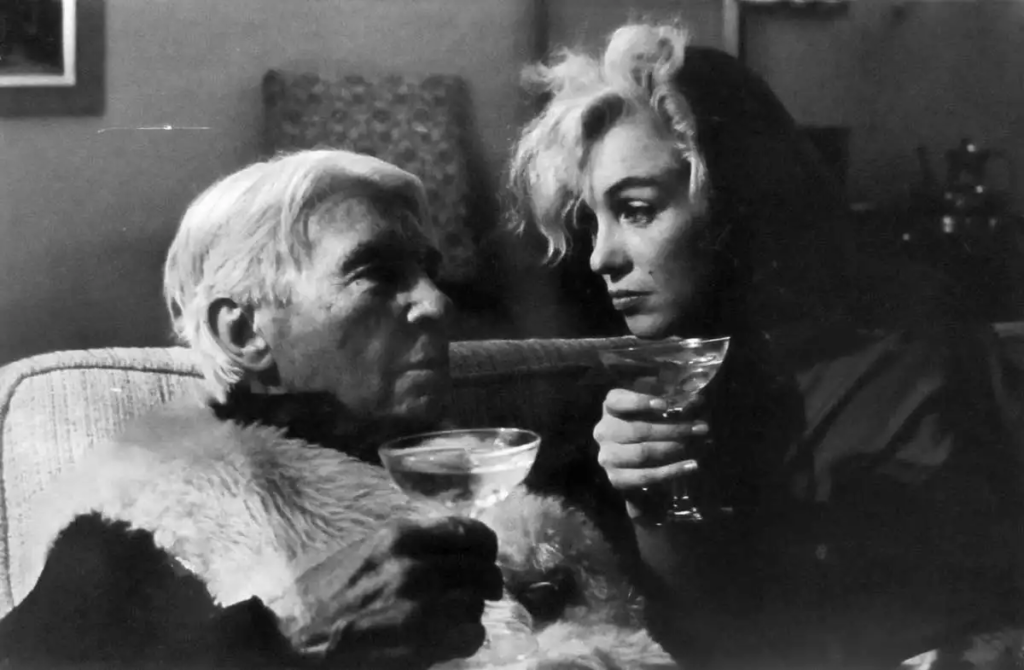
Newman has captured Marilyn Monroe and Carl Sandburg sat in his flat. The piece is know for the composition where they are sat glancing at one another, engaging with the camera from a different perspective. Also, the photo captures Monroe’s more glamorous, and public persona, whereas Sandburg is more serious, and is sat more naturally. Newman may have decided to do this to show the contrast between their personalities, which is expressed in a clear way to the viewer. I like how the photo is taken close up which creates an abstract portrait, leading your eye straight to the subjects. As the viewer, I think we engage more with the photo from a side angle, as it makes you look closer because we want to find out their expressions. The lighter areas are around the face which makes you focus on that area more, noticing subtle, soft tones which enhances these areas more, creating a short but engaging depth.
Environmental Portraiture
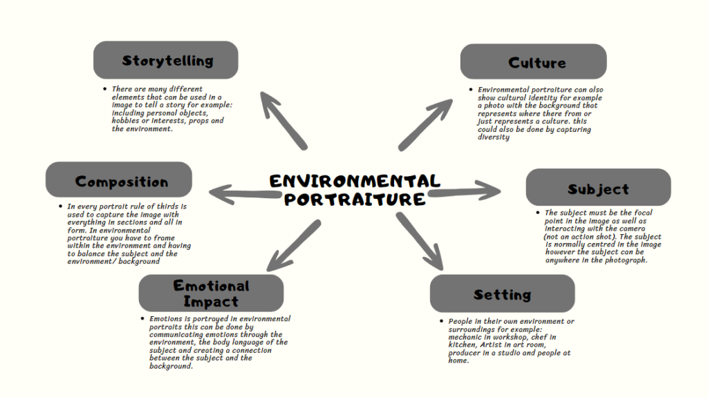
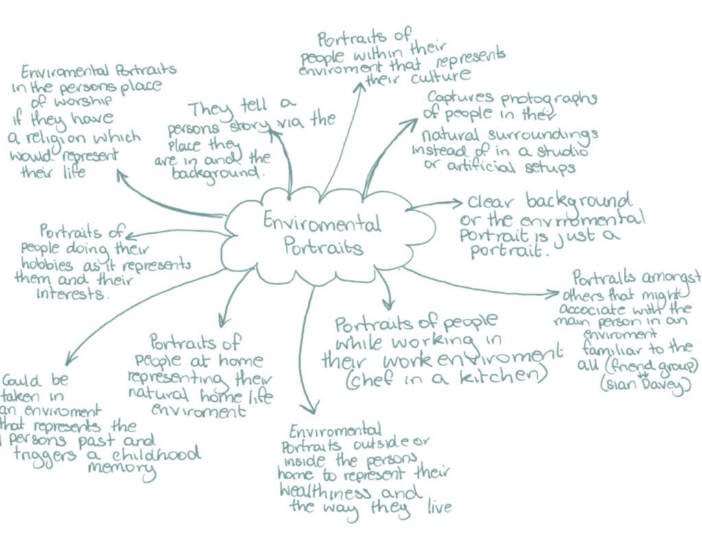
Environmental Portaiture is a style of portrait photography that aims to capture a subject in their normal/natural environment or surroundings. Instead of seperating the subject infront of a basic background, environmental poraiture tries to portray more about the person or subject by including parts of their daily life, work or surroundings. The background is an important part of the storytelling process, it can provide clues into the subject`s personality, interests and lifestyle. Normally these photos involve locations that are meaningful to the subject. Photographers may decide to take environmental portraits in various settings like a workplace or someones home or any place that highlights the emotion or feeling they want to give, the goal is to create a more real, authentic representation of the subject. Environmental Portraiture involves alot of planning and consideration of the composition, lighting and the overall visual in the setting.
Environmental Portraits Artist Research
Sian Davey (Looking for Alice & Project Martha)
Sian Davey was born in Brighton and later went to Bath academy of Fine Art where she studied fine art painting in 1985. she also went on to obtain an MA and an MFA in photography between the years 2014 to 2016. Sian has a daughter called Alice and a teenage Step-daughter called Martha. Sian Davey was greatly inspired by Louise Bourgeois retrospective. After visiting Tate Modern, London in 2007 she instantly loved the style of the photographs. After Martha’s 16th birthday, she questioned why Sian doesn’t take photos of her anymore. Sian had earlier assumed that Martha was becoming uninterested in being involved in the photography and wanted to give her space to grow up as she is a teenager. While she stopped taking photos of Martha, she took other photos of her youngest Alice where she created the project
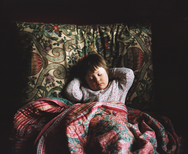
‘Looking For Alice’
The context of this particular project highlights the meanings of Love and Family. Sian Davey focusses this project on her daughter Alice as she was born with down syndrome and she explains her struggles and the importance that her “imperfect baby” feels what everyone else feels.
Visually, This image gives off a dark tone but it is also a very warming photograph. The overload of patterns works well especially with the dark background as it doesn’t make it overly crazy. You can easily tell that the girl is the viewpoint of the image and i like how the use of a brighter colour outfit compared to the blankets and pillows works well to stand her out. It contrasts with the colours and patterns of red/pinks and greens on the pillows and blankets and is very eye catching in contrast to the background. It also adds a really effective aspect to the image.
In technical terms, I think the lighting in this particular image works really well and I love how the natural light shines on Alice’s face. it is very intensely shining on the left side of Alice’s face and therefore making that side have a glow. The aperture has been adjusted to full focus on Alice and the bedding around her as the background is not visible at all.
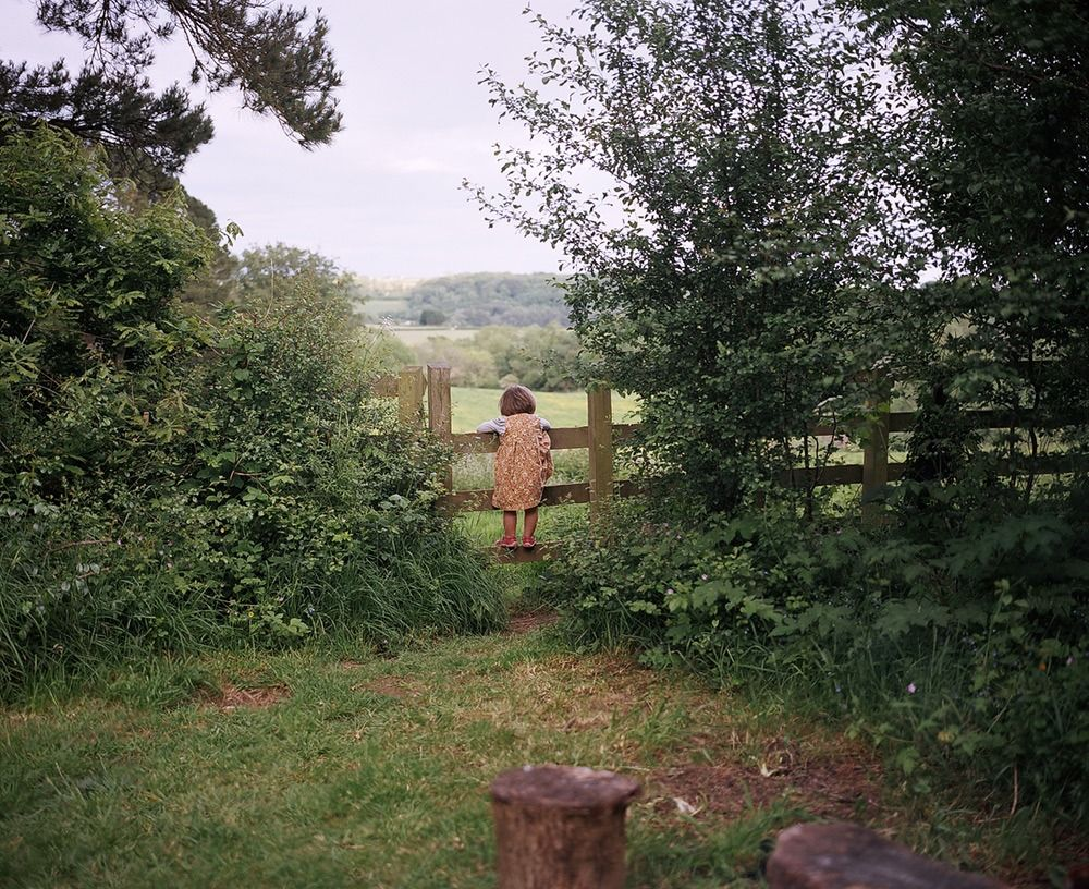
I think this photo also works well as an Environmental Portrait piece as Davey has said, the conceptual view of this photo shows that though Alice has down syndrome, she is like any other child who loves to explore their surroundings and go on adventures to places such as in the photo.
Visually, The viewpoint is immediately the centre of the image and the add of height to Alice creates more a focus on her, this could also be seen as her being in the centre box of a rule of thirds. In addition to this, the use of colour contrast in terms of Alice’s clothing also adds to the fact that she is the main focus as she differs from the rest of the image.
The technical aspects of this photo includes the use of the natural lighting. Though its clear that there are clouds cover the sky the light is still able to pass through and create a warming light
Project Martha
After Davey was asked the question by Martha, She then went on to begin her newest project called ‘Project Martha’ which involved being apart of her daughters teenage life with her friends. Sian expressed how she had to allow her friends to trust her and have her basically in the friend group to be able to capture these photos. She says the quote
‘I am always there as the photographer, as her step-mother, as mentor and friend, but where I am and where I place myself is harder to place as she grows and moves further away from her childhood.‘
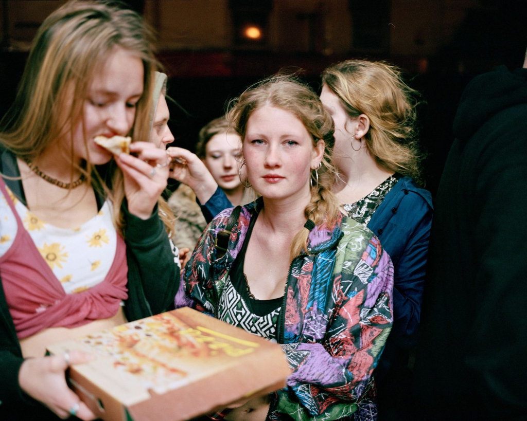
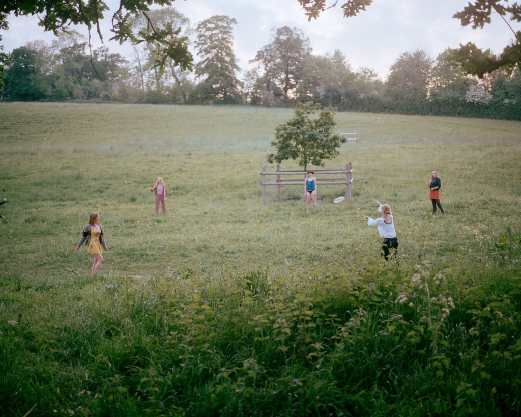
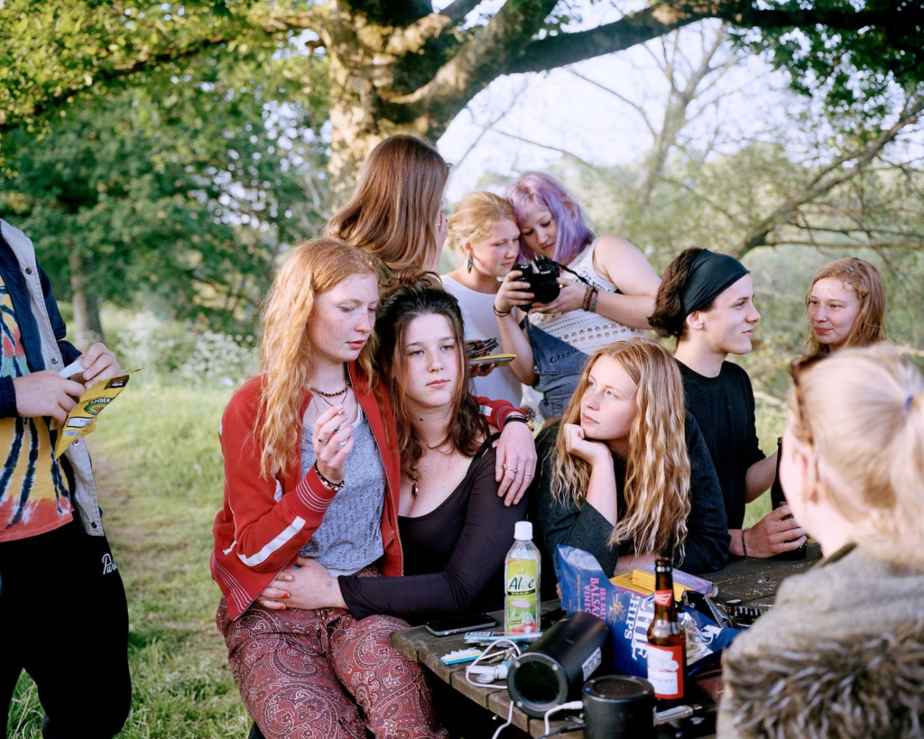
These were photos like the ones below
I think Davey’s photographs are very powerful because as well as capturing Martha’s teenage life with her friends, she is also expressing the relationship between herself and her step-daughter and the trust they have in each other. I think the bright colours that are in every photograph of Martha’s friend group makes the photo have a large feeling of happiness and memories being made, whereas, if she decided to make her photos black and white it wouldn’t have the same effect that it does. I think this point is greatly evident in the 2nd image below. I really like how natural Davey’s photos are. In the first image, I think the use of only Martha being aware and looking directly at the camera works really well to show that its a document of her life and what she does. the use of the friends not being aware of the photo also adds to how naturalistic the image is. The colours In almost all of her photographs are soft and bright and bring across a feeling of warmth.
Some of the photos from ‘Project Martha’
Environmental Portraits
What is an environmental portrait?
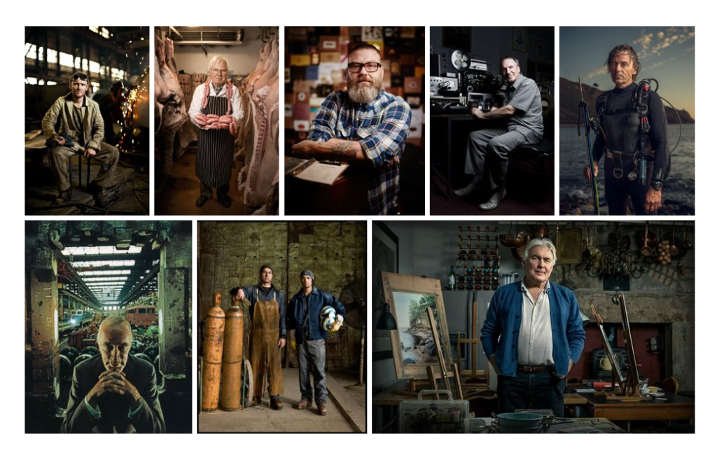
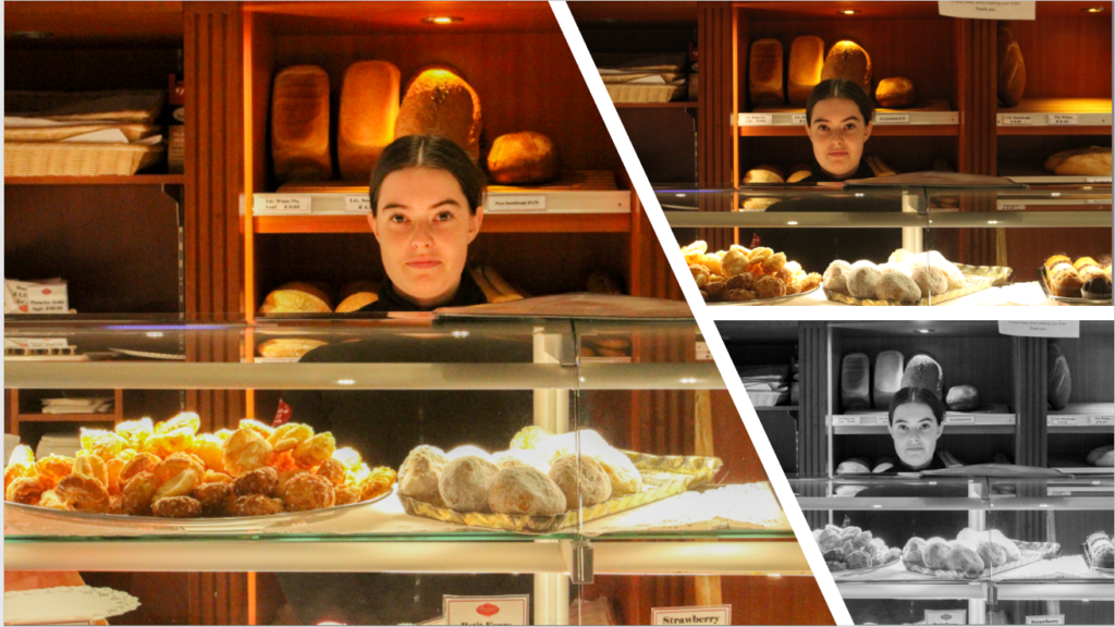
An environmental portrait is where the photo is produced in the persons natural environment. this could be places such as their home or the place they work. In a portrait such as this, it is not only the person that is important, it is also crucial that the background of your image contributes to the viewers understanding of the persons profession. For example, the photo of the Chef above explains this well. though he is wearing a chefs outfit, the profession needs to be clear even if it didn’t involve the aspect of objects that relate to that profession. As it is clear there is a kitchen behind the man, this means the the photograph is clear and is a good demonstration of environmental photography. These photographs are also powerful pieces that could share a deeper story about the persons life
As well as a work profession, environmental portraits can be taken at home as it is the persons natural environment. Rooms such as the living room or someone’s bedroom works really well for this type of portrait as it demonstrates where the person spends most of their time.
Project Evaluation
at the beginning of this project I wasn’t skilled with adjusting the settings of the camera, I learnt how to do this and I could tell how a lot of my images increased in quality. The use of the studio gave me a chance to experiment with different lighting techniques and angles. I made sure to involve different levels into my photographs by using the objects provides such as plain boxes. I think my nostalgia project differs from the rest as I experimented more in this photoshoot and I think it turned out well. If I were to do this project again, I would try and involve different nostalgic which would be more interesting to photograph.
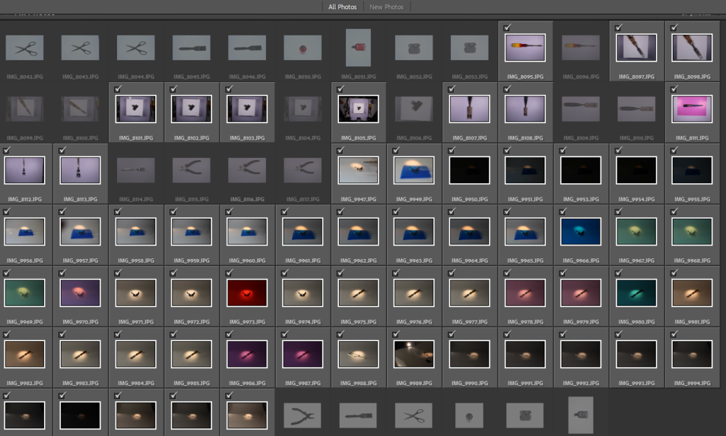
I really liked how my Tools photoshoot turned out as well. I used three different ways of photographing these by using the bird eye view using the set up in the studio. As well as this, I used the coloured transparent plastic to add different colours to my images which make it more interesting and make the, stand out form the rest. The third technique I used was using the light box. Like the first, this was also taken at bird eye view. If I were to do this photoshoot again, I would aim to take more photos than I did and make the photos more unique than just the basic object.
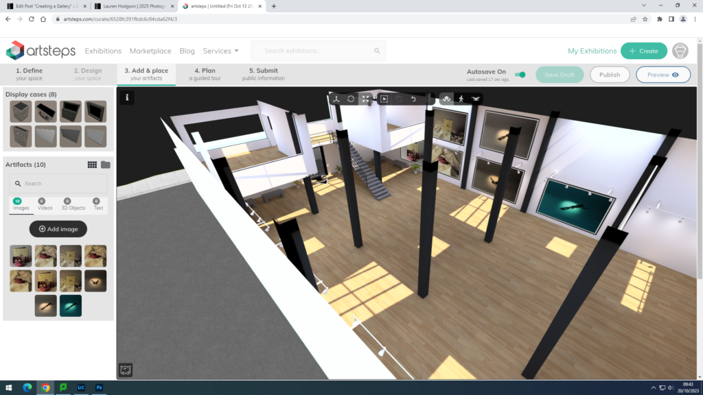
At the end of my photoshoots I created a phot gallery of both my photoshoots. First I did this on photoshoot which I didn’t really like as it was difficult to get the angles right on the walls and it doesn’t have the aspect of walking around like Artsteps does. I like how my gallery turned out on Artsteps. I like the gallery space I chose as I have a lot of areas to choose from and add my images to. I prefer this more than photoshop as it’s an easier process and on photoshop the angles of the images sometimes don’t turn out right or look the wrong angle.
Environmental Portraits Photoshoots
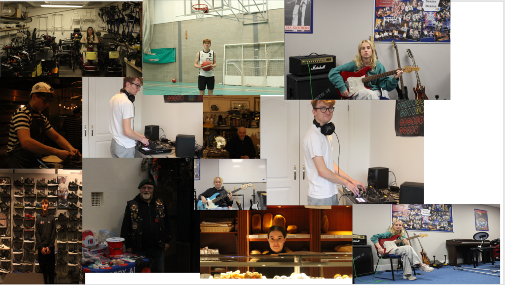
These are the photos that I picked out of each of my photoshoots because I thought they were the best ones.
Photoshoot 1:
Photoshoot 2:
Photoshoot 3:
Photoshoot 4:
Photoshoot 5:
Photoshoot 6:
Photoshoots 7:
Photoshoot 8:
These one I have picked because I liked them the best and plan to edit them.
Vanessa Winship
who is Vanessa Winship?
Vanessa Winship was born 1960 and is a British photographer who works on a series of long term projects of portrait, landscape, reportage and documentary photography.
Vanessa Winship studied film before teaching photography in London. She shortly joined Agence VU’ in 2005 and then began long-term projects in the Balkans with her husband, who is also a photographer called Georges Gerogiou. She prefers black and white and portrait format because it represents a bare and frontal. tone. She became known for her series on Anatolian schoolgirls in uniform, published in the book Sweet Nothings. Her work is raw, she doesn’t show this sweet and fluffy side to school girl, she extremely and methodically frames little girls who pose seriously, with serious eyes, clearly showing the backgrounds, etc classroom and mountainous.
In 2011, she began a trip to the United States that lead to the publication of the book ‘She Dances on Jackson’, whose title refers to a missed photograph. It was description of a scene she was unable to capture. Portraits, landscapes and urban views follow one another to form a poetic and melancholic vision of the country, made of details and interstices.
These projects have mainly been in the Eastern European part of the world but also in the USA. Vanessa created lots of books and some include Schwarzes Meer (2007), Sweet Nothings (2008) and She Dances on Jackson (2013).
Her first exhibition was at Fundación Mapfre gallery in Madrid in 2014. Her actual first major in UK solo exhibition was at a famous Barbican Art Gallery in London (2018) Her work has also been exhibited twice in the National Portrait Gallery in London and noticeably in Rencontres d’Arles in France.
Vanessa has won two World Press Photo Awards, ‘Photographer of the Year’ at the Sony World Photography Awards, the HCB Award (the first woman to do so) and in 2018 an Honorary Fellowship of the Royal Photographic Society. She is a member of Agence Vu photography agency.
Mood board
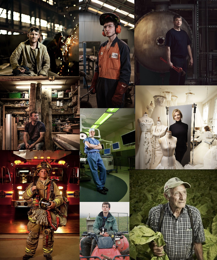
environmental portraiture
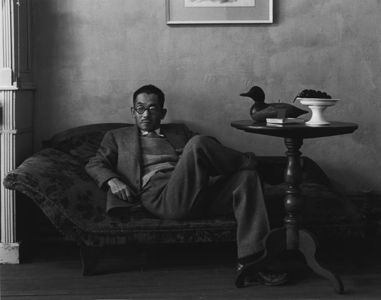
An environmental portrait is a portrait that captures a subject in their natural surroundings, such as their homes or workplaces.
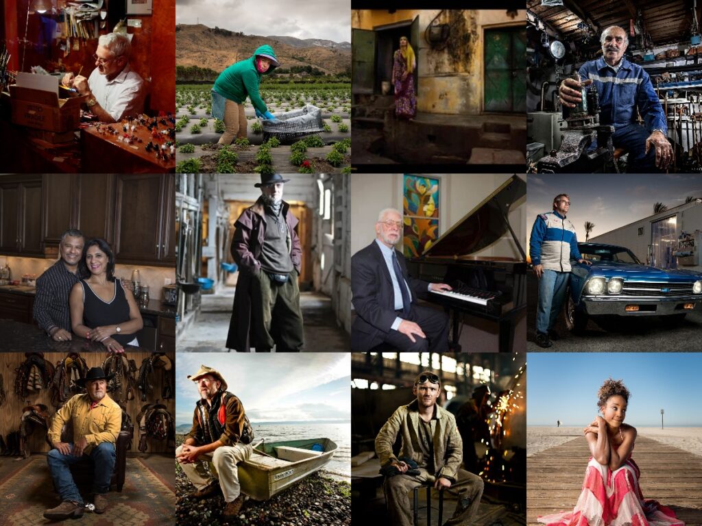
here are some examples of environmental portraiture:
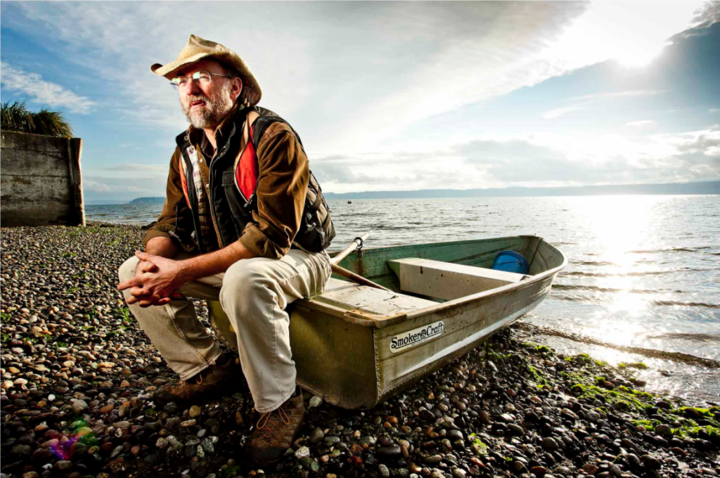
Enviromental portraiture is full of emotion and can display more of a story than the average photo. this allows the view to create stories and fantasise about the lives of the people in them.
This photo is an excellent example. it shows an older man sitting of a rowboat, possibly waiting for someone or resting before going out or bringing the boat in.