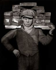
August Sanders

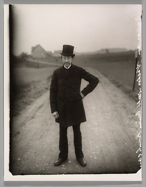
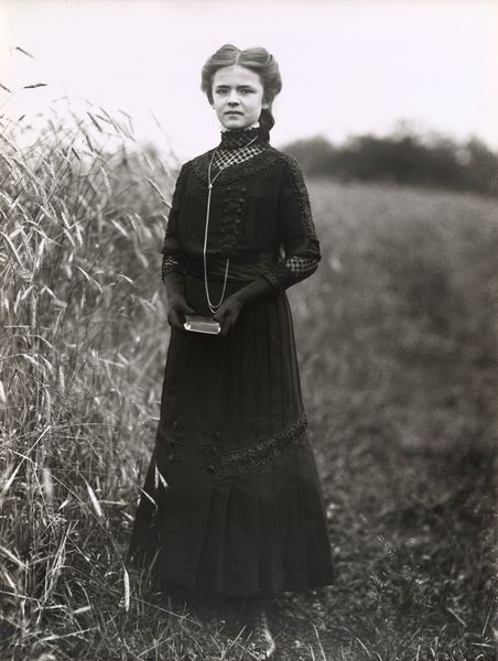
August Sanders is a famous photographer who actually started by working in a mine and then working as an assistant for a photographer called Siegen who was also working in the mine at the same time. As he progressed who brought his own equipment and set up his own darkroom before his military service 1897-1899. After his service he started working for Photographische Kunstanstalt in Hungry before becoming a partner then later becoming the sole owner of the company. Later on he left the company and set up a new studio at Durener Strasse. His most famous work began in 1911 when he did his first series of portraits for his work, he aimed to show the differences in society during the Weimar Republic. He then divided the shoot into seven sections ranging from different professions, different classes to homeless people and veterans. Continuing his career he travelled to Sardinia for three months, while he took around 500 photos however he did not write his planned book on his travels. His most famous work continued when his ‘People of our time’ was published, this was a series of 60 photos aiming to describe and show the people of the 20th century. However sadly under Nazi regime his photography plates were seized and destroyed, along with later on his studio being bombed and the a fire wrecking what was left of his work. After the war in 1953 Sander sold 408 photographs of Cologne taken between 1929 and 1939, later on in 1988 they were published in book format, under the title Koln Wie Es War (Cologne as it was). His work has continued to be influential even now inspiring people with his environmental portraiture.

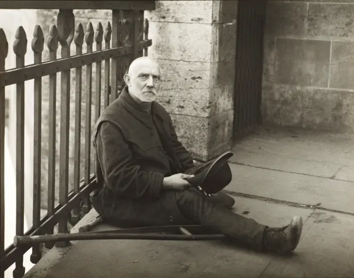
Beggar, 1926 – August Sanders

This is one of my favourite pieces of August Sanders work; just after the end of WW1 he captured a shot of a beggar on the streets. Many people were left without a home and or without an income leaving many people on the street after the devastating effects of WW1.

Within the photo there is not much, however it appears busier than it is due to the lines and patterns. The man is sitting in the centre of the photo with a crutch underneath him and holding his hat out for change. The photo is in black and white as all of Sanders work is as Sander never updated his equipment with the times instead sticking to his original set up. It’s quite a saddening image as it is very solemn and while it is a fairly simple image in its composition it has a high emotional complexity to it. When you first glance at the photo, I didn’t notice the crutch or the hat I assumed it was someone resting or waiting for a train. However as you take a closer look at the shot it becomes clear what is really happening. Sanders used the lines in the natural surroundings to create a busy look to the photo. By having a ‘busy’ background in the photo and around the subject it reflects the subjects daily life of blending into a busy lifestyle of everyone else. The composition of the photo is quite interesting as it isn’t an overly wide angle so there isn’t much foreground or background to the shot but the subject is slightly off centred to the left and in the little foreground there is immediately drawing the viewers eye to him. Harsh lines are prominent throughout the shot as a whole from the wall edge creating a harsh line to the fencing creating repetition both offset by more lines however they are softer and lead to the subject again. Creating this juxtaposition of the harsh world around the subject and the softer, emotive side of the subject is still a person no matter what his circumstances. This is a great example of an environmental portrait by having the subject as the main focus of the photo, providing context about the person by having a common environment of theirs as the background. By having the subject wearing a blank expression it takes away from the falsities that can crop up in photos by wearing different expressions, this instead helps the people look deeper into the photo and understand the correlation between the subject and the surroundings.
Sanders used all natural lighting in a majority of his work not only due to his camera set up but also due to his work being in the subject’s natural environment didn’t allow for easy lighting all the time, in this shot he has balanced the exposure well creating a balanced tonal image. What Sanders has done particularly well with this shot is capturing a 3D scene and transforming it into an emotive, dynamic 2D image. By using the shapes and lines available in the environment it has enhanced the final outcome creating depth in the shot and providing a small background and a feeling that the image extends onwards confusing off the edge of shot from the simple use of the wall further away from the subject.

This is another one of Sanders famous pieces of work, there is not much information available about this shot in-particular. However it is evident that it is a great example of Sanders environmental portrait style. This photo was taken after WW1 (1928) however the effects were still very present. The frame of the photo is mostly filled with the subject an in a white chefs jacket, boots and black trousers. He is holding a large metal bowl that has small patches of lighter grey where the light is reflecting off it. While the chef is holding a spoon in the bowl he is not moving it as it is an environmental portrait he is posed and still. It would be noticeable if he was moving at all due the the nature of Sander’s camera equipment there would be blurring to the image where the movement isn’t captured quick enough to remain clear. The background and foreground of the shot are a complete tonal contrast to the white coat being black with small speckles of white from the grout on the tiled floor to the labels on the above counter cupboards. Having the subject in his professional environment is a great way of capturing an environmental portrait as it would have been where the chef spent a lot of his life. There is a also a connection between our jobs and out personalities and lifestyle. The chef has a neutral expression on his face, however he does not seemed annoyed or put out by the photo instead looks proud. This allows for the photo to be perceived as the man is proud of his job, this could be for many reasons but a large part of this could be that he proud that he could, after the war being able to enjoy his passion again. The more technical side of the photo is that Sander’s has used the space around the chef to provide a stark tonal contrast from the dark background. This draws the viewer to the subject, the chef, and away from the surrounds. However the dark background also makes the viewer curious to what is in it, this gets them to start looking closer to the the subject and where they might be standing in correlation to what he is wearing and if he is holding anything. Following on from that the dark background also helps the image appear more 3D which is a great skill of Sanders work in creating a 3D scene into a 2D photo while keeping the photo form looking flat. Sanders has used the rule of thirds to put the subject in the centre to keep the focus on him. He has also used the lines on the floor to add depth to the photo and provide a feeling of foreground and background. He uses many lines throughout the photo not just the floor, he also has something with a sharp edge and harsh line just behind the soft, unfocused edge on the side of the shot. The photo is filled with smooth looking textures like the subjects jacket and the metal bowl, this reminds me of how pastry chefs work is neat and appears almost perfect when it comes to things like cakes with white icing. Contrasting this is the mess on the floor, this is a great way Sander’s has captured the neatness and how pristine the chefs have to be as well as there work but it is an environment that is not very forgiving.

Environmental Portraiture Virtual Gallery and Evaluation

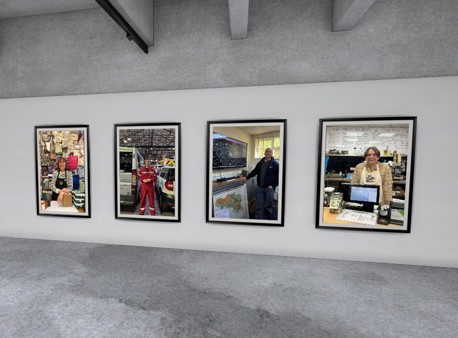
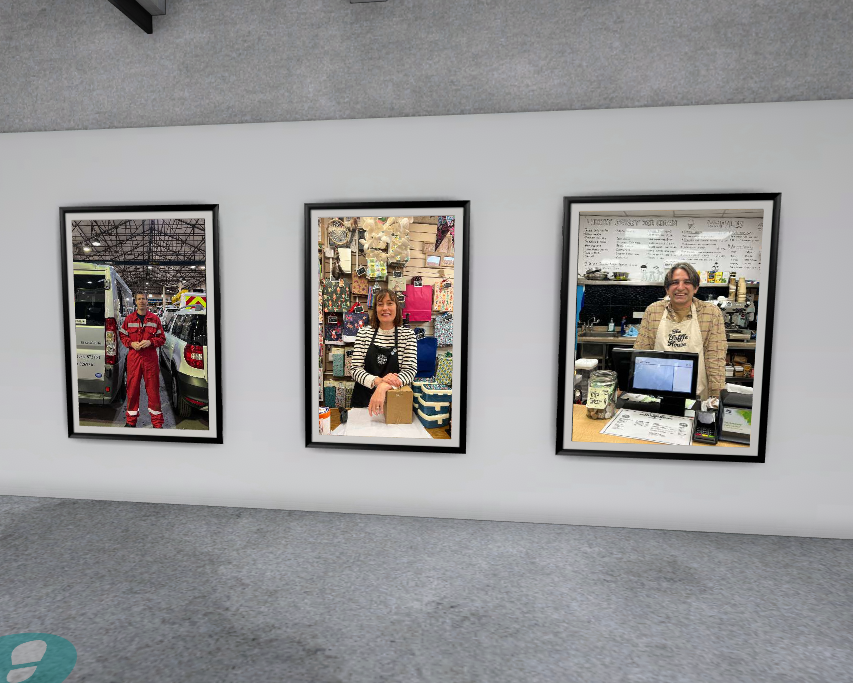
Virtual Gallery

This image has an empty alt attribute; its file name is image-2788.png

Evaluation

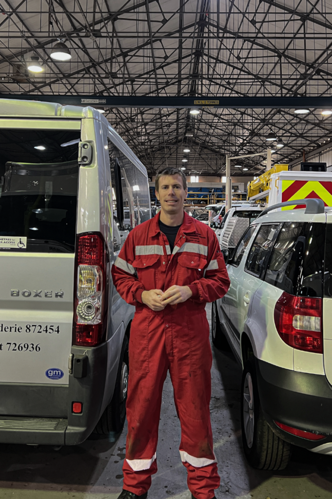
I personally think that this image is one of my best Environmental Portraits because I think it is effective how his outfit fits the environment he is within and I also think that the photo is unique because it’s not very easy to get into the warehouse for the government vehicles. If I were to take this image again, I would potentially try and take in in another position so that you can see more of the warehouse, however, I was not allowed to get the number plates in the photos.

This image has an empty alt attribute; its file name is Screenshot-2023-12-01-at-13.16.43-627x1024.png

I also really like this photo because I think that the women’s character and appearance reflects the shop she is in and I also like how she is wearing her apron with the little badges as they suit the background.

Environmental portraiture

Environmental portraiture is photos/portraits of someone in their environment so either someone is their work or maybe a hobby that they do a lot you want something that shows an aspect of who that person is.

You want your photos to tell a story the story behind the person in it. Try and revel/show parts of their lives. You’re not just telling the story through the background though you want your model to show parts of themselves like if the model looks sad it can show that they live a sad life in their eyes or aren’t happy with where they are in life

Arnold Newman – Case Study

“You don’t take pictures with your camera. You take pictures with your mind and heart.” – Arnold Newman.

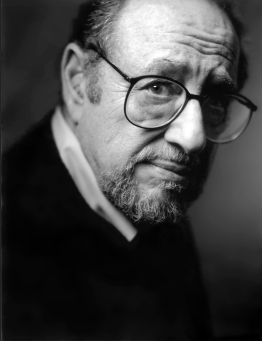
Arnold Newman was born on March 3rd 1918, and passed away on June 6th 2006 as an American photographer who was greatly known for his environmental portraits of mainly artists and politicians. He was also widely known for his still life images which were described as “abstract”.

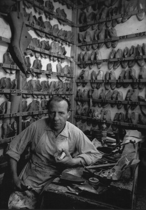
Examples of his environmental portraiture:

Examples of his still life:

The first ever environmental portraits were created by Newman, as he was seen to push the boundaries of traditional portrait photography during the 20th century. Newman’s passion for photography began in the 1920’s, and started taking environmental portraits in the 1940’s. He included a variety of famous people in his portraits, swell as scientists, workers, composers and political leaders.

Image Analysis:

I chose to analyse this portrait by Newman because it differs from Sander’s work. This is because often Sander’s backgrounds are dull and dark, so we can focus on the subject in the image. However the background in this image is quite chaotic, which distracts the viewer from looking at the subject. This image intrigued me because usually in environmental portraits the subject is centred, and standing up. This shows us they know what they are doing and portray dominance in the photo. This photo is unique to the others because the subject is sat down, and looks overwhelmed by the mess around him. This tells us that his profession is very busy and difficult.

What I like about Newman’s work is all his photos are pure and raw. They capture the true reality and events happening at the time, rather than editing them to what he thinks the viewers will like. The people in his photos are never specifically posing for the camera, instead they are acting out their proper duties. In a way, this makes us feel more connected to them by understanding how their job really is. I will take inspiration from Newman when creating my own images. I will have some where the subject is not using for the camera, to create a sense of realism. Yet I will also have some where poses and props are used to make them more effective and intriguing.
Visual:

  • Messy
  • Chaotic
  • Intimidating
  • Dull
  • Background is the main focus rather than the subject
  • Bright lighting
  • Depth of field is large

Emotional:

  • I feel sympathetic towards the subject as he looks overwhelmed
  • Stress
  • Work overload
  • Uneasy
  • Sense of unhappiness

Technical:

  • Balanced composition from either side of the subject, which distracts us
  • Line of symmetry
  • Lighting is coming from the camera, so the image is bright
  • Lots of distractions around the subject, which makes us focus on the background

Conceptual:

  • This image was taken in Essen, Germany in 1963.
  • ” Mr. Newman’s portraits were defined by his sitter’s environments, which led him to be known as the “father of the environmental portrait.”

More examples of his environmental portraits:

August Sander – Case Study

“If we can create portraits of subjects that are true, we thereby in effect create a mirror of the times.”

August Sander was a famous German photographer, born in 1876 and sadly passed in 1964. His passion for photography began to grow when he was a teenager, and by his twenties he was operating his own portrait studio. Sander began his most famous project in the 1920s, named “People of the 20th Century”. This project includes over 600 photos divided into 7 volumes and nearly 50 portfolios. The majority of Sander’s images in this project are in black and white, reflecting the time he was taking portraits. This is also attractive to modern viewers because it shows us what times were likes in the 1920s, which makes us feel closer to the photographer.

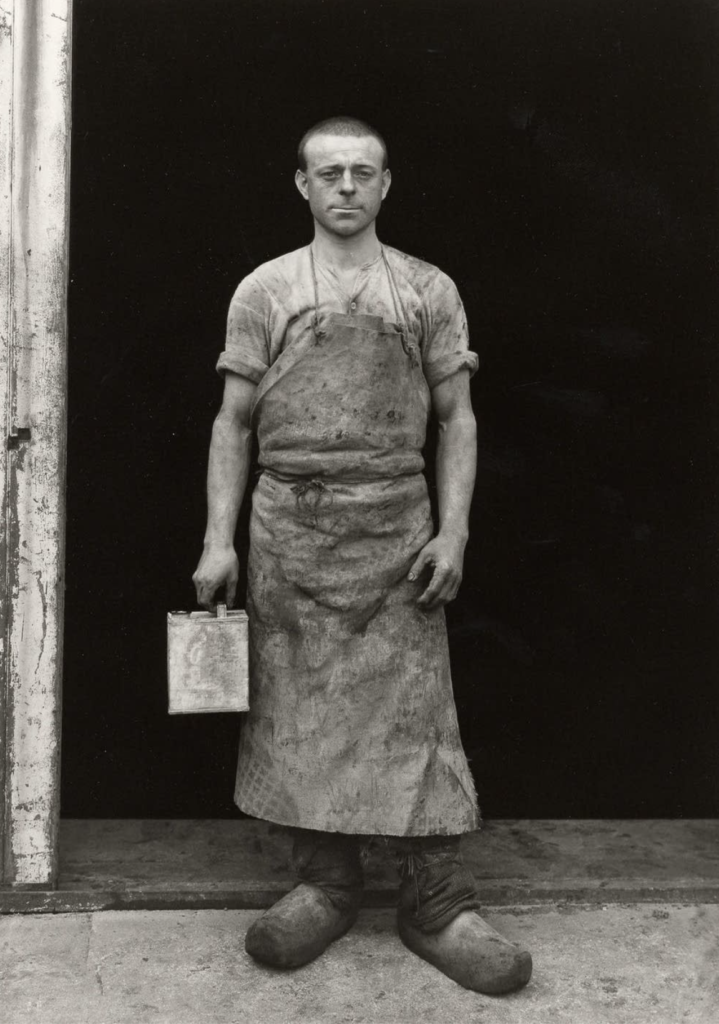
Sander captured this image in black and white like all of his other photos. However this one stood out from the rest to me because of the emotion on the man’s face as he is the subject of the image. He is displaying a face of exhaustion, which makes me feel sympathetic towards him. This implies that maybe he does not feel passionate towards his job, and could portray the difficult times in the 1920s. I noticed the background of this image was plain and dull, which could also imply that there is nothing exciting about his job, which again tells us he is miserable. This makes me question why Sander took this photo, and perhaps he is trying to pass a message through it.

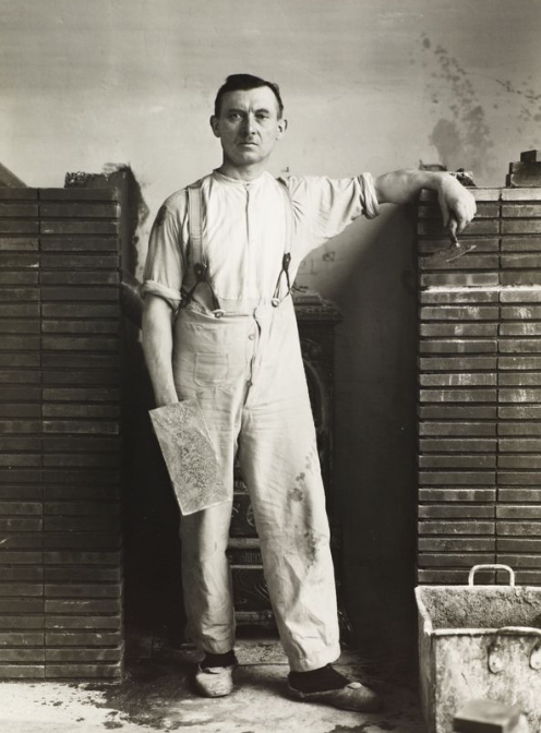
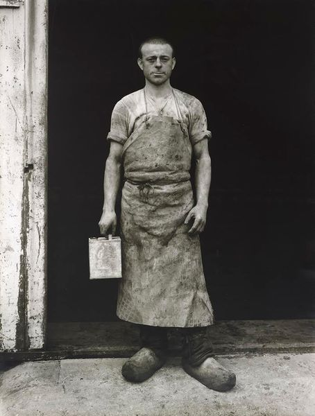
This is another image taken by August Sander in 1926. I chose to analyse this image because it differs from the one above in terms of emotion. In this photo, the emotion on the craftsmans face shows more anger, and portrays more dominance than the previous. The subject’s facial expression is one of frustration, and shows us he maybe dislikes his profession also. The subject of the photograph is also centred, which I have noticed is a common theme in Sander’s work. The background is again dull, which contrasts well with the subject making him stand out more. This makes it easy for the viewer to focus on the subject’s emotions. The use of the man holding a prop for the photo also allows us to make the connection between the subject and his job. I think this image creates an emotional response through his body language and facial expressions by the way he is staring into the camera with an intimidating manner.

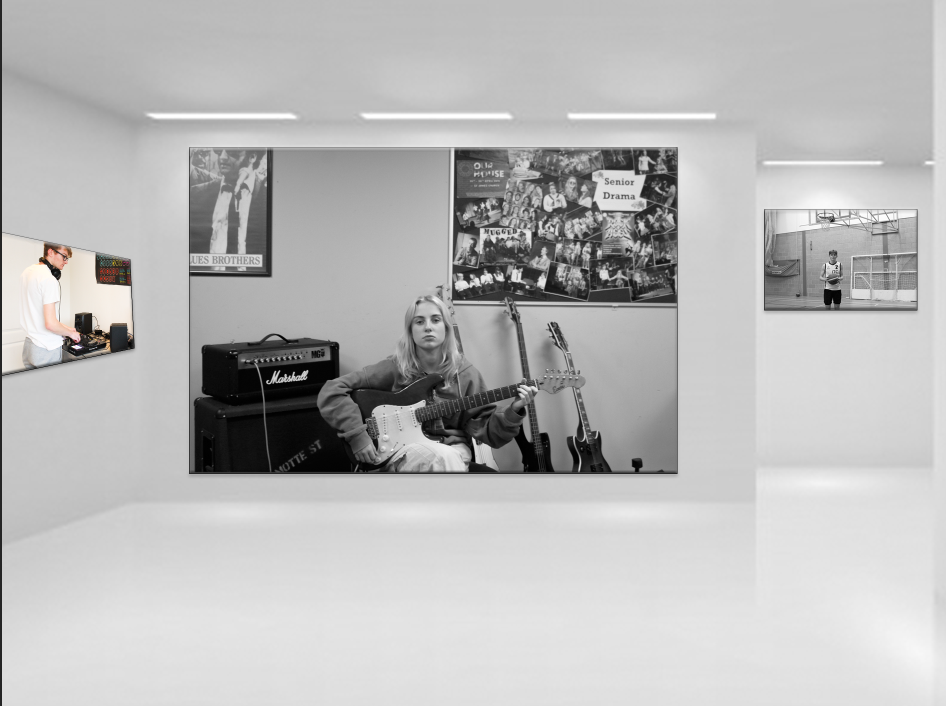
Environmental Portraits Gallery

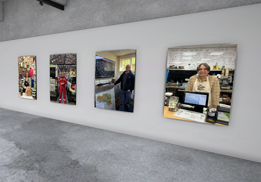
This is my three favourite photos from this task. They are presented in an art gallery form as a better way to show them off.

I really liked these ones because even before edited i thought they looked better then the rest I also feel like they show very very clearly what the task was a fit in with the inspiration and the environmental portraits.

I like all my pictures but some need improvement the main improvement is probably my photography directing before the photo is taken as lots are the subject looking away from the camera, which isn’t incorrect just not the aim.

Karen Knorr

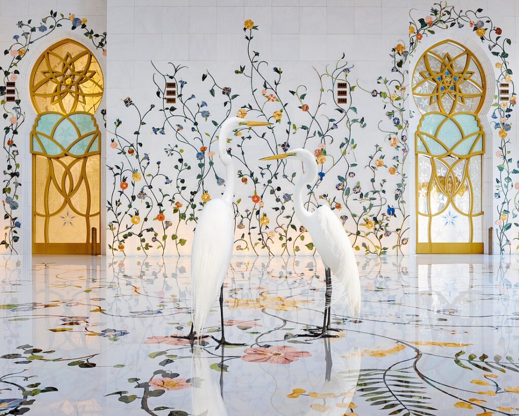
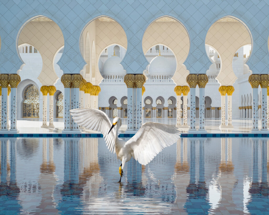
Karen Knorr is a a German photographer who’s lived in both America and the UK. She combines animal studies with conceptual art and lifestyle. Her work consists of intricate and meaningful backgrounds with animals as the focus.

Academies was Karen Knorr’s project from 1994 until 2001 where she began experimenting with fine arts transmissions and consumption as well as animal studies. These ideas continued through to her projects Fables (2004-2008) and her most recent projects. She uses heritage sites with rich history and aesthetic and combines feminine subjectivity and animality.

Case Study

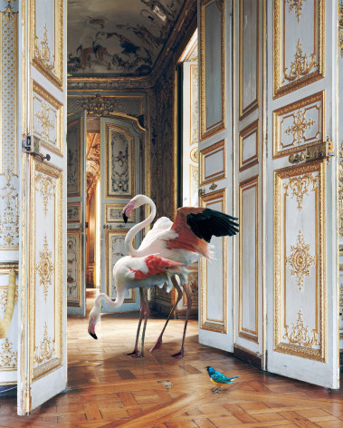
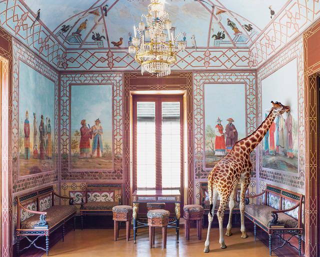
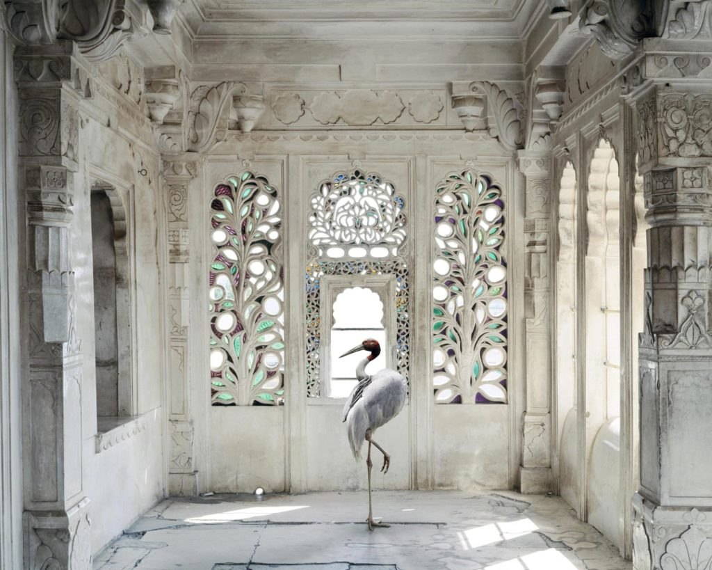
This photograph shows a grand house with rich embellishments from an older period. This building radiates wealth and therefore power and so would have been built for someone with lots of influence. Instead of a person that would be associated with such an environment, Karen Knorr photographs birds. There are three birds in frame and all of them are centred in the frame. By placing these birds in such an impressive building it makes these birds seem important and powerful.

This photograph is all in focus because the photographer used a high focal length to capture the whole hall. This is important because it ensures the whole hallway is visible and showcases the fine details to highlight the wealth in the interior design. The interior design of a building is different to the exterior which everyone sees. Only people invited into the building will see all these fine details and wealth. Someone’s interior is only shown to friends, family and close piers. Someone wealthy would host an even to other wealthy individuals to showcase how they deserve to be in elite circles and deserve respect. Being invited into someone’s home is personal and intimate.

There are two different species of bird: the first is a tall, elegant bird and the second is a small, colourful one. The tall one has long, slim legs which showcase a lack of muscle or strength. This bird does not need strength to radiate power as its height towers and its wingspan takes up space showing importance. This bird has neutral colouring with a splash of pink which isn’t showy and instead elegant. Its neck creates an ‘S’ shape which reflects a swans which is associated with femininity, elegance and grace. I think that this elegance makes the bird look at home in its environment. It doesn’t stick out for any reasons other than the fact that its a bird inside of a house which is unusual.

-The small bird has bright green, blue and yellow colouring. It looks out of place for its flamboyant colour and disproportionate size. This bird lacks the elegance that the taller one has and instead reflects a child who accidently stumbled into a showroom. This not only makes everything else seem larger and more sophisticated but also shows elitist biases. The colour palate is muted with exception to the small bird which makes it stand out massively in comparison. This ostracization of the bird through colour shows us through the eyes of the elite how they would view a common folk or ‘outcast’. The birds physical size is representative of its wealth and therefore power in the room. Unlike the tall, powerful bird, this little one does not fit in. The birds small size also makes the viewer look down on it like someone of the elite would.
This photograph is vertical to elongate the doors and make the building seem even taller. This is because high ceilings are associated with wealth and power. In terms of wealth, vertical height requires more materials and space which would require a significant sum of money in the past. All the space is unnecessary for practicality and purely to showcase an abundance of wealth. Height is commonly associated with power because physically something tall towers over everything else, stands apart and looks intimidating. Additionally something tall is powerful because throughout history, height is symbolic of being closer to a heaven above and whatever has been believed to be there. The tall bird also encapsulates this power which is part of why it blends into the environment and almost looks natural.
I believe that this photograph has been created to break down what would typically be expected in an environment and present it in an unconventional way. A grand environment like this would be associated with generational wealth, elegance and importance. Britain is still rooted in a class system which would have impacted Karen Knorr who is currently living here. By moving to the UK she would have an exterior perspective on these beliefs. Karen Knorr took these traits (elegance and importance) and presented them in the form of a bird. Despite the bird meeting these traits it looks unnatural in its environment because its doesn’t meet subconscious and conscious criteria such as being human. By association, we would probably also expect the owner to be on the older side and typically a white male but by using birds which don’t match stereotypes, she’s questioning this subconscious bias in a light-hearted way.

Alternatively this photograph could be approaching an angle of symbolism. Animals throughout history have had meanings associated with them such as a deer with antlers pointing to the sky make them leaders. A lamb is associated with innocence for its pure white colour, soft wool, and eyes. They are prey not predator which signifies helplessness. A sheep is stupid which makes it seem like a brainless herd following animal. However a horned goat is associated with evil because its similar enough to a sheep for a false sense of security but has aggressive tendencies, and large horns which curl around/downwards as opposed to a strong deer with sky grazing antlers. These powerful horns reaching downwards shows strength being drawn from ‘low’ or evil places.

This idea could be associated with the birds. Birds are associated with hope because their flight allows them further transport through the sky which means they can see from height. This has led sea travellers to utilise birds to find land by staving them and letting them try to find food. This has lead to associations with good fortune, new beginnings and hope.

Artist Reference Environmental Portraits Michelle Sank

Michelle Sank

Michelle Sank was born in Cape Town Africa, but however has been living in England since 1987. Her images reflect a preoccupation with the human condition and to this end can be viewed as social documentary. Her work encompasses issues around social and cultural diversity. Michelle Sank, “Insula”, Insula was a photoshoot that took place within Jersey, Gurnsey and Sark.

Insula

“Working outside of particular demographic scenarios Sank’s Jersey imagery continues to develop a lyrical vision within which the defining influences are place and cultural geography. As a stranger, present for a limited period only, Sank’s ‘residency photographs’ are of course procured under certain psychological precepts. In April 2013 when she arrived at the Archisle Project to undertake a six month residency, geographic and historical influences also loomed large. There were late twentieth century blanks in the archive to compensate, Jersey’s peculiar British-Norman cultural identity to contemplate, economy, politics, community, work, leisure, environment; these concerns together set against a twenty-first century backdrop.”

Image analysis

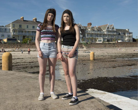
The location of this image is a well-known beach in Jersey, from my perspective of living in Jersey I know that this is a popular beach that many people use for many varied reasons, either being to swim, relax or just have an enjoyable time. From an outsider’s point of view, it clearly looks like this photo was taken on a warmer day, giving the reflection that these girls are there to enjoy their summers. The environment of the image gives context to the viewer, this tells a story about the people within the image. With the beach clearly being a public beach, it proves something of their social class, we can see that they may be more middle/lower class due to being on a public beach, one which is more known for being not a genuinely pleasant beach too. We can also interpret this from the girls ages and clothes, we can see that these girls may be in their teens and there clothing does not seem to be anything designer adding more to our assumption of their class and social status. Within the framing of this image, we can see the girls’ whole bodies, showing off their skin due to the warm weather, and may give ideas of their outfits to further add to assumptions of their wealth. The girls are clearly not smiling and are posed in a more formal way which gives off a completely different idea to us if they were posed in a more unformal way. I personally think Sank has posed them in this formal was to contrast their personalities, being their age and wearing those outfits in that setting almost proves how these girls may be more informal so the look of them being formal is a mind twister. Both of the girls are engaging with the cameras, giving a feel that they are looking directly as us, this can connotate to many things, people are generally scared of eye contact, and the idea of the girls staring at you almost makes you want to look away from the camera, they look with more of an angry gaze yet again adding to the peoples fear.  

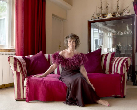
This image represents a completely different idea than the last photo did. The environment and location of this image are in this lady’s house. We can see that the lady clearly has a cabinet behind her which are filled with things of more wealth and ore meaning hence why they are locked away. Being able to see this we can Invision her social status of something more of the upper class. There is a clear colour scheme going on here of the woman’s dress, her couch, and her curtains’, the colour red has many symbolic meaning’s, sex, anger, power but within this woman’s case it is symbolising something of power. We can see her whole body in frame and her whole entre environment, this gives an idea that she may be happy with her life and proud of what she owns and is wanting to show it off. This woman is looking at the camera in a formal way, but her body posture may be argued as formal or informal, she seems like more of a formal lady trying to assert her power with her body posture. This environmental image stems very differently from the last one I just analysed, proving that depending on the environment and person you are photographing they can all have completely different outcomes.  

Alec Soth

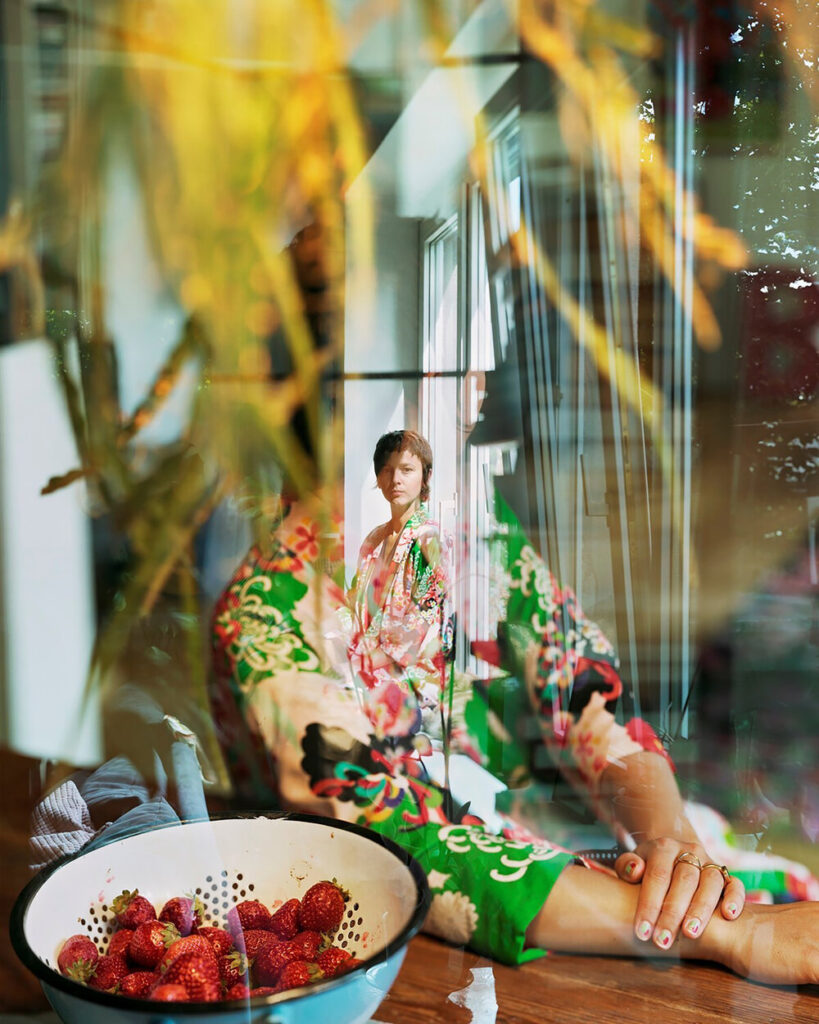
Alec Soth is an American photographer who photographs strangers in different parts of America. He targets individuals out and about with unique equipment like tents and suitcases. One of his projects was called ‘Sleeping by the Mississippi’ where he travelled by the river and photographed interesting individuals he past. He aimed for people with a unique story and showcased their characters through props and environment.

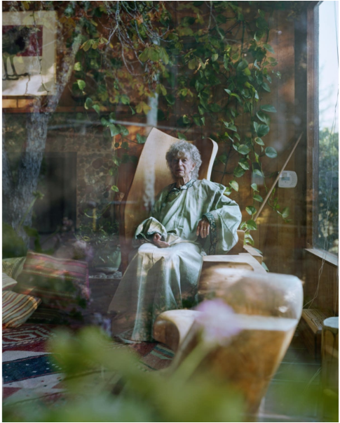
This photograph shows an older lady sat on her chair in a large, old house. She is centred in the frame surrounded by woods, patterns and greens. It looks as though there are two images overlaid: one of the house and the second with a tree. There is an out of focus plant also at the front which creates a sense of depth as everything else in frame is further away and sharply in focus.

This photograph is laid out as though the viewer is looking through a window and the trees appear like a reflection. By peeking through a window into the lady’s personal home the viewer is peaking into the woman’s life as homes are used in the media for as a reflection of a person/characters mind and personality. Her home has earth tones and lots of wood which shows a down to earth headspace. She has a plush orange chair which shows her loving/comforting personality. To her side is a large, modern window which lights up the whole room. This shows an open mind and cheerful personality which shines bright despite being realistic and down to earth. Additionally she has a selection of bold patterned cushions and carpets which show an unconventional look on life.

The woman herself is dressed in a green nightdress. Its shape reflects a nightgown which shows how she values comfort. By making the photograph look like its been taken through a window this isn’t necessarily how she would present herself to others and instead how she dresses on her own in the comfort of her own home. Despite being alone in her home, she is dressed well in a clean and tidy dress which shows how she values and cares for herself.

The overlay of greenery shows how she isn’t in a bubble or closed off but overgrown with external influence, has a successful social life and constantly growing as a person. Alternatively it could show what the woman is looking at. Since it looks like a reflection, it seems as though the woman is staring out her window at the woodlands. This could show an appreciation for the plant life but also outside in general which she might’ve taken for granted when she was younger and able to spend long periods of time in. If her house is representative of her mind then this staring out a window could be showing her longing for the outside world around her and what’s past her through the years and therefore her youth. She could be reflecting on her past with regrets or pride or wishes to go back. I believe this could also show a disconnect with the viewer as she is looking at the world around her with appreciation while the viewer is looking inwards at her instead and judging her based on her environment in the comfort of her home. We weren’t invited in were just looking.

The woman is well lit in light colours to make her stand out from the darker background. Additionally she is centred and well lit which draws the eye and showcases that nothing makes up her personality but her. Some people put too much importance into work or material items however this woman understands the balance. The flower in the foreground could represent her love for her garden however since it does not obscure her in away way it shows that she doesn’t let it takeover her life.

This portrait also showcases and highlights the woman’s age. The abundance of bright colours with bold patterns creates a vintage appearance. The background also highlighting outdated maximalist styles with woods, a grand fireplace and an excess of cushions and rugs also looks old in comparison to white, modern minimalistic styles. I believe that the background having an older look is significant because it reflects both the woman’s age and her interests. This tells us a lot about the woman without ever meeting her as interests and experience will impact her personality and therefore her home.

Introduction To Environmental Portraits

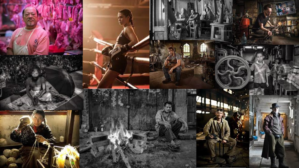
Different Types of Environmental Portraits by many different photographers.

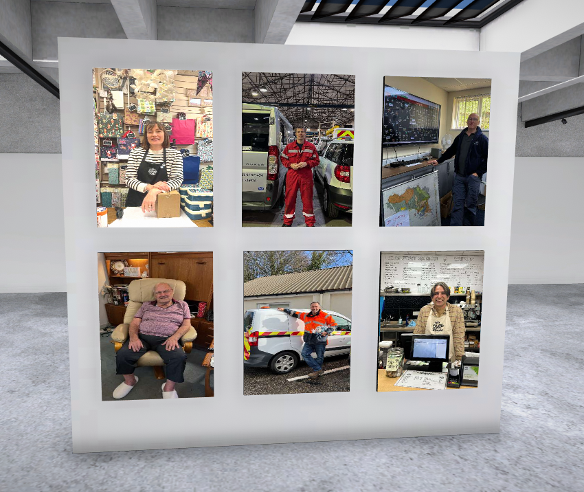
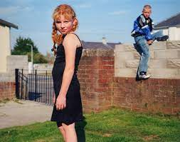
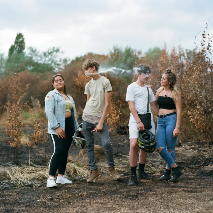
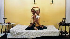
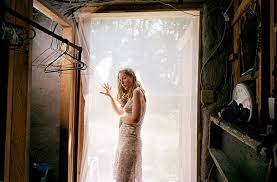
The table shown above includes 6 different environmental portraits by 6 different photographers. Each different photo portrays a different type of environment , the first image portrays a girl and a boy, giving ideas of a relationship between them based on the distance between them maybe one with tensions, the idea of them in the garden and the boys clothing portrays ideas about their social class maybe being a little bit on the lower side. The environment of that image led me too all those connotations, that’s why the environment of your image is so important to the viewer’s, its sets a whole basis for thinking.

Ways in which we use environmental portraits~

Environmental Portraits can be used for many different things, a main reason being business, they are a tool that can help a business connect with its potential clients. They can show a more realistic and authentic representation of a workers everyday routine, which may make the business more appealing, opposed to regular old business headshots. Workplaces, like offices, tend to be flatly and evenly lit, which makes them good for a photoshoot without needing to set up a background. Environmental portraiture offers more options than traditional headshots when it comes to cropping photos. Capturing the subject’s stance, gestures, and corporal expression shows they are real people. Recently, it has become very common to see companies use environmental portraits instead of the classic business portraits or headshots, and it works. However, that doesn’t mean business headshots and environmental portraits are the same thing.

Environmental portraits are powerful tools in photography that convey a subject’s personality and story through their surroundings. Here are several ways to use environmental portraits effectively:

  1. Contextual Storytelling: Use the background to provide context about the subject’s life, interests, or profession, enhancing the narrative and allowing viewers to gain insight into who they are.
  2. Emphasizing Character: Choose settings that reflect the subject’s personality or hobbies, helping to illustrate their identity and creating a deeper connection with the viewer.
  3. Creating Atmosphere: Use lighting and composition to establish a mood or atmosphere that complements the subject, enhancing the emotional impact of the portrait.
  4. Capturing Action: Incorporate dynamic elements by photographing subjects engaged in activities relevant to their environment, making the portrait feel more alive and authentic.
  5. Incorporating Details: Include objects or elements in the environment that hold significance for the subject, adding layers of meaning and personal touch to the image.
  6. Balancing Elements: Use composition techniques to balance the subject with their environment, ensuring the viewer’s eye is drawn to the person while still appreciating the setting.
  7. Highlighting Relationships: In group environmental portraits, show interactions among subjects within a shared space, emphasizing connections and relationships.
  8. Experimenting with Angles: Explore different perspectives and angles to create unique and compelling compositions that highlight both the subject and their surroundings.
  9. Using Natural Light: Leverage natural lighting to enhance the mood and texture of the environment, creating a more organic and engaging portrait.
  10. Conveying Emotion: Use the environment to evoke specific emotions, whether it’s warmth, solitude, or vibrancy, aligning the setting with the subject’s feelings or story.

By thoughtfully integrating the subject with their environment, environmental portraits can create rich, engaging images that resonate with viewers and tell powerful stories.

What actually is an environmental portrait?

Environmental portrait photography is the art of taking pictures that will be used to tell a person’s story via its connection to a certain place. This connection often reflects the message that the environmental portrait photographer wants the viewer’s eye to receive. Great portraits of this sort will capture people’s interaction with their natural surroundings to tell strong stories that generate an emotion in the viewer, giving insight into where these people are, what they do and who they are.

An environmental portrait is a type of photography that captures a subject in their natural surroundings, providing context about their life, personality, and interests. Unlike traditional portraits that often focus solely on the subject’s face, environmental portraits incorporate elements of the background to enhance the narrative and emotional impact of the image.

These portraits often showcase the subject engaged in an activity or situated in a setting that is significant to them, such as their home, workplace, or a location that reflects their hobbies or passions. The combination of the subject and their environment helps to tell a more complete story, offering viewers insights into the individual’s identity and lifestyle. Environmental portraits can range from casual and candid to formal and composed, and they are widely used in editorial, documentary, and fine art photography.

Hoe to create a good environmental portrait

  1. 1. Get to know the subject. As a photographer, you can increase your subject’s comfort in front of the camera by connecting with them on a personal level. By getting to know them a little, you’ll be able to better figure out the type of shot that reflects who they are. This is a great time to talk about possible locations, such as their workplace, their home, or an urban or natural area where they like to spend time.
  2. 2. Get to know the location. Research potential locations to understand the layout and available lighting conditions so that you can come properly equipped with the right gear. Test out different portrait lighting setups if necessary to ensure you’ll get what you need.
  3. 3. Make a plan. Have a few shots in mind that you know you want to capture, especially if you’re working with natural light. Depending on the available light or present colors, you may also want to instruct your subject on what they should wear, or some particular poses to try.

To create a good environmental portrait, start by choosing a location that reflects the subject’s personality, interests, or profession, ensuring it enhances the narrative of the image. Pay attention to composition by framing the subject thoughtfully within their surroundings, using elements like leading lines or the rule of thirds to guide the viewer’s eye. Utilize natural light for a softer, more organic feel, and consider the time of day to capture the best lighting conditions. Engage the subject in an activity or pose them naturally within the environment to convey authenticity and emotion. Finally, include meaningful details in the background that add depth to the story, ensuring the focus remains on the subject while still allowing the environment to play a significant role in the portrait.

Reviewing the Photos

Reviewing the photos after a photoshoot is a crucial step in ensuring the quality and integrity of the final images. This process allows photographers to assess the composition, lighting, focus, and overall aesthetic of each shot, ensuring that they have captured the intended vision and achieved the desired results.

Taking a close look at every detail is essential for identifying any potential issues or areas for improvement. Pay attention to composition and framing, ensuring that elements within the frame are well-balanced and visually appealing. Check for proper exposure and lighting, making adjustments as needed to enhance the overall mood and atmosphere of the images.