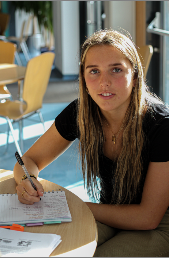
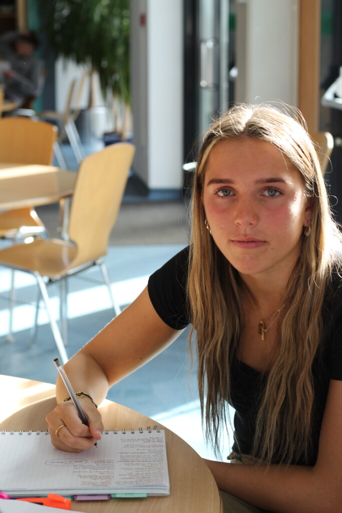
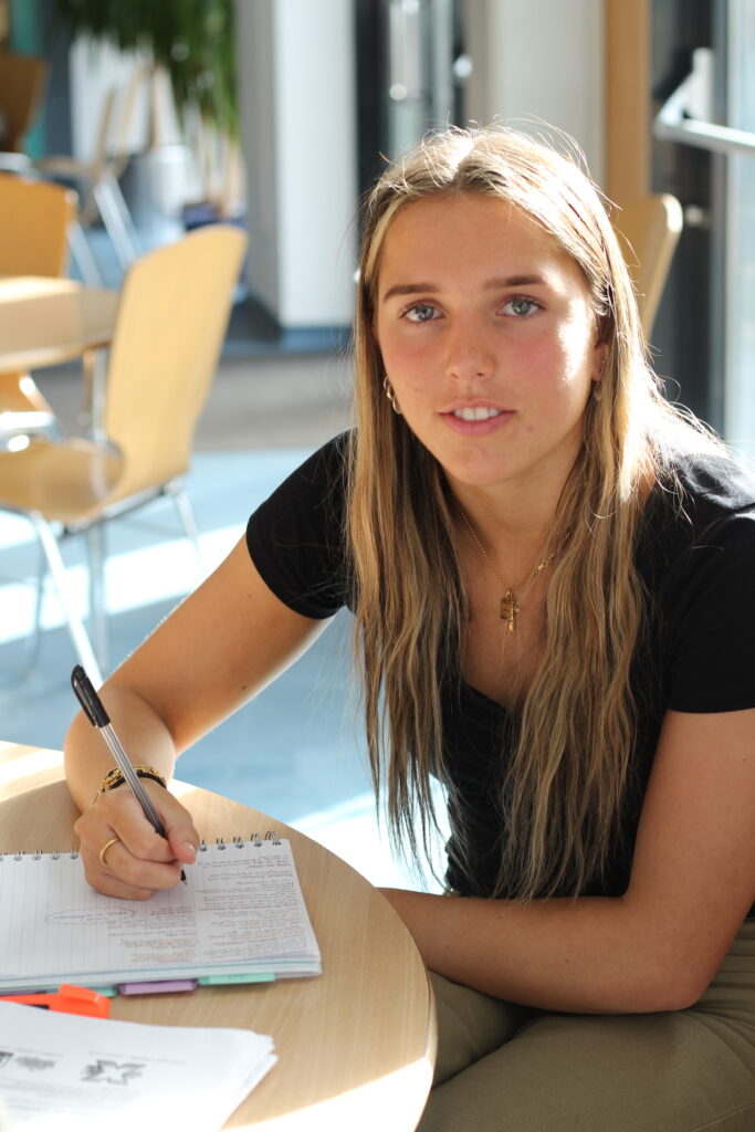
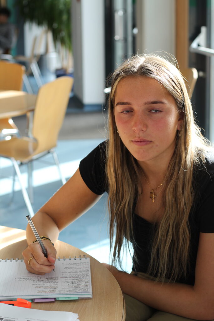
Studio Lighting

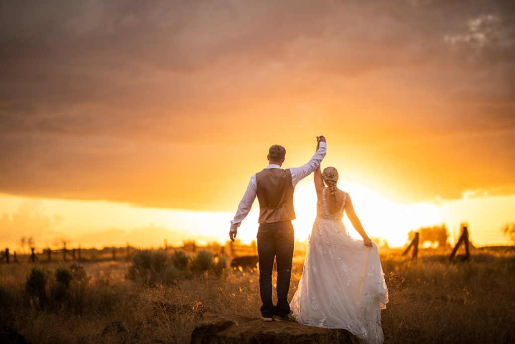
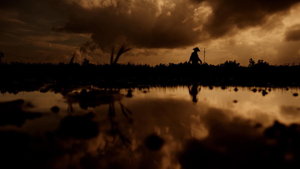
In most cases we can make use of natural or available / ambient light, but we must be aware of different kinds of natural light and learn how to exploit it thoughtfully and creatively. We can do this by looking at the:

  • intensity of the light
  • direction of the light
  • temperature of the light (and white balance on the camera)
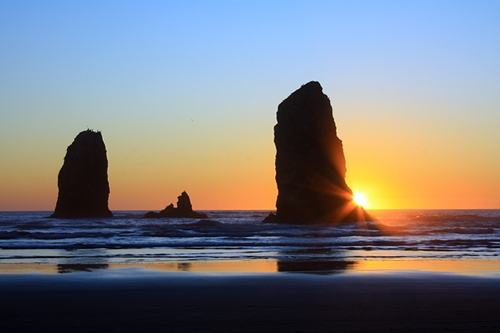
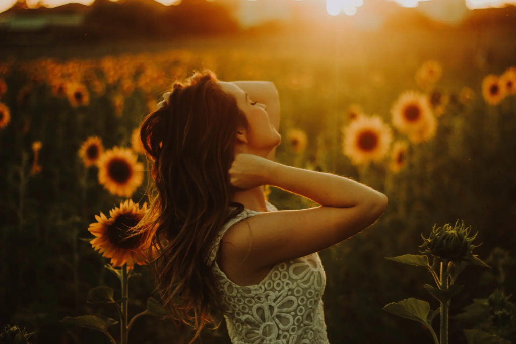
  • making use of “the golden hour”
  • Using reflectors (silver / gold)

There are different types of studio lighting that we can use such as Rembrandt, butterfly and chiaroscuro.

Rembrandt Lighting

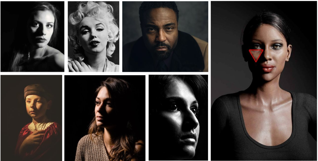
Rembrandt lighting is a technique for portrait photography named after Rembrandt Harmenszoon van Rijn, a Dutch painter. It refers to a way of lighting a face so that an upside-down light triangle appears under the eyes of the subject.

Chiaroscuro Lighting

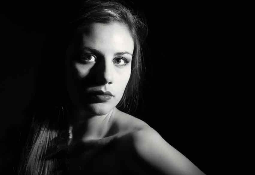
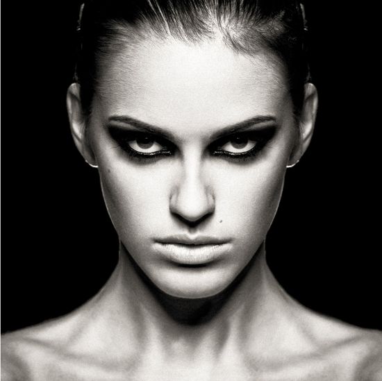
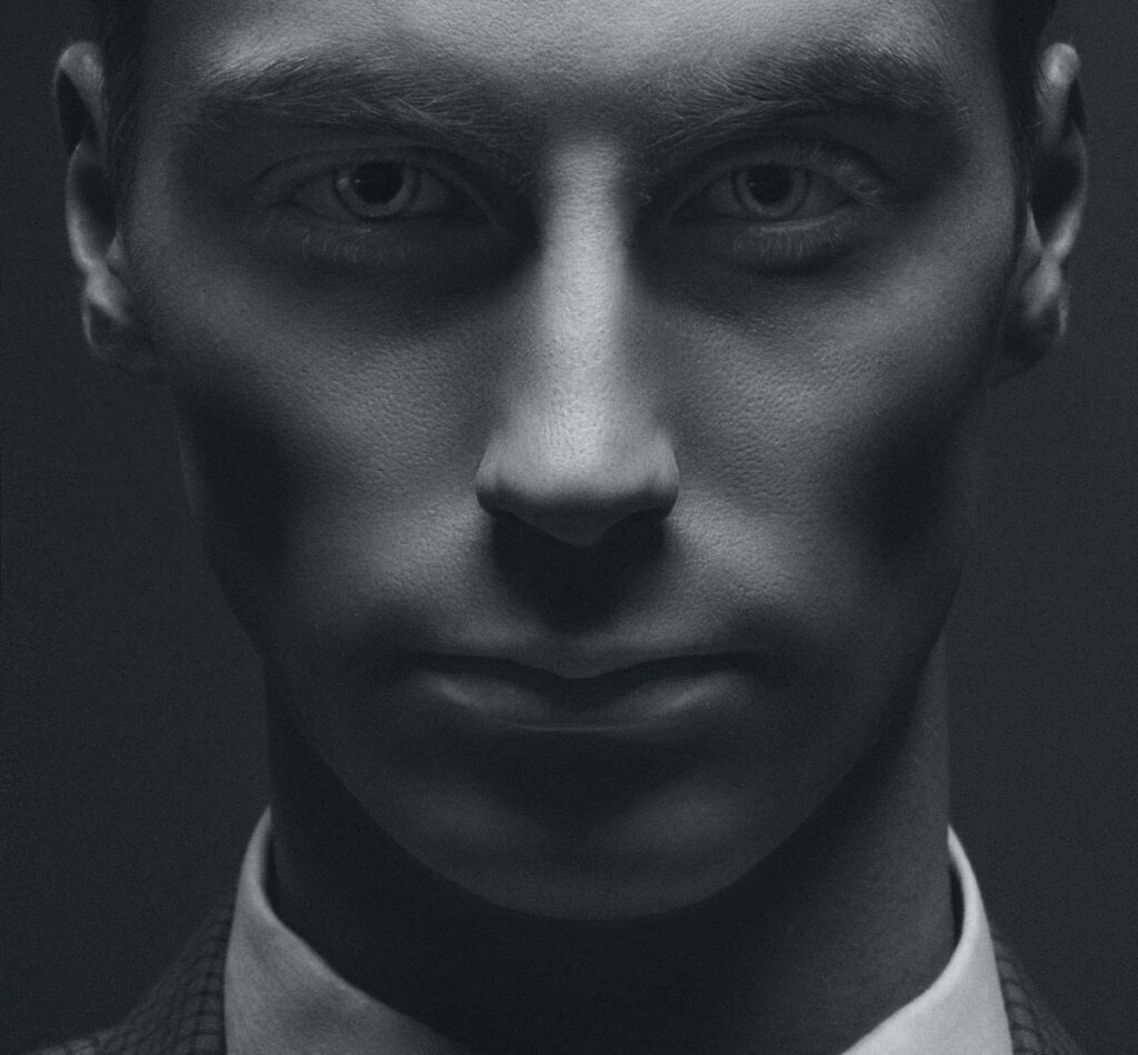
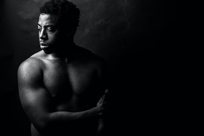
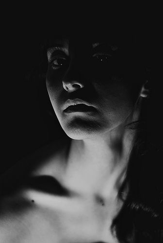
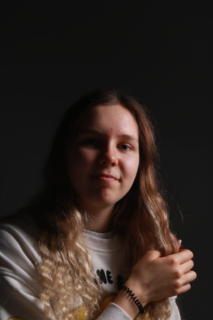
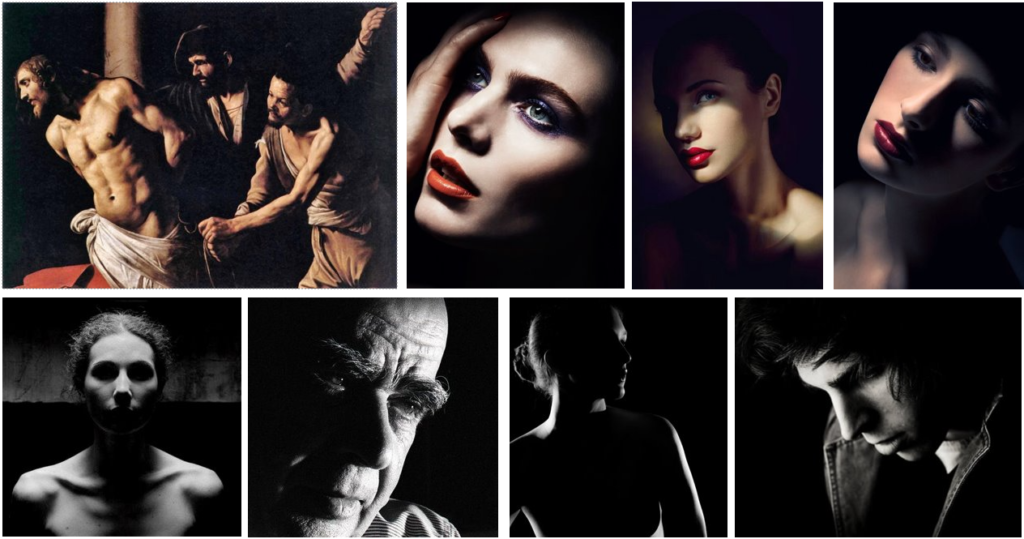
Chiaroscuro, Italian for lightdark, is bold contrast between light and dark. It first appeared in 15th century paintings in Italy and Holland. However, true chiaroscuro began during the 16th century in Mannerism and Baroque art. Dark subjects are dramatically lighted by a shaft of light, creating a split of light and shadow.

Butterfly Lighting

Butterfly lighting is a type of portrait lighting technique used mainly in a studio setting. Its name comes from the butterfly-shaped shadow that forms under the nose because the light comes from above the camera. It is also sometimes called ‘paramount lighting’ or ‘glamour lighting’.

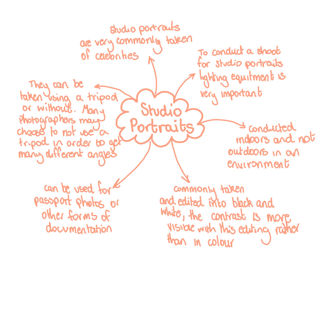
Studio Portrait Photography

What is Studio Portrait Photography?

Studio portrait photography is a type of photography that focusses on the individual in the photography rather than the background.

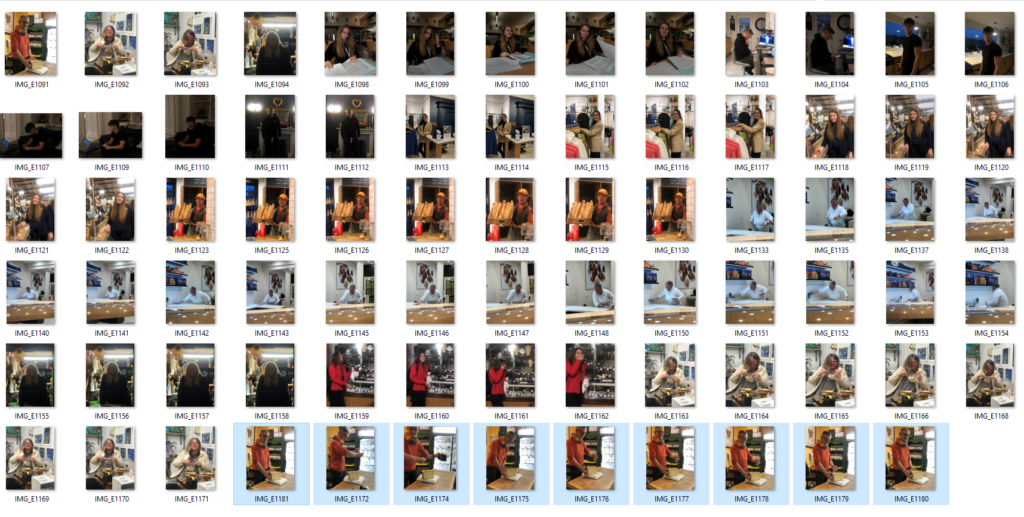
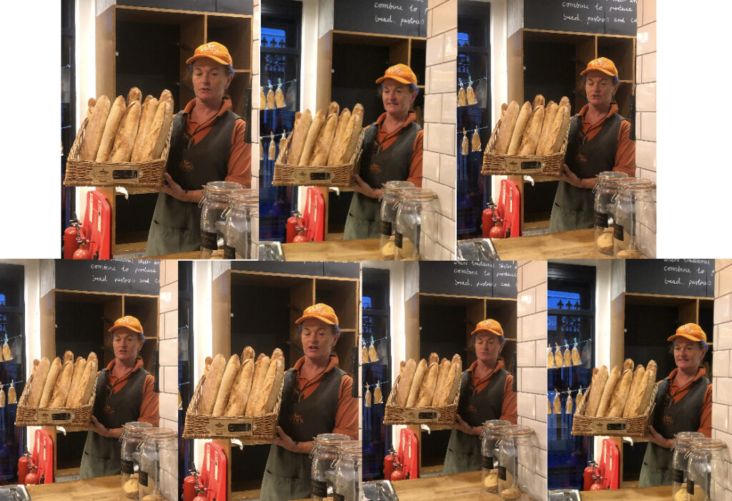
These photos could involve props to allow the individuals personality to be expressed more. Furniture is also a common prop to be used as it will allow the photographer to get different angles of the individual, for example, sitting on a chair facing away from the camera but twisting your body to capture the face in the photograph. The photographs are taken in an indoor environment where various types of lighting is accessible. this would most likely be a photography studio. Like in usual photography photoshoots, studio portraits can take up to several hours or less than a hour. As well as this, photographers will aim to take as many photographs as they can to ensure they get the right outcomes from their shoot. they do this for reasons such as: many photos wont have focuses and will come out blurry, the lighting might have no looked right in some photos and the individual may have not been prepared for some of the shoots. Studio portraits usually have better outcomes when the individual and photographer are comfortable with each other. this is a good advantage as it gives the photographer the confidence to direct the individual during the photo and it also gives the individual the chance to express themselves and feel secure enough to be involved.


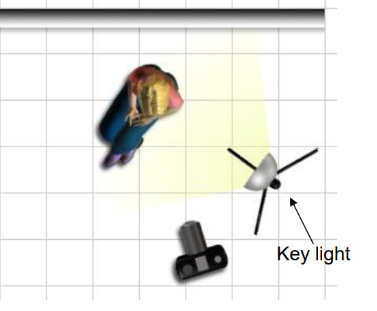
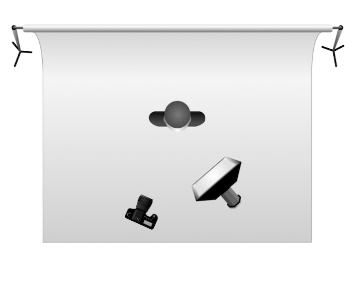
Studio set up for photoshoot

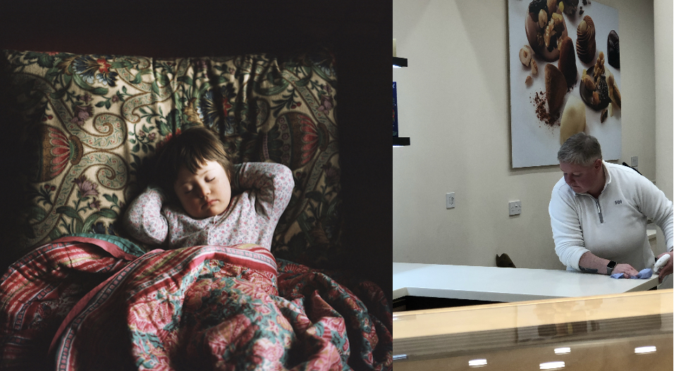
Environmental Portrait Artist Reference Comparison

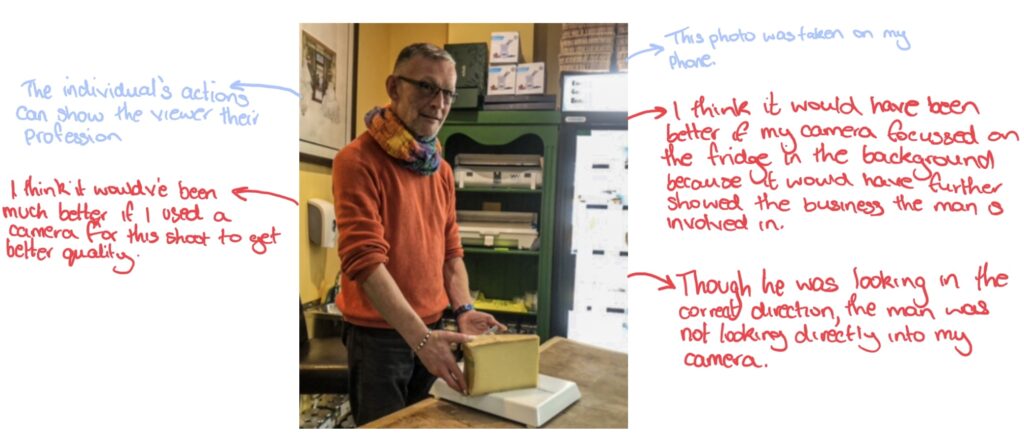
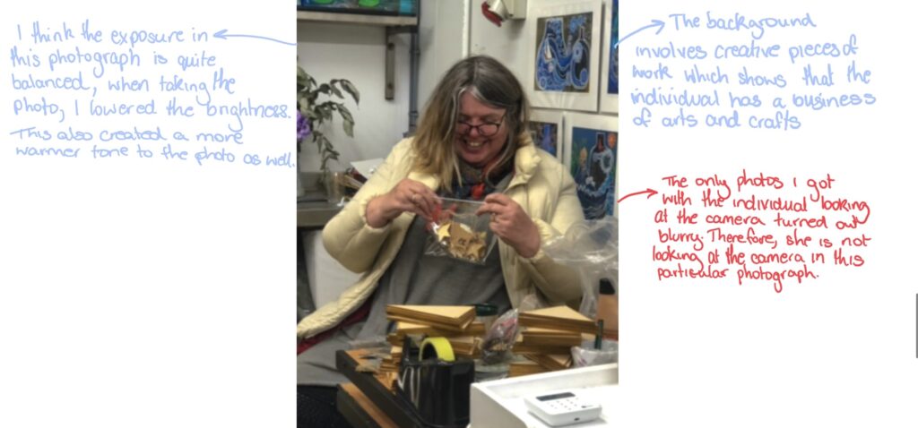
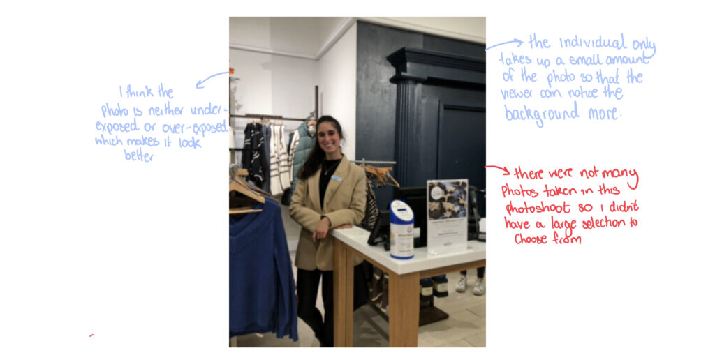
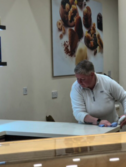
A similarity between my photos and Davey’s is that we both only focus on one person. This means that the main view point is just on one particular place.
as well as this, a lot of my photo involve warmed toned colours like hers does. In these two photos, the mix of dark reds and forests green with the sunlight shining through creates a really warm tone in Davey’s photo. Though my photo has more brighter tones, use of wood, creams and browns also give across a warming feel to the photo.

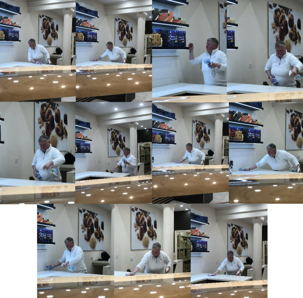
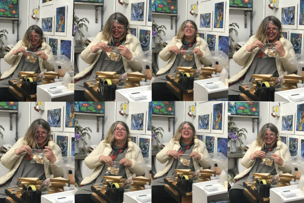
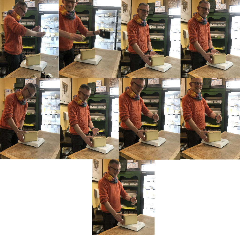
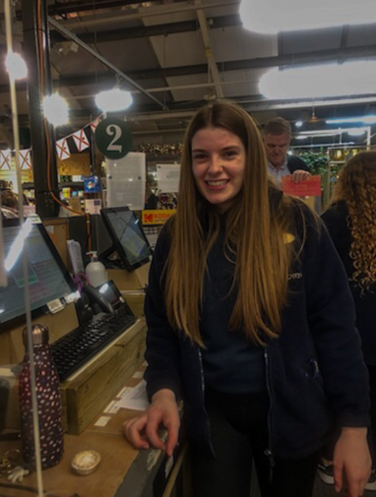
One big comparison between our photos is that Davey’s photos are taken on a more personal level than mine. She photographs her children in their day to day lives. The photo above is taken from one of her projects which focuses on her daughter Alice. In contrast, my photos are simply focussing on people’s professions in their own work places. You can tell that Davey puts more effort into taking her photos than I do. She takes time controlling the lighting and props, whereas mine are just taken in the moment and as they are people who I am disturbing I try to be quite quick taking them.

Environmental Portraiture photoshoots+ edits

Photoshoot 1

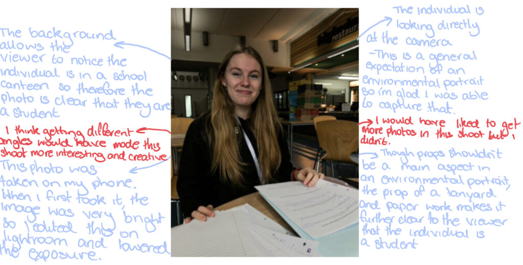
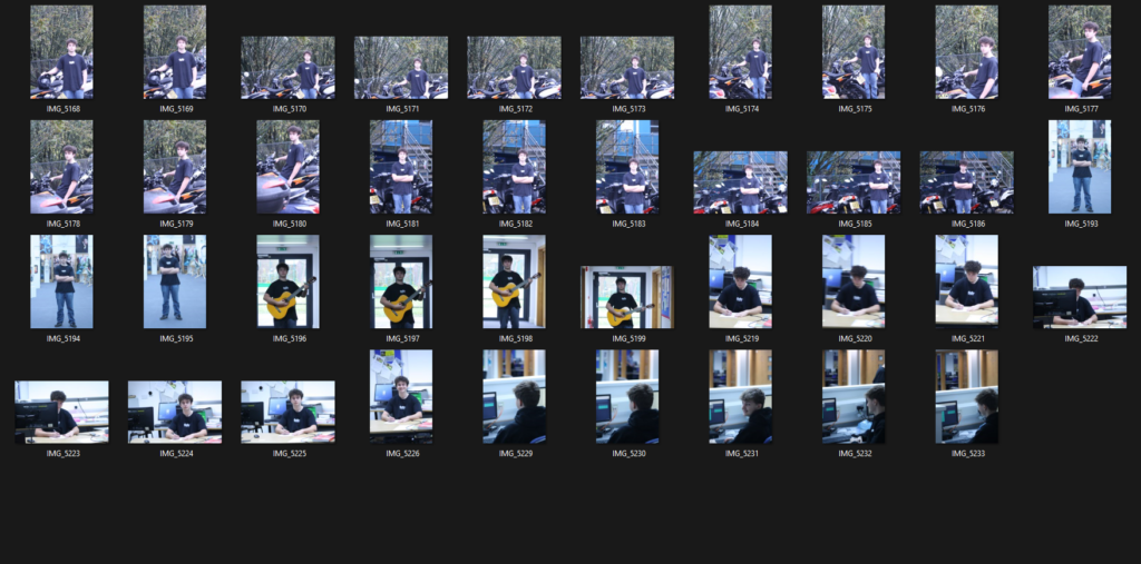
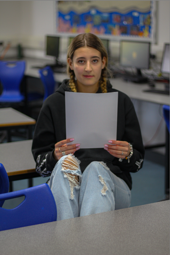
For this first photoshoot on environmental portraiture I took photographs around the school of students working or just hanging around in the school. I think this photoshoot could of been much better, I could of included a variety of people instead of using just one model and I also could have taken photographs of teachers. Overall I got a few good photos out of this photoshoot but I could have done a lot better.

Photoshoot 2

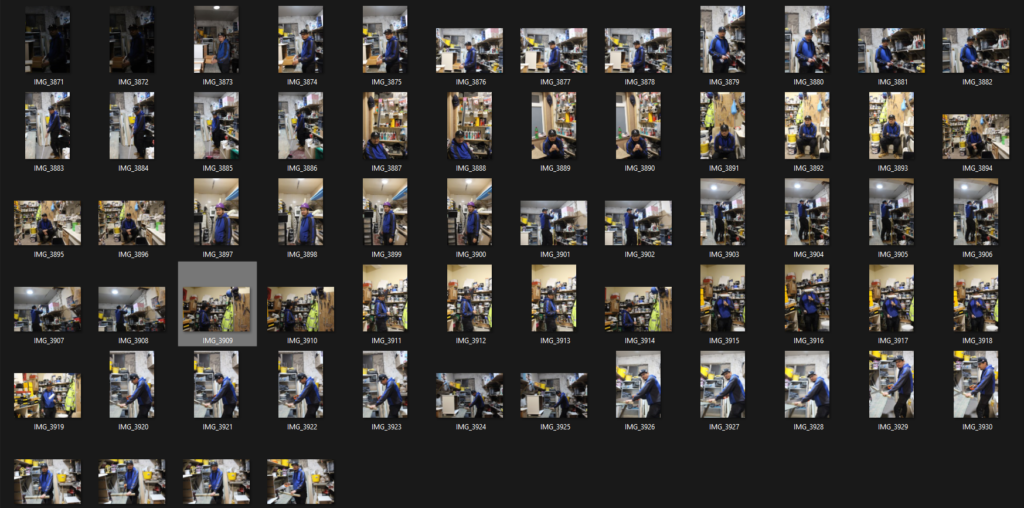
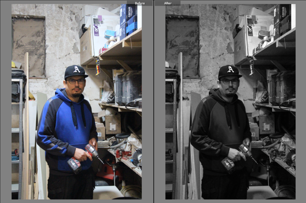
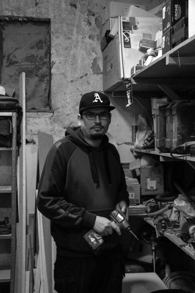
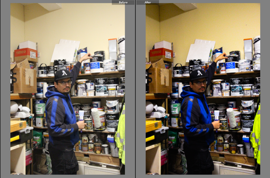
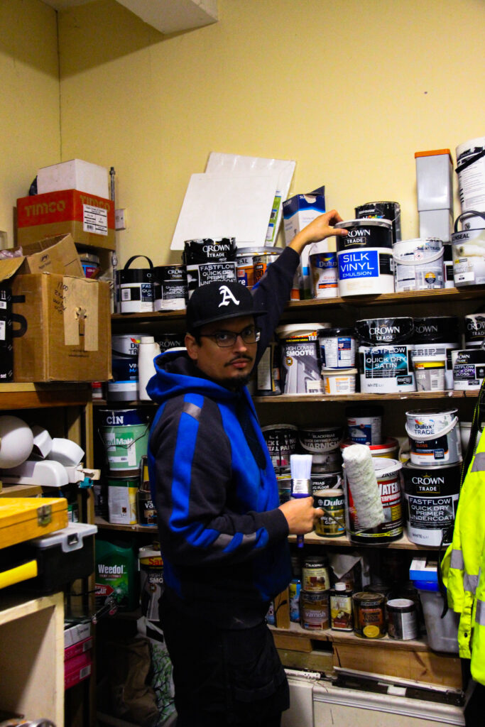
For this second photoshoot on environmental portraiture i took photographs of a construction worker, a labourer. In this photoshoot the model was in various different poses holding different objects for example a saw or paintbrush. This photoshoot turned out much better than the first one, I think this because this photoshoot was more planned out and i spent more time on this photoshoot, I also prefer these images because it isnt in a school environment and the images have more of a story to it and they are unique. Overall i think this second photoshoot came out nicely and i have many good images from this photoshoot.

Photoshoot 3

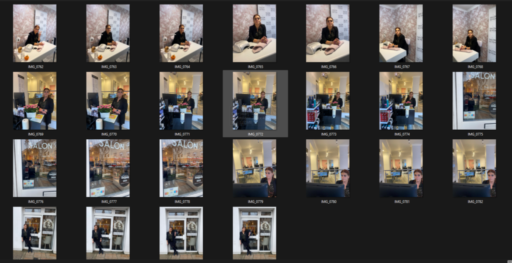
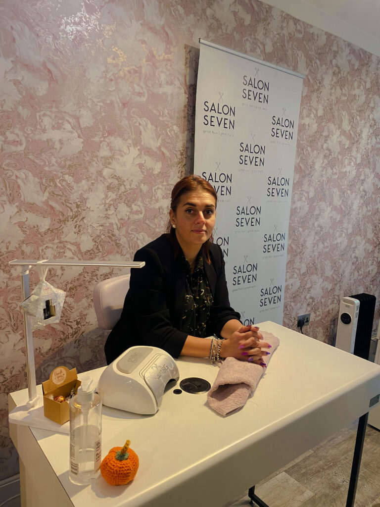
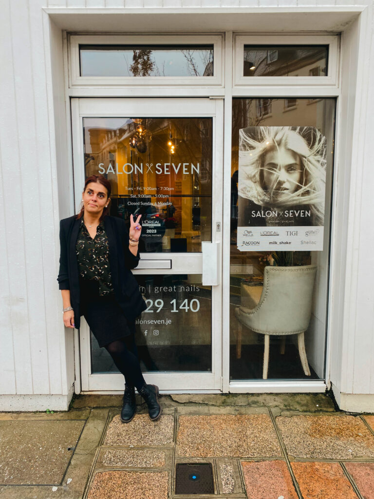
This is my third photoshoot on environmental photography, for this third photoshoot i took photographs of a nail technician, at her salon. The model in this photoshoot was in many different places in the salon for example: the reception, outside the salon and at her work desk. The model is not holding anything in these images and is just posing engaging with the camera, i liked this because it gives off the sense of professionalism since everything is planned. I really like how this photoshoot turned out and I got many great photos out of it.

Photoshoot 1 Favourite images + edits

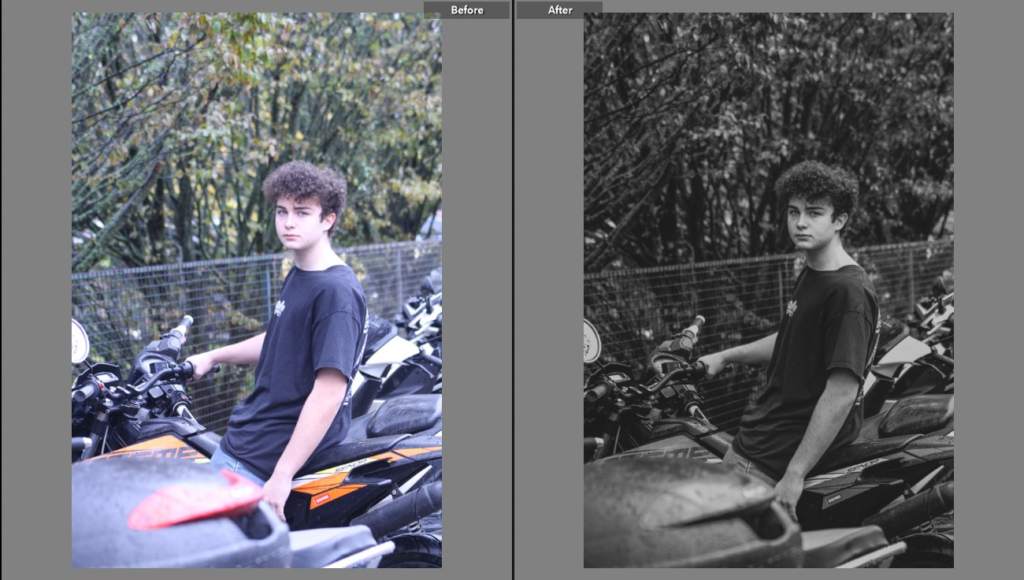
This is a before and after of my favourite photo from my 1st photoshoot, i like this photo because the image tells a story very clearly, another thing i like about this photo is how it is zoomed however you can still see the bikes in the backdrop. For this edit i put the image in black and white increased the temperature in the image, reduced the exposure and contrast, i also increased the clarity.

ISO 800 , Focal Length 75 mm, Aperture f/5.0, Shutter Speed 1/125 sec

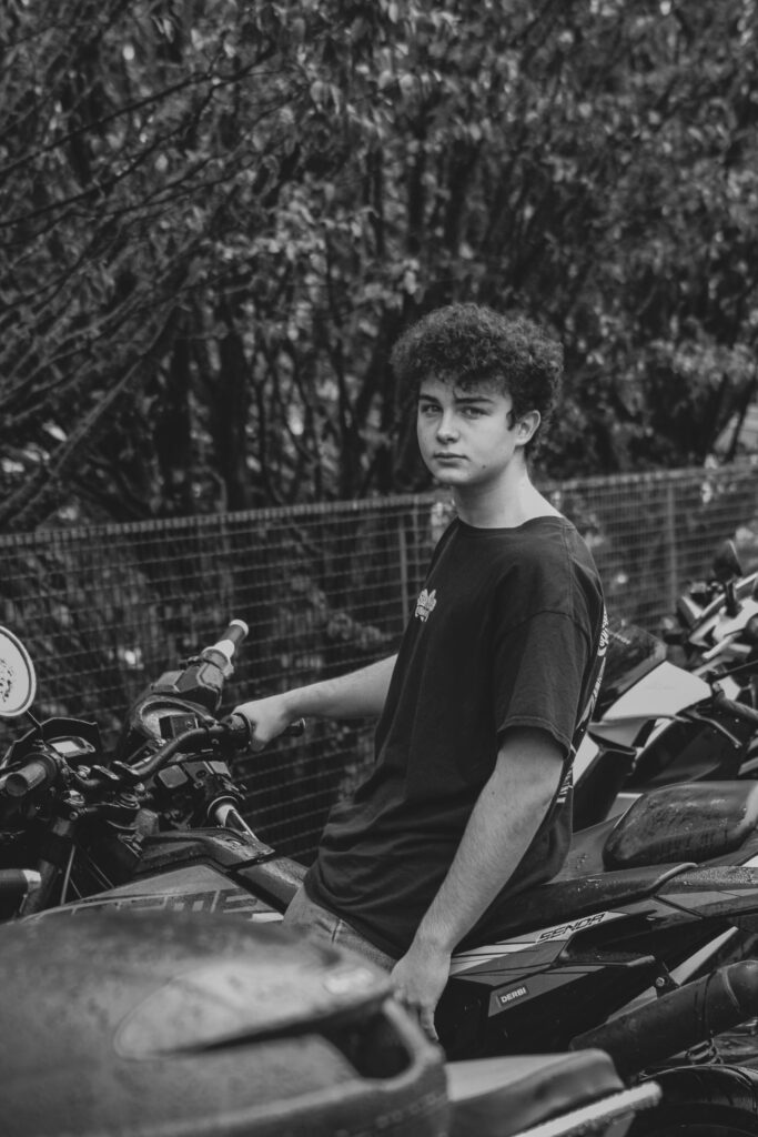
This is another one of my favourite photos from my 1st photoshoot, i like this photo because the model is centred and is very serious. For this image i put it into monochrome and reduced the exposure and the contrast and decreased the blacks and increased the clarity by a bit.

ISO 800 , Focal Length 75 mm, Aperture f/4.0, Shutter Speed 1/100 sec

Photoshoot 2 Favourite images + edits

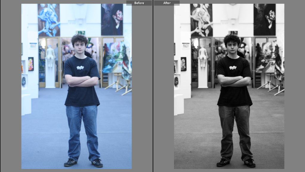
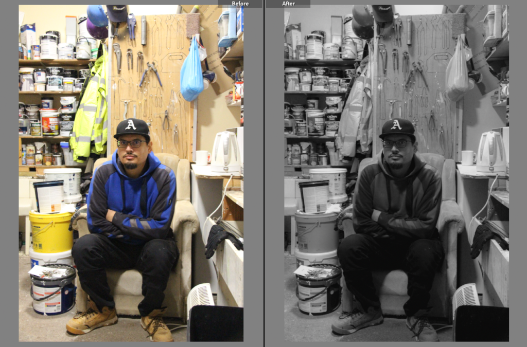
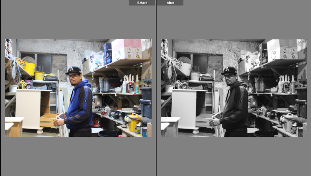
This is a before and after of one of my favourite images from my second photoshoot. For this edit i put the image in black and white, reduced the exposure, contrast and i increased the shadows.

Canon Camera, ISO 6400, Focal Length 32mm, Aperture f/4.0, Shutter Speed 1/40 sec

This is a before and after of another one of my favourite photos from this second photoshoot. This is one of my favourite images from this photoshoot because it catches the worker mid action but it still is not an action shot, he is still engaging with the camera. For this edit i reduced the exposure, increased the contrast, decreased highlits and shadows and i also increased the saturation and vibrance.

Canon Camera, ISO 6400, Focal Length 28mm, Aperture f/4.0, Shutter Speed 1/40 sec

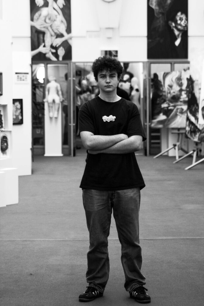
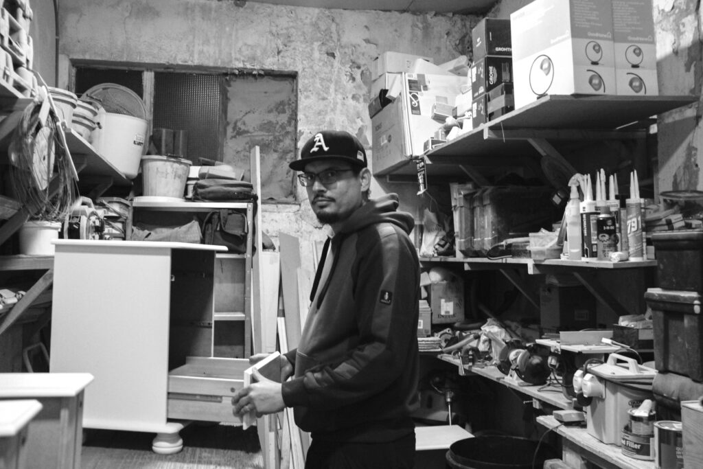
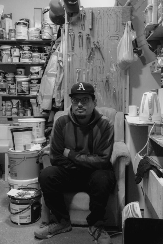
This is another one of my favourite photos from my second photoshoot, i like this photo because the worker is looking straight on at the camera very seriously, reminding me of the image arnold newman took of Alfried Krupp. I also like this image because it is very clear to see where his environment is, as all the tools are behind him. For this image i put the image into a soft black and white, reduced exposure and contrast, and i also reduced shadows and higlights.

Canon Camera, ISO 6400, Focal Length 28mm, Aperture f/4.0, Shutter Speed 1/25 sec

This is another one of my favourite images from my second photoshoot, i like this image because there is so much going on in the background which makes it interesting because the viewer has so many different things to look at.For this edit i put it into black and white, increased exposure and shadows and reduced contrast and highlights.

Canon Camera, ISO 5000, Focal Length 20mm, Aperture f/4.0, Shutter Speed 1/30 sec

Photoshoot 3 Favourite images + edits

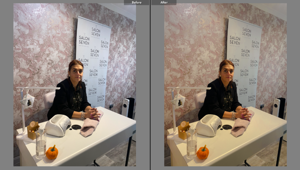
This is a before and after of one of my favourite photos from photoshoot 3, I like this image because the nail technician is looking directly at the camera and you can see her work desk with some of her equipment for her job. She is also smiling which gives this image a very joyful feeling. For this image i increased the temperature and exposure, then i decreased shadows, highlights and the white.

ISO 100 , Focal Length 4.25mm, Aperture f/1.8, Shutter Speed 1/50 sec

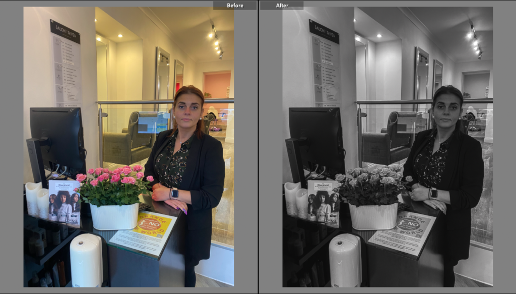
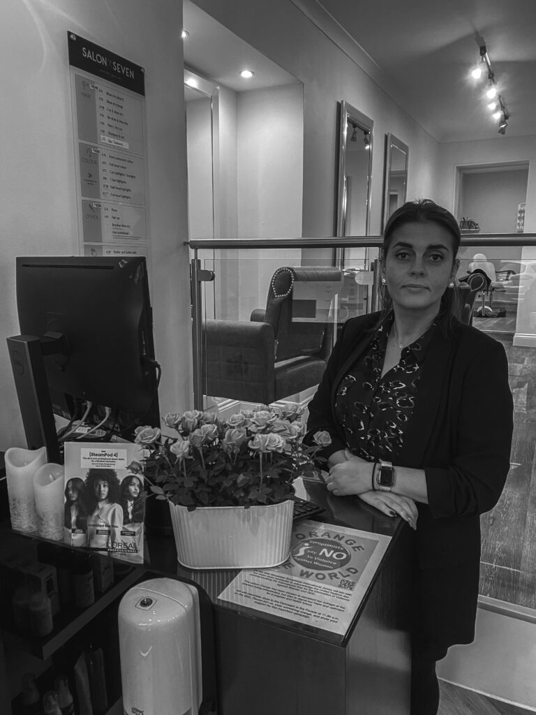
This is another before and after of another one of my favourite photos from my third photoshoot, I like this photograph because it shows that her job is not only about nails but also shows that there is other other things in her job like doing receptionist work and many more. For this image i put the image in monochrome, decreased the highlights, increased shadows and i reduced the exposure.

ISO 100 , Focal Length 4.25mm, Aperture f/1.8, Shutter Speed 1/50 sec

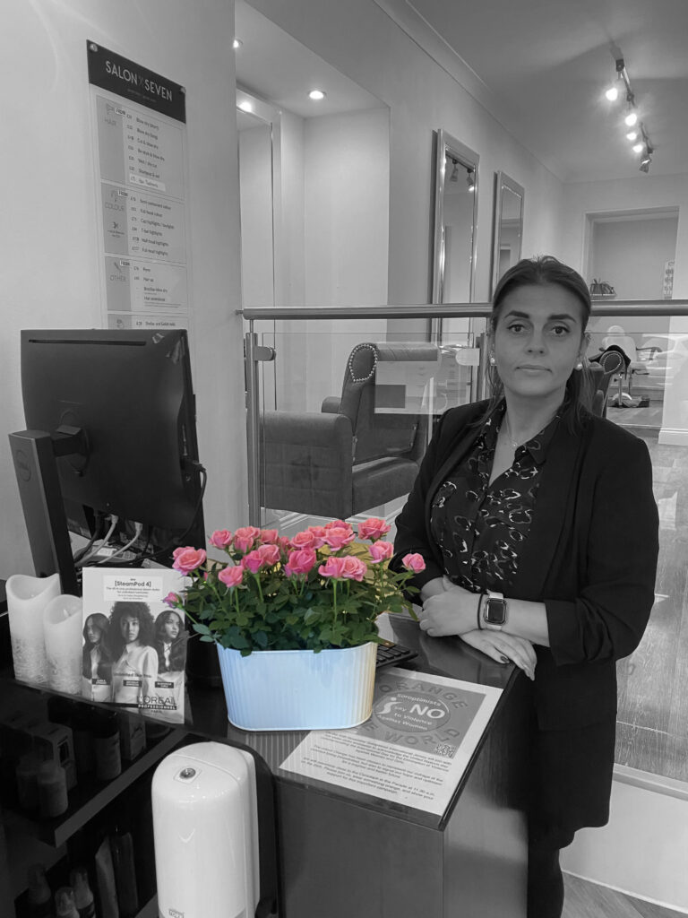
I also made this colour splash edit in photoshop. I made this colour splash because the flowers were very colourful and i think it is a great contrast with the rest of the image in black and white.
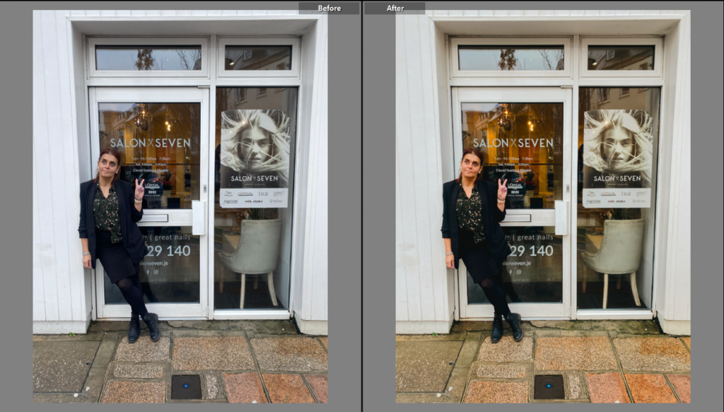
This is another before and after of one of my favourite images from my third photoshoot. This is one of my favourite images because she is posing which shows that the photoshoot is staged and she is engaging with the camera, the image also shows the whole of her environment. For this edit i increased the temperature, reduced exposure and highlights and i also reduced the whites.

ISO 40 , Focal Length 4.25mm, Aperture f/1.8, Shutter Speed 1/100 sec

Environmental Photoshoot 1

Camera settings I used:

Portrait Plans

For my Environmental Portraits, I will photograph indoor and outdoor locations of people at:

  • School

I will be photographing my:

  • Friends.
  • Acquaintances/ fellow students.
  • Teachers

I will take my photos:

  • During my lesson time
  • In my free times
  • Whilst on a break.
  • Hanging out with friends.

How I will take my photos will be:

  • With a Camera.
  • In a place I am comfortable
  • With my friends

why I will take them is because:

  • It captures people in a natural environment.
  • Displays school life and people’s natural environment
  • Examples of what students, teachers and workers do and what environment they are in.

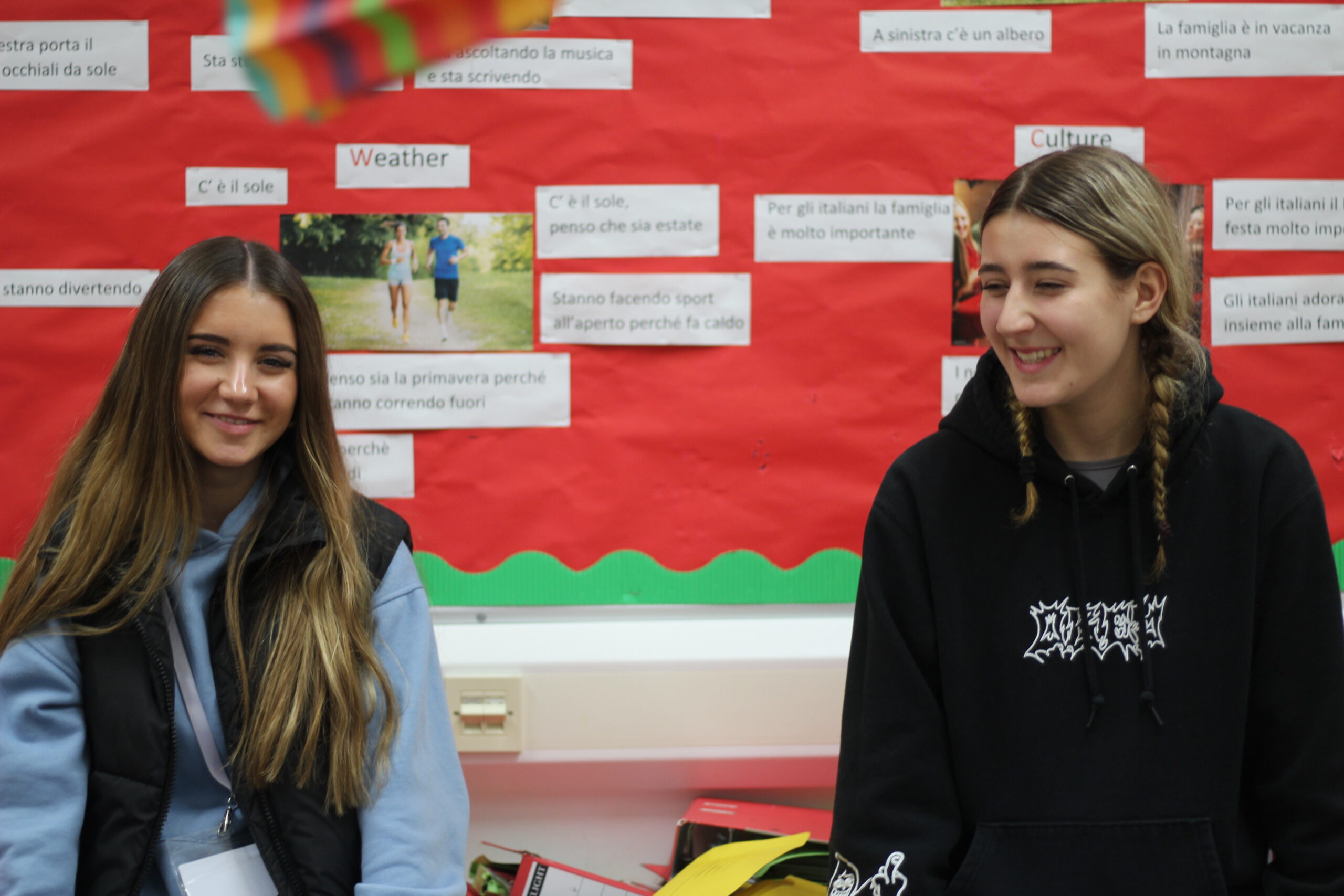
For my first experimentation with environmental photography I photographed my friends around school and focused on the different backgrounds and different angles whilst they are in their ‘natural environment’. This consists of working or learning or conversing with friends, completing schoolwork or teaching a lesson. Taking these photos was beneficial to helping me adjust to taking portrait photos of people instead of objects.

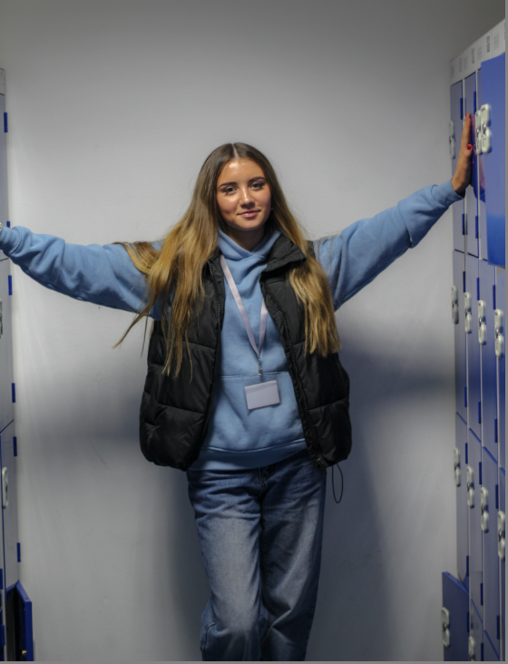
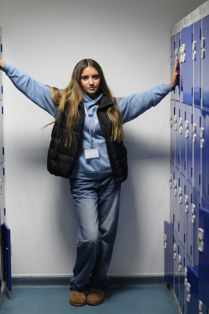
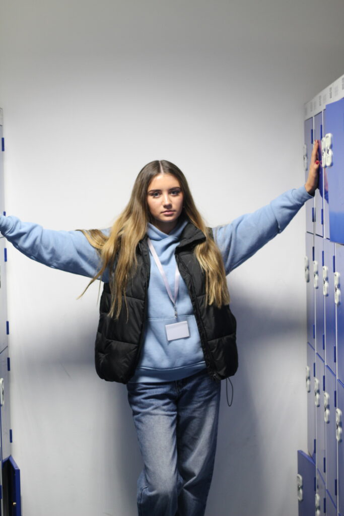
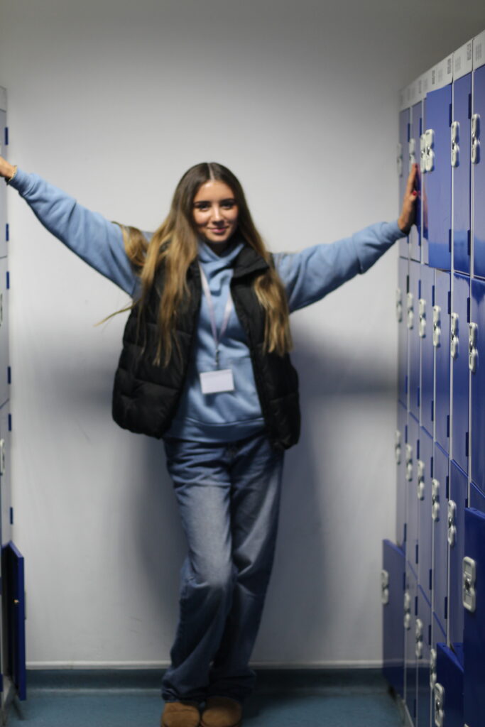
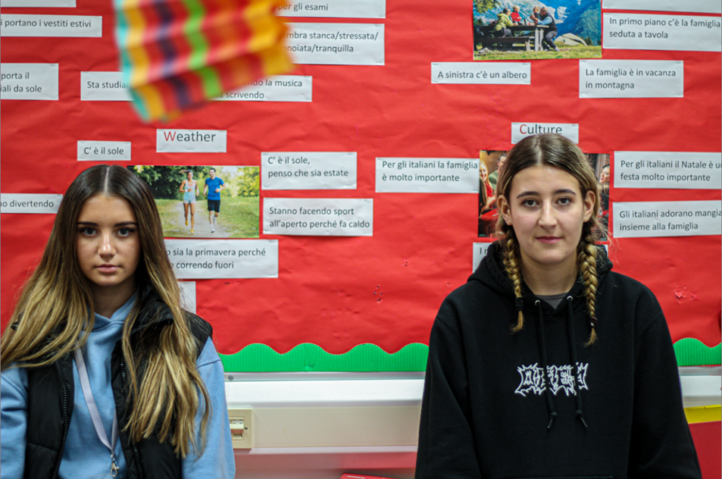
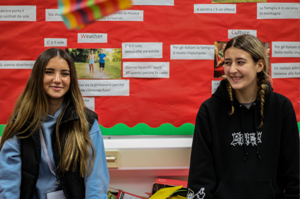
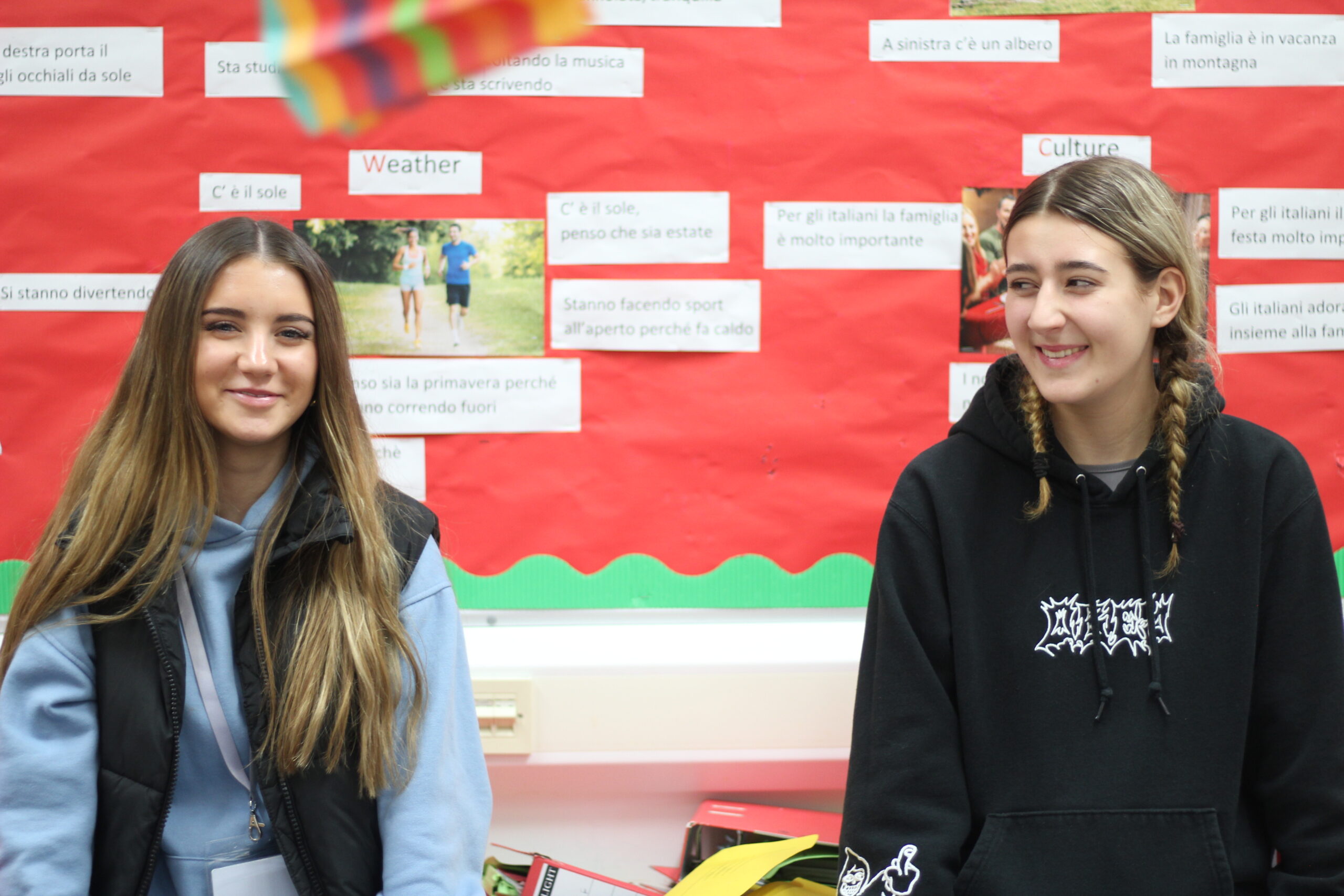
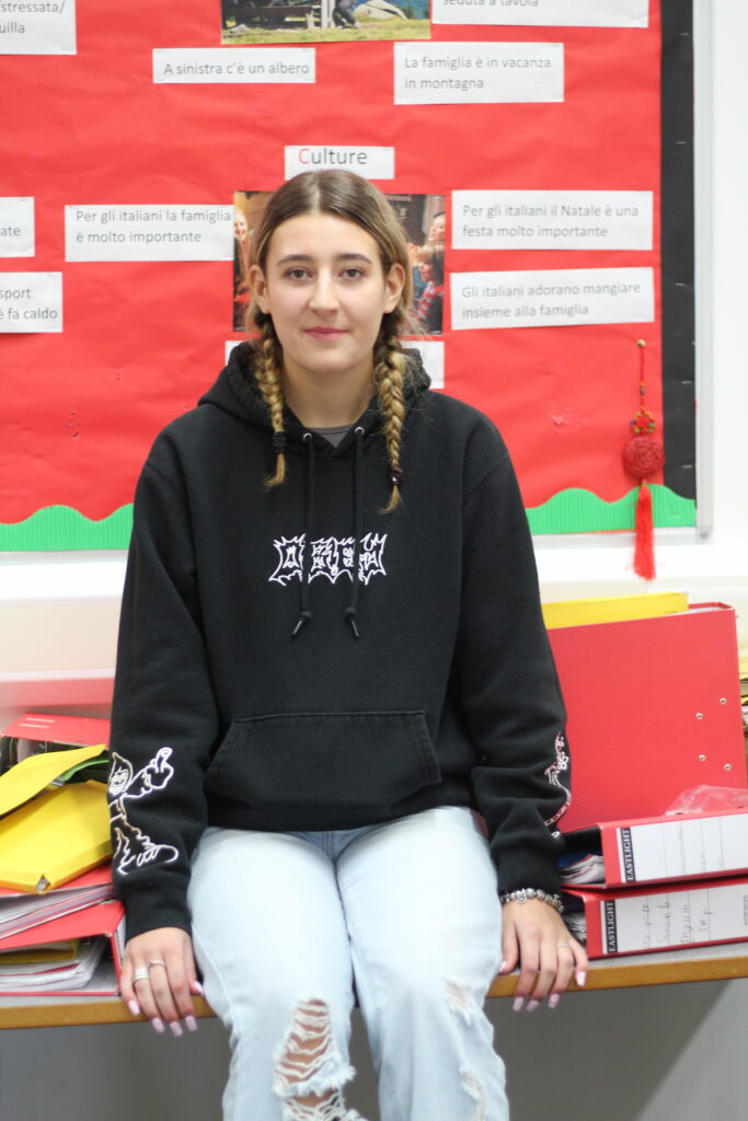
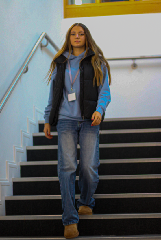
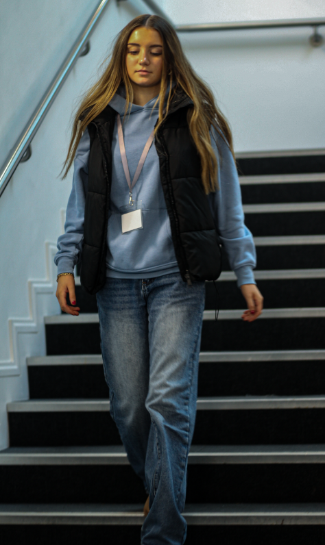
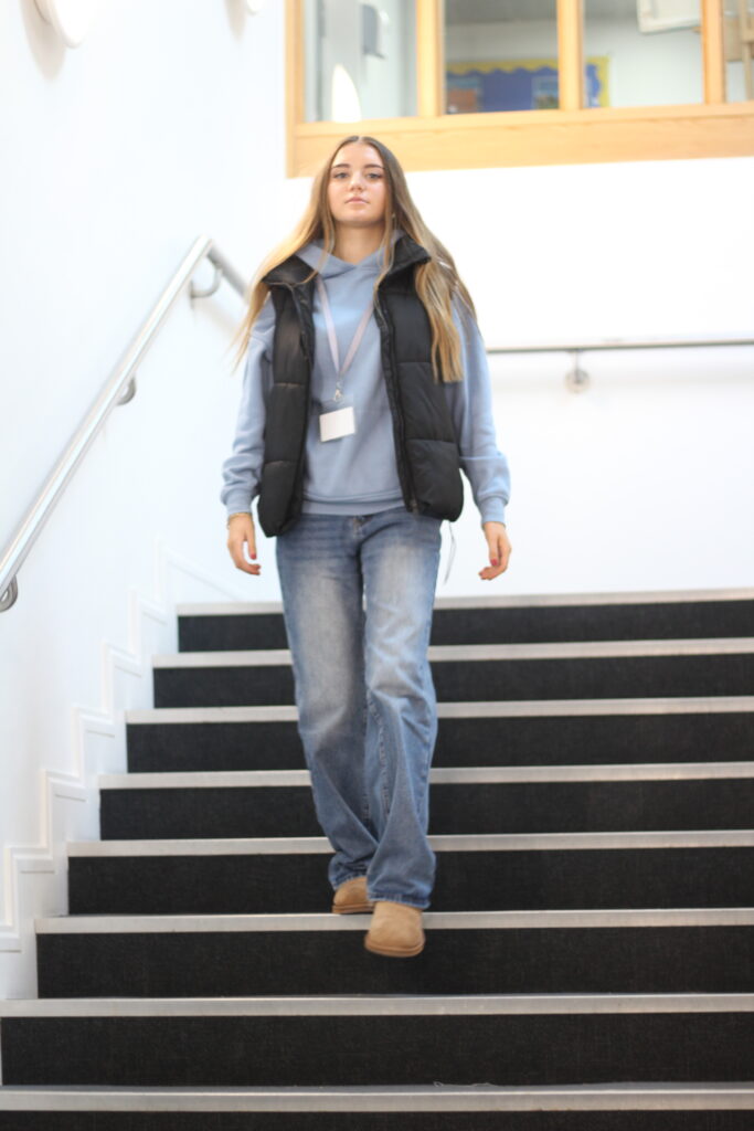
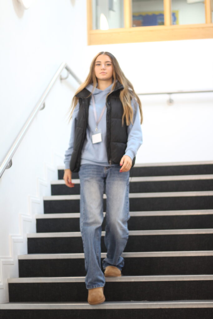
These full body shots were taken in the locker room, I took these photos to represent students as they daily enter the locker room and socialise with friends etc. I got my model to pose for these photos to create a mixture of photos in my experimentation. I wanted her to look directly at the camera and engage with it whilst looking happy with positive energy. Next time to improve I would remove the shadow from behind her as I think it makes the image confusing and looks slightly more unprofessional.

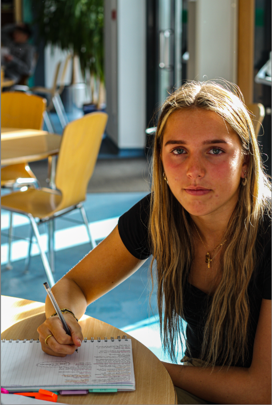
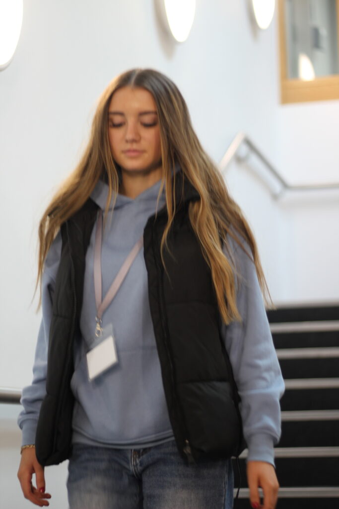
I first of all edited this half-body shot photo by increasing the exposure and making it more colourful and far less dull. I like this picture because it shows her looking directly at the camera with a blank expression, this shows her possible inner feelings and shows her concentration and calmness.

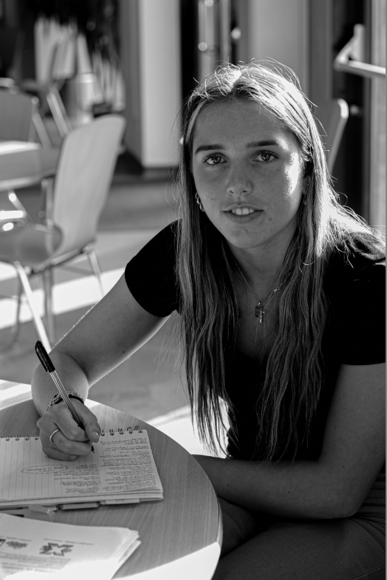
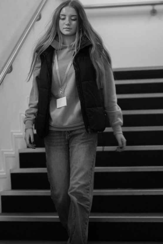
However, I decided to edit this picture in black and white. I think this works with the image as it has many different shadows. I prefer the image above due to the brightness of colour showing more personality through the high exposure and highlights.

I took these photos of students in their natural environment. I think these photos are effective because they were not posing and they were genuine. These differ from my other photos due to the fact they they are not looking directly at the camera like the others and that they show real emotion whilst conversing with friends, which is perfect for school environmental photography. I edited this photo by increasing the exposure and focusing on making it slightly brighter with more colour. However, I do not like these photos as much due to the background being slightly blurred and two people are also blurry. This lowers the quality of the image and makes them less strong.

I like these photos because they are landscape unlike my other photos, they again show a school environment with two students. I easily edited these by just increasing the brilliance, contrast, exposure. This helped escalate my images by just making them more colourful and stand out more. I also made these photos slightly darker and created a shadow around the two people whilst they look more serious.

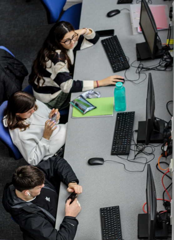
This photograph was a photo I look from a heightened angle or ‘above angle’ to capture these students in their natural environment. I wanted to quickly capture this photo whist these students weren’t looking, this helped with the rawness of the photo and the students in their natural element. I like how they are all doing their own thing.

  • Two students are on their phone
  • One is communicating

I like this because they aren’t all doing the same thing and it shows a reality of school life throughout adolescent teens.

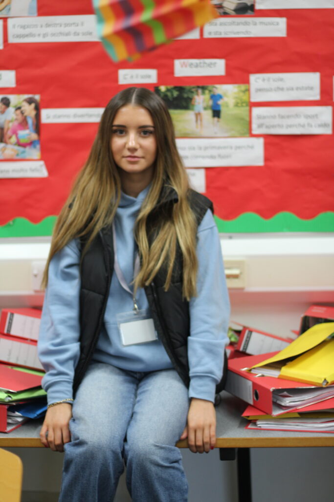
This photo shows environmental photography in school In a unique way. This photo of a single student is powerful in my opinion. I like it because of the blurred background around her, this helps her to stand out more and become even more eye-catching. Her lack of emotion portrays how she feels and her eyes are directly looking into the lens which shows her engaging with the photo.

I edited these photos by adding multiple different colours. In the first photo, I added a slight yellow tint, I like this because It creates a warmer colour around her which helps to highlight her and create a contrast between a bluer background with colder and warmer tones. The second photo I only added a small amount of yellow and focused more on the slight blue tint to it, I did this to focus more on this colder approach.

However, I like the yellow in the second picture because of the I think this was a good addition to this photo as it brightens the photo but does not add too much warmth to the photo.

Studio Lighting Introduction

In photography, lighting is extremely important for every photograph, as it adds a mood to each photo. There are three different common types of lighting, shown below:

Rembrandt Lighting:

Rembrandt lighting is a technique that was taken from a famous painter in the 1600s, Rembrandt Harmenszoon van Rijn. It’s a popular technique because it creates images that look both dramatic yet natural. This technique is a way of lighting the face so that a small upside-down triangle of light appears just under the models eye, on the less illuminated side of their face. It is a simple, effective photography lighting setup that’s flattering to a wide variety of faces, and is easy to master quickly. It’s possible to achieve this using just your camera and a single light source, which is why its so popular.

Examples of Rembrandt lighting:

The Rembrandt lighting technique is mostly known for dimension and depth it adds to portraiture. By using it you instantly create shadows and contrast in your photos. It also adds an element of drama, which is effective in photography because it draws the viewer’s attention immediately.

Lighting set up:

Light – lighting styles are determined by the position of your light source. Rembrandt lighting is created by the single light source being at a 40 – 45 degree angle and higher than the subject. Both flashlights and continuous lights can be used for this technique.

Lens – a 35mm or 50mm lens will work the best for this technique if your space is at a premium. Or, if you’ re looking at including more of the subject than just the head and shoulders. A 50mm works very nicely for portraits, and will give a nice depth of field if you’re shooting with a shallow aperture. However, a 35mm will give you a wider perspective, meaning you can include more of the background in a photo. However, this is usually not needed in portraits as we want to focus on the subject.

Butterfly Lighting:

Butterfly lighting is a lighting pattern used in portrait photography where the key light is placed above and pointing down on the subject’s face. This creates a dramatic shadow under the nose and chin that looks like a butterfly. One of the most famous photographers to use butterfly lighting was George Hurrell, who was known for his dramatic portraits of Hollywood stars, and since, the technique has grown more popular.

Examples of butterfly lighting:

Butterfly lighting is primarily used in a studio setting. It is named “butterfly” because of the butterfly shaped shadow that it creates just under the models nose. This occurs because of the lighting in the shot, comes from above the models head. Butterfly lighting is mostly used for portraits, as it is flattering on everybody.

Lighting set up:

Light – Butterfly lighting requires a key light that can be a flash unit, or continuous. If continuous, it can be artificial or natural, meaning you have a lot more choice in which lighting you think would benefit your photos a lot more. Butterfly lighting can be varied, soft or hard depending on the objective of the image.

Lens – The most popular lens used for butterfly lighting is between a 50 – 85mm lens. This helps the photo because it allows a larger depth of field.

Chiaroscuro lighting:

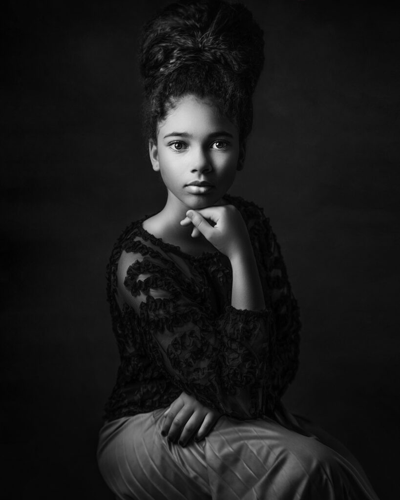
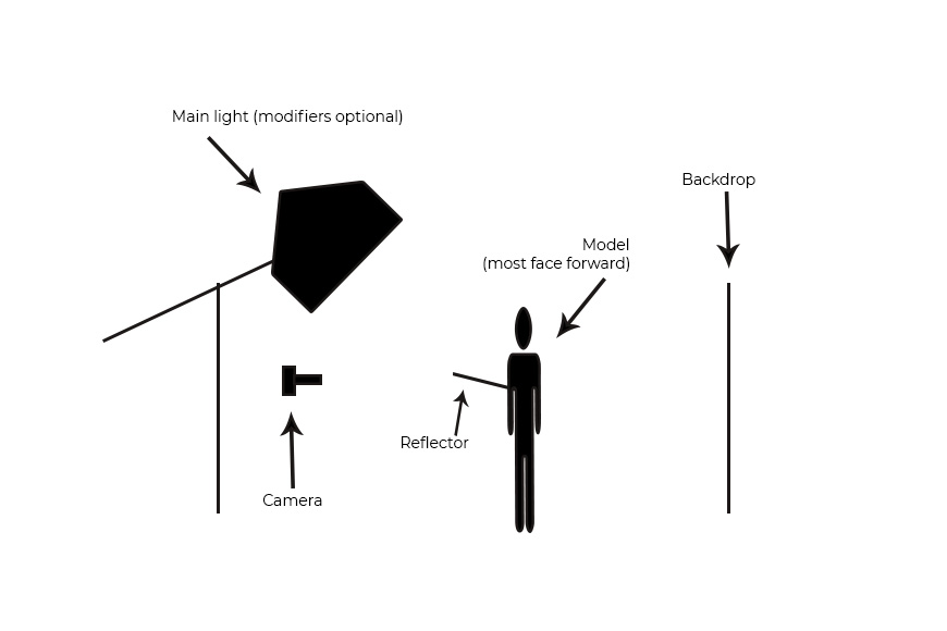
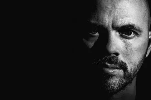
Chiaroscuro lighting is a high-contrasting light technique that utilises a low-key lighting set up to achieve contrast between the subject and the dark background. Window light is the most accessible for this technique, as it focuses on only half of the models face being seen. By using window light, the photographer is able to enhance the exposure to avoid any distraction in the background of the photo. This helps keep the spotlight on the model. The window must be the only source of light when using this technique, if there is other background lighting then the focus will drift from the model into the background.

Examples of Chiaroscuro lighting:

This technique is mainly used in film to create striking images or evoke a certain feeling. The contrast between light and shade can help frame a subject more effectively. Drawing viewers eyes to things they would not usually focus on in the image.

Lighting set up:

Light – Chiaroscuro mainly uses one key light, and a variation using a reflector which helps deepen the contrast between the shadows.
Virtual Gallery

Print Screen 1:

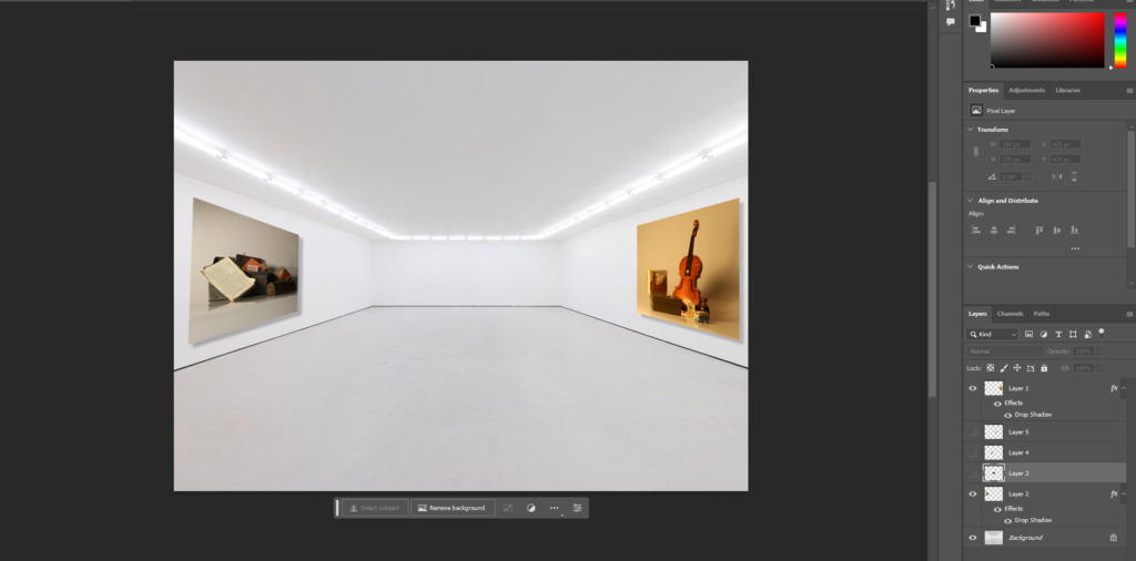
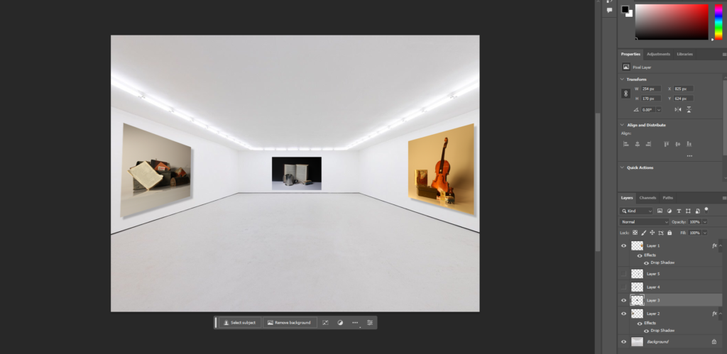
To start with, I opened up a plain gallery photo I found on the internet, I chose this one because there is lots of space where I can add my own images in. I began with these two images because they are definitely two of my most successful images that I have taken and edited so far. I thought that by adding these to the sides without any other images near them, it prevents distractions when looking at them, and means the viewer can focus on them more. By using photoshop I was also able to add shadow effects, and slant the images on the sides to add a sense of realism, it already began to look professional.

Print Screen 2:

I then moved on to the back section of the gallery, where I added another still life image I had taken in the middle. I did this because it looks efficient if my still life photos are equally separated. I did not need to add any shadows to this image because it was a neutral shot, meaning I can not see any of the sides.
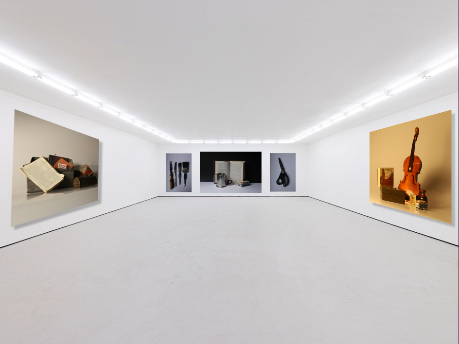
Final Virtual Gallery:

This was the final result of my virtual gallery, after I added in my final images. For the final two, I decided to incorporate photos of tools, which was inspired by Walker Evans and Darren Harvey-Regan. I did this because it created a realistic contrast of photos you could find in a real art gallery. I like the effect of the two tool images separating the still life because it creates disparity, and therefore makes each detail in each image more noticeable and eye-catching.
Studio Lighting: Rembrandt Lighting – George Blake

What is Rembrandt lighting?

Developing from a Dutch portrait painter, Rembrandt Harmenszoon Van Rijn, it refers to the way of lighting the face in which an upside-down triangle is formed under the eyes with shadows of the subject.

With the invention of spotlights in Hollywood in the early 20th century, Rembrandt lighting in photograph emerged from this as people were able to experience with light artificially instead of relying on it naturally.

Becoming widely used with film stars for promotional material it soon became a well known lighting technique.

Why use Rembrandt?

By using Rembrandt lighting, it creates a interesting shadow and contrast, with the triangle of light being casted on the subjects face.

Drawing in the eye with an interesting lighting technique, the portraits subject is made the main focal point with a shallow depth of field as an additional method helping to achieve this.
Rembrandt can be used with either hard or soft light creating a choice in how the photographer wants to create an individual look on the viewer.
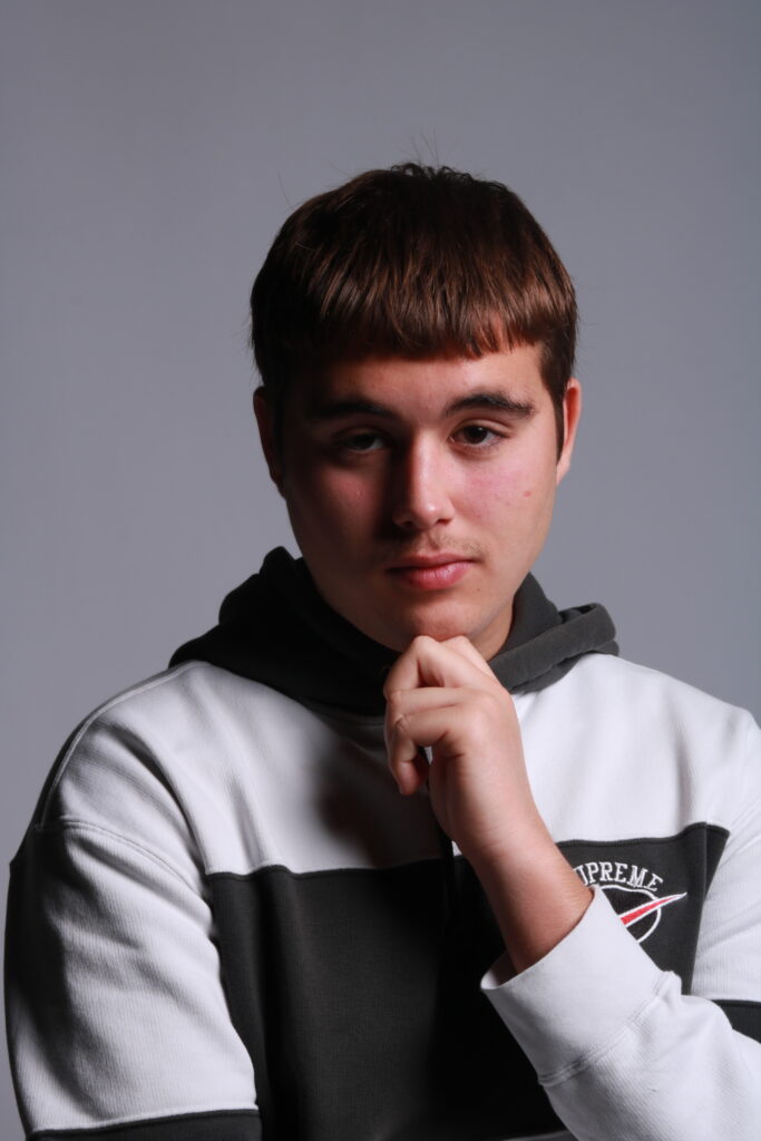
(As seen here).

Hard light

Soft light

(As seen in both images the reoccurring triangle of light below the eye signifies this lighting technique as Rembrandt).

How to create Rembrandt:

Light – By using one singular light source, at an angle of 40 – 45 degrees, placed higher than the subject, this creates the Rembrandt technique.

Lens – A 35mm or 55mm is the best lens types for Rembrandt lighting. 50mm is best for a good depth of field and shallow aperture. 35mm is best for a wider point of view and is able to capture the subject entirely.

Examples of own work:

Exploring lighting

In most cases we can make use of natural or available / ambient light but we must be aware of different kinds of natural light and learn how to exploit it thoughtfully and creatively.

Natural Lighting :

Natural light refers to the ambient light supplied by the sun or moon, not a camera flash or other artificial light sources. Natural light is also taken to include lights you’d find naturally in the environment, such as street lights, lamps, etc.

Ambient lighting :

Ambient light is any light a photographer or cinematographer did not bring to the shoot. Also known as available light, it’s any light that you haven’t set up yourself.