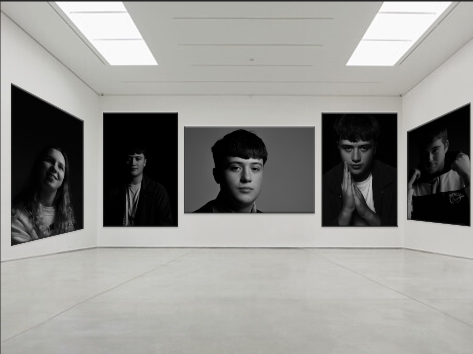
These are a few of my best and favourite edited portraits, I have presented them in a gallery form, and most are in black and white, all the ones that are presented are, because I saw it as inspiration. I also edited in colour as well and these were just the best ones in my opinion.
From this topic I have learnt a greater understanding about different lighting such as, butterfly, Rembrandt, and chiaroscuro. And even learnt more about my camera handling skills, and become more comfortable with it.
Critique
I like them all but there is room for improvement always. I think that the one in the middle of George isn’t clear enough that it is Rembrandt lighting, there is a large triangle on his cheek but it isn’t defined so if I was to retake the image I would bring the light closer to his face making the triangle smaller and clearer.
