Rembrandt lighting

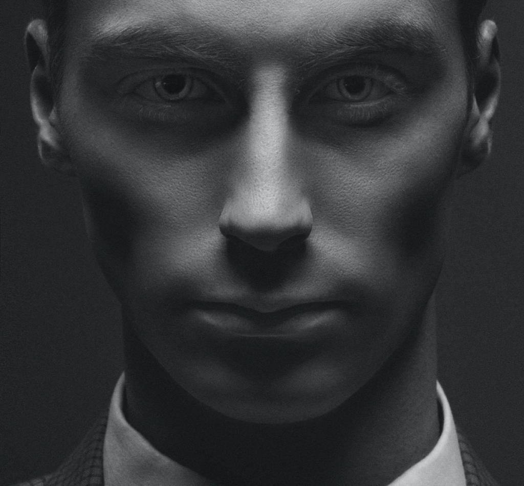
The term Rembrandt lighting is relatively new. The term was originally coined by 20th century filmmaker Cecil B. DeMille when he made the film The Virginia Warriors. As the story progressed, he borrowed several spotlights to recreate a lighting scheme in which the actors’ faces were half illuminated.

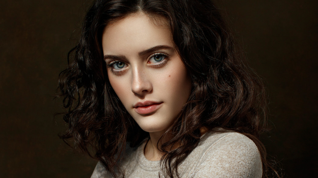
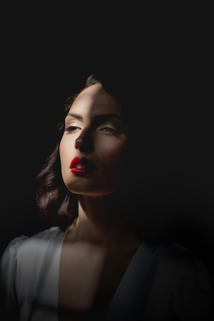
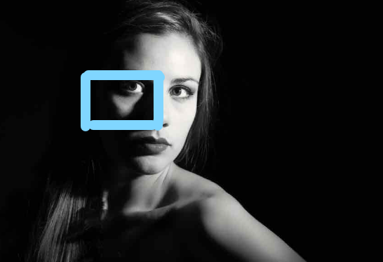
Rembrandt lighting is a technique using one light as well as a reflector or two separate lights. It is a popular as it gives an image a dramatic look as well as a natural look. it is recognisable through the lit-up triangle on the subjects unlit side of their face.
My photoshoot:

Best photos:
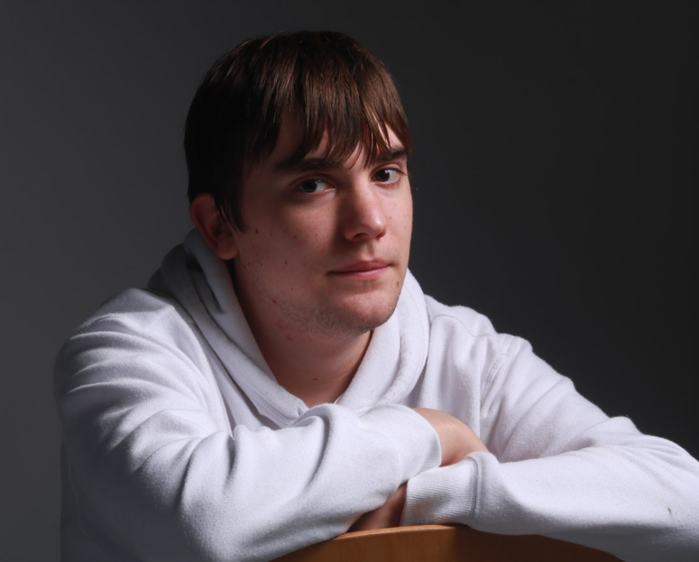
Editing:
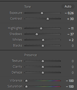
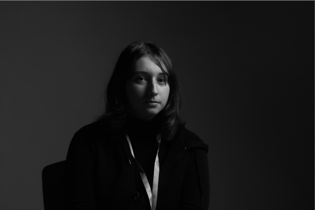
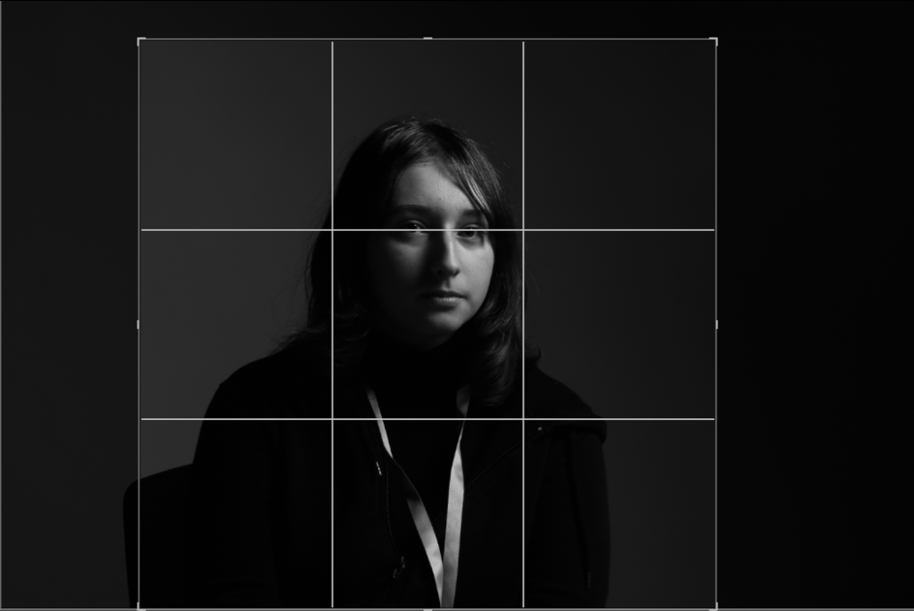
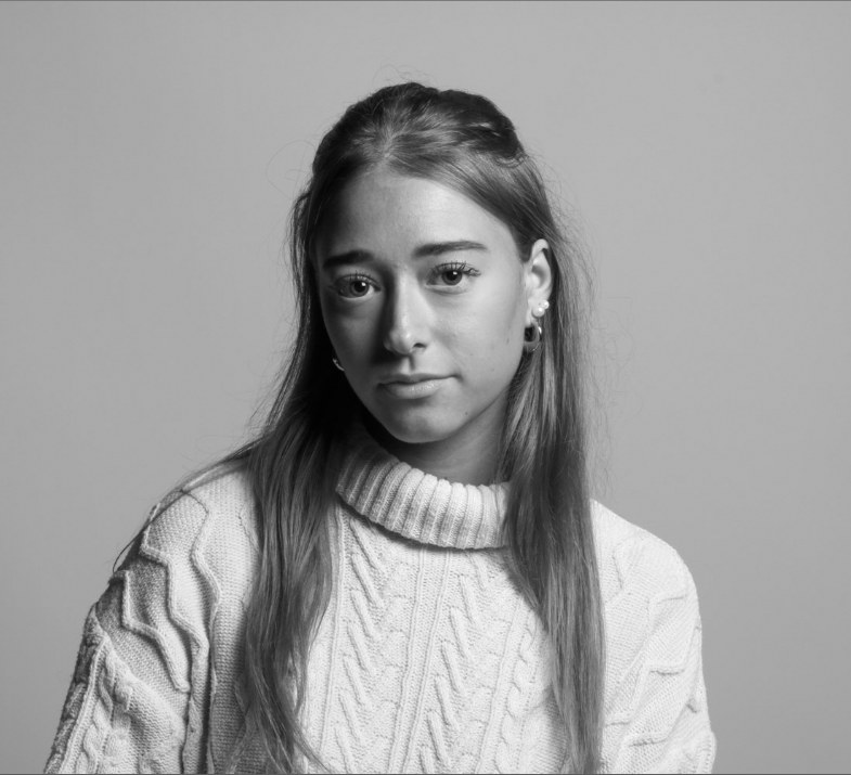
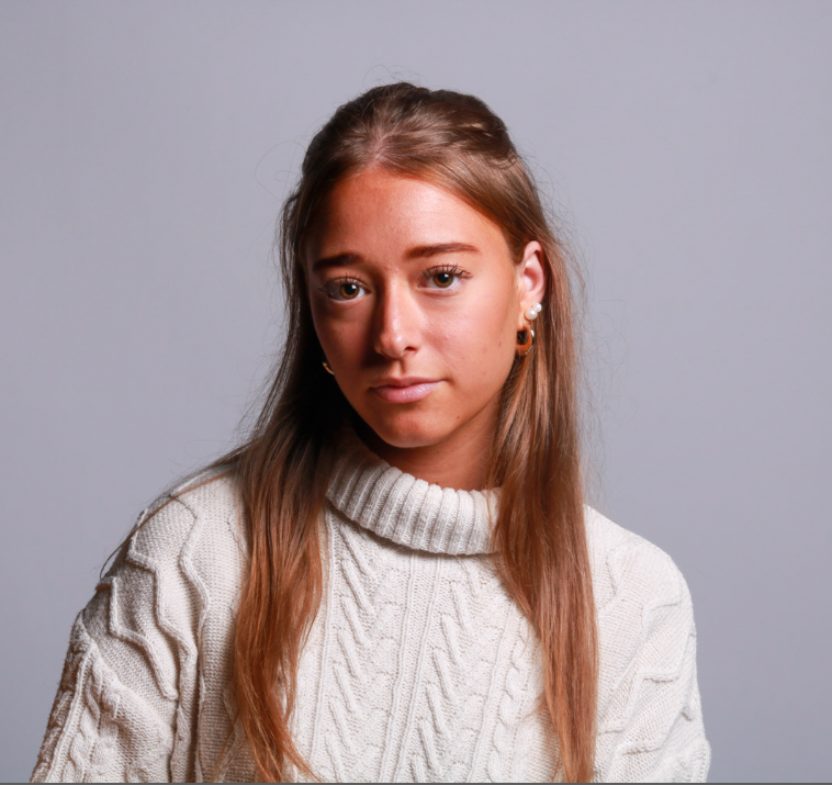
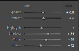
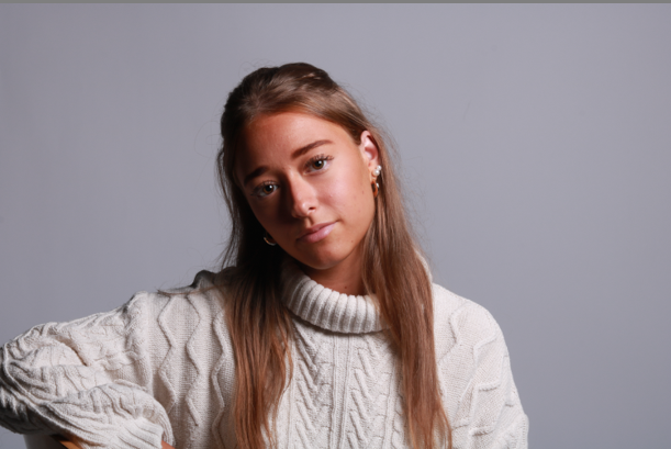
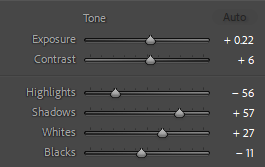
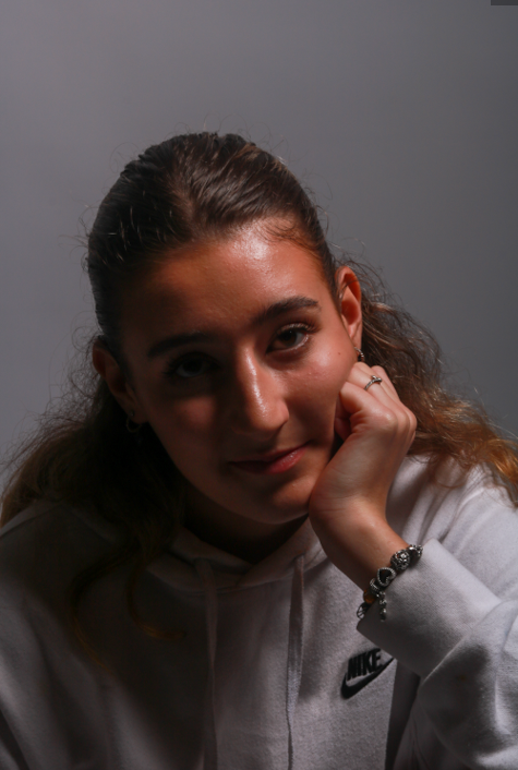
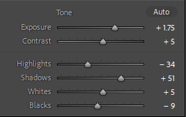
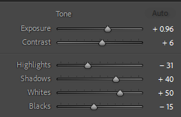
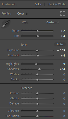
I chose to edit this photo as it has a clear Rembrandt lighting. I made slight changes to the tone of the photo to add a higher level of contrast so that the triangle would be enhanced. I then went on to removing the colour by decreasing the saturation and vibrancy to -100.

Before and after:
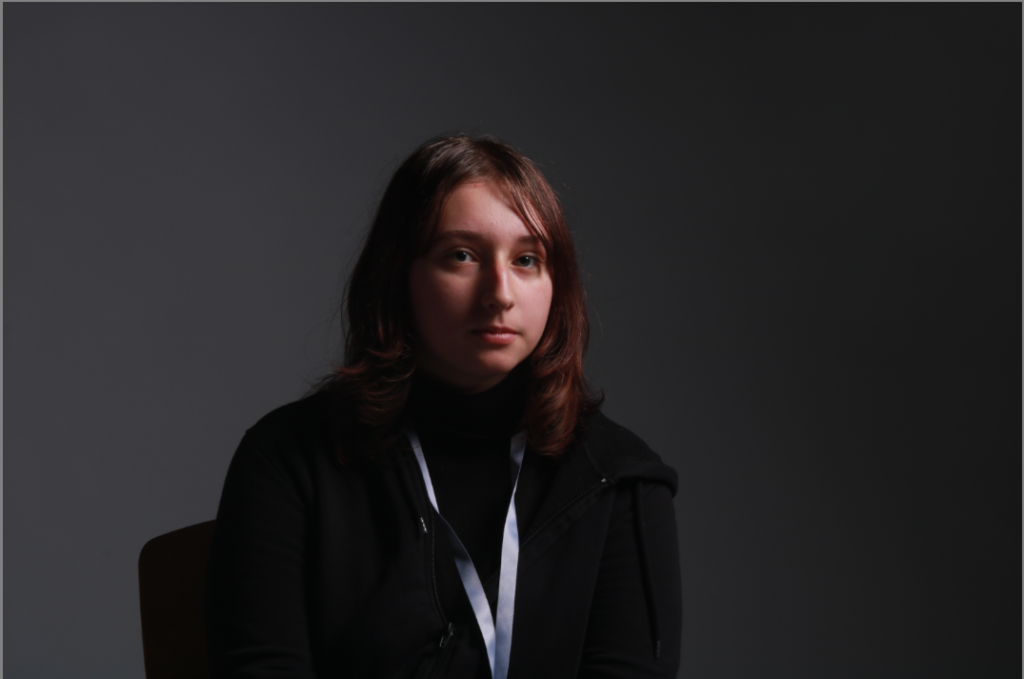
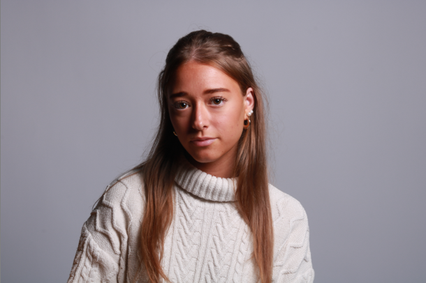
Next I cropped the photo to remove some of the background to ensure the model was the main focus of the photo rather than the space around.
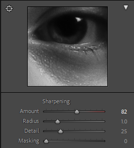
Finally I increased the sharpness to cause the photo to be more detailed and sharper so that the shadows were more contrasted.
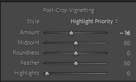
I decided to add vignette to the photo to draw the viewers eyes to the model.

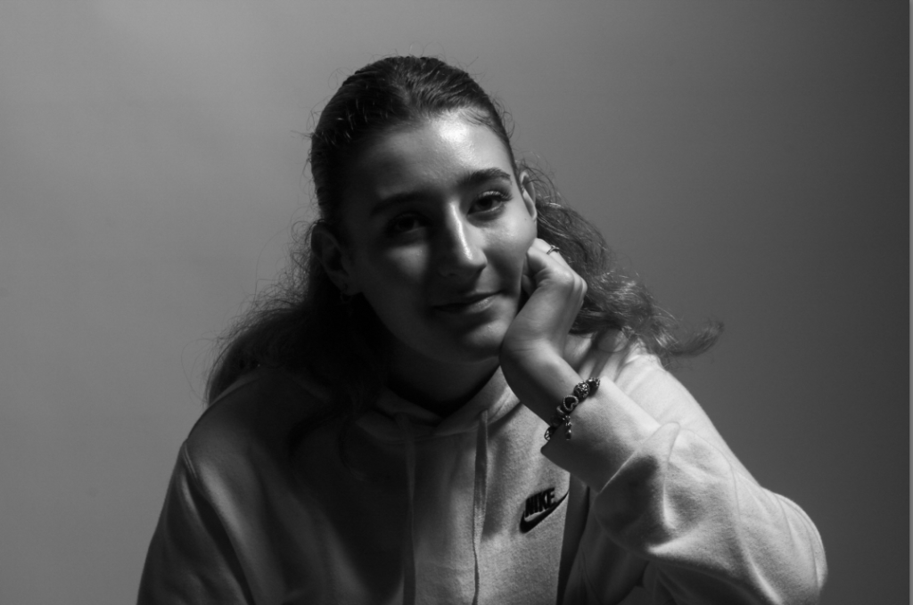
Final edit:
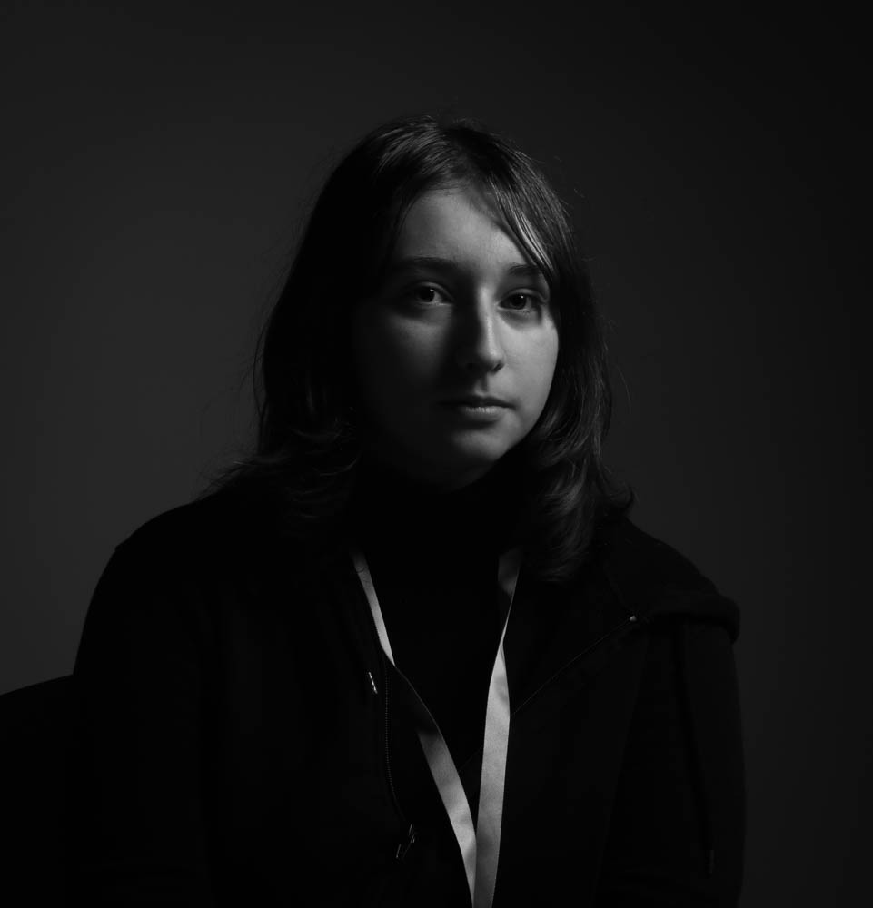
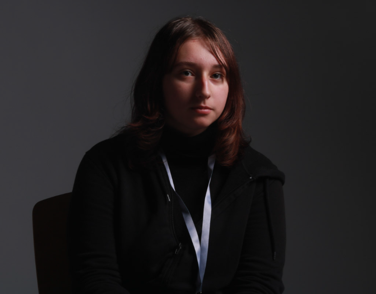
I think this edit is successful as there is a clear triangle under the models left eye which shows that it is a Rembrandt inspired photo. I also think the black and white makes the highlights brighter and the shadows darker which enhances the contrast between them, this is especially useful for the triangle under the eye and it makes it clear. By cropping the photo and adding the vignette effect the focus of the photo is drawn to the centre, the model.

Edited Rembrandt photoshoot

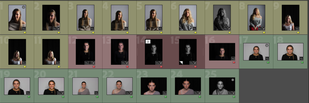
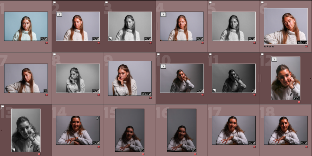
I colour-coded all my Rembrandt photos into one colour so they were clear to point out and to easily assess which ones were the best compared to the worst.

REMBRANDT EDITED IMAGES:

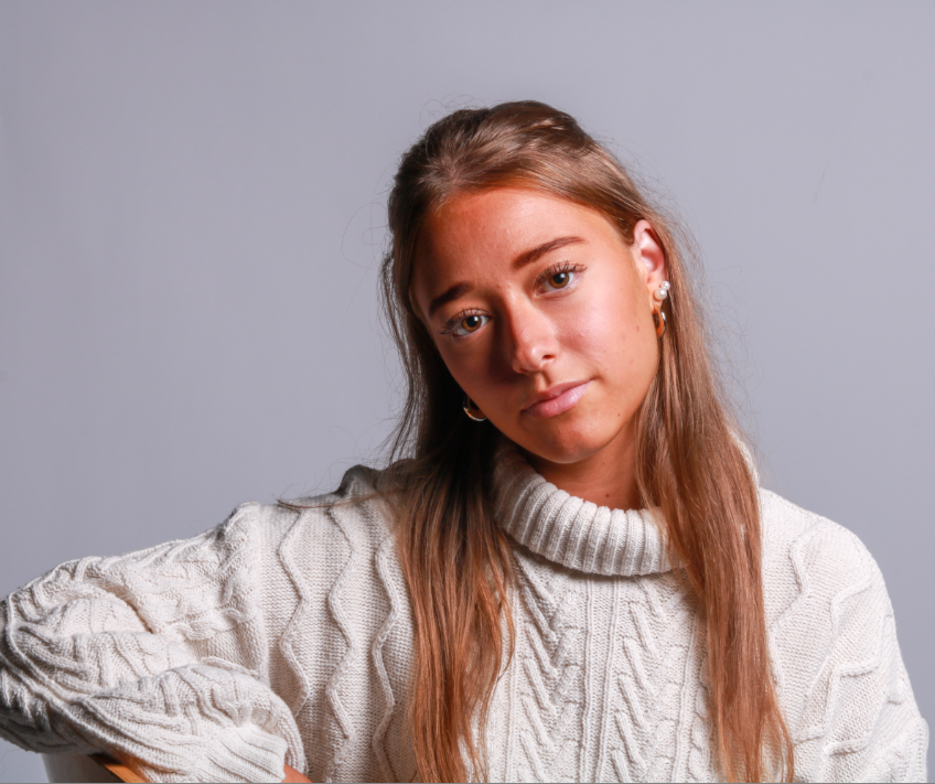
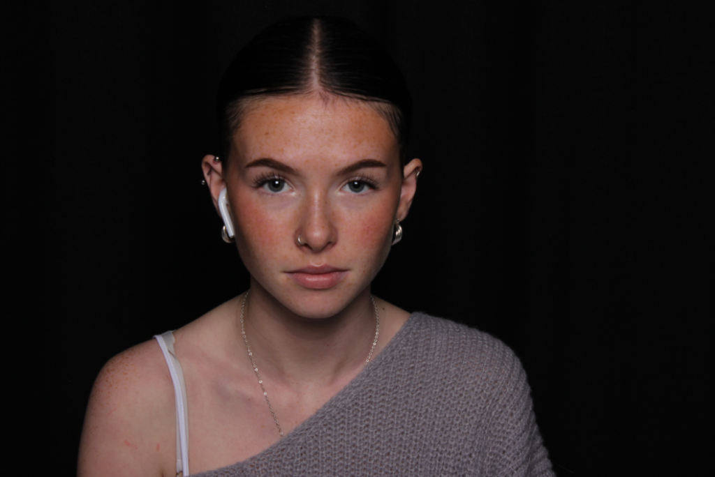
I created a virtual copy of the original image so that I could create a black & white version too. I cropped the background as there was a lot empty space surrounding the subject and I didn’t want this to make the viewer’s eyes wonder to the background. I really like the way the light has created a warm tone on one side of her face and given me that ideal triangle underneath the eye. I used a gold reflector to do this which I think has worked quite effectively.

Original image:

MY SECOND IMAGE:

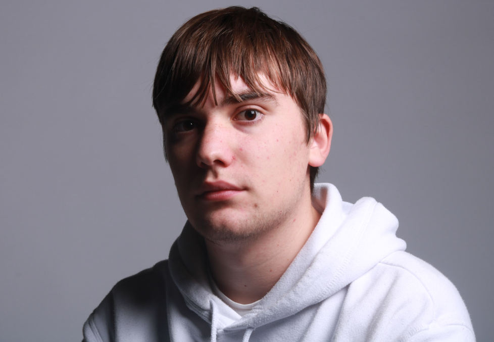
I really like this pose as she looks very relaxed and calm leaning on her chair. I had similar photos to this but I found that this one was better because I liked the way her head was positioned more. The light has given her a warm tone and this lighting has worked very well. I also like the way she is not entirely central and more to the side as this makes it different from a standard image. There is a lot of light brought into her eyes as I got someone to hold a reflector for me to bounce the light onto her face.

Original image:

MY THIRD IMAGE:

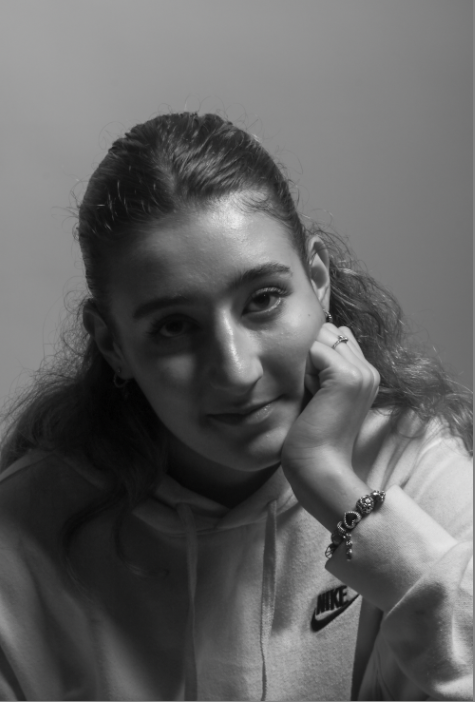
I really like this image as I didn’t have to do much editing, I really like the expression and where her hand is placed as I feel it makes her more connected to the viewer. I chose to put it in black and white because I felt that it just looked better. I also really liked the way she is looking up into the camera as its a more powerful way to use the eyes.

Original image:

MY FOURTH IMAGE:

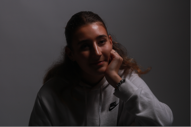
I really liked this image because it has an element of Chiaroscuro lighting in it alongside Rembrandt due to the split lighting however there’s a clear triangle of light below the eye which I think has worked effectively. To improve this, I could use a reflector when taking the image to bring more light into her eyes as it is quite dark. The position she is in looks very relaxed and natural as she is resting on her hand.

Original image:

The final images:

Butterfly Lighting 

Butterfly lighting is a technique where the light source is placed directly above and slightly in front of the subject’s face, creating a small butterfly-shaped shadow under the nose. This happens because the lighting in the shot comes from above the models head. The technique is achieved by placing a light source at a 45-degree angle to the subject, slightly above eye level.
Butterfly lighting is primarily used in a studio setting. Butterfly lighting is mostly used for portraits, as it is flattering on everybody. It can either be a very harsh light or soft depending on the type of photo you want to achieve.

Here are some examples:

My photoshoot:

For my photos the Chiaroscuro photos are coloured yellow, the Rembrandt photos are red and the butterfly photos are coloured green

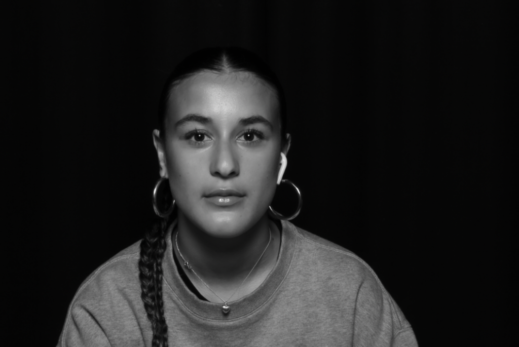
For this photo I didn’t edit it that much because the original photo perfectly displaced the butterfly lighting technique already so all I did was change the colour of the photo to a bit darker to match the dark backdrop.

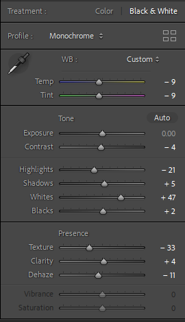
For this photo I changed it to black and white to display the butterfly shadow under her nose and really show it off. Black and white was the better option for this photo as the model has dark hair and had a grey jumper on so by changing it to black and white demonstrates the darker features more effectively in this photo.

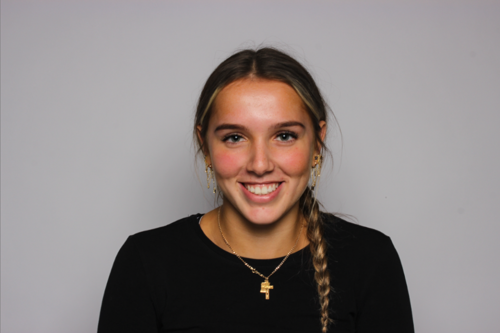
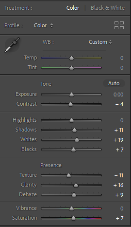
For this photo I edited the highlights and saturation of the photo as it looks like a happy photo as she is smiling so I turned up the whites, clarity and the saturation of the photo because I wanted to make the photo look more colourful to make it look vibrant and happy.

 Chiaroscuro lighting

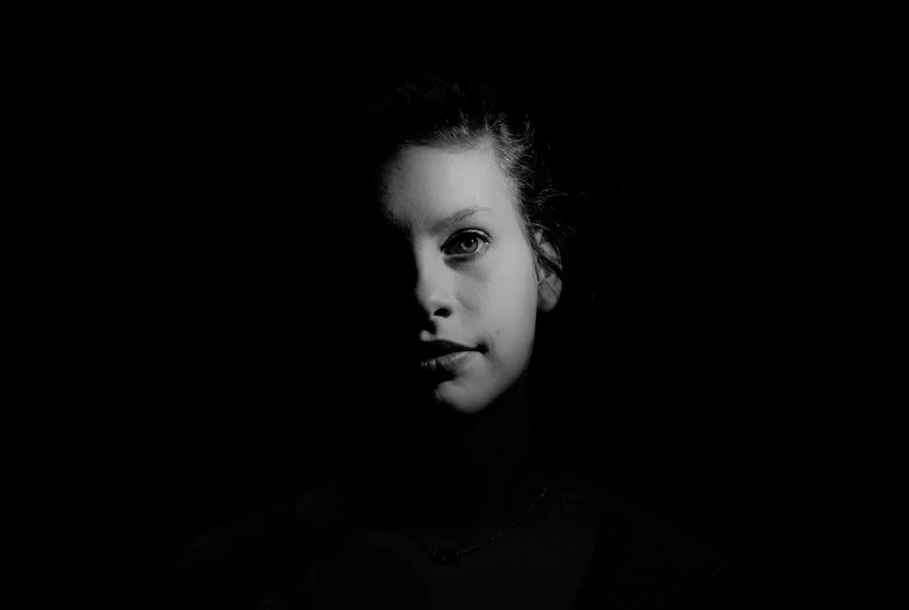
Chiaroscuro is a high-contrast lighting technique that uses a low-key lighting setup to achieve contrast between the subject and a dark background

Chiaroscuro is Italian for light/dark and makes the use of strong contrasts between light and dark, usually bold contrasts affecting a whole composition. In these photos the shadows are very harsh while the light is bright. There is a very obvious contrast of lighting in these photos.

here are some examples:

My photoshoot:

For my photos the Chiaroscuro photos are coloured yellow, the Rembrandt photos are red and the butterfly photos are coloured green

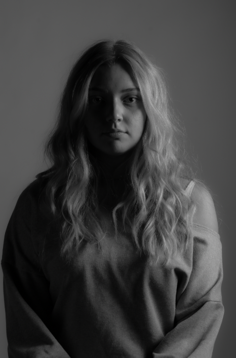
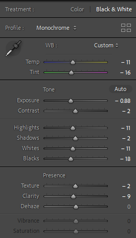
For this photo I edited it to black and white because I think it looks better than to when it was in colour. i changed the shadows and the blacks the most to make the darker side of my face look harsher but also cleaner so it is a prominent split between the middle of my face.

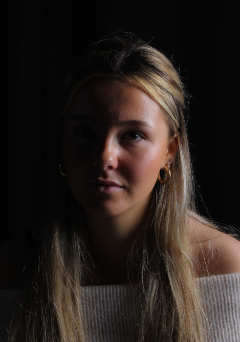
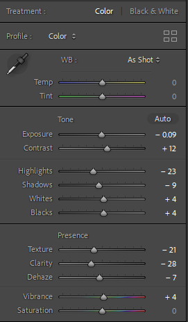
For this photo I took inspiration from the example photos by making one side of her face very dark and not prominent compared to the light side of her face to make it look light and vibrant I changed the texture and clarity to get rid of the highlights on the darker side of the photo.

Camera Handling Skills

In photography, I use a DLSR Canon camera to take photos, because it ensures they all have good quality and there are various different ways I can adjust my images. This camera is extremely beneficial for photography as it allows me to change the shutter speed, ISO and aperture.

  • The shutter speed is the length of time from the moment the shutter opens and this then allows light into the camera. A fast shutter speed will create a short exposure, whereas as a slower shutter speed will create a long exposure. This is because the shutter is open for a longer period of time which allows more light into the camera.
  • The aperture is the opening of the lens’s diagram through which light passes through. Having a smaller aperture creates a sharper image.
  • The ISO ( International standard organization) is an image sensitivity in a numerical value. Having a higher ISO can lower the quality of your photo and degrade is which will cause your photos to be grainy or “noisy”.

We used this app to begin experimenting with different apertures, shutter speeds and ISO, which was helpful because it allowed us to decide which ones look best for each specific photo. We then could apply these skills to when we actually use the cameras, which saves time and we could identify which ones would benefit the photos most.

Aperture

Aperture controls the size of the lens opening which allows light into your camera.

Opening the lens more or having a low f-stop number (e.g. f/1.4) blurs the background/foreground around your subject. This is known as a shallow depth of field.

Keeping the lens more closed or having a high f-stop number (e.g. f/16) keeps the photo sharp throughout. This is known as a wide depth of field.

Shutter Speed

Shutter Speed is the amount of time the shutter is open to expose the image sensor to light.

Slow shutter speeds expose more light to the image sensor so still objects will have more detail and moving objects will appear to have more motion/be blurry.

Faster shutter speeds means less light is exposed to the image sensor and moving objects appear more still.

ISO

The ISO of a camera selects how much light the image sensor detects.

Too much light on a sunny day can cause overexposed shots so a lower ISO would be preferred.

Too little light in a shady room or day can cause grainy images.

The general rule is to use the lowest ISO possible to get the most detail possible.

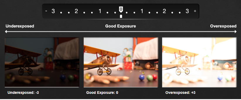
Exposure Meter

The Exposure Meter is your final check before you snap a shot. It shows you how well your aperture, ISO and shutter speed are working together.

It is used as a guide to show exposure.

White Balance

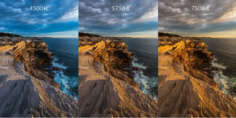
White balance is the ratio of blue light to red light in an image which refers to the concept of colour temperature.

White balance is measured is Kelvin(K). Higher values of Kelvin contain more blue light whereas lower values of Kelvin contain more red light.

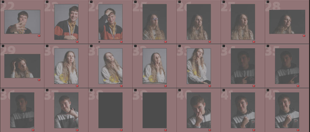
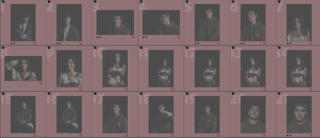
studio lighting techniques contact sheet

Rembrandt-

for this shoot I wanted to create Rembrandt lighting in the best possible way in my ability, I did this by making sure I had the lighting on point and making the shadows I needed to make around the face. And these are the photos I came up with.

4-5 star photos (best photos I came up with)-

3-4 star photos (decent photos I came up with)

1-2 star (worst photos)-

Butterfly lighting– I judged these based of the lighting on the face and how well the butterfly effect was created on the subject.

4-5 star photos (best photos I came up with)-

3-4 star photos (decent photos I came up with)

1-2 star (worst photos)-

conclusion-

in conclusion I think that there is a lot of room for improvement when it comes to taking my photos as there is only a handful that I think show off the lighting technique to its best. I think if I was to do this photoshoot again I would take a lot more photos and keep adjusting the lighting until its perfect.