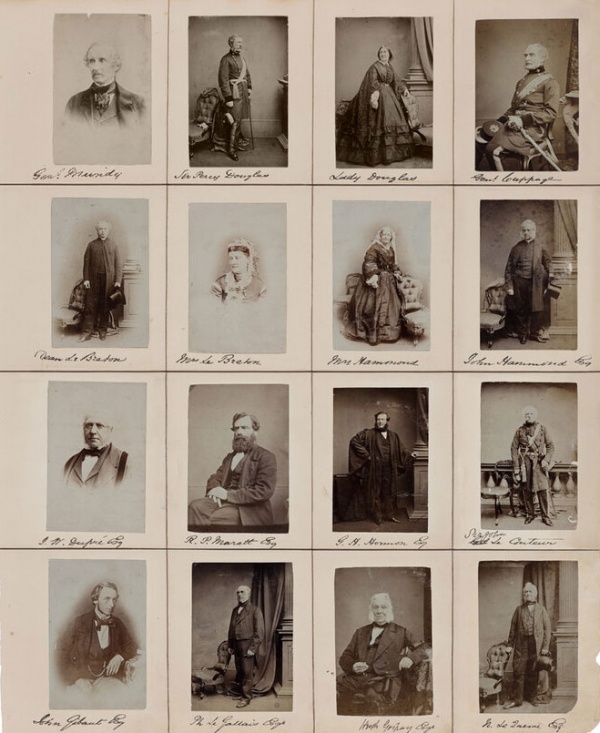
Henry Mullins moved to Jersey from London to take commercial portraits of over 9,000 islanders from 1852 to 1873. He compiled copies of these portraits into 4 large albums currently kept in the Societe Jeriase Photo-Archive.
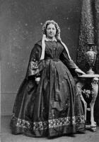
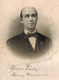
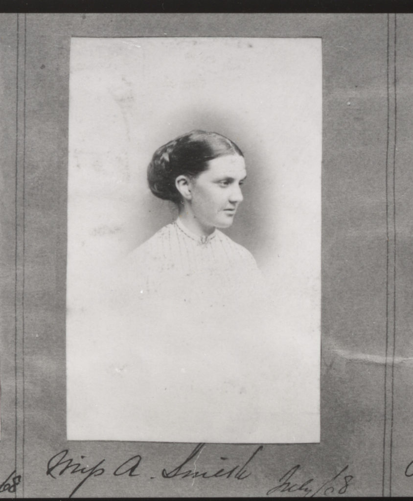
Henry Mullins opened a studio named the ‘Royal Saloon’ at 7 Royal Square. Here he would photograph middle-class subjects under Queen Victoria’s rein. Commercial photography was still incredibly new and costed £1 per image. This price meant that portraiture was no longer limited to wealthy upper-class individuals. His subjects included the elite: the Bailiff, Lt Governor, Jurats and Deputies but also bankers, doctors and Clergies.
The commercialisation of photography
Carte de Visite was a small photograph originating rom France in 1854. This was not the first permanent photograph or commercial photography process (Daguerrotype came first. It was the process of printing onto a fragile copper plate created in 1839.) but was the first small, portable type. These images were 6x9cm and would be sent like postcards between friends and sparked interest in creating albums. Carte de Visite used Albumen Print where the images were binded using egg whites. This technique used negatives which made allowed for reproductions. This was the technique used by Henry Mullins where he even advertised his studio as being cheaper than London.
Henry Mullins
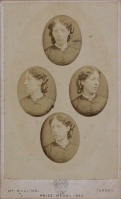
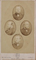
Henry Mullins adventured with different styles of portrait. He would use diamond cameo, four ovals showing a face at different angles, as a unique presentation. He would cut out the ovals and arrange them into a diamond shape. Additionally he would bleach the edges to whiten the background and fade them into the page. Both of these styles would frame a headshot unlike the usual portraits which were full body in front of a intricately decorated background.
An Inspiration
Henry Mullins has inspired many other photographers including Michelle Sank who travelled to jersey to photograph people in a similar way. There are many similarities between the portraits but also many differences.
Comparing the two
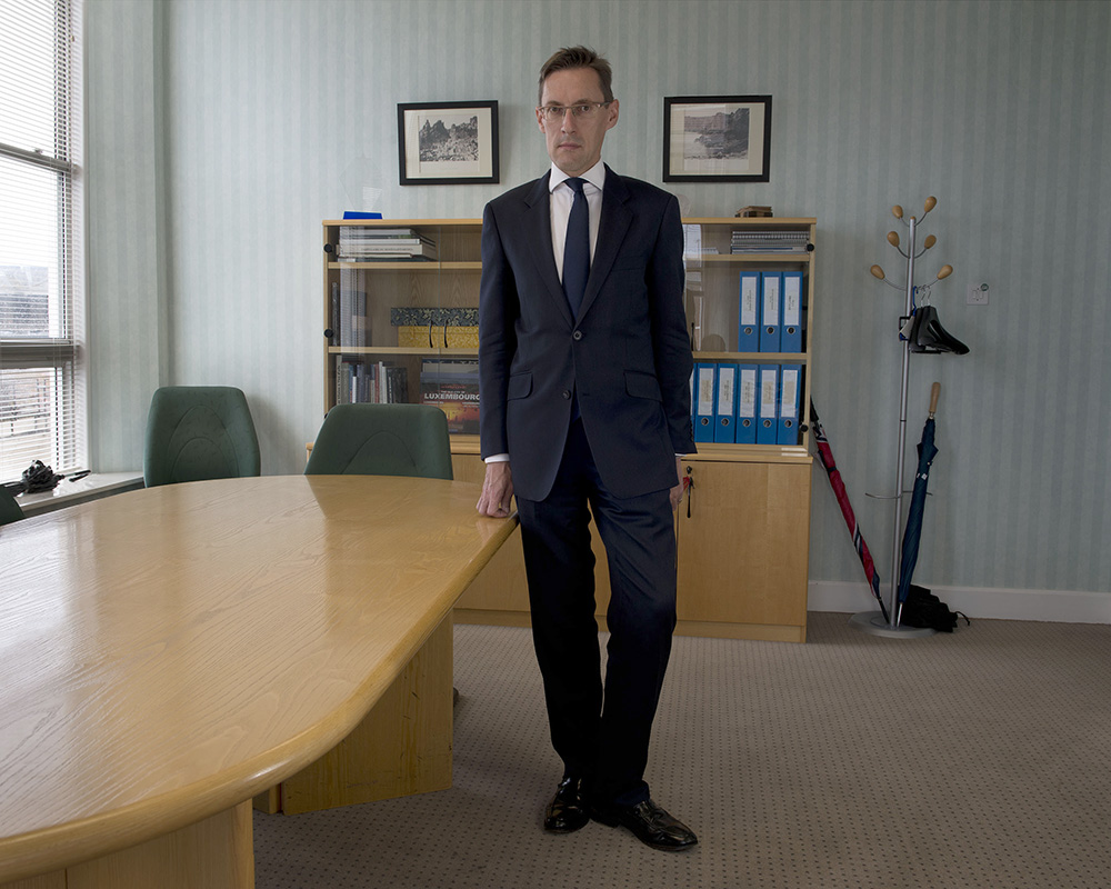
In this Portrait Michelle Sank photographed Ian Gorst, the chief minister. It would have been impossible for Henry Mullins to photograph Jerseys Cheif Minister since the first one was only elected in 2005, however he did photograph many of the islands elite.
Composition
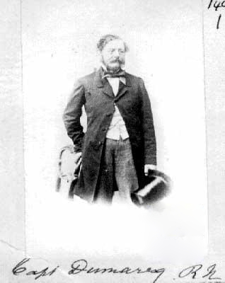
I decided to compare these two images because they both show a man dressed in a suit angled straight on. Both of the subjects are resting their right hand some furniture to create an interesting pose and are stood upsright.
Michelle Sank was able to take her photographs in colour due to the advancements of digital photography. This photograph is also taken to landscape to showcase the background unlike a traditional portrait. The background is a dull 2000s office with the whole thing in focus. This image uses the natural light from the window as the main source of light and frames the subject slightly off centre. These features together separate this image from a traditional portrait and instead file it under the umbrella of ‘modern art’ instead.
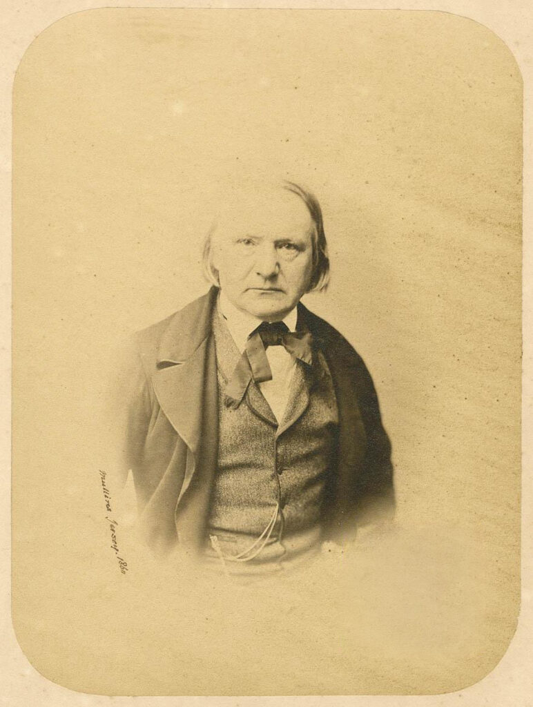
Henry Mullins took his photograph in his studio using slightly harsher light. The image has been taken in portrait to frame the subjects full body. However unlike Michelle Sanks portrait, Henry Mullins bleached out the background and the bottom of the mans body to frame and draw attention to the subject, a technique called vignette. Since this was early in the development of photography, it was used as a means of documentation instead of an art form. Bleaching out the background was a way to highlight the individual in their portrait. Having a full background could make the frame too busy which is why when Henry Mullins does use backgrounds its a way to put a person into an environment or to create unique shapes.
Clothing
This portrait shows a modern man in modern dress. Like Henry Mullins, the subject wearing what he would normally be wearing to work, only this was taken 100+ years later showing a stark difference in silhouette, fabric and colour. Both here and in inspirational photographs show the subjects in typical suits of the period. A modern suit is created with cut corners due to the nature of them being mass produced. The fabrics are thinner and cheaper to produce leading to less flattering draping, shaping overall quality. There is no care put into their production which comes through when buying, wearing and being photographed.
The modern suit can have as few as 2 main layers: Shirt and blazer. A Victorian suit however needed to cover everything and a shirt had only really recently stopped being seen a part of underwear. The suit had began showing signs in Britain while under the rein of Charles II however only became recognisable in the late Stuart era. The Vicorians are well known for their modesty which meant formal attire for men required a minimum of 3 layers but was typically accompanied by a coat also. Typically the sets were created with bold colours and patterns as well as rich embroidery and detailing to showcase wealth (which would be important in a portrait being sent to friends for example).
These sets were made with thicker, organic materials and were still being handmade which meant it was tailored with more flattering seams and unique shapes. Unlike a modern suit with only one back seam at times, the Victorian suits could have 3. This would allow for a form fitting jacket, movement and a unique silhouette which wouldn’t be possible with just one back seam. These differences are evident when comparing photographs. In Henry Mullins’s photographs, the fabrics show depth in folds, texture and shape leading them to photograph much better.
Michelle Sanks portrait above shows a rigid, square and ill fitting suit. I believe this is a good comparison between the portraits because it is (apart from the colour) the first visual sign of a difference in time period I caught onto. This demonstrates how photography creates perfectly preserved time capsules. The modern suit is quickly identifiable due to its familiarity now and in years time fabrics and shapes. A Victorian suit isn’t what we’re used to or would see on a daily basis so it is unfamiliar despite still being a suit. When putting these two images next to each other it shows
Since the above Image is low resolution here is a good example of the quality difference. This is another portrait taken by Henry Mullins however this time of Victor Hugo, a French writer.
Juxtaposition
Juxtaposition is when two opposites are placed next to each other with contrasting effect.
Placing these two images next to each other showcases not only the advancements in photography and production but also society.
Headshots
This photoshoot is a response to Henry Mullins where I will be experimenting with a new camera lens (105mm) and diamond cameo.
Photoshoot 1
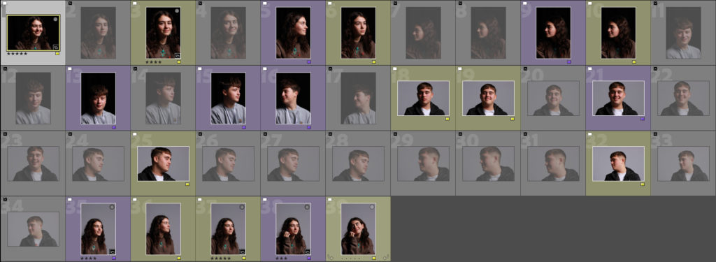
I began choosing sets of 4 images to use for a diamond cameo. To edit the images I set them all in black and white and adjusted the settings until I was happy with the effects. They don’t all have the same background since I was moving around the backlight for different lighting effects. This wont be as much of an issue when I edit the portraits into a diamond cameo however when all the images are being presented as is it ruins the continuity.
Set 1
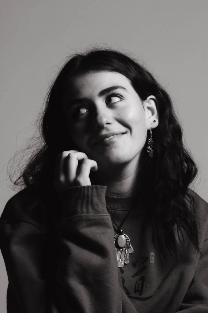
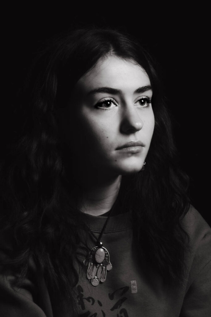
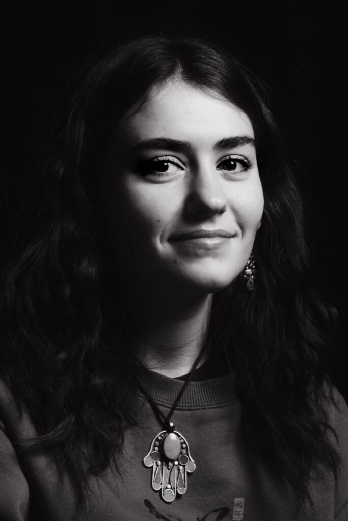
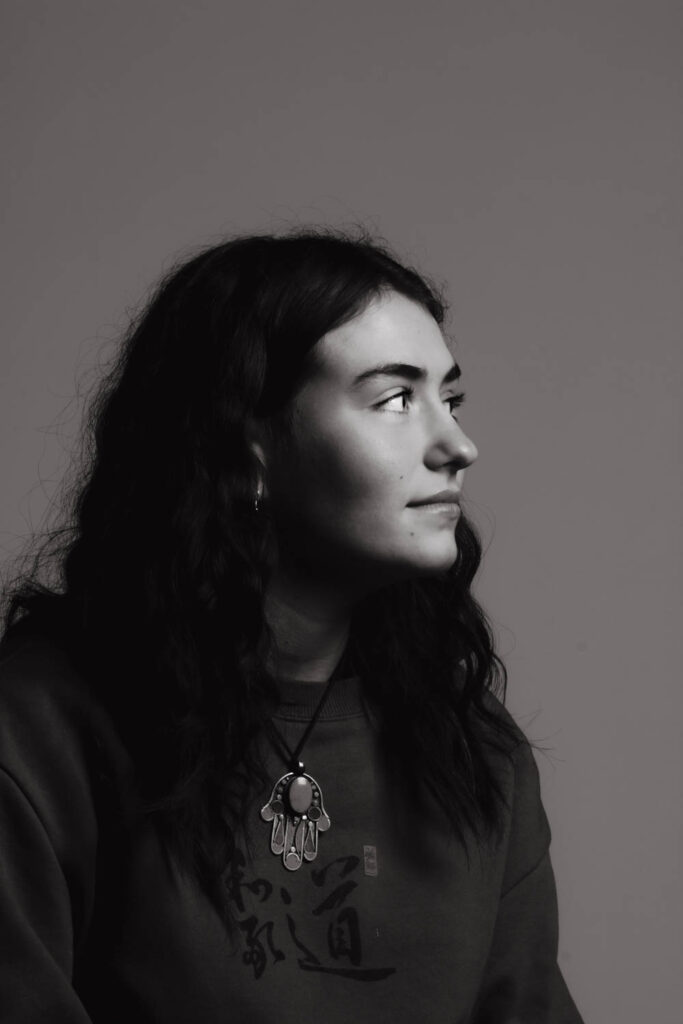
Set 2
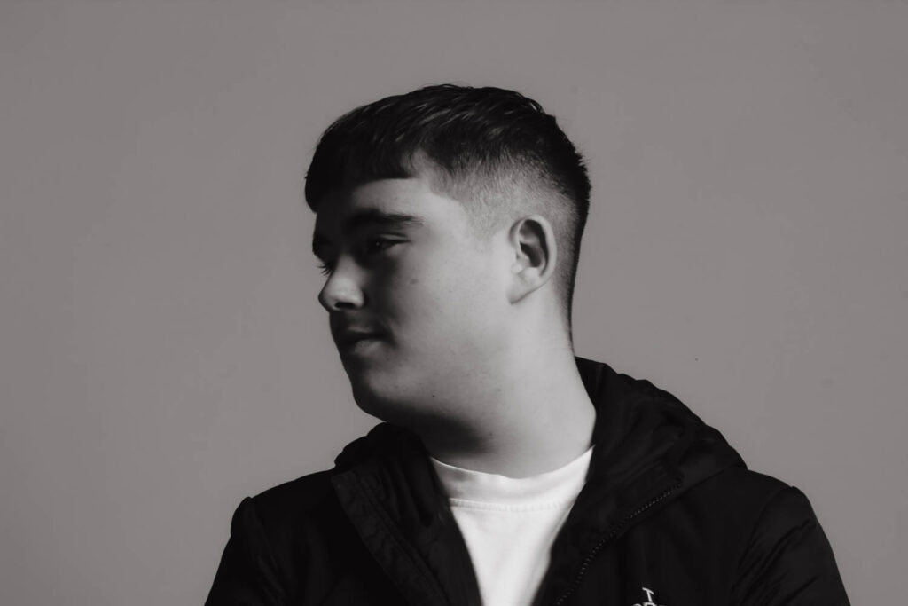

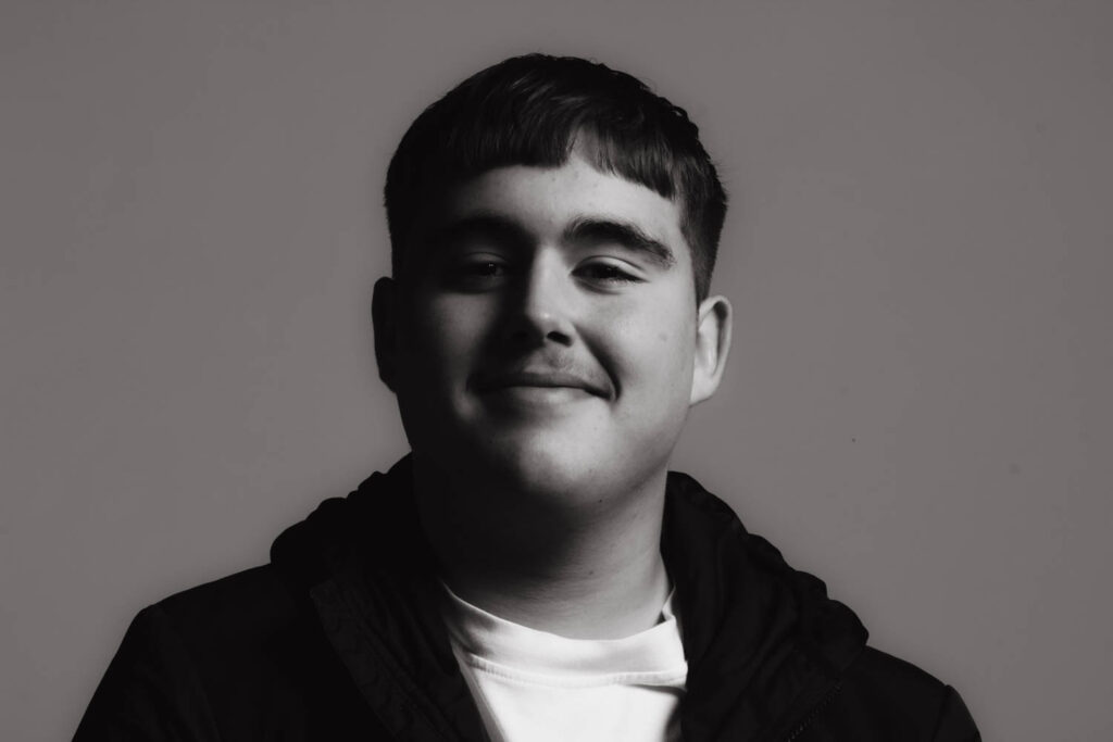
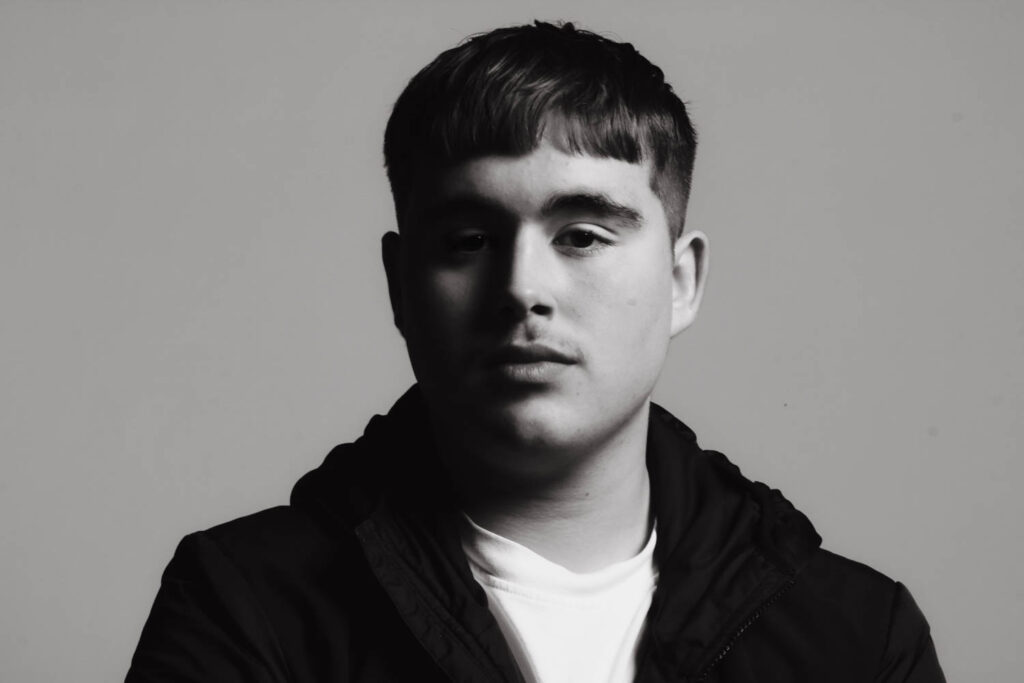
Diamond Cameo
I wanted to try out two different styles when I created the diamond cameo arrangements. I wanted one where I used some old paper as a background and coloured the portraits in beige to create an aged look similar to Henry Mullins. I then wanted to try a second one where I used a different background and didn’t recolour the portraits.
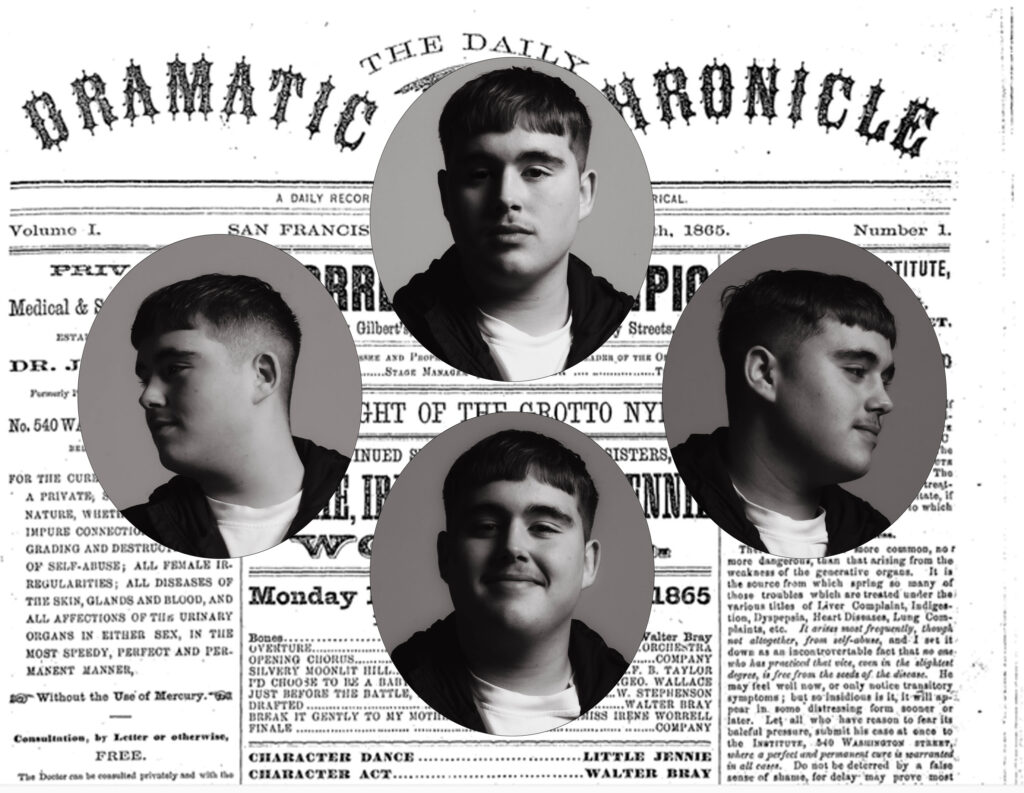
For this first one I added each Image onto the background and created an oval shape. This oval shape needed to be same for each of the four portraits so I copied the shape 4 times and rearranged them into the diamond shape. I then added the portraits over the top of the shapes and created a clipping mask so they’d be the correct shape.
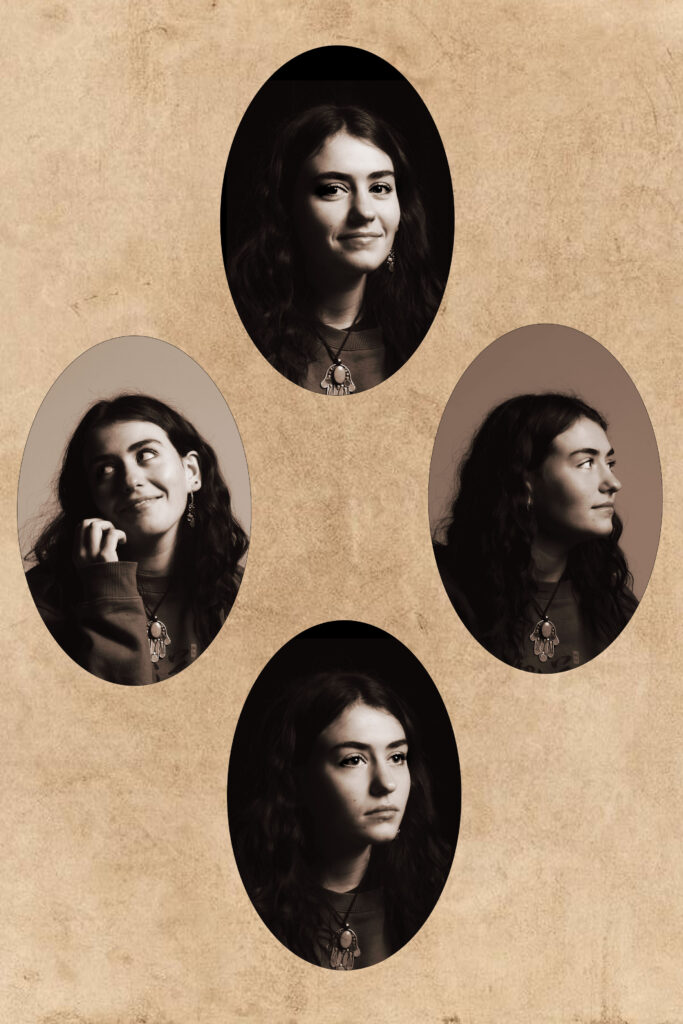
The only difference in this was when I recoloured the portraits. To recolour the black and white portraits I selected the colour overlay and changed it to a brown to match the background. This one was made in portrait as opposed to landscape like the first. This made the circles more round which didn’t look like Henry Mullins examples.
