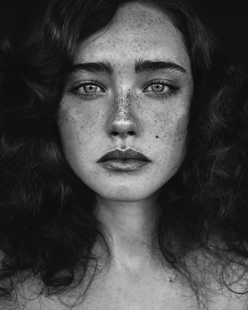
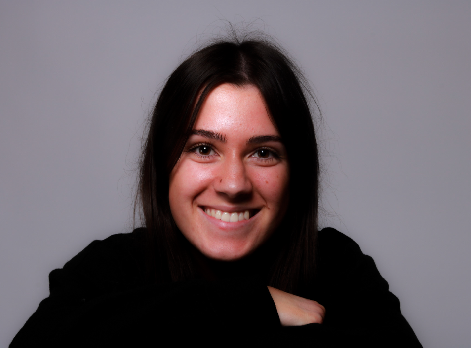
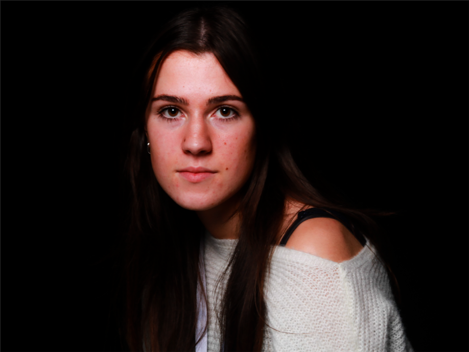
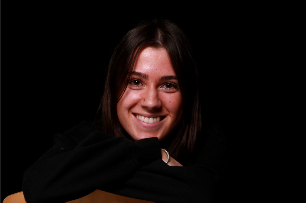
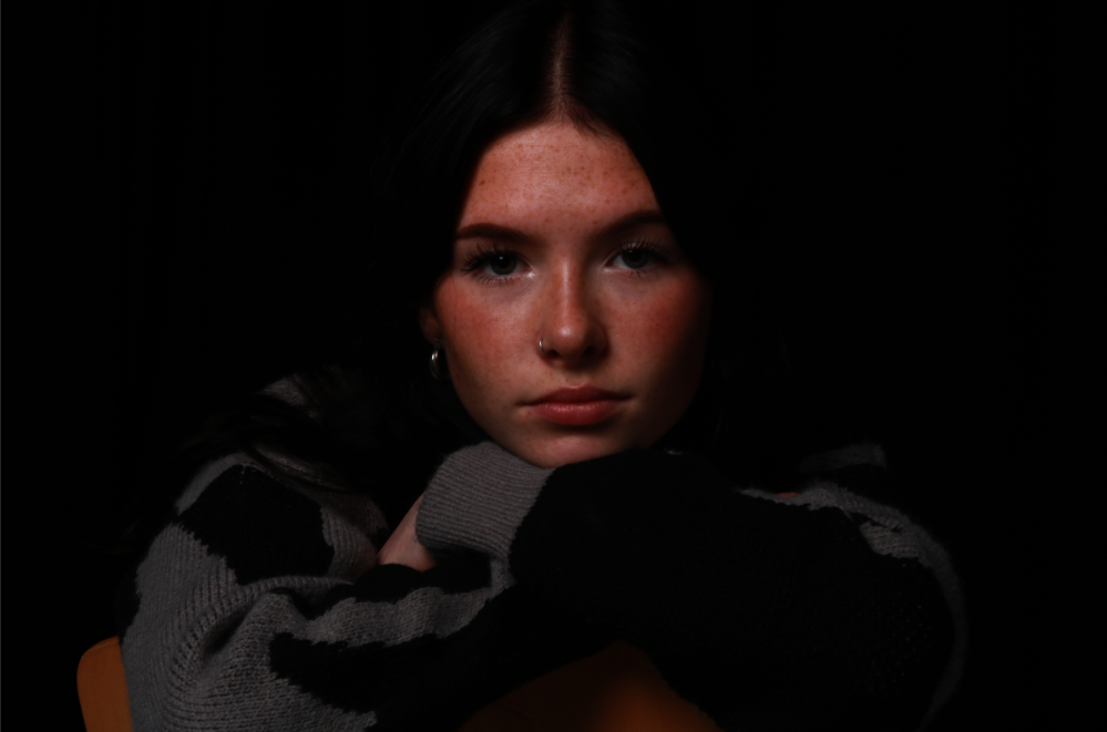
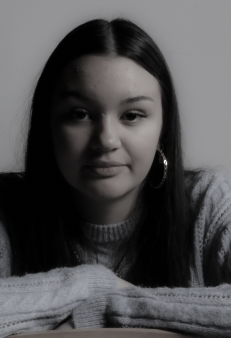
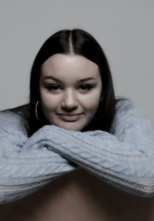
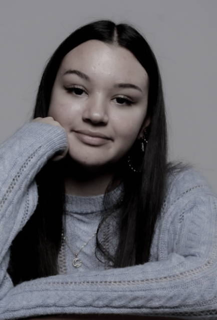
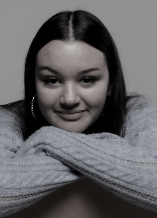
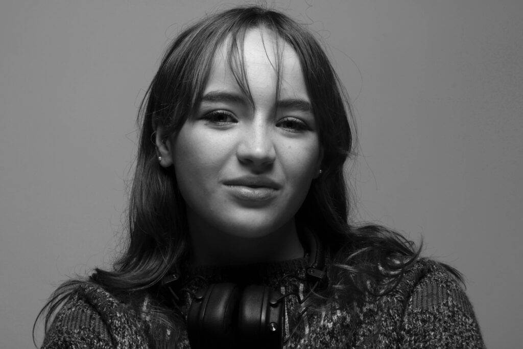
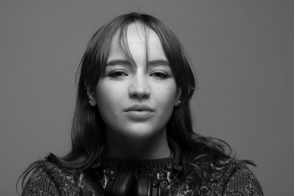
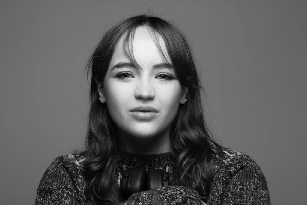
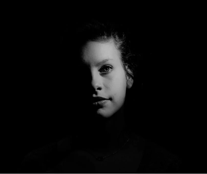
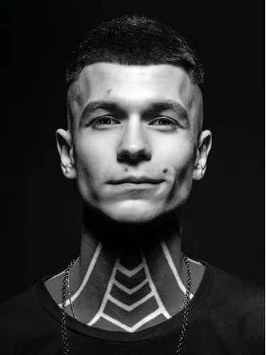
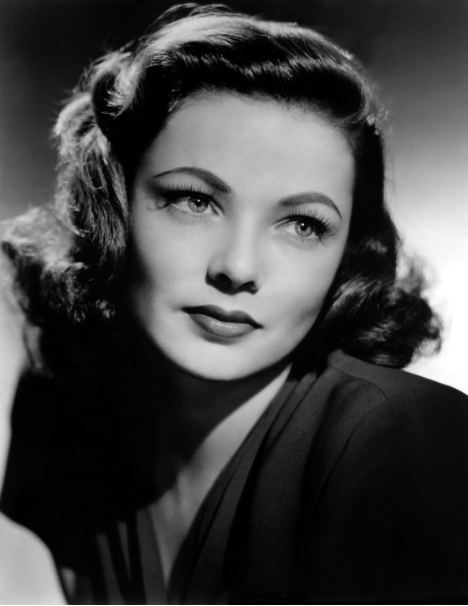
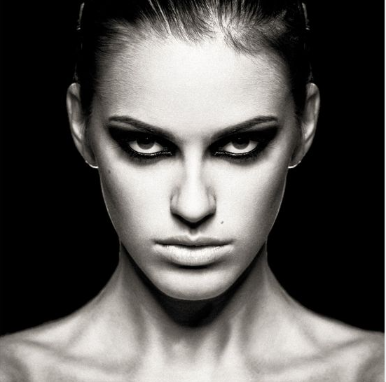
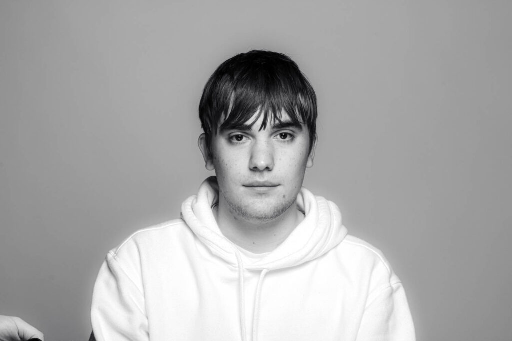
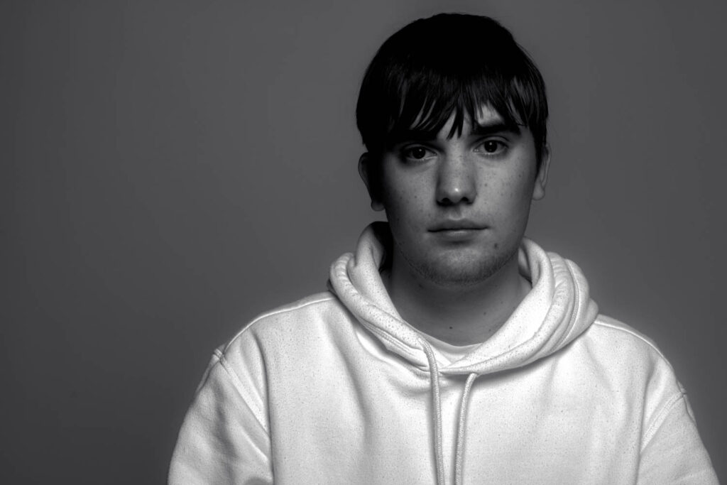
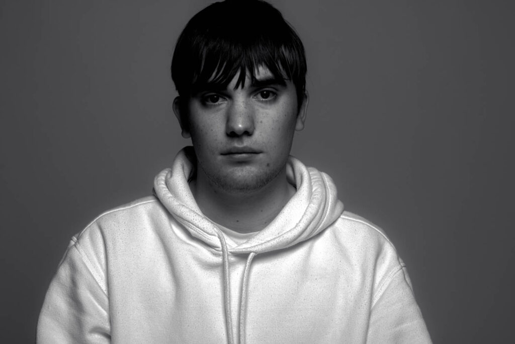
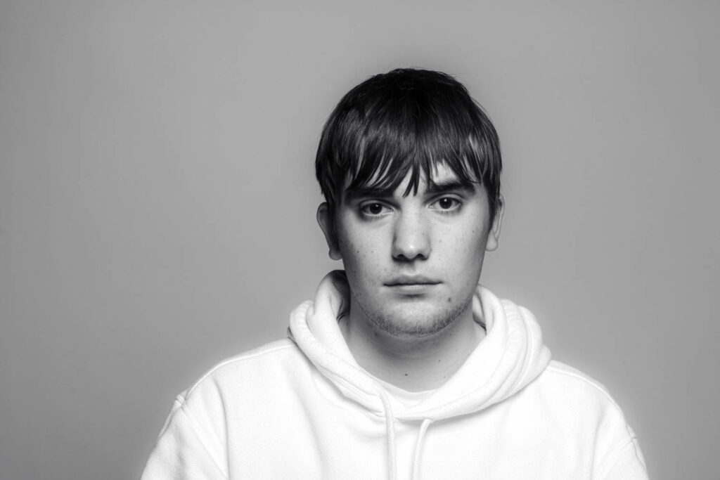
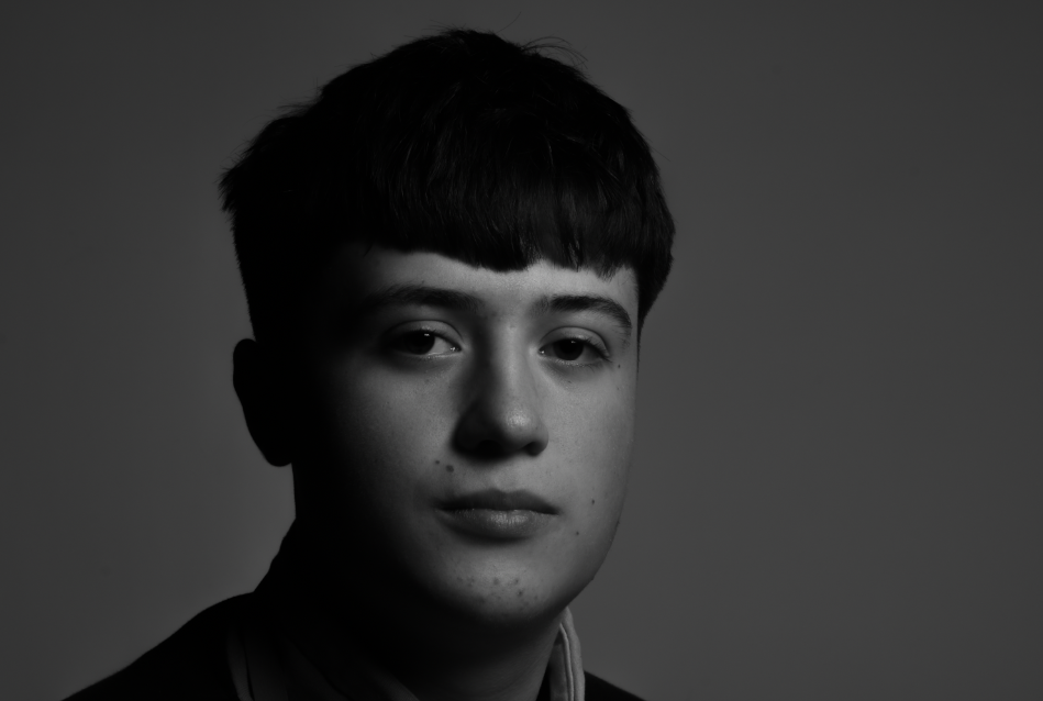
Rembrandt Lighting

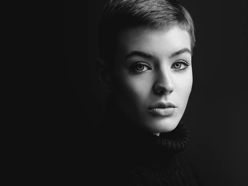
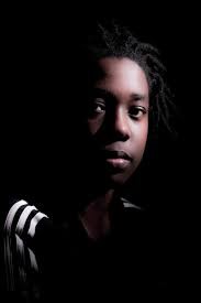
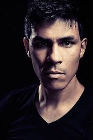
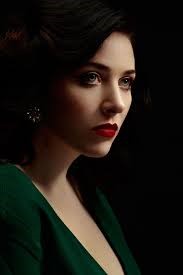
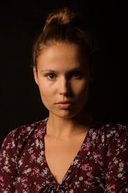
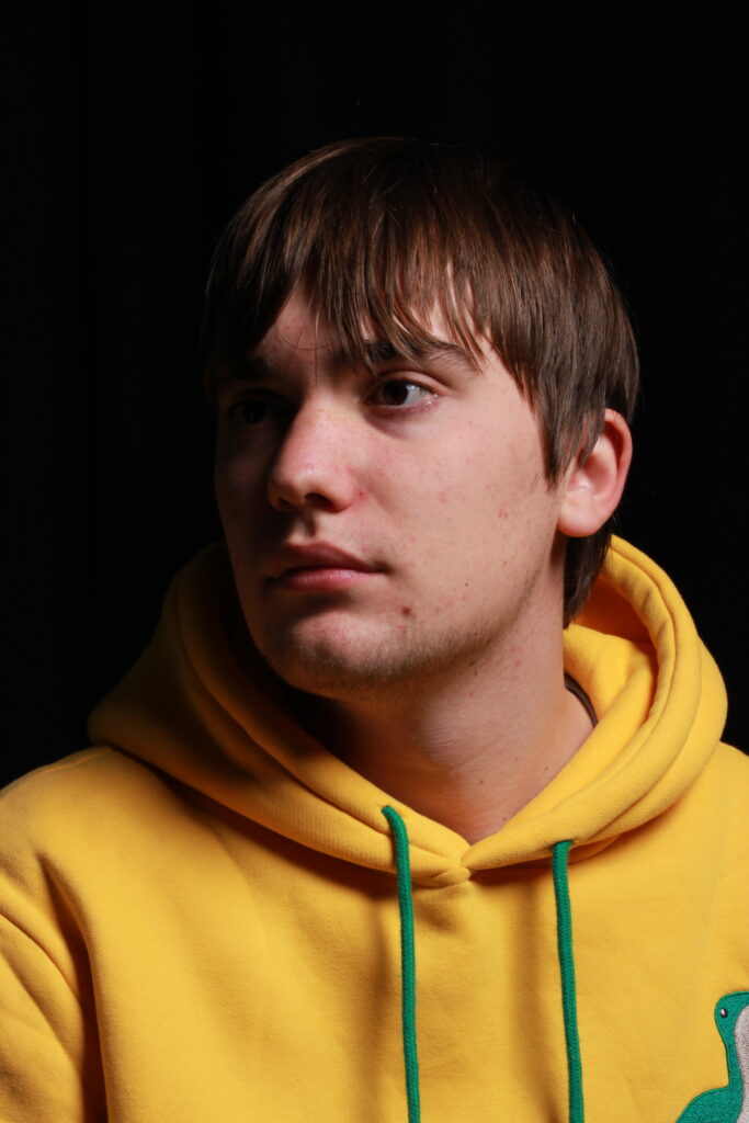
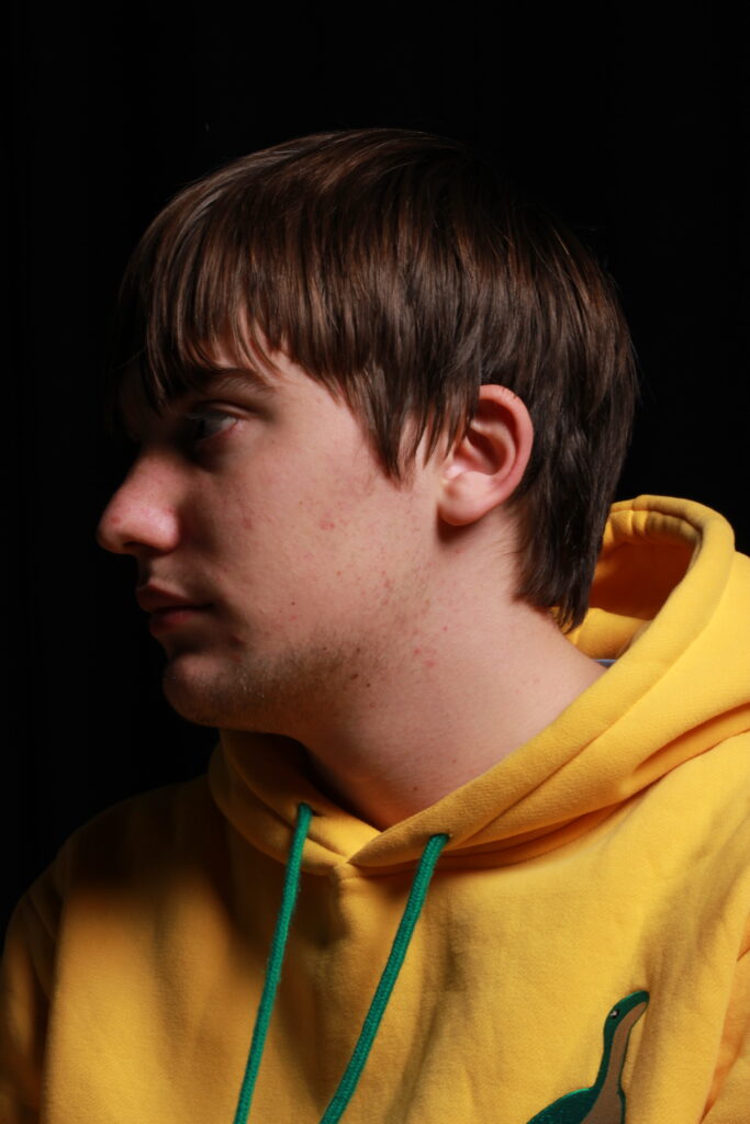
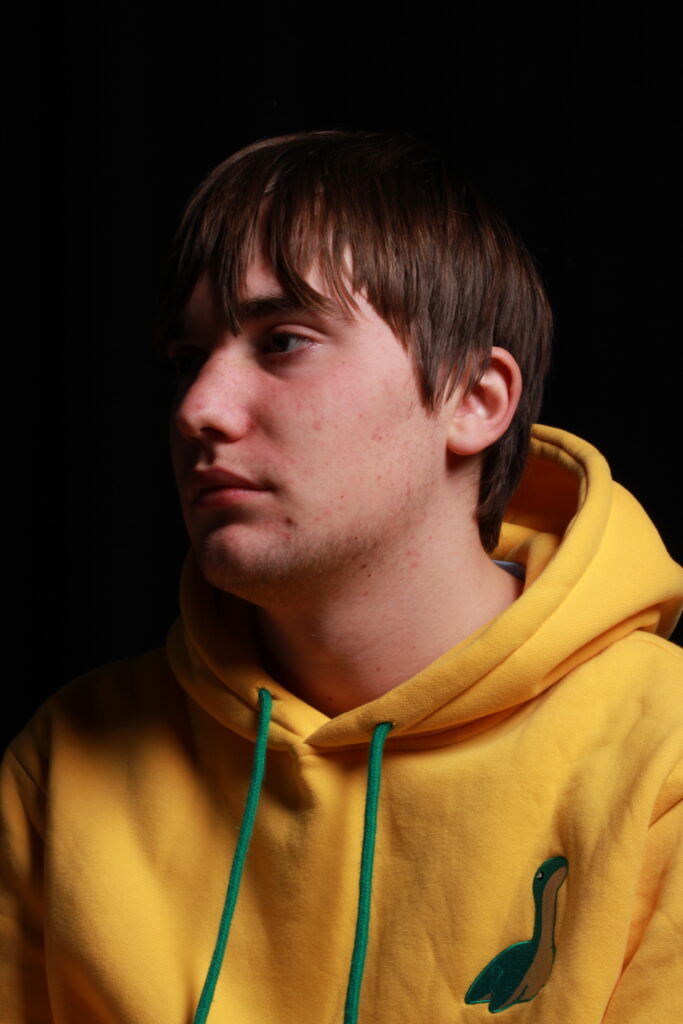
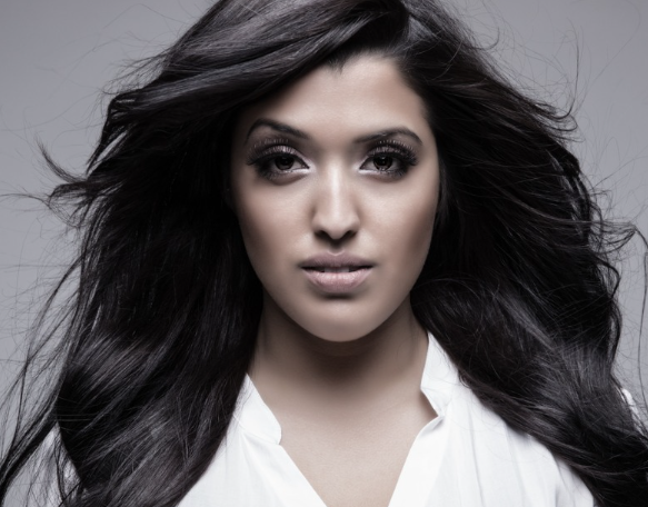
Rembrandt lighting is a technique utilizing one light and one reflector or two separate lights.

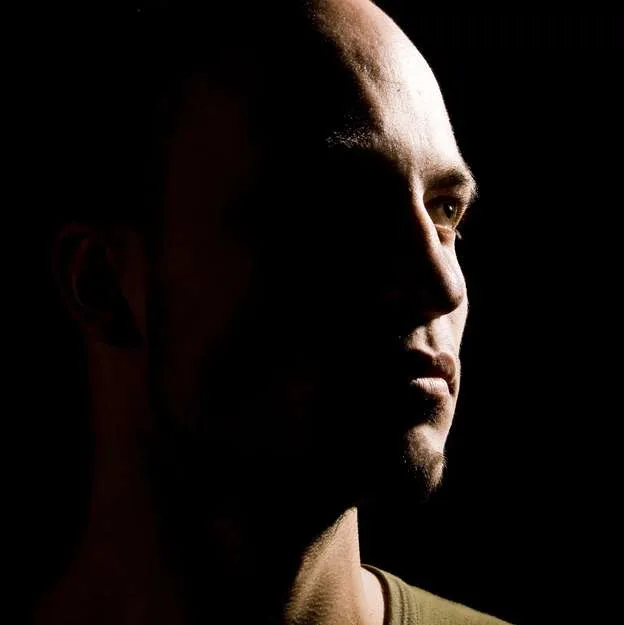
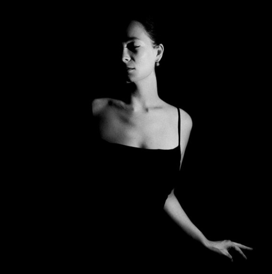
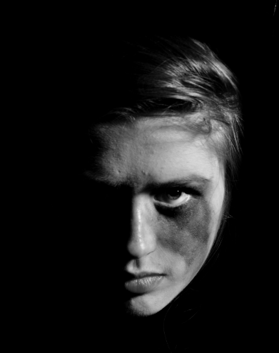
It can be described as a low-key lighting technique. It is lighting particularly for light/dark contrast to emphasize volume and specific areas.

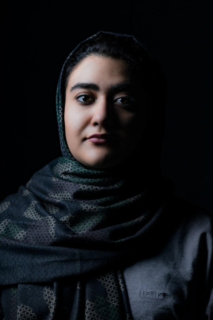
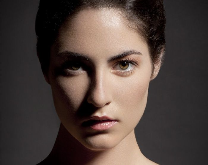
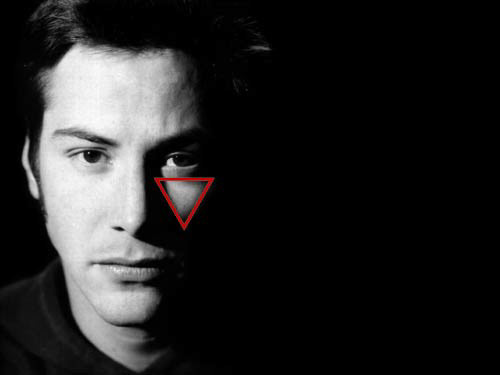
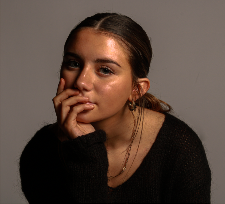
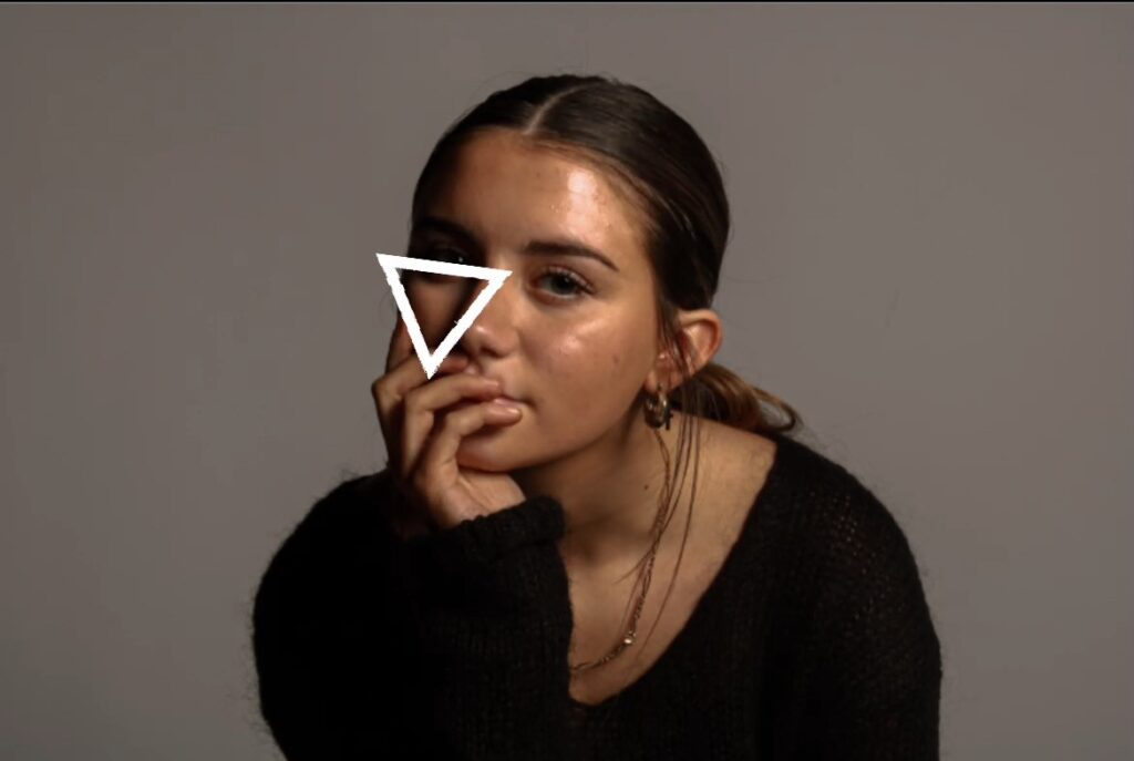
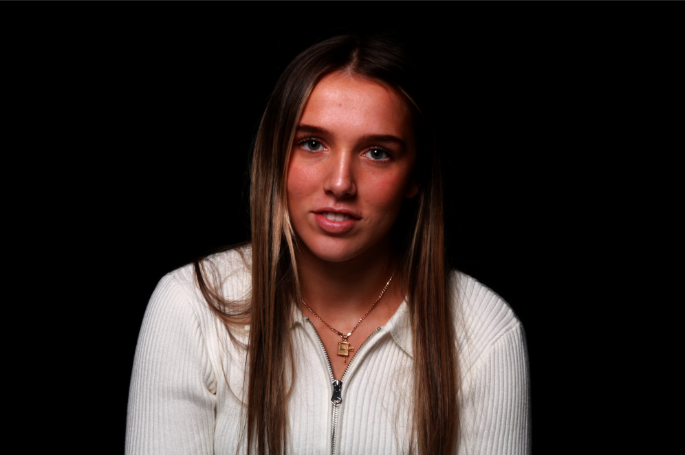
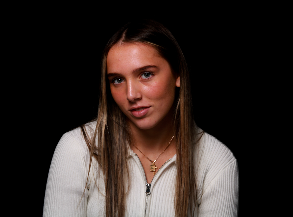
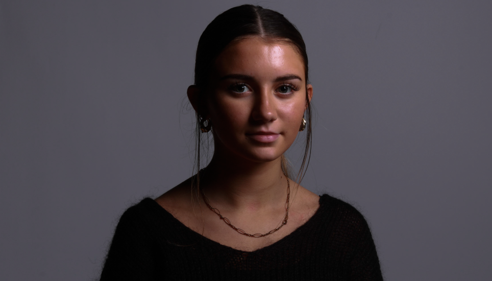
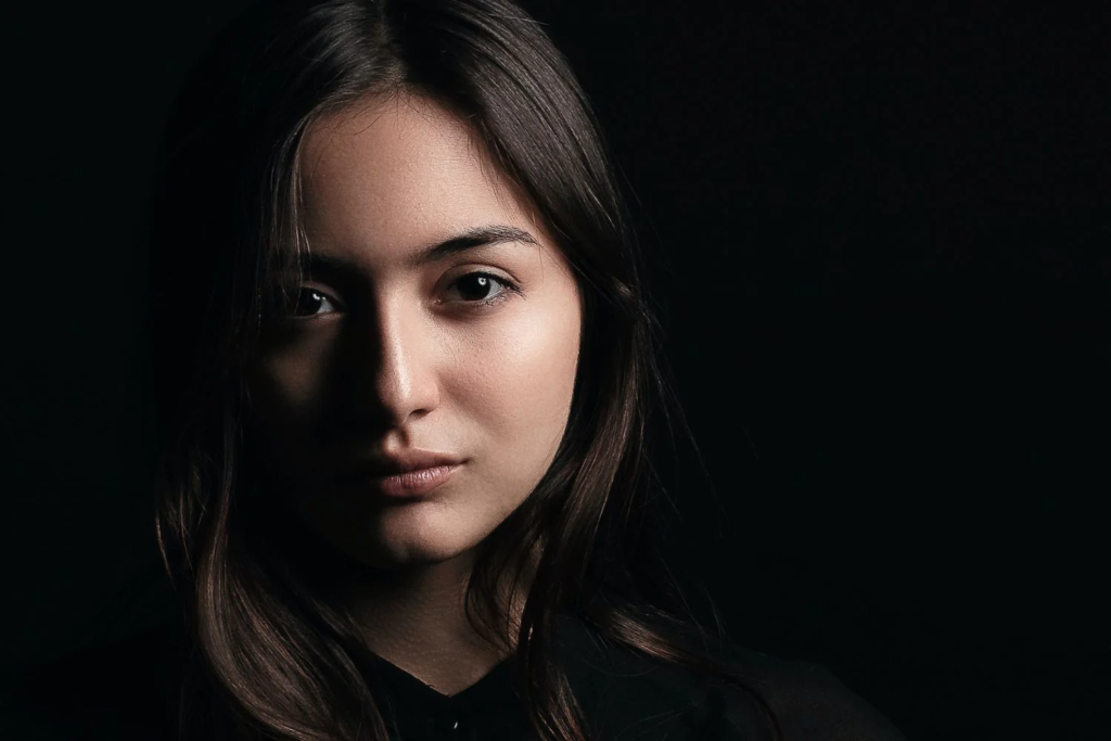
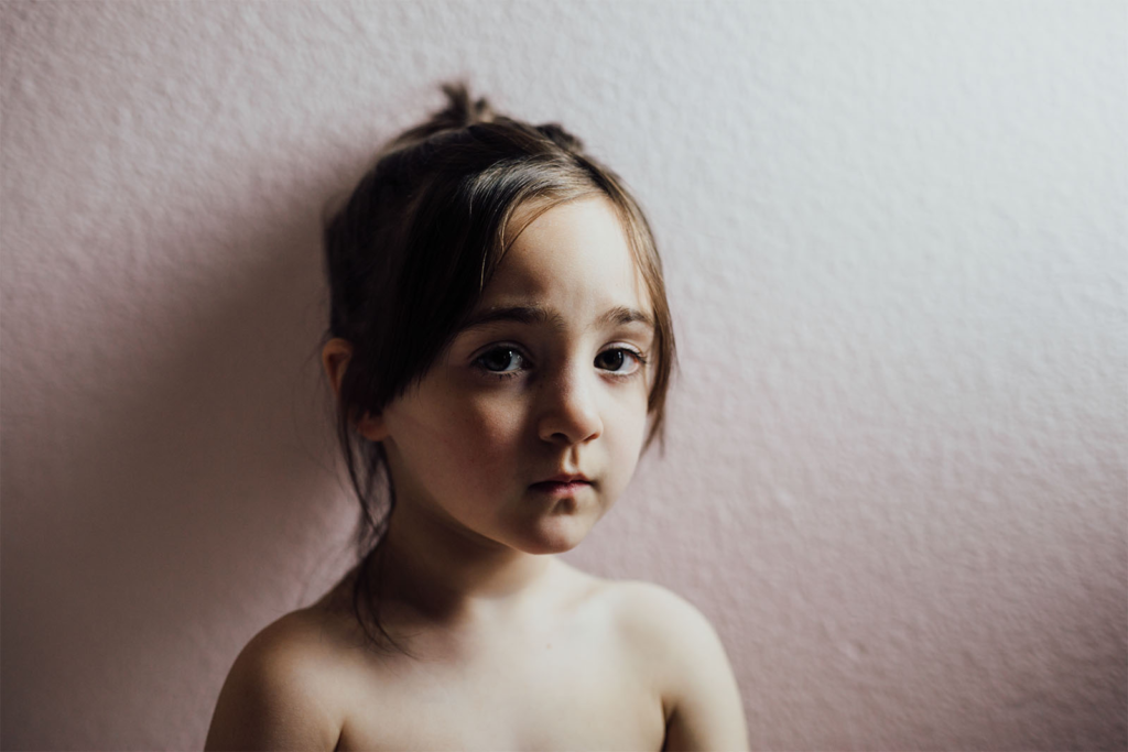
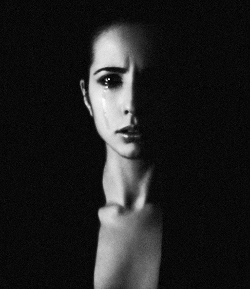
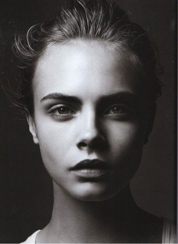
Rembrandt lighting is characterized by an illuminated triangle under the eye of the person, particularly on the less illuminated side of the face. It’s a popular technique because it creates images that look both dramatic yet natural.
THE ARTIST HIMSELF

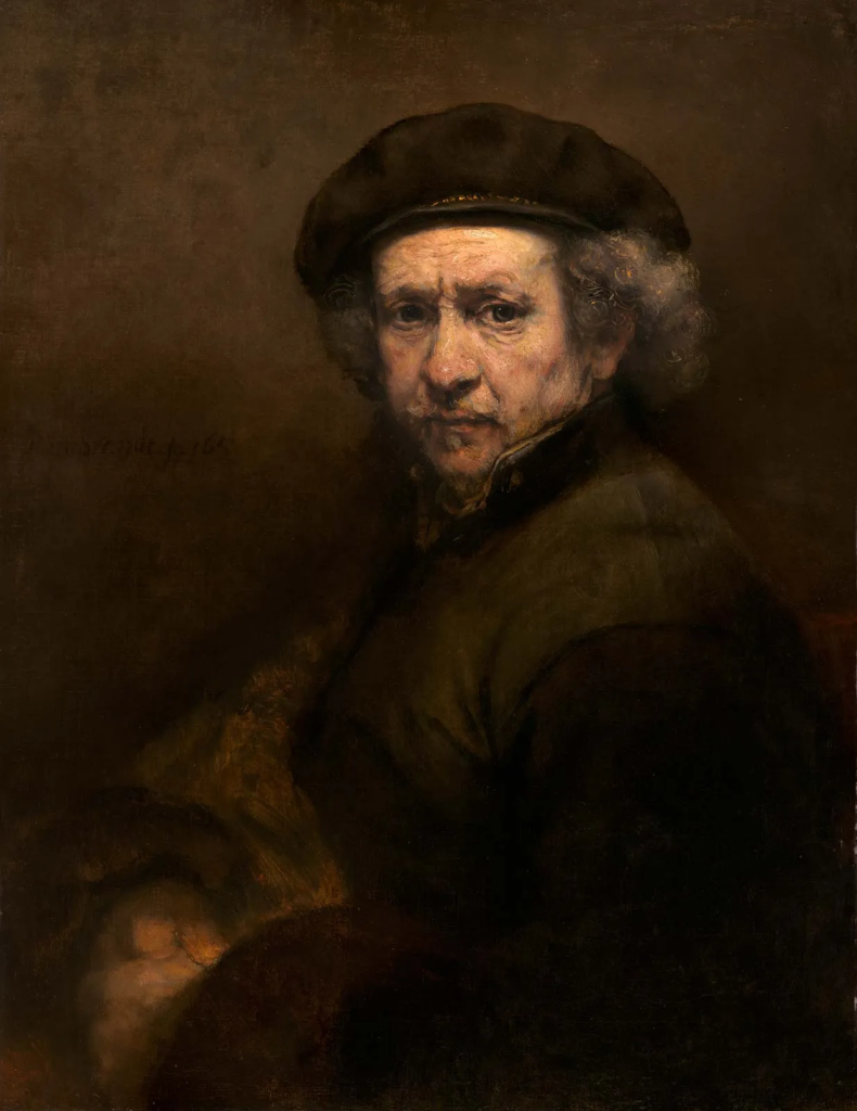
Why was Rembrandt important?

Rembrandt Harmenszoon van Rijnprolific was seen as a painter, draftsman, and etcher, Rembrandt van Rijn is usually regarded as the greatest artist of Holland’s “Golden Age.” This technique was made during the Renaissance period, but Rembrandt then pushed t even further and used dramatic lighting to lure out the ‘psychological depth’ of his models.

How to Do It

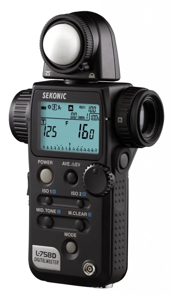
1. Use a Spot Meter for Precise Control of Focus Point

2. Experiment With Multiple Light Sources

3. Practice With Models or Yourself

4. Practice Placing the Inverted Triangle of Light

5. Shoot It Raw To Make the Most Of Lighting Contrast

6. Occasions and Models Suited to This Lighting Type

Studio Photography Using Rembrandt Lighting

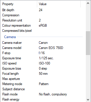
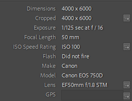
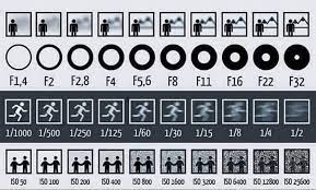
Camera settings I used:

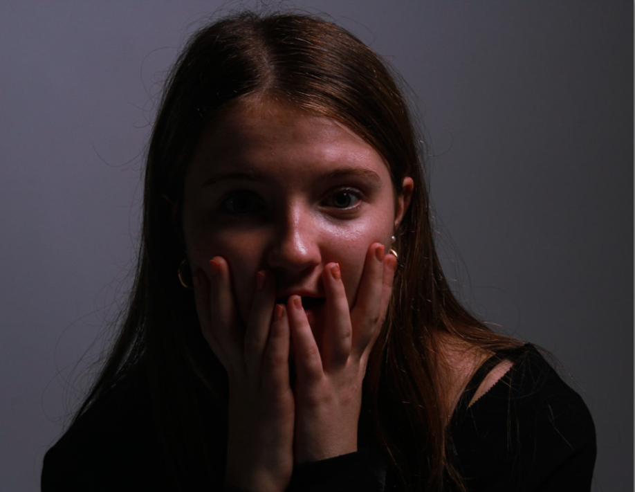
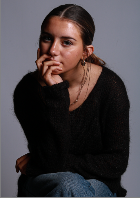
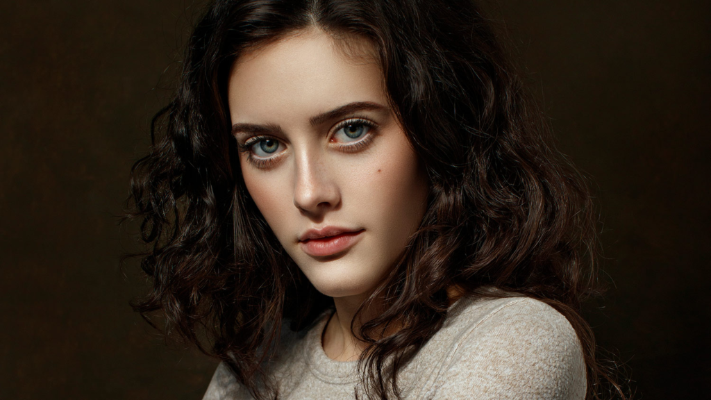
This photo was my favourite photo from my collection of Rembrandt photos I took of this model.

  • I first of all cropped this image to dispose of any extra space in the background. Cropping this image helps the photo to increase in detail as the person looking at it is able to focus more on the important parts and the focal points such as the eyes or the mouth etc.
  • The pose I asked my model to do is to look shocked into the camera, she did this by widening her eyes, opening her mouth and covering her face and mouth with her hands. This emotion in the photo portrays shock, surprise or fear.
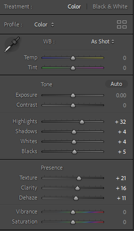
  • I then edited this photo further than I usually do with my images. I first edited the highlights, texture, clarity etc.
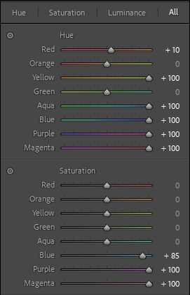
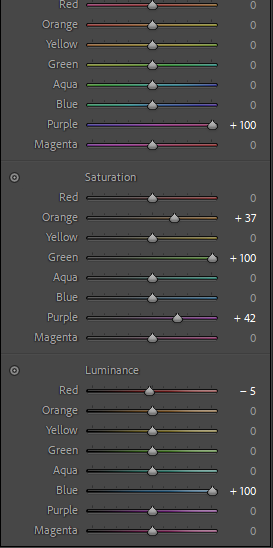
  • I then went into further editing on Photoshop and edited the colour, saturation and luminance. I increased the colour purple fully up and then the saturation colours orange, green and purple. I then increased the luminance of red slightly and then blue completely.
  • This further editing with colour added extra dimension to this photo, the background colour has slightly changed and the photo is slightly more vibrant but still maintains its shadows and darker parts of the face and hands.

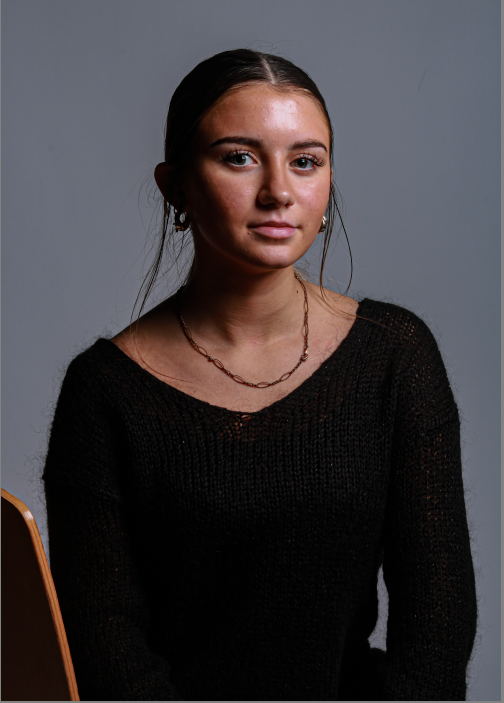
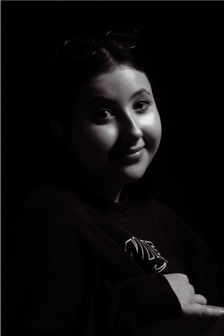
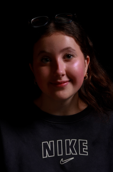
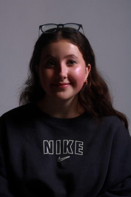
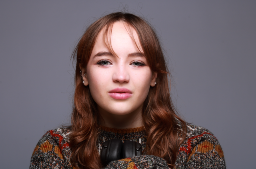
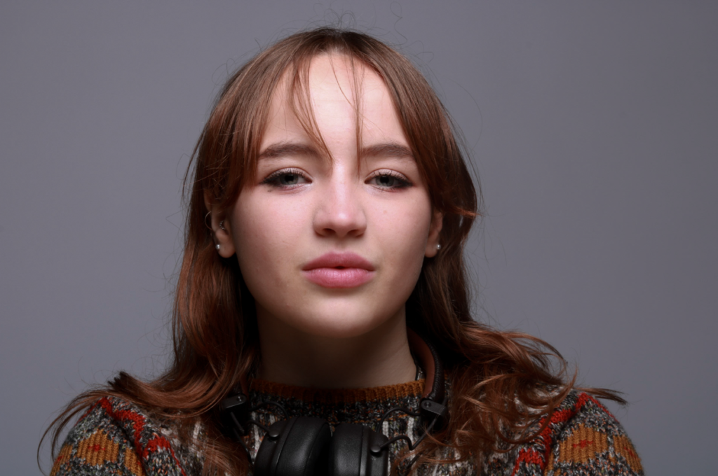
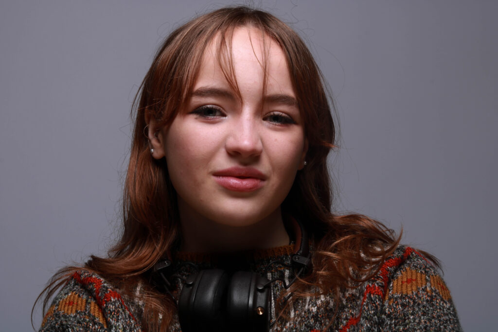
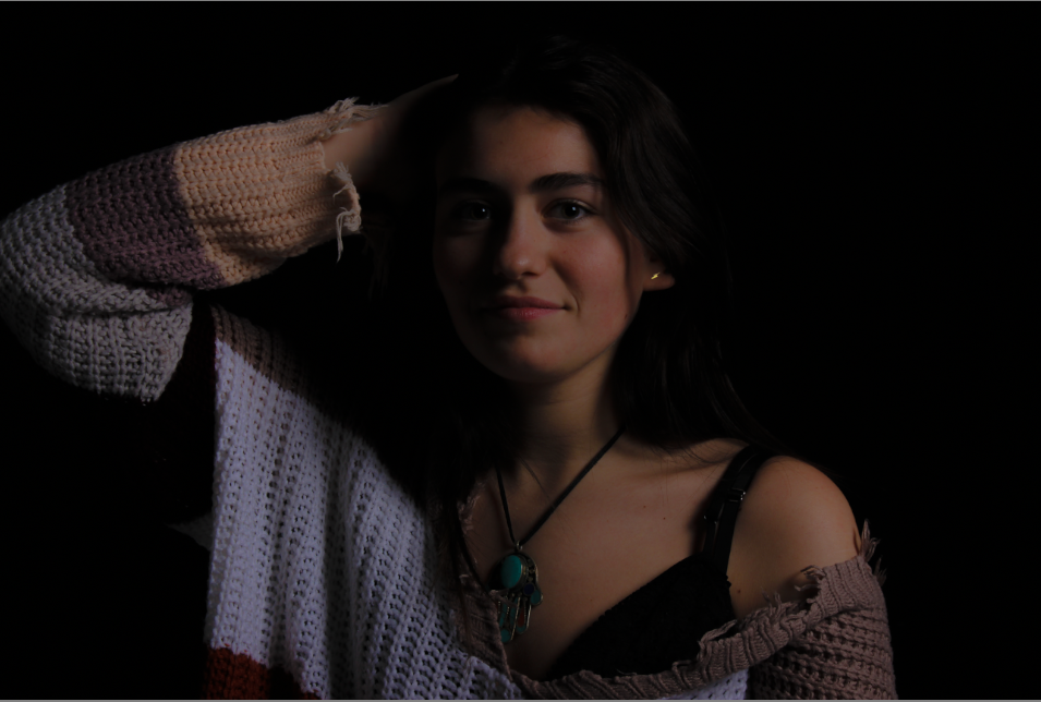
For these headshots I took photos of a new model. I focused mostly on different facial expressions than different positions. I asked my model to be herself and act natural to be able to take more personal photographs. I edited these in adobe photoshop. I can really see the Rembrandt triangle shown here on my models left cheek.

This photo is my favourite photo I’ve taken in my first photoshoot. This 1/4 body shot perfectly represents Rembrandt lighting, this is because there is a triangular shape on my models left cheek. I made this triangle on a 45 degree offset from the subject, about 5 feet away. The triangular shape truly demonstrates the Rembrandt effect and how it shows an image to look professional and high detail. I have highlighted the triangle created to clearly show the technique I have used.

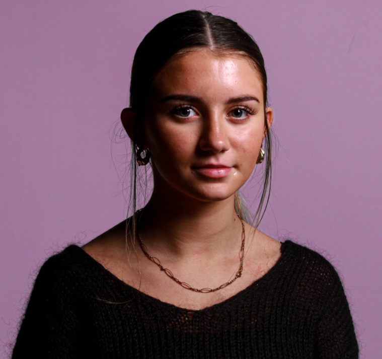
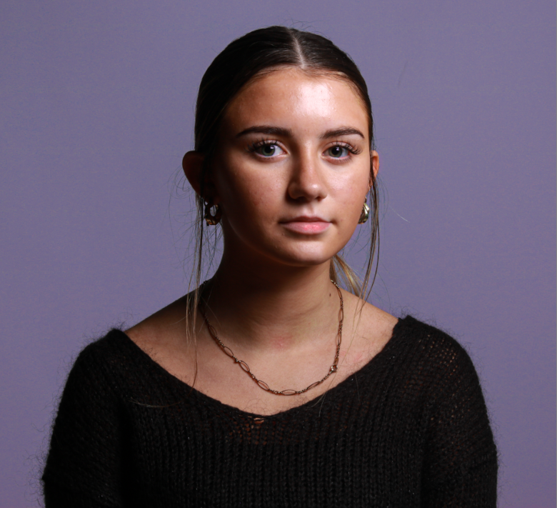
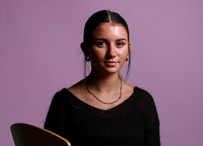
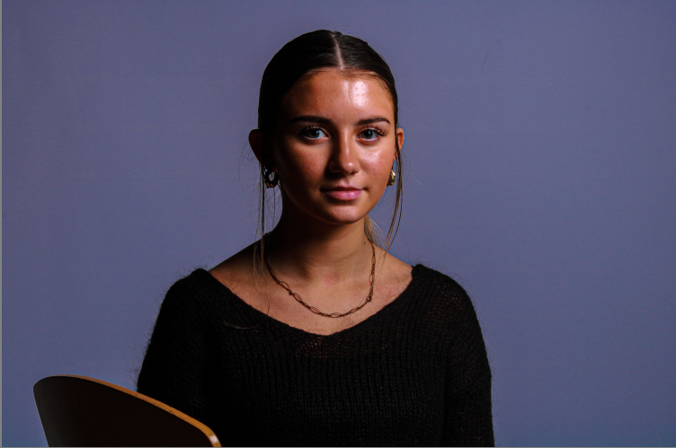
these are my two images after cropping them to capture only the model and less of the background. This is to help improve my image’s quality as there is less of a backdrop.

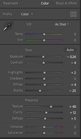
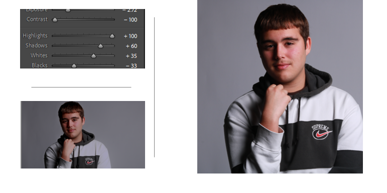
I edited these two photos to create a coloured background. The first I created a more pink background and maintained the colour of her face and body. I did this by increasing the luminance This helped to experiment with different backgrounds and how these can improve my photos. These are the editing tools I used to edit the photos above.

Further Editing Settings

I then took these half body shots. In the first photo I told my model to look straight at the camera and pose naturally. This creates a perfect position to capture a portrait of my model and experiment with different lighting techniques. I like how she is looking directly at the camera, due to my lighting techniques and correct camera settings, these photos did not need a large amount of editing.

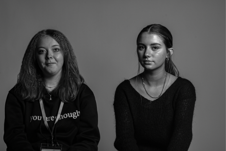
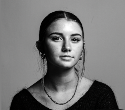
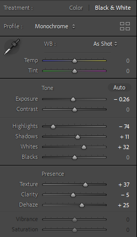
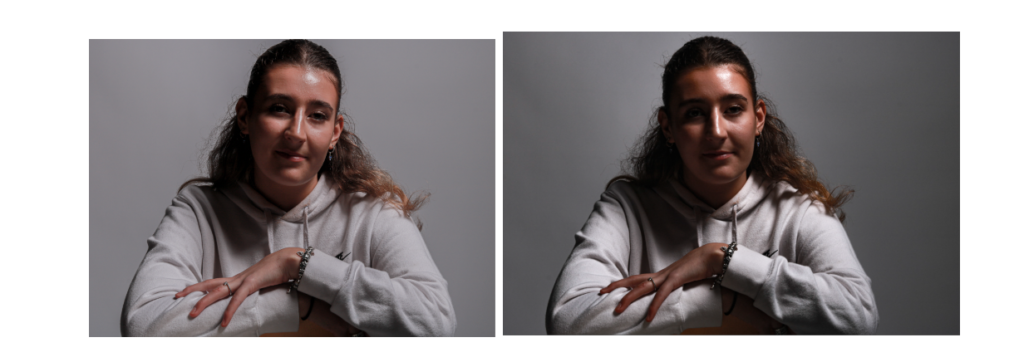
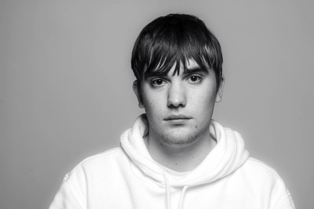
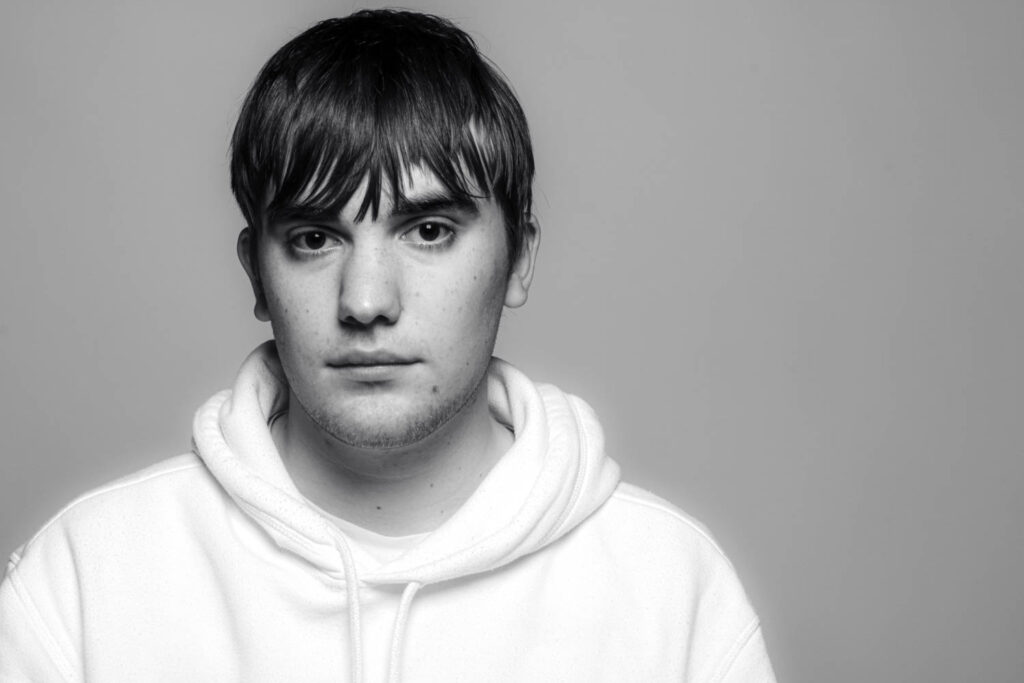
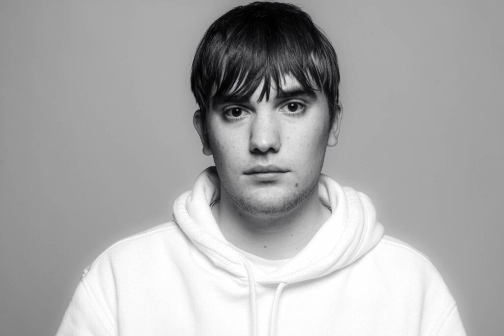
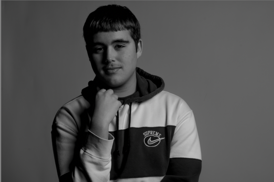
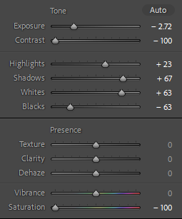
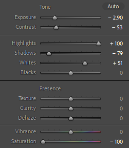
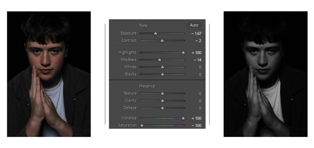
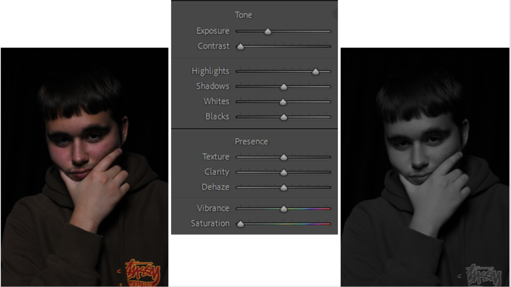
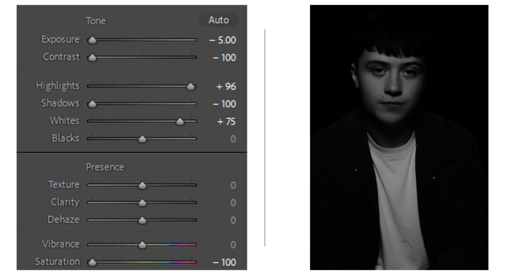
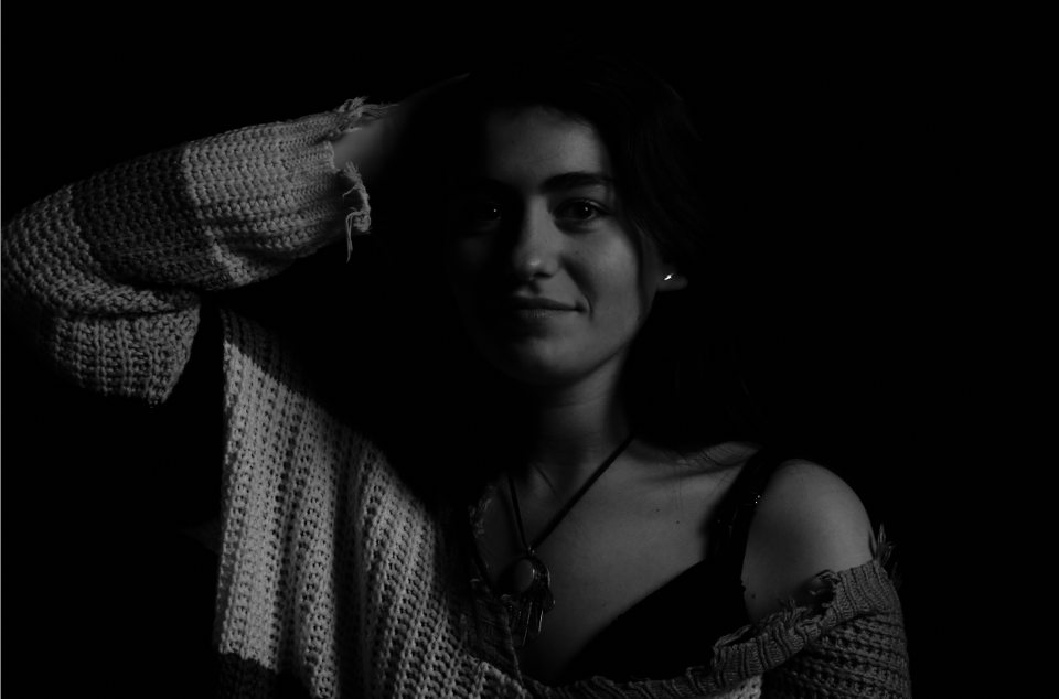
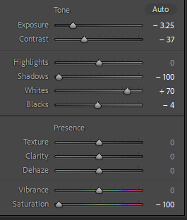
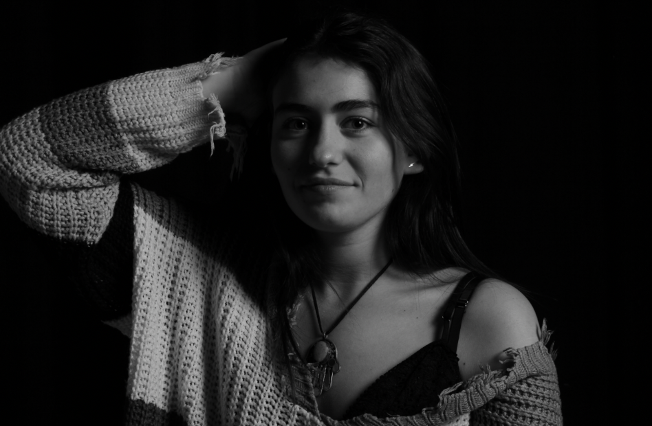
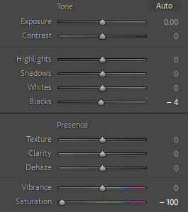
I then used another model to help with my portrait experimentation. I was able to capture Rembrandt lighting on my model on the right. However, my model on the left is missing the clear triangle on her cheek. To improve these half body shots, I would attempt to capture clear Rembrandt lighting techniques on both of my models to elevate these images even further. These photos are black and white, this helps with creating more mystery and dimension into my images, I think this black and white effect In Lightroom has really made these photos more effective and look much better. These are the editing tools I used to create this black and white effect:

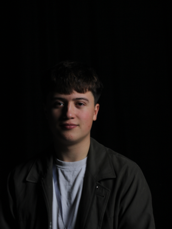
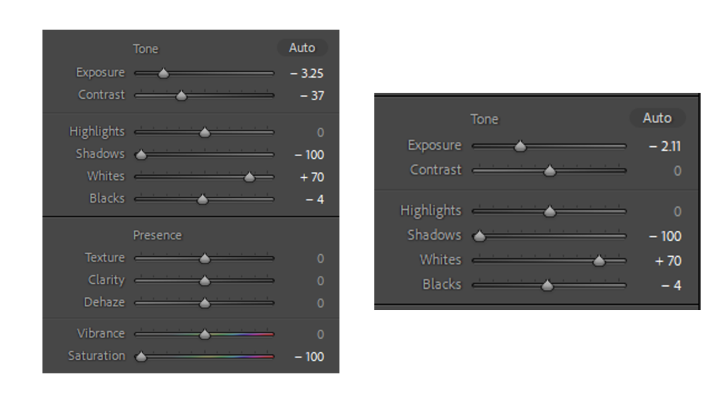
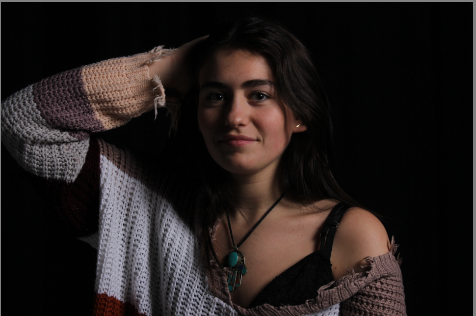
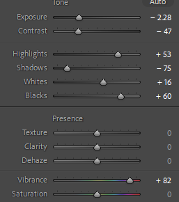
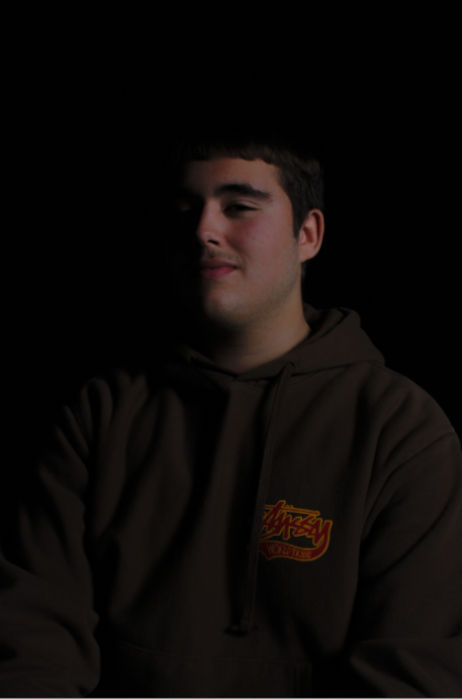
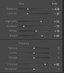
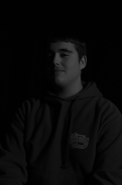
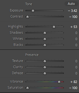
I then took photos of a new model, these photos were taken originally very dark, this was due to a incorrect exposure. Exposure is the amount of light that gets into your camera and produces the picture on the image sensor. To improve these photos, next time I need to widen the aperture, extend the shutter speed, and boost the ISO. However, I needed to edit these on photoshop instead, I increased the exposure, highlights and whites to help the quality of the photo increase and make it brighter. This was a challenge for me as I found it difficult to maintain the high quality of her features and textures etc, whilst brightening up the photo.

Butterfly Lighting

What is butterfly lighting ?

Butterfly lighting is a portrait lighting pattern where the key light is above the photographers camera to ensure that the light is pointing down on the subjects face. This creates a shadow under the subjects nose and creates an illusion of a butterfly under the nose.

Butterfly lighting is when there is a shadow on the face just below the nose shaped like a butterfly. It is a technique used by many photographers to achieve a very elegant and sophisticated image.

Why do photographers use it ?

Butterfly lighting is used for flattering and glamorous portrait photos. The lighting is usually soft on the face and an advantage of using this type of lighting is that it can be used on almost all faces and it is extremely easy to set up.

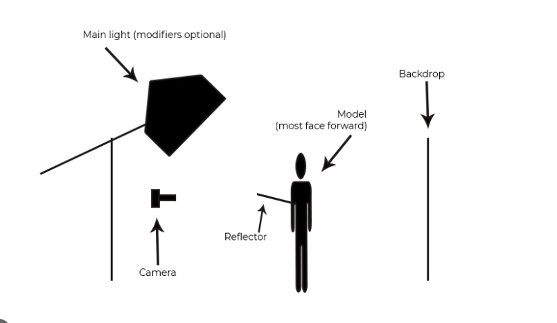
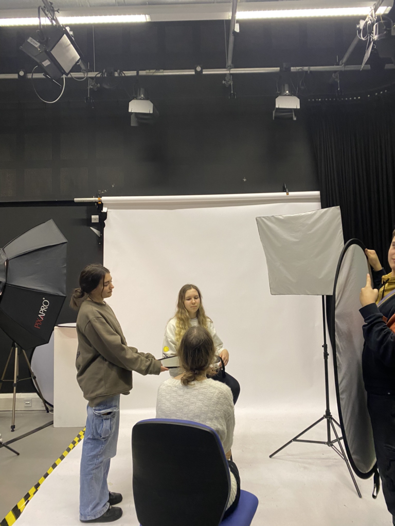
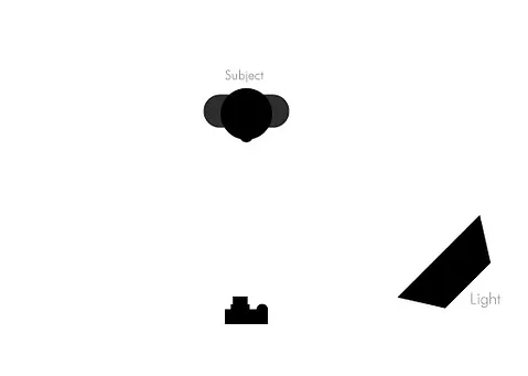
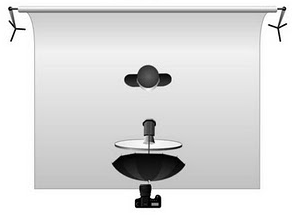
As you can see from this image of the setup, the lighting is placed above the camera with the subject in front of the camera facing forward. There is also a reflector underneath the models face which reflects the lighting upwards and helps to create the butterfly shadow underneath the nose. There is a plain backdrop behind the model to enhance the models face and to ensure that the model is the main focus of the photo. For Butterfly lighting you can use any coloured background as it doesn’t matter as long as there is a shadow underneath the nose of the model.

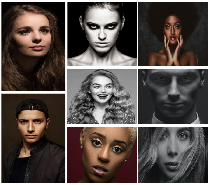
Butterfly Portrait Mood Board

Edited Portrait Photos

my Portraits

Portrait photography, also referred to as portraiture, is a type of photography in which the subject is one or more people and the aim is to convey something about the subject’s identity, personality, or story.

Basic Lighting

Rembrandt Lighting

Rembrandt Lighting is a technique for portrait photography named after Rembrandt Harmenszoon van Rijn, the great Dutch painter. It refers to a way of lighting a face so that an upside-down light triangle appears under the eyes of the subject.

Butterfly Lighting

Butterfly lighting is a type of portrait lighting technique used primarily in a studio setting. Its name comes from the butterfly-shaped shadow that forms under the nose because the light comes from above the camera. You may also hear it called ‘paramount lighting’ or ‘glamour lighting’.

MY FAVOURITE PHOTO:

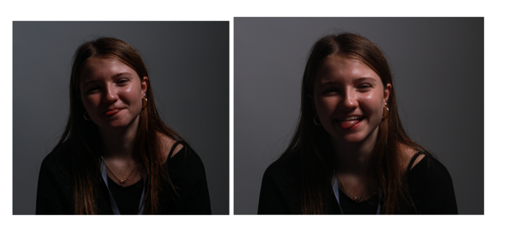
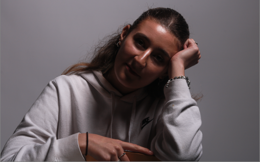
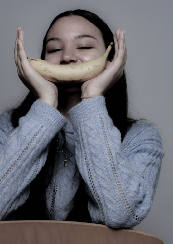
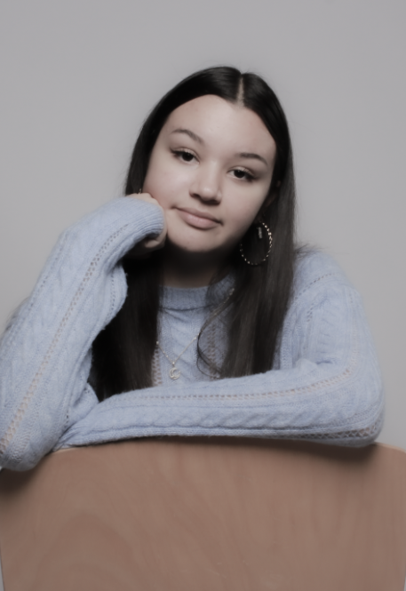
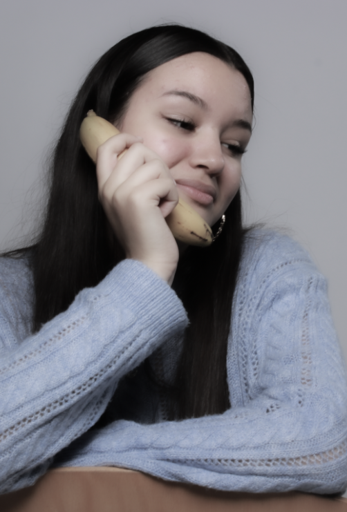
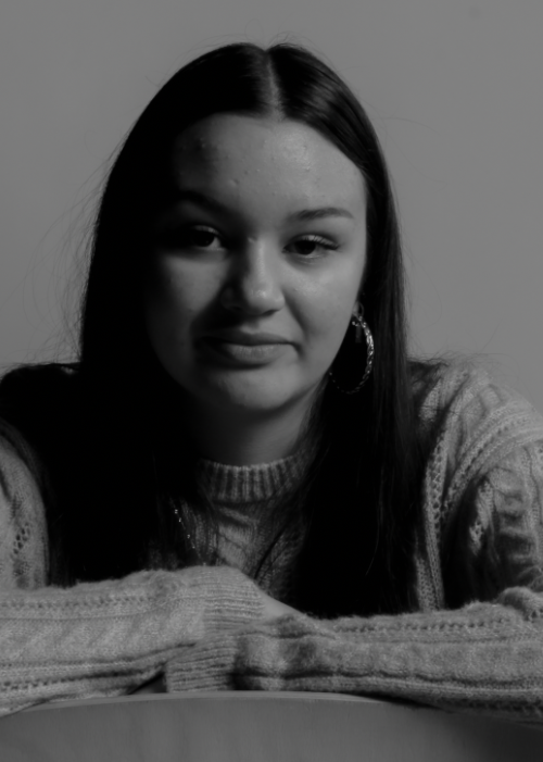
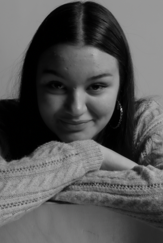
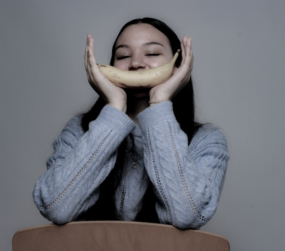
Personally I really like this photo as its not too simple but not too much, I made the model use a prop and had an idea of using something to make their smile wider, This added colour and perception to the photo, I made the photo black and white but made sure that some colour was still shown as I didn’t like how bright the original colour was, this photo makes me feel very happy as the model is very smiley and the photo isn’t black and white, colour makes the photo look more powerful. I really like how they turned out however if I could I would have liked to not get the chair into the photo to make it more mysterious. I do really like how we used a prop as it adds effect to the photo and its isn’t seen as basic and boring like some of my other photos although sometimes simple is better and too much details can ruin it.

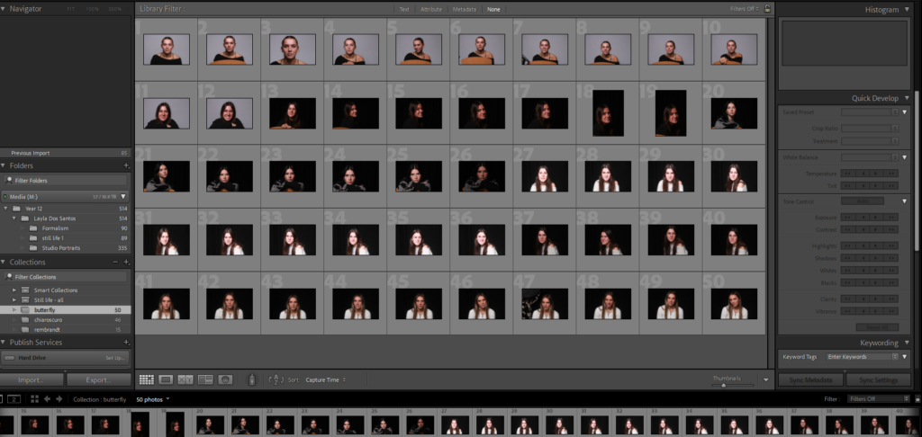
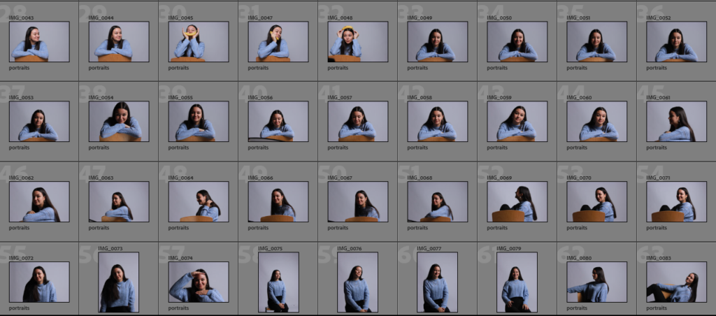
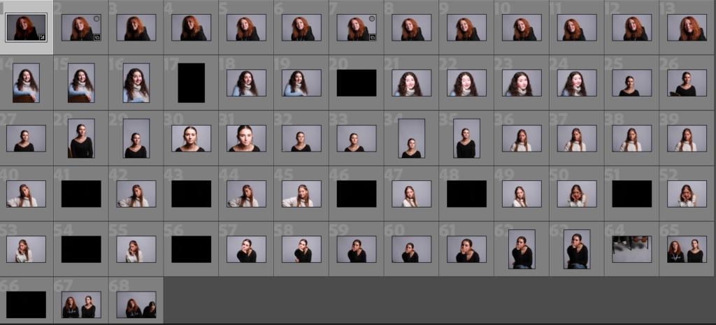
Studio Lighting/contact sheet – George Blake

These images are from studio lighting portraits:

My Intention with these shoots was to play around and experiment with the Rembrandt, Butterfly and Chiaroscuro lighting techniques.

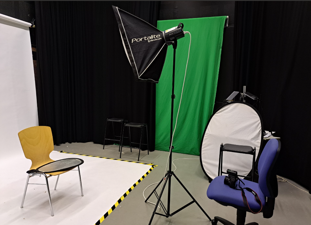
Recreating these, in the studio we used a DSLR camera, with a flash adapter, additionally with a reflector to try out with.

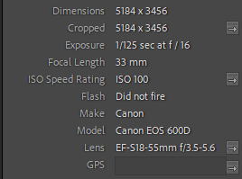
camera settings:

Studio set up:

Rembrandt –

5 – 4 star rated photos:

(These are also white flagged – meaning they consist of photos that are taken clearly and match the Rembrandt light triangle).

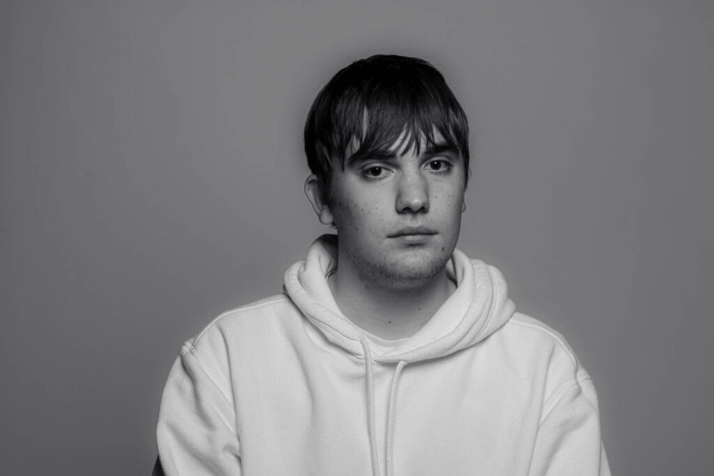
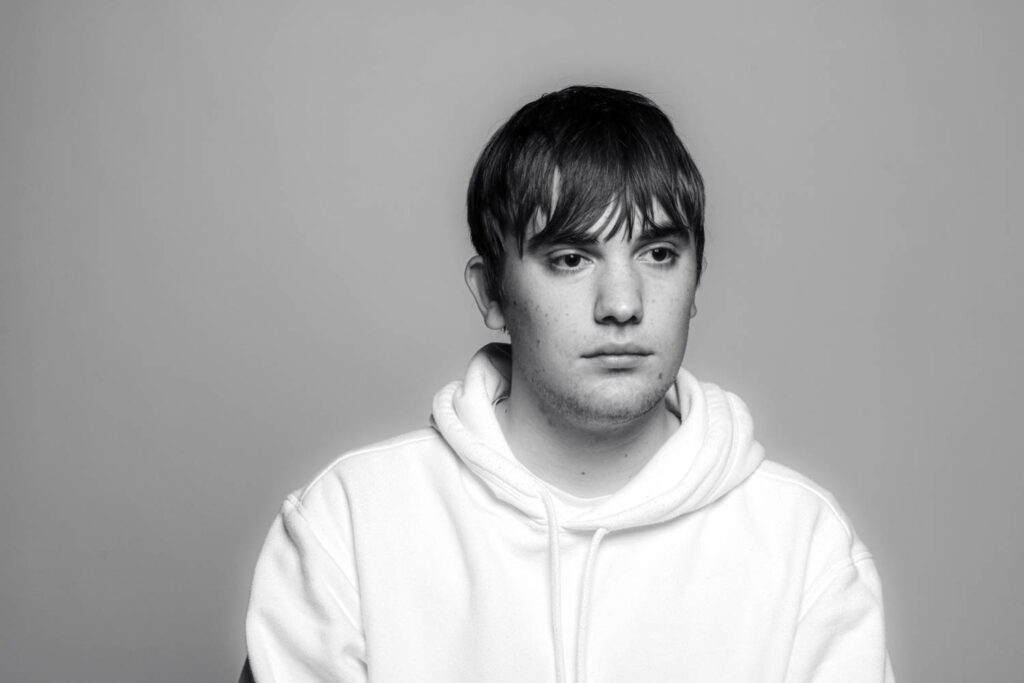
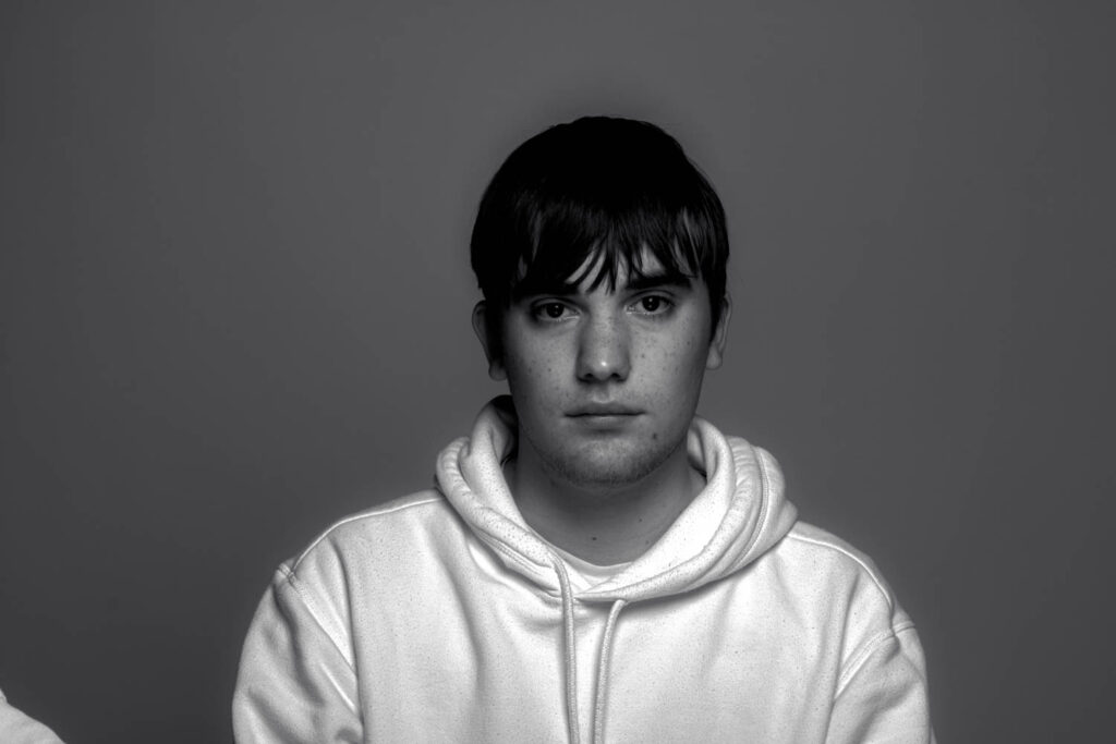
These photos, capture the visual elements of Rembrandt, with the light positioned at a 45 degree angle and Rembrandt light triangle present on the cheek.

3 – 2 star rated photos:

(These are also white flagged – meaning they consist of mostly clearly taken photos or just didn’t fit the look I was going for, such as not containing a clear indicator of the light triangle or too poorly exposed).

These could improve, by altering the exposure on the camera or by repositioning the light to create a starker contrast of the triangle.

2 – 1 star rated photos:

(These are black flagged meaning they do not appeal to what I was aiming for during this photoshoot).

These, to me didn’t fit the look I was going for, therefore this is why I have given them a low rating.

Butterfly –

5 – 4 star rated photos:

(These are also white flagged – meaning they consist of photos that are taken clearly and match the Butterfly lighting effect).

These images, best represented the effect of butterfly lighting as shown with the shadow casting on the top lip.

3-2 star rated photos:

(These are also white flagged – meaning they consist of mostly clearly taken photos or just didn’t fit the look I was going for).

These images were clearly taken but did not fit what I had In mind.

Chiaroscuro –

5 – 4 star rated photos:

(These are also white flagged – meaning they consist of photos that are taken clearly and match the tonal contrast of Chiaroscuro lighting).

These are my best of the shoot, the contrast with tones, and balance of colour most represent examples I’ve looked at.

3 – 2 star rated photos:

(These are also white flagged – meaning they consist of mostly clearly taken photos or just didn’t fit the look I was going for).

The poses to me created to much brightness, which isn’t what chiaroscuro is.

2 – 1 star rated photos:

(These are black flagged meaning they do not appeal to what I was aiming for during this photoshoot).

The exposure for this image was too low.

Conclusion –

In conclusion, I think these shoots turned out well, in terms of the visual composition they are inspired from and recreated to fit the techniques to a decent standard. I would improve by experimenting more with the light and try to get better at Rembrandt. as that proved the most difficult to create.

Rembrandt Lighting

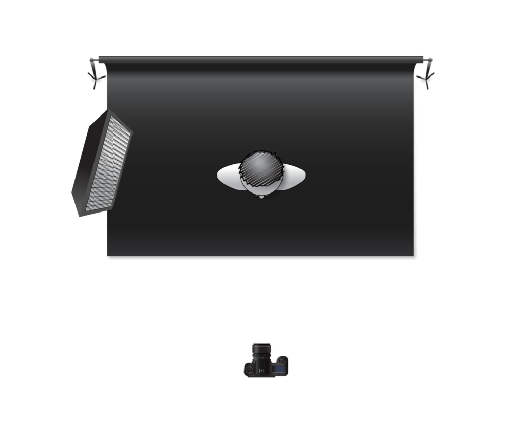
Rembrandts origin came from the Dutch painter. Rembrandts lighting technique is where he has a spot light at a 45 degree angle to the side of his model and the shadow from the light creates a triangle on the side of the face that does not have the light on it. This creates the triangle and it lights up the other eye making it become more visible.

This technique makes the models face brighter and highlights the eye to give the image a more interesting complexion.

Photo Analysis

The model is having their photograph taken on a black background, and the colour from their faces and their clothes contrasts against the black background and it gives a vibrant bit of colour. The form of these photos are all 3D and the texture is trying to represent the texture of one of his paintings but his photos all have a clean look.

My Response

My best photo

Rembrandt Lighting

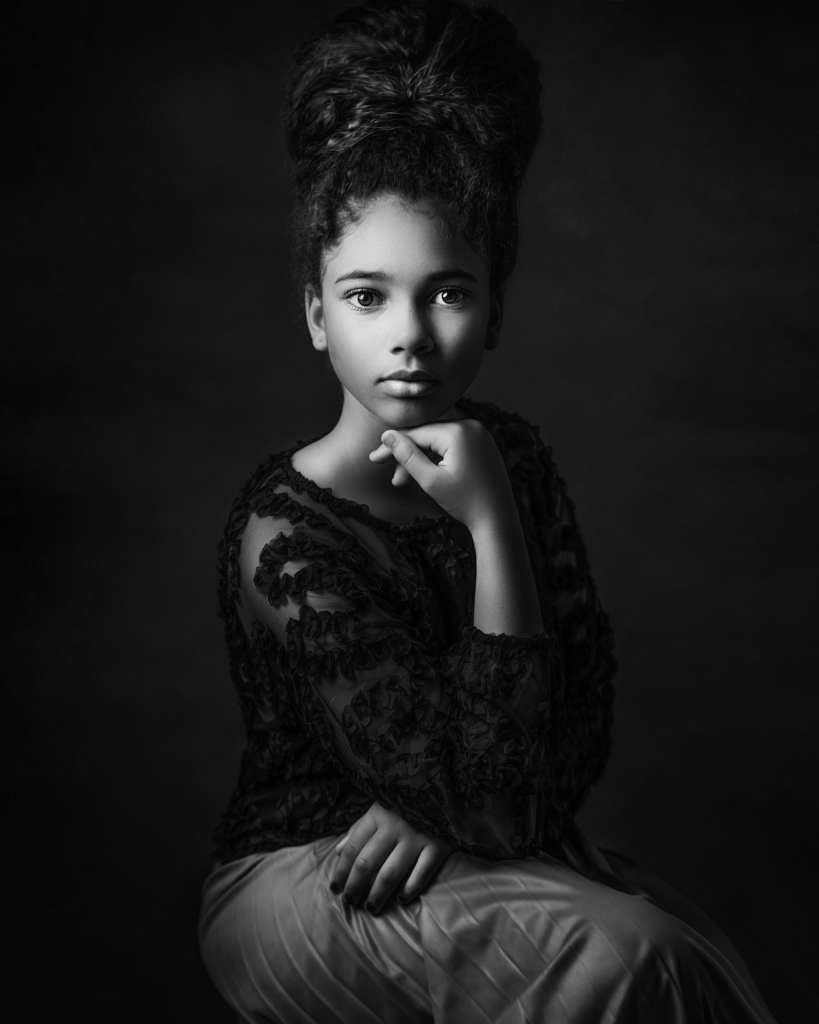
Rembrandt lighting is a technique for portrait photography named after Rembrandt Harmenszoon van Rijn, the great Dutch painter. It refers to a way of lighting a face so that an upside-down light triangle appears under the eyes of the subject.

Rembrandt lighting is characterized by an illuminated triangle under the eye of the person, particularly on the less illuminated side of the face. It’s a popular technique because it creates images that look both dramatic yet natural.
Rembrandt photography :

Rembrandt context/analysis

Rembrandt lighting is a technique utilizing one light and one reflector or two separate lights. It’s a popular technique because it creates images that look both dramatic yet natural. It’s predominantly characterized by a lit-up triangle underneath the subject’s eye on the less illuminated area of the face.
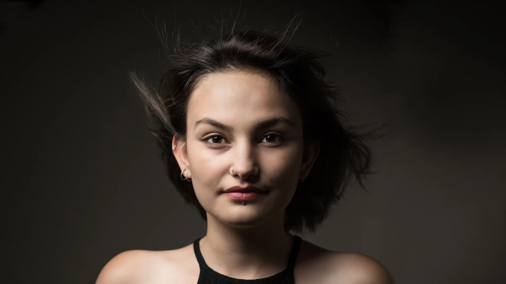
Why was Rembrandt important?

Rembrandt Harmen zoon van Rijnprolific was seen as a painter, draftsman, and etcher, Rembrandt van Rijn is usually regarded as the greatest artist of Holland’s “Golden Age.” This technique was made during the Renaissance period, but Rembrandt then pushed t even further and used dramatic lighting to lure out the ‘psychological depth’ of his models.
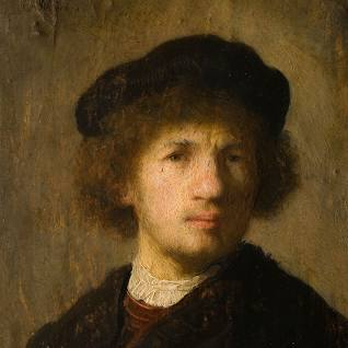
what to use when taking photos in the style of Rembrandt :

you can use…

one type of lighting that is usually placed at a 45 degree angle on the side of your model, take photos from whichever side of your model that you would like the triangle shape to form on.
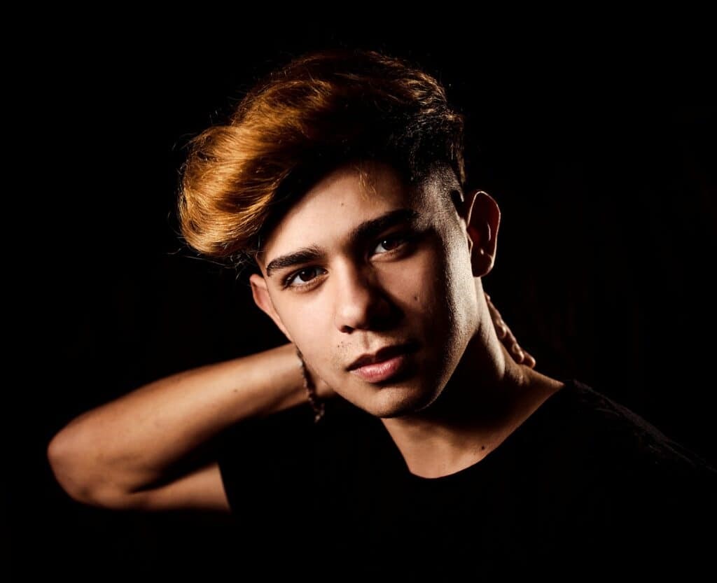
here are my camera settings :

My response :

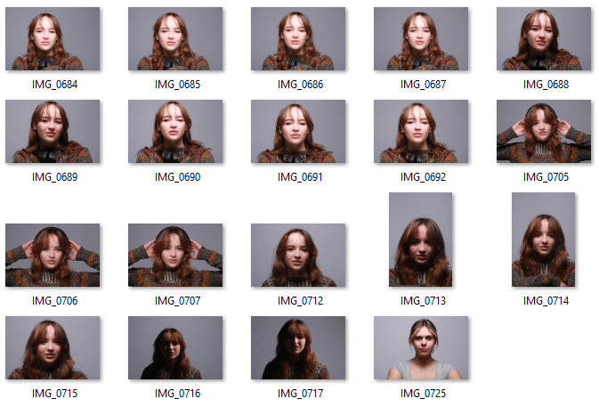
contact sheet :

Best 3 images :

In my images I have used one type of continuous lighting placed at an angle to the side of my model, I asked my model to tilt her head slightly to give the Rembrandt effect where the triangle is visible on the right side of her face. This image is all natural colourings other then the editing which has been done to the images where I had changed the saturation, the dark and bright areas have been adjusted and I had cropped the images to fit a portrait shaped canvas. immediately with all these images my eye gets drawn straight to the lit up areas of the images.
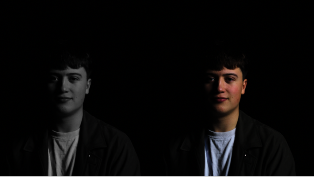
Butterfly lighting

Butterfly lighting is a portrait lighting pattern where the key light is placed above and directly centred with a subject’s face. This creates a shadow under the nose that resembles a butterfly. Butterfly lighting is often used in portrait photography, especially in headshots. Butterfly lighting is commonly used to photograph famous stars from classic Hollywood.

Its main features are cheapness, versatility for almost all types of faces, and the fact that it is easy to set. The butterfly lighting creates a soft and flattering effect on the subject’s face. Another feature of butterfly lighting is it creates a slimmer look on the subject’s face due to the shadows that are created on both sides of it.

When making a Butterfly lighting setup, the light source should be placed directly above and slightly in front of the subject’s face, creating a small butterfly-shaped shadow under the nose. The technique is achieved by placing a light source at a 45-degree angle to the subject, slightly above eye level. The result is a soft and flattering effect that adds depth and dimension to the subject’s face. Butterfly lighting can also be achieved using natural lighting. In order to achieve butterfly lighting using natural light, you can position the subject facing a window or door where the light source is coming from directly above. 

How to create a butterfly lighting portrait:

  1. Position the subject in between the background and the light.
  2. Lift the light source above the subject’s eye level.
  3. Put a reflector underneath the subject’s chin.
  4. Stand under the light and start shooting – Keep the subject looking straight ahead.

Butterfly Lighting Photoshoot:

For this photoshoot, I took studio portraits using a butterfly lighting technique. In order to achieve this type of lighting, I first placed my light source directly in front of my subject. Next, I raised up the Lightsource so that it was above the person I was photographing’s head. Finally, I got another person to hold a reflector slightly below the subject’s chin in order to reflect the light from the Lightsource back onto the face at the chin. I had to adjust the angle at which I took my photographs in order to get the most defined butterfly shape below the nose. I also got my subject to experiment with her poses as I found the straight on, hands down pictures to become quite repetitive and boring. She then put her hands up to her head in order to create a more interesting photograph.

I used Lightroom in order to edit my images. I altered and experimented with the contrast, exposure, highlights, shadows, whites and blacks of the photographs until I was left with an image I was satisfied with. Finally, to complete my photoshoot on butterfly lighting, I decided to turn my images black and white as this is what the majority of the images I saw online had.

Overall, I like how this photoshoot came out as a first attempt at trying to create butterfly lighting. I feel it helped me to become more confident using a camera and its different settings. However, if I were to do this photoshoot again, I would try and make the butterfly shadow under the subject’s nose more pronounced as I feel in some of the images it wasn’t as clear as I wanted it to be. Next time, I may try and put the Lightsource up higher in order to cast a bigger, more defined shadow under the nose.

Chiaroscuro Lighting

Definition: Chiaroscuro lighting is a high-contrast lighting technique that utilises a low-key lighting setup to achieve contrast between the subject and a dark background.

Examples of this lighting:

This lighting is used for balancing high-contrast light and shade to give the appearance of depth, creating an enhanced or more dramatic effect. It illuminates the subjects and emphasizes them.

The photographs taken with this lighting technique are often monochrome. This is because it works well with the high contrast.

It originated in Italy where it started off as an art movement and was developed by Leonardo Davinci, Caravaggio, Vermeer, and Rembrandt during the Renaissance period.

Setup

Light – The way to set up this lighting is by placing a single light source at an angle to the subject.

Own response to this lighting technique

Butterfly Lighting

Definition – Butterfly lighting is a lighting technique that uses a key light is placed above and directly centered with a subject’s face.

Examples of this lighting being used:

This lighting is used for taking soft, flattering and glamorous portrait photos. The lighting forms a butterfly-like shape under the subject’s nose which gave it it’s name.

It is also very good to use for portraits because it highlights the subject’s main features such as their cheekbones and nose. This lighting has versatility for almost all types of faces which makes it easy to use on any subject.

It originates back to the Golden Age of Hollywood. It was widely used by Hollywood glamour photographers in the 1930s and 1940s to capture the beauty of Hollywood stars.

Setup

Light – The way to set up this type of lighting is by using a single light source which goes directly in line with the subject’s face and the camera. Sometimes the shadows can be a bit too deep/dark so you can use a reflector which can be placed below the subject’s face.

Lens – Because this lighting is mainly used for portraiture, you should use a 85mm lens. This focal length will help to compress the features of your subject and make them look more flattering. 

Own response to this type of lighting

Setup – I have placed the lighting in front and a bit above my subject as well as used a reflector to add more light to my subject’s features.

Edited Portrait Photoshoot

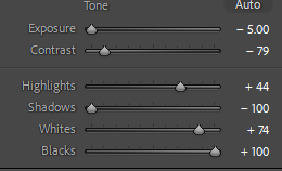
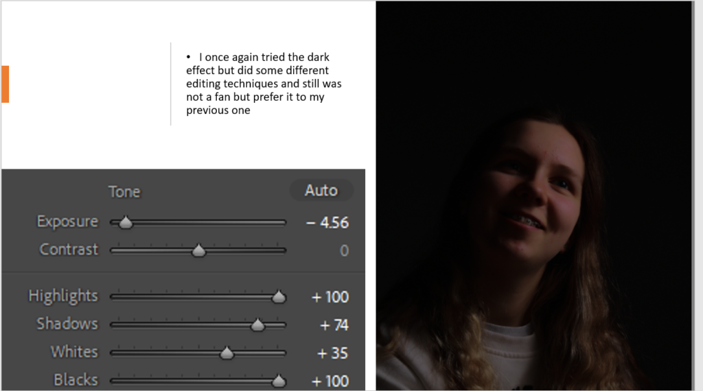
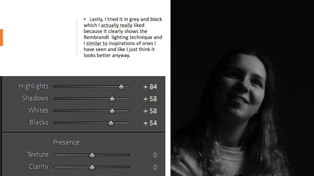
When editing the photos I actually really liked how most of them turned out but I just was changing the exposure and blacks to give a deeper effect that I was looking for and could even change some into black and white to be like the inspiration.

Rembrandt Edited Photos;

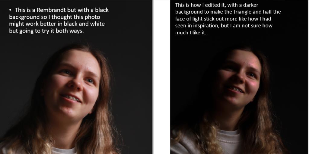
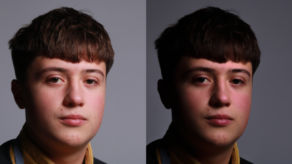
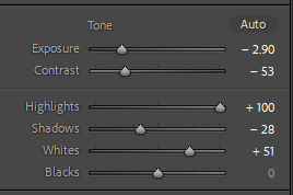
The photo on the right is my edited version, I just changed some of the shadowing to give an affect of more contrast and I wanted to show off the triangle on the opposite cheek from the light so it gives the Rembrandt effect.
I tried it in Black and white but I wasn’t a massive fan and am going to try that more for the other lighting techniques or photos to see if it works.

Butterfly Edited photos;

Most Butterfly lighting Photos I saw and used as inspiration were in black and white and once I edited and put this photo into black and white I really liked it I thought it gave a good effect to the photo and made the white pop.

Chiaroscuro edited photos;

The photo and how I edited it