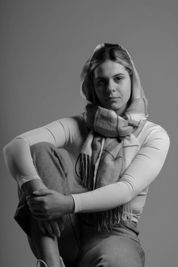
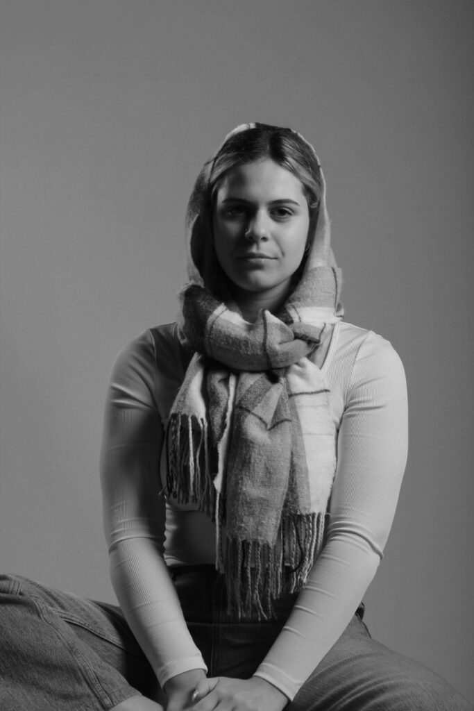
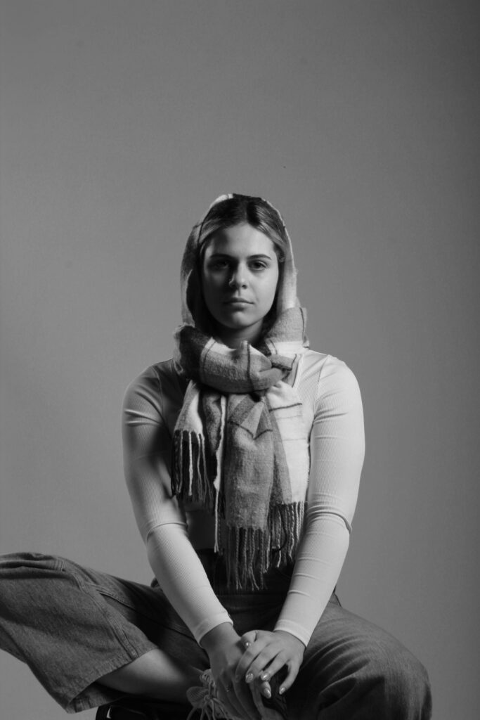
Rembrandt lighting is a technique utilising one light and one reflector or two separate lights. It’s a popular technique because it creates images that look both dramatic yet natural. It’s predominantly characterised by a lit-up triangle underneath the subject’s eye on the less illuminated area of the face (fill side). One side of the face is lit well from the main light source while the other side of the face uses the interaction of shadows and light, also known as chiaroscuro, to create this geometric form on the face. The triangle should be no longer than the nose and no wider than the eye. This technique may be achieved subtly or very dramatically by altering the distance between subject and lights and relative strengths of main and fill lights.

Rembrandt lighting takes its name after Rembrandt Harmenszoon van Rijn, a 17th-century Dutch painter who was known for using earthy tones and golden highlights to frame the faces of his portraiture subjects. What made his painting style distinct was focusing lighting on the subject’s face and adding detail around it, tapping into an innate human attraction to the face. The Rembrandt lighting technique results in a moody and dramatic effect. This type of lighting technique often features a dark or black background behind the subject, putting the subject front and centre.
Rembrandt lighting technique is considered one of the go-to photography lighting setups because it produces a dramatic visual effect without requiring a lot of setup. A more sophisticated version of this setup includes a reflector, which brings detail back into the shadows on the subject’s face, but even this setup requires minimal tools and associated costs.
For the single light method you will need:
- indoor studio environment
- off-camera light source with stand
- optional: 32″ – 42″ reflector or split light sources
At its most basic, Rembrandt lighting consists of a single light source placed on a 45 degree offset from the subject, about 5 feet away. Positioned roughly two feet higher than eye level, the light source is angled slightly downward and hits the side of the face that is farthest away from the camera.
Rembrandt Lighting Photoshoot:
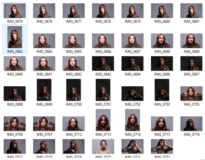
For this photoshoot, I took studio portraits using a Rembrandt lighting technique. In order to achieve this look, I placed my light source on a 45 degree offset from my subject (approximately). I then experimented with different distances and angles in order to get the most defined triangular shape I could possibly get. I had multiple attempts at this until I was satisfied with the final outcome.
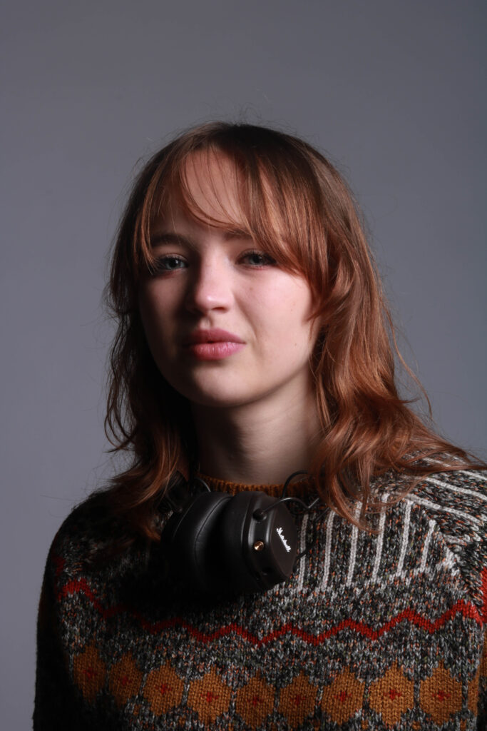
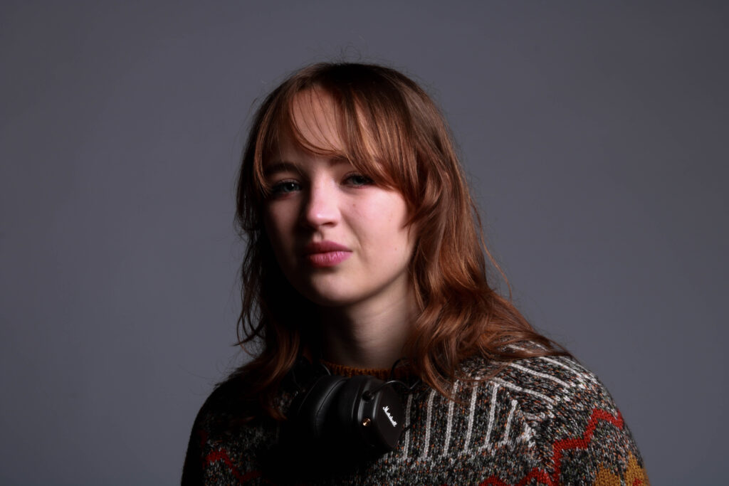
Overall, I like how these images came out as I think I successfully managed to create a triangular shape on the majority of my images which is what I was trying to achieve. Additionally, I like the negative space in the background of my images which helps to draw the attention to the subject only. However, if I were to do this photoshoot again, I would try to get a more defined triangle shape and use Lightroom to enhance it even more. Additionally, to improve my final outcomes, I would make some of my images black and white as seen in traditional studio portrait photography.
Response to evaluation:
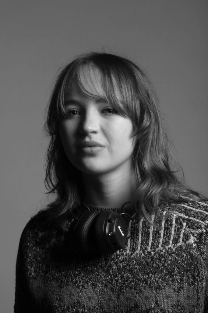
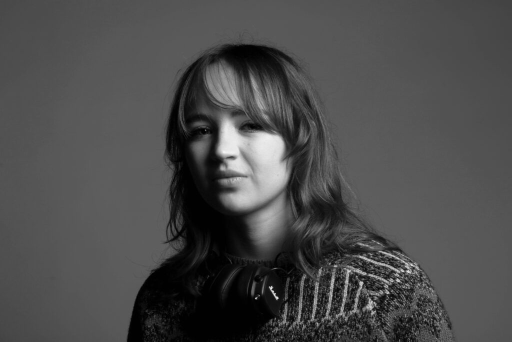
I decided to edit my images on photoshop in order to make them black and white as this was a common theme amongst the other images I saw online. I think I did this successfully and my final images came out similar to those seen on the internet. The black and white also helped to define my triangular shape created from the lighting setup as you can see the comparison more clearly and your attention is immediately drawn to the brighter side of the face rather than the different colours seen on her sweater etc.
Rembrandt Lighting Photoshoot 2:
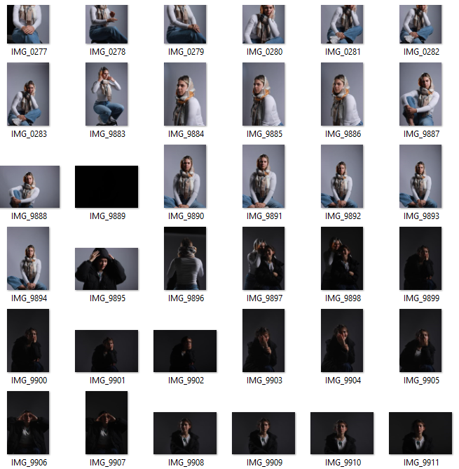
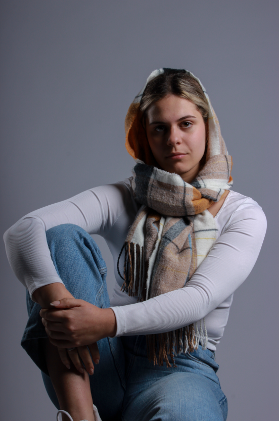
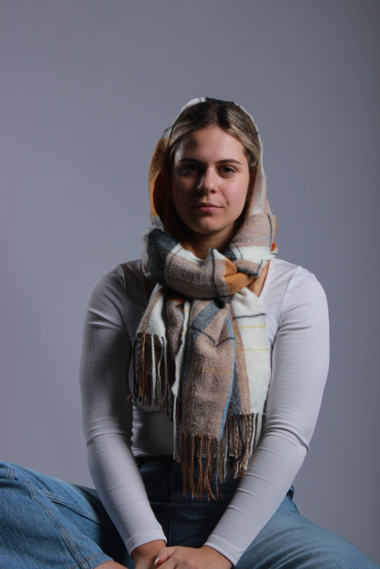
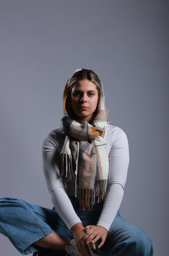
For my second attempt at creating Rembrandt lighting, I decided to include more of my subjects body in it as the first set of photos only had their face/ upper body. I think these photos came out well as they are of good quality and you can see the triangular shape on the subject’s face, which is the main focal point in a Rembrandt lighting photograph. However, an improvement that I would make to this photoshoot is I would turn the subject on her side slightly in order to enhance the triangle shape seen on her face. Additionally, I would get her to experiment with her hands more and maybe place them on her face etc. Finally, to finish this photoshoot, I decided to edit my photos and make them black and white on photoshop.
