Selected images
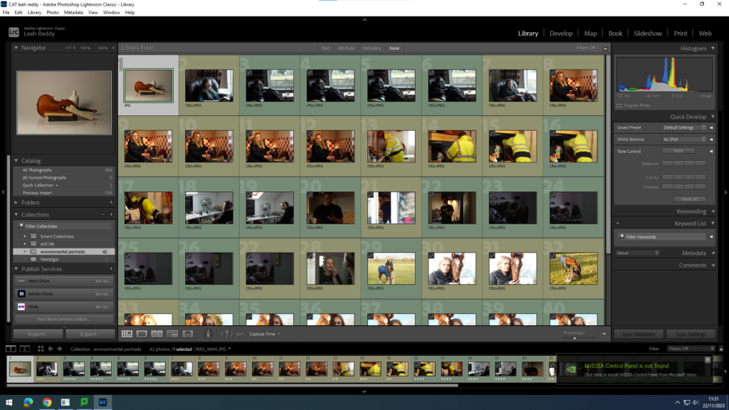
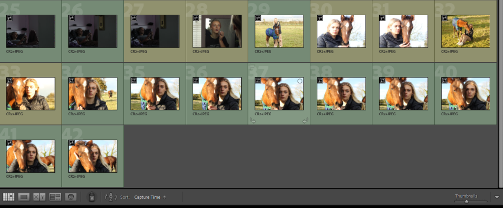
Green=good photos.
Yellow=okay photos.
I then edited my top 5 photos.
Edited photos
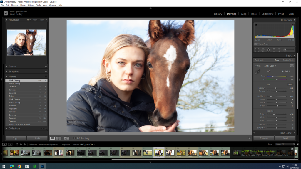
Before
After
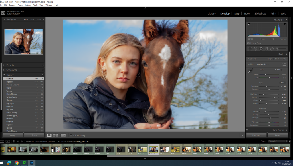
Analysis- This is my favourite environmental portrait picture. The lighting compliments the whole picture. I like how she has a subtle glow to her face, but not too much that it makes the picture too white. I also like how the horse is right next to her face as it really represents the environmental portrait task.
Before
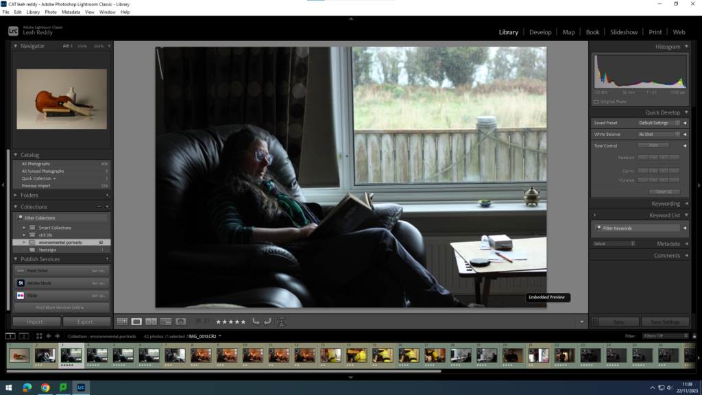
After
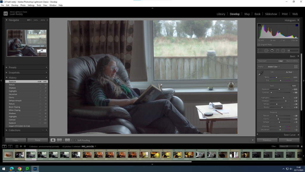
Analysis- For this picture I lightened it up and smoothed it out. I like the the picture has a soft touch. I also like how the lighting is quite low as it sets a sombre mood.
Before
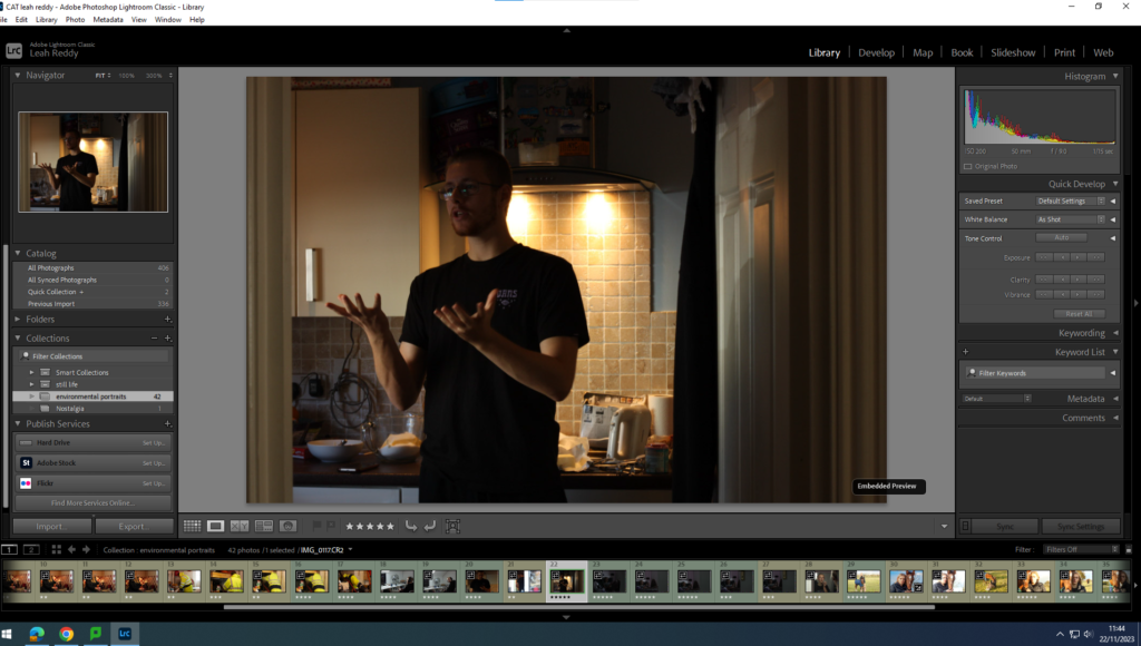
After
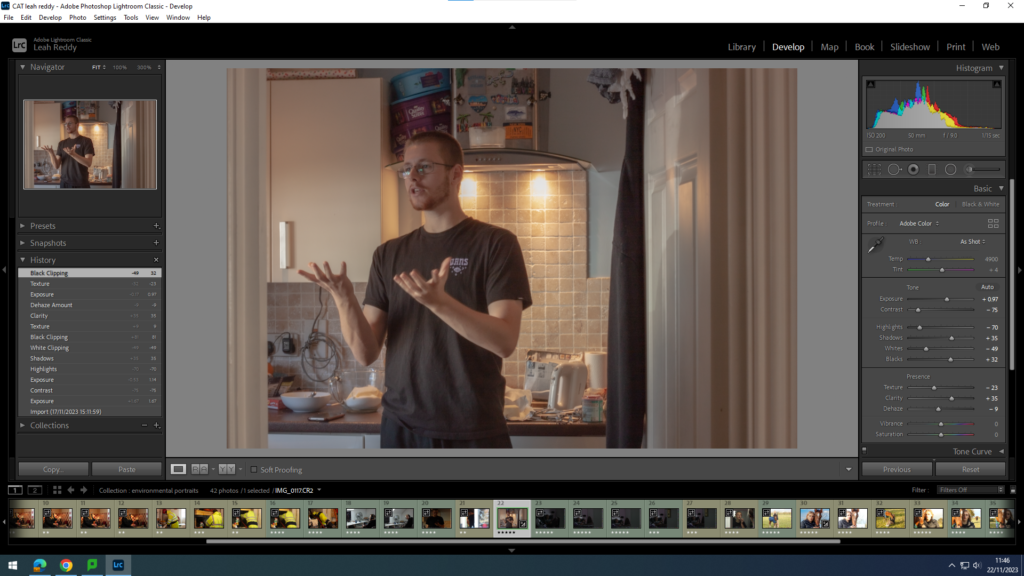
Analysis- This photo shows my brother discussing measurements in the kitchen. I have turned the temp down to make the reflection of the lights less bright. I then put the tint up a fraction to warm the photo up a bit. I also put the exposure up to brighten it up. I moved the contrast down to calm the colours down so it wasn’t so bright.
Before
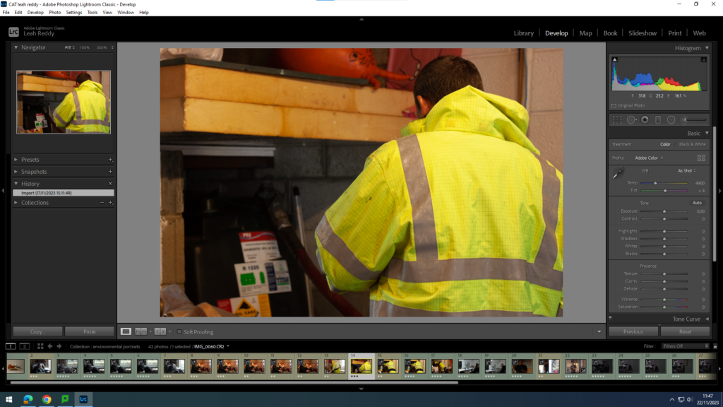
After
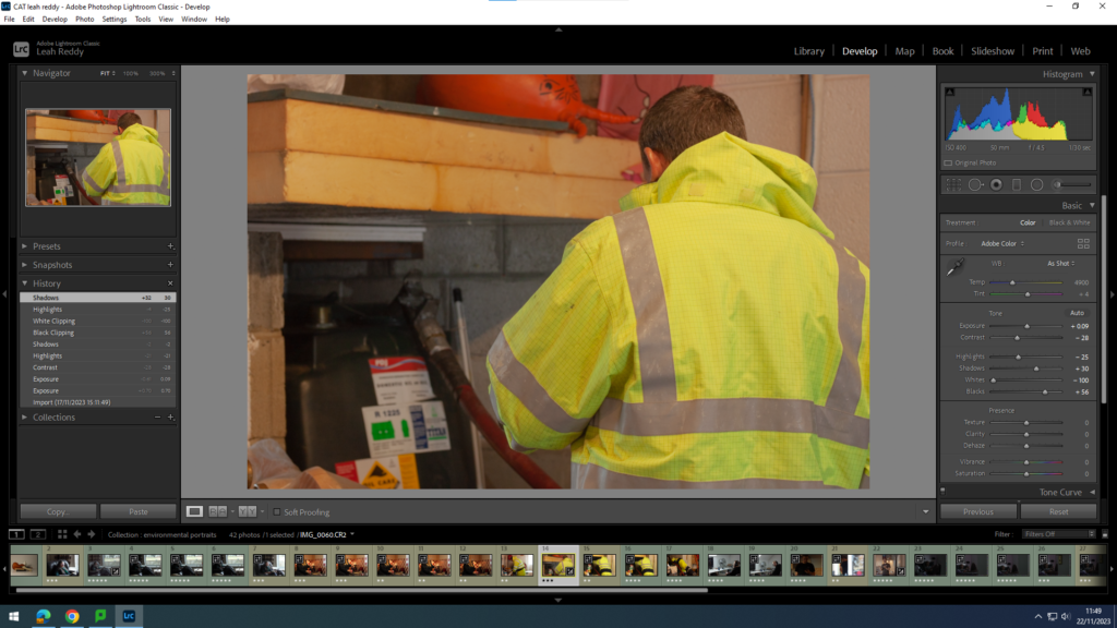
Analysis- I didn’t do much to this photo, but i dragged the whites to the very left to add more detail in to the image. I also moved the blacks all the way to the right to brighten up the darker parts of the photo.
Before
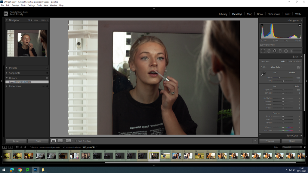
After
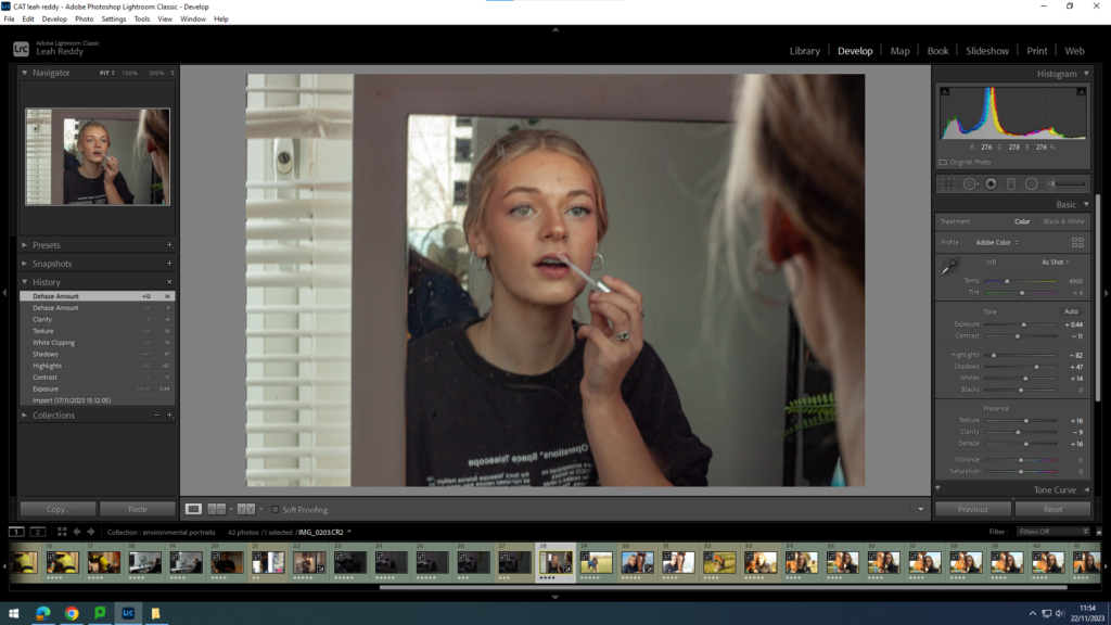
Analysis- I put the highlights down and the shadows up to make a nice blend and contrast of the colours on her face.
On the side of each edited image, it shows how i have edited them.
