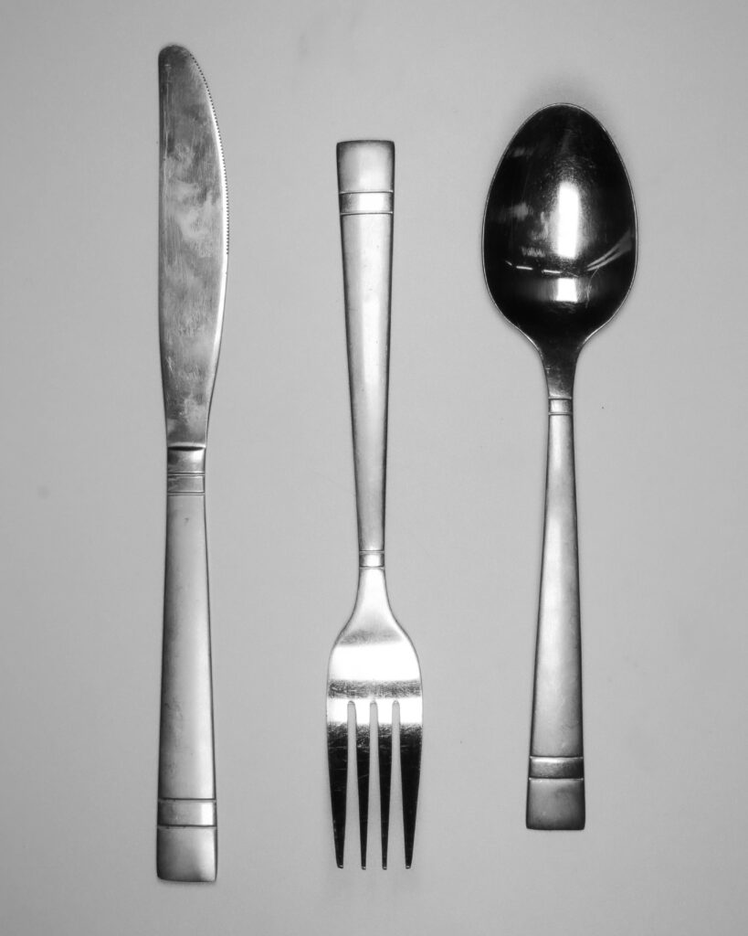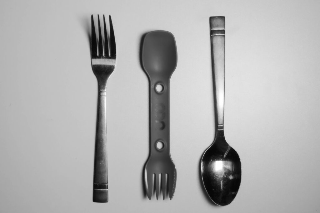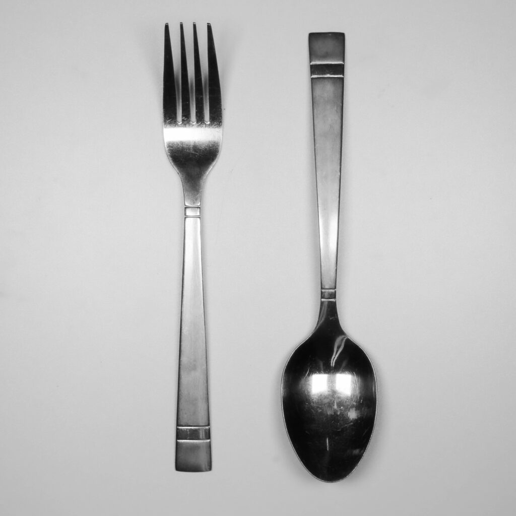
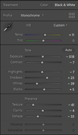
I have tried to mimic the Walker Evans style by matching the monochrome theme and soft textures of the Polaroid SX-70 that he used by reducing the dehaze and texture.
I also wanted to lightly emphasise the shadow so I have increased the blacks over the whites.
Additionally, I have attempted to centre the subjects on a vertical axis to match Walker Evans positioning as well.
Walker Evans usually centres his subject as a line or a grid which I think I could have developed on.
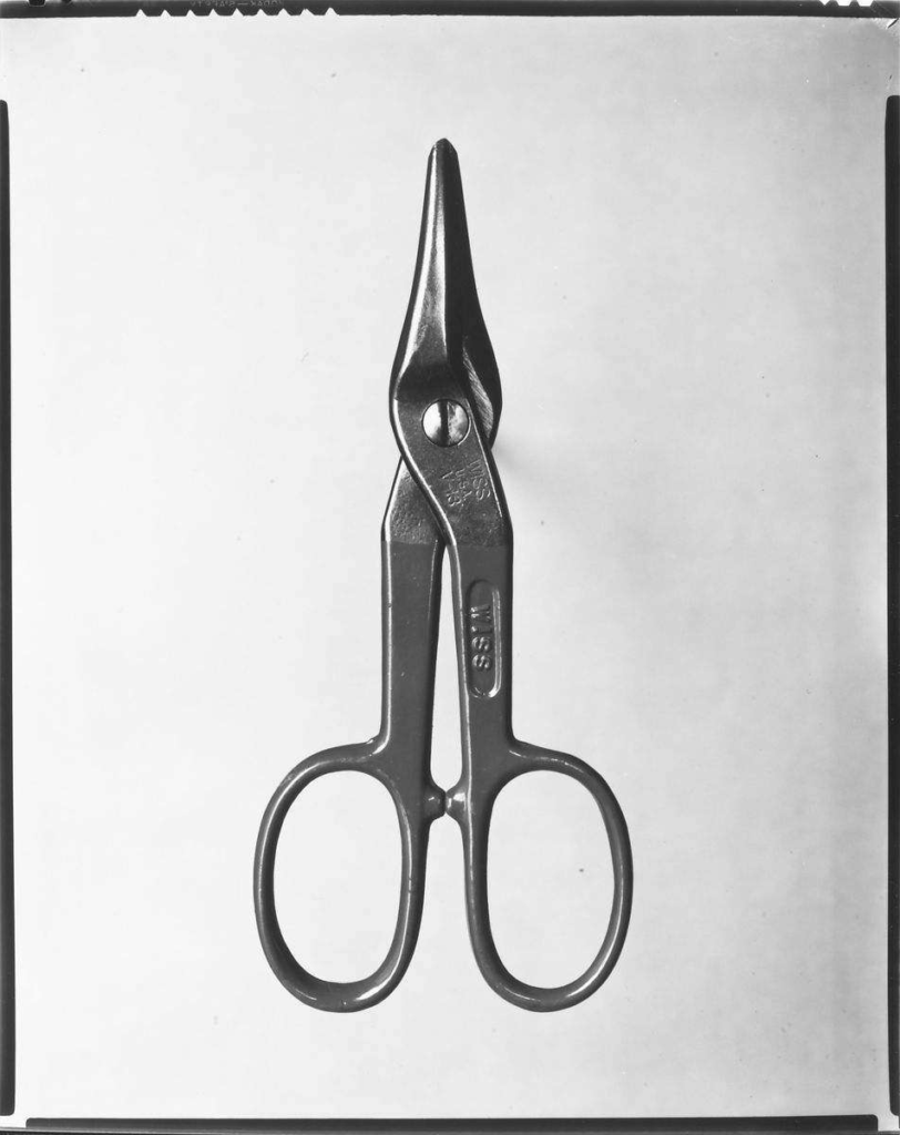
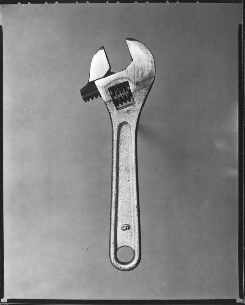
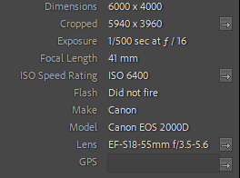
Our ISO, shutter speed and aperture were too high for our lighting setup which resulted in some images being dim, grainy and way too under exposed.
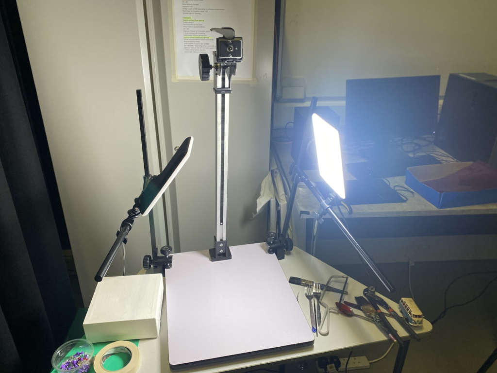
We used a studio table top setup with 1 point continuous lighting.
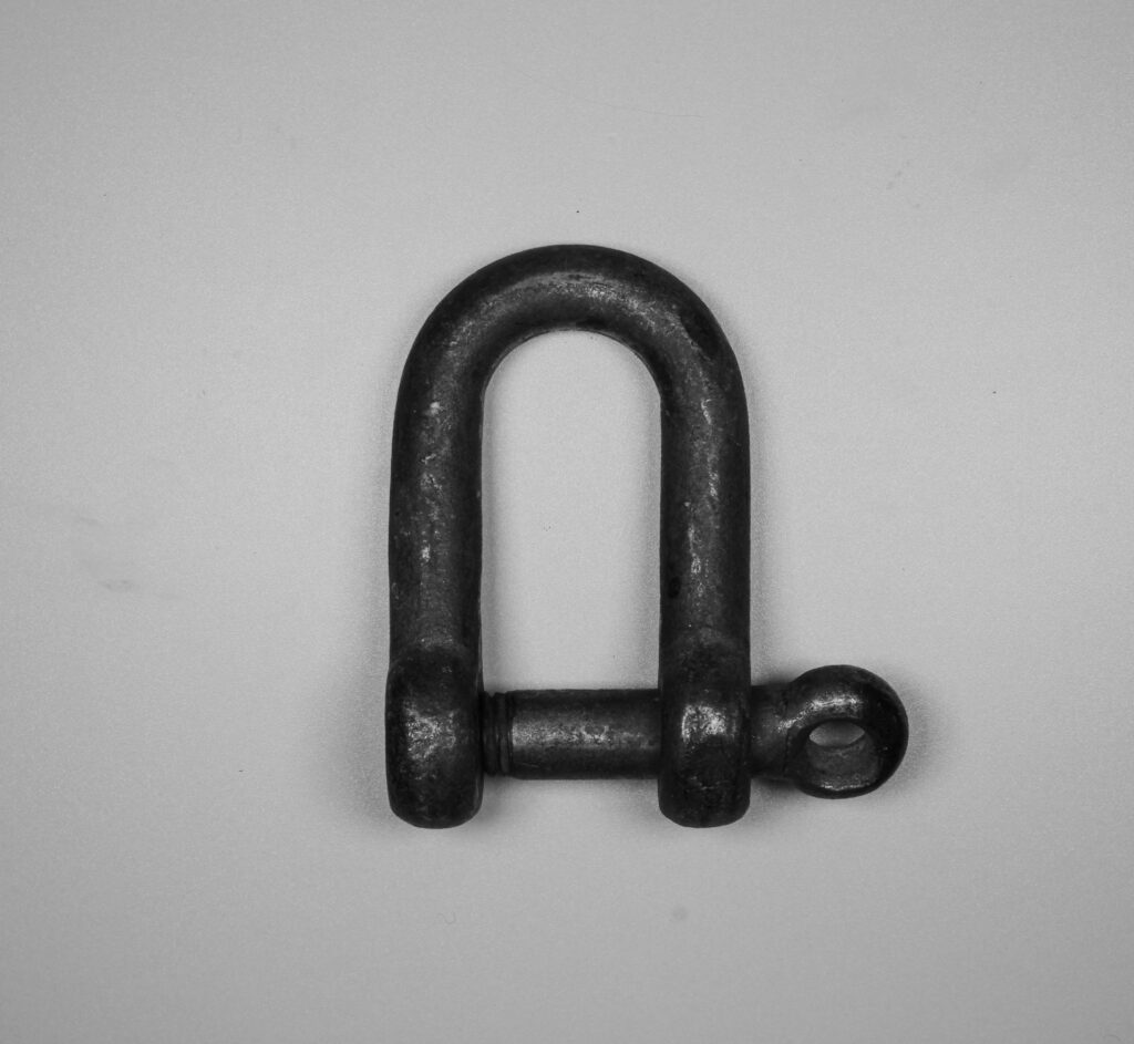
In this image I have used the wider side of the object to create parallel lines that give the image some shape.
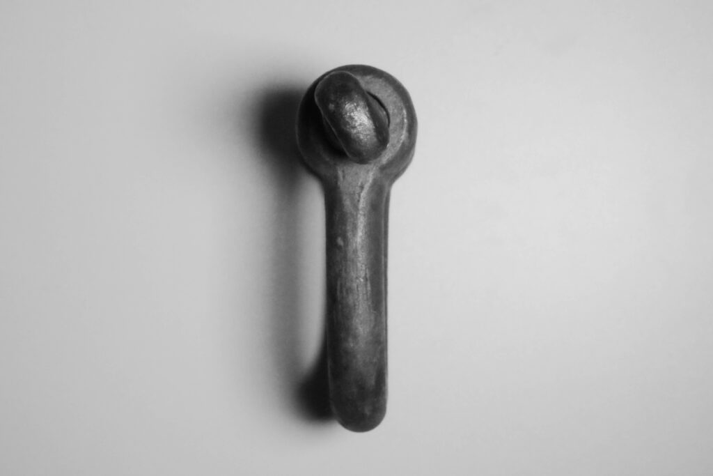
Standing the subject on its side gave the photo some depth because of the shadow cast by the single static light.
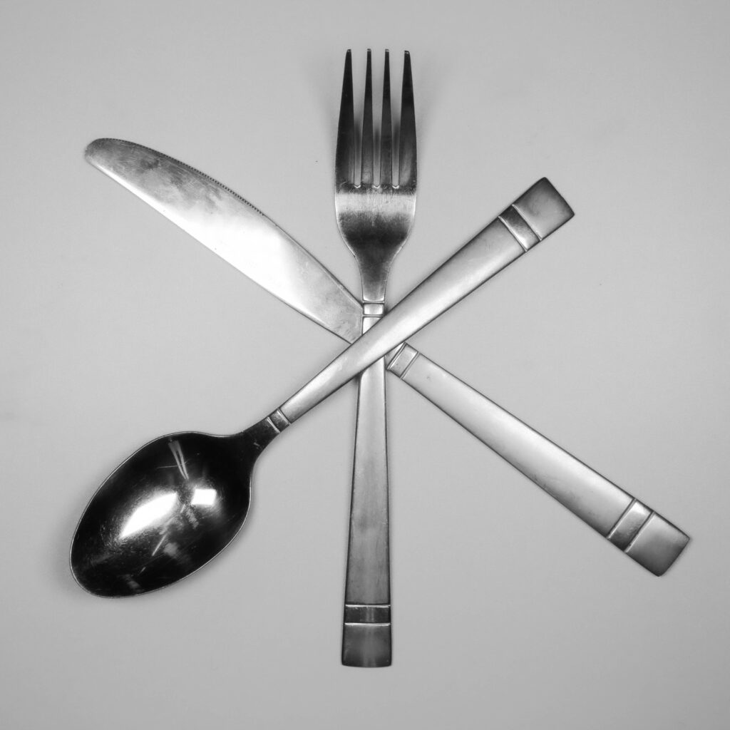
By crossing the cutlery it created an interesting shape.
