Rembrandt Lighting
What is Rembrandt Lighting?
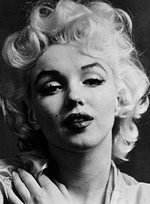
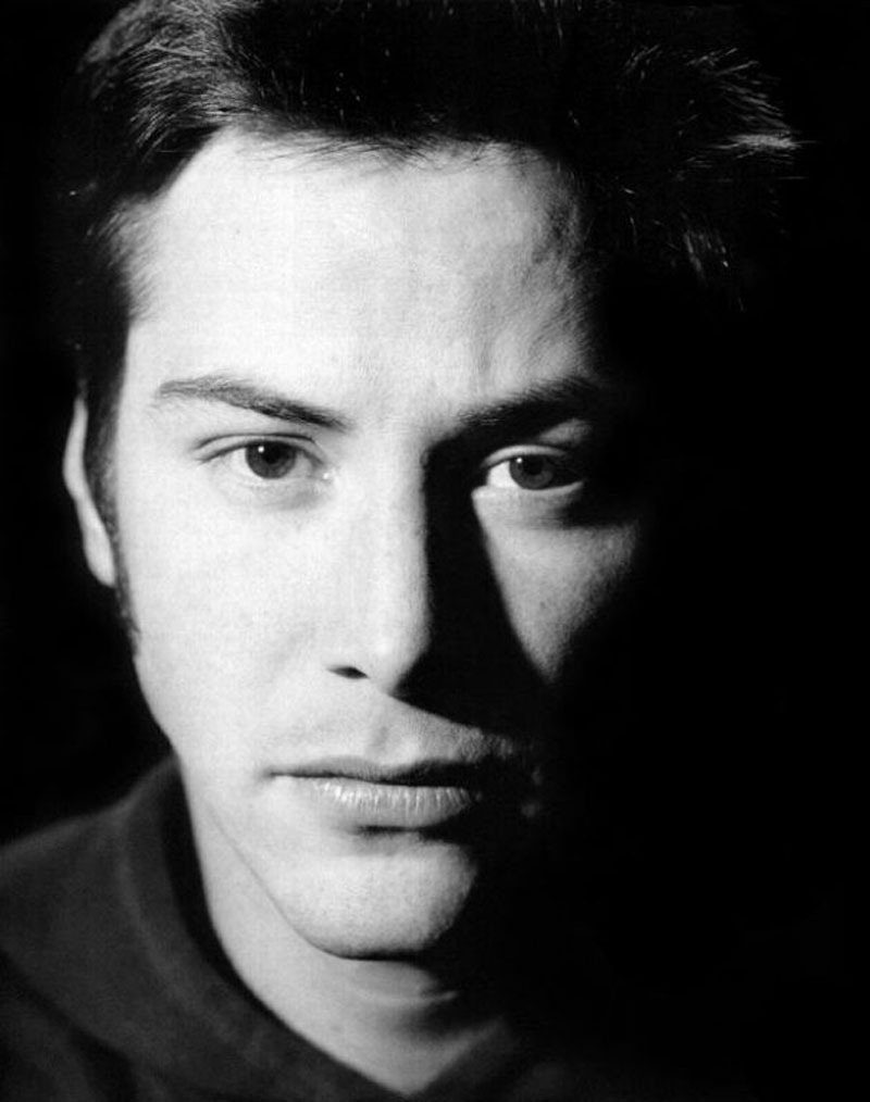
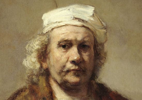
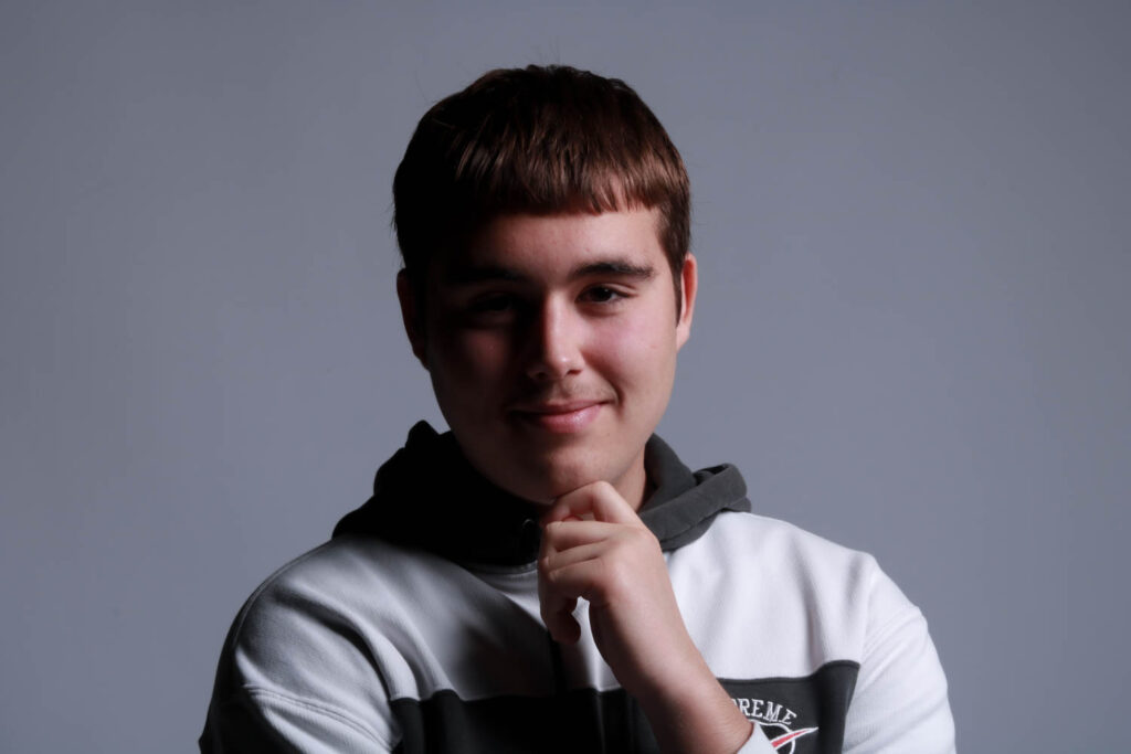
Rembrandt Lighting is characterised by the triangle of light under one eye. It uses one artificial light at a 45 degree angle to create shadows over a persons face.
Origins
Rembrandt Lighting is named after Dutch artist Rembrandt Harmenszoon van Rijn who painted portraits during the golden age. He ranged from self-portraits to animal studies with around three hundred portraits and two thousand drawings and solidified his reputation as one of the greatest etchers during his lifetime (1606-1669).
His interpreted biblical scenes were highly praised as well as representing emotions and attention to detail. He was an influential artist but not without his fair share of personal troubles which is reflected in his collection of self-portraits. He had many teachers who influenced his style of painting, mainly: Jacob van Swanenburg, Pieter Lastman, Jacob Pynas and Joris van Schooten.
Set up
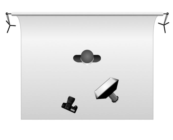
A flashlight is set up at a 45 degree angle to cast shadows over the face. The angle of this light will illuminate one half of the face but not the other which creates the triangle associated with this lighting style. The nose will cast a sharp shadow while the rest of face will have lighter shading which is part of what makes this such a unique and interesting technique. This works best for headshots so the camera needs to be close to the face with a 55mm lens.
Examples

Butterfly Lighting
What Is Butterfly Lighting?
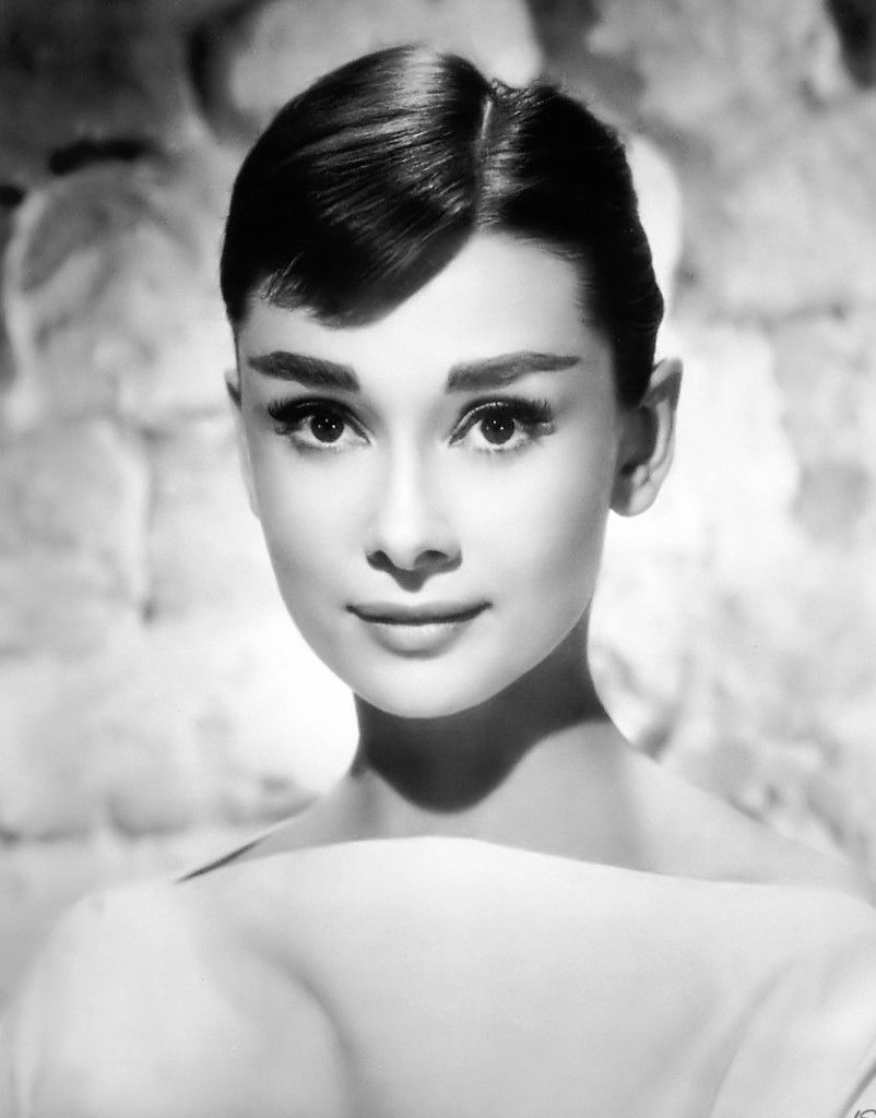
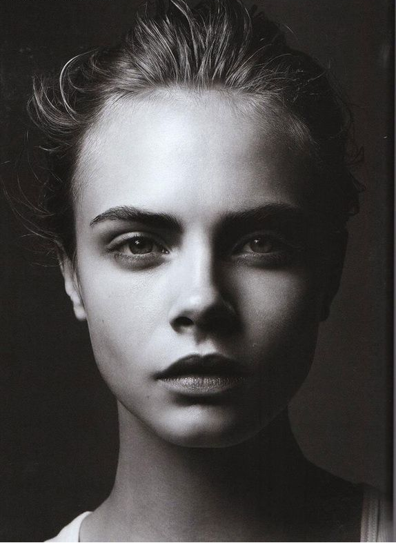
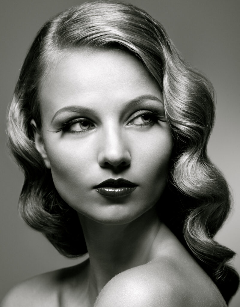
This lighting technique uses an overhead light which casts a butterfly like shape under the nose. Also known as ‘paramount lighting’ and ‘glamour lighting.’
Origins
This lighting technique earned the name ‘Paramount lighting’ from its common appearance in classic Hollywood. Paramount used this technique for every corporate image in the early days of Hollywood earning it the name. It makes the model look slimmer by highlighting cheekbones and creating shadows under the neck and also evens the face and hides wrinkles giving it its other name ‘Glamour lighting’.
Set up
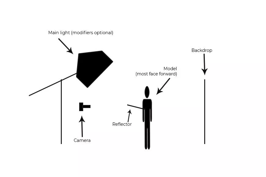
The type of light can vary massively for this lighting technique however the light is always higher than model looking down on them. This ensures the shadows are under the nose, jaw and cheekbones since they are further forwards and will catch block the light.
The camera needs to placed slightly lower than models face and not above. The model needs to be in front of the backdrop so that there isn’t a shadow over the backdrop.
Examples
Chiaruscuro
What Is Chiaruscuro Lighting?
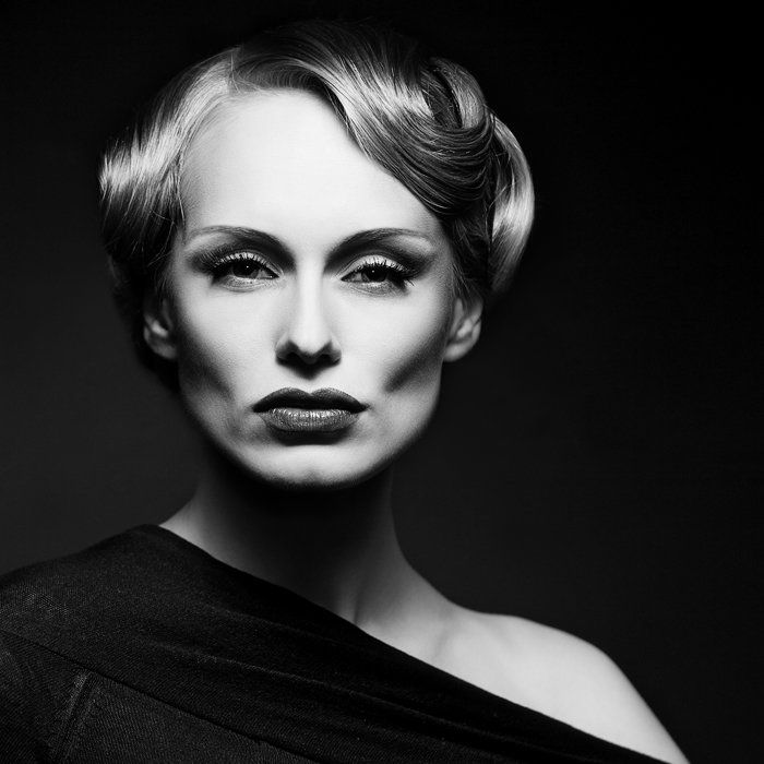
Chiaruscuro is Italian for ‘lightdark’ which is defined by a bold contrast between light and dark. Also known as ‘split lighting’.
Origins
It first appeared in renaissance paintings in Italy and Flanders however didn’t fully develop until it was associated with Baroque art. It began with drawing on coloured paper and gradually working towards whites or building up darker shades in a gradient.
It is used often in art to create a sense of volume or three-dimensional objects and in photography and cinema is typically black and white for additional emphasis.
Set up
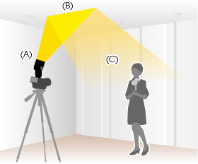
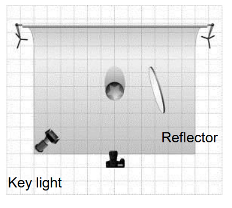
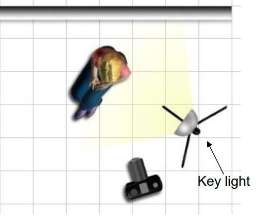
The first of these techniques uses the flash to bounce off of white surfaces to create a soft effect. The second two use only one key light and occasionally a reflector to bounce light back onto the model.
Examples
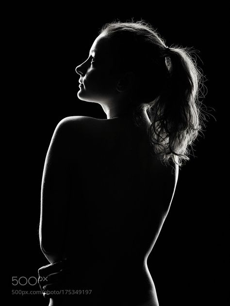
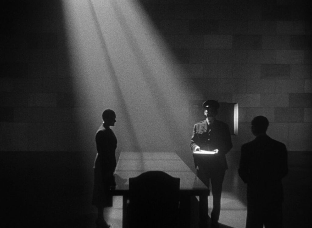
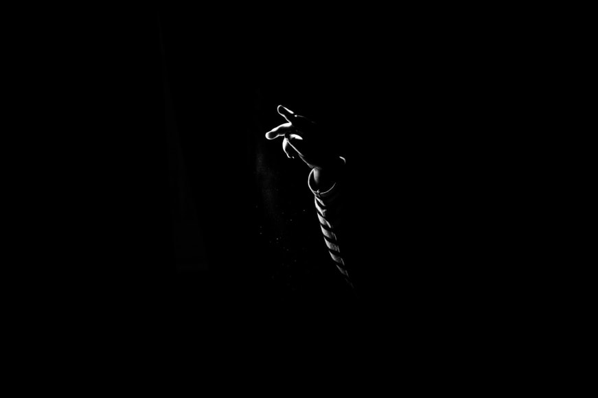
Stylistically these types of images are typically black and white for additional contrast between the white light and the black shadows. Using light this technique can also showcase silhouettes which have interesting shapes and are unique to this type of lighting.
Loop Lighting
What is Loop Lighting?
A style of lighting where a round shadow is formed under the subjects nose, similar to butterfly.
Set up
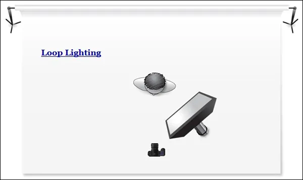
The key light is set up at 45 degrees from the persons face and raises just above the eye line. This height creates the nose shadow similar to butterfly and the angle is similar to Rembrandt. This means that similar shadows are casted to the side of the face but not as extreme as Rembrandt so there is no defined triangle.
Types of Light
Why do we use Studio Lighting?
Studio Lighting is controlled, artificial light to achieve a specific outcome and/or style. The light will be consistent across the whole photoshoot unless deliberately changed. It also reduces the amount of post-production editing to be done. When the environment is consistent and created in a way to achieve a specific look there shouldn’t be much if any editing after because any issues can be adapted on the spot.
What is fill lighting?
A fill light is used to expose details lost in shadows. This is the secondary light in a 3 point lighting set up. It is typically set up in the opposite direction to the key light to fill in the shadows.
How do the 3 points of light differ?
- this involves just one point of light known as the key light. This is the simplest type of light placement. This technique will cast dark, ominous shadows and brings drama to an image.
- two points of light are typically set up at 45 degrees from the subject to illuminate the image with the key light and fill in shadows with the fill light. This softens shadows which solves some problems with one point lighting that the shadows are too dark or prominent.
- Three points of light are the key light, fill light and backlight. This is used to fully illuminate a subject in a pleasing way with minimal shadows.
Studio Photoshoot
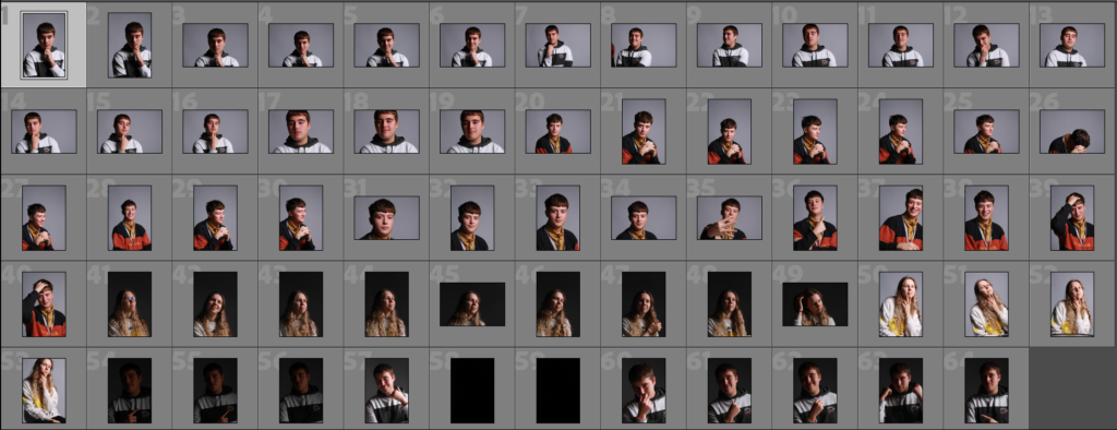
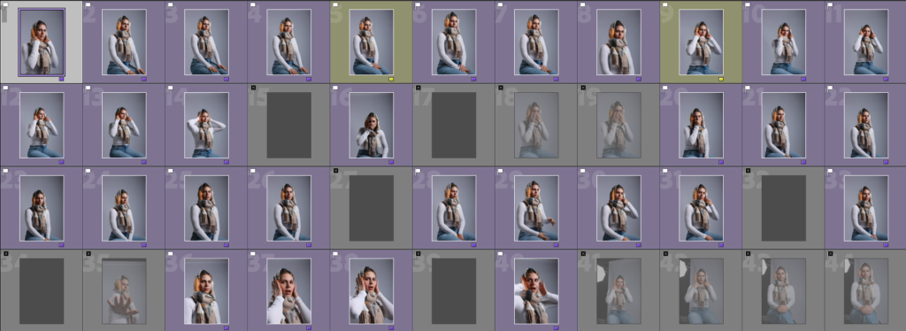
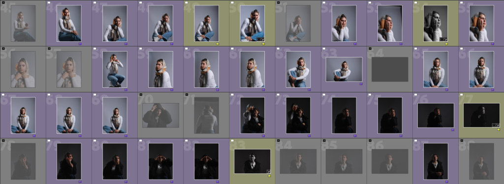
For this photoshoot we tried two set ups. First was standard Rembrandt lighting which makes up the first half of these images. They turned out really well however we didn’t have a second light on the background to make it white so it was a grey instead because the flashlight wasn’t bright enough to reach it. The second set up switched the flashlight away from the people and onto a reflective surface which still illuminated the face but didn’t reach far enough to shine any light onto the background so it was black. This one was more difficult since a lot of the time there wasn’t enough light on the face.
Occasionally we used a smaller reflective surface under the face also to lighten the eyes since they sit back in the sockets and are usually slightly overcast with shadows.
The camera was a 55mm lens at a close distance to the models. They were sat on a stool at a slight angle towards the light with their heads turned towards the camera so they weren’t front on or sat in an awkward positions.

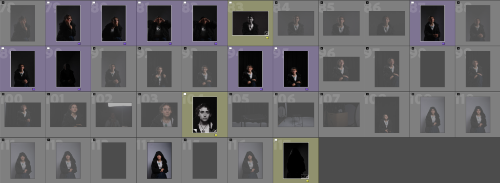
When I was sorting images I was checking that the photographs were in focus first of all. Second I was checking the placement of the model and their pose. I could crop out background to centre the person but when half the face is out of frame there’s nothing I could do. I had to make sure that they weren’t awkward also. In lots of portraits its obvious that they don’t want to be there and aren’t comfortable in front of the camera yet so they wouldn’t hold eye contact or weren’t posing in an interesting or meaningful way.
I started by flagging all focused images and marking down all the unusable ones. I then went in and used stars to rate the quality of each one. I mainly only used 4/5 star images to edit. Using green I marked all the images I considered editing and purple for the ones I wasn’t going to use.
Images
Using the same three images I also tried black and white:
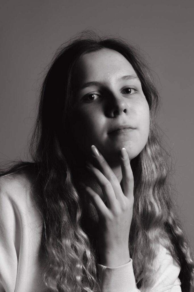
Next time I will also experiment with hands and props. I tried to photograph fingers twisting hair etc but I wasn’t directing the models very well so the hands were out of shot, obscuring the face or just looked out of place. I would like to experiment with props especially when we move into full body portraits because it will give the model something to do leading them to pose easier and fell less uncomfortable. Props will also bulk up the frame a bit whereas a single person in fame could look small with some props it will create more interesting shapes and fill out space a bit more.
Studio Photoshoot 2
We used a three point lighting set up for this photoshoot. We had the key light at 45 degrees, a fill light behind and a reflector to bounce from key light.
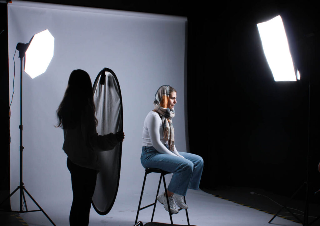
We used flash light which occasionally didn’t go off leading to a few black shots in the photoshoot but on the whole I think these came out well. I think I’ve gotten better since the first photoshoot as I have more experience and practice. As I take more photos I will get better at directing the subjects and arranging the lighting.
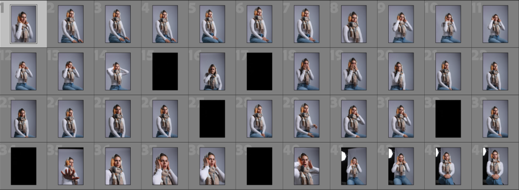
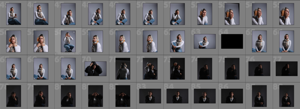

As I was going through these images I was making sure that they were in focus and sharp. I used a 55mm lens at varying distances from the subjects to either get headshots, half body or full body. The subjects were all sat on a stool which was taller than the chair I was sat on so that they were framed easier and looked more important. Mainly we used three point lighting with the key light at an angle, the reflector under the eyes and a fill light on the background to make it white.
Images
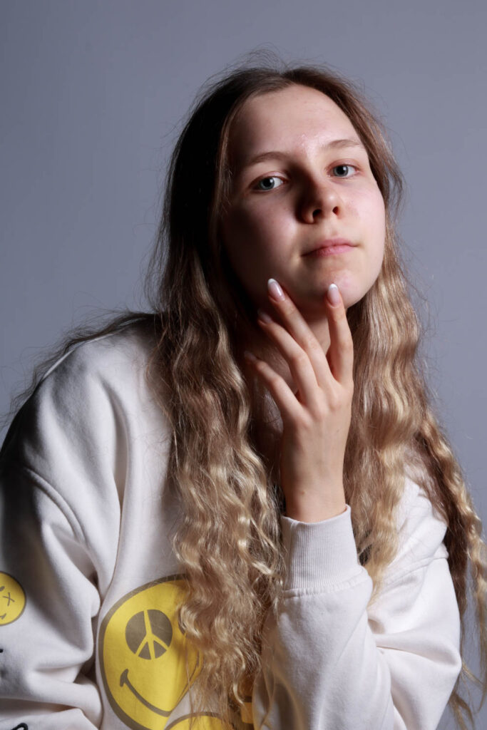
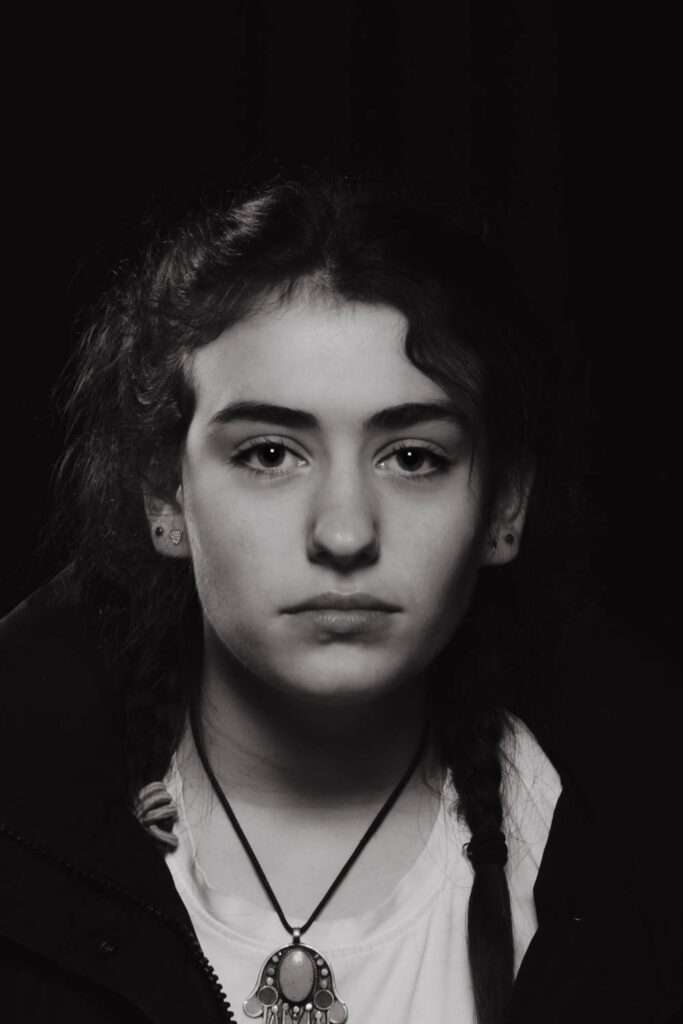
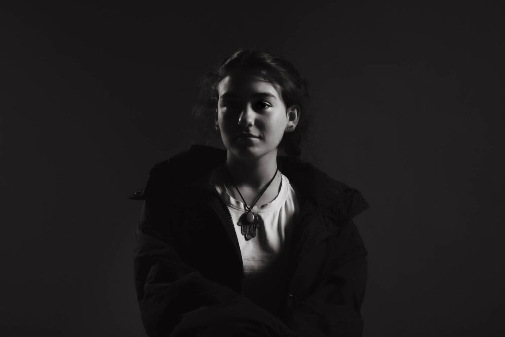
This Image used butterfly lighting which created a shaped shadow below her nose and defined her cheekbones. I think this image could have benefited from not using the fill light and defining the nose shadow more. I think making this portrait black and white helped since the shadows became more defined since they’re the opposite of the whites. We drew the blinds behind her face so that the background was pure black and the key light could be directly on her face. The reflector was below her eyes to lighten them.
I used Chiaruscuro lighting for this image where the key light was pointed away from the subject and towards the reflector. This made the background black and created an overall darker Image since there was less light on the subject. In addition we kept the fill light to illuminate the hood from behind to create the outline to the left.
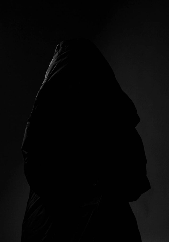
This portrait used just the key light and the reflector. The key light was turned away from the subject and pointed towards the reflector so that the light was too weak to reach the white background making it black. The little light that was bounced back at the subject illuminated half the face in a Chiaruscuro technique.
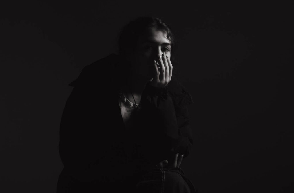
I framed this portrait in landscape instead of portrait because she was wearing a bulky coat which I wanted to be fully in frame. I used loop lighting with both sides illuminated creating a dark stripe down the subjects face. This stripe obscures her eye and creates a moody look. The fill light is to the left of her face which breaks up the shadow while the key light is reflecting to light up her right.
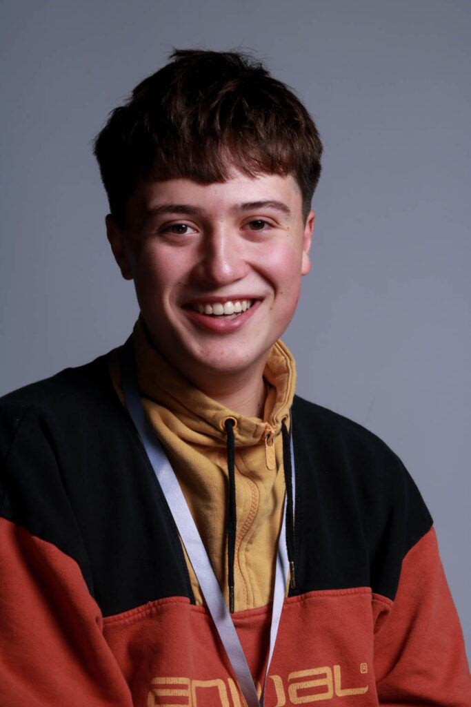
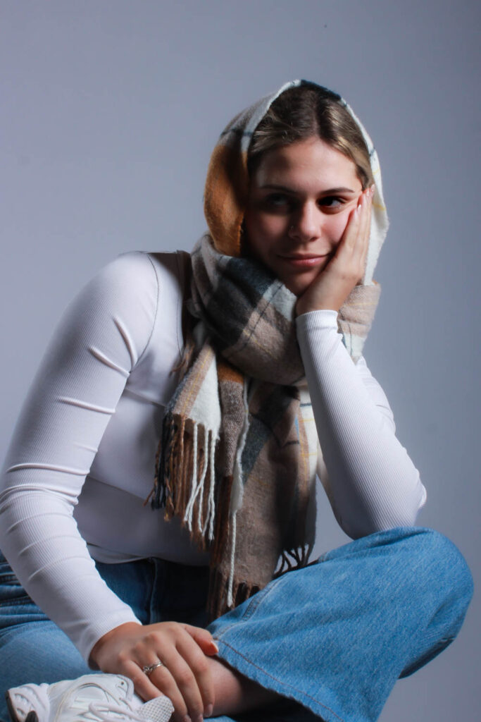
This image was made with Rembrandt lighting to create a triangle over her cheek. I kept this image in colour because I like the difference from all the previous portraits and I think all the colours worked well together. The portrait was also lit much brighter than the previous few so it didn’t look as moody and so wouldn’t fit black and white because it would need more prominent shadows to avoid looking grey.
Presentation
I plan to group three black and white images into a triptych and keep the other two separate. This is because I think all three are similar and compliment each other well.
Final Images

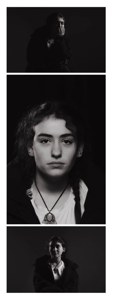
I tried two arrangements using just the three portraits: one vertical, and one horizontal. The vertical arrangement makes the centre portrait look too big in comparison which is disproportionate especially since the landscape ones have wider framing and make the subject look even smaller in comparison. I do think that the smaller gap between the images looks better though. The horizontal arrangement is better proportion wise however in this one makes the centre portrait look squished.
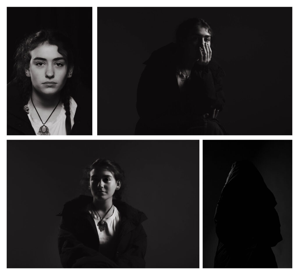
To combat these issues I created a grid with all four. Initially I wasn’t sure about this arrangement since the hooded image doesn’t have a face and mightn’t of fit with the others. All of them use a different type of lighting however I think these portraits sit well together anyways because they all use the same editing and the same subject. None of the images look squished or too big because there is one landscape and one portrait frame on each level which evens it out.
Virtual Gallery
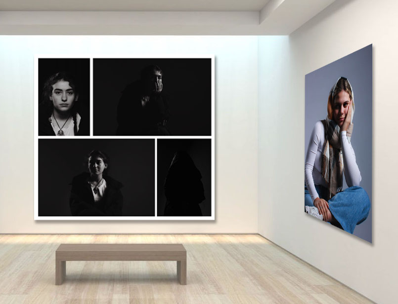
I downloaded a blank virtual gallery background off of google after setting filters for a large size so that I could edit on it photoshop. I then opened up the images on top of it and changed their perspectives if needed. I added a drop shadow bellow the images to match the backgrounds lighting.
Evaluation
Each time I used the studio I think the quality of my photographs increased. This is why all the final Images are from the second photoshoot as opposed to a mixture with the first since the quality of each portrait was overall better. I tried each type of lighting and there was at least one good example for each although next time I will focus on Rembrandt to get a sharp, large triangle because I only got small soft triangles. By experimenting with the position of the key light I managed to create two completely different styles of portrait; the black and white one where the key light is pointing away, and the coloured one where there is lots of bright and directed lighting.
I need to try and get more light into the eyes by using a reflector because they look quite dark in some of the images. To do this I will use a reflector close under the eyes and pointing at an angle as opposed to being completely flat. This will bounce lots of light up into the sockets which sit slightly back in the face and therefore don’t usually get well illuminated. I would also like to get more creative with my portraits because a lot of these images are rather basic with plain white light and deadpan angles.
