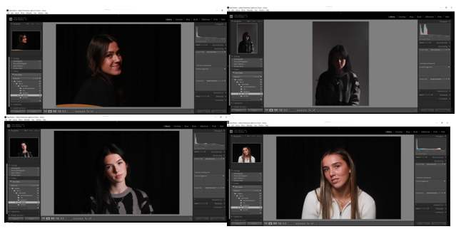
These are the photos I want to use for the Studio Portrait topic. They show a variety of different lighting techniques, like Rembrandt lighting, Chiaroscuro and butterfly technique and I think they portray my skill well overall.
Rembrandt lighting –
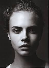
Rembrandt lighting is where there is a little triangle of light on the cheek ( under the eye ) of the model in the photo. This appears when the features of the model in the photo block a certain amount of light from reaching the side of the face where the light is not facing which created the triangle patch of light on the face.
Chiaroscuro lighting –
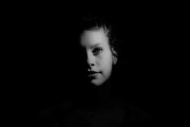
Chiaroscuro lighting is when there is only a slight patch of light that hits the face of the model in the photo. This happens when the light that hits the face comes from an angle which doesn’t disrupt the shadow on the rest of the face. This causes an orb like light hitting the face darkening everything else around it.
Butterfly lighting –
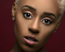
Butterfly lighting is where the light hitting the face causes there to be a butterfly shaped shadow below the tip of the nose. This happens because the light that hits the faces comes from above the models head causing the little shadow below the nose.
Editing ( photo 1 ) –
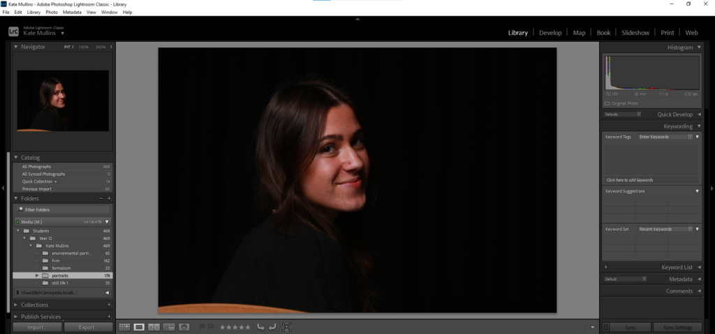
The end result I want to see in this edit is a brighter contrast between the shadows and the highlights. The lighting technique used in this photo is Rembrandt lighting as you can see the triangle of light on the far side of the face caused by the shadow of her nose.
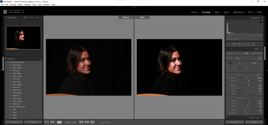
In this edit, I obviously enhanced the highlights in this photo and changed the shadow as needs be to create a better contrast between the two. The clarity has also been brought up to show enhancements in the detail, especially in the hair.
Editing ( photo 2 ) –
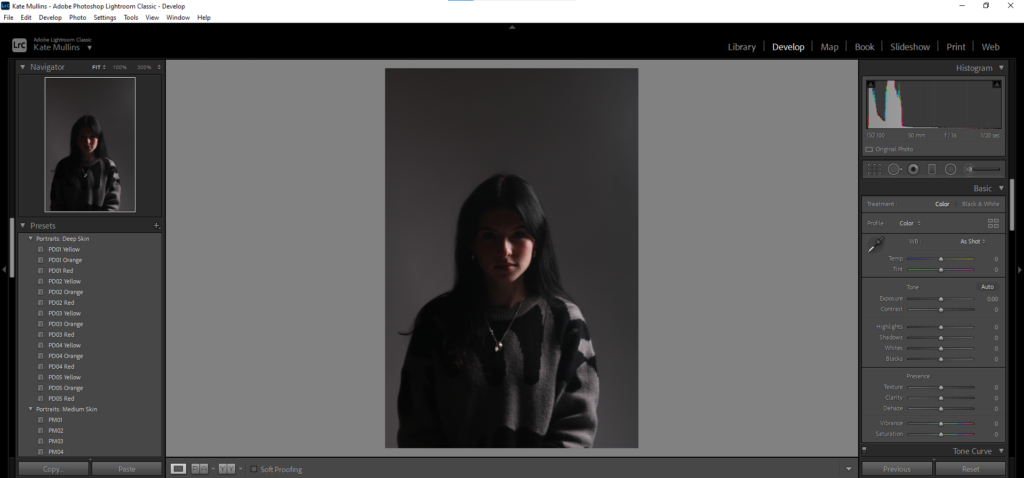
For this photo, the main thing I want to do is add some light into the photo to give some contrast because currently, the photo is very dark and not well lit at all.
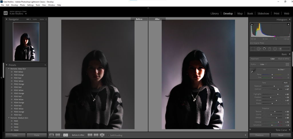
In this edit, I increased the saturation in the photo which is where the coloured ‘aura’ cam from surrounding the outline of me. While I did the saturation, I made sure to keep the vibrancy down to avoid having neon colours lurking in the photo. I enhanced the shadows while controlling the highlights to give a smoother transition from light to dark in certain places in the photo.
The Lighting technique used in this photo is chiaroscuro as there is only light on one side of my face instead of seeping onto the other side.
Editing ( photo 3 ) –
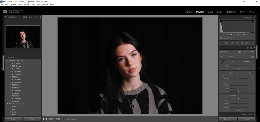
There is not a lot of editing I want to do to this photo but I am going to shadow my face slightly just to give more definition and dimension. Also, I am going to add a black and white hue to the photo too enhance the definition even more.
The lighting technique used in this photo is Rembrandt lighting as you can see the triangle shape patch of light on the left cheek.
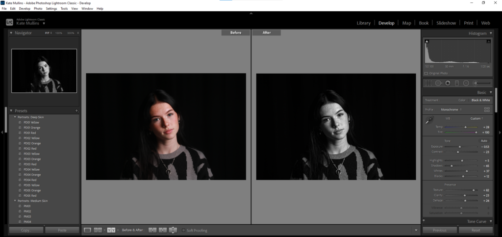
In this edit, I did focus on shadows and enhancing the light for highlights. But I also enhanced the clarity, because for me, in the wrong lighting, my freckles blur and are not as defined and I want to include those in the self portraits of me.
Editing ( photo 4 ) –
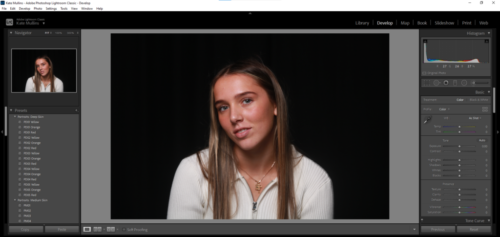
For this photo, I want to give it some depth so that it looks more like a headshot photo. With that, I will have to focus on highlights and texture as well to make sure the photo keeps its detail.
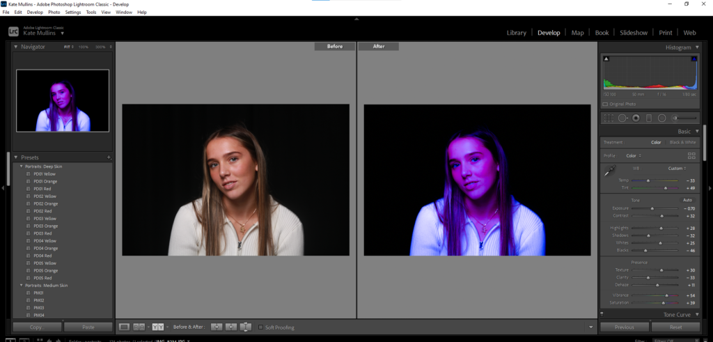
With this edit, I was highly inspired by the iconic Marilyn Monroe photos that are highly saturated and very dimensioned. I added highlights on points where the natural light hit the skin and shadows where the saturation had taken away the natural ones.
Evaluation –
If I was to re do these edits, what I would do differently would be that I would focus more on how the edits may effect the photo as a whole and not just doing them quickly and without too much thought. This would improve the edits all together and boost my confidence editing and changing the original photos.
