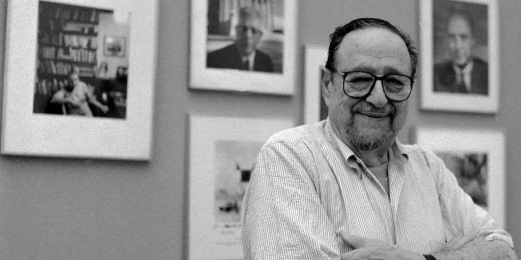
Arnold Newman was an American photographer widely known for his “environmental portraiture”. Arnold’s journey began his photography career in 1938 “working at chain portrait studios in Philadelphia, Baltimore and West Palm Beach” (https://arnoldnewman.com/biography.html). Afterwards he immediately “began working in abstract and documentary photography on his own”. With his way of environmental portraiture later on, he placed his sitter representatives of their professions. In his photographic work, he was partially influenced by Flemish Painters. He had mentioned as well that the work of the Cubists, including Picasso had influenced the way that he structured a photograph. Newman was known to use a range of lighting techniques to create “the desired mood” and atmosphere in his portraiture. Arnold’s skills played a part in his use of natural light as well as studio lighting setups. They helped him balance between “the subject and their environment”. In his photographic work, he used a 35mm SLR camera where “additional freedom” was an advantage.
What sparked my interest was when I saw that Arnold was not only a photographer but an author as well, publishing many books throughout the decades. His work has been recognised and profiled in international and domestic magazines. He grabbed the attention of well-known commercial & advertising clients such as Ford, Canon, Eastman Kodak and Polaroid etc.

Emotional Aspect-
- Intimidated
- A quite a dark atmosphere/ same as the subject
- Quite firm and threatening
- Alarming and questionable
- Feeling uneasy
Visual Aspect-
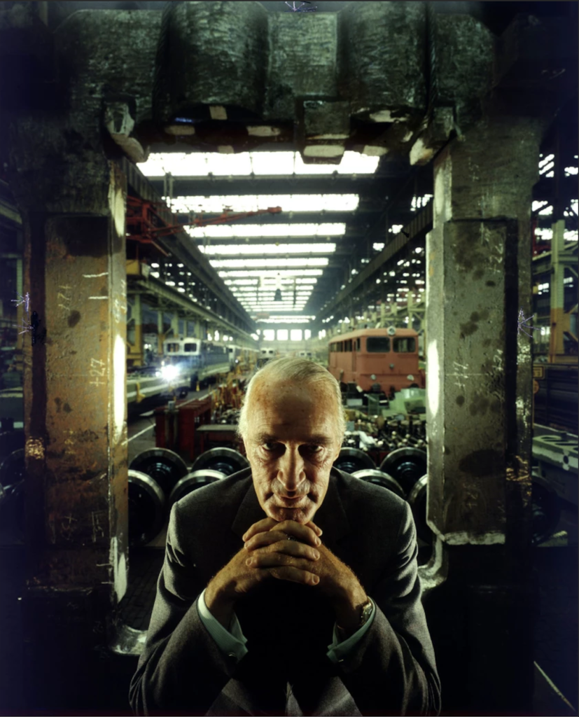
- Can see a late 50 middle-aged/60-year-old white male at the bottom centre of the photograph with his hands locked together in a fist resting underneath his chin.
- The middle-aged man may be working in an abandoned and dark factory, maybe a railway/train production factory centre/ place of work.
Technical Aspect-
- The lighting may be centred specifically so that the eyelids and central facial features are darkened making the subject of the photograph look a bit sinister and uncomfortable to look at as he is looking directly at the audience therefore making us want to look away.
Conceptual Aspect-
- The concept of the photo portrait is that Arnold takes a photograph of a convicted Nazi criminal, who supplied the German government with materials (being a personal supplier). At first, he refused but “eventually, decided to take the assignment as a form of personal revenge” (Newman being a Jewish Photographer) https://aboutphotography.blog/blog/story-of-alfred-krupps-portrait-by-arnold-newman
Contextual Aspect-
- “The Jewish American photographer saw the convicted (and later pardoned) war criminal as the devil and wanted to put a knife in his back.”
- atimes.com/entertainment/arts/la-et-cm-arnold-newman-photographer-20190613-story.html

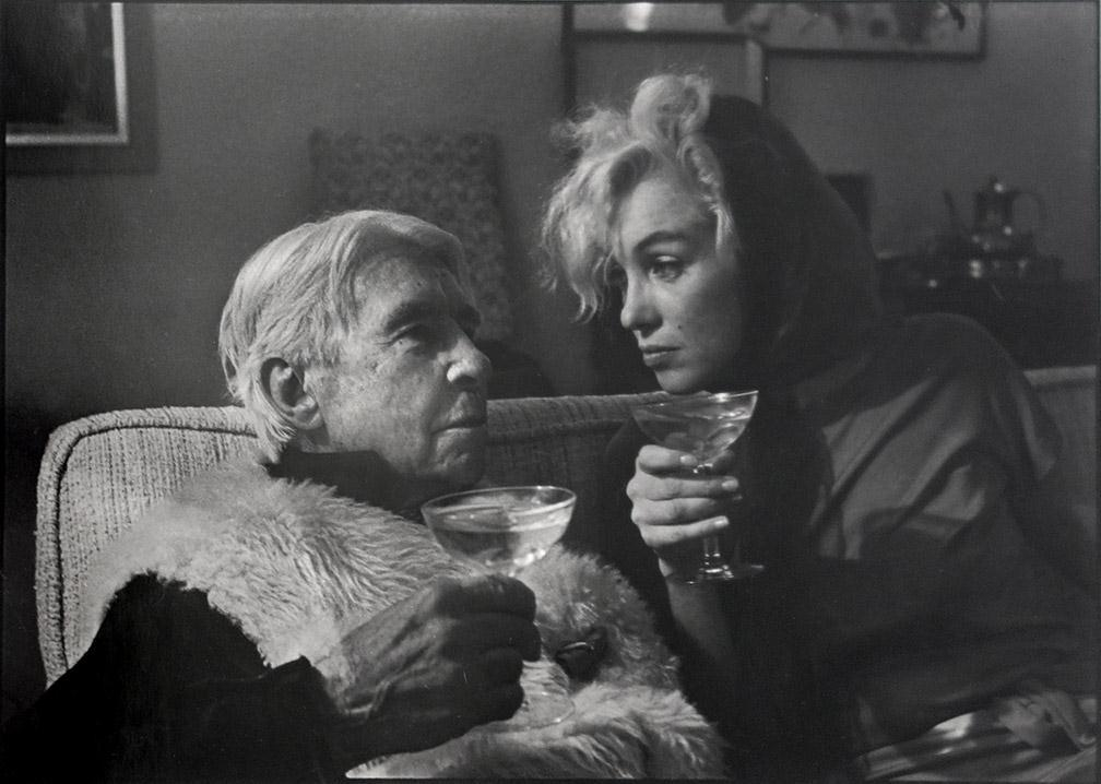
Arnold “did the iconographic image of Marilyn Monroe, which is a signed photo (used for the Louisiana MoMA poster, signed, too), while the images of Carl Sandburg and Marilyn Monroe are vintage prints”. These photographs were made for an exhibition created by Peri Alcaide. Peri was very active in the film industry from the 1950s. She was a member of the Screen Actors Guild and worked to raise awareness of art and photographic memorabilia from Hollywood. In the late 1960s/ early 1970s, she created the exhibition of Marilyn Monroe.
The photograph of the two, taken in Carl’s home in Flat Rock North Carolina, presents Marylin Monroe having her head tilted to the lift and sitting on a couch, she faces Carl (famed novelist and poet). It is where Marylin gathered “information for a magazine article she was writing about the poet “. Looking from an emotional perspective at the photograph the chemistry between the two recognised individuals can be presented clearly as they both share an intimate glance. Arnold Newman shows the contrast between Marylin’s famous sultry and glamorous public persona and Carl’s more serious and intellectual image and how that is softened and differentiated in the photograph. Newman creates that emotional response by putting two individuals with different outlooks and backgrounds into one showing vulnerability and presenting both individuals underneath one theme, being on the same level (can be status-wise).
Looking for a visual perspective, I can see two recognisable people looking directly at each other with a clear glass (potentially a martini) in both their hands. It is hard to consider what lighting is reflected onto both of the subjects but the light features of the individuals are highlighted lightly potentially showing the natural light peeking through. The textures of the photograph are clear to understand and look at, it’s quite soft.
Carl is wearing a fur coat, presenting the difference in textures of clothing to Marylin, where she is clothed in a smooth fabric status higher/ above than Carl potentially presenting her popularity level at the time when the photograph was taken. The type of backdrop that I can see somewhat resembles a living room, a place of comfort as the two subjects appear to be sitting in the centre of the photograph with paintings presented on the walls and a teapot behind on a table.
The technical aspect of the photograph was that the focus was on both subjects as they are the centre and focus of attention for the viewer. If you were to take the rule of thirds into perspective, the viewer can recognise that the photographer intentionally placed the subject in the middle and centre column.

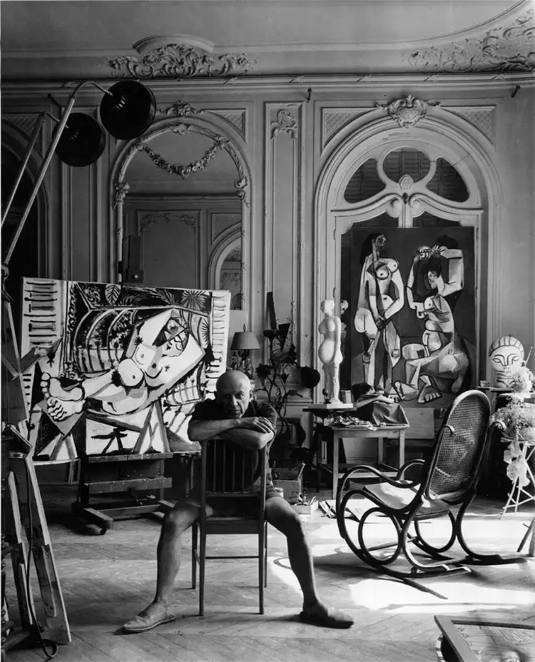
In the photograph, taken in 1956, Pablo Picasso is captured through the lens, he is seated on a chair in a large room filled with both finished and unfinished artworks. Picasso is dressed in casual attire (he appears to have wearing his house slippers). Arnold Newman catches him in his “natural environment”. The photograph is looked back on as a memorable image that has become ” an iconic representation of his artwork and his legacy”.
The photograph can convey a ” sense of intensity, passion, and obsession that drove Picasso to create his body of work”. (https://www.thecollector.com/how-did-arnold-newman-portray-famous-people/)
Looking at the photograph from an emotional perspective, the photograph makes me feel a bit intimidated and interested as the subject in the centre seems to be dominating as they are seated in a somewhat relaxed and focused position. The photographer created this emotional response to show how much control and status the subject has over the room and everything in it. The fact that the paintings, whether finished or not, are behind him presents the clear division and backstory of the subject himself, his skills and character can be translated onto his work therefore it is presented in opposition to the subject in the centre.
Looking at the photograph from a visual perspective, I can see the photograph in a black-and-white colour scheme. I can see an individual with arms crossed and hunched over a bit forward not looking directly but looking to the left on the photograph, this can mean the viewer feels more calm and less intimidated to look at the subject as they aren’t making eye-to-eye contact.
Looking at the photograph from a technical perspective, I can see the photograph has natural light appearing from the right of the photograph. Half of the face of Picasso is covered from the shadows, contrasting the features on his face.
