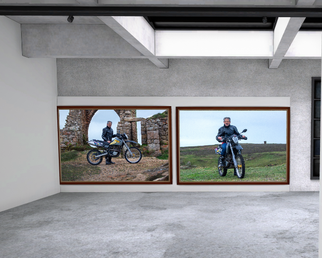
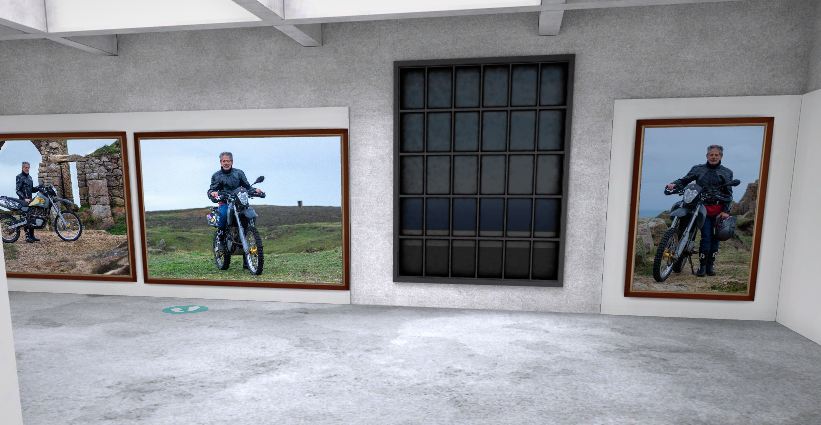
This is my final outcome I haven’t included any photos from my original shoot as I wanted a small selection of the best few shots which happened to be three photos from the second shoot. I chose to contrast the dark and blue tones of the photos with brown wooden frames to also make sure the photos don’t feel too flat on the wall. I placed the two landscape shots next to each other and the portrait one on a wall by itself as the photo is busier with it being a closer cropped shot I didn’t want it to take attention away from the landscape shots.
Comparison to August Sanders Work
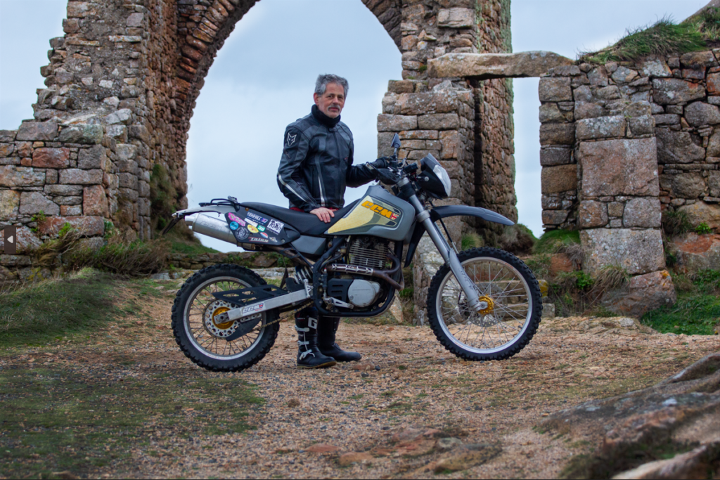
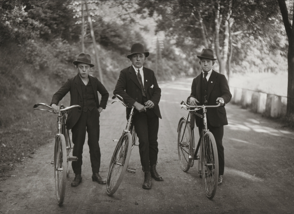
These two images in particular and interesting to compare, as they are very ear appropriate with Sander’s work featuring old fashioned bicycles in full suits and my photo which is a motorbike and motorbike jacket and boots. A large part of Sander’s style is having the model have a blank facial expression, which similarly I have asked the model to do in my photo. I also used the same framing ideas while I only had one model which is more common in environmental portraits but I kept to using the rule of thirds and keeping the subject in the middle ground in the depth of field. Something unusual for portrait work is keeping the background in full focus around the subject however due to the style it is very common to and like Sander’s work I kept a slightly cropped out background look to focus in on the subject. Unlike Sanders work I chose to keep my shots in colour as while it was a choice Sander made as colour cameras were common at the time I felt it would take away from the image unless it was a high contrast version but even then I would rather use the colours in the photo to my advantage and help tell the story in the photo and help describe the subject.
Final Image Analysis

This is my favourite image of this project. It’s a particularly strong image compositionally. For example I place the model under the point of the arch as when looking at the photo the first thing that draws your attention is the motorbike and then the castle ruins, by placing the model in the middle of the two I have not only used the rule of thirds to my advantage I have also put the model in natural eyeline when looking between the two major parts of the image. Continuing from this I have used the rocks on the right of the frame to add depth to the image, however by having the rocks out of focus it removes any of the rough texture that could distract from the subject. I chose to use this location because it is very representative of the models hobbies and due to the nature of it and the props used (his motorbike) it is obvious to the viewer what the models interests are and it’s not too complicated to work out some context to the image and learn about the person which is the intention of environmental portraits. By lightening the granite I have pulled out the grey and pink tones, typical in Jersey granite, without making the texture too smooth for the rough rock. To contrast this I darkened the black plastics and jacket to make the subject stand out against the blue sky background framed by the granite.
