Image Editing

image final selection

Image Editing
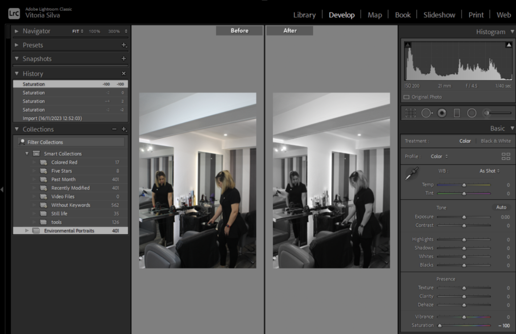
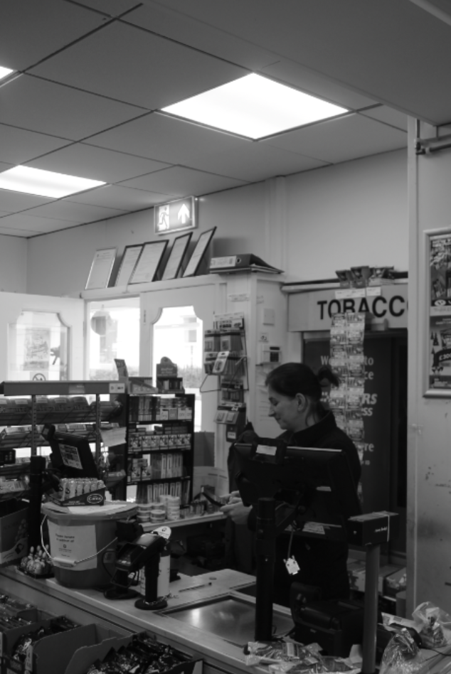
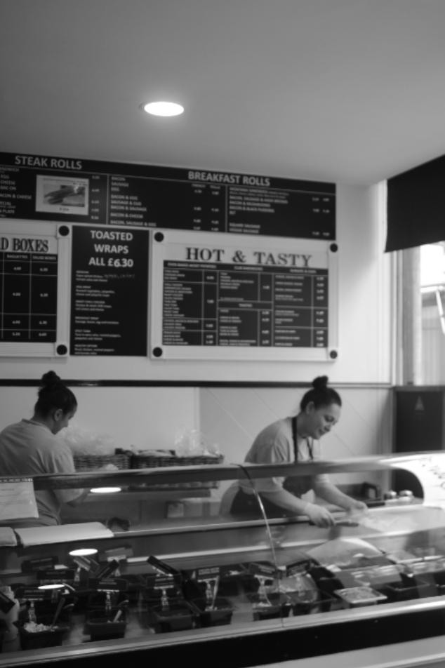
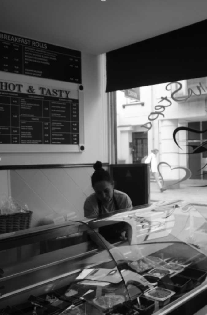
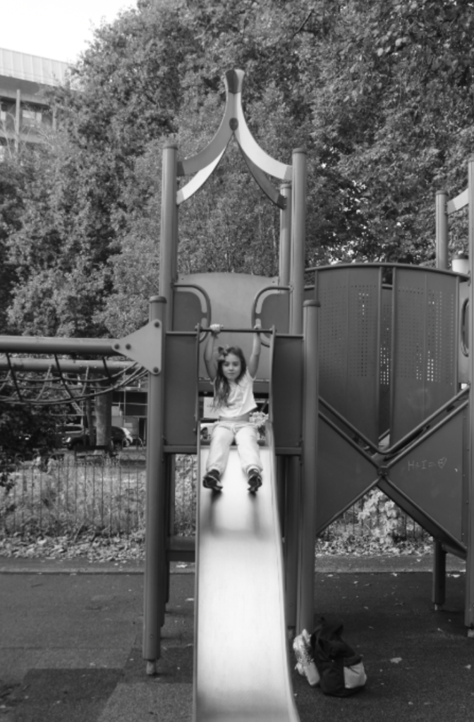
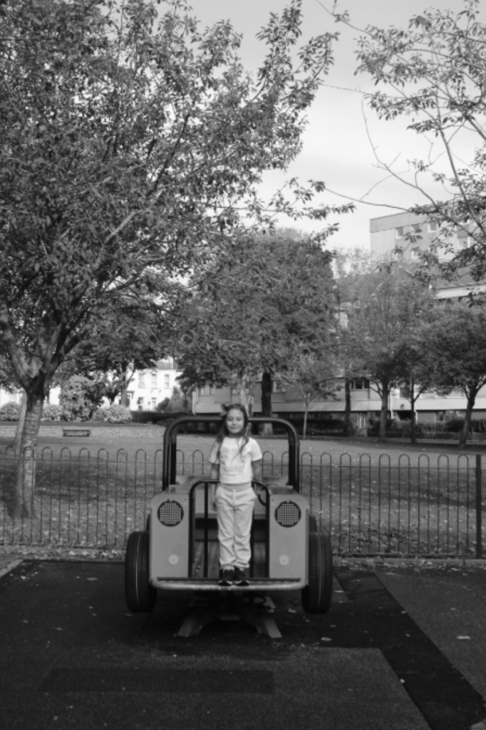
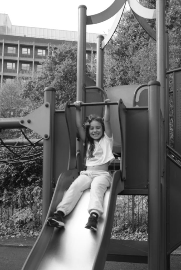
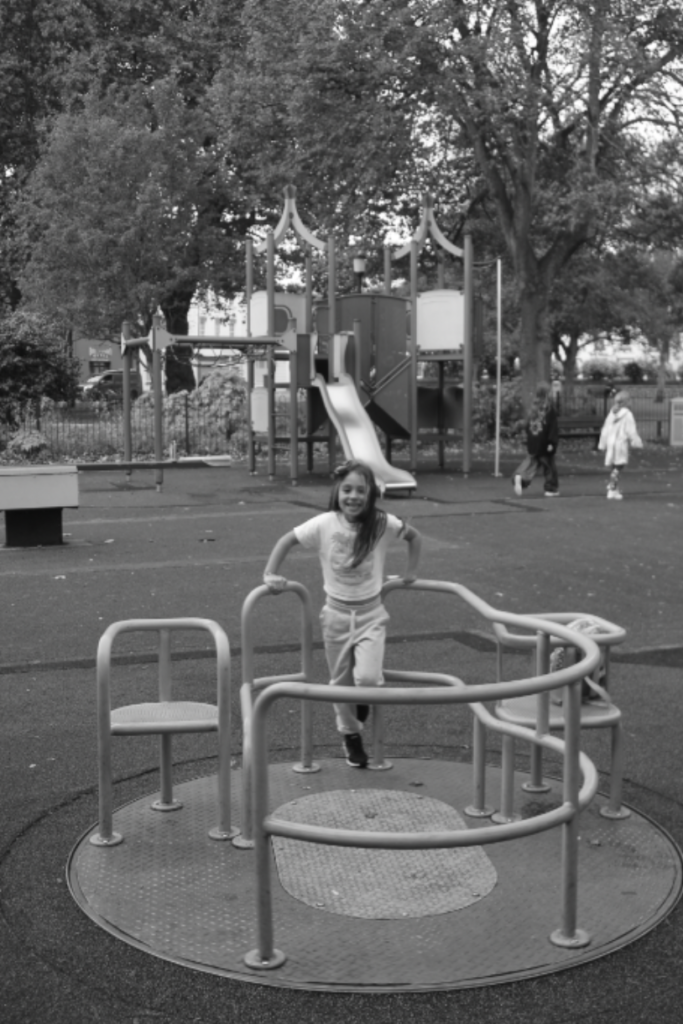
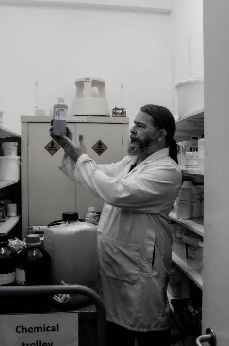
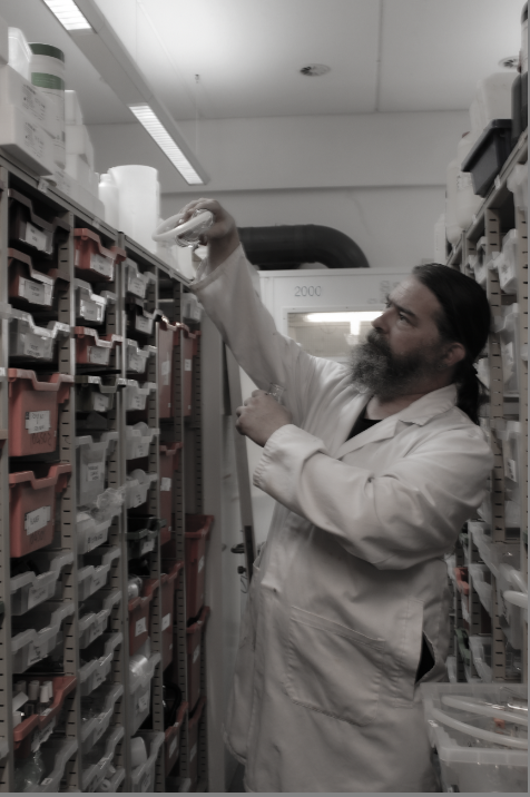
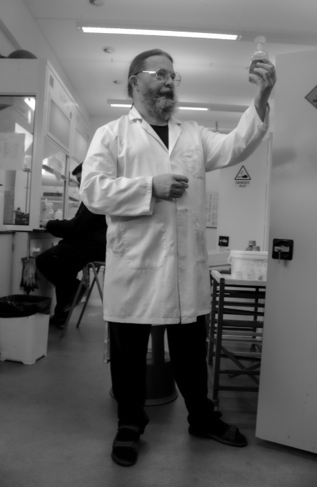
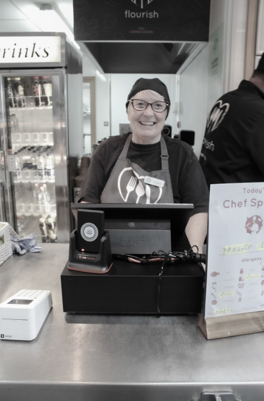
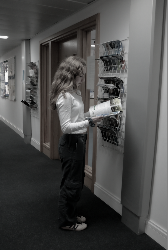
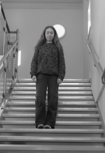
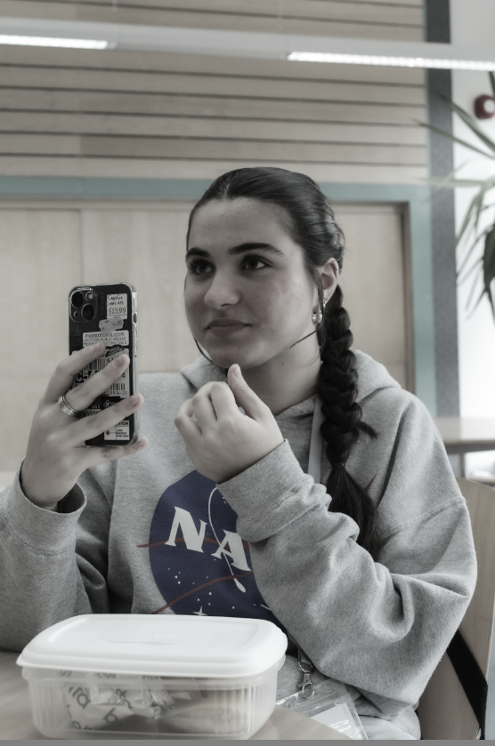
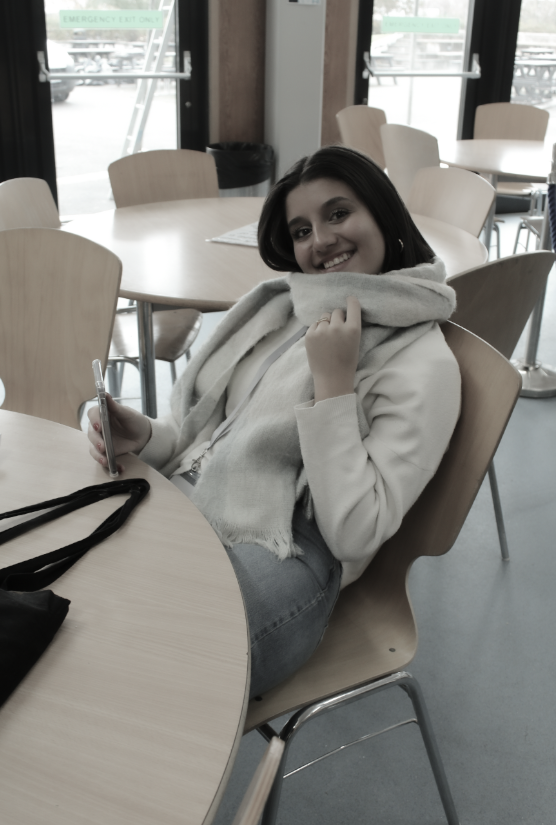
For all of my pictures i kept the editing the same, i decreased the saturation to -100 because i wanted to transform it into black and white to show the inspiration from the artist Vanessa Winship.

Here is the final outcomes for all my pictures that were edited by decreasing the saturation to -100.
experimentation 

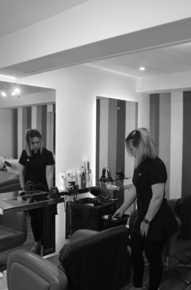
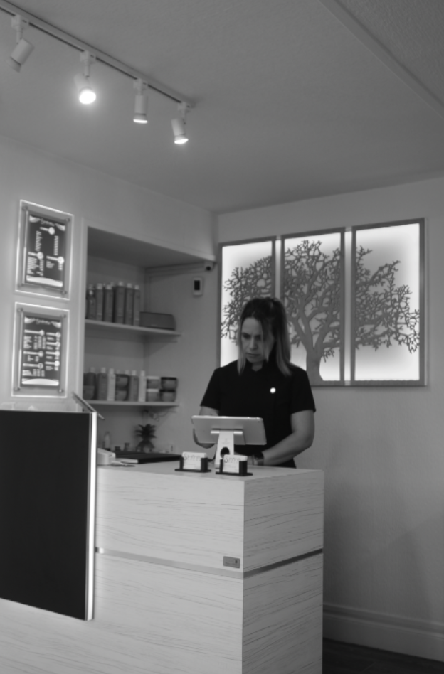
whilst editing these pictures i decided to experiment with diverse ways of desaturating the picture into black and white using the develop segment of lightroom.  

first experiment:
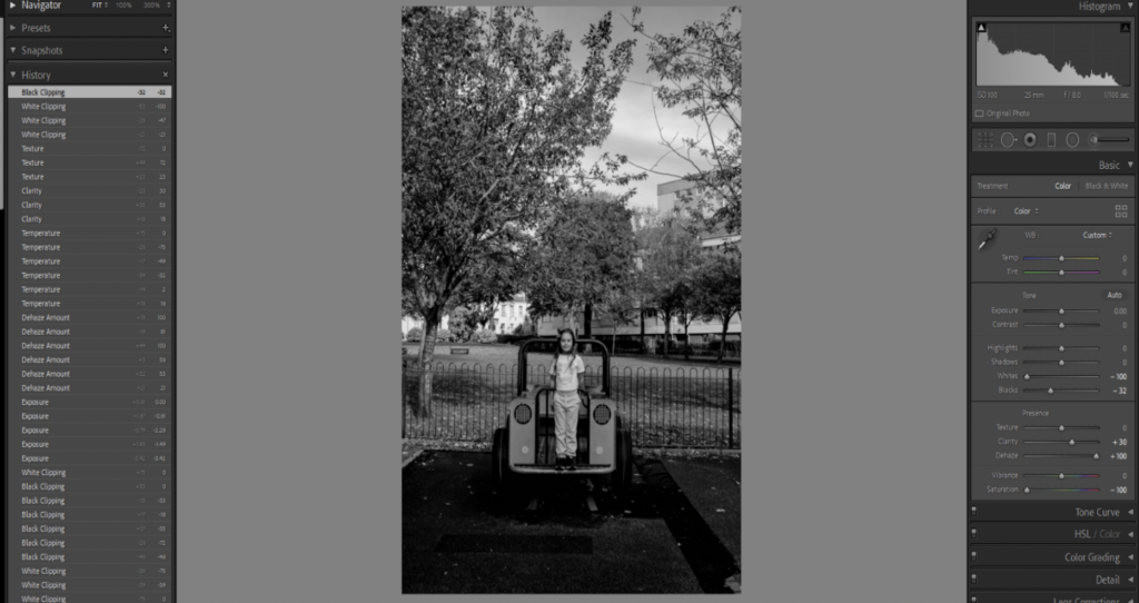
For this picture I decided that I wanted to decrease the whites (-100) to make the colour in the picture look a lot warmer to produce a more smoother black and white picture, blacks (-32) to make the picture darker and saturation (-100) to take all of the colour off of the picture. I increased the clarity (+30) to make the picture more clear and Dehaze (+100) to amplify colour and contrast where the photo appeared a little ‘washed out’. I liked the way this picture was edited but it was too dark for me.

second experiment:
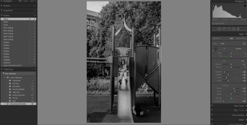
For this picture I decreased, highlights (-89) to recover lost detail and darken the lighter parts of picture, shadows (-39) to make the picture darker, whites (-61) to make picture look warmer, blacks (-39) to make picture even darker and saturation (-100) to completely take the colour from the picture. I increased texture (+37)to add visual interest and clarity (+47) to make the image much more clearer. This picture was slightly lighter than the picture above but I didn’t like how pixilated the picture continued to be and how blurry it was even after adding clarity and interest.

Third/ last experiment:
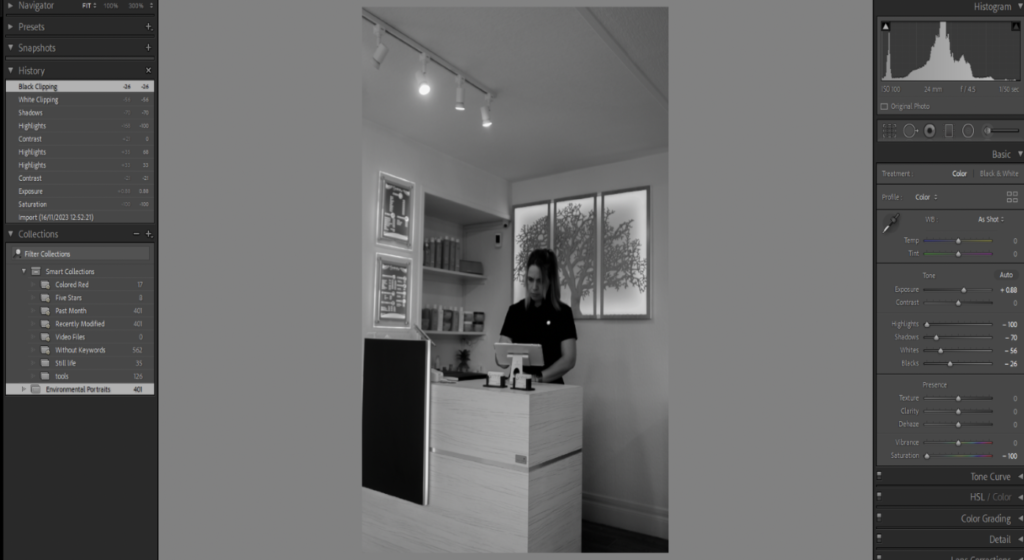
For this final picture experiment I decreased highlights (-100) to recover lost details, shadows (-70) to make picture darker, whites (-56) to make picture look warmer, blacks (-26) to make picture darker and saturation (-100) to remove any colour from the picture. This picture turned out too grey. i also didn’t like how dark the persons face became and how little shadows are present in the picture therefore i didn’t like the finish product of this picture.

ENVIRONMENTAL PORTRAITS

An environmental portrait is a portrait executed in the subject’s usual environment, such as in their home or workplace, and typically illuminates the subject’s life and surroundings. The term is most frequently used of a genre of photography

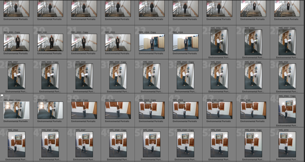
Here I went round my school to take some photos of Environmental portraits, I made the photos black and white to recreate Alys Tomlinson photos she had created herself, having photos in black and white really changes the perspective of the photo as it could change the tone and mood of each photo, normally when I see a black and white photo I feel quite low and down however it could suggest that the photograph is modern, or even old as they didn’t have coloured photos back in the day, these little details change so much about the photograph and makes the viewer want to explore so much more about what this photo could actually mean, and what it represents.

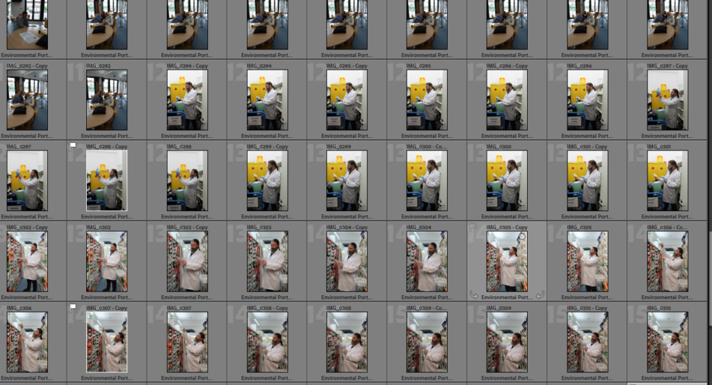
Here I went round school and took photos of students and teachers to get a perspective of what they do during the day and to get a different environment behind each model. I chose to take pictures around my school as there are any different people inside of a school, For example I could take pictures of the canteen staff as they would be in a kitchen and wearing different clothes. However taking pictures of students would be slightly different as half of the students are wearing their own clothes which makes it slightly difficult to identify that they are students but we do know that they are young people. I also went to the science lab and took pictures of some of the technicians around the science rooms to show the chemicals and the different equipment they use. This helped me to identify that different people go to different surroundings each day to do different things they may enjoy or not. The pictures that i took of the students were mainly of them walking around school or sat down however if I were to recreate this I would have a student sat at a desk with a text book in front of them to really show that the are studying and engaging in school although students don’t just study at school we also explore friendships and many different things.

Virtual Gallery -Environmental Portraits

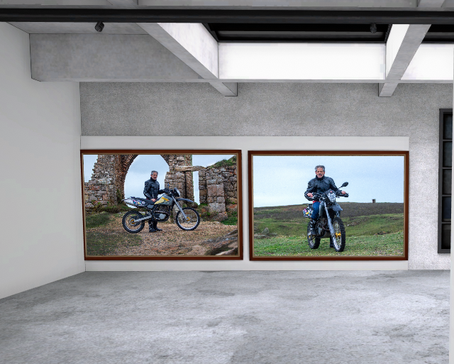
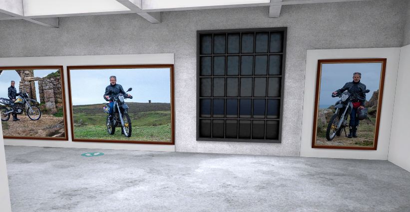
This is my final outcome I haven’t included any photos from my original shoot as I wanted a small selection of the best few shots which happened to be three photos from the second shoot. I chose to contrast the dark and blue tones of the photos with brown wooden frames to also make sure the photos don’t feel too flat on the wall. I placed the two landscape shots next to each other and the portrait one on a wall by itself as the photo is busier with it being a closer cropped shot I didn’t want it to take attention away from the landscape shots.

Comparison to August Sanders Work

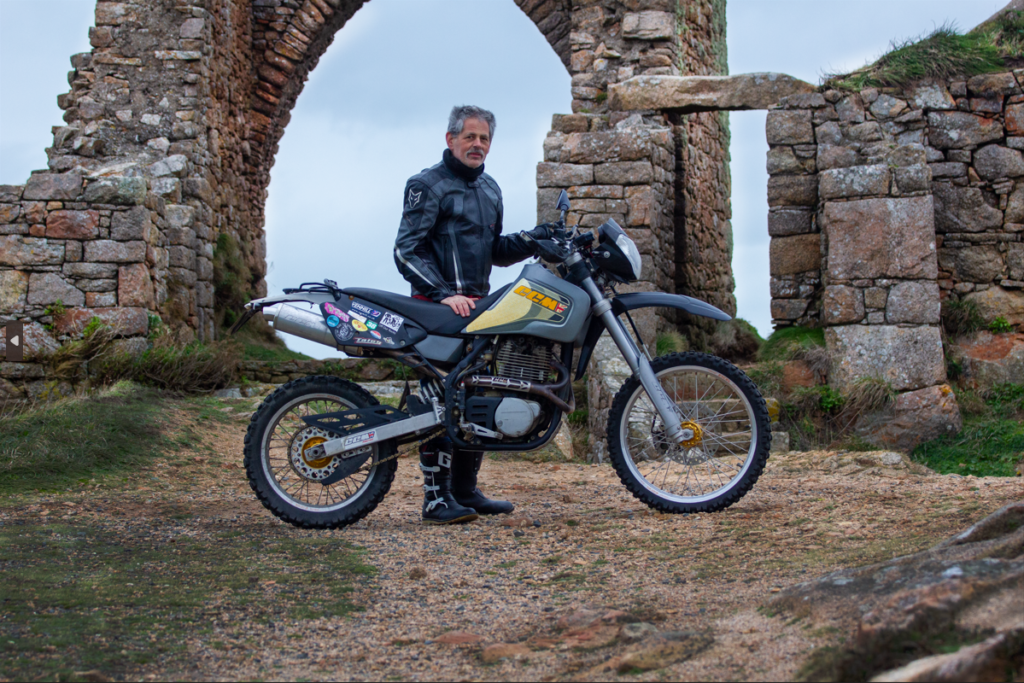
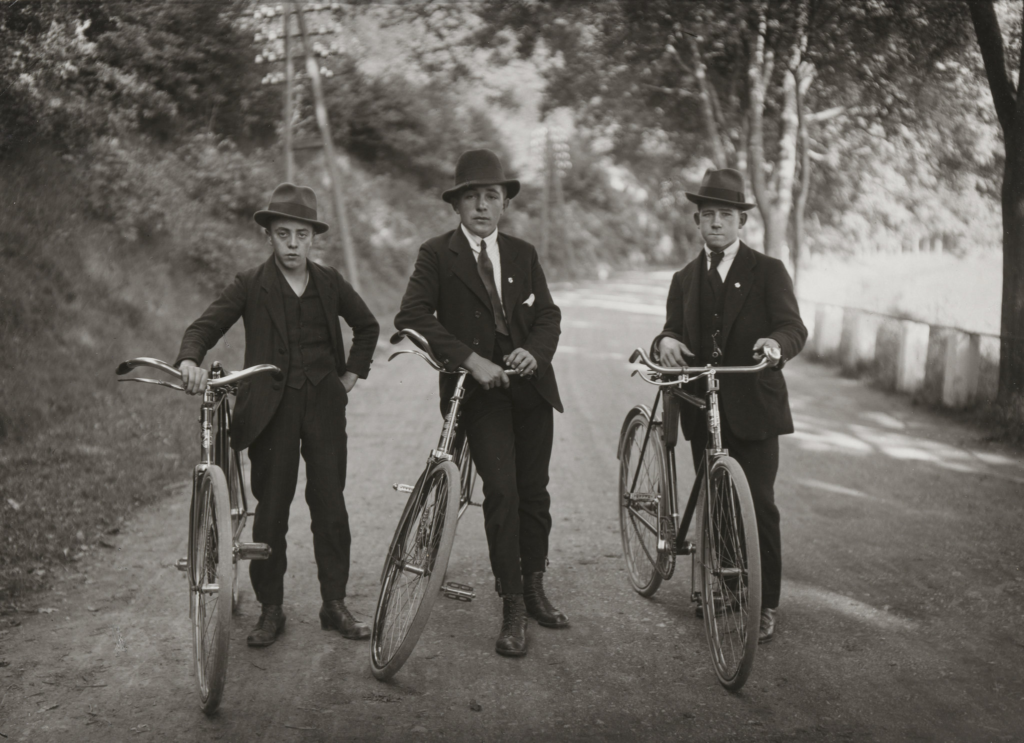
These two images in particular and interesting to compare, as they are very ear appropriate with Sander’s work featuring old fashioned bicycles in full suits and my photo which is a motorbike and motorbike jacket and boots. A large part of Sander’s style is having the model have a blank facial expression, which similarly I have asked the model to do in my photo. I also used the same framing ideas while I only had one model which is more common in environmental portraits but I kept to using the rule of thirds and keeping the subject in the middle ground in the depth of field. Something unusual for portrait work is keeping the background in full focus around the subject however due to the style it is very common to and like Sander’s work I kept a slightly cropped out background look to focus in on the subject. Unlike Sanders work I chose to keep my shots in colour as while it was a choice Sander made as colour cameras were common at the time I felt it would take away from the image unless it was a high contrast version but even then I would rather use the colours in the photo to my advantage and help tell the story in the photo and help describe the subject.

Final Image Analysis

This is my favourite image of this project. It’s a particularly strong image compositionally. For example I place the model under the point of the arch as when looking at the photo the first thing that draws your attention is the motorbike and then the castle ruins, by placing the model in the middle of the two I have not only used the rule of thirds to my advantage I have also put the model in natural eyeline when looking between the two major parts of the image. Continuing from this I have used the rocks on the right of the frame to add depth to the image, however by having the rocks out of focus it removes any of the rough texture that could distract from the subject. I chose to use this location because it is very representative of the models hobbies and due to the nature of it and the props used (his motorbike) it is obvious to the viewer what the models interests are and it’s not too complicated to work out some context to the image and learn about the person which is the intention of environmental portraits. By lightening the granite I have pulled out the grey and pink tones, typical in Jersey granite, without making the texture too smooth for the rough rock. To contrast this I darkened the black plastics and jacket to make the subject stand out against the blue sky background framed by the granite.