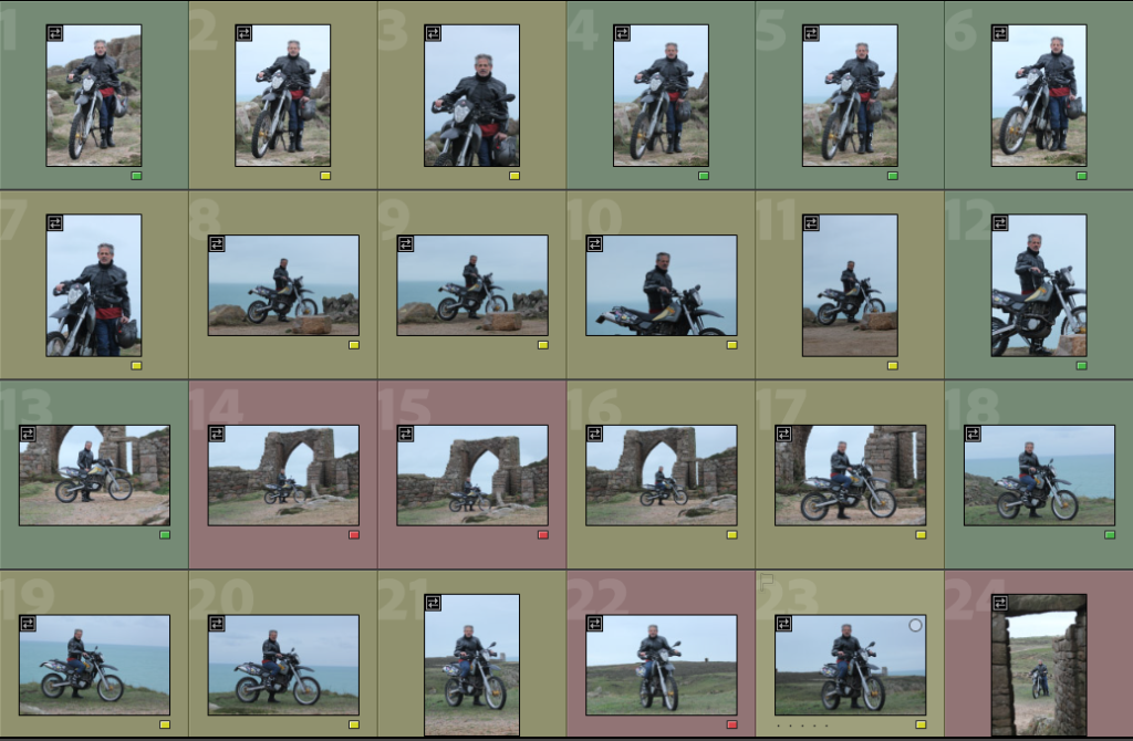
I took a variety of different shots from different angles and depths. To achieve this I used ether a 70-200mm or a wide angle lens 10-20mm. I have used a colour coding system to make quickly look through the shots and select the ones I want to edit. The green photos are the ones I like and want to potentially edit some, the red are the shots that are repeats or just don’t work, for example they could not be in focus or have a busy background that just doesn’t work for the results I want.
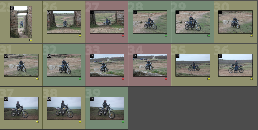
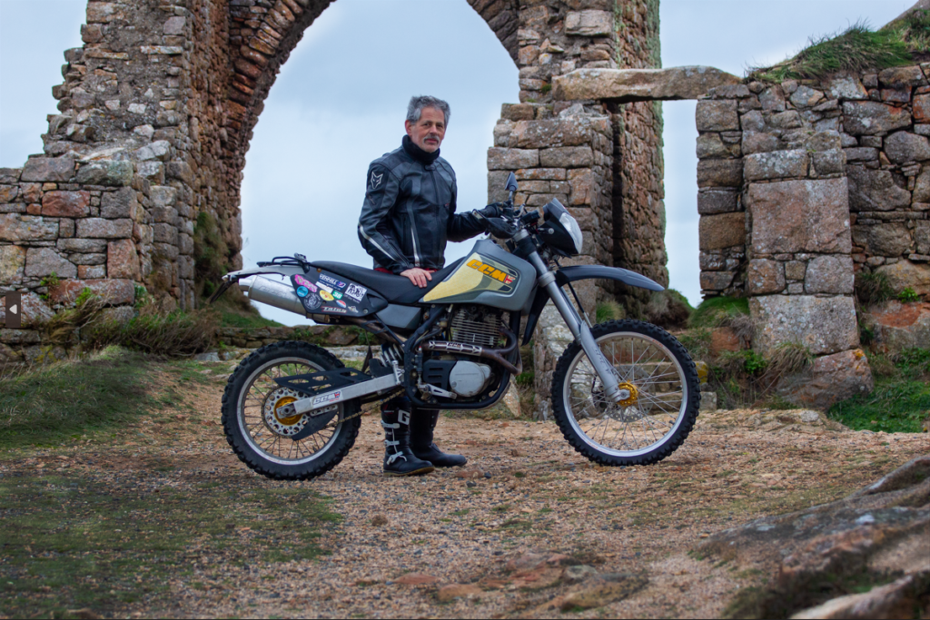
I did a second photo shoot as I felt my first one wasn’t overly telling or interesting. I used the same model but instead of a his work I asked him ‘what is an environment that describes you and your passions?) I got many answers of different hobbies, interests, work and even things like food. However I chose to use the prompt of my motorbike and off – roading. This led to me exploring where we could take the photos over here as there isn’t actually anywhere over here that represents the style of riding he does. I picked Gronez Castle as not only it was the closest to the rocky mountains in Spain etc but he also has a large interest in Jersey’s history so this was a great location to show the models different interests and what makes up his ‘environments’.
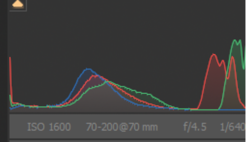
These are the settings I used for the three photos below. By using a 70-200mm lens it allowed me to take a range of shots with high quality.
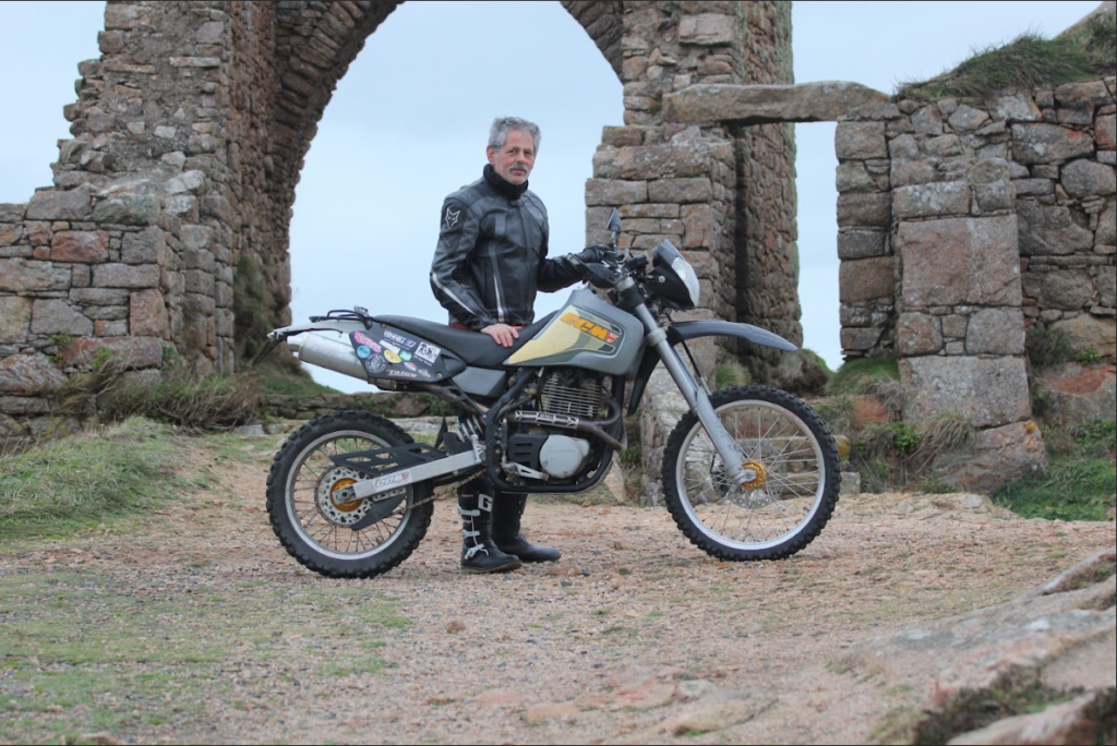
Before
After
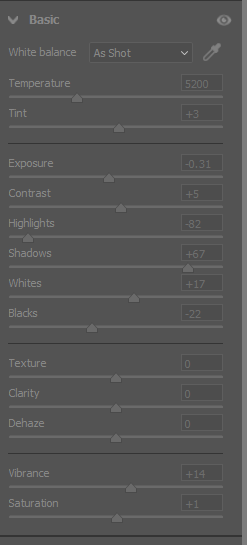
I started by using the RAW settings on photoshop, when you upload a RAW file it allows you to make some basic adjustments to the image prior proper editing. This helped bring some colour back to the photo before I changed too much about it.
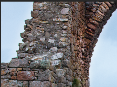

To complete this edit I made sure to use the dodge and burn tools to add depth to the image, the darker parts, like bricks lacked colour so using the dodge tool brought light onto it and made the image feel more open. I then mixed this with using the dodge tool on the grass and motorbike to draw attention to the subject and making the colours feel more vibrant and true to life.
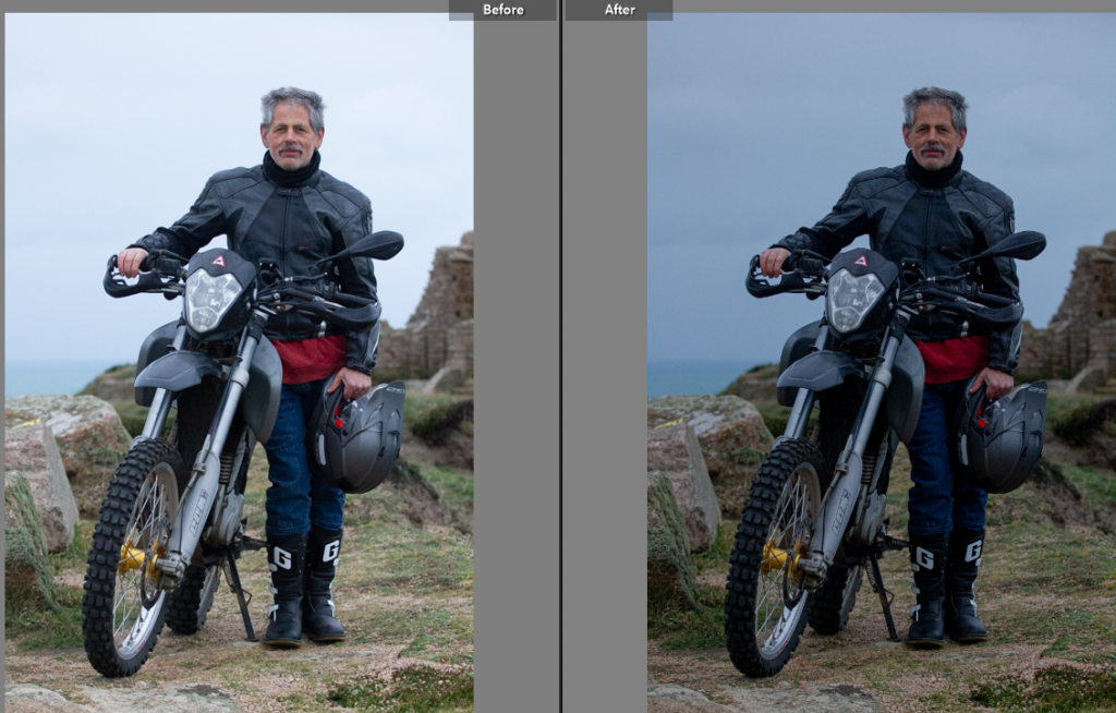
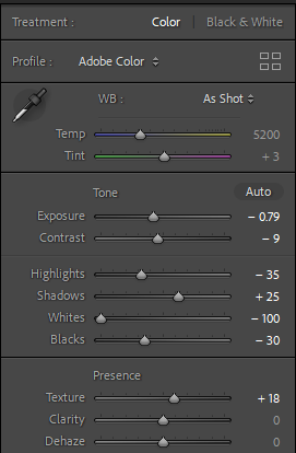
For this edit I felt it only needed Lightroom editing, so this meant I adjusted the colouring and lighting. I felt it needed the exposure bringing down to reveal the blue sky and sea, this also made the rest of colours less washed out. By then continuing to edit the image by decreasing the whites, blacks and highlights it took away from the over exposed look.
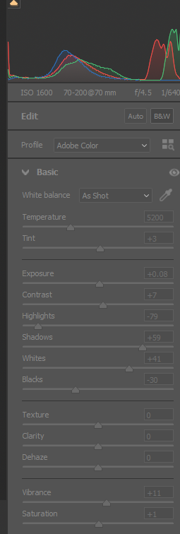
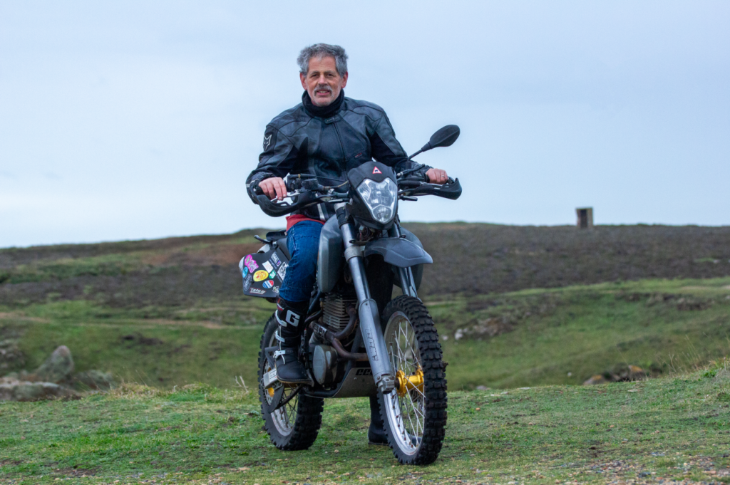
With the final image I edited I chose to mostly just use the RAW settings adjustments as I felt it didn’t need much else as too much editing can over complicate the image and I didn’t want it to take away from the photography style. Overall I’m really happy with the results of this shoot and I think it has produced strong results and that are inspired by August Sander’s work. By editing my best three shots I have now got good final images to presents in a virtual gallery.
